JavaScript Across Responsive States
The most common way to make web sites responsive is by using media queries in the style sheets. The media query defines the rules the browser much meet to show those particular styles. The main limitation of using media queries, however, is that they can only be used to change the look and feel of a site as they only have a limited use for changing the way a web site functions. To properly respond to the differences between the different types of devices a web site supports and to provide a truly responsive experience, other technologies must be used in conjunction with the media queries in the style sheet.
The potential need for a change in functionality will be determined by both the differences in the features available on the device and the size of the viewport that it offers. The disparity between devices can mean that users on different devices could potentially be interacting with your site in completely different ways. In particular, the varying input methods, such as touch screens, TV remotes, keyboards, and mouse interactions, all need to be incorporated in different ways to allow for the broad spectrum of devices to access the highest level of site functionality.
To cater to this requirement to change the functionality across responsive states, you’ll need to learn how to use JavaScript to respond to the browser. Even as I sit here writing this chapter, I realize that both user experience designers and developers are thinking of new interactions that could be add to a site. Upon trying them out, you might find that these interactions do not work well across the variety of devices you are aiming to support and you might want to be able to adapt the functionality. Because it is impossible to cover every interaction you might find yourself implementing, this chapter focuses on arming you with the tools necessary to allow you to handle changes through the use of progressive enhancement techniques.
This chapter will explore:
- Different functionality across responsive states
- Techniques for changing functionality
- Implementing responsive JavaScript techniques
Different Functionality Across Responsive States
Prior to responsive design, when building a web site, the developer aimed to provide the same functionality of a site across the wide variety of browsers they wanted to support. Where this wasn’t possible, they would likely try to provide a degraded experience to the older browsers. What developers could rely on, however, was that users would likely be interacting with the web site with a keyboard and mouse, because the number of input methods used to control web sites was much more limited. Knowing that users would only interact with the site with their keyboard and mouse meant developers could optimize for this experience, an example being adding functionality for when a user hovered over a particular element of the page.
With new devices (smartphones in particular) entering the main stream, developers have seen a growing number of input methods in which users have started to interact with a web site. New input methods such as touch screens and simplistic remote controls for smart televisions have broadened the old input spectrum substantially. Developers therefore now need to consider these new input methods when adding functionality to a site. With this, developers need to consider that some user interactions they have come to rely on like hover, mouse enter, and mouse leave won’t work on a touch screen.
Aside from the different user input methods, there are also a growing number of features that are available on the devices for which a web site built. Among these features, it is becoming more common to find devices that have support features like camera, geolocation, motion, and different device orientations.
If we look out onto the horizon, there are many new features coming for devices. One such new API is the vibration API that notifies the user of a change within an application, or alternatively provides feedback similar to how game consoles provide feedback through vibration.
With all these new capabilities, it gives developers the ability to add new kinds of functionality that couldn’t have been achieved in a desktop browser. These technologies need to be implemented using progressive enhancement, because not all devices are created equal. So although you might already be progressively enhancing your site using media queries, you also need to start doing this in JavaScript.
Chapter 8 looked at different, common user interactions with the aim of exploring ways to adapt them to work better responsively. Chapter 8 provided several examples of common user interactions, and five of these required making changes to the functionality that is built with JavaScript:
Techniques for Changing Functionality
Having explored why you would want to change functionality on different devices based on their capabilities in Chapter 8, let’s look at how to perform these changes in functionality.
The techniques that can be used for changing functionality can be separated into two categories: feature detection and state management. It is important that you have a good understanding of both of these techniques so you know when it is appropriate to use either individually or together to achieve the desired result.
Feature Detection
One of the main areas that media queries are extremely limited is for detecting the features of the browser. Although the media types can be used to a small extent to determine the type of device the user is on, there are a variety of devices with a huge range of different features available, all of which respond to the media type “screen.” The implication of this is that you can’t rely on media types to give you any idea as to which features a device might have. Similarly, although media queries can detect the size of the viewport or the device pixel density, they can’t detect JavaScript APIs or the majority of the HTML5 features. With this in mind, you need to find other ways to detect these features, and this can be done within JavaScript.
Using JavaScript, you can programmatically detect if a feature is supported and a web site can be built to respond appropriately. Depending on the type of feature you want to detect, there are different techniques that can be employed to determine whether it is supported. It is important to understand the different ways to detect features, so let’s look at the different methods that can be used.
Part of Global Object
The easiest method to detect if a feature is supported is if it is exposed on the global object (e.g., the window object). If it belongs to the window object, then the feature is supported.
An example of where this technique can be applied is to test whether the browser supports the localStorage API. You can simply check for the existence of localStorage on the window object, as shown in the following code:
var hasLocalStorage = function(){
        return 'localStorage' in window;
}
Part of an Element
If instead you wanted to test for support of a particular element that was added as part of the HTML5 specification, you would need to create an element and test for a specific feature of that element.
An example of an element that you can test using this approach is the Canvas element. You first need to create a dummy element. In this example, you will store it in a variable named elem. You can then test the element for support of the canvas API by attempting to call a Canvas-specific method on the element; in this case you will use getContext. Usually when you call getContext, if Canvas is supported, you will get back a Canvas Rendering Context, otherwise you will get back undefined. To turn this into a Boolean value, you can simply use two exclamation marks (!!) before the elem.getContext, resulting in the method returning true if Canvas is supported and otherwise returning false, as shown in the following code:
var hasCanvas = function(){
        var elem = document.createElement('canvas'),
        return !!(elem.getContext)
}
Simply knowing an element is supported is not always enough; one example is the HTML5 video element, which supports different video formats in different browsers. If you are dynamically adding videos, it doesn’t make sense to add all the different formats into the page, therefore, you would need to be able to determine which video formats the browser supports. An example of this is the H264 video format that is supported by Webkit browsers including Safari on the iPad and iPhone. To test for H264 support, you would first want to test for the method canPlayType, and if it is supported, you can then use the method to test for support for the H264 codec.
It is important to note that the value from canPlayType will return a string with three possible values: probably, maybe, or an empty string. With this in mind, you need to typecast the variable (change the variable type) to Boolean so it can return true or false. To achieve this, you would use double exclamation marks (!!) before returning the value. The first exclamation mark will typecast the value based on whether its truthy or falsy and then inverse its value. The second exclamation mark will then inverse the value again so it is as expected. The following code shows this:
var hasVideoH264 = function(){
        var elem = document.createElement('video'),

        if(!!elem.canPlayType){
                return !!(elem.canPlayType('video/mp4; codecs="avc1.42E01E, mp4a.40.2"'));
        }
        return false
};
Checking if Values Are Kept
Sometimes you want to test for new features of older elements, and you can do this by adding a value to a property and testing if the browser keeps the value or falls back to something else that is supported.
An example of where you would use this is for testing if the browser supports new input types. You would do this by setting the attribute type to have a value of email and then testing whether the browser ignores the new value. In the case of the value being ignored, the browser will have defaulted the input type to be set to text. The following code shows this:
var hasInputEmail = function(){
        var elem = document.createElement('input'),
        elem.setAttribute("type","email");
        return elem.type === "email";
}
Using a Library
Having looked at writing tests, you can easily see that it is relatively simple to test for support for a particular feature. The problem comes when you need to test for a large number of features because it can be time-consuming to write and test for each of the features across different browsers. Rather than write your own tests, you can instead choose to use a library that contains a variety of different tests that can be used in your code. One such library is Modernizr.
Modernizr is a feature detection library created by Faruk Ateş and developed by a community of developers. The aim of Modernizr is to allow you to test for a large variety of features. The feature detection can be used in two distinct ways: first, it can be used in CSS, and second, it can be used within your JavaScript.
You can use Modernizr very easily in your JavaScript by checking against values stored on the Modernizr object. What this means is that you can easily wrap code related to a specific browser feature in a conditional statement to check for support before you run your JavaScript. An example of checking for support of the geolocation API using Modernizr is:
if(Modernizr.geolocation){
        //JavaScript specific to the geolocation API
}
Modernizr also allows you to react to the availability of different features in your CSS; it does this by adding classes to the HTML element that you can use from within your CSS to add styles to your site for use with a particular feature:
.geolocation .local-search{
        background: #666 url('geosearch.png') center center no-repeat;
        width: 40px;
        height: 40px;
}
Alongside adding classes for features that the browser supports, Modernizr also adds classes for features it doesn’t support, these classes have the prefix no-. You can use these prefixed classes to hide parts or provide alternatives or fallbacks for any unsupported features you have chosen to use on your site. An example would be:
.no-geolocation .local-search{
        display: none;
}
This enables you to progressively enhance your site, taking advantage of the features your users’ browsers offer, while providing fallbacks for users whose browsers do not support the features.
Dynamically Loading Based on Features
I have already explained that you can respond to a feature by simply checking it using a conditional statement, and then if it is true you can add or remove specific functionality. There may, however, be some instances where you want to load additional JavaScript libraries or polyfills when a feature is available or unavailable. An example would be for devices that don’t support the window.matchMedia API, where you could conditionally load a polyfill. To handle this conditional loading of JavaScript, you can use a JavaScript library called yepnope.js. This library allows you to provide a test and then provide an array of JavaScript files that you want to load depending on the pass or fail of that test.
To use yepnope, simply pass an object with your parameters to the yepnope method. The parameters the yepnope.js method supports are:
- test: The test you want to use, this should be either true or false, however you can use a method if you immediately run it.
- yep: An array of JavaScript files to load if the test passes.
- nope: An array of JavaScript files to load if the test fails.
- both: An array of JavaScript files to always load for both yep and nope.
- load: An array of JavaScript files to always load (similar to “both”).
- callback: A callback for after the file has loaded.
- complete: A callback for after all files have loaded.
If you wanted to take a look at how you would use yepnope.js to test whether the matchMedia API is supported and to load a polyfill in the case that it is not, you would need to provide a test and add the polyfill to an array passed to the nope parameter:
yepnope({
    test : function(){
        if(typeof window.matchMedia === "function"){
            return true
        }
        else{
            return false;
        }

    }(),
    nope : ['matchMedia.js']
});
With this in place, you are now conditionally loading the polyfill if the window.matchMedia API is unavailable.
State Management
Although being able to conditionally run code and apply CSS based on a browser’s feature set is really powerful, sometimes you need to manage the code that runs based on the state of the browser.
When you first think of a browser state, you might think about it in terms of key viewport sizes. By thinking this way, you might surmise that there are four different states: extra small, small, medium, and large. The definition of a browser state can, however, be simplified further to being the size of the viewport at any given point. This means that when talking about states, rather than thinking about them in terms of key viewport sizes or devices, you should think about them in terms of a range of dimensions that your code targets.
Understanding what a state is allows you to properly think about what you need to be able to do to manage your states. The key things you need to do when managing your states are how to activate, deactivate, and manage the transition between different states. When a state is activated, for example, you might want to add a piece of functionality, and later when the state is deactivated, you might want to remove the functionality.
There are many ways you can use the APIs offered by the browsers to manage the browser states. The first of the two APIs that I will explain is the window.matchMedia API, which is a new API brought in alongside media queries to allow you to test a media query from within JavaScript. The second API I will explain is the window.onresize API, which, although not originally intended for responsive design, as I will explain, can be applied to manage responsive states.
To properly understand how to use each of these APIs, let’s explore each individually, looking at the benefits of each approach.
window.matchMedia
Using the window.matchMedia API, you are able to test an individual media query to check whether it matches the current browser state. The media queries you use with the API are the same as those you have already learned about using within the CSS.
The simplest way to use this API is for checking whether a media query currently matches. This can be achieved by calling window.matchMedia and passing the media query you want to test as the parameter. The API will then return a MediaQueryList, which is an object containing several properties, one of which is matches, which when queried will have a value of either true or false. If you put this together as a simple conditional statement to check if a media query matches, it would look like the following code:
if (window.matchMedia("(max-width: 767px)").matches) {
    // the viewport is a small device
} else {
    // the viewport is a larger device
}
Although being able to test if a media query currently matches is really useful, where the true power of the window.matchMedia API lies is in its ability to add listeners to the MediaQueryList you created using your media query. If you add listeners to the MediaQueryList, it allows the browser to notify you when the media query becomes matched or unmatched, allowing you to respond appropriately.
I have already explained that passing a media query as a parameter will return a MediaQueryList object that has a number of properties. To enable you to use these properties as necessary, rather than calling them directly off the API call, you can store your MediaQueryList in a variable:
//Create match media list
var mql = window.matchMedia("(max-width:767px)");
It is easy to see what this MediaQueryList object looks like in the browser console, you would simply run this code in the browser and then check the value of the variable you defined (see Figure 9-1).
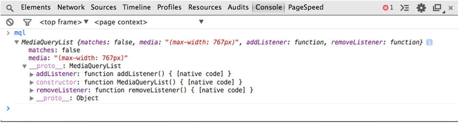
Figure 9-1. The media query list object as shown in the browser console
As you can see from looking at the object in the console, the MediaQueryList provides the ability to see immediately if the media query matches by looking at the matches property and to both add and remove listeners.
To add a listener to the MediaQueryList, you can use addListener by passing a listener method. The listener you define will pass the MediaQueryList back as the first parameter, which you can then use to check whether the media query the user has defined currently matches. This is achieved by using the matches property discussed earlier and checking if the value is equal to true or false. If you use a conditional statement, you can easily separate the entering the state (matches will be equal to true) from the exiting the state (matches will be equal to false). Put together, the listener method will look like this:
//Create an the listener for mobile
var mobileListener = function(mqlObj){
    if(mqlObj.matches){
        console.log('enter mobile'),
    }
    else{
        console.log('exit mobile'),
    }
};
It is important to note that although you could pass an anonymous function to the addListener method, there is a disadvantage to this when it comes to adding listeners. This is because when you pass an anonymous function, you do not have a reference point to use when you want to later remove the listener.
With both the MediaQueryList and the listener method complete, you can now attach the listener method to the MediaQueryList. This is achieved by simply using mql.addListener, passing the listener method as a parameter:
mql.addListener(mobileListener);
If you look at this all together, you get the following:
//Create match media list
var mql = window.matchMedia("(max-width:767px)");

//Create an the listener for mobile
var mobileListener = function(e){
    if(e.matches){
        console.log('enter mobile'),
    }
    else{
        console.log('exit mobile'),
    }
};

//Add the listener to the MediaQueryList
mql.addListener(mobileListener);
The second method that the MediaQueryList object has for managing listeners is the removeListener method. The purpose of this method is to allow you to easily remove a listener you previously added. Prior to adding a listener, you assigned the listener to a variable; so to remove a listener, you will need to pass this variable to removeListener, which will remove the listener from the MediaQueryList:
mql.removeListener(mobileListener);
So far I have explained how to both add and remove a listener to a single media query. More often than not, this will not be enough as you will most likely need to manage a variety of different states. You can therefore choose to set up multiple MediaQueryLists, attaching state-specific listeners to each:
//Create match media list
var smallMediaQuery = window.matchMedia("(max-width:767px)"),
    mediumMediaQuery = window.matchMedia("(min-width:768px) and (max-width:991px)"),
    largeMediaQuery = window.matchMedia("(min-width:992px)");

//Create an the listener for small devices
var smallListener = function(e){
        if(e.matches){
                console.log('enter small device'),
        }
};

//Create an the listener for medium devices
var mediumListener = function(e){
        if(e.matches){
                console.log('enter medium device'),
        }
};

//Create an the listener for large devices
var largeListener = function(e){
        if(e.matches){
                console.log('enter large device'),
        }
};

//Add the listener to the MediaQueryList
smallMediaQuery.addListener(smallListener);
mediumMediaQuery.addListener(mediumListener);
largeMediaQuery.addListener(largeListener);
In the above example, I have created a MediaQueryList for each of the media queries, attaching a different listener to each. Optionally, I could have created a shared listener method, which would have been added to each of the MediaQueryLists, however, in this case, I would have had to additionally query the MediaQueryList passed to the listener to determine which state was being managed.
As you have now learned, you can easily manage your states using the window.matchMedia API, with the key benefit being that you can reuse the same media queries you used within the CSS from within the JavaScript.
It is important to note that the browser support for the matchMedia API is limited to newer browsers, therefore, if you want to use the matchMedia API in browsers older than Internet Explorer 10, you will need to use a polyfill.
window.onresize
Having already looked at the window.matchMedia API, let’s look at how to use the window.onresize API to manage a responsive state. This API was around long before responsive design, so it was not originally intended for managing responsive states, however, it is perfectly suited for doing so as it fires as the browser is resized, much like how you would want to switch responsive states when users resize the browser.
With this in mind, let’s look at how to use the window.onresize API in a responsive manner. The examples here will look at how to respond to the browser’s viewport width.
For this example, I will be using the revealing module pattern developed by Christian Heilmann as an adaptation of Richard Cornford’s module pattern. This makes sense because it encapsulates the code. I won’ be going into the pattern I am using in depth, however, if you want to read more about it, Christian wrote a useful post about it on his blog.1 The example begins with the simple code:
var stateManager = (function(){
    return {
    }
}());
Because you need to know which state you are in at any given moment, you will need to create a variable at the top of the module, which you will use to store the name of the current state:
var stateManager = (function(){
    var state = "";

    return {

    }
}());
As the resize method fires, you need to check the browser width to determine whether the current state has changed. With this in mind, you need to write a method that will determine the width of the browser. Unfortuantely this is not as simple as you might expect as the way in which we can find the width of the browsers is inconsistent across different browsers.
var getWidth = function () {
        var x = 0;

        if (typeof(document.body.clientWidth) == 'number') {
                // Newer generation of browsers
                x = document.body.clientWidth;
        }
        else if( typeof( window.innerWidth ) == 'number' ) {
                //None Internet Explorer
                x = window.innerWidth;
        }
        else if( document.documentElement && document.documentElement.clientWidth ) {
                //Internet Explorer 6 and above in 'standards compliant mode'
                x = document.documentElement.clientWidth;
        }

        return x;
};
With this method for checking the width of the browser in place, you now need to write the method to handle the resize event. The methodology for the resize event can be broken down as follows:
- Check the width against different values to determine which state the browser is currently in.
- Determine if that state is currently active.
- If the state is not active, fire the relevant method and set the state to the name of the new state.
With this methodology in mind, the code for the method looks like this:
var onResizePage = function () {
        if (getWidth() < 768) {
            if (state !== "small") {
                //Enter mobile method goes here
                state = "small";
            }
        }
        else if (getWidth() >= 768 && getWidth() < 992 && state !== "medium") {
            if (state !== "medium") {
                //Enter tablet method goes here
                state = "medium";
            }
        }
        else if (getWidth() < 992) {
            if (state !== "large") {
                //Enter desktop method goes here
                state = "large";
            }
        }
};
The next step is to define the methods that will be called when you enter each of the states. Because you have defined three states, you will create three methods: enableSmall, enableMedium, and enableLarge. For this example, simply log to the console the name of the state:
var enableSmall = function(){
    console.log('enter small);
};

var enableMedium = function(){
    console.log('enter medium);
};

var enableLarge = function(){
    console.log('enter large);
};
Having defined the methods for when you enter a state, you will now want to add the calls to these methods into the onResizePage method already created:
var onResizePage = function () {
        if (getWidth() < 768) {
            if (state !== "small") {
                enableSmall();
                state = "small";
            }
        }
        else if (getWidth() >= 768 && getWidth() < 992 && state !== "medium") {
            if (state !== "medium") {
                enableMedium();
                state = "medium";
            }
        }
        else if (getWidth() < 992) {
            if (state !== "large") {
                enableLarge();
                state = "large";
            }
        }
};
Earlier when you defined a module, you defined a return value as an object; now you will want to add a key value pair to this object, setting the key to init and its value to a method. Inside this method, you will define and run the onResizePage method and then add a resize event listener, which will run the onResizePage method whenever the browser is resized:
var stateManager = (function() {
        var state = "";

        var getWidth = function () {
                var x = 0;

                if (typeof(document.body.clientWidth) == 'number') {
                        // Newer generation of browsers
                        x = document.body.clientWidth;
                }
                else if( typeof( window.innerWidth ) == 'number' ) {
                        //None Internet Explorer
                        x = window.innerWidth;
                }
                else if( document.documentElement && document.documentElement.clientWidth ) {
                        //Internet Explorer 6 and above in 'standards compliant mode'
                        x = document.documentElement.clientWidth;
                }

                return x;
        };

        var onResizePage = function() {
                if (getWidth() < 768 && state !== "small") {
                        enableSmall();
                        state = "small";
                }
               else if (getWidth() >= 768 && getWidth() < 992 && state !== "medium") {
                        enableMedium();
                        state = "medium";
                }
               else if (getWidth() < 992 && state !== "large") {
                        enableLarge();
                        state = "large";
                }
        };

        var enableSmall = function() {
                console.log('enter small'),
        };

        var enableMedium = function() {
                console.log('enter medium'),
        };

        var enableLarge = function() {
                console.log('enter large'),
        };

        return {
                init: function() {
                        onResizePage();
                        window.addEventListener("resize", onResizePage, true);
                }
        };
}());
Having completed the state manager, the final step is to run it, this can be achieved by simply running the returned init method:
stateManager.init();
The key problem with implementing responsive states using the window.onresize method is that you have to do a lot of the work yourself. The purpose of the window.onresize event in the browser is to simply fire some JavaScript when the browser is resized by the user so it has no concept of responsiveness or states. This means, in this simple example, that you would have had to check if a state is valid and keep track of when the states are enabled yourself.
Although being able to write a responsive state manager using the window.onresize method is a good solution to targeting JavaScript toward different responsive states, to get it right, it can take more time to implement than the window.matchMedia API does. With this in mind, don’t let this extra work involved put you off to using this method. With support for the window.onresize API in all the major browsers out of the box, this method offers the best browser support.
It is also worth being aware that if you are using a window.matchMedia polyfill, the listener events will use the window.onresize API to polyfill the window.matchMedia API. The implication of this is that you may have to do additional testing across different browsers because your code will be working in different ways depending on whether or not the window.matchMedia API is supported.
Libraries
Having looked at the two core APIs that can be used when writing responsive JavaScript, you now have a good understanding of the differences and capabilities of both. One of the things you might have noticed is that both require you to write a fair amount of code to manage your states. Thankfully, there are a number of libraries available that enable you to write less code and offer additional functionalities over what the browser APIs provide.
I will focus here on two JavaScript libraries: SimpleStateManager and enquire.js. Both of these libraries take a different approach to responsive JavaScript but aim to solve the same fundamental problems developers face when trying to target different functionality toward different responsive states.
SimpleStateManager
The first JavaScript library I will explain is SimpleStateManager, which is a responsive state manager built on top of the window.onresize API.
Before you can use SimpleStateManager, you need to download the library and add it to your site. There are two ways you can add the library to your project: the first, and easiest, way is to use Bower, which as you’ll remember is the package manager discussed in Chapter 7. You can use Bower to add SimpleStateManager to the project with the following command:
bower install SimpleStateManager
Once you have downloaded the package using Bower, simply include the JavaScript file in the page:
<script src="bower_components/SimpleStateManager/dist/ssm.min.js"></script>
 Note It is important to note that the path to SimpleStateManager may be different depending on the way in which you have configured Bower.
If you are not using Bower on your project, an alternative way to add SimpleStateManager to your project is to simply download the library directly from www.simplestatemanager.com and include it in your page.
Having set up SimpleStateManager within your project, you can now add your responsive states. A state in SimpleStateManager is defined by setting a number of configuration options, including defining any callbacks to be run when entering, leaving, and resizing a state. To add a state in SimpleStateManager, use the ssm.addState method, which allows you to define the state with a series of different options. The supported options for a state in SimpleStateManager are:
- id (optional): The ID is the unique identifier, if provided, you can use this ID to query the state and later remove the state if necessary.
- minWidth (optional): Allows you to define the minimum width that the state is active.
- maxWidth (optional): Allows you to define the maximum width that the state is active.
- onEnter (optional): Allows you to define a callback for when you enter the state.
- onResize (optional): Allows you to define a method for when the browser is resized while the state is active.
- onLeave (optional): Allows you to define a method for when you leave the state. This potentially could be used to clean up your state when you leave it.
It is important to understand that all the options in SimpleStateManager are optional, allowing you to use the library in a way that best suits your project. Now that you have seen what options are available when creating a state, let’s add the first state. The first state will be aimed at mobile devices, applying a maxWidth of 767, and for the onEnter, onResize, and onLeave methods, you will simply log what the state is currently doing to the console.
When you have set up all the states, you then need to tell SimpleStateManager that you are ready for it to apply the states. This is achieved using the ssm.ready method, which does not take any parameters and simply tests each of the states to see if they are valid. For any valid states, the onEnter method will be run. The use of ssm.ready is simply as follows:
ssm.ready();
Now that the states are all set up, you may find that later in the JavaScript, perhaps as part of handling a user action, you want to determine whether a particular state is currently active. This can be achieved using the ssm.isActive method, which takes one parameter, which is the ID of the state you want to check for active status. If you were to test if the mobile device state is active, you would likely want to use a conditional statement. In this example, you would log to the console if the mobile state is currently active:
if(ssm.isActive('mobile')){
    console.log('mobile is active'),
}
Sometimes the states might become redundant, so you would need to remove them; this is achieved using the ssm.removeState method. Similar to the ssm.isActive method, this method takes one parameter, which is the ID of the state you want to remove:
ssm.removeState('mobile'),
The important thing to note is that the removeState method simply removes the state from SimpleStateManager and does not handle any tidying up that may be required. This is intentional, as the library doesn’t know your intent when you are removing your states. In some cases you may find you need to fire the onLeave event if you remove the state. Although SimpleStateManager does not do this for you, it is very easy to use the ssm.getStates method to get the state you are removing and fire the onLeave method yourself.
When adding states to SimpleStateManager, you are not limited to adding a single state at a time. You can use the ssm.addStates method to add multiple states by passing an array of the objects defining the options for each state:
ssm.addStates([
    {
        id: 'mobile',
        maxWidth: 767,
        onEnter: function(){
            console.log('enter mobile'),
        }
    },
    {
        id: 'tablet',
        minWidth: 768,
        maxWidth: 991,
        onEnter: function(){
            console.log('enter tablet'),
        }
    },
    {
        id: 'desktop',
        minWidth: 992,
        onEnter: function(){
            console.log('enter desktop'),
        }
    }
]);
With SimpleStateManager, you can add an infinite number of states, which are able to overlap one another. It is important to note that although it is possible to add a large number of states, there are potential performance implications, so it is important to be sensible with the number of states you add.
Where SimpleStateManager really stands out is in its ability to add your own custom configuration options to your states. What this means is that you can define a test and then within a state’s options you are able to set a value that you can test against.
To add a custom config option, you would simply pass an object containing the name of the test (this will become the option you pass to the state so it is suggested you use camel-cased lettering), and you then pass the test method. The test method is then able to read the values set in the state’s options and test whether the conditions have been met. The method should then return true or false. If you look at an example of how to implement a new config option, it would look like this:
ssm.addConfigOption({name:"maxHeight", test: function(){
    if(typeof this.state.maxHeight === "number" && this.state.maxHeight >=document.documentElement.clientHeight){
            return true;
    }

    return false;
}});
For this config option, you would be defining a rule that allows you to target the maximum height of the viewport within the viewport. If your browser’s viewport exceeds the height defined by maxHeight in the state options, that particular state will not be applied or will be deactivated.
To test the new config option, simply add it to the state and use it in the same way you used the default config options that come with SimpleStateManager:
ssm.addState({
        id: 'mobile',
        maxWidth: 767,
        maxHeight: 320,
        onEnter: function(){
            console.log('enter mobile'),
        }
}).ready();
Having tested the custom config option, you can now see how easy it is to set up custom tests to run against your state. The real power with this is that anything you can test in JavaScript that is able to return a true or false value will work as a config option, meaning that this can be taken further than simply querying the viewport, but also could be used to test if a particular feature is supported by the browser. An example of this would be to test if the device supports localStorage:
ssm.addConfigOption({name:"localStorage", test: function(){
    if('localStorage' in window){
        return true;
    }

    return false;
}});
You can then simply add it as a config option on your state:
ssm.addState({
        id: "localStorage",
        localStorage: true,
        onEnter: function(){
            console.log('supports local storage'),
        }
}).ready();
You don’t even need to provide any width config options if they are not necessary and could have a set of browser-supported features be a state within themselves.
Aside from adding custom config options, there is another way you can add functionality to SimpleStateManager—by using or writing your own plug-ins. Similar to how jQuery allows you to write your own plug-ins, SimpleStateManager allows you to write plug-ins that extend its functionality. An example of a plug-in you might use with SimpleStateManager is SSM with Colorbox (http://colorbox.simplestatemanager.com/), which is one of the official plug-ins developed by the SimpleStateManager team. This plug-in wraps the jQuery plug-in Colorbox with a wrapper that allows you to enable and disable the plug-in within your states.
When considering whether SimpleStateManager is right for your project, it is important to look at the benefits it will bring to the project. The key benefits of using SimpleStateManager are:
- It removes the need to manage your responsive states manually, you simply add a state and the library manages the activation and deactivation.
- You can define enter, resize, and leave events for each of your states.
- You are able to extend SimpleStateManager with custom config options, allowing you to add custom tests to your states.
- There are a growing number of plug-ins for SimpleStateManager, allowing you to extend the library further.
- Through using the window.onresize API, the library does not require a polyfill to work in older browsers such as Internet Explorer 7, 8, or 9.
On the opposite side of the equation, there is one main disadvantage of using SimpleStateManager. SimpleStateManager uses configuration options to define a state, and you cannot use the same media query you are using in your CSS or JavaScript but instead have to provide values to the options.This is just a short example of what you can do with SimpleStateManager. There is full documentation on the SimpleStateManager web site at www.simplestatemanager.com.
enquire.js
Another library you can use is enquire.js, which in this case is built on top of the window.matchMedia API and allows you to write responsive JavaScript. It is built as a wrapper for the API, extending the functionality and making it simpler to use and adding the flexibility to degrade in browsers that do not support the API.
The first step to start using enquire.js on a project is to download the library and add it to your site; this can be achieved in two ways. The first, and simplest, way to add the library to your project is to use the Bower package manager discussed in Chapter 7. You can simply use Bower to add enquire.js to the project with the following command:
bower install enquire
Once you have downloaded the package using Bower, simply include the JavaScript file in your page:
<script src="bower_components/enquire/dist/enquire.min.js"></script>
It is important to note that the path to the enquire.js library may be different depending on the way in which you have configured Bower.
If you are not using Bower on your project, an alternative way to add enquire.js to your project is to simply download the library directly from http://wicky.nillia.ms/enquire.js/ and include it in your page.
The way you add states with enquire.js is through registering them with the enquire.register method. This method takes two parameters, the first being the media query that defines when a state is applied. The second parameter can take two forms, one being a callback, which it simply fires when the media query is matched, and the other is an object containing different events for the state. The options that you can pass to enquire.register are:
- match: Provides a method that will fire when the media query is matched.
- unmatch: Provides a method that will fire when the media query is unmatched.
- setup: Provides a method that will fire when the state is first registered.
- deferSetup: Provides a method that will fire when the media query first matches.
- destroy: Provides a method that will fire when the state is unregistered.
It is optional to provide callbacks to these events, which allows you to choose the callbacks most appropriate to use for your state changes. Let’s look at how to create the first state. You will do this by taking what you have learned earlier about writing media queries and write a media query that targets mobile devices. For this example you will use the media type screen and the media expression max-width: 767px, which when put together is coded screen and (max-width: 767px). You will pass this as the first parameter, and for the options let’s pass a match and unmatch method, both logging to the console. Put together, it looks like this:
enquire.register("screen and (max-width: 767px)", {
    match : function() {
        console.log('enter mobile'),
    },
    unmatch : function() {
        console.log('leave mobile'),
    }
});
When tested in your browser, after you enter the state, the console will output enter mobile, and when you leave the state the console will output leave mobile. As you can see, adding a single state with enquire.js is really simple, but adding multiple states is just as simple because enquire.js is a chainable library, meaning you can chain commands just like you chain commands in jQuery. With this in mind, let’s try to add multiple states by chaining the .register method. For this example, rather than pass an object of different methods as the second parameter, let’s simply pass a single method that will be used when the state is matched:
enquire.register("screen and (max-width: 767px)", function() {
    console.log("enter mobile");
})
.register("screen and (min-width:768px) and (max-width:991px)", function() {
    console.log("enter tablet");
})
.register("screen and (min-width:992px)", function() {
    console.log("enter desktop");
});
So far you have added states, however, sometimes you may find that you want to remove states. This can be achieved by simply passing the original media query to the enquire.unregister method:
enquire.unregister("screen and (max-width: 767px)");
Having successfully removed a state, let’s look at how enquire.js handles browser support. As discussed previously, the window.matchMedia API that enquire.js is based on is only supported by newer browsers. This means that Internet Explorer 7, 8, and 9 will not support the API. But enquire.js takes this into account and enables you to degrade your experience to a desktop-only experience. This is achieved by passing true as the third parameter to the register method for the desktop state, telling enquire.js that if the window.matchMedia API is not supported, this stage should always be matched:
enquire.register("screen and (min-width:992px)", function() {
    console.log("enter desktop");
}, true);
If you want to have your tests work in these older browsers rather than degrade, you can use a polyfill for the window.matchMedia API to add support for the API to older browsers. I discussed one such polyfill earlier when I explained the window.matchMedia API.
When considering whether enquire.js is right for your project, it is important to look at the benefits it will bring to the project. The key benefits of using enquire.js are:
- It takes away the need to manage your responsive states manually, simply add a media query and relevant listeners.
- You are able to use the same media queries in your JavaScript as you are using within your CSS
On the opposite side of the equation, there are some disadvantages of using enquire.js:
- It does not provide a built-in plug-in API.
- It requires the use of a matchMedia polyfill in order to support older browsers such as Internet Explorer 7, 8, and 9.
This is just a short example of what you can do with enquire.js. There is full documentation on the enquire.js web site at http://wicky.nillia.ms/enquire.js/.
Using Feature Detection for Advanced States
So far I’ve explained how to use feature detection to respond to the features of a browser; however, I have stopped short of explaining how to build states that take into account the features of a browsers. What this means is that states are limited to simply responding to the viewport width; while for many sites this might be enough, it is important to understand why and how you can take into account features from within your states.
As developers, we are often forced to make assumptions about our users when we build responsive sites. It is common for us to compartmentalize devices by their viewport; an example being that all small devices are smartphones. This sort of assumption can damage our users’ experience, as users on small devices that are not smartphones could potentially get a worse experience. This is because we have assumed they are using a smartphone, when in reality they may have simply resized their browser window. This is where it becomes important that when targeting features like touch screens, it becomes part of the way we progressively enhance a web site.
If you are progressively enhancing your site to use device-specific features, you might need to test for these from within your states. This is because a change to functionality may only be required in the circumstance of a pairing between a specific viewport state and a device-specific feature. This adds an extra level of complexity to your states, because not only are you targeting functionality based on the browser state, but you are also separating that functionality based on the features available.
To continue on with the smartphone example, let’s look at how to target a small device with a touch screen. For this example, let’s use the Modernizr feature detection library discussed previously. To determine whether the device is a touch screen, you can check the value of Modernizr.touch from within your state:
var smallState = function(){
    if(Modernizr.touch){
        console.log('small device with a touch screen'),
    }
    else{
        console.log('small device without a touch screen'),
    }
}
From this example it is easy to see how simple it is to combine using states with feature detection. However, by just adding one conditional statement to determine whether or not it’s a touch device has doubled the type of devices being testing for. Instead or just testing for “small devices,” you are now testing for “small devices with support for touch events” and “small devices without support for touch events.”
This adds more complexity to what otherwise would have been a simple state. An example of where this might get more complex would be if you wanted to test for the geolocation API alongside the touch API but requiring a different response based on whether it’s a touch device or not:
var smallState = function(){
    if(Modernizr.touch){
        if(Modernizr.geolocation){
            console.log('small device with a touch screen and geolocation'),
        }
        else{
            console.log('small device with a touch screen'),
        }
    }
    else{
        if(Modernizr.geolocation){
            console.log('small device without a touch screen but with geolocation'),
        }
        else{
            console.log('small device without a touch screen'),
        }
    }
}
As you can see, by adding the geolocation API, you have now doubled the number of different use cases that could happen. Although this is manageable, it’s important to highlight that while combining feature detection within state management can offer huge benefits, you need to be aware that it can add complexity to the code you will need to manage.
One option to manage this code is, as discussed previously, using the SimpleStateManager library, which allows you to add custom configuration options and allows you to add feature detection. This also allows you to configure your feature detection on a state level, however, the disadvantage here would be that you would need to define a new state for each different combination of features you are supporting.
Implementing Responsive JavaScript Techniques
So far I have focused on the theory behind why you would want to change functionality and how you would achieve this, but once you understand this theory, it is important to understand how you can apply responsive JavaScript techniques to your web site.
For this example, let’s look at how to implement a login prompt on a site that will appear on a new page on smaller devices and on larger devices will appear in a modal window. For simplicity of these examples, I will be using jQuery to handle some of the DOM manipulations. If you would prefer to use native JavaScript or an alternative library, feel free to replace the usage of jQuery.
As a starting point, let’s take the code built in Chapter 5 using Twitter Bootstrap. This is included in the code bundle for chapter 5. Having set up the project with this as a starting point, you can start by adding a new hyperlink to the navigation to link to the login page. To achieve this, simply add a second navigation to the navbar. Because you want this navigation to be on the right-hand side of the navbar, let’s add the class navbar-right:
<div class="collapse navbar-collapse" id="bs-example-navbar-collapse-1">
    <ul class="nav navbar-nav">
        <li><a href="#">Link</a></li>
        <li><a href="#">Link</a></li>
        <li><a href="#">Link</a></li>
    </ul>
    <ul class="nav navbar-nav navbar-right">
        <li><a href="login.html" class="login-link">Login</a></li>
    </ul>
</div>
Once you have added this link, it will then appear on the navigation bar. The medium viewport is shown in Figure 9-2.
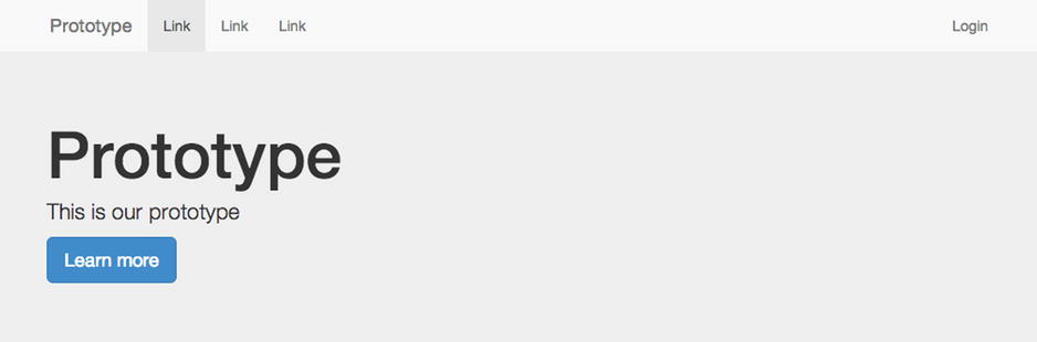
Figure 9-2. The navigation on the medium viewport
To enable you to add functionality, add a new JavaScript file, which you will name main.js, to the bottom of the page just before the closing body tag. You will also be using SimpleStateManager to manage the responsive states, so let’s also add this to the page:
<script src="js/ssm.min.js"></script>
<script src="js/main.js"></script>
Having linked to the login page and added a new JavaScript file, let’s create the login page you just linked to. The easiest thing to do is to duplicate the index.html file, naming it login.html.
Having created the login.html page, you can now start to create the login page. To start with, you will want to update the Jumbotron with information telling the user to log in:
<section class="jumbotron">
    <div class="container">
        <h1>Login</h1>
        <p>Login to your account</p>
    </div>
</section>
Next you want to replace the current product panels with your login form. As this site is built using Bootstrap, you can simply implement the forms using the classes indicated in the Bootstrap documentation (http://getbootstrap.com/css/#forms). Please note that I have added the id content to the section element, this will be used later when you pull the content into the modal window on larger devices:
<section class="container" id="content">
    <div class="row">
        <div class="col-sm-12">
            <form role="form">
                <div class="form-group">
                    <label for="email">Email address</label>
                    <input type="email" class="form-control" id="email">
                </div>
                <div class="form-group">
                    <label for="password">Password</label>
                    <input type="password" class="form-control" id="password">
                </div>
                <button type="submit" class="btn btn-default">Submit</button>
            </form>
        </div>
    </div>
</section>
Having implemented the form, build the user journey that you intended to implement for smaller viewports, which upon clicking the login link in the header will take the user to the login page, as shown in Figure 9-3.
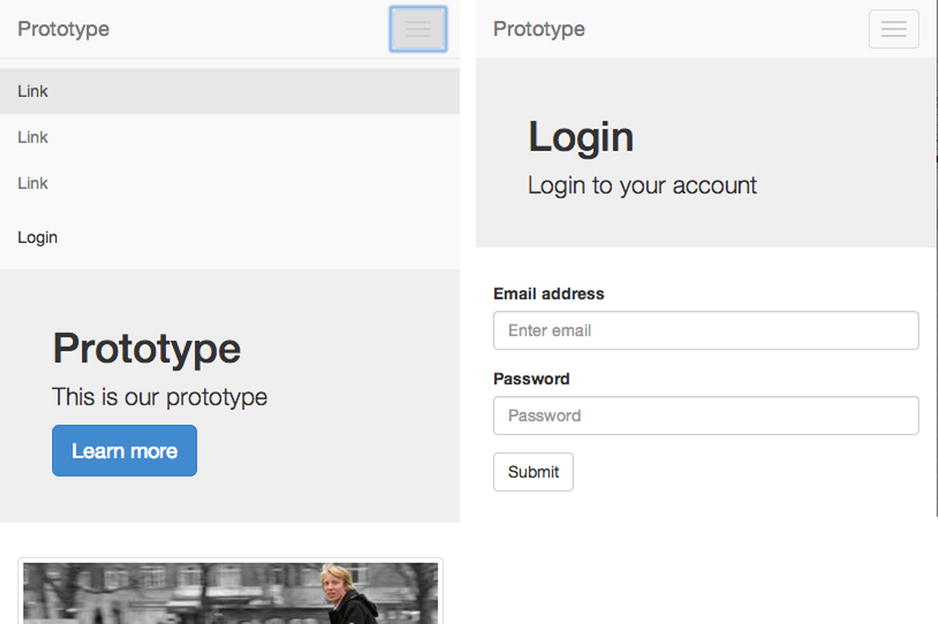
Figure 9-3. The home page with navigation open (left), and the login page the user clicks through to (right)
The next step is to look at how to progressively enhance the site by instead loading the login form into a modal window on larger viewports. Let’s use the default modal styles that come with Twitter Bootstrap, but you will then add JavaScript to show and hide the modal on medium and large viewports. To start with, add the modal HTML to the index.html file (this is taken from http://getbootstrap.com/javascript/#modals). You will notice in the code I have left the modal-body empty, this is because I will be dynamically pulling this content in from the login page so that when updating the form I only have to update the HTML once:
<div class="modal fade">
<div class="modal-dialog">
<div class="modal-content">
<div class="modal-header">
<button type="button" class="close"><span aria-hidden="true">×</span><span class="sr-only">Close</span></button>
<h1 class="modal-title">Login</h1>
</div>
<div class="modal-body">
</div>
</div><!-- /.modal-content -->
</div><!-- /.modal-dialog -->
</div><!-- /.modal -->
Having set up the HTML for the modal window, open the main.js file and start to write the functionality. Let’s start by creating an immediately invoked function expression, which is essentially an anonymous function that is invoked as soon as it is read by the JavaScript engine. In this case, it allows you to scope the variables privately to the codebase:
(function(){
}());
The next step is to cache the modal window in a variable so you can access it later. You will also at this point create the site overlay, which appears behind the modal window in a variable so that you can add it to the page when the modal window is shown:
var $modal = $('.modal'),
var $modalBackdrop = $('<div class="modal-backdrop fade"></div>'),
The next step is to put together the method that will open the modal window when activated. To begin with, declare the method as a variable called loginClick:
var loginClick = function(e){
};
I mentioned earlier that the form included on the login.html page would be pulled into the modal window. To achieve this, use jQuery’s ajax method, passing the URL to the login page and an object containing the success method:
$.ajax('/login.html',{ success: function(data){
}});
Having retrieved the HTML for the login page, filter it to extract the login form from the page. To do this, use jQuery’s filter method, passing the id specified earlier in the section containing the login form. Having filtered the returned HTML, use the html method to get the final HTML from the filtered data and to output it into the variable:
var html = $(data).filter('#content').html();
Having filtered the HTML, add it to the body of the modal window. Because you already have the modal cached in a variable, you can simply use the jQuery find method to find the modal body and then use the html method to update the modal bodies content with the HTML from the login panel:
$modal.find('.modal-body').html(html);
Having updated the modal body, you can now show the modal window. First, use jQuery’s show method to show the element, then use the removeClass method to remove the class out (which the element might have from previously fading out the content), and finally use the addClass method to add the in class, which will cause the element to fade in using CSS3 transitions:
$modal.show().removeClass('out').addClass('in'),
Next you will show the backdrop by inserting it after the modal window using insertAfter, show it using the show method, and then add the class in, which will perform the CSS animation:
$modalBackdrop.insertAfter($modal).show().addClass('in'),
After putting all this together, the code for the final method looks like this:
var loginClick = function(e){
        $.ajax('/login.html',{ success: function(data){
                var html = $(data).filter('#content').html();

                $modal.find('.modal-body').html(html);
                $modal.show().removeClass('out').addClass('in'),
                $modalBackdrop.insertAfter($modal).show().addClass('in'),
        }});

        e.preventDefault();
};
At this stage, you have written the method to show the modal window, but you haven’t had to write any CSS because you simply used the styles that come with Twitter Bootstrap. Having done this, write the method used to hide the modal.
First, define the method as a variable called modalClose:
var modalClose = function(e){
};
Next, remove the in class you added to the modal when you showed it using the removeClass method:
$modal.removeClass('in'),
Then do the same thing to the backdrop:
$modalBackdrop.removeClass('in'),
Removing these classes will cause the modal and its backdrop to fade out. Once this animation is completed, hide the modal and remove the backdrop, and to do this, you will need to set a timeout. The animation specified by Twitter Bootstrap is 300ms, so let’s set timeout to run after 300ms. Inside the timeout, use the jQuery hide method to hide the modal and then use the remove method to remove the backdrop:
setTimeout(function(){
        $modal.hide();
        $modalBackdrop.remove();
}, 300);
Finally, at the end of the modalClose method, use the preventDefault method of the event to prevent the button from firing the default browser action:
e.preventDefault();
After putting together this close method, the code looks like this:
var modalClose = function(e){
        $modal.removeClass('in'),
        $modalBackdrop.removeClass('in'),

        setTimeout(function(){
                $modal.hide();
                $modalBackdrop.removeClass('in').remove();
        }, 300);

        e.preventDefault();
};
So far I have discussed both the open and close methods, but I have not attached them to any events yet. You only want the modal window to be shown on larger viewports, so you will only add these event listeners when you are on these larger viewports. To achieve this, use SimpleStateManager to create a state where when you enter the state, the event listeners are added, and if you leave the state, the event listeners are removed.
To add a state, use SimpleStateManagers’ addState method, as discussed previously. Set the minimum width of the state to 768px so that on extra small devices the user will simply go to the new page. For the onEnter callback, use jQuery’s on method to add a click event to the login link in the header and to the close button on the modal. In the situation where the user resizes the browser and leaves the state, simply use jQuery’s off method to remove these event listeners:
ssm.addState({
        id: "mediumUp",
        minWidth: 768,
        onEnter: function(){
                $('.login-link').on('click', loginClick);
                $modal.on('click','.close', modalClose);
        },
        onLeave: function(){
                $('.login-link, .modal').off(‘click’);
        }
});
Having added the state, now simply run SimpleStateManagers’ ready method to tell the library to set up the states:
ssm.ready();
With this in place, open the page in a browser with a larger viewport and click the login link. This will now show the lightbox, as illustrated in Figure 9-4.
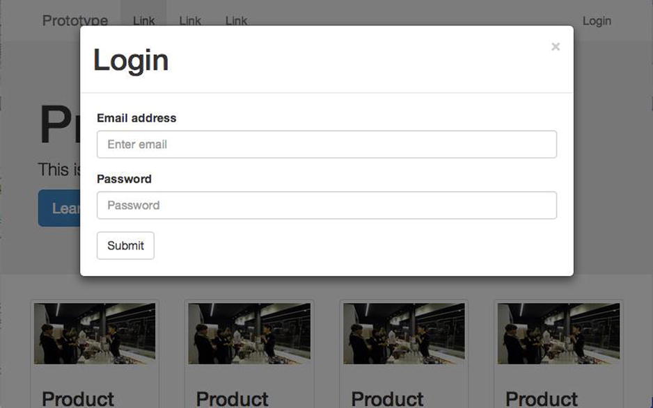
Figure 9-4. The modal window shown on larger viewports
After following this example, you will have now implemented your first piece of responsive JavaScript. As you can see, it isn’t difficult to offer users different functionality based on their responsive states, however, it does allow users to have a better experience overall when using a web site. The aim therefore should be to identify areas of a web site that don’t work particularly well on specific devices and then look to optimize them using these techniques.
Summary
Having looked at both feature detection and state management separately and then looked at how to use them together, you should now have a good understanding about how to use JavaScript to improve your users’ experience by changing your site’s functionality to best suit the user’s device.
There are some key points you should take away from this:
- Providing the same functionality to all users, regardless of device, can cause a bad user experience.
- Functionality can be targeted based on both the state of the browser and the features it supports.
- You can use feature detection alongside the state of the browser to enable you to progressively enhance your site.
Having looked at how you can respond to the device and change the functionality based on the viewport size and the features the devices support, the next chapter will look more in depth at the user experience decisions you have to make when building a responsive site.
__________________________
1http://christianheilmann.com/2007/08/22/again-with-the-module-pattern-reveal-something-to-the-world/.