
FIGURES, PORTRAITS, AND FASHION

For a creative artist, there is no bigger mystery than our fellow humans. In this chapter, we’ll explore various ways of depicting people. You’ll begin with a simple stylization frequently used by urban sketchers to enliven city scenes. I’ll share what I think makes a portrait expressive and unique.
You’ll also delve into fashion art, which is full of creative freedom, whether you’re painting garments or accessories. I recently collaborated with the Paris-based high-end fashion house Maison Margiela, and it was a fantastic experience. I contributed my work to the film A Folk Horror Tale, a movie based on an original concept by designer John Galliano and directed by Olivier Dahan. I hand-painted a pair of waders spliced with wooden Tabi clogs, with contemporary illustrations in the style of Delft Blue, distorting its classic imagery into motifs that look pretty from afar but reveal a more sinister reality when studied in detail.

LESSON: STYLIZED FIGURES
Drawing a figure can seem intimidating, but with inks it doesn’t have to be. In this lesson, you’ll learn how to depict small figures that can add motion and enliven your illustrations, and you won’t have to spend hours practicing anatomy and postures. You’ll discover a few key basics that make even a tiny figure look convincing.
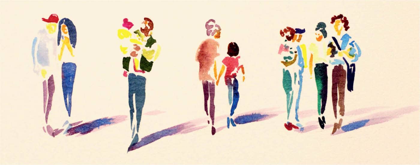
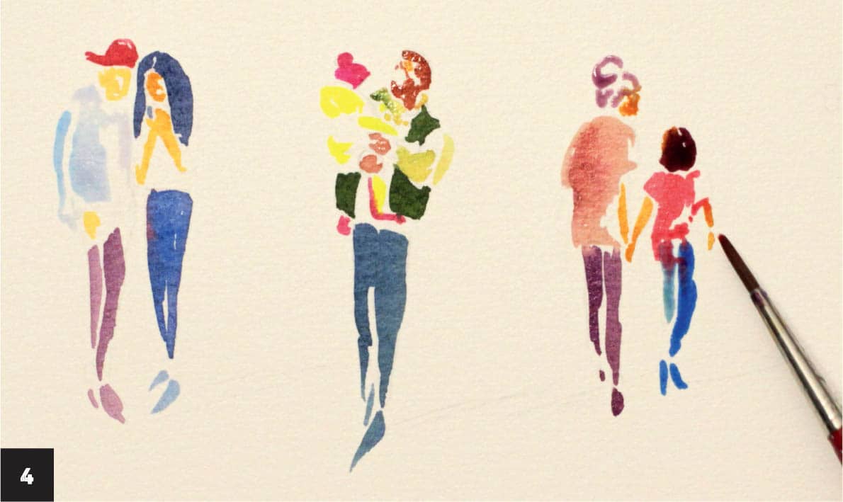
1 With pencil, make a few light sketches of long figures that suggest key details such as hair length, shoes, and clothes. Let your imagination fly! These stylized figures don’t have to follow anatomy rules, so you can exaggerate or minimize any features to your liking. There’s no wrong way to do this. Draw from imagination or find a few photo references of groups of people. Begin by inking the legs of the first figure wearing jeans. Using the size 3 round brush, make two long strokes with cobalt ink and unite them on top. The strokes should be short, no larger than your index finger, to form the figures. It’s easier to depict legs in the standing position than, for example, running or jumping.

2 Working small allows you to simplify what you see. Draw a couple using short strokes and leave a lot of white space after each element. The white jacket consists of three various strokes and is isolated from other forms, such as the head. This allows you to work quickly and not worry about ink bleeding off the edges. Ink the skin of the first figures with a warm color such as orange, only suggesting the shape of the face and the position of the hands.

3 Use a more abstract and simplified approach to ink this character, who is holding a child. Leave a lot of white space between the shoes and pants as well as all other elements. Use complementary colors to make some parts pop, such as a green jacket with a red-pink hat. Use sanguine slightly diluted with yellow or orange to create a variety of skin tones.

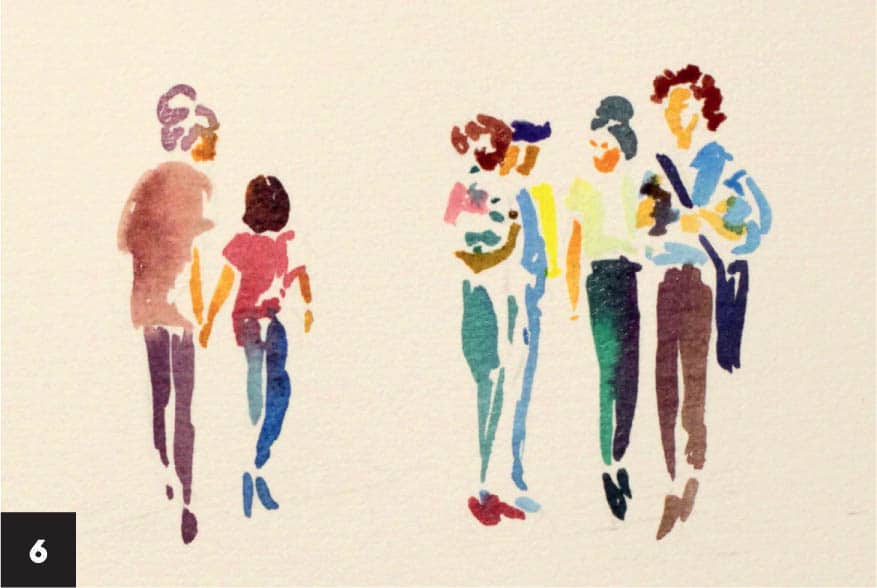
4 Painting people who are facing away and walking might sound challenging, but not for this stylized inky look. Ink simple shapes suggesting the outfit and general impression of the human form as you did in previous steps. Imagine you have just one or two brushstrokes to ink the head, body, hands, and legs. What is the most important? When you watch people walking away, you notice just a few details, and that’s what you should aim for. To show a woman’s personality, create a hairstyle with curvy strokes. Paint an irregular shape with an even wash to suggest a tunic. Make two uneven short strokes to ink the legs.
Note that in the left-hand figure of the walking couple on the right, the left leg in the distance seems shorter, so use a shorter stroke and a smaller mark for the shoes. Work the same way on the second character. Paint a V shape in orange suggesting the two are holding hands and dab the same mix to ink the side of the face. This principle works well for depicting people in the distance and for avoiding unnecessary details. Don’t forget to leave white space between pants and shoes for a better look.
5 Ink another group of people and indicate their profession (seen at far right). Hint at details on a small scale that are easily seen from a distance, such as a briefcase or suit. Begin by inking the legs and separating them from the shoes with white space. Mix cobalt with carmine and make a stroke to create a crossbody bag. Make a few strokes to define the position of the hands and the direction of the faces. Use short, brisk strokes to keep things fresh.

6 Paint a group of people at the far right, separating them into smaller shapes as before. Think of them as a tiny collection of garments and accessories that are put together to form a whole. Use the same colors for the group to unify the piece and bring balance. You can mix various skin tones or values, but the initial hues should still be recognizable. When inking a group, choose the main characters and depict them with more details and paint the others in a sketchier style. Even with a few strokes you can indicate character traits and professions.
7 Add shadows with a cool or neutral tint (see here) to create immediate depth and add a dynamic effect. I used neutral tint with a drop of cobalt near the shoes. Note the sharp angle of the shadow supporting the expressive silhouettes of the figures. This is an artistic trick to add a dramatic feel and interest to the composition when inking stylized people. The size and angle of the shadows depend on where the imaginary light source is. I imagined that the sun was low in the sky, affecting the size of the shadows. Ink the shadows at about three-quarters of the figure’s length for a dynamic feel.
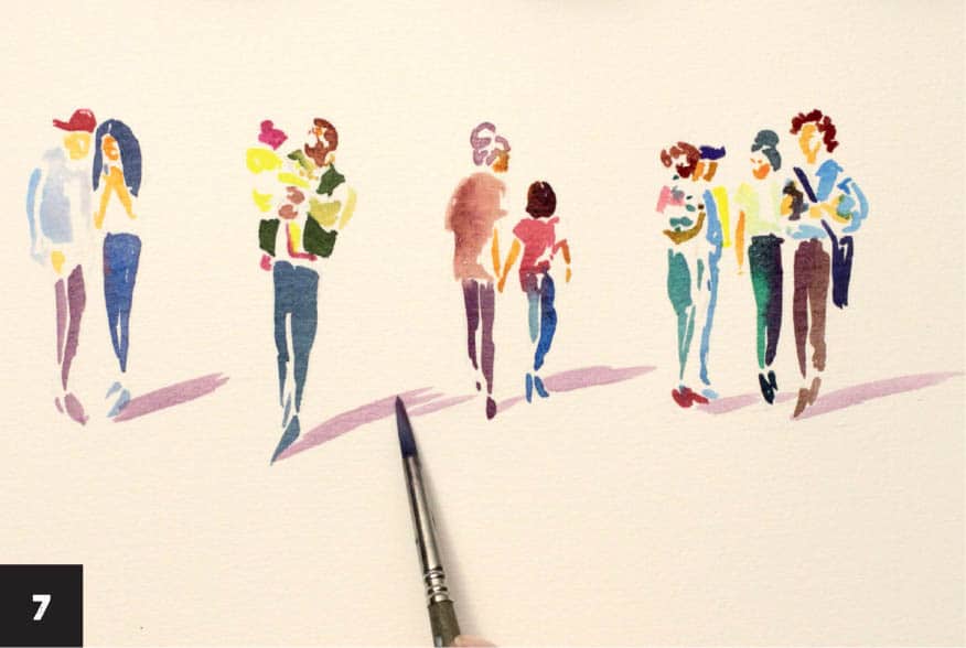
8 Shadows are darker when closer to an object, so add a stroke of cobalt to increase the intensity. Try painting figures with monochrome inks, playing only with lights and darks and keeping details to a minimum. Experiment and paint lots of tiny characters and see what suits your style best.


LESSON: EXPRESSIVE PORTRAIT

For a long time, I thought expert technique was key in creating a good portrait (especially when I couldn’t draw convincingly). But at the same time, I’d see portraits that seemed dull and lifeless, no matter the number of details. To be expressive and move the viewer, a successful portrait should have three components: It should tell a story, convey emotion, and have a personality.
Portraits can be executed in many styles and genres. Even a few brushstrokes can be enough to render a likeness. If you have a personal interest in the subject, that always helps. On the technical side, the shape and the base of the head are most important, and only then do we add as little or as many details as we want.

1 Using the template, an inspiration image, or your imagination, make a sketch with simplified proportions and features, defining the darkest areas and shadows. Using straight pencil lines, block in the darkest areas, such as the right side of the face and part of the neck, nose, and lips. If you feel a bit unsure at this stage, that’s normal, and don’t feel any pressure—just use the template as a guide.
Imagine the position of a light source (here it’s on the left side) and paint the large shadow that defines the shape of the face with a light wash of sanguine and red-brown. Use the size 3 round brush for all the steps except for the most delicate details. If you’re working with intense colored inks, water down the mix to get a fairly light color. You can darken it with another layer later, but it will be difficult to try to lighten it. Allow the ink to dry.

2 Add a small amount of yellow to the light mix and paint a second shadow that forms the mass of the head and defines the lips. Spread the mix on the initial ink layer, blending the border between the colors, and add more water to the wash if necessary. Although the first layer from step 1 is dry, the ink will optically blend, creating a lovely effect. Leave the eyes, teeth, chin, and neck white.

3 Mix ultramarine and red-brown in a 1:1 ratio to get a rich, glowing dark color. Decide which elements you’re most drawn to and emphasize them with dark accents. This will be different for every artist; I always choose to intensify the eyes, eyelids, parts of the hairstyle, and the corners of the lips. Paint the eyes, hair, and a shadow on the lips. Don’t paint the teeth details or any other small elements that can interfere with the general impression and distract us with nuances. The mouth and smile are the most expressive elements after the eyes, and color plays a huge part in their expressiveness too. We want to keep spirits light and cheerful, so less is more. Allow the ink to dry.

4 Imagine a general three-dimensional shape of the headdress and how the fabric is wrapping around the head. Make several inky marks in various directions to follow the shape you’ve imagined. Use any colors from your palette to add variety. I used ultramarine, red-brown, and a slightly diluted yellow, applying it with a small brush. Using ultramarine on top helps to contrast the face tone. Avoid outlining the fabric and leave white space between the marks.
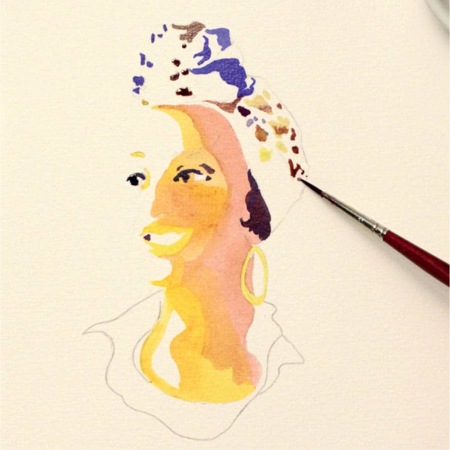
5 Add another layer of the wash of sanguine and red-brown (or any dark wash) from step 1 to emphasize the deeper values on the right side of the head, part of the nose, eyelids, lips, and neck (5A). This wash should be darker, so depending on the intensity of your ink, use just a little or no water at all. Begin with the top right corner of the face, following the hairline. Don’t worry if you ink over the hair; the mix will only add brilliance (5B). Use the size 2 round brush for small details. Be sure to ink around the hoop earring and support the general shape of the head by using the same wash for all the elements in the portrait.


6 Define the shadows on the lips, the plane of the nose, and the neck with the size 2 round brush. Carefully add darker shapes around the eyes and unite them with the biggest shadow area. This effect is achieved by using the same dark mix across the whole piece. Think of the shadow areas as small separate blocks. Since you’ve started by shading the larger area, it becomes easier to see where to put additional smaller shades.
Imagine what lies in light and what’s in shadow. Put just a few tiny light, brisk strokes on the eyebrows, another one on the nose plane, and then a horizontal stroke as a hint of a nostril. Add slightly diluted shadow mix to the eyelids. The eyes are usually the focal point of the portrait, so make sure you intensify them. At this stage, after you’ve made these marks, take a small break, and look at the piece with fresh eyes to see whether everything feels right.
7 Decide which part of the clothes you want to show to balance the portrait. Ink the shirt collar with deep green, starting on the left with the size 3 round brush (7A). Halfway through painting, switch to ultramarine right on the paper and continue filling in the shape. Blend the border between the colors if necessary (7B). If you’re using enough water or ink, the blending should happen automatically.
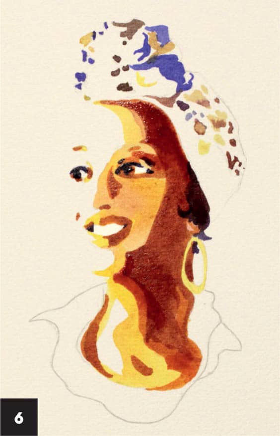
This mix not only adds interest but also creates a different visual texture from what you created on the face, separating parts of the image from one another and emphasizing the fabric’s velvety texture. Allow the ink to dry.
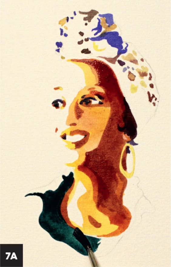

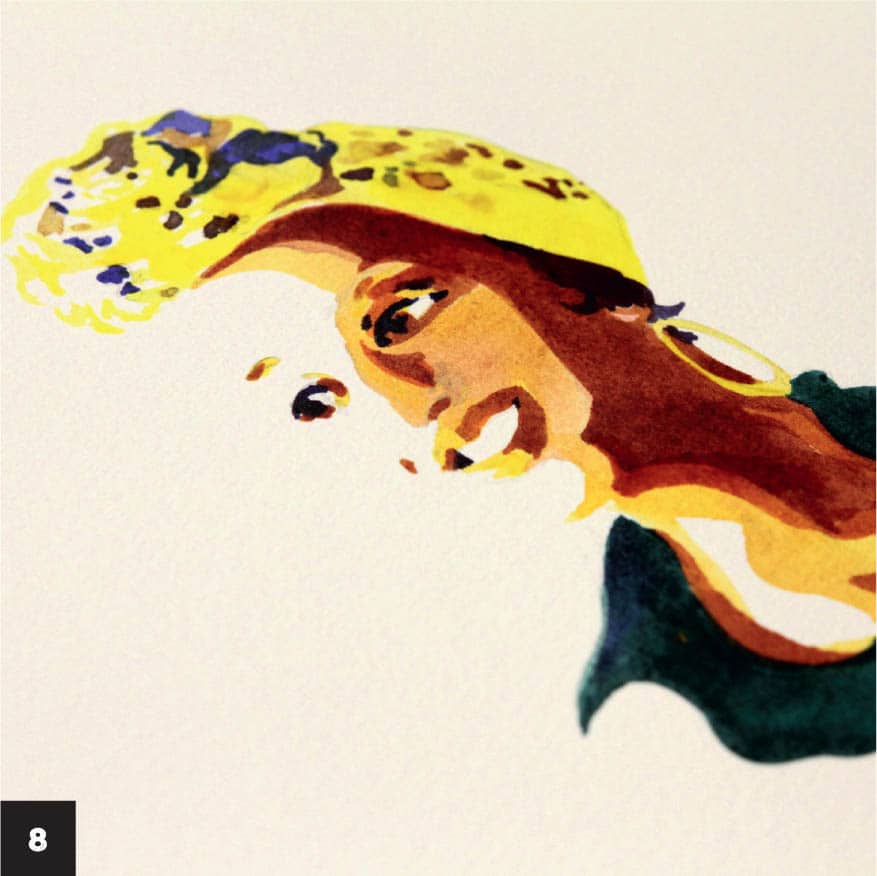
8 Add final touches with glowing yellow. Ink the headdress, leaving a few white spots at the very top. Fill in the white space on the eyelids with yellow, and anywhere you think it feels right and needs some highlighting. Most of the information lies in the shadow areas of the artwork, so now you can unify the image by calming down white areas with yellow. These areas would otherwise look too bright and grab attention. You can jump from one part of the portrait to another, working with a small brush and adding tiny strokes here and there, as you see fit.
You’ve created a beautiful portrait with several shapes and a lot of light areas. This style may look more finished and impressive than a perfectly rendered, extremely detailed artwork.

LESSON: RADIANT FASHION ILLUSTRATION

In this lesson, you’ll learn how to create contemporary and elegant fashion illustrations using inks on toned paper. Your artwork will shimmer and glow with the addition of metallic pigments.
1 Prepare all the materials and test them on the paper you plan to use for the final artwork. Make a few strokes, washes, and marks and, as you work, make notes on your findings:
- How long does it take for the ink to dry? Is it possible to use a hair dryer to hasten the drying time?
- How do acrylic inks interact with India ink or shellac inks?
- How bright and opaque is the white ink on the toned paper? If you want to add bold, impactful highlights, the ink should be opaque (most white acrylic inks are). Semitransparent white ink looks faded and dull on toned paper.
- What’s the best way to work with the metallic pigment powder?

2 Using the finished artwork, an inspiration image (fashion magazines are a great resource), or your own imagination, sketch a light figure with pencil depicting the head, neck, and upper torso using only a few lines. Mix a neutral tint or a purple-gray color with Prussian blue in a 1:1 ratio and paint several brisk strokes with the size 3 round brush to outline the head, hair, and upper body.
Choose the pose and perspective for the figure. Dab the size 6 round brush in Prussian blue ink and make a few messy marks defining the corset. Change the angle of the brush to add interest to the marks.

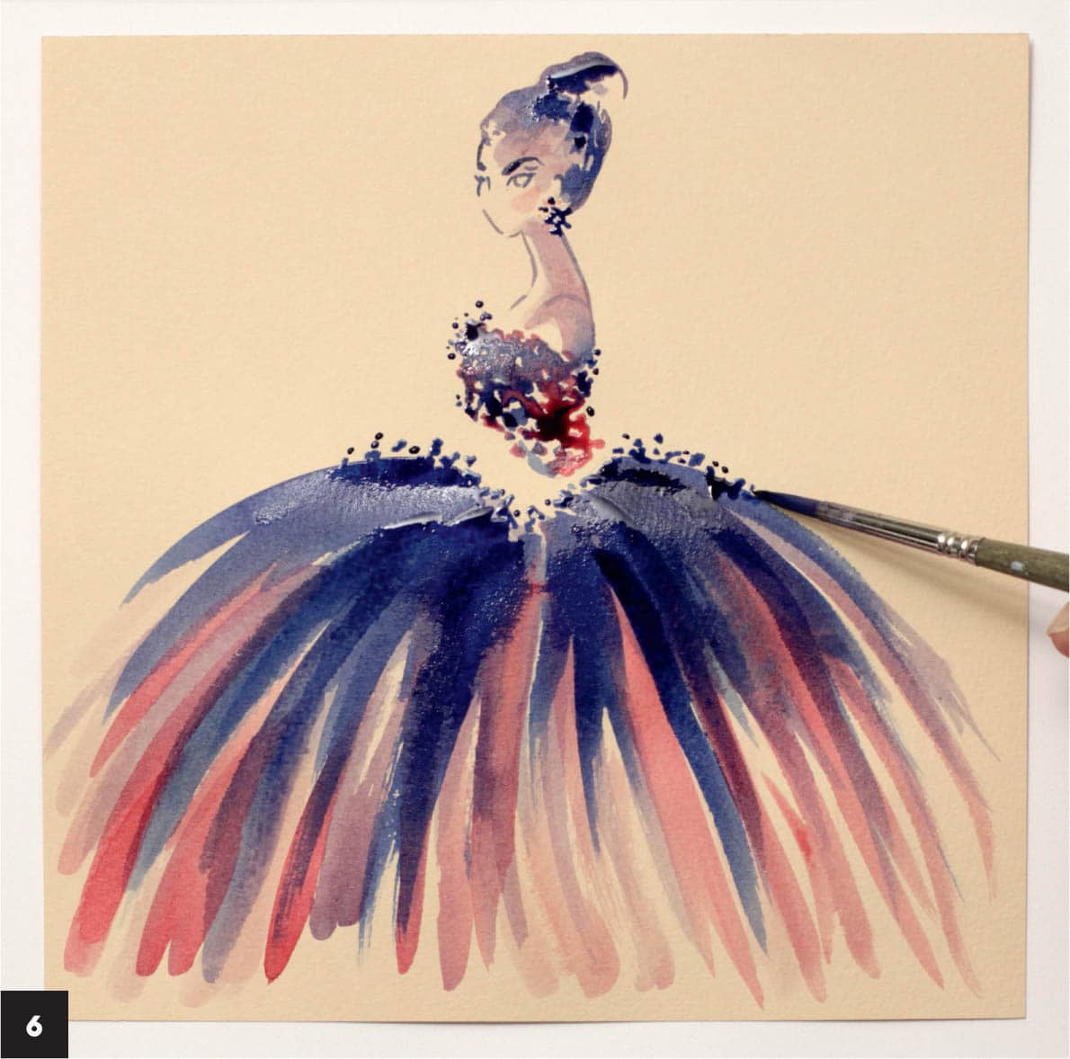
3 Load the size 6 round brush with the color you used for the head and hair and make some bold, confident strokes to define the dress. Try watering down the mixture and continue making broad brushstrokes. Dip the brush in the initial mixture and make new ones. You can ink them on top of or near each other, bringing a spontaneous look. Notice how changing the amount of water adds depth and interest to the strokes even with one layer.

4 While the paper is still slightly damp, load the same brush with carmine and add more strokes to the dress. The ink will mix beautifully on the beige-toned paper and create the illusion of semitransparent layers of fabric. Add a few marks with carmine on the corset too.

5 Paint a tiny blush oval on the face using a light carmine wash. Allow the ink to dry.
Load the brush with Prussian blue and apply bold strokes on top of the poufy skirt. Imagine there is a sphere shape underneath the skirt and you’re painting over it; this will help create the impressive three- dimensional effect.

6 Make some dots on top of the skirt and corset using the size 6 round brush and Prussian blue. This helps accentuate these areas by creating a different pattern. Make the same marks near the ear with a smaller brush, creating large earrings.
Make a few strokes on the right side of the figure to create a large shadow on the face, neck, and shoulder, using a light wash of carmine and neutral tint, or carmine and Prussian blue. The wash should be light enough to maintain a general subtle feel in the artwork, but darker than the tone of the paper.
7 Create some highlights. Using the size 3 round brush, apply a few strokes of opaque white ink on top of the skirt to highlight the dots you made in step 6. Carefully add white ink to the left part of the figure, face, and hair, creating highlights (imagine a light source on the left side of the figure). Pay extra attention to the eye and stylize the eyeball, filling it with white. Add a subtle white stroke under the eyebrow. If the contrast in the face is too low, wait until the white ink is completely dry and ink the outline of eyelashes, eyebrows, and hair once again using a dark mix from previous steps.

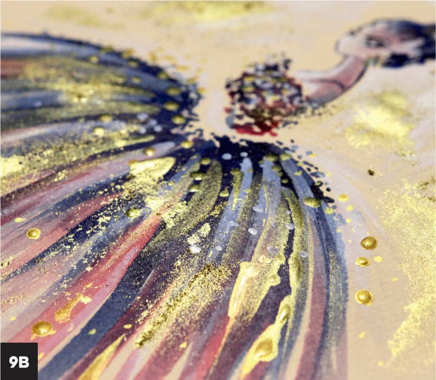
8 Apply the gold metallic acrylic ink to the dress with the dropper, creating a shimmering effect. Avoid creating symmetrical patterns as you drop the ink, following the radial shape of the dress. Create smaller drops close to the waist and larger ones near the edges.

9 When this delicate work is done, take a larger brush, load it with white ink, and add some random strokes on the background to add a modern, grungy feel (9A).
While the ink is still wet, add even more glimmer with the gold pigment powder. The powder will mix with ink or water, and the result is a more brilliant and opaque look than pearlescent paints and inks—and it’s one of my favorite techniques. I throw a bit of pigment here and there, adding to the fairy-tale feel (9B). Once the piece is dry, you can protect it with fixative. Alternatively, you can add gemstones, glitter, sequins, shiny beads, or even transparent fabric, such as tulle.