
BASIC TECHNIQUES AND BEYOND

Starting a new piece of artwork can seem overwhelming at first, but by making tiny steps and exploring possibilities, you’ll turn the process into pure joy. Let’s explore some wonderful techniques that you can apply to your artistic practice.
In this chapter, I’ll introduce you to several techniques with ink, including my favorite: creating monotypes. This simple and satisfying method boosts your imagination and creativity. With this fine art practice, you can create a unique artwork in minutes!

MARK-MAKING WARM-UPS
This is a great warm-up exercise for practicing mark-making skills with colored inks, and it incorporates both brushes and nib pens. You can use any type of colored inks, but it’s best to work on watercolor or Bristol paper that can hold enough water.

Work on a standard sheet of Bristol or smooth watercolor paper (I’m using 8.3" × 11.7" [21 × 30 cm]). Fill the entire page with various experimental marks using a nib pen. Don’t overthink what marks you want to make—just try! Hold the pen in a way that’s comfortable and try making straight, short, curvy, messy lines and strokes. The amount of space between the strokes determines the lightness or darkness of the pattern. Mix sharp-pointed open strokes with sweeping swirls. Begin drawing with the nib pen at one angle, then change the speed and vary the depth by pushing it harder onto the paper. Try a free-flowing ink stroke, then roll it into an oval shape.
Notice that some of your lines create visual texture and value, while others only suggest two-dimensional graphic effects. Imagine drawing a tree with just a few marks like this. Try working with the pen as if you were going to ink the crown of the tree, changing the position of the marks.
With a simple line, you can create an illusion of depth and move the viewer’s eye in any direction. Change the angle and direction of the strokes, and the eye will follow. Imagine a three-dimensional object in your head and try to “wrap” it with marks to describe its shape. You can draw a light pencil sketch of a shape first, cover it with marks, and then delete the rest of the graphite when the ink is completely dry. If you draw cross-hatched lines, make sure the first set of lines is dry before creating another set so you don’t smudge the ink.
Nib pens are diverse, so you can achieve an incredible number of effects with them. They’re pretty inexpensive, so you can try a lot of pens to find the ones you love. Nibs and holders are sold separately; holders are typically made of wood or metal.
Nibs vary in sizes and styles. Some are flexible, while others are stiff. I prefer the ones with a very fine tip—the word "fine" refers to the size of the tip and not the quality.
A fountain pen is a nib pen that contains an internal reservoir of liquid inks. I love drawing with these pens, but even the best ones don't have the versatility of lines like a classic nib pen does.
Here, I've make a variety of marks with a nib pen.


Exercise: Dancing Brush Warm-Up
1 If you prefer working with a brush (like I do), I’m sure you’ll love the exercise I call the dancing brush. Before you begin, fill a page of Bristol or smooth watercolor paper of any size with simple brushstrokes that resemble the letter S.
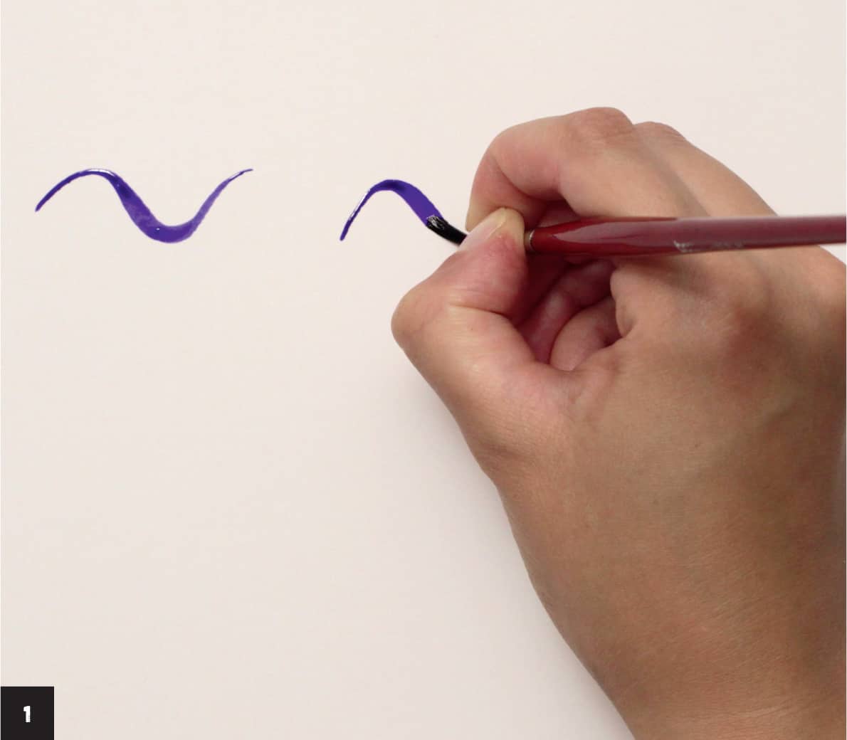
2 Load a small synthetic brush with ink. Lightly touch the paper with the tip of the brush, press the brush flat onto the paper, then lift it so only the tip is touching again.
The width of the brush creates the curve, making a beautiful variety of stroke widths. Use your brush to give the lines character.

COLOR
Color theory, color wheel—I’m sure you’ve heard these terms before. If you’re like a lot of creatives, you may still feel challenged when putting the concepts into practice when creating artwork. I know the feeling! Not to worry. I’ll provide a brief overview with some practical tips and ideas I believe are the most essential when working with vibrant colored inks.
Color Value
Value is a fundamental characteristic of color. Color value refers to the lightness and the darkness of a color.
These properties can be changed by adding white or black to any hue. Add black to any color to make a darker shade. Add white to make a variety of lighter tints from any color or mix.
You can use a full value range in one artwork or focus only on high-key choices by choosing light colors. For dramatic and moody effects, include plenty of dark areas, creating a low-key image.
To simplify the process, limit the range to three values: low, middle, and high key. When creating an artwork, think about these value relations and which parts of the image will be the lightest and the darkest. Even if you use just one color and apply a full value range with it (called monochromatic), the artwork will look interesting and intense.
Color is a personal choice. Look at your wardrobe, the covers of your notebooks, and the fabrics, jewelry, phone cases, bikes, and even food that you choose. Trends change every season, and that may influence our choices. You can spot these trends in the design and fashion worlds and the annual Pantone Color of the Year.
Although it’s fun to experiment, I encourage you to be true to yourself and master the endless varieties of palettes that please your soul.

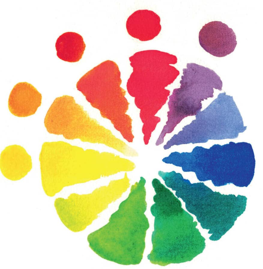
Meet our old friend, the painter’s wheel, or color wheel. Most color wheels feature twelve colors, but endless iterations exist. Here are a few things to note:
- Primary colors are red, yellow, and blue. They’re referred to as primaries because you can’t create them from other colors. The word primary may be added to paint or ink names to denote that this is the most vivid hue, such as primary cyan.
- Secondary colors are created by mixing two primary colors. For example, mixing red and blue creates purple.
- Tertiary colors are created by mixing a secondary color with a primary one. Mixing purple with primary blue results in blue-violet.
I didn’t pay much attention to these concepts for a long time. Most valuable for me was the feeling of a color and the emotion, impression, mood, and temperature it created. That’s still the case, to be honest.

Primary colors

Black and white create the strongest contrast of light and dark. Similarly, placing red, yellow, and blue together makes the most powerful color contrasts. When colors are placed near white, it makes them appear lighter. Placing colors near black causes them to look brighter.
Pay special attention to these elements of color theory so you can be playful and creative with the subtleties:
- Complementary colors: These are the opposite colors on the color wheel. These pairs make each other bright and vivid when painted near each other but turn into gray-brown neutrals when mixed. The most common pairs are red and green, yellow and purple, and blue and orange. You often see these complementary combinations in eye-catching design posters or packaging, including warning signs.
- Analogous colors: Use a few colors that are close to each other on the color wheel to create harmonious and sophisticated artwork. For example, use colors that make a smooth transition from yellow to red-purple.

Complementary colors
Analogous colors
Advancing and Receding Hues
Use the principle of aerial or atmospheric perspective to add the illusion of depth to your artwork. Warm colors such as yellow, red, and orange appear brighter and nearer to the viewer, while cooler hues such as blue and green appear farther away.
If you imagine a hazy mountain landscape, the mountains become lighter and cooler in tone as they recede. This principle works for any subject matter.

Exercise: Optical Color Mixing
Colored inks can be extra vibrant. Since every brand is different, it’s a good idea to do some test mixes up front. These steps outline my favorite color-mixing method.
1 After choosing a color palette for a painting, place all the colors in rows and allow them to dry.

2 Place the same colors vertically on top of the first row, creating a reference chart. Be sure to leave white space around the edges when inking so the colors don’t run into each other. This chart allows you to see how the vivid inks interact, such as the green shade when yellow is painted over blue.

3 Take note of the combinations to avoid. Some color mixes are called muddy, usually referring to browns, grays, and green tints. I believe there are no bad or wrong colors, but optical color mixing allows you to see which colors don’t suit a particular work.
Setting a Color Palette
Working with a limited color palette is best for beginning artists to avoid becoming overwhelmed with choices and to better focus on the creative process. I suggest choosing primary colors and a few additional hues that you love. You can add variations to achieve desired effects.
Some artists prefer establishing a palette of colors, and some like to work intuitively, adding colors according to the feel and flow of the process. Try both options to discover what suits you best.
Preparing a color palette up front is a great way to unify artwork and create a balanced look. This can be done in several ways. For example, you can add a small amount of one color, such as yellow or gray, to all the mixes you’re using. Or, you can set a palette with particular colors and be consistent throughout the artwork.
Here are some suggestions for choosing colors for a palette:
- Get inspired by the artworks of your favorite artists, movies, and even books, and pay attention to the colors they’re using.
- Have an inspiration folder where you collect ephemera and other pieces, or use Pinterest.
- Pay attention to the things around you that you love, such as books, music, and plants—even fabric and clothing.
- The most important thing is to listen to your inner voice and not force yourself to paint loose pink flowers if you’re drawn to dramatic rainy landscapes.
Color palettes can create a variety of moods, and you can use them to convey emotions. A strong, cheerful feel can be achieved with yellows, reds, and magentas. Conversely, artwork that is melancholy or sentimental needs cool grays and blues.

WASHES AND GRADIENTS
If you want to cover large areas of your artwork, washes and gradients are the most effective techniques. Both look impressive, reproduce well in fine prints and on the web, and bring a moody or cheerful atmosphere to any painting.
Let’s discover the unique properties and limitations of these water-based artistic methods.
Ink Washes
A wash is a mixture of pigment (in this case, ink) and water. The lightness and darkness of the wash are controlled by the amount of water mixed with the pigment. You can also control the value by layering a wash over white paper, over a dry layer of wash, or over any background. The intensity can increase by repeating layers several times, but keep in mind that only one or two colors are usually used for an effective wash mix. Make sure the first layer of wash is completely dry before adding a new one.

A flat wash is a basic technique used to cover a large area using a big brush. A graded wash is a smooth blending of color from light to dark and vice versa.
Keep these essential properties of washes in mind as you work.
- A wash can provide a full range of values, starting with the lightest shades and ending with a dark, solid color. This allows you to create a variety of desirable effects, such as fluid, light, watercolor-like washes or darker, moody, atmospheric inky scenes. You can add a wash or layers of washes at any stage of a piece. When completely dry, you can add fine lines or expressive brushstrokes.
- The technique is unpredictable. The liquid nature of the wash makes it difficult to control, but at the same time provides a fantastic variety of effects.
- Washes work well for creating skies, water, or moody backgrounds.
- Washes generally dry quickly but can vary depending on how much water is used, the type of paper, and weather conditions. They’re handy when you need to quickly create a large background or tonal painting, but be aware of some pitfalls. If you didn’t create enough wash to cover an area and need to mix more, you may get unwanted streaks or bleeding between the tones. If you use a small brush, it may transfer tiny pigment particles to the paper and make streaks or marks. But we know there are no mistakes—only happy accidents!

Exercise: Create an Ink Wash
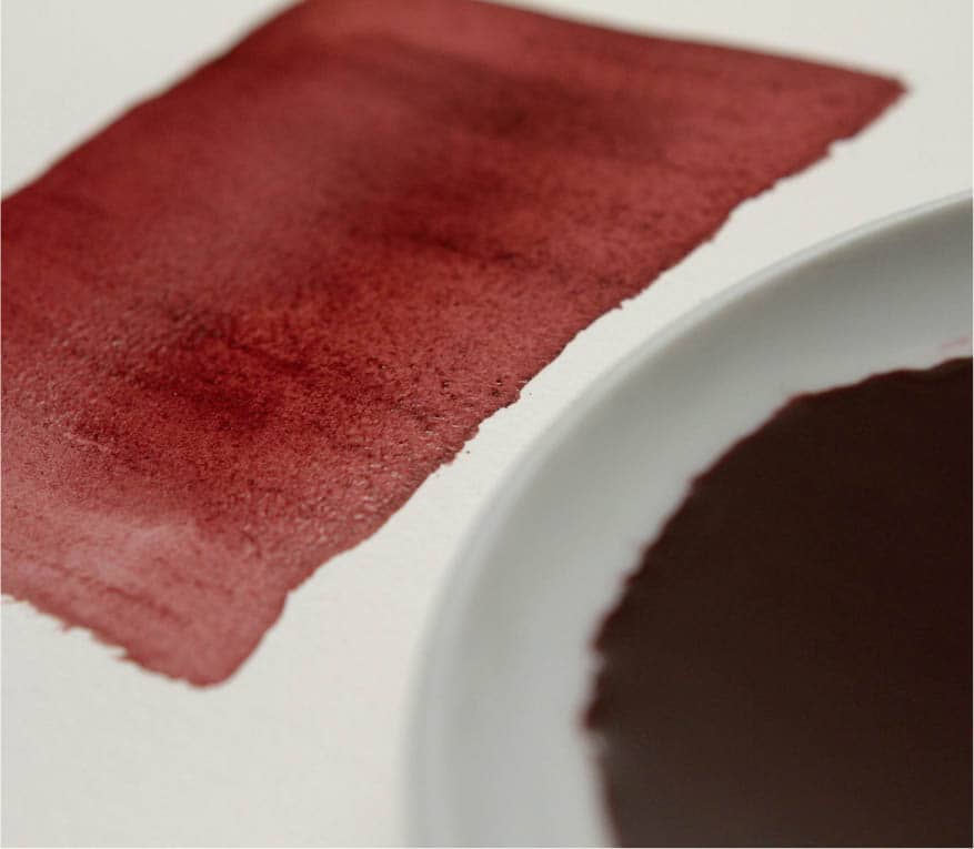
To master this adventurous technique, you’ll need watercolor paper (see Tip), any kind of ink, a lot of clean water, and a palette or small plate (dedicated for ink) to mix the ink. I used a large bottle of pigmented waterproof caput mortuum ink (a deep purplish-brown shade) and my usual brushes.
1 Pour some water onto the plate or palette, add a lot of ink, and mix it thoroughly. The ratio of water to ink depends on the intensity of the wash you want to make. Make sure you have more of the watered-down ink than you plan to use.

2 Place an object under the drawing board or paper pad, such as a tape roll or something similar, so the board can tilt a little. This slight angle allows you to guide the wash gradually.
3 Choose a brush that’s compatible with the size of paper you’re working with. For a wash, pick a brush that holds enough water. If it’s a synthetic brush, use size 6 and up; if it’s a mop brush, even size 1 can be enough.
Load the brush with the ink wash. Apply a puddle of ink at the top of the paper and glide the brush down, using back-and-forth motions. The highly granulated pigment-based ink I’m using creates wonderful texture right away.
4 Always start a wash with a puddle of ink, and add as much wash as you need along the way. Continue the wash by keeping the puddle large as you go. When the area is covered, remove the final puddle with a dry brush, soaking up the excess ink.

Gradients
By adding increasing amounts of clean water to an ink puddle, you can lighten the tone and create a beautiful fading effect, called a gradient. It works the opposite way as well; by increasing the amount of ink, you can intensify and darken the value.
Exercise: One-Color Gradient
A gradient can be used as an atmospheric background or a stand-alone effect.
1 For this technique, you can use any type of colored inks and Bristol or watercolor paper. If the ink is concentrated, dilute it in water, aiming for a 1:1 mixture.
2 Begin painting a strip (I used bright orange) with a synthetic round brush, size 6 or larger. I chose this color because it reminds me of gorgeous sunsets.
3 Clean the brush and, with a wet brush tip full of clean water (no ink), continue painting where you left off.

4 Continue working with water, creating a smooth transition between the ink and the water, until the end of the strip becomes fully transparent. Be mindful of the amount of ink you’re putting in the water as you work. You’re aiming for a smooth transition.

You can also use multiple colors to make a gradient, where one color seamlessly blends into another. Create a few color strips using the following techniques to discover the combinations you like most.
Exercise: Multicolor Gradient
Let’s explore how to create a multicolor gradient by painting a water lily leaf (Nymphaeaceae) inspired by vintage Japanese woodblock prints.
1 Add some green, yellow, and carmine red inks (any type of ink will work) to the wells of a palette. Draw a water lily leaf lightly on watercolor paper with a pencil. Add a light layer of green ink to the centermost part of the leaf. I used shellac inks and a size 6 synthetic round brush.
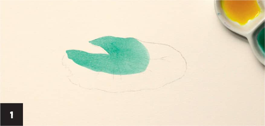
2 While the ink is still wet, add a yellow border around the green area. You’ll notice how the edges blend on the paper right away.

3 While the inks are still damp, add the third layer of carmine red around the yellow area, to the edge of the leaf (3A, 3B). The beautiful gradient is complete. Add a few lines of carmine to define the veins of the leaf while the gradient is still slightly damp (3C). Working on a wet surface blends the lines, resulting in a beautiful effect of blurry edges and creating natural transitions you couldn’t make intentionally.


WET-ON-WET
Wet-on-wet is a technique of applying a layer of wet ink (or paint) to wet paper. This method requires working quickly, because the desirable effects of merging or blending colors should be achieved before both layers are dry.
This basic technique is also known as indefinite blending or alla prima. With just a few elementary steps you can create a variety of effects and unexpected textures with intense colored inks. This technique works especially well for creating abstract paintings, backgrounds, skies, surface pattern designs, and clouds. It’s helpful for beginners and allows you to become more familiar with your ink.
Some inks will blur and blend naturally while others will dominate. For example, if you mix earthy tones such as burnt sienna or Indian red with crimson or blue, the highly pigmented browns will spread more and fill more space. Keep in mind that colors will lighten a bit when dry, even when using highly pigmented ink.


TRANSPARENT AND TRANSLUCENT EFFECTS
Colored ink is a thin medium. When diluted with water, it becomes more transparent, and the intensity of the value changes. This is also referred to as opacity. Even opaque inks can be diluted to become semitransparent, allowing a previous layer to shine through. Let’s see how this works with an exercise that uses cobalt blue ink.
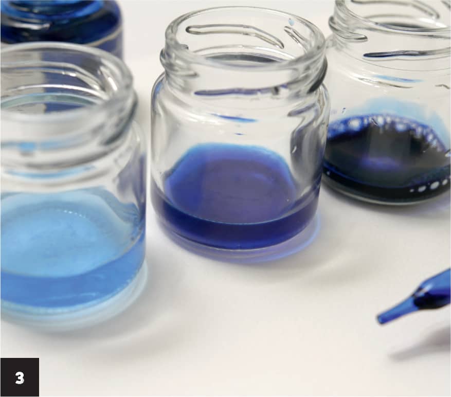
Exercise: Explore Tones
1 Prepare three small jars or three deep palette wells by filling the first two with water. Add one drop of cobalt blue drawing ink (or any color of your choice) to the first jar or well. This creates a lovely light color and is your first tone.

2 Add two or three drops of ink to the next jar. You can see the difference in an instant. The tone increases, but the color is still very transparent.

3 Fill the last jar with ink straight from the bottle. This is the darkest tone.
4 Paint a raindrop shape on watercolor or Bristol paper using the lightest tone and a large size 6 round brush. Add more raindrops of various shapes and sizes with the same mix. Repeat, painting more shapes using a second darker tone. Allow the ink to dry. Add more drops with the third, darkest tone.

5 Paint more raindrops that overlap the first layers with any tones. You can see how the intensity increases when the shapes overlap.

THE POWER OF SILHOUETTES
Creating a powerful silhouette is arguably one of the most precious skills an artist can possess. When the core characteristics of a subject are expressed correctly in a silhouette, the artwork becomes convincing regardless of the style.
Lesson: Cat Silhouettes
1 Using the template (see here) or another reference image or your own imagination, draw a couple of basic outlines of cats that define their shapes and edges. Use light pencil lines on watercolor paper.
2 Begin inking one of the silhouettes, starting with the top left corner of the head. I used dark violet shellac ink and a size 3 round synthetic brush, but you can use any color and any type of ink. Use inks straight from the bottle, since the goal is not to create a perfect wash. I worked in a grungy manner, using a variety of brushstrokes. For a more idyllic silhouette, use a wash technique to color the subject (see here). This method works for large and small areas, regardless of details.

3 Add tiny details with a small round brush, such as whiskers and a few tufts of fur. As you paint, keep in mind the direction of the fur. This makes even a simple drawing convincing.

4A, 4B Ink the second cat using a lighter ink tone that conveys it’s in the distance. Your purrfect company is ready!


NEGATIVE PAINTING
Have you heard of Rubin’s vase? Even if you’re not familiar with the name, you’ve no doubt seen this silhouetted image of two faces that form a vase in the negative space.
Negative space, or air space, is the area between and around objects. Instead of drawing a vase, you could draw the space around it and the vase will appear. Usually, negative space is defined by the white of the page, while the rest of the space is drawn or painted.
As with a silhouette, this technique helps achieve maximum effect with minimal effort. You can create this effect by painting directly on the surface or by using masking fluid or masking tape to cover areas.
Exercise: Negative Space Swan
For this exercise, I was inspired by Hans Christian Andersen’s fairy tale The Ugly Duckling, and I created three similar sketches of the swan.
1 Draw three swan outlines using light pencil lines on watercolor paper. Cover the entire swan with masking fluid using an old brush. Allow the masking fluid to dry (this may take some time).
Note: Masking fluid is available as a liquid in a small bottle or in a pen. This rubberlike medium blocks out and protects small areas from paint.

2 As the fluid dries, cut the shape of another swan out of a large piece of low-tack tape (2A). If you have narrow tape, adhere a few strips together to create a larger piece. Place it carefully on the corresponding swan (2B).


3 For the first swan, use violet drawing or shellac ink (or any bold color) to paint around the sketch to define its shape. The beautiful swan is glowing! Draw some ripple shapes and paint around those as well, adding interest and dimension to the artwork.

4 For the second and third swans, use an inked sponge or just a brush and make some strokes directly on and around the birds. I love the texture created with a sponge; you can tap it or even slide a bit on the paper to create a variety of effects. Allow the ink to dry.

5 Remove the masking fluid by gently rubbing it with your fingers, and carefully remove the masking tape. You have a negative painting of beautiful swans.

DRIBBLE, SPATTER, FLICK
Try dribbling, spattering, and flicking inks if you want to experiment and add unique textures to your artwork. Every combination of ink, paper, and application is different, so don’t be afraid to try it many times. And then come back and try again. The results can be rewarding!
Dribble
Add a few drops of ink in select areas on dry artwork and let it dribble. Hold the artwork vertically as you dribble the ink. This effect looks amazing on fashion illustrations.
Perfectionists may be terrified by runaway ink but try to be open to experiments and see it as another creative opportunity.

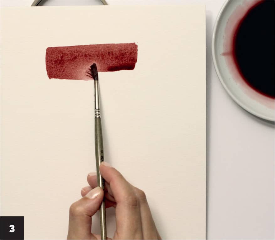
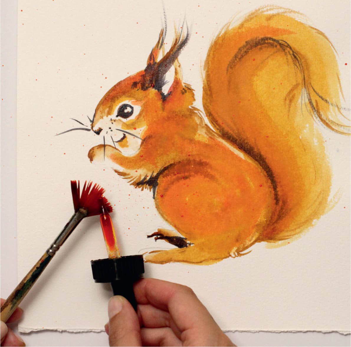
Spatter
Prepare the ink (any type will work) by diluting it with a small amount of water in a palette as you did for the wash technique. Load a synthetic pointed brush with the ink wash. Chinese and mop brushes will also work well for this technique because they hold a lot of water.
Use your hand to snap the brush against the paper. You’ll see a lot of tiny ink spots across the paper.
I used light olive green and a bit of warm yellow with a small round brush for the spatter technique on this painting of a buckthorn, which reminds me of summer. If a painting is missing something dynamic, adding texture this way is a great idea.

Flick
We need more unpredictable textures, so we’ll add those by flicking ink.
Load a fan brush or any flat brush with ink. Flick an ink dropper or your finger across the brush to create a spray of spots.
If you want to add this technique to a particular artwork, try the technique first on a separate sheet of paper. It may be more unpredictable than you think.

INK DROPPERS
An eyedropper or ink dropper has an intriguing charm and long history. Also known as a Pasteur pipette, this tool is used to transfer small quantities of liquids, which is what we’ll do with inks. The most common ink pipette is a glass tube with a rubber bulb at the top, which often serves as the cap on a bottle of ink.
Ink droppers are useful for the following:
- Adding vivid color directly onto artwork without using a palette
- Working wet-on-wet (see here) and dropping ink straight from the bottle in an abstract manner
- Working with a potentially hazardous liquid (such as bleach or alcohol) without exposing it to the environment
- Adding tiny details to flowers or patterns
- Creating glazing effects (see here) for eyes and shiny objects


MONOTYPES
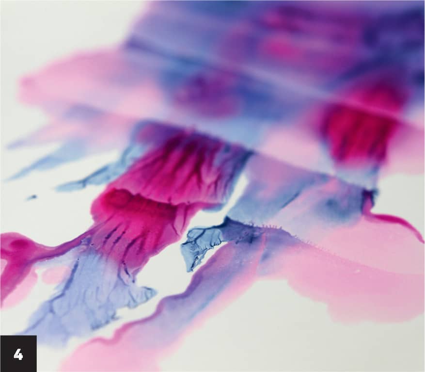
Sharing my favorite fine art technique with my fellow artists is pure joy, and I’ve been waiting impatiently for you to discover the monotype technique. Monotypes are a hybrid of drawing and printmaking and offer endless possibilities. Artwork is created by painting or drawing on a smooth, non-absorbent surface. Previously, this was done on a copper etching plate, but modern artists can use glass. A monotype print is made by pressing a plate to paper, resulting in a one-of-a-kind piece of art. This technique is usually done without an initial sketch. Most of the ink is removed during the first pressing, with some ink left on the glass. More prints can be made from the remaining ink, but these pieces differ greatly from the first print and are not considered originals.

For this exercise you’ll need a piece of glass—I took one from an inexpensive A4-size picture frame (about 8½" × 11" [21.5 × 28 cm]; cover the edges with tape if they’re sharp—paper, size 3 and 6 synthetic brushes, and shellac ink (I used indigo, violet, and purple).
The most important component is paper. To create beautiful fractals, use synthetic chalk-coated paper such as Yupo, stone paper, or glossy-coated paper, which is often used for calendars and magazines. Glossy-coated paper doesn’t absorb ink into the paper fibers, creating the beautiful fractal effects we’re looking for in the monotype technique. You can also work with Bristol paper.
Exercise: Monotype Gradations
1 Paint a loose silhouette of a jellyfish with indigo ink directly on the glass, using large brushstrokes.

2 Brush on a bit of violet with a smaller brush to create a beautiful gradient.

3 Add a few drops of a vivid contrasting color from an eyedropper to add accents.
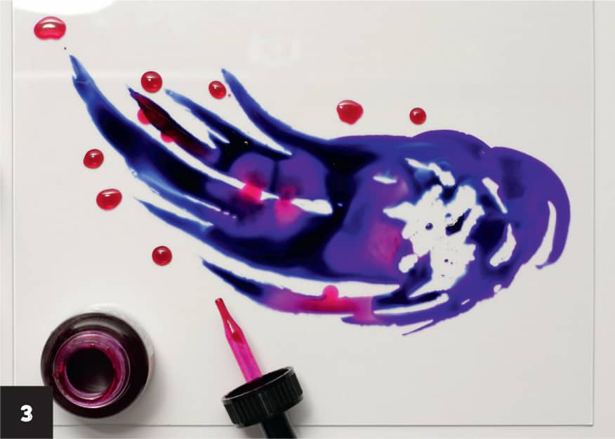
4 Place a sheet of paper on top of the glass while the ink is still wet and remove it immediately, peeling it off gradually. Slow, steady movements create particularly beautiful gradations of texture. Discover what magic has happened!

5 If ink is left on the glass after pulling a print, try again. Add a few drops of inks and repeat the process.

