Choosing quickly from a long list of items is one of the key offerings of the mobile UI. The limited real estate on mobile phone screens makes data grids a challenge and leads to extensive and creative use of lists. Grouping of items, scrolling, gesture sensitivity, and images make lists one of the most versatile and reusable data-bound tools available. Lists are to mobile development what the data grid is to web development.
This chapter covers the ListView class which allows us to make a scrollable, selectable list. The primary considerations include binding to an array or data model, handling item selection, customizing the look of rows, grouping headers, and perhaps most importantly: performance.
Xamarin.Forms ListView
Lists in Xamarin.Forms are created using the ListView control bound to an array or data model. The Xamarin.Forms ListView class provides a scrollable, selectable list. List rows are customizable using layouts, images, and views such as buttons. ListView supports grouping, headers, footers, jump lists, and pull-to-refresh. Deleting and applying operations to list rows are supported using Context Actions.
The lists in this chapter are read-only, which means that they are bound to a data source for viewing and selecting, but the rows are not edited, deleted, or added. We touch on some editable list UI techniques in the “Customizing List Rows” and “Using Context Actions” sections, but do not cover changes to the data model or two-way data binding so that these changes can be reflected in the list. For editable ListView data binding, see Chapter 9.
We can bind directly to a collection or list using the ItemsSource property with the default list template. We can also bind to data models and create custom rows with the ListView’s built-in adapter class called ItemTemplate. Let’s try both approaches: ItemsSource and ItemTemplate. Beginning with ItemsSource, let us proceed by binding ListView to a simple data source.
Tip
We don’t cover them in this book as they’re just being released as it’s going to print, but the next generation of ListView may be the CollectionView.
Binding to a List of Strings
The simplest ListView implementation is binding to a List of Strings.
Instantiate a ListView class on your page and point it to the default data source using the ItemsSource property:
<ListView ItemsSource="{Binding .}" />
ItemsSource is defined as the local BindingContext, indicated by a period (“ . ”). We will soon define BindingContext to contain the list of items in the code behind. Typically you’ll want to use the XAML ItemTemplate and possibly a ViewModel for binding, but we’re starting simple with “ . ” and the page’s BindingContext so you can see how ItemsSource works (more on data binding in Chapter 9).
Next, in the main class’s constructor, such as ListViewStrings in Listing 6-1, declare your string List class called Items after InitializeComponent();. Populate Items and set it all to the ContextPage's BindingContext.
public ListViewStrings()
{
InitializeComponent();
List<string> Items = new List<string>
{
"First",
"Second",
"Third"
};
BindingContext = Items;
}
Listing 6-1
ContentPage Constructor for a ListView Bound to String Items
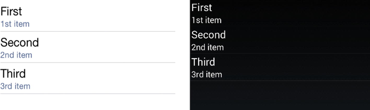
Using the default ListView layout, each item in the list will be a single cell using the TextCell template displaying a single line of text. Here’s the list in Figure 6-1.
Figure 6-1
ListView in iOS and Android
Tip
Create space around the edges of your list using the layout Padding property mentioned in Chapter 3:
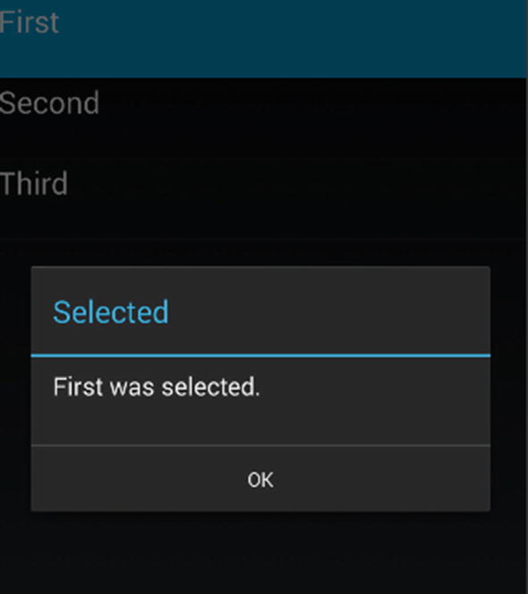
Selecting a list item fires the ItemSelected event.
Selecting an Item
There are two events for use in item selection: ItemTapped and ItemSelected. Both can happen when a user taps a cell in the ListView. The difference between them is apparent when a list permits more than just tapping and items can be selected and unselected. In simple lists where there is no unselection of rows (like the example here), there is little difference between them.
ItemTapped is the simplest. It fires as a motion event when the user clicks a list row:
await DisplayAlert("Selected", item + " was selected.", "OK");
}
Using async/await isn’t mandatory on these event handlers, but it is a good habit when any processing is done, to avoid tying up the UI thread. Use either ItemTapped or ItemSelected to select the first item in Figure 6-2.
Figure 6-2
The alert displays the selected item
Clear the selected row (removing the row highlight) by setting the ListView's SelectedItem property to null. The easiest place to do this is inside the ItemTapped handler:
await DisplayAlert("Tapped", item + " was selected.", "OK");
((ListView)sender).SelectedItem = null;
}
If you’re using the ItemSelected event, be aware that changing the SelectedItem value fires the ItemSelected event again. In order to safely clear the selected row, you need to check if e.SelectedItem is null prior to responding to the event:
await DisplayAlert("Selected", item + " was selected.", "OK");
((ListView)sender).SelectedItem = null;
}
The XAML in Listing 6-2 and its code behind in Listing 6-3 show the complete ListView example for binding to a List of Strings, selecting an item using async/await for backgrounding the ItemTapped event handler, and then clearing the selected row when you’re done.
await DisplayAlert("Selected", item + " was selected.", "OK");
}
}
Listing 6-3
Binding to a List of Strings in ListViewStrings.cs
Tip
Multiple row selection must be coded manually and is not covered here.
A List<String> is useful for demonstration, but in many real-world scenarios, we bind to a data model.
Binding to a Data Model
Binding ListView to a data model is made easy in Xamarin.Forms through the use of ListView's built-in adapter called ItemTemplate.
Prepare your data model class and assign it to the ListView.ItemsSource property. Then bind each property of your model to the list using the ItemTemplate.SetBinding method.
Create a data model, or custom class, containing the list items. Call it ListItem:
public class ListItem {
public string Title { get; set; }
public string Description { get; set; }
}
Create a List of ListItem and populate the list:
List<ListItem> ListItems = new List<ListItem>
{
new ListItem {Title = "First", Description="1st item"},
new ListItem {Title = "Second", Description="2nd item"},
new ListItem {Title = "Third", Description="3rd item"}
};
Point the ListView’s ItemsSource property to ListItems. Use the name DataModelList for the ListView which you’ll declare in XAML in a moment:
This is an alternative to setting the ItemsSource to "{Binding .}" and binds the ListItems to the ListView.
Next, create a ListView in XAML and name it DataModelList. Format list rows using the ListView's ItemTemplate property. Create a DataTemplate class and use the standard cell type to display, TextCell, which will display a title for each row plus some detail text which you’ll add in a minute. Specify the property to display as the main row text by binding it to TextCell.Text, in this case Title:
await DisplayAlert("Tapped", item.Title + " was selected.", "OK");
((ListView)sender).SelectedItem = null;
}
CODE COMPLETE: Binding to a Data Model
Listings 6-4 and 6-5 show the completeListView example where we bind to a data model containing text and detail for each row in the list, found in the ListViewExample solution.
await DisplayAlert("Tapped", item.Title + " was selected.", "OK");
((ListView)sender).SelectedItem = null;
}
public class ListItem
{
public string Title { get; set; }
public string Description { get; set; }
}
}
Listing 6-5
Binding to a Data Model in ListViewDataModel.cs
Tip
In Model View ViewModel (MVVM) apps, the data models are typically wrapped inside screen-specific classes called view models (VM). See Chapter 9 for how to create view models that are data-bound to ListViews.
Adding an Image
Adding a single image to a ListView is easy using the ImageCell cell type. Previously, we used the TextCell cell type to display text and detail in each row. An ImageCell inherits from TextCell and adds an ImageSource property, which contains the image filename or URI. We use the bindable properties ImageSource, Text, and Detail to bind to our data model. The image is displayed left-justified, as seen in Figure 6-5.
Figure 6-5
ImageCell in a ListView
I’ll highlight the differences from the previous TextCell data-binding example and then you can see the final result in Listings 6-6 and 6-7. Add a Source property of type String to the ListItem class and populate it with your images (filename or URI):
List<ListItem> ListItems = new List<ListItem>
{
new ListItem {Source = "first.png", Title = "First", Description="1st item"},
new ListItem {Source = "second.png", Title = "Second", Description="2nd item"},
new ListItem {Source = "third.png", Title = "Third", Description="3rd item"}
};
Create a ListView called ImageList and declare an ItemTemplate with a DataTemplate containing the ImageCell. Bind the ListItem properties to the ImageCell—Title, Description, and Image Source:
Assign the ListItems to the list's ItemsSource property and that’s all there is to it:
ImageList.ItemsSource = ListItems;
Tip
The image folder will be local to each platform project (Android: Resources/drawable, iOS: /Resources). Remember to set the Build Actions by right-clicking on the image file in your project (Android: AndroidResource, iOS: BundleResource).
Listings 6-6 and 6-7 contain the complete code to add an image to a ListView using ImageCell, as shown in Figure 6-5.
await DisplayAlert("Tapped", item.Title + " was selected.", "OK");
((ListView)sender).SelectedItem = null;
}
public class ListItem
{
public string Source { get; set; }
public string Title { get; set; }
public string Description { get; set; }
}
}
Listing 6-7
Image in a List Row in ListViewImageCell.xaml.cs
Tip
A ListView can contain four built-in cell types: TextCell, ImageCell, SwitchCell, and EntryCell. The most useful here are TextCell and ImageCell. Although cell types can be combined using a TableView, a TableView cannot be data-bound, so TableViews are not useful for building ListViews.
Sooner or later you’ll outgrow TextCell and ImageCell and will need greater control over the look of your list rows. So, you’ll learn to customize them.
Customizing List Rows
Customize the list rows by creating a custom row template, which is basically a custom cell containing a Layout with Views. It begins with a custom class inherited from ViewCell. Then we place a layout on it and add our views. Views are more versatile than the built-in cells like TextCell and expose more properties for layout and design.
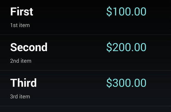
With a custom row template, you can customize your labels and add more views to your list, as shown in Figure 6-6. These three labels have their positions, font sizes, attributes, and colors customized.
Figure 6-6
Custom row template
Let’s walk through the code for this multiline custom row example using three Label Views to display the title, description, and price. Figure 6-6 is an example where more control was needed over fonts and formatting than is provided for by the built-in cells.
Add Price to your ListItem data model:
public class ListItem
{
public string Source { get; set; }
public string Title { get; set; }
public string Description { get; set; }
public string Price { get; set; }
}
In the ContentPage’s constructor, populate Price with values:
List<ListItem> ListItems = new List<ListItem>
{
new ListItem {Title = "First", Description="1st item", Price="$100.00"},
new ListItem {Title = "Second", Description="2nd item", Price="$200.00"},
new ListItem {Title = "Third", Description="3rd item", Price="$300.00"}
};
Create a ListView called CustomList, and add a DataTemplate and a row class called ViewCell with a custom template inside it. Place one or more controls or layouts within this custom template. For simple text fields in different-sized fonts, create label controls and place them on a StackLayout (or AbsoluteLayout or Grid if performance is an issue). Be careful when using Image views, as images can affect performance, particularly on older devices.
Double-bag your StackLayouts for formatting’s sake, placing a vertical StackLayout inside a horizontal one. Inside the inner StackLayout, place two label controls on a vertical StackLayout and bind them to the ListItem model’s Title and Description fields, respectively. Place the price label after the end of the inner StackLayout and bind it to the data model’s Price property.
Note the use of the main StackLayout’s Padding on all four sides to provide proper positioning of views within the row. LayoutOptions help with alignment (that come at a performance cost), using Start for left- or top-justified views and End for right- or bottom-justified ones.
Back in the ListView declaration, let’s consider Backgroundcolor and RowHeight. If you’re on iOS, we need to set the background color to black so you can see the white text. Also, on all platforms, set the RowHeight to accommodate the extra Views:
Customizing a list can result in a beautiful, highly functional UI feature. It is also one of the best ways to destroy a list’s performance, so customize with caution. Use TextCell or ImageCell as much as you can before deciding to customize. Images and nested layouts are a challenge to optimize in Xamarin.Forms, particularly on older devices. If you’re having difficulty with performance as you test your customized list, try the performance tips in the (Xamarin.Forms) “Optimizing Performance” section. If those don’t work for you, then consider using a custom renderer with platform-specific controls instead. (See the list views in the Android and iOS sections of this chapter and then turn to Chapter 8 to read about custom renderers.)
Tip
ListView row separator lines are customizable using its SeparatorVisibility and SeparatorColor properties. Set the ListView’s SeparatorVisibility property to None to hide the lines (the default value is Default). Set the color of the separator using SeparatorColor.
Headers and footers are supported by ListView. Use the Header and Footer properties for a simple text or view. For more complex layouts, use HeaderTemplate and FooterTemplate.
CODE COMPLETE: Customizing List Rows
Listings 6-8 and 6-9 contain the complete code for the row customization example shown in Figure 6-6, with the addition of an ItemTapped event.
await DisplayAlert("Tapped", item.Title + " was selected.", "OK");
((ListView)sender).SelectedItem = null;
}
public class ListItem
{
public string Source { get; set; }
public string Title { get; set; }
public string Description { get; set; }
public string Price { get; set; }
}
}
Listing 6-9
Customizing List Rows in ListViewCustom.cs
Tip
Changes to list properties can be reflected in the list in real-time using an implementation of the INotifyPropertyChanged interface. See Chapter 9 for more on editable list data binding.
Among the views that can be added to a list row, Buttons require special attention due to their prevalence and unique qualities.
Adding Buttons
Buttons can be added to a list in one of two ways: as button views and as Context Actions. Button views are straightforward views added to the custom template, while Context Actions appear when a row is swiped or long-pressed, such as for buttons hiding behind each row, which are often used for operations on the selected row such as deletion.
Note
Image Views paired with gesture recognizers (manually coded image buttons) contain the list row in their BindingContext, though the property is more cumbersome to retrieve than with a button.
Using Button Views
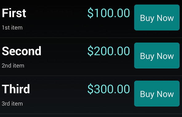
Add button views to your custom template during the customization of a ListView. Add the Button View onto a layout in a custom ViewCell, and it will display on the list in every row, as shown in Figure 6-7.
Figure 6-7
Add a Button View to a ListView
Declare a Button view in your custom ViewCell. Set up a Clicked handler using the CommandParameter property to determine which button was clicked. Bind a period (.) to the button’s CommandParameter property to retrieve the clicked row:
Create a clicked handler called BuyClicked. Retrieve the row that was clicked using the Button's CommandParameter, which returns the affected ListItem object, where you can get the Title parameter to display:
public async void BuyClicked(object sender, EventArgs e)
{
var b = (Button)sender;
var item = (ListItem)b.CommandParameter;
await DisplayAlert("Clicked", item.Title.ToString() + " button was clicked", "OK");
}
Listings 6-10 and 6-11 contain the code where we add a Button View to the ListView, as shown in Figure 6-7.
Adding a Button to a List Row from ListViewButton.xaml
public partial class ListViewButton : ContentPage
{
public ListViewButton()
{
InitializeComponent();
List<ListItem> ListItems = new List<ListItem> {
new ListItem {Title = "First", Description="1st item", Price="$100.00"},
new ListItem {Title = "Second", Description="2nd item", Price="$200.00"},
new ListItem {Title = "Third", Description="3rd item", Price="$300.00"}
};
ButtonList.ItemsSource = ListItems;
}
public async void BuyClicked(object sender, EventArgs e)
{
var b = (Button)sender;
var item = (ListItem)b.CommandParameter;
await DisplayAlert("Clicked", item.Title.ToString() + " button was clicked", "OK");
}
public class ListItem
{
public string Title { get; set; }
public string Description { get; set; }
public string Price { get; set; }
}
}
Listing 6-11
Adding a Button to a List Row from ListViewButton.xaml.cs
Tip
On iOS the addition of this button can cause the title text to wrap, so set the FontSize = 20 on titleLabel.
An alternative to Button Views are Context Actions.
Using Context Actions
Context Actions are bars of buttons that appear for a particular row when the row is left-swiped on iOS or long-pressed on Android, as shown in Figure 6-8.
Figure 6-8
The Context Action buttons More and Delete
In a ListView, create a MenuItem and place it on your ViewCell while customizing your list. Create ContextActions (as MenuItems) on the ViewCell, one for each context button you need. Set both MenuItem's Text property which displays on the contextual button. Set the Clicked property to methods MoreClicked and DeleteClicked which you’ll handle in C# in a moment. Bind both MenuItem’s CommandParameter like a ListView button using a period (.):
Implement the Clicked events and retrieve the list row data class using CommandParameter, which contains the respective ListItem object with a Title to display:
public async void MoreClicked(object sender, EventArgs e)
{
var mi = ((MenuItem)sender);
var item = (ListItem)(mi.CommandParameter);
await DisplayAlert("Clicked", item.Title.ToString() + " More button was clicked", "OK");
}
Tip
If you’re building ViewModels, consider using the Command property instead of Clicked.
For a delete button, do all the same things as the more button except set the IsDestructive flag to true. On iOS this will make the button red (not terribly destructive, really). Set IsDestructive flag to true for only one of the buttons:
Creating Context Actions for a List, from ListViewContextAction.xaml
public async void MoreClicked(object sender, EventArgs e)
{
var mi = ((MenuItem)sender);
var item = (ListItem)(mi.CommandParameter);
await DisplayAlert("Clicked", item.Title.ToString() + " More button was clicked", "OK");
}
public async void DeleteClicked(object sender, EventArgs e)
{
var mi = ((MenuItem)sender);
var item = (ListItem)mi.CommandParameter;
await DisplayAlert("Clicked", item.Title.ToString() + " Delete button was clicked", "OK");
}
Listing 6-13
Creating Context Actions for a List, from ListViewContextAction.xaml.cs
Tip
Adding and deleting rows from the list can be reflected in the UI using an ObservableCollection. See Chapter 9 for more on editable list data binding.
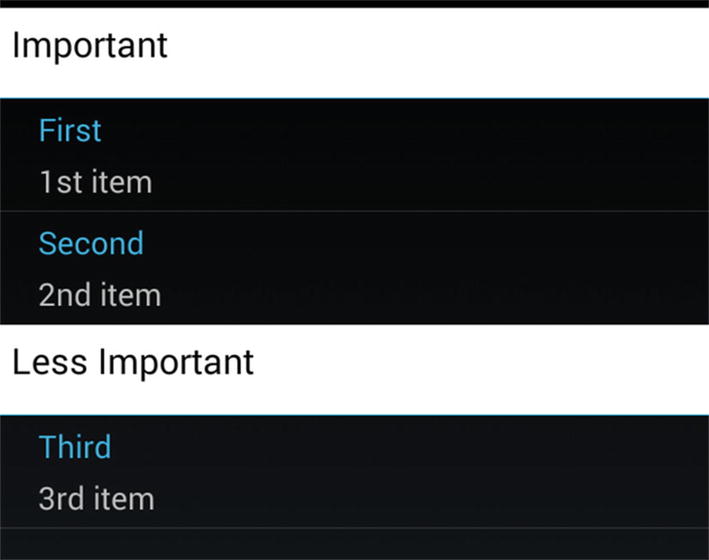
Grouping Headers
Long lists can be difficult to navigate and sometimes sorting just isn’t good enough. Grouping headers create categories to help users quickly find what they’re looking for. Items can be grouped using the IsGroupingEnabled and GroupDisplayBinding properties of a ListView.
You must first create group titles. A good way to store group headers is to create a static data model that is a collection of groups, each of which contains a collection of data items. That is, a collection of collections is created, with the group header field(s) defined in each group collection.
Create a group class that contains the group-by key and a collection for the items:
public class Group : List<ListItem>
{
public String Key { get; private set; }
public Group(String key, List<ListItem> items)
{
Key = key;
foreach (var item in items)
this.Add(item);
}
}
In the ContentPage constructor, populate the groups and assign them to a master model. Create as many groups as you need with corresponding keys and their contained items. In this example there are two groups, with keys called “Important” and “Less Important”.
List<Group> itemsGrouped = new List<Group> {
new Group ("Important", new List<ListItem>{
new ListItem {Title = "First", Description="1st item"},
new ListItem {Title = "Second", Description="2nd item"},
}),
new Group ("Less Important", new List<ListItem>{
new ListItem {Title = "Third", Description="3rd item"}
})
};
Note
This is a simplified, static data example for demonstration purposes. In the real world, you might use a view model, or populate a sorted data model with LINQ or with a loop, inserting grouped items with their accompanying keys.
Create a ListView named GroupedList, setting the IsGroupingEnabled to true. In the GroupDisplayBinding, bind the list to your Group object’s Key:
This ItemTemplate happens to contain a Title and Description for list data, but there is no particular ItemTemplate required for the grouping of items.
Assign the group model to the ListView.ItemsSource property in your page’s constructor:
public partial class ListViewGrouped : ContentPage
{
public ListViewGrouped()
{
List<Group> itemsGrouped;
InitializeComponent();
itemsGrouped = new List<Group> {
new Group("Important", new List<ListItem>
{
new ListItem {Title = "First", Description="1st item"},
new ListItem {Title = "Second", Description="2nd item"}
}),
new Group("Less Important", new List<ListItem>
{
new ListItem {Title = "Third", Description="3rd item"}
})
};
GroupedList.ItemsSource = itemsGrouped;
}
public class Group : List<ListItem>
{
public string Key
{
get;
private set;
}
public Group(string key, List<ListItem> listItems)
{
Key = key;
foreach (var item in listItems)
this.Add(item);
}
public class ListItem
{
public string Title { get; set; }
public string Description { get; set; }
}
}
}
Listing 6-15
Grouping List Items in ListViewGrouped.xaml.cs
Customizing the Group Header
When you’re ready for fancier group headers than the default ones, you can create your own in a similar manner to customizing list rows, using a custom template class that implements a layout and controls. Create the custom template using the ListView's GroupHeaderTemplate property:
The HasUnevenRows property helps maintain the formatting when you’re handling header and item rows of different heights. On iOS the developer must then calculate (or estimate) the height of each cell manually.
Let us customize the group headers to have a white background with large black text for the header group key. Finish creating your ListView named CustomGroupedList, setting the IsGroupingEnabled to true. Put your group header Label inside the GroupHeaderTemplate and DataTemplate, binding that Label to your Group object’s Key:
Customizing List Group Headers in ListViewGroupedTemplate.xaml
public partial class ListViewGrouped : ContentPage
{
public ListViewGrouped()
{
List<Group> itemsGrouped;
InitializeComponent();
itemsGrouped = new List<Group> {
new Group("Important", new List<ListItem>
{
new ListItem {Title = "First", Description="1st item"},
new ListItem {Title = "Second", Description="2nd item"}
}),
new Group("Less Important", new List<ListItem>
{
new ListItem {Title = "Third", Description="3rd item"}
})
};
GroupedList.ItemsSource = itemsGrouped;
}
public class Group : List<ListItem>
{
public string Key
{
get;
private set;
}
public Group(string key, List<ListItem> listItems)
{
Key = key;
foreach (var item in listItems)
this.Add(item);
}
public class ListItem
{
public string Title { get; set; }
public string Description { get; set; }
}
}
}
Listing 6-17
Customizing List Group Headers in ListViewGroupedTemplate.xaml.cs
Creating a Jump List
Long lists can be unwieldy and require fast scrolling using a jump list, which is a list of keys on the right that permit quick movement through the list. These are often letters corresponding to the first letter of the items.
Assign the jump list values by binding the property in the group model to the ListView.GroupShortNameBinding property. This example binds the Group.Key property to the jump list.
You’ll need a fairly long grouped list to see this in action.
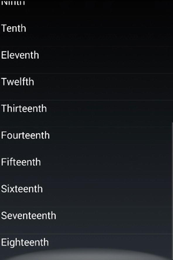
Let’s move on to scrolling. Xamarin.Forms ListViews are automatically scrollable when they contain more elements than can fit on the screen at one time.
ListViews Scroll Automatically
No additional coding is required to get a ListView to scroll. The ScrollView is built-in and the list will scroll if it is longer than the space available on the page.
Add a few more rows to the ItemsSource in the original data model binding example:
ListItems = new ListItem [] {
new ListItem {Title = "First", Description="1st item"},
new ListItem {Title = "Second", Description="2nd item"},
new ListItem {Title = "Third", Description="3rd item"},
new ListItem {Title = "Fourth", Description="4th item"},
new ListItem {Title = "Fifth", Description="5th item"},
new ListItem {Title = "Sixth", Description="6th item"} ,
new ListItem {Title = "Seventh", Description="7th item"},
new ListItem {Title = "Eighth", Description="8th item"},
new ListItem {Title = "Ninth", Description="9th item"} ,
new ListItem {Title = "Tenth", Description="10th item"},
new ListItem {Title = "Eleventh", Description="11th item"},
new ListItem {Title = "Twelfth", Description="12th item"} ,
new ListItem {Title = "Thirteenth", Description="13th item"},
new ListItem {Title = "Fourteenth", Description="14th item"},
new ListItem {Title = "Fifteenth", Description="15th item"} ,
new ListItem {Title = "Sixteenth", Description="16th item"},
new ListItem {Title = "Seventeenth", Description="17th item"},
new ListItem {Title = "Eighteenth", Description="18th item"}
};
Getting a ListView to scroll requires only putting enough data/rows into it to make it longer than the space on the screen (Figure 6-11).
Figure 6-11
ListView scrolls automatically when there are more rows than fit on the screen
Pull-to-Refresh
ListView supports a pull-to-refresh feature using its IsPullToRefreshEnabled property.
Implement the RefreshCommand method in order to enact a list refresh (see Chapter 9). Set IsRefreshing to true while you’re refreshing and then to false when done for the refresh animation to work correctly.
Optimizing Performance
Cell reuse is built-in with Xamarin.Forms, giving you a leg up over iOS and Android lists. Even so, scrolling lists can become slow, laggy, or janky. This is annoying to the user and makes the app feel unprofessional.
There are two ways to improve ListView performance: use caching and optimize.
ListView Caching
ListView has a built-in caching mechanism to create and retain cells only as needed by the visible screen. Cells that fall offscreen can be recycled to conserve memory. This is largely handled automatically although there are three options:
RecycleElement—Recycles list cells to minimize memory use. This is the recommended approach but not the default.
RetainElement—Creates and keeps all list items. This is the default ListView caching behavior.
RecycleElementAndDataTemplate—Recycles and optimizes for DataTemplateSelector use.
These options are in the ListViewCachingStrategy enumeration used in the CachingStrategy attribute of the ListView:
<ListView CachingStrategy="RecycleElement">
Caching Tips
Try RecycleElement first unless you have lots of bindings per cell (20+) or your template changes all the time, in which case use RetainElement.
If you’re using DataTemplateSelectors, opt for RecycleElementAndDataTemplate.
Sometimes RetainElement is faster than RecycleElement for no apparent reason, so try them both.
There are lots of little improvements and strategies for a faster list.
ListView Optimization
When building ListViews, a few things to watch out for are custom template ViewCells with many views, using images on older devices, and using layouts that require a large amount of measurement calculations.
Here are some recommendations for optimizing ListView performance:
Use IList<T> instead of IEnumerable<T> in your ItemsSource to employ random access.
Use the built-in cells whenever you can: TextCell and ImageCell.
Use custom template ViewCells only when you have to.
Use images only when necessary and keep images as small as possible. Images typically perform better on iOS than Android.
Avoid using custom template ViewCells with many views.
Avoid using images on older devices.
Avoid using layouts that require a large amount of measurement calculations.
Use as few elements as possible. For example, consider using a single FormattedString label instead of multiple labels.
Use AbsoluteLayout when you can, as it does no measurements.
RelativeLayout can work well if constraints are passed directly.
Avoid deeply nested layout hierarchies. Use AbsoluteLayout or Grid to help reduce nesting.
Avoid specific LayoutOptions except Fill (Fill is the cheapest to compute).
As a last resort, with a complex list, use custom renderers to create the list natively (see Chapter 8).
That’s it for ListView in Xamarin.Forms!
Summary
In mobile development, lists are the new data grid. (until they’re replaced by CollectionViews!)
List views are bound to arrays, Lists, or data models and allow scrolling when there are more items than will fit on the screen. They usually contain text string rows, but some contain images or entire layouts of controls.
Selection can be accomplished with a single row or multiple rows. Multiple row selection must be done by hand in Xamarin.Forms.
Cell reuse is a common theme in performant lists and involves the economic use of already populated list rows whenever possible. In Xamarin.Forms, this is built-in.
Grouping is often required for long lists, with grouping headings to help guide a user to find what they’re looking for.
Built-in list row views give you layout options without having to build them from scratch. These provide a range of control layouts for list rows providing titles, descriptions, and images as well as accessories such as checkboxes and radio buttons.
Custom list rows provide versatility at the risk of slower performance. Beware when creating these, as there are often performance trade-offs. Test for performance and follow the rules of performant customization for each platform when using long lists.
Lists help us navigate an app. Let’s now explore other types of navigation in Chapter 7.