Users choose dates, times, text, integers, doubles, and other values on mobile devices by using tactile controls. Touch-sensitive screens have user interaction that differs slightly from mouse-driven UIs: most is done with the thumbs and forefingers on the touchscreen. From the user’s standpoint, this results in a hands-on control-panel interface with switches, icons, sliders, keyboards, and pickers that sometimes look—but, more important, feel—like physical mechanisms.
Chapter 1 covered some of the basic Xamarin.Forms views such as the Label, Button, and Image. In this chapter, you’ll explore additional controls available on each platform, the gestures and events that make them work, and their outputs.
Many of the controls in this chapter are picker-style (pick a date, pick an option, pick a time, etc.). These controls tend to look and work better when displayed in a modal dialog box, a pop-up box that overlays the app and maintains focus until dismissed by the user. Xamarin.Forms handles this for you by automatically placing pickers in dialogs. You can enhance your controls using Xamarin.Forms’ commands, triggers, and behaviors.
This chapter is a gallery and a reference for the most commonly used selection controls.
Xamarin.Forms Views
These are more of the basic Xamarin.Forms views:
Picker: A pop-up to select a value from a simple list
DatePicker: A pop-up for selecting month, date, and year
TimePicker: A pop-up for selecting hour, minute, and AM/PM
Stepper: Increment/decrement buttons for discrete values
Slider: Sliding input lever for continuous values
Switch: Boolean on/off control
Xamarin.Forms views provide a range of controls that mimic and extend their iOS and Android counterparts. All of the views covered here allow selection and populate at least one property with a data value specified by the user, sometimes more. Let’s look at each view in turn.
Xamarin.Forms views often provide the selected value in two places: a handler event property (e.g., e.NewValue) provides the most recent value, and a general-use property on the view provides the selected value for use throughout the page. You will create two labels to display both of those values: EventValue and PageValue.
Create a new page called Controls.xaml and declare StackLayout with two Label views to hold the results of control selection.
<StackLayout HorizontalOptions="Center">
<Label x:Name="EventValue" Text="Value in Event" />
<Label x:Name="PageValue" Text="Value in Page" />
</StackLayout>
Center all of the controls in the StackLayout by using HorizontalOptions = "Center".
All of the Xamarin.Forms examples in this chapter can be found in the source listing Controls in the ControlExamples solution, shown in Listing 5-1 at the end of this section.
As you move on to other controls, remember to add each view to your StackLayout as you go!
Picker
The Picker view provides a pop-up to select a value from a simple list.
Note
The Picker view is used for quick selection of short words, phrases, or numbers. Complex lists with composite cells containing multiple strings and images are covered in the next chapter.
First, create the picker and give it a title, "Options," to identify what the user needs to pick:
Option names are placed into the list and then added to the ItemsSource collection in the picker.
A Picker first presents as an Entry control, which in Figure 5-1 starts as a data entry field, similar to Xamarin.Forms.Entry, displaying the value of the Title property.
Figure 5-1
Entry views often have inline labels instead of side labels
When this Entry field is tapped, a modal dialog appears, containing the list of items (Figure 5-2).
Figure 5-2
Each picker looks a bit different, depending on the platform
The list spins when swiped, and the highlighted value becomes the selected value. The selection is automatically populated into the original entry field, so the user can see the effect of the change. The SelectedIndexChanged event was assigned the PickerSelectedIndexChanged handler method:
The Format property is set to D for the full month/day/year display. More date formats are provided later in this section.
The DatePicker view starts as a data entry field (Figure 5-3), similar to Xamarin.Forms.Entry displaying the value of the Date property.
Figure 5-3
DatePicker begins as an Entry view waiting for a tap
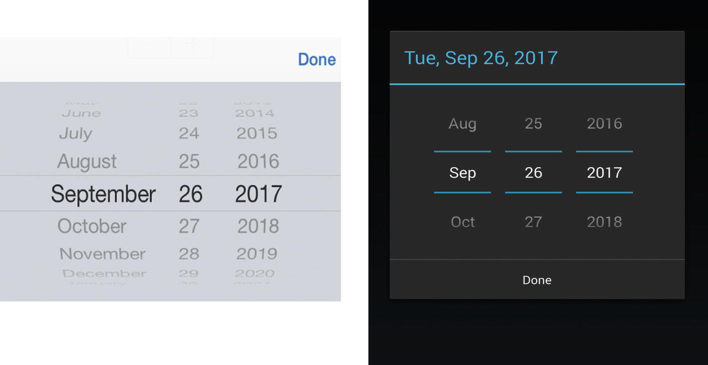
When the date field is tapped, a dialog appears (Figure 5-4).
Figure 5-4
DatePicker is a dialog
Each column spins individually when swiped, and the highlighted values become the selected values. When Done is tapped, the selected date is automatically populated into the original entry field, so the user can see the effect of the change. The DateSelected event was assigned the PickerSelectedIndexChanged handler method:
The properties e.OldDate and e.NewDate are available within this event to provide the old and new selected date values. In general cases, however, the value entered by the user is stored in the Date property. All of these properties use type DateTime.
The format of the Date field is customizable with the Format property—for example:
<DatePicker.Format>MM-dd-yyyy</DatePicker.Format>
Other values are as follows:
D: Full month, day, and year (Monday, March 5, 2021)
d: Month, day, and year (3/5/2021)
M: Month and day (March 5)
Y: Month and year (March 2021)
yy: Last two digits of the year (21)
yyyy: Full year (2021)
MM: Two-digit month (03)
MMMM: Month (March)
dd: Two-digit day (05)
ddd: Abbreviated day of the week (Mon)
dddd: Full day of the week (Monday)
You set a date range for selection by using MaximumDate and MinimumDate:
<DatePicker.MinimumDate>
<sys:DateTime x:FactoryMethod="Parse">
<x:Arguments>
<x:String>Jan 1 2018</x:String>
</x:Arguments>
</sys:DateTime>
</DatePicker.MinimumDate>
<DatePicker.MaximumDate>
<sys:DateTime x:FactoryMethod="Parse">
<x:Arguments>
<x:String>Dec 31 2025</x:String>
</x:Arguments>
</sys:DateTime>
</DatePicker.MaximumDate>
Tip
On Android, the Format and MaximumDate/MinimumDate properties affect the DatePicker entry field but not the modal selection dialog at the time of this writing.
TimePicker
The TimePicker view creates a pop-up for selecting hour, minute, and AM/PM. Create a TimePicker view like this:
The Format property set to T displays the full time. More time formats follow.
The TimePicker view starts as a data entry field similar to Xamarin.Forms.Entry, displaying the value of the Time property (Figure 5-5).
Figure 5-5
TimePicker waits for a tap
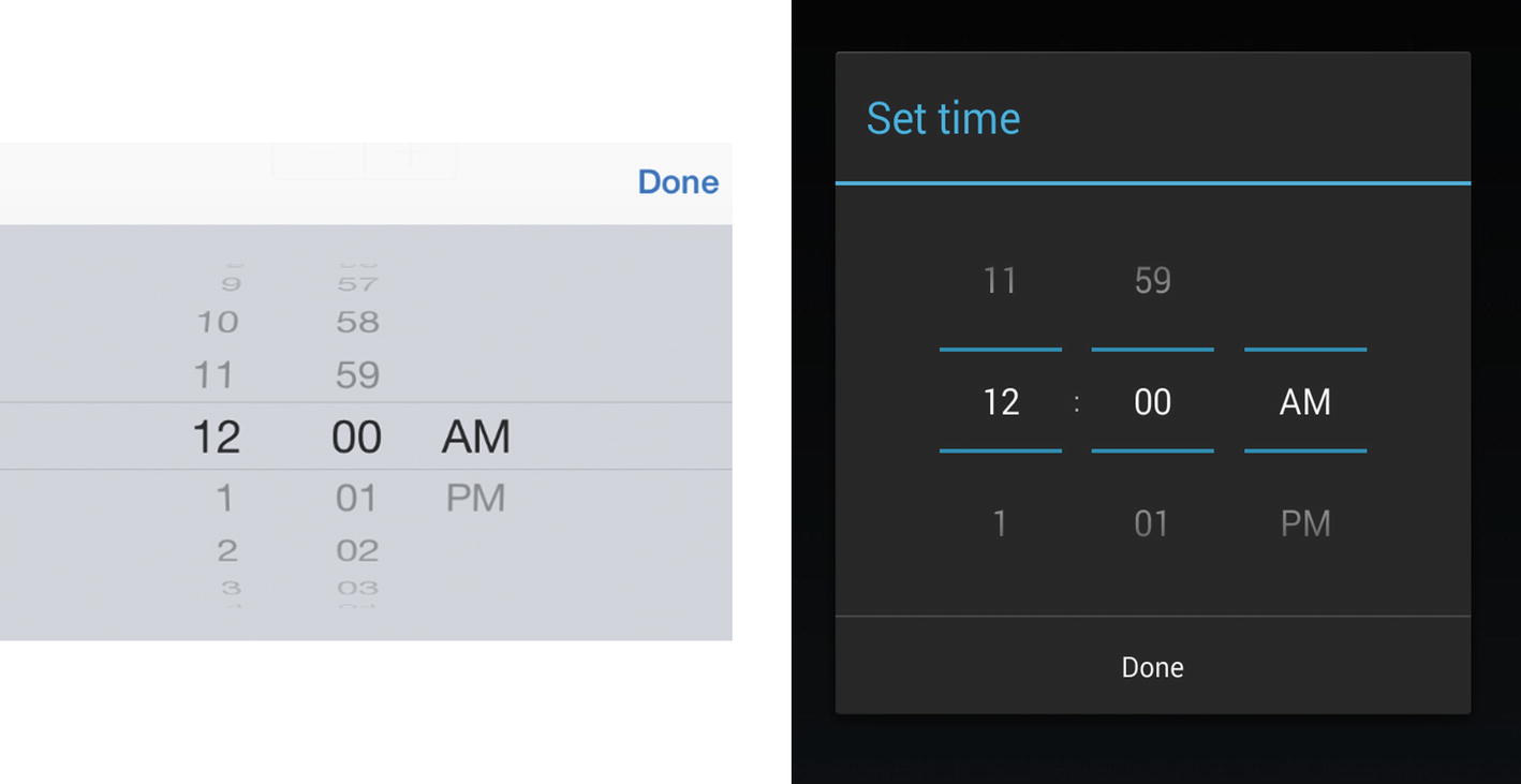
When the time field is tapped, a modal dialog appears (Figure 5-6).
Figure 5-6
TimePicker is a dialog box
Each column spins individually when swiped, and the highlighted values become the selected values. When Done is tapped, the selected time is automatically populated into the original entry field, so the user can see the effect of the change.
There is no TimeSelected event that triggers when a value is selected. Instead, use the PropertyChanged event in Xamarin.Forms data binding to track changes to this view.
EventValue.Text = String.Format("Stepper value is {0:F1}", e.NewValue);
PageValue.Text = TheStepper.Value.ToString();
}
The properties e.OldValue and e. NewValue are available within this event to provide the old and new selected values. In general cases, however, the value entered by the user is stored in the Stepper'sValue property. All these properties are type Double.
Slider
The Slider view is a sliding input control providing a continuum of selection:
Minimum and Maximum properties are set for the slidable value. The start value can be set in the Value property. The value changes by increments by one-tenth of a unit (0.1) as the slider is moved. The WidthRequest property sets the width of the view without changing minimum or maximum values.
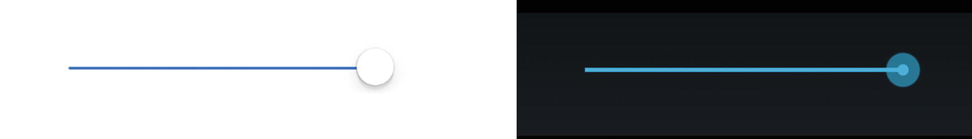
Figure 5-8 shows what the Slider view looks like (with Value = 100).
Figure 5-8
Slider view at its max value
Sliding the slider changes the adjustable value and fires the ValueChanged event, named SliderValueChanged in this case:
EventValue.Text = String.Format("Slider value is {0:F1}", e.NewValue);
PageValue.Text = TheSlider.Value.ToString();
}
The properties e.OldValue and e.NewValue are available within this event to provide the old and new selected values. In general cases, the slidable value is also stored in the Value property. All these properties are of type Double.
EventValue.Text = String.Format("Switch is now {0}", e.Value ? "On" : "Off");
PageValue.Text = TheSwitch.IsToggled.ToString();
}
The property e.Value is available within this event to provide the new switch value. In general cases, the value is also stored in the IsToggled property. These properties are of type Boolean.
Scale, Rotation, Opacity, Visibility, and Focus
You can alter the appearance and behavior of Xamarin.Forms views by using members of the View superclass, VisualElement. Here are some key properties that can be set on a view:
Scale: Change the size of a view without affecting the views around it. The default value is 1.0.
Scale = "0.7"
IsVisible: Make a view invisible or visible again.
IsVisible = "False"
IsEnabled: Disable and reenable a view.
IsEnabled = "False"
Opacity: Fade a view in and out. The default value is 1.0.
Opacity = "0.5"
Rotation: View rotation can be achieved on all axes by using the Rotation, RotationX, and RotationY properties. These rotate the view around the point set by AnchorX and AnchorY.
Using C#, give focus to a view by using the Focus() method, which returns true if successful.
var gotFocus = entry.Focus();
This example sets focus on an Entry view (which pops up the keyboard).
Tip
Use the animation extensions on Xamarin.Forms controls and UI elements to handle fades, rotation, scaling, and translation. The ViewExtensions' methods include TranslateTo, ScaleTo, RelScaleTo, RotateTo, RelRotateTo, RotateXTo, RotateYTo, and FadeTo. Fade in an image over four seconds like this: await image.FadeTo (1, 4000);
CODE COMPLETE: Xamarin.Forms Views
Listing 5-1 contains the complete code for all Xamarin.Forms selection control examples in this chapter. Figure 5-11 shows the full example screen.
Controls.xaml in the ControlExamples Project of the ControlExamples Solution
Note
Again, the two labels used in this example, EventValue and PageValue, reflect the two ways in which selection values can be retrieved: in a handler event property (e.g., e.NewValue), which provides the most recent value, or in a general-use property on the view (e.g., TheControl.Value), which provides the selected value for use throughout the page.
Now that you can use Xamarin.Forms controls, how can you group them into UI components for reuse throughout your app? By using old and familiar custom controls, of course.
Custom Controls
Every XAML page you create is really a custom class. Using C# you create a page by inheriting the ContentPage class in the code behind. Using XAML you specify a ContentPage as the root of your XAML and declare your namespace and class name using the x:Class attribute. Creating custom controls is no different. Xamarin.Forms provides two base classes for this purpose: ContentView and ViewCell. ContentView is useful if you want to create your own reusable controls. If you want to define a template for items in a list, then use ViewCell. Listing 5-2 shows a simple custom control based on ContentView.
The custom control MyControl in the namespace mycontrols is a Label View. You can use as a View any of the Xamarin.Forms Views available to you and create beautiful and reusable controls. You derive from ContentView and inside of it build your control using layouts, buttons, labels, images, etc. Listing 2-33 demonstrates how you use this control inside your XAML pages. Here you use MyControl declared in Listing 5-3.
After specifying your namespace mycontrols with the prefix my, you are able to use your custom control inside the page, that is, <my:MyControl/>.
Custom controls enable XAML code reuse. Use control templates for a separation between the appearance of a page and its content.
Control Templates
Control templates are generalized reusable user interfaces meant to be used along with page-specific content. Define a control template as a resource in a resource dictionary and use them in your XAML pages. Control templates can increase consistency of your visual design across several pages or across your entire application. Custom templates can be used application-wide or on a single page. Some examples include app-wide header and footer definitions or repeated blocks of UI on a single page. We’ll use an application-wide header and footer example here.
A ControlTemplate is created using a ContentPage or ContentView and their respective base classes, TemplatedPage and TemplatedView. Listing 5-4 shows how a control template with the Key MyTemplate is defined as a resource of the Application. Create a ControlTemplate and add a StackLayout with a header label and a footer label.
In between the header and footer is the ContentPresenter, a placeholder for page-specific content added later, shown in Listing 5-5. Create a new page with a ControlView and set the ControlView.ControlTemplate property to the ControlTemplate Key, MyTemplate in this case. Add page-specific controls you want in the body of the page inside the ContentView, such as a Label with text “Page Body.”
The ContentPresenter element inside the ControlLayout is replaced with whatever you have defined in your ContentView. The resulting page would be comprised of a StackLayout with three Labels: Header, Page Body, and Footer.
Tip
Another type of template is the data template useful for creating list items, which we’ll cover in Chapter 6.
Commands
Xamarin.Forms offers commands as an alternative to events and event handlers. Event handlers reside in the C# code behind tightly coupled to your XAML file, making them non-reusable. Xamarin.Forms provides your controls with a bindable property Command and a corresponding CommandProperty.
Command is of type ICommand which requires an implementation of the methods Execute and CanExecute and also defines the event CanExecuteChanged. The CommandParameter object allows your Execute to receive an additional argument that is used during its execution.
You can define classes with properties that implement the ICommand interface and bind them to the bindable property Command provided by Xamarin.Forms to react to user interactions. Anytime interaction takes place, your command property is notified. First the CanExecute method will be called, and if the result is true, the Execute method runs. You can also provide a delegate to handle scenarios where CanExecute changes. To simplify the creation of custom commands, Xamarin.Forms defines two classes that implement ICommand: Command and Command<T>. These helpers also define a ChangeCanExecute method that you call to fire a CanExecuteChanged event.
Create a class called MyClass with a command called MyCommand that executes when the user presses a Button as shown in Listing 5-6.
namespace mycommands {
class MyClass {
public ICommand MyCommand { protected set; get; }
public MyClass() {
MyCommand = new Command({
Console.WriteLine("Hello");
});
}
}
}
Listing 5-6
Creating a Command
This defines a class MyClass with a command MyCommand and writes "Hello" to the Console. Command also allows async calls. Listing 5-7 shows how to bind a Button to our MyCommand using the view’s Command parameter and BindingContext.
<Button Text="Click Me"
Command="{Binding MyCommand}">
<Button.BindingContext>
<my:MyClass/>
</Button.BindingContext>
</Button>
Listing 5-7
Binding a Command to a Button
Assuming that you have specified the namespace mycommands with the prefix my in the ContentPage of your XAML file, you can define a Button and set its BindingContext to our custom class MyClass.
Tip
Execute a Command as a method by calling that method in the Command definition.
Commands offer an alternative to the traditional event handling. However, not all classes and types of user interactions are supported. The vast majority of controls inherit from View class, and a view specifies the property GestureRecognizers of type IList<GestureRecognizer> that allows you to register classes that implement the IGestureRecognizer interface. The GestureRecognizer class that implements the IGestureRecognizer interfaces has three children: TagGestureRecognizer, PanGestureRecognizer, and ClickGestureRecognizer. TagGestureRecognizer and ClickGestureRecognizer have a bindable property Command of type ICommand and CommandParameter of type object.
Classes that inherit from Element, which is higher in the hierarchy, don’t have gesture recognizers. For MenuItem (and hence also ToolbarItem) and for TextCell (and hence also ImageCell), Xamarin.Forms directly defines the Command and CommandParameter bindable properties. A MenuItem notifies your command when it is activated, and TextCell notifies your command when any property of it is changing or changed or was tapped. The Views SearchBar, ListView, and Button in addition to the GestureRecognizers also implement their own Command property, that is, SearchCommand, RefreshCommand, and Command. The Views SearchBar and Button also provide for a command parameter, SearchParameter, and CommandParameter of type object. This means that you cannot use classes that represent pages like ContentPage for commanding.
So, before you opt for an event, consider using a Command. First explore Binding, or whether you can use commands provided on Views, through GestureRecognizers, or controls that have a Command property.
Executing code is as a Command is useful, but what if it needs parameters?
CommandParameters
Now that you can bind the Command property of Button to your MyCommand, it’s time to pass in a parameter. Begin with passing the “Hello” string into your command via CommandParameter. Replace the line containing the Command definition in Listing 5-6 to pass value s into the Command and display it in the Writeline.
MyCommand = new Command<string>(s => {Console.WriteLine(s); });
MyCommand now expects a string command parameter in s and writes the string to the Console. Working from Listing 5-7, pass your old “Hello” into the Button’s CommandParameter attribute.
<Button Text="Click Me" Command="{Binding MyCommand}" CommandParameter="Hello">
When the button is clicked and MyCommand is called, the "Hello" string is passed into the Command through the CommandParameter.
Tip
Need multiple parameters? Create a class and populate it with properties to pass into your Command.
Another approach to respond to user interactions and states of your UI is with triggers.
Triggers
Triggers respond to changes on a control or other element in your page. A trigger is composed of one or more conditions and an action. All controls, with the exception of cells, which do not inherit from the VisualElement class, have a Triggers property, where you can register your trigger. There are four types of triggers based on the type of condition: Property, Data, Multi, and Event.
All of these trigger types require the use of the TargetType property.
TargetType
Use TargetType when you define your trigger to specify the control type the trigger applies to, which is an Entry control in this example:
You can also use TargetType to define a trigger as a resource in your resource dictionary instead of registering it with the Triggers property of a specific control (Listing 5-8). For this you have to use a Style element as the container and register your trigger to its Triggers property. The Style element also has a TargetType that you need to specify for this to take effect. This allows you to change its properties for all controls of that type.
Using TargetType to Create a Page-Wide Property Trigger
Insert your UI at the ellipses and include one or more Entry controls. This is a page-wide implementation of a Property Trigger.
Property Trigger
This trigger is useful when you want your control to respond to changes of its own properties. Inside your control, create an Entry.Triggers tag that contains your Triggers. Create a Trigger with the property name/value pair you want to trigger on. The Trigger element has the properties Property and Value:
<Trigger Property="IsFocused" Value="true">
Set Trigger.TargetType to your view, Entry in this case, and a change to the Property that matches your Value executes the Setter within the trigger. In this case, when Entry gets focus, the Entry background is set to Red, as shown in Listing 5-9.
<Entry>
<Entry.Triggers>
<Trigger TargetType="Entry"
Property="IsFocused" Value="True">
<Setter Property="BackgroundColor" Value="Red" />
</Trigger>
</Entry.Triggers>
</Entry>
Listing 5-9
Creating a Property Trigger
Data Trigger
Use this trigger when you want your control to respond to changes that take place on other elements in the user interface. The DataTrigger element expects the properties Binding and Value.
This trigger fires when another entry control gets the focus (Listing 5-10). With the binding markup extension, you also have access to the Converter property for more advanced computations. DataTrigger requires that you specify the TargetType property to the control you are registering the trigger with.
Use multi triggers if you need several conditions to be met before an action takes place. The MultiTrigger element has a Conditions property that can have multiple BindingCondition and PropertyCondition elements. A BindingCondition expects the properties Binding and Value and a PropertyCondition the properties Property and Value. With the binding markup extension, you also have access to the Converter property for more advanced computations. Listing 5-11 shows that MultiTrigger requires that you specify the TargetType property to the control you are registering the trigger with.
You can subscribe to events that are fired in your control. The handler needs to be written in C# by implementing inheriting from the TriggerAction<T> class. T represents the type of control this action is related to. In the C# code, you override the Invoke (T t) method and can change the properties of your control t.
There are two types of actions that you can define: Setters and TriggerAction<T> classes. For property, data, and multi triggers, you can use a Setter element to define the action that needs to happen when a condition is met. A Setter allows you to change the Value of a Property of your control, e.g., <Setter Property="IsEnabled" Value="false"/> disables your control. All trigger types allow instead of Setters registering one or more TriggerAction(T) implementations that you register with the trigger’s EnterActions or ExitActions properties. You define your TriggerAction<T> classes in C# by inheriting from TriggerAction(T) and overriding the Invoke(T t) method. T represents the type of control the action applies to (Listing 5-12).
Property Trigger, DataTrigger, MultiTrigger, and EventTrigger
Listing 5-13 shows a page with a ResourceDictionary that has a Style object which includes a Trigger, which is only applicable to Entry controls, changing their BackgroundColor to Yellow if they get the focus. The page contains a StackLayout with a Label and an Entry. The Text of the Label property is bound to the Text property of the Entry. Anything you write in the Entry is shown in the Label. The Entry has three triggers: DataTrigger, EventTrigger, and MultiTrigger. The DataTrigger is bound to the Text of the Label and changes the TextColor of the Entry to Green as soon as the Text property of the Label contains text. We use a IsEmptyStringConverter that we will implement in a moment that returns true if the Label has some text. The EventTrigger uses a custom EntryTextLogger TriggerAction class that logs the user entry to Console. Finally, we have a MultiTrigger defined with one BindingCondition and one PropertyCondition monitoring the Label Text and whether the Entry has focus and changing the Entry FontSize to Large. Listing 5-14 shows the ValueConverter and TriggerAction we use in this example.
namespace MyTriggers {
class IsEmptyStringConverter : IValueConverter {
public object Convert(object value, Type targetType,
object parameter, CultureInfo culture) {
return ((int)value>0) ? true : false;
}
public object ConvertBack(object value, Type targetType,
object parameter, CultureInfo culture) {
throw new NotSupportedException();
}
}
public class EntryTextLogger : TriggerAction<Entry> {
public EntryTextLogger() { }
protected override void Invoke(Entry entry) {
Console.WriteLine(entry.Text);
}
}
}
Listing 5-14
Value Converter Example
The IsEmptyStringConverter we have defined in Listing 5-14 is very simple. It checks whether the integer value that was provided is greater null or not and returns true or false. The TriggerAction<Entry> is also very simple. The Invoke(Entry entry) method simply writes the value of Text to the Console. As you have learned, you can define auto-implemented properties to pass additional data to your TriggerAction class. Our EntryTextLogger could, for instance, have a DebugMode property that only writes to Console if set to true, e.g., <my:EntryTextLogger DebugMode="true"/>.
Behaviors
Behaviors let you extend the functionality of controls without subclassing them using Attached Properties or Behavior<T> classes.
Attached Properties
Extend behavior of a visual element using attached properties. Bindable properties are properties of UI elements that can be bound to data sources in code, such as arrays, collections, or view models.
Attached properties are a particular type of bindable property defined as a static property in a static class with corresponding static GetPropertyName and SetPropertyName methods. The difference between an attached property and a regular bindable property is that these properties are defined in one class but used in others.
Recognize an attached property by the class.propertyname notation in your XAML. As discussed in Chapter 9, the propertyChanged delegate can respond to changes on that property receiving a reference to the BindableObject that makes use of the attached property as well as the new and old value assigned. Since you have a reference to the control in your propertyChanged delegate, you can take full control over the object, change its properties, or enhance its behavior. The key restriction with attached properties is that they must be defined in a static class with static properties and methods, which means that they cannot have state, which is why it is recommended to use Behavior classes in many cases.
Assign an attached property to your control by using the attribute myprefix:MyStaticClass.PropertyName="true" on the element, and set it to false if you want to detach it again.
<Entry my:MyClass.PropertyName="true"/>
This requires that you have defined in your namespace with the prefix my a public static class MyClass with the public static BindableProperty MyAttachedProperty.
Implement your attached property within the Attached Behavior called MyBehavior as shown in Listing 5-15.
public static class MyBehavior
{
public static readonly BindableProperty PropertyNameProperty =
BindableProperty.CreateAttached (
"PropertyName",
typeof(bool),
typeof(MyBehavior),
false,
propertyChanged:OnPropertyNameChanged);
public static bool GetPropertyName (BindableObject view)
This implementation also uses an Attached Behavior OnPropertyNameChanged that is triggered on the change of PropertyName.
Behavior
Behaviors are associated with a control, and every subclass of VisualElement has a Behaviors property where you can register your Behavior subclass.
Create a class that inherits from Behavior or Behavior<T>., where T is the type of the control tied to your behavior. Override the OnAttachedTo and OnDetachingFrom methods to provide your behavior implementation (Listing 5-16). Lastly, implement your behavior functionality.
Using an Entry control in this example, register your behavior, MyBehavior, as shown in Listing 5-17.
<Entry Placeholder="Enter Name">
<Entry.Behaviors>
<my:MyBehavior />
</Entry.Behaviors>
</Entry>
Listing 5-17
Consuming a Behavior
Tip
When you’re finished with your behavior, you can only detach it using code. Detach by calling myControl.Behaviors.Clear() prior to your page going out of scope.
Behaviors can have a state, as opposed to attached properties, and you should not use resource dictionaries to share them if you want to manage state.
Note
If you prefer a Style in the resource dictionary to set your Behavior as a property of your visual element, then you need to combine the Behavior with the attached property technique.
EffectBehavior is another type of behavior used to define reusable visual effects for your user interface controls. We will explain this type more in depth in Chapter 8 when we talk about effects.
In this section, we covered how to extend the behavior of visual elements without the need to use the underlying C# file of your XAML file. These are valid but not reusable approaches because the behavior is bound to a specific control. However, what makes Behaviors really interesting is that all VisualElements have a Behaviors property that you can use to overcome the shortcomings of classes in Xamarin.Forms that don’t support commands. Typically a Behavior class uses reflection to register a generic event handler with the control and provides properties in XAML to specify the event name as well as the Command the behavior should execute when the event is fired, as shown in Listing 5-18.
<Entry.Behaviors>
<my:EventToCommand Event="TextChanged"
Command="{Binding MyCommand}"/>
</Entry.Behaviors>
Listing 5-18
Event-to-Command Example
There are several libraries that eliminate the need to write event handlers entirely and replace them with commands. Check out Event-To-Command Behavior implementations for more details.
That completes our tour of Xamarin.Forms views!
Summary
Many controls share a common goal: allowing the user to pick a value. Simple selection controls require us to specify minimum and maximum values and set a default value. Pickers/spinners work best inside a modal dialog, and we use them to select from a list or choose dates and times. Xamarin.Forms handles the dialog pop-ups for you. The selection controls in this chapter typically provide a value changed or click event of some kind to allow your code to respond to changes in values.
Xamarin.Forms Views become more powerful every year, with features to help us make them interactive with minimal, elegant code.Commands provide an alternative to events useful for building a testable architecture. Commands help consolidate behaviors in a view model providing bindable properties and commands that can be unit tested independent of the user interface. Triggers can fire under a broad array of circumstances driving logic within the app. For example, data triggers can be used within views to update presentation based upon information in the data model. Behaviors supply a way to let you extend the functionality of controls without subclassing them.
While indispensable, the controls in this chapter are simple ones. In the next chapter, you’ll dive deeper into the heart of mobile UI selection, where both the data and the selection can be richer and more complex when using lists and tables.