© Dan Hermes 2019
Dan Hermes and Nima MazloumiBuilding Xamarin.Forms Mobile Apps Using XAMLhttps://doi.org/10.1007/978-1-4842-4030-4_8

8. Custom Renderers, Effects, and Native Views

Dan Hermes1  and Nima Mazloumi2
(1)
Boston, MA, USA
(2)
San Francisco, CA, USA
 

When you’re ready to extend the capability of Xamarin.Forms views beyond their out-of-the-box functionality, then it’s time to start customizing them using custom renderers, effects, and native views. Platform-specific controls and layouts have scores of features inaccessible using only the Xamarin.Forms abstraction. There are three ways to access those features and extend the functionality of your application. The custom renderer gives full control over a Xamarin.Forms control by allowing you to gain access to all of its native functionality. It allows you to override the methods of the default renderers provided by Xamarin.Forms or even replace the platform-specific control Xamarin.Forms used with another control. Xamarin.Forms developers’ customization approach of choice is effects, a milder form of customization. Use effects if you need to change properties or use event listeners. Finally, Xamarin.Forms supports the use of the native views directly in XAML. This provides full access to the power of native controls along with the full responsibility of managing their lifecycle and behavior.

Custom Renderer

Xamarin.Forms exposes the mechanism whereby cross-platform views are made into platform-specific views, called renderers . By creating your own custom renderers, you get full access to platform-specific features buried deep within each view! Custom renderers are a bridge between Xamarin.Forms and Xamarin platform-specific libraries, Xamarin.iOS as well as Xamarin.Android.

Note

Custom renderers are the most powerful option for Xamarin.Forms view customization, so we’ll explore it first before moving onto a milder but more popular approach: Effects. Xamarin.Forms controls are drawn on the screen using two primary components: elements and renderers. Throughout this book you’ve been working with the elements: views, pages, or cells defined within Xamarin.Forms. The renderers take a cross-platform element and draw it on the screen using the platform-specific UI library. All Xamarin screens use renderers! For example, if you create a Label view using Xamarin.Forms, this element is rendered in iOS using UILabel and in Android using TextView. However, Xamarin.Forms provides only a partial binding to these platform-specific views. If you want to gain access to all of the properties and methods within platform-specific elements (such as UILabel, TextView, and TextBlock), then you need to create a custom renderer (or an Effect, but we’ll get to that later).

Think of a custom renderer as a way to access and extend your use of the platform-specific elements.

Tip

You can create custom renderers for these elements: Views, Cells, and Pages.

At the end of this topic, I’ll list most of the Xamarin.Forms elements covered in this book, their platform-specific equivalents, and which renderers to use when customizing them.

When to Use a Custom Renderer

When might you want to use a custom renderer?

You may want a view to behave differently and Xamarin.Forms isn’t obliging you. For example, you know for a fact that iOS does text decorations or shadows on a particular view and this isn’t available in Xamarin.Forms, so you create a custom renderer to access a Xamarin.iOS control. Use a custom control when you need direct access to an element’s platform-specific properties and methods, when you need to override platform-specific control methods, or when you need to replace a Xamarin.Forms element with your own custom platform-specific element.

Tip

A Xamarin.Forms customized control uses a custom renderer to access native functionality in a single control. A custom control is typically a group of controls composited into a single reusable component using ContentView (Chapter 5) (but you can also create a custom control using a custom renderer and replace the view with a group of views). Sometimes developers will say “custom control” to refer to a customized control.

Let’s explore how to create a custom renderer for Android and iOS.

Creating and Using a Custom Renderer

A custom renderer is created to implement the visual representation of a custom element. You create a custom element class that inherits from a standard Xamarin.Forms element, such as Button. Then you use that custom element in the UI. You can implement the custom renderer for each platform to use platform-specific members of that element, such as Android’s SetBackgroundColor method or the iOS BackgroundColor property.

Note

Button Backgroundcolor is the example used in this chapter. It’s a simple function that lends itself well to demonstrating how to create custom renderers. In the real world, outside of a teaching context, you would not customize this particular element because there is an easy way to do this in Xamarin.Forms:

    View.BackgroundColor = Color.FromRGB(50,205,50);

or

    <Button Text="Press Me" HorizontalOptions="FillAndExpand" BackgroundColor="#32cd32" />

Custom renderers should only be written for functionality that cannot be achieved using regular Xamarin.Forms views and their elements.

There are several steps in the creation and implementation of a custom renderer, but I’ll break them into two tasks: preparing the custom element in the Xamarin.Forms project and creating a custom renderer in each platform-specific project.

Prepare the custom element in your Xamarin.Forms project by creating an element subclass and then using it in your UI. The following steps only happen once.
  1. 1.
    Create an element subclass. Create a custom element that is a subclass of the element you want to customize, such as Button, in your Xamarin.Forms project.
    <Button FontSize="Large" HorizontalOptions="Center" VerticalOptions="Fill" xmlns:="http://xamarin.com/schemas/2014/forms" xmlns:x="http://schemas.microsoft.com/winfx/2009/xaml" x:Class="CustomRendererExample.CustomButton"/>
     
  2. 2.
    Create the C# partial class implementation of your custom element (code behind).
        public partial class CustomButton : Button
        {
             public CustomButton()
             {
               InitializeComponent();
             }
        }
     
  3. 3.

    Use the element. Use the subclassed element, such as this CustomButton, in a layout in your Xamarin.Forms project.

     
Create a custom renderer in each of your platform-specific projects (iOS, Android) using these three steps. The following steps occur once for each platform.
  1. 1.

    Create a custom renderer. Add a custom renderer class to each platform-specific project where you want to make customizations.

     
    public class CustomButtonRenderer : ButtonRenderer
  1. 2.

    Add [assembly]. Add the [assembly] attribute outside of the namespace declaration to declare the new renderer.

     
  2. 3.

    Add using. Add using statements to the renderer class so that the renderer types are resolved.


That’s the upshot for creating a custom renderer.

In the next example, you will create a custom button that has custom renderers for each platform. Start by preparing your custom view in the Xamarin.Forms project before moving onto the renderers.

Creating the Custom Element

A custom renderer first requires a custom Xamarin.Forms element, which can be a View, a Cell, or a Page. In this example, you will use custom renderers to change the background color of a button view to some variant of green. The custom view will be called CustomButton and inherit from the Button view and is defined in XAML file. You need to provide two files for every custom element you are creating: the XAML file and the associated code behind file.

Now, to make your CustomButton green, create a Xamarin.Forms solution called CustomRenderer; then I’ll go through these steps in more detail.
  1. 1.
    Create an element subclass. Create a new XAML document called CustomButton.xaml, and replace the root element ContentPage that Visual Studio created with Button both in the XAML and the code behind and assign some default values.
        <Button xmlns:="http://xamarin.com/schemas/2014/forms"
        xmlns:x="http://schemas.microsoft.com/winfx/2009/xaml"
        x:Class="CustomRendererExample.CustomButton" FontSize="Large"
        HorizontalOptions="Center" TextColor="Black"
        VerticalOptions=="Fill" />
     
  2. 2.
    Create the C# partial class implementation of your custom element (code behind).
        public partial class CustomButton : Button
        {
             public CustomButton()
             {
               InitializeComponent();
             }
        }
     
  3. 3.

    Use the element. Use the subclassed element, such as this CustomButton, in a layout in your Xamarin.Forms project.

     
Create a new ContentPage in a file called CustomRendererExamplePage.xaml. Declare the namespace of your CustomButton using the xmlns directive; provide a prefix for this namespace, e.g., local; declare an instance of the CustomButton view ; provide a name for a click handler; and place the button on a Stacklayout, as shown in Listing 8-1.
    <ContentPage xmlns:="http://xamarin.com/schemas/2014/forms"
    xmlns:x="http://schemas.microsoft.com/winfx/2009/xaml"
    xmlns:local="clr-namespace:CustomRendererExample"
    x:Class="CustomRendererExample.CustomRendererExamplePage">
        <StackLayout VerticalOptions="Center">
            <local:CustomButton Text="Custom Button" Clicked="ButtonClicked" />
        </StackLayout>
    </ContentPage>
Listing 8-1

Use the CustomButton in CustomRendererExamplePage.xaml (in the Forms Project)

The CustomRendererExamplePage also requires a partial class implementation in the code behind CustomRendererExamplePage.xaml.cs, which includes a default constructor that calls the InitializeComponent method and provides an implementation of the event hander ButtonClicked, as shown in Listing 8-2.
    public partial class CustomRendererExamplePage : ContentPage {
        public CustomRendererExamplePage() {
            InitializeComponent();
        }
        public void ButtonClicked(object sender, EventArgs args) {
            DisplayAlert("Congratulations",
            "This button was rendered in a platform-specific class.", "OK");
        }
    }
Listing 8-2

Use the CustomButton in CustomRendererExamplePage.xaml (in the Forms Project)

Remember to assign this CustomRendererExamplePage class to the MainPage property of your Application constructor. In the StackLayout, your use of the custom view, CustomButton, is exactly the same as the use of a regular Xamarin.Forms Button view.

Creating the Custom Renderer

Now that you have created a custom element and used it in your UI, you’ll need to create the custom renderer. You’ll need to determine the name of the renderer for your element, and I’ll show you how to do that later in this chapter in the section “Which Renderer and View Do You Customize?” In this example, you’ll use ButtonRenderer.

There are two main ways to customize a control: by property or by replacing the entire control. Customizing a control’s properties involves accessing platform-specific properties unavailable via the Xamarin.Forms view (such as a button’s background color). A Xamarin.Forms control can also be completely replaced by a platform-specific control of the developer’s choice. I’ll cover property customization in depth in this chapter and touch upon control replacement in the notes.

Here are the custom renderer’s key methods:
  • OnElementChanged : This main method fires upon changes to the element and is used for control initialization. Set the initial control value and its properties. This is also where to replace the entire control with your own customized platform-specific control.

  • OnElementPropertyChanged : This method fires upon changes to element and attached properties and is useful for data binding.

  • SetNativeControl : Call this method manually to replace the entire element with a custom platform-specific control (such as SetNativeControl(new YourCustomizedControl());).

Here are the custom renderer’s important properties:
  • Control: A reference to the platform-specific element (such as UIButton) displayed by the renderer. Platform-specific properties are available here. This object can also be replaced with an entirely new (and customized) platform-specific control.

  • Element: A reference to the Xamarin.Forms subclassed element (such as CustomButton). Xamarin.Forms element properties are available here.

  • Customize controls and their properties by using the Control property within the OnElementChanged method.

Implement data-bound customized controls by assigning Control properties from their corresponding Element properties in the OnElementPropertyChanged method.

Now create a custom renderer on each platform. Begin with the Android platform, then do iOS.

Android Custom Renderer

Renderers realize a view on the native platform. Create your own renderer by inheriting from the standard renderer, such as ButtonRenderer. Then call into the native view’s platform-specific API to customize the view using the renderer’s Control property. In OnElementChanged, you’ll assign your Control's background color property.

Do the first of three platform-specific steps.
  1. 1.

    Create a custom renderer. Add a custom renderer class to the platform-specific project, which is ButtonRenderer in this case.


Tip

Refer to the section “Which Renderer and View Do You Customize?” at the end of this chapter to help you determine the renderer and platform-specific control(s) to use for the element you want to customize.

Create CustomButtonRenderer.cs as a class in the Droid project. Inherit from the ButtonRenderer class and modify the Control property to affect your button as needed. The platform-specific view is assigned to the Control property, in this case an Android Button control, and its native properties and methods are made available. Listing 8-3 shows an Android renderer where the background color is set using the SetBackgroundColor method.
    public class CustomButtonRenderer : ButtonRenderer {
        public CustomButtonRenderer(Context context) : base(context) {
            AutoPackage = false;
        }
    protected override void OnElementChanged
    (ElementChangedEventArgs<Button> e) {
        base.OnElementChanged (e);
        if (Control != null) {
            Control.SetBackgroundColor (global::Android.Graphics.Color.LimeGreen);
            }
        }
    }
Listing 8-3

Customized ButtonRenderer in CustomButtonRenderer.cs (in the Droid Project)

Note

If you don’t add a platform-specific renderer, the default Xamarin.Forms renderer will be used.

Complete the final two platform-specific steps. In order to make the custom renderer visible to the Xamarin.Forms project, an attribute on the class is required. Then add the using statements.
  1. 2.
    Add the [assembly] attribute outside of the namespace declaration to declare the new renderer.
       [assembly: ExportRenderer (typeof (CustomButton), typeof (CustomButtonRenderer))]
     
  2. 3.
    Add using statements to the renderer class so that the renderer types are resolved.
        using Xamarin.Forms.Platform.Android;
        using Xamarin.Forms;
        using CustomRendererExample;
        using CustomRendererExample.Droid;
        using Android.Content;
     
Figure 8-1 shows the result: a “lime green”-colored button. Setting a button’s background color is only possible using a custom renderer with the current version of Xamarin.Forms.
../images/394196_1_En_8_Chapter/394196_1_En_8_Fig1_HTML.jpg
Figure 8-1

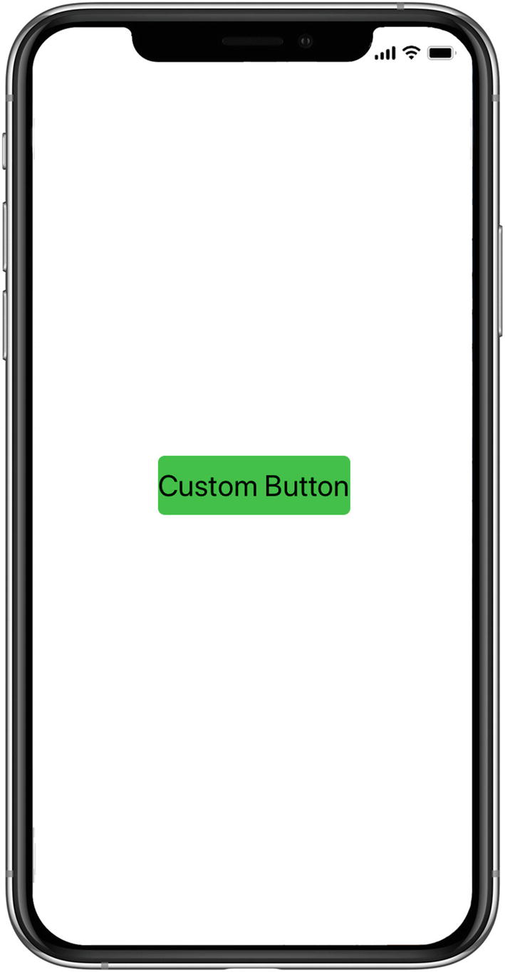
Lime green CustomButton via an Android custom renderer

Tip

Color is close-captioned in this chapter for all of you black-and-white print readers.

CODE COMPLETE: Android Custom Renderer

Listings 8-4, 8-5, 8-6, 8-7, and 8-8 contain the complete code listing for the Android custom button renderer. Listing 8-4, CustomButton.xaml; Listing 8-5, CustomButton.xaml.cs; Listing 8-6, CustomRendererExamplePage.xaml; and Listing 8-7 are in the Xamarin.Forms project, and Listing 8-8, CustomButtonRenderer.cs, is from the Droid project in the same solution, CustomRendererExample.
    <?xml version="1.0" encoding="UTF-8"?>
    <Button FontSize="Large" HorizontalOptions="Center" VerticalOptions="Fill"
    x:Class="CustomRendererExample.CustomButton"/>
Listing 8-4

CustomButton.xaml (in the Forms Project)

    using Xamarin.Forms;
    namespace CustomRendererExample {
        public partial class CustomButton : Button {
            public CustomButton()
            {
                InitializeComponent();
            }
        }
    }
Listing 8-5

CustomButton Code Behind in CustomButton.xaml.cs (in the Forms Project)

    <ContentPage xmlns:="http://xamarin.com/schemas/2014/forms"
    xmlns:x="http://schemas.microsoft.com/winfx/2009/xaml"
    xmlns:local="clr-namespace:CustomRendererExample"
    x:Class="CustomRendererExample.CustomRendererExamplePage">
        <StackLayout VerticalOptions="Center">
            <local:CustomButton Text="Custom Button" Clicked="ButtonClicked" />
        </StackLayout>
    </ContentPage>
Listing 8-6

Use the CustomButton in CustomRendererExamplePage.xaml (in the Forms Project)

    using Xamarin.Forms
    namespace mynamespace {
    public partial class MainPage : ContentPage {
        public XAMLBookPage() {
            InitializeComponent();
        }
        void Handle_Clicked(object sender, EventArgs e) {
            DisplayAlert("Congratulations",
                  "This button was rendered in a platform-specific class.", "OK");
        }
    }
}
Listing 8-7

Use the CustomButton in CustomRendererExamplePage.xaml (in the Forms Project)

    using Xamarin.Forms.Platform.Android;
    using Xamarin.Forms;
    using CustomRendererExample;
    using CustomRendererExample.Droid;
    using Android.Content;
    [assembly: ExportRenderer (typeof (CustomButton), typeof
    (CustomButtonRenderer))]
    namespace CustomRendererExample.Droid {
        public class CustomButtonRenderer : ButtonRenderer {
            public CustomButtonRenderer(Context context) : base(context) {
                AutoPackage = false;
            }
            protected override void OnElementChanged
            (ElementChangedEventArgs<Button> e) {
                base.OnElementChanged (e);
                if (Control != null) {
                    Control.SetBackgroundColor (global::Android.Graphics.Color.LimeGreen);
                }
            }
        }
    }
Listing 8-8

CustomButtonRenderer.cs (Droid Project)

Now we’ll do a green button in iOS.

iOS Custom Renderer

Creating an iOS renderer for the Button view is similar to making the Android one. Create a custom renderer that inherits from a standard renderer, such as ButtonRenderer. Then call into the native view’s platform-specific API to customize it using the renderer’s Control property. In OnElementChanged, you’ll assign your Control's background color property.

Begin with the first platform-specific step.
  1. 1.

    Create a custom renderer. Create CustomButtonRenderer.cs as a class in the iOS project. Inherit from the ButtonRenderer class and modify the Control property to affect your button as needed. The platform-specific view is assigned to the Control property, in this case an iOS UIButton control , and its native properties and methods are available. Listing 8-9 shows an iOS renderer where the background color is set using the UIButton's BackgroundColor property.

     
    public class CustomButtonRenderer : ButtonRenderer {
         protected override void OnElementChanged
         (ElementChangedEventArgs<Button> e) {
                base.OnElementChanged (e);
                if (Control != null) {
                    Control.BackgroundColor = UIColor.FromRGB(50,205,50);
                }
           }
      }
Listing 8-9

Customized ButtonRenderer in CustomButtonRenderer.cs (iOS Project)

Next, do the final two steps. In order to make the custom renderer visible to the Xamarin.Forms project, you need to add an attribute on the class and the two using statements.
  1. 2.
    Add [assembly] . Add the [assembly] attribute outside of the namespace declaration to declare the new renderer.
        [assembly: ExportRenderer (typeof (CustomButton), typeof (CustomButtonRenderer))]
     
  2. 3.
    Add using statements to the renderer class so that the renderer types are resolved.
        using Xamarin.Forms.Platform.iOS;
        using Xamarin.Forms;
        using UIKit;
        using CustomRenderer;
        using CustomRenderer.iOS;
     
Figure 8-2 displays the result: another lime green button, using a custom renderer with the current version of Xamarin.Forms.
../images/394196_1_En_8_Chapter/394196_1_En_8_Fig2_HTML.jpg
Figure 8-2

Lime green CustomButton via an iOS custom renderer

CODE COMPLETE: iOS Custom Renderer

Listing 8-10 shows the complete code listing for the iOS custom button renderer, which goes in the iOS project in the solution, CustomRendererExample.
    using Xamarin.Forms.Platform.iOS;
    using Xamarin.Forms;
    using UIKit;
    using CustomRendererExample;
    using CustomRendererExample.iOS;
    [assembly: ExportRenderer (typeof (CustomButton), typeof
    (CustomButtonRenderer))]
    namespace CustomRendererExample.iOS {
        public class CustomButtonRenderer : ButtonRenderer {
            protected override void OnElementChanged
            (ElementChangedEventArgs<Button> e) {
                base.OnElementChanged (e);
                if (Control != null) {
                    Control.BackgroundColor = UIColor.Brown;
                }
            }
        }
    }
Listing 8-10

CustomButtonRenderer.cs for the iOS Project

That’s how to build a custom renderer on both mobile platforms!

The first trick in building a custom renderer is figuring out what the renderer is called and the native element name. Here’s a quick guide to help with that.

Which Renderer and View Do You Customize?

Table 8-1 shows most of the Xamarin.Forms elements covered in this book, their renderers, and their platform-specific equivalents that can be customized.
Table 8-1

Elements, Their Renderers, and Platform-Specific Elements

Xamarin.Forms

Renderer

Android

iOS

Chapter 1 : Views


ContentPage

PageRenderer

ViewGroup

UIViewController

Label

LabelRenderer

TextView

UILabel

Button

ButtonRenderer

Button

UIButton

Entry

EntryRenderer

EditText

UITextField

Image

ImageRenderer

ImageView

UIImageView

BoxView

BoxRenderer

ViewGroup

UIView

ScrollView

ScrollViewRenderer

ScrollView

UIScrollView

ActivityInidcator

ActivityIndicatorRenderer

ProgressBar

UIActivityIndicator

SearchBar

SearchBarRenderer

SearchView

UISearchBar

Map

MapRenderer

MapView

MKMapView

WebView

WebViewRenderer

WebView

UIWebView

Chapter 3 : Layouts


StackLayout

ViewRenderer

View

UIView

RelativeLayout

ViewRenderer

View

UIView

AbsoluteLayout

ViewRenderer

View

UIView

Grid

ViewRenderer

View

UIView

ContentView

ViewRenderer

View

UIView

Frame

FrameRenderer

ViewGroup

UIView

Chapter 4


Editor

EditorRenderer

EditText

UITextView

Chapter 5 : Controls


Picker

PickerRenderer

TextView, AlertDialog, NumberPicker

EditText

UIPickerView, UIPickerViewModel, UIToolBar, UIBarButtonItems, UITextField

DatePicker

DatePickerRenderer

TextView, AlertDialog

UIDatePicker, UIToolbar, UITextField, UIBarButtonItems

TimePicker

TimePickerRenderer

TextView, AlertDialog

EditText

UIDatePicker, UIToolbar, UITextField, UIBarButtonItems

Stepper

StepperRenderer

LinearLayout, Button

UIStepper

Slider

SliderRenderer

SeekBar

UISlider

Switch

SwitchRenderer

Switch

UISwitch

TemplatedPage

PageRenderer

ViewGroup

UIViewController

TemplatedView

ViewRenderer

View

UIView

ContentPresenter

ViewRenderer

View

UIView

Chapter 6 : Lists


ListView

ListViewRenderer

ListView

UITableView

TextCell

TextCellRenderer

LinearLayout, TextView, ImageView

UITableViewCell

EntryCell

EntryCellRenderer

LinearLayout, TextView, EditText

UITableViewCell, UITextField

ViewCell

ViewCellRenderer

View

UITableViewCell

SwitchCell

SwitchCellRenderer

Switch

UITableViewCell, UISwitch

ImageCell

ImageCellRenderer

LinearLayout,

TextView, ImageView

UITableViewCell, UIImage

Chapter 7 : Navigation


NavigationPage

NavigationRenderer

ViewGroup

UINavigationController, UIToolbar

MasterDetailPage

MasterDetailRenderer, PhoneMasterDetailRenderer (iPhone)

TabletMasterDetailRenderer(iPad)

DrawerLayout

UIViewController(iPhone), UISplitViewController(iPad)

TableView

TableViewRenderer

ListView

UITableView

TabbedPage

TabbedRenderer

ViewPager

UIView

CarouselPage

CarouselPageRenderer

ViewPager

UIScrollView

That should be sufficient to get you started with custom renderers. Now that you’ve seen the complete implementation of a renderer, it’s time for a subtler approach.

Effects

What do you do when Xamarin.Forms view you want to use is just shy of perfect? If you could just change one or two properties or its behavior, the view would meet your requirements. This is where effects come into play.

Effects allow access to the platform-specific control and container Xamarin.Forms uses to access the Xamarin.Android or Xamarin.iOS layer. Effects can be added to any page, layout, and view in Xamarin.Forms. Effects offer a reusable and lightweight approach to extend the capability of a Xamarin.Forms view compared to a custom renderer. Use effects if you only need to change a small number of the properties or behaviors of the underlying platform-specific control that Xamarin.Forms uses.

Tip

Fast renderers on view have increased performance over containers. Fast renderers are available only for certain controls on certain platforms (e.g., Button, Image, Label on Android, and more every release).

An effect is created by deriving from PlatformEffect in each platform-specific project to access the native control and then registering the effect with a unique identifier and organization-wide name. To use the effect, subclass the RoutingEffect in the shared project, resolving the effect by the organization-wide name and identifier. All Xamarin.Forms views have an Effects member that accepts one or more effects. Use the Effects property in XAML to add an effect.

Creating and Using Effects

An Effect gives access to the native control and container used by the Xamarin.Forms view through the platform-specific PlatformEffect class. The cross-platform RoutingEffect class is used to resolve the platform-specific effect in the Forms project. Both classes need to be subclassed to create and use an effect.

Creating an effect is simpler than creating a custom renderer primarily because you don’t have to determine and implement the native renderer. There is only one class PlatformEffect that gives direct access to a generic Container, Control, and the Xamarin.Forms Element. This simplicity comes with a greater responsibility. The developer needs to ensure that an effect is not accidentally added to a view that the effect does not support.

PlatformEffect

PlatformEffect gives direct access to the native control, its container, and the Xamarin.Forms element. Here are the PlatformEffect properties that reference those three classes:
  • Control—references the platform-specific control Xamarin.Forms uses to implement its view

  • Container—references the platform-specific control used to implement the layout

  • Element—references the Xamarin.Forms view itself

Create an effect by subclassing PlatformEffect in each platform-specific project and registering a unique organization-wide namespace using ResolutionGroupName and a unique identifier using ExportEffect assembly attributes, e.g.:
    [assembly: ResolutionGroupName("my.company")]
    [assembly: ExportEffect(typeof(DroidEffect), "MyEffect")]
Override the OnAttached and OnDetached methods as needed for initialization and cleanup:
  • OnAttached —called on initialization of your effect on the Xamarin.Forms view. Use this method to implement your effect.

  • OnDetached —called when the effect is detached from your Xamarin.Forms view for cleanup. This method is used less frequently.

To listen to changes to the bindable properties of the Xamarin.Forms view, override the OnElementPropertyChanged method of PlatformEffect.

Listing 8-11 shows the basic structure of the platform-specific effect.
    public class MyEffect : PlatformEffect
    {
        protected override void OnAttached() { ... }
        protected override void OnDetached() { ... }
        protected override void
        OnElementPropertyChanged(PropertyChangedEventArgs args) { ... }
    }
Listing 8-11

Platform-Specific Effect

RoutingEffect

The RoutingEffect class abstracts from the platform-specific PlatformEffect implementation and is there to resolve the effect in the Forms project by its resolution group name and identifier. Subclass RoutingEffect and provide a default constructor that passes the resolution name group and identifier to the base class to initialize the effect, as shown in Listing 8-12.
    public class MyEffect : RoutingEffect
    {
        public MyEffect() : base("my.company.MyEffect") { }
    }
Listing 8-12

MyEffect RoutingEffect (in the Forms Project)

Routing effects can have auto-implemented properties that can be used in the XAML to parameterize the effect, e.g.,
    public bool MyProperty {get;set;};

Note

Attached properties are often used in the context of customizing Xamarin.Forms views. An attached property is a particular kind of bindable property, coded in XAML as an attribute that contains a class.property. Details in the upcoming section, Adding Effects via Attached Properties.

Using the Effect

To use the effect, first register its namespace in XAML, e.g.:
    xmlns:local="clr-namespace:my.company"
Next you add the effect to the Effects property of the target view, as YourEffect is added to Entry.Effects in Listing 8-13.
    <Entry>
        <Entry.Effects>
            <local:MyEffect MyProperty="some value"/>
        </Entry.Effects>
    </Entry>
Listing 8-13

Applying the Effect to a Xamarin.Forms View (in the Forms Project)

Let’s create an effect that validates the Text entered in an Entry view.

Text Validator Effect

Imagine the following scenario: You want to give visual feedback to a user if the text he or she enters exceeds a maximum length! Wouldn’t it be nice if a Xamarin.Forms Entry would allow this type of validation? Unfortunately, this is not possible out of the box. You can use an effect to implement this behavior.

Let’s create an effect that allows you to validate the length of the text.

Create in your Forms library the TextValidatorEffect class that inherits from RoutingEffect and add an auto-implemented property MaxLength of type int and the default value 5, as shown in Listing 8-14.
    public class TextValidatorEffect : RoutingEffect {
        public int MaxLength {get;set;} = 5;
        public TextValidatorEffect() : base("EffectExample.TextValidatorEffect") { }
    }
Listing 8-14

Custom RoutingEffect (in the Forms Project)

The empty default constructor passes our namespace EffectExample as the resolution group name and the name of the class TextValidatorEffect as the identifier to the base class RoutingEffect.

Create a page called TextValidatorPage.xaml and add the effect namespace to the ContentPage. Define two Entry controls and register the effect with the Effects property of the Entry controls . The first Entry uses the TextValidatorEffect without explicitly setting the MaxLength property , which defaults to 5. The second control sets MaxLength explicitly to 10, as demonstrated in Listing 8-15.
    <Entry Text="Good">
        <Entry.Effects>
            <local:TextValidatorEffect/>
        </Entry.Effects>
    </Entry>
    <Entry Text="Not so good">
        <Entry.Effects>
            <local:TextValidatorEffect MaxLength="10"/>
        </Entry.Effects>
    </Entry>
Listing 8-15

Registering an Effect in XAML (in the Forms Project)

Xamarin.Forms uses EditText in Android and UITextField in iOS as the native control to render an Entry. Both platform-specific views provide the ability to set the background color. Begin with the Android platform, then do iOS.

Android Platform Effect

The Android platform-specific control Android.Widget.EditText has the method SetBackgroundColor that expects an Android.Graphics.Color.

Create in the platform-specific Android project the DroidTextValidatorEffect class that derives from PlatformEffect. Register the effect with the namespace EffectExample using the assembly attribute ResolutionGroupName and export the effect with the identifier TextValidatorEffect. Override the OnAttached and OnDetached methods of PlatformEffect. The OnDetached method can be empty. In the OnAttached method , call a Validate method that we will implement next, as shown in Listing 8-16.
    [assembly: ResolutionGroupName("EffectExample")]
    [assembly: ExportEffect(typeof(DroidTextValidatorEffect), "TextValidatorEffect")]
    namespace EffectExample.Droid {
        public class DroidTextValidatorEffect : PlatformEffect {
            protected override void OnAttached() {
                Validate();
            }
            protected override void OnDetached() {}
        }
    }
Listing 8-16

Android Platform-Specific TextValidatorEffect (in the Droid Project)

Create a private Validate method that casts Element view to Entry and Control to the EditText view, retrieves the TextValidatorEffect effect, and evaluates the length of the Entry.Text property to determine if it exceeded the MaxLength value of the effect and changes the background color of EditText, respectively, as shown in Listing 8-17.
    private void Validate() {
        var entry = Element as Entry;
        var view = Control as EditText;
        var effect = (TextValidatorEffect)Element.Effects.FirstOrDefault(
        e => e is TextValidatorEffect);
        if (entry.Text.Length > effect.MaxLength) {
            view.SetBackgroundColor = Color.Maroon.ToAndroid();
        } else {
            view.SetBackgroundColor = Color.Lime.ToAndroid();
        }
    }
Listing 8-17

Android Platform-Specific TextValidatorEffect (in the Droid Project)

Figure 8-3 shows the text validation effect on Android. The first Entry has a Lime background, and the second has a Maroon background.
../images/394196_1_En_8_Chapter/394196_1_En_8_Fig3_HTML.jpg
Figure 8-3

TextValidatorEffect on Android

Now create the platform-specific IOSTextValidatorEffect for iOS.

iOS Platform Effect

The iOS platform-specific control UIKit.UITextField has the property BackgroundColor that can be set using a UIColor.

Create in the platform-specific iOS project the ITextValidatorEffect class that derives from PlatformEffect. Similarly, register the effect by its namespace and identifier and override the OnAttached and OnDetached methods. The OnDetached method can be empty. In the OnAttached method, call a Validate method, as shown in Listing 8-18.
    [assembly: ResolutionGroupName("EffectExample")]
    [assembly: ExportEffect(typeof(IOSTextValidatorEffect), "TextValidatorEffect")]
    namespace EffectExample.iOS {
        public class IOSTextValidatorEffect : PlatformEffect {
            protected override void OnAttached() {
                Validate();
            }
            protected override void OnDetached() {}
        }
    }
Listing 8-18

iOS Platform-Specific TextValidatorEffect (in the iOS Project)

Create a private Validate method that casts Element view to Entry and Control to the UITextField view, retrieves the TextValidatorEffect effect, and evaluates the length of the Entry.Text property to determine if it exceeded the MaxLength value of the effect and changes the background color of UITextField, respectively, as shown in Listing 8-19.
    private void Validate() {
        var entry = Element as Entry;
        var view = Control as UITextField;
        var effect = (TextValidatorEffect)Element.Effects.FirstOrDefault(
        e => e is TextValidatorEffect);
        if (entry.Text.Length > effect.MaxLength) {
            view.BackgroundColor = Color.Maroon.ToUIColor();
        } else {
            view.BackgroundColor = Color.Lime.ToUIColor();
        }
    }
Listing 8-19

iOS Platform-Specific TextValidatorEffect (in the iOS Project)

Figure 8-4 shows the text validation effect on iOS. The first Entry has a Lime background, and the second has a Maroon background.
../images/394196_1_En_8_Chapter/394196_1_En_8_Fig4_HTML.jpg
Figure 8-4

TextValidatorEffect on iOS

Tip

Attached Behaviors are often used in the context of Effects, removing extra code from code behind files. Details here: https://docs.microsoft.com/en-us/xamarin/xamarin-forms/app-fundamentals/behaviors/reusable/effect-behavior

The effect does not listen to changes to the Text property of Entry and will not re-validate it. Let’s change that.

Handling Events

Effects can override the OnElementPropertyChanged of PlatformEffect to listen to property changes of the Xamarin.Forms Element. This is useful when the effect needs to change the behavior of the native view depending on what has changed.

Let’s listen to what the user is writing in the Entry and re-validate the Text.

The PlatformEffect’s OnElementPropertyChanged method has the argument PropertyChangedEventArgs with the member PropertyName that contains the name of the bindable property of the Xamarin.Forms Element that was changed. Check if the property that has changed is Text and call the Validate method to re-validate the entry, e.g.:
    if (args.PropertyName == "Text") Validate();

The implementation of the OnElementPropertyChanged method is identical for both iOS and Android, shown in Listings 8-22 and 8-23.

Tip

You can also register event handlers for the PlatformEffect's Container and Control members. These are platform-specific and require familiarity with the underlying platform.

CODE COMPLETE: TextValidatorEffect

Listings 8-20, 8-21, 8-22, and 8-23 show the complete code listing for the iOS and Android TextValidatorEffect. Listing 8-20, TextValidatorEffect.cs, and Listing 8-21, TextValidatorPage.xaml, are in the Forms project, and Listing 8-22, DroidTextValidatorEffect.cs, and Listing 8-23, IOSTextValidatorEffect.cs, are in the respective platform-specific Droid and iOS projects of the solution EffectExample.
    using System;
    using Xamarin.Forms;
    namespace EffectExample {
    public class TextValidatorEffect : RoutingEffect {
        public bool IsActive { get; set; } = true;
        public TextValidatorEffect() : base("EffectExample.TextValidatorEffect") { }
    }
}
Listing 8-20

Custom RoutingEffect (in the Forms Project)

    <ContentPage xmlns:="http://xamarin.com/schemas/2014/forms"
    xmlns:x="http://schemas.microsoft.com/winfx/2009/xaml"
    xmlns:local="clr-namespace:EffectExample"
    x:Class="EffectExample.EffectExamplePage">
        <StackLayout Padding="30">
            <Entry Text="Good">
                <Entry.Effects>
                    <local:TextValidatorEffect />
                </Entry.Effects>
            </Entry>
            <Entry Text="Not so good">
                <Entry.Effects>
                    <local:TextValidatorEffect MaxLength="10" />
                </Entry.Effects>
            </Entry>
        </StackLayout>
    </ContentPage>
Listing 8-21

Registering and Using an Effect in XAML (in the Forms Project)

    using System;
    using System.ComponentModel;
    using System.Linq;
    using Android.Text;
    using Android.Widget;
    using EffectExample.Droid;
    using Xamarin.Forms;
    using Xamarin.Forms.Platform.Android;
    [assembly: ResolutionGroupName("EffectExample")]
    [assembly: ExportEffect(typeof(DroidTextValidatorEffect), "TextValidatorEffect")]
    namespace EffectExample.Droid {
        public class DroidTextValidatorEffect : PlatformEffect {
            protected override void OnAttached() {
                Validate();
            }
            protected override void OnDetached() { }
            protected override void
            OnElementPropertyChanged(PropertyChangedEventArgs args) {
                base.OnElementPropertyChanged(args);
                if (args.PropertyName == "Text") Validate();
            }
            private void Validate() {
                var entry = Element as Entry;
                var view = Control as EditText;
                var effect = (TextValidatorEffect)Element.Effects.FirstOrDefault(
                e => e is TextValidatorEffect);
                if (entry.Text.Length > effect.MaxLength) {
                    view.SetBackgroundColor(Color.FromHex("#f9c5c9").ToAndroid());
            } else {
                view.SetBackgroundColor(Color.FromHex("#c5f9e1").ToAndroid());
            }
        }
    }
Listing 8-22

Android Platform-Specific TextValidatorEffect (in the Droid Project)

    using System;
    using System.ComponentModel;
    using System.Linq;
    using EffectExample.iOS;
    using UIKit;
    using Xamarin.Forms;
    using Xamarin.Forms.Platform.iOS;
    [assembly: ResolutionGroupName("EffectExample")]
    [assembly: ExportEffect(typeof(IOSTextValidatorEffect), "TextValidatorEffect")]
    namespace EffectExample.iOS {
        public class IOSTextValidatorEffect : PlatformEffect {
            protected override void OnAttached() {
                Validate();
            }
            protected override void OnDetached() {}
            protected override void
            OnElementPropertyChanged(PropertyChangedEventArgs args) {
                base.OnElementPropertyChanged(args);
                if (args.PropertyName == "Text") Validate();
            }
            private void Validate() {
                var entry = Element as Entry;
                var view = Control as UITextField;
                var effect = (TextValidatorEffect)Element.Effects.FirstOrDefault(
                e => e is TextValidatorEffect);
                if (entry.Text.Length > effect.MaxLength) {
                    view.BackgroundColor = Color.FromHex("#f9c5c9").ToUIColor();
            } else {
                view.BackgroundColor = Color.FromHex("#c5f9e1").ToUIColor();
            }
        }
    }
Listing 8-23

iOS Platform-Specific TextValidatorEffect (in the iOS Project)

You can pass an effect as an attached property instead of adding it in XAML using the view’s Effects property. Let’s see how.

Adding Effects via Attached Properties

Chapter 5 explained the concept of attached properties. Attached properties allow you to associate properties to elements that do not have the property defined themselves. Attached properties can also be used as wrappers to assign triggers, commands, behaviors, and effects programmatically through C# instead of using XAML. Currently, assigning an effect to a view is a multiline process, as shown in Listing 8-24.
    <Entry Text="Not so good">
        <Entry.Effects>
            <local:TextValidatorEffect MaxLength="10" />
        </Entry.Effects>
    </Entry>
Listing 8-24

Adding an Effect Using the Effects Property (in the Forms Project)

Create a new static class called TextValidatorEffect2 with a bindable attached property called MaxLengthProperty and its static accessor methods GetMaxLength and SetMaxLength, as shown in Listing 8-25.
    public class TextValidatorEffect2 {
        public static readonly BindableProperty MaxLengthProperty =
        BindableProperty.CreateAttached("MaxLength", typeof(int),
        typeof(TextValidatorEffect2), 5, propertyChanged: ValidatorChanged);
        public static int GetMaxLength(BindableObject view) {
            return (int)view.GetValue(MaxLengthProperty);
        }
        public static void SetMaxLength(BindableObject view, int value) {
            view.SetValue(MaxLengthProperty, value);
        }
    }
Listing 8-25

Static Class with Attached Property (in the Forms Project)

Add a MaxLengthPropertyChanged method that is fired when the MaxLength property is attached to a view or is changed. Check if the view is not null. Remove any existing TextValidatorEffect, and then add a new one to ensure that MaxLength property has the most recent value, as shown in Listing 8-26.
    private static void MaxLengthPropertyChanged(BindableObject bindable,
    object oldValue, object newValue) {
        var view = bindable as View;
        if (view == null) return;
        var effect = view.Effects.FirstOrDefault(e => e is TextValidatorEffect);
        if (effect != null) {
            view.Effects.Remove(effect);
        } else {
            effect = new TextValidatorEffect {MaxLength = GetMaxLength(view)};
            view.Effects.Add(effect);
        }
    }
Listing 8-26

MaxLengthPropertyChanged Method (in the Forms Project)

Internally, the previously defined routing effect TextValidatorEffect is used, which references the platform-specific implementation at runtime.

Create a new page called UsingAttachedPropertyPage.xaml, add the local namespace, and assign the effect to an Entry view, as shown in Listing 8-27.
<ContentPage xmlns:local="clr-namespace:EffectExample" ...>
        <Entry Text="Looks Good" local:TextValidatorEffect2.MaxLength="10"/>
</ContentPage>
Listing 8-27

MaxLengthPropertyChanged Method (in the Forms Project)

Tip

Attached properties can also be used to attach commands, behaviors, triggers, and other functionality to XAML elements.

This covers the building blocks to create cross-platform effects for Xamarin.Forms controls. Up until now the platform-specific (sometimes we call these “native”) control’s role was behind the scenes, either encapsulated within the custom renderer or concealed by an effect. The final section of this chapter will present native controls as the headliner on the Xamarin.Forms XAML stage.

Native Views

Native views give you the power of platform-specific controls such as those found in Xamarin.iOS and Xamarin.Android directly within your XAML.

Custom renderers and effects leave the plumbing to Xamarin.Forms, which provides over 40 cross-platform visual elements and views and takes care of the mapping to platform-specific controls using custom renderers. The last topic in this chapter shows you how to use native (platform-specific) controls directly in a XAML page and handling their details manually, such as instantiating them and setting their properties.

Note

Using native views will quickly become advanced as you will find yourself having to take care of all aspects of the controls. This technique requires knowledge of the platform-specific APIs, Xamarin.iOS and Xamarin.Android.

Adding native views to your XAML file is easy. As with any other C# class, you need to declare the namespace in the root element of your XAML file, and you are ready to declare the class in your XAML. For native views this process is called Native View Declaration .

Create a XAML page called NativeViewsPage.xaml.

Next, declare all the namespaces that are intended to be used in the root element of the page. For a page that is supposed to work both on iOS and Android, these are the namespaces UIKit for iOS and Android.Widget and Xamarin.Forms for Android, as shown in Listing 8-28.
    xmlns:ios="clr-namespace:UIKit;assembly=Xamarin.iOS;targetPlatform=iOS"
    xmlns:droid="clr-namespace:Android.Widget;assembly=Mono.Android;
    targetPlatform=Android"
    xmlns:formsdroid="clr-namespace:Xamarin.Forms;
    assembly=Xamarin.Forms.Platform.Android;targetPlatform=Android"
    x:Class="NativeViewsExample.NativeViewsPage">
Listing 8-28

Registering the Namespaces for Native Views in XAML (in the Forms Project)

The xmlns declaration accepts the directive targetPlatform followed by the name of the platform Android or iOS. This tells XAML parser to ignore any namespace declaration not relevant for the platform the application is currently running on. This is very nice, because it allows you to create one XAML file for all platforms.

Add the iOS UITextField view to the XAML, e.g.:
    <ios:UITextField Text="iOS UITextField"/>
Figure 8-5 shows the iOS result.
../images/394196_1_En_8_Chapter/394196_1_En_8_Fig5_HTML.jpg
Figure 8-5

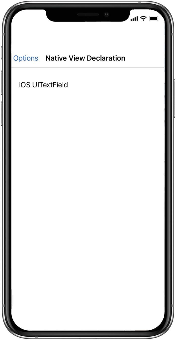
Native View Declaration on iOS

Most Android.Widget views require that you pass in the Activity within which they are used as their Android Context in the constructor. Xamarin.Forms provides the Forms.Context member that represents the Activity. Use the XAML directive x:Arguments to pass required parameters.

Add the Android EditText view to the XAML, e.g.:
    <droid:EditText Text="Android EditText" x:Arguments="{x:Static
    formsdroid:Forms.Context}"/>
Figure 8-6 shows the result for Android.
../images/394196_1_En_8_Chapter/394196_1_En_8_Fig6_HTML.jpg
Figure 8-6

Native View Declaration on Android

CODE COMPLETE: Native View Declaration

Listing 8-29 shows the complete XAML listing for declaring native views in the NativeViewsPage.xaml in the solution NativeViewsExample.
    <ContentPage Title="Native View Declaration"
    xmlns:="http://xamarin.com/schemas/2014/forms"
    xmlns:x="http://schemas.microsoft.com/winfx/2009/xaml"
    xmlns:ios="clr-namespace:UIKit;assembly=Xamarin.iOS;targetPlatform=iOS"
    xmlns:droid="clr-namespace:Android.Widget;assembly=Mono.Android;
    targetPlatform=Android"
    xmlns:formsdroid="clr-
    namespace:Xamarin.Forms;assembly=Xamarin.Forms.Platform.Android;
    targetPlatform=Android"
    x:Class="NativeViewsExample.NativeViewsPage">
        <ios:UITextField Text="iOS UITextField"/>
        <droid:EditText Text="Android EditText"
        x:Arguments="{x:Static formsdroid:Forms.Context}"/>
    </ContentPage>
Listing 8-29

Native View Declaration (in the Forms Project)

Tip

There are some limitations to consider when working with native views. You cannot use the Style element because the properties of the native view are not bindable properties, and you cannot use the x:Name directive. If you want to reference them in your code behind, create a custom control as a wrapper using ContentView that has a name.

In Listing 8-29, a non-default constructor for the Android EditText view was used to pass the Context as an argument to its constructor using the x:Static markup extension, that is:
    <droid:EditText x:Arguments="{x:Static formsdroid:Forms.Context}"/>

Properties of native views often require instances of other native classes that may require a factory method to construct the object. Let’s use some factory methods to assign properties to a native view next.

Using Factory Methods

Some native classes have in addition to default constructors and non-default constructors factory methods for instantiation. In Chapter 2, you learned to instantiate objects using factory methods and the x:Arguments keyword in the XAML syntax to pass the arguments.

Create a new XAML page called FactoryMethodsPage.xaml.

Both EditText in Android and UITextField on iOS have factory methods that specify a platform-specific font. In iOS the UIFont class is used to specify a font. In Android the TypeFace class is used. Listing 8-30 and 8-31 extend the example provided in Listing 8-29 to specify fonts for the UITextField and EditText views.

UIFont has the static factory method FromName that expects two arguments, the name of the font as a string and the font size as a single, that is:
    <x:Arguments><x:String>Papyrus</x:String><x:Single>24</x:Single></x:Arguments>
Declare a UITextField with the font Papyrus and the size 24, as shown in Listing 8-30.
    <ios:UITextField>
        <ios:UITextField.Font>
            <ios:UIFont x:FactoryMethod="FromName">
                <x:Arguments>
                    <x:String>Papyrus</x:String>
                    <x:Single>24</x:Single>
                </x:Arguments>
            </ios:UIFont>
        </ios:UITextField.Font>
    </ios:UITextField>
Listing 8-30

Passing Arguments to Native Views (in the Forms Project)

In Android, the Typeface property of EditText expects an Android.Graphics.TypeFace object. Likewise, the factory method Create of TypeFace can be used to create an object by passing in a string argument with the font family name as well as providing the name of the enumeration value of TypefaceStyle. The arguments for a Serif font with an Italic font style are:
    <x:Arguments><x:String>Serif</x:String>
        <androidGraphics:TypefaceStyle>Italic</androidGraphics:TypefaceStyle>
    </x:Arguments>
To use TypeFace in the XAML, add the namepace Android.Graphics to the page, e.g.:
    xmlns:androidGraphics="clr-namespace:Android.Graphics;assembly=Mono.Android;
    targetPlatform=Android"
Define an EditText with the size 24, a Serif font with an Italic font style, as shown in Listing 8-31.
    <droid:EditText TextSize="24">
        <droid:EditText.Typeface>
            <androidGraphics:Typeface x:FactoryMethod="Create">
                <x:Arguments>
                    <x:String>Serif</x:String>
                    <androidGraphics:TypefaceStyle>Italic</androidGraphics:TypefaceStyle>
                </x:Arguments>
            </androidGraphics:Typeface>
        </droid:EditText.Typeface>
    </droid:EditText>
Listing 8-31

Passing Arguments to Native Views (in the Forms Project)

Figure 8-7 shows the result for both platforms.
../images/394196_1_En_8_Chapter/394196_1_En_8_Fig7_HTML.jpg
Figure 8-7

Using Factory Methods

CODE COMPLETE: Non-Default Constructors and Factory Methods

Listing 8-32 shows the complete XAML listing for declaring native views in the FactorMethodsPage.xaml in the solution NativeViewsExample.
    <ContentPage Title="Using Factory Methods"
    xmlns:="http://xamarin.com/schemas/2014/forms"
    xmlns:x="http://schemas.microsoft.com/winfx/2009/xaml"
    xmlns:ios="clr-namespace:UIKit;assembly=Xamarin.iOS;targetPlatform=iOS"
    xmlns:droid="clr-namespace:Android.Widget;assembly=Mono.Android;
    targetPlatform=Android"
    xmlns:androidGraphics="clr-namespace:Android.Graphics;
    assembly=Mono.Android;targetPlatform=Android"
    xmlns:formdroid="clr-namespace:Xamarin.Forms;
    assembly=Xamarin.Forms.Platform.Android;
    targetPlatform=Android"
    x:Class="NativeViewsExample.FactoryMethodsPage">
    <StackLayout Padding="30">
        <ios:UITextField Text="Papyrus Font">
            <ios:UITextField.Font>
                <ios:UIFont x:FactoryMethod="FromName">
                    <x:Arguments>
                        <x:String>Papyrus</x:String>
                        <x:Single>24</x:Single>
                    </x:Arguments>
                </ios:UIFont>
            </ios:UITextField.Font>
        </ios:UITextField>
        <droid:EditText x:Arguments="{x:Static formdroid:Forms.Context}"
        Text="Serif Font" TextSize="24">
            <droid:EditText.Typeface>
                <androidGraphics:Typeface x:FactoryMethod="Create">
                    <x:Arguments>
                        <x:String>Serif</x:String>
                            <androidGraphics:TypefaceStyle>Italic
                            </androidGraphics:TypefaceStyle>
                        </x:Arguments>
                    </androidGraphics:Typeface>
                </droid:EditText.Typeface>
            </droid:EditText>
        </StackLayout>
    </ContentPage>
Listing 8-32

Passing Arguments to Native Views (in the Forms Project)

This covers the basics of declaring native views. Refer to Chapter 9 to create user interfaces that use data bindings to allow native views and Xamarin.Forms views to interact in harmony.

Summary

Custom renderers, effects, and native views complete the Xamarin.Forms picture, extending the reach of Xamarin.Forms deep into the platform-specific APIs using Xamarin.iOS and Xamarin.Android. The Xamarin.Forms abstraction provides immeasurable value as a cross-platform tool, but the platforms differ, and developers need a way to bridge the gap. These platform-specific techniques, custom renderer, effects, and native views are that bridge.

Now it’s time for the foundation beneath all of our UI technique: the data. Let’s explore data access and data binding in depth.

..................Content has been hidden....................

You can't read the all page of ebook, please click here login for view all page.
Reset
3.129.247.196