Chapter 2. Basic iPhone Styling
Ultimately, we are going to build a native iPhone app using HTML, CSS, and JavaScript. The first step on this journey is to get comfortable styling HTML to look like an iPhone app. In this chapter, I’ll show you how to apply CSS styles to a bunch of existing HTML pages so that they are easily navigable on an iPhone. So, in addition to moving closer to building a native app, you’ll be learning a practical (and valuable) skill that you can use immediately.
First Steps
Theory is great, but I’m a “show me, don’t tell me” kinda guy. So let’s dive in.
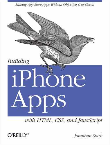
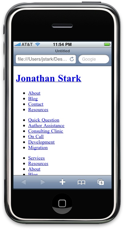
Imagine that you have a website that you want to iPhone-ize (Figure 2-1). In this scenario, there are a number of easy things you can do to optimize a site for the iPhone. I’ll go over your options in this chapter.
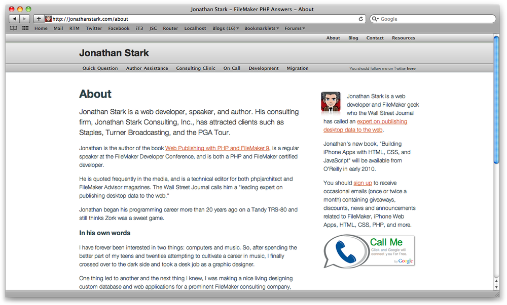
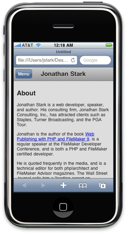
Figure 2-2 shows what the same web page looks like on the iPhone. It’s usable, but far from optimized for the iPhone.
Example 2-1 shows an abbreviated version of the HTML for the web page shown in Figure 2-1. This is the HTML you’ll be working with in this chapter. You can download it from the book’s website (see How to Contact Us) if you’d like to try styling it as you go through the chapter. The desktop stylesheet (screen.css) is not shown, as it is not essential, but you can use the stylesheet from the previous chapter if you’d like to have something to play with.
<html>
<head>
  <link rel="stylesheet" href="screen.css" type="text/css" />
  <title>Jonathan Stark</title>
</head>
<body>
<div id="container">
  <div id="header">
    <h1><a href="./">Jonathan Stark</a></h1>
    <div id="utility">
        <ul>
            <li><a href="about.html">About</a></li>
            <li><a href="blog.html">Blog</a></li>
        </ul>
    </div>
    <div id="nav">
        <ul>
            <li><a href="consulting-clinic.html">Consulting Clinic</a></li>
            <li><a href="on-call.html">On Call</a></li>
            <li><a href="development.html">Development</a></li>
        </ul>
    </div>
  </div>
  <div id="content">
    <h2>About</h2>
    <p>Jonathan Stark is a web developer, speaker, and author. His
       consulting firm, Jonathan Stark Consulting, Inc., has attracted
       clients such as Staples, Turner Broadcasting, and the PGA Tour.
       ...
       </p>
  </div>
  <div id="sidebar">
    <img alt="Manga Portrait of Jonathan Stark"
         src="images/manga.png">
    <p>Jonathan Stark is a mobile and web application developer who the
       Wall Street Journal has called an expert on publishing desktop
       data to the web.</p>
  </div>
  <div id="footer">
    <ul>
        <li><a href="services.html">Services</a></li>
        <li><a href="about.html">About</a></li>
        <li><a href="blog.html">Blog</a></li>
    </ul>
    <p class="subtle">Jonathan Stark Consulting, Inc.</p>
  </div>
</div>
</body>
</html>
Tip
For years, web developers used tables to
lay out elements in a grid. Advances in CSS and HTML have rendered
that approach not only obsolete, but undesirable. Today, we primarily
use the div element (along with a
variety of attributes) to accomplish the same thing, but with more
control. Although a complete explanation of div-based layouts is well beyond the scope
of this book, you’ll see plenty of examples of it as you read through
the chapters. To learn more, check out Designing with Web
Standards by Jeffrey Zeldman (New Riders Press), which
covers the issue in greater detail.
Preparing a Separate iPhone Stylesheet
I’m as DRY as the next guy, but in the real world you’re better off making a clean break between your desktop browser stylesheet and your iPhone stylesheet. Take my word for it and make two completely independent files—you’ll sleep better. The alternative would be to wedge all of your CSS rules into a single stylesheet, which ends up being a bad idea for a number of reasons; the most obvious is that you’d be sending a bunch of irrelevant desktop style rules to the phone, which is a waste of precious bandwidth and memory.
Note
DRY stands for “Don’t Repeat Yourself,” and is a software development principle stating that “Every piece of knowledge must have a single, unambiguous, authoritative representation within a system.” The term was coined by Andrew Hunt and David Thomas in their book The Pragmatic Programmer (Addison-Wesley).
To specify a stylesheet for the iPhone, replace the stylesheet link tag in the sample HTML document with ones that use the following expressions:
<link rel="stylesheet" type="text/css"
      href="iphone.css" media="only screen and (max-width: 480px)" />
<link rel="stylesheet" type="text/css"
      href="desktop.css" media="screen and (min-width: 481px)" />
Here, desktop.css refers to whatever your existing desktop stylesheet is, and iphone.css is a new file that we’ll be discussing in detail in a bit.
Note
If you’re following along using the sample HTML document shown earlier, you’ll now need to rename screen.css to desktop.css; however, since we’re focused on the iPhone stylesheet, you can ignore the desktop stylesheet completely. If it fails to load, your browser won’t get too upset.
Regrettably, Internet Explorer will not understand the previous expressions, so we have to add a conditional comment (shown in bold) that links to an IE-specific version of the CSS:
<link rel="stylesheet" type="text/css"
      href="iphone.css" media="only screen and (max-width: 480px)" />
<link rel="stylesheet" type="text/css"
      href="desktop.css" media="screen and (min-width: 481px)" />
<!--[if IE]>
<link rel="stylesheet" type="text/css" href="explorer.css" media="all" />
<![endif]-->
So now it’s time to edit the HTML document:
delete the existing link to the screen.css file and replace it with the
lines just shown. This way, you will have a clean slate for the
iPhone-specific CSS that I’ll show you in this chapter.
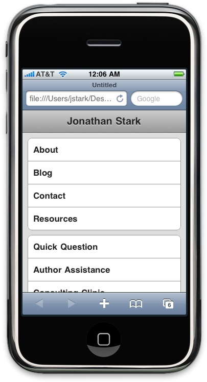
Controlling the Page Scaling
Unless you tell it otherwise, Safari on the iPhone is going to assume that your page is 980px
wide (Figure 2-3). In the majority of cases,
this works great. However, you are going to format our content
specifically for the smaller dimensions of the iPhone, so you must let
Mobile Safari know about it by adding a viewport meta tag to the head element of the HTML
document:
<meta name="viewport" content="user-scalable=no, width=device-width" />
If you don’t set the viewport width, the page will be zoomed way out when it first loads.
Note
The viewport meta tag will be ignored by browsers other than Mobile Safari, so you can include it without worrying about the desktop version of your site.
Merely by suppressing the desktop stylesheet and configuring your viewport, you are already giving your iPhone users an enhanced experience (Figure 2-4). To really impress them, let’s start building the iphone.css stylesheet.
Adding the iPhone CSS
There are a number of user interface (UI) conventions that make an iPhone app look like an iPhone app. In the next section, I’ll add the distinctive title bar, lists with rounded corners, finger-friendly links that look like glossy buttons, and so on. Using your text editor, create a file named iphone.css, add the code in Example 2-2, and save the file in the same directory as your HTML document.
Tip
Note that I have set the overall font for the document to Helvetica, which is the font used by most of the applications on the iPhone. If you are trying to achieve a professional look, you should probably stick with Helvetica unless you have a specific reason not to.
Now I’ll attack the header div that contains the main home link (i.e.,
the logo link) and the primary and secondary site navigation. The first
step is to format the logo link as a clickable title bar. Add the
following to the iphone.css
file:
#header h1 {
    margin: 0;
    padding: 0;
}
#header h1 a {
    background-color: #ccc;
    border-bottom: 1px solid #666;
    color: #222;
    display: block;
    font-size: 20px;
    font-weight: bold;
    padding: 10px 0;
    text-align: center;
    text-decoration: none;
}
I’m going to format
the primary and secondary navigation ul blocks identically,
so I can just use the generic tag selectors (i.e., #header
ul) as opposed to the tag ids
(i.e., #header ul#utility, #header ul#nav):
#header ul {
list-style: none;
margin: 10px;
padding: 0;
}
#header ul li a {
background-color: #FFFFFF;
border: 1px solid #999999;
color: #222222;
display: block;
font-size: 17px;
font-weight: bold;
margin-bottom: -1px;
padding: 12px 10px;
text-decoration: none;
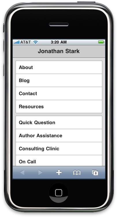
}Pretty simple so far, right? With this little
bit of CSS, we have already made a big improvement on the iPhone page
design (Figure 2-5). Next, add some padding to
the content and sidebar divs to
indent the text from the edge of the screen a bit (Figure 2-6):
#content, #sidebar {
    padding: 10px;
}
Tip
You might be wondering why I added padding to the content and sidebar elements instead of setting it globally on the body element itself. The reason is that it’s very common to have elements that you want to have displayed edge to edge (as with the header in this example). Because of this, padding applied to the body or some other global wrapper element can become more trouble than it’s worth.
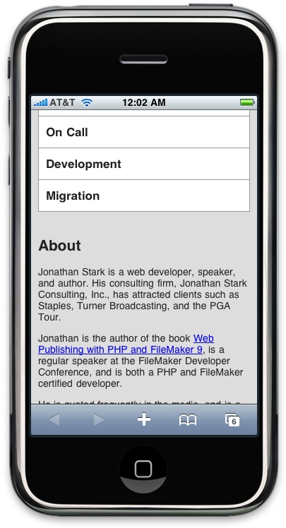
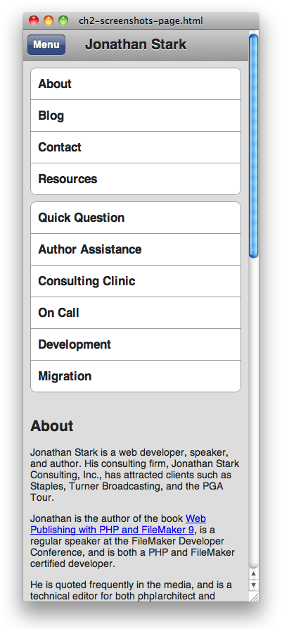
The content in the footer of this page is
basically a rehash of the navigation element at the top of the page (the
ul element with the id nav), so you can remove
the footer from the iPhone version of the page by setting the display to
none:
#footer {
    display: none;
}
Adding the iPhone Look and Feel
Now it’s time to get a little fancier. Starting from the top of the page, add a 1-pixel white drop shadow to the logo link text, and a CSS gradient to the background:
#header h1 a {
    text-shadow: 0px 1px 0px #fff;
    background-image: -webkit-gradient(linear, left top, left bottom,
                                       from(#ccc), to(#999));
}
In the text-shadow
declaration, the parameters from left to right are horizontal offset,
vertical offset, blur, and color. Most of the time, you’ll be applying
the exact values shown here to your text because that’s what usually
looks good on the iPhone, but it is fun to experiment with text-shadow because it can add a subtle but
sophisticated touch to your design.
The -webkit-gradient line
deserves special attention. It’s an instruction to the
browser to generate a gradient image on the fly. Therefore, a CSS
gradient can be used anywhere you would normally specify a
url() (e.g., background image, list style image). The
parameters from left to right are as follows: the gradient type (can be
linear or radial), the starting point of the gradient (can be left top,
left bottom, right top, or right bottom), the end point of the gradient,
the starting color, and the ending color.
Tip
Note that you cannot reverse the horizontal and vertical portions of the four gradient start and stop point constants (i.e., left top, left bottom, right top, and right bottom). In other words, top left, bottom left, top right, and bottom right are invalid values.
The next step is to add the traditional rounded corners to the navigation menus:
#header ul li:first-child a {
    -webkit-border-top-left-radius: 8px;
    -webkit-border-top-right-radius: 8px;
}
#header ul li:last-child a {
    -webkit-border-bottom-left-radius: 8px;
    -webkit-border-bottom-right-radius: 8px;
}
As you can see, I’m using corner-specific
versions of the -webkit-border-radius property to apply an 8-pixel radius to both the top two
corners of the first list item, and the bottom two corners of the last
list item (Figure 2-7).
It would be cool if you could just apply the
border radius to the enclosing ul, but it doesn’t work. If
you try it, you’ll see that the square corners of the child list items
will overflow the rounded corners of the ul, thereby
negating the effect.
Note
Technically, I could achieve the rounded
list effect by applying the radius corners to the ul if I
set the background color of the ul to white and the
background of its child elements to transparent. However, when you
click the first or last item in the list, the tap highlight will show
up squared off and it looks terrible. Your best bet is to apply the
rounding to the tags themselves as I’ve demonstrated here.
Adding Basic Behavior with jQuery
One of my favorite things about building web apps for the iPhone is that I can be reasonably sure that JavaScript is enabled. Regrettably, this is not the situation when building websites for desktop browsers. My next step is to add some JavaScript to my page to support some basic dynamic behavior. In particular, I want to allow users to show and hide the big honking navigation section in the header so that they only see it when they want to. In order to make this work, I’m going to write some new CSS, and use some JavaScript to apply the new CSS to the existing HTML.
First, let’s take a look at the new CSS. Step
one is to hide the ul elements in the header so they don’t show up when the user first
loads the page. If you are following along at home, open your iphone.css file and add the following:
#header ul.hide {
    display: none;
}
Next, I’ll define the styles for the button that will show and hide the menu. Note that the button does not exist in the HTML yet; for your information, the HTML for the button is going to look like this:
<div class="leftButton" onclick="toggleMenu()">Menu</div>
I’ll describe the button HTML in detail in a
moment (Adding Basic Behavior with jQuery), so don’t bother adding the
preceding line of code to your HTML file yet. The important thing to
note is that it’s a div with the class
leftButton and it’s going to be in the header.
Here is the CSS style for the button (you can go ahead and add this to the iphone.css file):
#header div.leftButton {
position: absolute; top: 7px;
left: 6px;
height: 30px;
top: 7px;
left: 6px;
height: 30px; font-weight: bold;
 text-align: center;
color: white;
text-shadow: rgba(0,0,0,0.6) 0px -1px 0px;
text-align: center;
color: white;
text-shadow: rgba(0,0,0,0.6) 0px -1px 0px; line-height: 28px;
 border-width: 0 8px 0 8px;
 -webkit-border-image: url(images/button.png) 0 8 0 8;
 }
}Tip
For the graphics used in this chapter, you can download jQTouch from http://jqtouch.com/ and copy the graphics from the themes/jqt/img directory. Put these copies into an images subdirectory beneath the directory that contains your HTML document (you’ll probably need to create the images directory). We’ll be talking about jQTouch in detail in Chapter 4.
-
Taking it from the top, I set the position to absolute to remove the
divfrom the document flow, which allows me to set its top and left pixel coordinates.-
Here, I set the height to 30px so it’s big enough to tap easily.
-
Next, I style the text bold, white with a slight drop shadow, and centered in the box.
-
In CSS, the
rgbfunction is an alternative to the familiar hex notation typically used to specify colors (e.g., #FFFFFF).rgb(255, 255, 255)andrgb(100%, 100%, 100%)are both the same as #FFFFFF. More recently, thergba()function has been introduced, which allows you to specify a fourth parameter that defines the alpha value (i.e., opacity) of the color. The range of allowable values is 0 to 1, where 0 is fully transparent and 1 is fully opaque; decimal values between 0 and 1 will be rendered translucent.-
The
line-heightdeclaration moves the text down vertically in the box so it’s not flush up against the top border.-
The
border-widthand-webkit-border-imagelines require a bit of explanation. These two properties together allow you to assign portions of a single image to the border area of an element. This means no more nonsemantic nesteddivs or slicing images into topLeftCorner.png, topRightCorner.png, etc. If the box resizes because the text increases or decreases, the border image will stretch to accommodate it. It’s really a great thing; having fewer images means less work, less bandwidth, and shorter load times.With the
border-widthline, I’m telling the browser to apply a 0 border to the top, an 8px border to the right, a 0-width border to the bottom, and an 8px-width border to the left (i.e., the four parameters start at the top of the box and work their way around clockwise). Note that I don’t need to specify a color or style for the border.-
With the border widths in place, I can apply the border image. The five parameters from left to right are the
urlof the image, the top width, the right width, the bottom width, and the left width (again, clockwise from top). The url can be absolute (http://example.com/myBorderImage.png) or relative. Relative paths are based on the location of the stylesheet, not the HTML page that includes the stylesheet.Tip
When I first encountered the border image property, I found it odd that I had to specify the border widths when I had already done so with the
border-widthproperty. After some painful trial and error, I discovered that the widths in theborder-imageproperty are not border widths; they are the widths to slice from the image. Taking the right border as an example, I’m telling the browser to take the left 8 pixels of the image and apply them to the right border, which also happens to have an 8px width.It is possible to do something irrational, such as applying the right 4 pixels of an image to a border that is 20px wide. To make this work properly, you have to use the optional parameters of
webkit-border-imagethat tell the image what to do with the slice in the available border space (repeat, stretch, round, etc.). In three years of trying, I have failed to come up with any sane reason to do this, so I won’t waste space here describing this confusing and impractical option of an otherwise killer feature.
OK, time for some JavaScript. In preparation
for the JavaScript you’re about to write, you need to update your HTML
document to include jquery.js and
iphone.js. Add these lines to the
head section of your HTML document:
<script type="text/javascript" src="jquery.js"></script>
<script type="text/javascript" src="iphone.js"></script>
Note
jQuery downloads, documentation, and tutorials are available at http://jquery.com. To use jQuery, you will need to download it from the website, rename the file you downloaded (such as jquery-1.3.2.min.js) to jquery.js, and put a copy of it in the same directory as your HTML document.
The primary duty of the JavaScript we need to write is to allow the user to show and hide the navigation menus. Copy the following JavaScript into a file called iphone.js and save it in the same folder as the HTML file:
if (window.innerWidth && window.innerWidth <= 480) {
-
The entire page is wrapped in an
ifstatement that checks to make sure theinnerWidthproperty of thewindowobject exists (it doesn’t exist in some versions of Internet Explorer) and that the width is less than or equal to 480 (the max width for the iPhone). By adding this line, we ensure that the code only executes when the user is browsing the page with an iPhone or some other similarly sized device.Caution
If you are testing your iPhone web pages using the desktop version of Safari as described in Don’t Have a Website?, the
ifstatement here will fail if your browser’s window width is too large. As a workaround, enter the following line of JavaScript into Safari’s location bar to resize your browser to more iPhone-esque dimensions:javascript:window.scrollTo(0,0);resizeTo(320,480);You can even increase the height measurement to make a tall skinny view which is sometimes helpful if you are working with a lot of content (Figure 2-10, shown later).
-
Here we have the so-called “document ready” function. If you are new to jQuery, this can be a bit intimidating, and I admit that it took me a while to memorize the syntax. However, it’s worth taking the time to commit it to memory because you’ll be using it a lot. The document ready function basically says, “When the document is ready, run this code.” More on why this is important in a sec.
-
This is typical jQuery code that begins by selecting the
uls in the header and adding the “hide” CSS class to them. Remember,hideis the selector we used in the previous CSS. The net effect of executing this line is to “hide” the headerulelements. Take special note: had we not wrapped this line in the document ready function, it would have most likely executed before theuls were even finished loading. This means that the JavaScript would load, this line would fail because theuls wouldn’t exist yet, the page would continue loading, theuls would appear, and you’d be scratching your head (or smashing your keyboard) wondering why the JavaScript wasn’t working.-
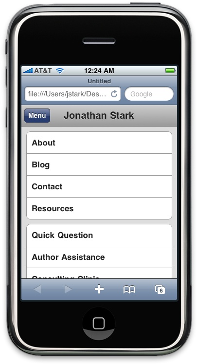
Here is where I append a button to the header that will allow the user to show and hide the menu (Figure 2-8). It has a class that corresponds to the CSS we wrote previously for
.leftButton, and it has anonclickhandler that calls the functiontoggleMenu(), which comes next.-
The
toggleMenu()function uses jQuery’stoggleClass()function to add or remove the specified class to the selected object. On this line, I’m toggling thehideclass on the headeruls.-
Here, I’m toggling the
pressedclass on the headerleftButton.
We haven’t written the CSS for the
pressed class yet, so let’s do so now. Go back to iphone.css and insert the following:
#header div.pressed {
    -webkit-border-image: url(images/button_clicked.png) 0 8 0 8;
}
As you can see, I’m simply specifying a different image for the button border (it happens to be slightly darker). This will add a two-state effect to the button that should make it evident to the user that the button can both show and hide the menu (Figure 2-9).
What You’ve Learned
In this chapter, I covered the basics of converting an existing web page to a more iPhone-friendly format. I even used a bit of dynamic HTML to show and hide the navigation panels. In the next chapter, I’ll build on these examples while introducing some more advanced JavaScript concepts—in particular, some yummy Ajax goodness.