
The purpose of analysis is to produce and communicate effectively and clearly helpful insights about a problem. Good analysis begins with good architecture and good housekeeping of the analysis structure, elements, relationships, and style.
The Case Study
The following is a simple case study that I often use when I teach seminars on quantitative business analysis. It’s simple enough to convey a big-picture idea, yet challenging enough to teach important concepts related to structuring the thoughts and communications about complex business interactions, representing uncertainty, and managing risk. There is no doubt the business case could contain many more important details than are presented here. The idea, however, is not to develop an exhaustive template to use in every case; rather, the key idea is to demonstrate the use of the R language in just enough detail to build out your own unique cases as needed.
We will think through the case study in two sections. The first section, “Deterministic Base Case,” describes the basic problem for the business analysis with single value assumptions. These assumptions are used to set up the skeletal framework of the model. Once we set up and validate this deterministic framework, we then expand the analysis to include the consideration of uncertainties presented in the second section, “The Risk Layer,” that might expose our business concept to undesirable outcomes.
Deterministic Base Case
ACME-Chem Company is considering the development of a chemical reactor and production plant to deliver a new plastic compound to the market. The marketing department estimates that the market can absorb a total of 5 kilotons a year when it is mature, but it will take five years to reach that maturity from halfway through construction, which occurs in two phases. They estimate that the market will bear a price of $6 per pound.
Capital spending on the project will be $20 million per year for each year of the first phase of development and $10 million per year for each year of the second phase. Management estimates that development will last four years, two years for each phase. After that, a maintenance capital spending rate will be $2 million per year over the life of the operations. Assume a seven-year straight-line depreciation schedule for these capital expenditures. (To be honest, a seven-year schedule is too short in reality for these kinds of expenditures, but it will help illustrate the results of the depreciation routine better than a longer schedule.)
Production costs are estimated to be fixed at $3 million per year, but will escalate at 3% annually. Variable component costs will be $3.50 per pound, but cost reductions are estimated to be 5% annually. General, sales, and administrative (GS&A) overhead will be around 20% of sales.
- 1.
Cash flow profile.
- 2.
Cumulative cash flow profile.
- 3.
Net present value (NPV) of the cash flow.
- 4.
Pro forma table.
- 5.
Sensitivity of the NPV to low and high changes in assumptions .
The Risk Layer
The market intelligence group has just learned that RoadRunner Ltd. is developing a competitive product. Marketing believes that there is a 60% chance RoadRunner will also launch a production facility in the next four to six years. If they get to market before ACME-Chem, half the market share will be available to ACME-Chem. If they are later, ACME-Chem will maintain 75% of the market. In either case, the price pressure will reduce the monopoly market price by 15%.
What other assumptions should be treated as uncertainties in the base case?
- 1.
Cash flow and cumulative cash flow with confidence bands.
- 2.
Histogram of NPV.
- 3.
Cumulative probability distribution of NPV.
- 4.
Waterfall chart of the pro forma table line items.
- 5.
Tornado sensitivity chart of 80th percentile ranges in uncertainties.
Abstract the Case Study with an Influence Diagram
When I ask people what the goal of business analysis should be, they usually respond with something like logical consistency or correspondence to the real world. Of course, I don’t disagree that those descriptors are required features of good business analysis; however, no one ever commissions business case analysis to satisfy intellectual curiosity alone. Few business decision makers ever marvel over the intricate nature of code and mathematical logic. They do, however, marvel at the ability to produce clarity while everyone else faces ambiguity and clouded thinking.
I assert that the goal of business case analysis is to produce and effectively communicate clear insights to support decision making in a business context. Clear communication about the context of the problem at hand and how insights are analytically derived is as important, if not more so, than logical consistency and correspondence. Although it is certainly true that clear communication is not possible without logical consistency and correspondence, logical consistency and correspondence are almost useless unless their implications are clearly communicated.
I think the reason many people forget this issue of clear communication is that, as analysts who love to do analysis, we tend to assume lazily that our analysis speaks for itself in the language we are accustomed to using among each other. We tend to forget that the output of our thinking is a product to be used by others at a layer that does not include the underlying technical mechanisms. Imagine being given an iPhone that requires the R&D laboratory to operate. An extremely small number of users would ever be able to employ such a device. Instead, Apple configures the final product to present a much simpler user interface to the target consumers than design engineers employ, yet they still have access to the power that the underlying complexity supports. Likewise, good business case analysis–that which supports the clear communication of insights to support decision making in a business context–should follow principles of good product design.
Before we write the first line of R code (or any code in any construct, even a spreadsheet) I recommend that we translate the context of the problem we have been asked to analyze to a type of flowchart that communicates the essence of the problem. This flowchart is called an influence diagram.
Influence diagrams are not procedural flowcharts. They do not tell someone the order of operations that would be implemented in code. They do, however, graphically reveal how information (both fixed and uncertain) and decisions coordinate through intermediate effects to affect the value of some target key figures of merit on which informed decisions are based. In most business case analyses, the target key figures of merit (or objective functions) tend to be a cash flow profile and its corresponding NPV.
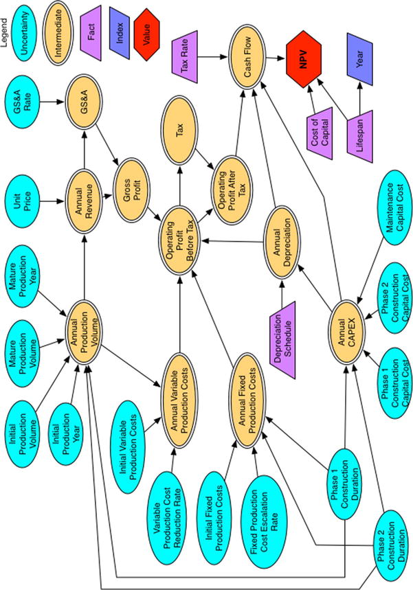
The influence diagram of the deterministic base case
Notice that assumptions are represented both as light blue ellipses and purple trapezoids. The light blue ellipses represent assumptions that are not necessarily innately fixed in value. They can change in the real world due to effects beyond our control. For example, notice that the Phase 1 construction duration is represented as an ellipse . Although it is true that this outcome in the real world might be managed with project management efforts , at the beginning of the project, no one can declare that the outcome will conform to an exactly known value. Many events, such as weather, supply chain failures, mechanical failures, and so on, could work against the desired duration. Likewise, some events could influence a favorable duration. For this reason, Phase 1 construction duration and the other light blue ellipses will eventually be treated as uncertainties. For now, though, as we set up the problem, we treat their underlying values as tentatively fixed. The other assumptions displayed as trapezoids represent facts that are fixed by constraints of the situation, by definition (i.e., the tax rate or depreciation schedule of capital expense), or are known physical constants or unit conversion constants.
Intermediate values are displayed as double-lined yellow ellipses. These nodes represent some operation performed on assumptions and other intermediate values along the value chain to the objective function. The objective function (or value function), usually a red hexagon or diamond, is the ultimate target of all the preceding operations.
The dark blue parallelogram in the influence diagram labeled Year represents an index. In this case, it is an index for a time axis defined by the initial assumption of the life span duration of the analysis but that functions as a basis for all the other values. Because this node can affect many or all of the nodes, we don’t connect it to the other dependent nodes to reduce the visual complexity of the diagram. We need to explain this condition to the consumers of our analysis.
Historically, we observe the convention that canonical influence diagrams do not contain feedback loops or cyclic dependencies. As much as possible, the diagram should represent a snapshot of the flow of causality or conditionality. However, if the clarity of the abstraction of the problem is enhanced by showing a feedback loop in a time domain, we can use a dotted line from the intermediate node back to an appropriate predecessor node. Keep in mind, though, that in the actual construction of your code, some variable in the loop will have to be dependent on another variable with a lagged subscript of a form that conceptually looks like the function
where t is the temporal index, and n is the lag constant.
Again, the influence diagram is supposed to capture the essence of the problem in an abstract form that does not reveal every detail of the procedural line code you will employ. It simply gives the big picture. Constructed carefully, though, the diagram will provide you as the analyst an inventory of the classes of key variables required in your code. You should also make a habit of defining these variables in a table that includes their units and subject matter experts (SMEs) or other resources consulted that inform the definitions or values used.
The influence diagram displayed in Figure 2-1 represents the base case deterministic model; that is, the model that does not include the risk considerations. Once we develop the base case code structure and produce our preliminary analysis, we will modify the influence diagram to include those elements that capture our hypotheses about the sources of risk in the problem.
Set Up the File Structure
Again, we should think of good business case analysis as a product for some kind of customer. As much as possible, all aspects of the development of our analysis should seek to satisfy the customer’s needs in regard to the analysis. Usually, the customers we have in mind are the decision makers who will use our analysis to make commitments or allocate resources. Decision makers might not be the only consumers of our analysis, though. There are a number of reasons why other analysts might use our analysis as well, but if we are not immediately or no longer available to clarify ambiguous code, their job becomes that much more difficult. There is a social cost that accompanies ambiguity, and my personal ethics guide me to minimize those costs as much as possible. With that in mind, I recommend setting up a file structure for your analysis code that will provide guidance about the content of various files.
- 1.
Data: Contains text and comma-separated value (CSV) files that store key assumptions for your analysis.
- 2.
Libraries: Contains text files of functions and other classes you might import that support the operation of your code.
- 3.
Results: Contains output files of results you export from within your analysis (maybe for postprocessing with other tools) as well as graphic files that might be used in reporting the results of your analysis.
To avoid the problem of resetting the working directory of your projects, I also recommend that you build your file structure in the R application working directory. You can do this manually the way you would create any other file directory or you can use the dir.create() function of R. Consult the R Help function for the details of dir.create(), but to quickly and safely set up your project file directory, use the following commands in the R console:
Of course, you should create any other subdirectories that are needed to partition categories of files for good housekeeping .
Style Guide
Keeping with the theme of clear communication out of consideration for those who consume your code directly, I also recommend that you follow a style guide for syntax, file, variable, and function names within your R project. Google’s R Style Guide1 provides an excellent basis for naming conventions. Following this guide provides one more set of clues to the nature of the code others might need to comprehend.
- 1.
Separate words in the name of the file with an underscore.
- 2.
End file names with .R.
- 3.Name variable identifiers.
Separate words in variables with a period, as in cash.flow. (This convention generally conflicts with that of Java and Python variable naming; consequently, its practice is forbidden in some coding shops. If you think your code might be reused in those environments, stick with the most universally applicable naming convention to avoid later frustrations and heartbreaks.)
Start each word in a function name with a capital letter. Make the function name a verb, as in CalculateNPV.
Name constants like the words in functions, but append a lowercase k at the beginning, as in kTaxRate.
- 4.Use the following syntax .
The maximum line length should be 80 characters.
Use two spaces to indent code. (Admittedly, I violate this one, as I like to use the tab to indent. Some rules are just meant to be broken. Most IDEs will now let you define a tab as two spaces in the Preferences pane.)
Place a space around operators.
Do not place a space before a comma, but always place one after a comma.
Do not place an opening curly brace on its own line. Do place a closing curly brace on its own line.
Use <-, not =, for variable assignment. (Arguments about the choice of assignment operator in R can approach religious levels of zeal. However, the <- operator is still the most widely adopted convention in R programming circles.)
Do not use semicolons to terminate lines or to put multiple commands on the same line .
Of course, always provide clear comments within your code to describe routines for which operation might not be immediately obvious (and never assume they are immediately obvious) and to tie the flow of the code back to the influence diagram. The complete Google R Style Guide presents more complete details and examples as well as other recommendations for file structuring.
I learned the value of these guidelines the hard way several years ago while working on a very complex financial analysis for a new petroleum production field. The work was fast paced, and my client was making frequent change requests. In an effort to save time (and not possessing the maturity to regulate change orders effectively with a client), I quit following a convention for clear communication, namely adding thorough comments to my code. As I was certainly tempting the Fates, I got hit by the bus of gall bladder disease and exited the remainder of the project for surgery and extended recuperation. Although my files were turned over to a very capable colleague, he could make little sense of many important sections of my code. Consequently, our deliverables fell behind schedule, costing us both respect and some money. I really hated losing the respect, even more than the money.
Write the Deterministic Financial Model
We need to write our code in the order of events implied by our influence diagram. Studying the diagram, we can see that the nodes directly related to the annual capital expense (CAPEX) are involved in driving practically everything else. This makes sense because no production occurs until the end of the first phase of construction. No revenues or operational expenses occur, either, until production occurs. Therefore, the first full code block we address will be the CAPEX block . Just before we get to that, though, we need to set up a data file to hold the key assumptions that will be used in the model.
Data File
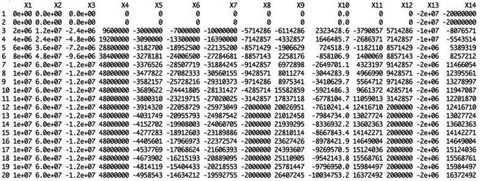
To begin the coding, we create a data file named, say, global_assumptions.R and place it in the ∼ /BizSimWithR/data subdirectory of our coding project. The contents of the data file look like this:
The values in this file are those that we will treat as constants, constraints, or assumptions that are used throughout the model. Notice that next to each assumption we comment on the units employed and add a brief description. Also, we choose variable identifiers that are descriptive and will permit easy interpretation by another user who might need to pick up the analysis after becoming familiar with the context of the problem.
Next, we import this file into our main R text file ( Determ_Model.R ) using the source() command.
If you are familiar with the concept of the server-side include in HTML programming, you will easily understand the source() command. It essentially reads the contents as written in the file into the R session for processing.
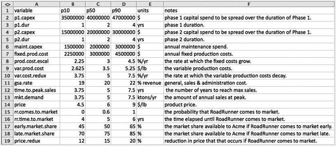
The data table used for this business case in .csv format rendered in a spreadsheet
We create columns in this file not only to capture the names of the variables and their values, but their units and explanatory notes, as well.
We read the contents of the CSV file using the read.csv() command and assign it to a variable.
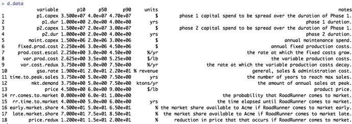
The data frame looks pretty much the same as the CSV file structure as it appears in Microsoft Excel; however, we will need to use the p50 values only for the initial deterministic analysis, so we slice out the p50 values from d.data and place them in their own vector. For the deterministic analysis, we will use only values of the first 13 variables. We will use the last five variables in the risk layer of the model.
The contents of the p50 vector look like this:
The final step in the process of setting up the data for our deterministic analysis is to assign the p50 values in d.vals to variable names in the R file.
At this point, you might be wondering what the p10, p50, p90 values represent, as the deterministic base case description of the model only included single point values. Remember, though, that in the description of the influence diagram, I described the ellipses as representatives of uncertain variables . For the deterministic base case, we treat these values in a fixed manner. Ultimately, however, for the risk layer of the business case to be thoroughly considered, ranges for each of the variables will be assessed by SMEs as their 80th percentile prediction interval. The three characteristic points of those prediction intervals are the 10th, 50th, and 90th percentiles. We use the median values, the p50s, for the deterministic analysis. The p50s were the numbers used in the business case descriptions.
CAPEX Block
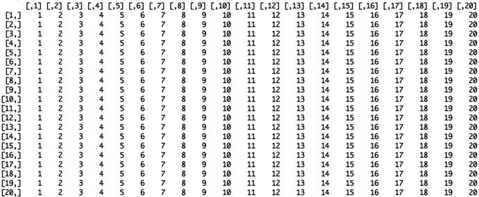
The first thing we need to establish in the actual calculation of the model is when the capital gets expended by phase. The phase calculation accomplishes this by telling R when the construction and operating phases occur. We can use 1 and 2 for the construction phases, and 3 for the maintenance phase.
The result is a vector across the year index.
From our influence diagram , we know that capex is a vector conditionally related to phase, captured by the following expression.
It produces the following vector .
Next, we need to handle the depreciation that will be subtracted from the gross profit to find our taxable income. The depreciation is based on the capital emplaced at the time of construction or when it is incurred (i.e., maintenance); however, it is not taken into account until it can be applied against taxable profit. This means that the capital incurred in Phase 1 won’t be amortized until Phase 1 is over and the plant begins generating revenue. Capital incurred in the Phase 2 construction and maintenance phases can be amortized starting in the year following each year of expenditure.
One way to handle this operation would be to use a for loop . The following code performs this process as already described.
We start with
Then, we run a loop to set up a depreciation schedule programmatically (instead of typing each one manually):
This loop incorporates the logic that, in general, for a straight-line depreciation schedule of n years, capital C incurred in year Y is spread over years Y + 1, Y + 2, …, Y + n - 1, as C/n in each year. So, if the project incurs $10 million of construction capital in Year 3, a seven-year depreciation schedule would spread that out evenly over seven years ($10 million/7 years) starting in Year 4 and running through Year 10.
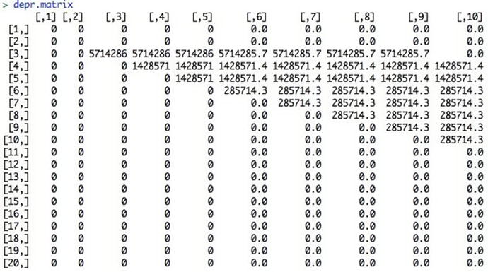
The depreciation table for the capital costs over the model time horizon
Now, if we sum the columns across the years of depr.matrix , we get the total annual depreciation.
Because R is a vectorized language, though, many people frown on the use of for loops . Instead we might consider replacing the loop with a variant of the apply() function combined with the ifelse() functions . Here, we use the sapply() function . The sapply() function is a type of functional for loop that steps across the elements of an index, applying the value of the step at the appropriate place in the expression defined after the function() statement.
A general for loop does this:
The sapply() function does this instead:
It’s a great way to reduce the visual complexity of the expressions we write as well as accelerate the speed of the code. We use this function more in the sections to come. In the meantime, to learn more about sapply(), simply call the help function in the R console using ?sapply or help(sapply).
Now, we replace the depreciation code block that employs the for loop with this sapply() function and nested ifelse() functions to accommodate the conditional requirements in the loop. Note that we transpose the results of sapply() with t() because the sapply() function produces a matrix result that is transposed from the for loop approach.
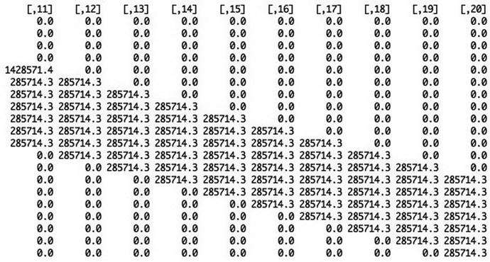
We can now see what the depreciation calculation looks like graphically (Figure 2-4) with the plot() function using
The total depreciation over time
Sales and Revenue Block
Sales begin in the year following the end of construction in Phase 1. Here we model the market adoption as a straight line over the duration from the start of Phase 2 to the time of peak sales.2
(phase > 1) produces a vector of TRUEs starting from the position in the phase vector where Phase 2 starts, and FALSEs prior to that.
The cumsum(phase > 1) phrase coerces the logical states to integers (1 for TRUE, and 0 for FALSE), then cumulates the vector to produce a result that looks like this:
By dividing this vector by time.to.peak.sales , we get a vector that normalizes this cumulative sum to the duration of time required to reach peak sales.
The pmin() function performs a pairwise comparison between each number in this vector and the maximum adoption rate of 100%.
Multiplying this adoption curve by the maximum market demand gives us the sales in each year.
Because the price of the product is given in “$/lb,” we convert the sales to pounds by multiplying it by the conversion factors 1,000 tons/kiloton and 2,000 lbs/ton.
By plotting revenue with
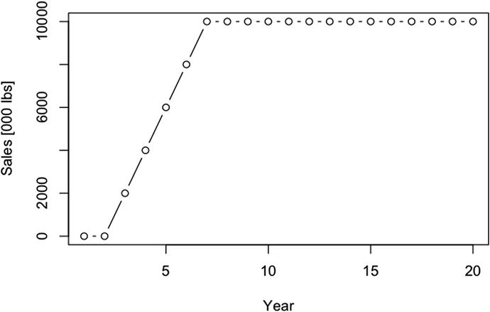
The annual unit sales response
Finally, revenue is given by
By plotting revenue with
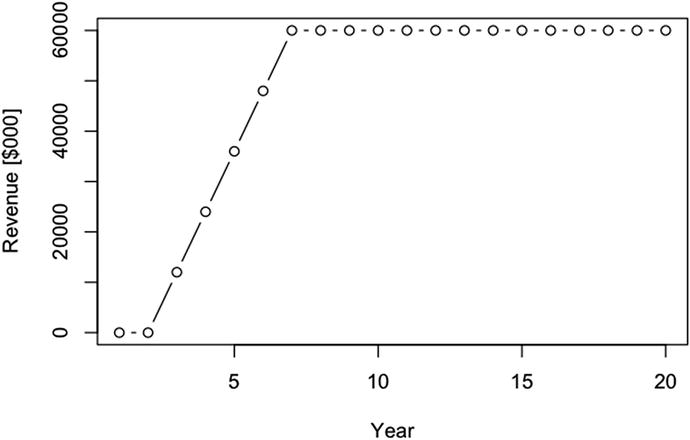
The annual revenue response
OPEX Block
The operational costs of the business case don’t start until after Phase 1. As in the case of the market adoption formula, we establish this with the term (phase > 1) for fixed costs.
We represent the escalation of the fixed costs with the compounding rate term
The phrase in the exponent term ensures that the value of the exponent is 0 in Year 3. The combined effect of these two terms produces a series of factors that looks like this:
Multiplying by the initial fixed cost value, we get
Because the variable cost is a function of the sales, and we have already defined sales to start after the end of Phase 1, we won’t need the (phase > 1) term in the variable cost definition. We do, however, need another compounding factor to account for the decay in the variable cost structure.
This series looks like
The final expression we use for the variable cost takes the form
We finish up the remaining expense equations with the following expressions .
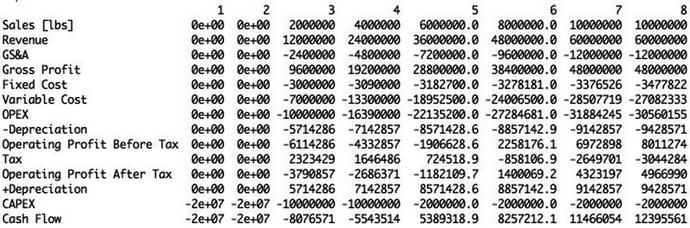
Pro Forma Block
Gross profit = revenue - GS&A
OPEX = fixed cost + variable cost
Operating profit before tax = gross profit - OPEX - depreciation
Operating profit after tax = operating profit before tax - tax
Cash flow = operating profit after tax + depreciation - CAPEX
Implemented as R code , we have the following:
We can see the cash flow (Figure 2-7) in thousands of dollars.
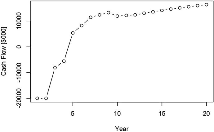
The annual cash flow response
We can also show the cumulative cash flow (Figure 2-8) in thousands of dollars.
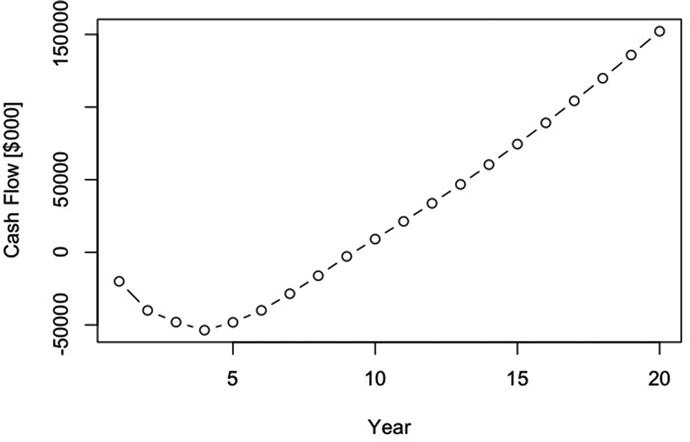
The annual cumulative cash flow
Net Present Value
To obtain the NPV of the cash flow, we simply need to find the sum of the discounted cash flows over the year index. Following the convention that we count payments as occurring at the end of a time period, we first create a vector of discount factors to be applied to the cash flow.
which produces
Figure 2-9 shows us the plot of the discount.factors.
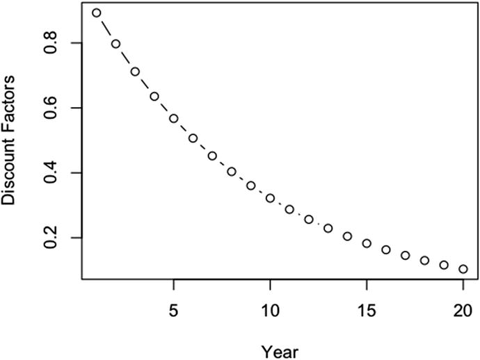
The discount factor profile
The discounted cash flow is then given by
which produces
Figure 2-10 shows us the plot of the discounted.cash.flow .
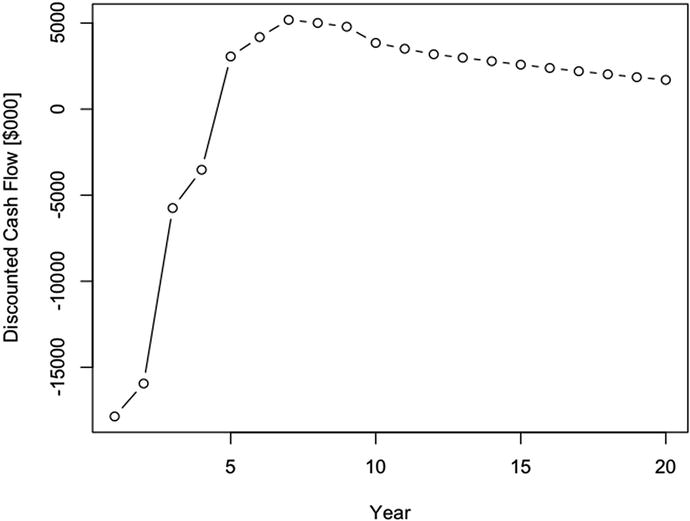
The annual discounted cash flow
Finally, we sum the values in this vector
to obtain NPV = $8,214,363.
It is very important to remember at this point that the NPV reported here is based on the deterministic median assumptions. It does not include any of the effects from the underlying uncertainty in our assumptions or that competition might impose. This NPV is unburdened by risks.
The NPV calculation is so important to financial analysis and so repeatably used that we should make a function out of it and keep it in a functions file that we would import every time we start a new analysis, just like we did at the beginning of this analysis with the data file.
Using this function, we would write the following to R with our currently defined assumptions .
Remember that this business case deals with a project spanning two decades. The likelihood that the company will use the same discount rate over the entire horizon of concern here is small, as the company might take on or release debt, face changing interest rates on debt, experience changing volatility for the price of similar equity, and so on. More realistically, then, we might consider using an evolving discount rate for projects with long horizons. That would require stochastic simulation, which is more of a topic for Chapter 3. If a question about the importance of the discount rate arises for whether a project is worth pursuing, we can always test our sensitivity to rejecting or accepting a project on the sensitivity of the NPV to the potential evolution of the discount rate .
As a bonus , we can also find the internal rate of return (IRR) of the cash flow. The IRR is the discount rate that gives an NPV of $0. However, there are no known methods of finding the IRR in a closed form manner, so we generally use a while routine to find that value.
Note that the CalcIRR() function calls the CalcNPV(). Therefore, we need to make sure to include the IRR() function in our functions file somewhere after the CalcNPV() function.
Be aware that the IRR most likely won’t have a unique solution if the cash flow switches over the $0 line multiple times. Regardless of the several cautions that many people offer for using IRR, it is a good value to understand if the conditions for finding it are satisfactory. Namely, by comparison to the discount rate, it tells us the incremental rate by which value is created (i.e., IRR > 0) or destroyed (i.e., IRR < 0).
Using the CalcIRR function now in our model, we write
and get back 0.1416301.
The IRR at 14.2% is better than our discount rate, 2.2% more, which should not surprise us because we have a positive NPV.
Write a Pro Forma Table
To create a pro forma table , we’d like to have all of the elements from the GAAP flow described earlier with the names of the GAAP elements in a column on the left, and the values for each element in a column by year.
The first thing we do is create an array composed of the pro forma elements, remembering to place a negative sign in front of the cost values.
The 14 in the dim parameter refers to how many pro forma elements we put in the array.
We then assign that array to a data frame from the existing calculations.
The raw pro forma table
Notice that R has oriented our pro forma with the result values in column form, and it uses a sequentially numbered X.n for the pro forma elements. Obviously, this is a little unsightly and uninformative, so we might want to replace the default column headers with header names we like better. Furthermore, we might prefer to transpose the table so that pro forma elements are on the left as opposed to across the top.
To accomplish this we first define a vector with names we like for columns.
Next, we coerce the default headers to be reassigned to the preferred names.
Then, using the transpose function t(), we reassign the pro forma to a transposed form with the column headers now appearing as row headers.
The pro forma table formatted now with row names and time column headers
Conduct Deterministic Sensitivity Analysis
Deterministic sensitivity represents the degree of leverage a variable exerts on one of our objective functions, like the NPV . By moving each of our variables across a range of variation, we can observe the relative strength each variable exerts on the objective. However, there is an extreme danger of relying on this simplistic type of sensitivity analysis, as it can lead one to think the deterministic sensitivity is even close to the likely sensitivity. It most likely will not be if it uses ±x% type variation that is too common in business case analysis.
Understand that the primary reason for conducting the deterministic analysis at this point is mainly to confirm the validity of the logic of the model’s code, not necessarily to draw deep conclusions from it just yet. Our primary goal is to ensure that the the objective function operates directionally as anticipated.3 For example, if price goes up, and we don’t use conditional logic that makes revenue do anything other than go up, too, then we should see the NPV go up. If the construction duration lasts longer, we should see the NPV go down due to the time value of money. We really should not draw deep conclusions from our analysis until we consider all the deeper effects of uncertainty and risk, which we’ll discuss in Chapter 3.
The best way to conduct deterministic sensitivity analysis would be to use the low and high values associated with the range obtained from SME elicitations for each variable that will eventually be treated as an uncertainty. Although the uncertain sensitivity analysis is a little more involved than the deterministic type, it does build on the basis of the deterministic analysis. In Chapter 3, not only will we use the full range of potential variation supplied by SMEs for all the variables (including those that explore the effects of competition), but each variable will run through its full range of variation as we test each sensitivity point.
- 1.
Iterate across the d.vals vector.
- 2.
Replace each value with a variant based on the range of sensitivity.
- 3.
Calculate the variant NPV.
- 4.
Store the variant NPV in an array that has as many rows as variables and as many columns as sensitivity points.
- 5.
Replace the tested variable with its original value.
In pseudocode , this might look like this:
The way we implement this in real R code is to duplicate the original R file. Then we wrap the for loops around the original code. Before we do this, though, we set up parameters that control the looping after the variable values are assigned to the d.vals vector and before the individual assignment of value to each variable.
The for loop code blocks surround our original code that found the NPV.
The resultant npv.sens matrix looks like this.
To make this table more understandable, we can convert it to a data.frame with column names equal to the sensitivity points and the row names equal to the variable identifiers that are driving the NPV using the following coercions .
The result is a table for npv.sens that looks like this.
The way we interpret this table is that each value is the NPV for our business case when each variable is independently varied through their p10, p50, p90 values independently of the others. For example, if the price were to go to its low (or p10) value, the NPV would shift to -$25.3 million. On the other hand, if the price were to go to its high value, the NPV would shift to $75.2 million. Accordingly, the price, market demand, and variable production costs are the factors that could cause the NPV to go negative or financially undesirable. If we delude ourselves into thinking there will be no competition, the other variables don’t seem to cause enough change to worry about. We’ll leave the analysis to the risk layer of the model that accounts for uncertainties associated with the competitive effects.
The following code produces the sensitivity chart using the barplot() function .
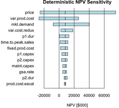
The deterministic tornado chart showing the ordered sensitivity of the NPV to the range of inputs used for the uncertainties
The beside = TRUE parameter sets the bar plot columns adjacent to each other as opposed to being stacked (i.e., beside = FALSE).
horiz = TRUE sets the tornado chart in a vertical orientation because the data frame for npv.sens.array has the names of the variables in the position that barplot() treats as the x axis.
offset moves the baseline of the bar plot, which is 0 by default, to some desired bias position. In our tornado chart, we want the baseline to be the NPV of the middle value of the sensitivity points.
las = 1 sets the names of the variables to a horizontal orientation.
space = c(-1,1) makes the bars in a row overlap. Namely, the -1 moves the upper bar in a row down by the distance of its width.
cex.names = 1 sets the height of the names of the variables to a percentage of their base height. I usually leave this in place so that I can quickly modify the value to test the visual aesthetics of changing their size.
Finally, the par(mai = c(1, 1.75, 0.5, 0.5)) statement, which we placed before the barplot function , sets the width of the graphics rendering window to accommodate the length of the names of the variables. You might want to adjust the second parameter of this term, here set to 1.75, to account for different variable names if you choose to expand the complexity of this model.