APPENDIX C
Commonsense Rules for Presentation Visuals
Software programs such as Microsoft’s PowerPoint, Corel Presentations, Harvard Graphics, and others have made it possible for businesspeople to enhance their presentations with eye-catching text, charts, and graphs. The programs offer immense color and design features: three-dimensional effects, many font choices, clip art, and much more. When used judiciously, these programs can create visuals that convey more information in less time than would more traditionally prepared visual aids. High-tech visuals can get key points across and make them memorable. In the wrong hands, however, these powerful tools can actually confuse or bore the audience, diminishing the impact of an entire presentation. Here are a few rules for making the most of presentation visuals.
Rule 1: Subordinate Your Visuals to Your Message
You and what you have to say should always be the focus of the presentation. Visuals should therefore play no more than a supportive role. They should never command center stage. Presenters can observe this important rule by following these guidelines:
- Don’t try to say everything through overheads.
- Refrain from simply reading your overheads to the audience.
- Avoid visuals that are not essential to the presentation.
Rule 2: Keep Your Visuals Simple
Some presenters clutter every overhead with border-to-border text, as in example A. Extra words detract from the presenter’s message and make the audience work unnecessarily hard to capture key points.
Example A is overburdened with text. It contains information better conveyed verbally by the speaker. Example B, in contrast, captures the key points without the supporting details.These points are clear and easy to remember.
Example A [Cluttered]: Challenges for the Coming Year
The sales force must become more efficient next year. Currently, selling costs are running close to 20 percent of revenues. The industry average is 14 percent.
On average, we have fifteen days of finished goods inventory. Financing and maintaining that inventory is expensive. If we were better at forecasting sales, we could cut that inventory level—perhaps by as much as four days. That would save the company close to $50,000 per year.
Our workforce needs more training to stay competitive. We should aim for forty hours of training for all nonprofessional employees and sixty hours for professional employees.
Example B [Simple]: Challenges for the Coming Year
- Greater sales efficiency
- Less finished goods inventory
- More training for everyone
Rule 3: Use a Minimum of Devices
People who take the time to master presentation software are tempted to use many of their “cool” devices: different colors, many font styles and sizes, shading, and on and on. Don’t fall into this trap. Those devices can deflect attention from the message. Ask yourself, “Do I need the fancy fill effects and the clip art? Would one font style be better than the three I’m using?” In most cases, your visuals will look more professional if you use a bare minimum of devices. Simpler is usually better.
Rule 4: Make Your Images Large and Legible
Your visuals should be clearly legible to everyone in the room—even those in the back row of seats. If you’ve observed rules 2 and 3, then you’ll have plenty of room on each slide or overhead to make your images large.
Rule 5: Use Graphics to Tell Key Parts of the Story
Most people are visually oriented. They perceive and digest information best when it’s presented graphically.
For example, a speaker wants to make the point that one product model has outsold two others. He could simply tell his audience, “Results for the previous twelve months indicate that model C outsold both models A and B.” He could also put this information in an overhead containing the following sentence: “Model C has outsold both model A and model B during the past twelve months.”
The speaker could then go on to detail the relative sales of these three models. Alternatively, he could use a graphic image that shows the relative sales performance of the three models in unit numbers (figure C-1).
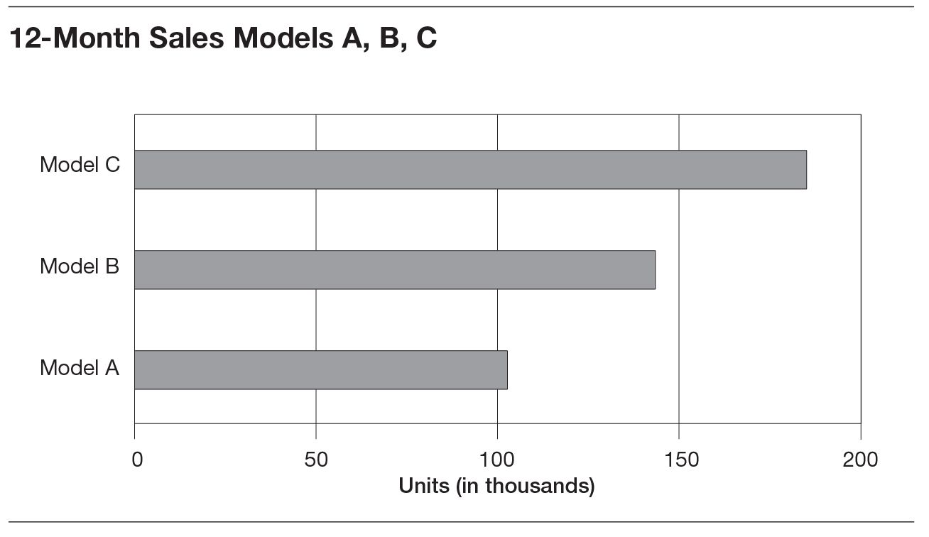
To show your audience the greatest impact, reserve graphics like those in figure C-1 for the key points of your presentation. If you create visuals for everything, the key points will be lost in the clutter.
Rule 6: Use the Most Appropriate Graphic Form
Most presentation programs and their spreadsheet supporting systems allow you to produce pie charts, column charts, bar charts, line charts, column charts, scattergrams, and so forth. Each is best for presenting certain types of data. Figure C-1 illustrates a bar chart and how it can be used. There are other forms of graphics that you can also consider.
Pie Charts
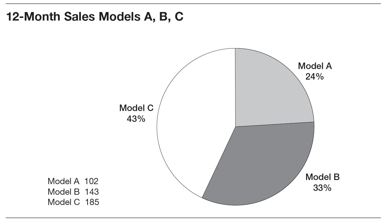
Pie charts are best when your goal is to show the impact of different factors on the whole. Thus, if you wanted your audience to understand the contributions of your company’s three product models to total sales revenue, a pie chart would be your best choice (figure C-2). Each is shown as a slice of the entire pie.
Bar and Column Charts
Use bar and column charts when you want the audience to compare outcomes, such as in the model A, B, C bar chart shown earlier in figure C-1. In that chart, the audience could see both the relative performances of the three different models and their actual unit sales. That’s something they won’t see in a pie chart.
Line Charts
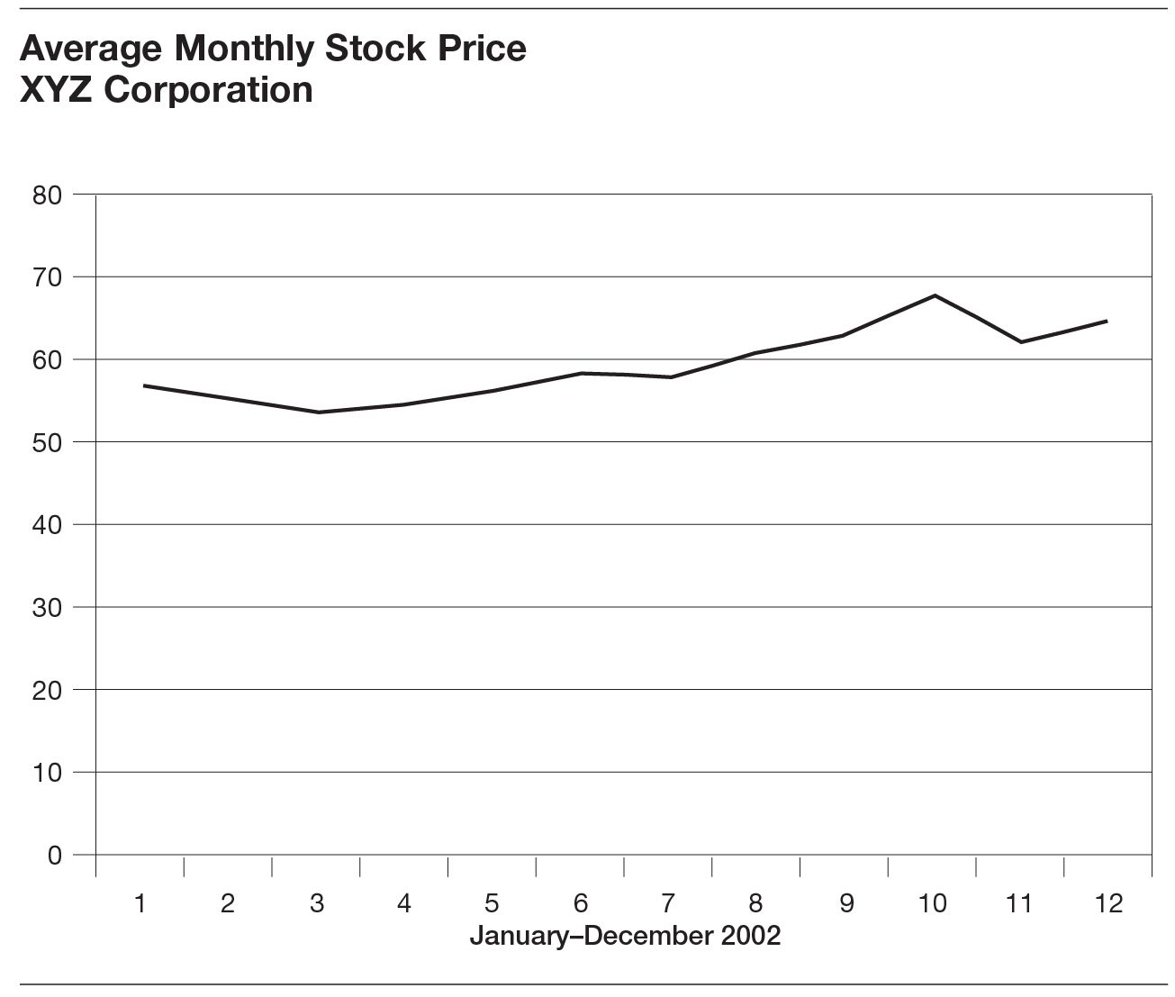
Line charts are particularly good at indicating trends. In figure C-3, we show the change in the share price of XYZ Corporation over time—January through December 2002. If we were comparing its price trend to that of a competitor, we could easily put them on the same chart.
Scattergrams
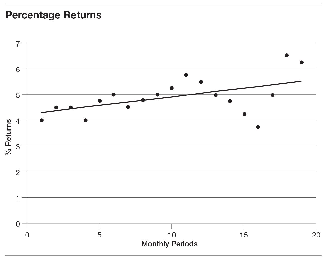
If you want to show a statistical linear regression (the best fit of a line drawn through a number of scattered data points), exponential smoothing, or a moving average, a scattergram is your best bet. These types of charts are invaluable when you have many data points for one specific variable, for example, the sales revenues from fifty branch stores for each month of a year. Figure C-4 maps data points along the x (time) and y (returns) axes. In the figure, we created a best-fit trend line based on statistical linear regression for a vendor’s merchandise returns over eighteen months. The audience can see at a glance the direction that returns are taking, even though the monthly percentage returns are scattered around.
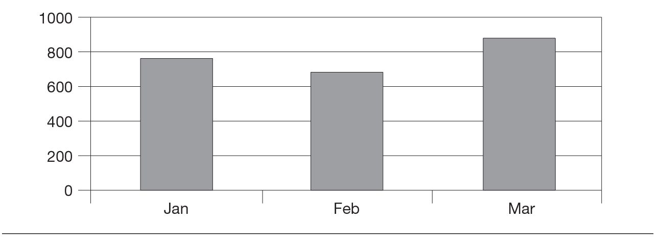
Rule 7: Label Key Features of Your Graphs
Make sure that your audience will understand at a glance what the quantitative data in your graphs represent. For example, in the first graph of figure C-5, we see data for a particular company. But what does each column represent? Complaints per salesperson? Total sales revenues? District sales revenues? A month or a quarter of revenues? Are the values on the vertical axis dollars or thousands of dollars? Or are they euros?
Now look at a better-labeled version of the same chart in figure C-5. We can now see that each column represents the dollar value of Acme Company sales, expressed in thousands, for the first three months of 2003.
With the availability of graphics software, it has become easier and easier to prepare visual illustrations for any presentation you may make. Observe these seven rules for the use of graphics, and your presentations will be more professional and more effective.
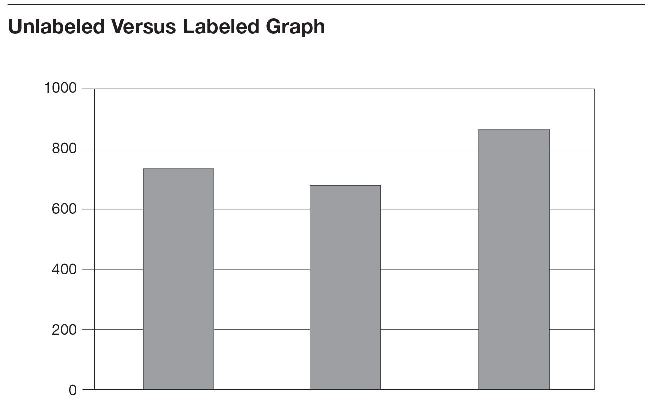
Acme Co. Sales ($000)
1st Qtr. 2003