
Lesson 2
Creating Controls
Way back in the computer stone ages, when programmers worked by candlelight on treadle-powered computers and hand-carved wooden monitors, input and output were very simple. The computer wrote text in toxic green on the bottom of a monitor and the text scrolled up as the monitor became full. The user typed on a keyboard to enter text at a single input prompt, and that was about it. Multiple windows performing useful work simultaneously, mice, and forms displaying many labels and textboxes, buttons, scrollbars, and full-color images existed only in the fevered dreams of science-fiction writers.
Today these things are so commonplace that we take them completely for granted. They appear in desktop software, web pages, laptops, handheld computers, and even cell phones.
Building these sorts of objects in the old days would have been extremely difficult, but today it's practically trivial to add them to your application.
You already saw in Lesson 1 how easy it is to make an application (albeit a trivial one) that displays a form that runs independently of the others on the computer. It's almost as easy to use labels, textboxes, buttons, scrollbars, images, menus, popups, and everything else that makes up a modern application.
C# makes all of these objects and more available as controls.
In this lesson, you learn how to add controls to a form. You learn how to size, position, and arrange controls. You also learn how to use a control's properties to change its appearance and behavior at design time and at run time. When you're done with this lesson, you'll be able to build a professional-looking form.
Understanding Controls
A control is a programming entity that combines a visible appearance on the screen and code to manage it. The code defines the control's appearance and behavior.
For example, a TextBox control displays a blank area on the screen where the user can type information. The code inside the control determines how the control draws itself and provides normal textbox features such as multiline or single-line behavior; scrolling and scrollbars displayed as needed; copy, cut, and paste; a context menu displayed when you right-click the control; the ability to navigate when the user presses the Tab key; and much more.
In addition to controls, C# provides components. A component is similar to a control except it has no visible piece on the form. For example, the Timer component acts as a clock to let the program do something at regular intervals. The Timer interacts with the program but doesn't display anything visible to the user. (Some components such as ErrorProvider and ToolTip may display visible effects on the screen, but the components themselves are not visible on the form.)
The features of controls (and components) fall into three categories: properties, methods, and events.
Properties
A property determines the appearance and state of a control. If a Car were a control, its properties would be things like Color, TransmissionType, CurrentSpeed, and NumberOfCupHolders. Your program could set a Car's Color to HotPink (to attract the attention of other drivers) or set its CurrentSpeed to 110 (to attract the attention of the police).
For a programming example, the TextBox control has a Font property that determines the font it uses and a ForeColor property that determines the color of its text.
Methods
A method is a feature of a control that makes the control perform some action. Your code can call a method to make the control do something. For example, the Car control might have methods such as Start, Stop, EjectPassenger, and OilSlick. Your program could call the OilSlick method to make the car spray oil out the back so you can escape from spies.
For a programming example, the TextBox has a Clear method that blanks the control's text and an AppendText method that adds text to the end of whatever the control is currently displaying.
Events
An event occurs when something interesting happens to the control. The control raises or fires the event to tell the program that something happened. For example, a Car might have RanOutOfGas and Crashed events. The Car control would raise the Crashed event to tell the program that the user had driven it into a tree. The program could then take action such as calling an ambulance and a tree surgeon.
For a programming example, the TextBox has a TextChanged event that tells the program that its text has changed. When the event occurs, the program could examine the text to see if the user had entered a valid input. For example, if the TextBox should hold a number and the user entered “One,” the program could beep and change the TextBox's BackColor property to Yellow to indicate an error.
Later lessons discuss events and the code that handles them in greater detail. This lesson focuses on adding controls to a form, arranging them, and setting their properties.
Creating Controls
Adding controls to a form is easy. In fact, it's so easy and there are so many different ways to add controls to a form that it takes a while to describe them all.
Start by creating a new project as described in Lesson 1. Open the form in the Form Designer. (If the form isn't already open, double-click it in Solution Explorer.)
The following list describes some of the ways you can put controls on the form:
- Click a tool in the Toolbox to select it. Then click and drag on the form. When you release the mouse, Visual Studio creates the control in the area you selected and then selects the pointer in the Toolbox.
- Click a tool in the Toolbox to select it. Then hold down the Ctrl key while you click and drag on the form to place a copy of the control on the form. When you release the mouse, Visual Studio creates the control in the area you selected and keeps the control's tool selected in the Toolbox so you can make another control of that type.
- Double-click a tool in the Toolbox to create an instance of the control on the form at a default size and position. (You'll then probably want to resize and reposition it.)
- Select one or more controls that are already on the form, press Ctrl+C to copy them, and then press Ctrl+V to paste them onto the form. You can even copy and paste from one instance of Visual Studio to another.
- Select one or more controls on the form. While holding down the Ctrl key, drag the controls to a new location. Visual Studio makes a copy of the controls, leaving the originals where they started.
The first method (select a tool and then click and drag to create a control) is probably used most often, but some of the other methods are particularly useful for creating groups of similar controls.
For example, the form in Figure 2.1 displays five rows, each of which holds a Label and a TextBox. You could easily build all of these controls individually, but you can build them even faster by using copy and paste. First place one Label and TextBox on the form, arrange them next to each other, and give them any property values that you want all of the Labels or TextBoxes to share. (For example, you may want to set their fonts or colors.) Now click and drag to select both controls, copy and paste, and drag the new controls into position. Repeat this three more times and you'll have all of the controls in position. You'll still need to change the Labels' text but the basic arrangement will be done without going back and forth to the Toolbox.

Setting Control Properties
After you've added controls to a form, you can use the Properties window to view and change their property values. If you have more than one control selected, the Properties window shows only the properties that the controls have in common.
For example, if you select a TextBox and a Label, the Properties window shows the Text property because both Labels and TextBoxes have a Text property. However, it won't display the Multiline property because the TextBox control has that property but the Label control does not.
The Properties window provides special support for many control properties. For example, Figure 2.2 shows the Properties window when a TextBox is selected.

Notice that the Font property contains its own sub-properties: Name, Size, Unit, Bold, and so forth. Click the plus or minus sign next to a property to expand or collapse it and show or hide its sub-properties.
Also notice in Figure 2.2 the ellipsis to the right of the Font property. If you click that ellipsis, the dialog shown in Figure 2.3 appears. You can use this dialog to edit the font sub-properties and see a sample of the font.

The Properties window provides appropriate support when it can for other properties. Many properties can hold only certain values. For example, the Font's Italic, Bold, Strikeout, and Underline sub-properties can only take the values True or False. The Font's Unit sub-property can only take the values World, Pixel, Point, Inch, Document, and Millimeter. In these cases, the Properties window provides a dropdown listing the allowed choices.
Figure 2.4 shows the editor that the Properties window displays when you click the dropdown arrow to the right of a TextBox's BackColor property. The Custom tab lets you pick a color from a palette, the Web tab lets you pick standard web page colors, and the System tab lets you pick system colors such as the normal control background color or the menu highlight color.

By using the Properties window's editors and typing in values when there is no editor, you can change a control's appearance and behavior.
Control Names
Whenever you create a control, Visual Studio gives it a rather nondescript name such as label2, textBox5, or pictureBox1. Although these names tell you what kind of object the control is, they don't tell you what it is for and that's much more important when you later need to use the control in your code. Names like firstNameTextBox, hatSizeTrackBar, and mediaTypeComboBox are much more meaningful than textBox3 and textBox7.
Note that you don't need to give good names to every control, just the ones that you will need to use later in the code. You often don't need to name Labels, GroupBoxes, and other purely decorative controls.
You can learn more about Microsoft's naming conventions on the web page “Guidelines for Names” at msdn.microsoft.com/library/ms229002.aspx.
Popular Properties
You'll learn about key control properties as you go along, but for now Table 2.1 summarizes some of the most useful properties. Note that not all controls have every property. For example, a Button cannot display a border (or it always displays a border, depending on your point of view) so it has no BorderStyle property.
| Property | Purpose |
Anchor |
Determines how the control sizes itself to use the available space. This property is described further in Lesson 3. |
AutoSize |
Determines whether the control automatically resizes itself to fit its contents. This can be True or False. By default, Labels are born with AutoSize = True. |
BackColor |
Determines the control's background color. |
BackgroundImage |
Determines the image that the control displays. |
BorderStyle |
Determines whether the control displays a border. This can be None, FixedSingle, or Fixed3D. |
Dock |
Determines how the control sizes itself to use the available space. This property is described further in Lesson 3. |
Enabled |
Determines whether the control will interact with the user. Many controls display a special appearance when disabled such as being grayed out. This can be True or False. |
Font |
Determines the font that the control uses to display text. |
ForeColor |
Determines the control's foreground color. For controls that display text, this is usually the text's color. |
Image |
Determines the image that the control displays. (Some controls have Image, others have BackgroundImage, a few have both, and many cannot display any image. No one said this was completely consistent!) |
Items |
For controls such as ListBox and ComboBox, this is the list of items that the user can select. |
Location |
Gives the control's location in pixels from the upper-left corner of whatever it is in (for now, assume it's in the form). Location includes X and Y sub-properties. For example, the value (10, 20) means the control is 10 pixels from the form's left edge and 20 pixels from its top edge. |
Name |
Gives the control a name that your code can use to refer to it later. You should always give a good name to any control that you will refer to in code. |
Size |
Gives the control's width and height in pixels. For example, the value (75, 30) means the control is 75 pixels wide and 30 pixels tall. |
Tag |
This property can hold any value that you want to store with the control. For example, you might put text or a number in the Tag properties of some Buttons so the code can easily tell the Buttons apart. |
Text |
Many controls have a Text property that determines what the control displays. For Labels and TextBoxes, Text determines the text they show (pretty obvious). For controls such as ComboBoxes and ListBoxes, Text determines the control's current selection. For a Form, which in a real sense is just another kind of control, Text determines what's displayed in the title bar. |
TextAlign |
Determines how text is aligned within the control. |
Visible |
Determines whether the control is visible. This can be True or False. Set it to False to hide a control from the user. |
If you want some practice with these properties, create a new project and give them a try. Create a Button and set its Text property. Also click the form and set its Text property. Change the form's Font property and see what happens to the form and the button it contains. Experiment with some of the other properties such as Image and ForeColor if you like.
Modifying Properties in Code
This lesson doesn't really go into handling control events very much (that's the subject of Lesson 4), but I do want to explain how to set properties in code and you need event handlers to do that. Besides, it's easy and sort of fun, and it'll let you make a program that does something more than just sitting there looking pretty.
To make a simple event handler for a control, double-click the control in the Form Designer. That opens the Code Editor and creates an empty event handler for the control's default event. For Button controls, that's the Click event. Whenever the user clicks the control at run time, it raises its Click event and this code executes.
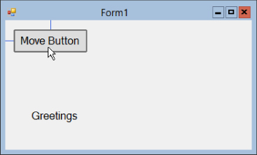
To change a property in code, type the control's name, a dot (or period), the name of the property, an equals sign, and finally the value that you want to give the property. Finish the line of code with a semicolon. For example, the following statement sets the Left property of the label named greetingLabel to 100. That moves the label so it's 100 pixels from the left edge of its container:
greetingLabel.Left = 100;The following code shows a complete event handler:
// Move the Label.
private void moveLabelButton_Click(object sender, EventArgs e)
{
    greetingLabel.Left = 100;
}
In this code, I typed the first line that starts with two slashes. That line is a comment, a piece of text that is contained in the code but that is not executed by the program. Any text that comes after the // characters is ignored until the end of the current line. You can (and should) use comments to make your code easier to understand. They don't make the executable program bigger or slower, so don't be stingy with your comments!
I also typed the line that sets the Label's Left property.
Visual Studio typed the rest when I double-clicked the moveLabelButton control. You don't need to worry about the details of this code right now, but briefly the sender parameter is the object that raised the event (the Button in this example) and the e parameter gives extra information about the event. The extra information can be useful for some events (for example, in the MouseClick event it tells where the mouse was clicked), but it's not very interesting for a Button's Click event.
Simple numeric values such as the 100 used in this example are easy to set in code, but some properties aren't numbers. In that case, you must set them to values that have the proper data type.
For example, a Label's Text property is a string so you must give it a string value. The following code sets the greetingLabel control's Text property to the string Hello:
greetingLabel.Text = "Hello";Other property values have more exotic data types such as Date, AnchorStyles, Point, and BindingContext. When you set these properties, you must make sure that the values you give them have the correct data types. I'm going to ignore most of these for now, but one data type that is relatively simple and useful is Color.
A control's ForeColor and BackColor properties have the data type Color so you cannot simply set them equal to strings such as Red or Blue. Instead you must set them equal to something that also has the type Color. The easiest way to do that is to use the colors predefined by the Color class. This may seem a bit confusing, but in practice it's actually quite easy.
For example, the following two statements set a Label's BackColor and ForeColor properties to HotPink and Blue, respectively:
greetingLabel.BackColor = Color.HotPink;
greetingLabel.ForeColor = Color.Blue;
The following code shows how the MoveButton example program, which is available as part of this lesson's code download on the book's website, changes several Label properties when you click a Button:
// Change a Label's properties.
private void moveLabelButton_Click(object sender, EventArgs e)
{
    greetingLabel.Left = 100;
    greetingLabel.Text = "Hello";
    greetingLabel.BackColor = Color.HotPink;
    greetingLabel.ForeColor = Color.Blue;
}
Arranging Controls
The Form Designer provides several tools to help you arrange controls at design time. The following sections describe some of the most useful: snap lines, arrow keys, the Format menu, and the Layout toolbar.
Snap Lines
When you drag a control around on the form, the Form Designer displays snap lines that show how the control lines up with the form and with other controls. Figure 2.5 shows the Form Designer displaying light blue snap lines indicating that the control is standard distances away from the form's top and left edges.
You can drag the control away from this position and, if you do so, the snap lines disappear. When you drag the control close to one of the form's edges, the control jumps to the standard distance and the Form Designer displays the snap lines again.
The Form Designer also displays snap lines to show how controls align. In Figure 2.6, I dragged a second Button below the first. Different snap lines show that:
- The second
Buttonis the standard distance from the form's left edge. - The second
Button's left and right edges line up with the firstButton's edges. - The second
Buttonis a standard distance below the firstButton.

Other snap lines show how the control contents line up. In Figure 2.7 snap lines show that the Label is the standard distance from the second Button and that the Label's text baseline lines up with the baseline of the second Button.

For a more realistic example, consider Figure 2.8. In this figure I was laying out a small data entry form, and I wanted all of the Labels and TextBoxes to line up nicely. In this figure, snap lines show that the Street TextBox is lined up on the left and right with the other TextBoxes, is a standard distance from the TextBoxes above and below, is a standard distance from the form's right edge, and has its baseline lined up with the Street Label.

Arrow Keys
In addition to dragging controls with the mouse, you can move controls by pressing the arrow keys. Select one or more controls and then use the left, right, up, and down arrow keys to move the control(s) one pixel at a time. This method is slower than using the mouse but gives you finer control.
When you move controls with the arrow keys, the Form Designer doesn't display snap lines so you may want to keep an eye on the control's Location property in the Properties window to see where it is.
The Format Menu and Layout Toolbar
The Format menu contains many commands that arrange one or more controls. Table 2.2 summarizes the Format menu's submenus.
| Submenu | Commands |
| Align | Aligns groups of controls on their lefts, middles, rights, tops, bottoms, or centers. |
| Make Same Size | Makes controls have the same width, height, or both. |
| Horizontal Spacing | Adjusts the horizontal spacing between controls. It can make the space between controls equal, smaller, larger, or zero. |
| Vertical Spacing | Works like the Horizontal Spacing submenu except it adjusts the vertical spacing between controls. |
| Center in Form | Centers the controls vertically or horizontally in their container. If the controls are inside a container like a Panel or GroupBox, these commands center the controls within the container, not the form. |
| Order | These commands send a control to the front or back of the stacking order. This is useful if you have controls that overlap so some are behind others. |
The Layout toolbar contains the same commands as the Format menu but in a handy toolbar so they're easier to use. The buttons display little pictures that show how they align controls.
WPF Controls
WPF applications use their own set of controls, some of which are similar to controls used by Windows Forms applications. Visual Studio for Windows lets you create WPF applications in roughly the same way Visual Studio for Windows Desktop lets you make Windows Forms applications. Both provide an editor where you can click and drag to create controls and a Properties window where you can set control properties.
One big difference is that Visual Studio also displays a XAML code editor for WPF applications. XAML, which stands for “eXtensible Application Markup Language” and which is usually pronounced “zammel,” is a language that Visual Studio uses to define user interfaces for WPF applications.
Sometimes it's easier to edit the XAML code directly than it is to use the Window editor. In particular, it's often easier to make copies of controls by copying and pasting XAML code (and changing the new controls' names) than it is to copy controls in the Window editor.
For now, you should probably start with the Window editor, but you may also want to look at the XAML code and experiment with it a bit to see how it works.
Try It
In this Try It, you get some practice building a user interface. You place controls on a form and arrange them so they line up nicely. You also get some practice setting control properties at design time and changing them at run time.
Lesson Requirements
In this lesson, you:
- Add controls to a form and arrange them as shown in Figure 2.9. (Note the form's title and the fact that the form has a non-resizable border.)

- Give the key controls names.
- Set properties at design time on the result label (at the bottom in Figure 2.9) to make the label:
- Display its text centered.
- Show a border.
- Use a 16-point font.
- Remain invisible until the user clicks one of the buttons.
- Make the OK button be the form's default button so it fires when the user presses Enter. Make the Cancel button be the form's cancel button so it fires when the user presses Esc.
- Add code behind the OK button to display the result label with a green background as shown in Figure 2.9.
- Add code behind the Cancel button to display the result label with a hot pink background and the text “Operation Canceled.”
Hints
- Create the First Name
LabelandTextBoxfirst and arrange them. Then copy and paste them to make moreLabels andTextBoxes. - Use the Format menu or Layout toolbar to center the buttons and the result label.
Step-by-Step
- Add controls to a form and arrange them as shown in Figure 2.9. (Note the form's title and the fact that the form has a nonresizable border.)
- Start a new project named NewCustomer. Remember to put it somewhere easy to find.
- Use the Properties window to set the form's
Textproperty to New Customer. - Use the Properties window to set the form's
FormBorderStyleproperty toFixedDialog. (Feel free to experiment with the other values.) - Create the First Name
TextBox.- Click the Toolbox's
TextBoxtool and then click and drag to place aTextBoxon the form. - Drag the
TextBoxinto the form's upper-right corner until the snap lines show that it is a standard distance from the top and right edges of the form.
- Click the Toolbox's
- Create the First Name
Label.- Click the Toolbox's
Labeltool and then click and drag to create theLabel. - Drag the
Labelto the form's upper-left corner so the snap lines show that theLabelis a standard distance from the form's left edge and that its baseline aligns with theTextBox's baseline. - To determine the
Label's width, you need to set its text. Use the Properties window to set theLabel'sTextproperty to First Name. - Click the
TextBox. Click the drag handle on theTextBox's left edge and drag it until it is a standard distance from theLabel.
- Click the Toolbox's
- Make copies of the
LabelandTextBox.- Click and drag to select both the
Labeland theTextBox. - Press Ctrl+C to copy the controls. Then press Ctrl+V to paste new copies of the controls.
- With the new controls still selected, click and drag the
TextBoxuntil the snap lines show it is standard distances away from theTextBoxabove and from the form's right edge. - Use the Properties window to set the new
Label'sTextproperty to Last Name. - Repeat this four more times (using appropriate
Textvalues) until you have five rows ofLabels andTextBoxes.
- Click and drag to select both the
- Make the ZIP
Label.- Set the bottom
TextBox'sTextproperty to 12345-6789. Then use theTextBox's left drag handle to resize it so it's a bit bigger than itsTextvalue (see Figure 2.9). - Create a
Labelfor the ZIP code and set itsTextproperty to ZIP. Drag it so the snap lines show its baseline aligns with the baseline for theLabelandTextBoxon that same line, and it is the standard distance to the left of theTextBox. - Use the Properties window to set the
TextBox'sTextAlignproperty toRight.
- Set the bottom
- Make the State
ComboBox.- Use the Toolbox to make a
ComboBox. Set itsTextproperty to WW and resize it so the text fits reasonably well. - Drag the
ComboBoxso the snap lines show its baseline aligns with theLabels on that row and its left edge aligns with the left edges of theTextBoxes above. - With the
ComboBoxselected, look in the Properties window and click theItemsproperty. Then click the ellipsis (…) button on the right to open the String Collection Editor. Enter CO, AZ, WY, UT, and any other state abbreviations that you want to use and click OK. (If you want to enter Confusion and Denial, you'll need to make theComboBoxwider.) - Use the Properties window to set the
DropDownStyleproperty toDropDownList.
- Use the Toolbox to make a
- Make the
Buttons.- Double-click the Toolbox's
Buttontool twice to make twoButtons with standard sizes. - Drag one
Buttonso it is a nice distance below theTextBoxes. Drag the otherButtonso it's aligned vertically with the first, positioning it some reasonable distance to the side (the exact distances don't matter here). - Click and drag to select both
Buttons. Select Format Center in Form Horizontally.
 - Use the Properties window to give the
ButtonstheTextvalues OK and Cancel.
- Double-click the Toolbox's
- Use the Toolbox to make the result
Label. (Don't worry too much about its size and position right now. Just drop it somewhere close to where it is shown in Figure 2.9.)
- Give the key controls names.
- Give the key controls the names shown in Table 2.3. You don't need to give names to the other controls because the program won't need to refer to them. (Actually this example doesn't refer to the
TextBoxes orComboBoxeither, but a real program certainly would. A form wouldn't containTextBoxes andComboBoxes that it won't use.)Control Name First Name TextBoxfirstNameTextBoxLast Name TextBoxlastNameTextBoxStreet TextBoxstreetTextBoxCity TextBoxcityTextBoxState ComboBoxstateComboBoxZIP TextBoxzipTextBoxOK ButtonokButtonCancel ButtoncancelButtonResult LabelresultLabel
- Give the key controls the names shown in Table 2.3. You don't need to give names to the other controls because the program won't need to refer to them. (Actually this example doesn't refer to the
- Set properties at design time on the result label (at the bottom in Figure 2.9) to make the label:
- Display its text centered.
- Set the
Label'sTextAlignproperty toMiddleCenter. (Use the Properties window'sTextAligneditor to select the middle position.) - Set the
Label'sAutoSizeproperty toFalse. - Set the
Label'sSizeproperty to218, 37. (Or expand theSizeproperty and set theWidthandHeightsub-properties separately.) - Use the Format menu or Layout toolbar to center the
Labelon the form.
- Set the
- Show a border.
- Set the
Label'sBorderStyleproperty toFixed3D.
- Set the
- Use a 16-point font.
- Expand the Properties window's
Fontentry. Set theSizesub-property to16.
- Expand the Properties window's
- Remain invisible until the user clicks one of the buttons.
- Set the
Label'sVisibleproperty toFalse.
- Set the
- Display its text centered.
- Make the OK button be the form's default button so it fires when the user presses Enter. Make the Cancel button be the form's cancel button so it fires when the user presses Esc.
- Click the form and use the Properties window to set the form's
AcceptButtonproperty tookButton. - Similarly, set the form's
CancelButtonproperty tocancelButton.
- Click the form and use the Properties window to set the form's
- Add code behind the OK button to display the result label with a green background as shown in Figure 2.9.
- Double-click the OK button to create an event handler for its
Clickevent. - Type the bold text in the following code so the event handler looks like this:
// Create the new customer.private void okButton_Click(object sender, EventArgs e) {resultLabel.Text = "New Customer Created";resultLabel.BackColor = Color.LightGreen;resultLabel.Visible = true;}
- Double-click the OK button to create an event handler for its
- Add code behind the Cancel button to display the result label with a hot pink background and the text “Operation Canceled.”
- Double-click the Cancel button to create an event handler for its
Clickevent. - Type the bold text in the following code so the event handler looks like this:
// Don't create the new customer.private void cancelButton_Click(object sender, EventArgs e) {resultLabel.Text = "Operation Canceled";resultLabel.BackColor = Color.HotPink;resultLabel.Visible = true;}
- Double-click the Cancel button to create an event handler for its
Now run the program and experiment with it. Notice what happens when you press the Enter and Esc keys while focus is in a TextBox. See what happens if focus is on one of the Buttons.
Exercises
- [Games] Build a checkerboard similar to the one shown in Figure 2.10. (Hints: The squares are
PictureBoxes with different background colors. Give the form a bluish background. Finally, use the Format menu or Layout toolbar to align the controls.)
- [Games, WPF] Repeat Exercise 1 with a WPF application. (Hints: Place colored
Rectangles inside aWrapPanelwith a width that makes theRectangles wrap in eight columns.) - [Games] Make a tic-tac-toe (or naughts-and-crosses) board similar to the one shown in Figure 2.11. (Hints: Make three
Labels for each square, named after the rows and columns. For the upper-left square, name themx00Labelfor the little XLabel,o00Labelfor the little OLabel, andtaken00Labelfor the bigLabel. Give the smallerLabelsClickevent handlers that set theTextproperty of the corresponding bigLabel. Don't worry about the rules such as not allowing someone to take a square that is already taken.)
- [Games, WPF] Repeat Exercise 3 with a WPF application. (Hints: For each square, use a
BorderwithMarginvalues set to 5. ABordercan hold only one content control, so put aCanvasin eachBorder. Then put the threeLabels inside theCanvas. Put the nineBorders inside aWrapPanelsized so they form three columns. See the video Making Event Handlers for instructions on how to make the smallLabels act like buttons. Add interesting backgrounds if you like.) - [Games] Modify the tic-tac-toe program from Exercise 3 so instead of displaying X or O in each square, it displays pictures. Use your favorite football team logos, a cat and a dog, your picture and your boss's, or whatever. (Hints: Use
PictureBoxes instead of the largeLabels. Add two hiddenPictureBoxes to the form. To set theirImageproperties, click the ellipsis next to theImageproperty in the Properties window, click the Import button, and browse for the image files. Finally, instead of setting aLabel'sTextproperty, theClickevent handlers should set the appropriatePictureBox'sImageproperty equal to one of the hiddenPictureBox'sImageproperties. Set allSizeModeproperties of thePictureBoxes toZoom.) - [WPF] Repeat Exercise 5 with a WPF application. (Hints: Use
Imagecontrols instead of the largeLabels. Use twoImages withVisiblity = Hiddento store the X and O images. In an event handler, use code similar totaken21Image.Source = oImage.Source.) - Make a program with a
Labelthat says “Move Me” and fourButtons with text (0, 0), (200, 200), (200, 0), and (0, 200). Make eachButtonmove theLabelto the corresponding position by setting itsLeftandTopproperties. - [WPF] Repeat Exercise 7 with a WPF application. (Hints: Set the
Label's position with code similar tomoveMeLabel.Margin = new Thickness(0, 200, 0, 0).) - The solution to Exercise 7 moves its
Labelin two steps by setting itsLeftandTopproperties. Modify the program so it sets theLabel'sLocationproperty in a single step using code similar to this:moveMeLabel.Location = new Point(0, 0); - Build a hotel menu form similar to the one shown in Figure 2.12. (Hints: Copy and paste the
Labels andTextBoxes from the Try It program. To set thePictureBox's image, look in the Properties window and click the ellipsis next to theImageproperty. In the Select Resource dialog, click Import and browse to select a picture. Finally, set thePictureBox'sSizeModeproperty toAutoSize.)
- [WPF] Repeat Exercise 10 with a WPF application.
- Build a form similar to the one shown in Figure 2.13. (Don't worry about making the program perform any calculations. You'll learn how to do that later.)

- [WPF] Repeat Exercise 12 with a WPF application.
- Build a form similar to the one shown in Figure 2.14. (Search the Internet for “labeled diagram” and pick an interesting image. Use MS Paint or some other image editing program to remove the labels. Then add
TextBoxes where the labels were so the user can fill them in.)
- [WPF] Repeat Exercise 14 with a WPF application.
- Build a bar chart similar to the one shown in Figure 2.15. (Hints: Use a
PictureBoxfor the chart's background andLabels for the bars.)
- [WPF] Repeat Exercise 16 with a WPF application. Give the chart background a color gradient and label the Y axis with a sideways label that says “Occurrences.”
- Build a bar chart similar to the one shown in Figure 2.16. (Hints: Use
PictureBoxes for the bars.)
- [WPF hard] Repeat Exercise 18 with a WPF application but fill the bar
Imagecontrols with a tile brush that uses a small picture of a car. Set the brush'sTileMode = TileandStretch = None. Use the XAML editor to add the codeViewport="0,0,55,27" ViewportUnits="Absolute"inside the brush's definition. The result should be bars that are tiled with little pictures of cars. - Modify the program you made for Exercise 18 to add tooltips for the bars. (Add a
ToolTipcontrol namedpeopleToolTipto the form. Then use the Properties window to set the “ToolTip on peopleToolTip” property for the bar labels. For example, make the second bar's tooltip say “2 people.”) - [WPF] Repeat Exercise 20 with a WPF application. (Hint: In WPF you don't need to use a
ToolTipcontrol. Just set the bars'ToolTipproperties.) - [WPF hard] Build a WPF program similar to the one shown in Figure 2.17. (Hints: For the reflected text, use a
Label. Make itsForegroundbrush shade from medium gray to light gray. In the Transform property category, set the scale in the Y direction to –1 and set the skew in the X direction to 30.)
- [Games] Make a program named MovingButton. Make a
Buttonnamed clickMeButtonthat says “Click Me.” Add aTimernamedmoveButtonTimerto the form and set itsIntervalproperty to 500. - Next double-click the
Timerto open the code for itsTickevent and add the bold text so the event handler looks like the following:Random Rand = new Random();private void moveButtonTimer_Tick(object sender, EventArgs e) {clickMeButton.Left = Rand.Next(0, 250);clickMeButton.Top = Rand.Next(0, 250);} - Now double-click the
Buttonand add the bold text in the following code to create its event handler:private void clickMeButton_Click(object sender, EventArgs e) {moveButtonTimer.Enabled = !moveButtonTimer.Enabled;} - Run the program and have fun! Experiment with different values for the
Timer'sIntervalproperty such as 2000 and 10.