A gradient is a color fill that blends smoothly from one color to another. Introduced in CSS 3, the gradient functions can be used anywhere an image is required according to specification, but they are mainly used together with the background or background-image properties to create a background gradient.
Linear Gradients
The linear-gradient() function defines a gradient that provides a smooth transition from one color to another.
linear-gradient([<angle> | to <side-or-corner>]
{, <color stop> [stop position]} (2-∞) )
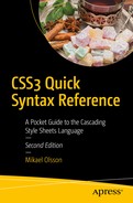
In its simplest form, the linear gradient consists of two colors with an even spread from top to bottom. In Figure 15-1, the gradient starts as gray and transitions into black at the bottom.
.mygradient {
background-image: linear-gradient(gray, black);
}
Figure 15-1
Simple linear gradient
The angle for the gradient can be set by using the keyword to, followed by the destination in which the gradient will end: top, right, bottom, left, or any combination thereof. An example is shown in Figure 15-2.
linear-gradient(to bottom right, gray, black);
Figure 15-2
Bottom-right linear gradient
More precise angles can be specified by using the deg unit, with 0 deg being the same as to top. The degrees proceed clockwise, and negative angles are allowed.
linear-gradient(0deg, gray, black); /* to top */
linear-gradient(90deg, gray, black); /* to right */
linear-gradient(180deg, gray, black); /* to bottom */
linear-gradient(-90deg, gray, black); /* to left */
Additional color stops can be added between the starting and ending colors. Any color stop can be followed by a stop position specified as either a percentage or a length value. If no stop position is specified, the colors are evenly distributed. In the following case, white is set at 25 percent, instead of its default position of 50 percent. Figure 15-3 illustrates the result of this code.
linear-gradient(gray, white 25%, black);
Figure 15-3
Gradient with multiple color stops
The standard syntax described so far is supported in Chrome 26+, Firefox 16+, Safari 6.1+, Opera 12.1+, and IE 10+. Legacy syntaxes can be used together with the -moz, -webkit, and -o prefixes to expand support down to Firefox 3.6, Chrome 1, Safari 4, and Opera 11.1.
.linear-gradient
{
background-color: red; /* fallback color */
/* Chrome 1-9, Safari 4-5 */
background: -webkit-gradient(linear, left top, right top, from(red), to(orange));
To create a radial gradient, at least two color stops must be defined. The radial gradient in Figure 15-4 starts as gray in the center and fades to black.
radial-gradient(gray, black);
Figure 15-4
Simple radial gradient
Like linear-gradient(), more than two color stops are allowed and they can optionally be followed by a length or percentage value, indicating the stop position of the color. An example is shown in Figure 15-5.
radial-gradient(black 25%, white, black 75%);
Figure 15-5
Radial gradient with set stop positions
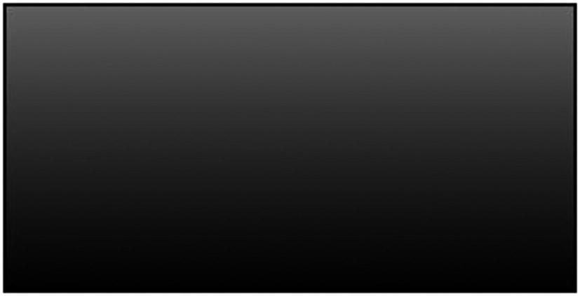
The shape of the radial gradient can be either an ellipse or a circle. The default shape is ellipse, which allows the gradient to spread itself to match both the height and width of the element, as shown in Figure 15-5. The alternative circle value, illustrated in Figure 15-6, forces the gradient to be circular, regardless of the shape of the element.
radial-gradient(circle, black 25%, white, black 75%);
Figure 15-6
Circular radial gradient
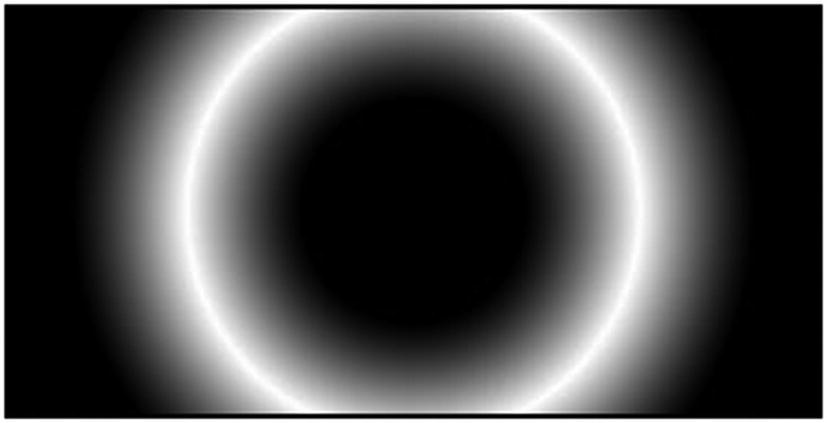
Two length values for the ellipsis or a single value for the circle can be used to set the horizontal and vertical radius of the gradient. For the ellipsis, they can also be percentage values that are relative to the dimensions of the element, as in the example shown in Figure 15-7.
radial-gradient(75% 25%, gray, black);
Figure 15-7
Resized radial gradient
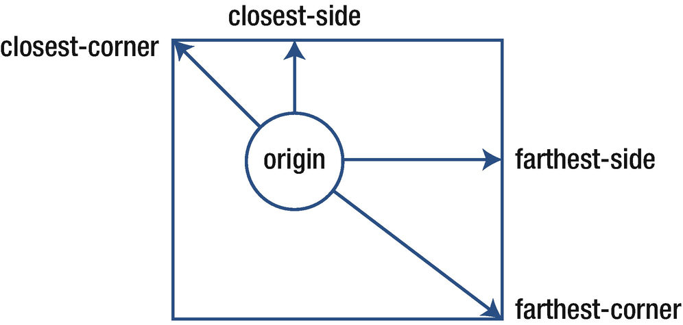
If less precision is needed, the size can be set by using one of the predefined keywords: closest-side, closest-corner, farthest-side, or farthest-corner. These values specify whether the gradient is contained by the sides or corners of the element nearest to or farthest away from the origin (see Figure 15-8). For example, the farthest-side value sizes the gradient so that its last color ends at the farthest side of the element away from its origin.
radial-gradient(farthest-side, gray, black);
Figure 15-8
Size keywords
The origin of a radial gradient is centered by default. It can be changed by specifying the position of the gradient’s origin with the keyword at followed by a position specified in the same way as for the background-position property. The horizontal position is specified first, optionally followed by the vertical position. The position can be set with keywords (left, center, right + top, center, and bottom), length values, percentage values, or a combination thereof. An example is given in Figure 15-9, in which the gradient origin is moved to the bottom right of the element.
radial-gradient(at right bottom, gray, black);
Figure 15-9
Bottom-right origin
Support for the radial-gradient() function is largely the same as for linear-gradient() when used together with the -moz, -webkit, and -o vendor prefixes. Like linear-gradient(), the syntax for the radial gradient has gone through some revisions. An example of a full cross-browser syntax is shown here:
.radial-gradient
{
background-color: red; /* fallback color */
/* Chrome 1-9, Safari 4-5 */
background: -webkit-gradient(radial, center center, 0px, center center, 100%, color-stop(0%,red), color-stop(100%,orange));
/* Chrome 10-25, Safari 5.1-6.1 */
background: -webkit-radial-gradient(center, ellipse cover, red 0%, orange 100%);
/* Firefox 3.6-16 */
background: -moz-radial-gradient(center, ellipse cover, red 0%, orange 100%);
/* Opera 11.6-12.1 */
background: -o-radial-gradient(center, ellipse cover, red 0%, orange 100%);
/* Standard syntax */
background: radial-gradient(ellipse at center, red 0%, orange 100%);
}
Repeating Gradients
Linear and radial gradients do not allow gradient patterns to repeat because they naturally stretch to fill the element on which they are defined. Two additional functions are used for creating repeating gradients: repeating-linear-gradient() and repeating-radial-gradient().
For the purpose of repeating a linear gradient, the repeating-linear-gradient() function is used. The arguments for this function are the same as for linear-gradient().
repeating-linear-gradient([<angle> | to <side-or-corner>]
{, <color stop> [stop position]} (2-∞) )
A repeating linear gradient repeats the color stops infinitely. The size of the gradient is determined by the final color stop. To avoid sharp transitions, the starting color in Figure 15-10 is repeated at the end.
repeating-linear-gradient(-45deg, white 0, black 10%, white 20%);
Figure 15-10
Repeating linear gradient
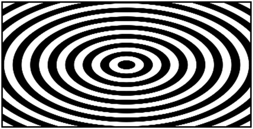
The repeating function for the radial gradient also shares the same syntax as the nonrepeating version. The example shown in Figure 15-11 illustrates the repeating function. Note that this gradient has sharp color transitions in contrast with the previous example.
repeating-radial-gradient(black, black 5%, white 5%, white 10%);
Figure 15-11
Repeating radial gradient
The syntax for defining gradients is notably more complex than many other CSS features. For this reason, it can be preferable to use an online tool to graphically design the desired gradient. One such tool can be found on Colorzilla.com.1 In addition to the standard compliant gradient code, it also provides the prefixed versions necessary for maximum browser compatibility.