The border properties are used to format the border around elements. They can be applied to any element and they do not inherit.
border-style
To make the border visible around an element, the border-style property has to be set to a value other than none, which is the default value.
border-style (1-4) | border-top-style |
border-right-style | border-bottom-style |
border-left-style :
none | dashed | dotted | double | groove |
hidden | inset | outset | ridge | solid
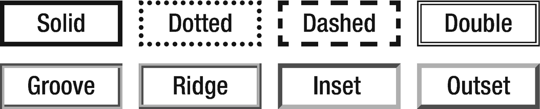
The solid border style is the one most commonly used, but there are several other options for displaying a border, as seen in Figure 17-1. The hidden value removes the border and is synonymous with none, except that it also hides shared borders in tables with collapsed borders.
Figure 17-1
border-style appearances
The border-style property is one of several properties that can be set with one to four values. When fewer than four values are specified, the border-style value is duplicated, as shown in Figure 17-2.
Figure 17-2
1-to-4-value syntax explained
Given these rules, the following declarations are synonymous and display a solid border on the top and bottom of an element:
border-style: solid none solid none;
border-style: solid none solid;
border-style: solid none;
To render all border sides in the same style, only a single style value needs to be specified.
border-style: solid;
The border-style property has four subproperties that can also be used to target each border side’s style.
border-top-style: dotted;
border-right-style: dashed;
border-bottom-style: ridge;
border-left-style: inset;
border-width
The border-width property, which controls the width of borders, can be set with a unit of length or with one of the predefined values: thin, medium, or thick. The initial value is medium, which is typically rendered as 3 pixels.
border-width (1-4) | border-top-width |
border-right-width | border-bottom-width |
border-left-width :
<length> | thin | medium | thick
As with border-style, this property can have one to four values and has four subproperties for setting the individual borders’ width.
/* Shortcut property */
border-width: thin medium;
/* Full-length properties */
border-top-width: thin;
border-right-width: medium;
border-bottom-width: thin;
border-left-width: medium;
A width of zero means that no border is displayed. This value has the same effect as setting the style of the border to none.
border-color
border-color sets the color of the border. CSS does not specify what the default border color should be, but most browsers render it black. This property can have from one to four values and has four subproperties for setting the individual borders’ color.
border-color (1-4) | border-top-color |
border-right-color | border-bottom-color |
border-left-color :
<color> | transparent
Setting the color to transparent makes the border invisible without changing the layout. As of CSS 3, the transparent keyword may be used anywhere a color value is expected.
border-color: transparent;
border
The border property can set the width, style and color border properties in a single declaration. It is the most commonly used property for controlling the border.
border | border-top | border-right |
border-bottom | border-left :
<border-width> + <border-style> + <border-color>
The values can be set in any order because there is no ambiguity between them. Either one of the values can also be omitted.
border: 1px solid black;
The border property has four subproperties for specifying the border settings for each of the four sides.
border-top: 1px solid red;
border-right: 1px solid blue;
border-bottom: 1px solid aqua;
border-left: 1px solid lime;
border-radius
The corners of the border can be rounded using the border-radius property or its four subproperties.
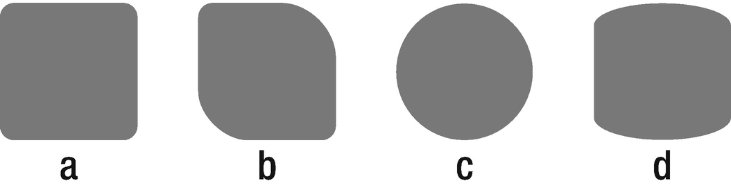
The border-radius property can have from one to four values. Each radius value can be set by using either one value for a circle radius or two values for an elliptical radius. The value can be either a length or a percentage. If a percentage is used, it is relative to the container’s dimensions. The examples that follow are illustrated in Figure 17-3.
.a { border-radius: 5px; }
.b { border-radius: 5px 20px; }
.c { border-radius: 50%; }
.d { border-radius: 30px/10px; }
Figure 17-3
Border-radius examples
The radius for each of the four edges can be set using the four subproperties of border-radius. The following example renders the same as the second box in Figure 17-3:
border-top-left-radius: 5px;
border-top-right-radius: 20px;
border-bottom-right-radius: 5px;
border-bottom-left-radius: 20px;
border-radius is a well-supported CSS 3 property. To add support for older browsers, the -webkit and -moz browser prefixes can be used.