The positioning properties can change how and where elements are displayed. They enable very precise control over the web page layout.
position
Elements can be positioned in four different ways using the position property. An element with the position property set to anything but static is known as a positioned element.
position : static | relative | absolute | fixed
A positioned element can be moved with the top, left, right, and bottom properties, which can be used to position elements anywhere on the page and also to resize them horizontally and vertically. They allow both positive and negative length and percentage values, with the percentage being relative to the dimensions of the containing block.
top | right | bottom | left (positioned) :
auto | <length> | <percentage>
static
By default, the position property has the value static. This value means that the element appears in its regular position in the page flow and is not affected by the top, left, right, or bottom positioning properties.
/* Not positioned element */
.static { position: static; }
Because the position property is not inherited, and static is the default, there is no need to explicitly set the position property to static.
relative
Changing the position value to relativemeans that the element can be positioned relative to its normal position in the page flow. For example, to display a selected element 20 pixels below its normal position, the following declarations are used:
/* Move element 20 pixels down */
.relative {
position: relative;
top: 20px;
}
Relatively positioned elements are considered part of the normal page flow, so other elements do not move to fill in the gap left by the moved element.
The effect of moving an element relative to its normal position can also be achieved by using the element’s margin. This solution is often preferable unless there is a specific need to make the element positioned, such as whether it will be a container for an absolutely positioned child element.
/* Move element 20 pixels down */
margin-bottom: -20px;
Keep in mind that changing the margin affects the layout and fills in gaps, whereas relative positioning does not.
absolute
The position value absolute detaches the element from any containing elements and allows it to be positioned relative to its nearest positioned ancestor or to the document body if there are none.
/* Place element in upper left corner */
.absolute {
position: absolute;
top: 0;
left: 0;
}
fixed
A fixed element is positioned relative to the screen viewport. It does not move when the page is scrolled. Similar to absolutely positioned elements, fixed elements do not reserve any space in the normal page flow.
/* Place element fixed in bottom right corner */
.fixed {
position: absolute;
bottom: 0;
right: 0;
}
overflow
The overflow propertydecides how content overflow is handled for block elements. It defaults to visible, meaning that text and child elements that expand beyond the element's content area are visible. Setting the value to hidden hides the overflowing content, and with the scroll value the element’s block becomes scrollable to accommodate the overflowed content. The auto value is similar to scroll, but the scrollbars then appear only when necessary.
overflow (block) : visible | hidden | scroll | auto
This property controls the behavior of both horizontal and vertical overflow. Two additional properties, overflow-x and overflow-y, can be used to differentiate between how horizontal or vertical overflow is handled. The values for these two properties are the same as for the overflow property.
The clip propertycan crop an element into a rectangle if it is positioned as either absolute or fixed. It uses a CSS function called rect() to specify the clipping region.
clip (absolute | fixed) :
auto | rect(<top>, <right>, <bottom>, <left>)
rect() requires four length values, each separated by commas. These values are relative to the top-left corner of the element. The example shown in Figure 21-1 cuts out and displays a 200 x 400 pixel region from the element to which it is applied.
.myclip {
position: absolute;
clip: rect(100px, 500px, 300px, 100px);
}
Figure 21-1
Shaded region is removed
The keyword auto can be used as a value for the right or bottom side to refer to the full width or height of the element, respectively. This keyword is also the default value for the clip property, which then means that the element is not clipped.
/* Remove 100px from left and top */
clip: rect(100px, auto, auto, 100px);
/* No clipping */
clip: auto;
Browser support for the clip property is almost universal: Chrome 1+, Firefox 1+, Safari 1+, Opera 7+, and IE 8+.
z-index
Positioned elements that overlap each other are normally layered according to their order in the web document. This natural stacking order can be altered with the z-index property
z-index (positioned) : auto | <integer>
The z-index property takes a positive or negative integer as its value, indicating the stacking order. Elements with a higher value are in front of elements with a lower value, as in the following example:
<img src="ace-of-hearts.png" style="
position: absolute;
left: 0;
top: 0;
z-index: 1;">
<img src="ace-of-spades.png" style="
position: absolute;
left: 100px;
top: 100px;
z-index: 0;">
In this example, shown in Figure 21-2, the ace of hearts is layered on top of the ace of spades because of its higher stacking order.
Figure 21-2
Customized stacking order
vertical-align
The vertical alignment of text and inline elements within a line can be controlled with the vertical-align property. This property can also be used on table cell elements.
vertical-align (inline | table-cell) :
baseline | <length> | <percentage> | top | middle |
bottom | text-top | text-bottom | super | sub
By default, the bottom of text and inline elements, such as images, align at the baseline, which is the invisible line on which all letters sit. The values top and bottom align the image to the top and bottom of the line, respectively. Less intuitive is the value middle, which aligns the middle of the image with the middle of lowercase letters in the parent. The rendering of these common alignment values is illustrated in Figure 21-3.
Figure 21-3
Common vertical alignment values
Two less commonly used values for vertical-align are text-bottom and text-top. The text-bottomvalue aligns the bottom of the element with the bottom of the text. Opposite of it, the text-top value aligns the top of the element with the top of the text. There is also the sub and super values, which align the element to subscript and superscript positions, respectively. The result of using these values is shown in Figure 21-4.
Figure 21-4
Other vertical alignment values
Elements can also be raised (positive value) or lowered (negative value) with either a length or percentage value. Both percentage and length values start at the baseline; the percentage value is relative to the line height.
/* Align text segment 5 pixels below normal text */
Normal <span style="vertical-align: -5px;">Lowered</span>
When applied to table cell elements <th> and <td>, the vertical-align property behaves as the deprecated valign attribute in HTML. Valid values for table cells are baseline, bottom, middle, and top. Other values, including lengths and percentages, should not be used with table cells.
The top. value aligns the cell’s top padding edge with the top of the row. Likewise, bottom aligns the cell’s bottom padding edge with the bottom of the row. More notably, the baseline value aligns the cell’s content so that it shares the same baseline as other cells that are baseline-aligned.
In contrast with inline elements that default to baseline, table cell elements are normally aligned in the middle. For table cells, the middle value behaves in a more intuitive way by aligning the cell’s padding box in the middle of the row, making the cell’s content appear centered.
In the following example, the table cell element is vertically aligned at the bottom:
<table>
<tr>
<td style="vertical-align: bottom;">Bottom</td>
</tr>
</table>
Centering
There are several ways to center elements in CSS. One method is to use the text-align property with the value center.
.text-center { text-align: center; }
By applying this property to a block element, text within it is center-aligned.
<p class="text-center">Centered text</p>
This method works for text and inline child elements, but not for child block elements. To center block elements, the left and right margins can be set to auto, which makes the horizontal margins equally large, causing the block to be centered.
.box-center { margin: 0 auto; }
Keep in mind that for a block element to appear centered, its width must be fixed and not flexible; otherwise, it takes up all the available width.
<div style="width: 50px; height: 50px;
border: 1px solid black;"
class="box-center"></div>
For vertical centering, one way to align content to the middle is to use the vertical-align property on the parent element with its value set to middle. This behavior only works as expected for table cell elements, so the container needs to be changed into one, as in the following example using the display property:
<div style="vertical-align: middle;
display: table-cell;
min-height: 100px;">Centered</div>
Simpler control over alignment has been added to CSS with the flexbox module, which will be looked at in a later chapter.
Transformations
The transform property allows for visual manipulation of an element by for instance rotating, skewing, translating, or scaling it.
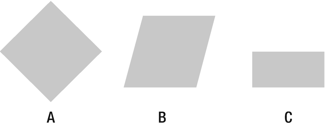
Consider the style rules below that will be used to illustrate how transformations work. Note the float property used here to cause block elements to stack up horizontally instead of vertically.
.box {
float: left;
width: 100px;
height: 100px;
margin: 0 1em;
background: #ccc;
}
/* Rotate element clockwise 45 degrees */
.a { transform: rotate(45deg); }
/* Tilt element 15 degrees right */
.b { transform: skewX(-15deg); }
/* Move element 25% down and scale height to 50% */
.c { transform: translateY(25%) scaleY(0.5); }
The result of applying these styles to a set of block elements can be seen in Figure 21-5.
<div class="box a"></div>
<div class="box b"></div>
<div class="box c"></div>
Figure 21-5
Transformed boxes
The matrix function can perform one or more of the 2d transformations using a set of six values. The first two values are for scaling vertically and horizontally, respectively, with the value 1 meaning no scaling is applied. The second and third values are for skewing the element, and the last two values are for translating the element.
/* Scale to half size and skew 45 degrees left and down */
.d { transform: matrix(1,0.5,0,0.5,0,0) }
.e { transform: scaleY(0.5) skew(45deg) }
Both of these transformations will produce the same result, which is illustrated in Figure 21-6.
<div class="box d"></div>
<div class="box e"></div>
Figure 21-6
Matrix transformation
By default the origin of a transformation is the center of the element. This point of origin can be changed using the transform-origin property. The first value is the horizontal position, the second value is the vertical, and the third value represents the position on the Z axis. The third value will only work when using 3d transformations, and it cannot be a percentage.
transform-origin (block) : 50% 50% 0 |
<x-axis: left | center | right | <length> | <%>> +
<y-axis: top | center | bottom | <length> | <%>> +
[<z-axis: <length>>]
2d transformations, as well as the transform-origin property, are supported in Chrome 4+, Firefox 3.5+, Safari 3.1+, Opera 11.5+ and IE 9+. The 3d transformations were added later and are available as of Chrome 12+, Firefox 10+, Safari 4+, Opera 15+ and IE 10+.