
6
SECONDARY COLOR CORRECTION
The previous chapter discussed the tools available to do Primary corrections, in other words, those that affect the overall balance and tone of the entire image or raster. Oftentimes it is necessary for even further control of specific regions of the picture. Color corrections that affect only a specific region or vector of an image are called Secondary corrections. There are two parts to making a Secondary color correction. The first is to qualify the area you want to affect and the second is to affect it in some way. There are a number of ways to qualify an area of the image to work on:
- Selected based on a specific luminance by creating a luma matte, (Figure 6-2 )
- Selected based on a color vector by creating a vector-based matte, (Figure 6-3 )
- Selected with a geometric shape or hand-drawn mask, (Figure 6-4 )
- Selected by any combination of these three methods, (Figure 6-5 )
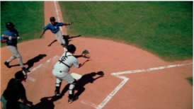
Figure 6-1 Original full color image, courtesy artbeats' Sports 1 HD Collection (clip SP105H2).
Raster
 This is computer terminology that has crossed over to video to represent an image created from horizontal lines of individual pixels The raster refers to the entire video image.
Qualify
![]() This term means that an area of the picture is specifically isolated for a correction by any number of methods. You could qualify something for correction using its hue, chroma strength, or tonal value. You could also qualify an area of the image using a “window” or garbage matte. For example: “I qualified the brightest highlights by making a matte of everything over 90IRE.”
This term means that an area of the picture is specifically isolated for a correction by any number of methods. You could qualify something for correction using its hue, chroma strength, or tonal value. You could also qualify an area of the image using a “window” or garbage matte. For example: “I qualified the brightest highlights by making a matte of everything over 90IRE.”
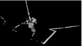
Figure 6-2 Matte created based on luminance, selecting only the whites.

Figure 6-3 Matte created based on vector (HSL) information (blue jerseys).
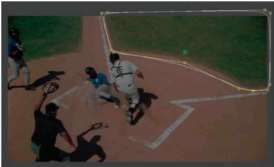
Figure 6-4 Hand-drawn Bezier shape in the Geometry room of apple Color. the mask itself would be a white area within the outlined shape, qualifying the infield grass.

Figure 6-5 Matte created using a vector and an oval garbage mask. the vector qualification selects the blue jersey color, and the yellow outline of the oval garbage mask selects only the blue of the baserunner, while masking away the blue of the batter's jersey.
The most obvious example of secondary qualifications include:
- The vignette, or spot color correction, which uses a user-defined shape to define a location on the screen and then allows you to alter the correction inside or outside of that defined area. These are often created to darken the outside edges of the picture, though there are much more sophisticated reasons to use a vignette or spot correction.
- The vector qualification, which selects a specific color on the screen and allows you to change just that color or to leave that color and change everything else. A well-known “demo” example of this is taking a shot of a car and select only the specific color of the car body and change it to a totally different color while leaving all of the other colors in the picture—like skin tones, grass, and sky—untouched. For our example (Figure 6-7 ), we've used the qualification in Figure 6-3 and corrected only the colors inside the matte from their original blue to red.
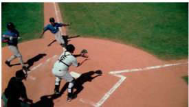
Figure 6-6 Original image from Artbeats.
Vector
![]()
Basically “vector” is just a fancy way to say “a specific color.” More technically, it is a position or coordinate in space or a direction between two coordinates. On a vectorscope, the vector is the specific position of a color in the two-dimensional circle defined by the vectorscope. The “targeted” vectors on the vectorscope are the three primary colors—red, green, and blue—and the secondary colors between them—magenta, cyan, and yellow. A colorist might say, “I'm trying to keep the yellow from drifting into that green vector.”

Figure 6-7 A vignette has been added to the image, darkening the edges to focus attention on the central action, adding depth and making the image more cinematic. the runner and catcher are the same brightness as in figure 6-6, but the outside edges of the image are darker.
Vignette

The standard dictionary meaning for this word is a photograph or other image with edges that shade off gradually. To a colorist, vignette is both a noun and a verb. The noun describes a shape placed in the picture to allow a different correction inside and out. Usually this correction is used to create the effect of fading out (usually darkening) the edges of the image. As a verb it is simply the action of making the vignette.
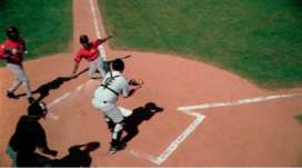
Figure 6-8 Blue uniforms have been changed to red using the qualification from figure 6-3 and turning the pixels within the qualification red.
Vector-Based secondaries
For vector-based qualifications, each system works a little differently, but the basic operational method is to define the specific color that you wish to change. Usually this is done with some kind of eyedropper method. When this initial gross selection is made, then you refine the selection by increasing or decreasing the luma range, saturation range, hue range, and softness of the matte. Then you select the new target color. Any pixels that are within your selected and refined range are then remapped to the new color. In Apple Color, vector-based secondaries are accomplished in the Secondary room using the controls at the top right (Figure 6-9 ). In Avid Symphony, they are done with the vectorscope-like display in the Secondary tab (Figure 6-10 ). In Final Cut Pro, they can be attempted with the Color Corrector 3-Way filter by spinning down the triangle at the bottom (under the Blacks wheel) to reveal a set of controls called “Limit Effect.” (Figure 6-11 ) In Color Finesse, use the Secondary Tab near the bottom left corner (Figure 6-12 ).
Garbage Matte
 A shape that is drawn to exclude or exclude portions of an image that have been selected by some other procedure, such as a color vector isolation. Garbage mattes effectively clean up the “garbage” left by other procedures or processes. They tend to be fairly rough and are drawn clear of whatever boundary the other process is trying to select. So in the case of a color vector selection, the garbage matte selects a rough area around the color vector to deselect any unwanted portions of the image that had been selected by the color vector isolation.
One of the things that differentiates the high-end color correctors from the lower end tools is the ability to define the affected secondary range and to soften the effect of the color change between affected and unaffected colors. Otherwise, the Secondary corrections look very electronic and noisy because there are harsh cut-off points between the colors. Be aware of this difference when choosing a color correction application if Secondary color correction is important to your work.
Secondary color correction does not have to be limited to special effects like changing the color of a car. Sometimes it is an important tool in dealing with color gamut issues. For example, if your image has one specific color that is violating legal gamut, instead of desaturating the entire image until the one offending color has been brought inside of gamut, you can select the color with a secondary qualification and reduce the saturation of just the one color.
Secondaries
 Shorthand for Secondary color corrections. The plural is often used because most applications allow you to have multiple Secondary color corrections—secondaries—on a single image.
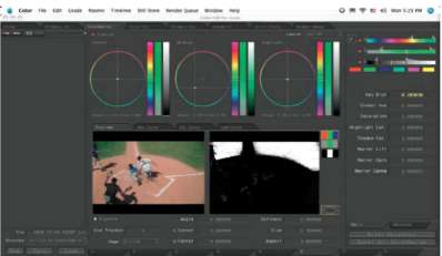
Figure 6-9 Apple Color Secondary room controls.
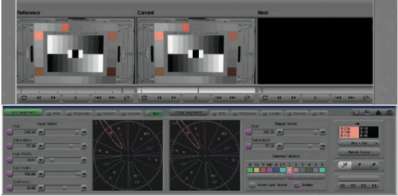
Figure 6-10 Avid Symphony Secondary tab controls.
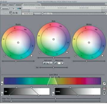
Figure 6-11 Final Cut Pro “limit effect” in Color Corrector 3-way.
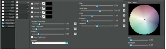
Figure 6-12 Color Finesse Secondary tab controls.
Also, certain colors cannot be very accurately captured on video. Kelly green is one that comes to mind. Many shades of yellow and red are also not reproducible on video. This can be a problem if one of those colors happens to be crucial to your client's brand identity. In this case, you can isolate the problem color and attempt to make it more closely resemble your client's vision, while not polluting the other colors with the correction to the specific vector you needed to change.
Similarly, skin tones can be crucial to the look and feel of a project. Secondary corrections are often used to isolate skin tones, pulling the green out of black skin, or changing yellowish skin tones toward pink or pinkish skin tones toward golden while leaving the rest of the image's color palette intact.
In addition to skin tones, humans have an innate connection to a few other specific colors, including grass and sky.
In addition to skin tones, humans have an innate connection to a few other specific colors, including grass and sky. These colors are often targets for experienced colorists who are trying to improve a shot because all viewers know what these colors should look like. We all have preferences for how those colors should look that are not necessarily based on the reality of the actual color or the truth of the way that those colors—skin tones, sky, and grass—are captured on film or tape. So colorists often do Secondary color corrections on these colors.
Let's create a Secondary color correction to punch up the grass in the baseball footage we've been examining in this chapter. I did this correction using Apple Color.
Load the SP105H2 footage from the Artbeats folder in the Tutorial Footage folder on the DVD into Color or some other application that allows for Secondary color correction.
![]() Watch the “Baseball_ secondary” video tutorial in the Video tutorials folder on the DVD.
Watch the “Baseball_ secondary” video tutorial in the Video tutorials folder on the DVD.
1. Go to the Secondary room (tab) and enable the secondary using the check box in the upper left corner (Figure 6-13 ).
2. In the upper left corner, click on the eyedropper (Figure 6-14 ). That will enable a red crosshairs overlay on your main image (Figure 6-15 ). Center the crosshairs on some portion of the grass and click. Then click on the eyedropper icon again to turn off the crosshair overlay.
3. The selected color from the eyedropper/crosshairs creates an HSL selection in the secondary HSL Qualifiers area to the right of the eyedropper (Figure 6-16 ). It also displays the matte that is created that identifies the selected area of your image (Figure 6-17 ). The grass is pretty well isolated, but there is quite a bit of green grass color that is not properly selected.
Figure 6-13 Enable check box in Secondary room.
Figure 6-14 Secondary qualifier eyedropper.
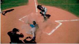
Figure 6-15 Crosshairs overlay on image to select secondary color vector.

Figure 6-16 HSL Qualifier sliders indicating the range of the initial selection.
4. Use the HSL Qualifier sliders to widen the selections for hue, saturation, and luminance. Holding down the shift key while moving either end of the range will allow you to just move that one end of the range, otherwise moving the white line at one end of the range moves the other end of the range in the opposite direction by an equal amount. “Focus” the ends of the range so that you get the best selection of grass with the least selection of any other color. This takes some experimentation. Figure 6-18 shows what the HSL Qualification sliders looked like when I was done with my qualification. This resulted in the matte seen in Figure 6-19, which has a much stronger selection of the grass than in the original selection (Figure 6-17 ).
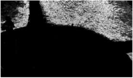
Figure 6-17 Matte shows white areas where image has been selected or qualified.

Figure 6-18 HSL Qualifiers with new ranges tweaked from initial eyedropper selection.
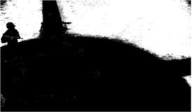
Figure 6-19 Matte shows stronger selection of grassy areas due to tweaked HSL Qualifier sliders.
5. Add some key blur to the mask to make your correction blend in better. That completes the “qualifcation” part of the Secondary correction.
6. Now that we have an area of the image that is well-defined as “grass,” we now use the familiar tools in Color to adjust just the area inside of the white mask. (You can also choose Control menu near the top left of the Secondary room to alter the colors outside of the mask instead of the inside of the mask if you want.)
7. You can use the color wheels to make the grass more pure green and/or add saturation (Figure 6-20 ). My correction goes a little beyond what would be normal for a TV image, but I wanted it to stand out (Figure 6-21 ). Compare the grass to the original image in Figure 6-22. Notice that none of the other colors changed except the grass. The skin tones, earth tones, whites, and uniform colors all stayed the same.
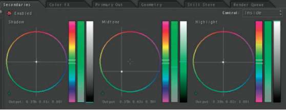
Figure 6-20 Color Wheel adjustments to make grass greener, mostly in midtones.
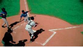
Figure 6-21 Final image with Secondary correction of grass.

Figure 6-22 Original image without Secondary correction of grass.
Randy Starnes explained his use of secondary as he was correcting shots for an episode of MTV's Making the Video:
I like my skin tone on this show not to be too red, and I like to have green grass and green screen shots to be cool green and a lot of green. So for green grass I take the green secondary. Of the six-vector color corrector, I take the green element only and turn it to cyan, away from yellow. I'll boost the saturation just of that green, and that always makes grass look better. If you take the green grass and move it away from yellow, it makes the difference between a springtime green and a fall green that's close to dead.
Skies: take a sky and keep it consistent by rolling the blue either down toward the cyan side or up toward a process blue or up farther toward magenta if I want it to be there for the time of day.
Mike Most was the visual effects supervisor for Ally McBeal. Before that, he was a sought-after colorist for prime-time episod-ics and worked on such signature shows as LA Law and NYPD Blue. Most explains that this is a world where the main skill is maintaining continuity:
Secondary correction for me was a way of fixing what I couldn't get quite right with the basic primary controls because Secondary correction basically acts as a keyer. It keys whatever color you tell it you want to select or whatever range of colors you tell it you want to select and lets you change just those colors. That can be a great help when you're trying to make, say, a very green tree into a very fall, golden-leaf tree. And I used to have to do that quite often, especially on NY[PD Blue]. Short of that, it doesn't have a whole lot of use.
Secondary correction basically acts as a keyer.—Mike Most
If a cameraman has shot his film right—and let's face it, most professional cameramen shoot beautiful film—so given a decently shot piece of film, you should be able to get what the cameraman was seeing without having to do anything fancy with it: ripping the colors out of it and recolor-ing them to something else.
I used to use Secondary correction sometimes to change my flesh tones a little bit because that tends to get a little out of hand with certain stocks, but generally I think that Secondary color correction is way, way, way overused. Unless you're trying to achieve something totally unique, as in a commercial, there's very little need for it in most cases. And I think a lot of colorists go to it far too quickly. That's one of the things that I train people not to do.
Secondary Limitations
There are several things that Secondary color correction cannot do. These are important to note, especially if you have any kind of prepro contact with clients that are considering using Secondary color correction.
Some Secondary color correction tools can only alter hue and saturation, yet clients often request to alter the color in a way that requires a change in luminance. Also, the lower the saturation level of a color that needs to be altered, the more difficult it is to isolate that color shift from others around it. Think of it like a game of darts played on a vectorscope. The lower saturation images are in the middle, and the higher ones are near the outside. If you toss a dart at a color near the outside, you'll either hit the one you were aiming for, or at least one that's adjacent to it. In the center of the dartboard, a near miss can still mean you've selected an image 180° from the one you aimed at.
In addition to the difficulty of isolating the color, lower saturation colors also offer less information to be able to increase the saturation because increasing saturation means increasing noise.
Alex Scudiero, a colorist and principal at I3 in Chicago, was one of several colorists who cautioned against the use of secondary until later in the correction process:
Some inexperienced colorists will go right for the secondary to change something specific, but then they'll get further into the correction and realize they need that secondary for something else, so they've painted themselves into a box. Try to correct using the basics first.
As color correction technology advances, this advice becomes a little less relevant because many color correction systems offer dozens of “secondaries” so even an inexperienced colorist won't “paint themselves into a box” very easily. With the original da Vinci systems that were delivered, extra secondaries cost extra money to purchase. But Color has eight secondaries, each of which can be corrected inside and outside of the qualification, making it more like 16 secondaries.
However, this is still valuable advice to heed because each secondary correction will take a significant amount of time to perform, and all jobs are done on some kind of deadline, so Secondary color correction should be used judiciously if for no other reason than time.
Vignettes or Spot Color Corrections
Another widely used type of qualification for Secondary color correction is the vignette or spot color correction. This is the ability to select a specific geographic area in the picture and adjust levels within that area without affecting the other areas of the picture. da Vinci colorists know this feature as Power Windows. In Apple Color it is known as Vignette in the Secondary room. In Avid Symphony it is called Spot Color Correction.
The terminology is a bit confusing because Apple's Color calls any spot correction or shaped mask a vignette, but the term “vignette” also means an image that fades out or darkens at the edges.
When creating these vignettes or spot corrections, some color correctors are limited to a handful of geometric shapes, like circles, ellipses, and squares. In skilled hands, though, this is more than enough control. Some of the more recent high-end color correction engines have the ability to create a larger number of organic, hand-drawn shapes. Plus, many color correctors, like Color, can track these vignettes as portions of the image move within the frame. This is incredibly valuable.
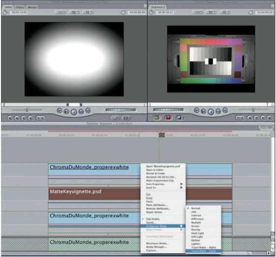
Figure 6-23 Final Cut Pro with “poor man's spot color correction.”
Although vignettes and spot color correction are a fairly rare feature in name, it can be accomplished by almost all NLEs using simple wipes and mattes. To do a vignette in Final Cut Pro, simply sync a corrected shot on one track with an uncorrected shot on a lower track and use a wipe or matte to reveal the correction in only a specific geographic area (Figure 6-23 ). This obviously takes a bit more effort than a one-step solution, but the capability is certainly available to almost anyone.
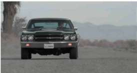
Figure 6-24 Original image (RED footage) from the short film Susannah, courtesy of director Evan Nicholas.
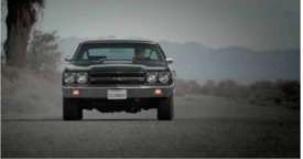
Figure 6-25 Same image as figure 6-24 with vignette added.
Spot correction is useful for many reasons. One of the most common is to create a true vignette, darkening the edges of the image to focus attention on the subject. This technique is used a lot in TV spots. When applied by a skilled colorist, you should never really notice that a vignette has been applied, but you should be able to look for vignettes by focusing your eyes on the corners of the TV image instead of on the center. When you do this, it becomes more apparent that the edges or corners have been darkened. Figure 6-24 and Figure 6-25 show a before and after image with a vignette applied. I used a fairly strong vignette to make sure the image could be seen properly on the printed page, but vignettes are typically much more subtle.
Another common use for spot color correction is to dodge or burn the image, in much the same way that photographers do with prints in the darkroom. A specific area is selected—say, a blown-out sky—in an otherwise nicely exposed image, and the levels are brought down in just that portion of the image. This is one of the things that can assist colorists doing film transfers to translate the higher latitude of film to the lower contrast range of video. In an image where the sky might have held detail in the bright areas on the negative as well as in the shadows of the landscape, on video the only way to properly hold detail in both areas is to spot correct the sky and the landscape separately.
Another use of spot color correction is to add the look of gradient filters to an image, for example, coloring a plain-looking sky to a rich sunset. In a film-to-tape transfer session, this is often done by actually using photographic filters in the filter gate. But spot color correction can also help you fix it in post without a full telecine session. This is usually easiest to accomplish by pulling a luminance mask on the sky and adding a large, horizontal, very, very soft-edged mask. The softness of the mask creates a gradation similar to what many directors of photography add “in camera” with a gradated filter on the sky. This effect can also be done with just the soft-edged mask, without the use of the luma key.
Vignettes or spot corrections can really add the finishing touches to a correction. Randy Starnes, a colorist for many prime-time TV shows, says da Vinci's spot correction—Power Windows—allowed him to add just a little more glamor to your favorite stars and to subliminally focus the audience's attention to specific parts of the screen.
 Watch the video tutorial “Susannah_vignette_glow_face” in the Video tutorials folder on the DVD.
I use Power Windows quite often to give a person a glow to his or her face. Separate the person by putting an oval soft-edged window on the face. Bring the luminance of the face up. If you include the face and a little bit over the top of the head, behind the person a little bit, it almost has the effect of a backlight or a halo. Make somebody look subtly a little special, kind, angelic.
I used Power Windows quite a bit on Dr. Quinn, Medicine Woman to separate the star and make her look even more beautiful, more radiant. A lot of people use them for vignettes. They can bring your attention to the center of the screen or wherever you want that attention. Place an oval window with a center where you want the eye to go and then soft edge so you don't see it.
Another use is to add punch to lighting. To amplify the effect of a light—let's say a window and light that's streaming in—I'll often put in a Power Window, make it a long oval aspect, and rotate it from the direction that the sun would be falling in the window and soft edge that. Inside that Power Window I'd increase the luminance, and probably outside I'd bring the blacks down, and that just makes the light more powerful.
I'm doing skies right now. I've got a sky where I want to keep the bottom of the image bright. I want to keep the blue in the sky, so I'm going to make a circular Power Window, and I'm going to change the aspect ratio so it's horizontal lines, take the sky, separate the sky, and then bring the luminance down inside the window. I'll add some blue to the sky and then soft edge the window, and that will keep the lower end of the frame where all my talent is bright, and it won't blow out the sky.
Figures 6-26, 6-27, and 6-28 show a spot color correction or vignette similar to that described by Randy Starnes to give the stars of the show a special glow. A soft-edged oval was drawn around the face, and the levels inside were increased and warmed up slightly. The levels outside the oval were brought down a little as well. This served to separate the talent from the background a little and make her visually more special.

Figure 6-26 Original image from the short film Susannah, courtesy of director Evan Nicholas.

Figure 6-27 Shot with a vignette around the actress's face, darkening the background and warming her skin tones.

Figure 6-28 .This is part of the apple Color Ul showing the mask that qualified the face. the two ovals indicate the inside and outside softness of the mask.
Unqualified Use of Secondaries
With so many secondaries available—at least in Apple's Color—one of the “off prescription” uses for secondaries is simply to use them like Photoshop Adjustment Layers.
Basically, just do the most general color balancing and level adjustment in Primaries, then use successive secondaries—without qualifying any specific portion of the image—to continue to refine the original correction. That way, if you want to back off or eliminate part of your correction, you can simply disable the secondary tab for that portion, leaving all of your other work intact.
This method of using secondaries in Apple Color was developed by Bob Sliga while he worked for the Color development team at Apple:
You can go back to the days when we didn't really have Secondary color correction, when we could only grab the six vectors and change saturation and hue and maybe luminance a little bit. That was the typical Secondary color correction where you could isolate a color. Up until da Vinci changed the game by Secondary color correction isolating a color by using a luminance key or an HSL key or by putting a window around something which wasn't traditionally called a secondary, but they called that Power Tiers. Color's Primary In room is where you do all your balancing, and the Secondary room is not just picking colors. We can use it as eight separate levels of color correction, full up RGB. It's not selectable color correction, it's full up RGB color correction. We're creating a color as opposed to just enhancing it, and that is how the game has changed. Having eight secondaries, I think I've filled one up once, where I've run out of room. If you're that far down, either (a) the shot was totally mis-shot, or (b) the effect you're trying to create was “you better be paying big money per hour,” because if you're using all eight windows and secondaries per scene on a feature or on a commercial, that's a long time color correction. This can be as basic as you want it or as complex as you want it. Does every job need all the complexity? No. But it's good to have the headroom if you need to be able to take something or push something a different way or a different color. I think the colorist that learns these tools and is more flexible and thinks “outside the bun” will be effective longer.
The colorist that learns these tools and thinks “outside the bun” will be effective longer.—Bob Sliga
Summary
Secondary color correction is really a step that can take an ordinary color correction and make it extraordinary. The skill that needs to be developed to use it most effectively is to have an understanding of how to isolate—qualify—the part of the picture that you want to change. After that, it is using your “artist's eye” to know when to leave the image alone.
It is very possible with secondaries to make the image look unnatural because you are essentially breaking the image down. One way to maintain a natural look is to continually compare the original image to the correction you're working on. (In Apple Color, you do this by clicking on control-G.) If you see that even a small part of your correction is worse than the original, find a new way to qualify the image or back off your correction until the problem is resolved.
 There are two additional video tutorials in the Video tutorial folder on the DVD that deal with secondary color correction: “Match_Lions_including_Secondary” and “Color_Secondaries.”