
1
GETTING STARTED WITH COLOR CORRECTION
Quick Start
Nobody wants to wade through the entire text or a book before they feel they've learned anything, so this first chapter of the book is designed to get you started color correcting quickly. We'll gloss over a few important details in this chapter, but we'll cover those things in more depth in the remaining chapters. This chapter is an overview of the chapters to follow. The goal of this chapter is for you to make as much progress as quickly as possible.
The goal of this chapter is for you to make as much progress as quickly as possible.
The Goals of Color Correction
There are two primary objectives in basic color correction: spread your tonal range and balance the colors.
There are two primary objectives in basic color correction: spread your tonal range and balance the colors. There are a lot of other important goals, including matching shots from one to another, helping to tell the story, and making the images “pop” or “read.” But we'll focus on spreading the tonal range and balancing colors in this initial chapter.
Spreading the tonal range means that you take full advantage of the tonal range of your display medium. In most cases this means maximizing the number of levels of gray between the deepest black and the brightest white that your display or broadcast specifications can reproduce. For most people reading this book, that means a TV screen or maybe a computer display. It can also mean prepping the image for a digital intermediate transfer to film. Tonal range corrections do not always have to spread completely from 0% black to 100% white, but oftentimes they do. The other goal of tonal range corrections is determining if certain parts of the tonal range should be compressed while other parts should be expanded. We'll do a quick tutorial on this in a moment.
Tonal Range
![]() Tonal range is sometimes also called the dynamic range, luminance range, or contrast range, though these terms can have slightly different technical definitions. The tonal range is the difference between the brightest and darkest areas of the image. The tonal range of the image—and how those tones are spread throughout the tonal range—defines its contrast. For some applications of this phrase, tonal range indicates the actual number of levels of tones that a recording medium can record (256 per channel in the case of RGB 8 bit, or 1025 per channel in the case of RGB 10 bit). For our purposes, we will refer to tonal range (singular) as the range of tones between brightest and darkest. Ansel Adams and other proponents of the Zone System break the tonal range of an image into 11 distinct tonal ranges.
Tonal range is sometimes also called the dynamic range, luminance range, or contrast range, though these terms can have slightly different technical definitions. The tonal range is the difference between the brightest and darkest areas of the image. The tonal range of the image—and how those tones are spread throughout the tonal range—defines its contrast. For some applications of this phrase, tonal range indicates the actual number of levels of tones that a recording medium can record (256 per channel in the case of RGB 8 bit, or 1025 per channel in the case of RGB 10 bit). For our purposes, we will refer to tonal range (singular) as the range of tones between brightest and darkest. Ansel Adams and other proponents of the Zone System break the tonal range of an image into 11 distinct tonal ranges.
Balancing the colors means that any unwanted color casts are eliminated. The reason for the term “balancing” will become more obvious as we start to examine and analyze our images with a number of different tools. Color casts in images are sometimes desired, for example, the warm, red tones of a sunset or the sad, blue, coolness of a rainy day. These are color casts that often serve the story, so we need to be careful not to eliminate them. Examples of color casts that are undesirable are usually caused by video cameras that haven't been white balanced properly or film footage shot with the wrong filter for the combination of film stock and light temperature.
Spreading the Tonal Range
Much of the information that viewers use to understand and interpret the image is based on the tonal range or contrast between brights and darks. In most cases we want to give viewers as much information as possible, but sometimes you don't, like the case of a thriller or horror movie where you may be trying to hide things in the shadows.
The first step in determining the proper tonal range where your image should “live” is setting the proper level for blacks or shadows.
The first step in determining the proper tonal range where your image should “live” is setting the proper level for blacks or shadows. Setting the black level is almost always the place where any experienced colorist starts a correction. So the question for a beginner is, “Where do I set the proper black level, and how do I know what I should set it to?”
This book is product and platform agnostic. In other words, this book is less about what buttons to push on specifc pieces of hardware or software and more about understanding the process so that you can feel comfortable color correcting on almost any application that exists now or in the future. Because of that, I'll show you the right buttons in a few applications. Hopefully you're using one of the apps that I used as an example. Otherwise, look for similar parameters in the software or hardware that you use.
Blacks are also known as shadows, pedestal, set-up, or lift, depending on the application.
Blacks are also known as shadows, pedestal, set-up, or lift, depending on the application. Setting the black level usually involves adjusting a slider called either “blacks,” “shadows,” “setup,” “lift,” or “pedestal,” such as the controls in the screen shots that are shown here from several of the most widely distributed applications with color correction capabilities.
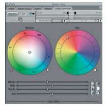
Figure 1-1 FCP Color Corrector.
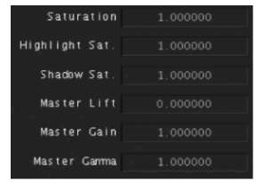
Figure 1-2 Color Primary room Basic tab.
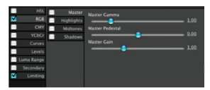
Figure 1-3 Color finesse HSL Controls master tab.
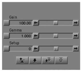
Figure 1-4 Avid HSL Hue offsets tonal controls.
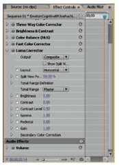
Figure 1-5 Premiere Luma Corrector.
 A waveform monitor displays the amplitude level— brightness and darkness— along the vertical axis with the dark parts of the image near the bottom and the brighter parts of the signal near the top. Technically, the horizontal axis of the waveform displays time, but practically speaking, the horizontal axis of the waveform corresponds to the horizontal placement of picture elements across the image with no regard to the vertical placement of elements in the image. The waveform monitor also displays chroma levels, but these are easier judged on a vectorscope.
How to Determine the Proper Black Level
When I started to learn color correction, the biggest mystery to me was simply “How do you know what's right?” To set black levels you need some tools for proper analysis of the black level. Basically that means a waveform monitor, though there are other tools that would work. We'll get into the full range of analytical tools later in the book. For now, a simple waveform monitor will do. Don't panic. You don't need to be an A/V geek or slide rule engineer to understand this display. We just need to know how low we can go legally, and that's pretty simple.
Firstly, you need to know what “legal black” is on your system or waveform monitor. For most waveform monitors, black is at 0 IRE or 0% or 0 millivolts. In the United States, which defnes black as 7.5 IRE for composite analog NTSC signals, black can mean 7.5 IRE or 0 IRE depending on the type of video signal. The easiest way to tell which is right for your system is to feed “filler” (the black signal your system generates whenever it doesn't have real video to send) to the waveform monitor.
The easiest way to tell which is right for your system is to feed “fller” (the black signal your system generates whenever it doesn't have real video to send) to the waveform monitor.
If “filler” is 0 IRE, then your goal in most color correction shots is to get at least some portion of the picture down to 0 IRE. If you get black lower than 0 IRE, your program may not pass quality control (QC) if you are sending it for broadcast or mass duplication.
Some waveform monitors have configuration settings that allow you to choose whether black displays as 0 IRE or 7.5 IRE (sometimes called “with NTSC setup”). The Tektronix WFM7120 that I use is confgurable, and I have it set to display blacks at 0 IRE. This is how I will display black throughout the book unless otherwise noted.
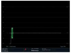
Figure 1-6 This figure shows a waveform monitor displaying blacks at 0 IRE. all waveform and vectorscope images are captured courtesy of a Tektronix WFM7120, which can be viewed as a traditional external scope or can be monitored remotely via a web browser.
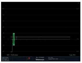
Figure 1-7 This figure shows a waveform monitor displaying blacks at 7.5 ire.
More on waveform Monitors
External Scopes versus Internal Scopes
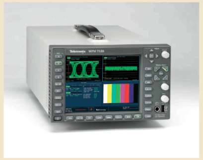
Figure 1-8 Tektronix WFM7120 external video scope.
I always suggest that color correction be done with external scopes, such as those by Tektronix, Leader, VideoTek, OmniTek, and others.
I always suggest that color correction be done with external scopes, such as those by Tektronix, leader, Videotek, Omnitek, and others. these scopes generally have more power and information than internal scopes and give you a true sense of the levels coming out of your system because they are downstream from the video card. all internal monitoring, such as the scopes in Color or final Cut or avid, do not represent the actual video signal as it has left your system, and software scopes usually do not represent the entire signal. Due to limitations in the amount of computational power required for these displays, software companies often only display every other line or only every fourth line of video. Sometimes, having real time scopes enabled on your chosen NLE (non linear editing system) can actually impede the performance of the NLE itself as it tries to do the important tasks that it is actually designed for. So you can make your editor or compositing software run better by turning off the internal scopes and running with a good external scope.
Flat Pass versus Low Pass (Luma)
External waveform monitors have a button that allows you to “flter” the incoming signal so that the display shows either luma only (low Pass), or whether the signal includes chroma information (flat Pass). in flat Pass, the chroma information can make the trace (the squiggly lines representing the signal) appear to go beyond legal. when you are trying to determine the luminance of your signal on a waveform monitor, you should be in low Pass, not flat Pass. look at the two images of a waveform display fed by color bars in low Pass and flat Pass to understand the difference.
If your black levels are generally higher than 0 IRE, then your picture may look washed out and flat. We'll get more into the complexities of the waveform monitor later in the book.
Vectorscope
![]() A vectorscope displays chrominance and hue. The saturation (or gain) of the chroma (or color) is measured by how far it extends from the center of the scope. Neutral images (black, white, and all levels of gray) register as a dot in the middle of the vectorscope. Hue is indicated by the position of the trace around the perimeter of the circle. Vectorscopes have graticules that show each of six different colors (red, green, blue, magenta, cyan, and yellow) in a different, fixed vector (position) around the vectorscope. Color includes a cool 3D vectorscope that allows you to rotate the vectorscope in 3D space to see luminance displayed as well. 2D vectorscopes cannot display luminance information.
A vectorscope displays chrominance and hue. The saturation (or gain) of the chroma (or color) is measured by how far it extends from the center of the scope. Neutral images (black, white, and all levels of gray) register as a dot in the middle of the vectorscope. Hue is indicated by the position of the trace around the perimeter of the circle. Vectorscopes have graticules that show each of six different colors (red, green, blue, magenta, cyan, and yellow) in a different, fixed vector (position) around the vectorscope. Color includes a cool 3D vectorscope that allows you to rotate the vectorscope in 3D space to see luminance displayed as well. 2D vectorscopes cannot display luminance information.
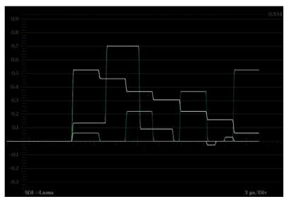
Figure 1-9 Taveform monitor with color bars fed to it in low Pass.
 Watch the video tutorial “Spreading the tonal range” on the DVD.
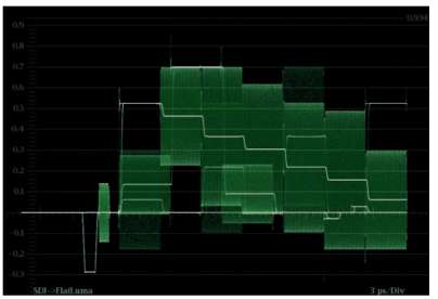
Figure 1-10 Taveform monitor with color bars fed to it in flat Pass.
Setting the Black Level
Using your waveform monitor in luma only mode, and knowing where your black level should be by looking at filler, you can use one of the tools in Figures 1-1 to 1-5 to set your black level to the proper position on some real video.
You can use your own video footage for this exercise, or load one of the video examples from the DVD. For the purpose of this tutorial, we'll use the FCP Color Corrector filter and the file from the DVD called “ChromaDuMonde_overbal.mov.”
Legal Levels
![]() Legal levels apply to video images that will be broadcast or duplicated. There are “legal” limits for black levels, white levels, and the strength of colors (saturation). These limits are determined by international committees and national governing bodies, such as the FCC. They can be further stipulated by specific broadcasters, such as PBS or the Discovery Channel. If you are creating a program for broadcast, check with your outlet for specifics. Some replicators or duplicators also have legal levels that videotape masters must adhere to.
Legal levels apply to video images that will be broadcast or duplicated. There are “legal” limits for black levels, white levels, and the strength of colors (saturation). These limits are determined by international committees and national governing bodies, such as the FCC. They can be further stipulated by specific broadcasters, such as PBS or the Discovery Channel. If you are creating a program for broadcast, check with your outlet for specifics. Some replicators or duplicators also have legal levels that videotape masters must adhere to.
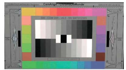
Figure 1-11 CamAlign ChromaDumonde Color bar/Gray Scale/resolution test Pattern chart. Copyright 2004/06 by DSC laboratories. used with permission. Shot with a Panasonic HVX200. this is commonly called a “chip chart” because of the “chips” of various colors and shades.
IRE
![]() This is a unit of measure for waveform named for the Institute of Radio Engineers, which defined the unit. The scale starts in negative numbers and goes beyond 100 IRE.
This is a unit of measure for waveform named for the Institute of Radio Engineers, which defined the unit. The scale starts in negative numbers and goes beyond 100 IRE.
Millivolts
![]() This is another unit of measure for waveform monitors. It is not as easy to use as the simple IRE scale or a simple percentage scale, so we will not use this scale to describe video levels.
This is another unit of measure for waveform monitors. It is not as easy to use as the simple IRE scale or a simple percentage scale, so we will not use this scale to describe video levels.
I suggest you drag all of the tutorial video files to your internal hard drive or a media drive from the DVD now.
1. Launch Final Cut Pro (or whatever application you want to use to follow along with the tutorial)
2. Import the “ChromaDuMonde_overbal.mov” file, dropping it into a sequence.
3. Then go to Effects>Video Filters>Color Correction>Color Corrector.
4. Go to Tools>VideoScopes to call up your internal scopes if you do not have external scopes.
5. In the Viewer, switch to the Filters tab to see the controls for the effect. You can view this filter in either Numeric mode or Visual mode.
 The trace is the portion of the waveform or vectorscope that indicates the levels of the video signal. It is the portion that responds to level adjustments. On most scopes, the trace tends to be green or sometimes white. Sometimes the trace is actually referred to as the “waveform,” while the actual device that displays it is referred to as the “waveform monitor.” The traditional color for the trace is green. More colorists don't like the green trace, so on many monitors the color of the trace is user selectable. Many colorists choose a neutral gray or white color for the trace.
Graticule
![]() The graticule is the fixed lines on the waveform and vectorscope that provide scale and positioning information, for example, the IRE lines on the waveform monitor or the color targets on the vectorscope. The graticule is often orange as a contrast to the green of the trace. This word is not limited to video. Graticule also defines the network of longitude and latitude lines on a map.
The graticule is the fixed lines on the waveform and vectorscope that provide scale and positioning information, for example, the IRE lines on the waveform monitor or the color targets on the vectorscope. The graticule is often orange as a contrast to the green of the trace. This word is not limited to video. Graticule also defines the network of longitude and latitude lines on a map.
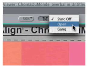
Figure 1-12 Open button in Canvas.
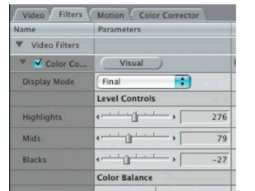
Figure 1-13 Color Correction filter in Numeric mode.
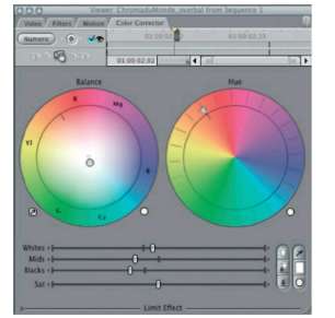
Figure 1-14 Color Correction filter in visual mode.
6. Adjust the “Blacks” slider down until the shape at the bottom of the center of the waveform monitor reaches the bottom orange line labeled “Black” or 0%.
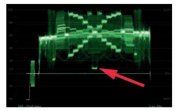
Figure 1-15 This shape at the arrow represents the starting point for the pure black “chip” in the middle of the ChromaDumonde camera chart. it should be on the “black” line (0 IRE) of the waveform monitor, not above or below it.
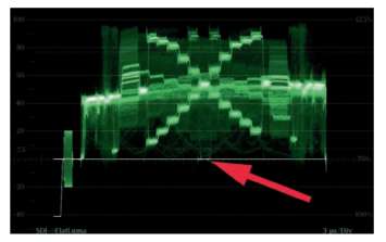
Figure 1-16 This figure represents the image when the black level has been brought down too low. the fattening of the shape at the arrow indicates clipping or crushing of the signal, which results in a lack of detail in the shadows.
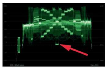
Figure 1-17 This figure represents the proper black level. the signal is neither too high above the black (0 IRE) line nor is it crushed.
![]() A camera test chart with small “chips” of different colors and shades. Each small block of color is called a chip. The charts used throughout this book are high quality camera charts from DSC Laboratories.
A camera test chart with small “chips” of different colors and shades. Each small block of color is called a chip. The charts used throughout this book are high quality camera charts from DSC Laboratories.
The ChromaDuMonde chart is really a test pattern. Bring in a real world image from your own footage or from the DVD that accompanies this book and try to set the black level. Remember to watch the bottom of the waveform monitor as you slowly lower the black level, making sure that you don't “flatten out” the trace of the waveform monitor along the bottom. Try to keep the basic shape of the trace from distorting too much.
In future lessons, we will break this rule about not flattening out the waveform shapes as we attempt to create certain looks, such as blown out highlights and crushed blacks, but for now, the goal is to maintain as much detail as we can in our video images, and that means that the shape of the trace on the waveform monitor should not flatten out.
TIP
![]() By selecting “Open” (the center icon at the top of your Canvas is a pulldown menu) on your Canvas, your Viewer will stay linked to your Canvas, updating effects status as you move in your timeline, making it easier to color correct multiple shots.
By selecting “Open” (the center icon at the top of your Canvas is a pulldown menu) on your Canvas, your Viewer will stay linked to your Canvas, updating effects status as you move in your timeline, making it easier to color correct multiple shots.
Determining the Proper White Level
Determining the proper white level is a little easier because there aren't any strange choices about black levels being at different legal levels depending on your country or type of video signal. With white level it's always 100 IRE or 100%.
There are certainly times when you may not want to bring your level up as high as 100%. You need to look at the image itself and determine if there's anything that actually deserves to be completely bright white. Sometimes, with a simple head shot interview, for example, the brightest part of the image should be a highlight on someone's skin, which may not belong past 80% or 90%.
TIP
![]() Adjusting levels when color correcting is like focusing a camera. You can never really be sure you're “in focus” unless you pass the proper point, so pull down your black level until the shape starts to fatten out at the bottom or goes past the line that indicates 0 IRE or 0% black. Then bring it back up to the proper level.
Adjusting levels when color correcting is like focusing a camera. You can never really be sure you're “in focus” unless you pass the proper point, so pull down your black level until the shape starts to fatten out at the bottom or goes past the line that indicates 0 IRE or 0% black. Then bring it back up to the proper level.
With your black level set, you can bring your white level up to the maximum legal level and see if the image appears too contrasty or harsh. If it does, then back it down to a comfortable level. On the other side of that, if your image appears to be underexposed or flat, then the white level should be brought up to its highest legal level. Also, remember that the white level—or highlight level—is not the final adjustment that we'll make to determine the overall brightness of the image, so if you're not happy with the brightness of your image at this point, or if it seems like your white levels are correct but your skin tones are now too bright, we will fix that in another step.
Another special circumstance to consider when determining white level is if your footage was shot overexposed, the whites and other bright highlights will be clipped. This can be seen as a thin, bright line along the top of the waveform monitor. In this case, you can attempt to bring your video levels down somewhat to cut the glare, but you shouldn't bring your levels much below 100% because having a clipped signal that is much lower than 100% will look very strange.
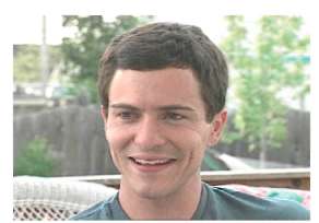
Figure 1-18 This sky on the left side is overexposed to the point of being clipped.
Crush
 When the black level is lowered so that the shadows lose detail, this is known as crushing the signal or creating a crushed look. It is a form of clipping or taking a signal beyond its correct range.
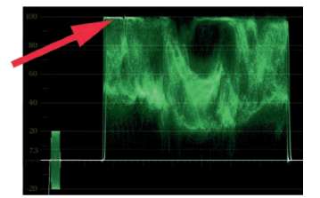
Figure 1-19 The waveform shows the clipped sky as a thin white line on the left side of the trace as indicated by the arrow. the sky on the right side is also bright, but it is not heavily clipped because the waveform doesn't form a thin, compressed line.
Setting the Proper White Level
Setting the white level is very similar to setting the black level. Let's go back to our “ChromaDuMonde overbal” clip in Final Cut Pro using our same Color Corrector filter that is already applied.
1. Using either the Numeric view or the Visual view, adjust the Highlights slider (as it is called in Numeric view) or the Whites slider (as it is called in Visual view) until the brightest portion of the signal sits no higher than the 100% line in the waveform monitor.
2. Drag an RGB Limit effect or Broadcast Safe effect on to the clip. Now, instead of having the white levels go beyond 100% you'll see the upper portions of the trace begin to distort or flatten out as you move them up near the 100% line. As with “crushing” the black levels, you want to avoid this distortion because it indicates that the signal is clipping and losing highlight detail. With this specific ChromaDuMonde file, you want to make sure that the ratio or steps between the lines of the trace that represent the brightest chips doesn't change. If you go too high, the lines representing the chips will actually flatten out to be on the same level.
Clip (clip, clipping, clipped)
![]() A clipped signal means that the image was exposed too bright for the imaging technology or recording technology. The result is a loss of detail that can be identified on a waveform monitor by a thin, sharp line at the top of the trace.
A clipped signal means that the image was exposed too bright for the imaging technology or recording technology. The result is a loss of detail that can be identified on a waveform monitor by a thin, sharp line at the top of the trace.
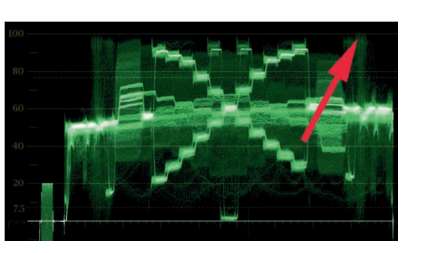
Figure 1-20 These whites are set correctly. though they don't quite go all the way to 100%, any higher setting caused the highlights to begin to compress, especially on the right side, which was lit slightly brighter than the left. i stopped raising the whites when the area near the arrow began to compress into a thin line.
3. You may have noticed that your black levels have come up a bit. Use your blacks slider to put them back where they were before you raised your white levels. This is a little dance that you will always have to do if you are color correcting with a mouse or single trackball. Professional colorists usually use a color correction interface similar to the JLCooper Eclipse or Tangent Devices CP-200-BK that allows them to simultaneously adjust black and white levels, so as they bring white levels up, they are holding down the black levels with another control.
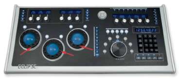
Figure 1-21 This is JLCooper's eclipse CX panel. the rings indicated by the arrows allow simultaneous adjustment of the whites, mids, and blacks.
Determining the Proper Gamma or Mids Level
With your white and black levels set (sometimes referred to as your highlight and shadow levels) the next step is to determine your “mid” or “gamma” levels. With the brightest and darkest portions of the picture often determined by legal levels, the gamma or midrange is the portion of the tonal range that can be set to give the shot its true overall tone.
Gamma
 This term has two meanings that are somewhat tied to each other. One meaning for gamma is the curve or transition between white and black. The other meaning describes the middle of the tonal range between shadows and highlights. The reason that these meanings are tied is that by altering the position of the midtones, the curve between white and black is also altered.
With the brightest and darkest portions of the picture often determined by legal levels, the gamma or midrange is the portion of the tonal range that can be set to give the shot its
There are several reasons for changing the gamma or mids. One is that raising the mids can make a shot that already has the whites set as high as they can go seem brighter. Another is that lowering gamma can help provide additional richness to an image that already has blacks set as low as they can go. Additionally, it is possible to “play” the gammas against either the highlights or the shadows so that a specific portion of the tonal range exhibits greater contrast. This can be accomplished in the shadows, for example, by crushing the blacks down and stretching the mids up—to accomplish greater contrast in the lower mids—or by clipping the highlights up and stretching the mids down—to accomplish greater contrast in the upper mids.
Think of your tonal range as a rubber band.
Think of your tonal range as a rubber band. First you want to stretch the top and bottom out to their safe or legal limits. Then you can grab the middle of the rubber band and stretch and compress the top or bottom within those limits. We'll deal with this concept in greater depth in later chapters.
Setting the Proper Gamma or Mids Level
Returning to Final Cut Pro and the same Color Correction filter that we started working with to set the blacks and whites, we'll finish the tonal correction on the file by adjusting the gamma, or mid, slider.
For now, let's just set the gamma or midrange of the image so that it looks pleasing. For our ChromaDuMonde file, we want the middle gray tones (the thick band of the trace that extends all the way across the middle of the waveform monitor) to average out to 50%. With our blacks set to 0% and our whites set to 100%, the middle grays are between 55% and 65% (similar to Figure 1-20).
Drag the Mids slider (which may be called the gamma slider in some other software) so that the waveform monitor looks more like Figure 1-22, with the average closer to 50%.
When you are done adjusting the mids down, you may find that it's necessary to adjust the blacks and whites up a little bit.
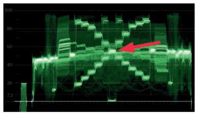
Figure 1-22 Note that the midtone grays are now between 40% and 60% with the center gray chip, indicated at the arrow, around 55%. Note that the tonal range is spread out between 0% and 100% and that the steps between the lines representing the chips on the chart are much more evenly distributed than in the original waveform image (Figure 1-15). also note that no portions of the image are clipped or crushed.
Now look at the waveform monitor and the image itself as you check and uncheck the Color Correction check mark at the top left of the filter in the viewer. When it is unchecked, you are seeing the original camera image. When it is checked, you are looking at your correction. Your correction should be much more pleasing.
My final settings for the numeric view of the filter were:
Highlights: 276
Mids: 80
Blacks: –27
Try setting the tonality of a different video clip. With the camera chart, the instructions that came with the chart indicated where the gray should be positioned on a waveform monitor. With a real world image, the choice is not quite so cut and dried. The positioning of the gamma or mids is set completely by eye with most images because there is no legal level for the middle of the image. Setting the gamma is done “to taste” or can be done to help better match the current shot to the surrounding shots in the sequence.
TIP
![]() When you are adjusting any specifc tonal range (shadows, mids, highlights) you need to focus more of your attention on the portion of the picture that has those kinds of tones. Look at what happens to the shadows as you adjust the blacks. Look at the midtones (skin tones, for example) as you adjust your mids. And look at the brightest portions of the picture as you adjust the highlights.
When you are adjusting any specifc tonal range (shadows, mids, highlights) you need to focus more of your attention on the portion of the picture that has those kinds of tones. Look at what happens to the shadows as you adjust the blacks. Look at the midtones (skin tones, for example) as you adjust your mids. And look at the brightest portions of the picture as you adjust the highlights.
Balancing the Colors
With the tonal range set nicely, the next step in most color correction is to balance the colors.
With the tonal range set nicely, the next step in most color correction is to balance the colors. This means that any unwanted color casts are removed. When I started doing color correction, I didn't understand how to see unwanted color casts unless they were pretty obvious. Some people are very good at doing this without any training. Some people need some practice. The good thing is that the tools to analyze color casts are always right at the colorist's fingertips, so if someone says, “The blacks look a little green,” and you don't really see what they're talking about, don't worry. I'll show you several ways to check out these color casts.
Analyzing Color with the Vectorscope
Please do not get freaked out by scopes. Think of the waveform and vectorscope as creative tools. They are there to help you.
A vectorscope is a simple analytical tool with the sole purpose of analyzing the strength and hue of colors in the video signal. It's easiest to understand by superimposing a color wheel on top of the vectorscope.
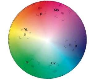
Figure 1-23 T vectorscope with a color wheel superimposed on top. Note that the unsaturated colors are in the center of the scope.
The strength or saturation of the color is relative to the distance of the trace from the center of the vectorscope. The direction of the trace around the perimeter of the circle tells what hue it is. Think of the vectorscope in terms of a clock face. If part of the trace extends toward 11:00, that means it's red. Toward 1:30 is magenta, 3:00 is blue, 5:30 is cyan, 7:30 is green, and 9:00 is yellow.
So with that knowledge in hand, you might ask, Where is white? Where is gray? And where is black? The seemingly bizarre answer is that black, white, and gray are all exactly in the middle because they are completely neutral. Remember: Saturation is indicated by the distance from the middle. Because black, white, and gray have no saturation at all, that means they are all in the exact middle of the vectorscope.
Because black, white, and gray have no saturation at all, that means they are all in the exact middle of the vectorscope.
Balancing colors in color correction means that colors that are supposed to be neutral are neutral.
Balancing colors in color correction means that colors that are supposed to be neutral are neutral. And because neutral colors are so easy to define on a vectorscope—they're in the middle— balancing them should be easy to do. You just center neutral colors on the vectorscope. This does not mean that a perfectly balanced image doesn't have portions of the trace that extend out toward red or blue or green. You want those colors if there are skin tones or grass or sky in your picture. It just means that most images have neutral tones in them, and those tones should be centered on the vectorscope.
TIP
![]() Centering the trace on the vectorscope is usually easiest to do when the gain or zoom on the vectorscope is increased so that it's easier to see the center. All good external scopes have a way to increase the gain or the zoom on the vectorscope, but not all software scopes can do this.
Centering the trace on the vectorscope is usually easiest to do when the gain or zoom on the vectorscope is increased so that it's easier to see the center. All good external scopes have a way to increase the gain or the zoom on the vectorscope, but not all software scopes can do this.
Analyzing Color with the RGB Parade Waveform
When I wrote The Art and Technique of Digital Color Correction, I interviewed dozens of great colorists. One of the questions I asked them was: “If you were stranded on a desert island with only one scope, which would it be?” Most of them said they'd want an RGB Parade waveform.
What is the advantage of the RGB Parade waveform monitor? It gives you information on brightness (tone) as well as important information on color balance, so it's the one scope that can really do it all.
The RGB Parade works very similarly to the waveform monitor that we used earlier in this chapter already, except that it displays each of the channels of color information—red, green, and blue— individually in a “parade” across the display. The first image or “cell” shows the red channel, the second shows the green channel, and the third shows the blue channel.
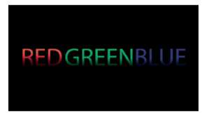
Figure 1-24 This is a graphic i created in Photoshop and imported into final Cut Pro.
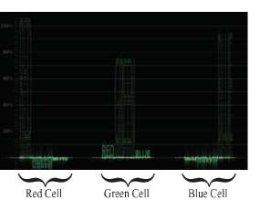
Figure 1-25 This is the RGB waveform display of figure 1-24. Note that in the first red cell, only the RED word is displayed, in the green cell, the GREEN word is predominant, and in the blue cell the Blue word is predominant. Because each word was created only from a pure color, the smaller, or inversed, words are probably only showing up due to an error in the way the color spaces were translated when the file was imported.
We're still talking about needing to balance the colors, and the RGB Parade gives some great information when it comes to balancing colors. As I mentioned, each of the cells is similar to the regular waveform monitor that you already used, except that each cell only gives a level for one color.
The thing to realize with video is that when the three color channels (red, green, and blue) are equal, there is no “color.” Equal levels of red, green, and blue means there is no saturation.
Equal levels of red, green, and blue means there is no saturation.
So when you are looking at an RGB Parade waveform display, you usually want the top and bottom of all three cells to line up. That indicates balanced colors.
Cell
![]() The display of the individual color channels of the RGB parade waveform monitor are referred to as cells. There are three cells: red, green, and blue. Sometimes there is a fourth cell for Y or luma. That cell is usually displayed first in left to right order, followed by red, green, and blue.
The display of the individual color channels of the RGB parade waveform monitor are referred to as cells. There are three cells: red, green, and blue. Sometimes there is a fourth cell for Y or luma. That cell is usually displayed first in left to right order, followed by red, green, and blue.
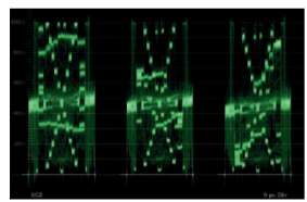
Figure 1-26 This is a properly white balanced ChromaDumonde chart displayed on an RGB Parade waveform. the image is balanced and neutral. Note that all three cells are essentially the same levels. remember: from left to right, the three waveforms are red, green, and blue.
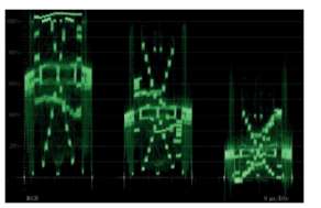
Figure 1-27 This is an improperly white balanced ChromaDumonde chart displayed on an RGB Parade waveform. the image is warm. Note that the red cell is higher than the green and blue cells.
Analyzing Color with the Eyedropper
It is also possible to analyze colors with an eyedropper in many applications. This is a popular method amongst Photoshop retouchers. Analyzing color with an eyedropper is similar to using the RGB Parade waveform. You sample a color that should be neutral (a black, white, or neutral gray) with the eyedropper and then take note of any color channel that is higher or lower than the others.
There are some tricks to this technique because the RGB values that you will get from an eyedropper can vary quite a bit from one pixel to the next, so you have to kind of average them out in your head as you drag around an area that you feel should be neutral.
![]() A retoucher is the print equivalent to a colorist in the film and TV world. The tools of the retoucher are often analogous to the colorist's tools, but sometimes the retoucher can do things that colorists cannot do because of the static nature of print.
A retoucher is the print equivalent to a colorist in the film and TV world. The tools of the retoucher are often analogous to the colorist's tools, but sometimes the retoucher can do things that colorists cannot do because of the static nature of print.
Let's analyze three images with an eyedropper. You can do this in Apple's Color, Color Finesse, or in almost any Adobe application. I will do this in Avid's color correction mode.
On the DVD are three files of a DSC Labs Grayscale Test Pattern chart shot with a Panasonic HVX200. The files are called “grayscale_neutral.mov,” “grayscale_warm.mov,” and “grayscale_cool. mov.” They are all HD files. Import them into your color correction application of choice and look for a way to sample colors with your eyedropper. I will walk you through this with specifc instructions if you're on an Avid, but you should be able to follow along with other applications.
After importing the three shots into the Avid, cut them into a sequence and go into color correction mode or choose Toolsets > Color Correction.
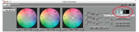
Figure 1-28 To sample with the eyedropper, click on either of the two color patches indicated by the red circle. Your cursor will change to an eyedropper, and you can click and drag to a color in one of the monitors in the Composer window.
TIP
![]() You can opt-drag (Mac) or alt-drag (PC) the color swatch you just saved into a bin for later matching or reference.
You can opt-drag (Mac) or alt-drag (PC) the color swatch you just saved into a bin for later matching or reference.
Click and drag from one of the color patches in the upper right corner of the Color Correction window to a neutral color in the Current window and release. This will save the RGB values of that color temporarily.
For the purposes of this tutorial, let's sample a black, gray, and white “chip” from the grayscale_neutral chart. I'll sample the middle gray chips and the black and white chips that are right in the center of the chart. These are 8-bit RGB values.
My RGB values for the grayscale_neutral.mov are:
White: 205, 226, 237
Gray: 140, 136, 140
Black: 27, 33, 37
(Your values may be slightly different. Mine varied between 3 and 7 values inside of each of the three chips as I dragged around.)
 Watch the video tutorial “Analyzing with the Avid eyedropper” on the DVD.
The preceding numbers tell us that the white balance on our “neutral” image is not really quite neutral. In the whites and blacks, the blue is slightly elevated (237 for whites and 37 for blacks), and red is a little deficient (205 for whites and 27 for blacks). If you really wanted to get this image looking absolutely neutral, you'd need to add some red in the whites and the blacks and maybe pull back on the blues in the whites and the blacks as well. In the grays, as I dragged around, the blues and greens were pretty similar most of the time, with red a little lower, so maybe you could add just a touch of red in the midtones as well, though the preceding sample would indicate that adding a little green is the right thing to do. Remember that you're never going to get all of these numbers to match, so we're just looking to get a general idea of which colors are slightly stronger or weaker.
Let's also sample the warm and cool chip charts. Here are the numbers I came up with:
Grayscale_cool
White: 146, 226, 253
Gray: 81, 133, 192
Black: 23, 33, 51
Grayscale_warm
White: 254, 204, 127
Gray: 162, 120, 72
Black: 32, 28, 25
These values give you a real clue about what's wrong with these images. In the cool file, blue is elevated across all three tonal ranges. Red is also more deficient than green, and green is also lower than blue. In the warm file, the red channel is elevated in the whites and grays, though the blacks are actually pretty close between the lowest and highest channel.
TIP
![]() Color casts are rarely the same strength across all three tonal ranges. This means that each tonal range should be balanced separately.
Color casts are rarely the same strength across all three tonal ranges. This means that each tonal range should be balanced separately.
So what about yellow casts, cyan casts, and magenta casts? How do you know if you have one of those? Take a look at a vectorscope (Figure 1-29). The primary colors of red, green, and blue form a triangle on the vectorscope. The secondary colors—cyan, magenta, and yellow—are positioned between each of the primary colors. The secondary colors are made up of equal amounts of each of the primary colors that they're between. Yellow is equal parts red and green, cyan is equal parts green and blue, and magenta is equal parts red and blue. If you look at the gray values of the preceding grayscale_neutral clip, you will see that the red and blue values are equal to each other and higher than green. That means that there could be a slight magenta cast (red + blue = magenta) to the midtones. Another way to check on secondary colors is to look at the color directly opposite the primary color on the vectorscope. In the case of the gray values in our neutral image, if you look opposite of green, which is slightly low, you see magenta, so once again you know that there could be a slight magenta cast to the midtones of that image.
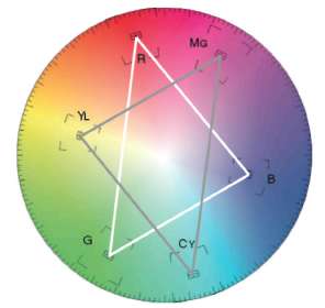
Figure 1-29 Note the position of the primary colors of red, green, and blue on the vectorscope. Note the position of the secondary colors of magenta, cyan, and yellow between the primary colors. and note the secondary colors that are opposite the primary colors. memorize these relationships. if memorizing these are difficult, remember that you can always see these relationships on a vectorscope.
![]() If you find a bright or dark patch in some video that you're sampling, and the numbers don't move much as you scrub around in the area, that is an indicator that that area is clipped. If all of the whites are pegged at 235 or 255 or the blacks bottom out at 0 or 16, then that area has no detail because it is clipped.
If you find a bright or dark patch in some video that you're sampling, and the numbers don't move much as you scrub around in the area, that is an indicator that that area is clipped. If all of the whites are pegged at 235 or 255 or the blacks bottom out at 0 or 16, then that area has no detail because it is clipped.
Balancing with the Color Wheels (Color Balance Controls, Hue Offset Wheels)
The tools that colorists are being exposed to in the last several years have changed fairly dramatically. For most experienced colorists, the “real” tool for fixing color casts are the color wheels.
For most experienced colorists, the “real” tool for fxing color casts are the color wheels.
Most of these experienced colorists practiced their craft on the gold standard da Vinci telecine/color systems. The three trackballs in the various da Vinci models basically did the same thing that the color wheels do in so many software color correctors now. As a matter of fact, several manufacturers, such as Tangent Devices and JLCooper, make manual user interfaces that allow the manipulation of the color wheels in many applications with triple trackballs (see Figure 1-21).
Using the color wheels to balance colors is very easy if you are looking at a vectorscope or eyeballing your corrections just looking at your monitor. Using the color wheels while monitoring an RGB Parade waveform monitor or while sampling with an eyedropper is a bit more challenging, but it is worth the effort and practice.
Using the color wheels while monitoring a vectorscope is simply a matter of grabbing the cursor in the middle of the color wheel. In Avid and Color Finesse, these are called the Hue Offset wheels, in Final Cut Pro's Color Corrector 3 Way effect they're called Color Balance controls. Apple's Color also calls them Color Balance controls. Adobe products refer to them as Color wheels.
Let's balance the cool gray chip chart using the Color Balance controls in Apple's Color. Once again, you can follow along in any application that has similar wheels.
In Color, import the “grayscale_neutral.mov,” “grayscale_ warm.mov,” and “grayscale_cool.mov” that we just used in the eyedropper exercise.
Select the Grayscale_neutral clip in the time line and go in to the Primary In room (tab) of Color (Figure 1-30). Take a look at the RGB Parade waveform monitor and the vectorscope. We're going to try to match the warm and cool grayscale images to this one.
![]() Watch the video tutorial “Balance Grayscale with Color Wheels” On the DVD.
Watch the video tutorial “Balance Grayscale with Color Wheels” On the DVD.
Select the Grayscale_cool clip in the time line. Notice that the vectorscope on the neutral image creates a nice dot in the center of the scope, while vectorscope of the cool image is more of a streak that extends out between the blue and cyan “targets” (Figure 1-31). Also on the red cell of the RGB Parade, the level is low, while in the blue cell, the levels are so high that they are clipped along the top. If you are doing this exercise in Color, you can see in the cool 3D vectorscope that the neutral image stays very close to the center line between white and black, while the cool image swoops away.
To balance the cool image, we'll use the Color Balance wheels in Color's Primary In room (tab). Start with the Shadow wheel (to the left) and drag the center crosshairs away from blue while watching the vectorscope image. You will see that the part of the trace that is closest to the center of the vectorscope will get even closer. Notice the effect you have on the center portion of the trace as you drag around in that Shadow wheel. The goal is to get it into the center.
Now we'll balance the highlights with the Highlight wheel (to the right). This time we're trying to drag the far end of the trace back to the middle. This will take a much more extreme move because the highlights are farther away from “normal” than the shadows were. Keep your eyes on the white chips on the chart to make sure they don't become too red or yellow.
Finally, we'll balance the midtones (the center wheel). Try to create the same nice tight point in the vectorscope that you saw when you were looking at the neutral clip. You won't be able to match them perfectly because the blue highlights clipped and some color data was permanently lost when that happened.
It will take a little bit of work going back and forth between the shadow, midtone, and highlight wheels to get this file looking good. You'll notice on the RGB Parade that the blown out highlights in the blue cell can't really be recovered, but the levels for the gammas all match across all cells, and the levels of the shadows also match across all three cells (Figure 1-32). A screen grab of the trackballs from my final correction are also included (Figure 1-33). Note that I also moved the Master Lift down a bit and the Master Gain up a bit to stretch the contrast a little.
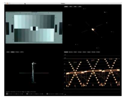
Figure 1-30 Tpple Color's displays for the neutral grayscale image.
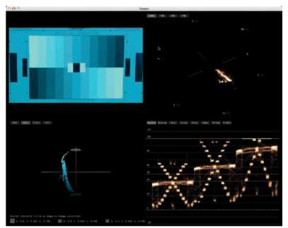
Figure 1-31 Tpple Color's displays for the cool grayscale image.
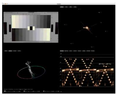
Figure 1-32 Tpple Color UI with RGB Parade indicating clipped highlights in the blue cell (farthest to the right in bottom corner).
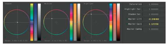
Figure 1-33 Tpple Color UI of the Primary in room showing positions of the Color wheel corrections and master lift and master Gain corrections.
Try this same exercise with the warm chart and with any of your own footage that has a color cast in it.
Balancing with the Color Balance controls is much easier to do while watching the vectorscope.
Balancing with the Color Balance controls is much easier to do while watching the vectorscope. With experience and practice, you'll be able to balance using the wheels while watching the RGB Parade waveform, but until then it'll be a little like trying to draw a circle on an Etch A Sketch®.
Balancing with RGB Levels
Another way to correct color balance is to use red, green, and blue levels controls. Basically these are controls—usually sliders— that allow you to adjust the highlight, midtone, and shadow amounts of each of the color channels individually. In Color, this is done in the Primary In room by clicking on the Advanced Tab along the right side. In Final Cut Pro, you would use the Video Filters>Color Correction>RGB Balance effect. In Color Finesse, you would use the RGB Master tab. In Avid (other than Symphony and DS) there are no controls to do this, though using Curves is similar, as you will see in the next section of the book. In Adobe Premiere and After Effects, these controls are in Effects>Levels (Individual Controls). Then inside the effect, spin down the “twirlies” for red, green, and blue to reveal the individual sliders for black, white, and gamma for each color channel.
Using these sliders seems very intimidating and way too technical, but if you watch the RGB Parade waveform monitor while adjusting these controls, you'll see how very easy this is to do.
If you didn't read the earlier part of this chapter recently, you may want to go back and check out the section on Analyzing Color with the RGB Parade Waveform.
 Watch the video tutorial “Balance grayscale with RGB sliders” on the DVD.
Let's use the same files we just used in the Balancing with the Color Wheels section. You can continue to work in Color, if you have access to it, by using the Advanced Tab in the Primary In room, but I will do the rest of this tutorial in Color Finesse (plugged in to Final Cut Pro).
1. Import the “grayscale_neutral.mov,” “grayscale_warm. mov,” and “grayscale_cool.mov” into Final Cut Pro—or any NLE that has Color Finesse as a plug-in, like Adobe Premiere or After Effects—and cut the files into a sequence. Select the “grayscale_warm.mov” clip in the time line and selectit.AddanEffects>VideoFilters>SyntheticAperture>SA Color Finesse 2 effect to the clip. In the Filters tab, choose the Full Interface for the Color Finesse effect (or you can drag way down on the list of controls to RGB Master where you will see gamma, pedestal, and gain controls for each color channel.
2. When balancing a chip chart that is essentially all neutral tones, the goal is to make each of the three color channels, or cells, on the RGB Parade waveform match one another. You can also use these sliders while analyzing your image with the eyedropper. While most real world images have colors that are of different levels of red, green, and blue, you can still balance colors using the same technique. You just need to be cognizant of the differences that should be kept between the color channels, for example, a blue sky will make the blue channel higher than red or green and it should be that way. A predominant skin tone (for example in a close up) will have higher red and yellow channels. But if there is something black and something white in the frame, you can balance the three color channels to those black and white references. Legendary colorist Bob Festa calls these references his “visual signposts.” They tell him where to go.
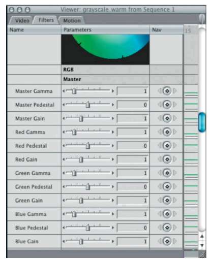
Figure 1-34 Color finesse RGB Sliders as a final Cut Pro filter.
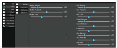
Figure 1-35 Color Finesse's full user interface. the RGB sliders are in the RGB tab.
Legendary colorist Bob Festa calls these references his “visual signposts.”
3. Start by adjusting the black levels of all three color channels so that you have a nice black on all three channels. If you're working in Color Finesse with an external scope, you can't use the full interface because the changes aren't updated to the output video card until you complete the correction, but if you use the Filters controls in Final Cut, they update in real time. I brought the overall pedestal down to –0.05, the red pedestal down to –0.03, and the green pedestal down to –0.03.
4. Now let's adjust the highlights or “gain” controls for each channel while we watch the top of the RGB Parade. The red channel is clipped at the top, so you shouldn't place the red channel all the way up. It's already too high because the image is so warm.
5. Finally, adjust the gamma controls for each color channel, trying to get the bar that runs through the middle of the trace to average out at about 50 IRE. When you do this, it will radically affect some of the other levels that you've already set. Go back and tweak them back into position. If you don't have a panel, like the Tangent Devices CP-200 or JLCooper Eclipse, this could take some time. The final figures I ended up with are as follows:
Master pedestal: –0.05
Red pedestal: 0
Green pedestal: –0.05
Blue pedestal: –0.13
Red gain: 0.9
Green gain: 1.32
Blue gain: 2.22
Red gamma: 0.93
Green gamma: 0.93
Blue gamma: 1.25
With the “chip chart” under your belt, try this same exercise with some of your own footage, or footage from the DVD, that has color casts in it. Remember, the order that you adjust levels should normally be blacks first, then whites, then midtones.
Balancing with Curves
Finally, you can balance with Curves. This is very similar to balancing with RGB levels. The easiest way to balance using Curves is to keep an eye on your RGB Parade waveform level. Pairing Curves and the RGB Parade will make your correction very intuitive. Many applications have Curves controls now. Avid was the first to popularize this method for video corrections (though they've been in Adobe apps forever), and Avid still has the “sexiest” of the Curves UIs with a nice color coding that lets you know that pulling down the blue curve will make your correction more yellow.
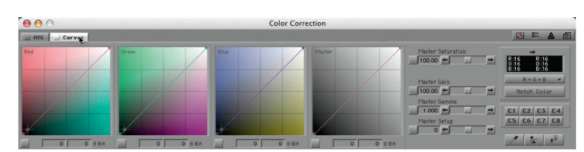
Figure 1-36 Curves control in avid media Composer.
We'll use the Avid to balance color using Curves, but you can also use Color's curves in the Primary room, or Color Finesse's Curves control. In After Effects andPremiere use Video Effects>Color Correction>RGB Curves. Final Cut doesn't have Curves controls except by using Color or the Color Finesse plug-in.
The theory behind using Curves is identical to using RGB levels. With Curves, the thing to understand is the relationships of the graphs to the video image and which axis controls what. Looking at Figure 1-36, the colors of the graphs help you to understand the relationships a little better. Let's consider the Master graph first. That's the one on the far right. It controls the levels of all three color channels, so it essentially does the same thing as a Master Gain, Master Set-Up, and Master Gamma control all rolled into one. To adjust set-up (blacks), drag the small purple dot at the lower left corner of the graph. To bring blacks up, drag straight up. To bring blacks down, drag to the right. To bring whites down, grab the small purple dot at the upper right corner of the graph and drag it down. To bring whites up, drag to the left. If you want to alter the gamma or midtones, you can click on a point along the line to add a point and then drag that point in any direction. Dragging it up or to the left will brighten the gammas. Dragging it down or to the right will darken the gammas.
![]() Watch the video tutorial “Balance color with Curves” on the DVD. Some video tutorials are done in a different application than the text tutorials, but the principles are the same.
Watch the video tutorial “Balance color with Curves” on the DVD. Some video tutorials are done in a different application than the text tutorials, but the principles are the same.
Most software that uses Curves also has numerical readouts of the direction that the points on the graph are being moved.
Let's use the same files we just used in the Balancing with RGB Levels section. You can continue to work in Color, if you have access to it, by using the Advanced Tab in the Primary In room, but I will do the rest of this tutorial in Avid.
- Import the “grayscale_neutral.mov,” “grayscale_warm. mov,” and “grayscale_cool.mov” into Avid and cut the files into a sequence. Go into color correction mode, or choose Toolset>Color Correction to enable the color correction workspace. Park the time line indicator on the “warm” clip.
- At the top of the Composer window, click on the word “Previous” or “Next” at the top of the screen and choose “RGB Parade” from the resulting pulldown window. If you have an Avid that has real video output (Mojo DX or Nitris DX, for example) and external scopes, then use the external scopes instead.
- The RGB Parade should look similar to the screen grab in Figure 1-39. Note that the red channel is very hot. The top of the red cell is clipped, the shadows are lifted, and the gamma is at almost 75% instead of 50%. Green is fairly close to where it should be. The midtones are just a touch low, the blacks are elevated similar to the reds, and the highlights are just a little low. The blue channel has the blacks at about the right level, and the midtones and highlights are only about halfway to where they should be.
- As with all other corrections, the black levels are the first thing to worry about, then highlights, and then midtones. Which color channel to start with doesn't really matter, but I like starting with green or whichever channel is closest to being correct. Then I can use that as a guide for the other two channels. We want to drag the bottom corner of the green Curve to the right just a bit to lower the black level of that channel. We want to get it down to the 0% mark, not the bottom orange line. If you can't get fine enough control, you can type in the numbers in the boxes just below the Curve. My final number in the first box was 8. This essentially lowered the black level of the green channel by 8 levels on a scale of 256 (8-bit color).
- Now raise the top right corner point on the green Curve to the left. This will raise the level of the highlights. We want to get them to about 100% without “flattening” any of the trace, which would indicate clipping. Do not take it all the way to the top orange line. My final number in the first box was 235. With those two levels correct, the gamma is absolutely perfect, averaging outright at 50%.
- Now do the same for the blue channel. The blacks in the blue channel look good. The highlights have to come way up. I took the top right part of the blue curve and pulled it back to 145. That brought my blacks up a bit, so I moved my black point down to 10. Then I placed a point in the middle of the blue Curve and brought it up. I brought a point at about 77 up to 135 to get the blue and green channels to match.
- Finally, work on the red channel. Blacks first. I moved the Curve to the right by 10 “bits,” matching the green and blue channels. I am going to skip jumping straight to the highlights of the red channel because it is so clipped, so I will set my midtones next by clicking on a spot in the middle of the blue Curve and pulling it down to match the other two curves. This pulled the blacks down too much, crushing them, so I'm going to move the black point back a little from where I had it. Bringing it all the way back to 0 matches the other two channels and unclips (or “uncrushes”) the red channel's black level. The highlights are still too high, so click on the top of the Curve and pull it down. I brought my level down to 191. That meant I had to raise the midpoint back up a little to get it to match the other two channels again. I set the white point of the red channel by seeing that only three of the chips above the midtone were unclipped, so I matched the top of the third chip of the red channel to the same level as the third chips of the blue and green channels. That makes the “steps” of chips in the RGB Parade look evenly matched except for the two clipped chips in the red channel.
8-bit Color
 8-bit color is one of the two primary color depths of video. 8-bit color refers to the number of bits that define a single color channel of video. 8 bit is sometimes mistakenly referred to as 24 bit (8 bits times three channels of color). 8-bit color has 256 levels of gray in each color channel. The number of colors that 8-bit color depth can reproduce (mathematically) is 256 × 256 × 256 = 16.8 million colors.
10-bit Color
![]() While it may sound only slightly better than 8 bit, 10- Bit color has 1024 levels of gray per color channel, or 1024 × 1024 × 1024 = 1 billion+ colors!
While it may sound only slightly better than 8 bit, 10- Bit color has 1024 levels of gray per color channel, or 1024 × 1024 × 1024 = 1 billion+ colors!
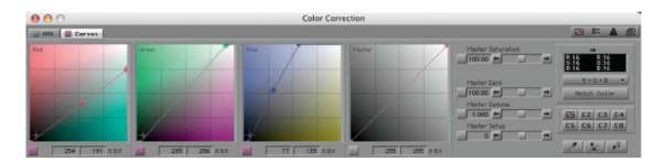
Figure 1-37 Here is what my Curves look like for the final correction. the numbers under the Curves indicate the level changes for the selected point on the Curve. the selected point is indicated by a small circle around the point. for the red, green, and master Curves it is the top point in my example. for the blue Curve, it indicates the middle point.
Take some time to try to use the Curves in your favorite app to adjust some of your own footage. The RGB Parade waveform is probably the easiest tool to analyze your results, but you could also use the eyedropper. In Color, you can select three simultaneous points on the image to monitor, and they update in real time as you either make adjustments or play through a scene. You can also try your hand at doing this correction using a vectorscope if you want a little more of a challenge.
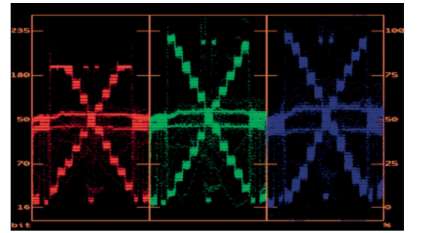
Figure 1-38 Here is the avid internal RGB Parade waveform with the final correction.
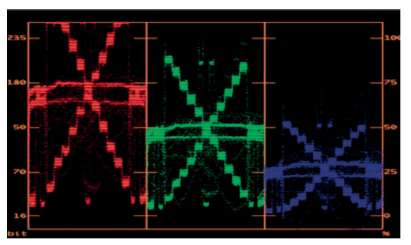
Figure 1-39 Tor comparison, this is the avid RGB Parade waveform of the original image.
Conclusion
You've learned that analyzing your footage with several tools is the key to doing good color correction.
You've learned that analyzing your footage with several tools is the key to doing good color correction. With lots of experience and a very long-term relationship to a great high-end monitor, you can use your eye more to guide these corrections, but even experienced pros rely on the waveform monitor and vectorscope because your eyes can fatigue and lose reference. The scopes and other tools provide hard, unyielding reference points that will guide you even after a long grading session.
The scopes and other tools provide hard, unyielding reference points that will guide you even after a long grading session.
Using these references, there are many different tools to affect your grades. Which ones you use will depend somewhat on personal preference and somewhat on the situation or image at hand.
With this basic understanding of what we're trying to accomplish and how it is generally done, let's delve deeper into the world of color correction in the following chapters. We still have a lot to learn, including becoming more adept at the tools already mentioned and discovering how much can be accomplished with great color correction, including enhancing storytelling and creating images that stop viewers in their tracks.
Grade (used as both a verb and a noun)
 To grade is the act of doing color correction. This is the widely accepted worldwide term, though it has enjoyed more popular support in the European postproduction community. As a noun, it indicates the color correction applied to a single shot. “On this grade, I went after more of a sunset feel.” Or, “How do you want me to grade this shot?”