Competition for your audience's attention is fierce. The fact that infographics are unique allows organizations an opportunity to make the content they are publishing stand out and get noticed.
—MARK SMICIKLAS, THE POWER OF INFOGRAPHICS
Online Infographics
Infographics published and shared online are the driving force behind the explosion in the public awareness of infographics. The term infographics was mostly confined to newspaper designers and was a behind-the-scenes term used in the print production process of art departments. As mentioned in Chapter 1, these more recent online infographics are quickly turning even the term infographic into a household word.
Of course, infographics aren't actually new. There are many historical examples of infographics and data visualization designs from the last 200 years. Traditionally, infographics have been defined as anything that qualified as “information graphics,” or any visual representation of data or information. Charts, graphs, data visualizations, maps, diagrams, and tables were all considered infographics.
The online revolution has created a new, additional definition of the word infographics for the Internet age. Mostly used for the marketing purposes of companies, online designs have become a new definition of what is an infographic. These new infographics are a complete story or article designed into a single image by combining text, images, illustrations, and data visualizations. Published as standalone images, they provide a visually engaging story in a self-contained package, usually an image file. The tools to share photos and images online were already strong, and these new infographics have taken full advantage of those tools to make sharing easy and popular.
In the last two years, the Internet has matured to a point at which people are now using it every day as their primary source of news and information. Photos, illustrations, and charts have always improved the readership of stories in print publications by adding a visual element, and that phenomenon is even stronger online. At the same time, online tools such as Tumblr, Flickr, Blogger, and WordPress have helped personal publishing become mainstream. People using these online publishing tools to create their own sites and blogs have quickly learned the same lesson: Visuals help drive traffic and engagement, and infographics are often more effective than images alone.
Vertical Versus Horizontal Layouts
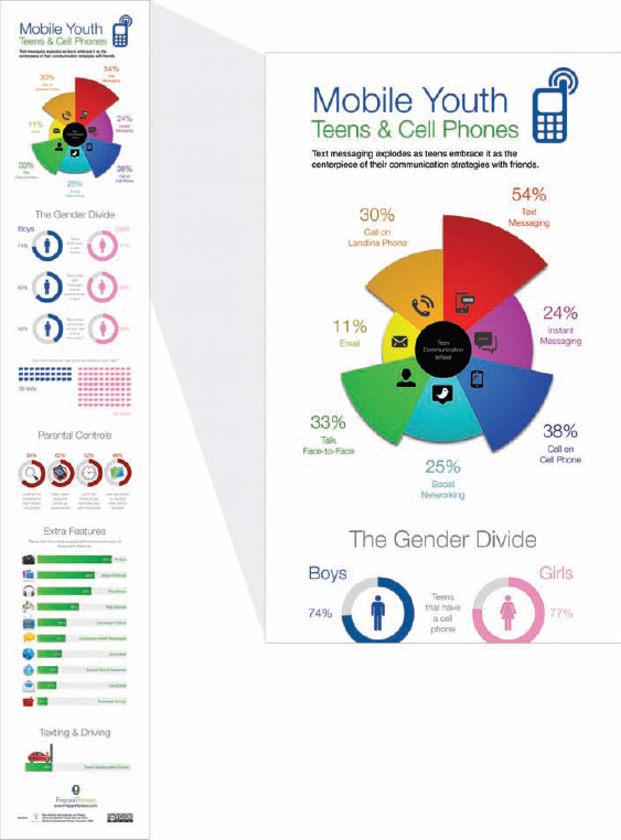
The tall infographic format shown in Figure 2-1 is a perfect example of this new type of online infographic. The Mobile Youth: Teens & Cell Phones design was published online by PrepaidPhones.com and is laid out in a sequential order that leads the reader through the information from top to bottom in five sections. This creates a tall design, and most infographics online follow this same format.
This design format is referred to in a number of different ways, such as a tall, long, or tower infographic design. From a design and web interface perspective, the aspect ratio of the tall format has some distinct advantages. The technology built into a computer mouse makes it easier for the computer user to scroll up and down with a simple flick of the finger, but more difficult to scroll side to side.
FIGURE 2-1: An example of a tall format infographic
coolinfographics.com/Figure-2-1
Source: Teens & Cell Phones, PrepaidPhones.com
More important, most site layouts are designed to allow easy vertical scrolling, but not horizontal. Websites generally fit the width of a browser window without the need for scrolling sideways and have content that runs down past the bottom of the window. Users already expect downward scrolling to reveal the rest of the site content. Images that are too tall to display on the screen disappear off the bottom of the browser window, and users know they can scroll down to see the rest of the image.
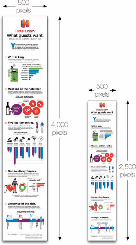
As a general rule of thumb, the original full-size version of an infographic is published online at an image size that is 800 pixels wide and as long as necessary to tell the story. This size allows an infographic to display on the company website at full resolution and fits within the window width of most web browsers and screen resolutions.
However, when the infographic is shared and reposted on other sites, the image size is normally reduced to a smaller thumbnail image to fit the width of the content space of a blog or website layout. Most of the layout templates available on blog design platforms (such as WordPress) have a content space that is only 600 pixels wide to allow for additional site content in a sidebar. A vertical, tall format design is usually still somewhat readable when reduced to fit the smaller content width, but a horizontal format would be reduced so dramatically that it would become a tiny, unreadable thumbnail.
For example, Figure 2-2 shows an infographic design from Hotels.com called What Guests Want. The original infographic design was published as an 800 × 4,000 pixel JPG image file. People who repost the infographic on their own blog would probably shrink that image file down to 500 × 2,500 pixels. A reduction in width of 37.5 percent, but a reduction in overall size (area of the design) of 61 percent.
FIGURE 2-2: Vertical infographic size comparison
coolinfographics.com/Figure-2-2
Source: What Guests Want, Hotels.com
By contrast, if we consider this fun design, in The History of Swimwear infographic from BackyardOcean.com in Figure 2-3, the story is different. The original infographic design is a wide 4,000 × 800 pixel horizontal format design, and the viewers are required to scroll side to side to see all the content. Side scrolling is not ideal, but the implementation on the BackyardOcean.com site is easy for the audience to scroll through the design. However, to fit within a standard blog format, the 4,000 pixel width would have to be reduced to 500 pixels wide. A reduction in width of 87.5 percent, but the overall size reduction is 98.4 percent—too small for viewers to read.
 Width is the size-limiting factor when posting infographics online.
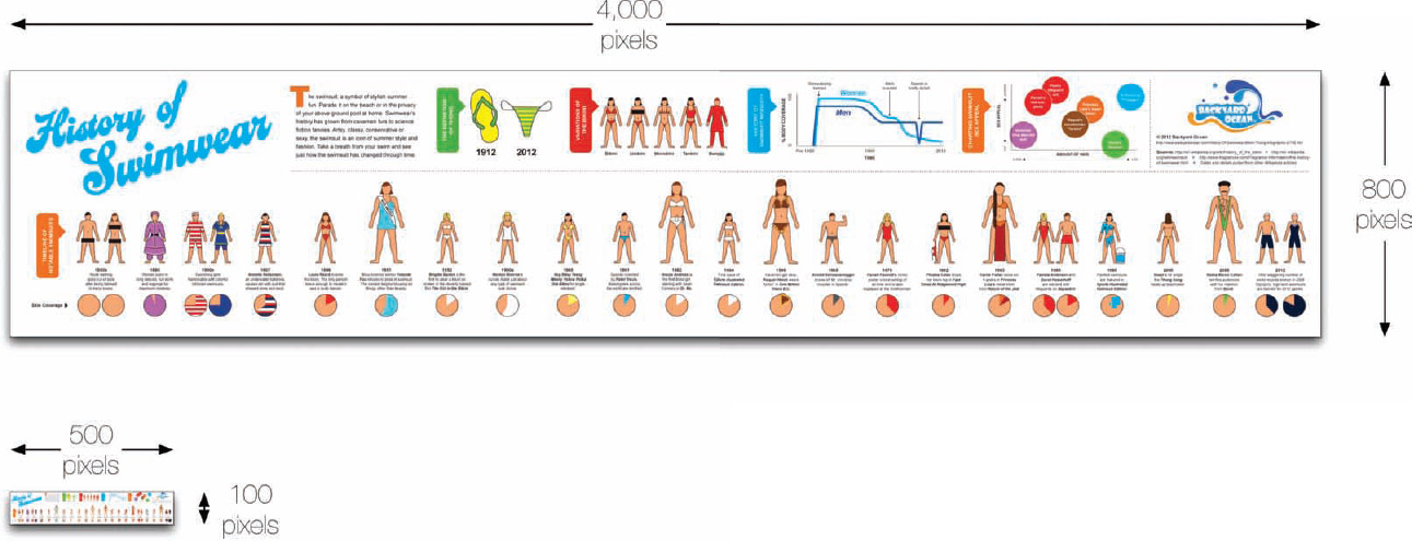
FIGURE 2-3: Horizontal infographic size comparison
coolinfographics.com/Figure-2-3
Source: History of Swimwear, BackyardOcean.com
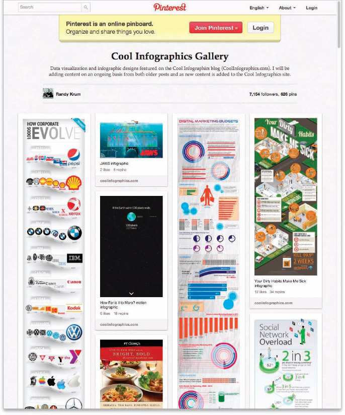
Image-sharing sites such as Pinterest use a vertical, scrolling interface to browse images with variable lengths. This allows for tall format designs to display in their entirety. Although it wasn't intended for this purpose, it resulted in an ideal display for a gallery of tall format infographics. In Figure 2-4, you can see how all the infographic image sizes are condensed to fit the fixed width columns. The tall format designs are much easier for the reader to view, but horizontal format infographics are reduced to a very small size.
FIGURE 2-4: Pinterest vertical display format
coolinfographics.com/Figure-2-4
Although tall format infographic designs are ideally suited for online distribution, they are only effective if online is the only place you are going to publish the infographic. The tall format designs are particularly difficult to use in presentation slides or printed out for physical distribution. For both presentation slides and printing, the limiting dimension changes to height, not width.
Tall format designs that are printed out on standard letter-size or A4 paper or pasted into presentation slides are scaled down to make their height fit the size of the page. This creates images that are usually too small to read or understand.
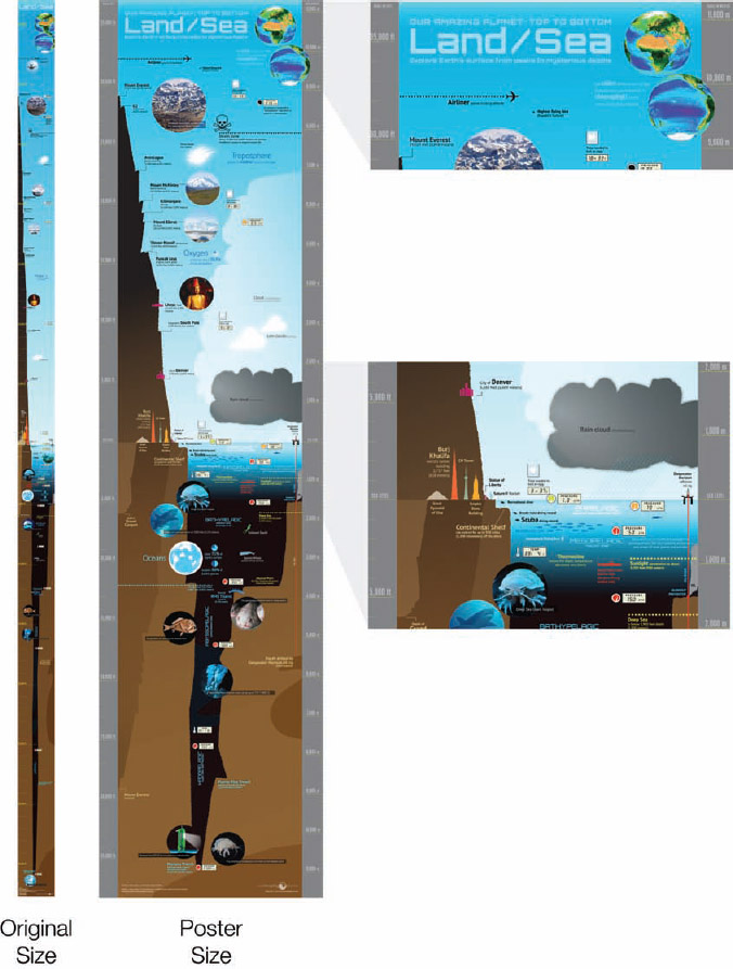
The Our Amazing Planet: Top to Bottom infographic (Figure 2-5) is a cool infographic by designer Karl Tate that illustrates the scale of altitude and depth from 35,000 feet above Earth, down to 35,000 feet below sea level. The design places all the height and depth examples correctly on a visual scale. The original design (far left) created an incredibly tall format infographic, sized at 800 × 15,000 pixels, but when shrunk down to fit on a printed page, it becomes too small to read.
This infographic was specifically designed for the online viewing experience. The tall format reinforces the huge scale of distance represented by making the audience spend a lot of effort scrolling the page to view the entire design. A second version (middle) was created as a better aspect ratio for printing as a custom poster, but even this version must be significantly reduced in size to print on a standard page size.
In this case, this works very well because the primary experience is online. However, designers need to carefully consider their publication strategy for any infographic design. If it's primarily going to be viewed online, tall formats are optimal. If you intend to print the infographic as a handout or use the infographic in presentations, consider limiting the overall design to fit within the size of a single piece of paper, or designing it in sections that can be easily printed on separate pages.
FIGURE 2-5: Tall format is great for viewing online, but can be a poor choice for printing.
coolinfographics.com/Figure-2-5
Source: Our Amazing Planet, Karl Tate, LiveScience.com
Types of Online Infographics
One of the biggest challenges for any marketing function within a company is to communicate directly to the end user of its product or service. Many companies sell to an intermediary company, like a retailer or service provider, and don't have many opportunities to send their message to the end users of their product or service. In addition, consumers generally don't thoroughly read the packaging or the manual that comes with the products they buy.
However, companies have some great stories to tell about their products or services.
- What consumer problems do they solve?
- What unique advantages or value propositions do they offer?
- How do they differ from other products?
- What benefits to the consumer have been designed into the product?
- Why were specific design choices made?
- How have they addressed environmental or sustainable concerns?
How do they get the consumers to listen to stories about why their products are better than the competition or how to use the products effectively? Infographics have become a fantastic format to reach consumers directly. Cool, fun, and engaging infographics published online can reach the target end users directly and grab the consumer's attention.
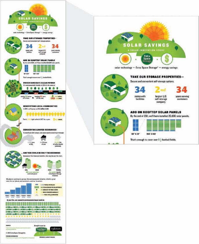
Figure 2-6 is a great example of this from Extra Space Storage. The Solar Savings: A Solar Innovation Story infographic is a design meant to share additional information with both customers and shareholders. The infographic provides some transparency into the data behind the decisions that are driving the business, and helps establish Extra Space Storage as a market leader in self storage.
FIGURE 2-6: Using an infographic to inform consumers and shareholders about the company
coolinfographics.com/Figure-2-6
Source: Solar Savings: A Solar Innovation Story, Extra Space Storage Inc.
Informative Infographics
Informative infographics are the dominant type of design you see online. The underlying theory is that online audiences are more willing to read and share valuable information instead of advertisements. If companies can provide valuable information to readers without a blatant sales pitch, those infographics have a significantly higher chance to be shared with friends and family and potentially go viral online.
After publishing infographics online for a number of years, I am completely convinced of this theory. If the goal of the design project is to maximize the number of views, visitors, and backlinks to the hosting site, informative infographics are more successful than all other types of designs.
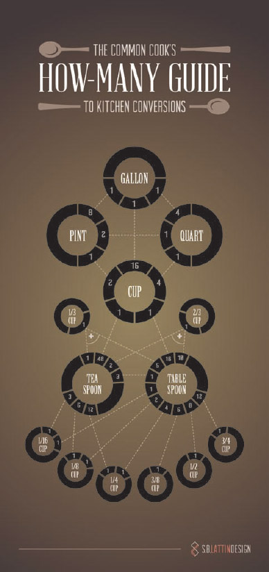
Consider this example from S.B. Lattin Design in Figure 2-7, The Common Cook's How-Many Guide to Kitchen Conversions. The design is beautiful, and the topic is a purely informative summary of common kitchen measurement conversions shown in a visual form. Nowhere in this design does it tell you what the company does or pitch its services to the reader. You know it comes from S.B. Lattin Design because it clearly shows its logo in the footer at the bottom of the design.
The information presented is common knowledge, available publicly to anyone that wants to compile it (people can figure out the conversion rates from most cookbooks), but the designer took the time to gather the data and present it in a visually compelling way to reach its audience. The design continues to be shared heavily online, generates sales as a printed poster, and puts S.B. Lattin Design into the mindshare of its target customers.
FIGURE 2-7: Informative infographic design
coolinfographics.com/Figure-2-7
Source: The Common Cook's How-Many Guide to Kitchen Conversions, S.B. Lattin Design
The best designs focus on a topic directly related to the company business or brand, and this creates the relevance that search engines are looking for. The infographic in Figure 2-8 is The Lifespan of Storage Media published by CrashPlan, an online backup company. Of course the company wants to sell its backup services to new customers, but the infographic isn't a sales pitch. Based on its extensive research, the infographic uses data visualizations to show the readers why an online, cloud-based backup is better than storing their data, music, videos, or photos onto their own devices.
The overall message is that all storage devices are at risk of failure over time, but an online storage solution offers a backup that has the additional benefits of being expandable, redundant, and offsite. Notice that the message is meant to be independent and objective. “Any” online cloud-based storage solution could provide those same basic benefits, but by publishing the informative infographic, Crash-Plan establishes itself as a credible market leader in the minds of the readers.
The link to the company brand could be blatantly obvious or subtle, but the objective of informative infographics is to tie the value of the information presented to the value of the brand. This creates a positive perception of the brand.
Persuasive Infographics
Persuasive infographics take a slightly different approach. These infographic designs lead the readers to a clear call to action and they attempt to convince the audience to do something after seeing the infographic.
FIGURE 2-8: Informative infographic about data storage, not an advertisement or a sales pitch
coolinfographics.com/Figure-2-8
Source: The Lifespan of Storage Media, CrashPlan
The visualizations and information in persuasive designs are all intended to lead the reader to a predetermined conclusion and then provide a specific action that the reader should take. This type of design can make readers skeptical and resistant to the message. They know the company or designer behind the infographic is pushing a specific agenda, but that doesn't mean these designs mislead the audience.
It's worth stating the obvious: “Readers should be skeptical of any infographic information.” Everyone should check the sources and make sure they understand the context of the information being presented, but they often don't.
There is a portion of the population (probably a large portion) that is not good at critical thinking. Over the years, information presented in an official-looking form is often perceived to be credible and has been often mocked:
I read it in the newspaper, so it must be true.
I heard it on the radio, so it must be true.
I saw it on television, so it must be true.
I found it on the Internet, so it must be true.
I learned it from an infographic, so it must be true.
Readers might not question the authenticity or validity of information being shared with them, and data visualizations can be especially compelling to audiences. Even if the audience doesn't understand the detailed data, the mere presence of data visualizations implies a scientific, quantitative credibility that appears to be objective. They imply that the information is a fact, not an opinion, even though that may not be reality.
As mentioned in Chapter 1, all data visualizations have some bias. The designer chooses what data to include in a visualization design. If the goal of the infographic is to persuade, of course the designer wants to present the information in a compelling way.
Millions of different reasons motivate people to choose their actions every day, and good storytelling is an effective way to convince people that they should join a particular effort. The actions that these designs try to convince the audience to take could be anything. Often these try to convince you to do good things to help yourself, your local community, or the world at large.
- Start exercising.
- Vote for a candidate, party, or referendum.
- Travel to a new destination.
- Visit a website.
- Improve the environment.
- Donate to a charitable organization.
- Join a community.
- Contact an elected official.
- Sign a petition.
- Buy a product.
- Give time to a worthy cause.
- Participate in an event.
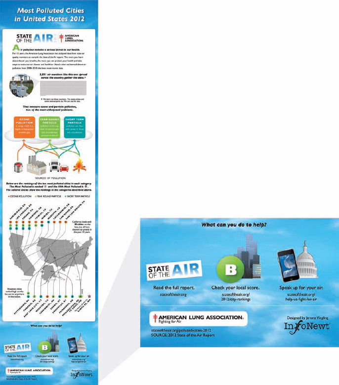
Figure 2-9 shows the Most Polluted Cities in United States 2012 infographic based on data gathered and published by the American Lung Association. The organization gathers air quality data from thousands of air sensors across the country and is an organization dedicated to improving health. The data is published in a 200-page report for anyone that wants to dig into the detailed information, but a series of infographics effectively shares the key findings with the general population.
FIGURE 2-9: Persuasive infographic leading the reader to the suggested actions at the bottom
coolinfographics.com/Figure-2-9
Source: Most Polluted Cities in United States 2012, American Lung Association
There's nothing subtle about this design, and that's the point. It's obviously from the American Lung Association, a well-recognized organization, and the title “Most Polluted Cities…” immediately tells the readers that this infographic is about to tell them how bad the situation is.
After the readers have looked through the information, the design assumes they are now convinced to act and offers three clear potential actions at the bottom of the design:
- Read the full report.
- Check local air quality score.
- Send a message to a congressional representative.
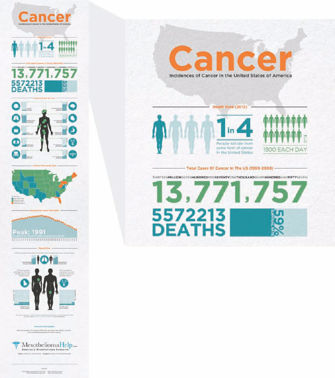
Another persuasive infographic is Cancer from MesotheliomaHelp.net, shown in Figure 2-10. This design includes data visualizations using several statistics gathered about the types of cancer, different locations across the country, and the mortality rate of cancer victims. At the end of the design is one clear call to action: Click to Donate, which takes the reader to a specific page on its website that lists many different cancer charities that the reader should contribute to. This design does a great job of laying out the scope of the problem and presenting a specific action that the reader can take to help the fight against cancer.
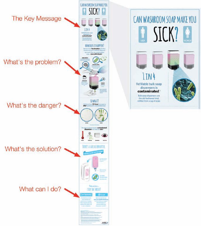
Now break down a persuasive design. The Can Soap Make You Sick? infographic from GOJO Industries in Figure 2-11 is a great example and demonstrates a structure similar to Monroe's Motivated Sequence1, a classic technique for organizing persuasive speeches. As you read through the infographic from top to bottom, the story told to the audience is a series of carefully structured facts with a powerful effect.
1. The key message. “1 in 4 bulk soap dispensers are contaminated with bacteria.” This grabs the audience's attention, and even if they don't read the rest of the infographic, they can understand the main point of the design.
FIGURE 2-10: Persuasive infographic design with one clear call to action: Donate
coolinfographics.com/Figure-2-10
Source: Cancer: Incidences of Cancer in the United States of America, MesotheliomaHelp.net
2. What's the problem? This section builds credibility of the Key Message by explaining how easy it is to get bacteria into a bulk soap dispenser.
3. What's the danger? This section tells the readers specifically the risks they can face and makes the information more meaningful to individual readers. It explains how the problem can affect the readers personally.
4. What's the solution? Now that the audience understands the underlying problem, it can understand the solution presented and what problems it solves.
5. What can I do? The design finishes with two clear calls to action that the reader should take. Forward this information to a facility manager (which implies that the reader is concerned about the issue), or sign an online petition to help raise awareness of the issue.
Notice that this is not an advertisement. The call to action is not to purchase a product, but to help inform others of the potential health risk. The design does not explicitly try to sell a GOJO soap dispenser, but the design is clearly from GOJO. By raising awareness of a potential health risk, GOJO raises its brand authority, and a persuaded facility manager is likely to contact GOJO to help replace its current soap dispensers with safer products.
Visual Explanations
Many infographic designs do not try to visualize a bunch of statistics, numbers, or data sets. Instead, they try to explain an idea, a process, relationships, or a complex concept to the audience. These visual explanation designs use illustrations, diagrams, and icons (and occasionally data visualizations) to explain their topic to the audience.
FIGURE 2-11: Persuasive structure that leads the reader through the sequence of information
coolinfographics.com/Figure-2-11
Source: Can Soap Make You Sick?, GOJO Industries
How Our Laws Are Made (Figure 2-12) is an award-winning design by Mike Wirth and Dr. Suzanne Cooper Guasco, PhD. The infographic is a visualization of the step-by-step process that takes a bill to a law at the federal level in the United States. Notice that there are no charts or data visualizations. It's an infographic design that uses illustrations and text to explain a process to the audience.
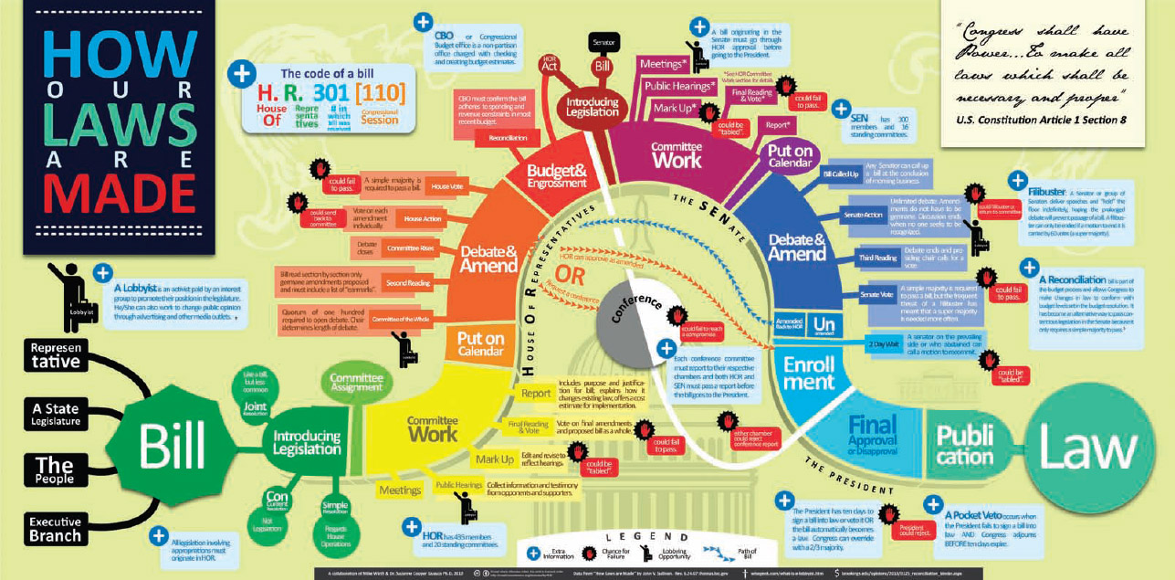
FIGURE 2-12: Visual explanation of the process to pass a new law in the United States
coolinfographics.com/Figure-2-12
Source: How Our Laws Are Made, Mike Wirth and Dr. Suzanne Cooper Guasco, PhD.
Visual explanations are an effective way for companies to demonstrate their authority and competence in an industry. These infographics often become a design that readers keep or print out for future reference, which from a marketing sense is terrific because it provides ongoing exposure to the company. Of course, for the exposure to the brand to be meaningful, the topic has to be relevant to the company's business.
Figure 2-13 is a visual explanation of How Affiliate Marketing Works from Sugarrae.com. There is no numerical data in the design. The design visualizes the process by using three color-coded characters on a path to show the sequence of events that occur. This could have been a simple 10-item text bullet list in a blog post, but turning the process into an infographic design, made it incredibly popular. The infographic went viral online and further established Rae Hoffman as one of the top authorities in the country on Affiliate Marketing.
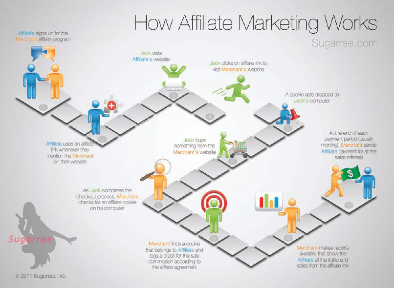
FIGURE 2-13: A 10-step process designed as a visual explanation infographic
coolinfographics.com/Figure-2-13
Source: How Affiliate Marketing Works, Rae Hoffman, Sugarrae.com
Infographic Advertisements
Infographic advertisements are a specific form of persuasive infographics, in that they obviously attempt to motivate the audience to take action. In this case, the call to action is usually intended to convince readers to purchase specific products or services.
In general terms, readers are less likely to share an infographic advertisement than a purely informative one. This is true for any form of content, not just infographics. People are less likely to share obvious advertisements with friends because it can feel like a sales pitch instead of forwarding something valuable.
However, data visualizations and infographics are a fantastic way for companies to show customers their product benefits. The goals of these designs are different.
For an infographic advertisement, the quality of readers is more important than the quantity of readers. 
The goal of an infographic advertisement is to educate the potential customers about the product instead of building links and traffic to the web page. They can be used to effectively share the often-complex information about a product.
- Comparing competitive products
- Assembly or usage directions
- Product benefits
- Product specifications
- Consulting or service processes
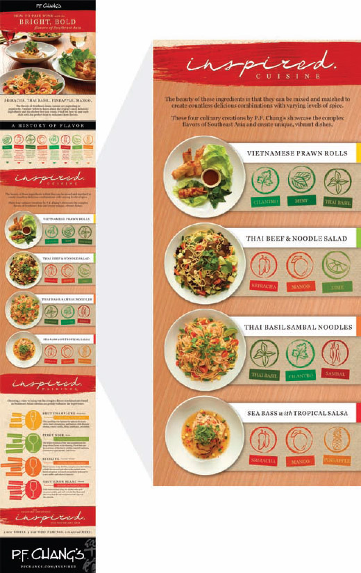
Figure 2-14 is How to Pair Wine with the Bright, Bold Flavors of Southeast Asia, an infographic advertisement from the P.F. Chang's restaurant chain. This is an advertisement for its new promotional menu items. The design visually ties unique cooking ingredients with the new dishes and presents wine pairing suggestions. The call to action is for the reader to go to a P.F. Chang's restaurant location and try the new menu items.
The company is obviously trying to sell their food, and that's perfectly acceptable. My impression is that the design is meant to appeal specifically to repeat restaurant guests by giving them a reason to come back to try something new.
This infographic advertisement is one content piece of a larger marketing campaign that includes a dedicated web page, print advertisements, an interactive PDF available for download, online videos, and the infographic.
Every product and service has a complex story to tell customers why the company made specific design decisions that shaped a product idea into an actual product on the store shelf. People work hard on these projects at companies and become passionate about them. They are often disappointed when the customers they expected to buy these products or services aren't as excited and passionate as they were.
The main difference is that the company's employees get to see all the stories behind the product. Consumers see only what's on the product packaging or in the advertisements, and they often don't take the time to completely read either of them. A company's opportunity to catch a consumer's interest long enough to tell their stories is rare.
FIGURE 2-14: P.F. Chang's new menu items infographic advertisement
coolinfographics.com/Figure-2-14
Source: How to Pair Wine with the Bright, Bold Flavors of Southeast Asia, P.F. Chang's China Bistro, Inc.
The use of infographics to tell the product's message can be a convincing form of advertisement. There are many specific reasons a company's products have been designed to its unique specifications, including:
- Unmet consumer needs
- Differentiation from competitors
- Unique benefits
- Lower price points
- Color selection
- Design style or fashion trends
- Ergonomic design
- Ease of use
- Environmental impact
The Picture Superiority Effect (refer to Chapter 1) can be used to make visual information 650 percent more likely to be remembered by the audience, and this is a major reason that companies have logos. A potential customer is more likely to remember a visual logo than the name of the company alone, and that memory carries over into purchasing behavior in stores. Customers tend to buy products from brands they recognize.
Infographics provide an opportunity for companies to tell the unique stories about their products and services in a compelling way that makes the complex stories easy for consumers to understand, share, and remember. By making the stories about their products visual, companies can increase the amount of information potential customers will remember when they stand in a store making a purchase decision.
Making an Organic Choice from SoNice in Canada (Figure 2-15) is an infographic advertisement that compares its organic processes making soy milk products to conventional food-processing methods. The company is passionate about organic foods, and an infographic design gives it the chance to show the data behind its passion side by side with data about conventional food. This is a great way to convey information that consumers may not realize.
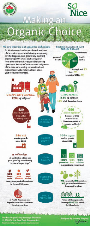
FIGURE 2-15: Side-by-side comparison as an infographic advertisement
coolinfographics.com/Figure-2-14
Source: Making an Organic Choice, SoNice, Earth's Own Food Company Inc.
PR Infographics
Similar to advertisements, companies also use infographic designs for public relations (PR) with press releases. The objectives of PR are different than advertisements. Instead of directly trying to sell a product, a PR strategy may use an infographic to build awareness of products and brands, to provide information to shareholders, or to increase the value of the brand. Infographics used for PR can be published as a supplement to a text-only press release, or the entire press release can be contained in the infographic design.
Many companies consider coverage by the news media as a more affordable and credible form of advertising than traditional advertising. Many people are more likely to pay attention and believe information from a news report than an advertisement, even though the information may be coming from the same source: the company's PR department.
When Honda announced the 2013 Accord, the design was a major design change to the car, inside and out. As a part of its PR content strategy, it released the infographic design, Accord: 30 Years of American Craftsmanship (Figure 2-16). Honda's primary target audience were members of the press. This one design was used as content in a handful of different ways:
- The infographic was printed and displayed on 7-foot banners at press events all across the country.
- A USB drive with a PDF file of the infographic was given out in the press kits provided to attendees.
- The infographic was made available as media content on the Honda North America press website, which can be accessed only with login credentials given to members of the press.
The objective of the infographic was to get attention and coverage from news sites and blogs covering the automotive industry. Many automotive-related sites published the infographic as part of their coverage of the 2013 Accord release. Only after all the press events were complete was the infographic published publicly on the Honda News Flickr account to make it available to the general public.
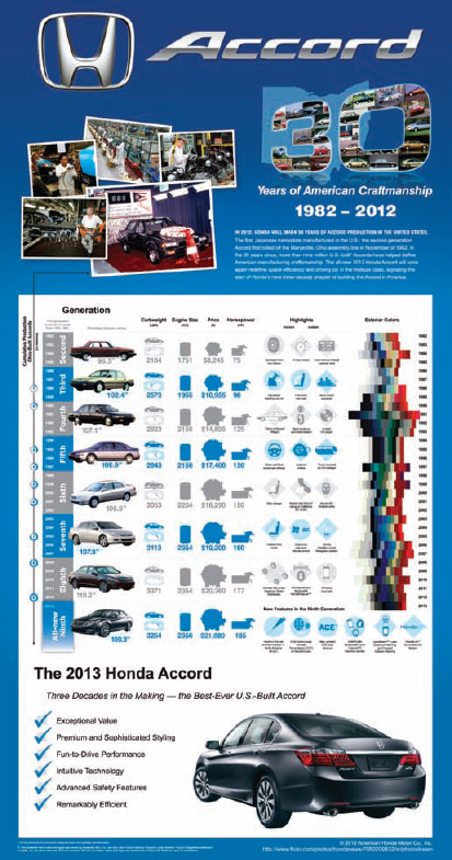
FIGURE 2-16: Infographics can be used as part of a Public Relations campaign
coolinfographics.com/Figure-2-16
Source: Accord: 30 Years of American Craftsmanship, Honda North America
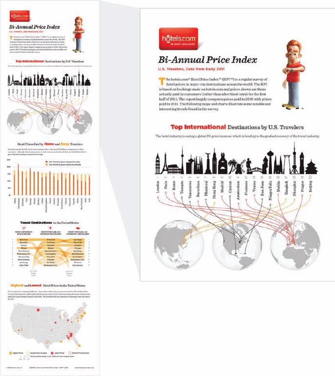
Hotels.com maintains a dedicated section of its press website just for infographic designs at http://press.hotels.com/en-us/infographics/. Its market position and research give it unique insights into the overall hotel industry, and it is continually providing data and information to the press. News outlets use this information in their reporting and cite Hotels.com as the source of the research data. The appeal of the data from Hotels.com is that the PR content is fun and engaging for news audiences, which encourages media outlets to utilize the information.
Twice a year, Hotels.com releases its Hotel Price Index (HPI), which is a summary of the results from its own research and survey data related to changing hotel room prices and popular travel destinations all over the world. For the last few years, it has designed and released infographics visualizing the data (Figure 2-17) along with a series of text press releases highlighting the key findings from the research. All of this is then published on its dedicated press website.
Infographic Posters
Along with the explosion of online infographics, a subindustry has begun to emerge dedicated to designing and selling large, wall-hanging infographic posters to the public. These niche designers have created some amazing designs and are creating businesses selling these posters online.
Instead of designing these posters to client specifications, this business model allows the designers to choose their own topics, select the data they want to include, and design the complete infographic poster based on their own design tastes and sense of style. These face the same risks as any consumer product. The topics and data research are completely done by the designers, and they are taking a chance that their choices will be popular enough to generate sales.
FIGURE 2-17: Hotels.com uses infographics to highlight key research findings on its press website.
coolinfographics.com/Figure-2-17
Source: Bi-Annual Price Index, Early 2011, Hotels.com
Infojocks
Infojocks.com is a site dedicated to sports-related infographic poster designs from infographic designer Jeremy Yingling. Self-described as the art of sports statistics, Infojocks has infographic poster designs covering the NFL, NHL, NBA, college teams, and other specific team histories. Figure 2-18 is the infographic poster titled, Hockey: History of the Stanley Cup.
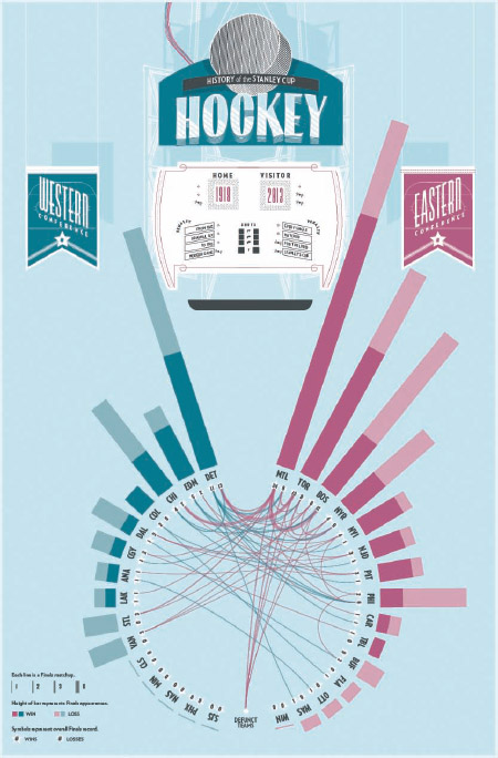
FIGURE 2-18: Hockey: History of the Stanley Cup poster, Infojocks.com
coolinfographics.com/Figure-2-18
HistoryShots.com
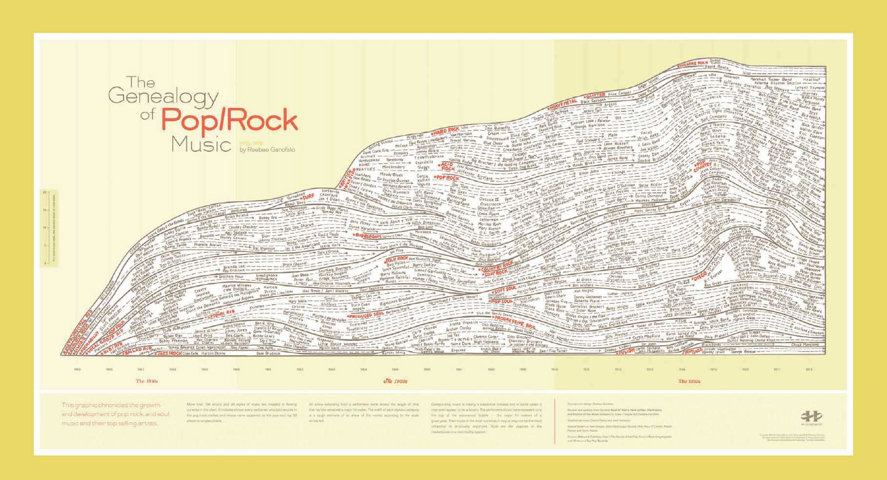
HistoryShots.com was created by Larry Gormley and Bill Younker, and they sell designs that combine information and art. Their designs are usually focused on the historical timeline or evolution of a particular topic, and the posters are printed on museum-grade papers. Meticulously researched, they offer amazing designs based on their interests in pop culture, sports finance, and politics. Figure 2-19 shows the incredibly detailed poster, Genealogy of Pop/Rock Music by designer Reebee Garofalo.
Timeplots
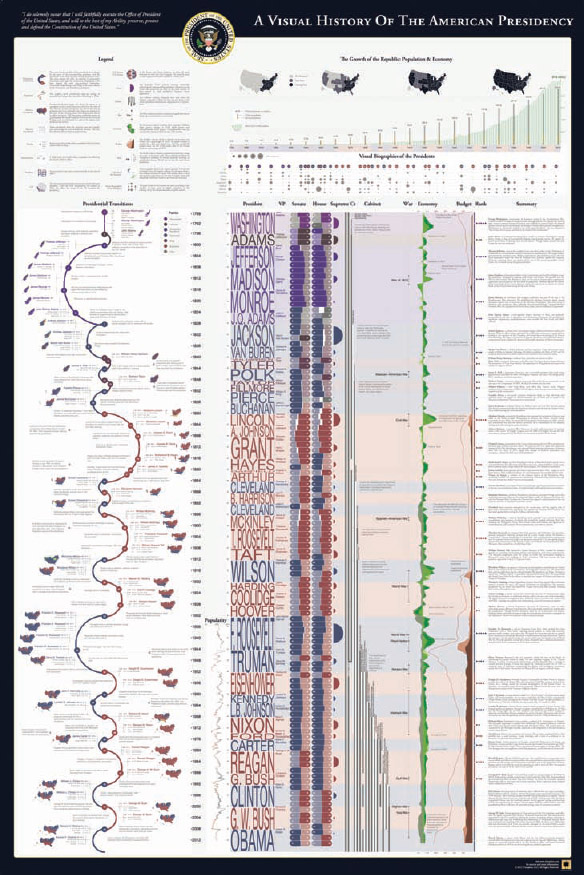
Timeplots.com is an information graphics firm founded by Nathaniel Pearlman. Located in Washington, DC, Timeplots has released a number of highly detailed infographic posters covering the historical timelines of various political topics. It has some fantastic designs covering the history of the Presidency, the Supreme Court, the Senate, the House of Representatives, both major political parties, and more. Figure 2-20, A Visual History of the American Presidency is the poster that visualizes details about election results and the state of the country during each term.
Pop Chart Lab
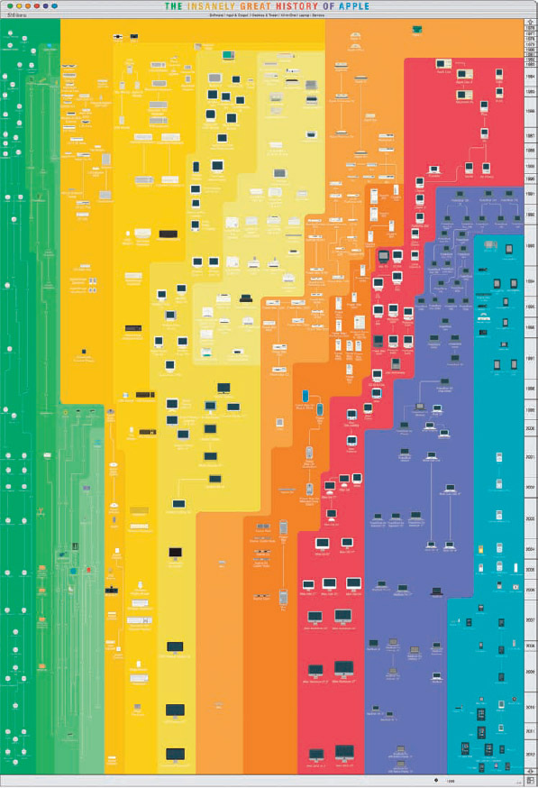
PopChartLab.com is an infographic poster design firm located in Brooklyn, New York, founded by Patrick Mulligan and Ben Gibson. They have created some amazingly detailed posters covering the evolution of Apple products (Figure 2-21) or incredibly complex network diagrams showing the relationships between the varieties of beer, the full array of culinary tools, a taxonomy of hip-hop, and many more mappings of cultural topics.
FIGURE 2-19: The Genealogy of Pop/Rock Music poster, Reebee Garofalo, HistoryShots.com
coolinfographics.com/Figure-2-19
FIGURE 2-20: A Visual History of the American Presidency poster, Timeplots.com
coolinfographics.com/Figure-2-20
FIGURE 2-21: The Insanely Great History of Apple poster, PopChartLab.com
coolinfographics.com/Figure-2-21
Intellectual Property Issues
Intellectual property law is a murky quagmire of legal opinion, interpretation, and confusion. Still, there are some fundamental issues that infographic designers must consider. The following observations are drawn specifically from the author's experience with U.S. laws.
Infographic designers have the responsibility to produce work that conforms to legal requirements and doesn't put their company or their clients at risk. Clients expect designers to be the experts in these areas, and infographic designers should have a good understanding of these four areas:
- Copyright
- Creative Commons
- Trademarks and Fair Use Doctrine
- Using images and illustrations
Copyright
Copyright law exists to allow the creators of designs (the copyright holder) the ability to control how other people are allowed to use, copy, or distribute their creative works. Sharing creative work without first getting explicit permission in the form of a license is called copyright infringement and is generally regarded as illegal. This law is what enables creative professionals to charge for their work and also protects their work from being copied by competitors. It applies to any type of creative product, such as photographs, art, books, music, graphic designs, videos, and of course infographics.
Designers make a living selling their creative work, and any time someone else uses their creative work without first getting a license, the designer loses potential income. When creative professionals find their work being used without their permission, the ugly process of cease-and-desist letters and lawsuits begins.
In the United States there are essentially three basic levels of copyright protection.
The lowest level of copyright is given to original creative works automatically. In 1989, Congress amended the U.S. copyright law (specifically to conform with the Berne Convention Implementation Act) making the use of copyright notices optional. Most infographic designers use this level of protection because they believe this automatic protection completely covers them; however, in practice, this level of protection is the hardest to enforce in court and any awarded damages are often lower.
If a designer does not include any mention or notice of copyright protection in an infographic, the design is still protected under copyright law. 
The second level of protection is claimed when the official copyright symbol (©) is displayed on the infographic, along with the year and name of the copyright owner. Designers can add the copyright notice to their original design work without any cost or official paperwork. By adding this explicit notice of copyright, publishers have clearly communicated their claim of copyright ownership and make any argument of “innocent infringement” a difficult defense. I recommend this level of protection to all of my clients as the best way to cover an infographic design with copyright protection.
The highest level of copyright protection is an officially registered copyright. To achieve this level, the publisher must submit the final published creative work to the United States Copyright Office and pay a registration fee, which establishes a copy of the work on file and an official date of registration. This level is the easiest to defend in court and can pay the highest damages. However, this level of protection is generally overkill for infographic designs that are going to be widely shared on the Internet.
Creative Commons
In 2001, Creative Commons (CC) was founded as a licensing alternative to traditional copyright licenses. Designed to provide for more open sharing of creative works while still controlling some key rights for the publisher, Creative Commons is often seen as the ideal license for infographics.
Even though Creative Commons is an open sharing license, many mistakenly think it means giving up all of their rights and publishing their work into the public domain. This is absolutely not true. Creative Commons is a type of copyright license that allows the owner to encourage sharing of their creative work, while still retaining control of how it is used.

A Creative Commons license is free for anyone to use and has a number of options that can be adapted to the needs of each specific design. The license owners have to make a few choices about what they are willing to allow others to do with their work; this will define the correct license to use.
The most common license used for infographics is identified by four two-letter codes as CC-BY-NC-ND. Designers should display the official license image shown in Figure 2-22 in the infographic image itself. That way, the license remains accessible to readers no matter where the infographic is posted.
FIGURE 2-22: Creative Commons license CC-BY-NC-ND
Table 2-1 shows the four aspects as they relate to an infographic design.
TABLE 2-1: Four aspects of a Creative Commons license
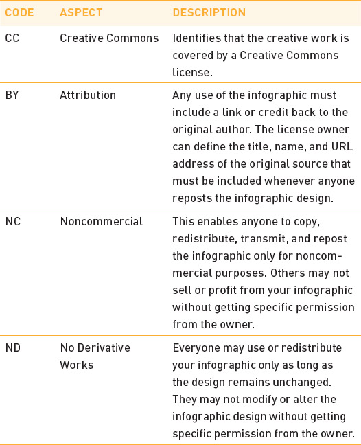
The easiest way to generate a CC license is for the content owner to go to the Choose a License page at creativecommons.org/choose/, shown in Figure 2-23, make attribute selections, and then use the license image that the site generates. If you need a larger version of the license image to include in the infographic design, there are higher resolution versions available on the creativecommons.org/about/downloads page. If the publisher uses the HTML-embedded code generated on this page to display the license on its web page, it also contains some additional metadata for web browsers.
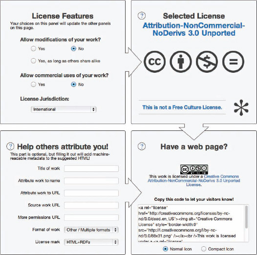
FIGURE 2-23: Choosing a Creative Commons license
Trademarks and the Fair Use Doctrine
Trademark protection is often confused with copyright protection, but they are two different things. Copyrights protect complete creative works, and trademarks protect distinctive words or symbols associated with specific companies, products, or services. The test for trademark infringement is called “likelihood of consumer confusion.”
If you are designing an infographic for your own company, of course you have the rights (and probably the responsibility) to include your company's trademarked logo in the design. This clearly identifies the company as the publisher of the infographic design and is necessary for the infographic to have any positive effect on the brand perception.
But what about including trademarked logos from other companies?
There is an exception to the trademark law called the Fair Use Doctrine that allows for limited use and publishing of a trademark in certain cases without permission of the owner. For infographics, your design needs to pass two tests:
1. Use of the logo can't make it appear that the infographic is designed or published by the company whose logo you are using.
2. Use of a company's logo can't imply that the company funds, authorizes, approves, supports, or endorses the infographic.
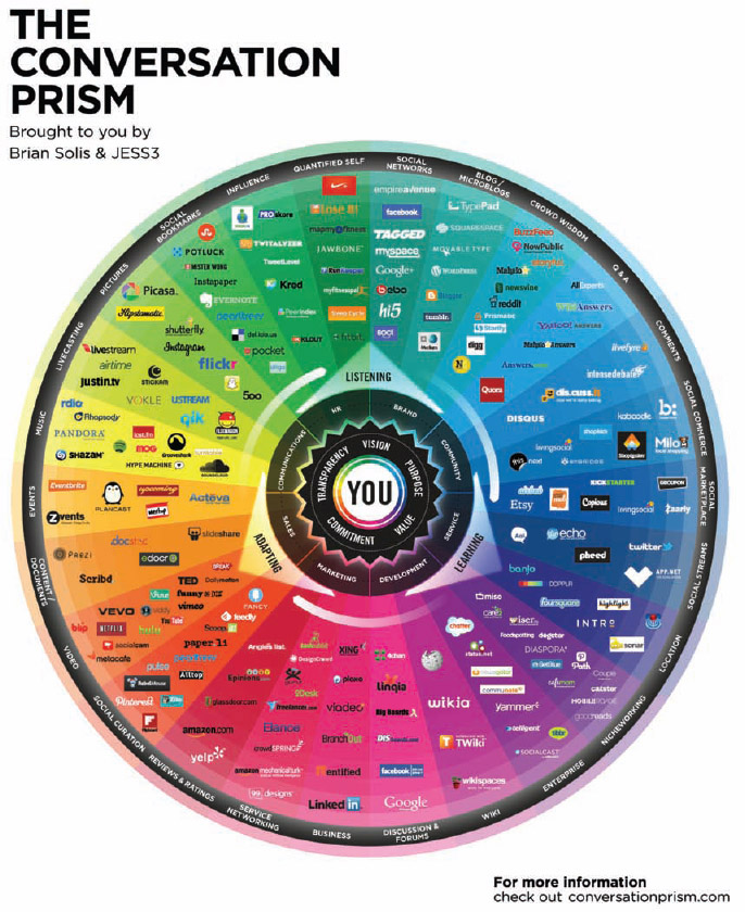
However, you can use another company's trademarked logo to identify or compare that company. The Conversation Prism 4.0 from Brian Solis and JESS3 in Figure 2-24 is a popular infographic design that prominently displays hundreds of trademarked logos from other companies. In this instance, the logos are used to identify the major companies in the different types of social media businesses.
An average reader of the infographic would not be confused that any one of these companies is the original publisher or endorses the design. Using trademarked logos in this way passes the two tests for fair use, and they did not need to get permission from all of those companies.
FIGURE 2-24: Fair use of trademarked company logos
coolinfographics.com/Figure-2-24
Source: Brian Solis and JESS3
Images and Illustrations
Beyond company logos, most infographic designs incorporate many images and illustrations. They might be photographs, illustrations, or vector art designs. Infographic designers need to have the appropriate rights to include any image that isn't an original design of their own.
Probably the most common way (and at the same time the worst way) to find images to include in an infographic design is to perform an image search in Google or Bing. Just because it has been published on the Internet does not make it public domain! Actually, it's just the opposite. As mentioned in the earlier section, copyright law automatically covers all original creative works, even if it doesn't have a copyright notice or include the copyright symbol.
Using images found through an Internet search, you are likely putting yourself and your client at risk of copyright infringement. An infographic designer needs to be certain the images included in a design are available through a public license. If you're designing an infographic for business reasons, you could unintentionally be putting your company at legal and financial risk.
Royalty-free stock image sites (like iStockPhoto.com or Shutterstock.com) are the best solution to ensuring that you have the required permissions to include an image in your infographic design. When you purchase a design asset (photo, illustration, vector art, video, and so on) you are actually purchasing a license to use that artwork. Royalty-free means that you can include that artwork in your commercial design without paying an on-going royalty to the designer. When designing infographic projects for clients, you should make sure that all of the images you include as part of the final infographic are either your own original designs or licensed royalty-free images.
In additional to icons and illustrations, hundreds of data visualization design elements have begun to become available on the royalty-free stock image sites. Figure 2-25 is a collection of vector art objects called Infographic Elements and is available for purchase from iStockPhoto.com. This collection is meant to help an infographic designer with predesigned visual elements that make the design process faster. Designers must still modify the visualizations to match the data included in their infographic design.
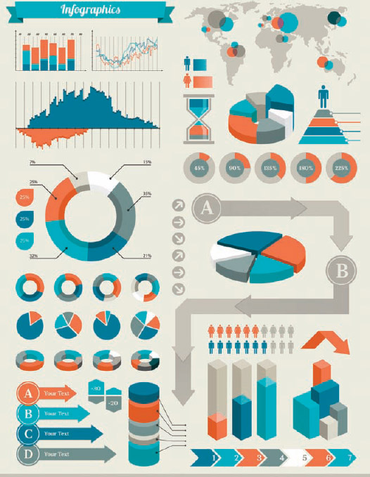
FIGURE 2-25: Infographic Elements by Artvea
coolinfographics.com/Figure-2-25
An infographic designer doesn't need to create all these visual elements from scratch. In general, infographic designs are not meant to be pieces of art; they are visual storytelling with data and information. If designers spend most of their time designing custom illustrations, the project is going to take much longer and cost much more than necessary.
AIGA, the Professional Association for Design
The legal issues are complicated, and all of them aren't covered here. You should consider an additional source of information meant to help designers understand and navigate the legal landscape.
AIGA, the professional association for design, (www.aiga.org) is an excellent resource for graphic designers about a wide variety of issues. It publishes a number of articles, case studies, videos, and webinars and a complete guide to Design Business and Ethics that covers copyright and trademark issues in more detail. The complete guide is available online at www.aiga.org/design-business-and-ethics/.
The AIGA Design Business and Ethics guide outlines the critical ethical and professional issues encountered by designers and their clients. [The guide] is mailed to all new professional- and associate-level members when they join.
AIGA WEBSITE
Should You Copyright Your Infographic?
Online infographics defy the traditional thinking behind protecting creative work online. With the exception of the infographic posters, publishers are generally not attempting to sell online infographics. Actually, it's quite the opposite. Most infographic publishers are actively trying to get their infographics shared, posted, linked, e-mailed, and even printed as frequently as possible but without any payment or licensing. It's viewed as a huge success for a company to have its infographic reposted on a major site that drives thousands of views.
In the case of online infographics, the purpose of a copyright needs to be thought about differently. Even though they may not be trying to sell their infographics, designers and companies should still copyright their infographic designs. A copyright prohibits others from modifying the design, claiming it as their own, or selling the infographic without the creators' consent. These are still important aspects of publishing creative work.
For example, even though all the examples included in this book have been published publicly online, available for anyone to view, they are all covered by copyrights. Because this book is a product for sale, it is considered a commercial use of those designs. To republish them in this book, I needed to get official permission from each publisher or designer for a copyright license to include their infographic designs.
So, should infographics be copyrighted? Yes. They are automatically covered by a copyright, but adding the official copyright notice to an infographic removes any ambiguity or misconceptions. Publishers should be clear and obvious about what rights they are granting to others related to their infographic designs.
Final Thoughts
Online infographics are a powerful content tool for companies to share information, build awareness, and drive traffic to their websites. They have exploded in popularity in the last few years, and their use will continue to grow going forward.
Infographic designers need to understand the objectives of an infographic project so they can make informed decisions about the format, orientation, and content that should be included in each design. Good infographic designers can bring together storytelling, data visualization, graphic design, online strategy, and legal understanding together to make a successful infographic.
References
1. Alan H. Monroe, Principles and Types of Speech, (Chicago: Scott, Foresman, 1935).
Links
Many of the images in this chapter can be viewed by using the following links or going to www.wiley.com/go/coolinfographics.
1. Mobile Youth: Teens & Cell Phones, PrepaidPhones.com:
http://infonewt.com/portfolio/client-work/18409928
2. What guests want, Hotels.com:
http://press.hotels.com/en-ca/more-infographics/hotels-comamenities-survey/
3. The History of Swimwear, BackyardOcean.com:
http://www.backyardocean.com/History-Of-Swimwear-Bikini-Thong-Infographic-s/758.htm
4. Cool Infographics Gallery on Pinterest:
http://pinterest.com/rtkrum/cool-infographics-gallery/
5. Our Amazing Planet: Top to Bottom, LiveScience.com:
http://www.livescience.com/27551-our-amazing-planet-top-to-bottom-mountaintop-to-ocean-trench-infographic.html
6. Solar Savings: A Solar Innovation Story, Extra Space Storage Inc.:
http://www.extraspace.com/infographics/solarpower/
7. The Common Cook's How-Many Guide to Kitchen Conversions, S.B.Lattin Design:
http://sblattindesign.wordpress.com/2012/01/03/measure-up/
8. The Lifespan of Storage Media, CrashPlan:
http://www.crashplan.com/medialifespan/
9. Most Polluted Cities in United States 2012, American Lung Association (stateoftheair.org):
http://infonewt.com/portfolio/client-work/18409910
10. Cancer: Incidences of Cancer in the United States of America, MesotheliomaHelp.net:
http://www.mesotheliomahelp.net/news/cancer-charity-infographic
11. Can Washroom Soap Make You Sick?, GOJO Industries:
http://www.gojo.com/NoMoreBulkSoap
12. How Our Laws Are Made, Mike Wirth and Dr. Suzanne Cooper Guasco, PhD:
http://www.mikewirthart.com/?projects=how-our-laws-are-made
13. How Affiliate Marketing Works, Rae Hoffman, Sugarrae.com:
http://www.sugarrae.com/affiliate-marketing/how-affiliatemarketing-works/
14. How to Pair Wine with the Bright, Bold Flavors of Southeast Asia, P.F. Chang's China Bistro, Inc.:
http://www.pfchangs.com/inspired/infographic.aspx
15. Making an Organic Choice, SoNice, Earth's Own Food Company Inc.:
http://www.sonice.ca/good-for-you/organic-choice
16. Accord: 30 Years of American Craftsmanship, Honda America:
http://www.flickr.com/photos/hondanews/7950209832
17. Bi-Annual Price Index, Early 2011, Hotels.com:
http://press.hotels.com/en-us/more-infographics/us-hpi-first-half-2011-results/
18. The Genealogy of Pop/Rock Music poster, Reebee Garofalo, HistoryShots.com:
http://www.historyshots.com/Rockmusic/index.cfm
19. A Visual History of the American Presidency, Timeplots.com:
http://www.timeplots.com/collections/all/products/a-history-of-the-us-presidency
20. The Insanely Great History of Apple, PopChartLab.com:
http://popchartlab.com/collections/prints/products/the-insanely-great-history-of-apple
21. The Conversation Prism 4.0, Brian Solis (http://www.briansolis.com) and JESS3 (http://JESS3.com):
https://conversationprism.com/
22. Infographic Elements Artvea:
http://www.istockphoto.com/stock-illustration-22855224-infographic-elements.php


