Vision trumps all other senses. We learn and remember best through pictures, not through written or spoken words.
—JOHN MEDINA, BRAIN RULES
The Science of Infographics
Why do people love infographics?
Humans have been drawing pictures to communicate with each other for thousands of years—from pictograms on cave walls to Egyptian hieroglyphics to ideograms on modern signs (Figure 1-1). People love using pictures to communicate and tell stories because it's hardwired into the human brain.
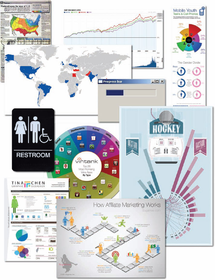
Infographics and data visualizations are all around us. We are surrounded by visual representations of information—charts, maps, icons, progress bars, signs, posters, diagrams, and online visuals (Figure 1-2). These are all examples of visual communication, but these are not all infographics.
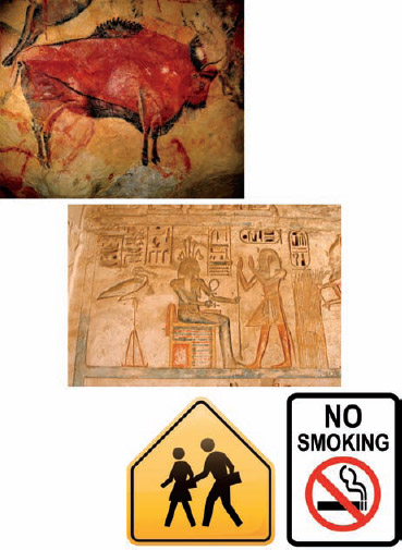
FIGURE 1-1 Altamira bison cave painting, ancient Egyptian hieroglyphics, and modern signs.
The word infographic is used by people to mean many different things. In many cases infographics and data visualizations are considered synonymous, but in the world of an infographic designer they mean different things.
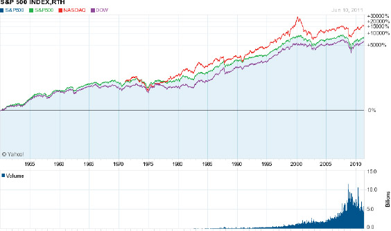
Data visualizations are the visual representations of numerical values. Charts and graphs are data visualizations and create a picture from a given set of data. Figure 1-3 shows the price chart of the S&P 500, the NASDAQ, and the Dow Jones Industrial Average since 1950. The reader can easily see the overall upward trend and the comparison between the three data sets. Including the volume chart beneath the price chart, this data visualization creates a picture using at least 80,000 data points.
FIGURE 1-2: Collage of infographics and data visualizations
It takes us only seconds to understand the long-term trend, to see the close relationship between the three indices, and to see the significant spikes and falls in the stock market. This visualization easily fits on one piece of paper, a computer screen without scrolling, or a presentation slide. Seeing the entire data set on one page, we can understand the data quickly and with little effort.
This is an efficient way to communicate data. Data visualizations can be very space efficient by visualizing a large set of numbers in a small space. By designing a visualization that displays all of the data within the readers' field of view, this enables us to see the entire data set with minimal eye movement without scrolling or flipping between pages.
If we looked at a spreadsheet with 80,000 values instead, how long would it take us to get a general understanding of the market?
In 2001, Dr. Edward R. Tufte, one of the pioneers of modern data visualization and professor emeritus of political science, statistics, and computer science from Yale University, clearly explained this phenomenon when he stated, “Of all methods for analyzing and communicating statistical information, well-designed data graphics are usually the simplest and at the same time the most powerful.”[1]
This screen shot (Figure 1-4) from the StockTouch app on an iPad is another example of a good data visualization design. The top 100 largest U.S. stocks are shown from nine different market sectors. In this view, the companies from each market segment are organized in a spiral pattern from largest (in the center) to smallest. Each stock is color coded based on its stock price performance over the prior 12 months, but the time period is adjustable with the slider on the right. The shades of green show stock prices that have increased, and shades of red show prices that have decreased.
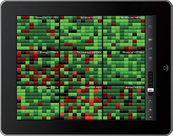
FIGURE 1-4: Heatmap visualization of stock price changes
coolinfographics.com/Figure-1-4
Source: StockTouch iOS app, Visible Market, Inc.
Whether it's a new definition or an additional definition of the term infographics, its use now implies much more than just a data visualization. Up until recently, a common definition for infographics was simply “a visual representation of data”; however, that definition is outdated and is more indicative of data visualizations. Originally derived from the phrase information graphics, infographics was a term used in the production of graphics for newspapers and magazines.
Today, the use of the word infographics has evolved to include a new definition that means a larger graphic design that combines data visualizations, illustrations, text, and images together into a format that tells a complete story. In this use of the word, data visualizations by themselves are no longer considered to be complete infographics but are a powerful tool that designers often use to help tell their story visually in an infographic.
This new definition of infographics is used consistently throughout this book. and data visualizations are meant as a separate design element used within the design of infographics. The art of data visualization is a huge topic about which many books have been written and is taught in many university classes. For the purposes of this book, they are not synonymous.
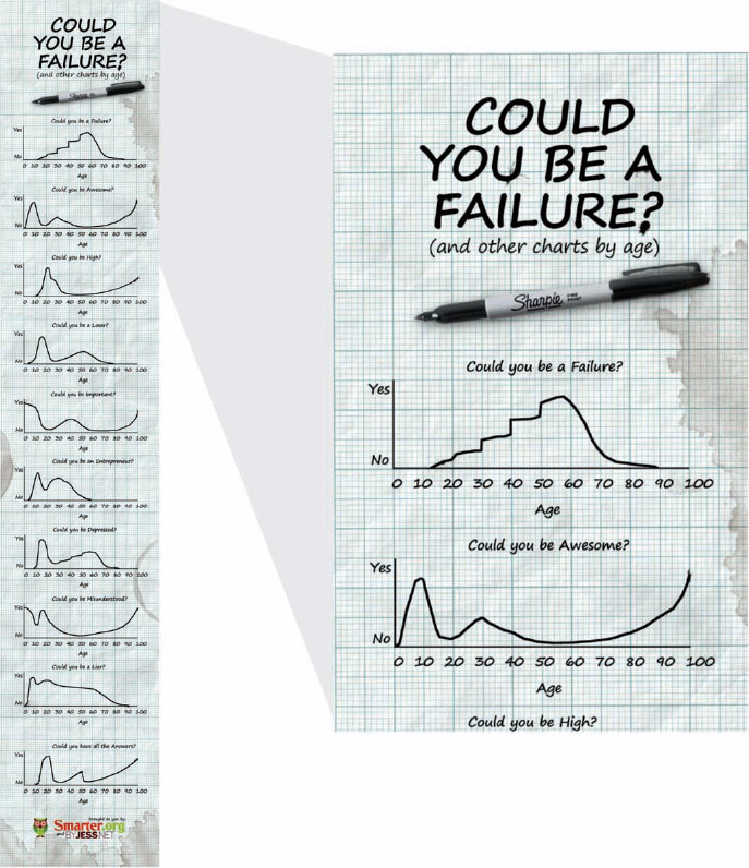
As shown in Figure 1-5, charts were the primary design element used to create the infographic, Could You Be a Failure? The designer, Jess Bachman (byjess.net), combined data visualizations (line charts), along with text, illustrations, and a photo of a Sharpie marker into this complete infographic design. The overall design is considered to be one infographic that uses many data visualizations in its design.
However, the best infographics tell complete stories. Infographics have become more like articles or speeches than charts. Their purpose can be categorized into the same three objectives as public speaking: to inform, entertain, or persuade the audience. They have introductions to get readers' attention, so the readers know why they should take the time to read the infographic. They end with conclusions and calls to action, so the readers have some indication of what they should do with the information they have just learned.
FIGURE 1-5: Infographic design made from 10 data visualizations
coolinfographics.com/Figure-1-5
Source: Could you be a Failure? from Jess.net and Smarter.org
This is how many would-be designers end up designing bad infographics. Many designs simply put a bunch of data visualizations on the same page without a cohesive story. They include all the data available, instead of choosing only the data relevant to a central storyline. The process of good infographic design is about storytelling and not about just making your data visualization pretty or eye-catching.
The term infographics is also becoming mainstream. Thirty years ago, the word was only used by art directors and print publications, but the Internet has changed that. Figure 1-6 (based on data from Google Insights for Search) shows that the last 3 years (2010–2012) has seen extraordinary growth in people searching for the term infographic. The Internet is turning infographics into a household word.
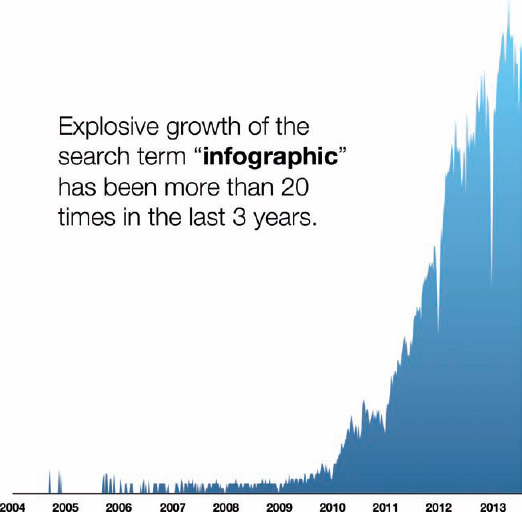
FIGURE 1-6: Growth of search for the term infographic
Information Overload
We are all confronted with an immense amount of data and information every day—news, advertisements, e-mail, conversations, text messages, tweets, books, billboards, signs, videos, and of course the entire Internet. The challenge we face is to filter out the junk, focus on the relevant information, and remember the important stuff.
It's a push-pull problem. We are actively seeking information, and at the same time, companies and advertisers are pushing their information at us.
The Rise of the Informavore
The first part of this problem is that people are constantly looking to find new information. In a real sense, we are our own enemy. We are confronted by most of the information because we look for it. The simplified reason for this is that we want to be better informed so we can make better decisions.
In 1983, George A Miller[2], one of the founders of the field of cognitive psychology, coined the term informavore to describe the behavior of humans to gather and consume information (Figure 1-7). It was later popularized by philosopher Daniel Dennett[3] and by cognitive scientist Steven Pinker[4]. Miller states, “Just as the body survives by ingesting negative entropy, so the mind survives by ingesting information. In a very general sense, all higher organisms are informavores.”
In 2000, technology writer Rachel Chalmers[5] wrote, “We're all informavores now, hunting down and consuming data as our ancestors once sought woolly mammoths and witchetty grubs.” She wrote that description as part of her article on how researchers at Xerox's Palo Alto Research Center in California were investigating how people find information on the Internet by using anthropology to compare them to the foraging habits of early humans. Here's the condensed version: The results were that the two behaviors were similar.
FIGURE 1-7: The evolution of the informavore
This behavior of hunting for information is not new. Humans have been driven to gather new information since before recorded history. It's a major reason that humans have not only survived, but also have developed the advanced civilization that exists today. How to grow better crops, how to build better weapons, and how to survive the winter, successfully hunting for more food, killing invading enemies, and so on. Our species thrives because we are constantly learning and improving.
There is also an immense amount of pressure to make better decisions. Why do people still make poor choices when this massive library of human knowledge is available? For example, people are pressured to research products before making purchase decisions because price comparisons, promotional offers, star ratings, customer reviews, expert recommendations, feature comparisons, and third-party testing results are easily available.
Part of this behavior is that people want to be perceived by others as having made good, well-informed decisions. It might take days to decide which is the best, new microwave to buy because we respond to this pressure by doing more research. We need more data, so we go looking for it.
The Rise of Big Data
We live in the Information Age. People have more information at their fingertips than at any time in history, and this problem is going to get worse (or better, depending on your point of view). It's like putting a starving man in a Las Vegas buffet restaurant. We see this growth in data all around us; however, it's hard to quantify how much information we see every day.
On average, we are exposed to the information equivalent of 174 newspapers every day (assuming an 85-page newspaper). This research by Dr. Martin Hilbert[6] at the University of Southern California looked at the state of information capacity in 2007, and the results represented an incredible growth when compared to the information equivalent of only 40 newspapers per day in 1986 (Figure 1-8).
Another way we can estimate the sheer magnitude of information is by measuring the amount of data that moves across the Internet. First, here's a quick reminder of how data is measured. In Figure 1-9, the tiny yellow square in the bottom-left corner represents 1 gigabyte of data (a single pixel on the computer screen). The larger, blue square represents 1 terabyte of data, and the big, purple square represents 1 petabyte. Each square is 1,024 times larger than the previous square.
Estimates from 2008 are that Google was processing 24 petabytes of data each day[7] and that the entire written works of mankind, from the beginning of recorded history, in all languages would be a total of 50 petabytes.[8]
With the size of a petabyte in perspective, the Cisco Visual Networking Index[9] makes more sense. Figure 1-10 shows you the historical Internet traffic that has been measured and leads up to the future projection of more than 120,000 petabytes per month by 2017.
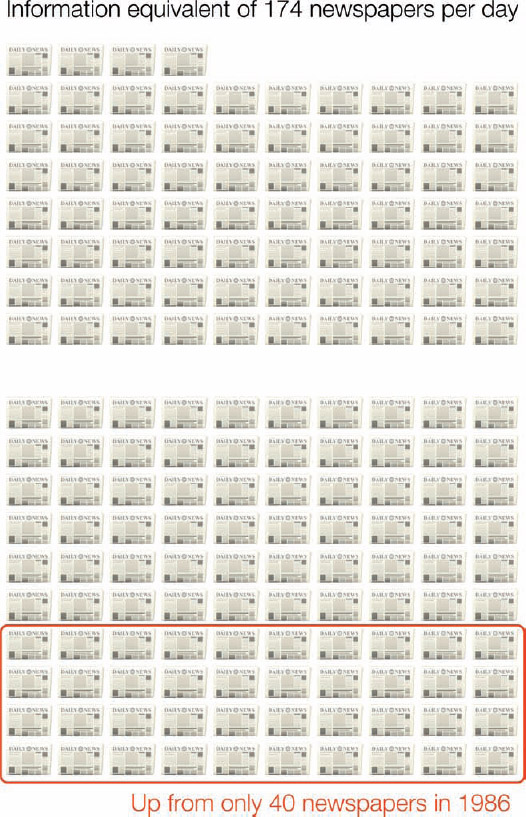
FIGURE 1-8: We are exposed to the information equivalent of 174 newspapers of information every day
FIGURE 1-9: The size of a petabyte
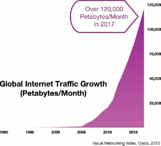
FIGURE 1-10: Global Internet traffic growth
The amount of data available in the modern world can be measured in many ways, but they all indicate that it will continue to increase.
Why Infographics Work
So, how can we cope?
There are a number of reasons why visual information is a more effective form of communication for humans. The main reason is that vision is the strongest form of input that we use to perceive the world around us. In his book Brain Rules, developmental molecular biologist John Medina states, “Vision is by far our most dominant sense, taking up half of our brain's resources.”[10]
Studies estimate that between 50–80 percent of the human brain is dedicated to forms of visual processing,[11][12] such as vision, visual memory, colors, shapes, movement, patterns, spatial awareness, and image recollection.
Pattern Recognition
Humans are pattern recognition machines. Yes, this comes from the evolution of a survival instinct. To survive, humans needed to see a situation and react appropriately in mere seconds. We can see the scene from the photo in Figure 1-11, recognize the lion hiding in the grass, understand the mortal danger we may be in, and start running away in a fraction of second.

FIGURE 1-11: Lion hiding in the grass
Visualizing data taps into this pattern recognition ability and significantly accelerates the understanding of the data.[13] You can look at a chart of data presented and understand it quickly by seeing the patterns and trends. This is a much faster way to comprehend information compared to reading numbers, comprehending the math, and then imagining in your mind how the numbers relate to each other.
The human ability to see patterns and trends quickly is the major reason why data visualizations are so powerful as components of infographic design.
The Language of Context
Data visualization is the language of context, which is all about showing multiple values in comparison to each other to provide context for the reader. If we see a number in text by itself, we don't know how to understand it.
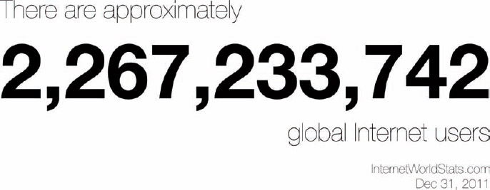
Figure 1-12 shows a numeric value in text by itself. In isolation, the brain doesn't know how to comprehend this value. Is it big or small, good or bad, increasing or decreasing? You don't know. If no context is provided, your brain tries to provide context from your own experiences. You may think: “There are a lot of digits, so it looks like it might be a big number. I know there are about 500 kids in my son's school, so this number sounds very big in comparison!”
This is the baggage that an audience brings with them. If the designer doesn't provide context to help understand the value, the audience will make up their own. Chances are good that it won't be how the designer intended the audience to interpret that data. To communicate clearly, the context needs to be provided to them.
We can't effectively visualize a number all by itself. The bar chart in Figure 1-13 has only one bar and it doesn't provide context to the readers either.
FIGURE 1-12: A text number by itself has no context.[14][15]
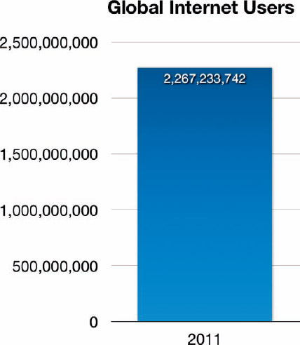
FIGURE 1-13: A bar chart with only one bar doesn't provide context.
Adding a second value for comparison puts the original value into context for the reader. It provides a frame of reference to give the reader a way to understand the magnitude of the original number. Figure 1-14, includes the population of the United States for comparison, using circles to visualize both values.
Now the readers have a way to comprehend the original number by comparing it to something they might be familiar with. They might think: “The number of global Internet users is more than seven times larger than the total population of the United States. That's a lot of Internet users!”
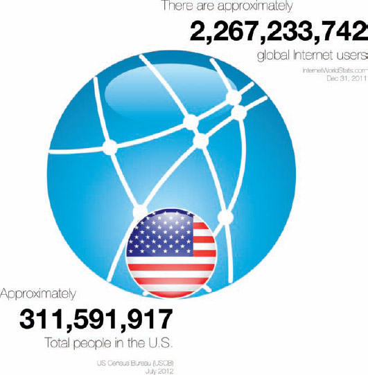
FIGURE 1-14: Providing a second value for comparison creates context.[14][15]
By providing the second number as a comparison, the designer can control the context that the audience uses to understand the data. Visualizing the two numbers taps into the pattern recognition of the brain, and even if the audience doesn't already know the population of the United States, they can see the comparison between the two values. Context is a powerful tool for the designer.
However, with great power comes great responsibility. All data visualization is biased. This upsets a lot of people that want data visualizations to be objective and “true to the data.” By putting numbers into context for readers, the designer is shaping the perception of the values. This introduces bias into the data visualization.
The choices a designer makes bring bias to the design. Just by choosing which numbers to include in the visualization for comparison creates some bias in the design. What numbers are left out? How far back in time should data be used to show a trend? How recently was the data collected? All of these choices introduce small and large elements of bias to the design.
Figure 1-15 changes the reference value used to create context to be the estimated total population of Earth.[15] Now the original value appears smaller in comparison because only approximately one-third of the world population has access to the Internet. This changes the reader's perception and understanding of the original value.
Notice the data visualization style is changed between the two examples. In the first visualization, not everyone in the United States has access to the Internet, so they display as two separate circles. In the second visualization, all Internet users are part of the total population of the planet, so the reader can visualize them as a portion of the total in a pie chart.
Designers need to balance two conflicting demands—the need to communicate a message and the need to minimize bias in the design. Designers struggle with this challenge every day.
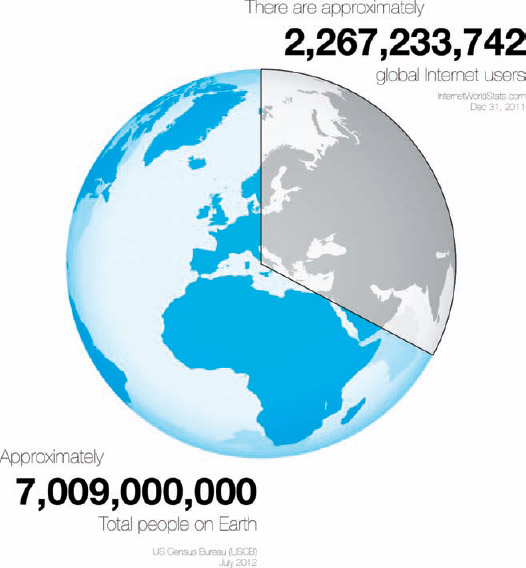
FIGURE 1-15: Providing a different second value for context
The Picture Superiority Effect
Probably the strongest way that visual systems can benefit us is in memory retention. People remember pictures better than words, especially over longer periods of time. This phenomenon is called the Picture Superiority Effect.
Even without understanding the science behind the concept, advertisers have known this intuitively for many years. Even in simple applications such as the Yellow Pages, listings that include pictures are more successful. People are more likely to remember the company advertised if there was an image included in the listing.
This is also the primary reason why companies design logos for themselves, as seen in Figure 1-16. People are more likely to remember the company logo, an illustration representing the company, than the actual name of the company. When it comes to purchase decisions, consumers are more likely to buy products from familiar companies. When buyers are in a store looking at products on the shelf, they are more likely to choose the products from companies they recognize, and logos are more likely to be remembered. Companies know this, and are very careful to design their product packaging to clearly show the company or brand logo.
FIGURE 1-16: Consumers are more likely to remember a company's logo than the text of the company name
Based on research into the Picture Superiority Effect (Figure 1-17), when we read text alone, we are likely to remember only 10 percent of the information 3 days later. If that information is presented to us as text combined with a relevant image, we are likely to remember 65 percent of the information 3 days later![10]
Combining relevant images with your text dramatically increases how much your audience remembers by 650 percent!
However, it's not just any image. It needs to be an image relevant to the content, which reinforces the message from your data. This works in advertisements, presentation slides, posters, brochures, websites, billboards, and, of course, infographics. A simple text message combined with a relevant image can make a lasting, memorable impression on your audience (Figure 1-18).
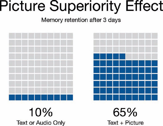
FIGURE 1-17: Picture Superiority Effect
FIGURE 1-18: Getting information from the Internet
coolinfographics.com/Figure-1-18
Source: The Information Hydrant, Will Lion, 2008
In 1917, artist and illustrator James Montgomery Flagg designed the still-famous “I Want YOU for U.S. Army” poster (Figure 1-19) that combines a simple text message with a dramatic image depicting Uncle Sam.[16] This poster is still recognizable and remembered almost 100 years later because of the Picture Superiority Effect. Without the image portion, no one would remember these posters at all.
In infographic design, the Picture Superiority Effect is extended to include charts, graphs, and data visualizations. Infographic designers use data visualizations and illustrations as the visual component of a design to trigger the Picture Superiority Effect, which can have incredible success getting the audience to remember the information presented.
FIGURE 1-19: “I Want YOU” poster from World War I, designed by James Montgomery Flagg
The secret is that the visualization needs to stand out. Just because you include a chart doesn't make a design interesting or memorable. The visualization must be unique and impactful, or it won't be memorable to the audience. Just as seeing a presentation full of similar bar charts can put an audience to sleep, if an infographic designer uses the same chart style over and over again, the audience won't remember the difference between multiple designs. Designers can spend a lot of time working on the design of one data visualization to find a new style or visualization method. This long amount of time focused on one chart design can contribute to why many people mistakenly think that infographic design is just about making charts pretty.
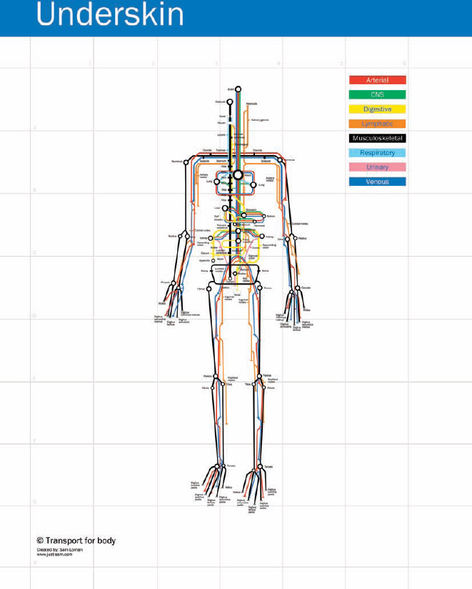
In 2010, Sam Loman designed the infographic Underskin, shown in Figure 1-20. The design maps eight different systems within the body (Digestive, Respiratory, Arterial, and more) and highlights the major connection points using the visualization style of a subway map. The design was unique and stood out because it wasn't a text list or a bunch of callouts on an image of an actual human body. Even though the subway map design style was well known, it had never been applied to this medical topic before, and the design stood out dramatically compared to other medical information sources. Even though it was intended for a medical audience, the design went viral with the general public online on many nonmedical sites such as Gizmodo, Behance, Vizworld, Information Aesthetics, Neatorama, Flickr, and Cool Infographics.
Loman effectively applied an existing design style to a new set of information to create a visualization that was new and different. The resulting design is definitely unique and memorable.
FIGURE 1-20: Underskin by Sam Loman
coolinfographics.com/Figure-1-20
Source: Underskin by Sam Loman
The Art of Storytelling
Good infographic design is about storytelling by combining data visualization design and graphic design. Many of the good infographics follow a simple three-part story format: introduction, key message, and conclusion, as shown in Figure 1-21.

FIGURE 1-21: The three-part story format
Introduction/Foundation
The introduction needs to introduce the reader to the topic of the infographic. What is the infographic about and why should the reader care? This is usually some combination of the title and a brief paragraph of text. This is the designer's chance to tell the target audience that this infographic is intended for them and contains something they will find interesting.
This section also needs to lay the foundation for the information—anything the readers need to understand clearly before they are ready to grasp the main event. Introductions may include a couple data visualizations that help lay the groundwork. Maybe it's a visualization of an entire industry before getting into the details, which helps prepare the reader to be ready to learn something new.
Ah-Ha! The Main Event
For an infographic to be remarkable to the audience, it needs to contain some new, previously unknown piece of information. This is the main event and usually the dominant visual portion of the infographic.
This section is the infographic's entire reason for existence. The information contained here is why someone went to the trouble of designing the infographic. Usually, a large illustration or data visualization is used in this section to trigger the Picture Superiority Effect with the readers. If the audience only remembers one thing from the infographic, the designer wants it to be this main point of information.
Conclusion/Call-to-action
Infographic designs need to have some closure at the bottom where the designer wraps up the message for the reader—just like ending a good speech.
If appropriate, this is where a call-to-action should be included if there is some type of follow-up the designer would like the readers to take after learning this amazing piece of information. Should they visit a website, sign a petition, buy a product, start eating healthier, write a letter to their congressman, or call their mother?
The design should not leave it to chance that they will act appropriately, but should tell the readers explicitly what to do with the nugget of wisdom just bestowed upon them.
Figure 1-22 is an infographic from RothIRA.com that targets a young audience with information about saving for retirement. There is a brief introduction that introduces the character Tom. Some basic assumptions are outlined as foundation information, such as saving $1.00 per day up until age 70.
The main event is the visualization of the tower of stacked beer cases that Tom would be able to afford if he starts saving at age 25. This stack of beer is shown in comparison to two smaller objects: the Statue of Liberty and, the world's tallest building, the Burj Khalifa Tower. By choosing two recognizable objects that are smaller than the Tower of Beer, the design highlights how impressively tall this stack would be.
The explicit call-to-action is the deceptively simple statement: “Learn more at RothIRA.com.” The subtle call-to-action is for the reader to start saving for retirement right now.
FIGURE 1-22: The Tower of Beer infographic exemplifies the three-part story format
coolinfographics.com/Figure-1-22
Source: The High Life, Tower of Beer, RothIRA.com, 2012
Media Formats of Infographics
Six different media formats of infographics are available to designers, as shown in Figure 1-23. Even though the majority of the infographics we see online are static images, many designers have begun to utilize storytelling and data visualization in different ways. The choice between these hinges on the overall objectives of the design.
Static Infographics
Static infographics are the simplest and most common form of infographics design. The final design is saved as an image file for easy distribution online and to print on paper. Most software applications have the capability to save the final design as a static image file (JPG, PNG, GIF, and such) for easy viewing in a browser or as a PDF file.
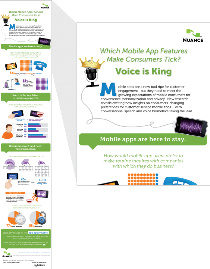
Figure 1-24 is a good example of a static infographic design. Voice is King from Nuance Communications uses data visualizations and illustrations to tell a compelling message. The design fits easily into website and blog posts, and the static image can be easily shared as a PDF file by e-mail.
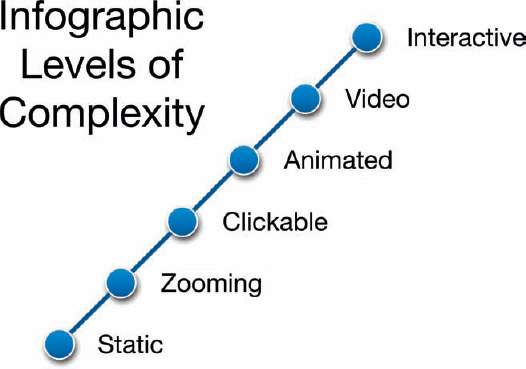
FIGURE 1-23: The six forms of infographics in order of increasing complexity
FIGURE 1-24: Voice is King, Static infographic example
coolinfographics.com/Figure-1-24
Source: Voice is King, Nuance Communications, 2012
Static infographics are also the easiest format to share online. No special applications or browser add-on extensions are required. Static images have a long history as part of web design and are easy to post and control in web design packages. After a static infographic image is published online, it becomes available for most readers to share online using the built-in function on social media sites to share images.
The major social media sites (Twitter, Facebook, Google+, Pinterest, Tumblr, and LinkedIn) have the capability to share static images built into the existing status update function (Figure 1-25).

FIGURE 1-25: Facebook upload photo image interface
A smaller, thumbnail image of the infographic becomes embedded in the status update and appears to all of the followers as part of the stream of status updates, as seen in Figure 1-26.

FIGURE 1-26: Infographic image shown in Facebook News Feed
Zooming Infographics
Zooming infographics add an interactive layer to large, static infographics online and enable the readers to easily zoom in closer to read the details. These are normally used for large designs and posters because the small space available in a computer's browser window makes the text too small to read. A large design is reduced in size so that the entire design can be viewed all at once on the screen, and the zooming controls are made available to allow the reader to view the small details clearly.
Figure 1-27 shows a zooming interface being used to view The Genealogy of Pop/Rock Music infographic poster from HistoryShots. This is a very popular design, but the large format makes it difficult to view online. The zooming viewer allows the reader to zoom into the details, but keeps a thumbnail of the overall design in the top left corner. This thumbnail shows the reader which portion of the design is being shown, and allows them to easily navigate to other parts of the design.
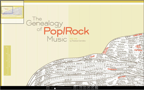
FIGURE 1-27: Zooming interface example
coolinfographics.com/Figure-1-27
Source: Genealogy of Pop & Rock Music, Reebee Garofalo, HistoryShots
A zooming interface is usually created by starting with a large image file of a static design and then adding the interface controls as part of the web page. Custom web page code such as HTML5 and JavaScript can create the user interface, but online services such as Zoom.it (zoom.it/) from Microsoft enable anyone to create an interactive, zoomable image interface using the link to an available image online.
Figure 1-28 shows the huge infographic design, Ownership of Beer Brands and Varieties 2010 by Associate Professor Phillip H. Howard from Michigan State University and his wife Ginger Ogilvie. The design is a large visualization of the many varieties of beers owned by the various parent companies. Viewed as a whole on the screen or page, most of the text is unreadable.
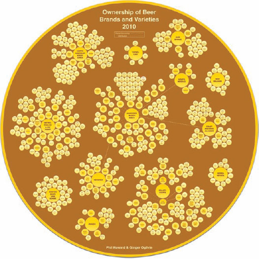
FIGURE 1-28: Large poster-sized info-graphic designs are perfect for zooming interfaces
coolinfographics.com/Figure-1-28
Source: Ownership of Beer Brands and Varieties 2010, Phillip H. Howard and Ginger Ogilvie
However, by using the Zoom.it tool, they were able to create the zooming interface you see in Figure 1-29. The reader can navigate the design using the mouse or the controls in the lower right-corner. The design with the zooming interface can be seen in all browsers and even embedded into other websites to share.
A major advantage to using a zooming interface is that it enables readers to see the entire design on the screen without any scrolling before delving deep into details. By starting with the big picture, the readers gain a better understanding and context of how the details fit into the overall story.
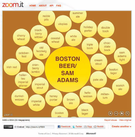
FIGURE 1-29: Beer Ownership infographic as seen in the Zoom.it interface tool
coolinfographics.com/Figure-1-29
Source: Ownership of Beer Brands and Varieties 2010, Phillip H. Howard and Ginger Ogilvie
Clickable Infographics
Clickable infographics also add a user interface layer to static infographic designs by making specific regions of the design clickable with HTML links. This interface is often created as an HTML Image Map, which is interpreted by the web browser to identify specific regions of the static image by their pixel locations as clickable to a URL address. Designers use the advantage of clickable designs to remove secondary information and additional details from the primary infographic design.
The designer can use clickable infographics as a method to keep the original infographic clean and simple to read. Readers who want more information can dig deeper by clicking the links, but the main infographic remains simple and easy to understand.
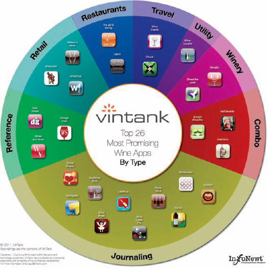
It's a little difficult to show how this works on a printed page, as shown in Figure 1-30. In this design from 2011, the list of the Top 26 Most Promising Wine Apps from VinTank is shown within a visualization that groups them by category. Each of the iOS app icons takes the reader to the appropriate page in the iTunes App Store when clicked. This kept the design clean and simple by removing the need to spell out all the URL addresses in the text.
A variation of this type of design style is a pop-up infographic style. Instead of the reader clicking different areas of the infographic to access additional information, the secondary information appears as the reader hovers their mouse pointer over different regions of the design.
FIGURE 1-30: Each icon in this infographic is a separate HTML link
coolinfographics.com/Figure-1-30
Source: VinTank App Spectrum
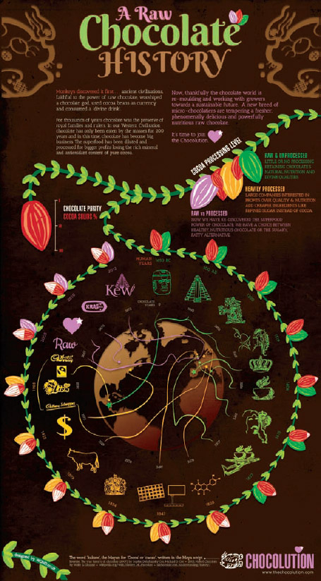
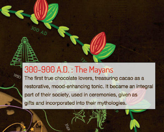
A Raw Chocolate History is an infographic timeline. The main design in Figure 1-31 is a simple, circular timeline with illustrations, but when the reader hovers over any of the illustrations, secondary information specific to that time period appears (Figure 1-32) providing additional information to the reader without cluttering the original design.
Both the clickable and pop-up design style share one major drawback. The additional functionality of the clickable regions and pop-up information is only functional when viewed on the original landing page that includes all the extra HTML code. Whenever a reader shares the infographic image on another site, only the static image file of the-original infographic is shared.
FIGURE 1-31: Using pop-up information can keep the original design clean
coolinfographics.com/Figure-1-31
Source: The Raw Chocolate History, The Chocolution.com
FIGURE 1-32: Additional Information pop-up window close-up
Another variation of this style is that many programs that have the capability to create the HTML Image Map files can also export the file into PDF format and maintain the clickable functionality. That means a designer can save the clickable infographic into a clickable PDF file. The resulting PDF file is then easy to send through e-mail or make available for download.
The clickable PDF file is not only fully functional when viewed on the reader's computer, but also when viewed on portable devices such as tablets and smartphones; all the clickable regions in the PDF file still function correctly and bring up the target URL addresses in the default web browser on the device.
My Visual Mapping Blogroll designed by Claude Aschenbrenner (SerialMapper.com) in 2008 is an infographic design in the style of a subway map. It's a PDF file available to view or download from the SerialMapper site (serialmapper.com/archive/2008/09/25/mise-en-seine-de-blogs.html) and each blog listed at a node is a clickable link that takes the reader to the URL address of each blog (Figure 1-33).
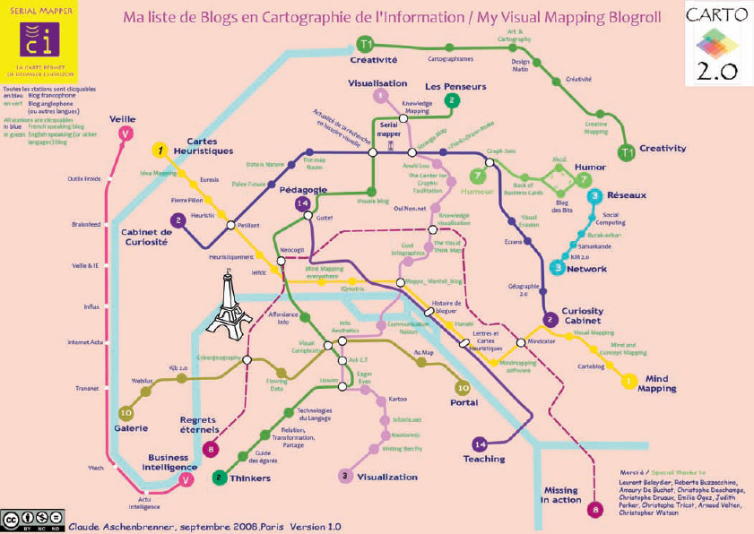
FIGURE 1-33: The Visual Mapping Blogroll
coolinfographics.com/Figure-1-33
Source: My Visual Mapping Blogroll, by Claude Aschenbrenner
Animated Infographics
Animated infographics create some motion or change to the design as the reader watches. It might be the bars in a bar chart growing, a color change, or an animated character. These are differentiated from the video infographics (next) because these are not video files. These are animated with HTML code or an image file format to create the animation but can exist as an object on the web page.
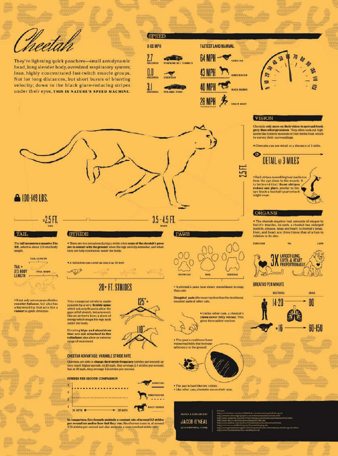
In the Cheetah infographic (Figure 1-34) by Jacob O'Neal, the cheetah is animated as running in the infographic, along with some other smaller animations in the charts. You'll have to follow the URL link to see the animation online. This is accomplished by using the animated GIF file format that displays a sequence of static images in a repeating loop. The result is a constantly moving animation that makes this design clearly stand out and get noticed.
The use of the animated GIF image file format has a significant additional advantage. Because the animation is completely contained within the image file, the animation will function when posted on other sites and blogs. This is in contrast to other designs using code to create an animated infographic, which is much harder to share.
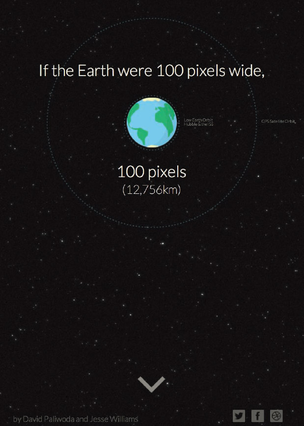
How Far is it to Mars? shown in Figure 1-35 is an animated infographic design built into a webpage. Created by David Paliwoda and Jesse Williams, the design visualizes the distance between Earth and Mars at a scale that makes planet Earth a diameter of 100 pixels on screen. Clicking on the arrow at the bottom of the screen begins the animation of scrolling the page to the orbit of the Moon and eventually to the planet Mars. The visual motion of the star field and the amount of time it takes before Mars appears on the screen gives the audience a clear understanding of how far apart the planets truly are.
FIGURE 1-34: Animated GIF image file used to create an animated infographic
coolinfographics.com/Figure-1-34
Source: Cheetah, Jacob O'Neal jacoboneal.com/cheetah)
FIGURE 1-35: Animated infographic begins when clicked by the viewer
coolinfographics.com/Figure-1-35
Source: David Paliwoda and Jesse Williams
Video Infographics
Video infographics are still fairly new but quickly gaining momentum online because of the ease of usability on video sharing sites such as YouTube and Vimeo. The ability to embed fully playable videos from these sites into blogs and social media posts has caused a tremendous increase in the traffic and value of video infographics to marketers.
The first video infographic I posted about on Cool Infographics in 2007 was the music video for “Remind Me,” by Royksopp (youtube.com/watch?v=eo4u4JJAPGk). The video is a story about a day in the life of a young woman living in London. The data visualizations in the video are about the details behind modern life that surround her, like showing how the plumbing system in her apartment works while she is shown brushing her teeth. This video set a high standard for the video infographic designs that followed (Figure 1-36).
Other video infographics are not made with high-end animation software applications. Many of the most popular video infographics online have been made using readily available presentation software applications such as Microsoft PowerPoint, Apple Keynote, and Prezi. Using the animated slide transitions and careful timing steps to automate the entire presentation, a presentation can be exported as a video file for distribution.
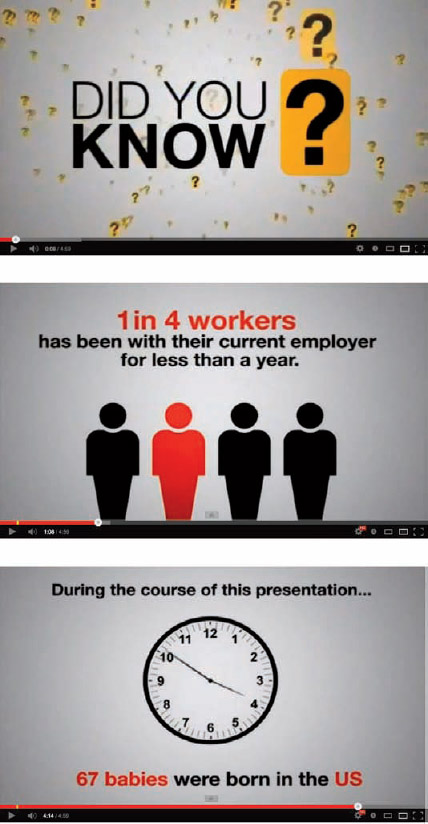
The “Did You Know? Shift Happens” video infographic by Karl Fisch, Scott McLeod, and Jeff Brenman (youtube.com/watch?v=ljbI-363A2Q) started out as a PowerPoint presentation to the faculty at Arapahoe High School in Centennial, Colorado in August 2006. The initial video was remixed to remove the school-specific information and uploaded to YouTube in 2008. It quickly went viral, and that one infographic video had more than 5.6 million views by the end of 2012 (Figure 1-37).
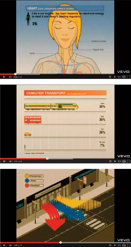
FIGURE 1-36: “Remind Me” by Royksopp video infographic
coolinfographics.com/Figure-1-36
FIGURE 1-37: “Did You Know? 3.0” Infographic video
coolinfographics.com/Figure-1-37
These videos didn't use many data visualizations (most of the data was shown in text only), but it did a good job of putting the numbers into context for the audience. That initial video has spawned a series of updates over the subsequent years and has grown to become probably the most successful video infographic campaign to date. Over the last 5 years, it has become a series of videos with the help of design firm XPLANE (xplane.com) and began using more advanced animation software tools. By the end of 2012, the entire series of videos had more than 33 million views online. A complete wiki site has been created around the history of the video series at shifthappens.wikispaces.com/.
Interactive Infographics
Interactive infographics are designs that give readers some control over the data or the visualization displayed. They are also popular because they keep the readers engaged with the data for a much longer period of time than static infographics. Some of these sites are standalone data visualizations, and others are built into a larger infographic design.
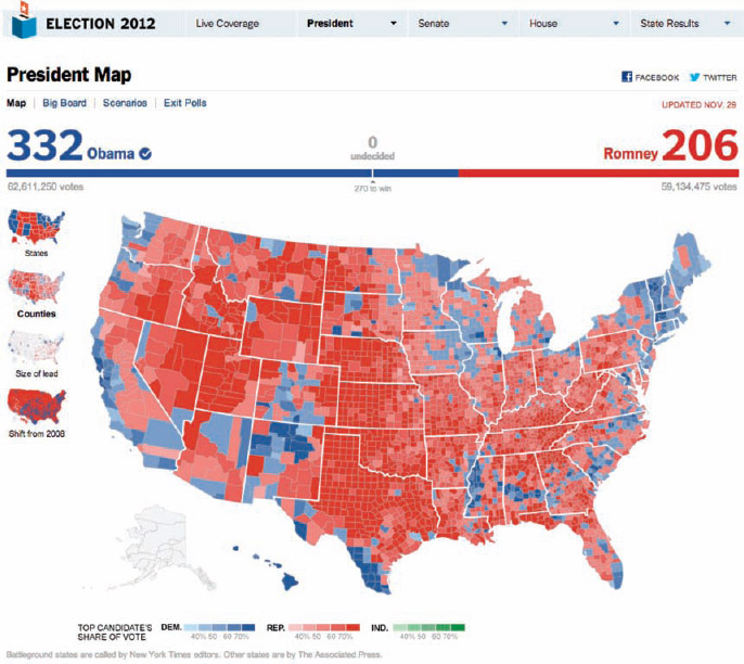
The New York Times website has become recognized by many as the world leader in interactive infographics and data visualizations. Figure 1-38 shows a map of results from the 2012 U.S. Presidential election. Each county in the country is colored a shade of red or blue depending on the final tally of votes. I would call this an interactive data visualization, but because of the historical use of the word infographics within the newspaper design industry, many people refer to this as an interactive infographic.
In this case, the data was being updated in real-time as the election results were officially released. Users could see the map evolve as additional results were reported. The user had the ability to zoom in to specific states, view the numeric data from each country or change the display based on the choices along the left-hand side.
FIGURE 1-38: The New York Times 2012 Election interactive infographics
coolinfographics.com/Figure-1-38
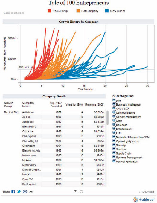
Some companies design and provide interactive data visualization tools for others to use. Tableau Software is one of the leaders in this area and makes its Tableau Public version of their product available to users for free. The tool enables us to use our own data to create interactive visualizations and then embed the visualizations into our websites (Figure 1-39).
coolinfographics.com/Figure-1-39
Source: Tale of 100 Entrepreneurs, Tableau Software.
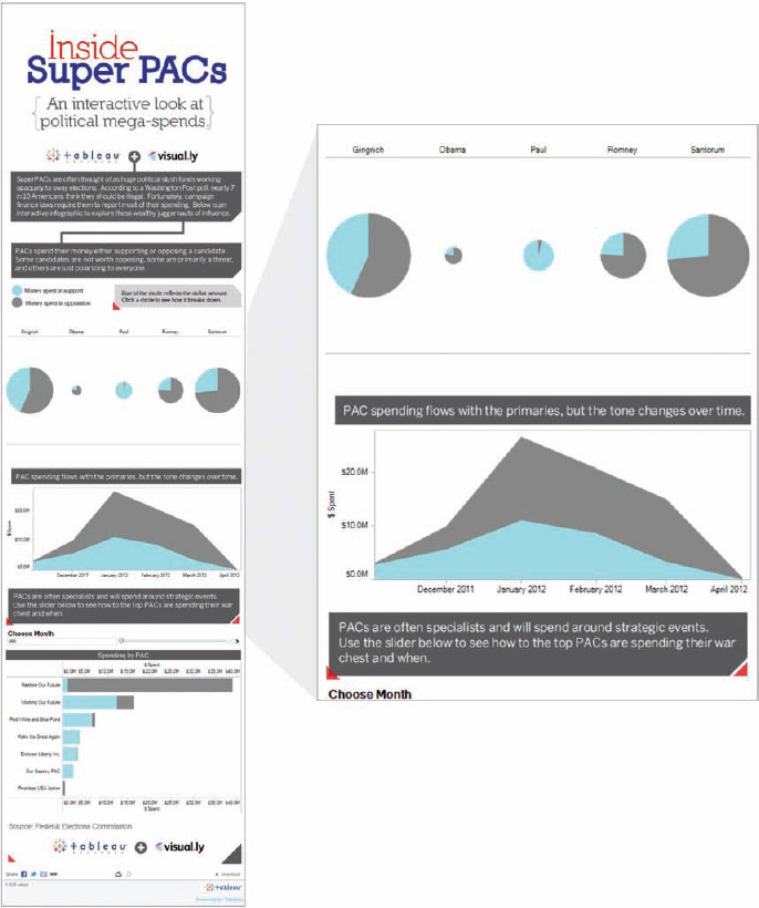
A few complete infographics have been designed using Tableau as a design tool to include interactive data visualizations within a larger infographic design. Inside Super PACs (Figure 1-40) was designed by Jess Bachman at Visually, Inc., using Tableau visualization modules as the charts within the design. As a result, all the charts are interactive, and the reader can adjust any of them by clicking to highlight different information.
FIGURE 1-40: Separate interactive charts were put together to create the complete infographic
coolinfographics.com/Figure-1-40
Source: Inside Super PACs, Visually, Inc.
Final Thoughts
Infographics have exploded in popularity in just a few years. Their formats will undoubtedly evolve into new types of media, but the use of data visualization and design to tell stories with data will only continue to grow. We will never have less data available than we do today. The amount of data we have to filter through and understand will continue to grow, and infographic designs are one of the best tools we have to share and communicate the things we can learn from that information.
References
1. Edward R. Tufte, The Visual Display of Quantitative Information (Cheshire, CT: Graphics Press LLC, 2001). http://www.edwardtufte.com/
2. George A. Miller, “Informavores,” in The Study of Information: Interdisciplinary Messages, ed. Fritz Machlup and Una Mansfield, (New York: Wiley-Interscience, 1983), 111–113
3. Daniel Dennett, Kinds of Minds: Toward an Understanding of Consciousness, (New York: Basic Books, 1997).
4. Steven Pinker, How the Mind Works, (New York: Norton, 1997).
5. Rachel Chalmers, “Surf like a Bushman,” NewScientist, no. 2264, (November 11, 2000).
6. Dr. Martin Hilbert, “Mapping the dimensions and characteristics of the world's technological communication capacity during the period of digitization (1986–2007/2010),” presented at the 9th World Telecommunication/ICT Indicators Meeting (WTIM-11), International Telecommunication Union (ITU), (Mauritius, December 7–9, 2011).
7. Kevin Kelly, “Scan This Book,” New York Times, May 14, 2006: http://www.nytimes.com/2006/05/14/magazine/14publishing.html?pagewanted=all&_r=0.
8. Jeffrey Dean and Sanjay Ghemawat, “MapReduce: Simplified Data Processing on Large Clusters,” Communications of the ACM 51, no. 1, (January 2008), 107–113. http://static.usenix.org/event/osdi04/tech/ full_papers/dean/dean.pdf.
9. Cisco Visual Networking Index, 2013: http://www.cisco.com/en/US/netsol/ ns827/networking_solutions_sub_solution.html.
10. John Medina, Brain Rules: 12 Principles for Surviving and Thriving at Work, Home, and School, (Seattle: Pear Press, 2009).
11. Michael Weliky, “Under the Surface, the Brain Seethes With Undiscovered Activity”, University of Rochester Newsroom, October 6, 2004, http://www.rochester.edu/news/show.php?id=1898.
12. MIT Research—Brain Processing of Visual Information, MIT News, December 19, 1996, http://web.mit.edu/newsoffice/1996/visualprocessing.html.
13. J. Heer, M. Bostock, and V. Ogievetskey, “A Tour through the Visualization Zoo,” Communications of the ACM 53, no.6 (June 2010), 59–67. http://queue.acm.org/detail.cfm?id=1805128.
14. Internet World Stats: http://internetworldstats.com/stats.htm
15. U.S. Census Bureau, “World POPClock Projection”: http://www.census.gov/population/popclockworld.html.
16. James Montgomery Flagg, http://en.wikipedia.org/wiki/James_Montgomery_Flagg.
Links
Many of the images in this chapter can be viewed by using the following links or going to www.wiley.com/go/coolinfographics.
1. StockTouch iOS app, Visible Market, Inc.:
https://itunes.apple.com/us/app/stocktouch/id445170859?mt=8
2. Could you be a Failure? From Jess.net and Smarter.org:
http://www.smarter.org/research/fail-charts/
3. The Information Hydrant, Will Lion, 2008:
http://www.flickr.com/photos/will-lion/2595497078/
4. Underskin, Sam Loman:
http://www.just-sam.com
5. The High Life, Tower of Beer, RothIRA.com, 2012:
http://www.rothira.com/tower-of-beer
6. Voice is King, Nuance Communications, 2012:
http://enterprisecontent.nuance.com/mobile-app-feature-adoption.html
7. Genealogy of Pop & Rock Music, Reebee Garofalo, HistoryShots:
http://www.historyshots.com/Rockmusic/index.cfm
8. Ownership of Beer Brands and Varieties 2010, Phillip H. Howard and Ginger Ogilvie: https://www.msu.edu/~howardp/beerownership.html
9. VinTank App Spectrum: http://www.vintank.com/2011iphoneapps/
10. The Raw Chocolate History, The Chocolution.com:
http://thechocolution.com/raw-chocolate-history-interactive-infographic-dark-version/
11. My Visual Mapping Blogroll, Claude Aschenbrenner:
http://www.serialmapper.com/archive/2008/09/25/mise-en-seine-deblogs.html
12. Cheetah, animated infographic:
http://jacoboneal.com/cheetah/
13. How Far is it to Mars? by David Paliwoda and Jesse Williams:
http://www.distancetomars.com; http://www.davepaliwoda.com, Twitter @davepaliwoda
http://www.iamjessewilliams.com, Twitter @jesse_lauren
14. Remind Me, infographic music video, Royksopp:
http://www.youtube.com/watch?v=eo4u4JJAPGk
15. Did You Know? Original video, 2006:
http://www.youtube.com/watch?v=ljbI-363A2Q
16. Did You Know? Wiki page with links to all videos:
http://shifthappens.wikispaces.com/
17. The New York Times 2012 interactive election maps:
http://elections.nytimes.com/2012/results/president
18. Tableau Public:
http://www.tableausoftware.com/public
19. Visualizing Super PAC Spending:
http://blog.visual.ly/visualizing-super-pac-spending/


