Chapter 9. Creating notifications and cards
At this point, you’ve explored a decent amount of what the Bulma framework has to offer. There are a lot of component and modifier classes that you can choose from. We hope you can see how you are able to create clean and structured user interfaces without custom CSS code. That’s pretty cool. Of course, you can always modify Bulma with your own variables or add your own custom styles.
There are a few aspects of Bulma that this book hasn’t explored yet: notifications and cards. Let’s wrap up the application, and in later chapters of the book, you’ll learn about using Bulma with Vanilla JavaScript as well as the Angular, Vue, and React frameworks.
Note: To see the full code of the example used in this book take a look at the book’s accompanying GitHub page.
The dashboard is the page the user lands on after logging in. It is usually the last page to be designed because it acts as both a summary of and a shortcut to the other pages of the admin area. Hence, why building the dashboard is the last step of this chapter; the idea is to take content of the other pages, and present them in a succinct way.
The layout will be a grid of components, each of them related to one or multiple content types:
- The most important metrics
- A list of the latest orders
- The most popular books
- The most loyal customers
By using standard Bulma components, you can easily build a dashboard with a wide range of use cases.
Title, time range
The dashboard’s main purpose is to provide a rapid overview within a certain timeframe, so that the user can, at a glance, get a grasp of the state of the admin area.
Duplicate books.html and remove everything in the main right column (from the “Books” title to the pagination), so only the navbar at the top and the sidebar menu on the left remain. Move the is-active class as well:
In this now empty right column, start with a level component that will combine a title and a select dropdown.
<divclass="level"><divclass="level-left"><h1class="subtitle is-3"><spanclass="has-text-grey-light">Hello</span><strong>Alex Johnson</strong></h1></div><divclass="level-right"><divclass="select"><select><option>Today</option><option>Yesterday</option><option>This Week</option><optionselected>This Month</option><option>This Year</option><option>All time</option></select></div></div></div>
has-text-grey-light: A helper class for typography. Assigns the text with a light grey color.
The title mentions the user’s name, which acts as a confirmation after the user has logged in.
The right part has a select dropdown that allows the user to change the timeframe of the dashboard they are viewing (similarly to most analytics dashboard).
Important metrics
The dashboard is a transient page: the user sees it, has a rapid look-around, and navigates to the part that caught their attention. That is why the UI should provide information almost instantly.
Bulma provides notification elements that come in various colors. Combined with titles with a bigger font size, they are the perfect candidates for high-level metrics.
After the level component, add these columns:
<divclass="columns is-multiline"><divclass="column is-12-tablet is-6-desktop is-3-widescreen"><divclass="notification is-link has-text"><pclass="title is-1">232</p><pclass="subtitle is-4">Orders</p></div></div><divclass="column is-12-tablet is-6-desktop is-3-widescreen"><divclass="notification is-info has-text"><pclass="title is-1">$7,648</p><pclass="subtitle is-4">Revenue</p></div></div><divclass="column is-12-tablet is-6-desktop is-3-widescreen"><divclass="notification is-primary has-text"><pclass="title is-1">1,678</p><pclass="subtitle is-4">Visitors</p></div></div><divclass="column is-12-tablet is-6-desktop is-3-widescreen"><divclass="notification is-success has-text"><pclass="title is-1">20,756</p><pclass="subtitle is-4">Pageviews</p></div></div></div>
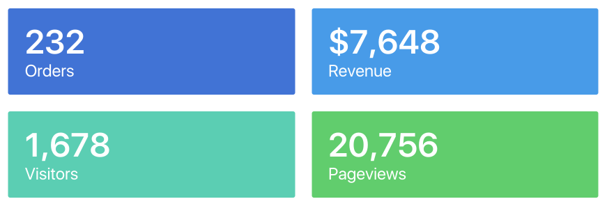
The columns are multiline so you can have one column on mobile and tablet, two on desktop, and four on widescreen.
Latest orders
The orders is the content type that is most likely to be frequently populated, since they come from the website. That is why it makes sense to show its latest state right away, before navigating to the “Orders” page.
Because the columns implemented for the high-level metrics are multiline, you can simply append more column items at the end.
Right after the last <div class="column is-12-tablet is-6-desktop is-3-widescreen">, but still within the <div class="columns is-multiline">, add this new column:
<divclass="column is-12-tablet is-6-desktop is-4-fullhd"><divclass="card"><divclass="card-content"><h2class="title is-4">Latest orders</h2><divclass="level"><divclass="level-left"><div><pclass="title is-5 is-marginless"><ahref="edit-order.html">787352</a></p><small>Nov 18, 17:38 by<ahref="edit-customer.html">John Miller</a></small></div></div><divclass="level-right"><divclass="has-text-right"><pclass="title is-5 is-marginless">$56.98</p><spanclass="tag is-warning">In progress</span></div></div></div><aclass="button is-link is-outlined"href="orders.html">View all orders</a></div></div></div>
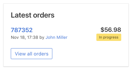
The level component here allows you to save vertical space by displaying the order id, date, and customer on the left, and push the total and status to the right.
Between the first level and the “View all orders” button, add a couple of other orders in this list, with different data:
Most popular books with cards
In this section you’ll be creating cards. Cards are a Bulma component that are great at conveying information in a smaller amount of space. Usually, cards have visual elements with them, like an image or a video. Cards are very common and are especially common with eCommerce websites. However, let’s create some cards with our in-progress book application.
Basic structure of a card
<divclass="card"><divclass="card-image"><!-- image here --><div><divclass="card-content"><!-- content here --><div></div>
For this example, you’ll be using Bulma’s media component for the card’s content. Let’s move on.
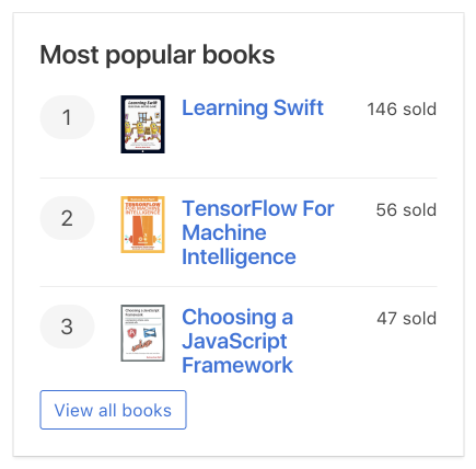
The dashboard should contain items that are likely to change over time. The list of the most popular books is one such item.
You can reuse the same layout as the previous column, but use a media component instead of a level one:
<divclass="column is-12-tablet is-6-desktop is-4-fullhd"><divclass="card"><divclass="card-content"><h2class="title is-4">Most popular books</h2><divclass="media"><divclass="media-left is-marginless"><pclass="number">1</p></div><divclass="media-left"><imgsrc="images/swift.jpg"width="40"></div><divclass="media-content"><pclass="title is-5 is-spaced is-marginless"><ahref="edit-book.html">Learning Swift</a></p></div><divclass="media-right">146 sold</div></div><aclass="button is-link is-outlined"href="books.html">View all books</a></div></div></div>

Two media-left elements are used here, which allows the UI to place multiple narrow elements side-by-side (the ranking and the cover image).
Now add a second and third book to the list:
Most loyal customers
For the final column, you can provide an overview of the last content type: customers.
Right after the previous column, add the following:
<divclass="column is-12-tablet is-6-desktop is-4-fullhd"><divclass="card"><divclass="card-content"><h2class="title is-4">Most loyal customers</h2><divclass="media"><divclass="media-left is-marginless"><pclass="number">1</p></div><divclass="media-content"><pclass="title is-5 is-spaced is-marginless"><ahref="edit-customer.html">John Miller</a></p><pclass="subtitle is-6">United States</p></div><divclass="media-right">7 orders</div></div><aclass="button is-link is-outlined"href="customers.html">View all customers</a></div></div></div>
button: Bulma component. Adds base styles for buttons.is-link: Modifier class for buttons. Much likeis-primary. Defaults to a blue color.is-outlined: Removed the background color of the button. Adds a colored border and colored text based on the other modifier.

The Bulma media component is versatile enough to be re-used here, but with different data, and with one fewer media-left.
Add the second and third most loyal customers to the list:

The dashboard is now complete! Play with the content, change the modifier clases, and add more columns.
Summary
As you have seen in the building of this admin area, Bulma components come in various forms:
- Layout utilities (
section,columns,level...) - Single elements (
box,button,input,notification...) - Multipart components (
navbar,card,media,menu,pagination...) - Helper classes (
has-text-grey-light,is-hidden-tablet-only...)
Most Bulma users like to combine all of these parts in a plethora of different ways, to build the UI their website needs. But most importantly, they like to customize their Bulma setup by providing their own colors and modifying the initial variables.
In the next chapter we will focus on using Bulma with Vanilla JavaScript.