Chapter 3. Creating and controlling forms with Bulma
Let’s dive right into creating user interfaces with Bulma. In this chapter, you create a full screen login form. This will give you a solid understanding of Bulma and give you the tools you need to start integrating Bulma. Some things to take away from this chapter are: the use of Bulma working with forms and why you leverage Bulma and when.
This login form that you’ll create will contain two form inputs (one for the email and one for the password). This will be vertically and horizontally centered in a full screen <div>.
To see the full code of the example used in this book take a look at the book’s accompanying GitHub page.
Template requirements
In order for the login page to work properly, you must follow the HTML5 web standard as well as the following tags:
<!DOCTYPE html><metaname="viewport"content="width=device-width, initial-scale=1"><linkrel="stylesheet"href="https://maxcdn.bootstrapcdn.com/font-awesome/4.7.0/css/font-awesome.min.css"><linkrel="stylesheet"href="https://cdnjs.cloudflare.com/ajax/libs/bulma/0.6.1/css/bulma.min.css">
All of these parts are combined in a valid HTML5 template:
<!DOCTYPE html><html><head><metacharset="utf-8"><metaname="viewport"content="width=device-width, initial-scale=1"><title>Login</title><linkrel="stylesheet"href="https://maxcdn.bootstrapcdn.com/font-awesome/4.7.0/css/font-awesome.min.css"><linkrel="stylesheet"href="https://cdnjs.cloudflare.com/ajax/libs/bulma/0.6.1/css/bulma.min.css"></head><body><!-- The rest of your code will go here --></body></html>
While this page is valid, it is not showing anything yet, so let’s create our fill screen <div>.
Bulma provides a hero class: it creates a large imposing banner that is useful to showcase something in particular (in this case, the login form). This hero class comes with modifiers which, when combined with the base class, enable us to choose an alternative style for the “hero.”
Inside the <body>, add the following snippet:
<sectionclass="hero is-primary is-fullheight"><divclass="hero-body">Login</div></section>
In addition to the hero class, leverage two Bulma modifiers: is-primary and is-fullheight. As stated above, modifiers “modify” the element that it’s attached to. In this case, is-primary adds the default primary color (turquoise) and is-fullheight makes the <section> increase the height of the <section> to 100% of the browser’s height.

You can now see that the whole viewport is turquoise, with "Login" written in white on the left side. The hero-body ensures that this text is vertically centered.
Tip: If you don’t see a turquoise page, make sure you have included all of the different assets, and that you are connected to the internet.
Centered layout
Before implementing the login box, be sure to first set up the layout. You want the box to be both horizontally and vertically centered:
container: Makes sure that the box will have a maximum width, and won’t reach the edges of the page on wider viewports.columns: Is a wrapper for the single column.column: Will be horizontally centered.box: With its white background and shadow allows its content to be readable on this turquoise webpage.
<sectionclass="hero is-primary is-fullheight"><divclass="hero-body"><divclass="container"><divclass="columns is-centered"><divclass="column"><formclass="box">Login</form></div></div></div></div></section>
Even though you are using is-centered, the content doesn’t look centered. It’s because by default, each Bulma column is automatically resized to fill the horizontal space. Since you only have one column, it takes up 100% of the width.
Tip: Try to add a second column, and notice how each column now takes up 50% of the horizontal space.
Since you don’t want the login box to be too wide, resize this column.
Resizing the single column
You only need a single column, but you want that column to be centered and responsive. Luckily, Bulma provides modifiers that allow you to center columns, and specify a different column size for each breakpoint.
To achieve this, append the following modifiers to the form wrapper. Each one serves a specific purpose.
is-5-tablet: Restricts the wrapper to be 5/12 columns wide on tablet (from769px)is-4-desktop: Restricts the wrapper to be 4/12 columns wide on desktop (from1024px)is-3-widescreen: Restricts the wrapper to be 3/12 columns wide on widescreen monitors (from1216px)
Bulma is designed with mobile first in mind, so you don’t need to add a modifier to your form wrapper. By default, it’s 100% of the mobile device’s width.
Append these modifiers to the column:
<divclass="column is-5-tablet is-4-desktop is-3-widescreen"><formclass="box">Login</form></div>

Resize your browser to see it in action! The column takes up the whole width, up to 768px. If a higher value is reached, it resizes at each breakpoint to maintain a reasonable width at all times.
You can now implement the form’s content.
Implementing the form’s content
The login form will be built with four fields:
- An email input
- A password input
- A “Remember me” checkbox
- A “Login” submit button
You will add a placeholder and a required attribute to some of the fields, which handle form errors, so you can display to the user why they failed to login.
Logo
To reassure the user that they are indeed logging into the correct website, add a logo first. Replace the “Login” text you’ve had so far with your first field:
<formclass="box"><divclass="field has-text-centered"><imgsrc="images/logo-bis.png"width="167"></div></form>
Note: Make sure the images folder is alongside your login.html file.
Bulma provides a field class that allows each form field to be spaced evenly. It also comes with helper classes like has-text-centered to center text and inline elements.
Email input
For the first input, use a couple of useful Bulma classes:
label: Class for all form labels, which turns it bold and adds some space at the bottom.control: This class acts as a wrapper for the input, and will allow you to enhance it with icons.
After the first field, use the following HTML:
<divclass="field"><labelclass="label">Email</label><divclass="control"><inputclass="input"type="email"placeholder="e.g. [email protected]"></div></div>

Although you are using an HTML5 email input, decorate the input with an email icon from Font Awesome to hint at the content expected here.
In order to do that with Bulma, you must first add the has-icons-left modifier to the control wrapper. This is a Bulma modifier that adds some padding to the left of the wrapper to make room for an icon.
<divclass="control has-icons-left">
You’ll want to add the envelope Font Awesome icon and add modifiers so the icon is floated to the left and fits within the email input.
<spanclass="icon is-small is-left"><iclass="fa fa-envelope"></i></span>
icon: A Bulma element that defines an icon.is-small: A modifier that makes the icon small. You can also use theis-largemodifier.is-left: Aligns the icon to the left of the form input.
The control wrapper now contains an input with an icon to the left.
<divclass="control has-icons-left"><inputclass="input"type="email"placeholder="e.g. [email protected]"required><spanclass="icon is-small is-left"><iclass="fa fa-envelope"></i></span></div>
Note: Even if the icon loads after the page, the layout will not “jump” because Bulma makes sure that the space defined by the icon is fixed.
Password input
The password input is very similar to the email icon, so you can simply duplicate the first field, and modify a few parts:
- The label is now “Password”
- The input type is
password - The input placeholder is
******** - The icon is
fa-lock
<divclass="field"><labelclass="label">Password</label><divclass="control has-icons-left"><inputclass="input"type="password"placeholder="********"required><spanclass="icon is-small is-left"><iclass="fa fa-lock"></i></span></div></div>
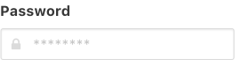
The same Bulma classes apply to this field as well.
Remember me checkbox
Add a simple checkbox for the “Remember me” feature. The <label> element allows you to increase the click zone of the checkbox: the text “Remember me” is clickable as well.
You don’t need a control here since you aren’t using an icon.
<divclass="field"><labelclass="checkbox"><inputtype="checkbox">Remember me</label></div>
Login button
To complete your form, you only need a submit button. Bulma provides a button class that can be used on:
- anchor tags
<a> - button tags
<button> - input tags
<input type="submit">
You’ll want to use the <button> element since it’s the most flexible and is a valid form element.
<divclass="field"><buttonclass="button is-success">Login</button></div>
Summary
The login page is now complete! Since you’re using the required attributes for your email and password inputs, the form can only be submitted if these are valid.
Next up, you can move on to the portion the user reaches after logging in: the admin area.