Chapter 13
Developing Real Use Cases: Data Plane Analytics
This chapter provides an introduction to data plane analysis using a data set of over 8 million packets loaded from a standard pcap file format. A publicly available data set is used to build the use case in this chapter. Much of the analysis here focuses on ports and addresses, which is very similar to the type of analysis you do with NetFlow data. It is straightforward to create a similar data set from native NetFlow data. The data inside the packet payloads is not examined in this chapter. A few common scenarios are covered:
Discovering what you have on the network and learning what it is doing
Combining your SME knowledge about network traffic with some machine learning and data visualization techniques
Performing some cybersecurity investigation
Using unsupervised learning to cluster affinity groups and bad actors
Security analysis of data plane traffic is very mature in the industry. Some rudimentary security checking is provided in this chapter, but these are rough cuts only. True data plane security occurs inline with traffic flows and is real time, correlating traffic with other contexts. These contexts could be time of day, day of week, and/or derived and defined standard behaviors of users and applications. The context is unavailable for this data set, so in this chapter we just explore how to look for interesting things in interesting ways. As when performing a log analysis without context, in this chapter you will simply create a short list of findings. This is a standard method you can use to prioritize findings after combining with context later. Then you can add useful methods that you develop to your network policies as expert systems rules or machine learning models. Let’s get started.
The Data
The data for this chapter is traffic captured during collegiate cyber defense competitions, and there are some interesting patterns in it for you to explore. Due to the nature of this competition, this data set has many interesting scenarios for you to find. Not all of them are identified, but you will learn about some methods for finding the unknown unknowns.
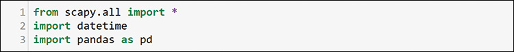
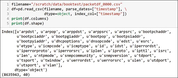
The analytics infrastructure data pipeline is rather simple in this case, no capture mechanism was needed. The public packet data was downloaded from http://www.netresec.com/?page=MACCDC. The files are from standard packet capture methods that produce pcap-formatted files. You can get pcap file exports from most packet capture tools, including Wireshark (refer to Chapter 4, “Accessing Data from Network Components”). Alternatively, you can capture packets from your own environment by using Python scapy, which is the library used for analysis in this chapter. In this section, you will explore the downloaded data by using the Python packages scapy and pandas. You import these packages as shown in Figure 13-1.
Loading the pcap files is generally easy, but it can take some time. For example, the import of the 8.5 million packets shown in Figure 13-2 took two hours to load the 2G file that contained the packet data. You are loading captured historical packet data here for data exploration and model building. Deployment of anything you build into a working solution would require that you can capture and analyze traffic near real time.

Only one of the many available MACCDC files was loaded this way, but 8.5 million packets will give you a good sample size to explore data plane activity.
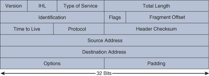
Here we look again at some of the diagrams from Chapter 4 that can help you match up the details in the raw packets. The Ethernet frame format that you will see in the data here will match what you saw in Chapter 4 but will have an additional virtual local area network (VLAN) field, as shown in Figure 13-3.

Compare the Ethernet frame in Figure 13-3 to the raw packet data in Figure 13-4 and notice the fields in the raw data. Note the end of the first row in the output in Figure 13-4, where you can see the Dot1Q VLAN header inserted between the MAC (Ether) and IP headers in this packet. Can you tell whether this is a Transmission Control Protocol (TCP) or User Datagram Protocol (UDP) packet?
![A screenshot of raw packet format from a pcap file is shown. The command line read, packets [0].](http://images-20200215.ebookreading.net/9/4/4/9780135183496/9780135183496__data-analytics-for__9780135183496__graphics__13fig04.jpg)
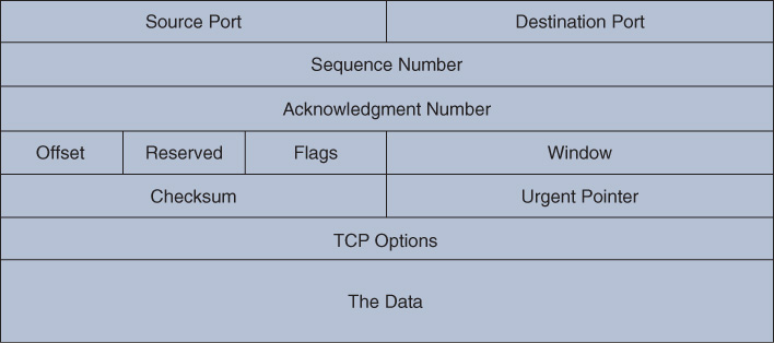
If you compare the raw data to the diagrams that follow, you can clearly match up the IP section to the IP packet in Figure 13-5 and the TCP data to the TCP packet format shown in Figure 13-6.
You could loop through this packet data and create Python data structures to work with, but the preferred method of exploration and model building is to structure your data so that you can work with it at scale. The dataframe construct is used again.
You can use a Python function to parse the interesting fields of the packet data into a dataframe. That full function is shared in Appendix A, “Function for Parsing Packets from pcap Files.” You can see the definitions for parsing in Table 13-1. If a packet does not have the data, then the field is blank. For example, a TCP packet does not have any UDP information because TCP and UDP are mutually exclusive. You can use the empty fields for filtering the data during your analysis.
Table 13-1 Fields Parsed from Packet Capture into a Dataframe
Packet Data Field |
Parsed into the Dataframe as |
None |
id (unique ID was generated) |
None |
len (packet length was generated) |
Ethernet source MAC address |
esrc |
Ethernet destination MAC address |
edst |
Ethernet type |
etype |
Dot1Q VLAN |
vlan |
IP source address |
Isrc |
IP destination address |
Idst |
IP length |
iplen |
IP protocol |
ipproto |
IP TTL |
Ipttl |
UDP destination port |
utdport |
UDP source port |
utsport |
UDP length |
ulen |
TCP source port |
tsport |
TCP destination port |
tdport |
TCP window |
twindow |
ARP hardware source |
arpsrc |
ARP hardware destination |
arpdst |
ARP operation |
arpop |
ARP IP source |
arppsrc |
ARP IP destination |
arppdst |
NTP mode |
ntpmode |
SNMP community |
snmpcommunity |
SNMP version |
snmpversion |
IP error destination |
iperrordst |
IP error source |
iperrorproto |
IP error protocol |
iperrordst |
UDP error destination |
uerrordst |
UDP error source |
uerrorsrc |
ICMP type |
icmptype |
ICMP code |
icmpcode |
DNS operation |
dnsopcode |
BootP operation |
bootpop |
BootP client hardware |
bootpchaddr |
BootP client IP address |
bootpciaddr |
BootP server IP address |
bootpsiaddr |
BootP client gateway |
bootpgiaddr |
BootP client assigned address |
bootpyiaddr |
This may seem like a lot of fields, but with 8.5 million packets over a single hour of user activity (see Figure 13-9), there is a lot going on. Not all the fields are used in the analysis in this chapter, but it is good to have them in your dataframe in case you want to drill down into something specific while you are doing your analysis. You can build some Python techniques that you can use to analyze files offline, or you can script them into systems that analyze file captures for you as part of automated systems.
Packets on networks typically follow some standard port assignments, as described at https://www.iana.org/assignments/service-names-port-numbers/service-names-port-numbers.xhtml. While these are standardized and commonly used, understand that it is possible to spoof ports and use them for purposes outside the standard. Standards exist so that entities can successfully interoperate. However, you can build your own applications using any ports, and you can define your own packets with any structure by using the scapy library that you used to parse the packets. For the purpose of this evaluation, assume that most packet ports are correct. If you do the analysis right, you will also pick up patterns of behavior that indicate use of nonstandard or unknown ports. Finally, having a port open does not necessarily mean the device is running the standard service at that port. Determining the proper port and protocol usage is beyond the scope of this chapter but is something you should seek to learn if you are doing packet-level analysis on a regular basis.
SME Analysis
Let’s start with some common SME analysis techniques for data plane traffic. To prepare for that, Figure 13-7 shows how to load some libraries that you will use for your SME exploration and data visualization.
Here again you see TimeGrouper. You need this because you will want to see the packet flows over time, just as you saw telemetry over time in Chapter 12, “Developing Real Use Cases: Control Plane Analytics Using Syslog Telemetry.” The packets have a time component, which you call as the index of the dataframe as you load it (see Figure 13-8), just as you did with syslog in Chapter 12.
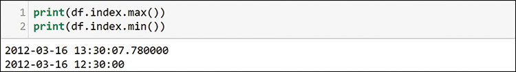
In the output in Figure 13-8, notice that you have all the expected columns, as well as more than 8.5 million packets. Figure 13-9 shows how to check the dataframe index times to see the time period for this capture.
You came up with millions of packets in a single hour of capture. You will not be able to examine any long-term behaviors, but you can try to see what was happening during this very busy hour. The first thing you want to do is to get a look at the overall traffic pattern during this time window. You do that with TimeGrouper, as shown in Figure 13-10.
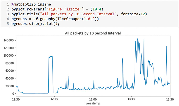
In this case, you are using the pyplot functionality to plot the time series. In line 4, you create the groups of packets, using 10-second intervals. In line 5, you get the size of each of those 10-second intervals and plot the sizes.
Now that you know the overall traffic profile, you can start digging into what is on the network. The first thing you want to know is how many hosts are sending and receiving traffic. This traffic is all IP version 4, so you only have to worry about the isrc and idst fields that you extracted from the packets, as shown in Figure 13-11.
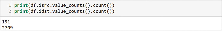
If you use the value_counts function that you are very familiar with, you can see that 191 senders are sending to more than 2700 destinations. Figure 13-12 shows how to use value_counts again to see the top packet senders on the network.
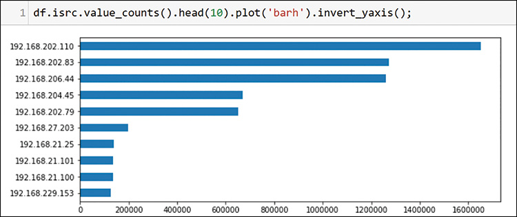
Note that the source IP address value counts are limited to 10 here to make the chart readable. You are still exploring the top 10, and the head command is very useful for finding only the top entries. Figure 13-13 shows how to list the top packet destinations.
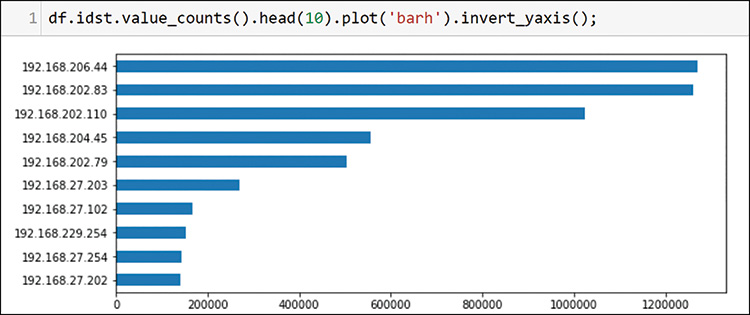
In this case, you used the destination IP address to plot the top 10 destinations. You can already see a few interesting patterns. The hosts 192.168.202.83 and 192.168.202.110 appear at the top of each list. This is nothing to write home about (or write to your task list), but you will eventually want to understand the purpose of the high volumes for these two hosts. Before going there, however, you should examine a bit more about your environment. In Figure 13-14, look at the VLANs that appeared across the packets.
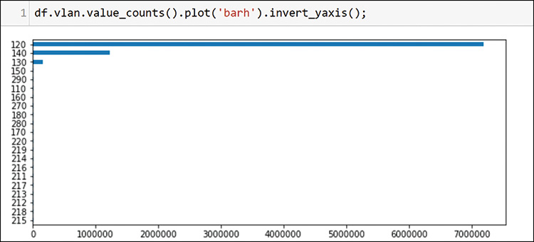
You can clearly see that the bulk of the traffic is from VLAN 120, and some also comes from VLANs 140 and 130. If a VLAN is in this chart, then it had traffic. If you check the IP protocols as shown in Figure 13-15, you can see the types of traffic on the network.
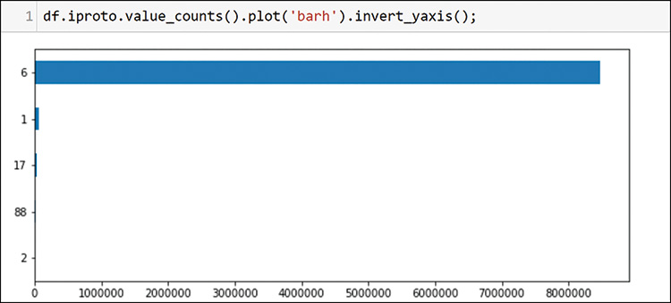
The bulk of the traffic is protocol 6, which is TCP. You have some Internet Control Message Protocol (ICMP) (ping and family), some UDP (17), and some Internet Group Management Protocol (IGMP). You may have some multicast on this network. The protocol 88 represents your first discovery. This protocol is the standard protocol for the Cisco Enhanced Interior Gateway Routing Protocol (EIGRP) routing protocol. EIGRP is a Cisco alternative to the standard Open Shortest Path First (OSPF) that you saw in Chapter 12. You can run a quick check for the well-known neighboring protocol address of EIGRP; notice in Figure 13-16 that there are at least 21 router interfaces active with EIGRP.
![A screenshot of possible EIGRP router count is shown. The command line read, df[df.idst==224.0.0.10].isrc.value_counts( ).count( ). The output read, 21.](http://images-20200215.ebookreading.net/9/4/4/9780135183496/9780135183496__data-analytics-for__9780135183496__graphics__13fig16.jpg)
Twenty-one routers seems like a very large number of routers to be able to capture packets from in a single session. You need to dig a little deeper to understand more about the topology. You can see what is happening by checking the source Media Access Control (MAC) addresses with the same filter. Figure 13-17 shows that these devices are probably from the same physical device because all 21 sender MAC addresses (esrc) are nearly sequential and are very similar. (The figure shows only 3 of 21 devices for brevity.)
![A screenshot of EIGRP router MAC Address is shown. The command line read, df[df.idst==224.0.0.10].esrc.value_counts( ). The output reads three MAC Addresses.](http://images-20200215.ebookreading.net/9/4/4/9780135183496/9780135183496__data-analytics-for__9780135183496__graphics__13fig17.jpg)
Now that you know this is probably a single device using MAC addresses from an assigned pool, you can check for some topology mapping information by looking at all the things you checked together in a single group. You can use filters and the groupby command to bring this topology information together, as shown in Figure 13-18.
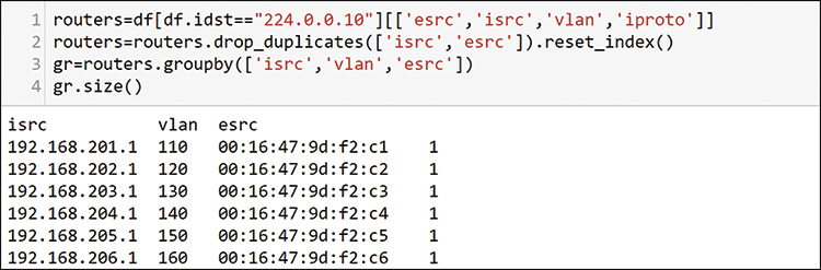
This output shows that most of the traffic that you know to be on three VLANs is probably connected to a single device with multiple routed interfaces. MAC addresses are usually sequential in this case. You can add this to your table as a discovered asset. Then you can get off this router tangent and go back to the top senders and receivers to see what else is happening on the network.
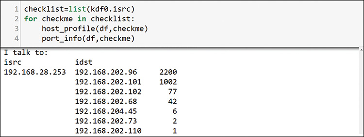
Going back to the top talkers, Figure 13-19 uses host 192.168.201.110 to illustrate the time-consuming nature of exploring each host interaction, one at a time.
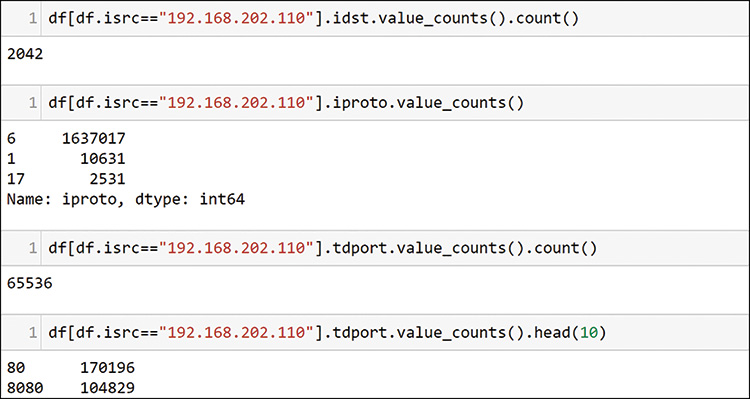
Starting from the top, see that host 110 is talking to more than 2000 hosts, using mostly TCP, as shown in the second command, and it has touched 65,536 unique destination ports. The last two lines in Figure 13-19 show that the two largest packet counts to destination ports are probably web servers.
In the output of these commands, you can see the first potential issue. This host tried every possible TCP port. Consider that the TCP packet ports field is only 16 bits, and you know that you only get 64k (1k=1024) entries, or 65,536 ports. You have identified a host that is showing an unusual pattern of activity on the network. You should record this in your investigation task list so you can come back to it later.
With hundreds or thousands of hosts to examine, you need to find a better way. You have an understanding of the overall traffic profile and some idea of your network topology at this point. It looks as if you are using captured traffic from a single large switch environment with many VLAN interfaces. Examining host by host, parameter by parameter would be quite slow, but you can create some Python functions to help. Figure 13-20 shows the first function for this chapter.
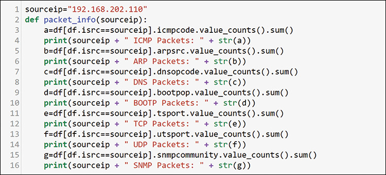
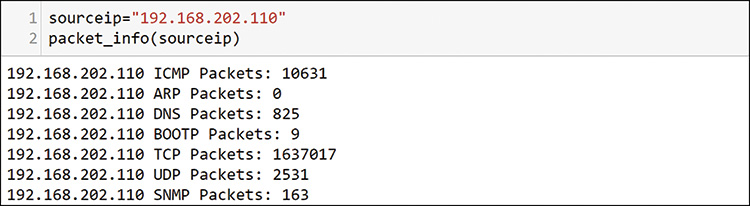
With this function, you can send any source IP address as a variable, and you can use that to filter through the dataframe for the single IP host. Note the sum at the end of value_counts. You are not looking for individual value_counts but rather for a summary for the host. Just add sum to value_counts to do this. Figure 13-21 shows an example of the summary data you get.
This host sent more than 1.6 million packets, most of them TCP, which matches what you saw previously. You add more information requests to this function, and you get it all back in a fraction of the time it takes to go run these commands individually. You also want to know the hosts at the other end of these communications, and you can create another function for that, as shown in Figure 13-22.
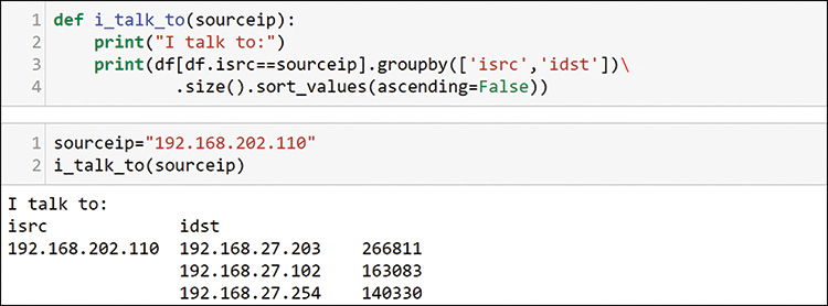
You already know that this sender is talking to more than 2000 hosts, and this output is truncated to the top 3. You can add a head to the function if you only want a top set in your outputs. Finally, you know that the TCP and UDP port counts already indicate scanning activity. You need to watch those as well. As shown in Figure 13-23, you can add them to another function.
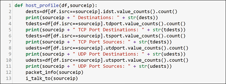
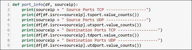
Note that here you are using counts instead of sum. In this case, however, you want to see the count of possible values rather than the sum of the packets. You also want to add the other functions that you created at the bottom, so you can examine a single host in detail with a single command. As with your solution building, this involves creating atomic components that work in a standalone manner, as in Figure 13-21 and Figure 13-22, and become part of a larger system. Figure 13-24 shows the result of using your new function.
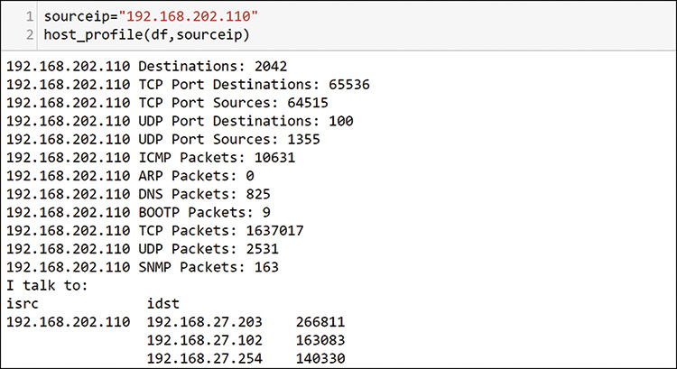
With this one command, you get a detailed look at any individual host in your capture. Figure 13-25 shows how to look at another of the top hosts you discovered previously.
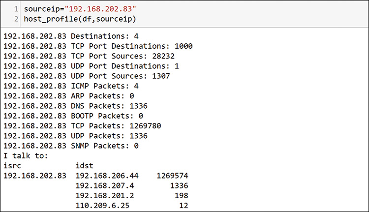
In this output, notice that this host is only talking to four other hosts and is not using all TCP ports. This host is primarily talking to one other host, so maybe this is normal. The very even number of 1000 ports seems odd for talking to only 4 hosts, and you need to make a way to check it out. Figure 13-26 shows how you create a new function to step through and print out the detailed profile of the port usage that the host is exhibiting in the packet data.
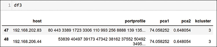
Here you are not using sum or count. Instead, you are providing the full value_counts. For the 192.168.201.110 host that was examined previously, this would provide 65,000 rows. Jupyter Notebook shortens it somewhat, but you still have to review long outputs. You should therefore keep this separate from the host_profile function and call it only when needed. Figure 13-27 shows how to do that for host 192.168.202.83 because you know it is only talking to 4 other hosts.
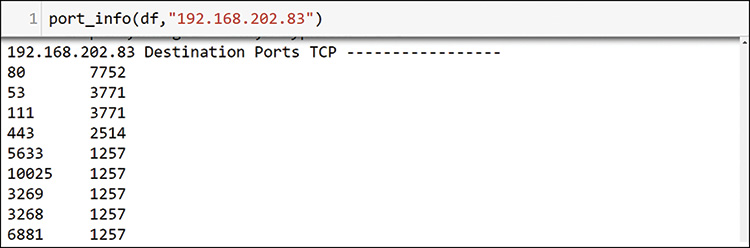
This output is large, with 1000 TCP ports, so Figure 13-27 shows only some of the TCP destination port section here. It is clear that 192.168.202.83 is sending a large number of packets to the same host, and it is sending an equal number of packets to many ports on that host. It appears that 192.168.202.83 may be scanning or attacking host 192.168.206.44 (see Figure 13-25). You should add this to your list for investigation. Figure 13-28 shows a final check, looking at host 192.168.206.44.
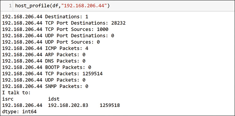
This profile clearly shows that this host is talking only to a single other host, which is the one that you already saw. You should add this one to your list for further investigation. As a final check for your SME side of the analysis, you should use your knowledge of common ports and the code in Figure 13-29 to identify possible servers in the environment. Start by making a list of ports you know to be interesting for your environment.
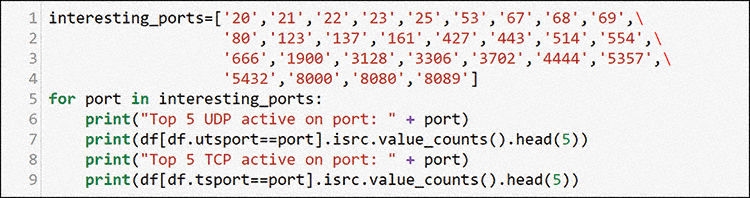
This is a very common process for many network SMEs: applying what you know to a problem. You know common server ports on networks, and you can use those ports to discover possible services. In the following output from this loop, can you identify possible servers? Look up the port numbers, and you will find many possible services running on these hosts. Some possible assets have been added to Table 13-2 at the end of the chapter, based on this output. This output is a collection of the top 5 source addresses with packet counts sourced by the interesting ports list you defined in Figure 13-29. Using the head command will only show up to the top 5 for each. If there are fewer than 5 in the data then the results will show fewer than 5 entries in the output.
Top 5 TCP active on port: 20
192.168.206.44 1257
Top 5 TCP active on port: 21
192.168.206.44 1257
192.168.27.101 455
192.168.21.101 411
192.168.27.152 273
192.168.26.101 270
Top 5 TCP active on port: 22
192.168.21.254 2949
192.168.22.253 1953
192.168.22.254 1266
192.168.206.44 1257
192.168.24.254 1137
Top 5 TCP active on port: 23
192.168.206.44 1257
192.168.21.100 18
Top 5 TCP active on port: 25
192.168.206.44 1257
192.168.27.102 95
Top 5 UDP active on port: 53
192.168.207.4 6330
Top 5 TCP active on port: 53
192.168.206.44 1257
192.168.202.110 243
Top 5 UDP active on port: 123
192.168.208.18 122
192.168.202.81 58
Top 5 UDP active on port: 137
192.168.202.76 987
192.168.202.102 718
192.168.202.89 654
192.168.202.97 633
192.168.202.77 245
Top 5 TCP active on port: 161
192.168.206.44 1257
Top 5 TCP active on port: 3128
192.168.27.102 21983
192.168.206.44 1257
Top 5 TCP active on port: 3306
192.168.206.44 1257
192.168.21.203 343
Top 5 TCP active on port: 5432
192.168.203.45 28828
192.168.206.44 1257
Top 5 TCP active on port: 8089
192.168.27.253 1302
192.168.206.44 1257
This is the longest output in this chapter, and it is here to illustrate a point about the possible permutations and combinations of hosts and ports on networks. Your brain will pick up patterns that lead you to find problems by browsing data using these functions. Although this process is sometimes necessary, it is tedious and time-consuming. Sometimes there are no problems in the data. You could spend hours examining packets and find nothing. Data science people are well versed in spending hours, days, or weeks on a data set, only to find that it is just not interesting and provides no insights.
This book is about finding new and innovative ways to do things. Let’s look at what you can do with what you have learned so far about unsupervised learning. Discovering the unknown unknowns is a primary purpose of this method. In the following section, you will apply some of the things you saw in earlier chapters to yet another type of data: packets. This is very much like finding a solution from another industry and applying it to a new use case.
SME Port Clustering
Combining your knowledge of networks with what you have learned so far in this book, you can find better ways to do discovery in the environment. You can combine your SME knowledge and data science and go further with port analysis to try to find more servers. Most common servers operate on lower port numbers, from a port range that goes up to 65,536. This means hosts that source traffic from lower port numbers are potential servers. As discussed previously, servers can use any port, but this assumption of low ports helps in initial discovery. Figure 13-30 shows how to pull out all the port data from the packets into a new dataframe.
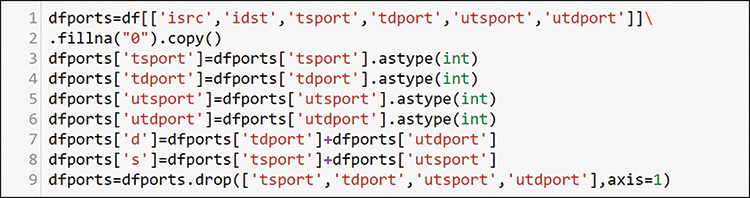
In this code, you make a new dataframe with just sources and destinations for all ports. You can convert each port to a number from a string that resulted from the data loading. In lines 7 and 8 in Figure 13-30, you add the source and destinations together for TCP and UDP because one set will be zeros (they are mutually exclusive), and you convert empty data to zero with fillna when you create the dataframe. Then you drop all port columns and keep only the IP address and a single perspective of port sources and destinations, as shown in Figure 13-31.
![A screenshot shows a port profile per-Host data frame format that read a command line, dfports[:2].](http://images-20200215.ebookreading.net/9/4/4/9780135183496/9780135183496__data-analytics-for__9780135183496__graphics__13fig31.jpg)
Now you have a very simple dataframe with packets, sources and destinations from both UDP and TCP. Figure 13-32 shows how you create a list of hosts that have fewer than 1000 TCP and UDP packets.
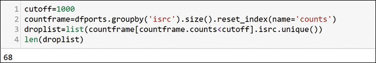
Because you are just looking to create some profiles by using your expertise and simple math, you do not want any small numbers to skew your results. You can see that 68 hosts did not send significant traffic in your time window. You can define any cutoff you want. You will use this list for filtering later. To prepare the data for that filtering, you add the average source and destination ports for each host, as shown in Figure 13-33.
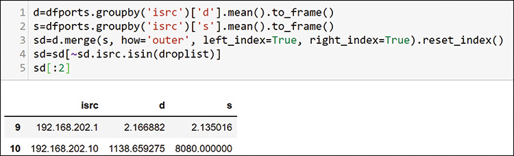
After you add the average port per host to both source and destination, you merge them back into a single dataframe and drop the items in the drop list. Now you have a source and destination port average for each host that sent any significant amount of traffic. Recall that you can use K-means clustering to help with grouping. First, you set up the data for the elbow method of evaluating clusters, as shown in Figure 13-34.
Note that you do not do any transformation or encoding here. This is just numerical data in two dimensions, but these dimensions are meaningful to SMEs. You can plot this data right now, but you may not have any interesting boundaries to help your understand it. You can use the K-means clustering algorithm to see if it helps with discovering more things about the data. Figure 13-35 shows how to check the elbow method for possible boundary options.
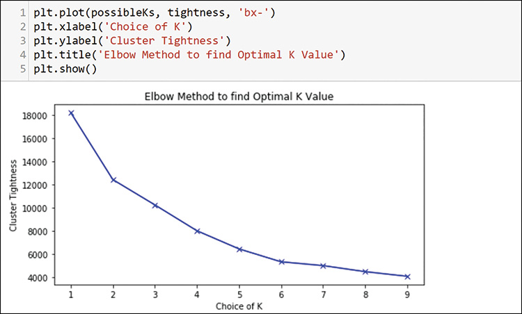
The elbow method does not show any major cutoffs, but it does show possible elbows at 2 and 6. Because there are probably more than 2 profiles, you should choose 6 and run through the K-means algorithm to create the clusters, as shown in Figure 13-36.
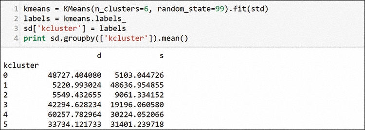
After running the algorithm, you copy the labels back to the dataframe. Unlike when clustering principal component analysis (PCA) and other computer dimension–reduced data, these numbers have meaning as is. You can see that cluster 0 has low average sources and high average destinations. Servers are on low ports, and hosts generally use high ports as the other end of the connection to servers. Cluster 0 is your best guess at possible servers. Cluster 1 looks like a place to find more clients. Other clusters are not conclusive, but you can examine a few later to see what you find. Figure 13-37 shows how to create individual dataframes to use as the overlays on your scatterplot.
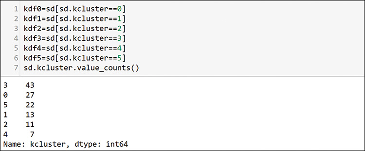
You can see here that there are 27 possible servers in cluster 0 and 13 possible hosts in cluster 1. You can plot all of these clusters together, using the plot definition in Figure 13-38.
This definition results in the plot in Figure 13-39.
Notice that the clusters identified as interesting are in the upper-left and lower-right corners, and other hosts are scattered over a wide band on the opposite diagonal. Because you believe that cluster 0 contains servers by the port profile, you can use the loop in Figure 13-40 to generate a long list of profiles. Then you can browse each of the profiles of the hosts in that cluster. The results are very long because you loop through the host profile 27 times. But browsing a machine learning filtered set is much faster than browsing profiles of all hosts. Other server assets with source ports in the low ranges clearly emerge. You may recognize the 443 and 22 pattern as a possible VMware host. Here are a few examples of the per host patterns that you can find with this method:
192.168.207.4 source ports UDP -----------------
53 6330
192.168.21.254 source ports TCP ----------------- (Saw this pattern many times)
443 10087
22 2949
You can add these assets to the asset table. If you were programmatically developing a diagram or graph, you could add them programmatically.
The result of looking for servers here is quite interesting. You have found assets, but more importantly, you have found additional scanning that shows up across all possible servers. Some servers have 7 to 10 packets for every known server port. Therefore, the finding for cluster 0 had a secondary use for finding hosts that are scanning sets of popular server ports. A few of the scanning hosts show up on many other hosts, such as 192.168.202.96 in Figure 13-40, where you can see the output of host conversations from your function.
If you check the detailed port profiles of the scanning hosts that you have identified so far and overlay them as another entry to your scatterplot, you can see, as in Figure 13-41, that they are hiding in multiple clusters, some of which appear in the space you identified as clients. This makes sense because they have high port numbers on the response side.
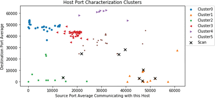
You expected to find scanners in client cluster 1. These hosts are using many low destination ports, as reflected by their graph positions. Some hosts may be attempting to hide per-port scanning activity by equally scanning all ports, including the high ones. This shows up across the middle of this “average port” perspective that you are using. You have already identified some of these ports. By examining the rest of cluster 1 using the same loop, you find these additional insights from the profiles in there:
Host 192.168.202.109 appears to be a Secure Shell (SSH) client, opening sessions on the servers that were identified as possible VMware servers from cluster 0 (443 and 22).
Host 192.168.202.76, which was identified as a possible scanner, is talking to many IP addresses outside your domain. This could indicate exfiltration or web crawling.
Host 192.168.202.79 has a unique activity pattern that could be a VMware functionality or a compromised host. You should add it to the list to investigate.
Other hosts appear to have activity related to web surfing or VMware as well.
You can spend as much time as you like reviewing this information from the SME clustering perspective, and you will find interesting data across the clusters. See if you can find the following to test your skills:
A cluster has some interesting groups using 11xx and 44xx. Can you map them?
A cluster also has someone answering DHCP requests. Can you find it?
A cluster has some interesting communications at some unexpected high ports. Can you find them?
This is a highly active environment, and you could spend a lot of time identifying more scanners and more targets. Finding legitimate servers and hosts is a huge challenge. There appears to be little security and segmentation, so it is a chaotic situation at the data plane layer in this environment. Whitelisting policy would be a huge help! Without policy, cleaning and securing this environment is an iterative and ongoing process. So far, you have used SME and SME profiling skills along with machine learning clustering to find items of interest to you as a data plane investigator.
You will find more items that are interesting in the data if you keep digging. You have not, for example, checked traffic that is using Simple Network Management Protocol (SNMP), Internet Control Message Protocol (ICMP), Bootstrap Protocol (BOOTP), Domain Name System (DNS), or Address Resolution Protocol (ARP). You have not dug into all the interesting port combinations and patterns that you have seen. All these protocols have purposes on networks. With a little research, you can identify legitimate usage versus attempted exploits. You have the data and the skills. Spend some time to see what you can find. This type of deliberate practice will benefit you. If you find something interesting, you can build an automated way to identify and parse it out. You have an atomic component that you can use on any set of packets that you bring in.
The following section moves on from the SME perspective and explores unsupervised machine learning.
Machine Learning: Creating Full Port Profiles
So far in this chapter, you have used your human evaluation of the traffic and looked at port behaviors. This section explores ways to hand profiles to machine learning to see what you can learn. To keep the examples simple, only source and destination TCP and UDP ports are used, as shown in Figure 13-42. However, you could use any of the fields to build host profiles for machine learning. Let’s look at how this compares to the SME approach you have just tried.
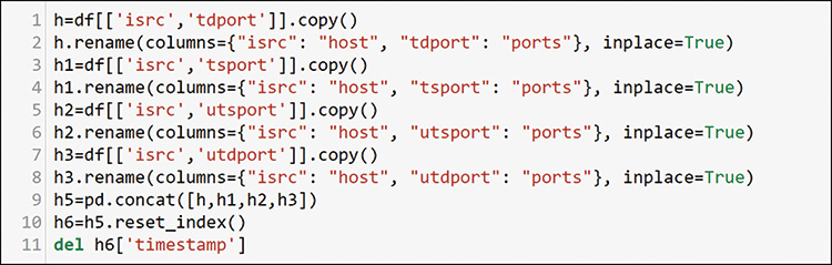
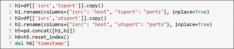
In this example, you will create a dataframe for each aspect you want to add to a host profile. You will use only the source and destination ports from the data. By copying each set to a new dataframe and renaming the columns to the same thing (isrc=host, and any TCP or UDP port=ports), you can concatenate all the possible entries to a single dataframe that has any host and any port that it used, regardless of direction or protocol (TCP or UDP). You do not need the timestamp, so you can pull it out as the index in row 10 where you define a new simple numbered index with reset_index and delete it in row 11. You will have many duplicates and possibly some empty columns, and Figure 13-43 shows how you can work more on this feature engineering exercise.
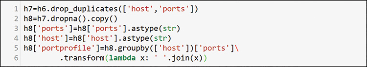
To use string functions to combine the items into a single profile, you need to convert everything to a text type in rows 3 and 4, and then you can join it all together into a string in a new column in line 5. After you do this combination, you can delete the duplicate profiles, as shown in Figure 13-44.
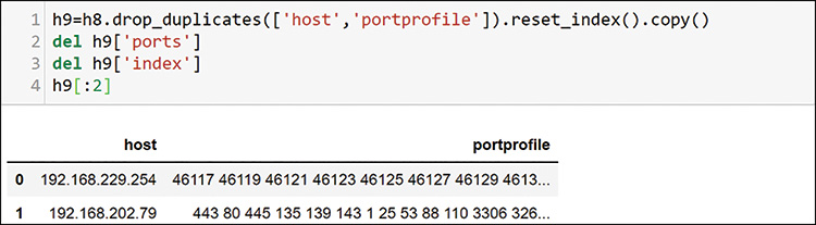
Now you have a list of random-order profiles for each host. Because you have removed duplicates, you do not have counts but just a fingerprint of activities. Can you guess where we are going next? Now you can encode this for machine learning and evaluate the visualization components (see Figure 13-45) as before.
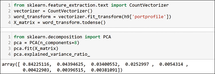
You can see from the PCA evaluation that one component defines most of the variability. Choose two to visualize and generate the components as shown in Figure 13-46.
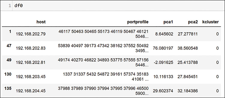
You have 174 source senders after the filtering and duplicate removal. You can add them back to the dataframe as shown in Figure 13-47.
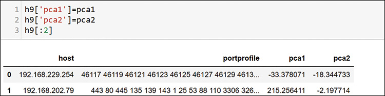
Notice that the PCA reduced components are now in the dataframe. You know that there are many distinct patterns in your data. What do you expect to see with this machine learning process, using the patterns that you have defined? You know there are scanners, legitimate servers, clients, some special conversations, and many other possible dimensions. Choose six clusters to see how machine learning segments things. Your goal is to find interesting things for further investigation, so you can try other cluster numbers as well. The PCA already defined where it will appear on a plot. You are just looking for segmentation of unique groups at this point.
Figure 13-48 shows the plot definition. Recall that you simply add an additional dataframe view for every set of data you want to visualize. It is very easy to overlay more data later by adding another entry.
Figure 13-49 shows the plot that results from this definition.
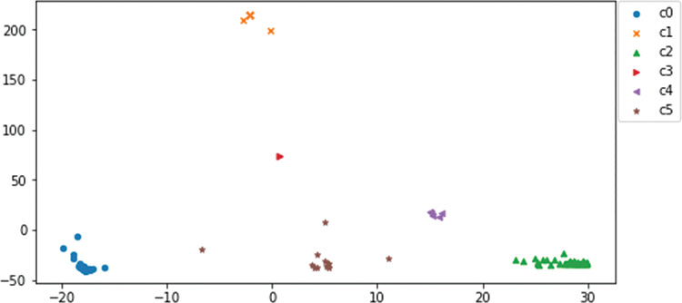
Well, this looks interesting. The plot has at least six clearly defined locations and a few outliers. You can see what this kind of clustering can show by examining the data behind what appears to be a single item in the center of the plot, cluster 3, in Figure 13-50.
What you learn here is that this cluster is very tight. What visually appears to be one entry is actually two. Do you recognize these hosts? If you check the table of items you have been gathering for investigation, you will find them as a potential scanner and the host that it is scanning.
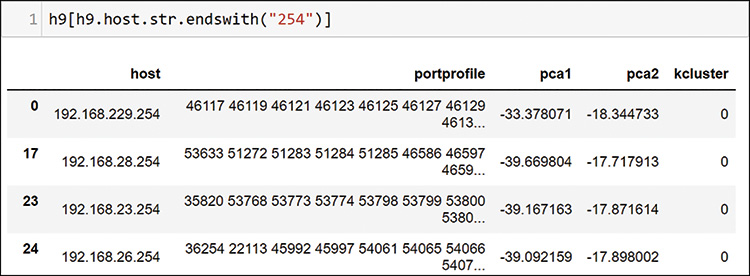
If you consider the data you used to cluster, you may recognize that you built a clustering method that is showing affinity groups of items that are communicating with each other. The unordered source and destination port profiles of these hosts are the same. This can be useful for you. Recall that earlier in this chapter, you found a bunch of hosts with addresses ending in 254 that are communicating with something that appears to be a possible VMware server. Figure 13-51 shows how you filter some of them to see if they are related; as you can see here, they all fall into cluster 0.
Using this affinity, you are now closer to confirming a few other things you have noted earlier. This machine learning method is showing host conversation patterns that you were using your human brain to find from the loops that you were defining earlier. In Figure 13-52, look for the host that appears to be communicating to all the VMware hosts.
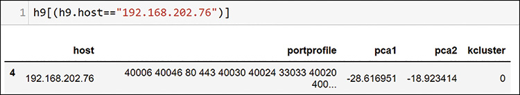
As expected, this host is also in cluster 0. You find this pattern of scanners in many of the clusters, so you add a few more hosts to your table of items to investigate.
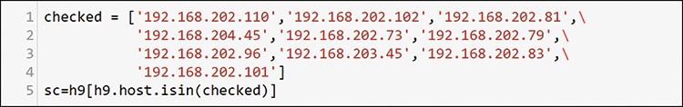
This affinity method has proven useful in checking to see if there are scanners in all clusters. If you gather the suspect hosts that have been identified so far, you can create another dataframe view to add to your existing plot, as shown in Figure 13-53.

When you add this dataframe, you add a new row to the bottom of your plot definition and denote it with an enlarged marker, as shown on line 8 in Figure 13-54.
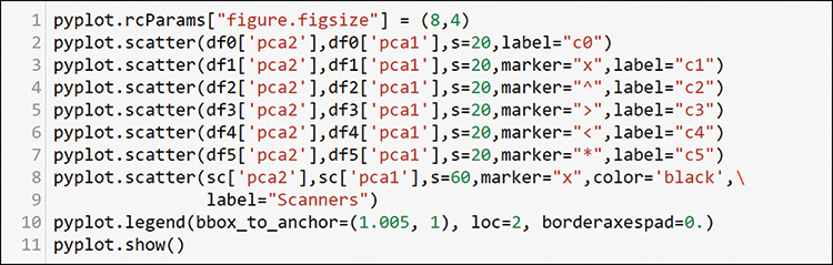
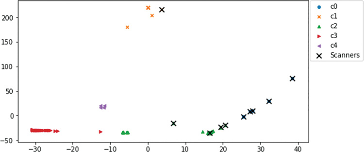
The resulting plot (see Figure 13-55) shows that you have identified many different affinity groups—and scanners within most of them—except for one cluster on the lower right.
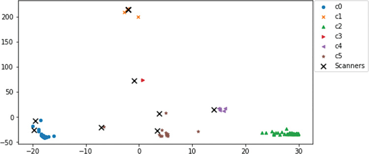
If you use the loop to go through each host in cluster 2, only one interesting profile emerges Almost all hosts in cluster 2 have no heavy activity except for responses to between 4 and 10 packets each to scanners you have already identified, as well as a few minor services. This appears to be a set of devices that may not be vulnerable to the scanning activities or that may not be of interest to the scanning programs behind them. There were no obvious scanners in this cluster. But you have found scanning activity in every other cluster.
Machine Learning: Creating Source Port Profiles
This final section reuses the entire unsupervised analysis from the preceding section but with a focus on the source ports only. It uses the source port columns, as shown in Figure 13-56. The code for this section is a repeat of everything in this chapter since Figure 13-42, so you can make a copy of your work and use the same process. (The steps to do that are not shown here.)
You can use this smaller port set to run through the code used in the previous section with minor changes along the way. Using six clusters with K-means yielded some clusters with very small values. Backing down to five clusters for this analysis provides better results. At only a few minutes per try, you can test any number of clusters. Look at the clusters in the scatterplot for this analysis in Figure 13-57.
You immediately see that that the data plots differently here than with the earlier affinity clustering. Here you are only looking at host source ports. This means you are looking at a profile of the host and the ports used but not including any information about who was using the ports (the destination host’s port). This profile also includes the ports that the host will use as the client side of services accessed on the network. Therefore, you are getting a first-person view from each host for services they provided, and services they requested from other hosts.
Recall the suspected scanner hosts dataframes that were generated as shown in Figure 13-58.
When you overlay your scanner dataframe on the plot, as shown in Figure 13-59, you see that you have an entirely new perspective on the data when you profile source ports only. This is very valuable for you in terms of learning. These are the very same hosts as before, but with different feature engineering, machine learning sees them entirely differently. You have spent a large amount of time in this book looking at how to manipulate the data to engineer the machine learning inputs in specific ways. Now you know why feature engineering is important: You can get an entirely different perspective on the same set of data by reengineering features.
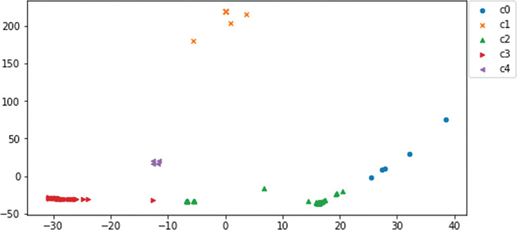
Figure 13-59 shows that cluster 0 is full of scanners (the c0 dots are under the scanner Xs).
Almost every scanner identified in the analysis so far is on the right side of the diagram. In Figure 13-60, you can see that cluster 0 consists entirely of hosts that you have already identified as scanners. Their different patterns of scanning represent variations within their own cluster, but they are still far away from other hosts. You have an interesting new way to identify possible bad actors in the data.
The book use case ends here, but you have many possible next steps in this space. Using what you have learned throughout this book, here are a few ideas:
Create similarity indexes for these hosts and look up any new host profile to see if it behaves like the bad profiles you have identified.
Wrap the functions you created in this chapter in web interfaces to create host profile lookup tools for your users.
Add labels to port profiles just as you added crash labels to device profiles. Then develop classifiers for traffic on your networks.
Use profiles to aid in development of your own policies to use in the new intent-based networking (IBN) paradigm.
Automate all this into a new system. If you add in supervised learning and some artificial intelligence, you could build the next big startup.
Okay, maybe the last one is a bit of a stretch, but why aim low?
Asset Discovery
Table 13-2 lists many of the possible assets discovered while analyzing the packet data in this chapter. This is all speculation until you validate the findings, but this gives you a good idea of the insights you can find in packet data. Keep in mind that this is a short list from a subset of ports. Examining all ports combined with patterns of use could result in a longer table with much more detail.
Table 13-2 Interesting Assets Discovered During Analysis
Asset |
How You Found It |
Layer 3 with 21 VLANs at 192.168.x.1 |
Found EIGRP routing protocol |
DNS at 192.168.207.4 |
Port 53 |
Many web server interfaces |
Lots of port 80, 443, 8000, and 8080 |
Windows NetBIOS activity |
Ports 137, 138, and 139 |
BOOTP and DHCP from VLAN helpers |
Ports 67, 68, and 69 |
Time server at 192.168.208.18 |
Port 123 |
Squid web proxy at 192.168.27.102 |
Port 3128 |
MySQL database at 192.168.21.203 |
Port 3306 |
PostgreSQL database at 192.168.203.45 |
Port 5432 |
Splunk admin port at 192.168.27.253 |
Port 8089 |
VMware ESXI 192.168.205.253 |
443 and 902 |
Splunk admin at 192.168.21.253 |
8089 |
Web and SSH 192.168.21.254 |
443 and 22 |
Web and SSH 192.168.22.254 |
443 and 22 |
Web and SSH 192.168.229.254 |
443 and 22 |
Web and SSH 192.168.23.254 |
443 and 22 |
Web and SSH 192.168.24.254 |
443 and 22 |
Web and SSH 192.168.26.254 |
443 and 22 |
Web and SSH 192.168.27.254 |
443 and 22 |
Web and SSH 192.168.28.254 |
443 and 22 |
Possible vCenter 192.168.202.76 |
Appears to be connected to many possible VMware hosts |
Investigation Task List
Table 13-3 lists the hosts and interesting port uses identified while browsing the data in this chapter. These could be possible scanners on the network or targets of scans or attacks on the network. In some cases, they are just unknown hotspots you want to know more about. This list could also contain many more action items from this data set. If you loaded the data, continue to work with it to see what else you can find.
Table 13-3 Hosts That Need Further Investigation
To Investigate |
Observed Behavior |
192.168.202.110 |
Probed all TCP ports on thousands of hosts |
192.168.206.44 |
1000 ports very active, seem to be under attack by one host |
192.168.202.83 |
Hitting 206.44 on many ports |
192.168.202.81 |
Database or discovery server? |
192.168.204.45 |
Probed all TCP ports on thousands of hosts |
192.168.202.73 |
DoS attack on port 445? |
192.168.202.96 |
Possible scanner on 1000 specific low ports |
192.168.202.102 |
Possible scanner on 200 specific low ports |
192.168.202.79 |
Unique activity, possible scan and pull; maybe VMware |
192.168.202.101 |
Possible scanner on 10,000 specific low ports |
192.168.203.45 |
Scanning segment 21 |
Many |
Well-known discovery ports 427, 1900, and others being probed |
Many |
Group using unknown 55553-4 for an unknown application |
Many |
Group using unknown 11xx for an unknown application |
Summary
In this chapter, you have learned how to take any standard packet capture file and get it loaded into a useful dataframe structure for analysis. If you captured traffic from your own environment, you could now recognize clients, servers, and patterns of use for different types of components on the network. After four chapters of use cases, you now know how to manipulate the data to search, filter, slice, dice, and group to find any perspective you want to review. You can perform the same functions that many basic packet analysis packages provide. You can write your own functions to do things those packages cannot do.
You have also learned how to combine your SME knowledge with programming and visualization techniques to examine packet data in new ways. You can make your own SME data (part of feature engineering) and combine it with data from the data set to find new interesting perspectives. Just like innovation, sometimes analysis is about taking many perspectives.
You have learned two new ways to use unsupervised machine learning on profiles. You have seen that the output of unsupervised machine learning varies widely, depending on the inputs you choose (feature engineering again). Each method and perspective can provide new insight to the overall analysis. You have seen how to create affinity clusters of bad actors and their targets, as well as how to separate the bad actors into separate clusters.
You have made it through the use-case chapters. You have seen in Chapters 10 through 13 how to take the same machine learning technique, do some creative feature engineering, and apply it to data from entirely different domains (device data, syslogs, and packets). You have found insights in all of them. You can do this with each machine learning algorithm or technique that you learn. Do not be afraid to use your LED flashlight as a hammer. Apply to your own situation use cases from other industries and algorithms used for other purposes. You may or may not find insights, but you will learn something.