
Chapter 3. You’re Invited!
The table was a large one, but the three were all crowded together at one corner of it: “No room! No room!” they cried out when they saw Alice coming. “There’s plenty of room!” said Alice indignantly, and she sat down in a large arm-chair at one end of the table.
“Have some wine,” the March Hare said in an encouraging tone. Alice looked all round the table, but there was nothing on it but tea. “I don’t see any wine,” she remarked.
“There isn’t any,” said the March Hare. “Then it wasn’t very civil of you to offer it,” said Alice angrily.
“It wasn’t very civil of you to sit down without being invited,” said the March Hare.
“I didn’t know it was your table,” said Alice; “it’s laid for a great many more than three.”
“Your hair wants cutting,” said the Hatter. He had been looking at Alice for some time with great curiosity, and this was his first speech.
“You should learn not to make personal remarks,” Alice said with some severity; “it’s very rude.”
Engagement
I recently held a party to celebrate my birthday. In planning the party, I needed to decide who was invited as well as the theme and events of the party itself. I had limited time to plan, and since this was a personal celebration, I wanted it limited to friends and family—I didn’t necessarily want to have a blowout party and invite everyone I have ever known. When I had confirmed the invite list, I sent out invitations. A couple of times between initially planning and the actual party, I sent out reminder updates to increase the anticipation of the event.
Once the night of the party arrived, I spent my time greeting people as they entered my home and then mixing through the crowd to make sure people felt welcome and that they were having a good time. As host, it was part of my responsibility to check in, to mingle, to make sure the house was welcoming, and to keep the food and drinks stocked.
Starting a site that is social or has social components is not really that different from planning and hosting a party. You need to think about who’s invited, whether they can invite other people, and what is going to happen once they are there. Once people come to the site, you need to greet them and welcome them in a friendly manner, and make them feel like they are important and have value to add to the community. If they don’t know the others there, then you need to make introductions or make it easy for people to introduce themselves. At that point, they need to feel as if they can mingle and have interesting conversations, even if they hadn’t known one another before arriving.
Don’t forget the cold-start issue, either. Early adopters like to come in and poke around, test the waters. They will show up and sign up for every new thing as it comes along. Like the homesteaders of old, they come in, lay the groundwork of a community, and either stay to become old-timers or move on if it’s not to their liking. Preparing for these types of users often goes beyond the simple interactions of signing up and has implications in how you welcome your users, how and when you encourage them to bring their friends along, and how easy that process is to set up.
The first steps in the process of encouraging people to come in and participate set the tone of their whole experience. How you follow up and welcome your users can make their first impressions favorable or not. People will share their first impressions with others, and that can affect the growth of your site and your brand if they are not favorable.
Think about the processes you have in place to allow your users to participate and become engaged in your community. How complex or easy does your registration need to be? What barriers are you willing to put in place between your site and what your users want to do? What barriers can you remove? What’s the bare minimum to get started? How much personal information is stored, and what privacy controls do you need to have in place to help people feel secure about their activity and contributions?
How will you engage early adopters, who may be incredibly influential in spreading the word about your service? Will you have a private or open beta? What’s the value of one over the other? Are there levels of engagement, a lifecycle that users go through where features are progressively disclosed? How do you re engage users who may be spending less time on your site than when they were newly engaged?
This collection of patterns addresses these questions with best practices for how to handle many of the options that affect the user’s entrée to a community, his overall participation lifecycle, and privacy options.
Sign-up or Registration
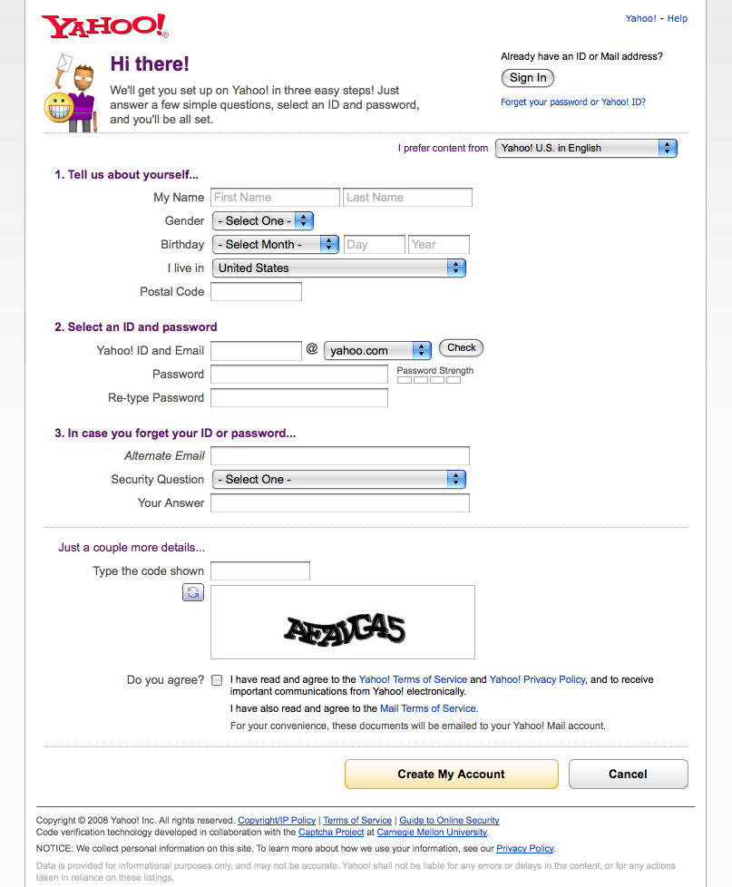
A user wants to access parts of a site or application that require creating or saving personal information. A user wants to contribute content to the site’s community and have it attributed and saved for later. (See Figure 3-1 and Figure 3-2.)
Use this pattern when:
Features require leaving personal or private information, and privacy and security are a concern.
Financial transactions require remembering billing, shipping, and transaction information.
A user wants to participate—leaving comments, blogging, posting to message boards, posting photos, building a personal network—and this participation needs to be attributed and/or associated with the user for purposes of building community or reputation, or building up a personal profile or knowledge base.
How
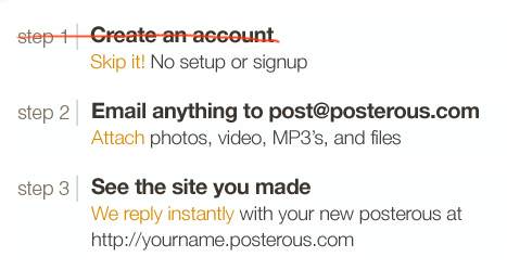
Collect the bare minimum of information needed that still allows your user to participate in the site. This is often an email address—used as the login—and a password. Consider whether or not registration is even needed (see Figure 3-3).
Figure 3-3. posterous.com doesn’t require a sign-up before using. The act of sending an email through the service creates an account automatically tied to the user’s email address and name.Collect other information only as necessary for a compelling experience. Ask yourself if the data you are about to collect can be requested in another part of the site at another time.
Provide explanations about what each piece of information requested will provide in terms of user benefits. For example:
Zip code or other location information provides location-relevant restaurants and stores.
Mobile phone number allows delivery of content to phone and delivery of content from phone to a web-based account.
Require registration at the last possible moment in the users’ process of exploring the site, such as when they want to save a video they have created.
After registration, deliver the users back to the task they were in before they were sidetracked. If they were coming from a tour or exploration process, put them in the most logical spot that encourages them to get started.
Avoid gradual engagement solutions that simply distribute the various input fields in a sign-up form across multiple pages. It’s a good possibility that this will reduce efficiency and not delight anyone.[3]
Allow the creation of a unique identifier by allowing the use of an email address, which is a unique piece of data and can be verified with the user.
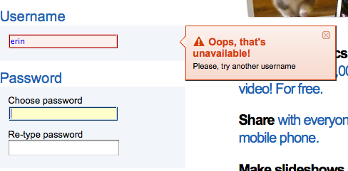
Don’t force the user to try and create a unique name that isn’t an email address. Unless she is an early adopter on your site, the odds that the name (often her first name) she wants is available gets smaller over time (as in Figure 3-4). At best, this will only annoy your users, and at worst cause site abandonment and ill will.
Allow use of a nonunique nickname to reflect back to the user and for communication between the system and user.
Clearly label what elements are required for a username and password. Are capital letters and numbers required? Are alternate characters not allowed? A minimum of 6 characters or a maximum of 15? Say so up front, and don’t wait to present this information in an error message. Jared Spool calls this designing defensively. Clearly stating expectations up front will prevent interruptions and ensure a more successful sign-up experience.
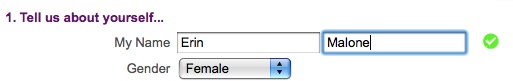
Provide feedback as the user fills out the form, as in Figure 3-5. Examples include a checkbox as a field is filled out correctly (e.g., a fully realized email address) or a password strength meter to indicate the security potential of a password.
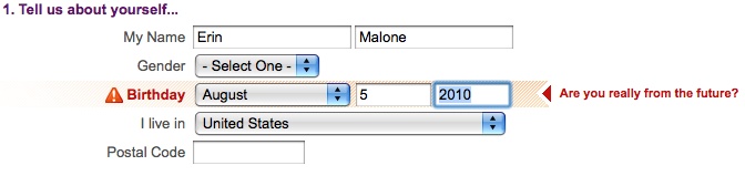
Provide inline, contextual error messages that validate dates and data formation or check on username availability before the Submit button is pressed (see Figure 3-6). This will allay user irritation and result in less drop-off in completions.
Make sure the level of security required for the password matches the level of security required for the data the user will be creating or saving. Saving a recipe is very different from paying a bill at a bank. The expectations for site security and the type of password used are very different. Adjust accordingly.
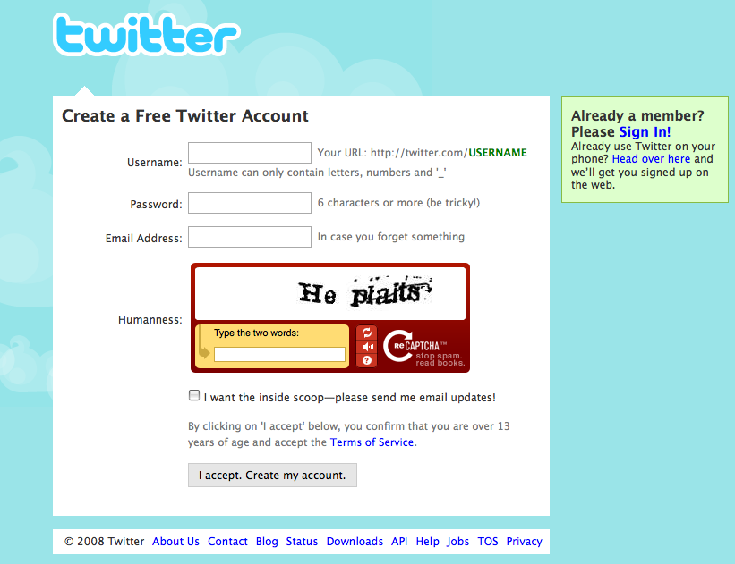
Include a captcha if absolutely necessary. Captchas are used to “prove” that the person registering for the service is a person and not a robot. Unfortunately, nefarious people have figured out how to get around this by using cheap labor to read captchas and create accounts for the purposes of sending spam and other types of attacks. Captchas also require a workaround for accessibility and are often hard to read, so make absolutely sure you require this extra work from your users.
Consider skipping the entire registration form and allow users to sign up with OpenID (http://openid.net/what/), OAuth (http://oauth.net), or Facebook Connect (http://developers.facebook.com/connect.php).
Why
Registration is often an interruption for users when they are in the middle of some other process. It’s a known and accepted evil when personal data or user-generated content needs to be stored, but that doesn’t mean sites should take advantage of the interruption to collect a life story and the user’s firstborn. (See Figure 3-7.)
Users will give what they believe is necessary in exchange for a good experience. If more information than a unique identifier and password is needed, it is important to be very clear why that information is necessary and what value it will bring to the user. Registration is a barter with users, and they will abandon the process and your site if the value isn’t clearly articulated or seen as high enough.
Accessibility
The sign-in form should easily navigable via the keyboard, with the Submit button triggered by the Return key.
Related patterns
Sign-In Continuity in Sign-In Continuity
Terms of Service in Terms of Service
As seen on
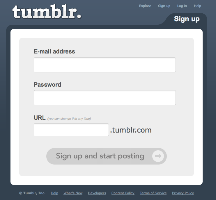
Tumblr (http://www.tumblr.com)
Twitter (http://www.twitter.com)
Yahoo! (http://www.yahoo.com)
Yelp (http://www.yelp.com)
Sign In
The user wants to access her personalized information or an application that is stored on the host site (Figure 3-8).
Use when
Use this pattern when:
Personal data needs to be stored or when there is customization or personalization unique to the particular user.
The site is a repository for user-generated content and the submissions or files need to be identified and/or managed by the author.
There are security or privacy concerns and the user’s data needs to be protected.
Don’t require the user to sign in if it isn’t really necessary. Just because you want to know who is on your site doesn’t mean that’s a good reason to put up the barrier to your users.
How
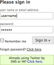
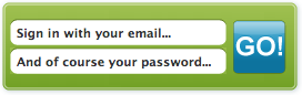
Provide a clearly labeled Sign In button, as in Figure 3-9. Don’t use the label Login. Remember you are speaking like a real person.
Provide an input field for the username.
This should be a unique identifier. Many sites use an email address (Figure 3-10) to alleviate the namespace problem that will happen as a site scales.
To avoid unnecessary errors, clearly label what type of username is required for the field (Figure 3-11). Many users often utilize a variety of login names, will forget which one is used, and can end up locked out, frustrated, or abandoning the site.
Provide a clear way to retrieve the username if it is forgotten.
Provide a clear way to retrieve the password if it is forgotten.
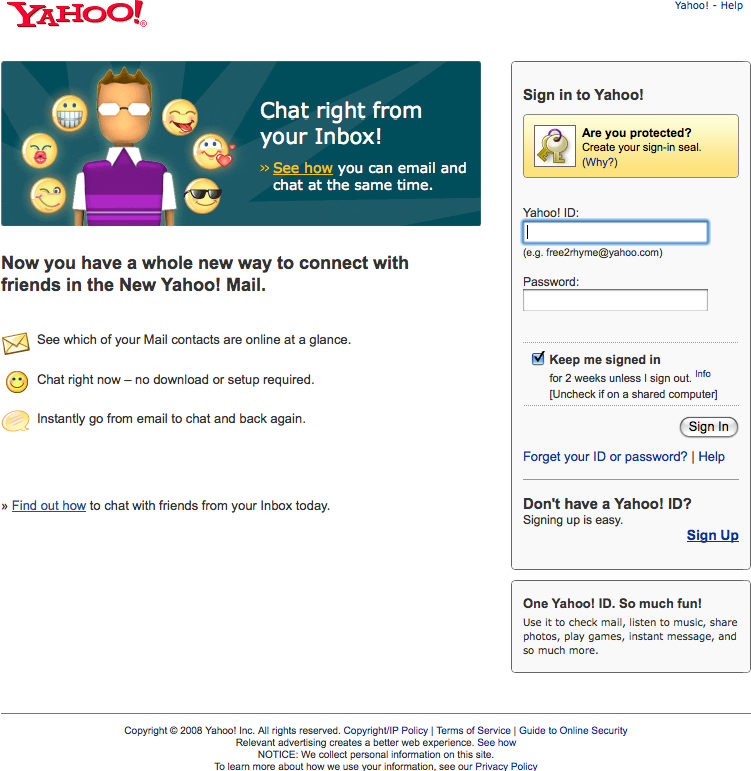
If appropriate, allow the user to stay signed in to the site for an extended amount of time. This is often presented with a checkbox and text that clearly lets the user know how long he will stay signed in. Don’t forget to set the right expectations of what will be remembered. Is it the name and password, or just the name only? Be clear.
Once signed in, the site should reflect back in some way that the user is signed in. This is often presented by showing the user’s name (login or nickname) and a Sign Out option.
Provide a way to sign out once signed in.
If the user does not have an account, provide easy access to signing up for the site, without distracting the user who just wants to sign in.
Delay the sign-in requirement until the last possible moment—when the user needs access to private information or needs to save data.
Options such as “Keep me signed in for 2 weeks” or “Remember me on this computer” should be opt-in. If the user’s computer is shared, this protects against accidentally allowing another person into the account.
Why
Having users sign in to your site allows them to save information and content for later use. Registered and signed-in users are more valuable to your business, as you will generally have more information about them (both direct information, and indirect information gleaned through their behavior and interactions).
Requiring users to sign in to do certain tasks—leaving comments, posting photos or videos, participating in a conversation—forces them to be responsible for their participation. They build up a reputation and a body of work, and others know who they are by their actions and participation.
Accessibility
The sign-in form should easily navigable via the keyboard, with the sign-in button being triggered by the Return key.
Related patterns
Sign-In Continuity in Sign-In Continuity
Sign-up or Registration in Sign-up or Registration
As seen on
Amazon.com (http://www.amazon.com)
Facebook (http://www.facebook.com)
Google Reader (http://google.com/reader)
LinkedIn (http://www.linkedin.com)
Photobucket (http://www.photobucket.com)
TripIt (http://www.tripit.com)
Twitter (http://www.twitter.com)
Yahoo! (http://www.yahoo.com)
YouTube (http://www.youtube.com)
Sign-In Continuity
A user who has an account but is not currently signed in wants to participate by contributing something.
Use when
Use this pattern when authentication is required for participation in a community. Forms of participation include (but are not limited to) comments, votes, ratings, tags, posts to blogs or forums, and so on.
How
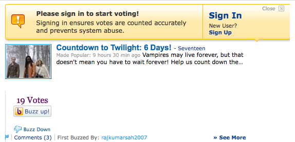
When the user attempts to comment (or take similar action), remind her of the need to sign in first and deliver her to the sign-in flow.
When the user has successfully signed in, return her to the context she was in when she was about to comment or take similar action (Figure 3-12).
When handling the submission of information, preserve any data that has been entered prior to the login procedure.
Why
It’s important that the sign-in requirement does not present an undue barrier to participation for the user.
Special cases
If security concerns (such as cross-site scripting issues, and possible cross-domain issues) require an interruption in flow or even that the user be returned to a home page, then at least insert an alert message with a clear call to action to resume the moment of participation.
This message might include a link to the last known location, a pre populated form, or a message indicating a redirect in x seconds.
Related patterns
Sign-up or Registration in Sign-up or Registration
As seen on
Kayak (http://www.kayak.com)
Yahoo! Buzz (http://buzz.yahoo.com)
Sign Out
The user wants to sign out of the system, to end a session, or become anonymous (Figure 3-13).
Use when
Use this pattern when:
A user wants to end his session.
A user wants to become anonymous.
A user is on a public computer and needs to preserve privacy and security of his personal data and contributions.
The user has signed out and you want to continue his relationship with your site. For example, you want to give him ideas for where to go next and information about new features.
How
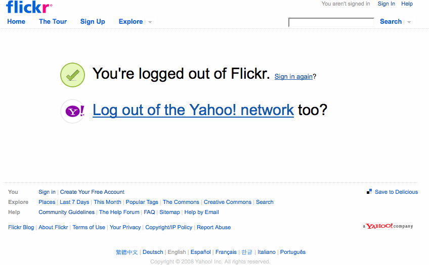
Consider providing a landing page that clearly indicates that the user is no longer signed in.
Offer clear options for features to explore, even if he is signed out, or for when he returns.
Provide the ability to easily sign back in.
Keep the page light in terms of content and performance size in order to mitigate frustration and end the session on a positive experience.
Why
Once a user signs out of a service, it isn’t clear what his next intentions are. Sites often will throw a user back to the home page once he is signed out, but this can be overwhelming and doesn’t always clearly indicate whether the logout process succeeded.
Providing a Sign Out landing page that clearly indicates the logout’s success will let the user know that he has been successful.
This page is also an opportunity for communication about new or unexplored features as part of a reengagement strategy (see the pattern Reengagement in Reengagement).
Related patterns
As seen on
Flickr (http://www.flickr.com)
Invitations
Invitations, both sending and acting upon them once received, are core to the viral nature of social web experiences.
Receive Invitation
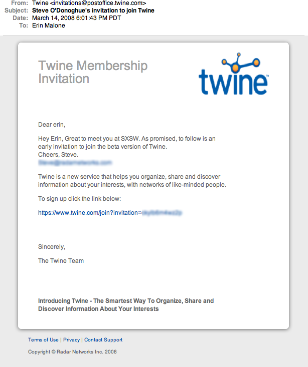
A user receives an invitation from a friend or connection to join a site (Figure 3-14).
Use when
Use this pattern when:
The user experience is enhanced by building a network of user connections.
Growth of the service is dependent on friends of friends.
You want to supplement traditional user acquisition with user-based referrals.
How
The invitation should have personal messaging from the sender.
The sender should be clearly identified to the recipient.
The benefits of joining and participating should be clearly articulated to the recipient.
A very clear “Call to Action” button or link should be available for the recipient to easily step right into the site to try it out.
Why
Having a formal invitation in place for your users to send to their friends allows you to combine a controlled marketing message from your site with a personal message from the user. This process also guarantees a consistent call-to-action for viral growth.
Related patterns
Send Invitation
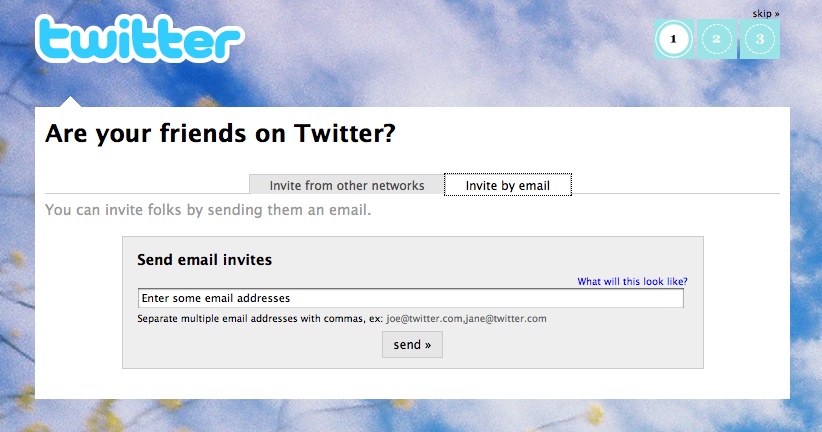
A user sends an invitation to a friend or group of friends asking them to join in a site experience (Figure 3-15).
Use when
Use this pattern when:
The user experience is enhanced by having a network of connections.
Growth of the service is dependent on friends of friends.
You want to supplement traditional user acquisition with user-based referrals.
A user has participated in the site enough to have formed an opinion of its value and can then recommend it to a friend.
Don’t use this pattern right after registration, when the user hasn’t actually participated in the site. When presenting the option to invite others, do so after enough interaction with your site that the user actually knows what she is referring.
How
Use an in-context email form.
Provide the user with a sample message that showcases the benefits of joining the service.
Make the prefilled content editable, and allow the user to personalize the invitation.
Allow users to invite others via access to their address books.
Provide a mechanism that allows users to send copies of the message to themselves.
Provide a mechanism to bring contacts and email addresses over from other social services. Use a standard accepted technology, such as OAuth and OpenID, rather than the password anti-pattern (see The Password Anti-Pattern, next).
Don’t force a user to invite others to the site before she has had a chance to try out the features.
Do make it easy for a new user to find the “invite friends” link.
Don’t spam a user’s address book or contact list from other sites.
Special cases
If the use of the site and its features is heavily dependent on a group of people interacting, then the need to allow a user to bring friends along, through invitations or bulk registering, will override the recommendation of encouraging use before inviting friends.
Why
Allowing users to invite their friends to your site is part of the viral nature of a social site. Providing tools and system interactions that allow your users to be good netizens will enhance the overall experience and your site’s reputation in the long run.
Related patterns
Receive Invitation in Receive Invitation
As seen on
Twitter (http://www.twitter.com)
The Password Anti-Pattern
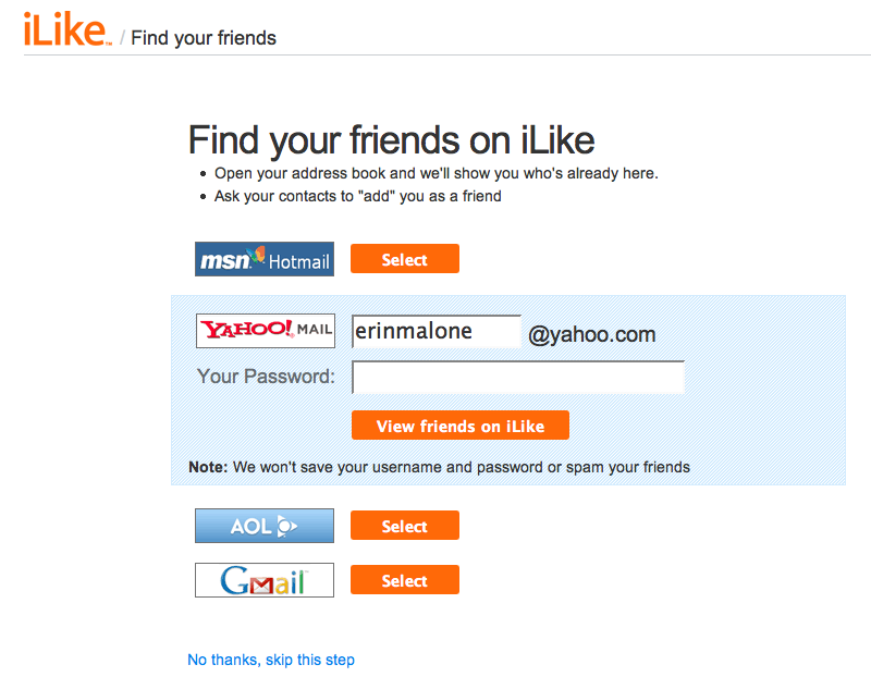
Just what is the password anti-pattern? And why is this an issue? On many social sites, to combat the cold-start situation where a user joins and has no friends, the site might ask a person to find his friends on the site by comparing known data pulled in from another service (such as the user’s online address book). The site may ask the user to open up access to all his various online address books so that it can match names and email addresses to current customers and then offer the new user a list of friends on the service for the purposes of making connections (see Figure 3-16).
Sites implement this because it’s easy. The problem with this interaction is that the site is asking the user to supply a username and password for another service. Many sites never intend to do anything beyond that one-time data grab and promise not to use the name and password for anything but that, but there is really no way for a user to trust the site or know that the site owners are telling the truth. The end goal of this solution is to make it easy and painless for a person to find his friends and become more quickly engaged. Unfortunately, there are phishing scammers and account hackers who have created sites or services that “appear” trustworthy, but are really just grabbing a user’s account for nefarious purposes. Additionally, this practice violates the terms of service for many of the sites that are being accessed.
The password anti-pattern teaches users to give their login credentials away to a stranger and sets them up to be more easily phished across the Internet. People get used to the practice and eventually don’t think twice about giving this information to a new site in exchange for some cool new promise.
A safer alternative is to use services such as OAuth, OpenID, or Facebook Connect to officially authorize access to the user’s data on the other site.
OAuth is “[a]n open protocol to allow secure API authorization in a simple and standard method from desktop and web applications.” In other words, it is an open technology that allows sites to access a user’s data in a safe way that doesn’t require the user to throw names and passwords all over the Internet. The actual access happens on the third-party site where the data is stored and under its control. AOL, Yahoo!, and Google have all agreed to support OAuth, so there should be no reason to perpetuate this anti-pattern in the coming years. Additionally, OAuth is a core component to the OpenSocial API, which is being developed and supported by many companies creating social software.
Flickr implemented a similar authorization scheme a while ago, in which any third party that wants access to a user’s photos requires a user to come through to Flickr to “authorize” the gateway and transfer of data. FriendFeed calls its solution RemoteKey, which “is a kind of password that you can give to third-party applications and websites to let them interact with FriendFeed on your behalf.” RemoteKey offers a limited set of actions to safeguard the user’s account. Twitter has recently implemented OAuth for account access, which will in turn stop the account hackers that have been popping up right and left around the Twitter ecosystem.
Ultimately, users should have access to their data and should be allowed to bring it from one site to another—whether it’s their connections, their social graph, or their contributed data, such as photos or videos. Social sites, which need connections to enhance the user’s experience, should adopt safe authentication interactions that both allow users to access their data and protect them by teaching better Net behavior for keeping their passwords safe.
Authorize
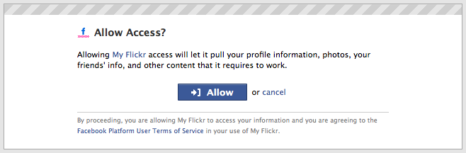
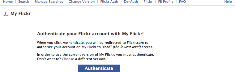
The user wants to participate on a site without starting from scratch. She would like to bring her data and files over from another site, as shown in Figure 3-17, Figure 3-18, and Figure 3-19.
Use this pattern when:
Features on your site are enhanced or expanded by accessing data and files from another site (Site A in the upcoming example).
User-generated content or data on your site has the potential to enhance or enable other sites that your users may be participating in (Site B in the upcoming example).
How
Successful authentication requires cooperation from two sites: one with features and functionality enhanced by a user’s data (Site A) and the other with that user’s data and/or files to share (Site B).
Site A
Before automatically using the Password Anti-Pattern (see The Password Anti-Pattern in The Password Anti-Pattern) to access a user’s data, check to see whether the other site is using OAuth. If so, tap into that protocol to facilitate the data transaction.
Site A should ask the user what data she would like to access.
Show possible choices, such as flickr.com, photobucket.com, smugmug.com, etc. for photos, or Yahoo! Address Book, Plaxo.com, Google, etc. for contacts.
Once the user selects the site where her data lives, Site A should send the user to that site to grant access.
Information about how the data will be used should be presented on Site A.
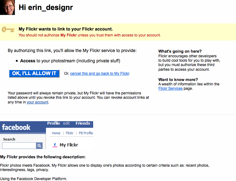
Site B
Use the open authentication protocol, OAuth, to facilitate the authorization process.
Site A will send its user to Site B. The user signs in to his account, and Site B should present a screen that asks if the user really wants to share the data with Site A.
Upon agreement, the user is sent back to Site A, and the data is now available in that experience.
Information about how Site A will use the permissions granted should be clearly presented to the user on Site B.
Allow the user to cancel the authorization at any point.
Provide an easy way for the user to revoke permissions from Site A.
Why
Using an authorization flow and protocol such as OAuth allows a user to give access among sites without exposing her username and password. This process is the preferred method of allowing data-sharing, rather than using the Password Anti-Pattern.
Related patterns
The Password Anti-Pattern in The Password Anti-Pattern
As seen on
Facebook (http://www.facebook.com)
Flickr (http://www.flickr.com)
Private Beta
A user is eager to try out a site even before it’s fully ready for the general public.
Use when
Use this pattern when:
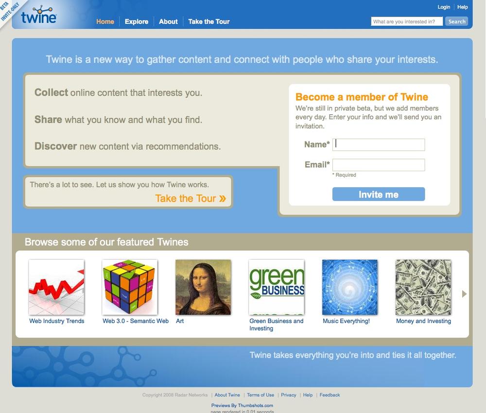
You want a limited group of users to help you test and popularize your first release (Figure 3-20).
Figure 3-20. twine.com shows its beta status in the upper-left corner. The sign-up form on the home page states that the product is still in beta, that it’s adding members every day by invitation only, and that signing up requests an invitation but does not necessarily sign the user up for the product at this time.You want to allow a small user list the opportunity to invite N new users to grow your site virally, but in a controlled fashion.
How
Clearly indicate that the site is in private beta.
Offer a list of features and benefits or a tour of the product to let the user know what he is signing up for.
When requiring a user to sign up to receive information about the beta or an invitation to join at the next release:
Provide an email address field for sign-up.
Provide a username field for sign-up.
Show a confirmation page letting the user know that the sign-up request was received, and indicate a timeframe for when he might expect a response or invitation to join the site.
Send a confirmation email to the address provided, to verify the address and remind the user that he signed up to receive an invitation to join the beta at a future date.
When allowing users to invite a limited number of others to the private beta:
Clearly indicate how many invitations the user gets in total.
Keep a count of how many invitations the user has sent out or has left from the total, and put this in a visible location.
Allow the user to add a custom message to the invitation.
Clearly articulate feature highlights and benefits to the potential invitee.
Why
A private beta can give you the opportunity to test-drive social features with a small group of people before opening the doors to the public. Starting off in a private beta also allows you to seed areas of the site with friends and family in order to avoid the cold-start issue. Additionally, the exclusivity of a private beta can encourage hype and desire for the service, and increase the requests for accounts.
Special cases
It used to be that beta was a period of time when real users would be asked to try the site out—to find bugs at a larger scale that might not have shown up with smaller test groups—and then the product would move quickly to General Availability (GA) release, where the public at large would have access.
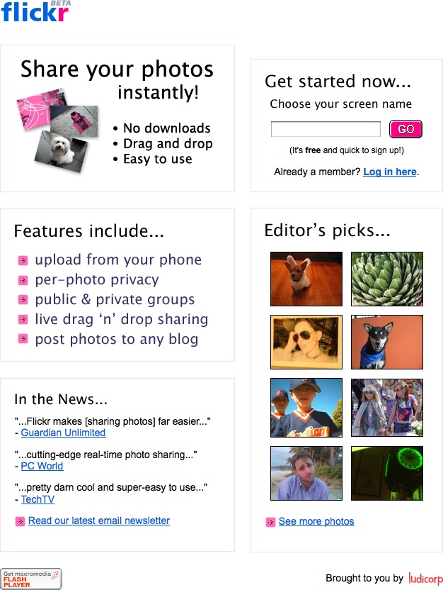
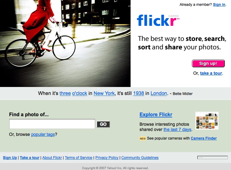
In today’s world of Web 2.0 and the ability to quickly launch web applications, we are seeing more and more sites slap the beta flag on the site and then never remove it. (See Figure 3-21, Figure 3-22, and Figure 3-23.)
This generally does a disservice to users and to the process of software development. Beta has certain implications about quality and the site’s point in the lifecycle of development. Keeping the beta flag for a lengthy period of time tells your users that the site is buggy and that you may not be spending time working through bugs to a full GA release. After a while, that message implies that you don’t care to improve the site, which could have the adverse effect of driving users away—because if you don’t care, then why should they?
As seen on
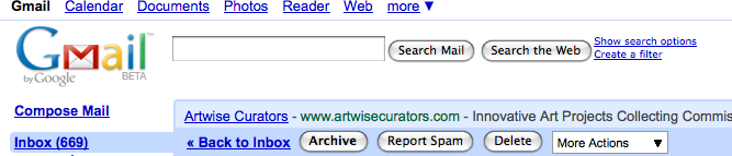
Flickr (http://www.flickr.com)
Gmail (http://mail.google.com)
Welcome Area
A user registers for a new service and needs to have a sense of what can be done at the site and how to get started (Figure 3-24).
Use when
Use this pattern when:
A new user first accesses your site.
You want to acquaint the user with important or useful features.
How
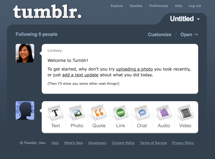
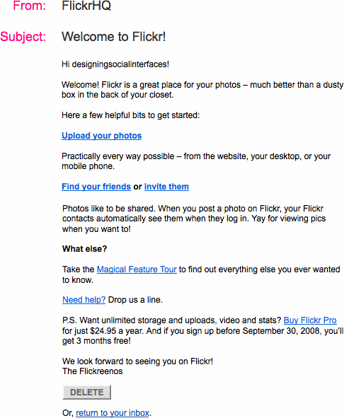
Provide the new user with a warm and gracious welcome to your site and services. This can be a special welcome screen right after registering for the service or a special email highlighting features, as in Figure 3-25. Consider sending a welcome email in addition to the start screen so the user has a quick reference of features.
Allow the user to easily move off of the welcome area and into the full features of the site.
Treat your new users as you would guests in your home. If possible, welcome them personally and check in periodically (without being annoying).
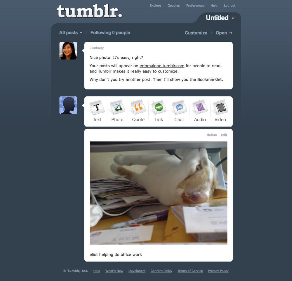
Use the welcome area to highlight the choices a user can make to get started on the service and what he might do first, as shown in Figure 3-26.
Consider offering tours of key scenarios from the Welcome Area, but don’t force the user to go through them.
Don’t overwhelm the user with a lot of pop-over bubbles or other intrusive interface elements.
Don’t dumb down the site language just because the user is new to your site. Keep your welcome language friendly and clear. Don’t assume that the new user is an Internet novice, but don’t assume he is an Internet expert, either.
Why
Providing a welcome area or start space is akin to orientation for a new job or college, or giving your friends a tour of your home the first time they visit. The more welcoming you are (in a light-handed fashion, of course), the more your users will feel comfortable and want to spend time on your site.
Related patterns
As seen on
Flickr (http://www.flickr.com)
Tumblr (http://www.tumblr.com)
Reengagement
A user participates in your community and then stops or forgets about your offerings. (See Figure 3-27 and Figure 3-28.)
Use this pattern when:
You want to entice users back to your site.
You want to inform users of new features.
How
Allow your users to opt in to email correspondence from your site when they initially sign up.
Plan an ongoing schedule for outgoing email.
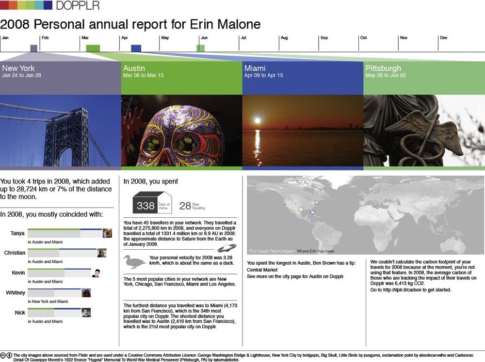
Emails should highlight key features and/or new features (see Figure 3-29).
Figure 3-29. Dopplr sends out an annual report at the end of the year recapping your trips, comparing your travel to others in your network, and giving an overview of your carbon footprint. The report was such an unexpected and pleasant surprise, people were talking about it for days, and it definitely encouraged reengagement for those who had forgotten to use the service.If your user hasn’t been to your site for some amount of time, send email that entices him back to the site, but only if he agreed to receive email. If the site has features that are based on relationships, share a piece of public data from the user’s friends to let him know what he is missing.
Develop a set of rules for how long a user must be absent before you send a reengagement email.
The email should contain a very clear call to action.
There should be a limited amount of messages included in each email.
Don’t send too many emails too often, or you will have the reverse effect: keeping the user away from your site.
Why
It goes without saying that you want to create a compelling service that your users will return to day after day. But there are times when you want to let users know about new features or new ways of using the service in order to reenergize them or remind them of why they signed up in the first place.
Reengagement of your users should be an ongoing effort. In most cases, reengagement efforts are done through email campaigns sent out on a regular basis. Emails are usually varied and highlight features or recent activities by the user’s network on the site. Surprising and fun messages, such as Dopplr’s annual report (Figure 3-29), can have the extra benefit of word-of-mouth discussion driving people back to the service.
Related patterns
Further Reading
“8 More Design Mistakes with Account Sign-in,” by Jared M. Spool, http://www.uie.com/articles/account_design_mistakes_part2/
“Account Sign-in: 8 Design Mistakes to Avoid,” by Jared M. Spool, http://www.uie.com/articles/account_design_mistakes/
“Design for Sign Up: How to Motivate People To Sign Up For Your Web App,” by Joshua Porter, http://www.peachpit.com/articles/article.aspx?p=1216150
Information about Facebook Connect, http://developers.facebook.com/connect.php
Information about OAuth, http://oauth.net/
Web Form Design: Filling in the Blank, by Luke Wroblewski, Rosenfeld Media, May 2008
“What is OpenID?”, http://openid.net/what/