
Chapter 2. Basic Voice User Interface Design Principles
THIS CHAPTER GETS RIGHT into best practices for designing today’s voice user interfaces (VUIs). It covers what conversational design means and the best way to achieve it. This includes knowing the best way to confirm information spoken by a user, whether your system should be command-and-control style versus conversational; how to handle novice versus expert users; and, especially important, designing for when things go wrong.
This book is focused on designing VUIs for mobile apps and devices. To set the stage, let’s look at the original VUIs—interactive voice response (IVR) systems—and see what’s different about them.
Designing for Mobile Devices Versus IVR Systems
In the early 2000s, IVR systems were becoming more common. Initially primitive touch-tone/voice hybrids (“Please press or say 1”), they became an expected way to communicate with many companies. IVRs could help callers get stock quotes, book flights, transfer money, and provide traffic information. Many of them were designed poorly, and websites popped up with backdoors on how to get transferred immediately to an operator (something many companies actively tried to hide). IVRs acquired a bad reputation, ending up the subject of satire on Saturday Night Live.
IVR systems were created to automate tasks so that customers would not always need to speak to a live person to get things done. They were created before the Internet became commonly used and before smartphones were invented.
Today, many IVR systems are used as the “first response” part of a phone call, so that even if the caller ends up speaking with an agent, basic information has been collected (such as a credit card number). For many tasks, even complex ones such as booking a flight, an IVR system can do the job. In addition, IVR systems are great at routing customers to a variety of different agent pools so that one phone number can serve many needs. Finally, some users actually prefer using an IVR system versus speaking with an agent because they can take their time and ask for information over and over (such as the 1990s-era Charles Schwab stock quote system) without feeling like they’re “bothering” a human agent.
Although some of the design strategies from the IVR world also apply to mobile VUI design (as well as VUI system for devices), mobile VUIs also present a unique set of challenges (and opportunities). This chapter outlines design principles for the more varied and complex world of designing modern VUI systems.
One of the challenges of mobile VUIs is determining whether it will have a visual representation such as an avatar. Another challenge is establishing when your VUI will allow the user to speak. Will users be able to interrupt? Will it use push-to-talk? These challenges are discussed later in the book.
However, unlike IVR systems, with mobile devices there is an opportunity to have a visual component. This can be a big advantage in many ways, from communicating information to the user, to confirming it, even to helping the user know when it’s their turn to speak. Allowing users to interact both via voice and by using a screen is an example of a multimodal interface. Many of the examples in this book are for multimodal designs. In some cases, the modes live together in one place, such as a virtual assistant on a mobile phone. In others, the main interaction is voice-only, but there is also a companion app available on the user’s smartphone.
For example, suppose that you ask Google, “Who are the 10 richest people in the world?” Google could certainly read off a list of people (and their current worth), but that is a heavy cognitive load. It’s much better to display them, as shown in Figure 2-1.

Taking advantage of the visual capabilities of mobile is essential to creating a rich VUI experience. In addition, this visual component can allow the user to continue at a more leisurely pace. In an IVR system, it is rare to be able to pause the system—instead, the user must continually interact.
If your VUI will have a visual component, such as a mobile app, video game, or smartwatch, it’s important to design the visual and the voice in tandem. If the visual designer and the VUI designer don’t work together until the end, the joining of the two mediums can be awkward and haphazard. VUI and visual are two components of the same conversation that the user is having with the system. It’s essential to design together from the beginning.
Another current common difference between IVR systems and VUIs on mobile apps or devices is that they are often used for one-turn tasks. For example, I’ll ask Cortana to set an alarm (Figure 2-2) or Google what the fastest land animal is, or instruct Amazon Echo’s Alexa to start playing my favorite radio station. These types of interactions are quite contained and do not require the system to maintain a lot of information.

Although this is quite common now, do not confine your VUI experience to this model. To begin thinking more specifically about how to best design VUI for mobile, let’s dive first into the topic of conversational design.
Conversational Design
Imagine you’re having a conversation with a friend. You’re sitting in a coffee shop, catching up after a long absence. Your friend says, “Did you see the new Star Wars movie?” “Yes,” you reply. “Did you like it?” she asks next. You say, “I’m sorry, I don’t understand.” No matter how many times she repeats herself, you never answer her question.
That level of frustration is about where we’re at with many VUI systems today. Despite the many recent advancements of speech recognition technology, we’re still a long way from simulating human conversation. Here’s a real-world example from Ok Google, illustrating two conversational turns (a turn is one interaction between the user and the system):
USER
Ok Google. When’s my next appointment?
GOOGLE
You have a calendar entry tomorrow. The title is “Chinatown field trip.”
USER
Ok Google. Can you please repeat that?
GOOGLE

Google has let down its end of the conversation. It’s like the first part never happened. Conversational design is becoming a common term, but it is often misused. Many people use it to mean any time you have an interaction with a system in which you speak, or text. But many of these “conversations” have only one turn; for example, asking Hound where the nearest coffee shop is located.
In this book, I define conversational design to mean thinking about an interaction with a VUI system beyond one turn. Humans rarely have conversations that only last one turn. Design beyond that one turn; imagine what users might want to do next. Don’t force them to take another turn, but anticipate and allow it. In addition, it is vital to keep a recent history of what the user has just told you. Having a conversation with a system that can’t remember anything beyond the last interaction makes for a dumb and not very useful experience.
When designing a VUI, many people only consider one-off tasks, such as answering a search query, setting up a calendar appointment, placing a phone call, playing a song, and so on. Sometimes these tasks can be accomplished in one fell swoop. But the best VUI designs also consider what happens next.
Here’s an example in which Google does a good job of remembering what occurred in previous conversational turns:
USER
Ok Google. Who was the 16th president of the United States?
GOOGLE
Abraham Lincoln was the 16th president of the United States.
USER
How old was he when he died?
GOOGLE
Abraham Lincoln died at the age of 56.
USER
Where was he born?
GOOGLE
Hodgenville, KY
USER
What is the best restaurant there?

It’s not quite the same as talking to a human, but Google successfully carried on the conversation for four turns, knowing the references for “he” and “there.” In addition, Google switched to a more visual mode at the appropriate time: to show the map and reviews for the restaurant.
A good rule of thumb is to let the user decide how long the conversation will be.
Setting User Expectations
Good conversational design is not just about crafting nice prompts. As Margaret Urban, Interaction Designer at Google, suggests: don’t ask a question if you won’t be able to understand the answer. She gives the example of a prompt that occurs after the user has finished writing an email: “Do you want to send it or change it?” One response, which you might not initially have planned for, will be “yes”—so build a response in your system to handle it. Although coaching the voice talent to use the appropriate stress and intonation can help with this issue, it is often not enough. For a case in which you’re seeing a lot of “yes” responses, you might want to consider rewording the prompt to something more clear, such as “What would you like to do: send it or change it?”
Urban emphasizes it’s important to set user expectations early on. How does your app introduce voice? You can offer a “tour” to first-time users, and provide educational points along the way. As Urban says:
When someone has successfully completed a VUI interaction, it’s a bit of an endorphin boost—the user has a glow of completion and satisfaction. It’s a nice time to educate people—“Since you were great at that, how about trying this?”
Be careful about telling users that tasks were successful. Urban says, “‘Setting the alarm,’ for example, implies to the user that the alarm has been set, whereas the engineer may argue that the task hasn’t necessarily been completed yet and should have an additional prompt that says ‘Alarm set successfully’.”
The Amazon Echo has the following dialog when setting a timer:
USER
Alexa, set a timer for 10 minutes.
ALEXA
Setting a timer for 10 minutes.
Imagine the conversation with an additional confirmation:
USER
Alexa, set a timer for 10 minutes.
ALEXA
Setting a timer for 10 minutes.
ALEXA
OK, timer successfully set.
It’s unnecessary verbiage. If in fact the time did at some point fail to be set, it would be good to alert the user—but that’s the exception.
Urban offers a good analogy about designing with breadth. Perhaps you’ve designed a system that allows people to set an alarm, but you didn’t give them a way to cancel it. She likens this to giving someone a towel for a shower, but no soap. If you set an expectation that you can accomplish a task, think about the corresponding (symmetrical) task that goes with it.
Discoverability is another important element of design. How does your user know when they can speak and what they can say? I discovered that my Android camera app was voice-enabled purely by accident—while taking a picture one day, I naturally said “smile!” and the photo clicked. I quickly discovered I could also say “1...2...3!” and “say cheese!” and it would also take a photo. This is a great example of piggybacking off of a user’s natural speech.
Another example of a command I discovered by accident occurred after I had to reboot my Amazon Echo. When it came back to life, without thinking I said “Alexa, are you working?” and she replied that everything was in working order. I never stopped and thought, “What can I ask Alexa to see if everything’s working again?” but my spontaneous request was handled. That’s a much better way to check Internet connectivity rather than going to Network Settings on a computer!
When asking the user for information, it’s often better to give examples than instructions. If you’re asking for date of birth, for example, rather than say “Please tell me your date of birth, with the month, day, and year,” use, for example, “Please tell me your date of birth, such as July 22, 1972.” It’s much easier for users to copy an example with their own information than translate the more generic instruction.[8]
To assist you in creating great conversational designs, let’s talk about tools.
Design Tools
Tools to create VUIs are becoming more common, but some of them are not specific to one piece of software; they are instead a methodology.
Sample Dialogs
One of the best (and cheapest!) ways to begin your design process is something called a sample dialog. A sample dialog is a snapshot of a possible interaction between your VUI and your user. It looks like a movie script: dialog back and forth between the two main characters. (The Google examples earlier in this chapter are in the form of sample dialogs.)
Sample dialogs are not just a way to design what the system will say (or display) to the user; they are a key way to design an entire conversation. Designing prompts one at a time often leads to stilted, repetitive, and unnatural-sounding conversations.
Pick five of the most common use cases for your VUI, and then write out some “blue sky” (best path) sample dialogs for each case. In addition, write a few sample dialogs for when things go wrong, such as the system not hearing the user or misunderstanding what they say. When you’ve written a few, or even as you write, read them out loud: often, something that looks great written down sounds awkward or overly formal when you say it.
Sample dialogs are very low tech, but they are a surprisingly powerful way to determine what the user experience will be like, whether it’s for an IVR system, a mobile app, or inside the car. In addition, it’s a great way to get buy-in and understanding from various stakeholders. Sample dialogs are something anyone can grasp, and quickly.
A great tool for this is the screenwriting software Celtx, but any place you can write text will do.
After you’ve written some sample dialogs, a very useful design exercise is to do a “table read”: read it out loud with another person. Another great use of sample dialogs is to record them, either using voice talents or text-to-speech (whichever will be used by your system). It is slightly higher cost than simply writing them, but an even more powerful way to know if the design sounds good before investing in more expensive design and development time.
Visual Mock-Ups
When designing a mobile app, wireframes and mocks are of course also an important piece of your early design process for a VUI app. They’ll go hand in hand with sample dialogs to help visualize the user experience. Your sample dialogs plus wireframes/mocks are your storyboard: it’s crucial to put them together. If the VUI team is separated from the visual team, ensure that they come together for this piece. To the user, it’s one experience; thus, VUI designers and visual designers must work together closely, even in early phases.
Because this book focuses on VUI, we do not go into detail about best practices for visual design tools.
Flow
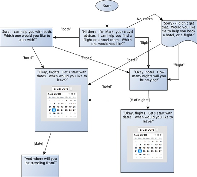
After you have written and reviewed a variety of sample dialogs, the next step is to sketch the VUI’s flow. Flows (referred to as callflows in the IVR world) are diagrams that illustrate all the paths that can be taken through your VUI system. The level of detail for this flow depends on the type of system you are designing. For an IVR system, or a closed conversation, the flow should include all possible branches the user can go down (Figure 2-5). This means that for each turn in the conversation, the flow will list out all the different ways the user can branch to the next state. This could be for simple states, that allow only “yes” and “no” type responses as well as more complex ones that might have 1,000 possible song titles. The diagram does not need to list every phrase someone can say, but it should group them appropriately.
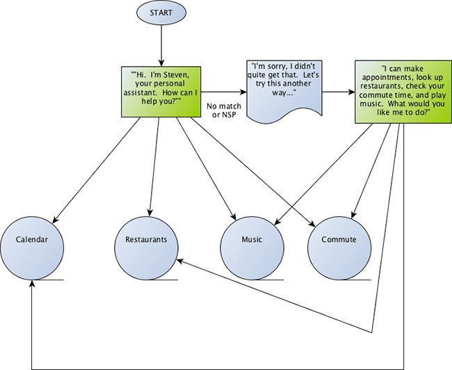
In the case of something more open-ended, such as a virtual assistant, the flow can be grouped into types of interactions (e.g., calendar functions, search, calling/texting, etc.). In these cases, not all possible interactions can be spelled out, but it helps to group the various intents, as illustrated in Figure 2-6.
You can use any flow tools for this—yEd, Omnigraffle, Google Draw, and Visio are all good options. In addition, storybuilding tools such as Twine can be helpful in this phase.
Confirmations
After you’ve designed the basic flow and have a set of sample dialogs completed, you can focus on some of the other important details, such as confirming input.
Making sure that users feel understood is an important part of any good VUI design. This also serves the purpose of letting a user know when they were not understood.
In the early IVR days, confirmations were sometimes used to an excessive degree. Here’s an example:
IVR TRAVEL SYSTEM
Would you like me to book that flight?
CALLER
Yes, please.
IVR TRAVEL SYSTEM
I think you said “yes.” Is that correct?
CALLER
Yes.
IVR TRAVEL SYSTEM
OK, I will book your flight...
A funny example of why over-confirmation can sound so unnatural was highlighted by a Saturday Night Live skit from 2006, called “Julie, the Operator Lady.” It was a parody between Rachel Dratch (playing the part of Julie, the Amtrak IVR persona) and Antonio Banderas, talking at a party. Ten years later, Amtrak now has an award-winning IVR system—but you can see how the same style of dialog doesn’t quite work in the real world:
JULIE
Will you be needing drinks tonight?
ANTONIO BANDERAS
Sure, thanks.
JULIE
Please listen carefully, as the options have changed—or, if you know the drink you want, you can interrupt me at any time. There’s merlot, chardonnay, various cocktails—
ANTONIO BANDERAS
Gin and tonic, on the rocks, lime...
JULIE
Before I get your drink, lemme see if I have that right. That’s one, gin and tonic, on the rocks, with a twist. Did I get that right?
ANTONIO BANDERAS
Yes.
JULIE
Your approximate wait time is one minute... [Julie walks away]
Over-confirming information might ensure accuracy, but it will also drive people (like Antonio Banderas) crazy.
When determining the right confirmation strategy for a VUI experience, consider the following:
What is the consequence for getting it wrong? (Would the wrong flight end up being booked? Would someone’s money be transferred to the wrong account? Would a traveler hear the weather for the wrong city?)
What modalities will the system have to provide feedback? (Will it be audio-only? Will there be nontextual visual feedback such as the light ring on the Amazon Echo?)
Will it have a small screen, such as a smartwatch, or a medium-sized screen, such as an iPhone?
What type of confirmation is most appropriate? (Explicit confirmation? Implicit? A hybrid?)
If someone is transferring money from one place to another, confirmation is extremely important. On the other hand, if the app is purely for entertainment, getting one thing wrong might not be a big deal, and in fact, might break the user out of the experience of the conversation.
Always take advantage of the channels you have available. When you want to talk to the Amazon Echo (by saying “Alexa”), the top rim of the device lights up in blue, letting you know that she’s now listening to a command. Note that the Echo is in fact always listening, but it does not light up until it knows that you want to initiate a conversation with it. I talk more about how devices show you they’re listening in Chapter 5.
When you ask the Amazon Echo a question, its primary channel for output is audio. It does have the aforementioned illuminating ring at the top, but this is generally just to indicate it’s listening (or processing), not to give you actual information. In addition, you can access information you give to the Echo on another device—such as your phone—after the fact (e.g., if you asked Alexa to add an item to your shopping list).
For VUI experiences for which audio feedback is the primary method to provide feedback, it is important to craft confirmations carefully. One way to do this is by using confidence thresholds.
A confidence threshold is how the speech recognition engine lets you know how well it thinks it’s performed. For example, it might recognize that you said “YES, PLEASE”—but the confidence could vary. Perhaps it’s only 45 percent confident that this is what it heard, or perhaps it’s 85 percent. Your app can access this information, and handle them in different ways:
- Explicit confirmation
Force the user to confirm the information. For example, “I think you want to set a reminder to ‘buy insurance before going skydiving next week.’ Is that right?”
- Implicit confirmation
Let the user know what was understood, but do not ask them to confirm. For example, “OK, setting a reminder to buy insurance...” (In the case of implicit confirmation, it might be necessary to allow the user to cancel or go back a step.)
There are many different ways to confirm information. The next section describes them in more detail.
Method 1: Three-Tiered Confidence
In this case, the system will explicitly confirm information between a certain threshold (e.g., 45–80), reject anything with a lower confidence, and implicitly confirm anything above the 80 percent threshold. It’s especially important to explicitly confirm information if the cost of a misrecognition (i.e., the system got it wrong) is high. Here is an example of how this might sound:
USER
Please buy more paper towels.
VUI
[>80 percent confidence, implicit confirmation] OK, ordering more paper towels...
[45–79 percent confidence, explicit confirmation] I thought you said you’d like to order more paper towels. Is that correct?
[<45 percent confidence] I’m sorry, I didn’t get that. What would you like to buy?
Method 2: Implicit Confirmation
Another method is to only confirm things implicitly, without requiring the user to take action. For example, if I ask, “What’s the world’s tallest mountain?” a system with implicit confirmation would give me the answer right away: “The world’s tallest mountain is Mount Everest.” Along with the answer, it included a piece of the original question so that I know the system recognized me.
Some systems provide the answer without confirming the original question; for example, simply saying “Mount Everest.” This approach can be appropriate when the confidence is very high and when trying to be more conversational.
Here are some other examples of implicit confirmation:
“The weather in San Francisco is...”
“OK, I’ve set your appointment for 10 AM tomorrow morning.”
“All right, I’ll tell you a story...”
“Cheetahs are the fastest land animal.”
Method 3: Nonspeech Confirmation
Another type of confirmation relies on completing an action that does not require a spoken response. For example, imagine that you are creating an app to turn the lights on and off in your home. The user says, “Turn on the Christmas tree lights.” Is it really necessary to say, “OK, turning on the Christmas lights,” when the lights just turned on?
A couple of caveats to this approach. First, you might want to consider having an audio confirmation that the system heard the user if there is likely to be a delay. For example, if it takes a few seconds for the lights to come on, it is useful to have the system say, “OK,” or, “Got it,” to let the user know it’s going to happen, even though it might take a few seconds. In addition, this lets the user know that if the lights do not turn on, it was not that the device did not hear the user. A second use case is if you’re doing something for which you won’t be able to see it to confirm, such as turning on the oven while you’re sitting in another room.
Another type of confirmation that does not use speech but does use audio is an “earcon”: a brief, distinctive sound. In the 511 IVR system (which provides traffic and transit information), when the user returns to the main menu, a specific, short audio clip plays. When the user goes to the traffic menu, a short car horn beep is played. This is called landmarking, and it helps users to quickly understand they have been taken to the right place.
Method 4: Generic Confirmation
In some conversational systems, it might be appropriate not to confirm exactly what the user said—even implicitly. This applies more for conversational systems in which the user might be doing more open-ended chatting. In this example, an avatar asks how someone is feeling, but does not necessarily act on that information:
AVATAR
How are you feeling today, Cathy?
CATHY
Well, pretty good today, I guess.
AVATAR
Thank you for sharing that with me. How did you sleep last night?
CATHY
Not so great.
AVATAR
I’m sorry to hear that.
This sort of generic confirmation can allow for a richer sharing experience from the user. This type of response will allow a wide variety of input from the user, while still moving the conversation along. Keep in mind that in human–human conversations, we don’t go around confirming exactly what someone says every time. Sometimes we might say, “mm hmm,” or, “tell me more”—and it’s OK for a computer to do that, as well.
To keep things more interesting, it helps to randomize these types of generic confirmations.
Note the confirmation in the second piece, as well: when the user says she did not sleep well, the avatar does not say “So you did not sleep well,” but rather offers up a sympathetic response. This turn in this conversation could have three categories of responses:
Slept well (“I slept great,” “Good, thanks”)
Slept poorly (“Not so great,” “I barely slept,” “I slept terribly”)
System is not sure (“Well I dreamed a lot,” “I was up late”)
There could be a set of appropriate randomized responses for each of these cases.
Method 5: Visual Confirmation
With mobile devices, visual confirmation is a commonly used method. For example, when asking Google a question, it often provides an audio confirmation as well as a visual one (Figure 2-7):
USER
Ok Google. When’s my next meeting?
GOOGLE
You have a calendar entry tomorrow. The title is “Chinatown field trip.”

Take advantage of the screen! Communicating a list of items is much more effective on a screen. Humans have a limited capacity to remember a string of information; typically, a user can’t remember more than about seven auditory items at a time.[9] “The ephemeral nature of output in auditory interfaces places significant cognitive demands on the user.”[10]
However, by putting those same items into a visual list on a screen, the cognitive load is lessened. Now the user can examine the list at their leisure, without remembering each little detail. This also gives the user more time to make a decision.
Another great way to use the screen is for confirming the user’s choice. Imagine a system that allows the user to select a response by either speaking or pressing a button. The system asks, “Did you take your antibiotics last night?” and provides a Yes and a No button. The user could say, “Yes,” and rather than have the system say, “I think you said ‘yes,’” simply highlight the button, as if the user had pressed it. The user will know whether she has been correctly (or incorrectly) understood (Figure 2-8).
In addition to thinking about confirmations, an important design decision is when to allow your user to speak.
Command-and-Control Versus Conversational
Most of the VUI systems out there today are command and control, meaning the user must explicitly indicate when they want to speak. Another type of design, which is becoming more common as systems become more conversational, uses a more natural turn-taking approach.
To know which type is right for your VUI design, answer the following questions:
Can the user ask the system a question/give a command at any time? (For example, Siri, Google Now, Amazon Echo, Hound)
Will the user be involved in a closed conversation with an explicit beginning and end? (Chatbot, game, avatar)
Command-and-Control
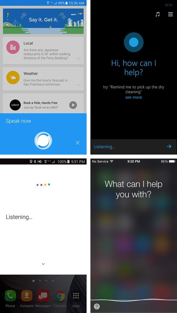
Many systems use this approach whereby users must do something explicit to indicate to the system that they are going to speak. For example, Siri requires the user to press the home button before speaking (or, from the Siri screen, press the microphone soft button (Figure 2-9). Ok Google requires either pressing the microphone icon, or saying “Ok Google” (Figure 2-10). The Amazon Echo has a physical button, but users can also indicate that they are about to speak by saying the wake word, “Alexa.” Even the starship Enterprise required the crew to say “Computer” before making a request.

In many cars, the user must use a “push-to-talk” approach; that is, the driver must press a specific physical button on the steering wheel to indicate that they will speak (Figure 2-11).

When this happens, the system typically responds with either nonverbal audio (the “bonk” noise) and/or with visual feedback (a wavy line, animated dots, a glowing light on the device). The user then knows that the system is listening and can speak (Figure 2-12).
When the system has decided that the user has finished speaking, it indicates in some way, often with more nonverbal audio (the “up” noise from Siri), and then responds. Identifying when the user has stopped speaking is called endpoint detection; I discuss this in more detail in Chapter 4.
At this point, the conversation might well be over. The system is not expecting the user to speak again, although sometimes it can handle a related follow-up request. But the user must again explicitly indicate that they are going to speak.
This works well for situations in which the device has no idea when the user might speak. Imagine you’re in the family room and your spouse is in the kitchen. You haven’t spoken for a while. You will probably use some kind of explicit notification to your spouse to let them know you’re going to speak, such as, “Hey, honey, can I ask you a question?” or, “Hey, Chris.” This prepares your spouse to listen. If you went for 30 minutes without speaking and suddenly you said “Where is it?” without any context of what you were looking for, your spouse will likely be confused.
The time window in which your system should still be listening after the wake word or button push should be carefully chosen. Too short, and you’ll miss users who hesitate briefly before speaking; too long and the system might be listening to a conversation that’s not intended for it. As a rule of thumb, 10 seconds is a good starting point.
Conversational
When there will be a longer back-and-forth between the user and the VUI, forcing the user to explicitly indicate that they are going to talk is not necessary and can be cumbersome and unnatural. When you are in the middle of a conversation with a real person, you do not have to give these indicators at every turn, as demonstrated here:
YOU
Long time no see! How are you doing?
FRIEND
I am going to speak now. I’m good, how are you?
YOU
Fine. Where did you go last night?
FRIEND
I will now tell you where I went last night. I went to a meetup about bonobos.
That’s going to be an awkward conversation.
If your user is involved in a conversation with your app, don’t force them to keep indicating they are going to talk. Instead, use natural turn-taking techniques, such as the following:
Asking a question
Using eye contact (if you have an avatar or video)
Pauses
Explicit direction
The easiest and most natural technique is asking a question. When the VUI asks the user something, people will naturally respond.
Explicit direction is fine, as well. For example, “Why don’t you just tell me the name of the movie you want to see.”
Be careful not to force the user into this conversational mode when it’s not appropriate. One virtual assistant I tried would turn the mic back on every time it finished speaking, but it was very confusing.
VIRTUAL ASSISTANT
I’d be happy to look up that info for you. All you have to do is ask. [turns on mic and beeps]
ME
[thinking...Isn’t that what I just did?]
Human turn-taking is not always clear cut. In many cases, a turn might be someone simply making an “mm hmm” noise while the other person continues to talk. As Urban says, a lot of human–human conversations have overlapping turns; when I murmur “mm hmm,” it’s not a signal that I want the other person to stop talking and give me the conch. Instead, it’s a “liveness” indicator—I’m still here, I’m still listening.
Computers are not yet able to handle this more-subtle form of turn-taking. In systems that don’t allow users to interrupt, however, this can be workable, since the “mm hmm” will not trigger the recognizer while the system is still talking.
With more careful design, a VUI system can handle some of the more common forms of these subtleties; for example, users might say, “thank you,” at the end of a transaction. You can program the system to either ignore this or acknowledge it with a “you’re welcome” rather than generate an error/reprompt.
In addition, don’t ask rhetorical questions to which you can’t understand the answer. Ben Brown, cofounder of “Howdy,” a chatbot that runs within the office communication tool Slack, had to outlaw the bot from asking rhetorical questions “because people expect to respond to them, even though the bot was just being polite,” he says. “You would never just stick a form on your web page and not expect people to type into it.”[11]
Another way you can violate turn-taking is by asking the question before the system has finished speaking. For example, a common IVR structure is, “Would you like to hear that again? You can say ‘yes,’ ‘no,’ or ‘repeat.’” Users often begin to speak as soon as the question has finished, which leads to frustration because either they can’t interrupt, or they interrupt just as the system begins the next sentence, stop talking, and have interrupted the flow. With good prompt design and very careful voice coaching it is possible to make this work, but in general you should avoid it by putting the instruction first and the question at the end.
Sometimes, it makes sense to switch between command-and-control and conversational modes, though it’s important to do this only in situations in which users will implicitly understand that the mode has changed. A good example of this is the Jeopardy! game on the Amazon Echo. To initiate the game, you must say, “Alexa, start Jeopardy!.” After Alexa says the quiz answer, however, you do not need to say “Alexa” again—you can simply say the question (e.g., “Who is Dorothy Hamill?”) and Alexa will tell you if you’re wrong or right. There is no “beep” to let you know you can speak, but there is no need for one—it’s a known conversational structure, so users do not have trouble figuring it out.
Conversational Markers
Another way to make your VUI more human-like (as well as more engaging) is to use conversational markers. See if you can spot the difference between these conversations:
VIRTUAL ASSISTANT
How many hours of sleep did you get last night?
USER
About seven.
VIRTUAL ASSISTANT
How many servings of fruits and vegetables did you eat yesterday?
USER
Maybe four.
VIRTUAL ASSISTANT
Did you take your medication last night?
USER
Yes.
VIRTUAL ASSISTANT
Goodbye.
Versus:
VIRTUAL ASSISTANT
I’ll be asking you a few questions about your health. First, how many hours of sleep did you get last night?
USER
About seven.
VIRTUAL ASSISTANT.
Good job. And how many servings of fruits and vegetables did you eat yesterday?
USER
Maybe four.
Got it. Last question—were you able to take your medication last night?
USER
Yes.
VIRTUAL ASSISTANT
All right. That’s it for now. I’ll talk to you again tomorrow. Goodbye.
Both of these examples collected the same three pieces of information. But which virtual assistant do you think the user will prefer speaking with, day after day?
Conversational markers are an important way to let the user know where they’re at in the conversation, and that they are understood. Users will also be more engaged when the system is using basic manners and will respond in kind. They are often the “glue” that keeps the various required pieces of the interaction together.
Conversational markers include:
Timelines (“First,” “Halfway there,” and “Finally”)
Acknowledgments (“Thanks,” “Got it,” “Alright,” and “Sorry about that.”)
Positive feedback (“Good job,” and “Nice to hear that”)
One practical way to see where conversational markers should be added to your dialog is to do a “table read” with someone. Write down a sample dialog (the back and forth between the system and the user) and each of you read one part. You’ll quickly see where things might be stilted or unnatural, or add to a user’s frustration because they have no idea how long the conversation is going to last.
Here are a couple of common concerns I hear from clients: “Computers don’t speak that way,” and “People will be put off because it’s a computer, not a person.” Some clients worry that the system will sound too informal or annoy people by pretending to be human.
It is important to use conversational markers that are appropriate to your system’s persona, but even the most formal systems will benefit. Users know they’re speaking to a machine, but humans appreciate these conversational basics nonetheless.
Next, we’ll discuss a crucial piece of design that addresses something that you hope never happens but is essential nonetheless.
Error Handling
When you talk to a human being, there is never an unrecoverable error state.
—ABI JONES, DESIGN LEAD AT GOOGLE
In the traditional IVR world, if the user was not heard or understood, the system prompts the user to speak again. This is important because otherwise the user might think the phone call was cut off or the system isn’t functioning. Another reason is that there is a fixed dialog that is expected; at any given point, the user is required to provide input to move the conversation forward. If the system doesn’t hear anything, it times out and prompts the user to speak again. If these timeouts are not planned carefully, the user and the system often end up cutting each other off, resulting in an awkward back and forth.
In the mobile VUI and device world, however, it’s not always necessary to reprompt the user when there is a failure. The Amazon Echo, for example, does nothing if it doesn’t hear you after saying the wake word. (If it heard but did not understand, it plays a short sound.)
When speaking to a device (especially a device with a name), users are more likely to respond to silence the same way they would with a human—by repeating themselves. In addition, the system is not waiting for the next piece of the conversation, because this is often a one-off command. Therefore, if the system fails to respond, it’s not that the entire transaction fails—just that one particular command. It’s not the same as suddenly ending a conversation in the middle of an important transaction; it has just failed once. Because of the higher fault tolerance, it’s more forgiving for Alexa to ignore you when she did not understand.
Imagine, however, that your app said, “I’m sorry, I didn’t understand,” every time it failed to recognize your latest command. It would get old very quickly. “I didn’t understand, I didn’t understand, I didn’t understand.” Alright, already! Users can quickly grow accustomed to a mode in which they simply need to repeat themselves if the device doesn’t understand on the first try.
We’ve talked a lot about “best path” behavior for a VUI design. But, as any good designer knows, you can’t just design for when things work—you need to design for when things go wrong, as well. This is especially true with VUIs, because something will always go wrong.
Although speech recognition has improved drastically in the past 10 years (greater than 90 percent accuracy given the right conditions), this will in no way ensure that your users will have a good experience when you add voice to your design. Think for a moment about human-to-human conversation. We often miss a word (or multiple words) when someone else is talking.
All of these factors play a role in VUI, as well. But humans are much better than computers about getting back on track, thanks to a rich understanding of context, and being able to recover from conversational errors. If I say something to you, and you stare at me quizzically, I’m likely to repeat myself, knowing you did not understand. I can ask you to repeat yourself. I can ask you to clarify. We have many ways to course-correct, because we’re both steeped in years of practice of human conversation.
When the VUI does not understand us, things often break down. How you decide to handle these error conditions in your VUI is extremely important. As Pilar Manchon, GM of voice and digital assistants at Intel said, “Every time that you score down because you make a mistake, or you don’t know something, it actually counts a hundred times for every time that you had it right.”[12]
If you do a good job, error conditions won’t derail users, and you can get them back on track and have them successfully complete a task. Handle it poorly, and not only will they fail to complete their tasks, they’re not likely to come back.
There are a variety of ways VUIs can make mistakes:
No speech detected
Speech detected, but nothing recognized
Something was recognized correctly, but the system does the wrong thing with it
Something was recognized incorrectly
No Speech Detected
Speech recognition engines have a “listening” mode in which they attempt to capture a speech signal. If speech is expected but not detected, automated speech recognizers return a “no speech” response.
It’s important to keep in mind that this does not necessarily mean that the user didn’t say anything. It could be that the user spoke, but for whatever reason, the system did not pick it up.
There are two ways to handle the case of “no speech”:
Call it out explicitly (e.g., “I’m sorry, I didn’t hear anything. What is your account number?”).
Do nothing.
Which one should you use? It depends on your app. For the explicit case, the following should be true:
Your system is audio only (such as an IVR).
There is no other way for users to respond (such as touching buttons on their mobile phone).
The system needs a response from the user before it can continue the task/conversation.
There are also cases for which it’s appropriate to do nothing:
The user can move forward another way (such as choosing a response via a button).
The consequence of not acting does not break the conversation.
There is a visual indicator that the system did not understand, such as an avatar continuing to engage in active listening by looking at the user.
Why not just err on the side of caution and always prompt the user to speak again? Because it becomes very annoying. Humans have a variety of ways to indicate that they did not understand what was said, and one of the most common (and effective) is to say nothing. Instead, you might look quizzically at the person, or smile politely—this action makes it clear very quickly that the speaker was either not heard or not understood.
VUI designers should take advantage of conversational rules that humans are already comfortable with. Rather than continually telling the user they were not understood (and having them lose faith in the system), subtle cues can be just as effective.
When conducting user tests at Volio, I have observed cases in which this was so well done that users did not even remember afterward an error had occurred, even when asked. In this case, when the user was not understood, the video showed the actor simply continuing to listen—nothing else occurred. The users naturally repeated themselves, and the system moved on.
Speech Detected but Nothing Recognized
In some cases, the automated speech recognition (ASR) tool did detect an audio signal, but it was unable to come up with any reliable hypotheses.
The strategies for dealing with this case are very similar to the case of “no speech detected”:
Call it out explicitly (e.g., “I’m sorry, I didn’t get that. What was the name of the restaurant?” or “Sorry, what was that?”).
Do nothing.
Some systems attempt to be clever or funny. If Alexa knows you were asking a question, but doesn’t have a way to answer it, she replies, “I’m sorry, I didn’t understand the question I heard.”
Siri, in some instances in which the system does not understand—for example, “Siri, tell me the meaning of love,”—will reply, “Who, me?”
Be careful with these types of responses. “Who, me?” can be cute the first couple of times, but I’ve seen users become exasperated with this nonhelpful response.
Recognized but Not Handled
In this case, the ASR tool did return a perfectly accurate recognition result, but for whatever reason, your VUI did not handle it properly. This could be because you did not program in a response. It could also be that you programmed the wrong response. Here’s an example:
In this example, the system decided that the keyword “cold” meant temperature, and now the conversation has been derailed. A smarter system would look for the concept of “having a cold” versus “being cold.”
Another example is when the system recognized it perfectly but has no programmed response:
MEDICAL VIRTUAL ASSISTANT
How are you feeling?
USER
Uh, my arm sort of hurts.
MEDICAL VIRTUAL ASSISTANT
I’m sorry, I didn’t get that. How did you say you’re feeling?
This is a case in which whoever designed the types of responses the system could handle did not include one for arm pain.
The strategy for handling these? Better anticipation of all the things a user might say. For tips on how to avoid this issue through data collection, see Chapter 5.
Recognized but Incorrectly
This is the case in which the ASR tool returned the wrong recognition result. This could produce two outcomes: either you don’t do anything with it, because you don’t expect it, or it incorrectly matches to the wrong behavior. Let’s look at an example:
MEETING SCHEDULING VA
What time would you like to schedule your meeting with Sharon?
USER
Umm...well, I guess I’d like to sort of, umm...I will schedule it for 3:30.
MEETING SCHEDULING VA
[ASR tool returned “um well I guess I’d like to sort of um I will sledge it throw forty”]
I’m sorry, what time did you say?
Unfortunately, there is not a lot you can do about the ASR tool not recognizing things correctly; however, you can build in ways to work around this issue by using N-best lists and data analysis of real user responses. (An N-best list is the list of the top possible recognition results returned by the ASR tool—for more about N-best lists, see Chapter 4.)
Escalating Error
A common strategy for cases when speech is expected (and is the primary mode for communicating with the app) is to use escalating error strategies. This simple example reminds the user what the needed information is:
WEATHER APP
I can get the weather for you. What’s the city and state?
USER
Uhhh...it’s Springfield.
WEATHER APP
I’m sorry, I didn’t get that. Please say the city and state.
USER
Oh, it’s Springfield, Minnesota.
Escalating error behavior prompts can become more detailed if needed, offering more help such as where to find an account number. In addition, if after several turns speech has continued to fail, offer another mode of communication such as pressing buttons or using a drop-down list of options.
Here’s an example showing a flight lookup app in which the user enters a number but it’s the reservation confirmation number, not the flight number. Rather than just reasking for the flight number, the system reminds the user what the number looks like:
If you are working on a system in which there is a live person who can provide assistance, set a threshold for number of errors, and when that threshold is met, transfer the user to the live assistance.
Don’t Blame the User
When at all possible, do not blame the user. Blame it on something else, or at the very least blame the system.
In a study performed by Clifford Nass and Scott Brave, users performed tasks with a driving simulator, and throughout the tasks, the system voice made comments about their driving performance. Half of the participants heard messages blaming the driver (“You’re driving too fast.”) and half heard messages blaming external factors, such as “Steering is difficult on this road.”[13]
The participants who were blamed by the system rated their driving performance lower, liked the voice less, and most importantly, showed less attention while driving. Error messages might seem like a small thing, but they can affect the user’s perception of the system and even their performance.
Novice and Expert Users
If your users will be using your system on a regular basis, it’s important to include different strategies in the design.
For example, a healthcare app might require users to log in every day and take their blood pressure. In the beginning, having the prompts include more instructional details is useful and necessary. However, after the user has become familiar with the app, there is no need to continue lengthy instructions (as well as other prompts). Let’s take a look at an example of each scenario.
Novice user:
AVATAR
Let’s take your blood pressure. Please make sure the cuff is turned on. Wrap the cuff around your arm so that the blue arrow is pointing toward your palm. Be sure to sit down and have your feet flat on the floor. When you’re ready, press continue.
User has interacted with the app every day for a week:
AVATAR
Time to take your blood pressure. Please put the cuff on and press continue.
Don’t just count the number of times the app has been used, however. It might be that an individual has used it many times but only once every month or two. In this case, you would continue to use the novice prompts.
You can also shorten explanatory prompts. For example, the system might say, “I’ll be asking you a series of questions about how you’re feeling. It will take a few minutes, but the questions will help the doctor determine the best course of action. First, did you take your medication yesterday?”
After doing this every other day for a week, you can shorten it to, “Did you take your medication yesterday?” (Be sure to use “conversational markers” even though the prompts are shorter, to keep the user informed that their answers have been understood, and where they are in the set of questions.)
Margaret Urban, interaction designer at Google, says it’s important to ensure that your goal is not simply to “train” your user. She says rather than beat them over the head with the available commands, adapt to their behavior.
In addition, take advantage of the concept of priming. Priming refers to the fact that exposing someone to a particular stimulus (such as a word or image) will influence their response to a later stimulus. For example, if you’ve been watching a nature program about llamas in Peru, and afterward someone asks you to name an animal that begins with the letter “L,” you’re much more likely to say llama than lion.
Letting someone know up front that you’ll be asking them a certain number of questions is also a form of priming; it gives the person an indication of what to expect, so they know how to prepare themselves.
Priming can be subtler. If your VUI confirms commands in a certain way, it primes the user to phrase it similarly in the future. For example, if I say, “I would like to hear the song by the group the Barenaked Ladies that’s called ‘Call and Answer,’” and my VUI responds with, “Playing ‘Call and Answer’ by the Barenaked Ladies,” next time I might just say, “play ‘Call and Answer’ by the Barenaked Ladies,” instead.
Keeping Track of Context
Remember the earlier example in which Google was able to continue the conversation about Abraham Lincoln? Let’s take a look at it again:
USER
Ok Google. Who was the 16th president of the United States?
GOOGLE
Abraham Lincoln was the 16th president of the United States.
USER
How old was he when he died?
GOOGLE
Abraham Lincoln died at the age of 56.
USER
Where was he born?
GOOGLE
Hodgenville, KY.
USER
What is the best restaurant there?
GOOGLE
Here is Paula’s Hot Biscuit.
What’s good about this example? Google continued the conversation, and remembered the context. Specifically, the use of pronouns. It knew “he” referred to Abraham Lincoln. It also knew that “there” meant Hodgenville, Kentucky. Keeping track of this information is not always easy, but without it, your app won’t be capable of anything but one-turn actions. The use of two different terms to refer to the same thing is called coreference, and is an essential part of communication. Without it, conversations will quickly break down.
Here’s another example, though a fictitious one, about an app that can help find movies to watch on TV:
USER
Show me movies with Harrison Ford.
TV
[shows list of movies starring Harrison Ford]
USER
Which ones were made before 1990?
TV
[shows new list]
USER
Now show me movies with him and Carrie Fisher.
TV
[shows list]
In this case, the app needs to know what “ones” means as well as “him.”
It can be difficult to anticipate all the things your system might need to track, but you can begin with the basics and build up based on what your users are actually saying (see more in Chapter 5).
If the user asks a question about a person, store that information. If the person is famous, you can even look up the gender. However, you can also use a simpler method, which is to always store the last person mentioned, and refer to that person whether the user says ‘he’ or ‘she.’ (Of course, this will not work if the user has mentioned more than one person, but in many instances it will work just fine.)” If you can’t determine the gender, you can also just use the person’s name, although it can sound robotic to keep using the full name rather than a pronoun. “They,” the gender-neutral form, is also gaining acceptance.
You can apply similar processes to remembering the last city or place the user (or the system) mentioned.
Systems often struggle with interpreting the user’s references. Here’s a Cortana example that isn’t able to handle the second query in the conversation:


As you can see, Cortana did not assign a meaning to “one” and treated the query as brand new. To contrast this, look at what Google does:
USER
What’s the most expensive dog?
GOOGLE
According to PopSugar, the most expensive dog in the global world today is the Tibetan Mastiff.

USER
Where can I get one?
GOOGLE

Here, Google successfully understood the word “one” in the second query, and gave some relevant search results.
Note
When I began writing this chapter, which was a couple of months before final publication, Google actually handled this query differently. It replaced “one” with the word “dog” (it actually modifies the search query itself so that you can see it). This was more intelligent than Cortana’s response, but not very useful all the same. It used my original query to replace “one,” whereas it should have used the answer it gave (as it does now). The example shows, however, how fast these systems are improving.
Another noteworthy item involves the content Google serves up. The description contains a mild profanity, which some users might find offensive. As a VUI designer, these are the things you still need to be aware of, even though technically it’s out of your domain. Google does offer the option for users to provide feedback on what they think of the result.
Help and Other Universals
When I worked on IVR systems, we made sure to include a set of universals at every state: repeat, main menu, help, operator, and goodbye.
For mobile apps, this is not a hard-and-fast rule. Many mobile apps (or connected devices) do not have the concept of a main menu. However, it is still important to ensure that users can get help when needed.
Supporting the “help” command is useful in many cases, but is traditionally used for context-specific help. For example, imagine an insurance IVR system in which a user has been asked to enter their medical record number (MRN). If the user says, “help,” at this point, it would be useful to remind the user that the MRN is on their insurance card.
But what if the user asks for help in an open-ended situation such as a general assistant, like Google, Cortana, or Siri? If the user has just initiated the conversation (by pressing the home button or saying, “Ok Google,” and then says “help”), you have no context around which to know what type of help the user needs.
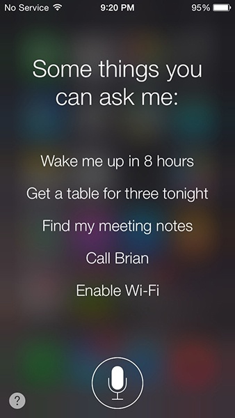
In addition, users are not always accustomed to using these types of universal phrases, despite us IVR designers trying to train them for many years! Therefore, it’s important to think not only about what type of help to provide, but how users might say it. For example, “Alexa, what can you do?” or asking Cortana, “What can you do for me?” Or with Google, asking, “Ok Google, what can I say to you?” In fact, Ok Google will display examples if you simply tap the mic and say nothing.
Alexa doesn’t even try to handle that question on her own; instead, she says, “For help with what you can say, take a look at the ‘things to try section’ in the Alexa app.”
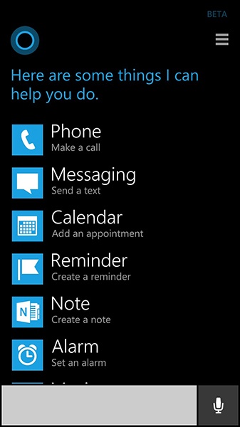
Cortana says “Here are some things I can help you do” and provides a visual set of examples, depicted in Figure 2-13.
Google says nothing, but provides a screen of examples, as shown in Figure 2-14.

In addition to allowing users to ask for help, take advantage of visual space if you have it, such as on a mobile app. Imagine designing an adventure game in which the player can talk to various characters and explore different worlds. Having a “help” or “info” button always available in the GUI commands is an obvious way to let the user know assistance is available.
In the current world of VUIs, “help” (and other ways people can ask “What can I do here?”) is especially important because there is no all-powerful VUI out there. Despite many VUIs saying something very open, such as “How may I help you?” they are still very limited in what they can understand and act on. Users need a way to find out just what it is they can really do.
Another important piece of good IVR design was to include a “goodbye” universal. In the early VUI designs, goodbye was not considered important because people could simply hang up to end the conversation. But years of collecting data made designers realize that, because people were used to saying goodbye to people when ending a phone conversation, they often did it with IVR systems, as well, and sometimes felt uncomfortable ending conversations by simply hanging up. Therefore, we added dialog to handle this case. Another important lesson was to make sure the system was very confident before actually hanging up! If your system will be using a “goodbye” option, be sure to use three-tiered confidence and confirm that the user really wants to exit the system if confidence is not high.
Here’s an example from the 511 IVR system, when confidence was medium: “I thought I heard you say goodbye. Do you really want to exit the system?”
The other night on my way to bed, I passed by my Amazon Echo and said, “Alexa, good night.” She responded with “Good night.” It might sound like a silly thing in which to invest development time, but it was very satisfying.
Allowing users to repeat and to go back a step are important for conversational systems as well. “Go back” is not necessary for things like Google Now, in which interactions are short, but for a task-oriented conversation, go back is very useful. During tasks that are not within a set of conversational turns, “go back” can take on different meanings. For example, if your user is listening to music, it might indicate they want to hear a previous song. These are commands that are often good candidates for GUI controls, as well.
Latency
Another component that is sometimes missed by designers is latency. It is important to determine as early as possible whether or not your system will have any latency, or delays. Latencies are generally caused by:
Poor connectivity
System processing
Database access
Perhaps your VUI system needs to access patient records, and you know that this will require a database lookup. Find out as early as possible how long this is likely to be, and plan accordingly.
If there is a known latency, ensure that the system has a way to handle this. You can do this both by the system telling the user about the delay (“One moment while I look up your record...”) as well as nonverbal and visual cues, such as a latency noise (often used on IVR systems) and visual (animated loading icon), as demonstrated in Figure 2-15.

There might be cases in which the expected latency time could range from none to 10 seconds. If so, in the case of no latency, pad the latency by a few seconds, because it sounds broken to the user if you say “One moment please” and immediately continue the conversation. If you set up the expectation of a delay, do not violate that expectation.
Sometimes latency can occur when processing speech, as well. Many devices use local recognition for their wake word, which is fast, and then send the rest of the audio for processing on the cloud.
Disambiguation
There can be times when the user provides some but not all of the details to take an action. For example, the user might ask for the weather for a location that exists in more than one place: “What’s the weather in Springfield?”
If possible, rely on any known information to determine the answer without having to ask the user. For example, the Amazon Echo requires the user to specify the home location as a part of the set up; thus, when you ask, “What’s the weather?” Alexa produces local conditions automatically. Knowing the home location can be used when the user asks for the weather somewhere else, as well—for instance, choose the “Springfield” close to home rather than across the country.
Other contextual clues can also be used. If the user just looked up a restaurant in Springfield, Illinois, and then asks, “What’s the weather in Springfield?” you can pretty safely bet that they mean the one in the location they just referenced.
If no contextual information is available, the system will need to ask the user to clarify:
USER
What’s the weather in Springfield?
SYSTEM
Did you mean the one in Illinois, or Maryland?
USER
Illinois.
SYSTEM
It’s 65 degrees...
If the system has high confidence for the word “Springfield,” it can use the reference word “one” rather than explicitly stating the name again. Also, be sure to allow the user flexibility in their response: the user should be able to say “Springfield, Illinois” or just “Illinois” or even “the first one” (imagine a list).
Another example where disambiguation is required is when an action is not clear:
USER
Call Cindy, please.
SYSTEM
OK. Cell phone, or home phone?
USER
Cell phone.
SYSTEM
Calling Cindy, cell phone...
Note the confirmation of the name came at the end, as an implicit conversation. This would be done if the system had (a) high confidence about the name and (b) there was only one Cindy in the caller’s Contacts list.
I noticed Google recently improved its dialing design. It used to be that when I said, “Text Chris Leggetter,” Google responded with, “Home or mobile?” and I had to choose. Now it’s smart enough to know I meant mobile, because I can’t text a home phone number.
Disambiguation might also be required when the user answers with more information than your VUI can handle.
SYSTEM
What is your main symptom?
USER
I’m throwing up and I have a fever.
SYSTEM
OK. Which one would you say is your primary symptom?
USER
Uh, my fever I guess.
SYSTEM
OK, fever...
It would be ideal if your system could handle both symptoms at the same time, but given that these systems do have underlying constraints, sometimes it is necessary to ask the user to narrow it down.
Design Documentation
In addition to the previously mentioned sample dialogs and dialog flow document, there are other tangible things that you might need to think about.
Prompts
It might be necessary during the design to create lists of prompts. A “prompt” is what the system can say to the user. It can be a complete sentence or sentences (“I can help you with that. Please tell me the make and model of your car.”) or it might be smaller snippets, such as numbers, dates, or products.
Prompt lists serve multiple purposes:
A list for voice talent to record
Getting sign off from the client
Input to the TTS engine
For a great resource on what prompt lists should look like, and how to create prompt lists for concatenation, see the previously referenced book, Voice User Interface Design.
Grammars/Key Phrases
In the early IVR days, we needed to specify complete grammars for every state in the dialog. For example, if the prompt asked the user “Do you want me to book the flight?” the grammar might look like this:
Yes: { “yep,” “yeah,” “uh huh,” “sure,” “yes yes,” “yes book the flight”}, and so on.
In addition, it needs filler words, such as “um” and “uh” and pleasantries such as “please” and “thanks.”
Because of the improvements of speech recognition technology, this is thankfully no longer the case. Instead, a lot of systems can get by with specifying key phrases instead of exact sentences, or using machine learning (starting with a set of sample input) to map the user’s intent.
I’ll get into more details on how to interpret natural language in Chapter 5.
Accessibility
To discuss accessibility, I’ve brought in an expert: Chris Maury. Maury is the founder of Conversant Labs, a company focused on improving the lives of the blind through providing improved access to technology. In 2011, Maury was told that he was going blind. Maury turned to technology to begin preparing for this future, but was dismayed at what was (or was not) available. Maury quickly realized that standard accessibility technology such as screen readers were not always pleasant to use. As Maury wrote:
From the beginning, I hated the way that Screen Readers work. Why are they designed the way they are? It makes no sense to present information visually and then, and only then, translate that into audio. All of the time and energy that goes into creating the perfect user experience for an app is wasted, or even worse, adversely impacting the experience for blind users.[14]
He set out to design audio experiences from scratch. In the sections that follow, he offers some tips on how to do just that.
Although designing experiences for everyone, no matter their abilities, should be a core requirement in every project, it becomes especially meaningful as we begin to explore interactions that go beyond a touchscreen and keyboard. What is a VUI but the ideal, nonvisual experience for the blind and visually impaired? The constraints of designing for people with different disabilities can help to inform how we solve similar challenges in not just VUI design but other emerging arenas, as well: conversational applications (chatbots) and immersive computing (virtual and augmented reality).
Here are a few best practices for VUI design informed by accessibility:
Interactions should be time efficient.
They should provide context.
They should prioritize personalization over personality.
Interaction Should Be Time-Efficient
When designing visual experiences, we try to limit the number of clicks a user must take to complete an action. The more clicks, the more cumbersome and tedious the experience feels. The same holds for voice-driven interaction, as well. Imagine asking a user for their address:
APP
What is your street address?
USER
1600 Pennsylvania Avenue
APP
What city?
USER
Washington
APP
What state?
USER
DC
APP
And what is your zip code?
USER
20009
In this example, the user must go through four call and responses before completing a single task. Now compare that to a single interaction:
This time there is only a single interaction. Although you might want to have a confirmation prompt (“I heard you say 1600 Pennsylvania Ave. Is that correct?”), there are still half as many interactions to complete the same task, making the design feel more responsive.
Keep It Short
In a visual experience, users can quickly focus their attention to the information that is most relevant to them, skipping over sections of the interface that they don’t care about. Audio interfaces, on the other hand, are linear. There is no skipping around. You are forced to listen to everything the app decides to tell you. This being the case, keep it short. Limit text to the most important information, and within that, present the most important information first.
In the example of a shopping app, imagine the user is listening to search results for a given product. Present the title of the product, the price, and the rating. Everything else can be deferred to a single product details dialog, as illustrated in Figure 2-16:
“Harry Potter and the Cursed Child by J.K. Rowling” — $17.99 — 3.5 out of 5 stars

Compare this to the visual experience, which can cram in far more details into a single search result, even on mobile.
For information that doesn’t make the cut, allow the user to ask for it. Continuing with the shopping example, here are some possible other queries the user might have:
“What are the product specifications?”
“Read me the reviews”
“Is it hardcover or paperback?”
Talk Faster!
A well-designed interface should have a shallow learning curve while still providing advanced features for power users (drop-down menus versus keyboard shortcuts). These advanced features make the interface significantly more time-efficient for those users who have the skills to use them. Many blind users of screen readers have trained themselves to listen to text at exceedingly fast speeds. You can listen to a demonstration at https://www.youtube.com/watch?v=92pM6hJG6Wo.
Not only can you read a book in less than half the time, but you can navigate voice-based applications significantly faster, as well. Not every user is going to be able to listen to your app at 950 words per minute, but more and more users are becoming accustomed to higher than normal speeds. For example, users can increase the playback speed on any YouTube videos up to 2 times, and the video speed controller extension for Chrome, which can increase playback speeds up to 5 times has more than 125,000 downloads.
Let your users control the speech rate of your app. It is a power feature that not every user will take advantage of, but it will make your app feel significantly more responsive to those users who can. Imagine what the world would be like if Photoshop didn’t support keyboard shortcuts.
Interrupt Me at Any Time
In graphical applications, when the app is loading, the user is waiting. They can’t do anything until everything is ready. The equivalent wait time in VUIs is waiting for the application to respond—recognizing what the user said and understanding what they meant are time-intensive processes. Don’t add to this wait time by forcing the user to wait for the app to finish speaking. (Allowing users to interrupt the system in this way is called barge-in.)
If you have an app that allows users to search nearby businesses, don’t make them listen to all search results before selecting the one that they heard:
USER
What coffee shops are nearby?
APP
There are four coffee shops within a 10-minute walk.
Espresso a Mano, 4 out of 5 stars, 2-minute walk.
Starbucks, 3.5 out of 5 stars.
USER
Give me directions to Espresso a Mano.
Another good example is asking Alexa for the weather. She begins with the most relevant information and then goes on to provide more detail. The user can say, “Alexa, stop,” at any time.
Provide Context
One of the primary challenges in VUI design is educating users on what they can do. In graphical applications, this is less of a problem. Everything is right there on the screen. You can see which buttons you can tap and which menus you can click. For voice interfaces, this visual discovery of features is nonexistent. The design of the VUI should inform the user as to how they can respond or what actions they can take.
When prompting the user, the text of the prompt should help to inform the user how they should respond, or specific actions they can take:
“Here are four recipes for ratatouille. You can ask me for more information on any of them.”
“You are standing in an open field west of a white house, with a boarded front door; there is a mail box here.”
But this implied context is often not enough, or a user might forget what they were doing. In these instances, they should be able to fall back to an explicit orientation action.
Where Am I?
A user should be able to ask for help at any time, and the help message should reorient them to their current context within the application. Here are some common user expressions of confusion:
“Help”
“What can I say?”
“Umm, I’m confused”
[silence] (after an app prompts the user for input).
And here are some example help messages:
“You can say ‘search’ at any time to search for a new product.”
“Your next meeting is at noon. Did you want me to remind you 10 minutes before?”
Help messages should reorient the user to the current context of the conversation as well as prompt them for common next steps.
Text-to-Speech Personalization
Allow users to choose what text-to-speech voice (TTS) voice that they will listen to in the app. Not only do these voices have their own unique personalities that can align with the brand of your specific application (think of a cooking app with the voice of Gordon Ramsey), but they can have technical features that users might prefer. Many voices are built with high speech rates in mind; they can sound more robotic, but they are much more intelligible at higher words per minute. In addition, users might have preferences for different voices, and simply enjoy using some more than others.
Conclusion
This chapter introduced many of the key concepts when designing VUIs. Many of them are drawn from the IVR world, with key differences. Basic strategies, such as well-designed error behavior, implicit versus explicit confirmation, and design artifacts such as sample dialogs and flows, apply in both cases.
Typical VUI project deliverables include:
Sample dialogs (you might want to include actual recordings, especially if using a voice talent)
Flow diagram
Prompt lists (if using voice talent or pregenerated text-to-speech)
Screen mocks (if this is a multimodal app)
If working with an external customer, these design deliverables will communicate what the finished product will look like and allow the customer to review and provide feedback. It also provides a way for everyone to agree on the design before it’s been implemented.
Some of the key design concepts covered in this chapter are:
Confirmation strategies (how your users know they were understood)
Whether your VUI should use command-and-control or a more conversational mode
Error handling (because there will be errors and they need to be handled gracefully)
Context (remembering what users have said, either in the same conversation or in prior ones)
Handling ambiguous input
Help and other universal commands
Designing for mobile can be both a richer experience as well as more complex. You’ll need to make decisions about how to let your users know when and where they can speak, and when and where to use visual feedback. In many cases, there will be no human to back up your experience.
Enabling users to speak to their phones and devices opens up an entire world of experiences; whether it’s looking up a piece of trivia during a dinner argument, asking a device to dim the lights, or managing the everyday tasks of your life, VUI can enhance them all.
[8] Bouzid, A., and Ma, W. (2013). Don’t Make Me Tap. 88.
[9] Miller, G. “The Magical Number Seven, Plus or Minus Two: Some Limits On Our Capacity for Processing Information,” Psychological Review (1956).
[10] Cohen, M., Giangola, J., and Balogh, J. Voice User Interface Design. (Boston, MA: Addison-Wesley, 2004), 75.
[11] Pavlus, J. (2016). “The Next Phase Of UX: Designing Chatbot Personalities.” Retrieved from https://www.fastcodesign.com/.
[12] Manchon, P. (2016). Quote from her talk at the RE-WORK Virtual Assistant Summit in San Francisco.
[13] Nass, C., and Brave, S. Wired for Speech. (Cambridge, MA: The MIT Press, 2005), 125
[14] Maury, C. (2016). “War Stories: My Journey From Blindness to Building a Fully Conversational User Interface.” Retrieved from https://backchannel.com/.
[15] See Deborah Dahl, “Voice Should Be User-Friendly—to All Users.” SpeechTechMag.com, November 2015 (http://bit.ly/2gSBa5W)