
Chapter Twelve. Charts with Html5 Canvas
Presenting complex data graphically—as a pie, line, area, or bar chart—is a powerful way to convey information and illuminate patterns and trends that would be much harder to spot poring over large tables of numbers. More and more on the web, we see charts and graphs used to deliver key information, including:
• Comparisons of statistical numbers or percentages, like voting or opinion poll results
• Tracking simple activity or performance information over time, like the number of users accessing a website, instances of news stories about a topic, or stock share prices
• Displays of complex financial or scientific trend data with moving averages, minimum and maximum values visualized to correlations, and other enhanced analyses in visual form
The two most common approaches to presenting visual chart and graph data have been to embed static chart images generated by a web server or to require plugins like Flash, Java, or Silverlight that generate charts within the browser. Unfortunately, neither of these approaches is ideal: static images are a problem because, being simply pictures, they don’t contain any actual data values. (The only way to summarize data from “pictures” for users without access to visuals is to populate the title attribute, which is difficult to manage for even very simple data sets.) And while plugin-based charting solutions can be made accessible in a subset of desktop browsers, many mobile devices, older browsers, or corporate environments that impose customized browser settings for security reasons may not support the specific plugin version required, leaving users with either a notice to upgrade or a blank block where the chart should be.
In the summer of 2004, the Safari browser development team put another option on the table when they introduced a new HTML element called canvas. The canvas element provides a native JavaScript drawing API for generating visuals on the front-end. In 2009, the HTML 5 specification added canvas as a standard element, which already has broad support in newer versions of Firefox, Safari, Chrome, Opera, and Webkit-powered mobile devices like the iPhone, Android, and Palm Pre. With relatively easy workarounds for Internet Explorer (which we’ll discuss in this chapter), canvas can be used safely in all popular modern browsers.
The visualization capabilities of the canvas element are not limited to charts and graphs—canvas can draw any type of image, and even supports animation. However, it’s important to note that on its own it is not a fully accessible solution—just like the image element, it’s a purely visual format, and offers very little means of communicating its content in a way that is accessible to users with disabilities such as blindness, or to non-human data parsers such as search engines.
But canvas does have the ability to read structured data (in the form of an HTML table) and visually render it to create chart visualizations in the browser client-side—providing a new way to present content that’s both visually rich and fully accessible to all users. It provides an enhanced visual representation of the data, without leaving any users in the dark about the information being conveyed.
In this chapter, we’ll demonstrate how to use the canvas element to generate a line chart from an HTML table, highlighting key concepts you’ll need to understand in order to use canvas effectively. Then, in the “Taking canvas charts further” section at the end of the chapter, we’ll discuss some of the more advanced logic required to create several other types of charts—including line, pie, bar, stacked bar, and area charts—with relative ease.
Note
The markup and scripts in the narrative below are representative to illustrate key ideas and principles for properly implementing accessible charting using the canvas element, but as is don’t include the full framework required for a working accessible charting implementation. In order to implement a working solution, we recommend that you download the visualize.js plugin at www.filamentgroup.com/dwpe, and then use the guidelines below to customize it as you like.
X-ray perspective
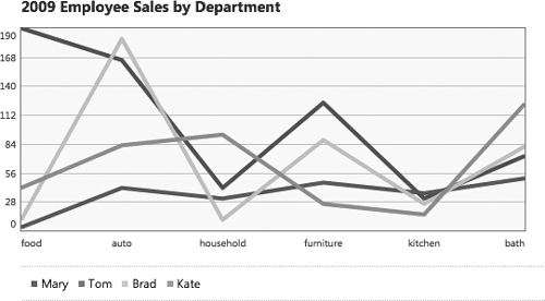
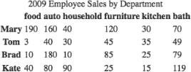
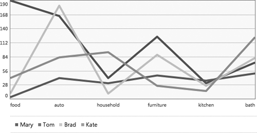
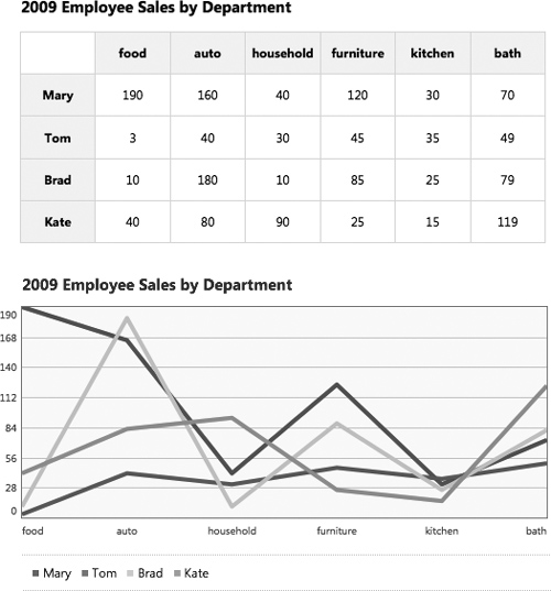
Let’s say we have a corporate dashboard that keeps track of employee sales performance data. We’d like to be able to show the sales data as a line chart so users can see how each person is selling in the various product categories, spot trends, and easily compare performance. We’d like the data chart to look something like this:
Figure 12-1 Sales performance target chart design
When we put the x-ray to our chart, the colors or the line weights in the image aren’t the important “bones” users need to see—it’s the data that matters. So instead of embedding an image of a chart into our page, we’ll start with a simple HTML table containing all our sales information:
Figure 12-2 Performance data in chart form
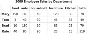
Because the table is coded with well-structured HTML, this data is accessible to anyone, including mobile devices, screen readers, and search engines.
Creating accessible charts takes a few more steps than some of the other widgets in this book, but still follows the same basic model: start with foundation markup that includes all relevant information a user needs in a fully accessible format; then apply the advanced CSS and JavaScript to transform that basic data into a visual image in the enhanced experience.
To create a chart from this table, we’ll parse the HTML table to extract all the data values, and use this data to create our chart in the browser using the canvas element. We’ll walk through the steps involved in generating a line chart from this table, and then, at the end of the chapter, we’ll discuss how to use our jQuery Visualize plugin, a full-featured charting script available on the book website.
Foundation markup
Before we can make a chart, we need a data source, so we’ll start by building an HTML table in our foundation markup.
The table contains retail sales data on four employees—Mary, Tom, Brad, and Kate—and their recent sales in various store departments—food, auto, household, furniture, kitchen, and bath.
Tables can have many child elements and attributes that add semantic value for both visual and non-visual users. We’ll make use of all the structure and meaning we can encode into the basic version of our page. Marked up, the table of sales data looks like this:
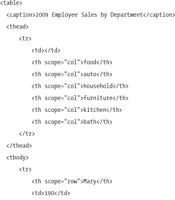
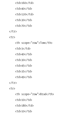
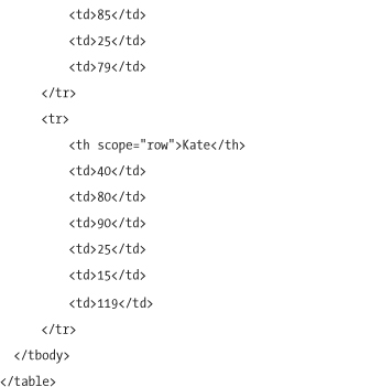
The table markup consists of three main sections: caption (a table-specific element that provides a short description of the tabular data to follow); thead (the top, horizontal header row of the table); and tbody (the rows containing the body of the table content). We mark up the first item in each column and row with the th element, denoting that the content serves as a heading for its column or row by applying a scope attribute with a value of either col or row, respectively. The scope attribute is recognized by newer screen readers, like the latest version of JAWS; however, support for this attribute is inconsistent across a wider range of screen readers. We find it’s still helpful to include for anyone who reads the markup, including screen readers and developers alike.
Note
For more complex tables, where headers and cells span multiple rows or columns, use the headers attribute to associate headers to their data cells. We describe how to use this attribute in Chapter 3, “Writing Meaningful Markup.” It’s also worth noting that the script described in this chapter would need to be modified to accommodate such a complex table structure.
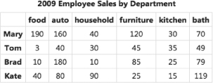
While it’s semantically rich, in most browsers the default appearance of a table element leaves much to be desired. In a newer browser like Firefox 3, tables don’t have borders or much cell padding, making it difficult to read the data.
Figure 12-3 Unstyled foundation table markup
To improve the legibility of the basic table, we’ll add some “safe” styles to the basic style sheet that are supported by most older and mobile browsers, and will safely degrade in browsers that don’t support them. First, we’ll collapse the borders of the table, leaving a single stroke between the cells, and apply light gray borders and some padding to the cells to make the rows easier to scan. The caption element also acts as a visual heading for the table, so we’ll bold the text and add bottom margin to make it stand out. We’ll also add a font-family stack to make the typeface look consistent with the rest of the site, but we’ll leave font sizes undefined to let each device use its defaults:
With these small style tweaks added to our basic CSS, the data table is now easier to read.
Figure 12-4 Foundation table markup with “safe” basic styles added
Creating an accessible chart
Creating a chart from the data table in our foundation markup takes a few steps: parse the data from the basic markup to make it usable for visualization; initialize the canvas element and write instructions to draw the image that represents the data values, legends, and labels within it; if keeping the data table on the page is desired, add enhanced styles to improve its presentation; and, lastly, add a couple of instructions and shortcuts to support accessibility.
Parsing the table data
Now that we have the HTML table set up and styled, we’ll use JavaScript to mine its information and structure it in a format that can be used to generate a chart that shows a comparison of each person’s sales by department.
First, we’ll create a JavaScript object called tableData to neatly hold all the information:
var tableData = {};
The tableData variable can be used as a namespace for additional variables, acting as a clean container for data parsed from the table. For example, we could add a property to this object by stating tableData.myNewProperty, and set that property’s value to whatever we like. In preparation for generating our line chart, we’ll gather the necessary data from the HTML table and store it in the tableData object.
For convenient referencing, we’ll also store our table element in a variable table:
var table = $('table'),
X-axis labels
The first property in the tableData object will be named xLabels. As the name suggests, it will contain values for the labels along the bottom x-axis that identify the data points charted above them.
For this graph, we’ll chart the “departments” data from left to right, so that the x-axis labels map to the top of the table in the thead.
Figure 12-5 X-axis labels are read from the table headers in THEAD.
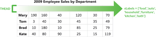
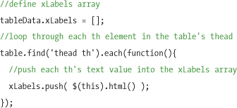
We’ll define xLabels as an empty array, and then use jQuery’s each method to loop through each th element in the thead and push its text value into the xLabels array:
Legend labels
The data from the left column of the table (employee names) will serve as the chart’s legend.
Figure 12-6 Chart legend labels are fetched from the THs in the table’s TBODY.
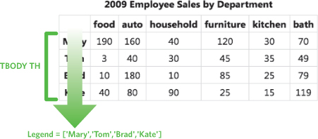
To capture that, we’ll add another property to the tableData object called legend:
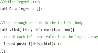
As you can see, the process of generating the legend array is very similar to the loop used to create the xLabels array, except that it references the th elements within tbody rather than in thead.
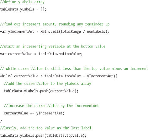
Y-axis labels
Next come the chart’s numeric y-axis labels, which we calculate by finding the highest and lowest values in the data set in the body of the table using the following logic:
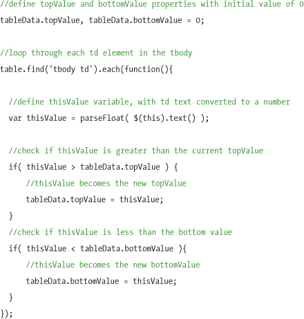
Figure 12-7 Y-axis is calculated by establishing the top and bottom data values.
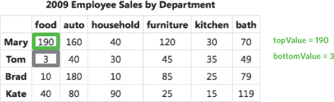
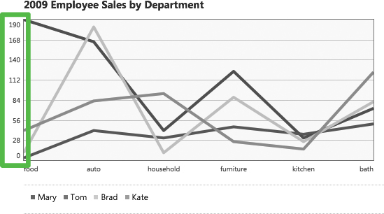
We’ve now defined two new values in our tableData object: topValue and bottomValue, for the highest and lowest data points, respectively. We’ll use these to calculate our y-axis labels. In this case, the y-axis for a bar or line chart will need to cover from 3 (bottomValue) to 190 (topValue), so the script will set the axis to 0–190 with as many tick marks between that will comfortably fit within the chart height.
Figure 12-8 Y-axis displayed on the line chart
To complete the information required to generate the y-axis labels, we’ll need to determine a few pieces of data:
• The height of the chart
• A preferred pixel distance between each of the labels on the y-axis
• The range between the lowest to the highest value in our data set
We’ll base the dimensions of our chart on the width and height of the table:
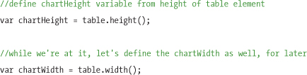
Then, we’ll figure out the number of labels that will display on the y-axis. We’ll divide the chartHeight by a number that represents the pixel distance between the labels. In this case, we’ll specify 30 pixels as our preferred label spacing, as that will create a comfortable distance given their font size. The rounded result gives us the number of labels that will be displayed on the y-axis:
//define chartHeight variable from
var numLabels = Math.round(chartHeight / 30);
Now that we know the number of labels to display, we’ll find the total range of our data set, and iterate through it to generate the value of each label. We’ll define the variable totalRange as the difference between the top and bottom values. In our sample data, totalRange will equal topValue; however, this calculation is still necessary because it ensures that data sets containing negative values will be properly represented in the total range:
//define totalRange variable as difference between top and bottom values
var totalRange = tableData.topValue - tableData.bottomValue;
Now that we have adequate data to generate our y-axis labels, we’ll define a new yLabels array and populate it with label values, spanning from the bottom value to the top value, and include as many values as we can fit in between (taking into account the chart’s height):
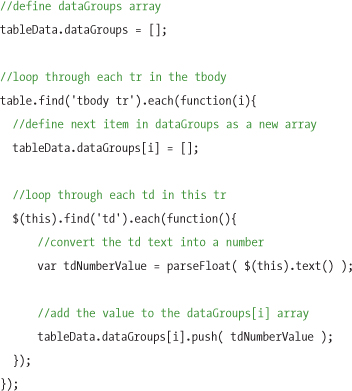
Data groups
The next property we’ll create is called dataGroups—a two-level array that aggregates the values from each table cell (td ), organized by columns or rows depending on the direction we choose to display the data in the chart. Here we’ll go from left to right, grouping the values by each containing tr row.
Figure 12-9 Data groups are created from parsing each row’s data values into an array.
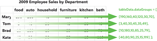
We’ll need to parse the table data to arrive at the array shown above. To do that, we’ll define the dataGroups array, and then loop through each row of the table, adding each row’s array of text values as an item in dataGroups:
We now have a programmatically generated array matching the content rows in the table, and can move on to the fun part: drawing the chart.
Using canvas to visualize data
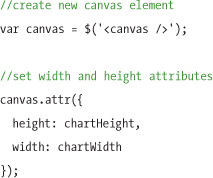
We have the necessary data to begin drawing a chart. The first step is to create the canvas element and set its width and height attributes using the chartHeight and chartWidth variables we created earlier based on the table’s dimensions:
Note
It’s important that we set the size of the canvas using HTML width and height attributes, rather than CSS. While it’s possible to use CSS to style the canvas element, the canvas drawing API corresponds only to the element’s width and height attributes.
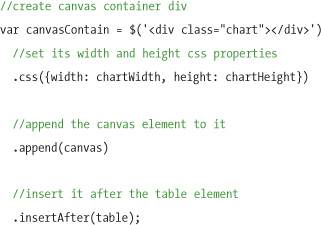
Now that we’ve created a blank canvas, we’ll append it to the page inside a wrapper div, which neatly contains the elements associated with the chart, including headings, captions, and axis labels. We’ll create this wrapper div, set its dimensions to match the canvas, inject the canvas into it, and then append it to the page just after the table:
Bringing IE up to speed
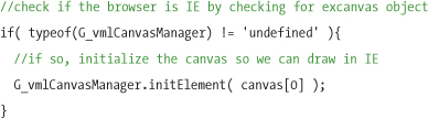
We’re almost ready to draw the chart. Before we do that, we’ll need to account for the fact that Internet Explorer (through version 8) doesn’t support the canvas element and its drawing API. For our charts to work in Internet Explorer, we’ll need a workaround. Fortunately, Google developed a library called exCanvas, which translates canvas commands into VML—a proprietary drawing language supported exclusively by Internet Explorer. To use exCanvas, we need to reference the excanvas.js script from the head of our page, before any other scripts that use canvas commands. We can reference the script using a conditional comment to make sure only IE sees and downloads the script:
<!--[if IE]><script src="excanvas.js"></script><![endif]-->
With exCanvas attached, we just need to initialize our canvas in IE by calling the G_vmlCanvasManager.initElement method. We’ll wrap this in an if statement that checks if exCanvas is defined, so that it’s applied only to the relevant browser (Internet Explorer):
Now we can start drawing our chart onto the canvas.
Drawing the chart lines
We’ll use the canvas 2D drawing API for our chart, so the first step is to call the getContext method to define the context of the canvas as 2D. We’ll save a variable, ctx, to store a reference to that context, which will be used to send drawing instructions to the canvas:
//define ctx var as our canvas 2d context object
var ctx = canvas[0].getContext('2d'),
We want the lines on the chart to be distinguishable from one another, so we’ll set up an array of hexadecimal color values. To keep things simple, we’ll call it colors:
var colors = ['#be1e2d', '#666699', '#92d5ea', '#ee8310'];
Note
When selecting colors to use in charts, choose ones that are distinguishable for the 5% of users (mostly male) who may have color blindness. Avoid picking red, green, and yellow hues that have the same value (level of darkness), and test your color choices in a color-blindness simulator such as Color Oracle (http://colororacle.cartography.ch).
Moving on to the lines: By default, the canvas drawing API orients its coordinates to start at the top-left corner and move down and right with positive values. In a chart, however, the coordinates start from the bottom-left corner and move right and up, so we need to reset the default starting point. We’ll use the canvas translate method to reset the y-axis value to the height of our canvas, again using the chartHeight variable:
ctx.translate( 0, chartHeight );
Now the starting point for drawing is in the bottom-left corner of the chart.
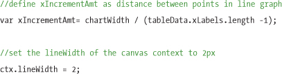
Earlier, we created a dataGroups property of the tableData object, which contains the data from the table, grouped by row. Now, we’ll use a for loop to iterate through the dataGroups array and plot lines on the chart. To prepare for running the loop, we’ll calculate the increment at which points should be plotted across the canvas, and divide its width by the number of points per line; we’ll store that quotient in a variable called xIncrementAmt. We’ll also define the width of the chart lines to 2 pixels using the lineWidth property:
With these variables defined, we’re ready to loop through the data array and actually draw the lines. We’ll start by moving the drawing tool to the first data point in the current group, using ctx.moveTo(0,-points[i]), and then match the line color to the item in the colors array that corresponds to this group using the iterating i variable. Next, we’ll press the drawing tool onto the canvas with the beginPath method, and run a loop through each point in the group, drawing a line from the previous point to the current one, incrementing the left offset by the amount of the xIncrementAmt variable.
After the loop is finished, the line is plotted. We’ll apply color and width to the line, and then close the path to end it (otherwise it would connect to the next line when the loop continues).
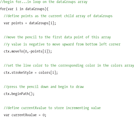
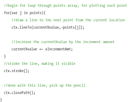
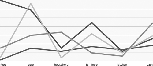
Figure 12-10 Canvas chart with a line plotted for each data set in a unique color

Adding axis lines and labels
The hard part is finished: our chart is drawn!
Next, we’ll add text labels to the axes so users can make sense of the charted lines. Earlier we created properties in the tableData object for xLabels and yLabels, and we’ll use them now to set labels along the axes of the chart.
From a technical standpoint, we could create these labels in several ways. Perhaps the cleanest way would be to write the text labels directly onto the canvas, using the native canvas text methods. Unfortunately, the canvas text methods aren’t supported as broadly as the canvas drawing methods, so canvas text won’t meet our needs.
Instead of writing the labels into the canvas, another valid approach is to add HTML markup for any text needed, and position it with CSS inside the chart div. For each set of labels, we’ll create an unordered list (ul), and loop through each property to append list items for each label. To style and position the labels, we’ll use a blend of external and inline CSS. As with any CSS layout, we’ll keep as much of the CSS in external style sheets as possible, but in the case of labels, which are dynamically positioned with JavaScript, it makes much more sense to set the coordinates inline than to attempt to guess their potential locations and apply classes. We’ll position the labels absolutely and set only the left or bottom values for each list item inline, depending on the axis.
We’ll use JavaScript to generate this list, iterating through the xLabels array and setting each list item’s left and width inline styles programmatically to divide them evenly along the x-axis. Our generated HTML for the x-axis labels looks like this:
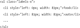
Figure 12-11 Chart with x-axis labels added

The y-axis labels are slightly more complicated, because the horizontal lines should span the graph at each label increment to make it easy to associate lines with their data points. We’ll use the following markup for the y-axis labels:
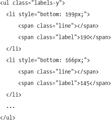
As you can see, the y-axis markup contains two spans per list item: one for a chart line and one for the text label. This time, we’re positioning the list items with bottom instead of left, so the items stack vertically from bottom to top.
The rest of the styling for the labels and lines can be handled through the following styles:
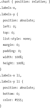
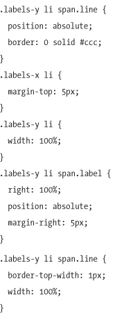
We set the dimensions of each label ul to 100% of the chart container div’s width and height so that we can position the list items around the chart easily using top, right, bottom, and left properties. We can then absolutely position the list items (and labels, in the y-axis), and set either their top or right values to 100%, depending on the axis.
We also set the width of the y-axis list items (as well as their child line spans) to 100%, so that we can add a top border to those spans to make lines that correspond to each label on the y-axis.
Figure 12-12 Chart with x- and y-axis labels and horizontal lines
Adding a color legend
Our line chart is almost complete: we need a legend to associate each line with an employee.
The legend will simply be another unordered list, where each item contains a span to serve as a color icon next to the employee’s name. We’ll loop through the legend array and generate a list using the following script (note that we’re referencing a parallel item in our colors array to obtain the appropriate color for each employee):
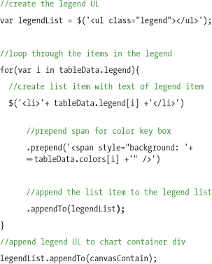
When the legend list is complete, we’ll append it to the canvasContain div.
Tip
The script above is structured to loop through and generate the complete unordered list before it injects anything into the page. While it’s also possible to create the unordered list and inject it to the page and then populate it, doing so will potentially cause browser performance problems, particularly for very large tables. Generating the complete list first ensures that the script acts quickly.
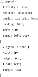
Now we’ll style the legend using CSS. We’ll keep it simple and position it below the chart in a flattened list format. The following CSS is all we need:
The styled legend now sits below the chart:
Figure 12-13 Chart legend with color-coded squares to identify each line
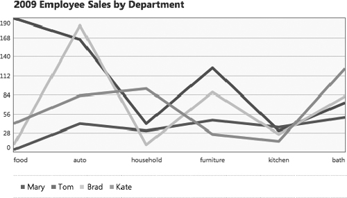
Adding a chart title
The last step in visualizing the table data is to copy and style the text from the table’s caption element to use as a title for the chart:
Then we’ll style the title to coordinate with the chart:
Our final canvas chart, with all styles applied:
Figure 12-14 Complete chart, including a title based on the table’s caption
Adding enhanced table styles
Though we have a fancy new chart, there may be cases where it makes sense to also keep the original table on the page—to provide additional numeric data for easy scanning, for example. In this case, we’ll add a few rules to the enhanced style sheet to improve its presentation.
Building on the styles we created for the foundation markup, we’ll style the caption element to be larger and bold, and add a very light gray background color to the table headers to help distinguish them from the table data cells.
Figure 12-15 Styled data table and final line chart both visible and stacked
Keeping the data accessible
As we mentioned early in this chapter, our page started out with an accessible data table, and since we’ve done nothing to prevent a user’s ability to access that table, our data remains accessible alongside its supplemental canvas chart. But now that we have both a table and a chart on the page, we might want to hide one or the other from view, perhaps to free up some space in the layout on a small screen, or simply to reduce redundancy on the page.
Hiding the table from view
A common approach to hiding the data table from view might be to either use the CSS property display: none; or to remove it from the page entirely using JavaScript. Unfortunately, and perhaps obviously, both of these techniques not only hide the content visually, but also hide it from screen-reader users, which effectively defeats the point of our table-generated approach—accessiblity.
Fortunately, there are other methods of hiding content that don’t affect accessibility. We recommend simply positioning the table absolutely and placing it far off the left edge of the page. This successfully hides it from visual users, yet preserves it in the document flow so that it’s accessible to screen readers:
table { position: absolute; left: -99999px; }
Hiding the chart from screen readers
The chart we generated serves a purely visual purpose, so it provides little value for visually impaired users; therefore, it would be helpful to hide this portion of the content from users with screen readers.
The W3C’s WAI-ARIA draft specification provides the role="img" attribute, which is perfect for just this purpose, because it informs a screen reader that the element is playing the role of an image.
Just like an image’s alt attribute, the img role can be paired with an aria-label attribute to describe the image in plain text. We’ll add these attributes to our chart wrapper div, which contains the canvas and other lists:
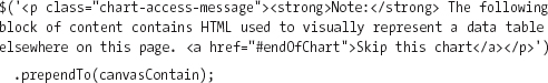
And these attributes could be easily added using jQuery:
Many screen-reader users are still using versions that don’t support ARIA very well, or even at all, so we’ll provide fallback text to alert these users that the content contained in the element is purely for visual purposes, and provide a link to allow the user to skip the element. This message will be contained within a div with an img role, so users on newer screen-reader versions will know that the div is purely visual, and they won’t see this message contained within it.
First, we’ll insert a paragraph element to the chart div that contains a message describing the visual nature of the content:
As you can see, we’ve added a “skip” link that references an element with an id attribute of endOfChart. For this skip link to work, we’ll create that corresponding element and append it to the end of the chart container. We’ll also set the element’s tabindex attribute to -1, which allows it to receive programmatic focus and prevent a bug in Internet Explorer that breaks jump scrolling:
$('<div id="endOfChart" tabindex="-1"/>').appendTo(canvasContain);
Now we’ll hide that message from visual users, because it’s relevant only to those browsing with screen readers:
With this quick addition to the chart styles and scripts, screen-reader users will now either recognize the chart as an image, or be warned of the visual-only content with a way to skip it.
Taking canvas charts further: the visualize.js plugin
We’ve extended the high-level ideas discussed in this chapter into a jQuery plugin called visualize. This plugin is more full-featured than the line chart example; it covers additional chart types like bar, area, and pie; includes two visual theme styles (the light white background style as shown, and an additional dark chart theme shown in the charts to follow); and is constructed with a clear API for generating charts with plenty of configuration options like width, height, colors, parse direction, and a lot more. You can use it to generate the chart described in this chapter by simply linking to the jQuery library and the plugin script and calling the visualize method on any table in the page.
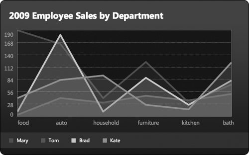
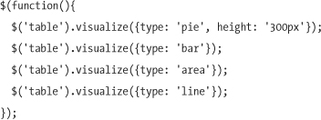
To call the visualize.js plugin on a table, set the chart type to line, area, bar, or pie. If you don’t specify a chart type, a line chart will be created by default.
$('table').visualize({type: 'line'});
Figure 12-16 Line chart created from the visualize.js plugin
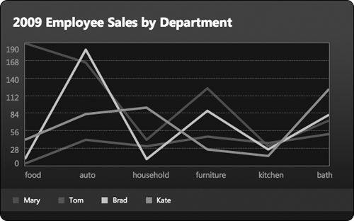
To create an area chart with semi-transparent filled areas under each line, simply pass in the area chart type:
$('table').visualize({type: 'area'});
Figure 12-17 Area chart created from the visualize.js plugin
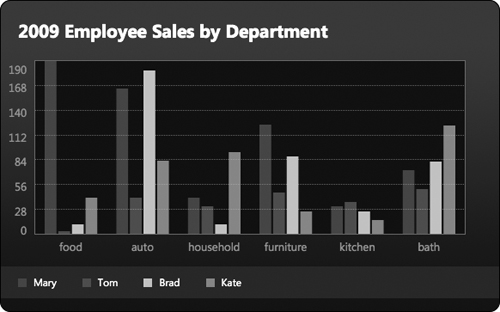
For a bar chart, pass in the bar chart type:
$('table').visualize({type: 'bar'});
Figure 12-18 Bar chart created from the visualize.js plugin
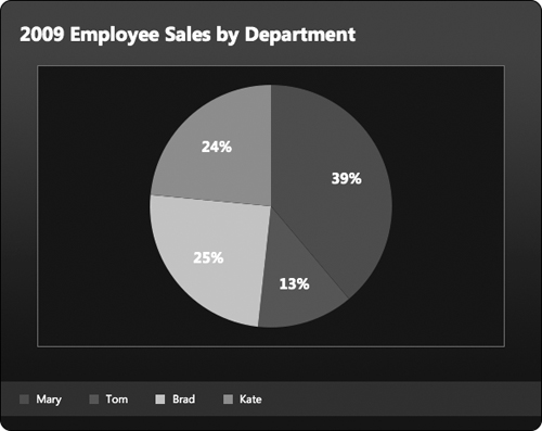
As you might expect, you can also summarize data into a pie chart by specifying the pie chart type. Pie charts created with visualize.js automatically constrain their dimensions to fit within the rectangular canvas. This size works well for bars and lines, but feels restrictive for the round pie; we can give it extra space by passing in an optional height argument to make the canvas a bit taller and let the pie scale:
$('table').visualize({type: 'pie', height: '300px'});
Figure 12-19 Pie chart created from the visualize.js plugin
The visualize method returns a new chart container div and automatically inserts it on the page just after the table. To display multiple visualizations of a single table, just call visualize multiple times:
Note
The visualize.js plugin referenced in this section is available for download at www.filamentgroup.com/dwpe. For more information on how to use the visualize.js plugin, read our article at www.filamentgroup.com/lab/jquery_visualize_plugin_accessible_charts_graphs_from_tables_html5_canvas.
The canvas element provides a rich API with robust drawing capabilities, compatibility with a wide range of browsers and devices, and the added benefit of allowing you to use data from within the page, which maximizes accessibility. There are just a few things to keep in mind when using canvas in your own work:
• Start with a well-structured, semantic data table that encodes as much meaning as possible.
• When referencing the canvas, also remember to reference the exCanvas library, to ensure that Internet Explorer users will see your charts.
• Set the canvas size with HTML width and height attributes—don’t rely on CSS to set dimensions.
• If your chart coordinates need to start at the bottom (as ours did) rather than the native canvas top-left, use the translate method to set the context.
• If you choose to hide the data table from sighted users, do so in a way that preserves it in the source for screen readers and search engines.
• As a service to screen-reader users, provide a “skip” link so they may move quickly past the chart markup and on to more meaningful data in the page.