
Chapter Thirteen. Dialogs and Overlays
Dialogs and overlays present content that appears to float over the page. Dialogs usually offer richer interactive content like embedded form elements, buttons, and links, and require a decision or input from the user; overlays typically present read-only content. The wide range of uses for dialogs and overlays include:
• Presenting system error messages and confirmations that require user interaction to dismiss
• Collecting user input in a form or multi-step wizard
• Displaying large version of a photo in a “lightbox” when a thumbnail image is clicked on the page
• Creating floating palettes and UI inspector windows in a web application, like a document editor
• Opening a “sticky” tooltip or mini-overlay to offer content and functionality in a compact format
Both dialogs and overlays can adopt two broad interaction patterns: modal and non-modal:
• A modal dialog or overlay prevents any interaction with the underlying page while it’s open, which focuses and constrains the user to completing the current interaction. To make this relationship clear, many designs call for a semi-transparent layer—either dark or light—between the dialog and page body to make the page look temporarily disabled and help the overlay stand out visually. Modal dialogs and overlays are useful for confirming user interactions, providing important error or system messages, collecting user input with a form, or simply focusing attention on specific content.
• A non-modal dialog or overlay allows a user to continue to interact with the base page while it’s open. It’s useful for situations where the dialog’s content updates the page dynamically based on the user’s interaction with it, like a floating color palette, Help content pane, search box, or chat window.
Dialogs and overlays can have fixed size and placement, or can be developed to be moveable and resizable to help them feel like tool palettes or application windows on a desktop PC. Both are relatively easy to build with modern web technologies, but they can present issues for screen readers if accessibility features like keyboard access, focus management, and ARIA attributes aren’t built in. It’s also important to consider how to make the content and functionality available to users in the basic experience, especially when Ajax is used to pull the overlay content into the enhanced page.
In this chapter, we’ll discuss how to build accessible dialogs and overlays with a progressive enhancement approach. We’ll focus specifically on a dialog, because it includes all the complexity you’d need to address in a simpler overlay; our example will use Ajax to update dialog content to highlight the specific techniques that need to be addressed for this more complex scenario.
X-ray perspective
Our target design is a common case in which dialogs are employed: a site with login and registration links in the global header that open mini forms over the page to keep the user in their place on the site. For the purposes of this discussion, we’ll focus on the login form, but the registration form would use the same principles and coding approach.
Figure 13-1 Target design for the login modal dialog
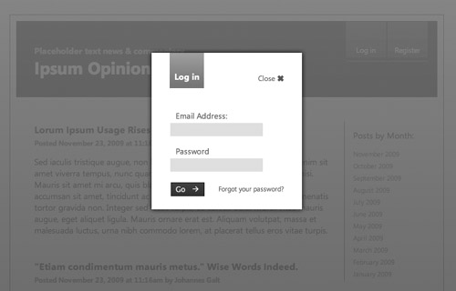
Looking at the login dialog design from an x-ray perspective, we clearly see that the dialog is modal, and a fixed size. Within it, the form fields can be easily coded as a simple HTML form that will work on any device. The big question is: where should the form code be included in the markup?
We have two options: either add the login form to the foundation markup in every page on the site, or link to a separate login page.
If we include the login form in the foundation markup, the login link at the top would be an internal anchor link that, when clicked, would scroll the user to the form block on the page. The upside of this approach is that the content is immediately available and fully accessible. The downside is that this form markup needs to be included on every page of the site, adding page weight and visual clutter in the basic experience, especially if both the login and registration forms are included.
The other option is to create a separate HTML page for the login form and link to that page in the foundation markup. This keeps the page weight and visual clutter to a minimum in the basic experience.
Either approach is valid. The choice will depend on the importance and frequency of use of the dialog for the site in question, and markup size of the content in each dialog. In this situation we want to keep our pages as lightweight as possible, so we’ll use the separate linked page approach.
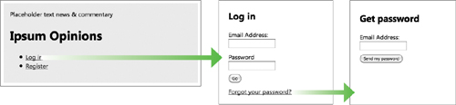
In the basic experience, the Login link in the global header will navigate the user to a separate login page. If the user clicks the “forgot your password?” link from this login page, they navigate to a separate password retrieval page. If the user doesn’t fill out either form correctly, the server reloads the form with the incorrect fields highlighted and a corresponding error message. Once either form is completed successfully, the user returns to the page he was on, and the header will update to reflect their login status. These individual linked pages will be fully accessible and navigable with the keyboard—as long as we use semantic HTML markup for our links and forms.
Figure 13-2 Multiple linked pages of the basic experience login sequence
All the server-generated pages and logic required for the basic experience will be reused in the enhanced experience.
There is no native dialog HTML element; the enhanced experience will use a div as the container for the form content, and use Ajax to load and display it in a dialog:
Figure 13-3 The enhanced experience brings the login sequence into the dialog using Ajax.
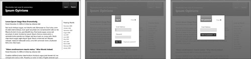
We will need to add ARIA attributes to the container div to tell screen readers that it’s playing the role of a dialog. We also need to use JavaScript to programmatically move the tab focus into the body of the dialog to ensure that it’s usable and accessible without a mouse.
Creating the dialog
Now that we have an approach outlined for our login dialog, we can write the foundation markup for the basic screens, and the enhanced styles and scripts to create the enhanced modal dialog presentation.
Foundation markup and style
Our foundation markup consists of two components: a standard anchor link in the base page that points to the login.html page that contains our login form:
<a href="login.html" id="option-login">Log in</a>
...and a fully formed HTML page, login.html, that contains the site’s global navigation elements and all login form content.
In the enhanced experience, we’ll need only a subset of the login.html page markup—just the part that contains the title and form. We’ll request the full page using Ajax, and filter its contents to the portion of content that we want to appear in the enhanced dialog.
To prepare that subset of content for the Ajax request, we’ll wrap it in a div container with an id of login, and create a heading describing the page content, a login form with pairs of labels and text inputs, and a Go button to submit the form data. After the form elements, a “forgot your password?” link points to a separate password-retrieval page:

The form’s foundation markup is fully functional without any CSS applied, but it looks a bit clunky with the labels, inputs, button, and links all running together on one line.
Figure 13-4 Unstyled foundation markup in login.html

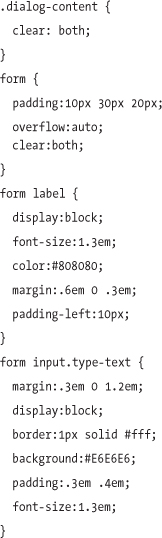
To remedy this, we’ll add a few safe styles to the basic style sheet to set a default font for the page, and set the label and input elements to display:block so they sit on separate lines. The input elements are styled with 1em of bottom margin to provide more vertical spacing between the form fields:
These simple, safe CSS rules make our form much clearer and easier to read in the basic experience:
Figure 13-5 Foundation markup with safe styles applied

Enhanced markup and style
In the enhanced experience, we want users to focus on and complete the login action, and don’t want to support simultaneous interaction with the base page. To accomplish this, we need to create markup for two separate components: the semi-transparent screen that covers the base page content and disables its functionality; and the dialog container that floats over it and presents the form content.
To accomplish the modal screen effect, the enhancement script needs to inject two elements into the enhanced markup at the end of the body element: a div that will receive the background color and opacity shift, and an iframe nested inside it to apply the protective behavior that keeps users from interacting with the page below. The iframe’s src must be set to avoid security warnings in some browsers, so we’ll set it to javascript:false; which acts as a null value, preventing it from making an unnecessary HTTP request:
<div class="modal-screen"><iframe src="javascript:false;"></iframe></div>
The div is styled with height and width of 100% to fill dimensions of the screen, a dark gray gradient background image, opacity of 90% to allow the page content to subtly show through the layer in browsers that support CSS opacity, and a high z-index value to ensure it stacks in front of other elements on the page that have z-index properties set:

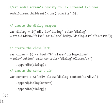
The iframe inside this div is used as a workaround for z-index (i.e., CSS stacking order) issues in some browsers that cause them to incorrectly display page elements—including select menus and elements with scrollbars—in front of the screen layer and dialog, regardless of the z-index stacking order set in the style sheet. The iframe will consistently and reliably stack above every element in the page, so it acts as a protective layer for the modal screen and dialog. We’ll set it to 100% height and width to fill the dimensions of the modal screen div, and with opacity set to 0 (we’ll reinforce this property with JavaScript so that it works in Internet Explorer 6, which doesn’t natively support the opacity CSS property). Even though it’s transparent, it will still prevent any z-index issues from occurring.

To complete the screen effect, the script will add a class to the body element when the dialog is present to remove any scrollbars on the browser window, preventing the user from being able to scroll the dialog out of view:
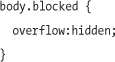
Figure 13-6 Modal screen covering the entire page content

Now that the modal screen’s markup and styles are roughed out, we can move on to the dialog code. First, we’ll add a role of application to the body element so that screen readers will properly recognize the dialog widget and allow us to define custom keyboard behavior:
<body role="application">
To create a container for the dialog, the enhancement script will generate a div with an ID of dialog:
<div id="dialog"></div>
For accessibility support, we’ll add an ARIA role attribute of dialog to the div to tell screen readers that it is acting as a dialog UI widget instead of a standard div. We’ll also assign a unique id to the div, which will be referenced by the Close link, and an aria-hidden attribute set to false, to tell screen readers that the dialog is currently visible:
<div id="dialog" role="dialog" aria-hidden="false"></div>
The enhancement script will load the full login.html page with Ajax, find the contents of the login form content div (#login) in the basic page, and add this block of markup into the dialog div:
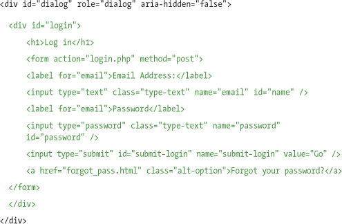
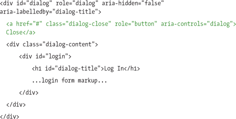
To allow for styling consistency, the script will wrap a container div with a class of dialog-content around all the dialog content:

The ARIA specification stipulates that when using the role of dialog, the markup should add the aria-labelledby attribute to point to the id of an element acting as the label for the dialog. To support this, the enhancement script will assign an id of dialog-title to the h1 element within the dialog content for this attribute to reference. With this connection in place, a screen reader will know the “Log in” heading describes the dialog’s purpose, and may speak “Log in dialog” when the dialog appears.

Note
If there isn’t a descriptive element like a heading already in the markup that can be associated, the aria-label attribute can be used to title the dialog for a screen reader.
The enhancement script will append a link after the heading element that will have behavior attached to close the dialog when clicked. We can tell screen readers that this link is acting as a Close button that controls the dialog by assigning the ARIA attribute aria-controls to reference the ID of the dialog div and adding the role=button attribute to this link:
The enhanced CSS for the dialog div will set it to a fixed width and absolutely position it in the center of the screen. We’ll do this by setting a 50% left value, offset by a negative left margin equal to half the dialog’s width (e.g., 125px). We’ll add a drop shadow effect in modern browsers that support the CSS3 box shadow property, and a z-index to position it in front of the modal overlay:

The title and Close button are both floated left so they sit side by side. The title has a background gradient image and a few rules to set a comfortable margin and padding on the text. The Close link has an “x” icon added as a background image to the left of the text and a rule to add an underline on hover:
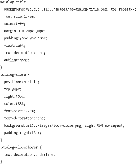
The div wrapped around the dialog content clears the title and the Close link’s floats so it always sits below them. The styles for the form element set basic font formatting, spacing, and colors for the labels, text inputs, and Submit button:
The :focus pseudo-class allows us to specify a darker stroke color when the user focuses into the text input. Some browsers will add additional visual feedback for a focused element—for example, a blue glow in Apple’s Safari. Although this can be overridden by setting the outline CSS property on the input, we recommend letting each browser handle outline focus styling in their internally consistent way, if possible:

Figure 13-7 Styled login form markup for the enhanced experience

Enhanced dialog script
Now that we’ve created our foundation markup and planned the enhanced markup and styles for the dialog, we’ll write the JavaScript that will generate the dialog markup and assign behavior in browsers that pass the capabilities test.
We’ll start by adding the role of application to the body element:
$('body').attr('role','application'),
Whenever the Login link is clicked in the enhanced experience, it will open the login dialog. To do this, we’ll start by binding a click event to the link:

Generating the enhanced markup from Ajax
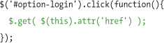
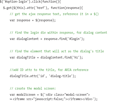
Once the link is clicked, the script will request the dialog content from the web server using Ajax. We’ll use the jQuery $.get utility method to load the page with Ajax by passing the login link’s href attribute as the URL we’d like to request:
The $.get Ajax utility provides a callback function that will execute when the server response returns the login.html page. This response (provided in the response variable below) is the full text of the HTML page source, so we’ll need to search within it to find the specific markup we need for the dialog. From the full Ajax response, the dialogContent variable references the login div element in the login page:

Now that we have the content, our script can generate the dialog according to the enhanced markup template we planned earlier:
At this stage, the script has pulled in the full login page with Ajax, parsed out the relevant content needed for the form, and assembled the full enhanced markup for the overlay screen and dialog, so it’s ready to apply events to the dialog markup.
Applying behavior to the enhanced markup
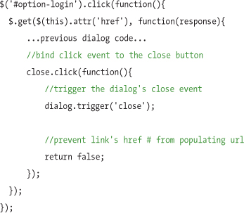
For the script to apply events to the dialog markup, first a custom close event is created that lists everything that must happen when the dialog closes: removing the modal screen, dialog markup, and the blocked class from the body that prevents the window from scrolling. This event can be triggered from a range of situations: clicking the Close button, pressing the Esc key, or successfully logging in. For context and clarity, the rest of the code examples will collapse a portion of their previous code in ellipses.

We’ll trigger the close event when the Close link is clicked, and return the click event false to prevent the URL hash from updating with the link’s href value:
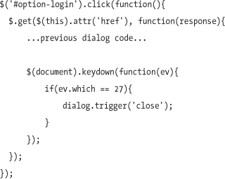
The close event will also be triggered any time the user presses the Esc key by looking for the keydown event for that key’s keyCode (27):
Appending and showing the dialog
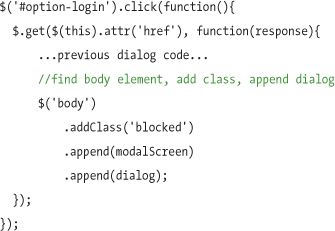
Now that the dialog markup is generated and events are bound, the enhancement script will add the class of blocked to the body element to prevent it from scrolling, and inject the completed dialog widget into the page to make it visible:
Managing focus
Managing keyboard focus to optimize navigation and accessibility is a crucial step in building a dialog that is fast and efficient to use. The ARIA spec recommends directing cursor focus into the dialog so the user can start interacting with the content within; otherwise the dialog would open but the focus would remain on the page below, which would be very confusing.
In our login form, even though the Close link is technically the first focusable element inside the dialog, the first text input is the most useful element to receive focus when the dialog opens, so users can immediately start entering their email address. We’ll direct focus there by using jQuery to find the first input inside dialogContent:

Once focus is placed in the first text input, the user can use the Tab key to navigate to the next password input, the submit button, and finally, the “forgot your password” link.
Pressing the Tab key one more time will natively move focus out of the dialog and onto the next focusable item in the source order of the page beneath it. This would be confusing for a user, because the dialog is designed to be modal. The script will programmatically constrain focus within the dialog, starting with the Close link, and then moving on to the form fields. We’ll apply this constraint by binding a focus event to the entire document that triggers whenever a change in focus occurs; when that change happens, the script checks if the newly focused element is outside of the dialog div, and if so, sends focus back to the first focusable element in the dialog:

Taking dialog further
The summary above covers all markup, style, and script cases to create a single fixed-size modal dialog, but there are a host of other dialog and overlay features and scenarios you may want to implement, including non-modal dialogs to provide tool palettes, simple overlays like photo slideshows that display images, and resizable helper text overlays to show supplementary content over a page.
The jQuery UI dialog plugin includes an expanded feature set for these dialog and overlay cases—including modal and non-modal capabilities, resizing, dragging, and placement, as well as the ability to support multiple dialogs on a page at one time—and also factors in ARIA support. In addition, jQuery UI dialog can be styled with the ThemeRoller tool. You can access the jQuery UI dialog plugin demo and documentation at jqueryui.com/demos/dialog, and download the dialog plugin at jqueryui.com/download.
Using the dialog script
The demo and code that accompanies this book (available on the book website, www.filamentgroup.com/dwpe) includes a script, jQuery.dialog.js, that wraps the techniques to create a single modal dialog as presented in this chapter into a convenient jQuery plugin for use in your projects.
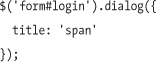
To use this script in your page, download and reference the files listed in the dialog example page. Then, simply find an element on the page (or even a string of HTML wrapped in a jQuery function) and call the dialog method on it. For example, let’s assume there’s a form on the page with an id of login. To display that form in a dialog, find it with a jQuery selector and call the dialog method on it:
$('form#login').dialog();
The dialog method will automatically generate a dialog wrapper for the content that includes all the markup and behavior specified in this chapter, such as the modal protector screen, and a Close link. When called, it will first close any existing dialogs on the page, ensuring only one dialog is visible at a time. The dialog method also includes configurable options for title, buttons, and focus, which are passed as an object containing key/value pairs.
The title option is used for specifying a particular element within the dialog to serve as the title for screen-reader users, and the plugin will automatically apply an id of dialog-title to this element. The title option accepts a jQuery selector as its value, and if no title option is specified, the plugin will default to the first occurrence of the following elements: h1, h2, h3, h4, h5, h6, legend, label, and p. For example, the following code sets the title option to the first span element within the dialog’s content area:
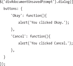
The buttons option allows you to generate buttons that will be appended to the bottom of the dialog. This is helpful in situations when the dialog is acting as a prompt that the user must either confirm or cancel. The buttons option accepts its own object of key/value pairs, generates button elements for each pair, and appends them to a div with a class of dialog-footer, which is placed at the end of the dialog markup. Within the key/value pairs, the key serves as the HTML text within the button itself, and its value serves as a function that will execute when that button is clicked. For example, the following script generates a dialog with two buttons, each triggering a different alert when clicked:
The focus option lets you specify a particular element that should receive focus when the dialog opens. By default, the plugin will attempt to focus on the first natively focusable element (such as an anchor, a form element, or anything with a tabindex attribute) in the dialog content div; if it doesn’t find any, it falls back to any buttons generated by the buttons option, and then to the dialog’s Close link as a last resort. You can override the focus option by specifying a jQuery selector to a specific element within the dialog. This might be useful in cases like a confirmation prompt, where you may want to direct focus to the Okay button, regardless of the content in the dialog:

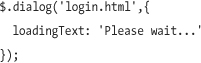
The dialog plugin also comes with a utility function (with the same name as the dialog method) that’s designed to create dialogs from external content. The dialog utility function requires a URL argument that specifies the location of the dialog content. For example, the following script will create a dialog with the content of the page login.html:
$.dialog('login.html'),
The dialog will open immediately, displaying a “loading...” message while the Ajax request is made. Once the request returns, the dialog will rebuild itself using the content of login.html and any configuration specified in the options argument. The loading message can be configured by passing any string of text to the loadingText option, via the options argument:
Assuming login.html is a full web page, including html, head, and body elements, as well as references to JavaScript and CSS files, you’d probably want only a subset of that page’s content to appear in the dialog. The dialog utility function makes this simple: just add a space after the URL path and include any jQuery selectors you’d like. For example, the following script will create a dialog from the content of a div with an id of login on the page login.html:
$.dialog('login.html #login'),
This approach could be used to easily produce the example described in this chapter, by binding a click event to the Login link that generates a dialog based on the page referenced in the link’s href attribute:
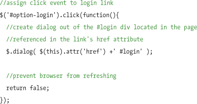
The dialog utility plugin also accepts an options argument that accepts any of the configurable dialog options specified above (e.g., title, buttons, focus), as well as an additional option, complete. The complete option accepts a callback function that executes after the Ajax response returns and the dialog is populated with its content. By passing a variable argument to the complete function, you can reference the Ajax response’s HTML, which can be used for further modification, such as adding events to the markup contained in the dialog. The following example extends the previous script by specifying a complete callback function that digs into the response content to find the “forgot your password” link, and binds a click event to request its content in a new dialog:

Creating accessible dialogs and overlays is pretty easy, as long as you remember to include the appropriate ARIA attributes, and manage focus to ensure proper keyboard support. The same basic coding principles illustrated here can be used to build a wide range of different widgets, from photo lightbox overlays to draggable and resizable panels, inspectors, and palettes.