In the previous chapter, we looked at the standard controls in the CocoaTouch UIKit. In this chapter, we're going to continue our journey through the UIKit control ecosystem and look at controls whose job it is to manage content, be it other views or controllers. Specifically, in this chapter we're going to cover the following controls:
We've already used some of these in the example applications, or at least talked about them in examples. In this chapter, we're going to dig into each one of them in more detail, examine their capabilities, and explore how to work with them.
You can find all of the examples in this chapter in the Example_ContentControls companion application and code to see these explorations in action.
The UINavigationController is the easiest way to handle navigation between hierarchical screens in iOS, because it manages the complexity of navigation, breadcrumbing, and display for you. You simply create a new UINavigationController and then push a UIViewController onto it using the PushViewController method. The first one you create is known as the root view controller. When you push a view controller onto a navigation controller, the navigation controller automatically displays the controller's view. To add a new controller, you just call PushViewController again. When you push a second view controller onto the stack, the navigation controller automatically adds a Back button, which will pop that controller off the view stack when that button is clicked. You can also manually pop a controller off the stack by calling the PopViewController method, although in practice, that's rarely used.
Generally, the Navigation Controller is used to display screens that contain hierarchical data. For example, in the Settings Application, the navigation controller is used to drill down through settings, as shown in Figure 8-1.

As you push view controllers onto the navigation stack, their title appears in the navigation bar and a Back button appears with the title of the previous controller. When a user clicks the Back button, the current screen is popped off the stack, which shows the previous screen. It encapsulates all the controls and logic needed to handle all this for you.
Unlike other controllers, it's not meant to be subclassed, but rather you can set properties and call methods on it to modify its behavior and appearance.
Unfortunately, this means that it's not extremely customizable, presumably because Apple wants to control the navigation experience and make it consistent across applications.
Before we get into using and customizing the navigation controller, let's first examine the different parts of it.
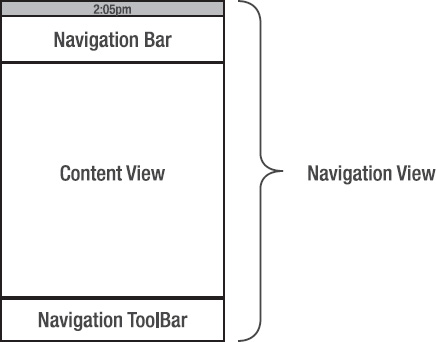
The navigation controller consists of four main components:
Navigation view: This is the entire view presented by the navigation controller and contains all other controls and views. The navigation view is available via the
Viewproperty on the navigation controller, and is what you add to your window or other parent when you want to actually display the navigation controller.Navigation bar: The navigation bar is the area at the top of the navigation view that displays any navigation items, such as the Back button, the current controller title, and, optionally, a button on the right. Displaying the navigation bar is optional, and it's very common to hide it when displaying the root view controller, and then animate it into view when the first subcontroller is pushed onto the navigation stack.
Navigation toolbar: The navigation toolbar appears at the bottom of the navigation view and provides a controller-specific set of toolbar items that are relevant for the current controller that's displayed on the stack. The navigation toolbar isn't displayed by default.
Content view: The content view is the main area of the navigation view. It's where the top controller on the view stack's view is displayed.
Figure 8-2 illustrates the relationship between these components.
You can create a navigation controller in Interface Builder, but because it's so simple, and there's very little you can customize in Interface Builder on it, it's far easier to create it in code. The basic pattern for using a navigation controller is as follows:
Instantiate it.
Push the root View Controller onto it.
Add its
Viewto the window or other parent controller (such as a Tab Bar).
Listing 8-1 (from the AppDelegate class in the Example_StandardControls companion code) does just that.
Example 8.1. Creating a navigation controller on the window
...
this._mainNavController = new UINavigationController ();
...
this._mainNavController.PushViewController (this._iPhoneHome, false);
...
this._window.AddSubview (this._mainNavController.View);
When you add view controllers to a navigation controller, you can get a reference to the navigation controller (to push more controllers onto, or to modify it) via the NavigationController property on the UIViewController that has been pushed on it. For example, Listing 8-2 is in a custom view controller that sets the transparency of the navigation bar.
Example 8.2. Accessing the navigation controller from a view controller that is on its stack
this.NavigationController.NavigationBar.Translucent = true;
When designing screens in Interface Builder that are meant to be used in a navigation controller, you can simulate the navigation controller so you get a more accurate idea of the screen size that your view will have by setting the Simulated User Interface Elements settings, as shown in Figure 8-3.

After you change these settings, you'll see the appropriate element simulated in the designer window, shown in Figure 8-4.

Because it's simulated, it only gives you a blank area of the appropriate size.
The navigation controller allows you to modify a few things on the navigation bar, including the following:
Title text
Navigation bar style
Navigation bar color
Transparency of the navigation bar
Right button
By default, the title text comes from the Title property of the UIViewController that is topmost on the view stack (the currently displayed one). However, you can also set it directly via the Title property on the navigation controller's NavigationItem. See Listing 8-3.
Setting it directly is useful when you want it to differ from title text that appears elsewhere, such as when you're using the tab bar controller, which we'll explore later.
The navigation bar itself can be set to one of two styles, Default, or Black, which are included in the UIBarStyle enumeration. See Figure 8-4.
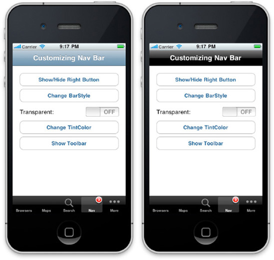
Default gives the bar and its buttons a gray-blue theme, and Black gives the bar and its buttons a black/dark-gray theme. To set the style, set the BarStyle property of the navigation bar to a value from the UIBarStyle enumeration (see Listing 8-4).
In addition to the two color choices in the BarStyle property, you can set the navigation bar to use a specific color via the TintColorProperty. See Figure 8-6.

For example, Listing 8-5 sets the bar tint color to be red.
Example 8.5. Setting the navigation bar tint to red
this.NavigationController.NavigationBar.TintColor = UIColor.Red;
To reset the color back to the default, simply set the TintColor property to null.
You can specify the navigation bar to take on a partially transparent quality by setting the Translucent property to true (see Listing 8-6).
Example 8.6. Making the navigation bar translucent
this.NavigationController.NavigationBar.Translucent = true;
However, when you do this, the content view area of the navigation controller is enlarged to also include the top bar area; so if you have any controls at the top of the view, they will appear behind the top bar! To account for this, make sure to leave extra room at the top of your view. If you're designing your view in Interface Builder, you can set the Top Bar property of the Simulated User Interface Elements section to Translucent Black Navigation Bar to see what this looks like.
In addition to the Back button and the title on the navigation bar, you can add a custom button to the right-hand portion of the bar. This is especially useful if you want to add an Edit button or the like. To set the button, call the SetRightBarButtonItem on the navigation item and pass in a UIBarButtonItem, and determine whether you want it to animate on or off (via a fade). You can either use a custom UIBarButtonItem, or you can use one of the built-in ones via the UIBarButtonSystemItem enumeration as shown in Listing 8-7.
Example 8.7. Adding a button to the navigation bar
this.NavigationItem.SetRightBarButtonItem(
        new UIBarButtonItem(UIBarButtonSystemItem.Action, null), true);
To remove the button, call the method again, but pass in a null for the button (see Figure 8-8).
The navigation controller can optionally show a toolbar at the bottom of view. The toolbar works exactly the same way the regular toolbar does, as described in the last chapter. The only difference is that the navigation controller gets its toolbar items from the toolbar items collection on the current view controller that is displayed. For example, Listing 8-9 crates the toolbar items collection on a custom UIViewController.
Example 8.9. Creating a toolbar items collection on a UIViewController for use in a navigation controller's toolbar
this.SetToolbarItems( new UIBarButtonItem[] {
        new UIBarButtonItem(UIBarButtonSystemItem.Refresh)
        , new UIBarButtonItem(UIBarButtonSystemItem.FlexibleSpace) { Width = 50 }
        , new UIBarButtonItem(UIBarButtonSystemItem.Pause)
}, false);
You can then show the toolbar by setting the ToolbarHidden property on the navigation controller to false, and it will show the items (see Listing 8-10).
The navigation controller works great for hierarchal navigation across screens, but sometimes you want to split your application into different areas. The UITabBarController is designed to do just that. It allows you to separate your application into different areas and navigate between them. You can even combine the use of the tab bar controller with the navigation controller and you can have different tabs control different groups of hierarchal screens.
The tab bar controller resides at the bottom of the device, and displays a set of tabs that you define. See Figure 8-7.

It also provides functionality for reordering the tabs. See Figure 8-8.

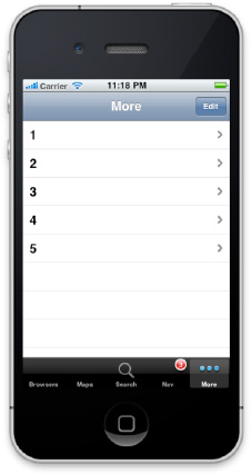
You can have up to five items on the tab bar at any one time. If you add more, it puts a More tab on the tab bar and, when you click it, you get a navigation table with the other tabs. See Figure 8-9.
Using the tab bar controller is very straightforward. You simply subclass it, set its ViewControllers property with an array of view controllers, and then add its view to a window. You do not manage the tabs directly; instead, you set the TabBarItem properties on each of your controllers that are associated with the tab bar controller, and the tab bar controller picks up those items and displays them.
As with the navigation controller, it's much easier to use programmatically rather than in Interface Builder. In fact, for a variety of reasons, Apple encourages you to use it programmatically.
To create a custom tab bar controller, define a new class that inherits from UITabBarController, then override the ViewDidLoad method, instantiate your controllers, and add them to the class via the UITabBarController's ViewControllers property. For example, Listing 8-11 is a custom tab bar controller that has two tabs: one contains a navigation controller, and the second tab contains just a custom view controller screen.
Example 8.11. A custom tab bar controller
public class MyTabBarController : UITabBarController
{
        //---- screens
        UINavigationController _browsersTabNavController;
        Browsers.BrowsersHome _browsersHome;
        Search.SearchScreen _searchScreen;

        public override void ViewDidLoad ()
        {
                base.ViewDidLoad ();

                //---- browsers tab
                // in this case, we create a navigation controller and then add our
                // screen to that
                this._browsersTabNavController = new UINavigationController();
                this._browsersTabNavController.TabBarItem = new UITabBarItem();
                this._browsersTabNavController.TabBarItem.Title = "Browsers";
                this._browsersHome = new Browsers.BrowsersHome();
                this._browsersTabNavController.PushViewController(this._browsersHome,
                        false);

                //---- search
                this._searchScreen = new Search.SearchScreen();
                this._searchScreen.TabBarItem = new
                    UITabBarItem(UITabBarSystemItem.Search, 1);
                //---- create our array of controllers
                var viewControllers = new UIViewController[] {
                        this._browsersTabNavController,
                        this._searchScreen,
                };

                //---- attach the view controllers
                this.ViewControllers = viewControllers;
//---- set our selected item
this.SelectedViewController = this._browsersTabNavController;
}
}When using a navigation controller with a tab controller (as with the first tab item we just looked at), the navigation controller should always be a child of the tab bar controller.
The tab bar picks up the tab bar item information from each controller you add to it via the TabBarItem property. When creating tab bar items, you can create them from built-in system items, or you can create them from scratch, specifying the title text and the image. You can find the available system items in the UITabBarSystemItem enumeration.
Once you've defined your custom tab bar controller, using it is very easy. Simply instantiate it and then add its view to your window or view, just as you would if you were using a navigation controller. For example, the example application delegate in Listing 8-12 uses the custom tab bar controller we defined as the root view controller on a window.
Example 8.12. Using a tab bar controller as the root view controller in an application
public class AppDelegate : UIApplicationDelegate
{
        protected UIWindow _window;
        protected MyTabBarController _tabs;

        ...
        public override bool FinishedLaunching (UIApplication app, NSDictionary options)
        {
                //---- create our window
                this._window = new UIWindow (UIScreen.MainScreen.Bounds);
                this._window.MakeKeyAndVisible ();

                this._tabs = new MyTabBarController();
                this._window.AddSubview (this._tabs.View);

                return true;
        }
}As mentioned before, the tab bar controller supports user rearranging of the tabs out of the box. This is accomplished via the CustomizableViewControllers property of the tab bar controller. Any controllers that are a part of this collection are reorderable. If you don't set this property directly, it automatically gets its values from the ViewControllers property. If you want to make only a subset of your tabs rearrangeable, then you need to specify which ones are customizable. For example, Listing 8-13 specifies that only the third and fourth items in the view controllers should be customizable.
The tab bar controller allows you to add a badge to tab bar items in order to bubble up information to the user that pertains to that particular tab. The badges show up as a red circle with white text on the upper-right portion of the tab icon. See Figure 8-10.
To specify a badge value, the tab bar item exposes a property called BadgeValue that takes a string. See Listing 8-14.
Simply set your value to that property and a badge will appear on the tab bar item.
The UISplitViewController is a specialized controller available only on the iPad that allows you to present a master-detail view where in landscape view, two views are shown onscreen, and in portrait view, one view is shown with the option to show the second view. See Figures 8-11 and 8-12.
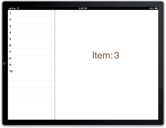
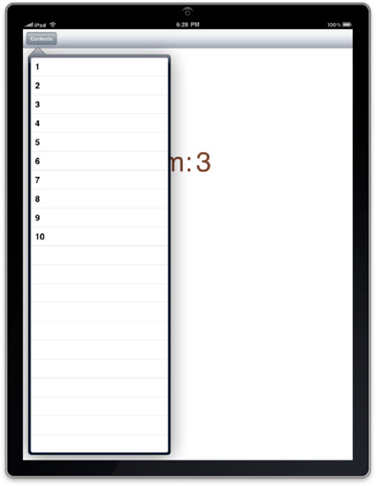
Figure 8.12. Split view controller in portrait mode, showing the master overlayed on the detail view.
The split view was created specifically for the iPad to take advantage of its screen size being larger than that of the iPhone and iPod Touch.
The master/detail user interface pattern exploits the metaphor that in a user interface you have a master view that allows you to choose from a number of detail views. In the example given in the Example_SplitView companion code and application, there is a table view as the master view. When you click on an item in that table, the detail view changes to reflect the selection. As you can see in Figure 8-12 both the master and the detail view are automatically shown in landscape view. However, by default when you rotate your device to portrait mode, the master view is hidden.
The split view is meant to be used such that in portrait mode, you provide a button that your users can touch to show the master view in a UIPopover control. The split view provides you with events (or delegate methods) that provide you with a button that is already wired up to show the master view; you just have to consume them and add the button to your detail view.
Like other controllers, the split view is easiest to use in code. Simply create a class that subclasses UISplitViewController and assign your controllers that it will manage to the ViewControllers property. The ViewControllers takes an array of two controllers: the first one being the controller that contains the master view, and the second one containing the detail view. For example, the custom split view class in Listing 8-15 comes from the Example_SplitView companion code and application.
Example 8.15. Implementing a custom split view and assigning the views to it
public class MainSplitView : UISplitViewController
{
        protected Screens.MasterView.MasterTableView _masterView;
        protected Screens.DetailView.DetailViewScreen _detailView;

        public MainSplitView () : base()
        {
                //---- create our master and detail views
                this._masterView = new Screens.MasterView.MasterTableView ();
                this._detailView = new Screens.DetailView.DetailViewScreen ();

                //---- create an array of controllers from them and then assign it
                // to the controllers property
                this.ViewControllers = new UIViewController[] { this._masterView,
                     this._detailView };

                ...
        }
}If you're using Interface Builder to create your master and detail view controllers, it will automatically size your views appropriately if you change the Split View setting in the Simulated User Interface Elements in the Attributes Inspector. See Figure 8-13.
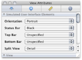
Figure 8.13. Changing the Split View setting will automatically resize your view in Interface Builder
That way, your view is automatically sized to simulate the actual size it will be in the split view.
Out of the box, the split view doesn't automatically add the button to your detail view that shows the master view. However, it does provide an event that gives you a button that is already wired up to show the view in a popover controller. In order to use this button, you should first define a place for it in your detail view, and then provide a method to add the button to that place. For example, in Listing 8-16, I put a toolbar at the top of the detail view, and then provided the following methods to add and remove the button.
Example 8.16. Providing methods in a detail view controller to add and remove the button to show the master view
public void AddContentsButton (UIBarButtonItem button)
{
        button.Title = "Contents";
        this.tlbrTop.SetItems(new UIBarButtonItem[] { button }, false );
}
public void RemoveContentsButton ()
{
        this.tlbrTop.SetItems(new UIBarButtonItem[0], false);
}
How and where you add the button is your choice, but for consistency purposes, it's a good idea to show it in the upper left corner.
Next, in your split view controller, you should handle the WillHideViewController and WillShowViewController events to call the methods that you define in your detail view controller.
this.WillHideViewController += (object sender, UISplitViewHideEventArgs e) => {
        this._detailView.AddContentsButton(e.BarButtonItem);
};
this.WillShowViewController += (object sender, UISplitViewShowEventArgs e) => {
        this._detailView.RemoveContentsButton();
};
You could also handle this in the delegate, but in this case it's simplest to use the events. WillHideViewController is raised when the device is rotated into portrait mode, and therefore the master view will be hidden, so in that event handler you should call your method to show the button.
WillShowViewController is raised when the device is rotated into landscape mode, and therefore the master controller will be shown, so in that event handler you should call your method to remove/hide the button.
Once you have your master and detail view up and running, it quickly becomes necessary to formulate a way for them to communicate with each other. There are a couple ways to handle this, depending on your needs. One way is to pass a reference to the other controller in each controller; however, the problem with this is that when something occurs in one of the controllers - say a button click that should affect the other controller - the split view controller doesn't know that anything has occurred.
Therefore, the best practice is to raise events in each controller, and then have the split view controller handle them and call the appropriate methods on the appropriate controller, thereby acting as a controller/mediator between the two child controllers. For example, in Listing 8-17, when a user clicks on a row in the master view, I raise an event that is handled in the split view controller and sets the appropriate data on the detail controller.
Example 8.17. Handling an event on the split view controller to affect the detail controller
this._masterView.RowClicked +=
        (object sender, MasterView.MasterTableView.RowClickedEventArgs e) => {
        this._detailView.Text = e.Item;
};
The nice thing about this pattern is that, because the split view controller is the main controller, you can then swap out detail controllers based on what's happening in the master controller. For instance, say you had several different options on the master view, that when clicked, each one should show a different detail view.
The iOS has one of the best built-in mobile browsers available. It ships with Mobile Safari, which bases its rendering engine on WebKit, the same rendering engine used in Safari, Google Chrome, and others.
Apple makes the core browser functionality available via the UIWebView control. With it, it's easy to integrate a full-featured browser directly into your application. Not only can you use it to display web pages, but it also provides a rich document display engine. You can display HTML documents complete with images, JavaScript, and other content, directly from your application. Taking it one step further, you can package your content as XML and use the XSL transform feature in .NET to style your content and display it to your users.
Additionally, the web view also supports a number of non-web document formats, including Microsoft Word, Microsoft Excel, Rich Text Format (RTF), Portable Document Format (PDF), and a number of other document formats.
In this chapter, we'll take a look at how to use the web view, including loading web pages, navigation, handling interaction, and so on. Then we'll cover loading local content, other document types, and finally, I'm going to talk about some magic that we can do to listen for events on the page and actually run JavaScript that allow you to deeply interact with the web view to use it as a powerful content rendering engine.
Using the web view control is very easy, all you have to do is add it to your view controller and call LoadRequest, passing a URL and it will load your web page (see Listing 8-18).
Example 8.18. Loading a web request of www.google.com in a web view
myWebView.LoadRequest (new NSUrlRequest (new NSUrl ("http://www.google.com")));The hardest part about loading a web page is actually constructing a URL. LoadRequest takes an NSUrlRequest object. The NSUrlRequest only has one interesting constructor, and that takes an NSUrl object. Let's take a moment to look at NSUrl.
NSUrl represents a URL in CocoaTouch and has a couple of different constructors, depending on what kind of URL you're creating. If you just want to do a plain-old web URL, you can use it by simply supplying the fully qualified web address (in this case, www.google.com.)
We'll look at some of the other constructors in just a bit.
Just like a browser, the web view control shares the concept of navigating backward and forward through page history. To this end, it exposes two methods, GoBack and GoForward, which navigate backward and forward in the page history. Before you call them, you should check the CanGoBack and CanGoForward properties to see if navigation in that particular direction is allowed. For example, Listing 8-19 handles the back and forward button clicks in the web browser example in the Example_ContentControls companion application and code:
Example 8.19. Navigating backwards and forwards in a web view control
this.btnBack.TouchUpInside += (s, e) => {
        if (this.webMain.CanGoBack) { this.webMain.GoBack (); } };
this.btnForward.TouchUpInside += (s, e) => {
        if (this.webMain.CanGoForward) { this.webMain.GoForward (); } };
If you want to stop a request while it's loading, you can call the StopLoading method on the web view. For example, Listing 8-20 handles the stop button click in the sample web browser.
The web view exposes events related to loading that allow you to respond to various states and inform users of the loading process. As with other controls, you can either choose to handle them as events, assign a strongly-typed delegate, or use a weak delegate (see Chapter 6 for more information on this pattern). The events are described in the following sections.
LoadStarted is raised at the beginning of the request. You can handle this event to let your user know that the request is loading by showing an activity spinner, or other indicator. For example, the handler in Listing 8-21 is from the web browser sample. It enables the Stop button, enables the navigation buttons based on navigation availability, and starts the animation of an activity spinner.
Example 8.21. Handling the LoadStarted method
public void LoadStarted (object source, EventArgs e)
{
        this.btnStop.Enabled = true;
        this.SetBackAndForwardEnable ();
        this.imgBusy.StartAnimating ();
}
protected void SetBackAndForwardEnable ()
{
        this.btnBack.Enabled = this.webMain.CanGoBack;
        this.btnForward.Enabled = this.webMain.CanGoForward;
}
LoadingFinished is raised when the request has completed loading. You can handle this event to stop or hide any activity indicator that you may have shown while the request was loading. For example, Listing 8-22 is from the web browser sample. It disables the Stop button (since the request is no longer loading), enables the Back and Forward button based on navigation availability (see previous code sample for the SetBackAndForwardEnable method), and then stops the activity spinner.
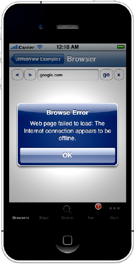
The LoadError event is raised when there is a problem with the request. This most commonly happens if the device does not have connectivity. As per the Apple Human Interface Guidelines, you are required to handle this event and notify the user if they do not have connectivity. If you load internet requests, Apple will test your application with and without connectivity, and if you don't fail gracefully and let your user know that they don't have connectivity, your application is almost certain to be rejected.
For example, Listing 8-23 is again from the web browser sample. It alerts the user with the reason why their web request failed to load.
Example 8.23. Handling the LoadError method
public void LoadError (object sender, UIWebErrorArgs e)
{
        this.imgBusy.StopAnimating ();
        this.btnStop.Enabled = false;
        this.SetBackAndForwardEnable ();
        //---- show the error
        UIAlertView alert = new UIAlertView ("Browse Error"
                , "Web page failed to load: " + e.Error.ToString ()
                , null, "OK", null);
        alert.Show ();
}
Running this with no Internet connectivity will result in the alert shown in Figure 8-14.
One of the most powerful uses of the web view control is to use it as a content rendering engine. You can format your content as HTML and then display it in the web view. Because it's a full-featured browser engine, it supports everything that would normally work in Mobile Safari, such as rich CSS integration, JavaScript, and the like.
You can even take it one step further and store your content as XML and then use .NET's built-in support for applying XSL style sheets to transform the XML into XHTML, and then display it in the web view. As you can imagine, with this technique, you could build content-rich applications very easily.
There are two ways to load local content: you can either call LoadRequest and give it a path to a file, or you can load content directly from a string. When you pass a path to load from, you should use the BundlePath property of the MainBundle object to get the local directory of your application. From there, you can append the path to your content as it appears in your project file. For example, Listing 8-24 loads the Home.html file from the Content directory of the project.
Example 8.24. Loading local content in a web view
string homePageUrl = NSBundle.MainBundle.BundlePath + "/Content/Home.html";
this.webMain.LoadRequest (new NSUrlRequest (new NSUrl (homePageUrl, false)));
When storing and loading content, there are two things that you should keep in mind: first, while the simulator is not case-sensitive, the device is, so make sure you have all your casing correct; otherwise, it'll work in the simulator but not on your device. Second, you content must have a build action of Content, or it won't get compiled into your application.
When you load HTML content into the web view directly from a string, you call LoadHtmlString and pass your HTML as well as a path in which you want it to execute in. For example, Listing 8-25 loads a page of HTML directly from a string, and sets the base directory to be the Content directory, so any links from the page will be relative to that directory.
Example 8.25. Loading content directly from a string of HTML
string contentDirectoryPath = NSBundle.MainBundle.BundlePath + "/Content/";
this.webMain.LoadHtmlString ("<html><a href="Home.html">Click Me</a>"
        , new NSUrl (contentDirectoryPath, true));
In this case, we used a different NSUrl constructor where the second parameter is a boolean value indicating whether or not the path was a directory.
While the web view makes a great content rendering engine, there are times in which it would be really nice if you could interact with the content. For instance, say you want to run a script on the page, or you want to listen for a user click on an element to launch something in the application.
Apple makes the first scenario very easy by allowing us to run a script on the page, but the second scenario is a little more complex. Let's look at the first scenario.
The web view exposes a method called EvaluateJavascript that allows you to run JavaScript code within the context of the page. You can pass the function any executable script in the method and the web view will run it. This can be extremely effective if you have methods that you want to call on the page. For instance, say that you have the JavaScript shown in Listing 8-26 in your page.
Example 8.26. Executing JavaScript in the web view
<script language="javascript">
        function RunAction()
        {
                alert('RunAction javascript method called'),
        }
</script>
You can run that script by calling:
myWebView.EvaluateJavascript ("RunAction();");Unfortunately, the web view doesn't give us an easy way to listen for events the way it allows us to run JavaScript, so we have to get a little crafty.
The web view exposes an event called ShouldStartLoad that we can use for just this purpose. You can use ShouldStartLoad to intercept load requests by the web view, figure out what the request is, and then return false if you want to handle the request, instead of letting the browser do it. For example, let's say that we have the following link, and we want to handle it by loading a screen in the application:
<a href="//LOCAL/Action=Image">action test</a>
One of the parameters of ShouldStartLoad is a UIWebViewNavigationType enumeration which tells us whether the request was from a link, a form submission, or something else. It'll even tell us if the user is navigating backward or forward (via the GoBack or GoForward methods). You can then use this, in conjunction with the NSUrlRequest parameter, to parse the request and then handle it in the application. For example, Listing 8-27 looks for the link that we just defined and shows an alert when it's clicked:
Example 8.27. Handling a link click in a web view by your application
public bool HandleStartLoad (UIWebView webView, NSUrlRequest request
        , UIWebViewNavigationType navigationType)
{
        Console.WriteLine (navigationType.ToString ());

        //---- first, we check to see if it's a link
        if (navigationType == UIWebViewNavigationType.LinkClicked)
        {
//---- next, we check to see if it's a link with //LOCAL in it.
if(request.Url.RelativeString.StartsWith("file://LOCAL"))
{
new UIAlertView ("Action!", "You clicked an action.", null,
"OK", null).Show();
//---- return false so that the browser doesn't try to navigate
return false;
}
}
//---- if we got here, it's not a link we want to handle
return true;
}In addition to HTML, the web view supports the rendering of the following document types:
Microsoft Excel (.xls)
Microsoft Word (.doc)
Microsoft PowerPoint (.ppt)
Apple Numbers (.numbers and .numbers.zip)
Apple Keynote (.keynote and .keynote.zip)
Apple Pages (.pages and .pages.zip)
Portable Document Format (.pdf)
Rich Text Format (.rtf)
Rich Text Format Directory (.rtfd.zip)
You can load these documents just as you would any other local content. Simply call LoadRequest and pass the path to the file.
CocoaTouch UIKIt includes the UIMapView control, which gives you the same powerful, easy to use map control that is used in the Maps Application. See Figure 8-15.

Just like with the Maps Application, the map control supports pinch and zoom touches, as well as scrolling via touch. By default, both zooming and scrolling are enabled, but you can turn them off via the ZoomEnabled and ScrollEnabled properties.
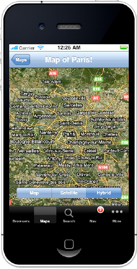
Using the map view is easy. Simply drop the view into your controller and set the Region property, passing in a CLLocationCoordinate2D that specifies the latitude/longitude of the center of the map, and an MKCoordinateSpan that specifies the size of the area to zoom to. For example, Listing 8-28 displays the map of Paris.
Example 8.28. Setting the map to display Paris, with a zoom level of 20 miles
//---- create our location and zoom for paris
CLLocationCoordinate2D coords = new CLLocationCoordinate2D(48.857, 2.351);
MKCoordinateSpan span = new MKCoordinateSpan(
        MilesToLatitudeDegrees(20), MilesToLongitudeDegrees(20, coords.Latitude));
//---- set the coords and zoom on the map this.mapMain.Region = new MKCoordinateRegion(coords, span);
Creating an MKCoordinateSpan requires the degrees, in latitude and longitude, of the area to display (thus creating the zoom level); however, if you want to convert miles to degrees, you can use the methods shown in Listing 8-29.
Example 8.29. Converting miles to latitudinal and longitudinal degrees
public double MilesToLatitudeDegrees(double miles)
{
        double earthRadius = 3960.0;
        double radiansToDegrees = 180.0/Math.PI;
        return (miles/earthRadius) * radiansToDegrees;
}
public double MilesToLongitudeDegrees(double miles, double atLatitude)
{
        double earthRadius = 3960.0;
        double degreesToRadians = Math.PI/180.0;
        double radiansToDegrees = 180.0/Math.PI;

        //---- derive the earth's radius at that point in latitude
        double radiusAtLatitude = earthRadius * Math.Cos(atLatitude * degreesToRadians);
        return (miles / radiusAtLatitude) * radiansToDegrees;
}The map view supports the display of the map in the following three modes, contained in the MKMapType enumeration:
Regular: The normal map mode that displays geographic features in an illustrated depiction.
Satellite: Renders the map using satellite images of the area.
Hybrid: A mix between Regular and Satellite, Hybrid mode renders the map using satellite images and then overlays geographic information, annotating the satellite view.
You can set the current map view mode via the MapType property. For example, Listing 8-30 handles the ValueChanged even on a button segment control and updates the map display to the appropriate type, depending on which segment is selected.
Example 8.30. Updating the map display type depending on what is selected
this.sgmtMapType.ValueChanged += (s, e) => {
        switch(this.sgmtMapType.SelectedSegment)
        {
                case 0:
                        this.mapMain.MapType = MKMapType.Standard;
                        break;
                case 1:
                        this.mapMain.MapType = MKMapType.Satellite;
                        break;
case 2:
this.mapMain.MapType = MKMapType.Hybrid;
break;
}
};When Hybrid is selected, the view looks like Figure 8-16.
The map can automatically display the location of the device by setting the ShowsUserLocation property to true (see Listing 8-31).
The map will then center on the location of the device; as the device moves, the map will update, keeping the map centered on the device location.
You can add annotations to the map such as pins that mark locations on the map. See Figure 8-17.

To add an annotation to the map view, first create a class that subclasses the MKAnnotation class. See Listing 8-32.
Example 8.32. A custom MKAnnotation class
/// <summary>
/// MonoTouch doesn't provide even a basic map annotation base class, so this can
/// serve as one.
/// </summary>
protected class BasicMapAnnotation : MKAnnotation
{
        /// <summary>
        /// The location of the annotation
        /// </summary>
        public override CLLocationCoordinate2D Coordinate { get; set; }
/// <summary>
/// The title text
/// </summary>
public override string Title
{ get { return this._title; } }
protected string _title;
/// <summary>
/// The subtitle text
/// </summary>
public override string Subtitle
{ get { return _subtitle; } }
protected string _subtitle;
/// <summary>
///
/// <summary>
public BasicMapAnnotation (CLLocationCoordinate2D coordinate, string title,
string subTitle)
: base()
{
this.Coordinate = coordinate;
this._title = title;
this._subtitle = subTitle;
}
}MKAnnotation has the following three properties that are important:
Coordinate: The only required property,
Coordinatespecifies the location of the annotation.Title: Optional,
Titlespecifies the first line of text in an annotation callout.SubTitle: Optional,
Subtitlespecifies the second line of text in an annotation callout.
You can then add your annotation objects to your map view via the AddAnnotation method, shown in Listing 8-33.
Example 8.33. Adding an annotation to a map view
this.mapMain.AddAnnotation(new BasicMapAnnotation(
        new CLLocationCoordinate2D(34.120, −118.188), "Los Angeles", "City of Demons"));
You should add all of your annotations when you create your map view; the map view will handle cleaning them up when they go off screen, and re-adding them when they come back into view.
The previous example will get you a basic annotation, but to really customize it, you need to implement an MKMapViewDelegate and override the GetViewForAnnotation method. GetViewForAnnotation is exactly like the GetCell method in the table delegate, but instead returning a cell, you return an MKAnnotationView object.
GetViewForAnnotation is called by the map view whenever an annotation needs to be retrieved to display on the screen. This can happen quite often, as a user scrolls around on the map because just as with table cells, when the annotation goes out of view, the iOS scavenges its object and puts it in a pool so that it can be reused for other annotations.
Listing 8-34 is a sample map view delegate that implements the GetViewForAnnotation method and returns an MKPinAnnotationView as the annotation view.
Example 8.34. Implementing GetViewForAnnotation in a custom map delegate
protected class MapDelegate : MKMapViewDelegate
{
        protected string _annotationIdentifier = "BasicAnnotation";

        public override MKAnnotationView GetViewForAnnotation (
                MKMapView mapView, NSObject annotation)
        {
                //---- try and dequeue the annotation view
                MKAnnotationView annotationView =
                        mapView.DequeueReusableAnnotation(this._annotationIdentifier);

                //---- if we couldn't dequeue one, create a new one
                if (annotationView == null)
                {
                        annotationView =
                        new MKPinAnnotationView(annotation, this._annotationIdentifier);
                }
                else //---- if we did dequeue one for reuse, assign the annotation to it
                { annotationView.Annotation = annotation; }

                //---- configure our annotation view properties
                annotationView.CanShowCallout = true;
                (annotationView as MKPinAnnotationView).AnimatesDrop = true;
                (annotationView as MKPinAnnotationView).PinColor =
                        MKPinAnnotationColor.Green;
                annotationView.Selected = true;

                return annotationView;
        }
}
The pattern in this code example is almost exactly the same pattern for table cells. The iOS keeps a pool of annotation view objects for the map, and you can reuse them via the DequeueReusableAnnotation method in conjunction with a reuse identifier (for more context see Chapter 9). To understand the rest of the code, though, we need to examine annotation views.
An MKAnnotationView object is different from an MKAnnotation in that it contains the callout view that the annotation displays when it's selected, as well as the MKAnnotation object that specifies the coordinates. When you create an MKAnnotation, you pass it your MKAnnotation (it can later be found on the read-only Annotation property), and a reuse identifier. The reuse identifier is used to identify the type of annotation view so that you can reuse them like templates.
The easiest way to customize an annotation view is to set properties on it that control its display. For example, the following are some common properties that you can set on an annotation view:
CanShowCallout:Whether the callout will be displayed when a user clicks on the marker on the map.Image:You can specify an image that will be displayed in the callout via the Image property. If you provide an image, the callout will automatically resize itself to fit the image.RightCalloutAccessoryView and LeftCalloutAccessoryView:These two properties allow you to set a custom view on either the right or left side of the annotation view.
For example, setting the properties shown in Listing 8-35 will result in a callout similar to the one in Figure 8-18.
Example 8.35. Customizing an annotation view
annotationView.CanShowCallout = true;
annotationView.RightCalloutAccessoryView = UIButton.FromType(UIButtonType.DetailDisclosure);
annotationView.LeftCalloutAccessoryView =
        new UIImageView(UIImage.FromBundle("Images/Apress-29x29.png"));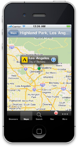
If the basic annotation view isn't quite enough for what you need, you can also subclass it and do the rendering yourself during the Draw method.
In the delegate in Figure 8-18, we created an MKPinAnnotationView. MKPinAnnotationView is a specialized that annotation view that gave us a few more options. Specifically, by using a pin annotation, we were able to do the following (see Listing 8-36).
Example 8.36. An MKpinAnnotationView gives us a little more control over the marker on the map.
(annotationView as MKPinAnnotationView).AnimatesDrop = true;
(annotationView as MKPinAnnotationView).PinColor = MKPinAnnotationColor.Green;
If you set the AnimatesDrop property to true, when the map is first displayed, the annotation marker (pin) will drop onto the map.
The PinColor property allows us to select from three different colors for the pin, available in the MKPinAnnotationColor enumeration (Red, Green, and Blue).
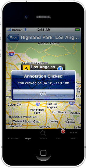
In Figure 8-18, we gave the annotation view a detail disclosure button as its right accessory view. The detail disclosure indicates that clicking on the button will result in a detail information screen for that particular item. To handle the click, simply add a handler as you would any other button. For instance, Listing 8-37 creates the button, adds a handler that shows an alert when clicked that displays the coordinates, and then adds that button as the right callout accessory view.
Example 8.37. Handling user interaction on a callout
UIButton detailButton = UIButton.FromType(UIButtonType.DetailDisclosure);
detailButton.TouchUpInside += (s, e) => { new UIAlertView("Annotation Clicked", "You
clicked on " +
        (annotation as MKAnnotation).Coordinate.Latitude.ToString() + ", " +
        (annotation as MKAnnotation).Coordinate.Longitude.ToString(), null, "OK",
        null).Show(); };
annotationView.RightCalloutAccessoryView = detailButton;
Clicking on the detail disclosure button would then result in the alert shown in Figure 8-19.
Because the map allows an unlimited number of annotations, there are two optimizations that you should consider to ensure a responsive map view as well as a pleasant user experience.
Annotation Reuse: When implementing
GetViewForAnnotation, make sure to make use of theDequeueReusableAnnotationso that your annotation objects are put in the pool when not onscreen, and are reused when they come into view.Annotation Display: Because a user can zoom in and out on the map view, you should consider overriding the
RegionChangedmethod in the map view delegate and managing the number of annotations that are on the map via theAddAnnotationandRemoveAnnotationmethods. For example, as a user zooms out (and more of the map becomes visible), you may want to reduce the number of annotations displayed. This not only helps with performance, but also provides a much nicer experience for the user, because they aren't inundated with too many pins when they zoom out, and when they zoom in, they're able to see more detail.
Overlays are a special kind of annotation that allow you to draw shapes on the map, such as lines, circles, rectangles, polygons, and so on, and then optionally fill them in. For example, Figure 8-20 shows the Pyramids at Giza with a circle overlay.

Overlays are available in iOS 4.0 and later and are useful in showing all kinds of data that is best illustrated on a map such as routes, population distribution, and the like.
Overlays are similar to annotations, and in fact, under the hood they're treated nearly identically. The general pattern to using overlays is as follows:
Create an overlay shape.
Add the overlay to the Map view.
Implement the
GetViewForOverlaydelegate.
When creating an overlay, you can choose from a number of built-in shapes, or you can define your own custom shape. The built-in overlay shapes are contained in the following classes:
MKCircle: Defines a circular area that can optionally be filled. You create anMKCirclevia the staticCirclemethod on theMKCircleclass.MKPolygon: Defines a polygon area that can optionally be filled. You can mask out areas within the polygon by adding interior polygons via theInteriorPolygonsproperty. You created anMKPolygonvia the staticFromPointsorFromCoordinatesmethods on the MKPolygon class.MKPolyline: Defines a multi-segment line. You create anMKPolylinefrom the staticFromCoordinatesmethod on the MKPolyline class.
For example, Listing 8-38 is from the Example_ContentControls companion code and application and creates the circle overlay seen in Figure 8-20.
Example 8.38. Creating a circle overlay
CLLocationCoordinate2D coords = new CLLocationCoordinate2D(29.976111, 31.132778);
this._circleOverlay = MKCircle.Circle(coords, .5);
In addition to the built-in shapes, you can define your own via a CGPath object and then use the MKOverlayPathView class in the GetViewForOverlay method. For more information on how to use a CGPath, see Chapter 14.
Once you've created your overlay shape, you can add it to the map view via either the AddOverlay method, or the AddOverlays method if you have more than one overlay to add. For example, Listing 8-39 adds the circle overlay we just created.
Once you've created and added your overlay to the map view, you need to implement the GetViewForOverlay method as part of your map view delegate (or handle the GetViewForOverlay event, and so on). GetViewForOverlay is different than GetViewForAnnotation in that there is no template reuse, so you don't have to worry about the deque reusable calls or reuse identifiers.
Instead, you simply have to instantiate a view that contains your shape. Each shape has an associated view class: MKCircleView, MKPolygonView, and MKPolylineView. If you're using a custom CGPath, then you use an MKOverlayPathView object. For example, Listing 8-40 uses a Lamda delegate to handle the GetViewForOverlay event.
Example 8.40. Implementing GetViewForOvlerlay to configure the view to hold our circle overlay
this.mapMain.GetViewForOverlay += (m, o) => {
        if(this._circleView == null)
        {
                this._circleView = new MKCircleView(this._circleOverlay);
                this._circleView.FillColor = UIColor.LightGray;
        }
        return this._circleView;
};
In this code, we create a view for the shape, assign any display properties we want, such as fill color, line width, color, and so on, and then return that view. In this case, I've defined the view at the class level, so that I check to see if it's already been initialized, and if it hasn't I configure it.
Of course, as specified in Chapter 6, you could also implement a map view delegate and override the GetViewForOverlay method in there as well.
The UISearchBar control is a very simple control that is really just a text box with a magnifier glass icon and an "x" button. It's commonly paired with a table control to display search results. See Figure 8-21.
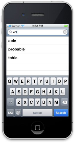
Despite its name, the search control doesn't actually provide any search functionality. It's really just a fancy text box. To use it, you simply listen for the TextChanged event and display (in your choice of format) the appropriate search results to the user. For example, in the Example_ContentControls companion code and application, I've paired the search bar with a table view and when the text changes, I update the table based on the value of the Text property. See Listing 8-41.
Example 8.41. Updating a table with search results when the text changes in a search bar
this.srchMain.TextChanged += (s, e) => {
        //---- select our words
        this._tableSource.Words = this._dictionary
                .Where(w => w.Contains(this.srchMain.Text)).ToList();

        //---- refresh the table
        this.tblMain.ReloadData();
};
You can also use the SearchButtonClicked event to show results; however, it is much better to give instant feedback by updating the results more during editing. Then, when a user clicks the search button, simply dismiss the keyboard, so that the results are in view. See Listing 8-42.
With this chapter, we've finished off the last of the controls in MonoTouch. If you've been reading this book through from front to back you should now have a solid understanding of nearly every control in the UIKit, how to use them and, when appropriate, how to extend them. In the next chapter, we're going to finish our journey through the user experience layer by examining working with keyboards.