Chapter Nine: CSS-Based Page Layouts
In the early years of CSS, web developers were restricted to using style sheets for superficial styling—fonts, colors, and sometimes margins and padding—but continued to lay out their pages using the tables-and-spacer-GIFs method championed in David Siegel’s famous (or infamous) book, Creating Killer Web Sites (Hayden, 1996).
It wasn’t until well after the release of Internet Explorer 6 in 2002 that Douglas Bowman’s groundbreaking CSS-based redesign of Wired magazine’s website debuted and demonstrated that high-traffic, high-profile sites could successfully use CSS to control page layout. The use of tables for layout has since fallen out of favor; table-based layouts mix presentation and structure, making it much more difficult to maintain pages, and harm sites’ accessibility and search engine visibility—often dramatically. Nevertheless, table-based layouts persisted for years after 2002, and are still occasionally seen today, though usually not on professionally developed sites.
The persistence of table-based layouts wasn’t simply a sign of stubbornness, nor of the unwillingness of developers to learn new tricks. Many common web layout patterns were closely tied to the table model, and the CSS layout model was not designed to replicate the layout model of tables. The classic multi-column layout with a header at the top and footer at the bottom of the page is a perfect example. This kind of layout is easy to achieve with HTML tables, but the real cost of this design method shows up later in the form of major accessibility, search-engine optimization, and maintenance problems. The same layout is superficially more difficult to create with CSS, and requires techniques that it took years to discover and perfect, but the payoff of CSS-based design is well worth the extra time.
In this chapter, we’ll look at common layout challenges and the best ways to achieve them with CSS. We’ll build on the CSS features we covered in Chapter 4, so if any of the features we cover here look unfamiliar, you may wish to flip back to that chapter for a refresher. Page layout usually requires fine control over element width, margins, padding, and borders, so we’ll also use browser-wrangling techniques introduced in Chapter 7 to mitigate problems caused by Internet Explorer’s unusual box model. Again, if you need a refresher, have a quick look at that chapter before continuing.
Horizontal Centering
Centering a block of content horizontally is a very common design request, and CSS offers two ways of accomplishing it. We can use the text-align CSS property to center the inline content of an element (or to set that content flush left, flush right, or justified), but this property isn’t designed for centering block-level elements. To center a block-level element (for example, a paragraph) inside its parent element (a div, perhaps, or the body element itself), we’ll use the width CSS property.
Suppose we want to make paragraphs that are half the width of the body, and are centered horizontally on the page. We can do this by creating a CSS rule that selects paragraphs and uses the width and margin properties, setting the width at 50 percent of the parent element and using the margin value auto for the element’s left and right margins. This works because when it’s used to define horizontal margins, auto specifies that the margin space inside the containing element be divided evenly between the left and right margins. Here’s a CSS rule that would make paragraphs half as wide as the parent element and center them horizontally:

Since we’re defining the element’s width using a percentage value, we could also use this rule instead:
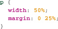
These two rules are functionally identical because we know the width of the p element as a percentage of its parent’s width. If we specified the element’s width using something other than a percentage—ems, for example—we would have to use auto for the left and right margins, because we wouldn’t know how much horizontal space there would be between the edges of the p element and those of its parent element.
Easy, right? Sadly, there’s one more step. Internet Explorer in Quirks mode doesn’t support the auto value for the margin property, so we need a workaround for Internet Explorer in Quirks mode. Luckily, we can rely on a text-align bug in IE to center our elements in IE/Quirks mode without affecting browsers that properly support auto values for margin.
Sticky Note
If you aren’t clear as to what exactly Quirks mode and standards mode are, we go into this in detail in Chapter 7.
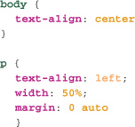
I mentioned that text-align is not designed to center block-level elements. In IE Quirks mode, however, text-align does center block-level elements. We can use this bug to counter the effects of IE’s lack of support for auto margin values in Quirks mode without confusing more CSS-capable browsers. Here’s how:
First, we’ll use text-align: center on the containing element of the elements we wish to center (in this instance, we want to center paragraphs inside the body):
This rule will center the paragraphs in IE, but will also center all text on the page in other modern browsers, because text-align is inherited. To overcome this problem, we’ll set the text-align of paragraphs to left (we could also use right or justified). This ensures that the text itself will not be centered—and because text-align aligns an element’s contents, not the element itself, the paragraph elements themselves will be centered in IE. Here’s what our CSS rules look like:
Because there’s no single CSS property for centering block-level elements horizontally, this design request is often a frustrating problem for CSS newcomers. Once you know how to do it, though, it’s very easy to achieve in all modern browsers with the tricks I’ve just described. Vertically centered elements, on the other hand, are more difficult to implement—but not impossible.
Vertical Centering
Just as developers are often asked to center a block of content horizontally, we’re frequently given the task of centering content vertically—a far more challenging problem to solve with CSS alone.
CSS offers a vertical-align property, but this property is designed to align inline elements in relation to the line of text they’re associated with. You might use it to indicate, for example, that the contents of a span element should be set as superscript, as in figure 9.1. Here’s an example rule:

9.1 Vertical-align; super used to create footnote links.
The vertical-align property can also be used to align images in relation to a line of text, and to align the contents of a table cell (td). The property is not, however, designed for aligning block-level elements within their containing elements. The CSS page layout concept was originally based on the idea that layouts would be fluid, with the width of elements changing as the browser window shrank and grew and the height of elements changing to accommodate their content. As a result, it remains difficult to vertically center an element within its parent element in ways that work across all modern browsers.
All the widely used methods have challenges, and none is especially straightforward, so you should select the method that is most appropriate for your situation. A good overview of the situation can be found at www.student.oulu.fi/~laurirai/www/css/middle, where Lauri Raittila details several types of content (inline content, images, block content) and outlines strategies for vertically centering each type. In short, there’s no really good solution, but depending on the particular circumstances, there may be an adequate solution.
CSS Positioning
CSS1 lacked features specifically designed for page layout, beyond the ability to modify the whitespace of an element via margin, padding, and border. However even version 4 browsers implemented at least some of the then–non-standardized positioning properties of CSS2. Popularized as layers in Dreamweaver, these properties allowed developers to position a limited set of elements absolutely or relatively in Internet Explorer 4 and Netscape 4.
Sticky Note
Ironically, CSS1 did contain the float property, which was originally created to solve a non-layout-related problem, but has become a staple of CSS layouts.
Initially, positioning was considered the way in which all CSS-based layouts would be developed. But although positioning is sophisticated, it was not designed with common page-design patterns in mind, and over time, positioning has given ground to float-based techniques. Positioning continues to have its uses, which we’ll focus on now, and there’s no reason not to combine position properties and float-based techniques to lay out pages.
Positioning Schemes
All elements on a page are positioned according to one of three positioning schemes. We detailed various positioning properties in Chapter 4, so we’ll focus on more advanced CSS layout and positioning concepts. First, let’s define the three primary positioning schemes used to lay out pages using CSS:
• Normal flow. This term describes the way browsers typically lay out elements on a page. Block elements begin their own new block, and inline elements are laid out inline within their containing block element. Elements with a static or relative position property value are in normal flow. (Remember: static is the default value of the position property.)
• Absolute position. When elements have a position property value of absolute or fixed, they are said to be absolutely positioned. Such elements are taken entirely out of normal flow—in other words, the browser ignores absolutely positioned elements when laying out other elements on the page.
• Floated. A floated element has a float property value of left or right, and is shifted to the left or right within its current line until its edge reaches the edge of its containing block (or the edge of another floated element within the same containing block), as shown in figure 9.2. Unlike absolutely positioned elements, floated elements are not removed from normal flow. They affect the flow of the page, with content below them flowing around them.
9.2 Here two images are floated to the left. The first, of Cheryl, is shifted to the left until it touches the edge of the containing element. The second, of Scott, shifts to the left until it touches the right edge of the first floated element. The gap between the floated elements is due to margins on them.

Positioning Properties
Confusingly, these positioning schemes don’t correspond exactly to the values of the CSS position property. As we saw in Chapter 4, position takes four possible values:
• static—Elements are in normal flow. This is the default positioning of an element.
• relative—Relatively positioned elements are laid out as if they were statically positioned, then moved from that position, while the document flow remains unchanged. Relative positioning has one other magical difference from static positioning which we’ll see in a moment.
• absolute—Elements with a position value of absolute are taken out of the flow entirely, and then positioned with respect to their containing block-level element.
• fixed—Elements with a position value of fixed are taken out of the flow entirely, and then positioned with respect to their viewport (typically the window, but some browsers such as those found on the iPhone and Wii lack windows).
Absolute Positioning in Action
Float-based layouts have largely superseded absolute positioning when it comes to creating multi-column layouts, but absolute positioning can still be used for this purpose, and in some ways it’s easier to use than float-based techniques. It does however have one significant drawback compared with those layouts, which we’ll turn to when we deal with floated multi-column techniques.
For our example, we’ll use a common document structure that includes a header, a content area that contains content and navigation columns, and a footer. Please note: This example is intended to illustrate features of CSS positioning properties, rather than to model a perfect approach to page layout. I wouldn’t recommend copying this particular code as the basis for your own layouts.

Creating the Columns
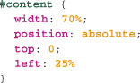
The first step will be to create our main columns. We’ll give the content div a width of 70% and position it absolutely.
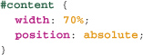
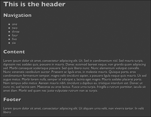
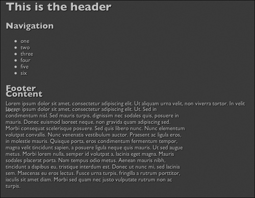
Figure 9.3 shows the page as it appears if all the elements are statically positioned. In figure 9.4 however, it’s been taken out of the flow of the document, so the footer element is now placed where it would be if the content element didn’t exist at all. Note too that the content element is not located in the top left corner of the page, as you might expect, because in the absence of a top value, an absolutely positioned element’s top and left corners remain where they would be in normal flow.
9.3 The page layout with all elements in static position.
9.4 An absolute element is taken out of the flow, but must have top, left, or other position values to be moved from its position in the flow.
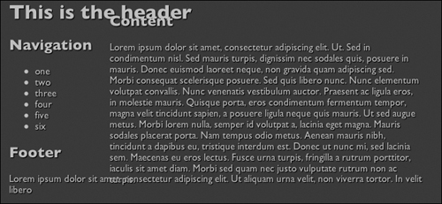
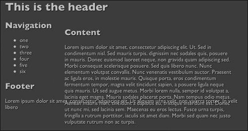
In order to properly position the content element absolutely, we need to give it a top value. At the same time, we’ll also give it a left value of 25%.
As we can see in figure 9.5, we have, in effect, created a column for the main text—though this column is currently positioned on top of the header element, and if we zoom the text size or add long entries to the navigation list, then some of the navigation would also be obscured by the content element.
9.5 The absolutely positioned content element now covers the header element, and may cover parts of the navigation element.
We can fix the problem with the navigation element by giving that element an explicit width of, for example, 20%.
Once we’ve done this, if any of the contents on the navigation element are wider than 20% of the page, they will wrap instead of going under the content element.
Rescuing the Header
Next, we need to prevent the content element from obscuring the header. We could change the top property for the content block from 0 to another value to account for the height of the header, but what value should we use? The height in pixels of the header will change if the text is zoomed by the user, and will also vary between platforms because of differing default resolutions. Using ems would be a little safer, but if we do that, there’s no way to precisely align the top of the content element with the top of the navigation block, which is being flowed by the browser. What we need is some way of taking advantage of aspects of the normal flow and absolute positioning schemes.
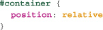
Enter position: relative. We mentioned earlier that when an element is positioned relatively it remains in the flow, and is only moved relative to its position in normal flow. But it’s another vital aspect of position: relative that will help us now: a relatively positioned element creates a new positioning context for any descendant elements that are absolutely positioned. So if an element is contained inside a parent element with position: relative, when we give that contained element a position: absolute, it will be absolutely positioned with respect to its relatively positioned parent element.
This is powerful stuff, though it can take a bit of work to understand its implications and uses. Let’s turn to our example, which will, I hope, clarify matters. Our content div is absolutely positioned. At present, none of its ancestor elements—the container div and the body element—have a position: absolute or position: relative. As a result, if we give the content element a position: absolute, it will be absolutely positioned with respect to the viewport. But if we give the container div a position: relative, the container div will remain where it is (provided we don’t give it a left or top value), and the content div will now be absolutely positioned with respect to the container element. In other words, if we use this rule:
...then the content element will be positioned at the top of the container element. Because the container element is in the document flow, if the header increases in size, the page will be re-flowed, and the container element’s position will be adjusted to accommodate the new header height [9.6]. And when the container element’s position is adjusted, the content element’s position will also be adjusted, because the content element is absolutely positioned with respect to the container element.
9.6 As the header element changes size, so too does the location of the container element—and, as a consequence, the location of the absolutely positioned content element.
Sticky Note
If you are wondering why the Navigation and Content headings don’t align vertically, it’s because of the margin on the h2 element inside the content element. If you set this element’s margin-top to 0, the headings will be aligned
Keeping Things on Top
As you lay out a page using CSS, you’ll frequently need to answer several questions about the page elements’ position in the imaginary stack defined by the z-index property. Elements with absolute and fixed positioning have a z-index property, and the higher the z-index of an element, the closer to the front an element is rendered. (We covered z-index in Chapter 4, so take another look at that chapter if you need to revisit the property.) Some of the questions you may need to consider are:
• How, in relation to other elements on the page, is a particular absolutely positioned element drawn?
• Does it obscure the elements rendered below it, or is it obscured by them?
• If there are several absolutely positioned elements, which is on top?
These questions can be difficult to answer. Elements positioned absolutely or as fixed elements are rendered in front of elements in the normal flow, which is one of the disadvantages of using absolute position to create page layouts.
By itself, absolute positioning is very powerful, but because absolutely positioned elements are completely disassociated from the normal page flow, the technique lacks finesse. However, if we use relative positioning to create elements that are in the normal flow and that provide a positioning context for absolutely positioned descendant elements, we have a combo system that looks almost ideal.
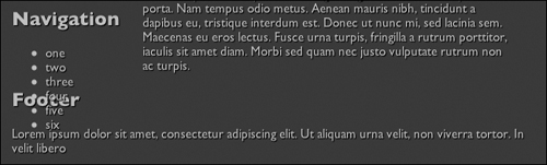
So what’s the problem? Well, take a look at the example page as shown in figure 9.7.
9.7 Even when they’re contained in relatively positioned elements, absolutely positioned elements don’t affect the normal page flow.

The footer element is still being styled as if the content element were not in the page. That’s because even if an absolutely positioned element is contained within a relatively positioned element, it still doesn’t affect the flow of the page. As a result, the height of the container element includes the height of the navigation element, but doesn’t include the height of the content block. That’s why the footer element is all the way up underneath the navigation element. And here’s the real challenge of absolutely positioned layouts like this: if the taller of two (or more) elements that comprise the columns of a layout is absolutely positioned, any element further down in the markup will suffer the same fate as the footer in figure 9.6. It may be possible—as, in fact, it is in this case—to absolutely position another of the “columns” instead of the content element, but this won’t always help. So although this approach to multi-column layouts is at times useful, it has serious limitations. We’ll look at ways to get around this roadblock using float-based layouts in just a moment.
Fixing Navigation on Screen
Some common page designs keep a subset of the navigation or a small set of tools constantly onscreen. This is often implemented with JavaScript, but can be more simply achieved using the fixed value of the position property. Like absolutely positioned elements, fixed elements are taken out of the page flow. But unlike absolutely positioned elements, fixed elements are always positioned with respect to the viewport, even if it is contained within an element that has a positioning context.
Using the preceding absolutely positioned example, if we made the navigation element (instead of the content element) absolutely positioned, we could give it a position: fixed to have it remain onscreen no matter how far down the page the user scrolls. The CSS rule would look something like this:

With fixed positioning, we need to be even more careful to prevent elements from overlapping and obscuring other elements on the page, because as the page scrolls, the fixed element remains where it is with respect to the viewport, and the rest of the page scrolls underneath the fixed element. As figure 9.8 shows, when the page is scrolled to the top, the navigation element doesn’t overlap the header element, but when the page is scrolled to the bottom it does overlap the footer.
9.8 Ensuring that fixed elements don’t overlap other page elements can be difficult.
Float-Based Layouts
To get around the limitations of positioning-based layouts, web developers have discovered and refined several other ways to create multi-column and other layouts using the float property of CSS. Float-based layouts don’t have the problems associated with z-index, and because floated elements still affect the normal flow of the page, the footer problem we saw a moment ago is much less of a problem.
We’ll begin by looking at a simple layout: we’ll create a horizontal navigation bar from a list of links, then turn to using the techniques learned here to create full-page multi-column layouts.
Horizontal, Floated Navigation Lists
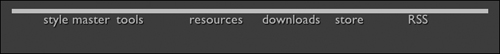
Site-level navigation arranged in a horizontal bar across the top of the page is a very common page design pattern [9.9]. Many developers agree that the most sensible approach to marking up such navigation is to use a list of links, since navigation is essentially a list of linked pages. Here’s the markup for the navigation shown in figure 9.9.

9.9 A classic horizontal navigation bar.

We’ll take what would otherwise be displayed as a plain list of links [9.10] and display it horizontally with just a small amount of CSS—and along the way, we’ll go over some powerful aspects of CSS that will be useful in many page layouts.
9.10 The default display of a list of links.

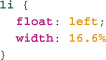
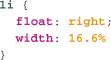
The secret to the technique is to float all the list items. As we saw in Chapter 4, if an element lacks an intrinsic width (as list items do), we need to give it an explicit width if we want to float it. In this instance, we want each list item to have the same width, so we’ll divide 100 percent by the number of list items (six), and we come up with a width of 16.6%:
We could also float each of the list items to the right, like this:
Doing so reverses the order of the list items, as we can see in figure 9.11:
9.11 Our floated list items floated to the right (top) and to the left (bottom).

With floated layouts, it always pays to leave a little bit of breathing room, because browsers need to convert percentages into pixels, and may round up to do so, thus making the total width (in pixels) of all the list items greater than the width of the containing element (in pixels). In this situation, the right-most list item in the layout wraps around under the left-most list item [9.12]. This applies to any adjacent floated elements inside the same parent element, and is a challenge for all float-based layouts.
9.12 When the total width of the list items exceeds the width of the containing element, one or more of the list items will move down directly beneath the first line of floated elements.

As you’ll recall, older versions of Internet Explorer (and IE 7 and 8 in Quirks mode) calculate the width of an element differently from all other modern browsers. This is almost certain to give rise to the problem shown in figure 9.11, which means one or more of the solutions I mentioned back in Chapter 7 will be required to make your float-based layouts work across common browsers.
Filling the Box
At this point, if we viewed our example page in a browser, you’d notice that the links don’t fill their parent list items—as inline elements, they are only as wide and tall as their content requires. But it can be useful to make inline content fill the dimensions of its parent elements, and our example provides just such a scenario. Users will expect the whole navigation bar to be clickable, but as it stands, unless the cursor is directly over the text of a link, clicking won’t do anything.
It’s easy to make these links fill their containing list items—we simply give them a display value of block. Elements with a display of block fill the entire height and width of their parent elements, all the way to the padding edge. Here’s what such a rule looks like:
A Border Around the Navigation List
Let’s now put a border around this navigation list. This should be easy. We just add a border to the list:
But now we have a problem. Figure 9.13 shows how the page now looks in a browser.
9.13 The list border doesn’t surround the list items.
This happens because when an element is floated within its parent, it no longer “counts” when the browser calculates the parent element’s height. So, when all the children of an element are floated as here, then the element effectively has no height.
It’s a giant headache, and for years, developers struggled to find a solution.
Happily, there is now a very simple fix for this problem that works in all modern browsers: give the containing element an overflow of auto (you can also use hidden, or scroll, but auto is what developers tend to use) and an explicit width, and all browsers will magically include the height of the floated elements when calculating the height of the containing element. Here’s the code:

Now that we’ve seen how float can be used to create page layout, we’ll use it to create common multi-column page layouts. This technique is very widely used, and has been explored in great detail by many developers over several years. While there has been some controversy as to whether using float for these outcomes is in some sense in violation of the CSS specification (float was not expressly designed for the purposes we are putting it to in this chapter), this approach to creating page layout is widely considered to be best practice in CSS layout, and without a doubt the most widely used set of techniques for CSS page layout.
Floated Multi-Column Layouts
Multi-column layouts are ubiquitous on the modern web. We’ve seen that such layouts can be achieved using absolute positioning, but that this approach comes with substantial limitations. The principal advantage of float over absolute positioning is that floated elements aren’t removed from the flow of the document, so we can let the browser worry about the impact of floated elements on the rest of the page instead of writing complex CSS and markup to control these interactions ourselves.
Float-based multi-column layout techniques use the same principle we’ve just seen with horizontal navigation bars. The so-called columns are elements that share the same containing element, and these are floated within their parent element [9.14]. (And as we know, a floated element floats out of the flow of its parent element, and to the edge of that parent, or until it touches the edge of another floated element.)
9.14 Both of the images are floated to the left. The first floated image touches the edge of its containing element, and the second floated element touches the edge of the first image (a margin separates them slightly). The content in the heading and paragraphs that follows these images flows around the floated images.

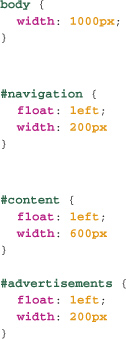
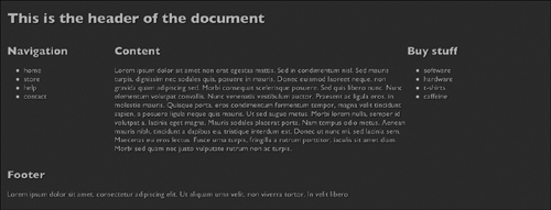
For our float-based layout example, we’ll construct perhaps the classic modern page layout: three content columns with a header and footer. As always, our goal is to change the original markup as little as possible to achieve the desired layout, and we’ll begin with simple, logical, semantic markup.

We’ll float each of the three column divs—navigation, content, and advertisements—and give each a different width. Again, we have to make sure the total width of these elements adds up to less than 100 percent—otherwise, the right-most column will wrap around underneath the other columns, breaking the layout and making us weep and rend our garments. So how should we specify the widths? We can use percentages, pixels, ems, or a combination of any of these, but the combination approach can get very complicated—each method results in different behavior when text is zoomed or the window size changes. Before implementing the layout, we’ll take a quick look at the strengths and weaknesses of each method.
Fixed-Width Layouts
The most common way to specify the width of columns in a multi-column layout is to use pixels. The resulting layouts are commonly called fixed-width layouts. Because column widths are specified using pixels, when the window is resized or the text zoomed, the column sizes remain unchanged.
One drawback of this method is that the length of lines of text shortens as text size increases, which can result in unreadable pages if the user needs to magnify the text by more than a few sizes. Additionally, fixed-width layouts are typically tuned for specific screen sizes, and as the range of screen sizes increases to include everything from tiny mobile device displays to mammoth 1980-pixel, high-resolution monitors, a single fixed-width layout is increasingly less likely to provide a reasonable solution to page layout. One way around this problem is to use JavaScript to change the pixel widths of columns based on the size of the window. Another is to use CSS3’s media queries, which we’ll cover in Chapter 14, but this method it not yet supported in any version of Internet Explorer, so it won’t be useful for every project.
Another trap for beginning CSS developers is that fixed-width layouts can be very fragile: if the window width is less than the total widths of the columns, the columns will wrap and one or more will be pushed below the other columns. This problem is easy to solve. If the columns are contained inside an element with a pixel-based width that is greater than or equal to the combined widths of the columns, the browser will add a horizontal scroll bar when the window width is narrower than the combined pixel width of the columns instead of breaking the layout. We could add an extra div to contain all our column elements, and give that div a fixed width, but in many situations, we can just plaster a fixed width on the body element. Here’s how we’d achieve a bulletproof fixed-width three-column layout.
The bottom line: Fixed-width layouts are still the most common type of floated layout, but as screen sizes continue to diversify, this may change.
Fluid Layouts
Fluid layouts, also known as liquid layouts, specify the width of columns using percentages. With this method, the pixel widths of the columns automatically adapt to the width of the window or viewport. Fluid layouts have several advantages over fixed-width layouts: they’ll never break when the window size is changed, and given the growing range of web-capable devices, their ability to adapt to a range of screen sizes makes them very attractive. On the other hand, viewed on very wide or very narrow screens, the line-length of text within fluid columns can become long or too short for easy reading.
Happily, we can combine the best of fixed and fluid layouts using the overlooked min-width and max-width CSS properties. As you might guess, these properties specify a minimum and a maximum width for an element, and you can use them alongside percentages to ensure that once the maximum or minimum width is reached, the layout stops growing or shrinking. If you’re thinking that this simple trick sounds too good to be true, however, you’re at least partially right.
With one exception, all the CSS features used in this chapter are supported across all modern browsers from IE 6 on. That exception is the max-width and min-width properties, which are supported in all modern browsers except for IE 7 and 8, which support them only in standards mode.
Because these layouts are somewhat fixed, and so may break as the window becomes narrow, it again makes sense to use the technique we used for fully fixed layouts of fixing the width of the body (or other element containing these columns). Here, instead of using the width property to do that, we’ll use the min-width property, with a value that is the sum of the minimum widths of each column. This means that in IE 6, we don’t get quite the robustness that the min-width on the containing element provides, and for narrow window sizes the layout may break in that browser. But for almost all browsers, our layout will be robust, regardless of the width of the window.

Elastic Layouts
A third, somewhat less common layout method is the elastic or em-driven layout. These specify column widths in (naturally) ems. The advantage of this method is that lines of text will contain approximately the same number of characters as the user zooms the text size up or down, which means that elastic layouts are less affected by text resizing than are fluid or fixed layouts.
Fully elastic layouts, in which each column’s width is specified in ems, are uncommon and suffer from the fact that as a user zooms the text, they may have to use horizontal scrolling. But a combination of em-based width for the main column of text and fixed or percentage-based widths for other columns can produce a layout that has consistently readable line lengths for the main text, while keeping the whole layout visible in most circumstances.
One more consideration: if you use elastic layouts, it’s a very good idea to specify a width on the body or another element that contains the columns so that the layout doesn’t break when the text size is zoomed up. See the earlier sections on fixed or fluid layouts for more on this technique.
The Footer
Now that we have that out of the way, let’s return to our example page. At present, our footer element will float up alongside the floated columns, but this problem is easily fixed using the clear property on the footer to specify that our footer element must not wrap around floated elements above it in the document. So a cleared element is pushed down below the tallest floated element above it, as shown in figure 9.15. By giving the footer element a clear value of both, we complete our layout.
9.15 The clear property means an element that will otherwise wrap around floated elements as they float past is pushed below the tallest floated element.
The Color Conundrum
With very little CSS, we’ve created the desired three-column layout, but one challenge remains: what if we want each column to have a different colored background? Can’t we just add a background color with CSS?
Sadly, it’s not quite that simple. We know that HTML elements are only as tall as their contents unless we give them an explicit height value. You might think that setting a height: 100% for the various columns would make them fill their containing element vertically, but the height property doesn’t work that way with percentage heights, only with length-based height values (that is, height values that use ems, pixels, and other length units). And whereas if all the columns are the same color, it’s not really noticeable if they’re not all the same height, when each column has a different background color, disparities in height are glaringly obvious. This challenge has long caused developers difficulties. In fact, it’s a design pattern you see less frequently now than in the past, perhaps in part due to the difficulty of solving it. Once again, there are several solutions, each with strengths and weaknesses.
The two main approaches to solving this problem are:
• Faux columns, developed originally by Dan Cederholm for fixed layouts, has also been adapted for fluid and elastic column layouts.
• The one true layout by Alex Robinson (this is a slightly more complex version of the floated column layout we’ve just explored, which through the ingenious use of negative margins allows the same three columns to be arranged left to right in any order without touching the markup).
Faux Columns
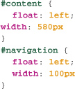
The basic principle of the faux columns technique (faux, for those of you non-francophones, means false, or fake) is that we use a background image on the containing element of the columns as a fake background color for the columns. Developed by renowned web developer and author Dan Cederholm, the technique was first described in A List Apart (www.alistapart.com/articles/fauxcolumns). The technique is, as Cederholm says himself, “embarrassingly simple”—though like many simple things, it’s also extremely clever. Suppose we have a page with two columns, floated left, each with a width fixed in pixels:
Now, on an element which contains both the columns (for example, the body), we use a background image that will provide the fake background color for both columns. Figure 9.16 shows an example image we could use. The lighter gray on the left is 580px wide, the darker gray is 100px—the same widths as the two columns, which will then sit on top of these columns of color in the background image. We then tile the background image vertically, and then the content of the columns overlays these background images.
9.16 An image with two solid color backgrounds (top) is vertically tiled as the background image, creating fake column backgrounds. The content of the columns sits on top of this image, creating the effect that the color fills their columns vertically.

Of course this approach won’t work when column widths aren’t fixed. Fluid faux columns are possible, though quite a bit more complicated than the fixed-width variety—the core principle of using background images on containing elements to create faux column backgrounds is the same, however. The concept has been explored in detail by Zoe Gillenwater, a well known web development expert and author, at communityMX (www.communitymx.com/content/article.cfm?cid=afc58). I recommend her article as a starting point for those who wish to get up to speed with fluid faux columns.
The One True Layout
A different approach to achieving this same outcome is part of the one true layout technique for creating multi-column layouts (www.positioniseverything.net/articles/onetruelayout). With this ironically named technique, the column order is completely independent of the source order. This can be beneficial for accessibility and search engine optimization, as it allows us to move content closer to the beginning of our markup, where search engines and assistive devices may give it more attention, but still display this content where we want in a page layout.
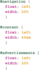
One drawback is that the elements which will be our columns must be contained within a containing element. One of the principles of design and markup we stress throughout the book is that as much as possible, our markup should not include presentational aspects, be they the obvious presentational elements and attributes, or more subtly, elements there solely for the purposes of presentation. But at times, depending on the needs (and demands) of the job, additional markup may be required. This is one of those cases. Here’s our column markup before, with an additional div wrapping the column divs.

A big advantage of this technique over the faux columns technique is that the background color or image for the columns is applied directly to the column elements, not to a containing element. The secret to this technique starts with adding the same large amount of padding to the bottom of each of our column elements. This value must be large enough so that the shortest column plus the padding is taller than the height of the tallest column (without padding). Now, if you are thinking this will simply make each column taller by the amount of padding added, you are indeed correct. There’s still a little more we need to do. Next, we’ll add a negative margin-bottom of the same amount as the padding we added to each of the column elements. Putting these together, along with the background color for each column element, here’s our CSS:
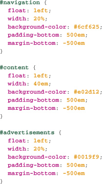
The negative margin-bottom in essence pulls the bottom of the element up the same amount as it has been pushed down by the padding. However, while the footer element is now sitting nice and snug underneath the bottom of the content of the tallest column, the colored background of the columns still extends past the footer and down the page.
The last part of the trick is to add overflow: hidden to the containing element of these columns (that’s why they must have their own container.) This clips any content (including the padding of the columns) to the actual height of the containing element.
And now, in all modern browsers, including Internet Explorer (as far back as IE 5 Windows), we have the holy grail of true columns, with equal heights, regardless of their content height.
Too good to be true? Well, yes. As with many of the more complex web development techniques, there are some challenges. With this approach, when there is a target anchor in any of the columns, if a link is followed to this anchor, then the container of the columns scrolls to bring this anchor to the top. A picture tells a sorry 1,000 words in this case, as figures 9.17 and 9.18 show.
9.17 Before: our three columns.

9.18 After we jump to an internal link, the columns have scrolled down to the linked anchor.

Sadly, there’s really not a solution to this problem—well, short of not having internal anchors in columns like this. For long columns of text, this means that a table of contents for the page can’t be implemented, which can be a real usability concern. If you have a situation where internal anchors are definitely not required, this is the solution for you. Otherwise, some variations on faux columns is your most likely approach. A recent straw poll conducted on Twitter reveals that as of this writing, Faux Columns continues to be the technique of choice among experienced developers.
Now that we’ve explored the most common ways in which page layouts are currently developed, there are two other subjects we should cover at least briefly while dealing with the issue of CSS page layouts. First, we’ll talk about the increasingly popular grid layouts, and then we’ll turn to a part of the CSS2 standard that is quite widely supported in modern browsers and promises a way out of the complex maze of techniques and workarounds that comprise web page layout with CSS.
Grid Layouts
Despite web design’s origins in print design, grid-based layouts—a staple of print design since the 1950s—have only relatively recently begun making inroads into web design, championed by such designers as Mark Boulton and Khoi Vinh. One significant drawback of grid-based designs is that their complexity typically requires that the markup be heavily influenced by the design itself, in contradiction to the widely held principle that markup and presentation should be kept separate as much as possible. (Most of these methods are associated with CSS frameworks, which we’ll focus on in Chapter 10.) There are, however, two developments in CSS that promise to help us avoid marking up our content in strange ways just to facilitate grid layouts: CSS2.1 table layout properties, which is almost ready for widespread use, and CSS3’s Grid Layout Module, which is still in development. Let’s look at the first of these now.
CSS2.1 Table Layout Properties
As was noted at the beginning of this chapter, web design patterns have been heavily influenced by developers’ early use of table-based layouts, and as we saw, the CSS page layout model was not designed to work the same way as the HTML table model.
CSS2.1, however, features a table layout model that is supported in all modern browsers, including (for once) IE 8, and which essentially reproduces the HTML table model in CSS. Just as we can use CSS to make any element act like a block-level element with the display property, with this model, we can now make any element act like a table, a table cell, a table row, and so on. Without using tables in our markup, we can use the table model via CSS, thus gaining the benefits of easy vertical alignment, equal width columns, and so on, without touching our markup or making our sites inaccessible.
For example, we can make any element display like a table row with the CSS display: table-row, or any element display like a td element with display: table-cell. So efficient is this technique that achieving a fluid, unbreakable multi-column layout without any additional containing element and with colors that fill each column can be done with just a handful of CSS properties. For example, to create a fluid, two-column layout in which each column is filled with a background color, we’d need only this HTML, and the attendant CSS.


We simply give each of the columns a display of table-cell, and then give the wider column a width (we could also apply a width to the narrower column), along with a background color for each. The browser takes care of the rest. Hard to believe, but try it in any modern browser, including IE 8!
Not Quite Ready for Prime Time
There are however a couple of challenges we need to be aware of.
As was true with old-school, table-based layouts, the order of the elements in the markup determines the order in which elements can be presented using CSS2. So, unlike in the One True Layout, and other float-based layouts, the source order of the HTML will be determined by the layout—which can have implications for search engines and assistive devices. Another drawback is that all versions of Internet Explorer before version 8 do not support CSS table layout properties, which means that as long as older versions of IE are widely used, using these CSS2.1 properties will present significant challenges to developers. The day of simply coded, sophisticated grid-based layouts has not arrived quite yet, but it’s coming soon—and we won’t have to wait for the CSS3 Grid Layout Module to be developed and supported.
The Wrap
Page layout tends to consume a lot of development time. Fortunately, thanks to the efforts of many developers over many years, there are well documented, robust techniques for implementing many common design patterns—and we now have a far greater understanding of what we can accomplish with existing CSS specifications and common browsers. Additionally, we know that emerging CSS standards will soon add to our armory of techniques.
Still, I sometimes wonder if, when we look back on web development a decade or so from now, we’ll have developed entirely new ways of designing for the web—and whether the concerns of this chapter won’t look a bit old fashioned. Only time will tell.