Chapter Four: Presentation
In this chapter, we’ll look at the core concepts and syntax of CSS. Later on, we’ll put this knowledge into practice with focused chapters on page layout (Chapter 9), CSS resets and frameworks (Chapter 10), CSS3 (Chapters 12 and 13), and web typography (Chapter 15).
A Short History of Style for the Web
The idea of separating structured content from information about how that content should be presented has been around since the 1970s. The initial proposal for HTML included the idea that presentation would be the domain of a separate style sheet language, but no such language was developed. In the mid-1990s, browser makers responded to a huge demand for control over presentation by creating such new HTML features as the font element, the bgcolor attribute for the body element, vlink and other attributes for styling links, and so on.
As a result of these changes, HTML devolved from a semantics-focused markup language to one festooned with presentational elements and attributes, few of which were part of any standard. Such HTML was difficult to write and to understand. Worse, web content marked up using these incarnations of HTML was hidden by vast swaths of purely presentational markup, making it difficult for search engines and user agents like screen readers to make sense of the content itself. Complex presentational markup is also extremely difficult to maintain: sites marked up solely with presentational HTML were so difficult to redesign that their markup often had to be abandoned and recoded from scratch.
In 1996, the W3C published the CSS1 specification, based in large part on earlier work by Bert Bos and Håkon Wium Lie. Internet Explorer 3, released in 1996, had experimental support for CSS, and both Internet Explorer 4 and Netscape 4—the “version 4” browsers that ushered in the era of modern web development—offered more complete though painfully buggy support for CSS1. With these browsers, CSS became a real option for basic styling including fonts, colors, and whitespace control. Complex CSS page layout, however, was still some way off.
Internet Explorer 5 for the Mac, released in 2000, was the first browser that could be said to have genuinely usable support for the features of CSS1 and many of the features of CSS2 (which was published in 1998, but never fully supported in any browser). IE 5 for the Mac, whose Tasman rendering engine was developed under the leadership of Tantek Çelik, showed what could be done with CSS, particularly when it came to page layout. It also made developers realize that targeting older, less capable browsers—as well as newer, more sophisticated browsers—would be an increasingly important part of their jobs. (See Chapter 7 for a much longer discussion of this issue.)
The release of Internet Explorer 6 for Windows was another important milestone for CSS-based development; though its CSS support is now seen as buggy and uneven in comparison to later browsers, IE 6 was the first browser that offered reasonably good CSS support for Windows users. Sadly, the demise of Netscape Communicator slowed updates to Netscape 4, which meant that developers had to keep coding for Netscape’s version 4 well after Internet Explorer had moved on to more sophisticated (though still buggy) CSS implementations. Through the late 1990s and early 2000s, support for CSS and web standards as a whole grew among web developers. Yet the slow pace of development of CSS support in browsers—and of browser upgrades by users—also made the period one of great frustration for developers. Many experienced developers who had perfected their presentational HTML skills resisted the adoption of CSS, often with the frustrated (and not entirely unreasonable) cry of “CSS doesn’t work!”
The introduction of Safari for the Mac in 2003 and Firefox in 2004 shook the world of web browsers out of its complacency. Safari, which was based on the open source KHTML—which Apple themselves later open sourced as the rendering engine WebKit—and Firefox, which was based on the Mozilla open source codebase started by the Netscape team, placed a strong emphasis on standards support. Simultaneously, Opera Software, led by CTO Håkon Wium Lie, continued to support standards in the Opera browser and promote standards-based development to the developer community.
At about this same time, Microsoft announced that they would not release new versions of Internet Explorer for their then-current OS, Windows XP, causing many developers’ hearts to sink at the thought of being forced to support IE 6 for all eternity.
The rapid adoption of Firefox and Safari, however, may have prompted a change of heart at Microsoft, which later announced that Internet Explorer 7 would be available on Windows XP as well as the newer Vista operating system—and that it would include improved standards support. With the release of IE 7 and the subsequent introduction of IE 8 (also available for Windows XP), which offered even better standards support, web standards had finally become central to both web developers and all browser makers. As a result, CSS finally became the undisputed technology for controlling the presentation of web content.
Why Separate Content from Appearance?
But why is CSS so important? What are the practical benefits of separating the presentation of a page from its markup?
• When markup is decoupled from presentation, multiple developers can work on different aspects of a site’s development independently.
• Site maintenance is far more efficient: a complete redesign can often be achieved with little or no changes to a site’s markup.
• When we increase the ratio of content to markup, we’re almost certainly improving the visibility of a page’s content to search engines, which is as important as any other factor in search engine optimization.
• Clean, well structured markup is usually much easier for assistive devices like screen readers to understand, which makes sites more accessible.
• The file sizes of pages that are marked up semantically and structurally are usually considerably smaller than those marked up presentationally, which results in bandwidth savings and (usually) improved site performance.
But if you’ve read this far, you’re probably already convinced. So let’s dive into CSS.
What Is CSS?
CSS is a language for describing the presentation of elements in a document marked up in HTML (and other markup languages, in theory at least).
How Is CSS Used?
There are several ways in which style sheets can be associated with an HTML document.
Inline Style
CSS can be added to individual HTML elements as the value of the style attribute. This method is called inline CSS. For example, we can give an individual paragraph a text color of red using this code:
This, however, isn’t a good idea. Applying style like this doesn’t separate presentation from markup and content, so it’s really not much better than using presentational HTML. Furthermore, it’s not possible to override inline styles, which makes this method even harder to work with than presentational HTML in some respects.
Embedded CSS
Embedded CSS puts the styles for an HTML document in the document’s head, inside a style element:
The style element contains a type attribute that tells the browser the type of contents of the element, and must be contained in the head of the element, unlike script elements, which may be contained anywhere in a document.
Embedding CSS is not the best possible way of adding CSS to a page, as it works only on a per page basis, and it too should be avoided in favor of the recommended approach, which we’ll look at next.
Linking to External CSS
The recommended technique of adding CSS to an HTML document is to link to one or more CSS files using a link element in the head of the HTML document. This allows us to experience the full benefits of using CSS in place of presentational HTML.
This link element has three attributes, all of which are important:
• The first is the rel attribute, which we saw in Chapter 3. It specifies the relationship of the linked file to this one—in this case, that the linked file is a style sheet for this document.
• The second attribute, href, specifies where the style sheet file is located. We can use a relative or absolute URL (style sheets can even be located on different domains from the HTML document).
• Lastly, we must also have the type of text/css. This tells the browser what type of style sheet language to expect. Some browsers also support XSLT style sheets, so we want to ensure the browser is aware of what it is getting.
An external style sheet is simply a text file. It usually takes the file extension .css, which will typically ensure that the server serves the file as text/css, the MIME type the browser expects based on the type attribute we set.
Basic CSS Syntax
Of course, we need to have something to put into our external (or embedded) style sheet. This is CSS, a simple language, which uses just text. We’ll start with the core of the CSS syntax, then dive into the major features of the language.
Selectors, Declaration Blocks, Declarations, and Properties
A style sheet, like an HTML file, is quite simple: in essence, it’s just one or more statements, which are also referred to as rules.
Each statement has two parts, a selector and a declaration block. The selector specifies what elements in an HTML document the statement will style. The declaration block specifies the style that will be applied to the elements the statement selects.
The declaration block contains one or more declarations. A declaration is made up of a property name and a value. Here’s an example statement:
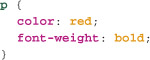
Try breaking this down in your own mind into selector, declaration block, declarations, and properties before we continue.
In the preceding example, our selector is p. This is one of many different types of selector we’ll cover in this chapter, and throughout the book. It matches every element with the name p—that is, every paragraph element in the page’s markup.
The declaration block is everything contained within the curly braces. It contains two declarations: one with a color property, and one with a font-weight property. Notice that the two declarations are separated by a semicolon (;). The semicolon after the second declaration is optional, as it is after the last declaration of any declaration block.
And that’s all the syntax you need to learn to use CSS. You will need to understand the various types of selectors, their structures, and what types of elements they match in a document. In this chapter we’ll cover all the major selector types in CSS1 and CSS2, and in Chapter 12, we’ll look at CSS3. The other thing you’ll want to learn are the various properties for styling these elements. There are several dozen, though only about two dozen are in common use. We’ll cover all the most commonly used CSS1 and CSS2 properties in this chapter, and in Chapter 13, we’ll look at CSS3 properties.
One note about the structure of this chapter: rather than simply cataloguing all the selector types and then all the properties of CSS, I’ll begin with some of the simplest selectors and properties and then build up to progressively more sophisticated versions.
The Basics of Selectors
CSS selectors are the least understood part of the language, but a good understanding of selectors and their uses is a hallmark of a good professional developer. Here’s your chance to really get to grips with the sophistication of CSS selectors.
Type Selectors
A CSS selector specifies which HTML elements a particular statement will style. The simplest kind of selector of the dozen or so is the HTML element, or type selector. These selectors use just the name of an HTML element (for example p, h3, or body), and select every element of that type. So p selects every paragraph, h3 selects every heading of level three, and body selects the body of the document (an HTML document can have only one body).
Grouping Selectors Together
We can group selectors so that the same declaration block of properties applies to all of elements selected by any of the selectors in the group. A selector group is simply the selectors separated by commas. For example, to select all heading levels at once, we can use the selector:
As we’ll see later, we can group together selectors of different kinds. Selector groups produce more compact, readable, and maintainable style sheets. For example, if all headings in a document use the same font, we can simply use the selector group in the preceding example rather than having to repeat the font selection property six times (and then change it six times if the style changes).
Basic Properties: Font Styles
CSS support in browsers began with simple text style properties, so it’s fitting that we begin our investigation into CSS properties with these foundational properties.
color
The color property specifies the text color for selected elements.
The property takes a single color value. Color values, which are also used by a number of other CSS properties, come in a number of forms.
The simplest color values are color keywords, of which there are two kinds: seventeen basic color values like red and blue, and a larger number of system colors, including ButtonFace, ButtonText, and other values. In addition, all browsers have long supported a large palette of 140 color keywords from the X11 color chart, and though these are not part of CSS1 or CSS2, they are part of the draft versions of CSS3.
The seventeen common colors are aqua, black, blue, fuchsia, gray, green, lime, maroon, navy, olive, orange, purple, red, silver, teal, white, and yellow. A full list of the X11 colors can be found at en.wikipedia.org/wiki/X11_color_names.
System colors don’t set text to a specific color—instead, they let developers match the style of their own elements (like buttons) to the current system colors as defined in each user’s operation system preferences, thus harmonizing their interfaces with the system’s.
Color in CSS can also be specified in a number of other ways, the most common of which is hexadecimal RGB colors. These have the form #RRGGBB, where RR is a red hexadecimal color value, GG is a green hexadecimal color value, and BB is a blue hexadecimal color value. You won’t generally need to manually determine the color value, as most design tools do this part for you, but now you know what the code means. When all three colors have their two digits or letters repeated (for example, #FF2277), the value can be truncated using the form #RGB (in this case, #F27). Note that this truncation can occur not when the second digit is a zero, but when the digit or letter for each color value is repeated. One very common CSS error is leaving off the # at the beginning of the hex value; don’t do this. The third and fourth way to specify color values is via decimal and percentage RGB colors. Both of these methods have the basic form rgb(color value), with the color value inside the parentheses. In decimal RGB, a number between 0 and 255 is used for each color, with these values separated by a comma. In percentage RGB, a percentage value from 0% to 100% is used. So, orange, which is #FFA500 in hexadecimal, would be rgb(255, 165, 0) in decimal RGB and rgb(100%, 65%, 0%) in percentage RGB.
Let’s cut to the chase and give our body a color of orange:
We’ve created our first statement. Easy, right?
font-family
Next, we’ll give our headings a font. In CSS, we use the font-family property for this. This property takes one or more font names, separated by a comma. Why specify more than one? In CSS, we can generally only use the fonts already installed on our users’ systems. There are exceptions to this rule, but web typography is sufficiently complex to deserve its own chapter (Chapter 15), so we’ll stick with basics for now. The fonts on users’ computers will depend on their operating systems, what fonts they have installed themselves, what software (such as Microsoft Office) they have installed, and several other factors. If we could only specify a single font, we’d really be stuck with the tiny subset of fonts that all platforms have in common. Luckily, we can specify more than one, so we can take advantage of a wider range of fonts. It’s usually best to use a set of fonts that are similar to each other—by which I mean not simply fonts that look alike, but that have similar metrics—so that the same characters will occupy a similar amount of space in the various fonts we select.
A common pair of fonts with very similar metrics is Helvetica and Arial. One or the other of these two fonts are found on most browsing platforms, so specifying both together makes a lot of sense. We’d do this with the font-family property like this:
It’s also a good idea to use a fallback generic font family, of which CSS provides five:
• serif
• sans-serif
• monospace
• cursive
• fantasy
Here’s how this all works together. When a browser sees the font-family property, it takes the list of font names (which are separated by commas) and looks to see whether the user’s system has a font that matches the first name. If so, it uses this font. If not, it goes to the next font name, and sees whether it has a match for this one. If so, it uses that; otherwise, it continues along the list. You can name as many alternate fonts as you like. If none of the names match a font on the user’s system, the browser takes the generic family name and uses either its default font for that family or the user’s preferred font for that family (most browsers let you set a preferred font for generic families).
When a font has one or more spaces in its name—like Times New Roman—the name of the font must be wrapped in single or double quotation marks. For example:
Common mistakes with the font property include using quotation marks with font names that don’t have spaces, using quotation marks with generic font family names (particularly sans-serif), and not using quotation marks with font names that do have spaces.
font-size
You can set the size of text with the font-size property. font-size is the first property we’ve seen that takes more kinds of values: length values and percentage values.
Length Values
A length value is a numeric value associated with a unit of measurement. In CSS, with very rare exceptions, when a property takes a numeric value, that value includes a unit. In HTML, unitless numeric values are assumed to be px values, but in CSS, a length value without a unit is almost always considered an error; there are one or two exceptions, which we’ll discuss shortly. This is one of the most common errors CSS developers make, and it’s so common in part because some browsers wrongly treat numeric values with no units as pixel values. There are several different units, the most common being pixels (px) and ems (em). Percentage values, though they’re not strictly length values, are very similar to length values; the trick is that percentage values don’t always refer to the same thing from property to property, as we’ll see shortly.
Relative and Absolute Values
There are two types of length value—absolute values, which are most commonly length values with a px unit, and relative values, which are most commonly values with an em unit. Percentage values are effectively relative values as well.
Absolute length values are (usually) fixed, regardless of factors like the user’s text zoom, window size, and so on. Relative values allow layouts, text size, and other CSS-applied styles to adapt to the user’s preferences and setup, so they’re generally preferred. We’ll see plenty of examples of the benefits of relative units throughout this book, but some very common examples include:
• Specifying font-size in em units or percentages. This allows for text to grow and shrink as users increase and decrease their font size (this is less of a problem today, but older browsers typically fixed the size of text so that it couldn’t be zoomed by the user if the unit for font-size was pixels).
• Specifying the width of an element in ems. This means that the element remains more or less the same number of characters wide regardless of how big or small the text is zoomed. This can be especially helpful for legibility, where particularly long or short lines of text can very much impact the ease of reading.
It’s possible to set font-size in pixels, but it’s much more preferable to set it in either percentages or ems. We could set our headings to have different font sizes using statements like these:
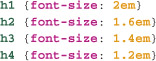
This means that the text of h1 elements will be twice the size that it would otherwise be, h2 elements 1.6 times the size it would otherwise be, and so on. We could similarly use equivalent percentages to do this:

Much less common is the use of keywords to specify font sizes. It is possible to use keywords like xx-small, small, and large, but it’s usually best to avoid these, as there’s no consensus among browsers—or in the CSS standard—as to exactly what these seven sizes should be in relation to one another.
font-weight
The font-weight property, which controls how bold or heavy a font should be, can be specified in two ways: we can use the keywords bold and normal, or we can use one of nine weights from 100 to 900. It’s rare that fonts have a wide range of weights, and so values of 100 to 400 map typically to the value of normal, and 500 and up are considered bold.
font-style
One of the challenges of becoming proficient in CSS is learning and remembering all the different possible property names, which don’t always align with what we commonly call these properties outside of CSS. A perfect example is how we specify whether an element’s text should be italicized. In CSS, we use the font-style property, with three possible keyword values—italic (not italics), normal, and oblique. We can essentially consider italic and oblique to be the same thing.
text-decoration
With the text-decoration property, we can add or change text strikethrough, underline, the far less commonly used overline, and the mercifully unused and largely unsupported blink decorations. The text-decoration takes one or more space-separated (not comma-separated) keyword values:
• underline
• overline
• line-through
• blink
• none (which removes, for example, the default underline most browsers apply to anchors)
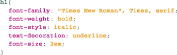
Putting these common properties together, we might style a heading of level 1 like this:
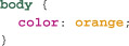
Inheritance
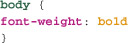
If we were to set for example a font-weight on the body element using, say, this statement:
then all of the text in paragraphs, headings, and other elements would be bold. But why? What’s going on?
Many, though not all, CSS properties are inherited by child elements from their parent elements. For example, font-weight is inherited. This means that all descendants of the body—that is, every visible element in the document—will have a font-weight of bold as well, unless some other CSS statement specifies that its font-weight should be normal.
Inheritance is powerful and sometimes confusing, but without it, CSS would be much less efficient. We’d have to specify font-size, font-weight, color, line-height, and many other properties for every single type of element in a document, which would produce larger and more difficult to maintain CSS files. I won’t exhaustively list the properties that are inherited and those that aren’t (these are detailed in the CSS specification). The good news is that in almost every case, properties that we’d want to be inherited will be, and those that we wouldn’t want to be inherited—border and padding, for example—aren’t.
In addition, we can always use a special keyword inherit for any CSS property, which specifies that the value should be inherited from the parent element, regardless of whether the property is inherited by default.
Getting Specific: class and id Selectors
Being able to select and style every paragraph or heading of level 1 is a leap forward over presentational HTML, but it’s still quite unsophisticated—after all, what happens if we only want to style specific paragraphs or other elements? Fortunately, CSS has different kinds of selectors that select HTML elements according to specific characteristics. The most commonly used (and also the most overused) of these are the class and id selectors. These selectors select any element with a given class value or id value.
class Selectors
Class selectors, as we’ve just seen, select every element with a given class value. The syntax is straightforward: just a period followed by the value of the class attribute we want to select. For example, in Chapter 3, we used the class value of chapter for the chapters of our book. We’d select every element with a class value of chapter like this:
This will select, for example, p class="chapter", but also div class="chapter".
We can make class selectors more specific by adding the type of element we want to select (in addition to the class it must have) before the period. For example, p.chapter will only select paragraphs of class chapter. It won’t select divs with that class value.
id Selectors
Closely related are id selectors. We saw in the last chapter that ids differ from classes mainly because whereas any number of elements may share the same class value, only one element in any document may have a given id value. We construct an id selector by using the pound (or hash) character (#) followed by the id name. So, if we wanted to select the div with the id volume1chapter1, we’d use this selector:
As with the class selector, we can make the id selector more specific, and only select an element of a particular type that also has a given id value by adding the type of element before the # character. For example, div#volume1chapter1 will only select a div with the id value volume1chapter1.
Specificity
Now, what happens if we have the following two CSS statements?
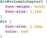
What font-size will the text of a div with id volume1chapter1 have? There are a few rules that, once we learn them, will allow us to easily determine which properties apply. The technical name for this is specificity—and in short, the more specific statement overrides less specific statements.
It’s important to note that whole statements don’t override one another. Rather, specific properties are overridden. Let’s come back to this point once we’ve looked at the basic rules of specificity:
• Different types of selectors have different specificities. The rules are technically quite involved, but they’re not difficult to remember: id selectors always trump class selectors, and class selectors trump type selectors. As we see more selector types, we’ll add them to our specificity rules.
• When they have the same specificity, statements closer to the end of a style sheet have higher precedence than those closer to the top of the style sheet.
Returning to our example, font-weight will be bold, because there’s no conflict with the second statement. font-size will be 1.1em, because the id selector trumps the type selector. font-color will be red, as there’s no font-color property in the first of the statements, and thus nothing to override this property.
Common Text Layout Properties
In addition to font styling properties, CSS also has a number of text layout properties for aligning text, specifying line heights, letter spacing, word spacing, and more.
text-align
Text can be aligned left, right, center, or fully justified using the text-align property and one of these four keywords:
• left
• right
• center (only the American spelling may be used)
• justify
Justified text on the web is usually a bad idea, because the justification algorithms in browsers are less sophisticated than those in page layout and word processing software. This leads to a much higher chance of undesirable effects like rivers, in which vertical rivers of whitespace occur when the spaces between words are stretched to fill the full width of the element.
line-height
In CSS, line-height, unsurprisingly, specifies the height of a line of text in an element.
The judicious use of line-height can have a noticeable effect on the appearance of a block of text. The CSS line-height property allows you to specify the line height as a length value, such as 1.4em, a percentage, or (in a rare exception to the rule) a number without units. Numberless units, when used with line-height, specify a multiplying factor rather than a pixel height.
This unusual multiplier allows a new way for elements to inherit line-height values. Before looking at this method, let’s consider the way inheritance works with percentage values. If a line-height whose value is specified with a percentage is inherited, the value of the line-height for the element is a percentage of the current font size of the element’s parent; child elements inherit this precalculated value, not the percentage itself. Consider the following statement (in which I’ve used a pixel font-size to simplify the calculations, though this isn’t a recommended in actual development):

In this example, the line-height for our div will be 120% of 12px, which is 14.4px—which will be rounded down to 14px, the nearest whole px value. A paragraph inside this element will inherit a line-height of 14px, even if its font-size is, say, 16px. And any child of that paragraph will also inherit a 14px line-height—which essentially loses the whole point of using a percentage value to begin with.
The multiplier value—a unitless numeric value—is nearly identical but is inherited in a different way. Suppose we specify the very similar statement

Here, the parent div will have a line-height of 1.2 times 12px, which is 14.4px, again rounded down to 14px. So far it’s identical to a percentage line-height. But this time, the children of the div will also have a line-height of 1.2. So if, for example, we have paragraphs inside the div with a font-size of 16px, their line-height will be 16px times 1.2 which is, 16.8px (17px, rounding to the nearest whole pixel value).
Importantly, using a multiplier rather than a percentage means that the line-height of elements doesn’t need to be individually specified in individual statements. Instead, the multiplying value is inherited from, for example, the body element. This is the recommended way of specifying line-height.
Incidentally, by default, most browsers use a line-height of 1.0 to 1.2.
Letter and Word Spacing
CSS allows developers to expand or condense the space between letters or words, using the properties letter-spacing and word-spacing. Each of these takes a length value, though not a percentage value. A positive value expands text spacing, and a negative value condenses it. Figure 4.1 shows text with no additional spacing and the same text condensed by .1em using letter-spacing: -.1em, and expanded by .1em using letter-spacing: .1em. We’ve used ems here, as we will do often in the book because with relative units, when a user zooms text, the proportion of letter spacing will stay the same. If we’d used a pixel-based letter-spacing, at some text sizes the spacing looks fine, while at others, it’s unnoticeable, or negatively affects legibility.
4.1 Text with no letter-spacing (top), with a letter-spacing of .1em (middle), and with a letter-spacing of –.1em (bottom)
text-indent
Frequently, with blocks of text such as paragraphs, the first line of text is indented or “outdented” to distinguish it from the rest of the block. We can do this easily with the rarely used text-indent property. For example, we could indent the first line by 5em like this:
We could also “outdent” the first line by using a negative value. Again, we’ve used em units so that our design will retain its proportions as the text grows and shrinks based on user preferences.
Putting all these properties together, here’s the CSS for a paragraph with text-align, line-height, letter-spacing, and text-indent:

And here’s what it looks like in a browser [4.2], along with some extra CSS and even CSS3 properties we’ll cover later in the book, just to give you something pretty to look at.
4.2 Our styled paragraph as rendered by Safari 4
Combinators: Descendant and Child Selectors
So far, we’ve selected elements based on their individual qualities—their type and their class and id values. But we can also select elements based on their place in the document structure. We can select any element descended from another element, for example, any element of class chapter descended from a div element. Or we can get more specific, and specify that the element must be a child element (that is, contained directly within a particular element).
Descendant Selectors
The first of these two new kinds of selector is the descendant selector. It selects an element based on the elements that contain it (either directly, as their parent element, or as a container of their parent, and so on up the tree). We can select elements based on one containment relationship, or chain together selectors to make them more and more specific. Let’s start with the simplest case, where we have just two elements.
In the last chapter, we cautioned against the indiscriminate addition of class and id values to elements, suggesting rather it makes sense to give an id value to significant, unique parts of a document (for example, the header part of a page, which will usually be a div element, which contains a heading and probably page or site navigation). Other common “landmarks” in a page include the main content of the page and footers. We’ll look at page layout in great detail in Chapter 9, which will also focus on markup conventions for page layouts.
Let’s suppose we have the main content block of our page contained within a div with class main (we’ve chosen this name from the ARIA landmarks, which we cover in detail in Chapter 6). Now, we can select only elements inside this element—for example, only paragraphs inside the main content—not those inside the footer or header using a descendent selector:
Rather than having to give a class of main to each paragraph in the main content div, we can use this descendant selector instead. Descendant selectors are the single most overlooked aspect of CSS in relation to their value. Learning to use id judiciously for marking up landmark elements and descendant selectors for selecting their contents is one of the most useful techniques you’ll learn as a web developer.
Child Selectors
Child selectors are closely related to descendant selectors, but they differ both in their syntax, as well as what they select. They select descendant elements of other elements, but only when the element is a child of the first selected element—that is, only when it is directly contained within the first selected element. These can be useful in situations like those just discussed, but they give us even more specific ways to select elements based on the structure of the document.
Child selectors, instead of simply having a space between the component selectors, have a greater-than sign (>) between them. So, for example, to select only headings of level 2 that are directly inside the main div, we’d use this:
As mentioned, we can also chain together selectors to make them even more specific.
Chaining
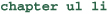
Nested lists are a particularly good example of the ways in which chaining is useful. Lists can be nested several deep. Suppose we have a list such as this one:
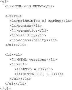
Let’s suppose we wanted to style only the list items nested three levels deep. We could do this by adding a class value to each such list item—though that’s something we’ve suggested time and again that we should try to avoid. We should always see whether there’s an approach using CSS before adding markup specifically for styling a document. The selector li will select every list item in the document, which won’t do. Similarly, ul li will select all of the list items that are inside an unordered list. Now if we think about the structure, we know the elements we want to select are list items inside unordered lists, inside unordered lists, inside unordered lists. So, working backwards, our selector for these list items would be:
Similarly, we can select the second-level indented elements using this:
But, if you think it through a bit, we have a problem. A list that is nested three levels deep is also listed two levels deep. So this statement selects any lists that are nested either two or three levels deep. But let’s suppose these lists are contained within the same div of id main. This selector will select the same lists (all of them being descendants of the main div):
On the other hand, if we want to select only those list items contained inside an ordered list that is itself contained inside an ordered list that is directly inside that the main div, we’d use:
This example shows how even seemingly intractable problems of selecting elements without resorting to adding class and id values solely for presentation can often, with some ingenuity, be solved with CSS selectors. In Chapter 12, we’ll see how CSS3 provides microsurgical tools for selecting elements with CSS, but the most important thing is to start “thinking in CSS,” which means really understanding and exploring selectors.
But, as you must be expecting by this point, there’s just one little hitch. We’ve mentioned browser support for CSS in passing, and how it’s long caused headaches for developers. In Chapter 7 we’ll go into this whole issue in significant detail, but here’s where we run into the issue in practical terms for the first time.
Although all modern browsers support child selectors, until Internet Explorer 7, Internet Explorer did not. This means that the reasonably large percentage of users who use IE 6 won’t see any style applied using child selectors without the use of workarounds such as JavaScript libraries, which add support to IE for features it doesn’t support. We’ll go into this in detail in Chapter 7, so don’t worry too much about the issue now.
Specificity of Child and Descendant Selectors
How does specificity work with selectors like these? Earlier we said that id selectors trump class selectors, which themselves trump type selectors. Often, that’s all you need to know, but in the case of child and descendant selectors, which may be made up of type, class, and id selectors, how do we determine which is the more specific selector? Well, each different kind of selector is given a value. Type selectors are worth 1, class selectors are worth 10, and id selectors are worth 100. We then add up the total value of all the component selectors for a child or descendant selector. (Really.)
So this selector:
would be worth 103 (100 for the id selector, and 3 for the three type selectors), whereas this one:
would be worth 12 (10 for the class selector, and 2 for the two type selectors). The selector with the highest value is the most specific, and it trumps any selectors with a lower specificity.
Note that this doesn’t apply to group selectors. Instead of adding up the individual selectors in the group, we treat each of the comma-separated selectors in the group as belonging to different statements. So, for instance, this selector:
is really two selectors—one with a specificity of 102, and one of 12.
Common Background Properties
Since CSS1, CSS has provided a number of properties that let us style the background of an element.
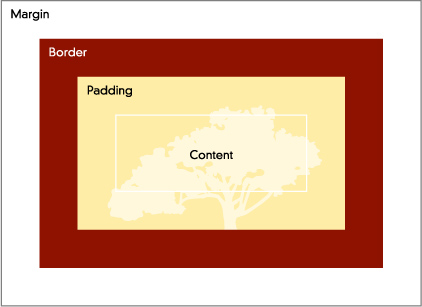
It may seem an obvious thing, but before we go on, just what is an element’s background? We’ll see in a moment that every element has its own box that contains its content; the box includes margin, border, padding, and content, as shown in figure 4.3.
4.3 The box of an element is a rectangle, with margin, padding, border, and content. Note that margin, padding, and border widths and heights may all be zero.

The background of an element starts inside the border box—so applying a background color or image to an element does not apply the background to its margin, as demonstrated in figure 4.4.
4.4 The background of an element starts at its border box and does not fill the margin.
CSS3 lets developers specify where the background starts, both horizontally and vertically: the border box, padding box, or content box are all options, but the margin box is not. Alas, this and other advanced background properties like multiple background images are not yet widely supported in browsers and can be difficult to use with progressive enhancement.
background-color
The background-color property specifies the color of the background of an element. It can take all of the values that we saw for the color property, and one more—the keyword value transparent (note that this value is not valid for the color property). A transparent background-color means that the content “behind” the element is visible through the element. We’ll look at how to create semi-transparent backgrounds using CSS3 in Chapter 13. To create a light gray background on an element, we use a statement like this:
It’s important, when specifying a background color, to ensure sufficient contrast with the text color so that the text will be legible. We look at this issue in some more detail in Chapter 6, but one good practice is to make sure you always specify a color when you specify a background color (the CSS validator will give you a warning to this effect).
background-image
The background-image property, which specifies a background image for an element, is one of the most commonly used features of CSS. It can be used to create patterned backgrounds behind whole pages or large sections of a page; to add icons (such as a PDF icon for a link to a PDF file); even to add “bullets” to lists—although there’s another a property designed expressly for this purpose.
A background image might be a single large image, or an image that’s tiled horizontally, vertically, or both. Background images can be positioned anywhere on the background of an image, though only in CSS3 can they be resized, and this feature has little support in browsers, so is as yet of little real-world value.
A background image is added to an element using the background-image property. This takes a URL value, which is a relative or absolute URL for the image file. The PNG, GIF, and JPEG formats are supported in all browsers, though some browsers also support other formats (such as PDF in Safari and SVG in Opera). Because of the limited support for formats other than these three main formats, only these formats should be used in most situations. As mentioned with the HTML img element in the last chapter, PNG is to be preferred for non-photographic images, and JPEG for photographic images.
URL Values
URL values in CSS have the form of a relative or absolute URL inside parentheses, and are preceded by the string url wrapped in single or double quotation marks, like this:
Here we’ll add the background image in figure 4.5 to the body element:
4.5 The background image for our body element
And here’s the effect [4.6], which is almost certainly not what we want.
4.6 Our background image, tiled horizontally and vertically
background-repeat
So what’s going on here? By default, a background image repeats both horizontally and vertically, creating a tiling effect. In this case, that’s not what we want. The effect we are trying to achieve is a shadow on the right-hand side of the page. So, we’ll need to repeat the image vertically but not horizontally. We can specify how an image repeats with the background-repeat property. This property takes one of these keyword values:
• repeat—The default value that repeats the image in both directions.
• no-repeat—Means the image is only shown once.
• repeat-x—The image is repeated horizontally but not vertically.
• repeat-y—The image is repeated vertically but not horizontally.
In this instance, we want to repeat vertically, so we’ll use background-repeat: repeat-y [4.7].
4.7 Our shadow image, repeated vertically

If you can’t make out where the shadow has gone, it’s now down the left-hand side of the page. What we want to do is position it down the right-hand side of the element, which we can do with background-position.
background-position
The background-position property lets us specify where the image will be placed, or if it is repeated, where the repeat starts from. We can specify the position of a background image for an element in a number of ways.
Keywords
The background-position property can take one or two keywords. If a single keyword is used, it applies to both horizontal and vertical position. If two keywords are used, the first applies to horizontal position, and the second applies to vertical position. Regardless of the keyword chosen, it’s important to note that the image tiles to fill the background horizontally, vertically, or in both directions. The keywords are:
• top—The image is placed, or repeats, vertically from the top down.
• center—The image is placed, or repeats, horizontally from the center of the element left and right, and vertically from the center of the element up and down. Note that the background image when repeated always repeats in both directions (up and down, or left and right).
• bottom—The image is placed, or repeats, vertically from the bottom up.
• left—The image is placed, or repeats, horizontally from the left-hand side of the element to the right.
• right—The image is placed, or repeats, horizontally from the right-hand side of the element to the left.
In this instance, we want the element to be repeated from the top down, and to be placed at the right-hand side of the element. We’d do this by using background-position: right top.
Length Values
It’s possible to explicitly specify where the image will be placed or repeated from with one or two length values. For example, we might specify that a background image is placed 5 em from the left edge of an element using background-position: 5em.
With length values, unless the width of our element is fixed, it’s not possible to achieve the objective of putting the image at the right side of the element.
Percentage Values
A particularly technical way we can specify background image position is using percentage values. Unlike length values, where the value specifies a vertical or horizontal offset for the top or left of the element, percentages are more subtle again.
With a percentage value of, for example, 60%:
we aren’t specifying that the left edge of the background image is 60% from the left edge of the element, but that a point 60% from the left edge of the image horizontally is aligned with a point 60% from the left edge of the element horizontally, as shown in figure 4.8.
4.8 Percentage background-position values align a point on the background image with a point on the element.

Figure 4.9 shows these different positioning approaches together.
4.9 background-position with keywords, length values, and percentages
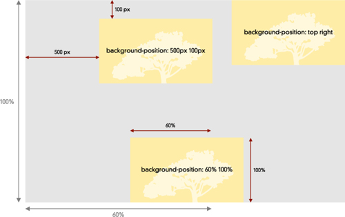
Although it sounds quite complex, it gives great flexibility when aligning background images with their elements. In the current situation, where we are looking to put the shadow image at the right of the element, we can use background-position: 100%.
This doesn’t put the left-hand edge of the image 100% across the background of the element—which would essentially hide the image to the right of the element—but rather aligns the point 100% across the image with the point 100% across the element, so that their right edges are aligned.
Figure 4.10 shows our page with the shadow now aligned with the right edge of the body element.
4.10 The shadow image aligns with the right edge of the body element.
background-attach
With the current example it might not make much sense, but it’s possible to “fix” an image on the background, so that when the content of the element is scrolled, the image remains fixed in its location on the background. We do this with the background-attach property, which takes two possible keyword values: scroll and fix. For example, if we had a single large watermark-style image as the background of a page:

then, when the page is scrolled, the watermark remains horizontally and vertically centered on the page, and the text and other content of the page scrolls over the top of it. scroll is the default value for the property.
CSS3 Background Properties
CSS3 introduces several new background properties, including the ability to specify multiple background images (we cover this in Chapter 13), to resize the background image, and to specify where the image fills from—the border, padding, or content box, not just the padding box, as is the case now. As noted briefly, none of these properties is very widely supported in contemporary browsers and should be used very carefully if at all at present, as their use can easily render content unreadable.
Shorthand Properties
CSS provides a way for some sets of properties to be specified with a single shorthand. For example, we can specify all of the background properties for a single statement with the one shorthand property background. We simply put each of the individual values separated with spaces as the value for the shorthand. For example, our shadow shorthand would look like this:
It’s important not to mix shorthand and regular properties in a single statement. When you use a shorthand, all of the properties associated with that shorthand are applied—including defaults for any property you’ve not explicitly set a value for in the shorthand. In our example, the default value of background-attach (scroll) would be specified even though we’ve not set it explicitly. Why is this important? Well, if you’d previously specified a background-attach value of fix in the same statement, the shorthand overrides this, because the shorthand is further down the style sheet. This is a subtle problem that can catch developers and cause considerable confusion. The best way to avoid it is to use either shorthand or “longhand” properties, but to not mix them together.
Dynamic Selectors
HTML elements can be in different states depending on the user’s current action (the mouse may be hovering over an element), or past actions (a link may have been visited by the user at some point). CSS provides ways of selecting elements based on these various states. The format for these selectors is to append a colon (:) and the name of the state to an existing selector. For example, to select an element with a class value of navigation when the mouse is over it, we’d use the selector .navigation:hover. The various states and associated selectors in CSS are:
• hover—When the user has the mouse over the element. The associated selector is :hover. Any element can be in the hover state, although in IE 6 and earlier only anchor elements in the hover state could be styled with this selector.
• active—This is the state an element is in when it is being activated—for example by being clicked, tapped, or when the return key is pressed while the element has the focus. The associated selector is :active.
• visited—Browsers typically remember for some period of time that a link has been visited, which can help users differentiate between different links on a page. You can style visited links with this selector. Think carefully before removing visual cues that differently styled visited and non-visited links provide the user. The associated selector is :visited.
• focus—When an element has the keyboard focus—that is, when keystrokes will go to this element—it is in the focus state. A common style for text fields with the focus is some kind of outline. The selector for an element with the focus is :focus.
One common “gotcha” with these states is the difficulty getting them in the right order in your style sheet. Elements can be in more than one state—for example, a link in the hover state might also be visited, or an element with the focus might also have the mouse over it. We know that the further down a style sheet a statement is, the more weight it has compared with other selectors of the same specificity. Now if we were to specify four statements like this:
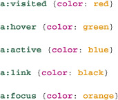
What color would a link be in the hover state? The visited state? The active state? When it has focus? The answer is that in all but the last case, it would be black—because the a:link selector “trumps” all the others by virtue of it being lower in the style sheet than them—and a link is always a link, regardless of what other state it is in.
The best order for dynamic statements is link, visited, hover, focus, active. This means that the most significant state to the user at any given time gets precedence when it comes to styling.
Adding :link, :hover, and so on to a selector increases its specificity over that same selector without the added “pseudo class” (the technical term for these selectors). So, in the following instance:

the link in its unvisited state will be red, even though this statement precedes the statement with the selector a.
Basic Page Layout
CSS1 introduced the fundamental model of page layout for CSS, along with a number of whitespace properties, and borders. CSS2 extended these properties, with a new model of positioning. We’ll look at the basic CSS page layout properties here, and more advanced properties shortly. We also look at the issue of creating page layouts in significant detail in Chapter 9, so here we’ll focus on the properties and their values.
Block vs. Inline Elements
In the last chapter, we saw that HTML has two kinds of elements: block elements, which may contain other block elements as well as inline elements; and inline elements, which may only contain other inline elements.
CSS has two main ways of displaying elements, block and inline, which are related to the HTML concepts of block and inline elements, but not exactly.
The CSS display property lets us specify different ways in which an element should be laid out on the page by the browser. The two main ways are referred to as display: block, and display: inline. But be careful, because although setting a display of block for an element like strong (which is an inline element according to the HTML specification) is quite valid, it does not change the rules of HTML—the strong element may still only contain other inline elements. So what does display do? It changes how the element is displayed in the page layout.
Elements with a display value of block create a new layout block on the page and cannot have content alongside them (unless they are given a float value, which we’ll see shortly). Common examples of block elements are headings, and paragraphs. Figure 4.11 shows this in action.
4.11 Elements with a display of block, like the heading and paragraph, create new blocks on the page. Elements with a display of inline don’t create a new block.
Elements with a display value of inline don’t create a new block. Rather, the browser places them alongside the inline elements that come before and after it in the HTML document. Common examples include strong elements and anchors.
Changing the display property value of an element will change how the browser lays out the page, but it doesn’t, as we said, change the rules of HTML. We’ll look at some other aspects of the display property shortly.
The Box Model
When a browser lays out the elements in a document, each element gets its own box. The rules of how these boxes are laid out can get quite complicated, but for now we’ll focus on the box of an element. It has four main components, as shown in figure 4.12: a margin, border, padding, and content.
4.12 The box model for an element
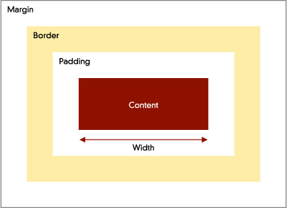
Working from the inside out, almost every element has content whose width and height can be determined in a couple of ways. It can be automatically calculated by the browser based on the actual contents (text, images, and so on), the width and height of the window, and other elements on the page. Or, it can be specified by the developer, using the width and height properties of CSS, which can take length or percentage values.
Next comes the padding of an element. This can be specified as either a length or percentage value, on all sides or individual sides of an element. As we saw earlier, the background of an element (image or color) fills the padding box of an element, as well as the content box, but that’s as far as it goes. Outside the padding box lies the border, which is also part of the element’s box. The border can be on all four sides of the element or one or more sides individually.
Lastly, outside the border, but still part of an element’s box, is the margin, which too can be on all four sides of the element or on individual sides.
width
The width property specifies an explicit width for an element. We can use either percentage values (the element will be this percentage of the current width of its parent element) or length values. For example, we could specify that paragraphs are 40em wide like so:
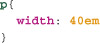
Specifying widths of elements in ems means that they remain the same number of characters wide regardless of the size users choose for their text. As we’ll see in Chapter 9, this can help make content much easier to read.
However, there’s a complication. Inline elements don’t take an explicit width (or height). Specifying a width for them has no effect on the flow of the document. In fact it’s slightly more complicated still. Some inline elements—specifically, “replaced” inline elements (most commonly images, but also embedded content like video)—can take a width and height that affect the line in which the element appears.
height
The height property specifies an explicit height for an element. height can be specified as length values such as pixels or ems, or as percentages, though percentage heights are tricky: a percentage height only has effect when the containing element for the element has an explicitly specified height. If the containing element’s height is calculated automatically by the browser based on the element’s content, or if it is specified as a percentage, percentage height won’t work on the contained element. This means that centering elements vertically is very difficult. (We’ll come back to this in Chapter 9.)
Overflowing Content
If we can specify the width and height of an element, what happens if the area of the element is not large enough to contain the contents of the element? The overflow property allows us to specify what happens in these situations. overflow can take the following keyword values:
• visible—Although the size of the element and its impact on the page layout doesn’t change, the content overflows its element.
• hidden—Any content which overflows its element is “clipped” and can’t be seen.
• scroll—Horizontal and vertical scroll bars are added to the element that enable scrolling to display all the content of the element. Note both scroll bars are shown even if scrolling is only required in one dimension and not the other, and even if the content doesn’t overflow its element.
• auto—The browser will display scrollbars only for the dimensions that need them—which may mean no scrollbars are shown, or only a horizontal or vertical scrollbar, or both, depending on how the content overflows the element.
The advent of browsers like those found in the iPhone and Palm Pre, which don’t feature scrollbars, means that you can’t rely on scrollbars being displayed to allow access to overflowing content in all browsers.
margin
The margin of an element is the space between its border and the edge of adjacent elements’ margins. We’ve seen that background colors and images aren’t seen behind the margin—so in essence the margin is transparent.
We can specify the margin for an element, either on all sides or on individual sides, using length values like pixels and ems, as well as percentages. When we use ems, the margin width and height is proportional to the size of the font for that element as it is currently being displayed. This allows margins that grow and shrink as the user increases and decreases the font-size, thus maintaining the proportions of font-size to whitespace. Percentages specify horizontal and vertical margins as a percentage of the overall width of the element—including margin, padding, and border.
There are four margin-related properties: margin-top, margin-left, margin-bottom, and margin-right. We can also use just the shorthand margin.
The shorthand can take one, two, or four values separated by spaces. Where it takes a single value, this is the value for each margin—top, left, bottom, and right. Where it is two values, the first value is for the top and bottom margin, and the second value is for the left and right margin. Where it takes four values, we have to be a little more careful. The four values apply to the different edges in the following order—clockwise around the element—top, right, bottom, and left.
Other shorthands, padding in particular, work in similar ways.
Gotcha: Collapsing Margins!
One very confusing aspect of vertical margins is that the top and bottom margins of elements that adjoin so that the two margin edges touch will “collapse” to be not the combined height of the two margins, but the height of the larger of the two. Suppose we have an h2 element and immediately below it a paragraph element [4.13] with the following CSS:
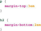
4.13 Adjacent vertical margins

Logically, we’d expect the total space between the two to be 5em. But, because the margins collapse according to the CSS specification, the total space between them is just 3em, the larger of the two widths (if the two widths had been 2em, the width would collapse to 2em).
We revisit this issue in Chapter 7, where we look at various browser bugs, because in some situations, in some versions of Internet Explorer, margins that should collapse, don’t.
border
Inside the margin of an element is its border. By default, elements have a border with no style, so in effect no border. Borders are specified using three properties: border-style, border-width, and border-color.
border-style
Browsers can draw borders in a number of different styles, specified with keywords. There are three one-dimensional (solid, dashed, and dotted), and four two-dimensional styles, which seem out of date and are very rarely used (groove, ridge, inset, and outset). The CSS3 properties box-shadow and border-image, both discussed in Chapter 13, essentially make the two-dimensional styles obsolete.
border-color
We can specify a border-color in the same ways in which we specify text and background colors—and like background colors, borders can be transparent. If no color is specified for a border, the border is the color of the text in the element (not black, as people often assume).
border-width
The third border property is border-width, and it can take three keywords—thin, medium, and thick—the exact widths of which aren’t specified and can vary from browser to browser. border-width can also be specified using length values, but not percentages.
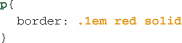
So, we could specify a .1em-wide solid red border for a paragraph with this CSS:

.1em is typically the smallest em value or increment that browsers recognize.
We can also use the border shorthand, with these three values in any order separated by spaces, for instance:
Individual Borders
Just as we can specify individual margins for each edge of an element, we can specify individual borders for each edge, with different styles, colors, and widths. It’s also possible to specify borders on some but not all edges.
The only complicating factor is that there are a number of different shorthands for doing so. The longhand properties look like this:
• border-top-style
• border-top-color
• border-top-width
But, we can also use a single shorthand for each edge, which takes the three space-separated width properties, for example:
We’ll see in Chapter 13 that we can also specify that the corners of our borders be rounded, using the CSS3 border-radius property.
padding
The last of our box properties is padding, which is inside the border, and behind which background color and images are seen.
Padding is otherwise very much like the margins of an element. We can specify different padding on different edges, using percentages (as with margin, the width of both horizontal and vertical padding will then be a percentage of the overall width of the element), or length values. Padding can be specified using the padding properties padding-top, padding-bottom, padding-left, and padding-right, or using the padding shorthand, which works just as margin does, taking one, two, or four values. (Refer to the preceding section on margins for how these shorthands work.)
How Wide and Tall Is an Element?
It may seem obvious, but just how wide is an element with a width of 50 em? The logical but not necessarily correct answer is “50em.” The width and height properties specify not the entire width and height of an element’s box, but only the width and height of the content area of the element. So, the total width of an element is the width of any left and right margins, plus left and right padding, plus any left and right borders, plus the content width. Similarly, the total height is the content height, plus any top and bottom padding, plus any top and bottom border, plus any top and bottom margin.
So, we have to be very careful when we specify an explicit width or height, along with padding, margin, or borders. The height or width we set won’t match the actual height or width of the element’s box. We’ll see in Chapter 7 how this is particularly problematic due to a bug in older versions of IE, where width does specify the total width of the element’s box. CSS3 in fact has a property, box-sizing, supported in all contemporary browsers, including IE 8, which lets us specify which of these two models—width and height apply to the whole block, or only the content area—the browser should use to lay out a page.
Advanced Page Layout
These CSS1 layout properties provide basic page formatting abilities, but they don’t give developers the tools to create complex page layouts. We’ll turn to the issue of page layouts in great detail in Chapter 9 (in fact, that’s all we cover in that chapter), but here we’ll look at the core properties we’ll be using to create those layouts, as well as other related properties.
float
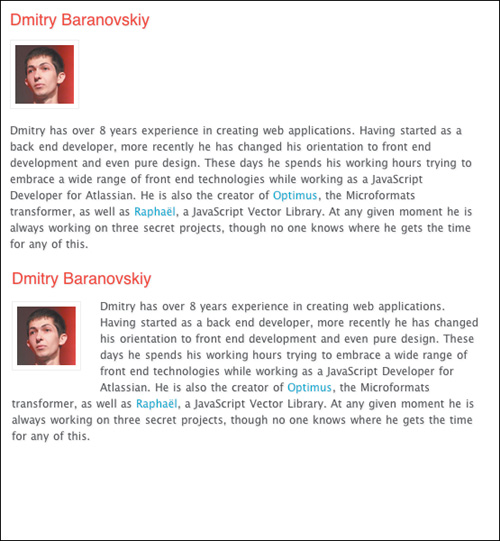
As we’ve seen, CSS can display elements in two ways: as blocks and inline. But in print design, it’s very common for text to flow around, for example, images. The float property in CSS1 is designed to enable this. Both inline and block elements can be given a float property, of either left or right, which specifies which side the element floats to. When an element is floated, say to the left, it is taken out of the flow of the page (that is how the page would otherwise be laid out), and then moved horizontally to the left, until it touches the left edge of its containing element, or the right edge of another floating element. Content “below” it in the document—that is content that comes after it in the HTML—then flows around the element. Let’s see this in action in figure 4.14. In this example, we’ve floated the portrait image to the left, and it also has a margin, which is why there’s a space between the text and the image.
4.14 The image before being floated (top) and after being floated (bottom)
Just as elements can be floated to the left, they can also be floated to the right by using the value float: right. We’ll revisit float in detail in Chapter 9, where we’ll see how it’s used to create multi-column page layouts, among other things.
clear
Sometimes, we don’t want an element’s content to flow around a floated element. We can stop this by giving the element a clear property of both [4.15]. We can also stop floating on one side of an element while allowing it on another by using clear: left (which still allows floating to the right), and clear: right (which still allows floating to the left).
4.15 clear stops floating to one or both sides of an element—here our heading stops the float beside it.

Positioning
As we’ll see in Chapter 9, float has become the principal way of creating many page layouts with CSS, but the CSS positioning properties, introduced in an interim “CSS Positioning” specification and included in CSS2, were designed to enable sophisticated page layout with CSS. They are still used for this purpose, often in conjunction with float and clear. For now, I’ll provide a brief overview of the properties and concepts, and we cover them in much greater detail later in the book.
The position Property and Positioning Schemes
The position property takes one of four keywords, each of which specifies a different way of placing the element on a page:
• static—The default position value, position: static, specifies that the element be laid out in the normal flow of the document. The rules for how a browser lays out elements in the flow are complicated, but they should be very familiar, at least intuitively, to anyone who has used the web extensively.
• relative—When an element is positioned with a relative value, it is first laid out as it would be in the flow, then moved from that position according to its top and left values (and less commonly bottom and right values). When the element is moved relative to its place in the flow, very importantly the normal flow of the document doesn’t change.
• absolute—Elements with a position: absolute are taken completely out of the flow of the document and then positioned with respect to the top and left of the first element that contains it that also has a position of absolute, relative, or fixed. Because the element is taken out of the flow, the rest of the page is flowed as if the element was not present in the document.
• fixed—Elements with a position: fixed are positioned very similarly to those with a position: absolute. They are taken out of the flow of the document and then positioned according to their top and left property values always with respect to the window they are in. This means that when the page is scrolled, the element remains exactly where it is with respect to the window.
While these concepts may sound a bit daunting, they are very logical. As mentioned, we revisit them in considerable practical detail in Chapter 9, so we won’t belabor them here.
top and bottom, left and right
With the exception of position: static, the other values of position are typically used in conjunction with the properties top and left, and—to a lesser extent—bottom and right to place the element on the page. These properties work in slightly different ways, depending on the value of the position property:
• For static, they have no effect.
• For relative, a positive top value moves the element down the page from where it would otherwise be placed; a negative top value moves it up the page from where it would otherwise be placed. Similarly, positive left values move the element to the right, and negative to the left of where they would otherwise be. bottom and right work in the reverse.
• For absolute, the effect is similar to relative, but in this case, the element is moved with respect to not where it would otherwise be in the flow, but with respect to the top and left of the first element that contains it that also has a relative, absolute, or fixed position value (such elements are said to have a positioning context). This will often be the body element.
• For fixed, again the effect of the top and other properties are similar, but in this case move the element with respect to the top and left of the window itself (inside all the browser controls, or chrome).
Mastering positioning takes time, so don’t feel you should be able to digest and use all of the information in this section immediately. More important than the actual properties and their values are the techniques we can implement with them, which is what Chapter 9 is about.
Advanced Selectors
CSS2 and CSS3 provide a number of more advanced selectors that give even finer control over the elements we select on a page with them. In Chapter 12, we’ll look in detail at some of the CSS3 selectors, but here, we’ll quickly touch on three very useful kinds of selectors.
Adjacent Sibling Selectors
Sibling elements are those elements that share the same parent element in the document structure. CSS2 introduced the ability to select two elements that are adjacent to one another. The form of the selector is selector 1 + selector 2 (for example li+li), and they select an element that matches the second selector that is directly after an element that matches the first selector in the HTML document. They aren’t commonly used but can come in very handy. This type of selector is supported in all contemporary browsers, including IE 7 and onwards, so it needs to be used with care where users of IE 6 are concerned.
Attribute Selectors
The attribute selector was introduced in CSS2 and considerably extended in CSS3. It enables us to select elements based on the value of their attributes.
With CSS2 we can select elements in three different ways:
• selector[attribute name] (for example, img[alt]) selects an element matching the selector that also has the named attribute set to any value.
• selector[attribute name=value] (for example, img[alt=photo]) selects an element matching the selector that also has the named attribute set to exactly the specified value. So img[alt=photo] selects <img alt="photo"> but not <img alt="photo of a flower">.
• selector[attribute name~=value] (for example, p[class~=introduction]) selects an element matching the selector that also has one of the space-separated values of the named attribute set to the specified value. This is useful for attributes like class that can take multiple values separated by spaces.
Note that we don’t put quotation marks around either the attribute name or value.
CSS3 adds several new attribute selectors, including the ability to match substrings in attribute values. For example, we could select a link with the final four characters “.pdf”, or the first seven characters “http://”. It’s also possible to select based on a substring value anywhere in an attribute value; for example, if we wanted to style the links to a particular subdirectory, say “contact” distinctly, we could do that as well.
• selector[attribute name^=value] (for example, a[href^=http://]) styles any element that matches the selector that also has the named attribute value starting with the specified value. a[href^=http://] selects any link with an absolute link, which could be used to style links away from the current site differently from those internal to the site (provided you use relative links internally, of course).
• selector[attribute name$=value] (for example, a[href$=.pdf]) styles any element that matches the selector that also has the named attribute value finishing with the given value. So a[href$=.pdf] selects any anchor that links to a file with the extension .pdf, which could enable us to let users know when they are going to download a PDF.
• selector[attribute name*=value] (for example a[href^=/contact/]) styles any element that matches the selector where the named attribute value also includes the given value.
These selectors are supported in all contemporary browsers other than Internet Explorer (including IE 8). As such, they need to be used with the consequences in mind of what happens when they aren’t supported. We address this issue in detail in Chapter 12.
The Universal Selector
The universal selector (*) selects every element in a document. For example, this statement:
removes the default margin from every element in the document (we look at default CSS properties in detail in Chapter 8). However, by itself the selector is not recommended, as it can have a significant impact on performance and is usually more heavy handed than required. It’s more likely to be used in combination with other selectors, and we’ll see it used a number of times in the book. It also played an important role in a hack that hides CSS from some versions of Internet Explorer; see Chapter 7 for more on this and other common hacks.
Display Types
We took a look at the block and inline values of the display property a short while ago. In this section, will look at some other values of this property and the related visibility property.
visibility
With visibility, we can show and hide an element. It takes the keyword values visible and hidden, which do pretty much what you’d expect them to. The one thing to note is that even when hidden, elements still take up space in the document flow. If we want the element to completely vanish, and both be invisible and the space it occupies in the document to collapse, we need to use a different property and value: display: hidden.
hidden
When an element has a display value of hidden, it is as if the element doesn’t exist. The page is rendered as if the element is not there, and its contents are completely invisible as well.
List Items
Just as it is possible to make inline elements like em display as block elements—and vice versa—with the display property, it’s possible to make any element display as a list item. For example, to make paragraphs display as list items, use:
You may need to give the element a left margin, so that the list-style marker (a bullet or number, for example) shows in the margin.
list-style-type
CSS provides many different list style types, which determine how lists are numbered or which bullet characters are used. The list-style-type property can take values that include:
• circle, disc, and square—These specify which character is used for list-item bullets.
• decimal—This numbers each list item sequentially, starting with 1.
• upper-roman and lower-roman—This numbers each list item using uppercase (such as IX) and lowercase (ix) roman numerals.
• upper-greek and lower-greek—These number list items using the Greek alphabet.
• And several others, including Chinese, Japanese, Armenian, and Georgian language options.
list-style-image
We can specify a bullet image for list items using the list-style-image property, which takes a URL value as its value. It’s increasingly common to use a background image as a bullet image, as this gives more precision when it comes to positioning the image than list-style-image. For example, we can use background-position to position an image on the background of an element, but there’s no way of positioning a list-style-image.
More Properties
CSS provides quite a few more properties and selectors than we’ve been able to cover, but we’ve covered the most commonly used and widely supported features of CSS1 and CSS2. To give you a sense of what else you might want to investigate, here’s a quick overview of some of the features we’ve left out.
Printing Properties
CSS2 features quite a few properties specifically for print styles—like widows and orphans, and page-breaking properties.
User Interface Properties
With CSS it’s possible to style the outline of an element used when it has the focus. It’s also possible to specify a cursor, using an image file URL or keywords for common cursor types.
Selectors
There are a number of very specialized and not very popular types of selectors we haven’t touched on in this chapter:
• Language selectors, which select an element based on the value of an element’s lang attribute, and allow us to style, for example, English text differently from Japanese text. For example, p:lang(en) selects a paragraph that has a lang attribute set to en.
• Typographical selectors, which allow us to select the first letter or first line of a given element. We can select the first letter of a heading of level 1 with h1:first-letter, or the first line of a paragraph with the selector p:first-line.
Generated Content
With CSS, it’s possible to add strings, various quotation marks, images, and the values of attributes, as well as complex numbering as “generated content” that comes before and after an element. We could, for example, add the value of an href attribute of a link when a page is printed after the link itself using this statement:
Media Types
CSS2 and HTML 4 were designed so that different style sheets could be used for different media. So it’s possible to design different style sheets for print, screen, projection, and other predefined media and have the browser apply the appropriate one depending on whether the page is being printed, being displayed by a projector, and so on.
HTML 4 and CSS2 both support a range of media types, including projection, screen, handheld, and print. The reality is that support for this concept has never been widespread, and even though most browsers support the screen and print style sheets, allowing us to create different style sheets for printing and onscreen display, the other possible values are far less widely supported. Opera supports the projection media type, and uses style sheets with a media type of projection when the browser is in full screen mode. Some mobile devices support the handheld media type, but the iPhone does not use handheld style sheets.
As we’ll see in Chapter 14, the concept of targeting different media via CSS has been refreshed with CSS3 and is already well supported. With CSS3 media types, it’s the features of the medium, such as color depth or window width, rather than the medium itself that is particularly important. Here we’ll touch on the key technical aspects of CSS media types—see Chapter 14 for details.
Media-Specific CSS
There are three ways in which we can specify specific CSS for a particular media type. We can use a link to a style sheet that includes a media attribute that specifies which media the style sheet is intended for; we can add a media attribute to the style element in the head of an HTML document; or we can use an @media statement inside the CSS itself.
Linking with Media Types
When we link to an external style sheet, it’s possible to specify the media type using the media attribute. This takes one of several values, the most common of which are all, screen, handheld, print, projection, and screen. For example, if we wanted to link to a style sheet for print use only, we could use this statement:
We can also specify more than one media type by separating media types with a comma as the value of the media attribute.
Embedding Based on Media Types
Similarly, we can add a media attribute to an embedded style sheet’s style element, specifying one or media for which the embedded style sheet applies. As mentioned earlier, embedding style sheets is not the best way to include CSS in an HTML document.
@media
You can also specify CSS inside a style sheet to apply only to particular media, using the @media statement. @media statements are like subsets of a style sheet. They have the following form:
where one or more statements that only apply to a particular medium or set of media are contained within curly brackets, and the media to which these statements should apply are specified after the keyword @media as a comma-separated list of media keywords, taken from the predefined list in CSS2 and HTML 4.
All commonly used browsers support all of these approaches, and there’s no enormous advantage of one over the other. We’ve mentioned that embedding is to be avoided where possible. The @media approach has the advantage over linking because it requires fewer individual requests to a server. When there are a significant number of server requests (for example a number of external style sheets, script files, images, and so on), site performance can suffer, so minimizing linked files is a good practice.
To date, using media types to create style sheets for particular media has not been common, but we’ll see in Chapter 14 that with CSS3, it’s possible to create far more tailored style sheets for devices and media based on their specific characteristics, like window width, color depth, and even orientation. Targeting different media and devices with CSS is likely to become much more common now that these features are widely supported in browsers.
Importing Style Sheets
If you’ve been wondering throughout the first 15,000 words or so of this chapter just where the word “cascading” in “cascading style sheets” comes in, well, wonder no longer. One of the strengths of CSS is that style sheets can import from other style sheets, enabling us to create, for example, a base style sheet, used across an entire site, and more specialized style sheets, which import from this base style sheet, associated with specific subsections of a site. This way, when the style sheets that are imported into a style sheet change, there’s no need to update the style sheets that do the importing—the changes flow, or “cascade” directly into these style sheets, then into the HTML documents they style. The “cascade” is the flow of style from one style sheet into another style sheet via importing.
@import
Any style sheet, whether it’s embedded or a stand-alone CSS file, can import another style sheet. We accomplish this with an @import statement, which has the form of the keyword @import, followed by the URL for the imported style sheet (a relative or absolute URL), and optionally a comma-separated list of media types, as we saw a moment ago.
The URL may take either the form of a URL value, like we saw earlier with the background-image and list-style-image properties, or simply the URL alone, but in either case should be quoted with single or double quotation marks. Very importantly, if the URL is relative, it must be relative to the style sheet the @import statement is in, not to the HTML document. (This may sound obvious, but Netscape 4 got this wrong and treated the URL as relative to the HTML document.) Here’s how we might import a style sheet for our typography into a main style sheet for a site:
We could import a page layout style sheet for the screen or projection media, and another for printing, like this:
Just as the order of statements in a style sheet is important for the specificity of a statement—statements lower down in the style sheet trump those of the same specificity higher up in the style sheet—the same rule applies in the cascade. Statements lower down in the cascade override those higher up in the cascade.
@import statements must appear in a style sheet above all other statements, and other @ rules like @media. This is so browsers can fetch the imported style sheets before calculating the specificity of all the rules in the style sheet.
Quality Assurance
In the previous chapter, we looked at the various QA tools that are available for ensuring the quality of your HTML. There are two principle concerns when it comes to the quality of CSS. First, we want to ensure our CSS is valid—that is, it conforms to the rules of the CSS language. We also want to ensure that the CSS we use is supported in as many widely used browsers as possible, and if it isn’t, that it doesn’t impact the ability of users to use the features and access the information of our site.
Validating Your CSS
Just as we can validate HTML, we can also validate CSS to ensure that it is free from errors. The W3C provides a CSS validator at jigsaw.w3.org/css-validator, and there are others online as well. Note that in order to validate CSS3, you need to change the default settings of the validator, which is set to validate CSS2.1.
Checking Browser Support
Now that CSS support in browsers is far better than it was even a few years ago, checking browser support is far less of a problem than it used to be. Some development tools, like Style Master, which I developed, include a database of browser support information, which can help you identify which selectors and properties are supported, aren’t supported, or are buggy in various browsers. There are also a number of online resources that detail browser support problems, which we link to at the end of the book.
Previewing in Browsers
Testing that sites are acceptable across a broad range of browsers, in particular, current and very recent versions of Firefox, Safari, and Opera, as well as versions of Internet Explorer back to at least version 6—which is still as widely used as any of these other browsers at the time of this writing—is an important quality assurance step. There are a number of services online that can make this a much more productive experience than simply running all these browsers locally. It’s particularly tricky to run multiple versions of Internet Explorer on the same version of Windows, and for the many Mac-based developers, it involves using a virtualization solution like Parallels or VMWare, and running Windows inside a virtual machine.
Some of the services available include:
• Browsercam (www.browsercam.com) has been around for many years, and it allows you to test your site in dozens of browser versions on various operating systems.
• Browsershots (www.browsershots.org) is a free but less sophisticated service that provides screenshots of your site in dozens of browser versions.
• Adobe’s new BrowserLab (browserlab.adobe.com/index.html) doesn’t yet provide the same level of browser coverage but looks like it may become an important tool for web developers. It integrates with Dreamweaver.
Specific Challenges and Techniques
Throughout the rest of the book, we’ll cover various development techniques that make heavy use of CSS. But here we’ll touch on a number of very common CSS challenges that don’t get much coverage elsewhere.
Styling Forms
Using CSS to style form elements has long caused developers headaches. In the past, support for styling form elements in many browsers was patchy, to say the least, and although contemporary browsers support CSS on form elements much better, there are problems stemming from the CSS specification and a lack of clarity about how form elements should be styled in some respects. Eric Meyer, whose knowledge of CSS is virtually without peer, has written on the issue extensively at meyerweb.com/eric/thoughts/2007/05/15/formal-weirdness.
This is not to say that developers shouldn’t use CSS with form elements, but we should be aware of some of the potential problems and pay particular attention to cross-browser problems, since different browsers interpret the relevant CSS specification in different ways.
Image Replacement
Because of the limited range of fonts available via CSS prior to the widespread availability of downloadable fonts (an issue discussed in Chapter 15), web designers have long used images of text, particularly for headings and other display elements. Initially, this involved simply using an img element with the “text” of the heading or other element rendered as an image. This severely impacts both accessibility and search engine visibility, and so it is strongly advised against. After CSS became widely supported in browsers, designers developed a number of “image replacement” techniques that aimed to address these shortcomings, while still enabling the use of text as an image. The first generation of these techniques exemplified by FIR (the Fahrner Image Replacement Technique named after Todd Fahrner, its inventor) were based on the idea of placing the text of an image to be replaced inside a span element, and then hiding this text from the reader, while using an image with the text rendered on it via CSS as the background image for the element. So, for example, we’d have this HTML:
<h1 id="mainheading"><span>This is the text of the heading</span></h1>
We would then hide the text in the span, typically by positioning it absolutely and then giving it a large negative left value (some versions of the technique used display: none, which may hide the element from a screen reader). We then add a background image to the heading, which contains an image of the text we have hidden:
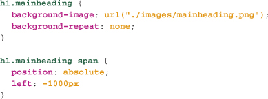
Although this “solves” the problem by letting developers use fonts other than those available on the end user’s system for a web page, and still provides text that a screen reader or search engine can recognize, it has several drawbacks:
• The text won’t increase or decrease in size when users zoom their text.
• With screen magnifiers, the text will pixilate, rather than magnify smoothly as “real” text will.
• Users often look for key words like “contact” on a page using the browser’s find command, and image replacement can interfere with that.
• The font is very likely rendered with a different font rendering engine than that found in the browser, and so there’s a mismatch in terms of anti-aliasing and other font hints between the text in the image and other text on the page.
• Site maintenance and development is more complicated, as any change to the text in replaced elements requires creating and uploading new images.
A second generation of techniques, typified by Scalable Inman Flash Replacement (sIFR), used Flash rather than images to replace the text. This addressed issues like magnification and zooming, but the other problems remain.
An even newer solution is Cufón (wiki.github.com/sorccu/cufon/about), which uses native browser technologies like SVG and VML—which we cover in Chapter 16—and JavaScript instead of Flash or images.
Despite their challenges, these techniques have been widely used, in part because clients and other decision makers often insist on a particular font being used. With luck, the arrival of widespread font embedding technology, which is covered in Chapter 15, will bring about an end to the need for these techniques.
Page Layout
As mentioned, we devote the whole of Chapter 9 to current practices in using CSS for page layout, so while we haven’t touched on how to create multi-column layouts here, we’ll cover that in detail there.
Browser Challenges
It’s no secret that browser support for CSS for many years left quite a bit to be desired. Even though CSS support in all contemporary browsers is excellent, we’ll still be dealing with legacy browsers like IE 6 for some time to come. In Chapter 7, we focus on the challenges of older browsers and techniques for addressing them.
Formatting CSS
In CSS code, whitespace isn’t significant, which means we can use spaces, tabs, and returns to improve the legibility of our CSS. Some common techniques for making CSS more readable include:
• Separating the selector from the declaration block with a return
• Putting each declaration on a new line and indenting them with a tab
• Ordering declarations alphabetically by property name
An example statement using these techniques might look like this:

CSS and Site Performance
When using CSS, as with any external resource (images, scripts, and so on), two things can impact the performance of a site: the size of the file, and the number of linked files. While CSS files are typically small in comparison with external resources like images, we can optimize them by removing all whitespace and comments and by using shorthands. Of course, these all make your code far less legible and less maintainable, so rather than using these techniques in your development code, it’s best to process your CSS into a production version just before serving it. There are numerous CSS compression tools available, with a good list here: www.askapache.com/css/online-css-compression-tools.html.
The other main impact on site performance is the number of external linked files. For production code, it can help to move numerous individual style sheets into a single large style sheet before serving.
Both of these are things that can help improve the performance of heavily trafficked sites, if you find page load times are less than desired.