
Chapter 12
Crunching Numbers: Running a Data-Driven Business
IN THIS CHAPTER
![]() Tracking site visitors with hyperlinks
Tracking site visitors with hyperlinks
![]() Using Google Analytics to see who’s taking action
Using Google Analytics to see who’s taking action
![]() Segmenting your audience to make your ads more specific
Segmenting your audience to make your ads more specific
![]() Drilling down on your audience to increase opt-ins
Drilling down on your audience to increase opt-ins
Few marketers disagree on the significance of collecting data. But for businesses to remain competitive, they must go beyond simply aggregating data to truly gain value from it. Simply knowing your averages is not enough. Companies need to analyze the data they gather in a process known as data analysis. True data analysis is data with a plan. Through data-collecting tools such as Google Analytics, you can track the return on investment (ROI) of traffic from your email campaigns, social media campaigns, paid ads, and more.
When you have the capability to track the ROI of your campaigns, you can cut the fat and double down on what’s actually working. That way, you transform your business from one that spends time, money, and resources on strategies that just seem as though they’ll work well to a business that makes smart, data-driven decisions and knows what strategies do work well.
In this chapter, we explore what data analysis is and what it can do for your company. We examine ways to make data useful using Google Analytics (which is free) so that you can create accurate, consumable reports that you can actually learn from as well as share with your team, client, or both.
Leveraging the Five Google Analytics Report Suites
Google Analytics is the most widely used website statistics service. After you’ve properly installed it on your site, Google Analytics gathers data on the traffic of your site, allowing you to make intelligent marketing and business decisions. This analytics suite can track visitors from search engines, social networks, and direct visits. Google Analytics has a basic service, which is free, as well as a premium version. To learn more about Google Analytics or how to install it on your site, visit the Google Analytics Help Center.
Within Google Analytics are five report suites that you can use to break down your data. You find these reports on the left side of the website:
- Real Time Suite: Gives data and shows what is going on within your site that instant. For instance, you can see how many visitors are on your site, what pages they are on, and what their geographical location is in real time. Figure 12-1 shows some of the information displayed by the Real Time Overview report in Google Analytics.
- Audience Suite: This report centers on the people who are on your site and gives you insight into their characteristics, including their demographics, interests and behaviors, the electronic device or browser they use to access your site, and more.
- Acquisition Suite: Use this report to discover how your users arrived at your site. For instance, you learn what website users were on before they came to your site, or what keyword or keyword phrase they searched for to land on your website.
- Behavior Suite: The Behavior reports focus on what people do when they arrive at your site. This report suite displays information like what pages users visit, how long they stay on those pages, and how many people exit that page.
- Conversions Suite: You run Conversion reports to determine whether users are making purchases or completing the goals you’ve set up, such as subscribing to your newsletter or buying a product or service.
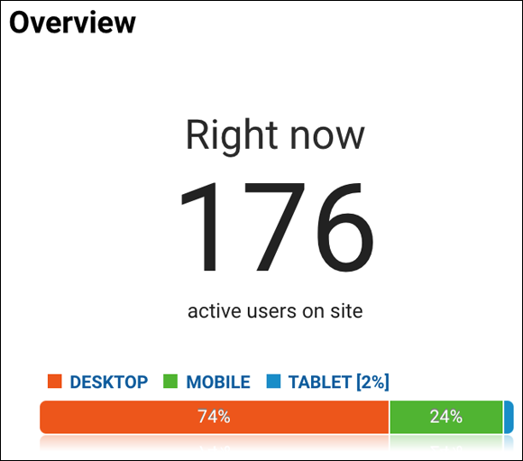
FIGURE 12-1: A look at a Real Time report in Google Analytics.
Each of these reporting suites contains multiple reports, and each of those reports can drill down into more and more detail. For example, you can view the Mobile Devices report in the Audience report suite to see how visitor behavior differs when people visit your website from a desktop, mobile, and tablet. While you’re in this same report, Google Analytics allows you to change the parameters to view behavior by service provider (AT&T versus Verizon) and operating system (iOS versus Android). If you want to get more granular, drill down by clicking one of the operating systems to view visitor behavior by the version of the operating system.
Understanding Where Your Traffic Is Coming From
Many different avenues can lead people to your site, ranging from ads to search queries to people bookmarking your page and then returning. While you may see other sources of traffic, here are the most common default sources of traffic as recorded by Google Analytics:
- Email: Visits from those who have clicked the links in your email promotions and newsletter.
- Organic search: Visits from people typing search queries into a search engine such as Google or Bing. If you’re focusing on optimizing pages for search engines, this is an important channel to watch.
- Display: This traffic found your site by clicking on an ad that you ran on another website. Banner ads on blogs and image ads on news sites are some common generators of display traffic
- Direct: Traffic from users who entered the exact URL of your site (such as Pepsi.com) directly into the address bar of their browser and navigate straight to your site. If someone bookmarks your page and then visits your site again via that bookmark, that visit also registers as direct traffic.
- Paid search: This traffic comes from your paid search ads (your pay-per-click ads), which appear in the search results of Bing, Google, or other search network players like AOL and Ask.com.
- Referral: Visitors who followed a backlink from sites that link to your website, such as blogs and forums.
- Social: Visits from people who found your page through an associated social media account, such as Twitter or Facebook.
- Other: Despite its power, the Google algorithm doesn’t always know exactly where your traffic came from. If Google is unable to identify where a particular source of traffic came from, they’ll throw it in the “other” channel.
 One of the most enlightening reports to view in Google Analytics is the Acquisition Overview report within the Acquisition Suite in Google Analytics. It is the first report you should view when evaluating the health and performance of a website. Figure 12-2 shows a pie chart from the Acquisition Overview report containing the various methods of traffic acquisition for a website.
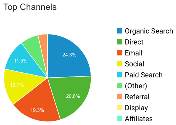
FIGURE 12-2: The Acquisition Overview report in Google Analytics.
Tracking the Origins of Site Visitors
Although analytics programs like Google Analytics track the origin of your site visitors using their default settings, you’ll likely find that these default settings are too broad to ascertain meaningful data. To get more granular (and thus more useful) data, you can append UTM parameters to the links you share around the web. UTM stands for Urchin Tracking Module, and it is a tracking marker appended to a Uniform Resource Locator (URL). The UTM system allows users to tag hyperlinks in order to trace where visitors originated.
For example, if you want to track the number of leads generated by a single link shared with your Facebook fans, you can do that using Google Analytics and a link with UTM parameters. Simply put, you place a UTM at the end of a hyperlink so that you can figure out how people get to your site and what they do after they get there.
For every hyperlink you want to track, whether on your blog or your social media channels, that directs traffic to a landing page you own, consider adding UTM parameters. By adding this tracking code to the hyperlinks you share, you can track the origins of that visit.
A UTM consists of various parameters. Here are the UTM parameters that matter most:
- Campaign source (utm:source)
- Campaign medium (utm:medium)
- Campaign content (utm:content)
- Campaign name (utm:campaign)
We explain each of these parameters in the sections that follow.
Campaign source (utm:source)
Generally, the source of a UTM describes where your visitors come from. The source tells you the specific place where the referring link was shared, such as
- An email promotion
- A social network
- A referring website
Common sources include
- Email newsletter
- YouTube
The source enables you to know which email, search engine, or Facebook ad (or other source) a user came from. Knowing where traffic is coming from can be powerful because you gain insight into what your users are responding to.
Campaign medium (utm:medium)
This parameter identifies the medium or vehicle that the link was used on, such as email. Medium tells you how visitors arrived at your site. Some of the most common mediums include
- Pay per click (PPC)
- Banner ads
- Direct (which tells you users directly typed in your site address)
Campaign content (utm:content)
Campaign content describes the specific ad, banner, or email used to share the link. It gives you additional details to use with A/B testing or content-targeted ads, as well as helps you determine what creative is working best at promoting an offer or distributing content.
Be as descriptive as possible with this parameter’s naming structure so that you can easily remember what email or ad this UTM refers to.
Campaign name (utm:campaign)
This parameter serves as an identifier of a specific product or promotion campaign, such as a spring sale or another promotion you run. The campaign name’s basic purpose is to highlight promotional offers or content distribution strategies so that you can easily compare performance across time and platform.
Campaign links should be consistent across all different sources and media for any given promotion to ensure that the campaign as a whole can easily be analyzed.
Dissecting a UTM
The previous sections go over the most important parameters that make up a UTM, and this one examines a UTM’s structure. For instance, here’s what a UTM looks like for a flash sale for one of DigitalMarketer’s products, a workshop on how to build quiz funnels:
Your UTM might look something like the preceding. Following is breakdown of this URL with a UTM by section:
https://www.digitalmarketer.com/quiz-funnel-workshop/:The hyperlink.- ?utm:source=house-list: The campaign source, which is the referring source of the traffic. In this case, it’s an email to our “house” email list.
- &utm:medium=email: Campaign medium, which is how the user was referred. In this case it was via email.
- &utm:campaign=quiz-funnel-workshop-04-11-2020: Campaign name, which is the specific promotion or strategy. In this case, this campaign is the Quiz Funnel Workshop beginning on April 11, 2020.
Creating UTM parameters for your URLs
Google makes building UTM links super easy with a free, easy-to-use UTM builder called the Campaign URL Builder. Visit the page, follow the steps, and plug in your information to automatically generate a hyperlink with UTM parameters that you can then track with Google Analytics — that is, if you’ve properly set up a Google Analytics account. If you haven’t already, visit Google Analytics Help Center. This resource contains further instructions about how you can use each of the different UTM parameters.
Creating properly attributed hyperlinks takes some time to get used to, but the data it provides is worth its weight in gold. To make consistency easy, create a unified document in which you track all the hyperlinks you use, which will make it easy to refer back to when you’re analyzing later.
 UTM parameters are case sensitive, so if you use abc for your utm:campaign tags on some links and ABC for your utm:campaign tags on other links, they show up as separate campaigns in your Google Analytics.
Creating Goals to See Who’s Taking Action
After you’ve created a UTM tag, as described in the previous section, you can set up goals in Google Analytics. Goals provide a way to track the actions that groups of people take on your site by tallying specific behaviors. What makes goals really useful is not just the ability to track how many times an action was taken but also to see which groups of people took that action. Although Google Analytics does not allow you to track behavior back to personal identifiable information, such as the person’s name or email address, it does allow you to track information such as the device they are using, where people are in the world, or the other pages they visited on your website. Thanks to the UTM parameters, you can actually see what individuals and groups of individuals do when they arrive on your site.
The most basic goal that you want to set in Google Analytics is an opt-in that generates a lead. When visitors fill out a form, they are often directed to a confirmation page. To measure the number of opt-ins you’re receiving, you simply set up Google Analytics to measure how many people visit the confirmation page after visiting the opt-in page.
To set up a form fill in Google Analytics, follow these steps:
-
Click the Admin section (may look like a “gear” symbol) of Google Analytics.
The Admin menu appears.
-
Click Goals under All Website Data.
The Goals dialog box appears.
-
Click the + New Goal button to create a new goal.
The Goal Setup page appears. Google offers a variety of goal templates that should fit your specific needs (although you can create custom ones as well). Because you want to track opt-ins, Sign Up should be perfect in this case.
-
Choose from the options listed to set up your goal. Then click the Continue button.
The Goal Description page appears.
-
Name your goal and then, under the Type field, select Destination and press the Continue button.
The final setup page, called the Goal Details page, appears.
-
Set up the specifics for your goal.
For Destination field, change your rule to Begins With and add your Thank You page’s URL string — that’s where people who opt-in end up. Using Begins With helps to ensure that all opt-ins are properly credited. The other way to ensure that you’re tracking actual opt-ins and not just accidental Thank You page visitors is to create a funnel. This involves adding the URL string of the opt-in page as well (see Figure 12-3). To set up a funnel, you turn the Funnel option to ON and add a step with the page field, including the URL that precedes your destination page. Set this step to Required and you’ve added this rule! When you’re done, verify your goal to make sure that you set it up correctly.
-
Click Save.
You’ve built your first goal in Google Analytics!
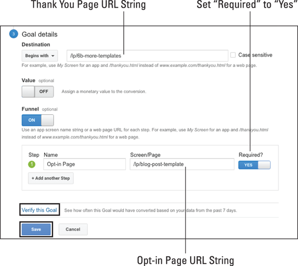
FIGURE 12-3: Setting up the specifics for your goal.
For your URL strings, always use the text after your domain name, not the entire URL — Google already knows the root domain.
After a few days of collecting data for your goal in Google Analytics, you can review the collected data. The goal you set up with UTM parameters gives you insight into your customers. Goals are also a great way to see what channels, such as Facebook, email, and your blog, are driving the most visits. To take a peek at these insights, go to the Reporting section of Google Analytics and choose the Conversions Suite in the left menu. Then click the Goals drop-down menu and click the Overview tab. The Goal Overview report opens and shows how the goals you have set up are performing. This report shows aggregated data for all the goals you have set up. To review one specific goal, click the drop down located at the top of the page beneath “Goal Option” and select one individual goal. That goal report opens. This report will tell you total goal completions and the conversion rate for this goal.
With a little bit of know-how and a lot of proper attribution tagging, you can set up the Google Analytics campaign tracking to give you some great insights! You then have the foundation you need to properly track your success, allowing you to focus on what’s working and eliminate what’s not. This type of assessment is essential to do for any business so that you can make educated decisions as you grow.
Segmenting Your Audience with Google Analytics
The previous sections of this chapter give you the bare-bones knowledge you need to properly track success and determine what channels are driving that success, but how do you put all this knowledge to work? The answer is that you segment your audience, which we also discuss in Chapters 4 and 10. The powerful information you’ve gained from UTM parameters and creating goals in Google Analytics enables you to break down your audience into segments based on the following:
- Channel
- Traffic source
- Completed actions
- Conversions
In the context of analytics, a segment represents groups of visitors with shared characteristics or behaviors. Segmenting your audience in Google Analytics allows you to
- Figure out who finds your message appealing so that you can send more of this audience to this particular offer.
- Craft customized messaging to enhance ad copy and shape follow-up campaigns.
Segmenting might sound simple, but it provides one of the best ways to make the most of your budget, or to know where you should spend your time and energy to drive new customers. By segmenting your audience, you gain a better understanding of what’s working and what’s not so that you can plan accordingly. In the following section, we cover how to create useful segments, as well as how to drill down into these segments to better understand the people who are taking the actions you’re looking for.
Creating audience segments
Using audience segments as a strategy shows you how to focus on the most valuable, highest-converting audiences. This allows you to figure out what makes them tick, so to speak. Before we dive into exactly what information you should be looking at, and how to pull it, we discuss how to create the segments you use to dig into your audience information.
Creating segments is fast and easy. You create a set of rules that include or exclude certain people, allowing you to narrow down your audience to look at a specific subset rather than all site visitors, such as people who opted in for a gated offer. After creating a segment, you can analyze how this subset of visitors behaved or who is in the subset, giving you valuable insight on what offers to make to this audience. Follow these steps to create your own segments.
- In Google Analytics, navigate to the Reports navigation menu on the left.
-
Select the Audience suite and click the Overview tab within the Audience suite.
The Audience Overview report appears.
-
Click the + Add Segment field along the top of the page.
The Segment menu appears.
-
Click the New Segment button to create a new segment (see Figure 12-4).
The Segment menu opens, allowing you to set conditions for your segments to meet and exclusions you want your segment to ignore. For instance, you might set a condition for age or operating system.
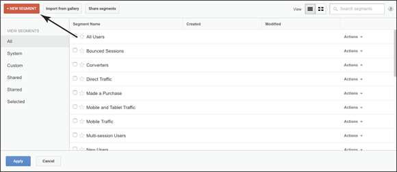
FIGURE 12-4: Creating a New Segment in Google Analytics.
- Set conditions for your segment by selecting any of the following check boxes or filling in the field within in the following categories:
- Demographics: Segment your users by demographic information, such as age, gender, location, and other details. These are check boxes and form fields, depending on the option within the Demographics category.
- Technology: Segment your users’ sessions by their web and mobile technologies, such as browser, device category, and screen resolution. These are check boxes and form fields, depending on the option within the Technology category.
- Behavior: Segment your users by how often they visit (called a session) and conduct transactions, such as sessions, session duration, and days since last session. These are form fields.
- Date of first session: Segment your users (create cohorts) by when they first visited your site. This is a form field.
- Traffic sources: Segment your users by how they found you, such as the keyword they used, the ad campaign, and the medium used. These are form fields.
- Ecommerce: Segment your users by their transactions and revenue. These are form fields. (Note: This may not appear depending on your business type and how you’ve set up your Google Analytics.)
- Conditions: Segment your users, their sessions, or both according to single or multisession conditions, such as time, goal conversions, and custom variables. This is a form field.
- Sequences: Segment your users, their sessions, or both according to sequential conditions, such as the steps they took to reach your site. This is a form field.
- After setting your conditions for your segment, name your segment by filling out the empty name field.
-
Click the Save button to successfully complete this segment.
Your new segment loads, and you can return to this segment at a later date when conducting future data research and analysis.
After your new segment loads, the data for your segment is displayed, allowing you to make assessments. For instance, it displays how many users make up the segment, as well as other stats. Figure 12-5 shows an example of a completed segment; this segment shows mobile users and consists of 122,263 users.
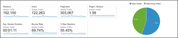
FIGURE 12-5: A segment for mobile users.
As a general rule, you want to aim for a minimum of 3,000 people in your audience segment, which ensures that you have enough subgroups to have faith in your groupings. You can experiment with fewer, but the larger your segment category is, the more trustworthy your data will be, allowing you to make sound, educated business decisions.
Segments aren’t limited to the Audience suite. You can create a segment for any of the following suites: Audience, Acquisition, Behavior, or Conversion. Choose the suite that best meets your needs to create this segment and select Overview within your chosen suite. Although the suite you choose may be different from Audience and thus the data it measures, the steps discussed in this section to set up a segment remain the same.
Honing In on Your Audience
After you segment your audiences, you can drill down further and gain more detail. Now is the time to run reports to figure out who’s taking the action you want (such as opting in) and who’s not so you can do more of what’s working. Reports give you a better understanding of your audience, and understanding your audience leads to driving down ad costs, or figuring out better strategies for monetizing the leads you’re getting!
You should look for two main types of data:
- Demographic
- Psychographic
Demographic data describes what people are like. Generally, this data includes statistical details like age and gender but can also include the type of device they’re using as well as their location. Demographic information helps you understand exactly who you are speaking to and guides the targeting you use in your campaigns.
Psychographic data, in contrast, describes what people like. This data is all about interests, hobbies, and likes, and it speaks more to the personality of the audience. Psychographic information is most powerful when you use it to shape your messaging.
Figure 12-6 shows a breakdown of the data types and what they’re best used for.
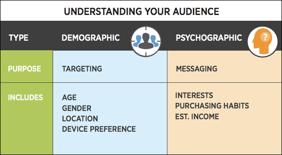
FIGURE 12-6: The best uses for demographic and psychographic data.
In the following sections, we build one report to look at demographic data and one to look at psychographic data. This way, you can easily run these reports for all kinds of audience segments.
Drilling into demographics
Although the data that a report for demographic data shows is typically fairly cut and dried, it yields very interesting insights. You can quickly look at a demographics report on the Audience tab in Google Analytics; however, this report’s key metric focuses on sessions (visits). To go beyond sessions and hone in on your users, you need to create a custom report.
To make a custom report for demographics, follow these steps:
-
Go to the Customization section in Google Analytics, select Custom Reports, and then click on the + New Custom Report button.
The Create Custom Report page opens. Create as many separate reports as you want to examine for demographics. At our company, we make four reports when drilling down into demographics: one each for age, gender, location, and device type.
-
In the Report Content section of the Create Custom Report page, create Report Tabs.
Name the tab based on the demographic you are drilling down on. For example, if you are measuring age, name it Age. If you plan to measure multiple demographics in this report, as we suggest in Step 1, you can create a new Report Tab by clicking the + Add Report Tab button under the Report Content section. Name each tab for the demographic you are measuring.
-
On the same page, set the Metric Groups dimension to Users by clicking the + Add Metric button and then selecting Users from the drop-down menu for every Report Tab you create (you can type “users” into the search bar that appears in the drop-down menu to find the option faster).
The word Users will now be displayed in the Metric Groups dimension. Users is the constant among all your tabs.
-
On the same page, in the Dimension Drilldowns dimension, set the demographic for each Report Tab you create by clicking the +Add Dimension button (again, you can type the dimension you’re looking for in the search bar that appears in the drop-down menu to find the option faster).
For Age, the Dimension Drilldown is Age; for Gender, it’s Gender, and for Device, it’s the Device Category. Your respective demographic now appears in the Dimension Drilldown dimension. Location is the only oddball; for the other demographics, you keep Type (located above the Metric Groups dimension) at the preselected Explorer Tab. For location, however, you set your Type to the Map Overlay tab and select and fill in your Zoom Level (world, continent, subcontinent, country) and Dimension (subcontinent, country, city).
Figure 12-7 shows the setup for creating an Age report.
-
Click the Save button when you’re done.
The report you created loads, and you now have a ready-made demographics report to use repeatedly.
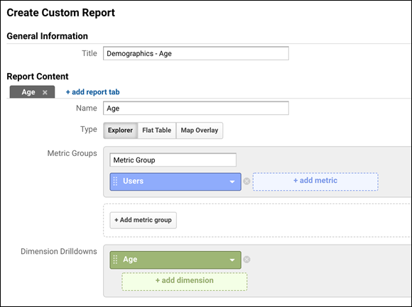
FIGURE 12-7: Creating a custom report for age.
The following sections tell you what to look for in the demographics report so you can gain insight into your campaign.
Age
First, examine the age of the people who are responding to your campaign. Who’s opting in? Are there any surprises? For instance, are the age ranges that are opting in fitting the customer avatar you created (see Chapter 1 for details on creating a customer avatar)? If not, you probably need to reevaluate the ad copy for your campaign through the lens of that age range. This report allows you to create a more customized campaign, which can lead to an increase in opt-ins and a drop in cost per click (CPC).
Gender
Next, what is the gender of the users who opted in to your campaign? If opt-ins are more heavily weighted toward a particular gender, you’ll likely see a benefit if you create a second version of the campaign that solely targets one gender, which leads to a boost in clicks and ad relevance while also dropping CPC.
Location
Location can be a powerful data set, especially if you’re looking to break into a new geographic market or scale in other areas. For instance, you may find from a Location report that your campaign is doing particularly well in a certain city, state, or country that you hadn’t previously considered. You can then make an informed decision about allocating more of your ad budget to target this location that you didn’t previously consider, allowing you to take advantage of regional interests.
Device
With a Device report, you can see what device people opted in to your campaign with. Was it their mobile device, their tablet, or their desktop? Knowing the device people are using to opt-in to your campaign helps you know how to design it. For instance, if your gated offer (see Chapters 3 and 4 for details on building gated offers) is doing particularly well with mobile users, then it is critical for this particular campaign to design your conversion funnel with mobile users in mind if you want to turn gated offer downloaders into purchasers.
Drilling into psychographics
The previous sections tell you how to dig into the cold, hard facts about your audience, and you can use that information to shape the targeting of the campaign during your optimization phase. But what about the messaging? What about your follow-up strategy? To figure out your best tactics here, we turn to psychographic data.
Again, you’re going to create another custom report, this time looking at Affinity Categories and In-Market Segments. Although Affinity Categories look more at your users’ likes and interests, In-Market Segments indicate what this audience wants to purchase (or may have just purchased). This process follows many of the same steps as when you created your custom demographic report:
-
Go to Customization in Google Analytics, select Custom Reports, and then click on + New Custom Report.
The Create Custom Report page opens.
-
In the Report Content section of the Create Custom Report page, create Report Tabs: one for Affinity Categories and another for In-Market Segments.
You add a tab by clicking the + Add Report Tab button under the Report Content section. Name one tab for your In-Market Segments and one for your Affinity Categories.
-
On the same page, set the Metric Groups dimension to Users by clicking the + Add Metric button and then selecting Users from the drop-down menu for every Report Tab you create (you can type “users” into the search bar that appears in the drop-down menu to find the option faster).
The word Users will now be displayed in the Metric Groups dimension. Users is the constant among all your tabs.
-
On the same page, in the Dimension Drilldowns dimension, set the demographic for each Report Tab you create by clicking the +Add Dimension button.
The Dimension Drilldowns that you select are Affinity Category and In-Market Segment, respectively.
Figure 12-8 shows what the setup looks like for creating an In-Market Segment report.
- Click the Save button when you’re done.
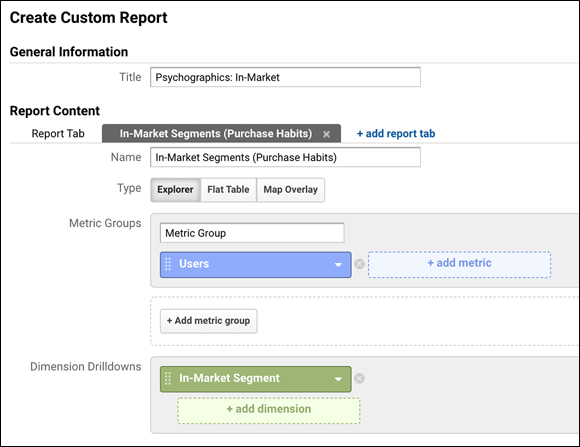
FIGURE 12-8: Creating a custom report for In-Market.
The report you created loads, and you now have a report that you can come back to repeatedly to study the interests of the users who have opted in.
Affinity Category report
Again, the Affinity Category report compiles what your users like and are interested in. This information allows you to create more customized campaigns by targeting specific interests. When looking at this data, setting the data view type to Comparison is best. (Click the Comparison View button, located on the right of the page.) This view highlights interests better than raw numbers do. Interests are listed from top likes to dislikes, as shown in Figures 12-9 and 12-10.
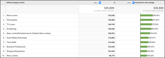
FIGURE 12-9: An Affinity report that shows the top interests for this audience.

FIGURE 12-10: An Affinity report that shows what this audience is least interested in.
Through Affinity reports, you can start to hone your marketing message. For instance, the audience depicted in Figure 12-9 is clearly interested in movies, TV, and entertainment and celebrity news. This knowledge enables you to get specific with your ad copy as you optimize your campaign. For example, an ad that asks “How does your business’s Social Media Score compare to Kim Kardashian’s?” would likely be a huge hit with this audience. On the other hand, as the data shows in Figure 12-10, sports-themed ads would most likely flop. So if you went in blind and tried a sports theme with your next ad campaign, you’d probably have a failed ad on your hands.
When trying to think of specific messaging, drill down your categories into more specific niche categories, such as “TV Lovers/Game, Reality & Talk Show Fans” rather than simply “TV Lovers.”
In-Market report
As we state earlier in the chapter, In-Market Segments give you some indication as to what your audience is in the market to purchase (or may have just purchased). This is extremely powerful information, allowing you to target your market based on products and services they search for. As with the Affinity report, when looking at this data, it’s best to set the data view type to Comparison. This view highlights interest better than raw numbers do. Figure 12-11 shows a sample of an In-Market report.
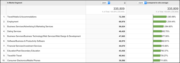
FIGURE 12-11: The data results of an In-Market report.
As shown in Figure 12-11, the audience who opted in to this campaign is also in the market for and researching employment, travel and hotel accommodations, and business and advertising services, just to name a few. Therefore, ads that used the language of travel or advertising services are set up for success.
You can also use In-Market reports to do some detective work to figure out your users’ income range. Use your sleuthing powers to get a sense of whether this target market is interested in luxury goods to try to get a sense of whether prospects fall on the high end of the spectrum of income. To do this, look for high concentrations of interest in categories that indicate wealth, namely luxury items. Here are some general categories to use for this analysis:
- Luxury Affinity Categories
- Shoppers/Luxury Shoppers
- Auto Enthusiasts/Performance & Luxury Vehicle Enthusiasts
- Travel Buffs/Luxury Travelers
- Luxury In-Market Audiences
- Apparel & Accessories/Jewelry & Watches/Watches
- Apparel & Accessories/Jewelry & Watches/Fine Jewelry
- Autos & Vehicles/Motor Vehicles/Motor Vehicles by Brand/Audi
- Autos & Vehicles/Motor Vehicles/Motor Vehicles by Brand/BMW
- Autos & Vehicles/Motor Vehicles/Motor Vehicles by Type/Luxury Vehicles/Luxury Vehicles (New)
- Autos & Vehicles/Motor Vehicles/Motor Vehicles by Type/Sports Cars/Sports Cars (New)
- Autos & Vehicles/Motor Vehicles/Motor Vehicles by Brand/Porsche
This strategy gives you another technique to understand your users’ income, and thus what products they may or may not be interested in. For example, if you ran this report and found that only about 3 percent of your audience for this campaign showed up within any of these segments, you could safely conclude that the people opting in for this particular gated offer aren’t wealthy. Therefore, following up with a campaign for a particularly pricey item is likely to be less successful than one with more moderate, flash-sale–style offers.
Putting It All Together
Armed with the information from your custom reports, you can now take the demographics and psychographics data and combine it to get a better understanding of the audience who is opting in to this campaign and have a profile of your ideal candidate for this campaign. Instead of guessing, you now have proven data to use for optimizing and scaling your campaign, which in turn can lead to more opt-ins, improved ad relevancy, and lower CPC. This is the power of crunching numbers and running a data-driven business. Here’s an example of what your customer avatar profile may look like after combining all the different data points that you’ve collected on your audience:
- Gender: Woman
- Age: Late 20s, early 30s
- Preferred Device: Smartphone
- Estimated Average Income: Under $100k Annually
- Role at Work: Non-supervisor
- Likes and Interests: Movies, Celebrity & Entertainment News, Pop Music, Education, Career Consulting, Dating Services, Home Décor & Gardening Services
- Dislikes: Sports, Horror Films, Board Games, Videogames, Automobile Accessories
Based on what has worked so far, you can then take this profile of your ideal candidate and create a more targeted campaign or scale it to other traffic platforms, but now your campaign can be even more specific. Armed with this information, you can attack the campaign from a new angle and speak more directly to your target audience. Imagine what your paid traffic team could do with this level of detail about whom they are targeting.
You can apply the data strategies covered in this chapter not only to people who opt in but also to purchasers or, with careful targeting, membership site users as well. In addition, you can use this strategy for any platform that drives sufficient traffic volume.