
Chapter 8
Thematic Maps
A thematic map focuses on a specific theme or variable, commonly using geographic data such as coastlines, boundaries, and places as points of reference for the variable being mapped. These maps provide specific information about particular locations or areas (proportional symbol mapping and choropleth maps) and information about spatial patterns (isarithmic and raster maps). The following sections illustrate the R code you need to produce these maps, with a final section devoted to the visualization of vector fields.
8.1 Proportional Symbol Mapping
8.1.1 Introduction
The proportional symbol technique uses symbols of different sizes to represent data associated with areas or point locations, with circles being the most frequently used geometric symbol. The data and the size of symbols can be related through different types of scaling: mathematical scaling sizes areas of point symbols in direct proportion to the data; perceptual scaling corrects the mathematical scaling to account for visual understimation of larger symbols; and range grading, where data are grouped, and each class is represented with a single symbol size.
In this chapter we display data from a grid of sensors belonging to the Integrated Air Quality system of the Madrid City Council (Section 10.1) with circles as the proportional symbol, and range grading as the scaling method. The objective when using range grading is to discriminate between classes instead of estimating an exact value from a perceived symbol size. However, because human perception of symbol size is limited, it is always recommended to add a second perception channel to improve the discrimination task. Colors from a sequential palette will complement symbol size to encode the groups.
8.1.2 Proportional Symbol with spplot
The NO2sp SpatialPointsDataFrame can be easily displayed with the spplot method provided by the sp package, based on xyplot from the lattice package. Both color and size can be combined in a unique graphical output because spplot accepts both of them (Figure 8.1). I define a sequential palette whose colors denote the value of the variable (green for lower values of the contaminant, brown for intermediate values, and black for highest values).

Annual average of NO2 measurements in Madrid. Values are shown with different symbol sizes and colors for each class with the spplot function.
library(sp)
load(’data/NO2sp.RData’)
airPal <- colorRampPalette(c(’springgreen1’, ’sienna3’, ’gray5’))(5)
spplot(NO2sp[“mean”], col.regions=airPal, cex=sqrt(1:5),
edge.col=’black’, scales=list(draw=TRUE),
key.space=’right’)
The ggplot2 version of this code needs to transform the SpatialPointsDataFrame to a conventional data.frame (which will contain two columns with latitude and longitude values).
NO2df <- data.frame(NO2sp)
NO2df$Mean <- cut(NO2sp$mean, 5)
ggplot(data=NO2df, aes(long, lat, size=Mean, fill=Mean)) +
geom_point(pch=21, col=’black’) + theme_bw() +
scale_fill_manual(values=airPal)
8.1.3 Optimal Classification and Sizes to Improve Discrimination
Two main improvements can be added to Figure 8.1:
Define classes dependent on the data structure (instead of the uniform distribution assumed with cut). A suitable approach is the classInterval function of the classInt package, which implements the Fisher-Jenks optimal classification algorithm.
library(classInt)## The number of classes is chosen between the Sturges and the## Scott rules.nClasses <- 5intervals <- classIntervals(NO2sp$mean, n=nClasses, style=’fisher’)## Number of classes is not always the same as the proposed numbernClasses <- length(intervals$brks) - 1Encode each group with a symbol size (circle area) such that visual discrimination among classes is enhanced. The next code uses the set of radii proposed in (Dent, Torguson, and Hodler 2008) (Figure 8.2). This set of circle sizes is derived from studies by Meihoefer (Meihoefer 1969). He derived a set of ten circle sizes that were easily and consistently discriminated by his subjects. The alternative proposed by Dent et al. improves the discrimination between some of the circles.
## Complete Dent set of circle radii (mm)dent <- c(0.64, 1.14, 1.65, 2.79, 4.32, 6.22, 9.65, 12.95, 15.11)## Subset for our datasetdentAQ <- dent[seq_len(nClasses)]## Link Size and Class: findCols returns the class number of each## point; cex is the vector of sizes for each data pointidx <- findCols(intervals)cexNO2 <- dentAQ[idx]

These two enhancements are included in Figure 8.3, which displays the categorical variable classNO2 (instead of mean) whose levels are the intervals previously computed with classIntervals. In addition, this figure includes an improved legend.

NO2sp$classNO2 <- factor(names(tab)[idx])
## ggplot2 version
NO2df <- data.frame(NO2sp)
ggplot(data=NO2df, aes(long, lat, size=classNO2, fill=classNO2)) +
geom_point(pch=21, col=’black’) + theme_bw() +
scale_fill_manual(values=airPal) +
scale_size_manual(values=dentAQ*2)
## spplot version
## Definition of an improved key with title and background
NO2key <- list(x=0.98, y=0.02, corner=c(1, 0),
title=expression(NO[2]~~(paste(mu, plain(g))/m^3)),
cex.title=.75, cex=0.7,
background=’gray92’)
pNO2 <- spplot(NO2sp[“classNO2”],
col.regions=airPal, cex=dentAQ,
edge.col=’black’,
scales=list(draw=TRUE),
key.space=NO2key)
pNO2
8.1.4 Spatial Context with Underlying Layers and Labels
The spatial distribution of the stations is better understood if we add underlying layers with information about the spatial context.
8.1.4.1 Static Image
A suitable method is to download data from a provider such as Google Maps™ or OpenStreetMap and transform it adequately. There are several packages that provide an interface to query several map servers. On one hand, RGoogleMaps, OpenStreetMaps, and ggmap provide raster images from static maps obtained from Google Maps, Stamen, OpenStreetMap, etc.; on the other hand, osmar is able to access OpenStreetMap data and convert it into classes provided by existing R packages (mainly sp and igraph0 objects).
Among these options, I have chosen the Stamen watercolor maps available through the ggmap (Kahle and Wickham 2013) and OpenStreetMaps packages (Fellows and Stotz 2013). It is worth noting that these map tiles are published by Stamen Design under a Creative Commons licence CC BY-3.0 (Attribution). They produce these maps with data by Open-StreetMap also published under a Creative Commons licence BY-SA (Attribution - ShareAlike).
madridBox <- bbox(NO2sp)
## ggmap solution
library(ggmap)
madridGG <- get_map(c(madridBox), maptype=’watercolor’, source=’
stamen’)
## OpenStreetMap solution
library(OpenStreetMap)
ul <- madridBox[c(4, 1)]
lr <- madridBox[c(2, 3)]
madridOM <- openmap(ul, lr, type=’stamen-watercolor’)
madridOM <- openproj(madridOM)
NO2df <- data.frame(NO2sp)
## ggmap
ggmap(madridGG) +
geom_point(data=NO2df,
aes(long, lat, size=classNO2, fill=classNO2),
pch=21, col=’black’) +
scale_fill_manual(values=airPal) +
scale_size_manual(values=dentAQ*2)
##OpenStreetMap
autoplot(madridOM) +
geom_point(data=NO2df,
aes(long, lat, size=classNO2, fill=classNO2),
pch=21, col=’black’) +
scale_fill_manual(values=airPal) +
scale_size_manual(values=dentAQ*2)
Although ggmap is designed to work with the ggplot2 package, the result of get_map is only a raster object with attributes. Therefore, it can be easily displayed with grid.raster as an underlying layer of the previous spplot result (Figure 8.4).

## the ’bb’ attribute stores the bounding box of the get_map result
bbMap <- attr(madridGG, ’bb’)
## This information is needed to resize the image with grid.raster
height <- with(bbMap, ur.lat - ll.lat)
width <- with(bbMap, ur.lon - ll.lon)
pNO2 + layer(grid.raster(madridGG,
width=width, height=height,
default.units=’native’),
under=TRUE)
The result of openmap is more sophisticated but can also be converted and displayed with grid.raster.
tile <- madridOM$tile[[1]]
height <- with(tile$bbox, p1[2] - p2[2])
width <- with(tile$bbox, p2[1] - p1[1])
colors <- as.raster(matrix(tile$colorData,
ncol=tile$yres,
nrow=tile$xres,
byrow=TRUE))
pNO2 + layer(grid.raster(colors,
width=width,
height=height,
default.units=’native’),
under=TRUE)
8.1.4.2 Vector Data
A major problem with the previous solution is that the user can neither modify the image nor use its content to produce additional information. A different approach is to use digital vector data (points, lines, and polygons). A popular format for vectorial data is the shapefile, commonly used by public and private providers to distribute information. A shapefile can be read with readShapePoly and readShapeLines from the rgdal package. These functions produce a SpatialPolygonsDataFrame and a SpatialLinesDataFrame objects, respectively. These objects can be displayed with the sp.polygons and sp.lines functions provided by the sp package.
For our example, the Madrid district and streets are available as shapefiles from the nomecalles web service1.
library(maptools)
library(rgdal)
## nomecalles http://www.madrid.org/nomecalles/Callejero_madrid.icm
## Form at http://www.madrid.org/nomecalles/DescargaBDTCorte.icm
## Madrid districts
unzip(’Distritos⊔de⊔Madrid.zip’)
distritosMadrid <- readShapePoly(’Distritos⊔de⊔Madrid/200001331’)
proj4string(distritosMadrid) <- CRS(“+proj=utm⊔+zone=30”)
distritosMadrid <- spTransform(distritosMadrid, CRS=CRS(“+proj=
longlat⊔+ellps=WGS84”))
## Madrid streets
unzip(’Callejero_⊔Ejes⊔de⊔viales.zip’)
streets <- readShapeLines(’Callejero_⊔Ejes⊔de⊔viales/call2011.shp’)
streetsMadrid <- streets[streets$CMUN==’079’,]
proj4string(streetsMadrid) <- CRS(“+proj=utm⊔+zone=30”)
streetsMadrid <- spTransform(streetsMadrid, CRS=CRS(“+proj=longlat⊔+
ellps=WGS84”))
These shapefiles can be included in the plot with the sp.layout mechanism accepted by spplot or with the layer and +.trellis functions from the latticeExtra package. The station codes are placed with this same procedure using the sp.pointLabel function from the maptools package. Figure 8.5 displays the final result.

Annual average of NO2 measurements in Madrid using shapefiles (lines and polygons) and text as geographical context.
spDistricts <- list(’sp.polygons’, distritosMadrid, fill=’gray97’,
lwd=0.3)
spStreets <- list(’sp.lines’, streetsMadrid, lwd=0.05)
spNames <- list(sp.pointLabel, NO2sp,
labels=substring(NO2sp$codEst, 7),
cex=0.6, fontfamily=’Palatino’)
spplot(NO2sp[“classNO2”], col.regions=airPal, cex=dentAQ,
edge.col=’black’, alpha=0.8,
sp.layout=list(spDistricts, spStreets, spNames),
scales=list(draw=TRUE),
key.space=NO2key)
pNO2 +
layer(sp.pointLabel(NO2sp,
labels=substring(NO2sp$codEst, 7),
cex=0.8, fontfamily=’Palatino’)
) +
layer_({
sp.polygons(distritosMadrid, fill=’gray97’, lwd=0.3)
sp.lines(streetsMadrid, lwd=0.05)
})
The ggplot2 package is not able to work directly with SpatialLines* or SpatialPolygon* objects. Instead, it includes several fortify methods to convert objects from these classes into a conventional data.frame. You should beware that the fortify process for large objects (such as the SpatialLinesDataFrame in our example) requires too much time to be completed.
8.1.5 Spatial Interpolation
The measurements at discrete points give limited information about the underlying process. It is quite common to approximate the spatial distribution of the measured variable with the interpolation between measurement locations. Selection of the optimal interpolation method is outside the scope of this book. The following code illustrates an easy solution using inverse distance weighted (IDW) interpolation with the gstat package (E. J. Pebesma 2004) only for illustration purposes.
library(gstat)
airGrid <- spsample(NO2sp, type=’regular’, n=1e5)
gridded(airGrid) <- TRUE
airKrige <- krige(mean ~ 1, NO2sp, airGrid)
The result is a SpatialPixelsDataFrame that can be displayed with spplot and combined with the previous layers and the measurement station points (Figure 8.6).

spplot(airKrige[“var1.pred”],
col.regions=colorRampPalette(airPal)) +
layer({
sp.polygons(distritosMadrid, fill=’transparent’, lwd=0.3)
sp.lines(streetsMadrid, lwd=0.07)
sp.points(NO2sp, pch=21, alpha=0.8, fill=’gray50’, col=’black’)
})
8.1.6 Export to Other Formats
A different approach is to use an external data viewer, due to its features or its large community of users. Two tools deserve to be mentioned: Geo-JSON rendered within GitHub repositories, and KML files imported in Google Earth™.
8.1.6.1 GeoJSON and OpenStreetMap
GeoJSON is an open computer file format for encoding collections of simple geographical features along with their nonspatial attributes using JavaScript Object Notation (JSON). These files can be easily rendered within GitHub repositories. GitHub uses Leaflet.js2 to represent the data and MapBox3 with OpenStreetMap4 for the underlying map data.
Our SpatialPointsDataFrame can be converted to a GeoJSON file with writeOGR from the rgdal package.
library(rgdal)
writeOGR(NO2sp, ’data/NO2.geojson’, ’NO2sp’, driver=’GeoJSON’)
Figure 8.7 shows a snapshot of the rendering of this GeoJSON file, available from the GitHub repository. There you can zoom on the map and click on the stations to display the data.

8.1.6.2 Keyhole Markup Language
Keyhole Markup Language (KML) is a file format to display geographic data within Internet-based, two-dimensional maps and three-dimensional Earth browsers. KML uses a tag-based structure with nested elements and attributes, and is based on the XML standard. KML became an international standard of the Open Geospatial Consortium in 2008. Google Earth was the first program able to view and graphically edit KML files, although Marble, an open-source project, also offers KML support.
There are several packages able to generate KML files. For example, the writeOGR function from the rgdal package can also write KML files:
library(rgdal)
writeOGR(NO2sp, dsn=’NO2_mean.kml’, layer=’mean’, driver=’KML’)
However, the plotKML package provides a simpler interface and includes a wide set of options:
library(plotKML)
plotKML(NO2sp[“mean”], points_names=NO2sp$codEst)
Both functions produce a file that can be directly opened with Google Earth or Marble.
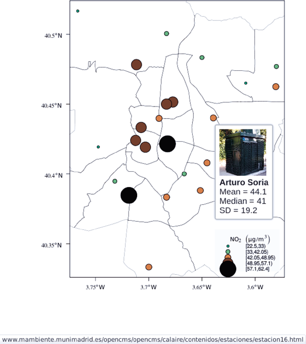
8.1.7  Additional Information with Tooltips and Hyperlinks
Now, let’s suppose you need to know the median and standard deviation of the time series of a certain station. Moreover, you would like to watch the photography of that station; or even better, you wish to visit its webpage for additional information. A frequent solution is to produce interactive graphics with tooltips and hyperlinks.
The gridSVG package is able to create an SVG graphic, where each component owns a title attribute; the content of this attribute is commonly displayed as a tooltip when the mouse hovers over the element. The content of this attribute can be modified thanks to the grid.garnish function. Moreover, the grid.hyperlink function can add hyperlinks to the correspondent graphical element.
The tooltips will display the photography of the station, the name of the station, and the statistics previously calculated with aggregate in the first step of this chapter. The station images are downloaded from the Munimadrid webpage. The htmlParse function from the XML package parses each station page, and the station photograph is extracted with getNodeSet and xmlAttrs.
library(XML)
old <- setwd(’images’)
for (i in 1:nrow(NO2df)){
codEst <- NO2df[i, “codEst”]
## Webpage of each station
codURL <- as.numeric(substr(codEst, 7, 8))
rootURL <- ’http://www.mambiente.munimadrid.es’
stationURL <- paste(rootURL,
’/opencms/opencms/calaire/contenidos/estaciones/
estacion’,
codURL, ’.html’, sep=’’)
content <- htmlParse(stationURL, encoding=’utf8’)
## Extracted with http://www.selectorgadget.com/
xPath <- ’//*[contains(concat(⊔“⊔”,⊔@class,⊔“⊔”⊔),⊔concat(⊔“⊔“,⊔“
imagen_1”,⊔”⊔”⊔))]’
imageStation <- getNodeSet(content, xPath)[[1]]
imageURL <- xmlAttrs(imageStation)[1]
imageURL <- paste(rootURL, imageURL, sep=’’)
download.file(imageURL, destfile=paste(codEst, ’.jpg’, sep=’’))
}
setwd(old)
Next, we attach the hyperlink and the SVG information to each circle.
print(pNO2 + layer_(sp.polygons(distritosMadrid, fill=’gray97’, lwd
=0.3)))
library(gridSVG)
NO2df <- as.data.frame(NO2sp)
tooltips <- sapply(seq_len(nrow(NO2df)), function(i){
codEst <- NO2df[i, “codEst”]
## Information to be attached to each line
stats <- paste(c(’Mean’, ’Median’, ’SD’),
signif(NO2df[i, c(’mean’, ’median’, ’sd’)], 4),
sep=’⊔=⊔’, collapse=’<br⊔/>’)
## Station photograph
imageURL <- paste(’images/’, codEst, ’.jpg’, sep=’’)
imageInfo <- paste(“<img⊔src=“, imageURL,
”⊔width=’100’⊔height=’100’⊔/>”, sep=’’)
## Text to be included in the tooltip
nameStation <- paste(’<b>’,
as.character(NO2df[i, “Nombre”]),
’</b>’, sep=’’)
info <- paste(nameStation, stats, sep=’<br⊔/>’)
## Tooltip includes the image and the text
paste(imageInfo, info, sep=’<br⊔/>’)
})
grid.garnish(’points.panel’, title=tooltips, grep=TRUE, group=FALSE)
## Webpage of each station
rootURL <- ’http://www.mambiente.munimadrid.es’
urlList <- sapply(seq_len(nrow(NO2df)), function(i){
codEst <- NO2df[i, “codEst”]
codURL <- as.numeric(substr(codEst, 7, 8))
stationURL <- paste(rootURL,
’/opencms/opencms/calaire/contenidos/estaciones/
estacion’,
codURL, ’.html’, sep=’’)
})
grid.hyperlink(’points.panel’, urlList, grep=TRUE, group=FALSE)
The title attribute can be accessed with the JavaScript plug-ins jQuery5 and jQuery UI6 to display tooltips when the mouse hovers over each station. The grid.script function creates objects containing links to these plug-ins. And grid.export uses these objects to produce an SVG document with script elements.
## Add jQuery and jQuery UI scripts
grid.script(file=’http://code.jquery.com/jquery-1.8.3.js’)
grid.script(file=’http://code.jquery.com/ui/1.9.2/jquery-ui.js’)
## Simple JavaScript code to initialize the tooltip
grid.script(file=’js/myTooltip.js’)
## Produce the SVG graphic: the results of grid.garnish,
## grid.hyperlink and grid.script are converted to SVG code
grid.export(’figs/airMadrid.svg’)
These plug-ins will work only after the file airMadrid.svg created by grid.export is inserted in a HTML file with standard headers. Figure 8.8 shows a capture of the result.
htmlBegin <- ’<!DOCTYPE⊔html>
<html>
<head>
<title>Tooltips⊔with⊔jQuery⊔and⊔gridSVG</title>
<link⊔rel=“stylesheet”⊔type=“text/css”⊔href=“http://code.jquery.com/
ui/1.9.2/themes/smoothness/jquery-ui.css”⊔/>
<meta⊔charset=“utf-8”>
</head>
<body>’
htmlEnd <- ’</body>⊔</html>’
svgText <- paste(readLines(’figs/airMadrid.svg’), collapse=’
’)
writeLines(paste(htmlBegin, svgText, htmlEnd, sep=’
’),
’airMadrid.html’)
8.2 Choropleth Maps
A choropleth map shades regions according to the measurement of a variable displayed on the map. The choropleth map is an appropiate tool to visualize a variable uniformly distributed within each region, changing only at the region boundaries. This method performs correctly with homogeneous regions, both in size and shape.
This section details how to create a multivariate choropleth map to show the results of the 2011 Spanish general elections. It is inspired by the infographic from the New York Times7, a multivariate choropleth map of the inmigration behavior in the United States.
votes2011 <- read.csv(’data/votes2011.csv’,
colClasses=c(’factor’, ’factor’, ’numeric’, ’
numeric’))
The next section describes how to define a SpatialPolygonsDataFrame with the data from this data.frame and the spatial information of the administrative boundaries from a shapefile. You can skip it for later reading if you are not interested in this procedure and jump to the section 8.2.2 where the maps are produced.
8.2.1 Administrative Boundaries
The Spanish administrative boundaries are available as shapefiles at the INE (Instituto Nacional de Estadística) webpage8. Both the municipalities, espMap, and province boundaries, provinces, are read as SpatialPolygonsDataFrame with readShapePoly.
library(sp)
library(maptools)
old <- setwd(tempdir())
download.file(’http://goo.gl/TIvr4’, ’mapas_completo_municipal.rar’)
system2(’unrar’, c(’e’, ’mapas_completo_municipal.rar’))
espMap <- readShapePoly(fn=“esp_muni_0109”)
Encoding(levels(espMap$NOMBRE)) <- “latin1”
provinces <- readShapePoly(fn=“spain_provinces_ag_2”)
setwd(old)
Some of the polygons are repeated and can be dissolved with unionSpatialPolygons (the rgeos package must be installed).
## dissolve repeated polygons
espPols <- unionSpatialPolygons(espMap, espMap$PROVMUN)
Spanish maps are commonly displayed with the Canarian islands next to the peninsula. First we have to extract the polygons of the islands and the polygons of the peninsula, and then shift the coordinates of the islands with elide. Finally, a new SpatialPolygons object binds the shifted islands with the peninsula.
## Extract Canarias islands from the SpatialPolygons object
canarias <- sapply(espPols@polygons, function(x)substr(x@ID, 1, 2) %
in% c(“35”, “38”))
peninsulaPols <- espPols[!canarias]
islandPols <- espPols[canarias]
## Shift the island extent box to position them at the bottom right
corner
dy <- bbox(peninsulaPols)[2,1] - bbox(islandPols)[2,1]
dx <- bbox(peninsulaPols)[1,2] - bbox(islandPols)[1,2]
islandPols2 <- elide(islandPols, shift=c(dx, dy))
bbIslands <- bbox(islandPols2)
## Bind Peninsula (without islands) with shifted islands
espPols <- rbind(peninsulaPols, islandPols2)
The final step is to link the data with the polygons. The ID slot of each polygon is the key to find the correspondent registry in the votes2011 dataset.
## Match polygons and data using ID slot and PROVMUN column
IDs <- sapply(espPols@polygons, function(x)x@ID)
idx <- match(IDs, votes2011$PROVMUN)
##Places without information
idxNA <- which(is.na(idx))
##Information to be added to the SpatialPolygons object
dat2add <- votes2011[idx, ]
## SpatialPolygonsDataFrame uses row names to match polygons with
data
row.names(dat2add) <- IDs
espMapVotes <- SpatialPolygonsDataFrame(espPols, dat2add)
## Drop those places without information
espMapVotes <- espMapVotes[-idxNA, ]
8.2.2 Map
The SpatialPolygonsDataFrame constructed in the previous section contains two main variables: whichMax, the name of the predominant political option, and pcMax, the percentage of votes obtained by this political option.
whichMax is a categorical value with four levels: the two main parties (PP and PSOE), the abstention results (ABS), and the rest of the parties (OTH). Figure 8.9 encodes these levels with a qualitative palette with constant hues and varying chroma and luminance for each class using the package colorspace (Zeileis, Hornik, and Murrell 2009). In order to improve the color discrimination, hues are equally spaced along the HCL (Hue, Chroma, Luminance) based color wheel.

Categorical choropleth map displaying the name of the predominant political option in each municipality in the 2011 Spanish general elections.
library(colorspace)
classes <- levels(factor(espMapVotes$whichMax))
nClasses <- length(classes)
qualPal <- rainbow_hcl(nClasses, start=30, end=300)
For the definition of a combined palette in the next section, it is interesting to note that the colors provided by rainbow_hcl can be obtained with the following code where the distances between hues and their values are computed explicitly.
## distance between hues
step <- 360/nClasses
## hues equally spaced
hue = (30 + step*(seq_len(nClasses)-1))%%360
qualPal <- hcl(hue, c=50, l=70)
spplot(espMapVotes[“whichMax”], col=’transparent’, col.regions=
qualPal)
On the other hand, pcMax is a quantitative variable that can be adequately displayed with a sequential palette (Figure 8.10).

Quantitative choropleth map displaying the percentage of votes obtained by the predominant political option in each municipality in the 2011 Spanish general elections.
quantPal <- rev(heat_hcl(16))
spplot(espMapVotes[“pcMax”], col=’transparent’, col.regions=quantPal
)
8.2.3 Categorical and Quantitative Variables Combined in a Multivariate Choropleth Map
Following the inspiring example of the infographic from the New York Times, we will combine both choropleth maps to produce a multivariate map: the hue of each polygon will be determined by the name of the predominant option (whichMax) but the chroma and luminance will vary according to the percentage of votes (pcMax). Hues are computed with the same method as in Figure 8.9, while the corresponding values of chroma and luminance are calculated with the sequential_hcl function.
classes <- levels(factor(espMapVotes$whichMax))
nClasses <- length(classes)
step <- 360/nClasses
multiPal <- lapply(1:nClasses, function(i){
rev(sequential_hcl(16, h = (30 + step*(i-1))%%360))
})
With this multivariate palette we can produce a list of maps extracting the polygons according to each class and filling with the appropiate color from this palette. The resulting list of trellis objects can be combined with Reduce and the +.trellis function of the latticeExtra and produce a trellis object.
It is important to note that, to ensure the legend’s homogeneity, the breakpoints defined by the at argument are the same for all the individual maps.
pList <- lapply(1:nClasses, function(i){
## Only those polygons corresponding to a level are selected
mapClass <- espMapVotes[espMapVotes$whichMax==classes[i],]
pClass <- spplot(mapClass[’pcMax’], col.regions=multiPal[[i]],
col=’transparent’,
## labels only needed in the last legend
colorkey=(if (i==nClasses) TRUE else list(labels=rep
(’’, 6))),
at = seq(0, 100, by=20))
})
p <- Reduce(’+’, pList)
The legend of this trellis object must be defined manually. The main operation is to merge the legends from the components of the list of maps to obtain a bivariate legend.
The first step is to add a title to each individual legend. This is a little complex because levelplot (the engine under the spplot method) does not include a title in its color key. The solution is to define a function to add the title and include it as an argument to the legend component of each trellis object. The print.trellis method will process this function when displaying the trellis object. The frameGrob and packGrob of the grid package will do the main work inside this function.
## Function to add a title to a legend
addTitle <- function(legend, title){
titleGrob <- textGrob(title, gp=gpar(fontsize=8), hjust=1, vjust=1)
## retrieve the legend from the trellis object
legendGrob <- eval(as.call(c(as.symbol(legend$fun), legend$args)))
## Layout of the legend WITH the title
ly <- grid.layout(ncol=1, nrow=2,
widths=unit(0.9, ’grobwidth’, data=legendGrob))
## Create a frame to host the original legend and the title
fg <- frameGrob(ly, name=paste(’legendTitle’, title, sep=’_’))
## Add the grobs to the frame
pg <- packGrob(fg, titleGrob, row=2)
pg <- packGrob(pg, legendGrob, row=1)
}
## Access each trellis object from pList...
for (i in seq_along(classes)){
## extract the legend (automatically created by spplot)...
lg <- pList[[i]]$legend$right
## ... and add the addTitle function to the legend component of
each trellis object
pList[[i]]$legend$right <- list(fun=’addTitle’,
args=list(legend=lg, title=classes[i]))
}
Now that every component of pList includes a legend with a title, the legend of the p trellis object can be modified to store the merged legends from the set of components of pList.
## List of legends
legendList <- lapply(pList, function(x){
lg <- x$legend$right
clKey <- eval(as.call(c(as.symbol(lg$fun), lg$args)))
clKey
})
## Function to pack the list of legends in a unique legend
## Adapted from latticeExtra::: mergedTrellisLegendGrob
packLegend <- function(legendList){
N <- length(legendList)
ly <- grid.layout(nrow = 1, ncol = N)
g <- frameGrob(layout = ly, name = “mergedLegend”)
for (i in 1:N) g <- packGrob(g, legendList[[i]], col = i)
g
}
## The legend of p will include all the legends
p$legend$right <- list(fun = ’packLegend’, args = list(legendList =
legendList))
Figure 8.11 displays the result with the province boundaries superposed (only for the peninsula due to a problem with the definition of boundaries the Canarian islands in the file) and a rectangle to separate the Canarian islands from the remainder of the map.

Spanish general elections results. The map shows the result of the most voted option in each municipality.
canarias <- provinces$PROV %in% c(35, 38)
peninsulaLines <- provinces[!canarias,]
p +
layer(sp.polygons(peninsulaLines, lwd = 0.1)) +
layer(grid.rect(x=bbIslands[1,1], y=bbIslands[2,1],
width=diff(bbIslands[1,]),
height=diff(bbIslands[2,]),
default.units=’native’, just=c(’left’, ’bottom’),
gp=gpar(lwd=0.5, fill=’transparent’)))
8.3 Raster Maps
A raster data structure is a matrix of cells organized into rows and columns where each cell contains a value representing information, such as temperature, altitude, population density, land use, etc. This section describes how to display a raster with two different examples: CM-SAF solar irradiation rasters will illustrate the use of quantitative data, and land cover and population data from the NEO-NASA project will exemplify the display of categorical data and multivariate rasters. Read Chapter 10 for details about these datasets.
8.3.1 Quantitative Data
As an example of quantitative data, this section displays the distribution of annual solar irradiation over the Iberian peninsula using the estimates from CM SAF. The RasterLayer object of annual averages of solar irradiation estimated by CM SAF can be easily displayed with the levelplot method of the rasterVis package. Figure 8.12 illustrates this raster with marginal graphics to show the column (longitude) and row (latitude) sum- maries of the RasterLayer object. The summary is computed with the function defined by FUN.margin (which uses mean as the default value).

library(raster)
library(rasterVis)
SISav <- raster(’data/SISav’)
levelplot(SISav)
Although the solar irradiation distribution reveals the physical structure of the region, it is recommended to add the geographic context with a layer of administrative boundaries (Figure 8.13).

library(maps)
library(mapdata)
library(maptools)
ext <- as.vector(extent(SISav))
boundaries <- map(’worldHires’,
xlim=ext[1:2], ylim=ext[3:4],
plot=FALSE)
boundaries <- map2SpatialLines(boundaries,
proj4string=CRS(projection(SISav)))
levelplot(SISav) + layer(sp.lines(boundaries, lwd=0.5))
8.3.1.1 Hill Shading
A frequent method to improve the display of meteorological rasters is the hill shading or shaded relief technique, a method of representing relief on a map by depicting the shadows that would be cast by high ground if light comes from a certain sun position (Figure 8.14).

The procedure is as follows:
Download a Digital Elevation Model (DEM) from the DIVA-GIS service.
old <- setwd(tempdir())download.file(’http://www.diva-gis.org/data/msk_alt/ESP_msk_alt.zip’, ’ESP_msk_alt.zip’)unzip(’ESP_msk_alt.zip’, exdir=’.’)DEM <- raster(’ESP_msk_alt’)Compute the hill shade raster with terrain and hillShade from raster.
slope <- terrain(DEM, ’slope’)aspect <- terrain(DEM, ’aspect’)hs <- hillShade(slope=slope, aspect=aspect,angle=20, direction=30)setwd(old)Combine the result with the previous map using semitransparency.
## hillShade theme: gray colors and semitransparencyhsTheme <- modifyList(GrTheme(), list(regions=list(alpha=0.6)))levelplot(SISav, panel=panel.levelplot.raster,margin=FALSE, colorkey=FALSE) +levelplot(hs, par.settings=hsTheme, maxpixels=1e6) +layer(sp.lines(boundaries, lwd=0.5))
8.3.1.2 Excursus: 3D Visualization
An alternative method for a DEM is 3D visualization where the user can rotate or zoom the figure. This solution is available thanks to the rgl package, which provides functions for 3D interactive graphics. The plot3D function in the rasterVis package is a wrapper to this package for RasterLayer objects.
plot3D(DEM, maxpixels=5e4)
The output scene can be exported to several formats such as WebGL with writeWebGL to be rendered in a browser, or STL with writeSTL, a format commonly used in 3D printing. Files using this format are viewed easily on GitHub (Figure 8.15)

3D visualization of a Digital Elevation Model using the STL format in a GitHub repository.
writeSTL(’figs/DEM.stl’)
8.3.1.3 Diverging Palettes
Next, instead of displaying the absolute values of each cell, we will analyze the differences between each cell and the global average value. This average is computed with the cellStats function and substracted from the original RasterLayer. Figure 8.16 displays the relation between these scaled values and latitude (y), with five different groups defined by the longitude (cut(x, 5)). It is evident that larger irradiation values are associated with lower latitudes. However, there is no such clear relation between irradiation and longitude.

Relation between scaled annual average radiation and latitude for several longitude groups.
meanRad <- cellStats(SISav, ’mean’)
SISav <- SISav - meanRad
xyplot(layer ~ y, data = SISav,
groups=cut(x, 5),
par.settings=rasterTheme(symbol=plinrain(n=5, end=200)),
xlab = ’Latitude’, ylab = ’Solar⊔radiation⊔(scaled)’,
auto.key=list(space=’right’, title=’Longitude’, cex.title=1.3))
Numerical information ranging in an interval including a neutral value is commonly displayed with diverging palettes. These palettes represent neutral classes with light colors, while low and high extremes of the data range are highlighted using dark colors with contrasting hues. I use the Purple-Orange palette from ColorBrewer with purple for positive values and orange for negative values. In order to underline the position of the interval containing zero, the center color of this palette is substituted with pure white. The resulting palette is displayed in Figure 8.17 with the custom showPal function. The corresponding correspondent raster map produced with this palette is displayed in Figure 8.18. Although extreme positive and negative values can be easily discriminated, the zero value is not associated with white because the data range is not symmetrical around zero.


Asymmetric raster data (scaled annual average irradiation) displayed with a symmetric diverging palette.
divPal <- brewer.pal(n=9, ’PuOr’)
divPal[5] <- “#FFFFFF”
showPal <- function(pal, labs=pal, cex=0.6, ...){
barplot(rep(1, length(pal)), col=pal,
names.arg=labs, cex.names=cex,
axes=FALSE, ...)
}
showPal(divPal)
divTheme <- rasterTheme(region=divPal)
levelplot(SISav, contour=TRUE, par.settings=divTheme)
The solution is to connect the symmetrical color palette with the asymmetrical data range. The first step is to create a set of breaks such that the zero value is the center of one of the intervals.
rng <- range(SISav[])
## Number of desired intervals
nInt <- 15
## Increment corresponding to the range and nInt
inc0 <- diff(rng)/nInt
## Number of intervals from the negative extreme to zero
n0 <- floor(abs(rng[1])/inc0)
## Update the increment adding 1/2 to position zero in the center of
an interval
inc <- abs(rng[1])/(n0 + 1/2)
## Number of intervals from zero to the positive extreme
n1 <- ceiling((rng[2]/inc - 1/2) + 1)
## Collection of breaks
breaks <- seq(rng[1], by=inc, length= n0 + 1 + n1)
The next step is to compute the midpoints of each interval. These points represent the data belonging to each interval, and their value will be connected with a color of the palette.
## Midpoints computed with the median of each interval
idx <- findInterval(SISav[], breaks, rightmost.closed=TRUE)
mids <- tapply(SISav[], idx, median)
## Maximum of the absolute value both limits
mx <- max(abs(breaks))
mids
A simple method to relate the palette and the intervals is with a straight line such that a point is defined by the absolute maximum value, ((mx, 1)), and another point by zero, ((0, 0.5)). Why are we using the interval [0, 1] as the y-coordinate of this line, and why is 0.5 the result of zero? The reason is that the input of the break2pal function will be the result of colorRamp, a function that creates another interpolating function which maps colors with values between 0 and 1. Therefore, a new palette is created, extracting colors from the original palette, such that the central color (white) is associated with the interval containing zero. This palette is displayed in Figure 8.19.

The raster map produced with this new palette is displayed in Figure 8.20. Now zero is clearly associated with the white color.

Asymmetric raster data (scaled annual average irradiation) displayed with a modified diverging palette.
break2pal <- function(x, mx, pal){
## x = mx gives y = 1
## x = 0 gives y = 0.5
y <- 1/2*(x/mx + 1)
rgb(pal(y), maxColorValue=255)
}
## Interpolating function that maps colors with [0, 1]
## rgb(divRamp(0.5), maxColorValue=255) gives “#FFFFFF” (white)
divRamp <- colorRamp(divPal)
## Diverging palette where white is associated with the interval
## containing the zero
pal <- break2pal(mids, mx, divRamp)
showPal(pal, round(mids, 1))
levelplot(SISav, par.settings=rasterTheme(region=pal),
at=breaks, contour=TRUE)
It is interesting to note two operations carried out internally by the lattice package. First, the custom.theme function (used by rasterTheme) creates a new palette with 100 colors using colorRampPalette to interpolate the palette passed as an argument. Second, the level.colors function makes the arrangement between intervals and colors. If this function receives more colors than intervals, it chooses a subset of the palette disregarding some of the intermediate colors. Therefore, because this function will receive 100 colors from par.settings, it is difficult to control exactly which colors of our original palette will be represented.
An alternative way for finer control is to fill the regions$col component of the theme with our palette after it has been created (Figure 8.21).

Same as Figure 8.20 but colors are assigned directly to the regions$col component of the theme.
divTheme <- rasterTheme()
divTheme$regions$col <- pal
levelplot(SISav, par.settings=divTheme, at=breaks, contour=TRUE)
A final improvement to this map is to compute the intervals using a classification algorithm with the classInt package. With this approach it is likely that zero will not be perfectly centered in its corresponding interval. The remaining code is exactly the same as above, replacing the breaks vector with the result of the classIntervals function. Figure 8.22 displays the result.

library(classInt)
cl <- classIntervals(SISav[],
## n=15, style=’equal’)
## style=’hclust’)
## style=’sd’)
style=’kmeans’)
## style=’quantile’)
cl
breaks <- cl$brks
idx <- findInterval(SISav[], breaks, rightmost.closed=TRUE)
mids <- tapply(SISav[], idx, median)
mids
mx <- max(abs(breaks))
pal <- break2pal(mids, mx, divRamp)
divTheme$regions$col <- pal
levelplot(SISav, par.settings=divTheme, at=breaks, contour=TRUE)
8.3.2 Categorical Data
Land cover is the observed physical cover on the Earth’s surface. A set of seventeen different categories is commonly used. Using satellite observations, it is possible to map where on Earth each of these seventeen land surface categories can be found and how these land covers change over time.
This section illustrates how to read and display rasters with categorical information using information from the NEO-NASA project. After the land cover and population density files have been downloaded, two RasterLayers can be created with the raster package. Both files are read, their geographical extent reduced to the area of India and China, and cleaned (99999 cells are replaced with NA).
library(raster)
## China and India
ext <- extent(65, 135, 5, 55)
pop <- raster(’875430rgb-167772161.0.FLOAT.TIFF’)
pop <- crop(pop, ext)
pop[pop==99999] <- NA
landClass <- raster(’241243rgb-167772161.0.TIFF’)
landClass <- crop(landClass, ext)
Each land cover type is designated with a different key: the sea is labeled with 0; forests with 1 to 5; shrublands, grasslands, and wetlands with 6 to 11; agriculture and urban lands with 12 to 14; and snow and barren with 15 and 16. These four groups (sea is replaced by NA) will be the levels of the categorical raster. The raster package includes the ratify method to define a layer as categorical data, filling it with integer values associated to a Raster Attribute Table (RAT).
landClass[landClass %in% c(0, 254)] <- NA
## Only four groups are needed:
## Forests: 1:5
## Shrublands, etc: 6:11
## Agricultural/Urban: 12:14
## Snow: 15:16
landClass <- cut(landClass, c(0, 5, 11, 14, 16))
## Add a Raster Attribute Table and define the raster as categorical
data
landClass <- ratify(landClass)
## Configure the RAT: first create a RAT data.frame using the
## levels method; second, set the values for each class (to be
## used by levelplot); third, assign this RAT to the raster
## using again levels
rat <- levels(landClass)[[1]]
rat$classes <- c(’Forest’, ’Land’, ’Urban’, ’Snow’)
levels(landClass) <- rat
This categorical raster can be displayed with the levelplot method of the rasterVis package. Previously, a theme is defined with the background color set to lightskyblue1 to display the sea areas (filled with NA values), and the region palette is defined with adequate colors (Figure 8.23).

library(rasterVis)
pal <- c(’palegreen4’, # Forest
’lightgoldenrod’, # Land
’indianred4’, # Urban
’snow3’) # Snow
catTheme <- modifyList(rasterTheme(),
list(panel.background = list(col=’lightskyblue1’),
regions = list(col= pal)))
levelplot(landClass, maxpixels=3.5e5, par.settings=catTheme,
panel=panel.levelplot.raster)
Let’s explore the relation between the land cover and population density rasters. Figure 8.24 displays this latter raster using a logarithmic scale.

pPop <- levelplot(pop, zscaleLog=10, par.settings=BTCTheme,
maxpixels=3.5e5, panel=panel.levelplot.raster)
pPop
Both rasters can be joined together with the stack method to create a new RasterStack object. Figure 8.25 displays the distribution of the logarithm of the population density associated to each land class.
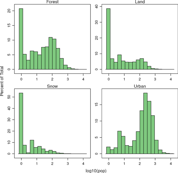
s <- stack(pop, landClass)
names(s) <- c(’pop’, ’landClass’)
histogram(~log10(pop)|landClass, data=s,
scales=list(relation=’free’))
8.3.3 Multivariate Legend
We can reproduce the code used to create the multivariate choropleth (Section 8.2) using the levelplot function from the rasterVis package. Again, the result is a list of trellis objects. Each of these objects is the representation of the population density in a particular land class. The +.trellis function of the latticeExtra package with Reduce superposes the elements of this list and produces a trellis object. Figure 8.26 displays the result.

library(colorspace)
## at for each sub-levelplot is obtained from the global levelplot
at <- pPop$legend$bottom$args$key$at
classes <- rat$classes
nClasses <- length(classes)
pList <- lapply(1:nClasses, function(i){
landSub <- landClass
## Those cells from a different land class are set to NA...
landSub[!(landClass==i)] <- NA
## ... and the resulting raster masks the population raster
popSub <- mask(pop, landSub)
## The HCL color wheel is divided in nClasses
step <- 360/nClasses
## and a sequential palette is constructed with a hue from one of
## the color wheel parts
cols <- rev(sequential_hcl(16, h = (30 + step*(i-1))%%360))
pClass <- levelplot(popSub, zscaleLog=10, at=at,
maxpixels=3.5e5,
## labels only needed in the last legend
colorkey=(if (i==nClasses) TRUE else list(labels=
list(labels=rep(’’, 17)))),
col.regions=cols, margin=FALSE)
})
8.4 Vector Fields
Many objects in our natural environment exhibit directional features that are naturally represented by vector data. Vector fields, commonly found in science and engineering, describe the spatial distribution of a vector variable such as fluid flow or electromagnetic forces. A suitable visualization method has to display both the magnitude and the direction of the vectors at any point.
This section illustrates two visualization techniques, arrow plots and stream lines, with the help of the wind direction and speed forecast published by MeteoGalicia (see Section 12.5 for details).
library(raster)
library(rasterVis)
wDir <- raster(’data/wDir’)/180*pi
wSpeed <- raster(’data/wSpeed’)
windField <- stack(wSpeed, wDir)
names(windField) <- c(’magnitude’, ’direction’)
8.4.1 Arrow Plot
A frequent vector visualization technique is the arrow plot, which draws a small arrow at discrete points within the vector field (Figure 8.27). This approach is best suited for small datasets. If the grid of discrete points gets too dense or if the variations in magnitude are too big, the images tend to be visually confusing.

vectorplot(windField, isField=TRUE, par.settings=BTCTheme(),
colorkey=FALSE, scales=list(draw=FALSE))
8.4.2 Streamlines
Another solution is to depict the directional structure of the vector field by its integral curves, also denoted as flow lines or streamlines. There are a variety of algorithms to produce such visualization. The streamplot function of rasterVis displays streamlines with a procedure inspired by the FROLIC algorithm: For each point, droplet, of a jittered regular grid, a short streamline portion, streamlet, is calculated by integrating the underlying vector field at that point. The main color of each streamlet indicates local vector magnitude. Streamlets are composed of points whose sizes, positions, and color degradation encode the local vector direction (Figure 8.28).

myTheme <- streamTheme(region=rev(brewer.pal(n=4, name=’Greys’)),
symbol=BTC(n=9, beg=20))
streamplot(windField, isField=TRUE,
par.settings=myTheme,
droplet=list(pc=12),
streamlet=list(L=5, h=5),
scales=list(draw=FALSE),
panel=panel.levelplot.raster)
The magic of Figure 8.28 is that it is able to show the underlying physical structure of the spatial region only displaying wind speed and direction. It is easy to recognize the Iberian Peninsula surrounded by strong winds along the eastern and northern coasts. Another feature easily distinguishable is the Strait of Gibraltar, a channel that connects the Atlantic Ocean to the Mediterranean Sea between the south of Spain and the north of Morocco. Also apparent are the Pyrenees mountains and some of the river valleys.
1 http://www.madrid.org/nomecalles/
4 http://www.openstreetmap.org/
7 http://www.nytimes.com/interactive/2009/03/10/us/20090310-immigration-explorer.html
8 http://www.ine.es/ > Products and services > Publications > Download the PC-Axis program > Municipal maps