
Chapter 12
Spatiotemporal Raster Data
12.1 Introduction
A space-time raster dataset is a collection of raster layers indexed by time, or in other words, a time series of raster maps. The raster package defines the classes RasterStack and RasterBrick to build multilayer rasters. The index of the collection can be set with the function setZ (which is not restricted to time indexes). The rasterVis packages provide several methods to display space-time rasters.
12.1.1 Data
Throughout this chapter we will work with a multilayer raster of daily solar radiation estimates from CM SAF (section 10.3) falling in the region of Galicia (north of Spain) during 2011. These data are arranged in a RasterBrick with 365 layers using brick and time indexed with setZ.
library(raster)
library(zoo)
library(rasterVis)
SISdm <- brick(’data/SISgal’)
timeIndex <- seq(as.Date(’2011-01-01’), by=’day’, length=365)
12.2 Level Plots
This multilayer raster can be displayed with each snapshot in a panel using the small-multiple technique. The problem with this approach is that only a limited number of panels can be correctly displayed on one page. In this example, we print the first 12 days of the sequence (Figure 12.1).

levelplot(SISdm, layers=1:12, panel=panel.levelplot.raster)
When the number of layers is very high, a partial solution is to aggregate the data, grouping the layers according to a time condition. For example, we can build a new space-time raster with the monthly averages using zApply and as.yearmon. This raster can be completely displayed on one page (Figure 12.2), although part of the information of the original data is lost in the aggregation procedure.

levelplot(SISmm, panel=panel.levelplot.raster)
12.3 Graphical Exploratory Data Analysis
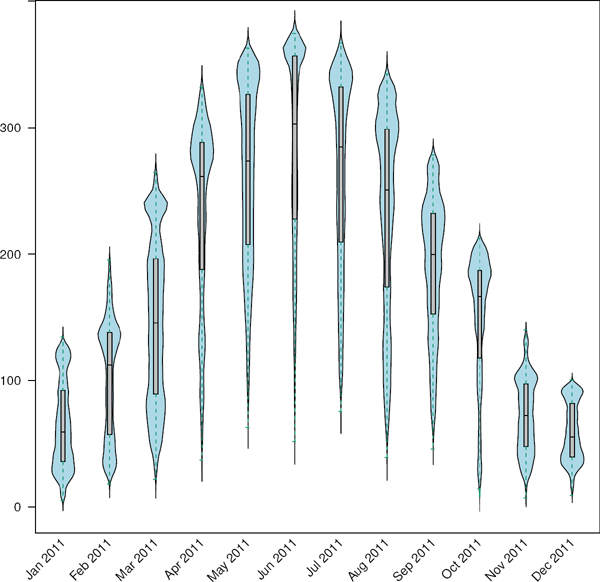
There are other graphical tools that complement the previous maps. The scatterplot and the matrix of scatterplots, the histogram and kernel density plot, and the boxplot are among the most important tools in the frame of the Exploratory Data Analysis approach. Some of them were previously used with a spatial raster (Chapter 8.3). In this section we will use the histogram (Figure 12.3), the violin plot (a combination of a boxplot and a kernel density plot) (Figure 12.4), and the matrix of scatterplots (section 4.1, Figure 12.5).


Scatterplot matrix of monthly averages together with their kernel density estimations in the diagonal frames.
histogram(SISdm, FUN=as.yearmon)
bwplot(SISdm, FUN=as.yearmon)
Both the histogram and the violin plot show that daily solar irradiation is bimodal almost every month. This is related to the predominance of clear sky and overcast days, with several partly cloudy days between these modes. This geographical region receives higher irradiation levels from June to September, and both the levels and the shape of the probability distribution contrast sharply with the winter.
The matrix of scatterplots displays a quasilinear relationship between the central months due to the predominance of clear sky conditions. However, the relationships involving winter months become strongly nonlinear due to the presence of clouds.
12.4 Space-Time and Time Series Plots
The level plots of Figures 12.1 and 12.2 display the full 3D space-time with a grid of panels where each layer is printed. In other words, the raster is sliced, and the collection of pieces is shown in a table. In the section 12.5, this collection of layers will be displayed sequentially like frames of a movie to build an animation. In this section, the 3D raster is reduced to a 2D matrix with spatial aggregation following a certain direction. For example, Figure 12.6 displays with colors the averaged value of the raster for each latitude zone (using the default value of the argument dirXY) with time on the vertical axis.

Hovmöller graphic displaying the time evolution of the average solar radiation for each latitude zone.
hovmoller(SISdm, par.settings=BTCTheme())
On the other hand, this 2D matrix can be conceived as a multivariate time series with each aggregated zone conforming to a different variable of the time series. This approach is followed by the xyplot (Figure 12.7) and horizonplot (Figure 12.8) methods, which reproduce the procedures described in Chapter 3 to display multivariate time series.

Time graph of the average solar radiation for each latitude zone. Each line represents a latitude band.

xyplot(SISdm, digits=1, col=’black’, lwd=0.2, alpha=0.6)
horizonplot(SISdm, digits=1,
col.regions=rev(brewer.pal(n=6, ’PuOr’)),
xlab=’’, ylab=’Latitude’)
These three figures highlight the stational behavior of the solar radiation, with higher values during the central months. It is interesting to note that (Figure 12.8) the radiation values around the equinoxes fluctuate near the yearly average value of each latitude region.
12.5 Animation
A different approach is to plot the individual layers of the space-time raster sequentially as movie frames to produce an animation. The procedure is quite simple:
- Plot each layer of the raster to produce a collection of graphic files.
- Join these files as a sequence of frames with a suitable tool (for example, ffmpeg) to create a movie file1,2.
The effectiveness of this visualization procedure is partly related to the similitude between consecutive frames. If the frames of the sequence diverge excessively from one to another, the user will experience difficulties to perceive any relationship between them. On the other hand, if the transitions between layers are smooth enough, the frames will be perceived as conforming to a whole story; and, moreover, the user will be able to spot both the stable patterns and the important variations.
12.5.1 Data
The daily solar radiation CM-SAF data do not meet the condition of a smooth transition between layers. The changes between the consecutive snapshots of daily radiation are too abrupt to be glued one after another. We will work with a different dataset in this section.
The THREDSS server3 of Meteogalicia4 provides access through different protocols to the output of a Weather Research and Forecasting (WRF) model, a mesoscale numerical weather prediction system. Among the set of available variables we will use the forecast of hourly cloud cover at low and mid levels. This space-time raster has a time horizon of 96 hours and a spatial resolution of 12 kilometers.
cft <- brick(’data/cft_20130417_0000.nc’)
## use memory instead of file
cft[] <- getValues(cft)
## set projection
projLCC2d <- ”+proj=lcc⊔+lon_0=-14.1⊔+lat_0=34.823⊔+lat_1=43⊔+lat_
2=43⊔+x_0=536402.3⊔+y_0=-18558.61⊔+units=km⊔+ellps=WGS84”
projection(cft) <- projLCC2d
#set time index
timeIndex <- seq(as.POSIXct(’2013-04-17⊔01:00:00’, tz=’UTC’), length
=96, by=’hour’)
cft <- setZ(cft, timeIndex)
names(cft) <- format(timeIndex, ’D%d_H%H’)
12.5.2 Spatial Context: Administrative Boundaries
Let’s provide the spatial context with the countries boundaries, extracted from the worldHires database of the maps and mapdata packages.
library(maptools)
library(rgdal)
library(maps)
library(mapdata)
projLL <- CRS(’+proj=longlat⊔+datum=WGS84⊔+ellps=WGS84⊔+towgs84
=0,0,0’)
cftLL <- projectExtent(cft, projLL)
cftExt <- as.vector(bbox(cftLL))
boundaries <- map(’worldHires’,
xlim=cftExt[c(1,3)], ylim=cftExt[c(2,4)],
plot=FALSE)
boundaries <- map2SpatialLines(boundaries, proj4string=projLL)
boundaries <- spTransform(boundaries, CRS(projLCC2d))
12.5.3 Producing the Frames and the Movie
The next step is to produce the collection of frames. We will create a file with each layer of the RasterBrick using the levelplot function. This function provides the argument layout to control the arrangement of a multipanel display. If it is set to c(1,1), a different page is created for each layer.
cloudTheme <- rasterTheme(region=brewer.pal(n=9, ’Blues’))
tmp <- tempdir()
trellis.device(png, file=paste0(tmp, ’/Rplot%02d.png’),
res=300, width=1500, height=1500)
levelplot(cft, layout=c(1, 1), par.settings=cloudTheme) +
layer(sp.lines(boundaries, lwd=0.6))
dev.off()
A suitable tool to concatenate these frames and create the movie is ffmpeg, a free cross-platform software to record, convert, and stream audio and video5. The resulting movie is available from the book website.
old <- setwd(tmp)
## Create a movie with ffmpeg using 6 frames per second a bitrate of
300kbs
movieCMD <- ’ffmpeg⊔-r⊔6⊔-b⊔300k⊔-i⊔Rplot%02d.png⊔output.mp4’
system(movieCMD)
file.remove(dir(pattern=’Rplot’))
file.copy(’output.mp4’, paste0(old, ’/figs/cft.mp4’), overwrite=TRUE
)
setwd(old)
12.5.4 Static Image
Figure 12.9 shows a sequence of twenty-four snapshots (second day of the forecast series) of the movie. This graphic is also created with levelplot but now using the argument layers to choose a subset of the layers, and with a different value for layout to display a matrix of twenty-four panels.

levelplot(cft, layers=25:48, layout=c(6, 4),
par.settings=cloudTheme,
names.attr=paste0(sprintf(’%02d’, 1:24), ’h’),
panel=panel.levelplot.raster) +
layer(sp.lines(boundaries, lwd=0.6))
The movie and the static image are complementary tools and should be used together. Watching the movie you will perceive the cloud transit from Galicia to the Pyrenees gradually dissolving over the Cantabrian region. On the other hand, with Figure 12.9 you can locate the position of a group of clouds in a certain hour and simultaneously observe the relationship of that position with the evolution during that period. With the movie you will concentrate your attention on the movement. With small multiple pictures, your focus will be on positions and relations. You should use both graphical tools to grasp the entire 3D dataset.
1 The animation package (Xie 2013) defines several functions to wrap ffmpeg and convert from ImageMagick.
2 An alternative method is the LA TEX animate package, which provides an interface to create portable JavaScript-driven PDF animations from rasterized image files.
3 http://mandeo.meteogalicia.es/thredds/catalogos/WRF_2D/catalog.html