
CHAPTER 5
HARMONY
We are familiar with the word “harmony” linked with music. Listening to vocalists harmonizing or hearing a certain chord played can be so pleasing. But we also experience visual harmony, which can give us a feeling of balance and peace. Harmony occurs when all of the elements being played with work together—nothing feels overworked and all is well with the world. In this chapter, we’ll explore projects based on the idea of harmony. Notice the elements that help tie things together and when a small adjustment helps to tell a story. Harmonize your colors, your composition, and your subject matter, and see what happens to the art-making process as you go.

The Talisman, or The Swallow-hole in the Bois d’Amour, Pont-Aven, Paul Serusier, French (1864–1927). Oil on panel, 1888. Musée d’Orsay, Paris/Bridgeman Images.
PROJECT 1
RAINBOW DROPS
Rainbows always catch us unaware when they appear out of nowhere in the sky. Ephemeral marvels of color, they are the perfect symbol of harmony, formed when the elements of light and moisture line up perfectly to make something beautiful and new. No wonder they seem to carry messages of hope, luck, happiness, and good days to come. Create your own rainbow with the colors of the spectrum or any harmonious colors of your choice.


Sky Study with Rainbow, John Constable, British (1776–1837). Watercolor on paper, 1827. Yale Center for British Art, Paul Mellon Collection, USA/Bridgeman Images.
YOU WILL NEED:
• watercolor paints
• paintbrushes, in a variety of sizes
• plate to use as a palette
• 8" × 10" (20.5 cm × 25.5 cm) sheets of watercolor paper
• scrap watercolor paper for testing your colors
1 Choose a color palette that you want to explore. You might use a series of blues with a contrasting gold or yellow or the rainbow in the reference painting as a guide. Find three or more colors to play with, mix them, and have them ready on your palette. (See A.)

2 Set a piece of watercolor paper vertically in front of you on your work surface. Wet your brush and let a few drops of your darkest color fall at the top edge of the paper. Tilt it at various angles to encourage the paint to slide down the page, perhaps in the arc of a rainbow. If the color isn’t dark enough, add another pass with the same color. If you’re happy with your first drip, allow it to set up and almost dry before introducing your next color. You can guide the drips with your brush, or blot them with a paper towel and go back in with more watercolor. (See B.)

3 Using the second darkest color, start at the top of the page again and add a new drip near the first. Make decisions as you go along, adding more of the second color or letting it dry and switching to the third. You can create your rainbow as wide as you’d like, with as many colors as you’d like, going in any direction you prefer. (See C and D.)


4 Take a look at your page. Did the colors run into one another? Are there drips you want to clean up? Add a background with thinned white gouache, leaving the drips you like visible. (See E.)

5 If there are spaces between the bands of your rainbow, decide if you’d like to fill them with new colors or blend the edges of the existing colors. Make your colors as watery or bright as you like. There are many ways to paint a rainbow. (See F.)

PROJECT 2
HARMONIZING ON A LINE
The way a selection of notes comes together to form a perfect chord is undeniably pleasing. Kazimir Malevich formed a visual chord of modern music in this painting, with grace notes joining from the sides. We’ll use his chord as inspiration for a collage filled with shapes and colors in space. There are myriad possibilities for combining the elements—and creating harmony. As you work, notice how adding one element makes you think about the shape, color, and placement of the next, similar to finding the right notes to combine as one. Keep an open mind as you play with the elements on your page. Enjoy the process, and consider listening to music as you work. Music helps things flow and adds a soundtrack to the process of making art.


Suprematist Composition No. 56, Kazimir Severinovich Malevich, Russian (1878–1935). Oil on canvas, 1936. State Russian Museum, St. Petersburg/Bridgeman Images.
YOU WILL NEED:
• sheets of mixed-media paper, any size
• gouache paints
• paintbrushes, in a variety of sizes
• scissors or a craft knife with a cutting surface
• 11" × 14" (28 × 35.5 cm) sheet of heavy watercolor paper
• white gesso for the background tone, optional
• matte medium
• colored pencils
• graphite pencil
• black Micron pens
1 Plan your palette using three main colors with black as an accent. In addition, choose a brighter version of one of your main colors. If you’ve chosen a deep blue, for instance, pick a lighter, brighter blue as well. Paint each of five sheets of mixed-media paper with one of the colors and allow them to dry. (See A.)

2 Spread out the painted sheets and think about the shapes you’d like to work with. Cut out rectangles, strips, circles, and crescents. Make sure you have a few larger shapes along with smaller ones. There’s no need to cut everything out all at once; you can allow for spontaneity later on in the process. At this point, just have enough to get started. (See B.)

3 Place the watercolor paper on your work surface. If the white background seems too bright, give it a light wash of color. Then, begin planning where you might place your shapes. In thinking about your composition, refer to the Malevich painting. Notice there’s a strong line that extends diagonally from top left to bottom right. Most of the colored shapes fall along that line or spring from it. This line is a central chord that other notes play upon. (See C.)

4 Draw or visualize your line and begin to arrange your cut-out shapes. There’s no need to fill every space—having some line exposed will help your composition. Shape by shape, build your composition, using matte medium to glue the pieces in place. Use tiny shapes and larger ones in a variety of colors. Keep the idea of harmony in mind. When you place one piece, are you moved to add another piece to balance it? If the elements look too balanced, add a fresh point for contrast. (See D and E.)

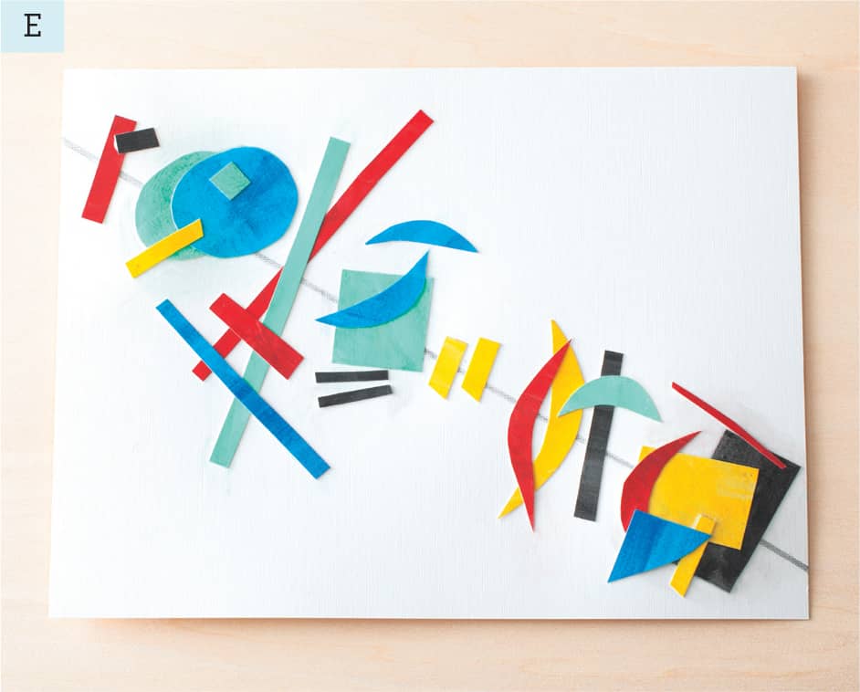
5 What about the space around the central chord? Try different shapes there to see how they interact with the core design. If you’ve been using all rectangles and strips, for instance, add a circle and a crescent to the mix. Add a pencil line to connect some of the shapes or doodle in the white space of the page. Play with the composition until you feel good about the balance of color, marks, and shapes. (See F.)

If you have leftover shapes and pieces, start a new collage. Try a smaller version, changing the angle of the line. Play and let the word “harmony” guide your choices.
PROJECT 3
ONE CLOUD
Harmony is the perfect spring day. This painting by Arkhip Ivanovich Kuindzhi captures it with a rich blue sky, lush green grass, and a beautiful cloud directly in the center. The simplicity of the composition and the cleanness of the color palette feels relaxing and quiet. Use this painting as a reference for a collage, or find another cloud image that speaks to you.


A Small Cloud, Arkhip Ivanovich Kuindzhi, Russian (1842–1910). Oil on panel. Odessa Fine Arts Museum, Ukraine/Bridgeman Images.
YOU WILL NEED:
• 8" × 10" (20.5 cm × 25.5 cm) watercolor paper, canvas board, or primed panel
• pencil
• several pages from magazines or catalogs that have black type on a white page
• additional catalog pages with green and blue tones
• scissors
• gouache paints
• paintbrushes, in a variety of sizes
• craft glue or matte medium
• pencil or charcoal stick
1 Place a piece of watercolor paper horizontally on your work surface. With the pencil, lightly map out placement for your main elements. In the Kuindzhi painting, the grass fills about a quarter of the composition, leaving the rest for the sky. If you place your horizon line higher, you will have more grass and less sky and your cloud might interrupt both planes. Choose where you will be placing your cloud and roughly how large you want to make it. (See A.)

2 Organize the catalog or magazine pages. Pages with a white background will be used for the cloud. Those with a darker blue or green background will form the cloud’s shadow. Note that black type on white paper can be lighter or darker, denser or airier. Cut shapes from the pages, keeping in mind the cloud shape you’d like to make. Rounder shapes cut in various sizes will eventually be collaged together to create a cloud with some varied lights and darks. Cut a pile of shapes to choose from. (See B.)

3 Paint your landscape in gouache, starting with the foreground. Create an expanse of lawn with lights and darks, using several shades of green. (See C.)

4 In painting the sky, the darkest shades of blue will appear at the top. The blues will become lighter, gradually turning into white as you approach the horizon. (See D.)

5 When the paint has dried, arrange the cut cloud pieces on the sky background. Begin gluing the pieces into place. Add the small pieces one by one, building the cloud. Pay attention to the density of the type on the pages. Does the cloud look too dark? Add some lighter pieces. (See E.)

6 Stand back to look at how your composition is coming together. Do you want to create a smaller cloud to balance the other? Build it the same way you did the first. (See F.)

7 Now create the shadow beneath your cloud. Apply cut pieces of blue or green paper on the grassy area in a shape that feels right. If you see other places where you’d like to create a little more texture, add more cut paper shapes to the surface. (See G.)

8 As a final step, pencil in lines or shading that help tie together the composition. Enjoy the process and reflect on other versions of this project you could create. Perhaps a series of three cloud collages with different color palettes, or different kinds of clouds?
PROJECT 4
OCEAN IMPRESSION
Monet’s colorful painting has an energy to it while still allowing the viewer to experience the calming effects of the sea. His color palette and brushstrokes above and below the horizon convey the changing light on clouds and waves, as though he caught the passage of time in a single frame.
We’ll use Monet’s color palette to make a collage of tiny bits of torn paper. You can develop this project over a period of time. Collect the colored paper you want to use as you go along, tear it into small bits when the spirit moves you (so satisfying!), and glue the pieces into place when you’re ready.


On the High Seas, Sunset at Pourville; Coucher de Soleil a Pourville, Pleine Mer. Claude Monet, French (1840–1926). Oil on canvas, 1882. Private Collection/Bridgeman Images.
YOU WILL NEED:
• colored pencils, gouache paints, or watercolors
• scrap paper
• magazines and catalogs
• variety pack of colored construction paper
• 8" × 10" (20.5 × 25.5 cm) Bristol board
• matte medium or glue stick
• small paintbrush
• scissors or craft knife
• graphite pencil
1 Using Monet’s painting as a guide, create a color palette. It helps to have a color reference while you’re looking for pages to tear from magazines and catalogs. Use colored pencils and a piece of scrap paper to jot down the range of pinks, yellows, blues, greens, and lavenders that you’d use. (See A.)

2 Look through your collection of magazines, catalogs, and construction paper. Find colors that relate to the palette you’ve made and tear out the pages. You may not find exactly what you are looking for, but be open to what you find. (You can also paint sheets of paper using the colors you want and allow them to dry.)
3 When you’ve gathered a pile of pages, tear them into pieces. Think about sizes and shapes, keeping in mind that you’ll be mimicking the look of Monet’s brushstrokes. In Monet’s painting, the brushstrokes that create the sky are much longer than the strokes that make the water. Create piles of torn bits by color and size. Imperfect edges and varied sizes are fine to play with. Don’t worry about matching anything exactly. (See B.)

4 Set the Bristol board horizontally on your work surface. Use a neutral color to paint the surface for the background. Allow it to dry and draw the horizon line. Look at Monet’s painting, studying the way he dispersed color throughout. Notice where bright, pale yellow suggests sunlight in the sky and how the horizon line is made up of the darkest tones. (See C.)

5 Choose a few general areas of color on which to concentrate first—the blue just above the horizon in the sky perhaps, or the darkest areas of the ocean. For the sky, choose your longest strips of blue and apply them to the background with matte medium. For the sea, go with your darkest small pieces of paper. The variety in paper sizes alone will create enough contrast to separate the two areas. (See D.)

6 Keep adding pieces with matte medium to create the sea and sky. If you find you need transitional, neutral pieces between colors, go back to the magazines and pull out a few more pages.
7 When your seascape is just the way you like it, brush on a light coat of matte medium to seal it.
Do this project using any photographs or paintings you like as your reference guides. Create a loose interpretation of the image or get more precise and add tiny details. This project is a translation; each time you do it, it will be totally unique.