
13. Using Behaviors and Navigation Objects
In This Chapter
Dreamweaver provides a number of built-in JavaScript actions you can easily add to your pages. No prior knowledge of JavaScript is required to use them. Adobe calls these JavaScript actions behaviors. Behaviors can add interactivity to your site. Many times the behavior is triggered by a user’s action; for example, the behavior will happen when the user clicks a link or hovers over a link. Other behaviors happen without any overt user action, such as when a browser loads images it will need for rollovers as a page loads.
In Dreamweaver, you add many behaviors with the Behaviors panel. Some behaviors are also available in the Insert panel. In addition, Dreamweaver imports behaviors from other Adobe software, such as Fireworks.
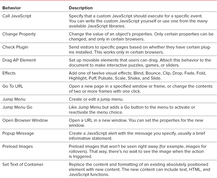
In this chapter, you’ll learn how to use behaviors to add rollovers, open new windows, validate forms, and insert jump menus. Table 13.1 lists some of the available behaviors.
Using the Behaviors Panel
To add interactivity to your site, you’ll want to add behaviors to the objects on your pages, such as images and links. To add, modify, and remove behaviors, you’ll use the Behaviors panel. Objects can have multiple behaviors attached, so you’ll also need to know how to rearrange their order.
To add a behavior
1. If the Behaviors panel is not visible, choose Window > Behaviors (Shift-F4). If necessary, drag and dock the Behaviors panel with the rest of the panels.
2. Select an object on the page, such as an image or a text link.
3. Click the plus button on the Behaviors panel to see the list of available actions for the selected object  . If a choice is grayed out, that action is not available for the selected object. Click to choose an action.
Behaviors are shown in black if they are available for the particular element you chose, and in gray if they aren’t. You can’t select a grayed-out behavior.
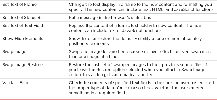
4. The dialog for the chosen action opens  . Enter the requested information in the dialog.
The Go To URL dialog is nice and simple.
5. The default event for that action is displayed in the events column on the left side of the Behaviors panel  . If you want a different event, select it from the pop-up menu in the events column
  by clicking the default.
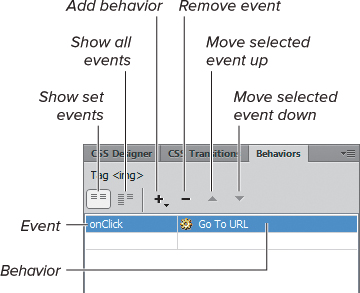
The Behaviors panel shows the event handler and the behavior name.
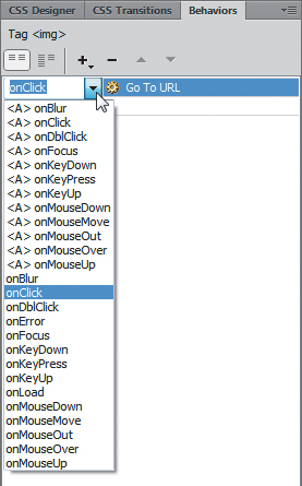
If you want to change the event handler, click the event. An arrow appears, and clicking it brings up the pop-up menu.
To edit a behavior
1. Select an object with an attached behavior.
2. Double-click the behavior name in the behaviors column of the Behaviors panel.
or
Select the behavior name and press Enter (Return). The dialog for the behavior opens.
3. Change any parameters and click OK.
To change the order of behaviors
If more than one behavior is attached to an object, the behaviors run in the order listed in the Behaviors panel, from the top to the bottom  . Select an event and use the up or down arrow to change the order.
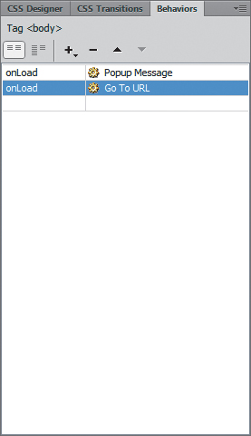
Behaviors attached to an element execute in the order in which they are listed in the Behaviors panel.
To delete a behavior
1. On your webpage, select an object with an attached behavior.
2. In the Behaviors panel, select the name of the behavior you want to delete.
3. Click the minus button.
or
Press Delete.
You can extend Dreamweaver by adding additional behaviors from the Adobe Dreamweaver Exchange. See Appendix B, “Customizing and Extending Dreamweaver,” for more information about extending Dreamweaver.
Tip
JavaScript you write yourself can be inserted in Dreamweaver. To learn more about JavaScript, check out another of our books: JavaScript: Visual QuickStart Guide (Peachpit, 2012).
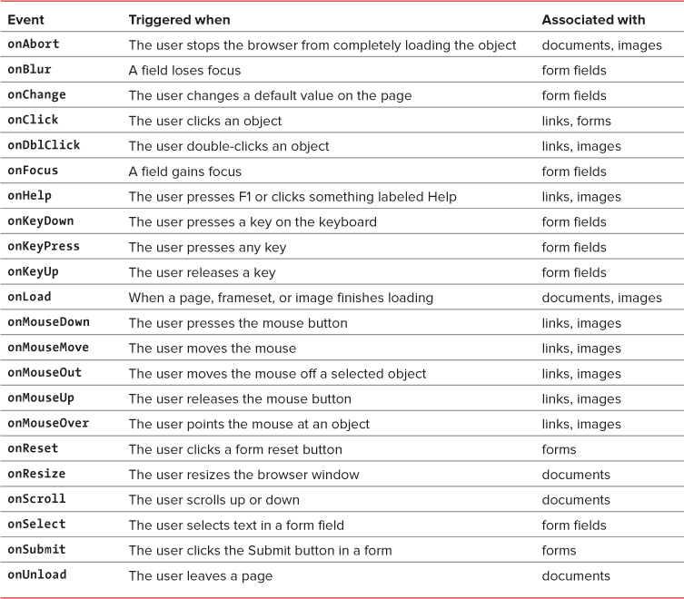
JavaScript includes many event handlers, such as onClick or onDblClick, as seen in  of “Using the Behaviors Panel.” The name of the event handler is usually pretty descriptive of the user event involved.
Adding Rollovers
Web users are used to rollovers, sometimes called mouseovers. There’s something endlessly pleasing about running a mouse over a page and watching things change. A color changes, an image changes, or an image somewhere else on the page changes or pops up. Web users also expect rollovers—if they move their mouse over an image and nothing happens, they’ll assume that it’s not a link and move on to something else.
To add a rollover
1. Prepare two images, such as those in and , for the rollover’s Up and Over states.
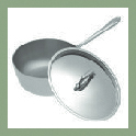
An example of an Up state image.
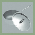
An example of an Over state image.
2. Position the insertion point in the document where you want the rollover to appear.
3. Select Insert > Image > Rollover Image.
or
In the Common category of the Insert panel, click the arrow beside the Image icon and select Rollover Image .
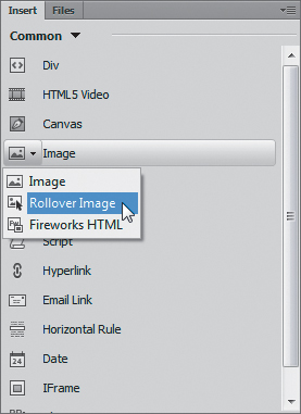
The Image icon in the Common category of the Insert panel has a pop-up menu with several options.
4. The Insert Rollover Image dialog appears . Fill out the fields:
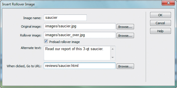
Specify both the Up and Over images to insert a rollover image.
 Image name: This is the name that JavaScript uses internally to refer to this image.
Original image: The path to the Up state of the image, which is what displays when the page is loaded.
Rollover image: The path to the Over state of the image, which is what displays when the user’s cursor is over the image.
Preload rollover image: This should be selected so the Over version of the image is in the browser’s cache when it’s needed. Don’t make users wait for the Over image to download—they might think the page isn’t working and give up on your site.
Alternate text: This is the alternate information for users with nongraphical browsers.
When clicked, Go to URL: This is the URL of the webpage you want to open when the user clicks the image.
 Up: This image appears when the page first loads. It’s the default image, in that it’s what is displayed unless the user is interacting with this image.
Over: This image appears when the user moves the mouse over the image.
Down: This image appears when the user clicks the image. Down state images are often used in navigation bars to indicate the current page.
OverWhileDown: This image appears when the user moves the mouse over an image after clicking.
5. Click OK to accept the changes.
6. Check the newly created events in the Behaviors panel to be sure they’re what you want .
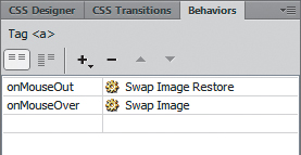
Be sure the Swap Image Restore behavior is added along with the Swap Image behavior.
Note that if your rollover is within an HTML tag, that tag appears in the Behaviors panel. In this case, the rollover is within the a tag.
Tip
To preview the rollover, click the Live View button at the top of the document window and then roll over the image with your cursor. You can also preview the page in a browser to see the rollover.
Tip
Select the behavior in the Behaviors panel if you want to change the mouse events or edit the parameters of the Insert Rollover Image dialog.
Tip
Adding a single rollover adds two events to the Behaviors panel: one for the action of moving the mouse over the image (Swap Image) and one for the action of moving the mouse off the image (Swap Image Restore). Check to make sure that both parts are added, or your rollover won’t work the way you expect it to.
Opening a New Browser Window
It isn’t a good idea to open a new browser window unless you really, really need one. Some users may not realize that a new window opened. Users may become lost or confused by the grayed-out Back button. Users may not realize they must close the new window to get back to the original page. Certain browsers, particularly those used by people with accessibility needs, may not deal with new windows in a way that helps the user understand what’s happening. Depending on the action you use to trigger the opening of the new window, some users may not see it at all. For example, setting a new window to open during an onLoad event is the trick to getting a pop-up or pop-under ad in a user’s face, so many users set their browsers so that pop-up windows won’t open, ever.
Given all that, when is a new browser window justified? Consider it when the content of the new window is a small example or elaboration of one idea. Small means smaller than a normal-sized browser window. Small also means small in concept: if the main content of your page is already clear, a new window can add a little something that people can check if they’re interested. For instance, a reasonable use of a new window is to show an enlarged image of a product, or a slideshow.
You should explicitly tell users that their click will cause a new window to open: “Click the image to see a larger view—opens in new window.” Leave the decision about whether to click up to your users—don’t blindside them with windows that automatically open without warning.
To add the Open Browser Window action
1. Prepare an HTML page or image that will appear in the new window.
2. Select an object, such as a link or image, in the document window.
3. In the Behaviors panel, click the plus button to add a new behavior. Choose Open Browser Window from the pop-up menu, and the Open Browser Window dialog appears .
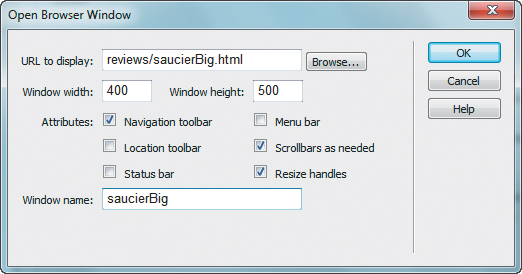
When you open a new browser window, you have all kinds of control over how it will appear.
4. Fill out the following fields:
URL to display: This is the HTML page or image that will appear in the new window.
Window width and Window height: Set an exact pixel size for the new window.
Navigation toolbar: Selecting this adds Back, Forward, Home, and Reload buttons.
Location toolbar: Selecting this adds a location text box with the page URL showing.
Status bar: Selecting this adds a display at the bottom of the browser window showing status information.
Menu bar: Selecting this adds browser menu items, such as File, Edit, View, Go, and Help. This option applies only to Windows users; Mac users always have access to the menu.
Scrollbars as needed: Selecting this adds scrollbars (horizontal or vertical) only if needed. If deselected, there will be no scrollbars. It’s a good idea to always select this attribute.
Resize handles: Selecting this adds a gripper in the lower-right corner of the window for the user to drag, and a maximize button at the top of the window. If deselected, the user can’t resize the window by either method. This is another good attribute to routinely include.
Window name: This is a required identifier needed by JavaScript. Remember, no spaces are allowed in this name.
5. Click OK to accept.
6. Check the default event. If it isn’t the event you want, select another event from the pop-up menu.
Tip
If the new window contains only an image, the pixel dimensions of the image and the pixel dimensions of the window won’t be an exact match. For better control, many designers put the single image on an HTML page and link to the HTML page.
Tip
Dreamweaver can be extended with an action to add a “Close Window” script to an HTML page. It’s a good idea to give users an obvious way to close the new window.
Tip
Though it’s certainly reasonable to use Dreamweaver’s built-in behaviors to work with opening windows, you might instead want to use a widget based on jQuery to do the job, especially if you’re displaying something like an image gallery. A widget is likely to be more flexible to use. See Chapter 14 for more.
Using Jump Menus
A jump menu is a pop-up menu listing links to documents or files. When users choose an item, they “jump” directly to the new URL.
Jump menus save space on the page. For example, to find a retailer in your area, you might be asked to select your state or country. A list of states or countries could be very lengthy. Putting the links in a jump menu saves you from listing them in full as part of the page layout.
In addition to the required list of linked items, a jump menu can optionally include a menu selection prompt, such as “Select one,” and a Go button.
To insert a jump menu
1. Place the insertion point inside a form in the document. For more information about forms, see Chapter 11.
2. In the form, insert a Select element by choosing Select from the Form category of the Insert panel.
3. With the Select element selected on the page, in the Behaviors panel, click the plus button to add a new behavior. Choose Jump Menu from the pop-up menu, and the Jump Menu dialog appears . Fill it out as follows:
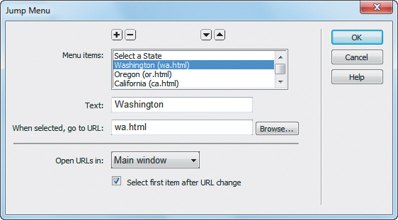
Here’s a brand-new Jump Menu dialog, ready for you to add as many items as you want.
Menu items: Don’t type anything in this list. As you add items to the menu, they automatically appear.
Move items up or down in the list by selecting one and using the up or down arrow to change its order.
Text: Type the text you want for the menu item. You can type a prompt such as “Select a State” here. For text to be a prompt, leave the URL blank.
When selected, go to URL: Browse for or type the URL to go to here.
Open URLs in: Select the window where you want the URL to display.
Select first item after URL change: If you entered a prompt in the Text field, select this.
4. Click OK to accept your changes, and the jump menu appears on your page .
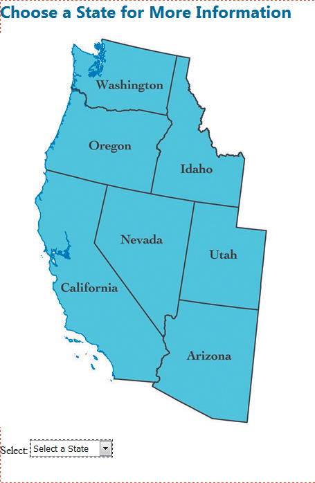
After you insert the jump menu, the Select element appears on the page.
To edit a jump menu
1. Double-click the behavior name in the Behaviors panel. The Jump Menu dialog opens.
2. Make any changes needed.
3. Click OK to accept the changes, and the revised jump menu appears in your document.
To insert a jump menu Go button
1. Select an insertion point in the document window. A jump menu must already exist in the document.
2. Insert a button from the Form category of the Insert panel. In the Property inspector, set the button’s Name and Value to Go (or something similar), as in .
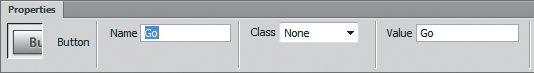
Make sure your new button has a name and value.
3. In the document, select your new button. In the Behaviors panel, click the plus button and select Jump Menu Go. The Jump Menu Go dialog opens .
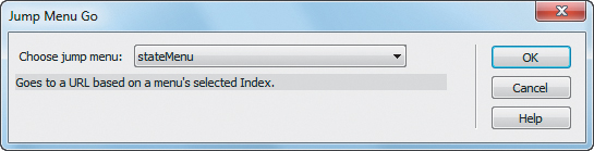
The Jump Menu Go dialog attaches a Go button to an existing jump menu of your choice.
4. Select a jump menu for the Go button to activate. A Go button needs to be associated with a jump menu to work. If you have only one jump menu on the page, you can take the default.
5. Click OK to add the behavior to the button. The finished menu appears on the page .
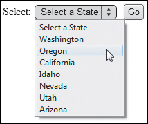
The finished jump menu, with a Go button.
Validating Forms
Dreamweaver behaviors can check up on how users complete forms. You can require certain fields, check to make sure that a user has entered a value in a required field, or check to make sure that the user entered the correct type of information in a field.
With the Validate Form behavior, you can set parameters for an entire form. You can also use the Validate Form behavior on individual fields. See Chapter 11, “Using Forms and Fields,” for more information about making a form with Dreamweaver.
To validate a form
1. In the document window, select the Submit button.
or
Select the form tag from the tag selector at the bottom of the document window.
2. In the Behaviors panel, click the plus button and select Validate Form. The Validate Form dialog opens :
Fields: Select a field in the box.
Required: Select this if the user must enter data in this field for the form to be accepted.
Anything: Select this radio button if any combination of text and numbers is acceptable.
Number: Select this if you want the user to enter a zip code, phone number, or other strictly numerical data.
Email address: Select this if you want to check for an @ symbol within the entered data.
Number from: Select this if you need to check for a number within a specified range.
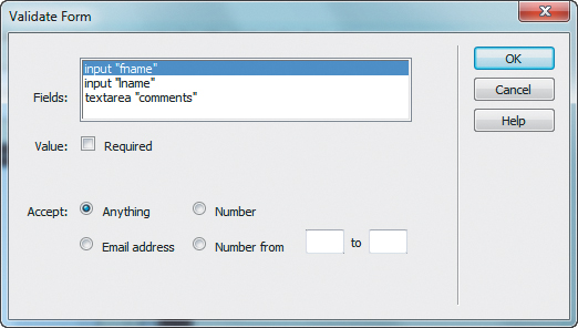
One form validation option is to require an email address from the user. You can also see here why you should always name your form fields: it makes it easier to know which field is which in this dialog.
3. Select the remaining fields in the Fields box and set the parameters for each until you have completed the dialog for each field in the form.
4. Click OK to accept your changes.
Tip
You can also select an individual form field and add a Validate Form behavior. The dialog is the same, but the event handler (that’s the real name for those fields on the Behaviors panel) is different. Check the Behaviors panel to be sure it’s the correct event (onBlur or onChange) when setting validation parameters field by individual field. Be careful with this method, because it can get annoying to a user who wants to skip certain questions and come back to them later. Saving the validation for last, when the user finally clicks the Submit button (onSubmit), is a better idea.
Tip
When a user enters something incorrectly or neglects to fill in a required field, a JavaScript alert box similar to pops up with a message about the error.
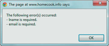
The user sees an alert if the form validation requirements aren’t met.
Tip
It’s good practice to give users an explicit cue when a field is required. An asterisk next to a required field is a common visual cue, along with a note to the user that the asterisk denotes a required field. You may have color-blind users, so merely formatting the required field labels in a different color isn’t considered adequate.
Tip
The Dreamweaver behaviors for validating forms are different from server-side scripts used to handle submitted information. The same validity checks on user data you add with Dreamweaver should also be done with server-side scripts. Why both? The server-side checks are necessary because not all users have JavaScript enabled in their browser (some mobile browsers may lack JavaScript altogether). The client-side JavaScript checks added here are also useful because they give faster feedback to users.
Tip
The Form Validation behavior doesn’t work with the HTML5 form fields added in Dreamweaver CC. So, for example, if you want to use this behavior to validate an email field, you must make it a Text field instead of an Email field. See the “Other Ways to Validate” sidebar for a better alternative.
HTML5: One of the really great things about using HTML5 is its built-in validation for some form elements. For example, when you insert an HTML5 email field, modern browsers will simply handle the email validation task. If the user enters a badly formed address, the browser will alert them when they try to submit the form . HTML5 also validates URLs. Dreamweaver has controls in the Property inspector for other validation tasks, like requiring fields or setting minimum and maximum values for number fields.
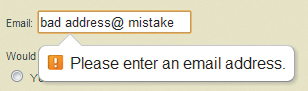
With HTML5 form validation, the browser does the validation work.
JavaScript libraries: HTML5’s validation is terrific, but you can’t be certain that all of your site’s visitors are going to be using browsers that understand that standard. So even if you are using HTML5 elements, most client-side validation these days is done using a validation widget written in one of the many JavaScript libraries available. See Chapter 14 for more on jQuery, a popular library supported in Dreamweaver. Like most libraries, jQuery has a plethora of form validators, which you can find with a web search.