This chapter explores the grid geometry manager that positions widgets on a grid that automatically adjusts its size. Grid was added in Tk 4.1.
The grid geometry manager arranges widgets on a grid with variable-sized rows and columns. You specify the rows and columns occupied by each widget, and the grid is adjusted to accommodate all the widgets it contains. This is ideal for creating table-like layouts. The manager also has sophisticated facilities for controlling row and column sizes and the dynamic resize behavior. By introducing subframes with grids of their own, you can create arbitrary layouts.
As discussed on page 395, you can use a combination of pack and grid to create your display. But for each individual manager widget, you must use only one of pack or grid to manage all of its immediate children.
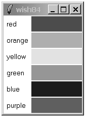
Example 26-1 uses grid to lay out a set of labels and frames in two parallel columns. It takes advantage of the relative placement feature of grid. Instead of specifying rows and columns, the order of grid commands and their arguments implies the layout. Each grid command starts a new row, and the order of the widgets in the grid command determines the column. In the example, there are two columns, and each iteration of the loop adds a new row. grid makes each column just wide enough to hold the biggest widget. Widgets that are smaller are centered in their cell. That's why the labels appear centered in their column:
Example 26-1. A basic grid
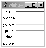
foreach color {red orange yellow green blue purple} {
   label .l$color -text $color -bg white
   frame .f$color -background $color -width 100 -height 2
   grid .l$color .f$color
}
If a grid cell is larger than the widget inside it, you can control the size and position of the widget with the -sticky option. The -sticky option combines the functions of -fill and -anchor used with the pack geometry manager. You specify to which sides of its cell a widget sticks. You can specify any combination of n, e, w, and s to stick a widget to the top, right, left, and bottom sides of its cell. You can concatenate these letters together (e.g., news) or uses spaces or commas to separate them (e.g., n,e,w,s). Example 26-2 uses -sticky w to left justify the labels, and -sticky ns to stretch the color frames to the full height of their row:
Example 26-2. A grid with sticky settings
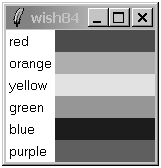
foreach color {red orange yellow green blue purple} {
   label .l$color -text $color -bg white
   frame .f$color -background $color -width 100 -height 2
   grid .l$color .f$color
   grid .l$color -sticky w
   grid .f$color -sticky ns
}
Example 26-2 uses grid in two ways. The first grid in the loop fixes the positions of the widgets because it is the first time they are assigned to the master. The next grid commands modify the existing parameters; they just adjust the -sticky setting because their row and column positions are already known.
You can specify row and column positions explicitly with the -row and -column attributes. This is generally more work than using the relative placement, but it is necessary if you need to dynamically move a widget into a different cell. Example 26-3 keeps track of rows and columns explicitly and achieves the same layout as Example 26-2:
Example 26-3. A grid with row and column specifications
set row 0
foreach color {red orange yellow green blue purple} {
   label .l$color -text $color -bg white
   frame .f$color -background $color -width 100
   grid .l$color -row $row -column 0 -sticky w
   grid .f$color -row $row -column 1 -sticky ns
   incr row
}
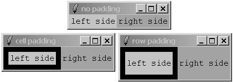
You can keep a widget away from the edge of its cell with the -padx and -pady settings. Example 26-4 uses external padding to shift the labels away from the left edge, and to keep some blank space between the color bars:
Example 26-4. A grid with external padding
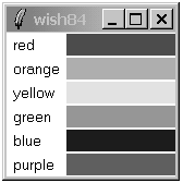
foreach color {red orange yellow green blue purple} {
   label .l$color -text $color -bg white
   frame .f$color -background $color -width 100 -height 2
   grid .l$color .f$color
   grid .l$color -sticky w -padx 3
   grid .f$color -sticky ns -pady 1
}
Tk 8.4 added the ability to specify asymmetric padding as a list of two screen distances. For example, -padx {0.125i 0.25i} adds 1/8 inch of padding to the left and 1/4 inch padding to the right of a widget.
You can give a widget more display space than it normally needs with internal padding. The internal padding increases the size of the grid. In contrast, a -sticky setting might stretch a widget, but it will not change the size of the grid. Example 26-5 makes the labels taller with -ipady:
Example 26-6 shows all possible -sticky settings. It uses the ability to put more than one widget into a grid cell. A large square frame is put in each cell, and then a label is put into the same cell with a different -sticky setting. It is important to create the frame first so it is below the label. Window stacking is discussed on page 409. External padding is used to keep the labels away from the edge so that they do not hide the -ridge relief of the frames.
Example 26-6. All combinations of -sticky settings
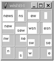
set index 0
foreach x {news ns ew  " " new sew wsn esn nw ne sw se n s w e} {
   frame .f$x -borderwidth 2 -relief ridge -width 40 -height 40
   grid .f$x -sticky news
      -row [expr {$index/4}] -column [expr {$index%4}]
   label .l$x -text $x -background white
   grid .l$x -sticky $x -padx 2 -pady 2
      -row [expr {$index/4}] -column [expr {$index%4}]
   incr index
}
A widget can occupy more than one cell. The -rowspan and -columnspan attributes indicate how many rows and columns are occupied by a widget. Example 26-7 uses explicit row, column, rowspan, and columnspan specifications:
Example 26-7. Explicit row and column span
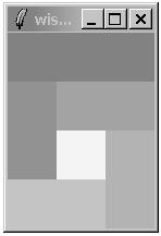
. config -bg white
foreach color {888 999 aaa bbb ccc fff} {
   frame .$color -bg #$color -width 40 -height 40
}
grid .888 -row 0 -column 0 -columnspan 3 -sticky news
grid .999 -row 1 -column 0 -rowspan 2 -sticky news
grid .aaa -row 1 -column 1 -columnspan 2 -sticky news
grid .bbb -row 2 -column 2 -rowspan 2 -sticky news
grid .ccc -row 3 -column 0 -columnspan 2 -sticky news
grid .fff -row 2 -column 1 -sticky news
You can also use special syntax in grid commands that imply row and column placement. Special characters represent a cell that is spanned or skipped:
-represents a spanned column.^represents a spanned row.xrepresents a skipped cell.
A nice feature of the implicit row and column assignments is that it is easy to make minor changes to your layout. Example 26-8 achieves the same layout:
The grid manager supports attributes on whole rows and columns that affect their size and resize behavior. The grid command has a rowconfigure and columnconfigure operation to set and query these attributes:
grid columnconfigure master col ?attributes?
grid rowconfigure master row ?attributes?
With no attributes, the current settings are returned. The row and col specifications can be lists instead of simple indices, so you can configure several rows or columns at once.
The -pad attribute increases a row or column size. The initial size of a row or column is determined by the largest widget, and -pad adds to this size. This padding can be filled by the widget by using the -sticky attribute. Row and column padding works like internal padding because it is extra space that can be occupied by the widget's display. In contrast, the -padx and -pady attributes on an individual widget act like a spacer that keeps the widget away from the edge of the cell. Example 26-9 shows the difference. The row padding increases the height of the row, but the padding on .f1 keeps it away from the edge of the cell:
The -minsize attribute restricts a column or row to be a minimum size. The row or column can grow bigger if its widget requests it, but they will not get smaller than the minimum. One useful application of -minsize is to create empty rows or columns, which is more efficient than creating an extra frame.
If the master frame is bigger than the required size of the grid, it shrinks to be just large enough to contain the grid. You can turn off the shrink-wrap behavior with grid propagate. If geometry propagation is off, then the grid is centered inside the master. If the master frame is too small to fit the grid, then the grid is anchored to the upper-left corner of the master and clipped on the bottom-right.
By default, rows and columns do not resize when you grow the master frame. You enable resizing by specifying a -weight for a row or column that is an integer value greater than zero. Example 26-10 grids a text widget and two scrollbars. The protocol between the scrollbar and the text widget is described on page 501. The text widget is in row 0, column 0, and both of these can expand. The vertical scrollbar is in row 0, column 1, so it only grows in the Y direction. The horizontal scrollbar is in row 1, column 0, so it only grows in the X direction:
Example 26-10. Gridding a text widget and scrollbar
text .text -yscrollcommand ".yscroll set"
   -xscrollcommand ".xscroll set"-width 40 -height 10
scrollbar .yscroll -command ".text yview" -orient vertical
scrollbar .xscroll -command ".text xview" -orient horizontal
grid .text .yscroll -sticky news
grid .xscroll -sticky ew
grid rowconfigure . 0 -weight 1
grid columnconfigure . 0 -weight 1
You can use different weights to let different rows and columns grow at different rates. However, there are some tricky issues because the resize behavior applies to extra space, not total space. For example, suppose there are four columns that have widths 10, 20, 30, and 40 pixels, for a total of 100. If the master frame is grown to 140 pixels wide, then there are 40 extra pixels. If each column has weight 1, then each column gets an equal share of the extra space, or 10 more pixels. Now suppose column 0 has weight 0, columns 1 and 2 have weight 1, and column 3 has weight 2. Column 0 will not grow, columns 1 and 2 will get 10 more pixels, and column 3 will get 20 more pixels. In most cases, weights of 0 or 1 make the most sense.
If a row or column has to shrink, the weights are applied in reverse. A row or column with a higher weight will shrink more. For example, put two equal sized frames in columns with different weights. When the user makes the window bigger, the frame in the column with more weight gets larger more quickly. When the window is made smaller, that frame gets smaller more quickly.
The -uniform attribute makes it easy to create columns (or rows) that are the same width (or height). Use the -uniform attribute to create a group of columns (or rows). The value of the attribute can by anything (e.g., xyz). All columns (or rows) with the same -uniform attribute are in the same group. If they all have the same -weight value, then they are all the same size. If one column (or row) in a group has a -weight that is twice what the other columns (or rows) have, then it is twice as big. This is illustrated in Example 26-11.
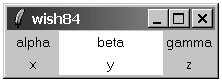
Table 26-1 summarizes the usage of the grid command. Table 26-2 summarizes the options for a widget set with the grid configure command.
Table 26-1. The grid command
Returns the bounding box, of the whole grid, the cell at | |
| Sets or queries the configuration of |
| Grids one or more widgets according to the |
| Unmaps the specified windows. |
| Returns the grid options of |
Returns the cell column and row under the point | |
| Enables or disables shrink-wrapping of |
| Sets or queries the configuration of |
| Unmaps |
| Returns the number of columns and rows. |
| Returns the list of widgets managed by |
Table 26-2. Grid widget options
| Places inside |
| Column position. Columns count from zero. |
| Spans |
| Internal widget padding in the X direction, in screen units. |
| Internal widget padding in the Y direction, in screen units. |
| External widget padding in the X direction, in screen units. May be a list of two screen units for asymmetric padding (Tk 8.4). |
| External widget padding in the Y direction, in screen units. May be a list of two screen units for asymmetric padding (Tk 8.4). |
| Row position. Rows count from zero. |
| Spans |
| Positions widget next to any combination of north ( |