This chapter describes several simple Tk widgets: the frame, label, labelframe, message, scale, and toplevel. In general, these widgets require minimal setup to be useful in your application. The bell command rings the terminal bell.
This chapter describes six simple widgets and the bell command.
The
frameis a building block for widget layout.A
labelframeis an enhanced frame that also supports the display of a label along its border.A
toplevelis a frame that is detached from the main window.The
labeldisplays read-only text or an image.The
messageprovides a read-only block of text that gets formatted onto several lines.The
scaleis a slider-like widget used to set a numeric value.The
bellcommand rings the terminal bell.
Chapters 40, 41, and 42 go into more detail about some of the generic widget attributes shared by the widgets presented in this chapter. The examples in this chapter use the default widget attributes in most cases.
Frames have been introduced before for use with the geometry managers. There is not much to a frame, except for its background color and border. You can also specify a colormap and visual type for a frame. Chapter 41 describes visual types and colormaps on page 624.
The labelframe widget, introduced in Tk 8.4, is a frame that can also display a widget along its border. The labelframe widget can create its own internal label, if needed, or it can automatically position a label widget that you create separately.
A toplevel widget is like a frame, except that it is created as a new main window. That is, it is not positioned inside the main window of the application. This is useful for dialog boxes, for example. A toplevel has the same attributes as a frame, plus screen and menu attributes. The menu attribute is used to create menubars along the top edge of a toplevel. This feature was added in Tk 8.0, and it is described on page 464. On UNIX, the screen option lets you put the toplevel on any X display. The value of the screen option has the following format:
host:display.screenNum
For example, I have one X server on my workstation sage that controls two screens. My two screens are named sage:0.0 and sage:0.1. If the screenNum specifier is left off, it defaults to 0.
Table 32-1 lists the attributes for the frame, labelframe, and toplevel widgets. The attributes are named according to their resource name, which includes a capital letter at internal word boundaries. When you specify an attribute in a Tcl command when creating or reconfiguring a widget, however, you specify the attribute with a dash and all lowercase letters. Chapter 31 explains how to use resource specifications for attributes. Chapters 40, 41, and 42 discuss many of these attributes in more detail.
Table 32-1. Attributes for frame, labelframe, and toplevel widgets
| Background color (also |
| Extra space around the edge of the frame. |
| Resource class and binding class name. |
| The value is |
| If |
| Cursor to display when mouse is over the frame. |
| The font to use for the label. Labelframe only. |
| The text color for the label. Labelframe only. |
| Height, in screen units. |
| Focus highlight color when widget does not have focus. |
| Focus highlight color when widget has focus. |
| Thickness of focus highlight rectangle. |
| Position of the embedded label; clockwise: |
| Pathname of a widget to use as a label, overriding any |
| The menu to use for the menubar. Toplevel only. |
| Extra internal space to the left and right. |
| Extra internal space above and below. |
|
|
| An X display specification. (Toplevel only, and this cannot be specified in the resource database). |
| Controls focus changes from keyboard traversal. |
| The text of the embedded label. Labelframe only. |
| A window ID from |
| Type: |
| Width, in screen units. |
You cannot change the class, colormap, visual, or screen attributes after the frame, labelframe, or toplevel has been created. These settings are so fundamental that you need to destroy the frame and start over if you must change them.
Labelframe widgets, which were added in Tk 8.4, function identically to simple frame widgets in most respects. However, they also have the ability to display a label along its border — either one that you create separately or an internal one created automatically by the labelframe. Another minor difference is that a labelframe has a default borderWidth of 2 and relief of groove, in comparison with the simple frame's default borderWidth of 0 and relief of flat. The rationale for this difference is that labelframes are used typically to set off distinct areas of a user interface, whereas frames are often used solely to group together other widgets for layout.
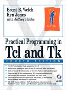
In many cases, you can simply set the text attribute of the labelframe to display a textual label in the upper-left hand corner of the frame. Example 32-1 shows a labelframe around a group of radio buttons:
Example 32-1. Labelframe example
labelframe .s -text Sizes
radiobutton .s.small -text Small -variable size -value small
radiobutton .s.med -text Medium -variable size -value medium
radiobutton .s.large -text Large -variable size -value large
.s.large select
pack .s.small .s.med .s.large -anchor w -padx 2 -pady 1
pack .s
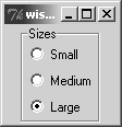
You can change the appearance of the label's text by setting the font and foreground attributes as desired. The labelAnchor attribute accepts a map direction which controls the position of the label along the frame's border. The default, nw, places the label on the north (top) border on the west (left) side. In contrast, setting the labelAnchor to wn places the label on the west (left) border towards the north (top) side, as shown in Example 32-2:
Example 32-2. Using the labelAnchor option to position a labelframe's anchor
-labelanchor wn -labelanchor s -labelanchor ne
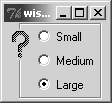
You also have the option of creating a separate label widget, configuring it in any way that you like, and then associating it with a labelframe through the labelWidget attribute. The labelWidget attribute overrides any text value already set for the labelframe. Example 32-3 shows a label with a bitmap as the frame decoration:
The container and use attributes support application embedding. Embedding puts another application's window into a Tk frame or puts a Tk frame into another application. The use attribute specifies the ID of a window that will contain a Tk frame. Wish supports a -use command line argument that is used for the same purpose. Set the container attribute if you want to embed another window. For example, here is how to run another wish application and embed its window in one of your frames:
frame .embed -container 1 -bd 4 -bg red
exec wish somescript.tcl -use [winfo id .embed] &
On Windows and Macintosh there are several styles of toplevel windows. They differ in their appearance and their behavior. On UNIX, toplevel windows are usually decorated by the window manager, which is a separate application. Chapter 44 describes how to interact with the window manager.
On Macintosh, Tk has an unsupported1 command that you can use to set the window style:
unsupported1 style window style
The possible values for style include documentProc, dBoxProc, plainDBox, altDBoxProc, movableDBoxProc, zoomDocProc, rDocProc, floatProc, floatZoomProc, floatSideProc, or floatSideZoomProc. The dBoxProc, plainDBox, and altDBoxProc styles have no title bar, so there is no close box on them. The other styles have different title bars, a close box, and possibly a full-sized zoom box. The default style is documentProc. I used the following code to see what each looked like:
Example 32-4. Macintosh window styles
set x {documentProc dBoxProc plainDBox altDBoxProc
   movableDBoxProc zoomDocProc rDocProc floatProc
   floatZoomProc floatSideProc floatSideZoomProc}
foreach y $x {
   toplevel .$y
   label .$y.l -text $y
   pack .$y.l -padx 40 -pady 20
   if [catch {unsupported1 style .$y $y} err] {
      puts "$y: $err"
   }
}
This feature may appear as part of the wm command in future releases of Tk. On Windows you can get a couple different styles by using transient and overrideredirect windows, as well as with options to the wm attributes command, all of which are described starting on page 663.
The label widget provides a read-only text label, and it has attributes that let you control the position of the label within the display space. Most commonly, however, you just need to specify the text for the label:
label .version -text "MyApp v1.0"
The text can be specified indirectly by using a Tcl variable to hold the text. In this case the label is updated whenever the value of the Tcl variable changes. The variable is used from the global scope, even if there happens to be a local variable by the same name when you create the widget inside a procedure:
set version "MyApp v1.0"
label .version -textvariable version
Example 32-5. A label that displays different strings
proc FixedWidthLabel { name values } {
   # name is a widget name to be created
   # values is a list of strings
   set maxWidth 0
   foreach value $values {
      if {[string length $value] > $maxWidth} {
         set maxWidth [string length $value]
      }
   }
   # Use -anchor w to left-justify short strings
   label $name -width $maxWidth -anchor w
      -text [lindex $values 0]
   return $name
}
The FixedWidthLabel example is used to create a label with a width big enough to hold a set of different strings. It uses the -anchor w attribute to left-justify strings that are shorter than the maximum. You can change the text for the label later by using the configure widget operation, which can be abbreviated to config:
FixedWidthLabel .status {OK Busy Error}
.status config -text Busy
A label can display a bitmap or image instead of a text string, which is described in Chapter 41 and the section on Bitmaps and Images.
This example could use the font metrics facilities of Tk 8.0 to get more accurate sizes of the text for different strings. It is possible, for example, that a three-character string like OOO is wider than a four-character string like llll in a variable-width font. The font metrics command is described on page 640.
When a label is displaying text, its width attribute is interpreted as a number of characters. The label is made wide enough to hold this number of averaged width characters in the label's font. However, if the label is holding a bitmap or an image, then the width is in pixels or another screen unit.
The wrapLength attribute determines when a label's text is wrapped onto multiple lines. The wrap length is always screen units. If you need to compute a wrapLength based on the font metrics, then you can use the font metrics command. If you use Tk 4.2 or earlier, then you have to measure text using a text widget with the same font. Chapter 36 describes the text widget operations that return size information for characters.
You can force line breaks by including newlines (
) in the label's text. This lets you create labels that have multiple lines of text.
Table 32-2 lists the widget attributes for the label widget. The attributes are named according to their resource name, which includes a capital letter at internal word boundaries. When you specify an attribute as an option in a Tcl command when creating or reconfiguring a widget, however, you specify the attribute with a dash and all lowercase letters. Chapter 31 explains how to use resource specifications for attributes. Chapters 40, 41, and 42 discuss many of these attributes in more detail.
Table 32-2. Label Attributes
| Background color when the label is in the |
| Text color when the label is in the |
| Relative position of the label within its packing space. |
| Background color (also |
| Name of a bitmap to display instead of a text string. |
| Extra space around the edge of the label. |
| Where the image or bitmap should be placed relative to the text: |
| Cursor to display when mouse is over the label. |
| Foreground (text) color when the label is disabled. (Tk 8.3.1) |
| Font for the label's text. |
| Foreground color (also |
| In screen units for bitmaps, in lines for text. |
| Focus highlight color when widget does not have focus. |
| Focus highlight color when widget has focus. |
| Thickness of focus highlight rectangle. |
| Specifies image to display instead of bitmap or text. |
| Text justification: |
| Extra space to the left and right of the label. |
| Extra space above and below the label. |
|
|
|
|
| Controls focus changes from keyboard traversal. |
| Text to display. |
| Name of Tcl variable. Its value is displayed. |
| Index of character to underline. |
| Width. In characters for text labels. |
| Length at which text is wrapped in screen units. |
The message widget displays a long text string by formatting it onto several lines. It is designed for use in dialog boxes. It can format the text into a box of a given width, in screen units, or a given aspect ratio. The aspect ratio is defined to be the ratio of the width to the height, times 100. The default is 150, which means that the text will be one and a half times as wide as it is high.
Example 32-6 creates a message widget with one long line of text. Backslashes are used to continue the text string without embedding any newlines. (You can also just type a long line into your script.) Note that backslash-newline collapses white space after the newline into a single space.
Example 32-6. The message widget formats long lines of text
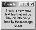
message .msg -justify center -text "This is a very long text
   line that will be broken into many lines by the
   message widget"
pack .msg
A newline in the string forces a line break in the message display. You can retain exact control over the formatting by putting newlines into your string and specifying a very large aspect ratio. In Example 32-7, grouping with double quotes is used to continue the string over more than one line. The newline character between the quotes is included in the string, and it causes a line break:
Example 32-7. Controlling the text layout in a message widget
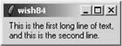
message .msg -aspect 1000 -justify left -text
"This is the first long line of text,
and this is the second line."
pack .msg
One disadvantage of a message widget is that, by default, you cannot select the text it displays. Chapter 38 describes how to define custom selection handlers, so you could define one that returned the message string. The message widget predates the text widget, which has many more features and can emulate the message widget. If selections, multiple fonts, and other formatting are important, use a text widget instead of a message widget. Text widgets are described in Chapter 36.
Table 32-3 lists the attributes for the message widget. The table lists the resource name, which has capitals at internal word boundaries. In Tcl commands these options are specified with a dash and all lowercase:
Table 32-3. Message Attributes
| Relative position of the text within its packing space. |
| 100 * width / height. Default 150. |
| Background color (also |
| Extra space around the edge of the text. |
| Cursor to display when mouse is over the widget. |
| Font for the message's text. |
| Foreground color (also |
| Focus highlight color when widget does not have focus. |
| Focus highlight color when widget has focus. |
| Thickness of focus highlight rectangle. |
| Justification: |
| Extra space to the left and right of the text. |
| Extra space above and below the text. |
|
|
| Controls focus changes from keyboard traversal. |
| Text to display. |
| Name of Tcl variable. Its value is displayed. |
| Width, in screen units. |
Both the label and message widgets have attributes that control the position of their text in much the same way that the packer controls the position of widgets within a frame. These attributes are padX, padY, anchor, and borderWidth. The anchor takes effect when the size of the widget is larger than the space needed to display its text. This happens when you specify the -width attribute or if you pack the widget with fill enabled and there is extra room. See Chapter 40 and the section on Padding and Anchors for more details.
The scale widget displays a slider in a trough. The trough represents a range of numeric values, and the slider position represents the current value. The scale can have an associated label, and it can display its current value next to the slider. The value of the scale can be used in three different ways:
Explicitly get and set the value with widget commands.
Associate the scale with a Tcl variable. The variable is kept in sync with the value of the scale, and changing the variable affects the scale.
Register a Tcl command to be executed after the scale value changes. You specify the initial part of the Tcl command, and the scale implementation adds the current value as another argument to the command.
Example 32-8. A scale widget
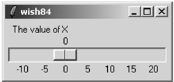
scale .scale -from -10 -to 20 -length 200 -variable x
   -orient horizontal -label "The value of X"
   -tickinterval 5 -showvalue true
pack .scale
Example 32-8 shows a scale for a variable that ranges in value from -10 to +20. The variable x is defined at the global scope. The tickinterval option results in the labels across the bottom, and the showvalue option causes the current value to be displayed. The length of the scale is in screen units (i.e., pixels).
Table 32-4 lists the bindings for scale widgets. You must direct focus to a scale explicitly for the key bindings like <Up> and <Down> to take effect.
Table 32-4. Bindings for scale widgets
| Clicking on the trough moves the slider by one unit of resolution toward the mouse click. |
| Clicking on the trough moves the slider all the way to the end of the trough toward the mouse click. |
| Moves the slider toward the left (top) by one unit. |
| Moves the slider toward the left (top) by the value of the |
| Moves the slider toward the right (bottom) one unit. |
| Moves the slider toward the right (bottom) by the value of the |
| Moves the slider all the way to the left (top). |
| Moves the slider all the way to the right (bottom). |
Table 32-5 lists the scale widget attributes. The table uses the resource name, which has capitals at internal word boundaries. In Tcl commands the attributes are specified with a dash and all lowercase.
Table 32-5. Attributes for scale widgets
| Background color when the mouse is over the slider. |
| The background color (also |
| Coarse grain slider adjustment value. |
| Extra space around the edge of the widget. |
| Command to invoke when the value changes. The current value is appended as another argument |
| Cursor to display when mouse is over the widget. |
| Number of significant digits in scale value. |
| Minimum value. The left or top end of the scale. |
| Font for the label. |
| Foreground color (also |
| Focus highlight color when widget does not have focus. |
| Focus highlight color when widget has focus. |
| Thickness of focus highlight rectangle. |
| A string to display with the scale. |
| The length, in screen units, of the long axis of the scale. |
|
|
|
|
| Delay before keyboard auto-repeat starts. Auto-repeat is used when pressing |
| Time period between auto-repeat events. |
| The value is rounded to a multiple of this value. |
| If true, value is displayed next to the slider. |
| The length, in screen units, of the slider. |
| The relief of the slider. |
|
|
| Controls focus changes from keyboard traversal. |
| Spacing between tick marks. Zero means no marks. |
| Maximum value. Right or bottom end of the scale. |
| The color of the bar on which the slider sits. |
| Name of Tcl variable. Changes to the scale widget are reflected in the Tcl variable value, and changes in the Tcl variable are reflected in the scale display. |
| Width of the trough, or slider bar. |
The scale operations are primarily used by the default bindings and you do not need to program the scale directly. Table 32-6 lists the operations supported by the scale. In the table, $w is a scale widget.
Table 32-6. Operations on the scale widget
| Returns the value of the configuration option. |
| Queries or modifies the widget configuration. |
| Returns the coordinates of the point in the trough that corresponds to |
| Returns the value of the scale, or the value that corresponds to the position given by |
| Returns |
| Sets the value of the scale. |
The bell command rings the terminal bell. The bell is associated with the display; even if you are executing your program on a remote machine, the bell is heard by the user. If your application has windows on multiple displays, you can direct the bell to the display of a particular window with the -displayof option. The syntax for the bell command is given below:
bell ?-displayof window? ?-nice?
UNIX has an xset program that controls the bell's duration, pitch, and volume. The volume is in percent of a maximum, for example, 50. In practice, many keyboard bells only support a variable duration; the pitch and volume are fixed. The arguments of xset that control the bell are shown below.
The b argument by itself resets the bell to the default parameters. You can turn the bell off with -b, or you can use the on or off arguments.
exec xset -b
exec xset b ?on? ?off?
The bell command has the side effect on most systems of resetting the screen saver for the screen, which usually makes the screen visible again. In Tk 8.4, a -nice option was added to prevent the bell command from resetting the screen saver.