8. Implementing Custom Data-Bound Controls
The .NET Framework provides a rich set of Windows Forms controls for presenting data in your applications. The controls in the Framework are by necessity and design very general purpose and flexible, and with the addition of the DataGridView in .NET 2.0, they can be used to address most common requirements. However, there are certain advanced scenarios where the Framework controls might not meet your needs, as well as other times when developing custom controls can make sense as well.
You might choose to implement your own custom data-bound controls for a number of reasons, including:
• You need similar special-purpose functionality in more than one place in your application or across multiple applications.
• You can contain the complexity of the special-purpose code, even if you don’t see a strong potential for reuse. Encapsulation is a good thing, both for providing the potential for reuse and for isolating portions of your code so that only those who need to know and work with the internal details of an implementation have to deal with that portion of the code.
• You want to create a custom control that encapsulates the code required to bend the Framework controls to your will.
• You can code and debug your custom functionality and code as a custom control once, and then reuse it in many places in the same way that you use the controls provided by the Framework.
• You need to provide functionality or a presentation rendering of data that is not already available through the Framework controls.
The code required to implement custom data-bound controls depends on how customized the control is. This chapter covers several examples of custom controls that demonstrate different approaches to custom controls and discusses the considerations for each approach. It describes how to subclass existing Framework controls, how to use containment to use existing custom controls while gaining an additional level of flexibility and ease of development from the subclassing case, and how to develop a custom data-bound control that doesn’t use any of the built-in data-bound controls or components. You don’t need to write much data-binding-related code yourself for subclassed controls and control containment, but if you step into the deep end and create a totally custom data-bound control, you will have to consume the data-binding interfaces described in Chapter 7. I’ll be demonstrating how to do that in the latter half of this chapter.
Depending on the kind of custom data-bound functionality you need to support, inheriting from one of the existing controls in the .NET Framework might be your best option. Specifically, if you want to tailor the presentation of the data in a control, many of the Windows Forms Framework controls expose rich event models and virtual methods in the base class that let you integrate your own code to customize the appearance and/or behavior of the control as it is presented to the user or while they interact with it.
The data-binding behaviors of the Windows Forms controls are pretty tightly woven into the controls; they aren’t exposed in a way that lets you easily override that data-binding behavior by inheriting from the control. If you need to vary the data that gets presented by a Windows Forms control, you are better off doing that by changing the data source that you bind to the control, rather than trying to make the control change what data in the bound data source it presents.
For example, if you wanted to only show selected items in a collection of data within a data-bound control, you could just bind that control to a binding source and use the Filter property on a binding source to modify which data items are presented by the control. Alternatively, you could requery for new data based on the user’s interactions.
However, if you want to customize the appearance of the data within a control, most of the data-bound Windows Forms controls let you take over some or all of the painting or rendering logic of the control and do the data rendering yourself. For text boxes, combo boxes, and the DataGridView, there are ways to handle the painting events that are raised by the Framework, and in your handler you can take over the painting of data yourself. You also have opportunities to customize the formatting of the data as it is rendered by the control. (See the discussion in Chapter 4 of the Format and Parse events of the Binding object, and the description in Chapter 6 of theDataGridView control’s CellFormatting event, and how to use those to modify the data presented within the control to be something different than what it is in the underlying data source.)
Most of these capabilities can be done on a case-by-case basis inside the forms where you use the controls. But many times it will make sense to encapsulate that logic, either to separate it from the other code in your form or to package it for reuse. Deriving a class from one of the Windows Forms control classes is one way to accomplish this encapsulation in an easily reusable way.
As an example of creating a custom data-bound control by deriving a class from an existing Framework control, let’s create a specialized DataGridView control that presents its bound data as grouped data items within each column. For example, say you have a table containing summary data of all the products ordered by each customer by date. Each customer may have multiple orders for the same product, and multiple orders might have been placed by each customer on a given date. If you sort the data by customer and product name, it would be easier to read the data in the grid if the repeated customer names and products weren’t shown in every row of the table. It would be much easier to read if only new values were shown, and rows with the same value as previous rows were presented with blank cells, and the borders of the cells also helped to indicate the grouping of data values (see Figure 8.1).
Because this example specifies some behavior and altered rendering of the data in the grid, it makes a decent candidate for subclassing (deriving from) the DataGridView control. To achieve this functionality doesn’t require a ton of code, just a few overrides of base class methods and tapping into the formatting and painting behavior of the base class.
The first step is to declare a class that derives from the DataGridView class:
public class GroupByGrid : DataGridView
{
...
}
To support the requirement to render blank cells when the cell content will be the same as the previous cell in the column, you need to override the OnCellFormatting base class method, as shown in Listing 8.1.
LISTING 8.1: DataGridView OnCellFormatting Method Override
protected override void OnCellFormatting(
DataGridViewCellFormattingEventArgs args)
{
// Call home to base
base.OnCellFormatting(args);
// First row always displays
if (args.RowIndex == 0)
return;
if (IsRepeatedCellValue(args.RowIndex,args.ColumnIndex))
{
args.Value = string.Empty;
args.FormattingApplied = true;
}
}
private bool IsRepeatedCellValue(int rowIndex, int colIndex)
{
DataGridViewCell currCell =
Rows[rowIndex].Cells[colIndex];
DataGridViewCell prevCell =
Rows[rowIndex - 1].Cells[colIndex];
if ((currCell.Value == prevCell.Value) ||
(currCell.Value != null && prevCell.Value != null &&
currCell.Value.ToString() == prevCell.Value.ToString()))
{
return true;
}
else
{
return false;
}
}
In almost all cases, when you override one of the base class OnXXX methods, you should call the base class method from your override either at the beginning or the end, depending on what you are doing in your override. The reason is that it’s the base class method that fires the corresponding event that can be handled in client code. Additionally, the base class method may do some additional work that usually needs to be performed even if you are doing other processing in your derived control method. Whether you put your custom code before or after the call to the base class method depends on if your custom code will act on other members of the class that might have side effects based on what the base class method does to them. This requires either understanding what the base class method is going to do by using a tool like Reflector to inspect the implementation of that base class method or just experimenting with the calling order to get the behavior you expect.
So the first thing this override of OnCellFormatting does is to call the base class implementation. Next it checks if the row index is zero, and if so, the handler just returns without doing anything else. This ensures that the first row cell values are always formatted normally. For rows beyond the first row, the handler calls a helper method to check whether the current cell’s value is the same as the previous cell’s value from the same column. If so, then it sets the cell value to an empty string so the cell will render blank. As discussed in Chapter 6, any time you change the formatted value of a cell, you should set the FormattingApplied flag to true, so this is done in Listing 8.1 after setting the Value property on the event argument.
That takes care of rendering the cell contents as blank when the value is the same as the previous row. The next thing is to handle painting the cell borders so that the blank cells for repeated values appear as one big cell in the grid. To do this, you need to override the OnCellPainting base class method as shown in Listing 8.2.
LISTING 8.2: DataGridView OnCellPainting Method Override
protected override void OnCellPainting(
DataGridViewCellPaintingEventArgs args)
{
base.OnCellPainting(args);
args.AdvancedBorderStyle.Bottom =
DataGridViewAdvancedCellBorderStyle.None;
// Ignore column and row headers and first row
if (args.RowIndex < 1 || args.ColumnIndex < 0)
return;
if (IsRepeatedCellValue(args.RowIndex,args.ColumnIndex))
{
args.AdvancedBorderStyle.Top =
DataGridViewAdvancedCellBorderStyle.None;
}
else
{
args.AdvancedBorderStyle.Top = AdvancedCellBorderStyle.Top;
}
}
The overridden method does the following:
1. It calls the base class implementation to ensure that subscribers of the CellPainting event still get notified.
2. It sets the event argument’s AdvancedBorderStyle.Bottom property to a border style of None. This ensures that no cells will draw a bottom border.
3. It checks to see if it is being called for the column or row headers (in which case the column or row index will be –1) or for the first row. If it is being called for a header cell it just returns and performs no further custom painting.
4. Finally, it calls the same helper method as the formatting method to determine if the current cell value is the same as the previous cell’s value from the same column. If so, it sets the top border to None; if not, it sets it to the value on the default AdvancedCellBorderStyle property from the base class.
That is all there is to it. If you duplicate this code or run the CustomControlsHost sample program from the download code, you should see the custom grid in action. This example is fairly straightforward, but it’s not even close to a bulletproof implementation. It doesn’t correctly handle if the user customizes the default cell borders, and there are other properties on the base class that can be set that could result in undesired effects running this code. This is a hazard of deriving a class directly from a Framework control: Any modifications you make to its behavior through the access you gain to protected members of the base class assume you have intimate knowledge of how the changes you make will affect the base class behavior. With a complex control like the DataGridView, that requires you to have far too much insight into the inner workings of the control. A better approach is to go with containment of the control and customizing its behavior through its public API, which is discussed shortly.
Once you have developed a custom control, you need to add it to a form or another user control to test it and verify that it works as expected. To test this, do the following:
1. Open the custom control project within the same solution as a Windows application project in which you want to test the control.
2. Open a form in the designer, and you will see a tab added dynamically to the top of the Toolbox for each custom control library in the solution.
3. Drag and drop your custom controls from the Toolbox onto a form to use and test them.
For production purposes, you don’t want others to have access to your projects and source code, so the way to use a custom control library without opening its project in the consuming solution is to customize the Toolbox. To do this, perform the following:
1. Open a new or existing Windows application project.
2. Bring up a form in the designer.
3. Display the Toolbox. From here, there are two ways you can add your custom controls to the Toolbox.
– You can locate the DLL that contains your custom controls through Windows Explorer and drag and drop the DLL onto the Toolbox. This will add all of the controls in that DLL to the Toolbox.
– If you want to have more explicit control over which controls are added, right-click in an existing tab within the Toolbox (such as the All Windows Forms tab), or create your own by choosing Add Tab from the context menu, then select Choose Items from the context menu. Click the Browse button in the lower right of the Choose Toolbox Items dialog and navigate to the location of the DLL containing your custom controls. Once you select that file and click Open, the dialog will check the boxes of all custom controls it finds in that library (see Figure 8.2). If you want to exclude certain controls from being added, simply uncheck their boxes. Click OK to add the selected controls to the Toolbox.
4. Once the controls are in the Toolbox (see Figure 8.3), you can drag and drop them onto forms and user controls like any other built-in Framework control in the Toolbox.
A new capability in Visual Studio 2005 is to run and debug a Windows user control without having to develop a forms application and add it to a form. Visual Studio now includes a test container (see Figure 8.4) for presenting user controls. This lets you test many of their behaviors directly from the Windows Control Library project that they live in. You display this by running a debug session from a project of type Windows Control Library.
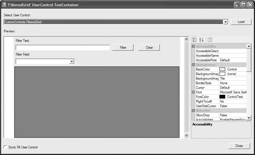
The test container renders the user control in a simple host container that exposes the control properties in the container’s properties panel that you can use to tweak properties and verify that they work correctly. Unfortunately, for data-bound controls, the control’s key behaviors are all based around providing runtime data through a data source. Although those properties are exposed in the test container (like they are in the designer for a hosting form), there is no data available in the test container’s runtime context to bind the control to. So for most data-bound control testing, you still need to create a test application form to host the control in and provide it with some data to bind to. But if you just want to test the way certain parts of your control will render themselves, the test container can be a quick way to check that out.
As mentioned earlier, the problem with deriving a new control from an existing Framework control type is that if you access or override any protected members of the base class, you need to have a great deal of insight into what the side effects will be. The public members exposed by a control are a lot easier to understand, are better documented, and provide greater protection from introducing unexpected side effects. As a result, you’ll usually have better success customizing the behavior of Framework data-bound controls from the outside through their public members rather than from the inside through their protected members.
However, if there are particular customizations you need to make that will be used in more than one location, repeating those customizations in all the forms that use the control is tedious, error-prone, and introduces an unnecessary maintenance burden. To avoid this repetition, you can customize the built-in Framework controls through containment in user controls. This lets you encapsulate all the customizations inside your user control, so that users of your control don’t have to worry about the messy implementation details at all. They just focus on the (often simplified) API of your control and add it to as many forms as they like.
Your user control can contain a collection of Framework controls, custom controls, and custom code to integrate those controls. You expose public properties and methods on your user control to enable users of your control to code against it in a fashion similar to the Framework controls. Another advantage of taking this approach is that you can use the new BindingSource component to greatly simplify exposing data-binding capabilities from your custom control. By containing a BindingSource (or several) inside your user control, you can easily hook up external data sources passed in by the users of your custom control, yet still have the built-in mechanisms of the Framework controls and components do all the dirty work for you.
The following sections develop a custom data-bound user control to demonstrate these concepts and techniques.
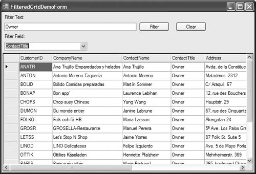
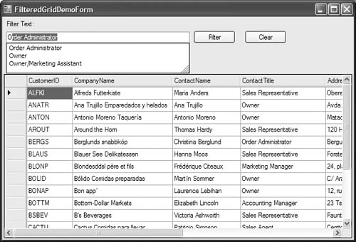
Assume that you need a DataGridView control in several places in your application that is going to present tabular data coming from various data sources. Once the grid is data bound, you want users to be able to input filter conditions into a text box and have it autocomplete the filter text based on the contents of a specified filter field within the table. This kind of grouping of functionality is a good example of where creating a custom user control is a perfect choice. You can reap the benefits of a good design-time experience in laying out the controls and setting their properties in the user control designer, and then you can add it to a form and test it out. Once it is all coded and working correctly, other developers can just add your control to their forms, set a few properties, and have a rich, consistent use case implemented in many places. Figure 8.5 shows the filtered grid in action, and Figure 8.6 shows the autocomplete functionality helping in the selection of filter criteria.
To get this kind of scenario working correctly requires a good understanding of binding sources and grids, as well as control and data-binding lifecycles. You also need to understand other Windows Forms concepts like working with ComboBox controls and using autocomplete functionality on a text box. I’ll step through all of this in the following sections. If you want to follow along to create a control like this, you need to create a Windows Control Library project. This is really a class library project that has references added to it for the System.Windows.Forms and System.Drawing namespaces. The project wizard also adds a blank user control named UserControl1 to the project. You can either rename that to get started, or delete it and add a new user control named what you want. (To add one, right-click on the project and choose Add > User Control.)
1. Name the control FilteredGrid. This results in a new user control file being added to your project and a design surface for the control that is similar to a form design surface (without the title bar and borders) is displayed.
2. Expand the size of the user control by grabbing the edge of it in the designer and dragging it down and right until it is about 600 × 350 pixels (you can monitor the size in the bottom right of the designer as you drag).
3. Using Figure 8.5 as a model, add two labels, a text box, two buttons, a combo box, a binding source (BindingSource component), and a DataGridView control to the user control by dragging them out from the Toolbox. Arrange them like you see the controls presented in Figure 8.5. The binding source will be shown in the nonvisual components tray at the bottom of the designer.
4. Set the Text property for the labels and button as shown in Figure 8.5, and leave the Text property of the text box control blank.
5. Name the text box, combo box, buttons, binding source, and grid controls m_FilterTextBox, m_FieldsCombo, m_FilterButton, m_ClearButton, m_BindingSource, and m_Grid, respectively.
6. Set the grid’s Anchor property to include the Top, Bottom, Left, and Right anchor values so that it will resize automatically to fill the bottom portion of the user control regardless of the size of the control.
At this point, all the code is being injected into the designer code partial class (FilteredGrid.Designer.cs), which is hidden from you in Solution Explorer by default. If you go to Code view on the FilteredGrid control now, you should just see the partial class definition with a call to the InitializeComponent method (which is in the designer partial class file):
public partial class FilteredGrid : UserControl
{
public FilteredGrid()
{
InitializeComponent();
}
}
This procedure will add the functionality to the control incrementally, just like you normally should while developing such a control. Let’s start with the simplest part—letting users of your control provide a data source and data member to bind the contained grid to a set of data. Because the DataGridView control is a child control of your user control, it is declared as a private member of your user control class. This is true for any controls you drag onto the designer surface of a form or control by default. You can alter this through the Modifiers property in the Properties window, if desired, or by editing the designer-generated code directly. In general, you should avoid directly modifying designer-generated code because your changes can be overwritten by subsequent designer actions, which is why it is all placed in a separate partial class code file in Visual Studio 2005.
One way to support data-binding to the grid in your user control would be to simply allow users to access the contained grid directly and set its data source. This wouldn’t work well for the filtered grid requirements though, because the whole point is to create a control that modifies what is bound to the grid based on input from the filter text box and field list. So the right way to set up data binding in this case is to mimic the data-binding API exposed by other data-bound controls on your custom user control. For displaying tabular data, that means exposing DataSource and DataMember properties that can be set to establish the data binding on your control.
Thanks to the contained binding source component in your control, you won’t have to do any grunt work for the data-binding yourself—you can just delegate the data binding to the binding source, and let it handle the dirty work. Continuing from the procedure in the last section, do the following:
1. Set the DataSource property on the grid (m_Grid) to the binding source (m_BindingSource) through the designer’s Properties window. By doing this, any time the data source on the binding source is modified, the grid will automatically update. Now you can expose DataSource and DataMember properties on the FilteredGrid control and delegate to the binding source in their implementations:
public object DataSource
{
get { return m_BindingSource.DataSource; }
set { m_BindingSource.DataSource = value; }
}
public string DataMember
{
get { return m_BindingSource.DataMember; }
set { m_BindingSource.DataMember = value; }
}
2. Because this control is being designed for bound data to be supplied to the grid externally through the user control, you also want to make sure the AutoGenerateColumns property on the grid is set to true, which you can do by adding a call to the constructor for your control:
public FilteredGrid()
{
InitializeComponent();
m_Grid.AutoGenerateColumns = true;
}
3. Add an instance of the FilteredGrid control to a Windows Forms application by dragging it from the Toolbox onto a form, and set its data source programmatically in the form Load event handler. When you run the application, you should see the data presented in the form:
private void Form1_Load(object sender, EventArgs e)
{
CustomersTableAdapter adapter = new CustomersTableAdapter();
filteredGrid1.DataSource = adapter.GetData();
}
CustomersTableAdapter here was generated by creating a typed data set with the Customers table in it (as described in Chapter 2).
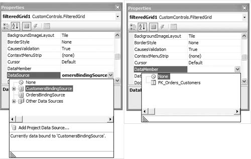
If you tried to set up the data binding through the designer instead of doing it programmatically, you would run into a few problems. First, if you tried to drag the Customers table from the Data Sources window, you would see that it wouldn’t consider the FilteredGrid control a valid drop target for the data source. Second, if you went to the Properties window with the FilteredGrid control selected in the designer, you would see the DataSource and DataMember properties exposed there, but the DataSource property would be grayed out because it is declared as an object reference type, so the designer doesn’t know enough to let you select something as a data source.
You want your DataSource and DataMember properties to behave just like those of the built-in Windows Forms controls, letting you select data sources and members using the graphical pop-up windows that allow browsing of project data sources, as described in Chapter 5. To do this, you need to adorn these properties with some attributes that let the designer know how to treat them in the designer.
1. Add the AttributeProvider attribute to the DataSource property and the Editor attribute to the DataMember with the appropriate arguments. This lets you tell the designer to treat your properties just like the Framework controls DataSource and DataMember properties get treated.
[AttributeProvider(typeof(IListSource))]
public object DataSource
{
get { return m_BindingSource.DataSource; }
set { m_BindingSource.DataSource = value; }
}
[Editor("System.Windows.Forms.Design.DataMemberListEditor,
System.Design, Version=2.0.0.0, Culture=neutral,
PublicKeyToken=b03f5f7f11d50a3a", typeof(UITypeEditor))]
public string DataMember
{
get { return m_BindingSource.DataMember; }
set { m_BindingSource.DataMember = value; }
}
2. Add a using statement to bring in the System.Drawing.Design namespace for the UITypeEditor type name.
Just by adding these attributes and rebuilding the control library, now when you work with the FilteredGrid control in a form’s designer, you get the same drag-and-drop data-binding experience as you do for a DataGridView, ComboBox, or any of the other data-bound Framework controls, as shown in Figure 8.7. You may need to close and reopen the form you are editing the FilterGrid on after rebuilding the solution to see the Properties window changes.
This gets you the interaction you are looking for in the Properties window, but if you try to drag and drop a data source from the Data Sources window, you will still get a mouse cursor indicating the drop is not allowed (circle with a slash). To remedy this, you need to add an appropriate binding attribute to the class itself.
When you want the designer to be able to set up data bindings for your control through drag-and-drop operations, the designer needs to know whether your control is designed for simple or complex data binding and which properties on the control it is supposed to be setting in response to drag-and-drop operations. To identify these items on a custom control that you want to use through the Data Sources window, you have to add an appropriate attribute to the control class definition so that the Data Sources window can work with it. The attributes used are described in Table 8.1.
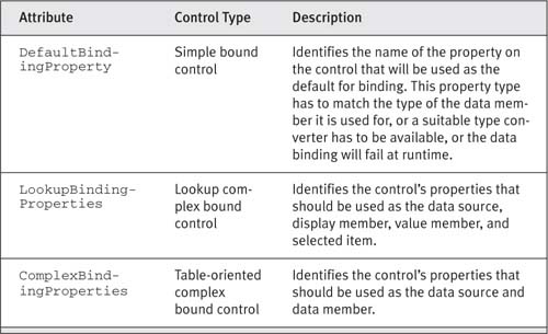
Because your FilteredGrid control represents a complex bound control, you need to add a ComplexBindingProperties attribute to the class itself:
[ComplexBindingProperties("DataSource", "DataMember")]
public partial class FilteredGrid : UserControl, ISupportInitialize
{
...
}
The two parameters of this attribute’s constructor specify the names of the properties for setting the data source and data member, respectively, on the control. I recommend that you stick to the convention of naming these DataSource and DataMember, respectively, which is what is done in the FilteredGrid control.
Now you should be able to drag and drop data sources from the Data Sources window onto the control, and the designer will generate all the appropriate objects (typed data set, table adapter, binding source, and data navigator in the case of a typed data set source) and hook them up to your DataSource and DataMember properties appropriately.
One other thing you should do at this point is to implement the ISupportInitialize interface, defined in the System.ComponentModel namespace.
This interface, as discussed in Chapter 7, lets you defer certain initialization steps until all the dependent properties on your control that might be set through the designer are initialized in a batch and then makes them take effect all at once. This interface is kind of like the IDisposable interface, in that if you create a class that contains disposable objects, you should make your class disposable and delegate to the contained objects in the Dispose method.
If your control contains objects that can be initialized, you should make your control initializable and delegate to the contained initialized objects. To do this, add the ISupportInitialize interface to your class definition, and add implementations of the interface’s methods to your class, delegating to the binding source and grid implementations:
public partial class FilteredGrid : UserControl, ISupportInitialize
{
private bool m_Initializing = false;
void ISupportInitialize.BeginInit()
{
m_Initializing = true;
((ISupportInitialize)(m_Grid)).BeginInit();
((ISupportInitialize)(m_BindingSource)).BeginInit();
}
void ISupportInitialize.EndInit()
{
m_Initializing = false;
((ISupportInitialize)(m_BindingSource)).EndInit();
((ISupportInitialize)(m_Grid)).EndInit();
}
}
This lets you control the initialization order of the controls, as well as giving you a place to control your own batch initialization if needed. I added a Boolean flag, m_Initializing, to the class as well. This lets you use this as a signal in your methods to indicate when you are in this initialization process, which will come in handy in a little while. I also chose to complete initialization on the contained binding source first, then the grid, which makes sense: to get the grid’s data source initialized before the grid tries to complete its data-binding process against the binding source.
To test everything you have so far, do the following:
1. Create a new Windows application project in the same solution as the Windows Control Library project that you created earlier.
2. In the Form1 that is added to the new project, drag and drop a FilteredGrid control from the CustomControls Components tab in the Toolbox onto the form.
3. Go to the Data Sources window, and add a new data source to the Northwind database (as described in Chapter 5).
4. Add the Customers table to the resulting typed data set and name it CustomersDataSet.
5. Drag the Customers table from the Data Sources window onto the FilteredGrid on the form.
The designer should create several objects on the form for you: an instance of the data set named customersDataSet, a binding source named customersBindingSource, and a table adapter named customersTableAdapter. It will also hook all these up appropriately, will set the DataSource and DataMember properties of your control to work with the generated data objects, and will add the line of code to the Form Load event handler to fill the data set using the data adapter.
If you run the application at this point, you should see the grid filled with data. However, you aren’t quite all the way there yet.
6. Add a BindingNavigator control to the form, and set its BindingSource property to the customersBindingSource.
7. Run the application, and select the navigation controls on the data navigator control. You will see that it is changing the position in the toolbar, but the caret on the grid inside the filtered grid control isn’t updating to match that position.
To understand how to fix this, you have to think about what controls and components are on the form and how they relate to one another.
When you add controls to a form, you are just adding instances of the controls that are members of the class to the Controls collection of the base class. So the FilteredGrid control that is added to the form is just one control on the form from the form’s perspective. Because FilteredGrid derives from UserControl, which derives from Control indirectly, it too has its own Controls collection, and this is the collection into which the grid and binding source inside the user control go. When you hooked up all the data binding in the form through the designer, what you effectively end up with is what is depicted in Figure 8.8 (minus the controls not directly involved in data binding yet).
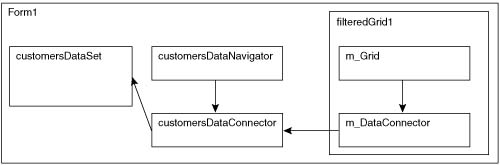
The customersBindingSource instance in the form is hooked up to the customersDataSet as its data source, with its DataMember set to the Customers table within that source. The filteredGrid1 instance has its DataSource set to the customersBindingSource, which just implicitly hooks the user control’s contained m_BindingSource instance up to that same binding source. The m_Grid instance inside the user control has its DataSource set to the m_BindingSource instance in the user control. When the data set gets filled out in the form’s Load event handler, the data shows up automatically in the grid through the handy work of the binding sources.
The problem with the data navigator is that it is hooked directly to the customersBindingSource in the form, and there is no automatic way for it to cascade the changes in the position for that binding source down into the one in the user control (m_BindingSource). This is because each binding source has its own currency manager under the covers, and they aren’t hooked up in a way that lets the binding sources know they are supposed to stay synchronized. To fix this, you need to do a little more work when you hook up the data source in the user control.
Chapter 7 briefly covered the ICurrencyManagerProvider interface, which is implemented by objects that host their own currency manager, as is the case with a BindingSource component. To be notified when the currency manager’s position in the form’s binding source changes within the user control’s binding source, you need to use the ICurrencyManagerProvider interface to detect when something will maintain its own currency manager, and you need to subscribe to that currency manager’s CurrentItemChanged event to keep things synchronized yourself. Listing 8.3 shows the modifications required to the set block of the DataSource property on the FilteredGrid control, as well as the event handler method that gets called.
LISTING 8.3: Handling Position Changes in the Bound Data Source
public partial class FilteredGrid : UserControl, ISupportInitialize
{
// Add a member to track parent currency manager
private CurrencyManager m_CurrencyManager = null;
[AttributeProvider(typeof(IListSource))]
public object DataSource
{
get
{
return m_BindingSource.DataSource;
}
set
{
// If there is an existing parent currency manager,
// unsubscribe from its event and get rid of the ref
if (m_CurrencyManager != null)
{
m_CurrencyManager.CurrentItemChanged -=
new OnCurrencyManagerPositionChanged;
m_CurrencyManager = null;
}
m_BindingSource.DataSource = value;
// Check to see if the new data source provides its own
// currency manager
ICurrencyManagerProvider currmgr =
value as ICurrencyManagerProvider;
// If so, subscribe to be notified when the parent current
// item changes
if (currmgr != null)
{
m_CurrencyManager = currmgr.CurrencyManager;
m_CurrencyManager.CurrentItemChanged +=
OnCurrencyManagerPositionChanged;
}
}
}
// Update your position based on the parent position
void OnCurrencyManagerPositionChanged(object sender, EventArgs e)
{
if (m_CurrencyManager != null)
{
m_BindingSource.Position = m_CurrencyManager.Position;
}
}
...
}
As shown in Listing 8.3, each time a new data source is assigned, you have to check to see if it implements the ICurrencyManagerProvider interface. If so, you subscribe to the CurrentItemChanged event on the CurrencyManager exposed through the interface property. You also need to hold on to a reference to the currency manager, so you can unsubscribe from that event before releasing the reference to the data source when a new data source is assigned. The event handler updates the position of the binding source inside the user control to match the position of the currency manager that is set as the data source. Now if you ran the sample application, when you change the position with the data navigator, the cursor in the grid will be updated as well.
The next requirement we will tackle is to be able to dynamically populate the m_FieldCombo control in the FilteredGrid control with the columns or properties of the data items in the bound data source. When you create custom controls that support data binding like this, you should make as few assumptions as possible about the actual data types being bound to your control. For example, one way to support this functionality would be to say that your control can only be bound to DataTable objects (in which case you wouldn’t even need a DataMember property), and therefore you could just cast the DataSource to a DataTable, access its Columns collection, and obtain the column names from each of the DataColumn objects in that collection.
The problem with that approach is that you have just prevented anyone from using your control with a collection of custom business objects, which is a use case that you should support in the same way that the data-bound Framework controls do. Because the data-bound portion of your user control is a grid bound to a binding source, you can let the binding source worry about all the details of handling various kinds of data collections, which it does quite nicely. However, you need to be able to reach into whatever collection is bound to the binding source and determine what the names of the columns or properties are on each of the data items in the collection, and you need to do it in a way that makes no assumptions about the object type. Whether the data source is a data set, data table, or custom collection of business objects, your code needs to handle it properly, and preferably without writing a bunch of conditional tests to check for specific types.
Luckily, the Framework has some built-in support for doing exactly this through property descriptors (the PropertyDescriptor class—see Chapter 7 for a discussion of property descriptors). By using the GetProperties static method on the TypeDescriptor class, you can get back a PropertyDescriptorCollection instance containing all the property descriptors for all of an object’s properties, whether that object is a row in a table or an instance of a Foo business object.
To dynamically populate the combo box control with the field or property names in the data source collection items, add the helper method to the FilteredGrid class shown in Listing 8.4.
LISTING 8.4: BindFilterFields Helper Method
private void BindFilterFields()
{
if (m_Initializing)
return;
List<string> cols = new List<string>();
// Check if you have something to work with
if (m_BindingSource.List.Count > 0)
{
object dataItem = m_BindingSource.List[0];
// Get the property descriptors for the object type
// currently contained in the collection
PropertyDescriptorCollection props =
TypeDescriptor.GetProperties(dataItem);
foreach (PropertyDescriptor prop in props)
{
// Exclude any properties that are references to
// child collections
if (prop.PropertyType.GetInterface("IList") == null)
{
cols.Add(prop.Name);
}
}
}
// Populate the combo box with the column/property names
m_FieldsCombo.DataSource = cols;
}
The first thing this helper method does is to check your m_Initializing flag to see if this method is being called while you are in the initialization stage, based on your implementation of the ISupportInitialize interface. If so, the method just returns without doing anything, because it will assume that the data source itself might not be done initializing yet.
Next, a list of strings is created using the List<T> generic type to hold the field names as they are discovered. The binding source exposes a List property that gives you direct access to whatever list of objects it contains as a data source. You could just go through the DataSource property of the binding source, but then you would have to manually resolve the data member within that data source if there was one. Using the List property gives you direct access to the resolved collection of data, which returns an IList reference.
As long as the list contains some items, the method then accesses the first item in the collection. Binding sources only support lists containing a homogeneous collection (objects of a single type), so accessing the first item should give you all the information you need to know. The method then obtains the collection of property descriptors for the properties on the first object in the list and loops through them.
The code checks each property descriptor to see if the property it represents implements the IList interface itself by using the PropertyType property on the property descriptor, which returns a Type instance describing the actual type of the property. The code calls the GetInterface method on the Type instance to determine if the property represents a child collection. If so, it doesn’t add the property to the list. This protects against two scenarios.
• If you have a data source that is a data set with data tables that have relations between them, and the binding source is bound to one of the tables with the data relation, the relation will show up as a property on the list through the property descriptors. However, it doesn’t make sense to show the relation in the filter fields list, because the data relation doesn’t represent a single-valued property that can be filtered through the text box entry.
• If the list contains business objects, those objects can have properties that are collections of data as well, and those properties wouldn’t be displayed by the grid, so they shouldn’t be included in the combo box.
So, as long as the property isn’t a list property, the property’s name is added to the string collection and the loop continues on through the rest of the data item’s properties. When the method ends, it sets the string collection as the data source on the m_FieldsCombo, which will automatically display those strings as the items in the combo box.
You need to call this helper method from somewhere appropriate, which is whenever you know that the underlying data collection has changed. You can be notified of this by the ListChanged event raised by the binding source. To continue in the vein of letting the designer do as much coding as possible for you, take the following steps.
1. Open the FilteredGrid control in the designer, and select the m_BindingSource in the components tray.
2. Go to the Events view of the Properties window and type OnListChanged into the text box next to the ListChanged event.
3. When you press the Enter key, the designer declares the event handler for you with the appropriate signature in your user control code file and subscribes the handler to the event in the designer-generated code partial class file behind the scenes.
4. Add the following code to the OnListChanged method:
private void OnListChanged(object sender, ListChangedEventArgs e)
{
if (e.ListChangedType == ListChangedType.Reset ||
e.ListChangedType == ListChangedType.PropertyDescriptorAdded
||
e.ListChangedType ==
ListChangedType.PropertyDescriptorDeleted)
{
if (!m_FilterInProgress) // Don't reinit when filtering
{
// Fill the combo box with the column names
BindFilterFields();
// Populate the autotext string collection with the
// contents of the filter column values
BuildAutoCompleteStrings();
}
else
{
m_FilterInProgress = false;
}
}
}
The ListChangedType property of the event arguments passed to this event let you filter those changes that affect the schema of the contained objects. A reset means the entire source has changed, and the PropertyDescriptorAdded and PropertyDescriptorDeleted change types let you handle the case if the data source is being programmatically modified at runtime. The guard condition checking the m_FilterInProgress flag keeps the combo box from resetting when the list has reset due to a filter being applied. This lets the combo box keep the current selection, and the autocomplete string list (discussed next) will remain as it was before the filter was applied.
If you run the Windows application that contains the filtered grid at this point, you should see that the combo box gets populated with the data source’s field names—just what you were looking for.
The next requirement to tackle is not directly related to data binding, but is a common requirement for data input applications: the capability to autocomplete user input as they type it within input controls such as a TextBox or ComboBox control. This is a new capability provided in .NET 2.0, so let’s use it to enhance the filtered grid functionality.
1. To enable autocomplete for a text box, you need to set the AutoCompleteMode property to something other than its default value of None. The options are Suggest, Append, or SuggestAppend.
– Suggest means that the text box will provide a drop-down list of potential matching string candidates to select from.
– Append means that it will append the best matching string candidate to the end of the characters that the user has typed so far, with those additional letters selected, allowing the user to overtype the additional characters.
– SuggestAppend gives you the combination of these behaviors, which is what you will probably want in most cases.
2. You also need to set the AutoCompleteSource property to one of its enumerated values. The choices for this include most recently used lists, file system lists, URL lists, and other built-in sources. Because you are going to be generating the list dynamically based on the data source, you need to select CustomSource as the value for this property.
3. Because you selected CustomSource, there is a third property provided on the control, AutoCompleteCustomSource, that is prepopulated with an instance of a AutoCompleteStringCollection that you can use to populate with your autocomplete values.
4. To set all these for the FilteredGrid control, open the control in the designer, select the m_FilterTextBox control, and go to its Properties window.
5. Set AutoCompleteMode to SuggestAppend, and set AutoCompleteSource to CustomSource.
6. You have to populate the AutoCompleteCustomSource collection programmatically. You do this by building a list of the current contents of each row for the filter field selected in the combo box. To populate the autocomplete string collection, I added the helper method to the class shown in Listing 8.5.
LISTING 8.5: BuildAutoCompleteStrings Helper Method
private void BuildAutoCompleteStrings()
{
if (m_Initializing || m_BindingSource.List.Count <= 0
|| m_FieldsCombo.Items.Count <= 0)
return;
// Clear what is in there now
m_FilterTextBox.AutoCompleteCustomSource.Clear();
// Get the column name
string filterField = m_FieldsCombo.SelectedItem.ToString();
// Build the list of filter values
AutoCompleteStringCollection filterVals =
new AutoCompleteStringCollection();
foreach (object dataItem in m_BindingSource.List)
{
PropertyDescriptorCollection props =
TypeDescriptor.GetProperties(dataItem);
PropertyDescriptor propDesc = props.Find(filterField, true);
string fieldVal = propDesc.GetValue(dataItem).ToString();
filterVals.Add(fieldVal);
}
// Set the list on the collection
m_FilterTextBox.AutoCompleteCustomSource = filterVals;
}
The first step in the helper method is to verify that it is being called while initializing or while the collection of data or the filter field combo box is empty. If any of those are true, then the method simply returns because there isn’t enough information available to build the autocomplete string collection. If there is data to work with, it first clears the current collection of strings, which again is accessible through the AutoCompleteCustomSource property on the text box.
Next, an instance of an AutoCompleteStringCollection is created to add your new filter values to. The method then enters a loop to step through each row in the data collection, and uses property descriptors and the Find method to locate the field or property on each item with the name of the field selected in the combo box. It then extracts the current value of that field with the GetValue method on the property descriptor and adds it to the collection of filter strings. Once the loop is complete, the code replaces the AutoCompleteCustomSource string collection with the one just created.
As with the BindFilterFields method, you need to call this helper method from an appropriate place, which includes two places.
• The first happens to be the same place as for the BindFilterFields method, in the ListChanged event handler (as you saw in the previous section).
• The other place is the SelectedIndexChanged event on the filter field combo box. Any time the filter field changes, you need to rebuild your autocomplete list by calling the BuildAutoCompleteStrings method from that handler as follows:
private void OnFilterFieldChanged(object sender, EventArgs e)
{
BuildAutoCompleteStrings();
}
If you run the sample at this point, the grid and filter field combo box should populate with data and column names respectively, and if you select a particular field in the combo box and start typing a value, you should see autocomplete kick in, as shown in Figure 8.6.
You are almost done with the filtering capabilities. The last thing you need to do is to make the selected filter take effect on the presented rows in the grid. To do this, add a handler for the Filter button named OnFilterClicked, with the code shown in Listing 8.6.
LISTING 8.6: OnFilterClicked Event Handler
private void OnFilterClicked(object sender, EventArgs e)
{
if (m_BindingSource.List.Count <= 0 ||
m_FieldsCombo.Items.Count <= 0)
return;
if (string.IsNullOrEmpty(m_FilterTextBox.Text))
{
m_BindingSource.Filter = null;
return;
}
// Set filtering flag
m_FilterInProgress = true;
// Determine the filter column
string filterMember = m_FieldsCombo.SelectedItem.ToString();
object dataItem = m_BindingSource.List[0];
PropertyDescriptorCollection props =
TypeDescriptor.GetProperties(dataItem);
PropertyDescriptor propDesc = props.Find(filterMember, true);
m_BindingSource.Filter = string.Format("{0} = '{1}'",
propDesc.Name, m_FilterTextBox.Text);
}
To do the actual filtering, use the inherent capability of the BindingSource itself to do the dirty work. All you need to do in your Filter button Click event handler is to tell it what to filter on, which needs to be a valid Filter expression. The filter expressions supported by the BindingSource are simpler than those used by the DataColumn.Expression property, in that you don’t have different delimiters for different data types. You just delimit the value of the filter property or field with single quotes, and it will work fine for numeric and date types as well. However, the underlying data source does need to support filtering, meaning it needs to implement the IBindingListView interface (discussed in Chapters 7 and 9).
The first thing the filter method does is to check to make sure there is data to work with; if not, it returns. The next thing is that if a blank filter expression is entered, it is treated as clearing the filter expression, so the code checks to see if the text box is empty and if so, sets the binding source’s Filter property to null. Notice the call to string.IsNullOrEmpty. This is a new method added to the string class in .NET 2.0, and it saves having to declare a long conditional statement that checks both for an empty string and for a null string, a very common requirement in code dealing with strings. In this case it is somewhat unnecessary, since the TextBox control always returns an empty string when blank (but I decided to include it here so you’d be aware of it).
After that, the code grabs the field name from the combo box and the filter string from the text box, and uses them to construct a filter expression with the string.Format method and set that as the Filter property on the binding source. With this in place, you should be able to type in filter values into the text box at runtime, see autocomplete kick in to help you select appropriate values, and then tailor the grid to matching values when you click the Filter button.
I want to add one more feature to this control before we declare it done. Because programmers using your FilteredGrid control won’t have direct access to the DataGridView that it contains, there is no opportunity for them to declaratively set the column names, widths, and such through the designer—this just automatically generates the columns based on the data. One of the most common desires when this is done is to have the column widths also set automatically to display the contained content without wrapping. As discussed in Chapter 6, the DataGridViewColumn class has an AutoSizeMode property that you can set to AllCells (or a number of other settings) to achieve this presentation effect. So what you need to add to your FilteredGrid is some code to set that property on the automatically generated columns of data. You probably also want to allow programmers using your control to turn this feature off as well.
To set that property on the columns, the columns naturally have to exist, which doesn’t happen until after data binding is complete. Luckily, the DataGridView control raises an event called DataBindingComplete when that occurs, giving you the perfect place to do this kind of post-data-binding processing.
1. Add an event handler for the DataBindingComplete event by selecting the grid in the FilteredGrid control design surface, and name the handler OnGridDataBindingComplete.
2. Add a property and a corresponding private member to let users of your control set whether to autosize columns or not:
private bool m_AutoSizeColumns = false;
public bool AutoSizeColumns
{
get { return m_AutoSizeColumns; }
set { m_AutoSizeColumns = value; }
}
private void OnGridDataBindingComplete(object sender,
DataGridViewBindingCompleteEventArgs e)
{
if (m_AutoSizeColumns)
{
foreach (DataGridViewColumn col in m_Grid.Columns)
{
col.AutoSizeCriteria =
DataGridViewAutoSizeColumnCriteria.HeaderAndRows;
}
}
}
The code for the DataBindingComplete event handler loops through each of the columns in the grid, setting the AutoSizeCriteria property to the appropriate enumerated value.
With that, you have a fairly complete functioning example of a custom data-bound control, created as a user control, containing other data-bound controls, and managed through a contained binding source. Approaching things this way gives you a clean way to encapsulate functionality in a single control that can be reused in many places, and lets you harness the powers of the built-in Framework data-bound controls to their full extent without having to know anything about them beyond their public properties, methods, and events.
You could certainly continue to enhance the capabilities of this control by surfacing additional properties on your control that you then delegate in appropriate ways to the contained controls and components. You might want to expose the contents of the filtered list so that other programmers can grab those filtered data items and do something with them as their own list. Obviously, caching all the autocomplete values of every row for the selected filter field in the grid in memory can be a scalability concern if you try to use this control for very large data sets. To address that, you would need to come up with a more robust way of populating the autocomplete list—or do away with that requirement. By doing things like this, you add capabilities to your control with minimal code, but limit what is exposed to the user of your control, which is a good approach to component-oriented development from an encapsulation point of view.
If you really want to expose the full API or a significant subset of it from the grid to the users of your control, you may want to expose just a property on your control that gives them direct access to a reference to the grid. However, that still won’t give them access to the designer capabilities of working with a DataGridView control, so if you need to support that as well, you might need to step back to deriving a class from the DataGridView control. At that point you have to tackle the full complexities of integrating custom code into the processing model of the Framework control, which again requires pretty intimate knowledge of all of the control’s internal details. An alternate approach would be to create a custom designer class for your control that provides similar capabilities to that of the DataGridView, as discussed in the sidebar “Supporting Rich Design-Time Declarative Programming.”
The full FilteredGrid example and a sample hosting Windows Forms application are available in the CustomControls project download code for this book.
So far I have presented examples of deriving from a built-in Framework control or developing a user control that contains other controls and exposing a data-binding interface on that user control. However, sometimes you may need to build custom controls that aren’t simple containment scenarios for existing Framework controls, and you may want to support data binding on these controls as well. If you can at least handle containing a binding source component as a child component of your control, you can let it do most of the data-binding dirty work, as you saw in the last example with the FilteredGrid. That control inherently supports all the myriad forms of data collections that the Framework controls do, simply because it is using a binding source to sort the data from whatever is provided as a data source and data member.
In case you need to be more directly in the loop for rendering your control and accessing the data that is bound to it, you may have to eschew the support of the binding source and drop back to dealing with different forms of data collections yourself. If you do this, one approach would be to handle all the different interface types described in Chapter 7 directly, figuring out whether you have a list, a list of lists, a list of lists of lists, and so on, and figuring out type information and sorting and filtering capabilities on your own. There is still some other support in the Windows Forms classes that can save you some of this grunt work without using a binding source, as you will see in the next example. So to demonstrate getting a little “closer to the metal” and how to implement a data-bound control that doesn’t rely on any Framework controls for its data binding, let’s jump right into another example.
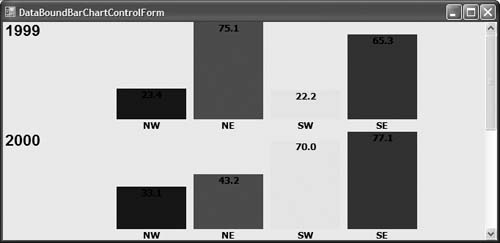
The scenario for this sample control is that you need to build a data-bound charting control that will render bar chart data for comparative purposes to help decision makers...well, make decisions based on that data. You can call this decision support, knowledge management, business intelligence, or whatever your favorite buzzword is for this kind of functionality. Obviously, to create a production-capable rich graphic control that executives would use to make billion dollar decisions is going to take a little more code than I have room or time for in this chapter. So I am going to limit the functionality and presentation graphics to a fairly crude and simple set of bar charts that can be generated dynamically from data with an appropriate shape.
This example will support users who are going to provide sets of data to the control. The sets of data contain numeric data series representing categories that I want to compare on two axes. Each row of data represents some entity; within each row will be sets of numeric fields, which each represent some category of data supported by each entity that the row represents. By presenting each row as a series of graphical bars, decision makers can quickly scan complex numerical data looking for trends and indicators. For example, consider a set of data where each row represents a sales year, and then within that row are data fields containing the net sales amounts for each sales region in your organization. If you had that kind of scenario and wanted to let executives quickly review that data for comparison purposes between years and regions, you could present it as shown in Figure 8.9.
As soon as you start designing for specialized data-binding scenarios like this, you step out of the realm of the generalized data binding that the Framework controls support. In this case, we have specified that the data that the control supports needs to have a particular shape. We could make this more explicit by perhaps defining a specific interface that the data collections have to support, say IDecisionSupportDataList, and then program against methods or properties exposed by that interface. This would model what the Framework controls do with respect to assuming that the data supports the IList interface. However, for many scenarios that may be overkill, and you will just want to support a particular shape of data based on assumptions of what you should find in data sources bound to the control, and then handle errors accordingly if those assumptions aren’t met. That is how we’ll approach things in this example. Defining a separate interface that describes a certain kind of data collection might make sense if you were going to define multiple controls that made the same assumptions about the shape of the data, but that would impose an additional nonstandard implementation burden on any data collections you want to use with your controls, which would limit its usability.
So let’s design a control that looks like Figure 8.9. It should provide the data that drives the presentation dynamically in a way that models the data-binding support in the Framework Windows Forms controls. Additionally, it should support both relational data sources, such as data sets, as well as custom business object collections. The data collections provided as a data source and data member are expected to have a single column or property that is the row identifier and will be used to label the row. They are also expected to have any number of additional columns or properties of numeric types that will be used to generate the bars with their values and property names.
To get started, you need to write the code that will do the graphical rendering of the bars for each row. Because this functionality is going to be invoked repeatedly for each row, and it is separable from the code that worries about the data binding to the collections of data that provide each row, it makes sense to separate out the rendering functionality into its own control. This control will be a custom control derived from the Control base class, because it is responsible for doing all its own drawing of its client area and will be named BarChartControl. Because this control won’t be used outside of the containing data-bound control (called DataBoundBarChartControl) that will render instances of the BarChartControl, you will make this class internal to the CustomControls assembly and won’t expose it in the Toolbox for other programmers to add directly to their forms.
Most of the implementation of the BarChartControl is a bunch of mundane geometric and graphics rendering code that I won’t go into the details of here. You can see all the details if you download the CustomControls sample code for the book. The basic skeleton of the BarChartControl class is shown in Listing 8.7.
LISTING 8.7: BarChartControl Class
[ToolboxItem(false)]
internal class BarChartControl : Control, IDisposable
{
BindingList<ChartPair> m_Data = new BindingList<ChartPair>();
Font m_LabelFont = new Font("Tahoma", 10, FontStyle.Bold);
internal BarChartControl() { ... }
public IList<ChartPair> Data
{
get
{
return m_Data;
}
}
private void UpdateCoordinates() { ... }
protected override void OnPaint(PaintEventArgs e)
{ ... }
protected override void Dispose(bool disposing)
{
try
{
m_LabelFont.Dispose();
}
finally
{
base.Dispose(disposing);
}
}
The class is declared as internal with a ToolboxItem attribute set to false, which prevents it from being added to the Toolbox, and the class is marked as internal to prevent using it outside of the declaring assembly. The BarChartControl class derives from both the base Control class and the IDisposable interface. The IDisposable interface implementation is needed (as well as a finalizer) because the class contains a member variable containing a Font object, which is itself a disposable object. To ensure that the Font object gets properly cleaned up when users of your BarChartControl are done with the control, you need to release that Font object when your control is released, which is what the Dispose and finalizer methods take care of.
The data that the control uses to render the bars is contained in a member data collection created from a generic BindingList<T> type (the Binding List<T> type is discussed in the next chapter). In this case, the BindingList<T> is used as a container for pairs of data contained in instances of ChartPair objects. The ChartPair object is a simple container for a value and a label associated with each bar:
internal class ChartPair
{
public string m_Label;
public double m_Value;
public ChartPair(string label, double value)
{
Label = label;
Value = value;
}
public string Label
{
get {return m_Label; }
set {m_Label = value;}
}
public double Value
{
get {return m_Value; }
set {m_Value = value;}
}
}
Again, this type is an implementation detail of the control, so it too is marked as internal. The data used by the control is exposed through an IList property named Data, so that the data can be populated and accessed by its containing control. There are some other member variables not shown here that are used for storing the bar and label rectangles, as well as minimum and maximum values used by the drawing code.
The control has an UpdateCoordinates method that is called to recalculate the coordinates of the bars and labels when needed based on the data, and an override of the Control.OnPaint method, which is where it does all the rendering of the bars based on the coordinates computed in UpdateCoordinates. Again, if you want to see the details of how it does all this, grab the download code. It is not super-involved; it only has about 100 lines of code.
Once the BarChartControl control has been coded and debugged (by making it public and allowing a containing form to populate the data directly), you can create the data-bound containing control that creates and populates an instance of the BarChartControl for each row of analysis data. In this example I created this as a user control to be able to automatically provide a scroll bar to use when more rows of data (BarChartControl instances) are added that can be presented within the control’s size.
Because the control is supposed to support data binding in a fashion similar to other data-bound controls, it will need DataSource and DataMember properties. The control presentation’s coupling to part of the individual data items in the bound collection (the need to use one of the fields in each data item as a label for the row) requires that the control also needs a property that lets users of the control specify what the field or property name is that contains the row identifier. This is similar in concept to the function of the DisplayMember and ValueMember properties on a ComboBox or ListBox control, and I will call the property RowIdentifierMember.
The basic skeleton of the class definition is shown in Listing 8.8.
LISTING 8.8: DataBoundBarChartControl Class
[ToolboxBitmap(typeof(DataBoundBarChartControl), "IDesignIcon.bmp")]
public partial class DataBoundBarChartControl : UserControl,
ISupportInitialize
{
private object m_DataSource;
private string m_DataMember;
private string m_RowIdMember;
private bool m_Initializing = false;
public DataBoundBarChartControl()
{
InitializeComponent();
}
[Editor("System.Windows.Forms.Design.DataMemberListEditor,
System.Design, Version=2.0.0.0, Culture=neutral,
PublicKeyToken=b03f5f7f11d50a3a", typeof(UITypeEditor))]
public string DataMember
{
get { return m_DataMember; }
set
{
m_DataMember = value;
UpdateDataBinding();
}
}
[AttributeProvider(typeof(IListSource))]
public object DataSource
{
get { return m_DataSource; }
set
{
m_DataSource = value;
UpdateDataBinding();
}
}
public string RowIdentifierMember
{
get { return m_RowIdMember; }
set
{
m_RowIdMember = value;
UpdateDataBinding();
}
}
private void UpdateDataBinding() { ... }
public void BeginInit()
{
m_Initializing = true;
}
public void EndInit()
{
m_Initializing = false;
UpdateDataBinding();
}
}
The DataBoundBarChartControl class is derived from UserControl and implements the ISupportInitialize interface, which lets it control its data binding when in an initialization phase. The ToolboxBitmap attribute is applied to the control class and sets what the icon is that will be used for the control when it is added to the designer’s Toolbox. The file name specified is the name of a 16 × 16 bitmap that is added to the project and marked as an embedded resource.
The DataSource and DataMember properties are declared in a fashion similar to that described for the FilteredGrid example, except that in this case you aren’t containing a binding source that you can delegate to. Instead, this control saves the DataSource and DataMember properties in member variables on the control class that it can use to do the data binding whenever it is appropriate. The set portions of these properties also call the UpdateDataBinding method, which is where the actual data-binding code lives. (We will get to the implementation of that method shortly.) A RowIdentifierMember property is also exposed to identify which property on the data items should be used for rendering the labels next to each bar chart instance.
The implementation of the ISupportInitialize, BeginInit, and EndInit methods prevents data binding from occurring during initialization by setting a flag that is checked by the UpdateDataBinding method (m_Initializing), and data binding is deferred until initialization is complete by calling that method explicitly from the EndInit method.
The implementation of the UpdateDataBinding method requires you to reach into the data source, locate the data collection specified by the data member (if there is one), and iterate through the data items to render the bar charts. Although that doesn’t sound overly complicated, it can get very involved if you consider that the data source could be a data set, a data table, an array, a custom collection, a list of lists of lists, and so on. Covering all those different scenarios can get very complex. It basically involves taking the data source and trying to cast it to one of the various interfaces described in Chapter 7. Once you discover what kind of a collection it is, based on the interfaces it implements, you can use the interface implementations and the DataMember to determine the actual list of data that you want to bind to. Luckily, most of the grunt work of doing this has been exposed through a static method on the ListBindingHelper class called GetList.
Listing 8.9 shows the implementation of the UpdateDataBinding method.
LISTING 8.9: UpdateDataBinding Method
private void UpdateDataBinding()
{
if (m_Initializing)
return;
if (m_DataSource == null || m_RowIdMember == null)
return;
IList list = ListBindingHelper.GetList(m_DataSource, m_DataMember)
as IList;
if (list == null || list.Count < 0)
return;
// Get the property descriptors for the items
PropertyDescriptorCollection objProps =
TypeDescriptor.GetProperties(list[0]);
// Loop through the items, extracting the row identifier member
// and binding each of the other numeric columns as ChartPairs
int vertPos = 0;
for (int index = 0; index < list.Count; index++)
{
object obj = list[index];
// Locate the row identifier property in the object
PropertyDescriptor propDesc =
objProps.Find(m_RowIdMember, true);
if (propDesc == null)
{
continue; // Not a valid row
}
// Code to add a label based on the row identifier omitted...
AddBarChartControl(index, 150, vertPos,obj,objProps);
vertPos += 150;
}
}
This method first checks to see if the control is initializing; if so, it does nothing. If it isn’t initializing, the method checks to make sure that, at a minimum, there is a data source and row identifier to work with. Then it calls the GetList method on the ListBindingHelper class. This method does a lot of complex work for you, based on the various data-binding interfaces discussed in Chapter 7. Basically what it does is to first check the data source to see if it implements the IListSource interface. If so, it uses the GetList method on that interface to get back a list. It then checks the data member and tries to resolve that data member on the data source and return that as a list. It goes through a few other gyrations, handling different combinations of lists of lists, data member vs. no data member, and so on, but basically it takes care of trying to find a valid IList collection from the provided data source and data member. If it fails to find a valid collection to work with, the data-binding method gives up and returns null.
Once the list has been determined from the data source and member, the code reaches into the list, again using property descriptors, and locates the field or property containing the row identifier label and gets its value. The method then creates an instance of a Label control, sets appropriate properties on that control, and adds it to the Controls collection of your custom control to render the row identifier label. The code for this is omitted because it is just rudimentary Windows Forms control initialization code like that the designer generates every time you drag and drop a Label control onto a form and set its Text property. Next the loop calls the AddBarChartControl method.
The AddBarChartControl method gets the property descriptors for all of the columns or properties in the corresponding data item, determines if the field is a numeric type based on the property descriptor’s PropertyType property, and then extracts the field name and value and adds a corresponding ChartPair to the Data property of the bar chart. This method is shown in Listing 8.10.
LISTING 8.10: AddBarChartControl Method
private void AddBarChartControl(int index, int xpos, int ypos,
object dataItem, PropertyDescriptorCollection objProps)
{
BarChartControl bar = new BarChartControl();
m_BarIndexes.Add(bar, index);
bar.Location = new Point(xpos, ypos);
bar.Size = new Size(ClientSize.Width-250, 150);
Controls.Add(bar);
bar.Data.Clear();
foreach (PropertyDescriptor propDesc in objProps)
{
Type propType = propDesc.PropertyType;
string propName = propDesc.DisplayName;
if (propName == m_RowIdMember)
continue;
double propVal;
if (propType == typeof(int) ||
propType == typeof(short) ||
propType == typeof(float) ||
propType == typeof(double) ||
propType == typeof(long))
{
object val = propDesc.GetValue(dataItem);
propVal = Convert.ToDouble(val);
}
else if (propType == typeof(string))
{
bool converted =
double.TryParse((string)propDesc.GetValue(dataItem),
out propVal);
if (!converted)
continue;
}
else
{
continue;
}
bar.Data.Add(new ChartPair(propName, propVal));
}
}
The AddBarChartControl method creates an instance of a BarChartControl, initializes it size and location, and adds it to the Controls collection of the container user control. It then loops through each of the properties on the data item that was passed in, and if it is a numeric type, or is a string that can be converted to a numeric type, then a corresponding ChartPair is added to the Data collection of the bar chart control.
Notice the use of the new TryParse method on the double class. Each primitive class in .NET has a Parse method that has been there since version 1.0 of the Framework. The problem with the Parse method is that it will throw an exception if it fails to convert the string passed in—and throwing an exception is a very expensive operation and can seriously hinder your performance if it is done frequently. As a result, in version 2.0 of the Framework, each of the primitive types has had a TryParse method added, which lets you try to parse a string value into a value of the primitive type without throwing an exception. If the parsing succeeds, it returns a Boolean value of true, and you can use the value you passed in as the second (out) parameter to the method. If the return value is false, parsing was unsuccessful and should ignore the value that you passed in.
As you can see, there isn’t a ton of code involved to handle the data binding yourself for basic iteration through a data source and presenting the data without a binding source, but there are a lot of things that aren’t handled in the code so far, such as support for sorting, filtering, editing, adding new rows, and so on, which the binding source handles for you. The ListBindingHelper.GetList method handles the initial probing and discovery aspects of locating an appropriate list in a data source. To handle all those other things requires working with a number of other interface types. You will usually want to harness the support of the binding source for these.
Presenting data is really only one-way data binding—from the data source to the screen. Most Windows Forms data-bound controls support some sort of two-way data binding—letting the user modify values in the control, which directly modifies the values in the underlying data collection. There are a number of different levels to which you can take this. If you recall from Chapter 7, the IList interface contains a Boolean property named IsReadOnly, which returns true if the list isn’t intended to be modified by the consumer of the list. The meaning of IsReadOnly can be interpreted in a number of ways, so the IBindingList interface refines this by adding AllowEdit, AllowNew, and AllowRemove properties to explicitly indicate whether the collection allows the editing of individual items in the collection, the addition of items, or the removal of items, respectively.
If you want to design a control to allow editing of the presented values, you need to use these interfaces to decide whether you should be trying to edit the collection of data represented by your data source and what kinds of edits you should allow.
As a simple example, let’s add some modifications to the BarChartControl and DataBoundBarChartControl to let users edit the presented values in a crude fashion. Specifically, end users can left-click on a bar to increase its value by 10 percent, or right-click on a bar to decrease its value by 10 percent. The control should only allow this interaction when the data is editable, meaning that the list is not read-only, and that if the collection supports the IBindingList interface, it specifically says that it allows editing of the contained values.
To support this functionality, the first step is to modify the BarChartControl to support the form of editing described earlier. This involves adding a property to indicate whether the bar should be editable based on the data it was created from, and a mouse-click handler to detect and react to mouse clicks if the control is in editable mode. There also needs to be a way to propagate the changed values back out to the containing control, which will be responsible for pushing them into the underlying data collection.
The modifications to the BarChartControl are shown in Listing 8.11.
LISTING 8.11: Changes to the BarChartControl for Edit Support
internal delegate void BarChartChangedEventHandler(
object sender, int barIndex);
internal class BarChartControl : Control, IDisposable
{
//... other members
BindingList<ChartPair> m_Data = new BindingList<ChartPair>();
public event BarChartChangedEventHandler DataValueChanged;
internal BarChartControl()
{
...
m_Data.ListChanged += new
ListChangedEventHandler(OnDataListChanged);
}
public bool AllowEdit
{
get { return m_Data.AllowEdit; }
set { m_Data.AllowEdit = value; }
}
protected override void OnMouseClick(MouseEventArgs mea)
{
base.OnMouseClick(mea);
if (!m_Data.AllowEdit)
return;
for (int index = 0; index < m_BarRects.Count; index++)
{
Rectangle barRect = m_BarRects[index];
if (barRect.Contains(mea.Location))
{
ChartPair pair = m_Data[index];
if (mea.Button == MouseButtons.Left)
{
pair.Value = pair.Value + pair.Value * .1;
}
else
{
pair.Value = pair.Value - pair.Value * .1;
}
m_Data[index] = pair;
UpdateCoordinates();
break;
}
}
}
void OnDataListChanged(object sender, ListChangedEventArgs e)
{
UpdateCoordinates();
if (DataValueChanged != null &&
e.ListChangedType == ListChangedType.ItemChanged)
{
DataValueChanged(this, e.NewIndex);
}
}
}
The way that the control supports editing is to add a handler for mouse-click events and to modify the values of the chart pairs contained in the control directly. However, to support two-way data binding, those changes have to be propagated outside of the control to the containing control so that the data-bound container control can update the data source from whence the values came. To support that, the control needs to raise an event that indicates that the bar was changed and which value within it changed. To support raising that event, the code in Listing 8.11 starts with a delegate definition called BarChartChangedEventHandler. This delegate’s parameters include a reference to the object (the control) that is firing the event, as well as the index of the data item that was modified. A corresponding event is declared on the BarChartControl class called DataValueChanged; it is this event that will be subscribed and handled by the containing data-bound charting control.
The data presented in the control can change in one of two ways: an end user clicking on a bar in the control, or programmatically outside the control through the Data property reference to the collection of ChartPairs. For the changes that are made directly to the data in the mouse-click event handler, you could raise the DataValueChanged event handler yourself. But how are you supposed to know when a data value has changed inside of the data collection of chart pairs if it is done outside of the control?
This is the reason that I implemented the collection using the BindingList<T> generic type. That type can automatically provide support for ListChanged events, even for modifications to the contained data values through bound controls. So by simply containing your data values inside a BindingList<T> type, and then handling the ListChanged event from that type, you can be notified any time a contained value changes, whether you did it yourself or whether it is done externally through the Data property reference. This lets you centralize your handling for changing values to one place, which is simply to tell the control to update itself (through the UpdateCoordinates method), and to fire the DataValueChanged event if the change type is an edited value and if there are any subscribers.
The AllowEdit property gets or sets the corresponding property on the contained BindingList<T> collection, which is checked by the mouse-click event handler to decide whether to process the mouse click as an edit. The mouse-click event handler does some simple hit detection on the rectangles calculated and stored by the UpdateCoordinates method, and if it sees that a mouse click is inside one of the bars, it increases or decreases the value by 10 percent, depending on which mouse button was clicked.
Now you need to add the corresponding support to the DataBoundBarChartControl control to update the corresponding data source if appropriate and control the editability of the individual bar chart controls. The modified portions of the control are shown in bold in Listing 8.12.
LISTING 8.12: Changes to DataBoundBarChartControl for Editing Support
public partial class DataBoundBarChartControl :
UserControl, ISupportInitialize
{
//... other members
private bool m_UpdateableDataSource = false;
private Hashtable m_BarIndexes = new Hashtable();
private IList m_BoundList = null;
private void UpdateDataBinding()
{
//... guard conditions
IList list = CurrencyManager.GetList(m_DataSource,
m_DataMember) as IList;
if (list == null)
return;
m_BoundList = list;
m_UpdateableDataSource = !list.IsReadOnly;
IBindingList blist = list as IBindingList;
if (blist != null)
{
// we have more fine grained info about editability
m_UpdateableDataSource = blist.AllowEdit;
}
// The rest of the implementation...
}
private void AddBarChartControl(int index, int xpos,
int ypos, object dataItem,
PropertyDescriptorCollection objProps)
{
BarChartControl bar = new BarChartControl();
m_BarIndexes.Add(bar, index);
bar.DataValueChanged += OnBarChartChanged;
bar.AllowEdit = m_UpdateableDataSource;
// rest of implementation...
}
void OnBarChartChanged(object sender, int barIndex)
{
BarChartControl bar = (BarChartControl)sender;
// Get the index of the bar in the collection
int index = (int)m_BarIndexes[sender];
// Get the corresponding item out of the data collection
object item = m_BoundList[index];
// Get the data value that changed
ChartPair pair = bar.Data[barIndex];
// Find the property on the data item
PropertyDescriptorCollection props =
TypeDescriptor.GetProperties(item);
PropertyDescriptor prop = props.Find(pair.Label, true);
if (prop == null)
throw new ArgumentException("Unable to find " +
pair.Label + " property on data item to make change.");
if (prop.PropertyType == typeof(double))
{
prop.SetValue(item, pair.Value);
}
else if (prop.PropertyType == typeof(float))
{
prop.SetValue(item, (float)pair.Value);
}
else if (prop.PropertyType == typeof(int))
{
prop.SetValue(item, (int)pair.Value);
}
else if (prop.PropertyType == typeof(long))
{
prop.SetValue(item, (long)pair.Value);
}
else if (prop.PropertyType == typeof(short))
{
prop.SetValue(item, (short)pair.Value);
}
else if (prop.PropertyType == typeof(string))
{
prop.SetValue(item, pair.Value.ToString());
}
else
{
throw new InvalidCastException("Cannot convert to type "
+ prop.PropertyType.ToString());
}
}
}
To keep track of enough information to change the bound data list when a change occurs inside an individual instance of a bar chart control, several new members had to be added:
• A flag to indicate whether you are dealing with an updatable data source
• A Hashtable to contain mappings between each instance of a bar chart control and its corresponding item index in the list of data
• A reference to the data list itself, to avoid having to resolve it through the currency manager more than once
When the data source is updated and UpdateDataBinding is called, you hold on to a reference to the bound list and set the flag that indicates whether the source is updated based on either the IList.IsReadOnly flag or the IBindingList.AllowEdit property, depending on whether the list’s data source implements IBindingList.
When each bar chart control is added to your Controls list, the containing control subscribes to its DataValueChanged event and sets its editability based on that of the list. Finally, the handler for the DataValueChanged event on any of the contained bar chart controls uses the sender object reference to the control, along with the changed bar index, to reach back into that control, extract the changed value, find the corresponding value in the bound data list based on the index stored in the Hashtable for that object, and set its value depending on the actual type of the value in the list.
With those changes, you now have a data-bound custom control that supports presenting and editing data from a bound data source. Obviously there are a lot of things that you would want to add to a production control, such as a little better look-and-feel, more customizability, and better designer support as discussed earlier. If you expected other controls in a form to be bound to the same set of data, you would want to monitor other forms of ListChanged events on the data (based on the ListChangedType event argument property) and possibly subscribe to the currency manager’s CurrentItemChanged event, as was done in the filtered grid example, to monitor context changes to the data from other bound controls.
This chapter explored three ways to create custom data-bound controls: subclassing Framework controls, creating a user control that contains Framework data-bound controls, and creating a data-bound control from scratch. In the process, you got some exposure to how many of the interfaces described in the last chapter were used from a control’s perspective as a consumer.
Some key takeaways from this chapter are:
• Inheriting from Framework controls is great for customizing simple presentation aspects of the control, but it is difficult to modify the data-binding behavior without a great deal of study of the protected members and interrelated behavior of those members in the class.
• Control containment is a better way to go for most custom controls, as shown in the filtered grid example.
• Building a generalized data-bound control from scratch is a lot of work, but building one that is specific to a given use case and a specific shape of data is much easier to tackle.
• The ListBindingHelper class makes it easy to obtain an appropriate IList reference from a data source without having to test for all the various related interface types yourself.
In the next chapter we’ll jump to the other side of the data-binding fence—to the data collection and object side, and you’ll see how to create custom objects and collections of objects that are suitable for data binding in Windows Forms.