Chapter 7. Adding Interactive Behaviors
What You’ll Do
Check for Browsers and Plug-ins
Introduction
Implementing the use of interactive buttons makes moving around a site an easy experience for a visitor. You can customize these buttons, and define hyperlinks for them. These animation effects are triggered by an event, such as clicking on a link.
Behaviors are timesavers because they give you sections of code for common tasks. In addition, behaviors are a great way to introduce yourself to the wonderful world of scripting without having to write all the code. For example, if you want to add a play script to a button, you can do it using the Insert button in the Behaviors task pane, or you can write out the code on your own. Using Behaviors, as opposed to writing the code by hand, is not better, they’re simply faster. The more time you save doing common scripting tasks using Behaviors, the more time you will have for the creative process.
You use the Behaviors task pane to apply the behavior to a triggering object, such as a button. You specify the event that triggers the behavior, such as releasing the mouse, select a target object, such as a graphic, and then select settings for behavior parameters, such as a URL address or element property.
Inserting Interactive Buttons
An interactive button gives you the ability to link one page to another page in the current Web site, a Web site, or an e-mail address. You don’t have to know HTML code to create, modify, and link an interactive button. You can select a button style from a pre-defined list and then add button text, select button and background colors, and specify the font style, size, and color for all states of the button including the original, hover, and pressed states. After you create the button, you can define a hyperlink for a button.
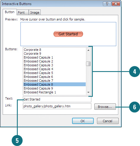
Create an Interactive Button
 Open and display the Web page you want to use.
 Position the insertion point where you want to insert an interactive button.
 Click the Insert menu, and then click Interactive Button.
 Click the button type you want.
 Type the button title.
 Type a hyperlink location or use Browse to locate and select it.
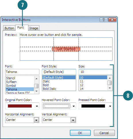
 Click the Font tab.
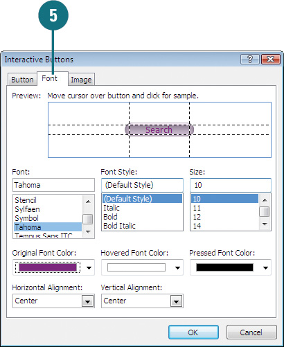
 Select the font options you want.
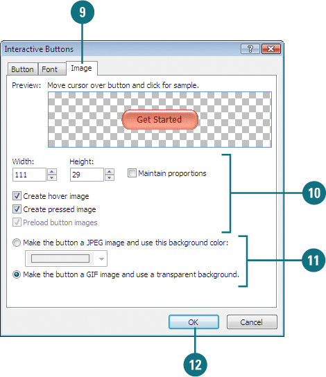
- Font, Font Style, and Size. Specifies the button text font type, style, and size.
- Font Color. Specifies the text font color for the original, hovered, and pressed button.
- Alignment. Specifies the horizontal and vertical alignment of the text.
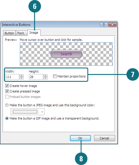
 Specify the image options you want.
- Width and Height. Controls the width and height of the button.
- Create Hover Image. Select to change the button when the mouse pointer passes over it.
- Create Pressed Image. Select to change the button when a visitor clicks it.
- Preload Button Images. Select to load all the button pictures in memory.
 Click the JPEG image option to choose a solid background color, or choose the GIF image option to set a transparent background.
 Click OK.
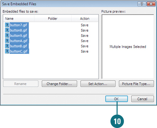
 Click the Save button on the Common toolbar, and then click OK (if necessary) to save any embedded and related files.
See Also
See “Adding Hyperlinks to Graphics” on page 162 for information on creating a hyperlink to a button graphic.
Working with Interactive Buttons
If you want to create a navigation bar with buttons with the same style and height, it’s faster and easier to make a copy of an existing interactive button and edit the button label and link location than to create new ones from scratch. When you create a copy of an interactive button and change the text label, the text may get cut off. To maintain the button height and change the width, use the Image tab in the Interactive Buttons dialog box to turn off the Maintain proportions option and change the Width of the button to make the text fit the way you want.
Copy an Interactive Button
Open and display the Web page you want to use with the interactive buttons.
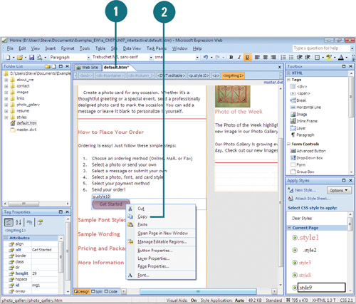
Right-click the button you want to duplicate, and then click Copy.
Position the insertion point where you want to place a copy of the button.
Click the Edit menu, and then click Paste.
The interactive button is pasted into the specified location where you can edit it.
Edit an Interactive Button
Open and display the Web page you want to use with the interactive buttons.
Double-click the interactive button or right-click the button, and then click Button Properties.
Change the button title.
Change the hyperlink location or use Browse to locate and select it.
If you want to change the font, click the Font tab, and then make the changes you want.
Click the Image tab.
Clear the Maintain proportions check box, and then change the Width and Height to the size you want for the button.
Click OK.
 Click the Save button on the Common toolbar, and then click OK (if necessary) to save any embedded and related files.
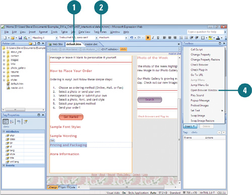
Adding Behaviors to Elements
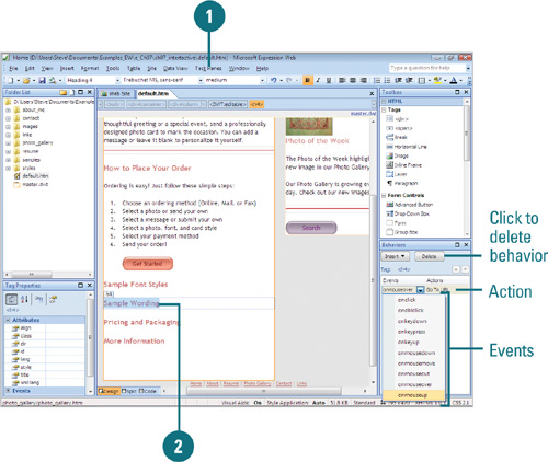
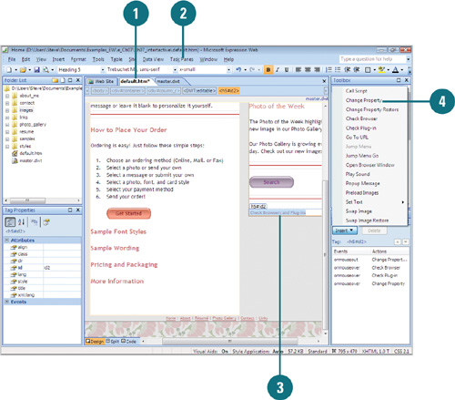
Behaviors are timesavers because they give you sections of code for common tasks. A behavior consists of an action triggered by a specific event. For example, an interactive button executes the Swap Images behavior action when a user points to the button event. You use the Behaviors panel to apply the behavior to a triggering object, such as a button. You specify the event that triggers the behavior, such as hovering the mouse, select a target object, such as a swap an image, and then select any related action property settings for the behavior, such as a preload images. Action property settings vary depending on the action. You can add more than one behavior to an element; the Behavior task pane lists the behaviors in the order in which they occur. When you add a behavior to an element, it doesn’t alter the element or show any visual indicator that a behavior is applied.
View a Behavior to an Element
Click the Task Panes or Format menu, and then click Behaviors.
The Behaviors task pane appears as a tab in the lower right-corner of the screen.
Select the element with a behavior. For example, an interactive button.
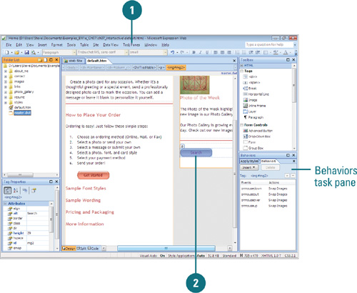
The Behaviors task pane displays the behaviors associated with the element.
Did You Know?
You can change available behaviors on the Insert button. The behaviors available on the Insert button are based on a CSS schema. To change the CSS schema, click the Tools menu, click Page Editor Options, click the Authoring tab, click the Schema version list arrow, and then select a schema version.
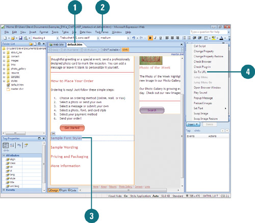
Add a Behavior to an Element
Open and display the Web page you want to use.
If necessary, click the Task Panes or Format menu, and then click Behaviors to display the Behaviors task pane.
Click the element you want to add a behavior.
In the Behaviors task pane, click Insert, and then select an action from the list.
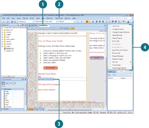
A dialog box appears, allowing you to set the details of the action.
Specify the action details and set the options you want.
Click OK.
The Behaviors task pane displays the event and action linked to the selected element.
To change the trigger, point to the event, click the list arrow, and then select the event you want.
Click the Save button on the Common toolbar, and then click OK (if necessary) to save any embedded and related files.
Did You Know?
You can change the order of behaviors associated with an element. Open the Behaviors task pane, select the element with the behaviors, select the action-event you want to change, and then click the Up or Down buttons in the task pane. If the buttons are grayed out, the action-event cannot be reorder.
For Your Information: Adding Behaviors to Text Within a Paragraph
If you want to add a behavior to text within a paragraph, you need to add some HTML code to isolate the text you want to use. Otherwise the behavior is added to the entire paragraph. In Split or Code view, you need to enclose the words in a span tag, including a unique ID.
For example, change the paragraph from <p>Click here for help.</p> to <p><span id="helplink">Click here</span> for help.</p>
Now, select the text “Click here” and add the behavior as shown on this page.
Modifying Behaviors
After you apply a behavior to an element, you can use the Behaviors task pane to change any of the actions or events. You can change action property settings or change the event associated with an action. Action property settings vary depending on the action. If you no longer want to use an action-event, you can delete it from the element.
Change a Behavior to an Element
Click the Task Panes or Format menu, and then click Behaviors.
The Behaviors task pane appears as a tab in the lower right-corner of the screen.
Select the element with the behavior you want to change.
The Behaviors task pane displays the behaviors associated with the element.
Perform the changes you want.
- Action. Double-click the action in the Behaviors task pane to open its dialog box, change action properties, and then click OK.
- Event. Point to the event in the Behaviors task pane, click the list arrow, and then select a new event.
- Delete. In the Behaviors task pane, click the action you want to remove, and then click Delete.
Click the Save button on the Common toolbar, and then click OK (if necessary) to save any embedded and related files.
Going to Another Web Page
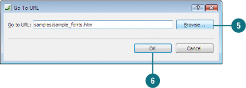
The Go To URL behavior gives you the ability to link an element on a Web page to a URL address. For example, you can create a Web page, and then use the Go To URL behavior to direct visitors to other sites and pages, or you could create a set of interactive buttons for use on a standard HTML driven Web site. Whichever option you choose, the ability to direct a visitor to other Web sites is essential to creating Internet-oriented documents.
Use the Go To URL Behavior
Open and display the Web page you want to use.
If necessary, click the Task Panes or Format menu, and then click Behaviors to display the Behaviors task pane.
Click the element you want to add the Go To URL behavior.
In the Behaviors task pane, click Insert, and then click Go To URL.
A dialog box appears, allowing you to set the details of the action.
Type the URL or click Browse, select the URL from the Edit Hyperlink dialog box, and then click OK.
Click OK.
The action appears, using the onmouseover event as the default.
To change the trigger, point to the event, click the list arrow, and then select the event you want.
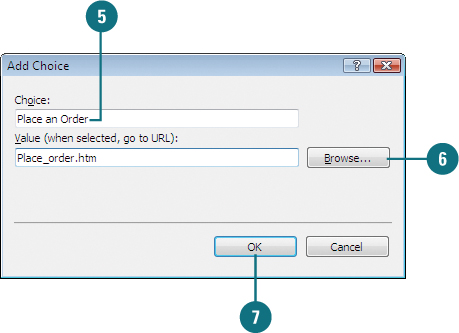
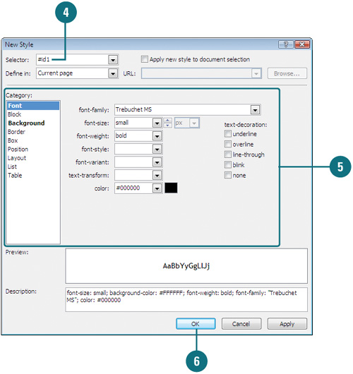
Creating a Jump Menu
The Jump Menu behavior allows you to add a drop-down menu to a Web page. When you use the Jump Menu behavior, you can specify the text for each item on the drop-down menu and where to link each one. After you insert a Jump Menu, you can create a new style in the Manage Style task pane using the element ID in the Selector box. Along with the Jump Menu behavior, you can also use the Jump Menu Go behavior, which allows you to not jump as soon you select an item in the drop-down menu.
Create a Jump Menu
Open and display the Web page you want to use.
If necessary, click the Task Panes or Format menu, and then click Behaviors to display the Behaviors task pane.
In the Behaviors task pane, click Insert, and then click Jump Menu.
Click Add.
Type a name for the first item in the menu.
Enter the URL or use the Browse button to select a Web page.
Click OK.
Repeat steps 4 through 7 to add more items to the menu.
Use the Move Up and Move Down buttons to rearrange the items in the menu.
Click Open URLs in list arrow, and then click Page Default (None) or New Window.
Click OK.
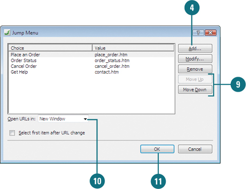
To modify the Jump Menu, double-click the Jump Menu, make any changes, and then click OK.
Format the Jump Menu Using a Style
Open and display the Web page you want to use.
If necessary, click the Task Panes menu, and then click Manage Styles to display the Manage Styles task pane.
In the Manage Styles task pane, click New Style.
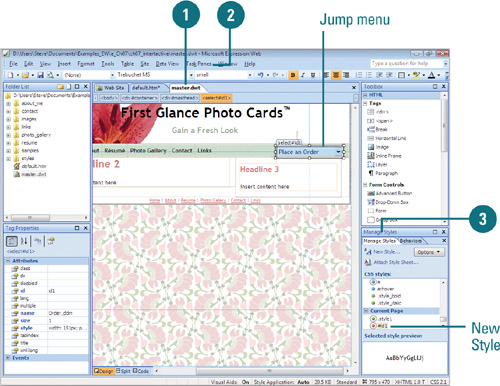
Type the ID name for the Jump Menu in the Selector text box. For example, type #id1.
In the left pane, click Font, Block, and Position to change the Jump Menu font size, menu width, and other formatting you want.
Click OK.
See Also
See “Working with Styles” on page 281 for information on formatting an element using a style.
Did You Know?
You can use the Jump Menu Go behavior. To use the Jump Menu Go behavior, insert a Jump Menu behavior and then insert or select an element to use for the trigger. In the Behaviors task pane, click Insert, click Jump Menu Go, and then select the jump menu from the list.
Displaying Text Messages
Expression Web provides several behaviors to display user text messages, including Popup Message and Set Text. The Set Text behavior consists of four individual behaviors: Set Text of Frame, Set Text of Layer, Set Text of Status Bar, and Set Text of Text Field. These behaviors allow you to display text in an alert dialog box, a specific frame, layer, text field, or the status bar.
Create a Popup Message Window
Open and display the Web page you want to use.
If necessary, click the Task Panes or Format menu, and then click Behaviors to display the Behaviors task pane.
Click the element you want to add a behavior.
In the Behaviors task pane, click Insert, and then click Popup Message.
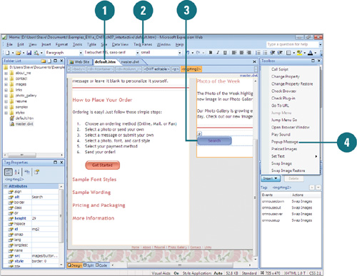
Type the message you want.
Click OK.
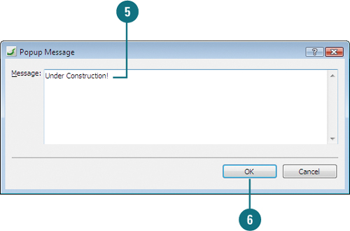
The action appears, using the onclick event as the default.
To change the trigger, point to the event, click the list arrow, and then select the event you want.
Create a Status Bar Message
Open and display the Web page you want to use.
If necessary, click the Task Panes or Format menu, and then click Behaviors to display the Behaviors task pane.
Click the element you want to add a behavior.
In the Behaviors task pane, click Insert, point to Set Text, and then click Set Text of Status Bar.
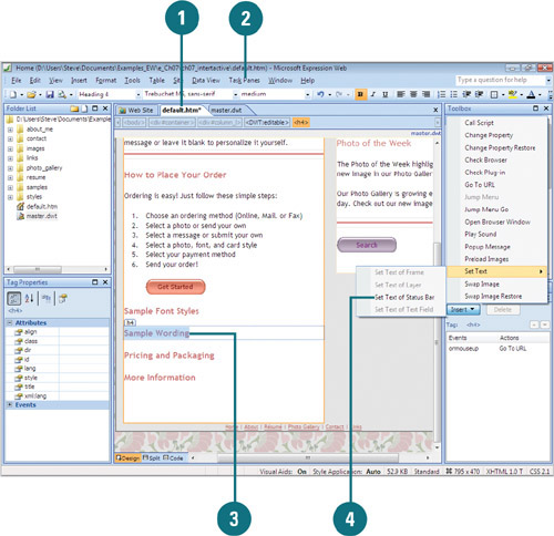
Type the message you want.
Click OK.
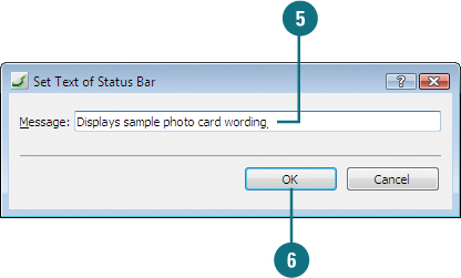
The action appears, using the onmouseover event as the default.
To change the trigger, point to the event, click the list arrow, and then select the event you want.
Preloading and Swapping Images
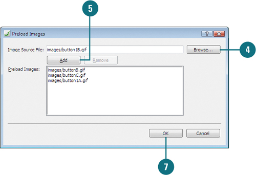
The Preload Images behavior allows you to preload images when a Web page initially loads. This is useful when you want to swap images on mouse rollover buttons. The Preload Images behavior loads the rollover image when the page initially loads, so visitors will not experience a delay while the image loads the first time a visitor points to the button. The Swap Images behavior allows you to swap one image for another when an event occurs. The most common use of this behavior is to create rollover buttons. When you insert an Interactive Button, Expression Web uses the Swap Images behavior. Along with the Swap Image behavior, you can also use the Swap Image Restore behavior, which restores the images that were swapped by the Swap Image behavior.
Preload Images
Open and display the Web page you want to use.
If necessary, click the Task Panes or Format menu, and then click Behaviors to display the Behaviors task pane.
In the Behaviors task pane, click Insert, and then click Preload Images.
Click Browse, locate and select the image you want to preload, and then click OK.
Click Add.
To add more images, repeat steps 4 and 5.
Click OK.
The action appears, using the onchange event as the default.
To change the trigger, point to the event, click the list arrow, and then select the event you want.
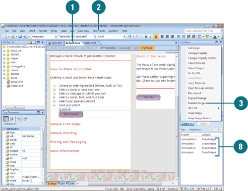
Swap Images
Open and display the Web page you want to use.
If necessary, click the Task Panes or Format menu, and then click Behaviors to display the Behaviors task pane.
Click the image you want to swap.
In the Behaviors task pane, click Insert, and then click Swap Image.

The selected image appears highlighted in the Swap Images dialog box.
Click Browse, locate and select the image you want to swap it with, and then click Open.
To insert a Preload Images behavior, select the Preload Images check box.
To insert a Swap Image Restore behavior, select the Restore on mouseout event check box.
To remove a swap, select an image in the list, and then delete the file and path in the Swap Image URL box.
Click OK.
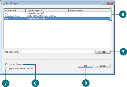
The action appears, using the onclick event as the default.
To change the trigger, point to the event, click the list arrow, and then select the event you want.
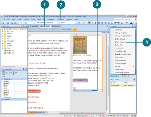
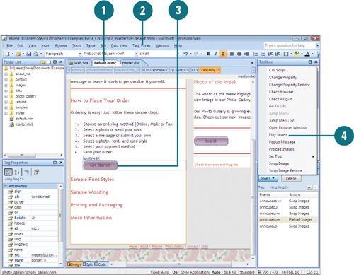
Checking for Browsers and Plug-ins
Web browser functionally vary depending on your version and don’t always display information and execute HTML code in the same way, so you may want to check a visitor’s browser before displaying a Web page. The Check Browser behavior allows you to detect a user’s Web browser and version and then redirect the visitor to another page. You can check for versions of Internet Explorer, Netscape Navigator, Opera, AOL, WebTV, AOL TV, and HotJava. If you want to check for FireFox (Mozilla 5.0), use Netscape Navigator for the browser type and a version later than 5. In addition to checking browsers, you can also check for plug-ins. The Check Plug-in behavior allows you to check for the existence of Adobe Flash, Apply QuickTime, RealNetworks RealPlayer, Adobe Shockwave, and Microsoft Windows Media Player, and then redirect a visitor.
Check the Browser Version
Open and display the Web page you want to use.
If necessary, click the Task Panes or Format menu, and then click Behaviors to display the Behaviors task pane.
Click the element you want to add a behavior.
In the Behaviors task pane, click Insert, and then click Check Browser.
Use the list arrows to select the browser type and version you want.
Select the Go to URL check box, and then enter the URL or use the Browse button for use with the specified browser.
Select the Go to URL check box, and then enter the URL or use the Browse button for use with all other browsers.
Click OK.
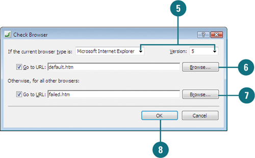
The action appears, using the onclick event as the default.
To change the trigger, point to the event, click the list arrow, and then select the event you want.
Check for Plug-ins
Open and display the Web page you want to use.
If necessary, click the Task Panes or Format menu, and then click Behaviors to display the Behaviors task pane.
Click the element you want to add a behavior.
In the Behaviors task pane, click Insert, and then click Check Plug-in.
Use the list arrow to select the plug-in type you want.
Select the Go to URL check box, and then enter the URL or use the Browse button for use with the specified plug-in.
Select the Go to URL check box, and then enter the URL or use the Browse button for use with all other plug-ins.
Click OK.

The action appears, using the onmouseover event as the default.
To change the trigger, point to the event, click the list arrow, and then select the event you want.
Changing Element Properties
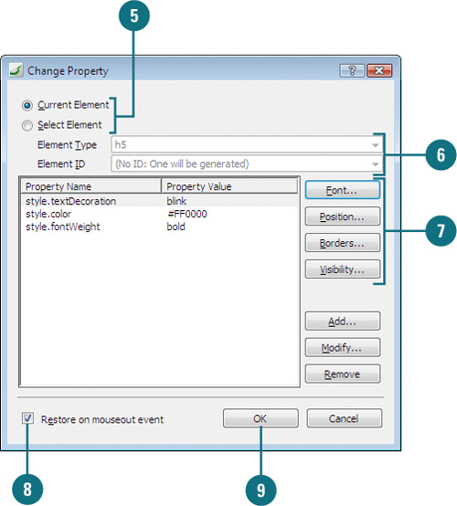
The Change Property behavior allows you to change properties, such a font styles, borders or visibility, for an element on a Web page. The Change Property behavior is useful for adding interactivity to a Web page. For example, you can have the Change Property behavior display a text description or link address when a user points to a picture on a page. Along with the Change Property behavior, you can also use the Change Property Restore behavior, which restores the most recent property changes made by the Change Property behavior. When you use the Change Property Restore behavior, Expression Web displays a message dialog box acknowledging the use of the behavior. You can double-click the behavior to display a list of properties being restored.
Use the Change Property Behavior
Open and display the Web page you want to use.
If necessary, click the Task Panes or Format menu, and then click Behaviors to display the Behaviors task pane.
Click the element you want to add a behavior.
In the Behaviors task pane, click Insert, and then click Change Property.
A dialog box appears, allowing you to set the details of the action.
Click the Current Element or Select Element option.
If you selected the Select Element option, click the Element Type list arrow, select a type, click the Element ID list arrow, and then select an ID.
Use the following property buttons to change the property you want.
- Font. Click Font, use the Font and Character Spacing tabs to select the font, font size, font style you want, and then click OK.
- Position. Click Position, select the wrapping and positioning options you want, and then click OK.
- Border and Shading. Click Borders, use the Borders and Shading tabs to select the options you want, and then click OK.
- Visibility. Click Visibility, click the Inherit, Visible, or Hidden option, and then click OK.
To not insert a Change Property Restore behavior, clear the Restore on mouseout event check box.
Click OK.
To change the trigger, point to the event, click the list arrow, and then select the event you want.
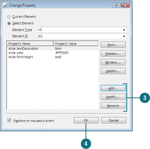
Add, Modify, or Remove Properties
Open and display the Web page with the behaviors.
In the Behaviors task pane, double-click the change property behavior you want to edit.
Perform any of the following options.
- Add. Click Add, type a property name and value, and then click OK.
- Modify. Select the property, click Modify, change the property name and value, and then click OK.
- Remove. Select the property, and then click Remove.
Click OK.
Opening Another Browser Window
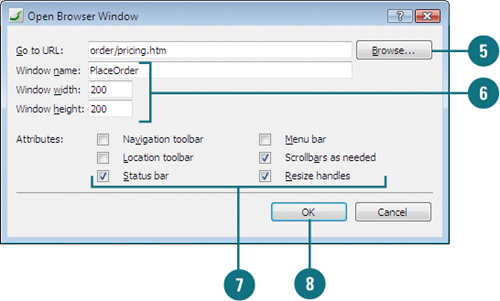
The Open Browser behavior allows you to set a hyperlink to open in a new browser window. When you use the Open Browser behavior, you need to specify the URL you want to open in the new browser window and any window attributes, such as width, height, navigation and location toolbar, status bar, menu bar, scrollbar as needed and resize handles. If you want to use this behavior with text, you can also use the Change Property and Change Property Restore behaviors to change the pointer to a hand when visitors hover over you text link.
Open Another Browser Window
Open and display the Web page you want to use.
If necessary, click the Task Panes or Format menu, and then click Behaviors to display the Behaviors task pane.
Click the element you want to add a behavior; typically link text or graphic.
In the Behaviors task pane, click Insert, and then click Open Browser Window.
Type the URL or click Browse, select the URL from the Edit Hyperlink dialog box, and then click OK.
Enter a window name and size (width and height in pixels). The window name is used in the behavior script, so it cannot have any spaces.
Select the check boxes with the window attributes you want to use; it’s recommended to keep the defaults: Status bar, Scrollbars as needed, and Resize handles.
Click OK.
The action appears, using the onclick event as the default.
To change the trigger, point to the event, click the list arrow, and then select the event you want.
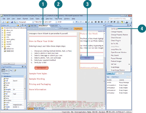
Executing a Script
The Call Script behavior runs a line of script when an event occurs. The behavior only runs one line of script, which means you can execute a single line of code or a procedure that calls a section of code. To use the Call Script behavior, you need JavaScript experience and coding knowledge, which is outside the scope of this book.
Use the Call Script Behavior
Open and display the Web page you want to use.
If necessary, click the Task Panes or Format menu, and then click Behaviors to display the Behaviors task pane.
Click the element you want to add a behavior.
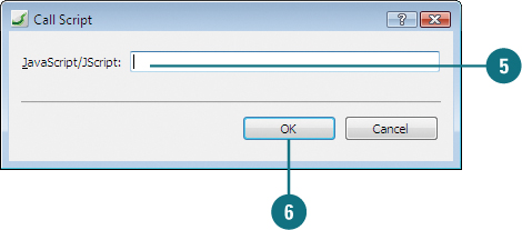
In the Behaviors task pane, click Insert, and then click Call Script.
Type the line of script you want to run.
Click OK.
To change the trigger, point to the event, click the list arrow, and then select the event you want.
Playing a Sound
The Play Sound behavior allows you to play a sound when an event occurs. With the Play Sound behavior, you can play a variety of sounds including WAV (.wav), MIDI (.mid), RealAudio (.ram or .ra), AIFF sound (.aif, .aifc, or .aiff), and AU sound (.au or .snd).
Open Another Browser Window
Open and display the Web page you want to use.
If necessary, click the Task Panes or Format menu, and then click Behaviors to display the Behaviors task pane.
Click the element you want to add a behavior.
In the Behaviors task pane, click Insert, and then click Play Sound.
Click Browse, locate and select the sound file, and then click Open.
Click OK.
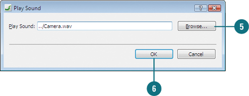
The action appears, using the onchange event as the default.
To change the trigger, point to the event, click the list arrow, and then select the event you want.
Playing Multimedia
You may be wondering why playing multimedia, such as Adobe Flash movies, Windows media, and other common video formats are not addressed in this book. Expression Web doesn’t include the ability to insert these types of multimedia formats using menu commands in this version. Although, I’m sure third-party developers are creating tools to insert multimedia formats as you read this page. However, you can still play multimedia formats in Expression Web. You just need to do it manually in HTML. The best way to do it is to check for documentation and development tools at the Web site of the video format developer. You can also look for content updates at www.perspection.com.
Windows Media Video and Audio
Windows Media Video (WMV) or Windows Media Audio (WMA) are standard video and audio formats that you can create using Windows Movie Maker and play using Windows Media Player. To play these formats in Expression Web, search for embedding Windows media in the Windows Media Knowledge Center at www.microsoft.com.
Adobe Flash
Adobe Flash movies are vector-based animations and media that you can scale, rotate, and modify without losing any degree of sharpness or quality. Flash movies are especially suited for playback over the Web because they have a small file size, which loads and plays quickly. To play Flash movies in Expression Web, search for flash detection in DevNet at www.adobe.com.
Other Multimedia Formats
For other common video formats, such as Motion Picture Experts Group (MPEG), Apple QuickTime (MOV), and RealVideo (RAM), search the related company Web site for documentation.