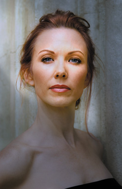
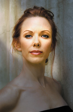
Light Changes Ahead
Up to this point, you have made significant modifications to Challen’s image, but their appearance is subtle. From here on, they will become more dramatic. By selectively removing such issues as color cast, which would otherwise be problematic throughout the image editing process, you have created an image with which you can more easily work. In other words, you have been working from global to granular.
Now it is time to start building the “lighting” of this image. Because the changes you make to an image must be transparent to the viewer, you must pay attention to the way light manifests itself in the real world. Light has a direction, and so do any shadows it casts. Fail to respect that physical law, and the result will look like those mass-produced paintings of snow-covered cottages with light shining from 17 different places at once.
You will start by using a Curves adjustment layer to create a full tonal range from light to dark. Then you will use the Render Lighting Effects filter in Photoshop. This filter is likely one of the most forgotten, yet one of the most powerful and useful, pieces of software within Photoshop, and I am going to show you the magic that you can do with it.
Step 1: Creating Light-to-Dark Using Curves Adjustment Layers
By now you can see that all of your work on this image is cumulative, one modification building on the last. This next step in the lighting process addresses the light-to-dark aspect of how the eye sees an image.
As a practical matter, it makes sense to tackle the DOF problem, as you have just done, before manipulating light-to-dark. Because it is a lot easier to see the effect of DOF while the image is light, you can use aspects of the warming tendencies of interpolation artifacting to work to your advantage (warm colors appear to move forward), and creating the illusion of DOF makes the lighting look realistic.
The first step in “lighting” the image in Photoshop is to use the Curves adjustment layer to get 90% of the correction you seek. This allows you to work in the ProPhoto color space and in 16-bit, a less destructive, less artifact producing way to work than in 8-bit, a smaller color space. Also, by using a Curves adjustment lighting layer, you can make better decisions on how to place your “lights” when you later use the Render Lighting Effects filter to complete the remaining 10% of the correction.
Because the Render Lighting Effects filter does not work in 16-bit (something I hope that Adobe will address in the next version of Photoshop), you will have to change both the bit depth and the color space when you use it. I will soon discuss this in depth.
Removing Everything That Is Not
- Duplicate the MASTER_2 layer and make it into a Smart Filter layer (Filter > Convert to Smart Filters).
- Create a Curves adjustment layer above the MASTER_2 layer. (You can create one by going either to the Adjustments Panel if you are using CS4 or above, or at the bottom of the Layers panel, which you can do in every version of Photoshop that is Adjustment layer capable.)
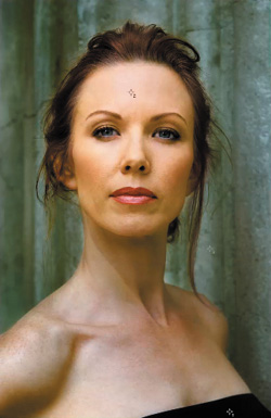
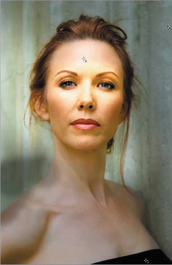
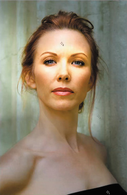
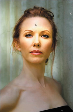
- Click the center point of the line that runs across the Curves dialog box and drag the point diagonally down. (Do not flatten or clip the bottom part of the curve.) Select the Luminosity blend mode (Figures 1.20.1 and 1.20.2). This is what the image looked like before the Curves adjustment (Figure 1.20.3), and this is after (Figure 1.20.4). Figure 1.20.5 shows the image after switching blend modes.
Figure 1.20.1. Placing a point on the curve
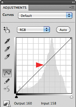
Figure 1.20.2. Moving the curve downward
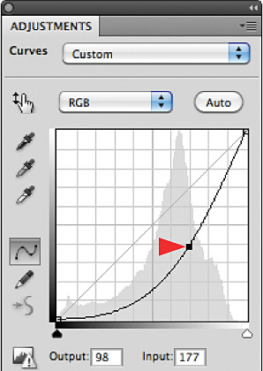
Figure 1.20.3. Before the Curves adjustment
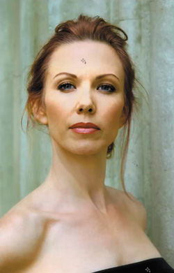
Figure 1.20.4. After the Curves adjustment
Figure 1.20.5. The image after switching the blend mode to Luminosity

Unlike the Normal blend mode, the Luminosity blend mode deals only with the light-to-dark aspect, or luminance, of the image and leaves the colors alone. When you darken an image in the Normal blend mode, you increase color saturation, which is something to avoid since you just spent a lot of time addressing the file’s color issues.
- Name the Curves adjustment layer L_2_D_LUM for Light-to-Dark Luminosity.
- Turn on the L2D image map (Figure 1.20.6) and make sure that both the Curves adjustment layer and the layer mask attached to it are active. Click on the D key to set the foreground and background colors to their defaults (foreground is white and background is black), and then click the X key to switch them. Select the Brush tool (keyboard command B) and set the brush size to 300 pixels at 100% opacity (keyboard command 0). Paint in the area of Challen’s face that you want lightest (Figure 1.20.7).
Figure 1.20.6. The L2D image map with the Curves adjustment active
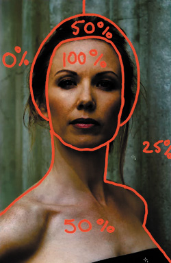
Figure 1.20.7. Painting in Challen’s face
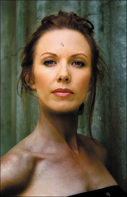
Set the brush opacity to 50% (keyboard command 5) and repeat the process with her hair (Figure 1.20.8). Bring up the Fade effect dialog box (Command + Option + Shift + F / Control + Alt + Shift + F), bring the opacity to 48%, and click OK. Compare the image before (Figure 1.20.3) and after (Figure 1.20.9).
Figure 1.20.8. Brushing in her hair
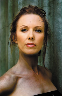
Figure 1.20.3. Before the Curves adjustment
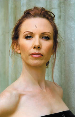
Figure 1.20.9. After the brushwork
- Making sure that your brush opacity is still at 50% and your brush size is still at 300 pixels, start to brush in her neck and torso. Compare the image before (Figure 1.20.9) and after (Figure 1.20.10).
Figure 1.20.9. Before brushing in her torso
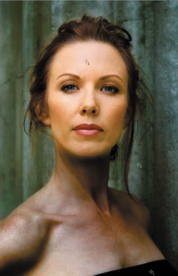
Figure 1.20.10. After brushing in her torso
- Increase your brush size to 800 pixels (the left bracket key) and, with the brush opacity still set at 50%, brush in the right side of the background wall. Follow the image map. Start at the top of her head and brush the wall around her moving to the bottom right of her shoulder. Bring up the Fade effect dialog box (Command + Option + Shift + F / Control + Alt + Shift + F), lower the opacity to 31%, and click OK. Look at the image after the Fade effect (Figure 1.20.11).
Figure 1.20.11. The image after all brushwork on the L2D Curves adjustment
- Go back and tighten up the layer mask using the techniques that you have already learned. Compare the layer mask before fine tuning (Figure 1.20.12) and after (Figure 1.20.13).
Figure 1.20.12. The initial layer mask
Figure 1.20.13. The layer mask cleaned up
- Save the image.
As you move through the next phase of the lighting correction, you will slowly lower the opacity of the light-to-dark layer so that, when you are done, it may not be at 100%. The quickest way to get an idea of what the completed image may look like is to use a Curves adjustment layer, a technique with which you should now be familiar. Using Curves adjustment layers is probably the least destructive way to effect adjustments and gives you the greatest control over color and luminosity, both at the same time. So if you have been using Levels, I suggest you change.
You are now ready to move into Render Lighting Effects.
Before moving on, compare the image after adding the light-to-dark adjustments (Figure 1.20.5) and then after the final brushwork and layer mask fine tuning (Figure 1.20.11).
Figure 1.20.5. The adjustment without fine tuning
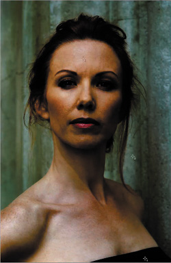
Figure 1.20.11. After fine tuning the layer mask
Step 2: Lighting the Image with Render > Lighting Effects
Every time you do something in Photoshop, you are dumping or clipping data and creating artifacts. If you shoot in the RAW file format, the original file contains the least artifacted, cleanest data it will ever have.
Because artifacts are cumulative, and may be multiplicative, your workflow should employ an approach that minimizes them and affords you an exit strategy. As I have already discussed, two ways to minimize artifacts is to do as much work as possible in 16-bit and to work in the ProPhoto color space because of its massive size. The next corrections to be done on this image, however, require that you convert the file to 8-bit. The payoff? Whatever artifacts you have created will be lost or minimized in the conversion process.
You will first convert the file from ProPhoto RGB to Adobe RGB because ProPhoto does not play as well in 8-bit as does Adobe RGB. Then you will go from 16-bit to 8-bit. (You want to do the color space conversion in the bigger color space first, and then to go to the smaller bit depth so as to minimize any color artifacts that might occur in the conversion process.)
Converting Color Spaces and Bit Depths
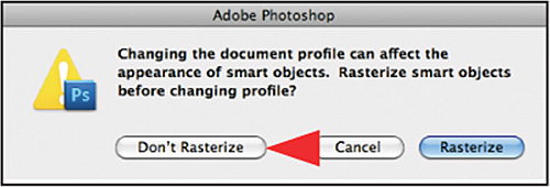
- Go to Edit > Convert to Profile (Figure 1.21.1) to get that dialog box and click on the Destination space (Figure 1.21.2). Once the Destination Profile list comes up, select Adobe RGB 1998 (Figure 1.21.3) and Relative Colormetric as the rendering intent. Turn on Black Point Compensation (Figure 1.21.4) and click OK. When the Changing Document Profile dialog box comes up, select Don’t Rasterize (Figure 1.21.5). You will see that nothing has changed. (That is a good thing.)
Figure 1.21.1.
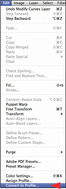
Figure 1.21.2.
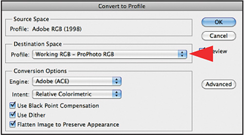
Figure 1.21.3.
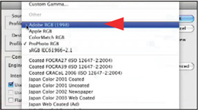
Figure 1.21.4.
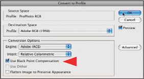
Figure 1.21.5.
- Press Save As and rename the file (Command + Shift + S / Control + Shift + S). Just change the name so that it ends with 8_ bit just before the file type (.tif, .psd, etc.), e.g., SHIBUMI_16_BIT.psd would become SHIBUMI_8_BIT.psd. This way, you always have an exit strategy.
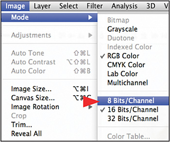
- Go to Image > Mode > 8 Bits/Channel (Figure 1.21.6).
Figure 1.21.6.
- Save the file.
You have converted the file’s color space and bit depth. It is now time to start working with the Render Lighting Effects plug-in.
Using the Render Lighting Effects Filter
You are going to work with the Render Lighting Effects filter to make the image look as if you had used the appropriate lighting when the image was first captured. You will light the background, and then the subject, using key lights and then fill light. Once the lights are placed, you will adjust their intensity.
Because this is a filter that you will use in almost every chapter of this book, you should understand how it is set up before you begin.
The Render Lighting Effects Dialog Box
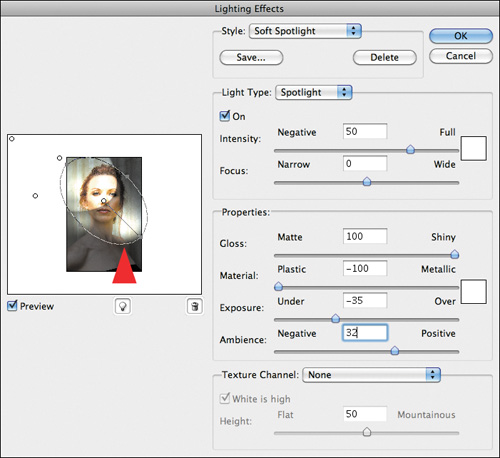
On the right side of the dialog box (Figure 1.21.8), at the top, is the Style pull-down menu. This menu contains 16 presets—ranging from the default, which is Spotlight, to multiple lights like Five Down and colored lighting effects like RGB. The list ends with Triple Spot.
Figure 1.21.8. The Render Lighting Effects dialog box
Note
The styles, such as Soft Spotlight and Soft Omni, are presets that use specific settings. Interestingly, re-creating those settings to get the same effect requires a very deft touch. I have found it is better to start with a preset and then adjust it, or add more lights, as each image requires.
Following the Style pull-down menu is the Light Type menu, the two of which work in tandem. In the Light Type menu, you can choose three types of light: Spotlight, Omni, and Directional.
Note
The best way to conceptualize these three types of light is this:
Spotlight throws an elliptical beam whose direction, focus, intensity, and size you can control and whose intensity diminishes as the light gets farther from the source.
Omni is omni-directional light; the type of light you see when there is a bare bulb hanging over a poker table.
Directional is a distant light with parallel rays. (Like sunlight, the light does not diffuse over distance, so the light angle remains constant.)
In general, I have found that using Omni or Spotlight creates studio lighting effects that most closely replicate a believable probability. Usually, you either want a downwardly directed light source (Omni) or you want an angled beam (Spotlight). However, when I am trying replicate the look and feel of natural sunlight, Directional gives a result that looks like sun shining through a window.
In addition to the pull-down menu, this dialog box has two sliders:
Intensity moves from Negative to Full in order to increase or decrease the brightness of the light source that you adjust.
Focus (used only with the Spotlight option) determines how much of the elliptical area is filled with light. (When the Spotlight area is round, 50% fills half the diameter.) When the Spotlight area is elliptical, the center of the “light” lies halfway along the line from the center to the light source, and the value determines how much of that area is filled. This slider defines the width of the light that you adjust.
Moving down the right side of the dialog box, the next area of the Render Lighting Effects dialog box is the Properties section, which has four sliders.
Gloss ranges from Matte to Shiny. The Gloss slider determines the apparent reflectivity of the surface onto which you apply the filter. Matte means that it is less reflective and Shiny means that it is more.
Material ranges from Plastic to Metallic. The Material slider determines what will be reflected, the light or the surface. Plastic uses the light’s color in the reflection, while Metallic uses the object’s.
The last two sliders, Exposure and Ambience, are properties of the surface upon which your created light is falling.
Exposure addresses the general brightness of the image and determines how bright or dark the objects to which you apply the Render Lighting Effects filter will be.
Ambience determines how much lighting exists in the scene other than your added light, i.e., how much light is allowed into the background. Another way to think about Ambience is that it governs the light outside of the ellipse or circle.
Note
For both the Light Type and the Exposure menus, there is a white box located to the right of the sliders. If you double-click on a swatch, you will open the Color Picker. This allows you to change the color of either the light source or background light (Light Type), as well as of the ambient light (Properties). You will use this in Chapter 2.
The Light Color box is found in both the Light Type and Properties parts of the Render Lighting Effects dialog box. When you double-click on this box, you bring up the Color Picker as described above.
To change the position of a light, click on the center dot of the light and drag it to the desired position.
Change the size or shape of a light by clicking on one of its four anchor points, or dots, and dragging them to bring about your desired change. (You can also rotate the position of the light by clicking on one of these points and rotating the light in the direction of choice.)
To create a new light, click on the light bulb (located centrally beneath the image preview), and drag it to the area that you want. Then, in the Light type pull-down menu, select either Spotlight, Omni, or Directional.
To make a light active, click on the center point of the light on which you want to work.
To remove a light, make the light you want to remove active and drag it to the Trash Can icon, located next to the Create a New Light icon (the light bulb).
To duplicate a light, Option- / Alt-click on the center of the light and drag the new light to the desired position. Remember this because it allows you to match lighting.
Let There Be Render Light
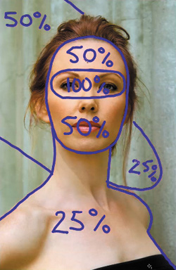
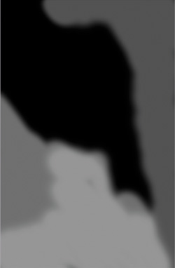
Look at the lighting image map (Figure 1.22).
Figure 1.22. Lighting image map

You want to light Challen’s eyes and face with key lights, and then add light to the background. The workflow sequence is to, first, light her eyes and face on one layer, and then light the background on another.
Placing the Key Lights
1. Turn off the L_2_D_LUM Curves adjustment layer (click the eyeball).
2. Duplicate the MASTER_ 2 layer, make it a Smart Filter. Then duplicate the layer twice (Command + J / Control + J). The result should be three Smart Filter layers, one named MASTER_ 2 copy, MASTER_ 2copy 2 and MASTER_ 2 copy3. Turn off MASTER_ 2 copy3. Change the name of MASTER_ 2copy 2 to KEY_LIGHT and MASTER_ 2 copy to BG_LIGHT.
Note
Smart Filters take some time to create, but no time to duplicate or discard. Because you can discard extra layers when you are done, it is a good idea to make one more than you anticipate needing.
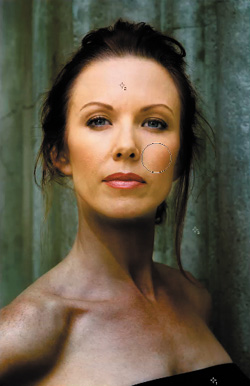
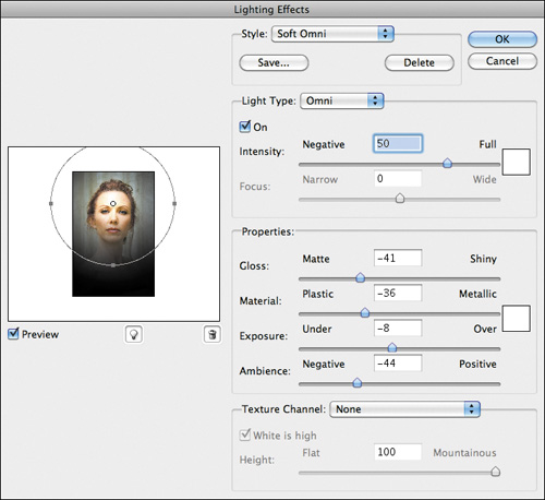
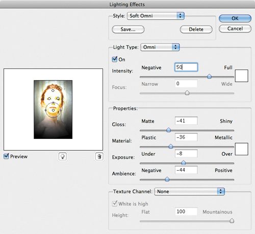
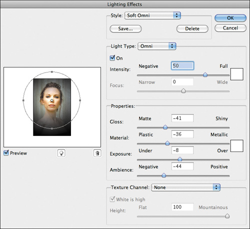
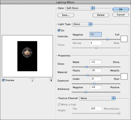
3. Make the KEY_LIGHT layer the active one, and go to Filter > Render > Lighting Effects. In the Style menu, when the Render Lighting Effects dialog box opens from the Style pull-down, select Soft Omni (Figure 1.22.1). Click the center point of this light, and move it so that it is between the top of her left eyelid and her eyebrow (Figure 1.22.2). Click on the outer left anchor point and reduce the circle until its outer edge is on the outer part of the subject’s hair (Figure 1.22.3).
Figure 1.22.1. Select Soft Omni
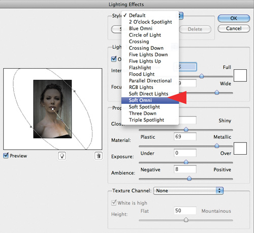
Figure 1.22.2. Move the light above her left eye
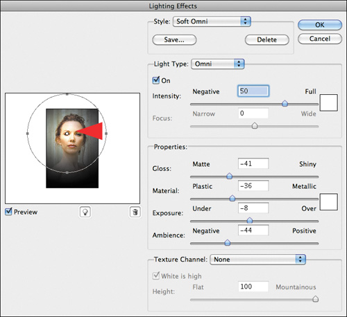
Figure 1.22.3. Reduce the light size
Note
You should use Soft Omni instead of Soft Spotlight so that you can obtain a softer, more diffused light that is not directional. Also, you want the light to appear as if it is in front of, and slightly above, the subject.
Note
If you have a version of Photoshop that does not allow you to make Smart Filters, make the light look the way you want it to and save it so that you can come back and adjust it should you need to. One of the problems with Render Lighting Effects is that its UI is very small, so it is difficult see what you are doing and you may have to tweak it a little later.
4. Holding down the Option / Alt key, click on the center point of the light you have just placed to duplicate it, and drag it just above the model’s right eye and just below her eyebrow (Figure 1.22.4). You now have two identical lights, with the same intensity. Once again, holding down the Option / Alt key, click on the center point of the light and move it to the top, middle of her forehead. Again, hold down the Option / Alt key, click on the center point of the light, and move it to just below the center of her lower lip. The image now has five lights (Figure 1.22.5).
Figure 1.22.4. Duplicate the light and place it above her right eye

Figure 1.22.5. All five lights on the model
Now that you have created and placed the lights, you can define a more exact placement, fine tune their size, and set their intensity. For example, when you first placed the light on this image, the light was on her forehead. It was then moved closer to her scalp line and to the left, and the lower light was moved closer to her chin. Once you have placed the lights where you want them, you can move to the next step: sizing the lights.
5. Click on the upper anchor point of the forehead light, and move it so that it is just inside her upper hairline (Figure 1.22.6). Click on the lower anchor point of the light on Challen’s chin and move it to just under her chin (Figure 1.22.7).
Figure 1.22.6. Moving her forehead light
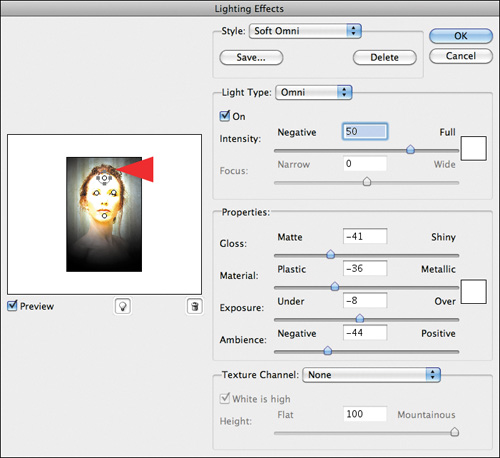
Figure 1.22.7. Moving a light to her chin
Once the lights have been placed and sized, it is time to adjust their intensity.
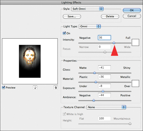
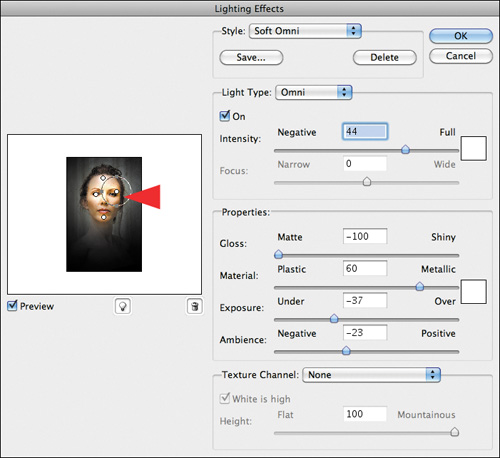
6. Click on the center anchor point of the light in Challen’s left eye to make it active. Then, click on the Intensity slider and move it from 50 to 44 (Figure 1.22.8). Click on the center anchor point of the light in Challen’s right eye to make it active. Click on the Intensity slider and change it from 50 to 44 by just typing 44.
Figure 1.22.8. Lower the Intensity to 44

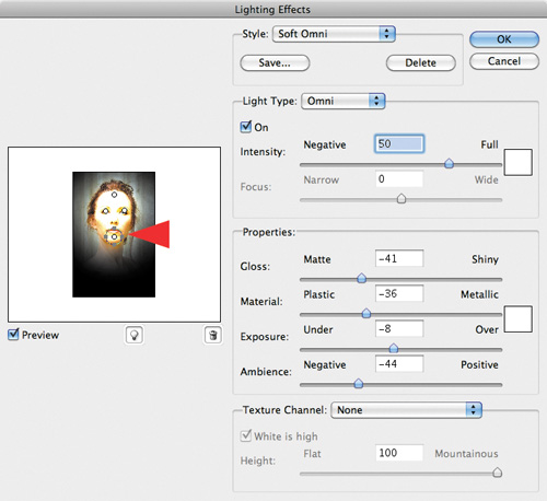
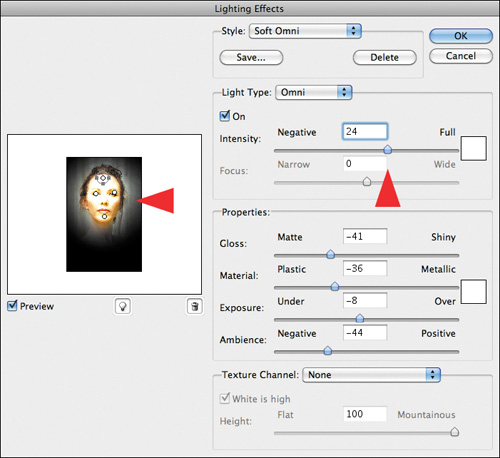
7. Click on the center anchor point of the light on Challen’s forehead to make it active. Click on the Intensity slider and move it from 50 to 24. Notice how the areas influenced by the individual lights are getting smaller while the background is getting darker (Figure 1.22.9).
Figure 1.22.9. Lower the Intensity to 24
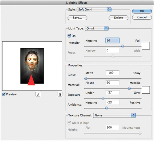
8. Click on the center anchor point of her chin light to make it active. Click on the Intensity slider and move it from 50 to 36 (Figure 1.22.10).
Figure 1.22.10. Lower the Intensity to 36
Creating the Quality of the Key Lights
With the lights in place, it is time to blend and shape them (working within the Properties dialog box) so that they aesthetically please you. You will do this by learning how to, for lack of a better word, dance with the properties metallic, material, and gloss.
Up to this point, everything you have done to this image has been about its colors, specifically, using its warmer aspects to create the illusion that Challen is further away from the background than she was at the time of capture. However, you did not select the Color Picker to change the color aspect of the light you chose, but I am sure that you would agree that the most important color aspect in this image is the color of the object (the model), not the light.
Therefore, I suggest that you start with the Material slider, which ranges from Plastic to Metallic. As previously described, Plastic uses the light’s color in the reflection, while Metallic uses the object’s.
Once you have found the blend that you like between Plastic and Metallic, move to the Gloss part of the Render Lighting Effects filter. Because you want to create the illusion of a diffused light in front of and above the subject, you will move more to Matte than Shiny.
Then it will be time to manipulate the qualities of Exposure and Ambience.
So let’s dance.
Sliding, Not Tripping, the Light Fantastic
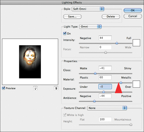
9. Click on the center handle of the right eye light. Click on the Material slider and move it to the right, starting from −36 and ending where it looks best to you. For this image, I chose 60 (Figure 1.22.11).
Figure 1.22.11. Move the Material slider to 60
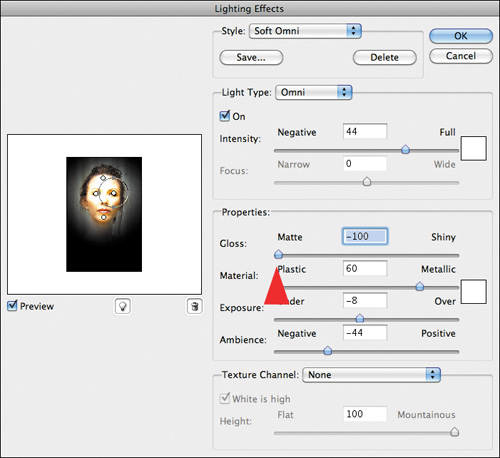
10. Click on the Gloss slider and move it to the left, from −41 to where it looks best to you. For this image, I chose −100 or completely Matte (Figure 1.22.12).
Figure 1.22.12. Move the Gloss slider to −100
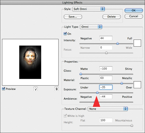
How you will work with the Exposure and Ambience sliders is different from how you used the other sliders. The other sliders worked individually, but Exposure and Ambience work in tandem. This means that you will move one, then the other, and then return to the first to readjust. You may have to repeat this part of the Light Dance several times. Click on the Exposure slider and move it to the left, from −8 to −35 (Figure 1.22.13).
Figure 1.22.13. Move the Exposure slider to −35
11. Click on the Ambience slider and move it to the right, from −44 to −23 (Figure 1.22.14).
Figure 1.22.14. Move the Ambience slider to −23
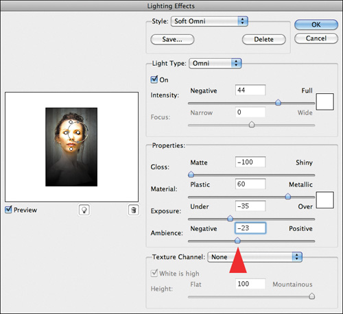
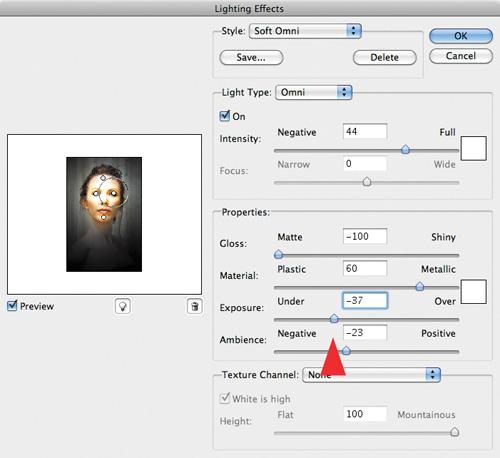
12. Click again on the Exposure slider and move it to the left, from −35 to −37 (Figure 1.22.15).
Figure 1.22.15. Move the Exposure slider to −37
13. Click OK.
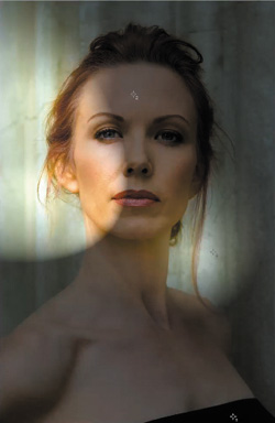
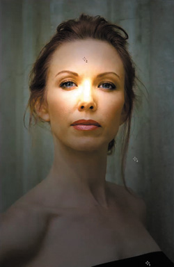
Examine the image with the key light adjustment after using Render Lighting Effects (Figure 1.22.16).
Figure 1.22.16. After the Render Lighting Effects filter
Brushing in the Key Light and Further Refining Light Positions Using Smart Filters
Although this image is not yet optimally lit, you have another piece of magic you can use, one that did not exist when I wrote the first edition of this book. You have Smart Filters. Before Smart Filters existed, once you clicked OK, that was it. With the advent of Smart Filters, you can re-open a filter if you do not like what you have done and this approach fits well into a non-destructive workflow. In addition, you will use a layer mask brush to brush in only the aspects of light you wish to keep from the image as it now exists.
Note
Look to your image map for ideas of the direction you want to take, i.e., which areas need to be brighter or darker than others.
14. Turn on the Lighting image map layer (LIGHTING_IM) (Figure 1.22.17).
Figure 1.22.17. The Lighting image map

15. Create a layer mask on the KEY_LIGHT layer and fill that layer mask with black.
16. Select the Brush tool, and set its opacity to 50% and its brush size to 300 pixels.
17. Making sure that layer mask is active on the KEY_LIGHT layer, brush across Challen’s eye area (the 100% area of the image map) at 50% (Figures 1.22.18 and 1.22.19).
Figure 1.22.18. Brushing in her eyes
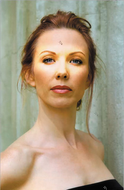
Figure 1.22.19. The layer mask for her eyes
18. Brush in her entire face including the eye area that you have just brushed (Figures 1.22.20 and 1.22.21).
Figure 1.22.20. Brushing in her face
Figure 1.22.21. The layer mask for her face
You have finished the primary brushwork on this layer. Next, you will use Smart Filters to fine tune the lighting. You will do this by re-opening up the Render Lighting Effects filter that you made into a Smart Filter at the beginning of this set of steps.
19. On the KEY_LIGHT layer, double-click on Lighting Effects.
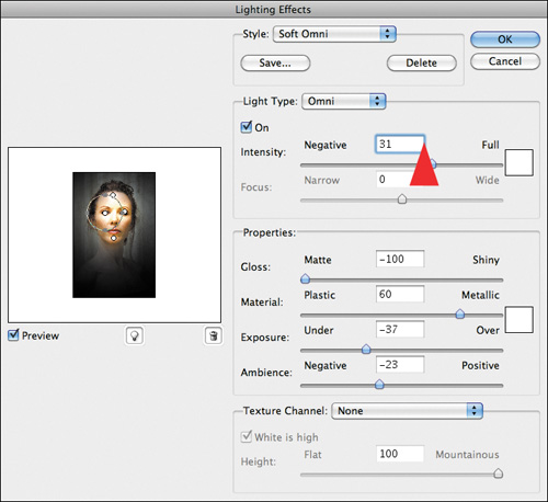
20. Once the Render Lighting Effects dialog box opens, click on the center handle of the left eye to make it active. Click on the Intensity slider and lower the Intensity to 31% (Figure 1.22.22). Then, move the light slightly to the left, just under where her left eyebrow ends.
Figure 1.22.22. Lowering the Intesnity to 31%
21. Click on the center handle of the light in her right eye to make it active. Move the light slightly to the right, under where her right eyebrow ends (Figure 1.22.23).
Figure 1.22.23. Move the light to the right
22. Click on the center handle of her chin light to make it active, and then click on the lower handle and make the light a little bigger (Figure 1.22.24).
Figure 1.22.24. Increase the size of the light
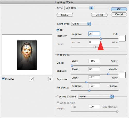
23. Click on the center handle of her forehead light to make it active, and make the light a little bigger (Figure 1.22.25). Bring the Intensity to 27 to restore detail and color (Figure 1.22.26).
Figure 1.22.25. Increase the size of the light
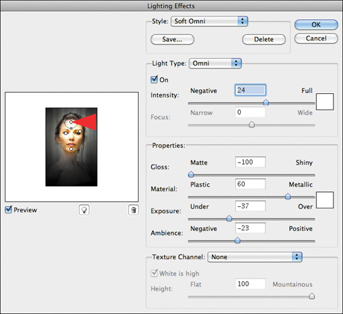
Figure 1.22.26. Lower the Intensity to 27
24. Click OK.
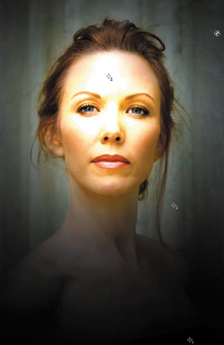
Compare the image before (Figure 1.22.27) and after (Figure 1.22.28)
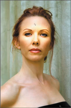
Figure 1.22.27. Before the adjusted Render Lighting Effects
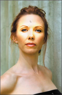
Figure 1.22.28. After the adjusted Render Lighting Effects
You can see that the power of using Smart Filters is that you can re-tweak an image at will. You never have to start from scratch if something does not work the way you envisioned.
There is still a bit of brushwork to do.
Brushing Off the Brush
25. Select the Brush tool, set its opacity to 50%, and its brush size to 300 pixels, making sure that layer mask is active on the KEY_LIGHT layer. Brush in the model’s neck and torso at 50% (Figure 1.22.29). Bring up the Fade effect dialog box, lower it to 31%, and click OK (Figure 1.22.30). Now, tighten up the layer mask using the techniques that you previously learned (Figure 1.22.31).
Figure 1.22.29. Brush in her neck
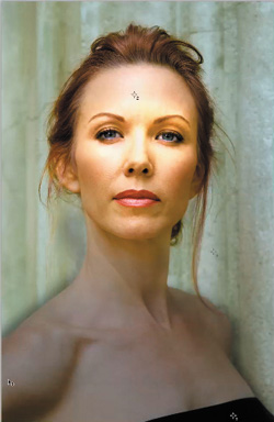
Figure 1.22.30. Fade the brushwork to 31%

Figure 1.22.31. The image after tightening up the layer mask
26. Turn on the L_2_D_LUM Curves adjustment layer (Figure 1.22.32) and lower its opacity to 67%. (Figure 1.22.33).
Figure 1.22.32. Turning on the L_2_D_LUM layer
Figure 1.22.33. The image after lowering the layer opacity to 67%
27. Turn off the L_2_D_LUM Curves adjustment layer.
28. Turn off the KEY_LIGHT Smart Filter layer.
29. Save the file.
Creating the Background Lights
You have placed the key lights and created the light-to-dark visual pathway using the L_2_LUM Curves adjustment layer, so the image is really taking shape. Hopefully, you are impressed with how Smart Filters play a key role in making workflow truly dynamic and in creating a non-destructive exit strategy.
Now it is time to place the background lights. The reason that I had you turn off both the KEY_LIGHT and L_2D_LUM layers is so that, when you affect changes to the placement and qualities of the background lights, you do not change any of the other lights. Once you have made the changes to the background lights, you will blend all of the lights together using opacity and layer masking.
Even more than placing the key lights, placing background lights is a dance. This is because of the subtley that you will want in them and because of the type of light you will use—Soft Spotlight instead of Soft Omni lights. These lights, however, are what will make this image visually unique and interesting.
You will be using Soft Spotlights for the background lights because their elliptical beam appears to diminish with distance from the light source, creating a 3D appearance. Also, you can better control this light’s direction, focus, intensity, edge appearance, and size. On the other hand, Soft Omni lights impart a soft, radial, directional light, perfect for key lighting.
Again, just because you place something, the dance is not over until you make the next master layer. I cannot reinforce this enough—rely on what looks or, more importantly, feels right to you.
- Make the BG_LIGHT Smart Filter layer, the active one, and make sure it is turned on. (Click the eyeball.)
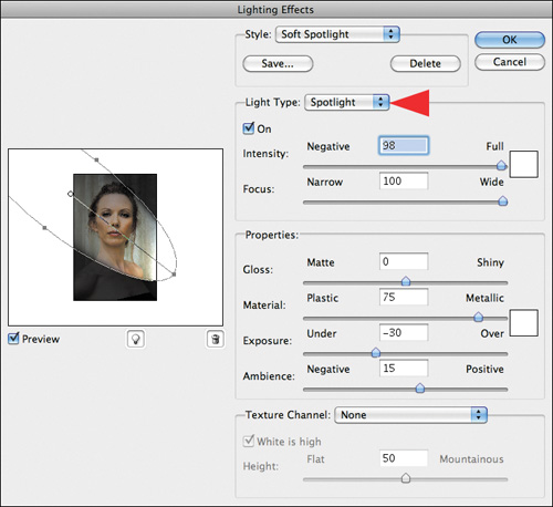
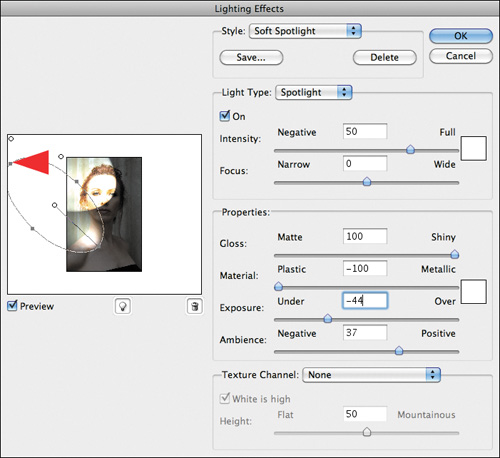
- Go to Filter > Render > Lighting Effects. When the Render Lighting Effects dialog box opens, from the Style pull-down menu, select Soft Spotlight (Figure 1.23.1).
Figure 1.23.1. Select Soft Spotlight
- Click on the center anchor point of the default light in the dialog box and move it to the upper left corner. When you release the light, it will look like Figure 1.23.2.
Figure 1.23.2. Move the light to the upper left
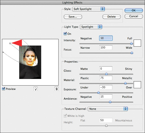
- Because you want this first light to be a fairly large, sweeping one, click on the lower handle located at the left edge of the image preview, and move it a little less than one half inch downward (Figure 1.23.3).
Figure 1.23.3. Adjust the size of the light
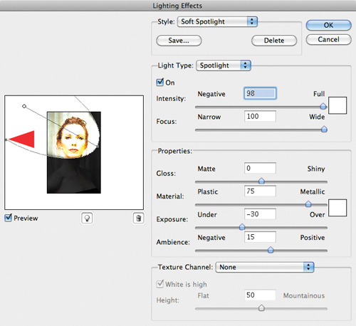
- Click again on the center handle of the default light, and readjust it by moving it higher up in the upper left corner. (Figure 1.23.4).
Figure 1.23.4. Move the light up
Note
Do not worry if the lights that you are placing affect Challen’s face; you are concerned only with the background wall.
The first background light is more or less placed, so it is time to do the initial adjustments to the light qualities that you want this light to possess.
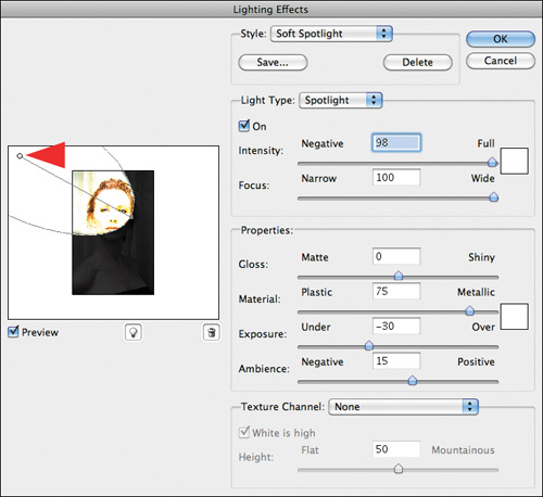
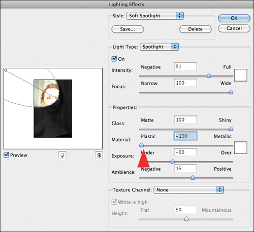
- Click on the Intensity slider and lower it from the default of 98 to 51.
- Click again on the center handle of the default light and readjust it by moving it so that it is almost in the farthest upper left corner. (Figure 1.23.5).
Figure 1.23.5. Move the light further to the upper left
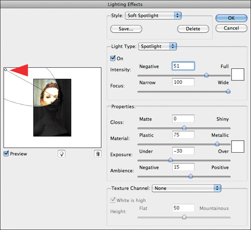
- Click on the Focus slider and lower it from the default of 98 to 59.
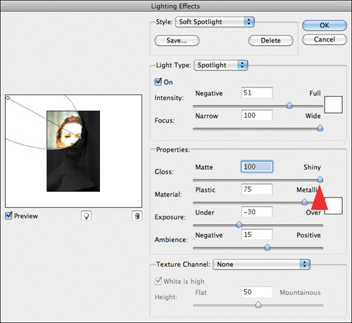
- In the Properties section, move the Gloss slider to Shiny or 100%, so that you get the appearance of a surface reflecting light (Figure 1.23.6).
Figure 1.23.6. Adjust the Gloss slider to 100%
- In the Properties section, move the Materials slider to Plastic or −100% because you want use the light’s color in the reflection (Figure 1.23.7).
Figure 1.23.7. Move the Materials slider to −100%
You now have a diffused, soft light on the background wall, so it is time to address the ambient nature of the light and the exposure. In general, it is best to first set the quality of the light and then to adjust the ambience and exposure. Because Ambience determines how much lighting exists in the scene other than the light you have added, and Exposure addresses the general brightness of the image, set the Ambience first and then adjust the Exposure.
- Click on the Ambience slider, and increase the ambience from 15 to 30.
- Click on the Exposure slider, and decrease the exposure from 30 to −39. The image should now look like Figure 1.23.8.
Figure 1.23.8. Adjust the Exposure slider to −39
You have set the base qualities of the first of the background lights, and it is time to place the second. Remember that this is a dance, so after you place the second light, you will need to come back and adjust the first, because the more lights you add, the brighter everything becomes. Every time you add a light, you need to adjust one or more of the variables of those already placed.
- Click on the light bulb icon (located directly under the image preview), and place it at the top corner of the left side of the image, just outside of the image preview (Figure 1.23.9).
Figure 1.23.9. Add another light to the top corner
- Click on the lower handle and expand the width of the light (Figure 1.23.10).
Figure 1.23.10. Expand the width of the light
- Click on the front handle and expand the length of the light (Figure 1.23.11).
Figure 1.23.11. Expand the length of the light
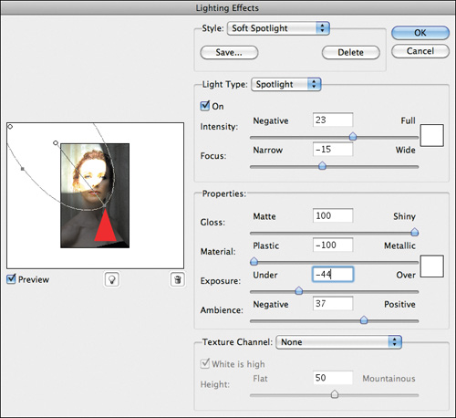
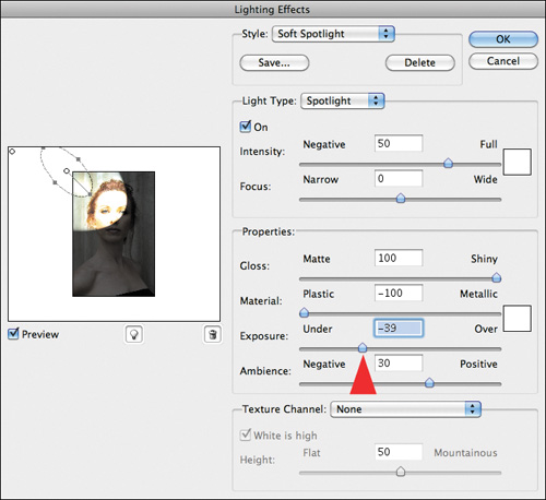
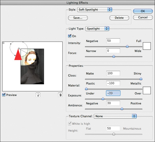
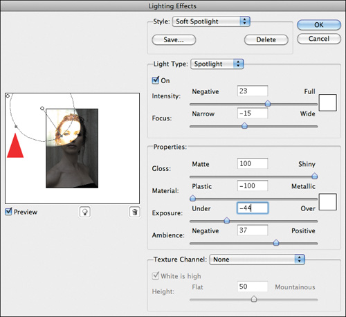
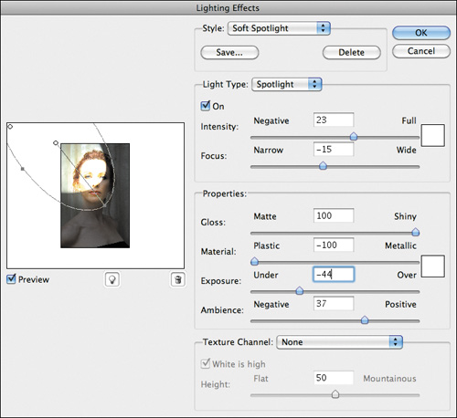
- Lower the intensity to 23, lower the focus to −15, increase the ambience to 37, and set the exposure to −44 (Figure 1.23.12).
Figure 1.23.12. Adjust the sliders
- Click on the center handle of the first light to make it active, and lower the intensity to 41.
- Click on the light bulb icon (located directly under the image preview) to create the third background light, and place it halfway down the left side of the image, just outside of the image preview (Figure 1.23.13).
Figure 1.23.13. Add a third light
- Click on the lower handle and expand the width of the light (Figure 1.23.14).
Figure 1.23.14. Expand the width of the light
- Click on the front handle and expand the length of the light (Figure 1.23.15).
Figure 1.23.15. Expand the length of the light
- Click on the center handle of the third light and reposition it so that the center handle is about a half inch from the edge of the image (Figure 1.23.16).
Figure 1.23.16. Move the light left
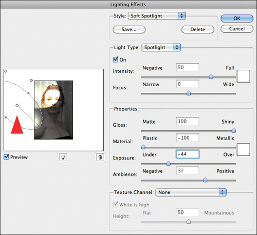
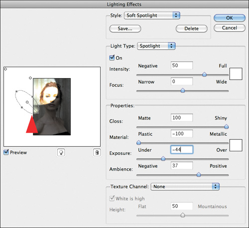
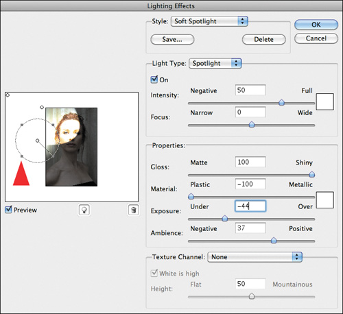
- Lower the intensity of the third light to 23, and lower the focus to −24.
- Click on the center handle of the first light to make it active, and lower the intensity to 27.
- Click on the center handle of the second light to make it active, and lower the exposure to 35.
- Click on the center handle of the third light to make it active, and lower the ambience to 32.
Review the adjustments you just made (Figure 1.23.17).
Figure 1.23.17. Review the adjustments
Note
You may find that you need to reposition the lights as you make these adjustments, because hot and dark spots may appear. What you are trying to create is the appearance of a single streak of light by overlapping one light with another. Just as it would be in real life, when placing multiple lights to create a desired effect, adjustments are often necessary.
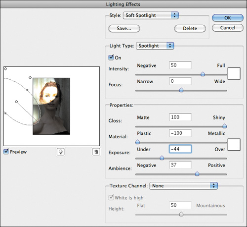
- Click on the light bulb icon (located directly under the image preview) to create the fourth background light, and place it so that the center handle is more or less on the tip of Challen’s nose (Figure 1.23.18).
Figure 1.23.18. Move the light to her nose
- Click on the top handle to expand its width and click on the front handle to expand its length (Figure 1.23.19).
Figure 1.23.19. Expand the light
- Lower the intensity to 29, and the focus to −27.
- Click OK (Figure 1.23.20).
Figure 1.23.20. The image after Render Lighting Effects
- Save the file.
Brushing in the Background Lights
You can see that the light you created on the background wall is quite good, while that on Challen’s face is most unattractive—and this is why I had you create two separate lighting layers. (You pro-acted rather than re-acted.) The filter is limited; it can do only one type of light modification at a time well, i.e. Soft Spotlight or Soft Omni. So, knowing that you had to pro-act, you worked around the limitations of the filter to get the desired result.
One of the best things about Adobe Photoshop is that, designed into the software, is the ability to make infinite modifications through the use of layers, layer masks, adjustment layers, Smart Filters, and opacity.
- Create a layer mask on the BG_LIGHT layer, make the sure that the foreground color is white and the background is black, make the layer mask active, and fill the layer mask with black.
Note
For all of the layer mask work that you will be doing in this book, it is easier to have both the image and the layer mask visible and active at the same time. To see how to do this, refer to the Unmasking Layer Masks sidebar earlier in this chapter.
- Select the Brush tool, and set the brush opacity to 50%.
- (This step is optional.) Turn on the LIGHTING_IM layer (the lighting image map) (Figure 1.24.1) and brush in the background light.
Figure 1.24.1. Lighting image map
- Brush in the background behind Challen at 50% so that it ends up looking something like this (Figure 1.24.2).
Figure 1.24.2. Brush in the background
- Turn on the KEY_LIGHT layer (Figure 1.24.3).
Figure 1.24.3. The KEY_LIGHT layer on
There are still issues to be addressed. Some background lights need to be replaced, and there is some unappealing overlap of layer masks. Frequently, you cannot see what needs to be done until you have completed the layer mask brushwork. Because you are using Smart Filters and a dynamic workflow, readjusting the image will be fairly easy.
Keeping the idea of working global to granular in mind, do you think the layer mask overlap or the light placement issue is the bigger of the two problems? I believe that the bigger issue is the light placement.
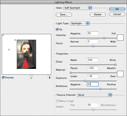
- Double-click on Lighting Effects in the BG_LIGHTS layer to reopen the Render Lighting Effects dialog box.
- Click the center handle of the lower light, and move it slightly downward and forward (Figure 1.24.4).
Figure 1.24.4. Move the light down
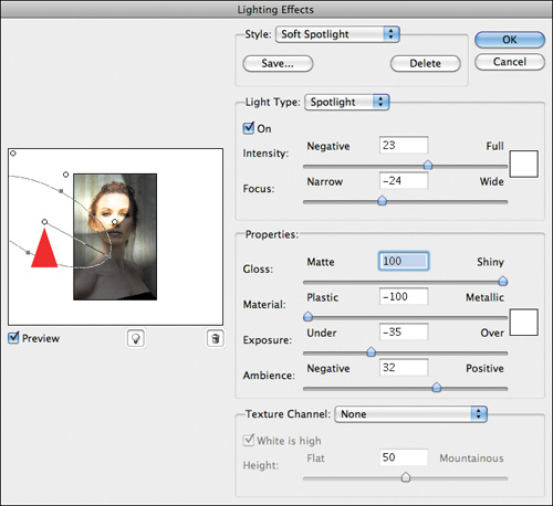
- Click on the lower handle and open it up until the handle touches the edge of the dialog box (Figure 1.24.5). Narrow the focus to −23, and you will notice that the light’s edge is now smoother.
Figure 1.24.5. Widening the light
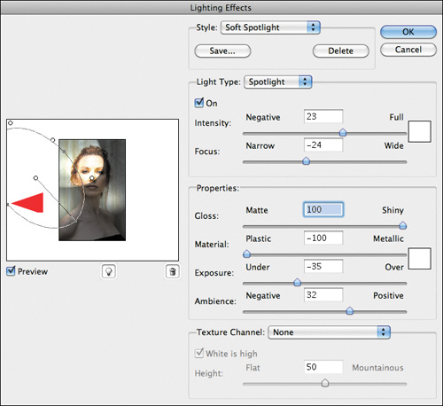
- Click on the second, or middle, light’s center handle to make it active (Figure 1.24.6), narrow the Focus to 20, and click OK.
Figure 1.24.6. Narrow the Focus to 20
You should see a smoother line of light (Figure 1.24.7). Now it is time to refine the layer mask.
Figure 1.24.7. The image after fine tuning the light
- Make the BG_LIGHT layer mask active, select the Brush tool with a brush width of 400 pixels, make the foreground color black and the background white, set the brush opacity to 50%, and brush back the area above Challen’s shoulder. This is what you should have when you are finished (Figure 1.24.8).
Figure 1.24.8. After fine tuning the brushwork
- Double-click on Lighting Effects in the BG_LIGHTS layer to reopen the Render Lighting Effects dialog box.
- Click on the center handle of the upper-most light, move it slightly upward and forward, and increase the focus to −23. Click OK. This is what it should now look like (Figure 1.24.9).
Figure 1.24.9. The image after adjusting the upper-most light
- Save the file.
Traveling at the Speed of Dark
Light thinks it travels faster than anything, but it is wrong. No matter how fast light travels, it finds the darkness has always got there first, and is waiting for it.
—Sir Terry Pratchett
In the known universe, it is true that light moves faster than anything else, but dark is always there first. I think that there is an artistic truth in Sir Terry Pratchett’s words and, in photography, dark is as important as light. Obviously, if an image is evenly lit, it is flat and will not hold anyone’s interest.
In the last set of steps, you created lighting layers with the Render Lighting Effects filter. Now you will create darkening layers, and you will use Render Lighting Effects in a way that the designers of Photoshop never intended, because Render Lighting Effects generates the most beautiful gray blur, a blur whose density and directionality you can control.
There is a fundamental principle here—do not let yourself be limited by the obvious. When you work with any tool, be open to everything that happens when you use that tool. Play with it. You may be surprised that there is more to the tool at hand than the designers of that tool had in mind.
- Make the MASTER_ 2 copy layer active and rename it DRKN_BG.
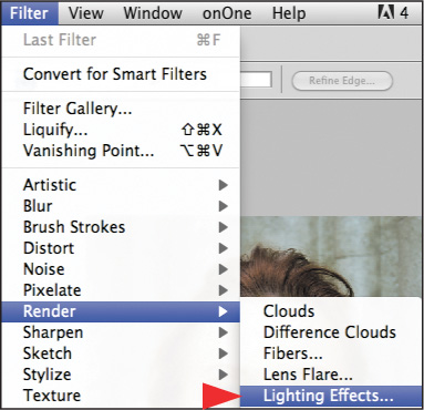
- Select Render > Lighting Effects from the Filter pull-down menu.
- Select Soft Omni from the Style pull-down menu.
- Click on the center handle and move the light from its default position (in the middle of Challen’s forehead) to the middle of her face (Figure 1.25.1).
Figure 1.25.1. Placing a light on her forehead
- Click on the upper handle and move it downward until the outer circle is just above her eyebrows (Figure 1.25.2).
Figure 1.25.2. Shrinking the light
- Click on the Ambience slider and increase it to 9. Click on the Exposure slider and lower it to −13. (Notice how even and nice the gray is in the dialog box.)
- Click on the Intensity slider and lower it to 35 where only the very center of her face is lit.
- Click OK (Figure 1.25.3).
Figure 1.25.3. After the Render Lighting Effects filter
- Create a layer mask, fill it with black, and select the Brush tool with a brush width of 400 pixels and an opacity of 50%. Brush in the area just below the background light and the entirety of Challen’s torso, beginning just under her chin. Compare the image before the brushwork (Figure 1.25.4) and after the brushwork (Figure 1.25.5). Bring up the Fade effect dialog box and fade back to 39% (Figure 1.25.6).
Figure 1.25.4. Before the brushwork
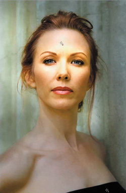
Figure 1.25.5. After the brushwork
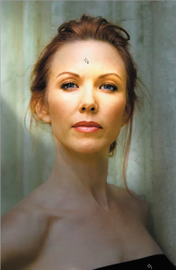
Figure 1.25.6. After fading the brushwork to 39%

- Starting at the top of the image in the middle on the other edge of the background light beam, brush in the background all the way down the right side, including Challen’s torso and neck (Figure 1.25.7). Bring up the Fade effect dialog box and adjust it to 24% (Figure 1.25.8). Look at the final layer mask to see if it needs to be tightened up (Figure 1.25.9).
Figure 1.25.7. Brush in her torso
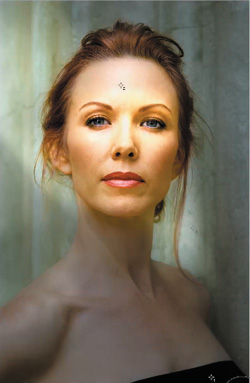
Figure 1.25.8. Fade the brushwork to 24%
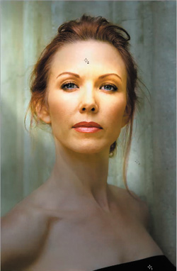
Figure 1.25.9. The resulting layer mask
- Save the file.
Step 3: Bending, Not Breaking, Pixels: Addressing the Sins of Our Artifacts
Whenever you do anything in Photoshop, you alter the data. When the data is altered, some of it is clipped or dropped, and forever lost. That is how artifacts are created. As I have already discussed, artifacting is cumulative, and if you accumulate enough artifacts, you will see them in your image. In other words, you have performed so many manipulations that you have bent the pixels to the point of breaking them.
The goal of anything you do in Photoshop is to make it look like you did not do anything at all. If someone asks, “Did you do something in Photoshop?” you want it to be a question rather than an accusation. You want to use Photoshop as an emery board and not a jackhammer. However, there are times when no amount of care can prevent artifact formation. Step 3 is about how to address blown-out areas (a type of artifacting) that sometimes result from using the Render Lighting Effects filter. The area of the image that is at issue is the key light area in the center of Challen’s face.
If you follow Einstein’s thought that we should make things as simple as possible but no simpler, you could go back to the KEY_LIGHT Smart Filter layer and readjust it. Another approach would be to ask the question, “What don’t I like about this image?” The answer is that her face is blown out and there is a loss of detail when compared to the original image. It is in this answer that you will find your solution. You need to bring back the detail.
You are striving for an efficient workflow, one that allows you to find the quickest way to achieve your goals yet causes the least amount of artifacting. So rather than readjusting all the lights yet again, go back to the base layer that you first started lighting.
- Duplicate the original MASTER_ 2 layer and move it above the DRKN_BG layer. Rename this layer FACE_CORRECT.
- Create a layer mask, and fill it with black. Select the Brush tool, and reduce it to the width of her nose (90 pixels) with the opacity set at 50%.
- Brush in the area of the bridge of her nose and under her left eye. Bring up the Fade effect dialog box and lower it to 40%. The layer mask will look like Figure 1.26.1.
Figure 1.26.1. Brush in her nose
- Next, brush in her forehead above her right eye. Bring up the Fade effect dialog box and lower the opacity to 20%. The layer mask will look like Figure 1.26.2.
Figure 1.26.2. Brush in her forehead and above her right eye
- Turn on the L_2_D_LUM Curves adjustment layer and lower the opacity from 67% to 40%. Compare the image before lowering the opacity (Figure 1.26.3) and after lowering the opacity (Figure 1.26.4).
Figure 1.26.3. Before lowering the opacity
Figure 1.26.4. After lowering the opacity
- Turn off the L_2D_LUM Curves adjustment layer.
- Make the LIGHTING layer set active.
- Create a Master Layer (Command + Option + Shift + E / Control + Alt + Shift + E) and name it MASTER_3.
- Create a new layer set and name it EXPRESSION_CORRECT.
- Drag MASTER _3 into the EXPRESSION_CORRECT layer set folder.
- Save the file.
Now that you have finished lighting the image, you must create a realistic shadow, and add coolness back in. Then you will correct the lens distortion that widens faces, and finally, you will enhance Challen’s expression. You will make her smile.
Plastic Surgery Without a Scalpel: Facial Rearrangements
While there is perhaps a province in which the photograph can tell us nothing more than what we see with our own eyes, there is another in which it proves to us how little our eyes permit us to see.
—Dorothea Lange
The image now resembles what it might have been had it originally been properly lit. Lighting the image before retouching it may seem contrary to the global to granular approach I advocate, because, at first, the biggest issues seem to be with Challen’s face. The reason I had you light it first has to do with one of the pillars of an adaptive, dynamic, non-destructive work flow: alter your image in ways that minimize artifacts.
A lot of what will happen to Challen’s face when you retouch it is dependent on how you light it, specifically, where the shadows will fall and the angle of those shadows. Also, if you were to have originally lit her with real lights, you would be retouching the lit image, not the unlit one. So, retouching her face is your next concern. The more you understand about the interactions of your workflow steps, the more informed your decisions can be throughout the entire process of working with any image.
In this next step, you will deal with issues of lens distortion, specifically, how a lens widens a face. Then you will go on to straightening her nose, as well as some other issues of facial expression and symmetry.
The Importance of Image Maps Every Step of the Way
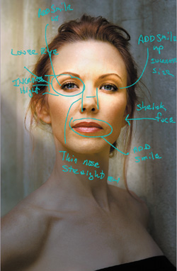
Not only do I use image maps when I meet with a client, I also use them to make notations to myself both before and, sometimes, after I make an adjustment. As I have mentioned before, you do not have to use image maps for every image, but if you want or need to return to an image to make further adjustments, they are invaluable. I started using image maps in my professional portrait work, but I found them useful in my landscapes as well.
This is the image map that I created for Challen’s facial expression correction (Figure 1.27.1). You are going to shrink Challen’s face, thin her nose and even it out, and add smile lines using Liquify. When changing a facial expression, keep in mind that for every action there is a reaction; if you move the edges of her lips upward, aspects of the rest of her face will need to be moved as well.
Figure 1.27.1. Image map for facial correction
Correcting Facial Widening Due to Lens Distortion
1. Select the Marquee tool (keyboard command M). Its default is the rectangular tool, which is the one you want for this step.
2. Starting in the upper left-hand corner of the image, click and drag the Marquee tool to the lower right-hand corner (Figure 1.27.2).
Figure 1.27.2. Use the Marquee tool to select her face
3. Copy the selected area to its own layer (Command + J / Control + J).
4. Name this layer FACE_SHRINK.
5. Bring up the Free Transform box (Command + T / Control + T).
6. Holding the Option key down, click on the middle handle on the left side of the Free Transform box (Figure 1.27.3) and move it towards the center until you have reduced it to 95.9%. Click on the Hand tool to bring up the Apply dialog box and click Apply. Compare the image before (Figure 1.27.4) and after (Figure 1.27.5).
Figure 1.27.3. Move the handle on the left side of the Free Transform box
Figure 1.27.4. Before the Free Transform adjustment

Figure 1.27.5. After the Free Transform adjustment
Note
Holding down the Option key causes the Free Transform box to uniformly expand or shrink. If you do not hold down the Option key, you will affect only the side of the box on which you are working.
7. Create a layer mask and fill it with black.
8. Select the Brush tool, make the foreground color white and the background black, set the opacity to 100%, and the brush width to 100 pixels.
9. Starting at the top right side of Challen’s face, brush in, following the entire outline of her hairline and face. Compare the image before brushwork (Figure 1.27.6) and after brushwork (Figure 1.27.7).
Figure 1.27.6. Before the brushwork
Figure 1.27.7. After the brushwork
Note
Whenever I do this type of retouching, I create a new layer and fill it with white to see if I missed anything or if there are unwanted gaps. If I see any problems, I fix the layer mask using the techniques I discussed previously.
Be aware that even though the layer mask may appear perfect, things you do not see on the screen may show up in the print. The reason for this is that your screen probably has a resolution of 72 dpi and your printer is likely to have one that ranges from 1440 dpi to 5760 dpi. So what you see is not always what you get. By creating a solid white layer (that I can toggle on and off) beneath the area in which I have just done brushwork, I can better see if I missed something and can fix it before I print it.
With just a brush stroke, you have removed the five pounds Challen seemed to have gain because the lens did not treat her fairly. Now that you have reduced her face and made any necessary refinements to the layer mask, it is time to realign and retouch her nose.
Correcting Nose Size Due to Lens Distortion and Adjusting Alignment
10. Make the MASTER_3 layer active.
11. If you have not already done so, bring up the Rulers (Command + R / Control + R). Select the Move tool (keyboard command V), click on the left Ruler, and drag the guide line until it locks in the center of the image. This is the image’s horizontal center (Figure 1.27.8).
Figure 1.27.8. Adding a vertical guide

12. Click on the top Ruler and drag down a guide until it locks in place. This is the image’s vertical center.
13. Click again on the top Ruler and drag a guide down until it lines up just below her right eye. Click on the top Ruler again and drag another guide so that it is just above her left eye brow (Figure 1.27.9).
Figure 1.27.9. Adding horizontal guides

You will notice that her left eye is a bit higher than her right eye and her nose is a little crooked and slightly off center.
14. Select the Marquee tool and, starting just below her left eyebrow, click and drag it to just above the right corner of her mouth.
15. Copy the selection to its own layer (Command + J / Control + J).
16. Name this layer NOSE.
17. Bring up the Free Transform box (Command + T / Control + T).
18. Click on the Reference Point (Figure 1.27.10) and move it to the center tip of her nose, right on the center vertical guide line (Figure 1.27.11).
Figure 1.27.10. Clicking on the Reference Point
Figure 1.27.11. Move the Reference Point to the center of her nose
Note
The Reference Point, also referred to as the Center Point of Rotation (or the Center Anchor Point if you work in Adobe After Effects), is an important and frequently overlooked function within Free Transform. To quote Adobe, “All transforms are performed around a fixed point called the reference point.” Therefore, if you move the Reference Point up, down, or even outside of the Free Transform box, the transformations you do will be done based on where this point is placed. Because of its importance, carefully consider its placement every time you bring up Free Transform.
19. Move the cursor to just outside the Free Transform box until you get rotation arrows. Click and drag the Free Transform box counter clockwise until you have an angle of −1.6, which is enough rotation to straighten out her nose. (Figure 1.27.12)
Figure 1.27.12. Rotate the Free Transform box
20. Holding the Option key down, click on the middle handle on the left side of the Free Transform box and move it towards the center until you have reduced it to 98.4%. Click on the Hand tool to bring up the Apply dialog box and click Apply. Compare the image before (Figure 1.27.13) and after (Figure 1.27.14).
Figure 1.27.13. Before the Free Transform adjustment

Figure 1.27.14. After straightening the nose
21. Create a layer mask, fill it with black, hide the guides (Command + H / Control + H), select the Brush tool, set the opacity to 100%, the brush width to 100 pixels, and brush in just her nose. Compare the image before (Figure 1.27.15) and after straightening the nose (Figure 1.27.16).
Figure 1.27.15. Before
Figure 1.27.16. After

Refining the Eye So the Eyes Have It
You have successfully made Challen’s face a bit more symmetrical and compensated for lens distortion. Now you will even out her eyes, since one appears higher than the other.
- Make the MASTER_3 layer active.
- Select the Marquee tool, and, from slightly above the upper guide line (above her left eye), drag the Marquee tool downward to the center guide. Copy that selection to its own layer (Command + J / Control + J). Here is the selected area (Figure 1.28.1).
Figure 1.28.1. The selected area
- Making sure that the Marquee tool is still active, switch to the Move tool and click with the down arrow key until the bottom of her left eye lines up with the guide that you have set beneath her right eye (Figure 1.28.2).
Figure 1.28.2. Move her left eye
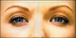
- Next, you will slightly increase her left eye’s vertical height. Select Free Transform (Command + T / Control + T), and type 3% in the Height dialog box. Click on the Hand tool to bring up the Apply dialog box, and click Apply (Figure 1.28.3).
Figure 1.28.3. Apply the Free Transform
- Make the MASTER_3 layer active.
- Select the Marquee tool.
- From slightly above the upper guide line, above her right eye, drag the Marquee tool downward to just above her right ear and copy that selection to its own layer (Command + J / Control + J) (Figure 1.28.4).
Figure 1.28.4. Select her right eye
- Select Free Transform (Command + T / Control + T) and type 3% in the Height dialog box. Click on the Hand tool to bring up the Apply dialog box, click Apply, and select the Move tool. Making sure that the Marquee tool is still active, click on the down arrow key until the bottom of her left eye lines up with the guide. Figure 1.28.5 shows everything you have already done to this image.
Figure 1.28.5. Mover her left eye
- Make active the layer into which you copied her left eye. (It should be above the layer into which you copied her right eye.) Merge the one with her left eye (Command + E / Control + E) into the layer with her right eye and name it EYE_ADJUST.
- If the EYE_ADJUST layer is not already below the NOSE and FACE_SHRINK layers, move it there.
- Create a layer mask, fill it with black, make the foreground color white and the background black, select the Brush tool, set the opacity to 100%, and brush in just the area of both her eyes and her eyebrows (not the bridge of her nose). The areas that you have just brushed in should look like Figure 1.28.6.
Figure 1.28.6. After the brushwork
- Make the MASTER_3 layer active.
- Select the Marquee tool.
- From slightly above the horizontal middle guide line (the guide closest to the bottom of the image and just above the left part of her mouth, drag the Marquee tool downward and copy that selection to its own layer (Command + J / Control + J) (Figure 1.28.7).
Figure 1.28.7. Select her mouth area
- Select Free Transform (Command + T / Control + T) and increase the Height to 103.8%. (This will add fullness to her lips.) In order to make it more symmetrical, rotate her mouth counter-clockwise to an angle of −1.7. Click on the Hand tool to bring up the Apply dialog box, and click Apply.
- Create a layer mask, fill it with black, make the foreground color white and the background black, select the Brush tool, set the opacity to 100%, and brush in the area of just her mouth. Examine the image before (Figure 1.28.8), the brushed in area (Figure 1.28.9), and after (Figure 1.28.10). Name this layer LIPS.
Figure 1.28.8. Before the mouth brushwork
Figure 1.28.9. The brushed in area

Figure 1.28.10. The lips after the brushwork
- Save the file.
Compare the image before (1.28.11) and after (Figure 1.28.12).
Figure 1.28.11. Before
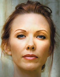
Figure 1.28.12. After
Final Fine Tuning Color Corrections and Adjustments
It is time to move into the final aspects of this image: correcting Challen’s eye color, removing some of the ruddiness from her skin, adding coolness and blueness into the background, adding warmth into her face, and adding a shadow beneath her nose.
Correcting Eye Color with the Vibrance Tool
Begin with the issues of diminished saturation of her eye color. You will do this using one of my favorite filters in Photoshop, the Vibrance tool.
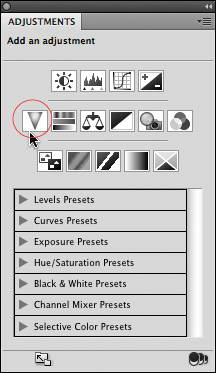
The Vibrance adjustment tool was new to CS4, but has been a part of ACR (Adobe Camera Raw) and Lightroom for a while. It is located in the second row of the Adjustments panel. Vibrance adds color saturation into the colors that need it, while leaving other colors alone. One of the benefits of using it as an alternative to Hue/Saturation is that Vibrance affects blues and greens more than yellows and reds, and because of this, tends to leave skin tones untouched. Because you will be working on eyes that are green/blue, Vibrance is the ideal tool to use.
Note
If you have CS3 or below, there is no Vibrance, so skip to the next section, Removing Ruddiness...
- Select the Vibrance tool from the Adjustment panel. Name this layer EYE_BOOST (Figure 1.29.1).
Figure 1.29.1. Vibrance tool
- Zoom into her left eye.
- Boost the Vibrance slider to 100% and the Saturation slider to 18% (Figure 1.29.2).
Figure 1.29.2. Increase the Vibrance and Saturation sliders
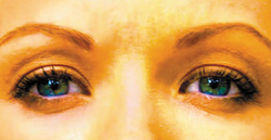
- Fill the Vibrance adjustment layer’s layer mask with black.
- Select the Brush tool, make sure the foreground color is white and the background is black, set the brush opacity to 50%, make the brush size 50 pixels, and brush in the iris and pupil of her left eye.
- Bring up the Fade effect dialog box (Command + Shift + F / Control + Shift + F) and increase it to 70%. Compare the image before the Fade effect (Figure 1.29.3) and after the Fade effect (Figure 1.29.4).
Figure 1.29.3. Before the Fade effect
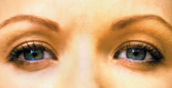
Figure 1.29.4. After the Fade Effect

- Brush the iris and pupil of her right eye, bring up the Fade effect tool, and increase the amount to 70%.
- To further fine tune Challen’s eye color, lower the overall layer opacity to 49%. (Figure 1.29.5).
Figure 1.29.5. Lower the layer opacity to 49%

You have enhanced the greens and blues of her irises while maintaining the whites of her eyes.
Removing Ruddiness from Skin Tone Using a Hue and Saturation Adjustment Layer
Next, you will remove the ruddiness of her skin due to sunburn.
Note
There is a video on youtube.com where you can watch me do this. The URL is http://www.youtube.com/watch?v=5ki3QhJkw-4.
- Create a Hue and Saturation adjustment layer and name it RED_CORRECT.
- Because you want to remove the redness from her skin, select Reds from the Colors pull-down menu (Figure 1.30.1).
Figure 1.30.1. Select the Reds from the Colors pull-down menu
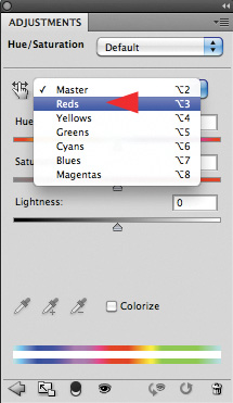
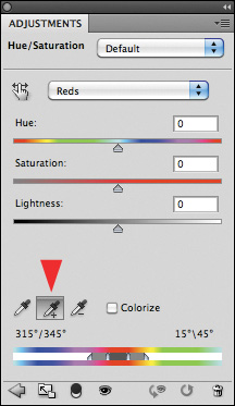
- Select the Positive or Additive Eyedropper correction, which is the default setting when you select a color from the Colors pull-down menu (Figure 1.30.2).
Figure 1.30.2. Select the Positive eyedropper
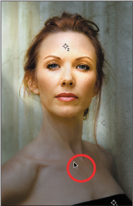
- Click the eyedropper on an area of unacceptable skin tone, in this case, the middle of her chest. You should notice that the area between the white triangles and the vertical line (below the color bar) has expanded. Look at the sample point area (Figure 1.30.3).
Figure 1.30.3. Selecting the skin color with the eyedropper
- Select the Negative or Subtractive eyedropper which is to the right of the Positive or Additive eyedropper.
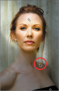
- Click the eyedropper on an area of acceptable skin tone, in this case, the upper right part of her shoulder. You should notice that the area between the white triangles and the vertical line (below the color bar) has contracted. Look at the sample point area (Figure 1.30.4).
Figure 1.30.4. The acceptable skin tone on her shoulder
- Click on the Hue and Saturation slider. Move it to −17, which is to your right and in the direction of yellow. Click on the Lightness slider and move it to +21. (Figure 1.30.5)
Figure 1.30.5. Adjusting Hue and Lightness slider
Note
The trick to removing ruddiness is to get the areas from which you want to remove color to closely match the acceptable areas surrounding them. After you are finished, if the overall skin cast is not exactly as you would like it, remember, you will soon be using a layer mask and brushing in the areas that you want.
Though not necessary for this image, you can further fine tune the correction by moving in the end points of the sample area. This will be further explored in a future book in this series. The chapter will be called “How to Retouch a Portrait in 15 minutes.” You can find this now in the Acme Educational tutorial DVD of the same name.
- Make the Hue and Saturation adjustment layer’s layer mask active and fill it with black.
- Select the Brush tool, and set it to 500 pixels at an opacity of 50%. Brush in just her torso; do not let your brushwork go above her chin. Bring up the Fade effect dialog box and increase it to 74.%. Where you just did the brushwork, the color of her chest has cooled, and you no longer have ruddiness. (Figure 1.30.6).
Figure 1.30.6. Brushing in the adjustment to her torso
Warm Colors Move Forward, Cool Colors Recede: Adding Coolness and Warmth to Further Enhance the Illusion of Realistic DOF
Using Photoshop’s Photo Filters to Add Coolness and Warmth
Inside of Photoshop are a set of filters that replicate actual photographic color correction filters so that you can set the white balance in your digital camera. You are going to use these filters in a way that was not originally intended in order to introduce coolness into the background.
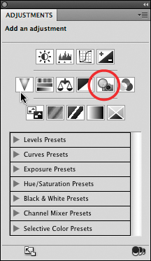
- In CS4 and above, go to the Adjustments panel and select Photo Filters to bring up a Photo Filters Adjustment layer (in CS3 or below, select Photo Filters from the Adjustment layers icon at the bottom of the layers palette/panel) (Figure 1.31.1).
Figure 1.31.1. Photo Filters
- From the Filter pull-down menu, select Blue (Figure 1.31.2). The image now has a blue cast (Figure 1.31.3).
Figure 1.31.2. Selecting Blue
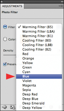
Figure 1.31.3. The image after selecting the Blue filter
- Make sure that the Blue Photo Filter Adjustment layer that you have just created is above the RED_CORRECT adjustment layer. Fill the layer mask with black, set the brush opacity to 50%, and the pixel width to 500. Brush in the region between the area just above her left shoulder and the background light. Bring up the Fade effect dialog box and type in 65% to further fine tune the intensity. Now, brush in every area that is not “lit.” In the background of the image, bring up the Fade effect dialog box and type in 65%. Next, brush in her torso (below her neck and her shoulders and chest). Bring up the Fade effect dialog box and lower it to 30%. Challen should appear to have moved forward from the background. Compare the before (Figure 1.31.4) and after (Figure 1.31.5).
Figure 1.31.4. Before the Blue filter on her torso
Figure 1.31.5. After the Blue filter on her torso
- Name this layer COOL.
- Save the file.
Note
Rather than paint a large area, which is time consuming, I had you begin with a small one so that you could more efficiently determine the optimal amount you would later use on the larger area. To achieve an efficient workflow, think about the fastest way to get the best result.
Challen’s torso is at a lower percentage than the wall, because her torso is closer to the camera and you have been creating the illusion that the subject is further from the wall. Because shadows tend to have a blue cast and since her torso is in shadow, it should be bluer (cooler) than the areas around it that are well lit.
Now that you have added coolness to the background and the areas of her body that are in shadow, it is time to add warmth into the area of the background light.
- Go to the Adjustments panel and select Photo Filters to bring up a Photo Filters Adjustment layer. (In CS3 or below, select Photo Filters from the Adjustment Layers icon at the bottom of the layers palette/panel.) From the Filter pull-down menu, select Orange and the image takes on a very warm color cast (Figure 1.31.6).
Figure 1.31.6. After adding an Orange filter to her
- Make sure that the Orange Photo Filter Adjustment layer that you have just created is above the RED_CORRECT adjustment layer. Fill the layer mask with black, set the brush opacity to 50%, and choose a pixel width of 500.
- Paint in the area to the right of Challen, bring up the Fade effect dialog box and increase the amount to 75%. Paint in the larger area of the background light, and once again, bring up the Fade effect dialog box and type in 75% (Figure 1.31.7).
Figure 1.31.7. After fine tuning the WARM layer
- Name this layer WARM.
- Save the file.
You now have the right colors and shadow, and everything is balanced. The last touch, which will make your observer believe that the image they see was in the original capture, is a shadow underneath Challen’s nose.
Creating a Realistic Shadow
This next step makes the image a believable probability. It is something so simple—a shadow. The most common way to make a drop shadow is to make a new layer, create a selection, feather that selection, fill that selection with black, zap it with Gaussian blur, and then lower the opacity. This works for things like fonts, but when you work with three-dimensional objects, the result may not look real. A major consideration when putting a shadow into your composition is recognizing the direction from which the light is striking your subject. This will influence the size and position of the shadow that you would expect to see. If you don’t take this into account, you run the risk of creating unrealistic images in which the light may appear to be coming from several different directions at once. In this step, you will create a realistic-looking shadow.
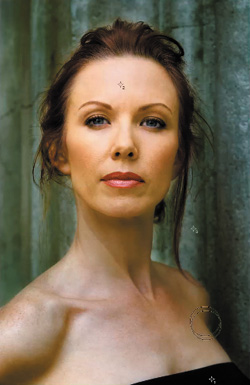
- Zoom in on the model’s nose and mouth. Select the Eyedropper tool, and sample the color of the shadow just below the right side of her nose, so that the foreground color reflects the color of the shadow (Figures 1.32.1 and 1.32.2).
Figures 1.32.1 and 1.32.2. Sampling the shadow color just below her nose
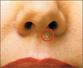

Notice that the color of the sample box in the tool bar is anything but gray. Rather, the color of the shadow is a darker variant of the colors around it.
- Create a new layer and name it SHADOW.
- With the Polygonal Lasso tool, select a lock point that starts at the edge of the shadow below her nose. Click a selection (Figure 1.32.3). Go to Select > Feather, select an 11-pixel radius, and click OK. This will cause the selection to even out (Figure 1.32.4). Fill the selection with the foreground color (Alt + Backspace / Option + Delete), and deselect the selection. (Click on the layer.) Make the layer a Smart Filter, then open the Gaussian Blur filter, and choose a radius of 27 pixels. Click OK and the image will look like Figure 1.32.5.
Figure 1.32.3. Make a selection
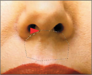
Figure 1.32.4. Feather the selection
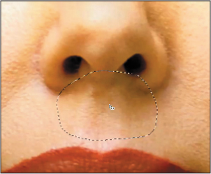
Figure 1.32.5. Apply a Gaussian Blur
- Bring up the Free Transform dialog box (Command + T / Control + T). Holding down the Control key, click on the Free Transform dialog box and select the Warp tool from the pop-up menu (Figure 1.32.6).
Figure 1.32.6. Select the Warp command
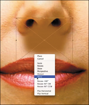
Note
When using Free Transform on a layer that is a Smart Filter, you will get the following warning, “Smart Filters applied to this layer will be turned off temporarily while the transform is being previewed. They will be applied after committing the Transform.” There is a “Don’t show me again” option that you can check if you prefer that this not reappear. Click OK.
- Click on the center square (Figure 1.32.7) and, keeping your finger depressed on the left mouse button, click and drag it downward (Figure 1.32.8) to fit the dip in her nose. Then, on the right side of the shadow, move the grid line upward to create the right side of the shadow contour (Figure 1.32.9). Repeat the same process on the left side of the nose shadow. Click on the Hand tool in the tool bar to bring up the Placement dialog box. Click Place (Figure 1.32.10).
Figure 1.32.7. Click on the center square
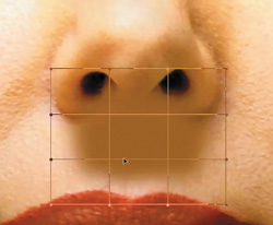
Figure 1.32.8. Drag it downward
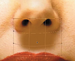
Figure 1.32.9. Move the gridline upward
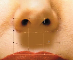
Figure 1.32.10. Place the transformation
- Create a layer mask.
- Lower the layer opacity to 82% (for this image) in order to match the nose color that you previously sampled. Make the foreground color black and the background white, select the Brush tool, and set the opacity to 50%. At a brush width of 125 pixels, gently ride the edge of the nose shadow with the edge of the brush to form the proper shape (Figure 1.32.11).
Figure 1.32.11. Brush in the proper shape
- Lower the layer opacity (49% for this image) until you can see the contours under Challen’s nose (Figure 1.32.12).
Figure 1.32.12. Lower the layer opacity to 49%
- Turn the L2D_LUM Curves adjustment layer back on, and lower the opacity (13% for this image) until you get the exact balance that you want (Figure 1.32.13).
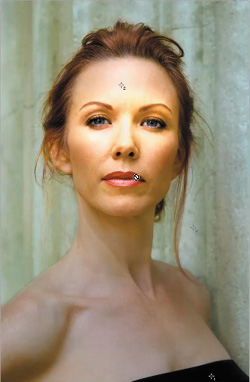
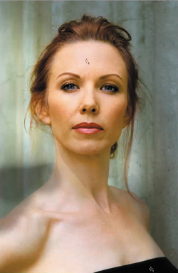
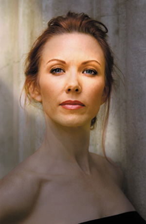
Figure 1.32.13. Final image
- Create a Master layer and name it FINAL.
- Save the file.
The Transformation Is Complete
This lesson has been about learning how to be in Shibumi whenever and wherever you create, and about developing a dynamic, proactive way of thinking about workflow. What you should have seen in this workflow is that everything was done to minimize artifact and replicate the reality of light.
As I discussed at the beginning of this chapter, practice doesn’t make perfect; perfect practice makes perfect. What you need to do is practice at practicing. So before you move on to the next chapter, I suggest you begin with the original image and repeat the entire process described in this lesson. Then try to do it without referring to the lesson. Lastly, try it without using image maps, and see how fast and accurate you can be. What I have found on my journey as an artist is that simple repetition was not the path to mastery. Rather, you need to engage in exercising variations of what you repeat. In that way, your technique evolves and grows. In other words, you need to engage in the exercise of repetition until you are in Shibumi, and with Shibumi comes mastery and the achievement of perfect practice.