Chapter 2. Classic Studio Lighting
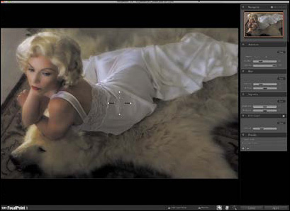
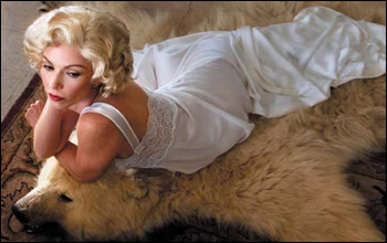
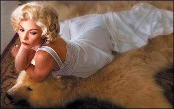
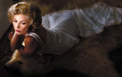
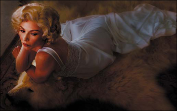
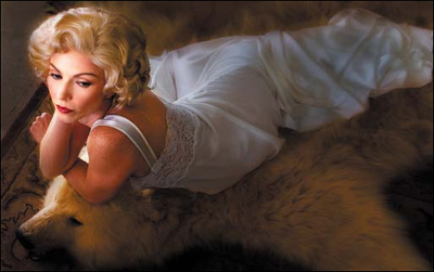
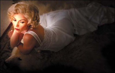
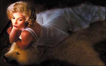
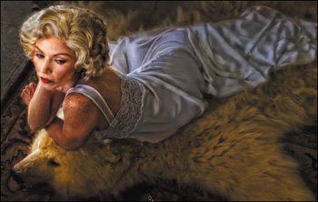
Figure 2.0.1. Before
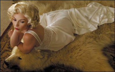
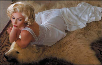
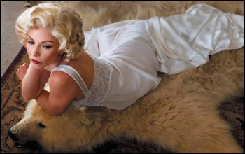
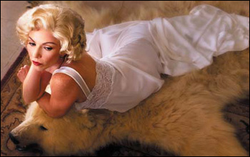
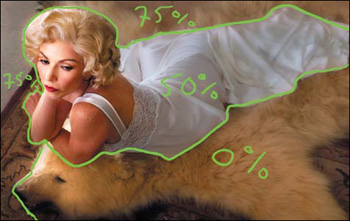
Figure 2.0.2. After

What’s the best type of light? Why that would be available light... and by available light I mean any damn light that is available.
—W. Eugene Smith
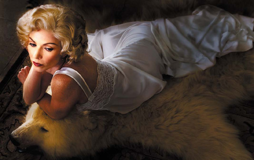
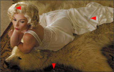
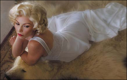
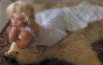
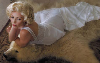
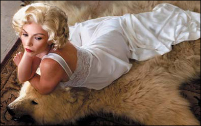
In this chapter, building on what you learned in Chapter 1, you will use Photoshop to emulate the look of a classic Hollywood glamour photograph lit with studio “hot” lights and shot on an 8×10 view camera. You will be working with an image that I have entitled Stardust.
Creating Stardust
When most people think of movie-star images from the 1930s and ’40s, George Hurrell’s classic 8×10 view camera photographs come to mind. With his iconic portraits of Greta Garbo, Jean Harlow, and Gary Cooper, Hurrell invented the Hollywood glamour photograph, and his dramatic use of light was second to none.
Hurrell most often used two focusable light sources, that he diffused and placed above and on either side of his subject. This type of lighting became known as “butterfly lighting” because of the hallmark shadow it produced under the subject’s nose.
He lit his famous subjects with tungsten movie or hot lights, not strobes, and photographed them with an 8×10 view camera, not an SLR. He didn’t have the luxury of roll film or CompactFlash cards. Nor did he have the ability to “fix it in Photoshop.” For him, Photoshop was the wet darkroom. He had to get it right in the camera, because he had no room for exposure error. He would engage his actor subjects in dialogue, and from time to time, he would click the shutter. The images he captured were the result of those experiences.
Note
This chapter was originally Chapter 4 in the first Welcome to Oz. An even earlier version of this chapter appeared in The PhotoshopWorld Dream Team Book, Vol. 1 (New Riders, 2005). I invite you to compare this chapter to both the PDF copy of the original Welcome to Oz chapter, which you can download with the source files for this lesson. The more important lesson is to be found in seeing the evolution of thought and technique.
In Stardust, the model on the bearskin was lit naturally with reflected sunlight. This takes advantage of the unique characteristic of sunlight to be both directional and ambient. The technique selected to light the base capture image is called “board-to-board reflecting.” It is used to get light from someplace other than a point light source (in this case, the sun), or to make the light source appear to be farther from the subject than it actually is. (See the sidebar Casting Light on the Stardust Model.) That technique was the best way to evenly light the subject with the best type of light—reflected sunlight.
Note
The reason that I prefer to use reflected, natural light is that it has a glowing quality that is unique. Also, when doing environmental portraiture, this approach gives me light that is simultaneously directional and ambient: directional because the reflector provides a point light source, ambient because the light is naturally present. This allows the subject more freedom of movement, which typically produces a more spontaneous photograph. I have found that the poses people naturally assume are often far more interesting than those I suggest.
While the image in Chapter 1 was a proactive solution to a difficult situation, the image in this chapter is lit in Photoshop by choice. I chose this lighting technique, not only for aesthetic reasons, but to save time and money. All I needed were two light stands with light disk holders, and two reflectors. Setup and breakdown times were insignificant, and the reflected sunlight was a bonus; again, the more you know about the middle, the more informed your choices can be at the beginning.
Measure Twice, Cut Once
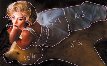
Step 1: Analyzing the Image and Creating image maps
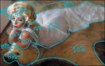
In order to avoid the feeling of being overwhelmed by the amount of work to be done on any image, whether simple or complex, it is best to break the task into manageable steps and attack them one at a time. The first step is to map the image. Next, define the issues you must resolve and decide how you want to approach them. Always work from global to granular. For me, the issues in the Stardust image are:
• Remove the sensor color cast.
• Create areas of selective DOF.
• Remove the blue color cast from the sunlight.
• Light the image.
With these issues in mind, I will show you how to create image maps and begin to develop a workflow specific to this image. Included in the folder that has the work files for this chapter is a source file that contains all of the image maps that I created, as well as a source file that is just the base file should you want to try your hand at making image maps.
Step 2: Removing Sensor Color Cast
Finding the Black and White Points
The first thing you are going to do before you begin lighting this image is to remove the color cast. I have already retouched it so that you do not need to repeat the steps you did in Chapter 1. (For this image, retouching should be done before removing the color cast because retouching may affect it.) Remember, there may be aspects of the digital color cast that you may want to use in the lighting of this image. Because I always work global to granular (solve the biggest problems first), my biggest problem is with the color cast removal. (From this point forward, I will refer you to subjects previously covered rather than re-describing them.)
1. Using the Threshold adjustment layer method, as described in Chapter 1, identify the black point. You are looking for “meaningful” black. For the white point, choose a point as close to the first white pixel as you can get, whether or not you can recognize shape or structure within it.
Note
To find the black point, start by moving the slider all the way to the left, then gradually to the right. For the white point, move the slider all the way to the right, then gradually to the left. Be sure to discard the Threshold adjustment layer once you have found the black and white points.
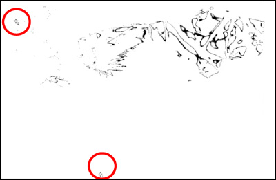
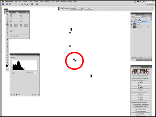
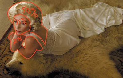
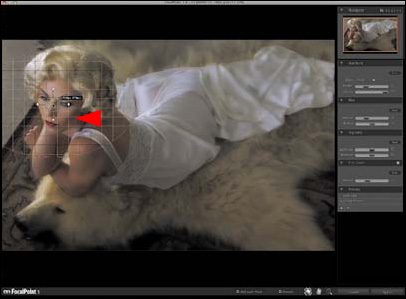
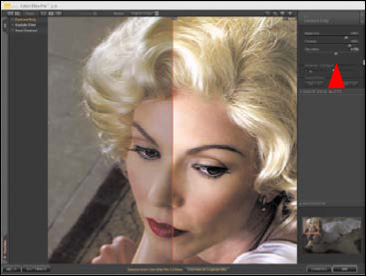
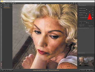
Once the white and black points are established, mark them with color samplers. The black and white color samplers are visible in this image as crosshair targets #1 and #2. The threshold level for the black sampler is 11, while the white sampler threshold level is 252 (Figure 2.1.1).
Figure 2.1.1. The two sample points found for BP & WP correction
Finding the Midpoint Using the Difference Blend Mode
Unlike the image in Chapter 1, there is no easily identifiable neutral or midpoint. In this step, you will learn to find a midpoint in spite of this.
Note
This is one of those ideas I wish had been mine, but credit for this creative technique goes to Dave Cross.
2. Create a new layer.
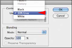
3. Go to Edit > Fill, select 50% Gray from the Contents dropdown menu, and click OK. You should see a completely gray screen (Figures 2.2.1 and 2.2.2).
Figure 2.2.1. Edit > Fill
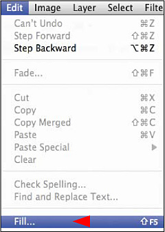
Figure 2.2.2. 50% Gray
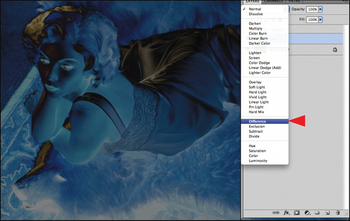
4. Select the Difference blend mode. You should see this (Figures 2.2.3 and 2.2.4).
Figures 2.2.3 and 2.2.4. The image after changing the blend mode to Difference
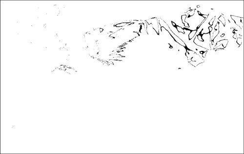
5. Select the Threshold adjustment layer and move the slider all the way to the left.
6. Move the slider to the right (a threshold range of 6) until you see something (black pixels). (Figure 2.2.5).
Figure 2.2.5. The image with a Threshold adjustment of 6
7. Begin entering progressively smaller numbers into the Threshold Range dialog box until you get the smallest number (as close as you can get to 1) of black pixels. For this image, the number is 3. Zoom into that area and place a sample point (Figures 2.2.6).
Figure 2.2.6. Place sample point 3
8. Discard the Threshold adjustment layer.
9. Discard the 50% Gray Difference blend mode layer.
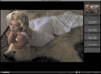
10. You should have an image with three sample points: a black, white, and mid-point (Figure 2.2.7).
Figure 2.2.7. All three sample points for the BP, WP and MP corrections that will be made to correct for digital sensor color cast
Creating Three Curves Adjustment Layers to Neutralize Sensor Color
Having defined black, white, and mid-points, it is time to create the three Curves adjustment layers that you need to remove the sensor color cast.
- Create a layer set (as you did in Chapter 1) and name it BP/WP/MP.
- Create a Curves adjustment layer and name it BP. Zoom into the part of the image that has the first sample point. Click on Caps lock. (This sets the cursor to Precise mode.) You should see crosshairs. Click on the sample point.
Note
Make sure that the black eyedropper’s sample threshold is set to R:7, G:7, B:7 and the white eyedropper’s sample threshold is set to R:247, G:247, B:247. See Chapter 1 for more detail.
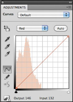
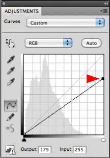
- You are going to fine tune the individual channels of the Black Point Curves adjustment layer. As you did in Chapter 1, click on the Red channel from the Curves adjustment layer pull-down menu (Figure 2.2.8). Click on the lower anchor point of the curve (Figure 2.2.9). Adjust the curve using the arrow keys until the number in the Info dialog box for sample point 1 is 7. Repeat this process for the Blue and Green channels, so that when you are finished, you have three 7s in the Info dialog box.
Figure 2.2.8.
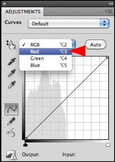
Figure 2.2.9.
- Repeat the steps of this process for the white point using sample point 2 and the white eyedropper.
- Repeat the steps of this process for the mid-point using sample point 3 and the midpoint eyedropper.
Granular Fine-Tuning the Individual Curves Adjustment Layers by Using Layer Masks
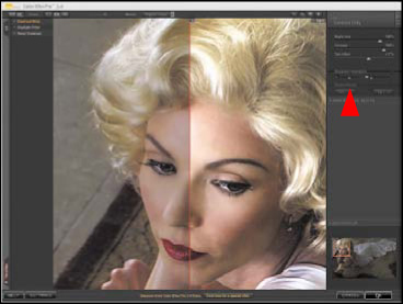
Now that you have globally removed the color cast from this image, the next step is to determine what you like and don’t like about it and how you are going to fine tune each layer. Compare the image before the adjustments (Figure 2.2.10), the BP adjustment (Figure 2.2.11), the WP adjustment (Figure 2.2.12), the MP adjustment (Figure 2.2.13), and all three adjustments together (Figure 2.2.14).
Figure 2.2.10. Before
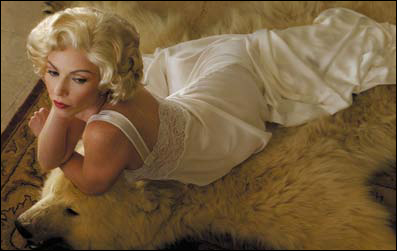
Figure 2.2.11. BP adjustment

Figure 2.2.12. WP adjustment
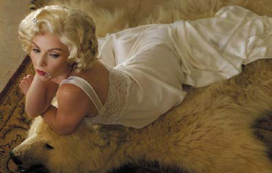
Figure 2.2.13. MP adjustment

Figure 2.2.14. All three adjustments applied
Look at your individual adjustments and analyze what you like and do not like about each, keeping your analysis as simple as possible. Remember that by practicing at practicing, you will discover how to do things that might not yet be part of your skill set so that you can free the image you envision from the file that you have in front of you. Also keep in mind that the file on which you are working is not a finished image. When you look at any given point in the process, it is a tree in the forest of things that will be done to make the finished image one that most closely reflects your vision and your voice—what you want to say to the world with the image that you saw.
For example, when you look at the black, white, and midpoint corrections together, you neutralize the overall color cast, which is the goal. However, there may be aspects of each correction that you like individually and which are lost when the three layers are combined. In this image, after looking at the three individually, I like the warmth of the white point and some aspects of the black point. When I look at all three together, the image is quite cool.
Before each step that you take in any workflow, you must keep your goal in mind. In this lesson, your goal is to create two illusions: first, that the model was lit as she would have been in a Hollywood glamour portrait, and second, that she was shot with a view camera that allows you to change the plane of focus and thus modify the DOF.
You must continually consider how light and color work in the real world, so that you can use Photoshop to merge the reality of what you see with what you imagine. There is a reason why Photoshop is capitalized. It is not a verb; it is a noun. It is a tool and you are the creative energy that drives it. Not the other way around.
When I look at all the adjustment layers together and observe what they do and how they interact, I form a direction for my workflow. As discussed in the first chapter, warm colors appear to move forward in an image, cool ones appear to recede, and shadows are cooler than areas that are lit. When beginning color correction for this (or any) image, it is that knowledge that determines many of the choices I make, even though this has little or nothing to do with the mechanics of Photoshop.
If you look at the three Curves adjustments individually, the white point is warmest. When you look at the black and white ones together, and then add the mid–point, the entire image becomes bluer, or cooler. The first thing to do, therefore, is to brush back some of the black point correction in Challen’s face and arms, and brush back all of her skin to allow the colors in these areas to be more affected by the white point. You should also brush back the head of the bear. The reason for brushing back these areas is that these will be directly hit by the “lights” that you will place using Curves adjustments layers and the Render Lighting Effects plug-in. This way you will use the color cast of the original source file to your advantage.
Note
Unless otherwise directed, whenever a lesson asks you to select a brush, use a feathered one. Using feathered brushes, rather than hard-edged ones, produces a more natural look as well as creating layer masks that better blend into the image.
Also, from this point forward in the book, you should use the techniques for refining a layer mask discussed in Chapter 1 whenever you do any brushwork on a layer mask.
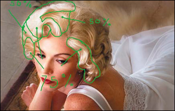
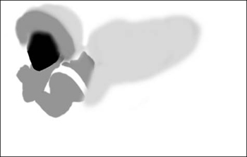
Here is the image map of the areas for the black point that you should brush back (Figure 2.2.15).
Figure 2.2.15. Image map for brushing back the BP adjustment
- Select the Brush tool, and set it to 50% opacity, with the foreground color black and the background white. Make the brush width 300 pixels and brush in only the model’s face and arms. Bring up the Fade effect dialog box and adjust the opacity to visual taste, which for me was 67% (Figure 2.2.16).
Figure 2.2.16.
- Brush in the model’s hair and the back of her body at 50%.
- Brush in the face of the bear’s head at 50%.
This is what the layer mask should look like when you are finished. (Figure 2.2.17).
Figure 2.2.17. The final layer mask for the BP adjustment
Now do the brushwork on the Midpoint Curves adjustment layer. You should see that when you add the mid-point adjustment to this image, it cools the colors. Because you are trying to replicate the DOF and bokeh of an 8×10 view camera, as well as light this image, you will use the coolness or blueness of this adjustment to your advantage. Warm colors move forward, cool ones recede, and shadows tend to be a bit bluer than areas that are lit. It is this bit of knowledge that will inform the choices that you make for this image.
Here is the image map of the areas for the midpoint that you will be brushing back (Figure 2.2.18).
Figure 2.2.18. Image map for brushing back the MP adjustment
- Select the Brush tool, and set it to 50% opacity, with the foreground color black and the background white. Make the brush width 300 pixels and brush in just her face, arms, hair, and back. Bring up the Fade effect dialog box, and adjust the opacity to your visual taste, which for me was 73% (Figure 2.2.19).
Figure 2.2.19. The image after the beginning MP brushwork
- Brush in the face of the bear’s head at 50%. Bring up the Fade effect dialog box and adjust the opacity. I chose 17%. Then, brush in the rest of the bear skin rug at 50%. Be sure to brush the upper part of the rug as well. Look at the layer mask (Figure 2.2.20) and then all three adjustment layers together after the brushwork (Figure 2.2.21).
Figure 2.2.20. The layer mask for the MP adjustment
Figure 2.2.21. The image after the brushwork for all adjustments
- Create a master layer, as you did in Chapter 1 (Control + Alt + Shift + E / Command + Option + Shift + E) and name it MASTER_1.
- Save the file using Save as and name it HOLLYWOOD_16BIT.
Now that you have fine tuned the image’s color cast adjustment layers, you are going to create the illusion of selective focus DOF—specifically, the illusion of the tilt and shift qualities of an 8×10 view camera. Although you may not be able to increase the selective focus as you could if you had shot this using a large format camera (see The Correct Perspective of Swings and Tilts: SLR vs. View Cameras sidebar), you can replicate the quality of a view camera’s selective blur.
The lighting technique used in creating this image is often referred to as board-to-board reflecting. The model was lit by bouncing sunlight off of two 36-inch reflectors. The first one, a Photoflex Silver reflector, directed light onto the second reflector, which reflected light onto the subject. The combination created a slightly warm light. See Figure 2.2.22 for the lighting setup.
Figure 2.2.22. The diagram for the “long light” technique
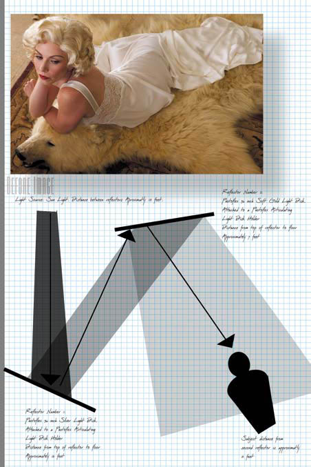
This type of light is referred to as “long light”—the kind that occurs in the Northern Hemisphere during late afternoons in February and October, when the sun is close to the horizon. At this time, because the light passes through the thickest part of the atmosphere, more blue light is scattered (making the sky blue), and therefore increasing the amount of the longer wavelength (warmer) colors in the sunlight shining on your subject. This type of light produces long shadows and, generally, warm tones.
Reflector #1: 36-inch Silver LiteDisc attached to an Articulating LiteDisc Holder. The distance from the top of the reflector to the floor was approximately 10 feet. Silver increases the specular highlights and yields a highcontrast image. (This reflector was angled slightly upward and was the lower of the two.)
Reflector #2: 36-inch Soft Gold LiteDisc attached to an Articulating LiteDisc Holder. The distance from the top of the reflector to the floor was approximately 7 feet. Soft Gold combines gold and silver in a zigzag pattern, giving a warm tone to the light it reflects. (This reflector was angled slightly downward onto the subject and was the higher of the two.)
Figure 2.2.23. D3x DSLR
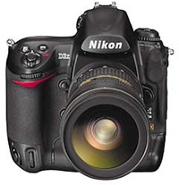
Figure 2.2.24. Cambo 4×5
The difference between SLR cameras and view cameras is a simple but profound one. With a SLR, the lens and sensor plane are always parallel to each other. As a result of this design, there will always be distortions to the image (bent buildings, bowed faces, weird lines, etc.) and, most importantly, subjects at different distances from the lens will never all be critically in focus at one time. Therefore, you may have to develop techniques that allow you to use these limitations as aesthetic choices.
Note
Tilt shift (TS) and perspective correcting (PC) lenses are a very expensive exception to this. These lenses are designed to afford you some of the control inherent in a view camera.
With view, field, or monorail cameras, the lens plane and sensor plane are designed to move independently from each other. These movements (described below) allow many changes to perspective, as well as the ability to increase or decrease the area of critical sharpness known as selective focus. It is how you use these adjustments that determines what is in focus and the amount of blur.
Note
These movements have other effects, but for the sake of brevity I am discussing only the aspects of focus and blur.
Camera Design
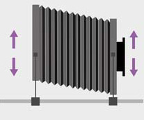
A typical large format view camera has a lens that mounts on a board that fits in a frame called a “standard.” The rear of the camera also contains a standard that houses an etched plate of glass upon which you focus. The image appears upside down on that glass and is fairly dim in available light, which is why photographers use a hood.
A flexible bellows connects the two standards. Since the standards can move independently of each other, the photographer can control sharpness and perspective by shifting or rotating the optical axes of the two standards as described on the next page. To avoid distortion, the rear standard should always be perpendicular to the surface of the earth.
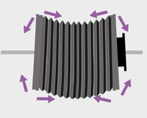
Swing Movements: (Figure 2.2.25)
Swings twist the lens or sensor plane on the vertical axis ether separately or in tandem with each other. When you use both front and back swings, you can increase or decrease the area of critical focus, or selectively focus by increasing or decreasing the DOF.
Figure 2.2.25. Swing Movements
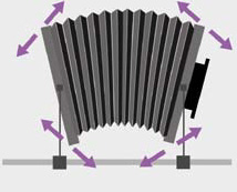
Tilt Movements: (Figure 2.2.26)
Tilts pivot the lens and sensor planes on the horizontal axis. (In some field cameras, the tilts occur at the bottom of the standard and not through the horizontal axis.) When you use both front and back tilts, you can increase or decrease the area of critical focus, or selectively focus by increasing or decreasing the DOF.
Figure 2.2.26. Tilt Movements
Shift Movements: Horizontal Shift (Figure 2.2.27) Vertical Shift (Figure 2.2.28)
Shift movements move the lens plane and/or sensor plane up and down or side, to side which causes the front and rear of the camera to be out of direct alignment to each other. For example, when you shift the front of the camera up, the image will move downward because the lens will have a greater coverage area of focus than the sensor area.
Figure 2.2.27. Horizontal Shift Movements
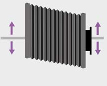
Figure 2.2.28. Vertical Shift Movements
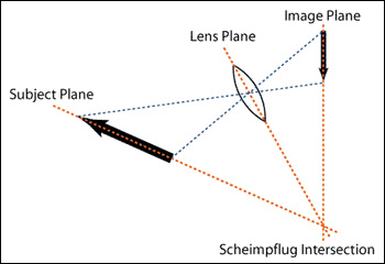
The Scheimpflug Principle: (Figure 2.2.29)
The plane of focus can be changed or adjusted by the swings and tilts. Focus will be achieved for a subject plane when the lens plane, the film plane, and the subject plane intersect along a common line. This means that when the subject plane, the lens plane, and the sensor plane all meet in a line, the entire subject plane will be sharp at any aperture.
Figure 2.2.29. Scheimpflug Principle
Step 3: Creating Selective DOF to Replicate Optical Lens Blur and Optical Lens Contrast
Because you are trying to create a probable believability, you have to make sure that all of your choices mimic reality as captured with a glass lens and a camera that has the ability to swing and tilt the lens. Granted you cannot increase the area of focus—that is set in pixels when the image was captured—but you can replicate the blur of an 8×10 view camera. And as I discussed in Chapter One, an image is more about what is blurred than what is in focus.
When you use a lens on a view camera, the effects are optically, and not digitally, created. One of these effects is that as blur increases, there is a tendency for contrast to diminish. This does not occur in Photoshop when blurring the image with Gaussian Blur or using the Lens Blur tool. Step 3 will illustrate how to realistically replicate true optical lens blur.
When you use a perspective-correcting camera or lens, like a view camera or a tilt shift lens, you can affect the area of blur as well as the perspective that blur will have. With these considerations in mind, you will work with two aspects of controlling the unconscious eye (which I will discuss at greater length in Chapter 3), specifically: in focus to blur, and high-contrast-to-low-contrast. Because you want the viewer’s eye to move from the model’s face to the front of her body, then to the bear’s face, and finally to the upper background, her face should be the central point of focus while the background should have the most blur. Also, you want the model’s body to appear to move forward, so blur and contrast go hand in hand for this image.
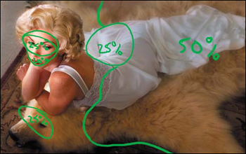
You are going to do things a little differently than you did in the last lesson. In the last lesson, you used the Skylight filter first, then attended to contrast, and then to blur. Now you will first attend to blur, then contrast, and you will use the Skylight filter last. You will do this because you will use both the Round and Planar types of blur on this particular image. Below are the Planar image map (Figure 2.3.1) and the Round image map (Figure 2.3.2). After completing the blur, you will generate the contrast layer mask from the layer mask that you created with the two blur layers.
Figure 2.3.1. Image map for Planar blur
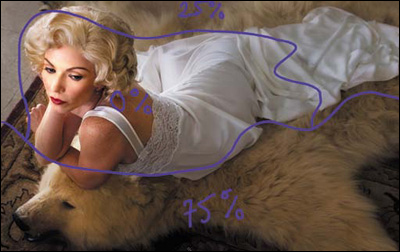
Figure 2.3.2. Image map for Round blur
- Duplicate the MASTER_1 layer, add a layer mask, then duplicate the MASTER_1 copy 1 layer (with the layer mask) (Command + J / Control + J).
- Just as you did in Chapter One, Shift-click onto these newly created layers, and drag them to the Create New Group icon at the bottom of the layers panel. Name this new layer set D_OF_F.
- Turn off the MASTER_1 copy 2 and make MASTER_1 copy 1 the active layer. Name this layer R:FOCALPOINT.
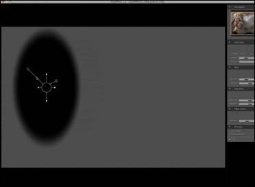
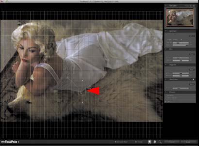
- Go to onOne > FocalPoint 2.0 and the FocalPoint 2.0 dialog box will come up (Figure 2.3.3).
Figure 2.3.3. The FocalPoint interface
- Go to the Aperture panel. You will first use the round aperture, and then, in a second adjustment layer, the planar one.
Note
Before I begin working with FocalPoint, I always reset the pallete. To do this click Command + Option + Z / Control + Alt + Z. The only time I will not reset the pallete is if I know that I am going to be redoing the same type of blur with the same values over and over again; then I would save it as a preset.
- Click on the FocusBug and move it to the center of the model’s face (Figure 2.3.4).
Figure 2.3.4. The FocusBug on the model’s face
- Holding down the Shift key (this causes the handle to lock in position), click on the Height control handle and move it downward until you have a height of 1768 pixels. Move the FocusBug to the right, just between Challen’s lips and cheek (Figure 2.3.5).
Figure 2.3.5. The Height handle at 1768 pixels, and moved between her lips and cheek
- Holding down the Shift key, click on the Width handle and move it inward to a width of 991 pixels. Move the FocusBug to the right, just below her cheek (Figure 2.3.6). The mask should look like Figure 2.3.7. (To see the actual mask, the keyboard command is Command + M / Control + M.)
Figure 2.3.6. The Width handle set to 991 pixels, and moved just below her cheek
Figure 2.3.7. The mask of the FocusBug
- Set the Motion Amount slider to zero (because you are not using that type of blur). Click on the Opacity/Blur control handle and move it upward so that the opacity is 85% and the blur blend is 50%. Click Apply. Look at the image with the Round blur applied (Figure 2.3.8).
Figure 2.3.8. The image after applying the Round blur
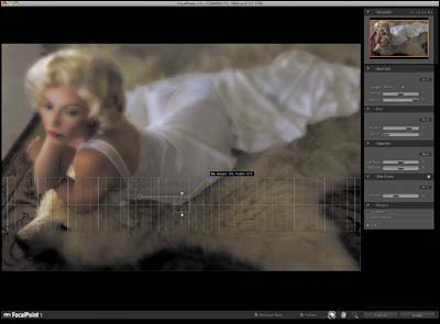
- Turn off the R:FOCALPOINT layer. Make MASTER_1 copy 2 the active layer and re-name it P:FOCALPOINT. Go to onOne > FocalPoint 2.0. When the FocalPoint 2.0 dialog box comes up, reset the plug-in (Command + Option + Z / Control + Alt + Z). Select Planar (Figure 2.3.9).
Figure 2.3.9. Select Planar for Blur type
- Click on the left control handle, and the work grid will come up. Rotate the control handle (and the grid) 90 degrees (Figure 2.3.10).
Figure 2.3.10. Showing the grid and rotating 90 degrees
- Click on the center of the Planar FocusBug and move it to just below the midpoint of her gown (Figure 2.3.11).
Figure 2.3.11. Moving the FocusBug to her gown
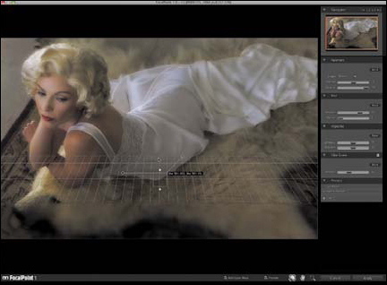
- Adjust the size of the focus area by clicking on the lower handle (the one that you rotated 90 degrees) while holding down the Shift key. (This locks the FocusBug into whatever position you have placed it, just as it does when you are in Photoshop.) Move the control handle inward to a width of 527 pixels (Figure 2.3.12).
Figure 2.3.12. Adjusting the size of the focus area to 527 pixels

- Set the Motion blur to 0% and the Opacity to 100%.
- Click on the upper right control handle and adjust the amount of blur to 73%. (Move it toward the upper right corner.) Adjust the feather (the softness of the edge of the mask that the FocalPoint plug-in generates) by moving the control handle left to 52% (Figure 2.3.13).
Figure 2.3.13. The image after adjusting the amount of blur and the feather of the blur
- Click on the center of the Planar FocusBug, and holding down the Option / Alt key, click and drag it upward so that you can tilt the blur (Figure 2.3.14). Click OK.
Figure 2.3.14. Adjusting the tilt of the blur
- Save the file.
Compare the image before the Planar blur (Figure 2.3.15) and after the Planar blur (Figure 2.3.16).
Figure 2.3.15. The image before the Planar blur

Figure 2.3.16. The image after the Planar blur
DOF Blur Brush In: Doing the Layer Mask Brushwork on the Round and Planar Blur Layers
Using Round blur on the body and Planar blur on the foreground and background, you have created the blurs needed to create the sweeping look of an 8×10 view camera. In this next step, you will create two layer masks, and you will brush in the effect of the Round and the Planar blurs to create the final look of selective focus. Once done, you will attend to the contrast. You will do these things a little differently than you did in Chapter One, but no two images and, therefore, no two workflows are the same. Workflow is dynamic and everything you do builds on everything that you have already done.
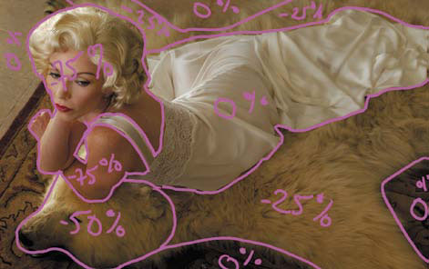
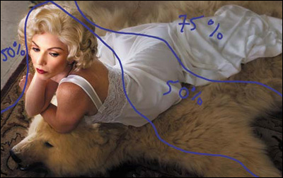
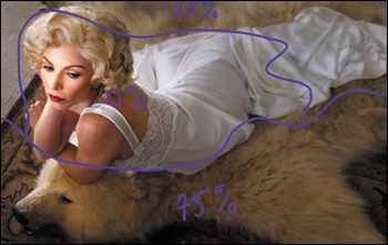
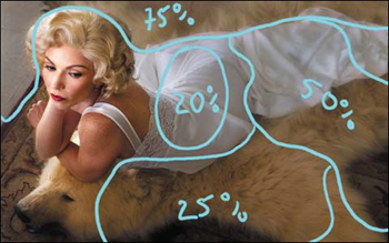
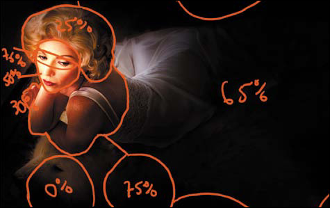
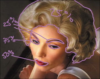
Before beginning your brushwork, look at the image maps for each layer mask on the Round (R:FOCALPOINT) blur layer (Figure 2.3.2). You want the area of Challen’s face, hair, and torso to be in focus. Move along the length of her body so that it gradually moves out of focus. With the Planar (P:FOCALPOINT) blur layer (Figure 2.3.1), you do not want to brush blur into her hair, face, or body, but you do want to brush in the foreground more than the background.
Figure 2.3.2. Image map for Round blur
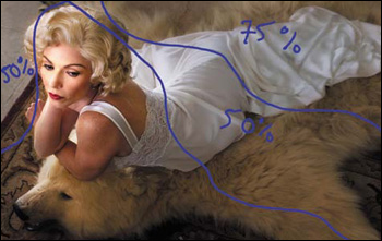
Figure 2.3.1. Image map for Planar blur
- Turn on the Round blur image map, and, making sure that the P:FOCALPOINT layer is turned off, make the R:FOCALPOINT layer the active one. Click on the eyeball to make it visible. Click on the layer mask of the R:FOCALPOINT layer and fill it with black.
- Select the Brush tool (making sure that you are using a feathered brush), set the pixel width to 300, and set the foreground color to white and the background to black. Set the opacity to 50%, and brush in both the areas that are 50% and 75% on the image map.
- Now, brush in just the 75% area (again at 50% opacity), and bring up the Fade effect dialog box (Command + Shift + F / Control + Shift + F) and move the slider upward to 79%. Look at the layer mask after the brushwork (Figure 2.3.17) and the R:FOCALPOINT layer after brushwork (Figure 2.3.18).
Figure 2.3.17. Layer mask for the Round blur layer
Figure 2.3.18. Image after the brushwork on the Round blur layer
Note
When you brush over an area using the same opacity with which you started, each successive brush stroke increases the opacity by the selected percentage. For example, if you brush over an area at 50% opacity, then re-brush it with an opacity of 50%, since 50% of 50% is 25, it is as if you brushed it at 75% opacity. Similarly, if you begin with an opacity of 40%, and rebrush at 40%, since 40% of 40% is 16, it is as if you brushed it at 56%.
- Turn off the Round blur image map and turn on the Planar blur image map. Making sure that the R:FOCALPOINT layer is turned off, make the P:FOCALPOINT layer the active one. Click on the eyeball to make it visible. Then, click on the layer mask of the R:FOCALPOINT layer and fill it with black.
- Select the Brush tool (a feathered brush), set the pixel width to 200, and set the foreground color to white and the background to black. Set the opacity to 50% and brush in both the areas that are 75% and 25% on the image map.
- Bring up the Fade effect dialog box (Command+ Shift + F / Control + Shift + F) and move the slider downward to 28%.
- Brush in just the 75% area (at 50% opacity), bring up the Fade effect dialog box (Command+ Shift + F / Control + Shift + F) and move the slider upward to 70%. Compare the layer mask after brushwork (Figure 2.3.19) and the P:FOCALPOINT layer after brushwork (Figure 2.3.20).
Figure 2.3.19. Layer mask on the Planar blur layer
Figure 2.3.20. Image after brushwork on the Planar blur

- Turn on the R:FOCALPOINT layer. Combine the R:FOCALPOINT and P:FOCALPOINT layers. Compare the image before (Figure 2.3.21) and after (Figure 2.3.22).
Figure 2.3.21. Before any blur applied

Figure 2.3.22. After the blurs are applied

Now that you have created the blur aspect of selective focus, it is time to create the contrast aspect.
Creating Realistic Optical Lens Contrast
- Make sure that the foreground color is black and the background is white.
- Duplicate the MASTER_1 once again, convert it to a Smart Filter, and name it R:CONTRAST.
Note
When I am working with an image, I tend to duplicate the master layer when I convert to Smart Filters, even though it increases file size. My reasoning is that hard drive space is cheap, my time is not. Also, keeping master layers that have not been touched offers me both exit strategy and workflow efficiency. Should I need to go back to a previous step, most of the time I have only to duplicate the master layer, which takes just a second regardless of the size of the file. Creating a master layer can take tens of seconds to upwards of a minute should there be Smart Filter layers involved.
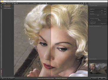
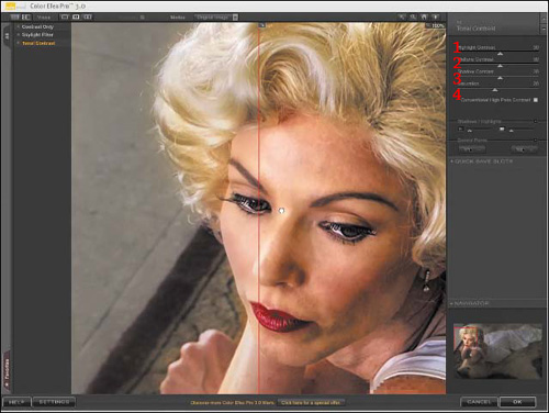
- Go to Filter > Nik Software > Color Efex Pro 3.0 Versace Edition. Select Contrast Only from the plug-in’s three options (Figure 2.4.1).
Figure 2.4.1. Select Contrast Only
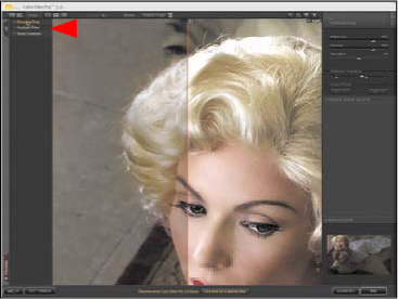
- Move Challen’s face using the Hand tool so that the before-after center line runs down its middle. (Figure 2.4.2) (To select this type of view, if it is not already selected, click on the Spilt view icon in the upper left corner of the Color Efex Pro 3.0 Versace Edition dialog box.)
Figure 2.4.2. Move her face to the middle of the preview area
- Click on the Contrast slider and move it to the right to increase the amount of contrast to 68% (Figure 2.4.3).
Figure 2.4.3. Increase Contrast to 68%

Although the contrast is where you want it, the image has darkened, the shadows have blocked up, and the color saturation is not where you want it to be. To correct these issues, you will first lighten the image, then dial in the saturation using the Saturation slider, and lastly, you will use the Protect Shadow functionality of the Contrast Only plug-in.
- Click on the Brightness slider and move it to the right to 55% (for this image), matching the brightness of the left, or before, side of the split view screen (Figure 2.4.4).
Figure 2.4.4. Increase the Brightness slider to 55%
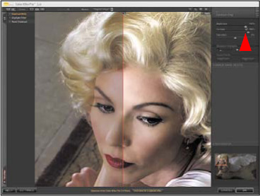
- Click on the Saturation slider and move it to the right to 17% (for this image), again attempting to match the saturation of the left, or before, side of the split view screen (Figure 2.4.5).
Figure 2.4.5. Move Saturation to 17%
- Click on the Protect Shadows slider and move it to the right until the shadows open up, which for this image is about halfway along the slider (Figure 2.4.6).
Figure 2.4.6. Increase the Protect Shadows slider
- Click OK.
Now compare the image before (Figure 2.4.7) and after the contrast correction (Figure 2.4.8).
Figure 2.4.7. Before the contrast correction

Figure 2.4.8. After the contrast correction
- Duplicate the R:CONTRAST layer and name the newly duplicated layer P:CONTRAST. Turn the P:CONTRAST layer off and make the R:CONTRAST layer active. Click on the layer mask to make it active
- Command- / Control-click on the layer mask of the R:FOCALPOINT layer. (This will make a selection of the layer mask.)
- Next, you will invert the selection. Go to Select > Inverse or Command + Shift + I / Control + Shift + I.
- Click on the Make Layer Mask icon and add a layer mask to the R:CONTRAST layer (which should be the active layer). The layer should fill the layer mask with black.
Look at the R:CONTRAST layer mask (Figure 2.4.9) and the R:CONTRAST layer with the mask applied (Figure 2.4.10).
Figure 2.4.9. The R:CONTRAST layer mask
Figure 2.4.10. The R:CONTRAST layer with the mask applied
- Make the P:CONTRAST layer active.
- Command- / Control-click on the layer mask of the P:FOCALPOINT layer. (This will make a selection of the layer mask.)
- Invert the selection. Go to Select > Inverse or Command + Shift + I / Control + Shift + I.
- Click on the Make Layer Mask icon to add a layer mask to the P:CONTRAST layer (Figure 2.4.11). Look at the resulting image (Figure 2.4.12).
Figure 2.4.11. The P:CONTRAST layer mask
Figure 2.4.12. The P:CONTRAST layer with the mask applied
- Shift click on both the R:CONTRAST and P:CONTRAST layers and drag them to the Create New Group icon on the Layers panel. Name this new group CONTRAST. Place this layer group beneath the Focal Point blur layers
- Now you will fine tune the contrast by lowering the layer opacity of the layer group. Click on the Opacity slider located at the upper right of the Layers panel and lower it to 55%.
Note
It is a good habit to place the contrast layers, if there are more than one, in a layer group folder, because if you need to lower the contrast via opacity, it is easier to do it this way. You may not always want to equally reduce the contrast in all your contrast layers, but it is helpful when doing these kinds of multiple blurs. Using layer groups and reducing contrast this way also makes it easier to rework the image at a later date.
Compare the image before (Figure 2.4.13) and after the contrast adjustments (Figure 2.4.14).
Figure 2.4.13. Before the contrast correction

Figure 2.4.14. After the contrast correction
Using the Nik Skylight Filter to Add Selective Warmth
You have worked with the blur and contrast aspects of this image; now is the time to work with its color. As I have discussed before, warm colors appear to move forward in an image while cool colors appear to recede. Also, lit areas tend to be warm in color and shadow areas tend to be cool. In this step, you are going to use the Skylight filter to add selective warmth to the image. Using Render Lighting Effects, you will choose where to add different amounts of the Skylight filter based on where the “lights” are going to be placed. You will also use Curves adjustment layers to add dark and light.
Here is the image map of the areas that you are going to brush in (Figure 2.4.15).
Figure 2.4.15. Image map for selective warmth
- Create a master layer (Command + Option + Shift + E / Control + Option + Shift + E). Make this layer a Smart Filter, and name it SKYLIGHT.
- Go to Filter > Nik Software > Color Efex Pro 3.0 Versace Edition. Select Skylight from the three plug-in options and click OK. For this image, the default of 25% appears to be the best. Compare the image before the Skylight filter (Figure 2.4.16) and after (Figure 2.4.17).
Figure 2.4.16. Before the Skylight filter
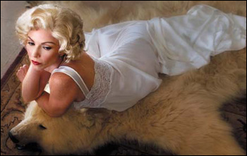
Figure 2.4.17. After the Skylight filter
- Create a layer mask and fill it with black
You are now going to selectively brush in the Skylight filter. You want to create the illusion of light hitting the model’s face, so her eyes need to be warmer than her face. (This is where you will be placing the the “key” light.) You also want her face warmer than her hair and torso. In addition, you will want to add some warmth into the face of the bear to create the illusion that light is falling on its eyes and face. Finally, you will want a bit of warmth in the bear skin rug to build the illusion that light falls off there.
- With a feathered brush of 150 pixels and a brush opacity of 50%, brush in the area of the model’s eyes. (Remember, all brushwork is cumulative.)
- Increase the brush width to 400 pixels and brush in her face. Bring up the Fade effect dialog box (Command + Shift + F / Control + Shift + F) and increase the amount to 75%.
- With the same 400-pixel brush, brush in her hair at 50% opacity.
- Reduce the brush width to 175 pixels and brush in her arms, hands, and back.
- Brush in the bear’s eye area at 50%.
- Brush in the bear’s face at 50%. Bring up the Fade effect dialog box (Command + Shift + F / Control + Shift + F) and increase the amount to 78%.
- Brush in the front and back of the bear skin rug at 50%.
Before moving on, you should fine tune the image, because the next step addresses the issues of too much of a good thing—the blown out areas in Challen’s hair. When you boosted the contrast, you also lost some hair detail. This is a good example of why you should always have an exit strategy and why you do not throw anything away until you are sure that the image is complete. Look at the layer mask after fine tuning (Figure 2.4.18) and the image after fine tuning the layer mask (Figure 2.4.19).
Figure 2.4.18. The layer mask after fine tuning
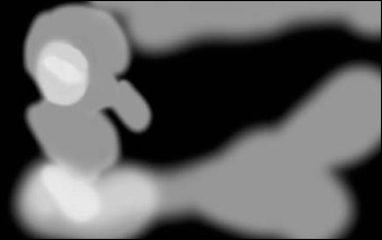
Figure 2.4.19. The image after fine tuning the layer mask
- Duplicate the master layer and move it above the SKYLIGHT layer.
- Apply the Skylight filter using Apply last filter, (Command + F / Control + F). Create a layer mask and fill it with black.
Because you are re-using the last filter, it will already be set to the amount most recently selected. Also, because you are trying to match the same color, there is no need to make this a Smart Filter. Lastly, you will use the MASTER_1 layer, because no filters have yet been applied to it, and it was the contrast layers that caused the loss of detail in her hair. Look at the Hair Brush Back image map (Figure 2.4.20).
Figure 2.4.20. The image map for brushing in her hair
- Select the Brush tool with a pixel width of 90 and an opacity of 50%. Brush in both areas that are outlined, including the areas that are marked at 75% on the image map.
- Again at 50%, brush in the areas that are marked on the image map at 75%. (Remember, all brushwork is cumulative when working at an opacity of less than 100%.)
Compare the image before the hair brush back (Figure 2.4.21) and after (Figure 2.4.22).
Figure 2.4.21. The image before brushing in her hair
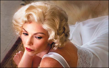
Figure 2.4.22. The image after brushing in her hair
- Make the D_OF_F layer set active, create a Master layer, name that layer MASTER_2, and save the file.
Step 4: Traveling at the Speed of Dark: Using Curves to Create Dark-to-Light Areas
That dark is as important to an image as is light is frequently overlooked. It is the dance between light and dark that makes an image compelling. Without dark, there is no drama; there is also no place to which the eye can retreat when viewing an image. It is how you use darkness in an image that makes the lighted parts more interesting.
Now that you have created the desired DOF and a more realistic relationship between in-focus-to-blur and contrast, it is time to start building up the image’s light-to-dark/dark-to-light relationship. The issue that you face is that there is not enough variation of light in the image as it now exists; it is too uniformly light. This happened because the base image was shot using reflected sunlight, my favorite type of light. (Light can be refracted, reflected, absorbed, and/or scattered.) I prefer to work with reflected sunlight because it has the ability to be both directional and ambient at the same time. It is this quality of light that I am going to have you modify in the following section.
The key concept to keep in mind is that you want to remove from this image everything that is not your vision. This is not a new idea; it is the way Michelangelo approached sculpture. He removed everything from the rock which was not the sculpture; he freed the sculpture from the rock. In this image, you will remove some light so that there will be more dark. There also needs to be greater contrast. In the section that follows, I will describe how to use the power of Curves to light this image so that you can achieve about 85% of your lighting goals.
You want the unconscious eye (which I will fully discuss in Chapter 3), to move from the model’s face to the left side of her body, and then to the right. Here are the image maps of what you will be doing: The combination of the first three (Figure 2.5.1), D2L_LUM image map (Figure 2.5.2), L2D_image map (Figure 2.5.3), L2D_SOFTLIGHT image map (Figure 2.5.4), L2D_SCREEN image map (Figure 2.5.5), and the L2D_FACE image map (Figure 2.5.6).
Figure 2.5.1. All three image maps combined
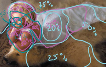
Figure 2.5.2. D2L_LUM image map
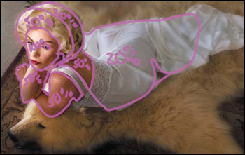
Figure 2.5.3. L2D image map
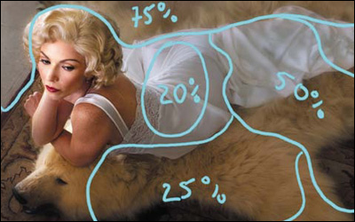
Figure 2.5.4. L2D_SOFTLIGHT image map
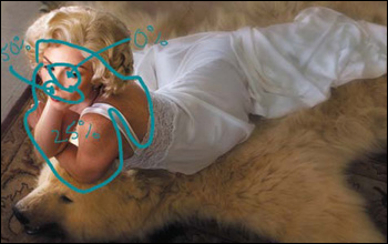
Figure 2.5.5. L2D_SCREEN image map
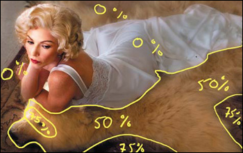
Figure 2.5.6. L2D_FACE image map
- Turn off the layer set D_OF_F and make MASTER_2 active.
- Create a new layer set and name it L2D_D2L, for light-to-dark/dark-to-light.
- Using either the Adjustment panel or the Make Adjustment Layer icon located at the bottom of the Layers panel, create the first of three Curves adjustment layers in the L2D_D2L layer set, and name it D2L_LUM for dark to light luminosity.
- Click on the center of the curve (Figure 2.5.7) and drag it downward towards the lower right corner (Figure 2.5.8). (The output should read 94 and the input should read 154.) Set the Blend mode to Luminosity.
Figure 2.5.7. Adding a point to the center of the curve
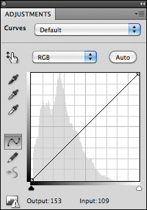
Figure 2.5.8. Moving the center point downward
Note
You find the appropriate level of darkness by clicking on the center part of the curve line and moving it around until you get the maximum darkness that you think you will need. Always approach your choices by going to an extreme and then, by using opacity and layer masks, retreat to a setting that you find optimal.
If you look at the image for this aspect of the edit process (Figure 2.5.9), there is a lot of “dark” that needs to be removed. Because you are adding “dark” and not light to this image, you will name this layer “D_2_L.” Because you have already made decisions about the image’s colors; you want only to darken them, not increase their saturation. To accomplish this, use the Blend mode Luminosity, which does just this.
Figure 2.5.9. Image after the Curves adjustment layer
- Leaving the layer mask filled with white (the default setting for layer masks), select the Brush tool and set it to 100% opacity with a pixel width of 300 pixels, making sure that the foreground color is black and the background white.
- Brush her face at 100% opacity. Look at the image after the brushwork (Figure 2.5.10) and the layer mask (Figure 2.5.11).
Figure 2.5.10. The image after brushwork on her face
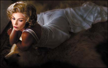
Figure 2.5.11. The layer mask of her face
- Set the brush opacity to 50%. Following the image map, brush in all of her hair. Bring up the Fade effect dialog box and lower the opacity to 19%.
- Following the image map, brush in just the front part of her hair at 50%. Compare the image after the brushwork (Figure 2.5.12) and the layer mask (Figure 2.5.13).
Figure 2.5.12. The image after brushwork on her hair
Figure 2.5.13. The layer mask of her face and hair
- At an opacity of 50%, brush in her arms and back. Compare the image after the brushwork (Figure 2.5.14) and the layer mask (Figure 2.5.15).
Figure 2.5.14. The image after brushwork on her arms and back
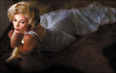
Figure 2.5.15. The layer mask after brushwork on her arms and back
- Following the image map, brush in the back part of Challen’s gown. Bring up the Fade effect dialog box and lower the opacity to 24%. Compare the image before any brushwork, (Figure 2.5.16) after the brushwork (Figure 2.5.17) and the layer mask (Figure 2.5.18).
Figure 2.5.16. The image before brushwork on her gown
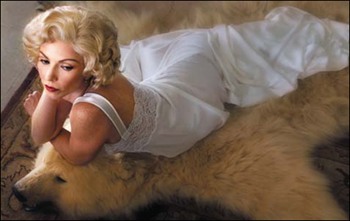
Figure 2.5.17. The image after brushwork on her gown
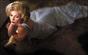
Figure 2.5.18. The final layer mask
- Save the file.
Step 4.1: Breaking the 11th Commandment: Thou Shalt Not Clip a Curve
What you are endeavoring to do with this image is to replicate, using sunlight, aspects of the warmth of tungsten lights and the way that focused hot lights fall off. One of the advantages of working in the computer is that impossible is merely an opinion, and it may be held by the person sitting in the same chair as you are. You decide what is impossible, and little is. In this image, you can control sunlight as if it were hot lights.
Next, in order to introduce more darkness into this image, you are going to break the 11th commandment—Thou Shalt Not Clip a Curve. You will do this in order to diminish the contrast, which you will then use to create the look of atmospheric haze. You will then darken the haze and introduce it into the image. And you will do all this using only Curves. As always, the goal is to do things as non-destructively as possible, and adjustment layers are just layers of math sitting over the pixels; you are not changing any of the pixels beneath them.
- Turn off the D2L_LUM adjustment layer.
- Create a new Curves adjustment layer (above the D2L_LUM adjustment layer) and set its blend mode to Luminosity. Name this adjustment layer L2D_LWR_CNTRST_LUM for “Light-to-Dark Lower Contrast Luminosity.”
Note
You will name this layer Light-to-Dark rather than Dark-to-Light, as you did in the previous step, because you will be adding dark into a layer that is light. In the previous step, you removed darkness. This naming convention makes it easier for you to know what you did should you need to readjust this image in the future.
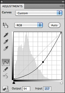
- Click on the upper right of the curve and drag it downward. For this image, drag it three grid lines (Figure 2.6.1).
Figure 2.6.1. Clip the highlights of the curve
- Then, click on the center of the curve and drag it slightly downward so that the output reads 84 and the input reads 148 (Figure 2.6.2). You should see that the image has acquired a gray cast as well as become a bit darker, for you have lowered the contrast as well as darkened it (Figure 2.6.3).
Figure 2.6.2. Drag the center down
Figure 2.6.3. The image after the Curves adjustment
- As you can see from the L2D_IM layer image map (Figure 2.6.4), you do not want to add any darkness or grayness to the model’s face or body or to the bear’s face. Also, you want the light to appear to come from a high angle, above and from the left, to focus on the model and the bear’s faces.
Figure 2.6.4. The L2D_IM image map
- Select the brush tool at a diameter of 700 and an opacity of 50%. Make sure that the foreground color is white and the background is black. Fill the layer mask with black.
- Brush in the lower part of the rug, bring up the Fade effect dialog box, and lower the opacity to 19% (Figure 2.6.5). Look at the layer mask after the brush work (Figure 2.6.6).
Figure 2.6.5. The image after brush work
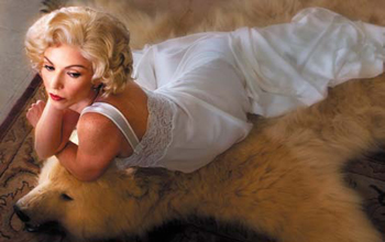
Figure 2.6.6. The layer mask after brush work
- Brush in the area above where you just brushed the rug and also brush in the back of her nightgown. Bring up the Fade effect dialog box and lower the opacity to 39%. Look at the image after the brushwork (Figure 2.6.7) and the resulting layer mask (Figure 2.6.8).
Figure 2.6.7. The image after brush work
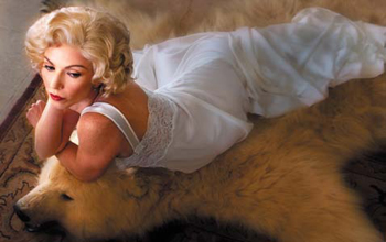
Figure 2.6.8. The layer mask after further brush work
- Brush in the area above the model’s head and the back part of the rug. Bring up the Fade effect dialog box and increase the opacity to 74%.
- Brush in the center area of her nightgown, bring up the Fade effect dialog box and decrease the opacity to 24%. Look at the image after the brushwork (Figure 2.6.9) and the resulting layer mask (Figure 2.6.10).
Figure 2.6.9. After brushing in the center of her nightgown

Figure 2.6.10. The layer mask after brushing the center of her nightgown
- Turn on the D2L_LUM adjustment layer and make it active. Using the Opacity slider in the upper left of the Layers panel, fine tune the layer to 48%. Compare the image before the opacity adjustment (Figure 2.6.11) and after (Figure 2.6.12).
Figure 2.6.11. Before the opacity adjustments and fine tuning
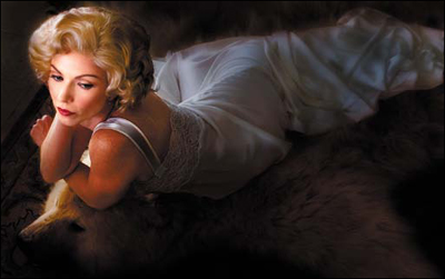
Figure 2.6.12. After the opacity adjustment and fine tuning
Frequently, photographers turn to the Overlay blend mode when manipulating images for the enhancement of light and dark. However, if you compare the Overlay and Soft Light (Figures 2.7.1 and 2.7.2) blend modes, you will find that the Overlay blend mode yields results that are considerably harder looking on color images than are achieved with Soft Light. This occurs because Overlay is a combination of the blend modes Screen and Multiply. This means that at middle (50%) gray (R:128, G:128, B:128), anything above will be screened and anything below will be multiplied. I prefer using Soft Light, which is much gentler on the image. Therefore, the areas in which Screen and Multiply switch occurs a little bit higher or lower on the scale.
Figure 2.7.1. Overlay
Figure 2.7.2. Soft Light
Step 4.2: Killing Two Birds with One Stone: Using the Screen and Soft Light Blend Modes to Enhance Contrast and Selectively Increase Dark and Light
Now that you have worked on the dark aspect of the image, the next step is to play with the light aspect using two blend modes, Screen and Soft Light.
As discussed in Chapter 1, contrast is the difference in brightness between the light and dark areas of a picture. If there is a large difference between the light and dark areas, then the result is an image with high contrast.
In Step 3 of this lesson, you increased and decreased contrast in relationship to DOF. In Step 4.1, you addressed creating areas of dark-to-light by adding “darkness” to the image.
In this next step, you will further reinforce the movement of the unconscious eye from light to dark by selectively changing the contrast of the image. (You have already created the relationship you like between light-to-dark and high-to-low contrast.) You will do this by creating two Curves adjustment layers: one that will address the image’s overall lightness and another that will address its overall darkness.
- Create a Curves adjustment layer and name it D2L_SOFTLIGHT. Select Soft Light from the Blend Mode pull-down menu. Before moving on, look at the Soft Light image map. (Figure 2.7.3).
Figure 2.7.3. Soft Light image map

- Fill the layer mask with black, select the Brush tool, set the brush opacity to 50% with a brush width of 650 pixels (making sure the foreground color is white and the background black), and brush in just the model. Bring up the Fade effect dialog box and adjust the opacity to 42%. Look at the image after brushwork (Figure 2.7.4) and the resulting layer mask (Figure 2.7.5).
Figure 2.7.4. After brushing in the model
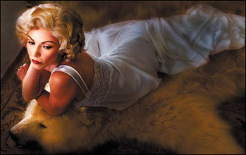
Figure 2.7.5. The layer mask after brushing in the model
- Brush in the area behind the model. Then, bring up the Fade effect dialog box and increase the opacity to 68%. Again, look at the image after the brushwork (Figure 2.7.6) and the resulting layer mask (Figure 2.7.7).
Figure 2.7.6. After brushing in the background area

Figure 2.7.7. The resulting layer mask
- Next, you will selectively add “light” using the Screen blend mode, which works by halving the density of the image. (In contrast, the Multiply blend mode doubles the density.)
- Create a Curves adjustment layer, and name it L2D_SSCREEN. Select the Screen blend mode from the Blend Mode pull-down menu.
The next illusion to create is that there was a light that hit the face of the bear. Before continuing, look at the Screen image map (Figure 2.7.8).
Figure 2.7.8. The L2D_SCREEN image map

- Fill the layer mask with black, select the brush tool, set the brush opacity to 50% with a brush width of 250 pixels (making sure that the foreground color is white and the background black), and brush in just the bear’s eyes. Look at the image after the brushwork (Figure 2.7.9) and the resulting layer mask (Figure 2.7.10).
Figure 2.7.9. The image after brushing in the bear’s face
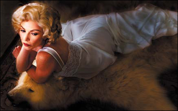
Figure 2.7.10. The resulting layer mask

- Now, brush in the face and body of the bear skin rug. When you are finished, bring up the Fade effect dialog box and decrease the opacity to 41%. Again, look at the image after the brushwork (Figure 2.7.11) and the resulting layer mask (Figure 2.7.12).
Figure 2.7.11. The image after brushing in the bear’s body
Figure 2.7.12. The resulting layer mask
- Brush in the front of the rug behind the bear’s head and its front paw. Then, bring up the Fade effect dialog box, increase the opacity to 88%, and brush behind the bear’s front paw. Bring up the Fade effect dialog box and increase the opacity to 72%. Look at the image after the final brushwork (Figure 2.7.13) and the resulting layer mask (Figure 2.7.14)
Figure 2.7.13. The image after final brushwork
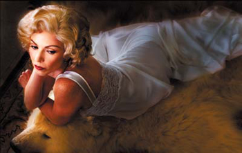
Figure 2.7.14. The final layer mask after fine tuning
- Save the file.
You have created the majority of the illusion that you wanted for this image. The advantage of the approach I described is that, although you started with reflected sunlight as your light source, you could modify the image to make it appear as if it had been lit with “hot” lights. All this was done nondestructively by using Curves adjustment layers and blend modes. Now it is time to fine tune the lighting using the Render Lighting Effects filter that is part of Adobe Photoshop.
Step 5: Lighting Without Lights: Placing Lights with the Render Lighting Effects Filter
You are at the point of no return. You have done everything with the lighting in 16–bit that you can. You must go to 8–bit to continue, so if you have not already done so, save the file.
- Turn off the layer set D_OF_F.
Note
You turn this layer set off because D_OF_F is full of Smart Filters. The problem with Smart Filters is that they each have to convert the file to pixels (referred to as rasterizing in Photoshop) when you open up or save one, which is very time consuming. Turning them off saves you time, and since you made a master layer, you have a layer that contains everything that is in the layer set. The trade off is increased file size, but I think it is better to have a larger file than to have the file open very slowly.
- Turn off the layer set L2D_D2L.
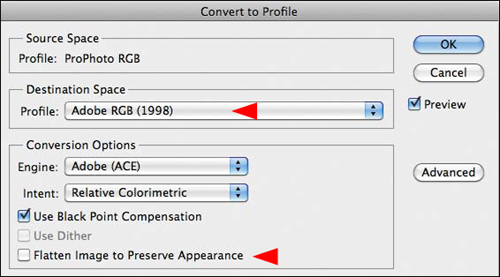
- Convert from ProPhoto to Adobe RGB (Edit > Convert to Profile). When the Convert to Profile dialog box appears, select Adobe RGB from the Destination Space menu, and turn off Flatten Image to Preserve Appearance (Figure 2.8.1).
Figure 2.8.1. Converting the profile to Adobe RGB (1998)
- Convert from 16-bit to 8-bit (Image > Mode > 8-bit). Click OK and select Don’t Rasterize.
- Select Save As (Command + Shift + S / Control + Shift + S) and rename it by changing 16_BIT in the file name to 8_BIT.
Note
The reasons for converting from 16-bit to 8-bit are discussed in Chapter 1 “Lighting the Image with Render Lighting Effects.”
- Create a new layer set below the L2D_D2L layer set and above the MASTER_2 layer, and name it LIGHTING/SHARPEN/NOSE.
- Duplicate the MASTER_2 layer (Command + J / Control + J) and convert it into a Smart Filter layer (Filter > Convert to Smart Filters). Add a layer mask to this layer and put it in the LIGHTING/SHARPEN/NOSE layer set.
- Duplicate the newly created Smart Filter layer (the one you just placed in the layer set) four times.
- Rename MASTER_2_copy1 to LIGHTING and turn off all of the other copies of MASTER_2.
You will use a threefold approach to lighting this image using the Render Lighting Effects filter. First, you will use the filter to do the key lighting as if there had been focusable lighting instruments at the shoot. (Challen’s eyes will get the most light, her face a little less, and her arms less than that.) The second approach is to use the Render Lighting Effects filter to add color to the light (which is different from how you used it in Chapter 1), and the third approach is to use it for the quality of “dark” that it creates so that you can further enhance the lighting you have already done. Your file is sheet music, but the image that you create is the symphony such that the sum becomes greater than the parts. Before moving forward look at the image map (Figure 2.8.2).
Figure 2.8.2. The image map
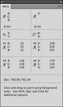
Because you want to make the light reminiscent of the warmth of hot lights, you are going to pick a color from the image and use that to color the “lights” that you place when you launch the filter. For this image, I picked a warm color, which is Info Point 4.
- Select the sample eyedropper from the Tools panel.
- Place a sample point on the color you want to use, which for this image is just to the right of the bear’s eye (Figure 2.8.3). In the Info panel, the RGB values for sample point 4 when I sampled the image were R:179, G:104, and B:149 (Figure 2.8.4).
Figure 2.8.3. A sample point just near the bear’s eye
Figure 2.8.4.
- Making sure that you have the LIGHTING layer active, go to Filter > Render > Lighting Effects.
The User Interface (UI) of the Render Lighting Effects filter appears very small on the screen so it can be hard to use. This UI has not changed since its introduction to Photoshop in Version 2. (Photoshop CS5 is actually version 12 of Photoshop.) There are some ways, however, to get around this obstacle.
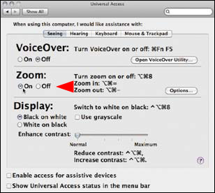
To do this in the Mac OS
Go to the Apple pull-down menu and select Preferences and then Universal Access (Figure 2.8.5). Click the On radial button in the Zoom In part of the Universal Access dialog box (Figure 2.8.6). When you hold both the Command + Option and the + keys down together, you can zoom into the area of the screen where you placed the cursor. To zoom out, press Command + Option and the − key.
Figure 2.8.5.
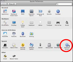
Figure 2.8.6.
To do this in Windows 7
(Unfortunately, this functionality does not exist in Windows XP or Vista.)
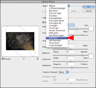
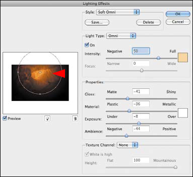
- When the Render Lighting Effects dialog box comes up, select Soft Omni from the Lighting styles pull-down menu (Figure 2.8.7).
Figure 2.8.7. Choose Soft Omni
- Double-click on the light color box that is located to the right of the Intensity slider located in the Light Type part of the Render Lighting Effects dialog box. When you do this, the Color Picker will come up.
- In the RGB part of the Color Picker dialog box, type in the RGB values of the sample point (4) that you chose to be the color of the light (R:179, G:149, and B:104). You should see that the “new” part of the color box has changed (Figure 2.8.8).
Figure 2.8.8. Selecting the color
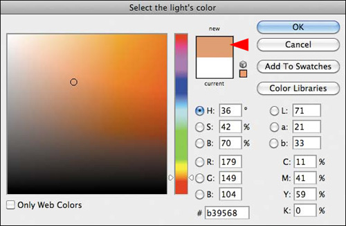
- Now, the color is correct, but is too dark. You can change that by clicking on a lighter part of the Color Picker. When you do that, the color should get lighter in the new color box (Figure 2.8.9). Click OK. You will see that the light’s color has dramatically changed (Figure 2.8.10).
Figure 2.8.9. Lightening the color slightly
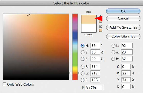
Figure 2.8.10. The color of the light has changed
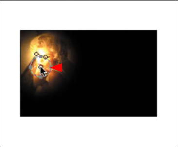
- Click on the center handle of the Soft Omni light and place it above the model’s left eye and below her left eyebrow. Click on the lower anchor point and move it inward (Figure 2.8.11).
Figure 2.8.11. Move the light to the left
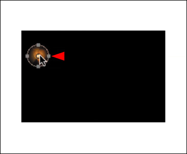
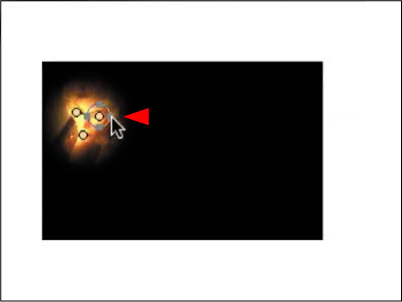
- Holding down the Option / Alt key, click on the center handle of the light you just created. (This duplicates the light and a light bulb icon appears.) Move the newly created light to the inside of her right eye (Figure 2.8.12).
Figure 2.8.12. Duplicate a nwe light to her eye
- Again, holding down the Option / Alt key, click on the center handle of the light you just created. Move the newly created light to the model’s bottom lip (Figure 2.8.13).
Figure 2.8.13. Move the new light to her lips
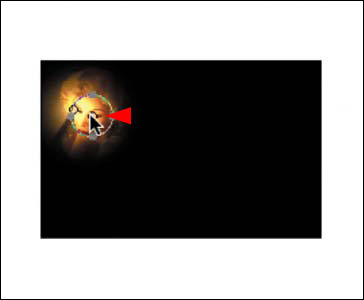
- Starting with the left light, further fine tune the size of the light by clicking on the left handle and moving it inward towards its center to shrink its size.
- Further fine tune the size of the right light by clicking on the left handle and moving it inward towards its center to shrink its size (Figure 2.8.14).
Figure 2.8.14. Fine tune the size of the light
Once you have placed and sized the lights, it is time to adjust their quality.
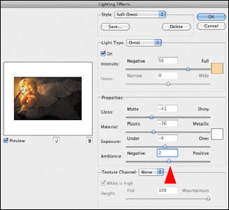
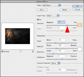
- Make the first light that you placed (the left light) active by clicking on the center handle. Start by adjusting the Ambience. Open it (move the slider right) to a setting of 2 (Figure 2.8.15).
Figure 2.8.15. Increase the Ambience to 2
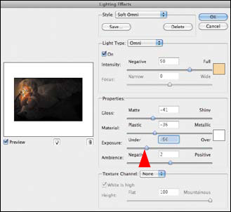
- Adjust the Exposure by lowering it (move the slider left) to a setting of −56 (Figure 2.8.16).
Figure 2.8.16. Lower the Exposure to −56
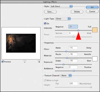
- Make the second light that you placed (the right light) active by clicking on the center handle. Start by adjusting the Intensity of the light, and lower it (move the slider left) to a setting of 38 (Figure 2.8.17).
Figure 2.8.17. Lower the Intensity to 38
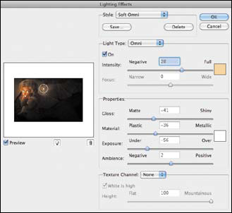
- Make the third light that you placed (the lower light) active by clicking on the center handle. Start by adjusting the Intensity of the light, and lower it (move the slider left) to a setting of 28 (Figure 2.8.18).
Figure 2.8.18. Lower the Intensity to 28
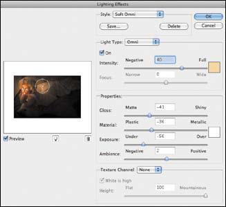
- Add a new light by Option-clicking on the light that is on the model’s lip (the third light you placed), and drag the new light to the upper part of the white gown, just behind the model’s head (Figure 2.8.19).
Figure 2.8.19. Add a new light on the gown
- Click on the lower handle of the newly placed light and expand it outward (Figure 2.8.20).
Figure 2.8.20. Expand the light outward

- Adjust the Intensity of the light by increasing it (move the slider right) to a setting of 40 (Figure 2.8.21).
Figure 2.8.21. Increase the Intensity to 40
- Click OK. This is the image with the Render Lighting Effects applied (Figure 2.8.22).
Figure 2.8.22. The image with the Render Lighting Effects applied
- Turn on the L2D_D2L layer set.
- Turn off the LIGHTING layer.
Before you did anything with the Render Lighting Effects filter, you were almost where you needed to be. By using the filter, you not only lit Challen’s face, you also lit the bear’s face. Now, you are going to use the Render Lighting Effects filter layer to selectively fine tune the lighting of the model’s face as well as to add the illusion of “atmospheric distance” to the image. The Render Lighting Effects filter creates the dark aspect of the lighting effect that can be used to add dimensionality to the atmospheric effects that light sometimes exhibits in real life and that cannot be achieved by using only curves.
Before continuing, look at the image before the Render Lighting Effects with the L2D/D2L layer set on (Figure 2.8.23), the image after the Render Lighting Effects with the L2D/D2L layer set on (Figure 2.8.24), and the image map of the brush back areas of the Render Lighting Effects layer (Figure 2.8.25).
Figure 2.8.23. The image before Render Lighting Effects with the L2D/D2L layer set on

Figure 2.8.24. The image with Render Lighting Effects and the L2D/D2L layer set on
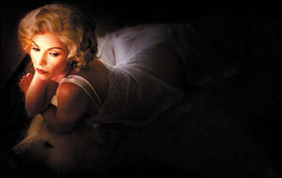
Figure 2.8.25. The image map for brushing back the Render Lighting Effects layer
- Turn on the LIGHTING layer. Create a layer mask and fill it with black. With the foreground color set to black and the background set to white, select the brush tool with a pixel width of 250 and a Brush opacity of 50%, and brush in the area of Challen’s eyes.
- Brush her face. (The brushing of her eyes and face are two separate actions. This is so you can create the “key” light.) Bring up the Fade effect dialog box and reduce the opacity to 35%. Increase the brush size to 600 pixels and brush in her whole head, including her face (which you have just brushed) and hair. Bring up the Fade effect dialog box and reduce the opacity to 35%. Look at the image after the brushwork (Figure 2.8.26) and the resulting layer mask (Figure 2.8.27).
Figure 2.8.26. The image after the brushwork on her face
Figure 2.8.27. The layer mask after the brushwork
- With a brush width of 200 pixels (foreground color white, brush opacity set to 50%), brush in her arms and back. Bring up the Fade effect dialog box and reduce the opacity to 29%. Look at the image after the brushwork (Figure 2.8.28) and the resulting layer mask (Figure 2.8.29).
Figure 2.8.28. The face after the brushwork
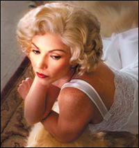
Figure 2.8.29. The layer mask after the brushwork
- Increase the brush size to 1100 pixels (foreground color white, brush opacity of 50%). Brush in the background, starting from the back right of the bear’s head, and go all the way around to the left side of the bear’s nose. (Be sure not to brush into any of the areas in which you have already done brushwork.) When finished, bring up the Fade effect dialog box and increase the opacity to 66%. At 50% opacity, brush in the lower left area of the rug, just behind the bear’s head and before its paw (Figure 2.8.30). Look at the resulting layer mask (Figure 2.8.31).
Figure 2.8.30. The image after brushing in the background and body
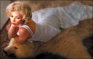
Figure 2.8.31. The layer mask after fine tuning the brushwork
Note
At this point in the production of the final image—the color was still too dark for my taste. (You can see the color change occur in the tutorial DVD.) Therefore, I further fine tuned the color of the lights by re-opening the Smart Filter and changing its color values to R:248, G:222, and B:185. You can do that by clicking on the center handle of each “light”, then clicking on the color picker square. When the Color Picker dialog box comes up, type in the new color values. These changes are reflected in the 100ppi example file for this lesson.
You separated out the Light-to-Dark Lighting Effects layer so that you could use the Light-to-Dark, Dark-to-Light (L2D_D2L) layer group over which you can have greater control. You can further fine tune a layer, layers, or layer set through the use of opacity. Also, by creating the Light-to-Dark and the Dark-to-Light Curves adjustment layers, you can make more informed decisions about selective contrast, render lighting, and selective sharpening of the image.
- Turn on the L2D_D2L layer set.
- Lower the opacity of the Render Lighting Effects layer (Figure 2.8.32).
Figure 2.8.32. The image after adjusting the opacity of the Render Lighting Effects layer
- Save the file.
The only thing left to do is to selectively move the “unconscious” eye a bit more by using a little sharpness and tonal contrast.
Step 6: Selectively Increasing Midtone Image Structure Using Tonal Contrast
By using contrast, you can further refine how the unconscious eye moves across the image. When you look at a person’s image, your eye goes first to their face. Therefore, the first areas on which to focus are Challen’s eyes, her mouth, and her eyebrows. After adjusting these, you will add tonal contrast to the bear’s face, Challen’s gown, and finally the rug. In order to accomplish this in this image, I will have you use a specific type of contrast: Tonal Contrast. (This is one of the three free plug-ins from Nik Software.) The simplest way to describe Tonal Contrast is that it is the Clarity tool on steroids. It is everything you wanted in the Clarity tool but do not have, and it is also things you did not even know that you wanted.
The Clarity tool is an inspired addition to Photoshop (based on Mac Holbert’s Midtone contrast approach to printing). The Clarity tool in Photoshop is a one-size-fits-all approach to applying contrast that locally targets midtone image structure by using the highpass filter. Tonal Contrast, however, allows you to selectively adjust not only the midtones, but the highlight and shadow areas as well. It also allows you to increase or decrease saturation, and protect highlights and shadows. Take a look at the image map (Figure 2.9.1).
Figure 2.9.1. Image map for the TONAL_CONTRAST layer
- Make MASTER_2_copy2 and rename it TONAL_CONTRAST.
- Select Filter > Nik Software > Color Efex Pro 3.0 Versace Edition. In the Nik Filter dialog box, select Tonal Contrast, which is located in the upper left-hand corner and is the bottom-most of the three plug-ins.
I use Tonal Contrast on 100% of my images, because it allows me to control the contrast of highlights, midtones, or shadows without affecting the rest of the image. It works by breaking an image into its component parts (such as sky, clouds, foreground, etc.) and then allowing you to increase the contrast of fine details within those component parts without affecting any others. This leads to a more natural look without the introduction of artifacts or halos. For those interested in more technical information, this plug-in is based on the LSC (Local Statistics Convolution) algorithm which provides a unique approach to increasing fine details in an image.
There are four controls in this plug-in. They are shown in Figure 2.9.2:
- Highlight Contrast—Controls the degree of contrast added to only the highlights (brightest objects) of the image.
- Midtone Contrast—Controls the degree of contrast added to only the midtones of the image.
- Shadow Contrast—Controls the degree of contrast added to only the shadows of the image.
- Saturation—Controls the overall vibrancy of colors by increasing or decreasing saturation throughout the image.
Figure 2.9.2. Tonal Contrast filter
- With the Hand tool, move the image so that the model’s face is filling the preview box and so that the split view line (before is to the left, after is to the right) runs down the middle of her face.
- Start this adjustment by moving the Midtone Contrast slider to the right (this increases the amount) until you reach 61% (Figure 2.9.3).
Figure 2.9.3. Increasing the Midtone Contrast slider to 61%
- For this image, you will leave the Shadow and Highlight sliders at their defaults of 30% and the saturation at its default of 20%. Shadow Protection and Highlight Protection are also good, so leave them at their default as well.
- Click OK. Look at the image after Tonal Contrast is applied globally (Figure 2.9.4).
Figure 2.9.4. Tonal Contrast applied globally
- Make the layer mask of the TONAL_CONTRAST layer active, and fill it with black.
- Zoom in on Challen’s face (Figure 2.9.5). Select the Brush tool, and set the opacity to 50% at a pixel width of 35. With the foreground color set to white and the background set to black, brush in just her left eye. Bring up the Fade effect dialog box (Command + Shift + F / Control + Shift + F), increase the opacity to 70%, and brush in her right eye. Again, bring up the Fade effect dialog box and type in 70%. (You want her eyes to be equal.) Brush in her mouth and right eyebrow at 50%. Bring up the Fade effect dialog box, lower the opacity to 24%, and brush in her left eyebrow. Bring up the Fade effect dialog box and type in 24%.
Figure 2.9.5. Zoomed into her face with the image map visible
- Increase the brush size to 100 pixels, and brush in her hair. Bring up the Fade effect dialog box and reduce the opacity to 36%. Look at the image after the inital brushwork (Figure 2.9.6) and the resulting layer mask (Figure 2.9.7).
Figure 2.9.6. The face after brushwork
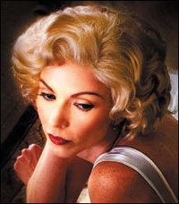
Figure 2.9.7. The layer mask after brushwork
- With a brush width of 500 pixels, brush in the bear’s face and head. Bring up the Fade effect dialog box and reduce the opacity to 36%. Look at the image after the brushwork (Figure 2.9.8) and the resulting layer mask (Figure 2.9.9).
Figure 2.9.8. The bear’s head after brushwork
Figure 2.9.9. The layer mask
- Still using a brush width of 500 pixels, brush in the bear’s face and head and the lower part of the bear skin rug. Bring up the Fade effect dialog box and reduce the opacity to 15%. Look at the image after the brushwork on the bear (Figure 2.9.10) and the resulting layer mask (Figure 2.9.11).
Figure 2.9.10. The image after brushwork on the bear’s body
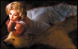
Figure 2.9.11. The layer mask after brushwork on the bear’s body
- Using a brush width of 125 pixels, brush in the lace of the model’s gown. Bring up the Fade effect dialog box and reduce the opacity to 13%.
- Increase the brush size to 400 pixels and brush in the entire gown (including the lace you just did). Bring up the Fade effect dialog box and reduce the opacity to 14%.
- Keeping a brush size of 400 pixels, brush in the center part of the gown (including the lace you just did). Bring up the Fade effect dialog box and reduce the opacity to 10%.
Now, compare the image before brushing in Tonal Contrast (Figure 2.9.12), the image after brushing in Tonal Contrast (Figure 2.9.13), and the final layer mask (Figure 2.9.14).
Figure 2.9.12. Before adding Tonal Contrast
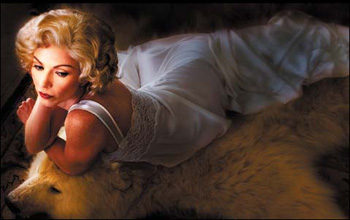
Figure 2.9.13. After brushing in Tonal Contrast
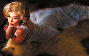
Figure 2.9.14. The final layer mask
- Throw away the Smart Filter layers that you did not use.
- Save the file.
It is time to add the whipped cream and cherry on top of this image sundae. You will add coolness to the shadows and a realistic butterfly shadow under Challen’s nose.
Step 7: The Whipped Cream and Cherry: Adding Shadow Coolness and a Butterfly Shadow
It is time to bring this picture home and put it to bed. You need to add the little touch of reality that will make this image a believable probability, one the viewer will believe was originally lit the way it appears. You will accomplish this is by creating a shadow underneath Challen’s nose and by adding the appropriate amount of blueness into the shadow areas.
Creating a Realistic Butterfly Nose Shadow
Note
When adding shadowing to images, it is a common mistake to overlook the color of the shadow. See also “Creating a Realistic Shadow” in Chapter 1.
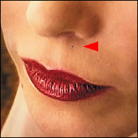
- Zoom in on the area of the model’s nose and mouth. With the eyedropper, sample the color of the shadow just below her nose (Figure 2.10.1). The foreground color now reflects the color of the shadow.
Figure 2.10.1. Sampling the shadow color under her nose
- Create a new layer and name it NOSE_SHADOW. Select the Polygonal Lasso and make a selection like the one shown (Figure 2.10.2). Go to Select > Modify > Feather and select a feather of 11 pixels. Notice that the edges of your selection are rounded out (Figure 2.10.3). Fill the selection (Option + Delete / Alt + Backspace) with the foreground color (Figure 2.10.4).
Figure 2.10.2. Making a selection with the Polygonal Lasso tool
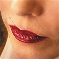
Figure 2.10.3. Feathering the selection
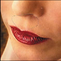
Figure 2.10.4. Filling the selection with the sampled color
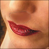
- Deselect the feathered selection. (Select the Crop tool and click anywhere on the image.) Convert the layer to a Smart Filter, and go to Blur > Gaussian Blur. Move the slider to the right until you get a blur that you find appealing. I chose 5.3 pixels. Click OK (Figure 2.10.5).
Figure 2.10.5. Applying the Gaussian Blur
- If you look closely, you will see that you created a bit of a halo beneath her nose (Figure 2.10.6). Select the Move tool and, with the up arrow key, move the shadow upward until the halo is gone and the shadow fits beneath her nose (Figure 2.10.7).
Figure 2.10.6. A halo under the nose

Figure 2.10.7. Moving the shadow to remove the halo
- Go to Window > Arrange > New Window and then to Full screen mode. (If you are in the gray space, press the F key twice.) Arrange the windows so that you can see both of them. Make the window with the enlarged nose shadow active.
- Bring up the Free Transform dialog box (Command + T / Control + T), and click on the Free Transform dialog box while holding the Control key / right-click. This will bring up the Free Transform Options dialog box. Select Warp (Figure 2.10.8).
Figure 2.10.8.
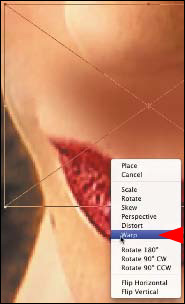
Note
You created a new window and arranged it the way that you did so that you could eliminate the Warp grid and better see what you were doing.
Next, you will warp the shadow to follow the contours of her philtrum (the midline groove in the upper lip that runs from the top of the lip to the nose) so that you give dimension to the nose shadow.
- Click on the center portion of the grid and pull it slightly downward (Figure 2.10.9).
Figure 2.10.9. Pulling the center of the grid down
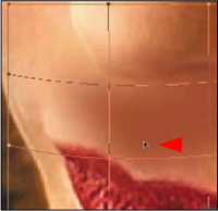
- Click on the left middle section of the Warp grid and move it slightly up and inward (Figure 2.10.10).
Figure 2.10.10. Moving the left middle section upward and inward
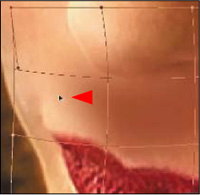
- Click on the right middle section of the Warp grid and move it slightly up and inward (Figure 2.10.11).
Figure 2.10.11. Moving the right middle section upward and inward
- Click on the upper middle control corner point and move it upward and to the right (Figure 2.10.12).
Figure 2.10.12. Moving the upper middle control point upward and to the right
- Click on the upper left control corner point and move it upward and to the right (Figure 2.10.13).
Figure 2.10.13. Moving the upper left control upward and to the right
- Click on the lower middle left control corner point and move it downward and to the right (Figure 2.10.14).
Figure 2.10.14. Moving the middle left control downward and to the right
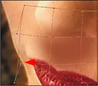
- Click on the lower left control corner point and move it downward and to the right (Figure 2.10.15).
Figure 2.10.15. Moving the lower left control downward and to the right
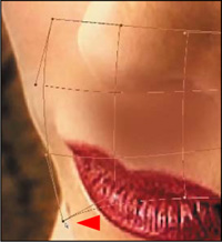
- Once you have adjusted the nose shadow to follow the contours of her philtrum, click on the Hand tool and click Place.
- Close the smaller version of the image; the one you created without the Warp dialog box.
- Go to the gray space. (Press the F key once.)
- Lower the layer’s opacity to 73%.
- Create a layer mask, select the Brush tool, set the opacity to 100%, set the foreground color to black, and brush around the shadow with a 40-pixel brush (starting at the top of Challen’s nose) (Figure 2.10.16) until you are happy with the shadow’s size. (Remember to use the edge of the brush.) When you are finished with your brushwork, it should look like Figure 2.10.17. Reduce the opacity of the layer until it looks realistic; 33% is about right (Figure 2.10.18).
Figure 2.10.16. Brushing the edge of the shadow
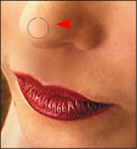
Figure 2.10.17. The shadow after the final brushwork
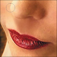
Figure 2.10.18. The face after reducing the opacity of the shadow layer
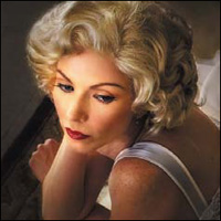
- Turn off the L2D_D2L layer set (if it is not already turned off).
- Create a master layer and name it MASTER_3.
- Turn off the LIGHTING/TONAL/NOSE layer set.
- Save the file.
Adding Realistic Coolness to the Shadow Areas
You separated out Light-to-Dark and Dark-to-Light adjustment layers so that you could control the opacity should you want to decrease the effective darkness. You did this so that you would have an exit strategy, and so that you would not be married to the darkness that you have created. This separation also allows you to move into or out of any layer group and to add things to them as the look of the image develops. In this final step, you are going to cool the shadows of this image using one of Photoshop’s built-in photo filters.
- Turn on the L2D_D2L layer set and open it.
- Make the L2D_SCREEN Curves adjustment layer active.
- Click on the Adjustment Layers icon located at the bottom of the Layers panel and select Photo Filter.
- After the Photo Filter dialog box comes up, select Cooling Filter 82 from the Filter pull-down menu (Figure 2.11.1).
Figure 2.11.1. Select Cooling Filter 82 from the pull-down menu
- Leave the filter at its default density of 25% (Figure 2.11.2).
Figure 2.11.2. Leave the Density at 25%
- Fill the layer mask with black.
Look at the image map diagram for this layer’s cooling filter (Figure 2.11.3). You want to leave the faces of the model and the bear alone, but you want to put a little coolness into the area of the gown onto which the light directly falls. You want to add increasing coolness as the light falls away down the back of the gown. In the area of the rug (both in front and behind), you want to apply a lot of coolness, because this is the area of the deepest shadow.
Figure 2.11.3. The image map for the cooling effect

- Set your Brush tool at an opacity of 50%, the foreground color to white, and the brush width to 500 pixels. Starting from just behind the bear’s head, brush in the entire area around the model ending at the top part of the bear’s head. Bring up the Fade effect dialog box and increase the opacity to 77%.
- Brush in the whole gown at 50%. (Include the front area onto which the light is falling.) Bring up the Fade effect dialog box and reduce the opacity to 26%. Brush in only the back of the gown. Bring up the Fade effect dialog box and lower the opacity to 24%. Look at the final layer mask (Figure 2.11.4).
Figure 2.11.4. The final layer mask for the cooling effect
- Make a master layer and name it FINAL.
- Save the file.
The Die Is Cast
Gone is the day that the movie moguls taught actors the importance of posing all day for a photograph.
—George Hurrell
You have reached the conclusion of this chapter’s main focus, creating classic glamour lighting and replicating the DOF and bokeh of an 8×10 view camera using Photoshop (Figures 2.12.1 and 2.12.2). In Chapter 3, I will further discuss the concept of the conscious and unconscious eye and how to control how the viewer “sees” your image.
Figure 2.12.1. The original image
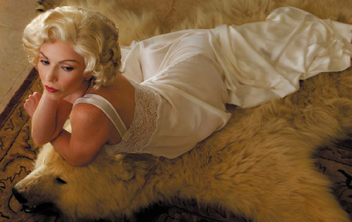
Figure 2.12.2. The final image