
1. About Variables and Values
Variables and Values
It must seem odd to start a book about statistical analysis using Excel with a discussion of ordinary, everyday notions such as variables and values. But variables and values, along with scales of measurement (covered in the next section), are at the heart of how you represent data in Excel. And how you choose to represent data in Excel has implications for how you run the numbers.
With your data laid out properly, you can easily and efficiently combine records into groups, pull groups of records apart to examine them more closely, and create charts that give you insight into what the raw numbers are really doing. When you put the statistics into tables and charts, you begin to understand what the numbers have to say.
When you lay out your data without considering how you will use the data later, it becomes much more difficult to do any sort of analysis. Excel is generally very flexible about how and where you put the data you’re interested in, but when it comes to preparing a formal analysis, you want to follow some guidelines. In fact, some of Excel’s features don’t work at all if your data doesn’t conform to what Excel expects. To illustrate one useful arrangement, you won’t go wrong if you put different variables in different columns and different records in different rows.
A variable is an attribute or property that describes a person or a thing. Age is a variable that describes you. It describes all humans, all living organisms, all objects—anything that exists for some period of time. Surname is a variable, and so are weight in pounds and brand of car. Database jargon often refers to variables as fields, and some Excel tools use that terminology, but in statistics you generally use the term variable.
Variables have values. The number “20” is a value of the variable “age,” the name “Smith” is a value of the variable “surname,” “130” is a value of the variable “weight in pounds,” and “Ford” is a value of the variable “brand of car.” Values vary from person to person and from object to object—hence the term variable.
Recording Data in Lists
When you run a statistical analysis, your purpose is generally to summarize a group of numeric values that belong to the same variable. For example, you might have obtained and recorded the weight in pounds for 20 people, as shown in Figure 1.1.
Figure 1.1. This layout is ideal for analyzing data in Excel.
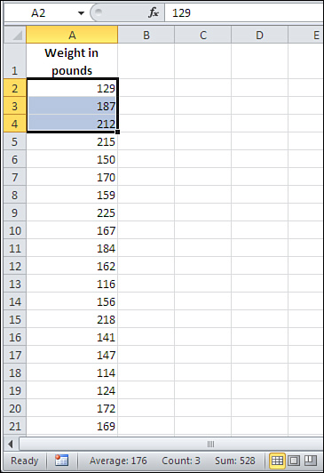
The way the data is arranged in Figure 1.1 is what Excel calls a list—a variable that occupies a column, records that each occupy a different row, and values in the cells where the records’ rows intersect the variable’s column. (The record is the individual being, object, location—whatever—that the list brings together with similar records. If the list in Figure 1.1 is made up of students in a classroom, each student constitutes a record.)
A list always has a header, usually the name of the variable, at the top of the column. In Figure 1.1, the header is the label “Weight in Pounds” in cell A1.
Note
A list is an informal arrangement of headers and values on a worksheet. It’s not a formal structure that has a name and properties, such as a chart or a pivot table. Excel 2007 and 2010 offer a formal structure called a table that acts much like a list, but has some bells and whistles that a list doesn’t have. This book will have more to say about tables in subsequent chapters.
There are some interesting questions that you can answer with a single-column list such as the one in Figure 1.1. You could select all the values and look at the status bar at the bottom of the Excel window to see summary information such as the average, the sum, and the count of the selected values. Those are just the quickest and simplest statistical analyses you might do with this basic single-column list.
Tip
You can turn the display of indicators such as simple statistics on and off. Right-click the status bar and select or deselect the items you want to see. However, you won’t see a statistic unless the current selection contains at least two values. The status bar of Figure 1.1 shows the average, count, and sum of the selected values. (The worksheet tabs have been suppressed to unclutter the figure.)
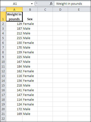
Again, this book has much more to say about the richer analyses of a single variable that are available in Excel. But first, suppose that you add a second variable, “Sex,” to the list in Figure 1.1.
You might get something like the two-column list in Figure 1.2. All the values for a particular record—here, a particular person—are found in the same row. So, in Figure 1.2, the person whose weight is 129 pounds is female (row 2), the person who weighs 187 pounds is male (row 3), and so on.
Figure 1.2. The list structure helps you keep related values together.
Using the list structure, you can easily do the simple analyses that appear in Figure 1.3, where you see a pivot table and a pivot chart. These are powerful tools and well suited to statistical analysis, but they’re also very easy to use.
Figure 1.3. The pivot table and pivot chart summarize the individual records shown in Figure 1.2.
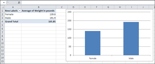
All that’s needed for the pivot chart and pivot table in Figure 1.3 is the simple, informal, unglamorous list in Figure 1.2. But that list, and the fact that it keeps related values of weight and sex together in records, makes it possible to do the analyses shown in Figure 1.3. With the list in Figure 1.2, you’re literally seven mouse clicks away from analyzing and charting weight by sex.
Note that you cannot create a column chart directly from the data as displayed in Figure 1.2. You first need to get the average weight of men and women, then associate those averages with the appropriate labels, and finally create the chart. A pivot chart is much quicker, more convenient, and more powerful.
Scales of Measurement
There’s a difference in how weight and sex are measured and reported in Figure 1.2 that is fundamental to all statistical analysis—and to how you bring Excel’s tools to bear on the numbers. The difference concerns scales of measurement.
Category Scales
In Figures 1.2 and 1.3, the variable Sex is measured using a category scale, sometimes called a nominal scale. Different values in a category variable merely represent different groups, and there’s nothing intrinsic to the categories that does anything but identify them. If you throw out the psychological and cultural connotations that we pile onto labels, there’s nothing about Male and Female that would lead you to put one on the left and the other on the right in Figure 1.3’s pivot chart, the way you’d put June to the left of July.
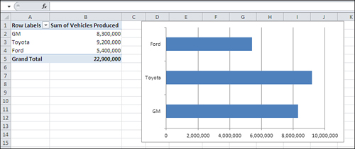
Another example: Suppose that you wanted to chart the annual sales of Ford, General Motors, and Toyota cars. There is no order that’s necessarily implied by the names themselves: They’re just categories. This is reflected in the way that Excel might chart that data (see Figure 1.4).
Figure 1.4. Excel’s Column charts always show categories on the horizontal axis and numeric values on the vertical axis.
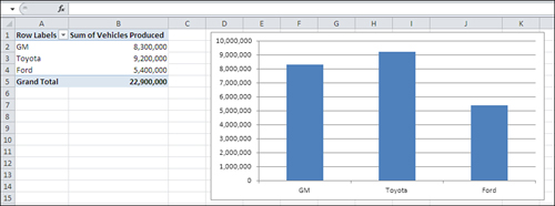
Notice these two aspects of the car manufacturer categories in Figure 1.4:
• Adjacent categories are equidistant from one another. No additional information is supplied by the distance of GM from Toyota, or Toyota from Ford.
• The chart conveys no information through the order in which the manufacturers appear on the horizontal axis. There’s no implication that GM has less “car-ness” than Toyota, or Toyota less than Ford. You could arrange them in alphabetical order if you wanted, or in order of number of vehicles produced, but there’s nothing intrinsic to the scale of manufacturers’ names that suggests any rank order.
Note
This is one of many quirks of terminology in Excel. The name “Ford” is of course a value, but Excel prefers to call it a category and to reserve the term value for numeric values only.
In contrast, the vertical axis in the chart shown in Figure 1.4 is what Excel terms a value axis. It represents numeric values.
Notice in Figure 1.4 that a position on the vertical, value axis conveys real quantitative information: the more vehicles produced, the taller the column. In general, Excel charts put the names of groups, categories, products, or any other designation, on a category axis and the numeric value of each category on the value axis. But the category axis isn’t always the horizontal axis (see Figure 1.5).
Figure 1.5. In contrast to column charts, Excel’s Bar charts always show categories on the vertical axis and numeric values on the horizontal axis.
The Bar chart provides precisely the same information as does the Column chart. It just rotates this information by 90 degrees, putting the categories on the vertical axis and the numeric values on the horizontal axis.
I’m not belaboring the issue of measurement scales just to make a point about Excel charts. When you do statistical analysis, you choose a technique based in large part on the sort of question you’re asking. In turn, the way you ask your question depends in part on the scale of measurement you use for the variable you’re interested in.
For example, if you’re trying to investigate life expectancy in men and women, it’s pretty basic to ask questions such as, “What is the average life span of males? of females?” You’re examining two variables: sex and age. One of them is a category variable and the other is a numeric variable. (As you’ll see in later chapters, if you are generalizing from a sample of men and women to a population, the fact that you’re working with a category variable and a numeric variable might steer you toward what’s called a t-test.)
In Figures 1.3 through 1.5, you see that numeric summaries—average and sum—are compared across different groups. That sort of comparison forms one of the major types of statistical analysis. If you design your samples properly, you can then ask and answer questions such as these:
• Are men and women paid differently for comparable work? Compare the average salaries of men and women who hold similar jobs.
• Is a new medication more effective than a placebo at treating a particular disease? Compare, say, average blood pressure for those taking an alpha blocker with that of those taking a sugar pill.
• Do Republicans and Democrats have different attitudes toward a given political issue? Ask a random sample of people their party affiliation, and then ask them to rate a given issue or candidate on a numeric scale.
Notice that each of these questions can be answered by comparing a numeric variable across different categories of interest.
Numeric Scales
Although there is only one type of category scale, there are three types of numeric scales: ordinal, interval, and ratio. You can use the value axis of any Excel chart to represent any type of numeric scale, and you often find yourself analyzing one numeric variable, regardless of type, in terms of another variable. Briefly, the numeric scale types are as follows:
• Ordinal scales are often rankings. They tell you who finished first, second, third, and so on. These rankings tell you who came out ahead, but not how far ahead, and often you don’t care about that. Suppose that in a qualifying race Jane ran 100 meters in 10.54 seconds, Mary in 10.83 seconds and Ellen in 10.84 seconds. Because it’s a preliminary heat, you might care only about their order of finish, but not about how fast each woman ran. Therefore, you might well convert the time measurements to order of finish (1, 2 and 3), and then discard the timings themselves. Ordinal scales are sometimes used in a branch of statistics called nonparametrics but less so in the parametric analyses discussed in this book.
• Interval scales indicate differences in measures such as temperature and elapsed time. If the high temperature Fahrenheit on July 1 is 100 degrees, 101 degrees on July 2, and 102 degrees on July 3, you know that each day is one degree hotter than the previous day. So an interval scale conveys more information than an ordinal scale. You know, from the order of finish on an ordinal scale, that in the qualifying race Jane ran faster than Mary and Mary ran faster than Ellen, but the rankings by themselves don’t tell you how much faster. It takes elapsed time, an interval scale, to tell you that.
• Ratio scales are similar to interval scales, but they have a true zero point, one at which there is a complete absence of some quantity. The Celsius temperature scale has a zero point, but it doesn’t indicate that there is a complete absence of heat, just that water freezes there. Therefore, 10 degrees Celsius is not twice as warm as 5 degrees Celsius, so Celsius is not a ratio scale. Degrees kelvin does have a true zero point, one at which there is no molecular motion and therefore no heat. Kelvin is a ratio scale, and 100 degrees kelvin would be twice as warm as 50 degrees kelvin. Other familiar ratio scales are height and weight.
It’s worth noting that converting between interval (or ratio) and ordinal measurement is a one-way process. If you know how many seconds it takes three people to run 100 meters, you have measures on a ratio scale that you can convert to an ordinal scale—gold, silver and bronze medals. You can’t go the other way, though: If you know who won each medal, you’re still in the dark as to whether the bronze medal was won with a time of 10 seconds or 10 minutes.
Telling an Interval Value from a Text Value
Excel has an astonishingly broad scope, and not only in statistical analysis. As much skill as has been built into it, though, it can’t quite read your mind. It doesn’t know, for example, whether the 1, 2, and 3 you just entered into a worksheet’s cells represent the number of teaspoons of olive oil you use in three different recipes or 1st, 2nd, and 3rd place in a political primary. In the first case, you meant to indicate liquid measures on an interval scale. In the second case, you meant to enter the first three places in an ordinal scale. But they both look alike to Excel.
Note
This is a case in which you must rely on your own knowledge of numeric scales because Excel can’t tell whether you intend a number as a value on an ordinal or an interval scale. Ordinal and interval scales have different characteristics—for one thing, ordinal scales do not follow a normal distribution, a “bell curve.” Excel can’t tell the difference, so you have to do so if you’re to avoid using a statistical technique that’s wrong for a given scale of measurement.
Text is a different matter. You might use the letters A, B, and C to name three different groups, and in that case you’re using text values to represent a nominal, category scale. You can also use numbers: 1, 2, and 3 to represent the same groups. But if you use a number as a nominal value, it’s a good idea to store it in the worksheet as a text value. For example, one way to store the number 2 as a text value in a worksheet cell is to precede it with an apostrophe: ’2. You’ll see the apostrophe in the formula box but not in the cell.
On a chart, Excel has some complicated decision rules that it uses to determine whether a number is only a number. Some of those rules concern the type of chart you request. For example, if you request a Line chart, Excel treats numbers on the horizontal axis as though they were nominal, text values. But if instead you request an XY chart using the same data, Excel treats the numbers on the horizontal axis as values on an interval scale. You’ll see more about this in the next section.
So, as disquieting as it may sound, a number in Excel may be treated as a number in one context and not in another. Excel’s rules are pretty reasonable, though, and if you give them a little thought when you see their results, you’ll find that they make good sense.
If Excel’s rules don’t do the job for you in a particular instance, you can provide an assist. Figure 1.6 shows an example.
Figure 1.6. You don’t have data for all the months in the year.
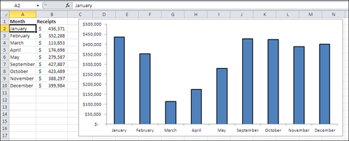
Suppose you run a business that operates only when public schools are in session, and you collect revenues during all months except June, July, and August. Figure 1.6 shows that Excel interprets dates as categories—but only if they are entered as text, as they are in the figure. Notice these two aspects of the chart in Figure 1.6:
• The dates are entered in the worksheet cells A2:A10 as text values. One way to tell is to look in the formula box, just to the right of the fx symbol, where you see the text value “January”.
• Because they are text values, Excel has no way of knowing that you mean them to represent dates, and so it treats them as simple categories—just like it does for GM, Ford, and Toyota. Excel charts the dates accordingly, with equal distances between them: May is as far from April as it is from September.
Compare Figure 1.6 with Figure 1.7, where the dates are real numeric values, not simply text:
• You can see in the formula box that it’s an actual date, not just the name of a month, in cell A2, and the same is true for the values in cells A3:A10.
• The Excel chart automatically responds to the type of values you have supplied in the worksheet. The program recognizes that the numbers entered represent monthly intervals and, although there is no data for June through August, the chart leaves places for where the data would appear if it were available. Because the horizontal axis now represents a numeric scale, not simple categories, it faithfully reflects the fact that in the calendar, May is four times as far from September as it is from April.
Figure 1.7. The horizontal axis accounts for the missing months.

Charting Numeric Variables in Excel
Several chart types in Excel lend themselves beautifully to the visual representation of numeric variables. This book relies heavily on charts of that type because most people find statistical concepts that are difficult to grasp in the abstract are much clearer when they’re illustrated in charts.
Charting Two Variables
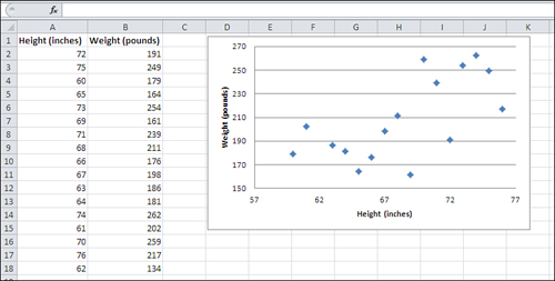
Earlier this chapter briefly discussed two chart types that use a category variable on one axis and a numeric variable on the other: Column charts and Bar charts. There are other, similar types of charts, such as Line charts, that are useful for analyzing a numeric variable in terms of different categories—especially time categories such as months, quarters, and years. However, one particular type of Excel chart, called an XY (Scatter) chart, shows the relationship between two numeric variables. Figure 1.8 provides an example.
Figure 1.8. In an XY (Scatter) chart, both the horizontal and vertical axes are value axes.
Note
Since the 1990s at least, Excel has called this sort of chart an XY (Scatter) chart. In its 2007 version, Excel started referring to it as an XY chart in some places, as a Scatter chart in others, and as an XY (Scatter) chart in still others. For the most part, this book opts for the brevity of XY chart, and when you see that term you can be confident it’s the same as an XY (Scatter) chart.
The markers in an XY chart show where a particular person or object falls on each of two numeric variables. The overall pattern of the markers can tell you quite a bit about the relationship between the variables, as expressed in each record’s measurement. Chapter 4, “How Variables Move Jointly: Correlation,” goes into considerable detail about this sort of relationship.
In Figure 1.8, for example, you can see the relationship between a person’s height and weight: Generally, the greater the height, the greater the weight. The relationship between the two variables is fundamentally different from those discussed earlier in this chapter, where the emphasis is placed on the sum or average of a numeric variable, such as number of vehicles, according to the category of a nominal variable, such as make of car.
However, when you are interested in the way that two numeric variables are related, you are asking a different sort of question, and you use a different sort of statistical analysis. How are height and weight related, and how strong is the relationship? Does the amount of time spent on a cell phone correspond in some way to the likelihood of contracting cancer? Do people who spend more years in school eventually make more money? (And if so, does that relationship hold all the way from elementary school to post-graduate degrees?) This is another major class of empirical research and statistical analysis: the investigation of how different variables change together—or, in statistical lingo, how they covary.
Excel’s XY charts can tell you a considerable amount about how two numeric variables are related. Figure 1.9 adds a trendline to the XY chart in Figure 1.8.
Figure 1.9. A trendline graphs a numeric relationship, which is almost never an accurate way to depict reality.
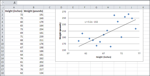
The diagonal line you see in Figure 1.9 is a trendline. It is an idealized representation of the relationship between men’s height and weight, at least as determined from the sample of 17 men whose measures are charted in the figure. The trendline is based on this formula:
Weight = 5.2 * Height − 152
Excel calculates the formula based on what’s called the least squares criterion. You’ll see much more about this in Chapter 4.
Suppose that you picked several—say, 20—different values for height in inches, plugged them into that formula, and then found the resulting weight. If you now created an Excel XY chart that shows those values of height and weight, you would get a chart that shows the straight trendline you see in Figure 1.9.
That’s because arithmetic is nice and clean and doesn’t involve errors. Reality, though, is seldom free from errors. Some people weigh more than a formula thinks they should, given their height. Other people weigh less. (Statistical analysis terms these discrepancies errors.) The result is that if you chart the measures you get from actual people instead of from a mechanical formula, you’re going to get data that look like the scattered markers in Figures 1.8 and 1.9.
Reality is messy, and the statistician’s approach to cleaning it up is to seek to identify regular patterns lurking behind the real-world measures. If those real-world measures don’t precisely fit the pattern that has been identified, there are several explanations, including these (and they’re not mutually exclusive):
• People and things just don’t always conform to ideal mathematical patterns. Deal with it.
• There may be some problem with the way the measures were taken. Get better yardsticks.
• There may be some other, unexamined variable that causes the deviations from the underlying pattern. Come up with some more theory, and then carry out more research.
Understanding Frequency Distributions
In addition to charts that show two variables—such as numbers broken down by categories in a Column chart, or the relationship between two numeric variables in an XY chart—there is another sort of Excel chart that deals with one variable only. It’s the visual representation of a frequency distribution, a concept that’s absolutely fundamental to intermediate and advanced statistical methods.
A frequency distribution is intended to show how many instances there are of each value of a variable. For example:
• The number of people who weigh 100 pounds, 101 pounds, 102 pounds, and so on.
• The number of cars that get 18 miles per gallon (mpg), 19 mpg, 20 mpg, and so on.
• The number of houses that cost between $200,001 and $205,000, between $205,001 and $210,000, and so on.
Because we usually round measurements to some convenient level of precision, a frequency distribution tends to group individual measurements into classes. Using the examples just given, two people who weigh 100.2 and 100.4 pounds might each be classed as 100 pounds; two cars that get 18.8 and 19.2 mpg might be grouped together at 19 mpg; and any number of houses that cost between $220,001 and $225,000 would be treated as in the same price level.
As it’s usually shown, the chart of a frequency distribution puts the variable’s values on its horizontal axis and the count of instances on the vertical axis. Figure 1.10 shows a typical frequency distribution.
Figure 1.10. Typically, most records cluster toward the center of a frequency distribution.
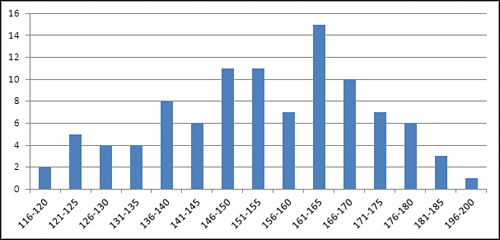
You can tell quite a bit about a variable by looking at a chart of its frequency distribution. For example, Figure 1.10 shows the weights of a sample of 100 people. Most of them are between 140 and 180 pounds. In this sample, there are about as many people who weigh a lot (say, over 175 pounds) as there are whose weight is relatively low (say, up to 130). The range of weights—that is, the difference between the lightest and the heaviest weights—is about 85 pounds, from 116 to 200.
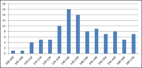
There are lots of ways that a different sample of people might provide a different set of weights than those shown in Figure 1.10. For example, Figure 1.11 shows a sample of 100 vegans—notice that the distribution of their weights is shifted down the scale somewhat from the sample of the general population shown in Figure 1.10.
Figure 1.11. Compared to Figure 1.10, the location of the frequency distribution has shifted to the left.
The frequency distributions in Figures 1.10 and 1.11 are relatively symmetric. Their general shapes are not far from the idealized normal “bell” curve, which depicts the distribution of many variables that describe living beings. This book has much more to say in future chapters about the normal curve, partly because it describes so many variables of interest, but also because Excel has so many ways of dealing with the normal curve.
Still, many variables follow a different sort of frequency distribution. Some are skewed right (see Figure 1.12) and others left (see Figure 1.13).
Figure 1.12. A frequency distribution that stretches out to the right is called positively skewed.
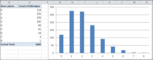
Figure 1.13. Negatively skewed distributions are not as common as positively skewed distributions.
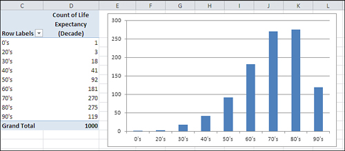
Figure 1.12 shows counts of the number of mistakes on individual Federal tax forms. It’s normal to make a few mistakes (say, one or two), and it’s abnormal to make several (say, five or more). This distribution is positively skewed.
Another variable, home prices, tends to be positively skewed, because although there’s a real lower limit (a house cannot cost less than $0) there is no theoretical upper limit to the price of a house. House prices therefore tend to bunch up between $100,000 and $200,000, with a few between $200,000 and $300,000, and fewer still as you go up the scale.
A quality control engineer might sample 100 ceramic tiles from a production run of 10,000 and count the number of defects on each tile. Most would have zero, one, or two defects, several would have three or four, and a very few would have five or six. This is another positively skewed distribution—quite a common situation in manufacturing process control.
Because true lower limits are more common than true upper limits, you tend to encounter more positively skewed frequency distributions than negatively skewed. But they certainly occur. Figure 1.13 might represent personal longevity: relatively few people die in their twenties, thirties, and forties, compared to the numbers who die in their fifties through their eighties.
Using Frequency Distributions
It’s helpful to use frequency distributions in statistical analysis for two broad reasons. One concerns visualizing how a variable is distributed across people or objects. The other concerns how to make inferences about a population of people or objects on the basis of a sample.
Those two reasons help define the two general branches of statistics: descriptive statistics and inferential statistics. Along with descriptive statistics such as averages, ranges of values, and percentages or counts, the chart of a frequency distribution puts you in a stronger position to understand a set of people or things because it helps you visualize how a variable behaves across its range of possible values.
In the area of inferential statistics, frequency distributions based on samples help you determine the type of analysis you should use to make inferences about the population. As you’ll see in later chapters, frequency distributions also help you visualize the results of certain choices that you must make, such as the probability of making the wrong inference.
Visualizing the Distribution: Descriptive Statistics
It’s usually much easier to understand a variable—how it behaves in different groups, how it may change over time, and even just what it looks like—when you see it in a chart. For example, here’s the formula that defines the normal distribution:
u = (1 / ((2π).5) σ) e ∧ (− (X − μ)2 / 2 σ2)
And Figure 1.14 shows the normal distribution in chart form.
Figure 1.14. The familiar normal curve is just a frequency distribution.
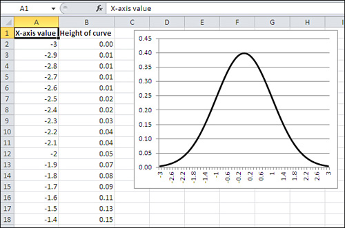
The formula itself is indispensable, but it doesn’t convey understanding. In contrast, the chart informs you that the frequency distribution of the normal curve is symmetric and that most of the records cluster around the center of the horizontal axis.
Note
The formula was developed by a 17th century French mathematician named Abraham De Moivre. Excel simplifies it to this:
=NORMDIST(1,0,1,FALSE)
In Excel 2010, it’s this:
=NORM.S.DIST(1,FALSE)
Those are major simplifications.
Again, personal longevity tends to bulge in the higher levels of its range (and therefore skews left as in Figure 1.13). Home prices tend to bulge in the lower levels of their range (and therefore skew right). The height of human beings creates a bulge in the center of the range, and is therefore symmetric and not skewed.
Some statistical analyses assume that the data comes from a normal distribution, and in some statistical analyses that assumption is an important one. This book does not explore the topic in detail because it comes up infrequently. Be aware, though, that if you want to analyze a skewed distribution there are ways to normalize it and therefore comply with the requirements of the analysis. In general, you can use Excel’s SQRT() and LOG() functions to help normalize a negatively skewed distribution, and an exponentiation operator (for example, =A2∧2 to square the value in A2) to help normalize a positively skewed distribution.
Visualizing the Population: Inferential Statistics
The other general rationale for examining frequency distributions has to do with making an inference about a population, using the information you get from a sample as a basis. This is the field of inferential statistics. In later chapters of this book you will see how to use Excel’s tools—in particular, its functions and its charts—to infer a population’s characteristics from a sample’s frequency distribution.
A familiar example is the political survey. When a pollster announces that 53% of those who were asked preferred Smith, he is reporting a descriptive statistic. Fifty-three percent of the sample preferred Smith, and no inference is needed.
But when another pollster reports that the margin of error around that 53% statistic was plus or minus 3%, she is reporting an inferential statistic. She is extrapolating from the sample to the larger population and inferring, with some specified degree of confidence, that between 50% and 56% of all voters prefer Smith.
The size of the reported margin of error, six percentage points, depends in part on how confident the pollster wants to be. In general, the greater degree of confidence you want in your extrapolation, the greater the margin of error that you allow. If you’re on an archery range and you want to be virtually certain of hitting your target, you make the target as large as necessary.
Similarly, if the pollster wants to be 99.9% confident of her projection into the population, the margin might be so great as to be useless—say, plus or minus 20%. And it’s not headline material to report that somewhere between 33% and 73% of the voters prefer Smith.
But the size of the margin of error also depends on certain aspects of the frequency distribution in the sample of the variable. In this particular (and relatively straightforward) case, the accuracy of the projection from the sample to the population depends in part on the level of confidence desired (as just briefly discussed), in part on the size of the sample, and in part on the percent favoring Smith in the sample. The latter two issues, sample size and percent in favor, are both aspects of the frequency distribution you determine by examining the sample’s responses.
Of course, it’s not just political polling that depends on sample frequency distributions to make inferences about populations. Here are some other typical questions posed by empirical researchers:
• What percent of the nation’s homes went into foreclosure last quarter?
• What is the incidence of cardiovascular disease today among persons who took the pain medication Vioxx prior to its removal from the marketplace in 2004? Is that incidence reliably different from the incidence of cardiovascular disease among those who did not take the medication?
• A sample of 100 cars from a particular manufacturer, made during 2010, had average highway gas mileage of 26.5 mpg. How likely is it that the average highway mpg, for all that manufacturer’s cars made during that year, is greater than 26.0 mpg?
• Your company manufactures custom glassware and uses lasers to etch company logos onto wine bottles, tumblers, sales awards, and so on. Your contract with a customer calls for no more than 2% defective items in a production lot. You sample 100 units from your latest production run and find five that are defective. What is the likelihood that the entire production run of 1,000 units has a maximum of 20 that are defective?
In each of these four cases, the specific statistical procedures to use—and therefore the specific Excel tools—would be different. But the basic approach would be the same: Using the characteristics of a frequency distribution from a sample, compare the sample to a population whose frequency distribution is either known or founded in good theoretical work. Use the numeric functions in Excel to estimate how likely it is that your sample accurately represents the population you’re interested in.
Building a Frequency Distribution from a Sample
Conceptually, it’s easy to build a frequency distribution. Take a sample of people or things and measure each member of the sample on the variable that interests you. Your next step depends on how much sophistication you want to bring to the project.
Tallying a Sample
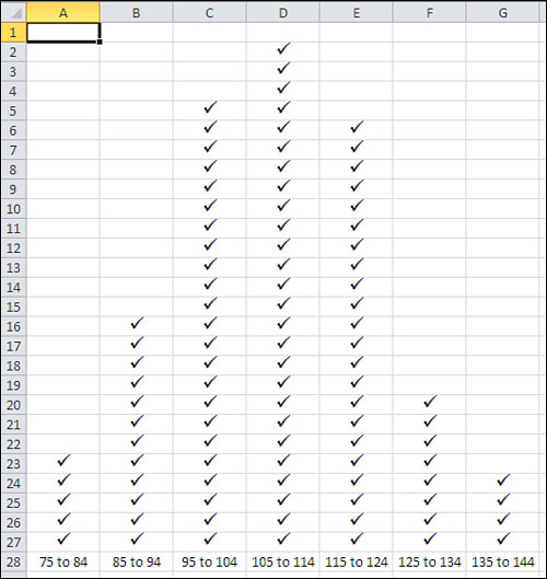
One straightforward approach continues by dividing the relevant range of the variable into manageable groups. For example, suppose you obtained the weight in pounds of each of 100 people. You might decide that it’s reasonable and feasible to assign each person to a weight class that is ten pounds wide: 75 to 84, 85 to 94, 95 to 104, and so on. Then, on a sheet of graph paper, make a tally in the appropriate column for each person, as suggested in Figure 1.15.
Figure 1.15. This approach helps clarify the process, but there are quicker and easier ways.
The approach shown in Figure 1.15 uses a grouped frequency distribution, and tallying by hand into groups was the only practical option as recently as the 1980s, before personal computers came into truly widespread use. But using an Excel function named FREQUENCY(), you can get the benefits of grouping individual observations without the tedium of manually assigning individual records to groups.
Grouping with FREQUENCY()
If you assemble a frequency distribution as just described, you have to count up all the records that belong to each of the groups that you define. Excel has a function, FREQUENCY(), that will do the heavy lifting for you. All you have to do is decide on the boundaries for the groups and then point the FREQUENCY() function at those boundaries and at the raw data.
Figure 1.16 shows one way to lay out the data.
Figure 1.16. The groups are defined by the numbers in cells C2:C8.
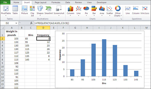
In Figure 1.16, the weight of each person in your sample is recorded in column A. The numbers in cells C2:C8 define the upper boundaries of what this section has called groups, and what Excel calls bins. Up to 85 pounds defines one bin; from 86 to 95 defines another; from 96 to 105 defines another, and so on.
Note
There’s no special need to use the column headers shown in Figure 1.16, cells A1, C1, and D1. In fact, if you’re creating a standard Excel chart as described here, there’s no great need to supply column headers at all. If you don’t include the headers, Excel names the data Series1 and Series2. If you use the pivot chart instead of a standard chart, though, you will need to supply a column header for the data shown in Column A in Figure 1.16.
The count of records within each bin appears in D2:D8. You don’t count them yourself—you call on Excel to do that for you, and you do that by means of a special kind of Excel formula, called an array formula. You’ll read more about array formulas in Chapter 2, “How Values Cluster Together,” as well as in later chapters, but for now here are the steps needed to get the bin counts shown in Figure 1.16:
- Select the range of cells that the results will occupy. In this case, that’s the range of cells D2:D8.
- Type, but don’t yet enter, the formula
=FREQUENCY(A2:A101,C2:C8)
which tells Excel to count the number of records in A2:A101 that are in each bin defined by the numeric boundaries in C2:C8.
- After you have typed the formula, hold down the Ctrl and Shift keys simultaneously and press Enter. Then release all three keys. This keyboard sequence notifies Excel that you want it to interpret the formula as an array formula.
Note
When Excel interprets a formula as an array formula, it places curly brackets around the formula in the formula box.
The results appear very much like those in cells D2:D8 of Figure 1.16, of course depending on the actual values in A2:A101 and the bins defined in C2:C8. You now have the frequency distribution but you still should create the chart. Here are the steps, assuming the data is located as in Figure 1.16:
- Select the data you want to chart—that is, the range C1:D8.
- Click the Insert tab, and then click the Column button in the Charts group.
- Choose the Clustered Column chart type from the 2-D charts. A new chart appears, as shown in Figure 1.17. Because columns C and D on the worksheet both contain numeric values, Excel initially thinks that there are two data series to chart: one named Bins and one named Frequency.
Figure 1.17. Values from both columns are charted as data series at first because they’re all numeric.
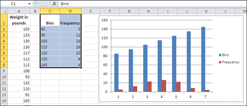
- Fix the chart by clicking Select Data in the Design tab that appears when a chart is active. The dialog box shown in Figure 1.18 appears.
Figure 1.18. You can also use the Select Data dialog box to add another data series to the chart.

- Click the Edit button under Horizontal (Category) Axis Labels. A new Axis Labels dialog box appears; drag through cells C2:C8 to establish that range as the basis for the horizontal axis. Click OK.
- Click the Bins label in the left list box shown in Figure 1.18. Click the Remove button to delete it as a charted series. Click OK to return to the chart.
- Remove the chart title and series legend, if you want, by clicking each and pressing Delete.
At this point you will have a normal Excel chart that looks much like the one shown in Figure 1.16.
Tip
You can use the same range for the Data argument and the Bins argument in the FREQUENCY() function: for example, =FREQUENCY(A1:A101,A1:A101). Don’t forget to enter it as an array formula. This is a convenient way to get Excel to treat every recorded value as its own bin, and you get the count for every unique value in the range A1:A101.
Grouping with Pivot Tables
Another approach to constructing the frequency distribution is to use a pivot table. A related tool, the pivot chart, is based on the analysis that the pivot table does. I prefer this method to using an array formula that employs FREQUENCY() because once the initial groundwork is done, I can use the same pivot table to do analyses that go beyond the basic frequency distribution. But if all I want is a quick group count, FREQUENCY() is usually the faster way.
Again, there’s more on pivot tables and pivot charts in Chapter 2 and later chapters, but this section shows you how to use them to establish the frequency distribution.
Building the pivot table (and the pivot chart) requires you to specify bins, just as the use of FREQUENCY() does, but that happens a little further on.
Note
A reminder: When you use the FREQUENCY() method described in the prior section, a header at the top of the column of raw data is helpful but not required. When you use the pivot table method, the header is required.
Begin with your sample data in A1:A101, just as before. Select any one of the cells in that range and then follow these steps:
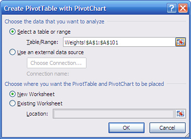
- Click the Insert tab. Click the PivotTable drop-down in the Tables group and choose PivotChart from the drop-down list. (When you choose a pivot chart, you automatically get a pivot table along with it.) The dialog box in Figure 1.19 appears.
Figure 1.19. If you begin by selecting a single cell in the range containing your input data, Excel automatically proposes the range of adjacent cells that contain data.
- Click the Existing Worksheet option button. Click in the Location range edit box and then click some blank cell in the worksheet that has other empty cells to its right and below it.
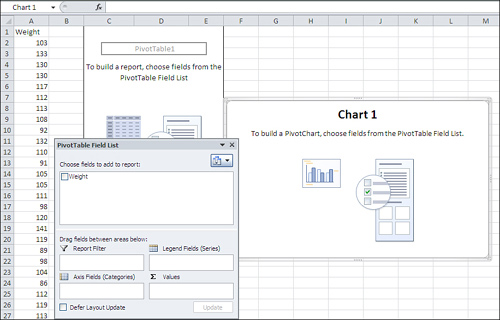
- Click OK. The worksheet now appears as shown in Figure 1.20.
Figure 1.20. With one field only, you normally use it for both Axis Fields (Categories) and Summary Values.
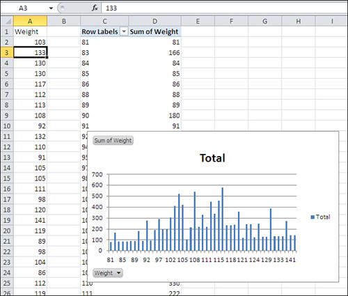
- Click the Weight field in the PivotTable Field List and drag it into the Axis Fields (Categories) area.
- Click the Weight field again and drag it into the Σ Values area. Despite the uppercase Greek sigma, which is a summation symbol, the Σ Values in a pivot table can show averages, counts, standard deviations, and a variety of statistics other than the sum. However, Sum is the default statistic for a numeric field.
- The pivot table and pivot chart are both populated as shown in Figure 1.21. Right-click any cell that contains a row label, such as C2. Choose Group from the shortcut menu.
Figure 1.21. The Weight field contains numeric values only, so the pivot table defaults to Sum as the summary statistic.
The Grouping dialog box shown in Figure 1.22 appears.
Figure 1.22. This step establishes the groups that the FREQUENCY() function refers to as bins.

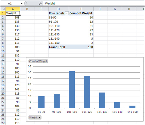
- In the Grouping dialog box, set the Starting At value to 81 and enter 10 in the By box. Click OK.
- Right-click a cell in the pivot table under the header Sum of Weight. Choose Value Field Settings from the shortcut menu. Select Count in the Summarize Value Field By list box, and then click OK.
- The pivot table and chart reconfigure themselves to appear as in Figure 1.23. To remove the field buttons in the upper- and lower-left corners of the pivot chart, select the chart, click the Analyze tab, click the Field Buttons button, and select Hide All.
Figure 1.23. This sample’s frequency distribution has a slight right skew but is reasonably close to a normal curve.
Building Simulated Frequency Distributions
It can be helpful to see how a frequency distribution assumes a particular shape as the number of underlying records increases. Statistical Analysis: Excel 2010 has a variety of worksheets and workbooks for you to download from this book’s website (www.informit.com/title/9780789747204). The workbook for Chapter 1 has a worksheet named Figure 1.24 that samples records at random from a population of values that follows a normal distribution. The following figure, as well as the worksheet on which it’s based, shows how a frequency distribution comes closer and closer to the population distribution as the number of sampled records increases.
Figure 1.24. This frequency distribution is based on a population of records that follow a normal distribution.
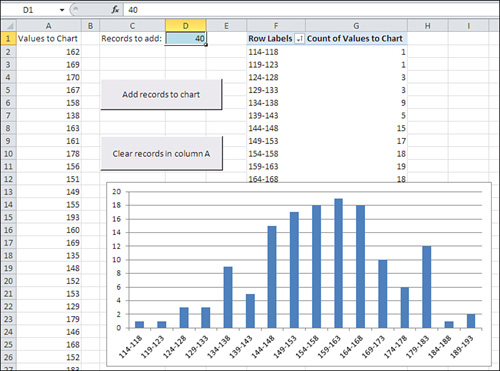
Begin by clicking the button labeled Clear Records in Column A. All the numbers will be deleted from column A, leaving only the header value in cell A1. (The pivot table and pivot chart will remain as they were: It’s a characteristic of pivot tables and pivot charts that they do not respond immediately to changes in their underlying data sources.)
Decide how many records you’d like to add, and then enter that number in cell D1. You can always change it to another number.
Click the button labeled Add Records to Chart. When you do so, several events take place, all driven by Visual Basic procedures that are stored in the workbook:
• A sample is taken from the underlying normal distribution. The sample has as many records as specified in cell D1. (The underlying, normally distributed population is stored in a separate, hidden worksheet named Random Normal Values; you can display the worksheet by right-clicking a worksheet tab and selecting Unhide from the shortcut menu.)
• The sample of records is added to column A. If there were no records in column A, the new sample is written starting in cell A2. If there were already, say, 100 records in column A, the new sample would begin in cell A102.
• The pivot table and pivot chart are updated (or, in Excel terms, refreshed). As you click the Add Records to Chart button repeatedly, more and more records are used in the chart. The greater the number of records, the more nearly the chart comes to resemble the underlying normal distribution.
In effect, this is what happens in an experiment when you increase the sample size. Larger samples resemble more closely the population from which you draw them than do smaller samples. That greater resemblance isn’t limited to the shape of the distribution: It includes the average value and measures of how the values vary around the average. Other things being equal, you would prefer a larger sample to a smaller one because it’s likely to represent the population more closely.
But this effect creates a cost-benefit problem. It is usually the case that the larger the sample, the more accurate the experimental findings—and the more expensive the experiment. Many issues are involved here (and this book discusses them), but at some point the incremental accuracy of adding, say, ten more experimental subjects no longer justifies the incremental expense of adding them. One of the bits of advice that statistical analysis provides is to tell you when you’re reaching the point when the returns begin to diminish.
With the material in this chapter—scales of measurement, the nature of axes on Excel charts, and frequency distributions—in hand, Chapter 2 moves on to the beginnings of practical statistical analysis, the measurement of central tendency.