
2. How Values Cluster Together
When you think about a group that’s measured on some numeric variable, you often start thinking about the group’s average value. On a scale of 1 to 10, how well do registered Independents think the President is doing? What is the average market value of a house in Minneapolis? What’s the most popular given name for boys born last year?
The answer to each of those questions, and questions like them, is usually expressed as an average, although the word average in everyday usage isn’t well defined, and you would go about figuring each average differently. For example, to investigate Presidential approval, you might go to 100 Independent voters, ask them each for a rating from 1 to 10, add up all the ratings, and divide by 100. That’s one kind of average, and it’s more precisely termed the mean.
If you’re after the average housing value in Minneapolis, you probably ask some group such as a board of realtors. They’ll likely tell you what the median price is. The reason you’re less likely to get the mean value is that in real estate sales, there are always a few houses that sell for really outrageous amounts of money. Those few houses pull the mean up so far that it isn’t really representative of the price of a typical house in the region you’re interested in.
The median, on the other hand, is right on the 50th percentile for house prices; half the houses sold for less than the median price and half sold for more (it’s a little more complicated than this, and the complexities will be explained shortly). It isn’t affected by how far some house values are from an average, just by how many are above an average. In that sort of situation, where the distribution of values isn’t symmetric, the median often gives you a much better sense of the average, typical value than does the mean.
And if you’re thinking of average as a measure of what’s most popular, you’re usually thinking in terms of a mode—the most frequently occurring value. For example, in 2009, Jacob was the modal boy’s name among newborns.
Each of these measures—the mean, the median and the mode—is legitimately if imprecisely thought of as an average. More precisely, each of them is a measure of central tendency: that is, how a group of people or things tend to cluster in some way around a central value.
Calculating the Mean
When you’re reading, talking, or thinking about statistics and the word mean comes up, it refers to the total divided by the count. The total of the heights of everyone in your family divided by the number of people in your family. The total price per gallon of gasoline at all the gas stations in your city, divided by the number of gas stations. The total number of a baseball player’s hits divided by the number of at bats.
In the context of statistics, it’s very convenient, and more precise, to use the word mean this way. It avoids the vagueness of the word average, which—as just discussed—can refer to the mean, to the median, or to the mode.
So it’s sort of a shame that Excel uses the function name AVERAGE() instead of MEAN(). Nevertheless, Figure 2.1 gives an example of how you get a mean using Excel.
Figure 2.1. The AVERAGE() function calculates the mean of its arguments.
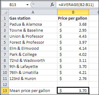
Understanding the elements that Excel’s worksheet functions have in common with one another is important to using them properly, and of course you can’t do good statistical analysis in Excel without using the statistical functions properly. There are more statistical worksheet functions in Excel, about one hundred, than any other function category. So I propose to spend some ink here on the elements of worksheet functions in general and statistical functions in particular. A good place to start is with the calculation of the mean, shown in Figure 2.1.
Understanding Functions, Arguments, and Results
The function that’s depicted in Figure 2.1, AVERAGE(), is a typical example of statistical worksheet functions.
Defining a Worksheet Function
An Excel worksheet function—more briefly, a function—is just a formula that someone at Microsoft wrote to save you time, effort, and mistakes.
Note
Formally, a formula in Excel is an expression in a worksheet cell that begins with an equal sign (=); for example, =3+4 is a formula. Formulas often employ functions such as AVERAGE() and an example is =AVERAGE(A1:A20) + 5, where the AVERAGE() function has been used in the formula. Nevertheless, a worksheet function is itself a formula; you just use its name and arguments without having to deal with the way it goes about calculating its results.
Suppose that Excel had no AVERAGE() function. In that case, to get the result shown in cell B13 of Figure 2.1, you would have to enter something like this in B13:
=(B2+B3+B4+B5+B6+B7+B8+B9+B10+B11) / 10
Or, if Excel had a SUM() and a COUNT() function but no AVERAGE(), you could use this:
=SUM(B2:B11)/COUNT(B2:B11)
But you don’t need to bother with those because Excel has an AVERAGE() function, and in this case you use it as follows:
=AVERAGE(B2:B11)
So—at least in the cases of Excel’s statistical, mathematical, and financial functions—all the term worksheet function means is a prewritten formula. The function results in a summary value that’s usually based on other, individual values.
Defining Arguments
More terminology: Those “other, individual values” are called arguments. That’s a highfalutin name for the values that you hand off to the function—or, put another way, that you plug into the prewritten formula. In the instance of the function
=AVERAGE(B2:B11)
the range of cells represented by B2:B11 is the function’s argument. The arguments always appear in parentheses following the function.
A single range of cells is regarded as one argument, even though the single range B2:B11 contains ten values. AVERAGE(B2:B11,C2:C11) contains two arguments: one range of ten values in column B and one range of ten values in column C. (Excel has a few functions, such as PI(), which take no arguments but you have to supply the parentheses anyway.)
Note
Excel 2010 enables you to specify as many as 255 arguments to a function. (Earlier versions, such as Excel 2003, allowed you to specify only 30 arguments.) But this doesn’t mean that you can pass a maximum of 255 values to a function. Even AVERAGE(A1:A1048576), which calculates the mean of the values in over a million cells, has only one argument.
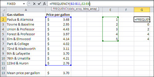
Many statistical and mathematical functions in Excel take the contents of worksheet cells as their arguments—for example, SUM(A2:A10). Some functions have additional arguments that you use to fine-tune the analysis. You’ll see much more about these functions in later chapters, but a straightforward example involves the FREQUENCY() function, which was introduced in Chapter 1:
=FREQUENCY(B2:B11,E2:E6)
In this example, suppose that you wanted to categorize the price per gallon data in Figure 2.1 into five groups: less than $1, between $1 and $2, between $2 and $3 and so on. You could define the limits of those groups by entering the value at the upper limit of the range—that is, $1, $2, $3, $4, and so on—in cells E2:E6. The FREQUENCY() function expects that you will use its first argument to tell it where the individual observations are (here, they’re in B2:B11, called the data array by Excel) and that you’ll use its second argument to tell it where to find the boundaries of the groups (here, E2:E6, called the bins array).
So in the case of the FREQUENCY() function, the arguments have different purposes: The data array argument contains the range address of the values that you want to group, and the bins array argument contains the range address of the boundaries you want to use for the bins.
Contrast that with something such as =SUM(A1, A2, A3), where the SUM() function expects each of its arguments to contribute to the total. To use worksheet functions properly, you must be aware of the purpose of each one of a function’s arguments.
Excel gives you an assist with that. When you start to enter a function into a cell in an Excel worksheet, Excel responds by prompting you for the remaining arguments. See Figure 2.2, where the user has just begun entering the FREQUENCY() function. Excel displays the names of the arguments in a small pop-up window.
Figure 2.2. The individual observations are found in the data_array and the bin boundaries are found in the bins_array.
Excel is often finicky about the order in which you supply the arguments. In the prior example, for instance, you get a very different (and very wrong) result if you incorrectly give the bins array address first:
=FREQUENCY(E2:E6,B2:B11)
The order matters if the arguments serve different purposes, as they do in the FREQUENCY() function. If they all serve the same purpose, the order doesn’t matter. For example, =SUM(A2:A10,B2:B10) is equivalent to =SUM(B2:B10,A2:A10) because the only arguments to the SUM() function are its addends.
Defining Return
One final bit of terminology used in functions: When a function calculates its result using the arguments you have supplied, it displays the result in the cell where you entered the function. This process is termed returning the result. For example, the AVERAGE() function returns the mean of the values you supply.
Understanding Formulas, Results, and Formats
It’s important to be able to distinguish between a formula, the formula’s results, and what the results look like in your worksheet. A friend of mine didn’t bother to understand the distinctions and as a consequence he failed a very elementary computer literacy course.
My friend knew that among other learning objectives he was supposed to show how to use a formula to add together the numbers in two worksheet cells and show the result of the addition in a third cell. The numbers 11 and 14 were in A1 and A2, respectively. Because he didn’t understand the difference between a formula and the result of a formula, he entered the actual sum, 25, in A3, instead of the formula =A1+A2. When he learned that he’d failed the test, he was surprised to find out that “There’s some way they can tell that you didn’t enter the formula.”
What could I say? He was pre-law.
Earlier this chapter discussed the following example of the use of a simple statistical function:
=AVERAGE(B2:B11)
In fact, that’s a formula. An Excel formula begins with an equal sign (=). This particular formula consists of a function name (here, AVERAGE) and its arguments (here, B2:B11).
In the normal course of events, after you have finished entering a formula into a worksheet cell, Excel responds as follows:
• The formula itself, including any function and arguments involved, appears in the Formula box.
• The result of the formula—in this case, what the function returns—appears in the cell where you entered the formula.
• The precise result of the formula might or might not appear in that cell, depending on the cell format that you have specified. For example, if you have limited how many decimal places show up in the cell, the result may appear less precise.
I used the phrase “normal course of events” just now because there are steps you sometimes take to override them (see Figure 2.3).
Figure 2.3. The Formula bar contains the Name box, on the left, and the Formula box, on the right.
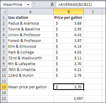
Notice these three aspects of the worksheet in Figure 2.3: The formula itself is visible, its result is visible, and its result can also be seen with a different appearance.
Visible Formulas
The formula itself appears in the Formula box. But if you wanted, you could set the protection for cell B13, or B15, to Hidden. Then, if you protect the worksheet, the formula would not appear in the Formula box. Usually, though, the formula box shows you the formula or the static value you’ve entered in the cell.
Visible Results
The result of the formula appears in the cell where the formula is entered. In Figure 2.3, you see the average price per gallon for ten gas stations in cells B13 and B15. But you could instead see the formulas in the cells. There is a Show Formulas toggle button in the Formula Auditing section of the Ribbon’s Formulas tab. Click it to change from values to formulas and back to values. If you don’t find that button (perhaps someone has customized the Ribbon), click the File tab and choose Options from the navigation bar. Click Advanced in the Excel Options window and scroll down to the Display Options for This Worksheet area. Fill the check box labeled Show Formulas in Cells Instead of Their Calculated Results.
Same Result, Different Appearance
The same formula is in cell B15 as in cell B13, but the formula appears to return a different result. Actually, both cells contain 3.697. But cell B13 is formatted to show currency, and United States currency formats display two decimal values only, by convention. So, if you call for the currency format and your operating system is using U.S. currency conventions, the display is adjusted to show just two decimals. You can change the number of decimals displayed if you wish, by selecting the cell and then clicking either the Increase Decimal or the Decrease Decimal button in the Number group on the Home tab.
Minimizing the Spread
The mean has a special characteristic that makes it more useful for certain advanced statistical analyses than the median and the mode. That characteristic has to do with the distance of each individual observation from the mean of all observations included in calculating the mean.
Suppose you have a list of ten numbers—say, the ages of all your close relatives. Pluck another number out of the air. Subtract that number from each of the ten ages and square the result of each subtraction. Now, find the total of all ten squared differences.
If the number that you chose, the one that you subtracted from each of the ten ages, happens to be the mean of the ten ages, then the total of the squared differences is minimized, thus the term least squares. That total is smaller than it would be if you chose any number other than the mean. This outcome probably seems a strange thing to care about, but it turns out to be an important characteristic of many statistical analyses, as you’ll see in later chapters of this book.
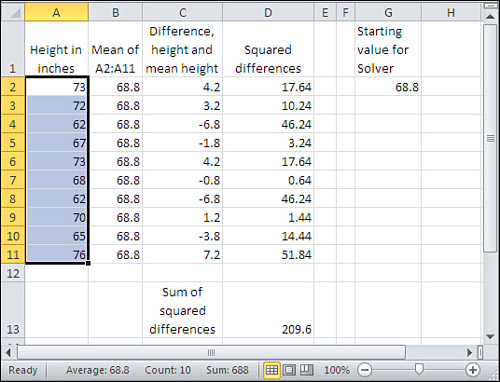
Here’s a concrete example. Figure 2.4 shows the height of each of ten people in cells A2:A11.
Figure 2.4. Columns B, C and D are reserved for values that you supply.
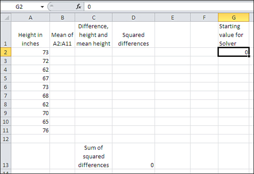
Using the workbook for Chapter 2 (see www.informit.com/title/9780789747204 for download information), you should fill in columns B, C, and D as described later in this section. The cells B2:B11 in Figure 2.4 will then contain a value—any numeric value—that’s different from the actual mean of the ten observations in column A. You will see that if the mean is in column B, the sum of the squared differences in cell D13 is smaller than if any other number is in column B.
To see that, you will need to have made Solver available to Excel.
About Solver
Solver is an add-in that comes with Microsoft Excel. You can install it from the factory disc or from the software that you downloaded to put Excel on your computer. Solver helps you backtrack to underlying values when you want them to result in a particular outcome.
For example, suppose you have ten numbers on a worksheet, and their mean value is 25. You want to know what the tenth number must be in order for the mean to equal 30 instead of 25. Solver can do that for you. Normally, you know your inputs and you’re seeking a result. When you know the result and want to find the necessary values of the inputs, Solver provides one way to do so.
The example in the prior paragraph is trivially simple, but it illustrates the main purpose of Solver: You specify the outcome and Solver determines the input values needed to reach the outcome.
You could use another Excel tool, Goal Seek, to solve the latter problem. But Solver offers you many more options than does Goal Seek. For example, using Solver, you can specify that you want an outcome maximized or minimized, instead of solving for a particular outcome. That’s relevant here because we want to find a value that minimizes the sum of the squared differences.
Finding and Installing Solver
It’s possible that Solver is already installed and available to Excel on your computer. To use Solver in Excel 2007 or 2010, click the Ribbon’s Data tab and find the Analysis group. If you see Solver there you’re all set. (In Excel 2003 or earlier, check for Solver in the Tools menu.)
If you don’t find Solver on the Ribbon or the Tools menu, take these steps in Excel 2007 or 2010:
- Click the Ribbon’s File tab and choose Options.
- Choose Add-Ins from the Options navigation bar.
- At the bottom of the View and Manage Microsoft Office Add-Ins window, make sure that the Manage drop-down is set to Excel Add-Ins and then click Go.
- The Add-Ins dialog box appears. If you see Solver Add-in listed, fill its check box and click OK.
You should now find Solver in the Analysis group on the Ribbon’s Data tab.
If you’re using Excel 2003 or earlier, start by choosing Add-Ins from the Tools menu. Then complete step 4 in the preceding list.
If you didn’t find Solver in the Analysis group on the Data tab (or on the Tools menu in earlier Excel versions), and if you did not see it in the Add-Ins dialog box in step 4, then Solver was not installed with Excel. You will have to re-run the installation routine, and you can usually do so via the Programs item in the Windows Control Panel.
The sequence varies according to the operating system you’re running, but you should choose to change features for Microsoft Office. Expand the Excel option by clicking the plus sign by its icon and then do the same for Add-ins. Click the drop-down by Solver and choose Run from My Computer. Complete the installation sequence. When it’s through, you should be able to make the Solver add-in available to Excel using the sequence of four steps provided earlier in this section.
Setting Up the Worksheet for Solver
With the actual observations in A2:A11, as shown in Figure 2.4, continue by taking these steps:
- Enter any number in cell G2. It is 0 in Figure 2.4, but you could use 10 or 1066 or 3.1416 if you prefer. When you’re through with these steps, you’ll find the mean of the values in A2:A11 has replaced the value you now begin with in cell G2.
- In cell B2, enter this formula:
=$G$2
- Copy and paste the formula in B2 into B3:B11. Because the dollar signs in the cell address make it a fixed reference, you will find that each cell in B2:B11 contains the same formula. And because the formulas point to cell G2, whatever number is there also appears in B2:B11.
- In cell C2, enter this formula:
=A2 − B2
- Copy and paste the formula in C2 into C3:C11. The range C2:C11 now contains the differences between each individual observation and whatever value you chose to put in cell G2.
- In cell D2, enter the following formula, which uses the caret as an exponentiation operator to return the square of the value in cell C2:
=C2∧2
- Copy and paste the formula in D2 into D3:D11. The range D2:D11 now contains the squared differences between each individual observation and whatever number you entered in cell G2.
- To get the sum of the squared differences, enter this formula in cell D13:
=SUM(D2:D11)
- Now start Solver. With cell D13 selected, click the Data tab and locate the Analysis group. Click Solver to bring up the dialog box shown in Figure 2.5.
Figure 2.5. The Set Objective field should contain the cell you want Solver to maximize, minimize, or set to a specific value.
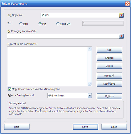
- You want to minimize the sum of the squared differences, so choose the Min radio button.
- Because D13 was the active cell when you started Solver, it is the address that appears in the Set Objective field. Click in the By Changing Variable Cells box and then click in cell G2. This establishes the cell whose value Solver will minimize.
- Click Solve.
Solver now iterates through a sequence of values for cell G2. It stops when its internal decision-making rules tell it that it has found a minimum value for cell D13 and that testing more values in cell G2 won’t help.
Using the data given in Figure 2.4, Solver finishes with a value of 68.8 in cell G2 (see Figure 2.6). Because of the way that the worksheet was set up, that’s the value that now appears in cells B2:B11, and it’s the basis for the differences in C2:C11 and the squared differences in D2:D11. The sum of the squared differences in D13 is minimized, and the value in cell G2 that’s responsible for the minimum sum of the squared differences—or, in more typical statistical jargon, least squares—is the mean of the values in A2:A11.
Figure 2.6. Compare cell G2 with the average of the values in A2:A11.
Tip
If you take another look at Figure 2.6, you’ll see a bar at the bottom of the Excel window with the word Ready at its left. This bar is called the status bar. You can arrange for it to display the mean of the values in selected cells. Right-click anywhere on the status bar to display a Customize Status Bar window. Select or deselect any of these to display or suppress them on the status bar: Average, Count, Numeric Count, Minimum, Maximum, and Sum. The Count statistic displays a count of all values in the selected range; the Numeric Count displays a count of only the numeric values in the range.
A few comments on this demonstration:
• It works with any set of real numbers, and any size set. Supply some numbers, total their squared differences from some other number, and then tell Solver to minimize that sum. The result will always be the mean of the original set.
• This is a demonstration, not a proof. The proof that the squared differences from the mean sums to a smaller total than from any other number is not complex and it can be found in a variety of sources.
• This discussion uses the terms differences and squared differences. You’ll find that it’s more common in statistical analysis to speak and write in terms of deviations and squared deviations.
This has to be the most roundabout way of calculating a mean ever devised. The AVERAGE() function, for example, is lots simpler. But the exercise using Solver in this section is important for two reasons:
• Understanding other concepts, including correlation, regression, and the general linear model, will come much easier if you have a good feel for the relationship between the mean of a set of scores and the concept of minimizing squared deviations.
• If you have not yet used Excel’s Solver, you have now had a glimpse of it, although in the context of a problem solved much more quickly using other tools.
I have used a very simple statistical function, AVERAGE(), as a context to discuss some basics of functions and formulas in Excel. These basics apply to all Excel’s mathematical and statistical functions, and to many functions in other categories as well. You’ll need to know about some other aspects of functions, but I’ll pick them up as we get to them: They’re much more specific than the issues discussed in this chapter.
It’s time to get on to the next measure of central tendency: the median.
Calculating the Median
The median of a group of observations is usually, and somewhat casually, thought of as the middle observation when they are in sorted order. And that’s usually a good way to think of it, even if it’s a little imprecise.
It’s often said, for example, that half the observations lie below the median while half lie above it. The Excel documentation says so. So does my old college stats text. But no. Suppose that your observations consist of the numbers 1, 2, 3, 4, and 5. The middlemost number in that set is 3. But it is not true that half the numbers lie above it or below it. It is accurate to state that the same number of observations lie below the median as lie above it. In the prior example, two observations lie below 3 and two lie above 3.
If there is an even number of observations in the data set, then it’s accurate to say that half lie below the median and half above it. But with an even number of observations there is no specific, middle record, and therefore there is no identifiable median record. Add one observation to the prior set, so that it consists of 1, 2, 3, 4, 5, and 6. There is no record in the middle of that set. Or make it 1, 2, 3, 3, 3, and 4. Although one of the 3’s is the median, there is no specific, identifiable record in the middle of the set.
One way, used by Excel, to calculate the median with an even number of records is to take the mean of the two middle numbers. In this example, the mean of 3 and 4 is 3.5, which Excel calculates as the median of 1, 2, 3, 4, 5, and 6. And then, with an even number of observations, exactly half the observations lie below and half above the median.
Note
Other ways to calculate the median are available when there are tied values or an even number of values: One method is interpolation into a group of tied values. But the method used by Excel has the virtue of simplicity: It’s easy to calculate, understand, and explain. And you won’t go far wrong when Excel calculates a median value of 65.5 when interpolation would have given you 65.7.
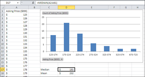
The syntax for the MEDIAN() function echoes the syntax of the AVERAGE() function. For the data shown in Figure 2.7, you just enter =MEDIAN(A2:A61).
Figure 2.7. The mean and the median are always different in asymmetric distributions.
Choosing to Use the Median
The median is sometimes a more descriptive measure of central tendency than the mean. For example, Figure 2.7 shows what’s called a skewed distribution—that is, the distribution isn’t symmetric. Most of the values bunch up on the left side, and a few are located off to the right (of course, a distribution can skew either direction—this one happens to skew right). This sort of distribution is typical of home prices and it’s the reason that the real-estate industry reports medians instead of means.
In Figure 2.7, notice that the median home price reported is $193,000 and the mean home price is $232,000. The median responds only to the number of ranked observations, but the mean also responds to the size of the observations’ values.
Suppose that in the course of a week the price of the most expensive house increases by $100,000 and there are no other changes in housing prices. The median remains where it was, because it’s still at the 50th percentile in the distribution of home prices. It’s that 50% rank that matters, not the dollars associated with the most expensive house—or, for that matter, the cheapest.
In contrast, the mean would react if the most expensive house increased in price. In the situation shown in Figure 2.7, an increase of $120,000 in just one house’s price would increase the mean by $2,000—but the median would remain where it is.
The median’s relatively static quality is one reason that it’s the preferred measure of central tendency for housing prices and similar data. Another reason is that when distributions are skewed, the median provides a better measure of how things tend centrally. Have another look at Figure 2.7. Which statistic seems to you to better represent the typical home price in that figure: the mean of $232,000 or the median of $193,000? It’s a subjective judgment, of course, but many people would judge that $193,000 is a better summary of the prices of these houses than is $232,000.
Calculating the Mode
The mean gives you a measure of central tendency by taking all the actual values in a group into account. The median measures central tendency differently, by giving you the midpoint of a ranked group of values. The mode takes yet another tack: It tells you which one of several categories occurs most frequently.
You can get this information from the FREQUENCY() function, as discussed in Chapter 1. But the MODE() function returns the most frequently occurring observation only, and it’s a little quicker to use. Furthermore, as you’ll see in this section, a little work can get MODE() to work with data on a nominal scale—that’s also possible with FREQUENCY() but it’s a lot more work.
Suppose you have a set of numbers in a range of cells, as shown in Figure 2.8. The following formula returns the numeric value that occurs most frequently in that range (in Figure 2.8, the formula is entered in cell C1):
=MODE(A2:A21)
Figure 2.8. Excel’s MODE() function works only with numeric values.
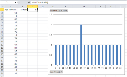
The pivot chart in Figure 2.8 provides the same information graphically. Notice that the mode returned by the function in cell C1 is the same value as the most frequently occurring value shown in the pivot chart.
The problem is that you don’t usually care about the mode of numeric values. It’s possible that you have at hand a list of the ages of the people who live on your block, or the weight of each player on your favorite football team, or the height of each student in your daughter’s fourth grade class. It’s even conceivable that you have a good reason to know the most frequently occurring age, weight, or height in a group of people. (In the area of inferential statistics, covered in the second half of this book, the mode of what’s called a reference distribution is often of interest. At this point, though, we’re dealing with more commonplace problems.) But you don’t normally need the mode of people’s ages, weights, or heights.
Among other purposes, numeric measures are good for recording small distinctions: Joe is 33 years old and Jane is 34; Dave weighs 230 pounds and Don weighs 232; Jake is 47 inches tall and Judy stands 48 inches. In a group of 18 or 20 people, it’s quite possible that everyone is of a different age, or a different weight or a different height. The same is true of most objects and numeric measurements that you can think of.
In that case, it is not plausible that you would want to know the modal age, or weight, or height. The mean, yes, or the median, but why would you want to know that the most frequently occurring age is 47 years, when the next most frequently occurring age is 46 and the next is 48?
The mode is seldom a useful statistic when the variable being studied is numeric and ungrouped. It’s when you are interested in nominal data—as discussed in Chapter 1, categories such as brands of cars or children’s given names or political preferences—that the mode is of interest. It’s worth noting that the mode is the only sensible measure of central tendency when you’re dealing with nominal data. The modal boy’s name for newborns in 2009 was Jacob; that statistic is interesting to some people in some way. But what’s the mean of Jacob, Michael, and Ethan? The median of Emma, Isabella, and Emily? The mode is the only sensible measure of central tendency for nominal data.
But Excel’s MODE() function doesn’t work with nominal data. If you present to it, as its argument, a range that contains exclusively text data such as names, MODE() returns the #N/A error value. If one or more text values are included in a list of numeric values, MODE() simply ignores the text values.
I’ll take this opportunity to complain that it doesn’t make a lot of sense for Excel to provide analytic support for a situation that seldom occurs (for example, caring about the modal height of a group of fourth graders) while it fails to support situations that occur all the time (“Which model of car did we sell most of last week?”).
Figure 2.9 shows a couple of solutions to the problem with MODE().
Figure 2.9. MODE() is much more useful with categories than with interval or ordinal scales of measurement.
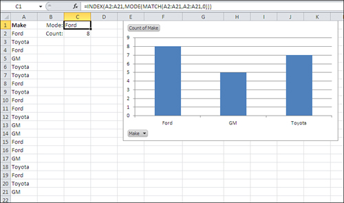
In contrast to the pivot chart shown in Figure 2.8, where just one value pokes up above the others because it occurs twice instead of once, the frequency distribution in Figure 2.9 is more informative. You can see that Ford, the modal value, leads Toyota by a slim margin and GM by somewhat more. (This report is genuine and was exported to Excel by a used car dealer from a popular small business accounting package.)
Note
Some of the steps that follow are similar, even identical, to the steps taken to create a pivot chart in Chapter 1. They are repeated here, partly for convenience and partly so that you can become accustomed to seeing how pivot tables and pivot charts are built. Perhaps more important, the values on the horizontal axis in the present example are measured on a nominal scale. Because you’re simply looking for the mode, no ordering is implied, and the shape of the distribution is arbitrary. Contrast that with Figures 1.21 and 1.23, where the purpose is to determine whether the distribution is normal or skewed. There, you’re after the shape of the distribution of an interval variable, so the left-to-right order on the horizontal axis is important.
To create a pivot chart that looks like the one in Figure 2.9, follow these steps:
- Arrange your raw data in an Excel list format: the field name in the first column (such as A1) and the values in the cells below the field name (such as A2:A21).
- Select a cell that has several empty columns to its right and several empty rows below it. This is to avoid overwriting any important data with the pivot table.
- Click the Ribbon’s Insert tab, and click the PivotTable drop-down in the Tables group. Choose PivotChart from the drop-down list. The dialog box shown in Figure 2.10 appears.
Figure 2.10. In this dialog box you indicate where Excel can find the underlying data set for the analysis, and where you want to pivot table to start.
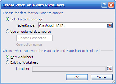
- Identify the range that contains your raw data (refer to step 1) by dragging through it with your mouse pointer, by typing its range address, or by typing its name if it’s a named table or range. The location of the data should now appear in the Table/Range edit box. Click OK to get the layout shown in Figure 2.11.
Figure 2.11. The PivotTable Field List pane appears automatically.

- In the PivotTable Field List, drag the field or fields you’re interested in down from the list and into the appropriate area at the bottom. In this example, you would drag Make down into the Axis Fields area and also drag it into the Values area.
The pivot chart and the pivot table that the pivot chart is based on both update as soon as you’ve dropped a field into an area. If you started with the data shown in Figure 2.9, you should get a pivot chart that’s identical, or nearly so, to the pivot chart in that figure.
Note
Excel makes one of two assumptions, depending on whether the cell that’s active when you begin to create the pivot table contains data.
One, if you started by selecting an empty cell, Excel assumes that’s where you want to put the pivot table’s upper-left corner. Excel puts the active cell’s address in the Location edit box, as shown in Figure 2.10.
Two, if you started by selecting a cell that contains a value or formula, Excel assumes that cell is part of the source data for the pivot table or pivot chart. Excel finds the boundaries of the contiguous, filled cells and puts the resulting address in the Table/Range edit box.
A few comments on this analysis:
• The mode is quite a useful statistic when it’s applied to categories: political parties, consumer brands, days of the week, states in a region, and so on. Excel really should have a built-in worksheet function that returns the mode for text values. But it doesn’t, and the next section shows you how to write your own worksheet formula for the mode, one that will work for both numeric and text values.
• When you have just a few distinct categories, consider building a pivot chart to show how many instances there are of each. A pivot chart that shows the number of instances of each category is an appealing way to present your data to an audience. (There is no type of chart that communicates well when there are many categories to consider. The visual clutter obscures the message. In that sort of situation, consider combining categories or omitting some.)
• Standard Excel charts do not show the number of instances per category without some preliminary work. You would have to get a count of each category before creating the chart, and that’s the purpose of the pivot table that underlies the pivot chart. The pivot chart, based on the pivot table, is simply a faster way to complete the analysis than creating your own table to count category membership and then basing a standard Excel chart on that table.
• The mode is the only sensible measure of central tendency when you’re working with nominal data such as category names. The median requires that you rank order things in some way: shortest to tallest, least expensive to priciest, or slowest to fastest. In terms of the scale types introduced in Chapter 1, you need an ordinal scale to get a median, and many categories are nominal, not ordinal. What’s the median value of Ford, GM, and Toyota? For that matter, what’s their mean?
Getting the Mode of Categories with a Formula
I have pointed out that Excel’s MODE() function does not work when you supply it with text values as its arguments. Here is a method for getting the mode using a worksheet formula. It tells you which text value occurs most often in your data set. You’ll also see how to enter a formula that tells you how many instances of the mode exist in your data.
If you don’t want to resort to a pivot chart to get the mode of a group of text values, you can get their mode with the formula
=INDEX(A2:A21,MODE(MATCH(A2:A21,A2:A21,0)))
assuming that the text values are in A2:A21. (The range could occupy a single column, as in A2:A21, or a single row, as in A2:Z2. It will not work properly with a multi-row, multicolumn range such as A2:Z21.)
If you’re somewhat new to Excel, that formula isn’t going to make any sense to you at all. I structured it, I’ve been using Excel frequently since 1994, and I still have to stare at the formula and think it through before I see why it returns the mode. So if the formula seems baffling, don’t worry about it. It will become clear in the fullness of time, and in the meantime you can use it to get the modal value for any set of text values in a worksheet. Simply replace the range address A2:A21 with the address of the range that contains your text values.
Briefly, the components of the formula work as follows:
• The MATCH() function returns the position in the array of values where each individual value first appears. The third argument to the MATCH() function, 0, tells Excel that in each case an exact match is required and the array is not necessarily sorted. So, for each instance of Ford in the array, MATCH() returns 1; for each instance of Toyota, it returns 2; for each instance of GM, it returns 4.
• The results of the MATCH() function are used as the argument to MODE(). In this example, there are twenty values for MODE() to evaluate: some equal 1, some equal 2 and some equal 4. MODE() returns the most frequently occurring of those numbers.
• The result of MODE() is used as the second argument to INDEX(). Its first argument is the array to examine. The second argument tells it how far into the array to look. Here, it looks at the first value in the array, which is Ford. If, say, GM had been the most frequently occurring text value, MODE() would have returned 4 and INDEX() would have used that value to find GM in the array.
Using an Array Formula to Count the Values
With the modal value (Ford, in this example) in hand, we still want to know how many instances there are of that mode. This section describes how to create the array formula that counts the instances.
Figure 2.9 also shows, in cell C2, the count of the number of records that belong to the modal value. This formula provides that count:
=SUM(IF(A2:A21=C1,1,0))
The formula is an array formula, and must be entered using the special keyboard sequence Ctrl+Shift+Enter. You can tell that a formula has been entered as an array formula if you see curly brackets around it in the formula box. If you array enter the prior formula, it will look like this in the formula box:
{=SUM(IF(A2:A21=C1,1,0))}
But don’t supply the curly brackets yourself. If you do, Excel interprets this as text, not as a formula.
Here’s how the formula works: As shown in Figure 2.9, cell C1 contains the value “Ford”. So the following fragment of the array formula tests whether values in the range A2:A21 equal the value “Ford”:
A2:A21=C1
Because there are 20 cells in the range A2:A21, the fragment returns an array of TRUE and FALSE values: TRUE when a cell contains “Ford” and FALSE otherwise. The array looks like this:
{TRUE;FALSE;TRUE;FALSE;FALSE;FALSE;TRUE;FALSE;TRUE;TRUE;
FALSE;FALSE;FALSE;TRUE;TRUE;FALSE;FALSE;TRUE;FALSE;FALSE}
Specifically, cell A2 contains “Ford” and so it passes the test: The first value in the array is therefore TRUE. Cell A3 does not contain “Ford” and so it fails the test: The second value in the array is therefore FALSE—and so on for all 20 cells.
Note
The array of TRUE and FALSE values is an intermediate result of this array formula (and of many others, of course). As such, it is not routinely visible to the user, who normally needs to see only the end result of the formula. If you want to see intermediate results such as this one, use the Formula Auditing tool. See “Looking Inside a Formula,” later in this chapter, for more information.
Now step outside that fragment, which, as we’ve just seen, resolves to an array of TRUE and FALSE values. The array is used as the first argument to the IF() function. Excel’s IF() function takes three arguments:
• The first argument is a value that can be TRUE or FALSE. In this example, that’s each value in the array just shown, returned by the fragment A2:A21=C1.
• The second argument is the value that you want the IF() function to return when the first argument is TRUE. In the example, this is 1.
• The third argument is the value that you want the IF() function to return when the first argument is FALSE. In the example, this is 0.
The IF() function examines each of the values in the array to see if it’s a TRUE value or a FALSE value. When a value in the array is TRUE, the IF() function returns, in this example, a 1, and a 0 otherwise. Therefore, the fragment
IF(A2:A21=C1,1,0)
returns an array of 1’s and 0’s that corresponds to the first array of TRUE and FALSE values. That array looks like this:
{1;0;1;0;0;0;1;0;1;1;0;0;0;1;1;0;0;1;0;0}
A 1 corresponds to a cell in A2:A21 that contains the value “Ford” and a 0 corresponds to a cell in the same range that does not contain “Ford”. Finally, the array of 1’s and 0’s is presented to the SUM() function, which totals the values in the array. Here, that total is 8.
Recapping the Array Formula
To review how the array formula counts the values for the modal category of Ford, consider the following:
• The formula’s purpose is to count the number of instances of the modal category, Ford, whose name is in cell C1.
• The innermost fragment in the formula, A2:A21=C1, returns an array of 20 TRUE or FALSE values, depending on whether each of the 20 cells in A2:A21 contains the same value as is found in cell C1.
• The IF() function examines the TRUE/FALSE array and returns another array that contains 1’s where the TRUE/FALSE array contains TRUE, and 0’s where the TRUE/FALSE array contains FALSE.
• The SUM() function totals the values in the array of 1’s and 0’s. The result is the number of cells in A2:A21 that contain the value in cell C1, which is the modal value for A2:A21.
Using an Array Formula
Various reasons exist for using array formulas in Excel. Two of the most typical reasons are to support a function that requires it and to enable a function to work on more than just one value.
Accommodating a Function
One reason you might need to use an array formula is that you’re employing a function that must be array-entered if it is to return results properly. For example, the FREQUENCY() function, which counts the number of values between a lower bound and an upper bound (see “Defining Arguments,” earlier in this chapter) requires that you enter it in an array formula. Another function that requires array-entry is the LINEST() function, which will be discussed in great detail in several subsequent chapters.
Both FREQUENCY() and LINEST(), along with a number of other functions, return an array of values to the worksheet. You need to accommodate that array. To do so, begin by selecting a range of cells that has the number of rows and columns needed to show the function’s results. (Knowing how many rows and columns to select depends on your knowledge of the function and your experience with it.) Then you enter the formula that calls the function by means of Ctrl+Shift+Enter instead of simply Enter; again, this sequence is called array entering the formula.
Accommodating a Function’s Arguments
Sometimes you use an array formula because it employs a function that usually takes a single value as an argument, but you want to supply it with an array of values. The example in cell C2 of Figure 2.9 shows the IF() function, which usually expects a single condition as its first argument, accepting an array of TRUE and FALSE values as its first argument:
=SUM(IF(A2:A21=C1,1,0))
Typically, the IF() function deals with only one value as its first argument. For example, suppose you want cell C2 to show the value “Current” if cell A1 contains the value 2010; otherwise, B1 should show the value “Past”. You could put this formula in B1, entered normally with the Enter key:
=IF(A1=2010,“Current”,“Past”)
You can enter that formula normally, via the Enter key, because you’re handing off just one value, 2010, to IF() as its first argument.
However, the example concerning the number of instances of the mode value is this:
=SUM(IF(A2:A21=C1,1,0))
The first argument to IF() in this case is an array of TRUE and FALSE values. To signal Excel that you are supplying an array rather than a single value as the first argument to IF(), you enter the formula using Ctrl+Shift+Enter, instead of the Enter key alone as you usually would for a normal Excel formula or value.
Looking Inside a Formula
Excel has a couple of tools that come in handy from time to time when a formula isn’t working exactly as you expect—or when you’re just interested in peeking inside to see what’s going on. In each case you can pull out a fragment of a formula to see what it does, in isolation from the remainder of the formula.
Using Formula Evaluation
If you’re using Excel 2002 or a more recent version, you have access to a formula evaluation tool. Begin by selecting a cell that contains a formula. Then start formula evaluation. In Excel 2007 and 2010, you’ll find it on the Ribbon’s Formulas tab, in the Formula Auditing group; in Excel 2002 and 2003, choose Tools, Formula Auditing, Evaluate Formula. If you were to begin by selecting a cell with the array formula that this section has discussed, you would see the window shown in Figure 2.12.
Figure 2.12. Formula evaluation starts with the formula as it’s entered in the active cell.
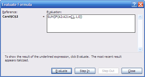
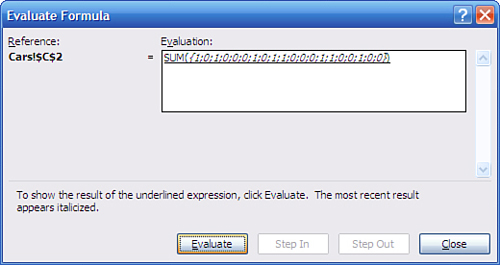
Now, if you click Evaluate, Excel begins evaluating the formula from the inside out and the display changes to what you see in Figure 2.13.
Figure 2.13. The formula expands to show the contents of A2:A21 and C1.
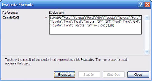
Click Evaluate again and you’ll see the results of the test of A2:A21 with C1, as shown in Figure 2.14.
Figure 2.14. The array of cell contents becomes an array of TRUE and FALSE, depending on the contents of the cells.
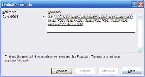
Click Evaluate again and the window shows the results of the IF() function, which in this case replaces TRUE with 1 and FALSE with 0 (see Figure 2.15).
Figure 2.15. Each 1 represents a cell that equals the value in cell C1.
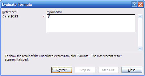
A final click of Evaluate shows you the final result, when the SUM() function totals the 1’s and 0’s to return a count of the number of instances of Ford in A2:A21, as shown in Figure 2.16.
Figure 2.16. There are eight instances of Ford in A2:A21.
You could use the SUMIF() or COUNTIF() function if you prefer. I like the SUM(IF()) structure because I find that it gives me more flexibility in complicated situations such as summing the results of multiplying two or more conditional arrays.
Using the Recalculate Key
Another method for looking inside a formula is available in all Windows versions of Excel, and makes use of the F9 key. The F9 key forces a calculation and can be used to recalculate a worksheet’s formulas when automatic recalculation has been turned off.
If that were all you could do with the F9 key, its scope would be pretty limited. But you can also use it to calculate a portion of a formula. Suppose you have this array formula in a worksheet cell and its arguments as given in Figure 2.9:
=SUM(IF(A2:A21=C1,1,0))
If the cell that contains the formula is active, you’ll see the formula in the Formula box. Drag across the A2:A21=C1 portion with your mouse pointer to highlight it. Then, while it’s still highlighted, press F9 to get the result shown in Figure 2.17.
Figure 2.17. Notice that the array of TRUE and FALSE values is identical to the one shown in Figure 2.14.
![]()
Note
Excel formulas separate rows by semicolons and columns by commas. The array in Figure 2.17 is based on values that are found in different rows, so the TRUE and FALSE items are separated by semicolons. If the original values were in different columns, the TRUE and FALSE items would be separated by commas.
If you’re using Excel 2002 or later, use formula evaluation to step through a formula from the inside out. Alternatively, using any Windows version, use the F9 key to get a quick look at how Excel evaluates a single fragment from the formula.
From Central Tendency to Variability
This chapter has examined the three principal measures of central tendency in a set of values. Central tendency is a critically important attribute in any sample or population, but so is variability. If the mean informs you where the values tend to cluster, the standard deviation and related statistics tell you how the values tend to disperse. You need to know both, and Chapter 3, “Variability: How Values Disperse,” gets you started on variability.