8. Wonderful Color
Such a world of wonder we live in today, where color can be printed so inexpensively and easily! I won’t bore you with stories of how tremendously expensive it was to print color just a few short years ago, and how tremendously tedious it was to design and produce the paste-up to go to press. Suffice it to say that just stopping by a site like PrintPlace.com makes me itch to create something! A thousand rack cards printed in full color on both sides for $75, and all I do is upload the file? Unbelievable! And I can create hundreds of full-color handouts for my workshops right here on my color laser printer? I’m in heaven!
InDesign makes the process of designing in color so satisfying. I hope you enjoy this as much as I do.
p.s. This chapter tells you how to create and apply colors. If you want to know more about designing with color, please see The Non-Designer’s Design Book.
It’s important to know the difference between RGB and CMYK colors, as well as process colors and spot colors, so don’t skip this short section!
CMYK color
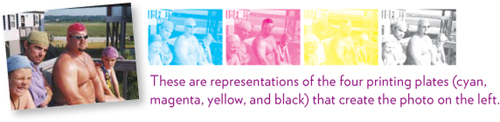
The color model CMYK is what is used for all printed matter (except that from your little inkjet printer). If you have a magnifying glass, look at a magazine cover and you will see tiny rosettes where varying dots of four colors—cyan, magenta, yellow, and black (CMYK)—overlap each other to visually represent the color. It’s quite amazing.
Use CMYK for projects that will be printed on a commercial press, at an online print shop, or on product you might create to sell on sites like CafePress.com or Zazzle.com.
Inexpensive inkjet printers usually prefer RGB (red, green, blue). If you send CMYK graphics to it, they will print up just fine, although the colors might not be exactly what you expect. If you own an expensive color laser printer (as opposed to a color inkjet printer), CMYK gives you better color; the printer will translate any RGB colors that happen to be in the file to CMYK.
CMYK is based on the color model we see in the world. A red apple appears red because when the light from the sun shines on it, all colors in the spectrum are absorbed except red, so red is what gets reflected to our eyes.

Color mixing in CMYK works like one would expect: When you mix blue and yellow, you get green.
RGB color
The color model RGB is what is used on all monitors—television screens, computer screens, mobile devices, projection monitors, etc. The color is made of red, green, and blue light coming from inside the device and going straight into your eyes (as opposed to CMYK which is light reflected off an object).

Use RGB color for graphics that will be displayed on a screen, such as a web site or a PowerPoint or Keynote presentation, a mobile device or an iPad or a television. If the light comes from behind the color, use RGB.
You can also use RGB for jobs that you will output on your own inexpensive inkjet printer (although if it uses four toner cartridges, use CMYK).
Color mixing in RGB is crazy: When you mix red and green, you get yellow!
Process color versus spot color
The Swatches panel gives you the option to create Spot Color or Process Color.
A process color is one that will go through the separation process to get printed on the page; that is, it is CMYK that will be divided up into the four dots of the rosette I mentioned on the opposite page.
Spot color is ink from a can on a printing press. In years past when four-color printing (CMYK) was horrendously expensive, we used spot colors at the local print shop to get two-color jobs (say, black and red inks on white paper). With spot colors you can get colors on paper that CMYK can’t create very well, such as a deep red, or you can use a spot color as a varnish. This entails a lot more expense, though, because the printer has to use the spot color as a fifth color.
Today, you will rarely run into a reason to have a spot color unless you are creating very expensive and professional work, in which case you’re probably not reading this book.
The bottom line is this: Unless you have a specific reason and understand totally why you need a spot color, don’t use one. Your inexpensive inkjet printer doesn’t really care whether you use RGB, CMYK, or spot colors, but if you’re printing to an online print shop or your local professional press, don’t use spot colors unless you have a good reason.
Note
The color you see on your computer screen is not necessarily what will print! Think about it: What you see on the screen is created with RGB, even if you’ve specified it as CMYK. What shows up on the paper uses completely different physics.
The color will probably be close, but if you need exact color, you need to learn to calibrate your monitor and work with the commercial press.
A really important thing to remember!
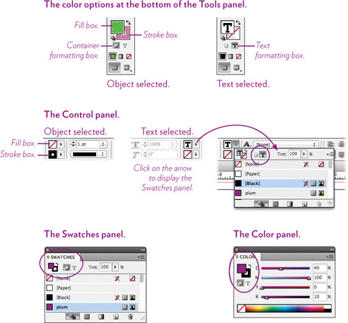
Keep in mind that every object, frame, and text character can have both a Fill color and a Stroke color.
The color gets applied according to 1) what is selected on the page, and 2) whether the Container formatting or the Text formatting box is selected, and 3) whether the tiny Fill box or Stroke box is selected.
You’ll probably forget often to check all three things. Well, maybe you won’t forget, but I’ve been working with a page layout application for more than twenty years now and have selected colors at least five billion times, and I still forget to check each box before I apply color. Aaarrghh.
Here are the several places where you can choose whether to apply the color to a Container or to Text and whether you want it to apply to the Fill or the Stroke (border). Use the tool that feels more convenient for you.
Color panel
There are a number of ways to create and apply colors in InDesign. First, let’s walk through the process of using the Color panel.
Task 1 Open the Color panel
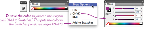
1 Find the Color panel either on your screen, or choose it from the Window menu.
2 If all you see is a color bar, as shown below, click the panel menu and choose “Show Options.”
3 If you don’t see the CMYK colors, as shown below, click the panel menu again and choose “CMYK.”
Task 2 Change the color in the Color panel
1 Open the Color panel as explained above.
2 Click the Fill box to bring it forward.
3 Try each of these methods to change the color in the Fill box:
• Drag the sliders for the four colors back and forth to see how the colors get mixed. Try to predict how the color will change as you add or delete more of each color.
• Click in the color bar across the bottom.
• Double-click the Fill box to open the Color Picker. If you’ve used the Color Picker in Photoshop, you’ll see that it’s just the same (see page 170 for more about the Color Picker).
4 Click the Stroke box to bring it forward, and change the colors as above.
Task 3 Apply color to an object
1 The colors in the Fill and Stroke boxes will be applied to the next object you create, so get the Rectangle tool or Ellipse tool and draw a shape (with the tool, press-and-drag diagonally).
2 While that object is selected, choose the Fill box and change the color, then select the Stroke box, choose a size for the stroke, and color it.
Task 4 Apply color to text
There are two ways to apply color to text:
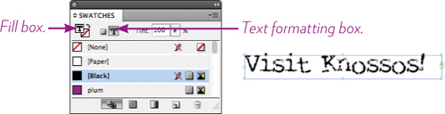
• To change selected text characters: With the Type tool, select the characters. Select the Fill box in the Color panel or the Swatches panel. Select the color. (If you want to add an outline to each selected text character, choose the Stroke box, choose a stroke weight, and choose a color.)
• To change all the text in a frame: With the black Selection tool, select the text frame. Click the tiny T (the Text Formatting box) in the Color or the Swatches panel, choose the Fill box, then choose a color. (This only works if the entire story is in one frame; see pages 24–26 about stories in relation to text frames.)
Try both methods several times until you feel confident in the task.
Essentially, the process of applying a color is like everything else in InDesign: Select the item appropriately, then choose the color.
Try this!
Recreate objects and text similar to the examples below. Remember, objects will be drawn with whatever colors and strokes are in the Color panel when you start to draw (you can control these defaults, as explained on page 12).
Get in the habit of checking all three things before you change the color: the selected object or text, the Container or Text Formatting boxes, and the Fill and Stroke boxes, as explained on page 166.
Color Picker
You might have used the Color Picker in Photoshop or Illustrator. The one in InDesign is very similar.
Task 5 Create a color in the Color Picker
1 Double-click on the Fill or Stroke boxes in the Color panel, the Tools panel, or the Control panel. This opens the Color Picker.
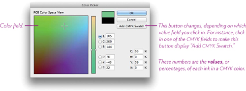
2 Drag around inside the color field; you’ll see crosshairs that indicate the color, and that color appears in the top half of the color box.
3 To change the color field, click inside the tall color spectrum bar or drag the sliders up and down.
4 If you know the CMYK or RGB values of another color that you want to match (in another file, for instance, or in Photoshop or Illustrator or on a web page), enter the values in the fields shown here.
5 To save the color as a swatch in the Swatches panel, click in one of the value fields for CMYK, then click the button “Add CMYK Swatch.”
To apply this color to whatever you had selected, click OK.
To make sure a color does not get accidentally applied to something that was selected, click “Cancel.”
The Color panel versus the Swatches panel
The Color panel creates local, unnamed colors. This is hugely important. When you create a local, unnamed color and apply it to an object or text, the color exists only in that object. If you want to edit that color, you have to select that object.
Colors in the Swatches panel are global, and all colors are named. When you create a swatch and apply that swatch to an object here, some text there, a style sheet definition, etc., that color is linked back to its swatch. If you change the swatch, everything that has that color applied will change! This is a terrific thing, as long as you understand what will happen.
You can customize a swatch color in an individual object: Apply a swatch color to an object, then select that swatch color in the object or text and use the Color panel to adjust the color. The color in the object or text is no longer a swatch color and will not change if you edit the original swatch. This is very useful for times when you have a main color throughout a piece, but here and there you need that color a little darker or lighter, as in the red example on page 182.
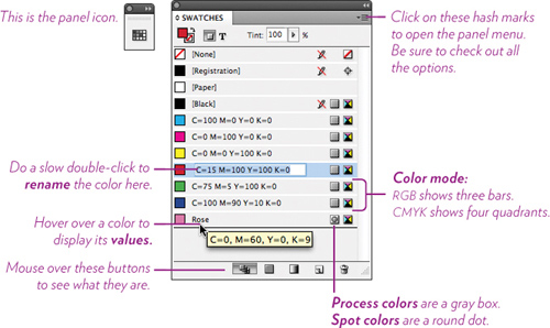
The Swatches panel
Most of the time you will be creating and selecting colors in the Swatches panel because if you are creating a job to be printed, you need to be aware of the color mode and whether a swatch is a spot color or process color (as explained on pages 164–165). This is the Swatches panel; see Task 4 for applying color.
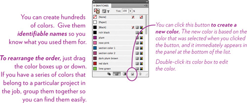
Task 6 Create a new color in the Swatches panel
1 Open the Swatches panel, of course.
2 From the panel menu, choose “New Color Swatch.”
3 Uncheck the box, “Name with Color Value,” then change the name of the color (you don’t have to change its name, however).
4 Drag the sliders to create your color.
If you know the values of the color you want (perhaps you want to match a color from somewhere else), enter those values.
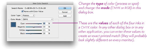
If you’re working with a professional press and they have a color matching system they want you to use, click on “Color Mode” and choose from thousands of swatch colors in the appropriate list.
5 If you need to, you can change the Color Type (process or spot; see page 165) or Color Mode (CMYK or RGB; see pages 164–165).
6 If you want to make more than one color, click “Add.” The color gets added to the Swatches panel and you can now create another.
When you are finished creating colors, click OK.
Task 7 Edit an existing color in the Swatches panel
There are two ways to rename a swatch:
• Double-click on the color swatch to open the “Swatch Options” dialog box. If there is a checkmark in the box labeled “Name with Color Value,” uncheck that box, then type in your name. Click OK.
• Or click once on the name in the Swatches panel. Wait just a second, then click again on the name. The field opens and you can enter the name you want.
To change its color, type, and mode: Double-click on the swatch color box to open the “Swatch Options” dialog box.
Task 8 Add Color panel colors to the Swatches panel
If you have created colors in the Color panel and applied them to text or objects, you can easily add those colors to the Swatches panel so you can use them globally: Click the hash mark in the Swatches panel to open the panel menu, and choose “Add Unnamed Colors.” They all appear at the bottom of the panel, named with their color values; you can rename them.
Whenever you create a color in the Colors panel, you can use its panel menu to “Add to Swatches,” which adds just that color.
Tip
Here are some handy shortcuts!
1. Select the text or object.
2. Click the Fill box or Stroke box.
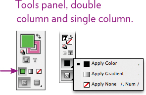
3. In the Tools panel, choose one of the following:
To apply the last selected color, click the Color button.
To apply the last selected gradient, click the Gradient button.
To remove the fill or stroke, click the None button.
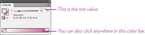
Working with the colors Registration, Black, None, and Paper
There are three colors that show a crossed pencil, which means you cannot edit nor delete these colors, and a fourth color, Paper, that is special.
Tip
You can drag a color box from any panel and drop it on an object to change its color!
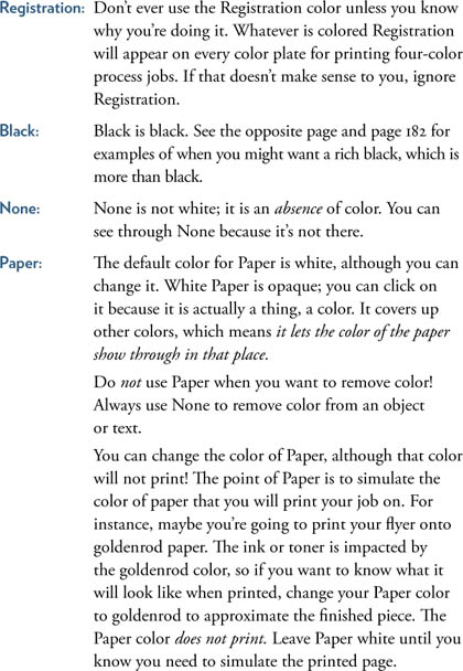
Make a tint of a color
A tint is when you add white to a color to make it appear lighter in value. There are several ways to do this in InDesign—try each of these techniques!
• To change the color of an object or text to a tint value, select it. Then in the Color panel or the Swatches panel, change the tint value (the number) or drag its slider. Only the selected color is changed.
• To create a Tint Swatch of an existing swatch color, single-click the existing color in the Swatches panel. From the panel menu, choose “New Tint Swatch....” Change the tint value or drag the slider.
Because it is based on a swatch, if you change the original swatch, the tint will automatically change at the same time, based on the tint value. You cannot rename a tint that is based on an existing swatch.
• To lighten an existing swatch (which changes the existing swatch), double-click its color box in the Swatches panel. Hold down the Shift key and drag any slider—all the other sliders will move at the same time, creating a lighter version.
If you want to keep the original, first make a copy of the original color (drag it to the New Swatch button, which is next to the Trash icon), and lighten the copy.
When to create a rich black
If you plan to send a job to a high-quality press and it includes areas of black, consider creating a rich black with the values 20/20/20/100 (see page 172 about values). They look the same on the screen, but you can see the difference on the printed page:

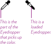
Take advantage of the Eyedropper tool
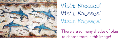
The Eyedropper tool is great—use it to pick up colors and formatting from somewhere else in your document. For instance, perhaps you placed a photograph in your brochure and you want to pull colors from that photograph into your brochure; maybe you want a background color and a type color. If you pick the colors from the photograph, you can create a unified look.
Now, when you pick up a color in the Eyedropper, it is applied to whatever happens to be selected at the moment. So it is very important to be conscious of what is selected (as usual)!
Task 9 Pick up a color and add it to the Swatches panel
1 Place a colorful photo of something on your page.
2 Make sure nothing is selected on any page of your document: With the black Selection tool, click on a blank space.
3 Open the Swatches panel.
Click on the Fill box and the Container formatting box, as shown here:
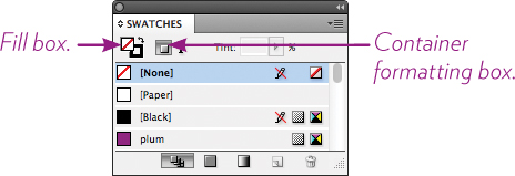
4 Get the Eyedropper tool.
5 Position the very tippy tip of the eyedropper over a color in the photo, then click. The Fill box in the Swatches panel changes to that color, and the Eyedropper flips itself horizontally and looks like it’s loaded with ink. If that’s the color you want, go to Step 5.
If that’s not the color you want, hold down the Option key (PC: Alt key) and you’ll see the Eyedropper flip back to its unloaded position and it is again “empty” of color, ready to pick up another.
You can keep the Option/Alt key held down and keep picking up colors until you get one you like.
6 When you like the color you see in the Fill box, let go of the Option/Alt key, open the Swatches panel menu and choose, “New Color Swatch.” Uncheck “Name with Color Value,” type in a name, and click OK.
Task 10 Change the color of text in a frame
1 Place a colorful photo of something on your page.
2 Create a few words of text in a frame.
3 With the black Selection tool, click on the text frame.
4 In the Color panel (or in the Swatches panel or the Tools panel), click the Text formatting box and the Fill box (which now has a T in it), as shown below.
5 With the Eyedropper tool, position the tip over a color in the photo, then click. The text within the frame immediately changes to that color. To keep that color, add it to the Swatches panel as explained in Step 6 on the opposite page.
To experiment with other colors, hold down the Option key (PC: Alt key) and click on other hues. As long as you keep the Option/Alt key down, you can keep changing the color. Let go of Option/Alt to click on an item to apply that color.
Notice that the Eyedropper tool adds a text cursor to its icon when you position it over text. This is your visual clue that if you press and drag over text, the text will change to the loaded color. See the example on page 182.
![]()
Task 11 Change the color of selected text
• To change the color of selected text (as opposed to all the text in a selected frame), select the text with the Type tool, then follow Steps 4 and 5 above. Because the text is highlighted, though, you won’t be able to see the actual color of the type until you deselect it!
Task 12 Pick up graphic formatting and apply to objects
You can either load the Eyedropper with attributes and then click on things to apply those attributes, or you can select text or objects first, then use the Eyedropper to pick up attributes from somewhere else which will be immediately applied to the selected object/s.
1 With the Pencil tool, draw two shapes. Apply different fills and strokes to the shapes.

2 Make sure nothing is selected (either click on an empty space, or go to the Edit menu and choose “Deselect All”).
3 Get the Eyedropper tool.
4 Click on one of the shapes to load the Eyedropper with its attributes.
Now click on the other shape to pour those attributes from the Eyedropper into that shape.

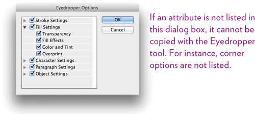
Check the Eyedropper options
Double-click on the Eyedropper tool in the Tools panel to get the “Eyedropper Options” dialog box, as shown below. These are all the things you can pick up with the Eyedropper! Select and deselect as needed for different projects.
Tip
To pick up only the fill or stroke of an object and no other attributes, first choose either the Fill box or Stroke box in a panel. Then with the Eyedropper tool, Shift-click the object to pick up the attribute, and Shift-click on the object you want to apply it to.
Try this!
To experiment with the Eyedropper tool, follow these steps. Try to predict what will happen before you click! If something different happens from what you expect, take a moment to figure out why.
1 With the shape tools, create three shapes on the page.
You can either set some defaults before you create them (as explained on page 12), or just create some shapes and see what shows up.

2 Create a fourth shape and customize it to your liking: Choose a fill color, a stroke, a stroke weight, a stroke type, and a stroke color. If you chose a stroke with a gap, perhaps color the gap.

3 With the black Selection tool, Shift-click to select all three of the shapes that you made in Step 1.
4 Now get the Eyedropper tool. While the three shapes are selected, single-click on the fancy shape you made in Step 2—its settings will be applied to all the shapes that were selected.

You can also use the Eyedropper tool the other way around, as in the Task on the opposite page:
1 Recreate Steps 1 and 2, above.
2 Get the Eyedropper tool, and click on the fourth, fancy shape; this loads the attributes into the Eyedropper.
3 Click on each of the plain shapes; what is loaded in the Eyedropper pours into the shape (or into text as well, if you drag over text).
Tip
Whatever the Eyedropper picks up become your new defaults! This can be crazy-making. Be alert.
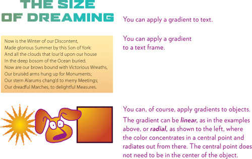
Create and apply a gradient
A gradient blends from one color to another, or from different tints of the same color. The gradation can be radical or very subtle. It’s easy to overdo gradients because they are so pretty and so fun to create, so try to restrain yourself from littering them all over the place!
Task 13 Create a gradient
1 Make sure nothing is selected (either click on an empty space or go to the Edit menu and choose “Deselect All”).
2 Open the Swatches panel, and from the panel menu, choose “New Gradient Swatch....”
3 Single-click on the first color stop, shown circled below.
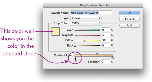
4 Adjust or choose a color: Either drag the sliders, or from the “Stop Color” menu, choose “Swatches” and choose a color from your list.
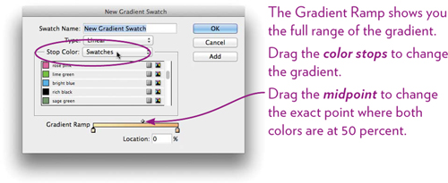
5 Click on the end color stop and adjust or choose a color for it.
You can add more color stops: Single-click directly beneath the Gradient Ramp. To remove stops, drag them off toward the bottom.
6 Choose whether the gradient “Type” is Linear or Radial, and name the gradient swatch. Click OK.
Task 14 Apply a gradient
1 As usual, a gradient is applied to whatever has been selected. Select text with the Type tool, or use the black Selection tool to select a text frame or an object, or the white Direct Selection tool to select the object inside a frame. Choose the Fill or Stroke box, as usual.
2 Once the item is selected appropriately, choose the gradient swatch you just created. (If you don’t see your named gradient in the Swatches panel, click one of the buttons at the bottom of the panel, either Show Gradient Swatches or Show All Swatches.) The gradient will fill your selection, but don’t stop there!
3 Choose the Gradient tool from the Tools panel.
![]()
While the item is still selected, press-and-drag with the Gradient tool over the item. You don’t need to start or stop an edge! Experiment with beginning to drag from inside the item or way off to the side, and try dragging way beyond the object. Drag diagonally or from bottom to top. As long as you’ve got the Gradient tool, you can drag, take a look, drag again, take a look, etc.
4 At any point, you can edit the gradient swatch and all the items that use that color will automatically update themselves.
5 Also experiment with the Gradient Feather tool! Use it just like the Gradient tool—it fades an edge of the gradient. Try it.
Try this!
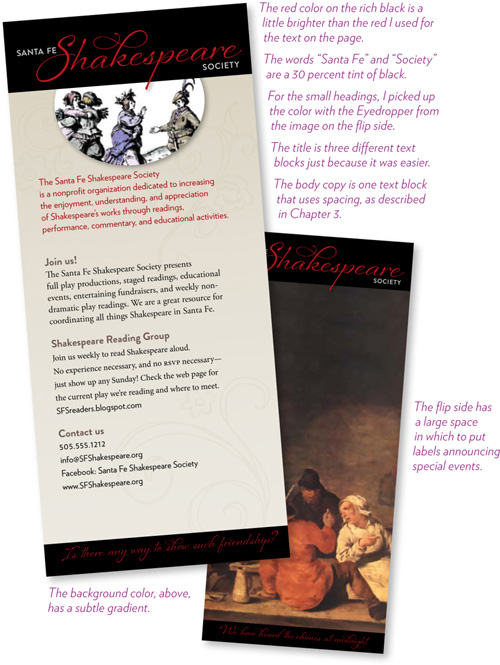
Below is a simple rack card that doesn’t use any features you don’t know how to use. It has a rich black border at top and bottom, different colors of type, a small graphic in the .tif format inside an oval with a drop shadow, and some large ornaments tinted just a bit darker than the background color to provide a little texture. The background color is a rectangle the size of the card, sent behind everything else. Can you recreate something similar? A standard rack card is 4 × 9 inches.