2. Text Frames & Formatting
One of the most important things to learn in InDesign is how to control the text frames, which is completely different from anything you’ve experienced in a word processor. It’s very empowering. Being able to pick up the text in a neat little package and move it and set it down anywhere you want—amazing. Roll it up, widen the columns, thread the copy throughout the pages, separate headlines from the body, choose background colors—oh the things you can do.
And since graphic design is mostly text, knowing how to control your text frames is also a really important feature.
Get used to points and picas
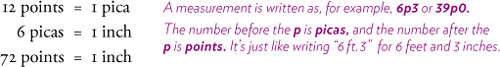
When working with text, you really need to get used to working with points and picas. You’re already familiar and comfortable with point sizes of type because you’ve been choosing font sizes for years in all your other applications. So you have a pretty good idea of how big 12 points is, and 12 points is one pica. There are 6 picas in one inch. Which of course makes 72 points per inch. And that’s all there is to it.
The reason it’s better to use a measuring system of points and picas when working with type is because the incremental units are small and thus easier to work with. You might want to add half of a point to the leading value (the space between the lines), or use a type size of 10.3 because 10 point is just too small and 10.5 is a wee bit too large for that particular project. It’s much easier to get an idea of how much space is between the paragraphs when you can set 6 points of space instead of .0833 inches of space.
Know how to change the rulers
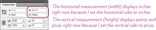
You can change the rulers with the click of the mouse; when you change the rulers, all the settings in every measurement panel change as well. That is, when you change the horizontal ruler to inches, the horizontal field in the Transform panel changes as well, and so does the horizontal field in the Preferences and the Document Setup, etc.
To change the ruler measurement system: Right-click on one of the rulers (horizontal or vertical) and choose the increment from the menu that appears.
I regularly flip back and forth between picas and inches because it’s still easier to specify a page size in inches or some boxes in inches. Generally, though, I tend to leave the rulers in picas until I need inches for something specific.
Putting text on the page
Since you’ve been working with a computer for a while, you already know that you need to first select the text and then choose the formatting.* So all you need to know here is how to do that specifically in InDesign. You’re also accustomed to using a toolbar or a panel to change formatting, so all you need to know is where those are. (Both of these things are explained in Chapter 1).
* Just as in any application, when the insertion point is flashing you can change the formatting specs and what you type next will be in that formatting. For instance, if your next word is to be italic, use the keyboard shortcut to choose italic, then type. When finished with the italic text, hit the same keyboard shortcut again to toggle off italic. Try it!
But first, you need to know how to put text on the page. Putting text on a page in InDesign is completely different from doing it in a word processor or an email message. (If you’re accustomed to using text in Illustrator or Photoshop, it will seem a little more familiar.)
Every piece of text in InDesign is inside a text frame. This frame is movable; that is, you can pick it up and move it anywhere you want. You can resize it, reshape it, rotate it, fill it with color, put a shadow on it, put it in front or behind other objects. You can break the text frame into many individual frames and connect them all together so the story flows continuously through the individual pieces.
The following task walks you through the process of creating a text frame, typing into it, and then manipulating the frame. What you learn here will apply to every project you ever create in InDesign.
Task 1 Create a text frame and type into it
You can import text from any word processor (see page 29), but often you will type directly on the page.
1 Get the Type tool from the Tools panel.
2 Create a text frame in which to type:
With the Type tool, press (don’t click) on an empty area of the page and drag diagonally downward to the right to create a rectangular frame several inches wide and a couple inches deep, then let go.
3 As soon as you let go of the mouse, the insertion point starts flashing in the upper-left corner of the text frame, signaling that you can start typing. (It doesn’t matter at this point where the cursor is.)
Before you start typing, read the information on the following page about frame edges.
A note on text frames and edges: Now, whether or not you actually see the rectangular text frame when you let go of the mouse depends on whether the “Frame Edges” are showing or not (turn them on or off as described below). If they are showing, you’ll see a frame edge with the insertion point flashing, as shown below-left; if they are not, you will still see the insertion point flashing, but the frame will be invisible, as shown below-right.

You can type into either one, and whether you choose to show the frame edges or not depends on how you like to work. For now, it’s probably a good idea to see them so you understand what’s happening on your page. At any time you can turn them off so you can see the page design better. Learn the keyboard shortcut so you can flip them on and off easily.
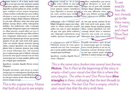
To show or hide frame edges, go to the View menu, to “Extras,” and choose “Show Frame Edges” so they are visible, or “Hide Frame Edges” so they disappear. Try it.
4 Your insertion point should still be flashing in the upper-left corner of the frame.* Type into the text frame.
* If there are any type settings you weren’t aware of, such as a centered alignment or an indent, the insertion point won’t be flashing in the upper-left corner. That’s okay. Type anyway, or see page 35 about defaults.
The text will use the font, size, and color that has been set as a default. (Remember what you learned about defaults and how to control them on page 12, but for now, just type.)
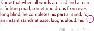
As you type, the text bumps into the right edge and automatically wraps back to the left edge (so do not hit a Return or Enter key at the ends of the lines!). Type several lines, until the text stops appearing in the frame and you see a red plus sign, as shown below.
5 Now that you’ve got a text frame, let’s look carefully at it. You are going to work with thousands of text frames, so it’s best you really understand them. And the first thing to understand is this:
The Type tool directly affects the individual characters. To enter text into a frame or edit existing text in a frame, use the Type tool.
The black Selection tool treats the frame as an object. To move, resize, or colorize a frame, use the black Selection tool.
The white Direct Selection tool manipulates the individual points on the object (points, not handles). To alter a frame’s shape, use the white Direct Selection tool.
We want to see the frame as an object right now, so get the black Selection tool and single-click on the frame. You will see something like this:
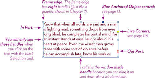
6 I recommend that you turn off things you don’t need right now, such as the yellow Live Corners control (which lets you change the shape of the corners) and the blue Anchored Object control (which lets you anchor a text frame or graphic to other text, which is great, but you end up doing it accidentally all the time, which is really annoying and frustrating to fix). If you see the yellow and blue boxes on your frame, hide them (if you don’t see them, they’re already hidden):
From the View menu, choose “Extras,” and then choose to hide each of those items.
Now let’s go play with the text frames.
Tip
If you’re using one of the Selection tools (black or white), double-click in a text frame to switch to the Type tool automatically.
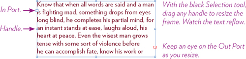
Get the black Selection tool and drag any side handle or corner handle. Do not click in an In or Out Port for now! If you accidentally do so, your cursor loads up with text—single-click on the black Selection tool in the Tools panel to let it go.
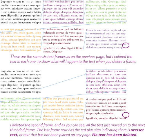
Notice as you resize the frame, the Out Port either displays a red + sign, or it’s empty.
A red + sign indicates there is more text in the frame that has not been placed on the page; this is called overset text.
An empty Out Port means all the text in that story has been placed on a page.
Practice resizing the frame until you feel comfortable doing so.
Threaded text frames
Often you will work with individual text frames, but just as often you will work with longer text that needs to be broken up into several frames. Because it’s something you will do millions of times, spend a couple of minutes now so you clearly understand the process.
Task 2 Create a long story and break it into frames
1 With the Type tool, create a text frame that is about 3 inches wide and about 7 or 8 inches deep.
2 While the insertion point is flashing in that frame, go to the Control panel across the top of the window and choose 10-point type and “Auto” leading (see page 30 if you don’t know how to do that).
3 Go to the Type menu and choose, “Fill with Placeholder Text.” Your entire frame should now be filled with 10-point mumbo jumbo. That’s good.
4 With the black Selection tool, single-click on the frame and you see that the Out Port is empty. What you have is one complete story, and at the moment the entire story is in one frame.
The concept of a story is important: A story might be totally contained in one frame, or it might be threaded through dozens of frames or an entire chapter. You can always tell when you’ve reached the end of a story because the Out Port is empty.
5 We’re going to separate the story you created into several frames, and the text is going to “thread” from one frame to the next.
With the black Selection tool, roll up the text frame so it’s only about two inches deep. Notice that the red plus sign appears.
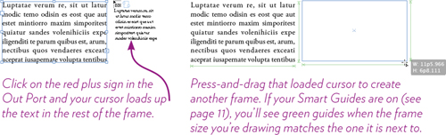
6 With the black Selection tool, single-click in the Out Port. The cursor gets loaded with the rest of the text from that frame, shown below-left.
7 With that loaded cursor, press-and-drag a frame about the same size as the first one, as shown below-right. Let go, and text fills the frame.
8 Continue loading the cursor from the red plus sign and creating new frames with it. You’ll know when all the text is placed when the frame has an empty Out Port.
Frames are holographic!
Threaded frames don’t have to be on the same page—they can be spread throughout the entire document, even hundreds of pages away. When you have the cursor loaded with the text, you can continue to turn pages, zoom in and out, move to another part of the page, and even create new pages, all while the cursor is loaded with text waiting to be placed.
To cancel a loaded cursor, click any tool in the Tools panel. No text gets lost. In fact, you’ll discover that it’s actually difficult to get rid of the text. It is always all contained within any remaining frame (kind of like a hologram in that you can cut a hologram into a dozen pieces, and each piece retains the entire image). You can cut the text directly with the Type tool, but while using the black Selection tool, you can’t destroy any text until you delete every existing frame of the entire story.
Tip
You can also click the empty In Port and then create a new frame. The beginning of the text will flow into that new frame.
Task 3 Experiment with those frames
Use the frames you created in Task 2 to do the following exercises.
1 Rearrange the frames on the page: With the black Selection tool, press-and-drag a frame or selected frames.
2 Delete a frame or two: With the black Selection tool, click on a frame or select more than one, then hit the Delete or Backspace key.
3 Make more frames: With the black Selection tool, click in either the In Port or the Out Port of any frame; this loads the cursor. Either click somewhere to automatically create a frame the width of a column on the page, or press-and-drag to draw a frame. Click an In Port as opposed to an Out Port, place the text, and see what happens.
Task 4 Break the thread
In this task you’re going to break the thread between the frames and put all the text back into one frame.
1 If your frame edges are hiding, show them now so you can be very clear on what is happening: From the View menu, choose “Extras,” then choose “Show Frame Edges.” Every frame should now display a thin blue border.
2 Find the first frame in the story (it’s the only frame with an empty In Port). If you have lots of frames, make sure you’ve got the black Selection tool, then press Command A (PC: Control A) to select all the frames so you can see their ports.
3 With the black Selection tool, single-click on the first frame to select it.
4 Now with the black Selection tool, double-click on the blue triangle in the Out Port. Bingo! All the other frames are blank because when you break the thread from one frame, it breaks it from all the subsequent frames. The Out Port in the first frame shows the overset + sign.
5 With the black Selection tool, drag the windowshade handle of the first text frame (which now holds all the text) all the way down until the Out Port is empty.
6 Delete all the empty text frames.
Tip
With the black Selection tool, click to select a frame, then hit Delete or Backspace. Now keep the Delete or Backspace key down and click on the other frames—they disappear instantly.
Task 5 Break the thread between non-consecutive frames
The previous task disconnects the first frame from all other frames. But what if you want to break the thread between two other frames?
1 Using the same frame you put back together in Task 4, separate it again into at least three frames.
2 With the black Selection tool, click on the first frame (you could do this with any frame).
3 Single-click on the blue Out Port; this gives you a loaded text icon. When you position this loaded icon over the next frame in the thread, a broken lock symbol appears on it, as shown here.

4 With that loaded icon, click anywhere in the frame to sever the thread.
You can also click on an In Port and disconnect from the previous frame in the thread. While the cursor is loaded, even if it’s with a lock icon, you can click or press-and-drag with it to create another linked frame.
Task 6 Link frames that are not yet threaded
You can link frames together that are not threaded yet.
1 Create three individual text frames, each with a little text. Make sure you can tell the text in one frame from another (maybe it’s a different color or a different font or size).
2 With the black Selection tool, single-click on a frame to select it.
3 Single-click in the empty In Port or Out Port (you can also click on a red overset plus sign). The cursor loads.
When you position that cursor over another unlinked frame, the loaded cursor displays a lock icon, as shown here:

4 With that loaded lock cursor, click anywhere in the frame to link those two frames together.
Of course, at any time you can paste text inside any frame and it will all flow through.
Reminder
You can always click a loaded icon on any tool in the Tools panel to release all the loaded text.
Import text
Some people (I mean me) use InDesign as a word processor. But most people create lengthy text in a word processor and then import it into InDesign. Someone might give you a text file to place, or perhaps you work in an office where you are the Star Design Geek and the others write words on which you perform Formatting Magic.
When you import, or place, a file that was created in a word processor, it always drops into your document as a single story, even if it covers many pages.
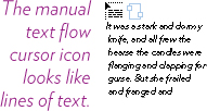
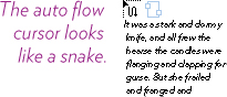
To place a file, you’ll go to the File menu and choose “Place...,” find your file, then double-click on it; you get a loaded text cursor, shown below. This is the manual text flow cursor, with which you can:
• Click on the page and InDesign creates a text frame for you, making it the width of a column and the depth of the page margin. The red plus sign will indicate overset text.
• Or press-and-drag with the loaded cursor to create individual frames to put the text in, as you did in Task 2. The red plus sign will indicate overset text.
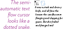
Hold down the Option key (PC: Alt key) and you get the semiautomatic text flow cursor:
• Click on the page and InDesign creates a text frame for you, automatically loading up the cursor with any overset text, ready for you to click and place. This is hugely helpful.
Hold down the Shift key and you get the automatic text flow cursor:
• Click on the page and InDesign places the entire text file. It creates as many new pages as necessary to hold the text. Amazing.
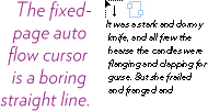
Hold down the Shift and Option keys (PC: Shift and Alt keys) and you get the fixed-page auto flow cursor:
• This is similar to the auto flow cursor, but InDesign will only fill the existing pages; that is, it won’t create as many pages as necessary.
Tip
You might want to set some options on text as it is imported. To do so, choose the file to place, then click the box to “Show Import Options” in the Place dialog box.
Formatting text
You already know how to format text—select it with the Type tool, then choose the font, size, color, etc. All you need to know is where to find the formatting specifications.
Character-specific formatting
Character-specific formatting is that which applies to individual characters. The characters must be highlighted with the Type tool or your formatting choices won’t be applied. This kind of formatting is found in the Character panel or the Character Formatting Controls in the Control panel (they have the same options), as shown below.
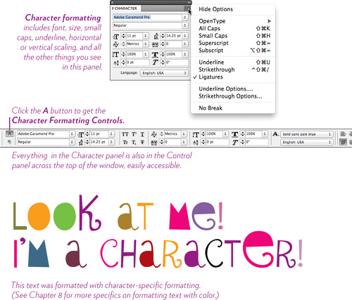
Tip
Although you can switch back and forth between the Character and Paragraph Formatting Controls in the Control panel, if you have a large screen, both panels actually show up at the same time—they just switch places horizontally. Check your panel.
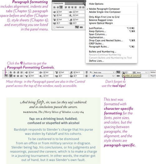
Paragraph-specific formatting
Paragraph-specific formatting is that which applies to the entire paragraph, no matter how many characters in that paragraph are selected. In fact, you don’t even need to select characters to apply any paragraph specific formatting—merely clicking the Type tool in a paragraph to set an insertion point flashing is enough to select the entire paragraph.
Character- or paragraph-specific formatting
There is one time when you can apply character or paragraph formatting without using the Type tool. You can select the entire frame or many frames with a click of the black Selection tool, and then apply any formatting you want. The formatting will apply to everything in the frame.
Formatting text frames
The text frame itself has many formatting options. You can create columns directly inside a frame, choose a border stroke and customize it, fill the frame with color or a gradient, alter the shape, and much more. This book can’t cover all the possibilities, but here are some techniques to get you started. Chapter 7 on Graphics has more details about strokes and fills, and Chapter 8 on Color has all the details on creating and choosing colors.
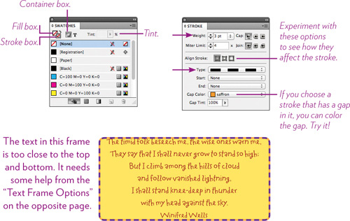
Task 7 Add a stroke and fill to the text frame
Every frame has a stroke (the default is “None” so you don’t see it) and a fill (also “None”), but you can change those when appropriate.
1 Create a frame with text, or use one of the frames you’ve already created.
2 With the black Selection tool, click on the frame to select it.
3 Open the Swatches panel. Click the Container box to make sure the formatting changes apply to the frame, not the text.
Click the Stroke box (shown below), then click a color.
4 Open the Stroke panel. Choose a stroke “Type” from the pop-up menu. Enter a “Weight” in the field, or choose from the options.
5 Go back to the Swatches panel and click on the Fill box (see below). Choose a fill color, then make it a tint of the color: Click in the “Tint” field and then drag the slider that appears, or enter a value.
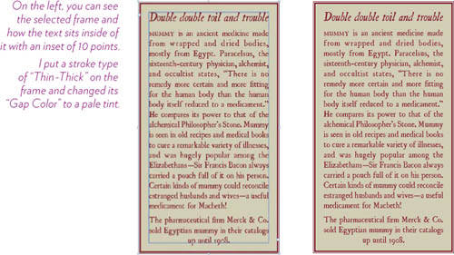
Task 8 Use frame options to add inset spacing
The “Text Frame Options” dialog lets you set the text a certain amount of space from the edge of the frame. This easily expands your design options. Follow these steps to create something like the example below.
1 Make a text frame and put some text in it.
2 Format the text appropriately.
3 While the insertion point is in the text frame or when it is selected with the black Selection tool, go to the Object menu and choose “Text Frame Options....” You’ll get the dialog box shown below.
Change the “Inset Spacing” and experiment with the “Vertical Justification.”
Click the “Preview” button so you can see the changes.

Manipulating frames
Practice doing these tasks until you feel comfortable and know what to expect when you do it. All of the steps below require a text frame on the page.
Task 9 Rotate a text frame
1 Get the black Selection tool.
2 Select the frame or frames you want to rotate.
3 Position the tip of the pointer near any corner point and watch for it to become a curved arrow. Press and drag.
You can also enter a value into the Transform panel, in the “Rotation Angle” field. This makes it easy to match angles of different frames.
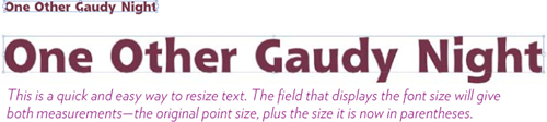
Task 10 Resize the text and the frame
Try this on a headline in its own frame and also on a paragraph of text.
1 Get the black Selection tool.
2 Single-click on the frame you want to resize (this selects it, of course).
3 Hold down the Command and Shift keys (PC: Control and Shift keys), then press on any handle and drag.
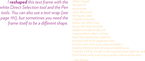
Task 11 Reshape the frame
You might need to change the shape of a text frame to align with an object or to create a special shape for text. It’s easy to do.
1 Get the white Direct Selection tool.
2 Click on an empty space somewhere to deselect the frame. Now click on it with the white Direct Selection tool.
3 Drag any corner point to reshape.
You can add more points to use for reshaping: Get the “Add Anchor Point Tool,” which is under the Pen tool (see pages 142–143 about the Pen tool). Click on the frame edge to add points. Then get the white Direct Selection tool again and drag those new points.
Text defaults
Be conscious of the text defaults. Whatever options are already selected, including any style sheets in the Paragraph Styles or Character Styles panels, the font chosen, the point size, the leading value, the tabs and indents, the color swatches, the drop caps—anything at all—whatever is already selected is what will show up when you click the Type tool and start typing. That’s why sometimes you start typing and things look completely crazy.
You have total control over the defaults. Whatever you choose from any menu when there is nothing selected on the page—those options become the defaults for that document. You need to get in the habit of constantly checking to see what they are, and of setting the options before you click the insertion point.
Task 12 Set the text defaults
1 Make sure nothing is selected: From the Edit menu, choose “Deselect All.”
2 Choose the Type tool.
3 From the Control panel or the Character panel, choose a font and a size. From the Swatches panel, choose a color.
4 Press-and-drag with the Type tool to create a text frame, then type into it. The text is formatted with the settings you just chose.
5 Create another text frame and type into it. Still has the defaults.
6 Create another text frame and type into it. Still has the defaults.
Take advantage of this! When you learn to use style sheets (Chapter 6), you can choose to set a particular style sheet as a default so you don’t have to select all the formatting elements individually.
As I explained in Chapter 1, you can set defaults for just this open document, as you just did in Task 12, above. And you can set defaults for every new document that you create (see page 12).
The Glyphs panel
One of my favorite features of InDesign is the Glyphs panel. “Glyph” is an all-encompassing word that includes not only the characters of an alphabet, but all the numbers, punctuation marks, fractions, ligatures, ornaments, swashes, foreign characters, special characters, etc., that might be included in a font. The Glyphs panel is particularly important if you’re using a large OpenType font, which can hold up to 16,000 glyphs—there is no way to access many of these glyphs on your keyboard. You can find some of them in the “Special Characters” panel on the Mac or the “Character Map” on a PC, but InDesign makes the process much easier and downright fun.
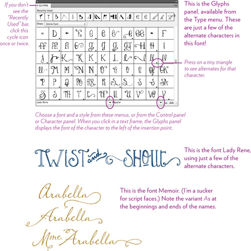
Task 13 Insert a glyph into your text
1 Create a new text frame, or use one you’ve already got on the screen.
2 With the Type tool, click anywhere inside the frame.
3 From the Type menu, choose “Glyphs” (if it isn’t already on your screen).
4 Scroll through and see the options for the font that is shown (which is the font loaded into your insertion point). When you see a character you want to add, such as a fraction, double-click it.
Once you have used a glyph, you’ll see it in the “Recently Used” row across the top of the panel (as shown on the opposite page). When it’s in that row, you can type in your paragraph, double-click a glyph from the “Recently Used” row, then continue typing in your original font. You get to skip all the steps of having to switch to another font and back again.
You can make your own set of glyphs for easy access to ones you need all the time.
1 Go to the panel menu in the Glyphs panel and choose, “New Glyph Set....”
2 Name it something memorable, such as “Fractions” or “Foreign Monetary Symbols.” Click OK.
3 Now you can add glyphs to that particular set:
Right-click on the glyph and choose “Add to Glyph Set,” then choose the set you named.
To access that set, from the panel menu choose “View Glyph Set.”
To see all the characters again, click on the “Show” menu under the Glyphs tab, and choose “Entire Font.”
Tip
InDesign has spell checking, of course, in the Edit menu. Also check out the “Dynamic Spelling” option, which checks your spelling as you type and fixes it for you.
Try this!
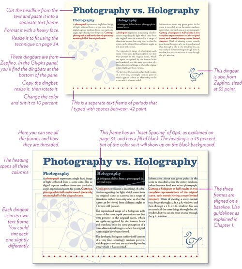
Recreate the example below, using one story that you break into separate frames and format as shown; everything you see on this page you have learned to do in this chapter; page setup information you learned in Chapter 1. The text is from Wikipedia on “Holography,” but feel free to use another topic.
This is a one-page document, not facing pages, Letter-Half, landscape/wide orientation, 3p0 margins (or .5 inch), 3 columns.