3. Painting with Brushes
Introduction
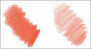
PAINTER’S BRUSHES ARE THE PROGRAM’S HEART: Without them, Painter would be a lot like other image editors. What sets Painter apart is the way it puts pen to paper and paint to canvas—the way its brushes interact with the surface below them and with the paint that you’ve already applied. Here’s a primer on getting the most from Painter’s brushes.
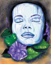
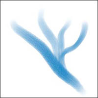
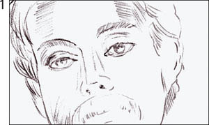
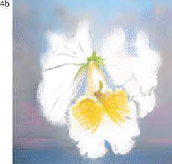
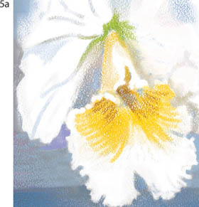
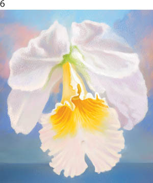
This detailed illustration shows Karen Carr’s refined digital oil painting technique, achieved by using Charcoal, Blenders and Oils variants. See more of Carr’s work in the gallery at the end of this chapter.
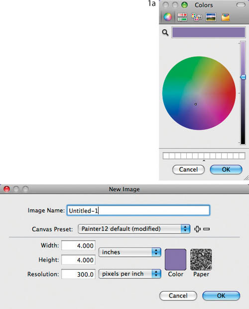
Getting started with painting. If you’re new to Painter, follow these steps to jump right in and begin trying out Painter’s brushes. Create a new file (File, New). In the New Image dialog box, choose the Painter 12 Default preset from the Canvas Presets pop-up menu, make sure that Pixels are chosen in the pop-up menus, and then type 1000 in the width and height fields. Leave the other settings at their defaults. If the Brush Selector is not open, choose Window, Brush Selector to open it. (To open the Brush Library panel, click the small arrow to the right of the Brush Category icon.) Choose Pastels—a texture-sensitive brush—from the Brush Library Panel, and then choose the Square Hard Pastel. Then to select a color, choose Window, Color Panels, Colors. Click in the Color panel’s Hue ring and in its triangle to choose a color for your painting (we chose a blue). When you launched Painter, Basic Paper, a versatile medium-grained texture, was automatically loaded. (For information about changing paper textures, see “Switching papers” on page 60.)
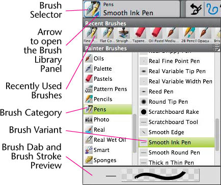
The open Brush Library Panel displayed in List View, showing the brush categories and variants
For the feel of real painting, use a pressure-sensitive tablet and stylus. With your stylus in hand, sketch loose circles to get the feel of the brush. This simple exercise will help you get to know the Painter brushes and become more comfortable with your tablet and stylus. Experiment by trying out more brushes—for instance, the Flat Oils and Round Camelhair variants of Oils, and the Grainy Variable Pencil and Sketching Pencil variants of Pencils. You can find information about drawing and painting with a tablet and stylus and Painter on page 5 in Chapter 1, “Getting to Know Painter.” (The Photoshop and Painter Artist Tablet Book: Creative Techniques in Digital Painting, published by Peachpit Press treats this topic in detail.)
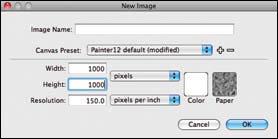
Setting up the New dialog box for a new image to try out the brushes
In addition to painting on the Canvas, it’s also possible to paint on a layer or mask. Painting on masks is covered in Chapter 5, “Selections, Shapes and Masks,” and painting on layers is covered in Chapter 6, “Using Layers.”
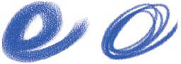
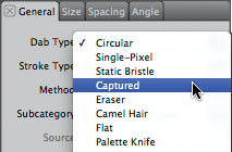
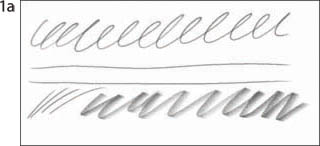
Brush basics. Located in the Brush Selector and the Brush Library Panel, Painter’s brushes are organized into categories and variants. Brush categories are at the top level of organization for mark-making tools in Painter; they are like the containers or drawers that hold the individual brushes, pens, pencils, pastels and other painting and drawing implements. Every brush category has its own variants or varieties, so every time you choose a different brush category, the list of variants changes. To demonstrate, in the Brush Selector, click on the small arrow to the right of the brush to open the Brush Library Panel. Choose the Pens category, then choose the Smooth Ink Pen variant of the Pens from the variant menu to the right of the category. For detailed information about other aspects of brushes, including creating your own custom brushes, see Chapter 4, “Building Brushes.”

Pens: Strokes drawn with the Smooth Ink Pen (left) and the Coit Pen (right)
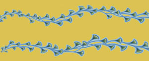
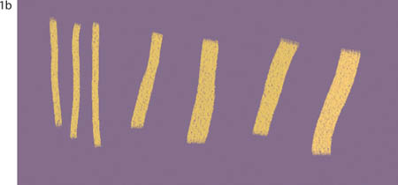
Pastels: Strokes drawn with the Square Hard Pastel (left) and the Tapered Pastel (right)
Oils: Strokes painted with the Flat Oils (left) and the Round Camelhair (right)
Pencils: Strokes drawn with the Grainy Variable Pencil (left) and the Sketching Pencil (right)
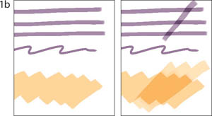
Paper interaction. When you draw with a texture-sensitive brush (such as the Grainy Variable Pencil variant of Pencils or the Square Hard Pastel variant of Pastels), the paper texture will be revealed in the stroke as you draw. When you launched Painter, Basic Paper was loaded automatically, unless you chose a different texture in the New Image dialog box. Not all brushes are sensitive to the paper texture in the Papers panel. For instance, many of the default Acrylics, Gouache and Oils variants paint beautiful strokes that have bristle marks but do not show paper textures. Although these default brushes do not interact with the paper textures, they can create interesting textures of their own.
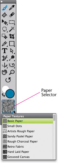
The Paper Selector on the Toolbox and open Papers panel
Switching papers. Here’s how to switch paper textures. Click the Paper Selector icon near the bottom of the Toolbox to open the Papers panel, displaying the Papers list. Click on a new paper swatch (such as Rough Charcoal Paper) to change the texture from Painter’s default. Experiment by choosing different textures and making brushstrokes using a grain-sensitive brush such as one of the Chalk or Pastels brushes.
![]()
The Grain setting and pop-up slider are visible in the Property Bar when the Brush tool is selected in the Toolbox.
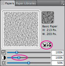
Controls on the Papers panel allow for the adjustment of Paper Scale, Paper Contrast and Paper Brightness. There are also buttons for toggling Directional Grain and Invert Paper on and off. (Paper Contrast is adjusted here, and the Invert paper box is circled.)
Emulating Traditional Techniques
Here’s a brief description of favorite traditional art techniques and how to re-create them in Painter. One or two techniques for each medium are outlined as a starting point for your own experimentation, but there are a number of ways to obtain similar results.
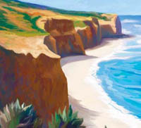
Athos Boncompagni added interest to Casa 1—maximizing the interaction between brush and virtual texture in Painter—by exaggerating the size of the texture. Before painting with Chalk & Crayons variants, he adjusted the Paper Scale slider in the Papers panel.
Pencil. Pencil sketches using traditional materials are typically created on location. Tools include soft-leaded graphite pencils (HB to 6B), various erasers and white paper with a smooth to medium grain. To create a pencil sketch in Painter, select an even-grained paper texture such as Basic Paper and choose the Pencils category, 2B Pencil variant. Select a black or dark gray and begin sketching. To paint a light color over dark—for instance, to add highlights—choose a white color and draw with the Cover Pencil variant. For more about working in pencil, see “Sketching with Pencils” on page 72.
Using the Real 6B Soft Pencil, when holding the stylus at a tilt, you can draw a thicker stroke—like shading with the side of a pencil.
Colored pencil. Conventional colored pencils are highly sensitive to the surface used. Layering strokes with light pressure on a smooth board will create a shiny look, whereas a rougher surface creates more of a “broken color” effect (strokes that don’t completely cover the existing art). To closely match the grainy, opaque strokes of a soft Prismacolor pencil on cold-pressed illustration board with Painter, select a fine- or medium-grained paper such as Plain Grain (found in the Drawing Paper Textures library in the Paper Textures folder on the Painter 12 DVD-ROM). Choose the Colored Pencil variant of Pencils. Open the General panel of Brush Controls and switch the Method from Buildup to Cover and then change the Subcategory to Grainy Edge Flat Cover. See “Drawing with Colored Pencils” later in this chapter for a full description of this technique.
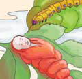
These quick sketches of Little Doll were drawn using the Cover Pencil variant on Italian Watercolor Paper with a Wacom pressure-sensitive tablet and stylus and a laptop.
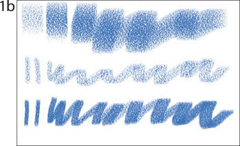
Pastel. Pastels encourage a bold, direct style. Edgar Degas preferred pastels for his striking compositions because they simultaneously yield tone, line and color. A great variety of hard and soft pastels are used on soft- or rough-grain papers. Pastel artists often use a colored paper stock to unify a composition.
Use Painter’s Chalk, Pastels and Oil Pastels brushes to mimic traditional hard or soft pastels, and if you want to use a colored paper, click on the Paper Color box (in the New dialog box) as you open a new document and choose a color. The Chalk and Pastels variants are among Painter’s most popular. For a step-by-step technique, turn to “Blending and Feathering with Pastels” later in this chapter.
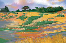
The Artist Pastel Chalk variant of Pastels and the Large Chalk variant of Chalk & Crayons were used on a rough texture to paint Coastal Meadow.
CHER THREINEN-PENDARVIS
Conté crayon. Popular in Europe since the 1600s and used today for life drawing and landscapes, Conté crayons have a higher oil content than conventional chalk or pastel; as a result, they work successfully on a greater variety of surfaces.
To get a realistic Conté crayon look in Painter, choose the Charcoal & Conté category and the Tapered Conté variant. Reveal more paper grain in the brush work by moving the Grain slider in the Property Bar to 8%. Begin drawing. This Conté variant works well over the Hard Laid Pastel Paper. To blend color while revealing the paper texture, choose the Smudge variant of the Blenders brush.
Charcoal. One of the oldest drawing tools, charcoal is ideal for life drawing and portraiture in chiaroscuro (high-value contrast) style. Renaissance masters frequently chose charcoal because images created with it could be transferred from paper (where corrections could be made easily) to canvas or walls in preparation for painting. To create a charcoal drawing in Painter, select a rough paper (such as Charcoal Paper) and a Hard Charcoal Pencil variant of Charcoal & Conté. Create a gestural drawing and then blend the strokes—as you would traditionally with a tortillion, a tissue or your fingers—with the Smudge variant of the Blenders. Finish by adding more strokes using the Gritty Charcoal variant.
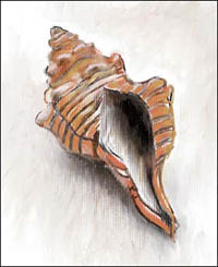
For this Harp Shell study, a Conté variant was used to draw on custom-made Laid Pastel Paper.
CHER THREINEN-PENDARVIS
Pen and ink. Many artists use Painter’s Pens variants to draw editorial and spot illustrations. To create a black-and-white pen-and-ink drawing in Painter, choose the Fine Point variant of the Pens and choose 100% black in the Color panel. Sketch your composition. To draw with lines that are expressively thick and thin based on the pressure you apply to your stylus, switch to the Smooth Ink Pen. To etch white lines and texture into black areas of your drawing, select pure white in the Color panel and draw with the Fine Point or Smooth Ink Pen. For a sense of spontaneous energy try drawing with the Nervous Pen. The Real Fine Point Pen, incorporates Hard Media capabilities, allowing you to draw a thin line with the stylus upright and a thicker line with the stylus tilted.
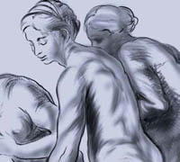
This charcoal study inspired by Raphael Sanzio was drawn with the Hard Charcoal and Soft Charcoal variants (Charcoal), and then blended with the Smudge and Just Add Water variants (Blenders).
Thick ink and resists. When you start to paint with Painter’s Liquid Ink, a special Liquid Ink layer is created. With Liquid Ink you can use the thick, viscous ink to paint graphic, flat-color art or to paint thick, impasto-like brushstrokes. For smooth-edged strokes try the Smooth Camel variant. To paint textured brushstrokes, experiment with the Sparse Bristle and Coarse Camel variants. To erode Liquid Ink you’ve already laid down, choose a Resist variant, such as the Graphic Camel Resist. Brush over the area of ink you want to erode. You can also apply a resist and then paint over it. The resist will repel brushstrokes made with a regular Liquid Ink variant, until repeated strokes scrub the resist away. To see how to add volume to a Liquid Ink drawing, click on the Liquid Ink layer in the Layers panel (Window, Layers) and press the Enter key. Move the Amount slider to 50%, and click OK. For more information about using Liquid Ink, turn to “A Painter Liquid Ink Primer” later in this chapter.
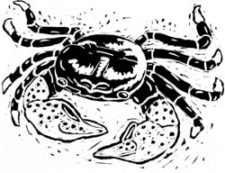
To draw Crab, a spot illustration, Mary Envall used the Smooth Ink Pen and Scratchboard Tool variants of the Pens. Both of these Pens use Painter’s rendered dabs.
To resize your brush on the fly, press Ctrl-Alt (Windows) or ![]() -Option (Mac). You will see the cursor change to a crosshair. Drag to create a circle the size of the brush you want. You can also set other brush attributes such as opacity, angle and squeeze onscreen. (See Onscreen Brush Settings on page 66.)
-Option (Mac). You will see the cursor change to a crosshair. Drag to create a circle the size of the brush you want. You can also set other brush attributes such as opacity, angle and squeeze onscreen. (See Onscreen Brush Settings on page 66.)

Brushstrokes made using the Opaque Acrylic variant of Acrylics. In the upper left, its default size; upper right, the resized brush “ghost” cursor; lower right, a stroke made with the resized brush.
Scratchboard illustration. Scratching white illustrations out of a dark (usually black) background surface became popular in the late 1800s. Illustrations created in this manner often contained subtle, detailed tone effects, making them a useful alternative to photographic halftones in the publications of that era. Modern scratchboard artists use knives and gougers on a variety of surfaces, including white board painted with India ink. To duplicate this look in Painter, start with the Flat Color variant of the Pens and increase its size in the Property Bar. Choose black from the Color panel and rough out the basic shape for your illustration. To “scratch” the image out of the shape with hatch marks, switch to white and change to the Scratchboard Tool variant. Use the Scratchboard Rake to draw several lines at once. Turn to “Coloring a Woodcut” on page 42 and the Chapter 6 gallery to see more work by Chet Phillips.

Kathleen Blavatt created Heart using Painter’s Liquid Ink brushes.
Calligraphy. With the exception of “rolling the nib” and a few other maneuvers, you can imitate nearly all conventional calligraphic strokes in Painter. (If you have a Wacom 6D Art Pen you can emulate those as well. See page 70 for more information about the 6D Art Pen.) To create hand lettering similar to the example on the left, choose the Calligraphy variant of Pens and begin your brush work. To make guides for your calligraphy, select Canvas, Rulers, Show Rulers and drag guides out from the rulers, or use Painter’s Grid overlay (choose Canvas, Grid, Show Grid). If you want a rougher edge to your strokes, try switching to the Thin Grainy Pen 10 variant of Pens, which has a flatter “nib.”
In Tiger Kitty, Chet Phillips used the Scratchboard Tool variant of the Pens.
Watercolor. Landscape artists such as Turner and Constable helped popularize watercolors in the nineteenth century. The medium’s portability lends itself nicely to painting on location. Traditional watercolor uses transparent pigment suspended in water, and the paper is often moistened and stretched prior to painting.
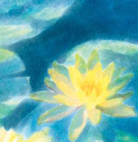
Wet-into-wet and glazing techniques were used for this watercolor painting of water lilies. Several Real Watercolor brushes were used including the Real Wet Filbert and Real Oval Wash.
CHER THREINEN-PENDARVIS
No Wet Fringe
Wet Fringe 50%
Painter lets you achieve many traditional watercolor effects—without paper-stretching! There are three watercolor brush categories in Painter: Real Watercolor, Watercolor and Digital Watercolor. Painters who have worked with traditional watercolors may find themselves more at home with Real Watercolor or Watercolor, even though they can be a bit more challenging to use. In contrast to Digital Watercolor, Real Watercolor and Watercolor employ a special Watercolor media layer. Here, the pigments can realistically blend, drip and run. To paint with Real Watercolor, choose the Real Oval Wash variant of Real Watercolor, a rough paper (such as French Watercolor Paper) and a light-to-medium color and then begin painting. Both Real Watercolor and Watercolor brushes are used to paint on Watercolor layers and the pigments painted with both of these brush categories can be mixed. To remove only the color painted with Real Watercolor or Watercolor variants choose the Wet Eraser variant of Real Watercolor or the Eraser Dry variant of Watercolor. For more about Real Watercolor and Watercolor, turn to “A Painter Watercolor Primer” on page 88.
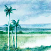
Cloudy Day on Kauai was painted with the Runny Wash Bristle, Wash Camel, Fine Camel and Diffuse Camel variants of Watercolor. On the trees, highlights were brought out using the Eraser Dry variant, and foreground texture was added with the Eraser Salt.
CHER THREINEN-PENDARVIS
Digital Watercolor. Digital Watercolor operates like most of Painter’s other painting tools—you can choose a brush and begin to paint on a standard layer or on the canvas. (Users of Painter 6 and previous versions will recognize similarities between the earlier watercolor and the new Digital Watercolor.) Many beautiful transparent painting effects can be achieved with Digital Watercolor, which is easier to use and correct than Watercolor. Choose the New Simple Water variant of Digital Watercolor and make brushstrokes on your image. To blend color, stroke over the area with a low opacity New Simple Water brush. For strokes that reveal bristle marks, try the Coarse Dry Brush or the Coarse Mop Brush. Turn to pages 82 and 90 for step-by-step techniques using Digital Watercolor.
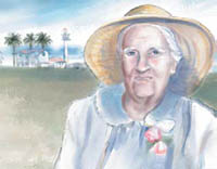
Glazing techniques were used for this watercolor portrait of Sabina Gaross.
CHER THREINEN-PENDARVIS
Pen and wash. Tinted, translucent washes over pen work has been a medium of choice of Asian painting masters for many centuries. Painter’s Digital Watercolor lets you add a wash to any drawn (or scanned) image without smearing or hiding the original image. Choose the Dry Brush or Wash Brush variant of Digital Watercolor and pick a color (it works best to build up color beginning with very light-colored washes). Choose an even, medium-textured paper (such as Basic Paper) and begin painting on top of line work.
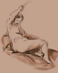
Study of a Nude after Rembrandt van Rijn. We sketched with the Fine Point variant of Pens, and then added washes using the Wash Brush variant of Digital Watercolor.
Airbrush. The trademark of most traditional airbrush work is a slick, super-realistic look; photo retouching is a more subtle use of the tool. A traditional airbrush is a miniature spray gun with a hollow nozzle and a tapered needle. Pigments include finely ground gouache, acrylic, watercolor and colored dyes, and a typical support surface is a smooth illustration board. Airbrush artists protect areas of their work from overspraying with pieces of masking film or flexible friskets cut from plastic.
In Painter, choose one of the Airbrushes variants and begin sketching or retouching. To get the most from the tool, make selections with the Lasso tool and use them to limit the paint, just as you would with traditional airbrush friskets.
Several of Painter’s Airbrushes (such as the Fine Spray, Pixel Spray and Graffiti variants) spray paint onto the image Canvas differently from earlier Airbrushes such as the Digital Airbrush. These Airbrushes take advantage of input technology available from tablet-and-stylus manufacturers such as Wacom. They respond to angle (tilt) and bearing (direction). For instance, as you paint, particles of color land on the image Canvas, reflecting the way the artist tilts the stylus. And with Painter’s Fine Wheel Airbrush variant, you can adjust the flow of paint by adjusting the wheel on a special Airbrush stylus. For those accustomed to the Airbrushes in earlier versions of Painter, the Digital Airbrush variant is most similar to these.
To paint Porcelain Morning Glory, Kathleen Blavatt used several Airbrushes.
Gouache. Roualt, Vlaminck, Klee and Miró were a few of the modern artists who experimented with this opaque watercolor, used most frequently in paintings that call for large areas of flat color. Gouache contains a blend of the same type of pigment used in transparent watercolor, a chalk that makes the medium opaque and an extender that allows it to flow more easily. For an expressive, opaque color painting brush, try the new Flat Opaque Gouache variants; for a more subtle semi-transparent look, use the Wet Gouache Round variants.
To change the settings for a brush onscreen, choose a brush (such as the Tapered Flat variant of Oils). To change its Size, press Ctrl/Alt (Windows) or ![]() /Option (Mac), and the Radius circle will appear in the document window. Press your stylus and, keeping your stylus pressed down, release the modifier keys. Now tap the Ctrl/
/Option (Mac), and the Radius circle will appear in the document window. Press your stylus and, keeping your stylus pressed down, release the modifier keys. Now tap the Ctrl/![]() key once and drag the cursor in the Radius circle to the left to decrease the size and to the right to increase it. When you arrive at the setting you desire, release pressure on the stylus.
key once and drag the cursor in the Radius circle to the left to decrease the size and to the right to increase it. When you arrive at the setting you desire, release pressure on the stylus.
To change the Opacity, press Ctrl/Alt or ![]() /Option), press your stylus, tap the Ctrl/
/Option), press your stylus, tap the Ctrl/![]() key once and drag the cursor in the Opacity circle to the left to decrease the Opacity and to the right to increase it, and then release.
key once and drag the cursor in the Opacity circle to the left to decrease the Opacity and to the right to increase it, and then release.
To change the Squeeze setting, hold down Ctrl/Alt or ![]() /Option, press your stylus, tap the Ctrl/
/Option, press your stylus, tap the Ctrl/![]() key twice and drag in the Squeeze circle to arrive at the setting you desire.
key twice and drag in the Squeeze circle to arrive at the setting you desire.
To change the brush angle, hold down Ctrl/Alt or ![]() /Option, press your stylus, tap the Ctrl/
/Option, press your stylus, tap the Ctrl/![]() key three times and drag in the Angle circle in the document to the setting you desire and then release the stylus.
key three times and drag in the Angle circle in the document to the setting you desire and then release the stylus.
An added bonus: You can cycle through the Size, Opacity, Squeeze and Angle settings, if you don’t lift the stylus. That is, if you pass up the setting you want, just keep tapping the Ctrl/![]() key until you arrive at the setting that you want.
key until you arrive at the setting that you want.
The Opacity circle and setting are displayed on the document.
![]()
The default settings for the Tapered Flat Oils variant of Oils
Oil paint and acrylic. These opaque media are “standards” for traditional easel painting. Both can be applied in a thick impasto with a palette knife or stiff brush. (Impasto is a technique of applying paint thickly.) They can also be extended (thinned) with a solvent or gel and applied as transparent glazes. They are typically applied to canvas that has been primed with paint or gesso. Try the following methods to get the look of acrylic in Painter.
For a technique that incorporates the texture of brush striations and a palette knife, begin by choosing the Gessoed Canvas paper texture from the Paper Selector (located near the bottom of the Toolbox) and an Opaque Acrylic variant of the Acrylics, and then start painting. Blend colors using short strokes with a Round Blender Brush variant of Blenders. To subtly bring out the Gessoed Canvas texture, try blending with the Grainy Water variant of Blenders. To scrape back or move large areas of color on the image canvas, use a Smeary Palette Knife variant of the Palette Knives. When working on smaller areas of your image, adjust the size of the Palette Knife variant using the Size slider on the Property Bar.
For a painting method that emphasizes the texture of canvas, begin by choosing the Coarse Cotton Canvas texture from the Paper Selector. Now choose the Opaque Bristle Spray variant of the Oils and lay color into your image. To smear existing paint as you add more color, switch to the Smeary Bristle Spray variant. To reveal the texture of the image canvas while you blend colors, switch to the Smudge variant of Blenders. For yet another digital oil method, see Dennis Orlando’s version of a traditional oil look in the gallery in Chapter 2 and at the end of this chapter; to see more examples of Richard Noble’s digital acrylic paintings, turn to the gallery at the end of this chapter.
This detail from Agaves on the Edge, Summer was painted with the Artists’ Oils brushes. See the entire image on page 102.
CHER THREINEN-PENDARVIS
To get textured brushstrokes (a “3D paint” look) with any of these methods when you’re finished, choose Effects, Surface Control, Apply Surface Texture. Choose Image Luminance from the pop-up menu and an Amount setting of 20%–30%. If you want to mimic the look of acrylic paint extended with a glossy gel medium, drag the Shine slider to 100%. To get a semi-matte finish, move the Shine slider to between 20% and 30%.
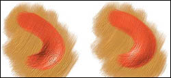
We painted each rust brushstroke on a separate layer with the Opaque Round variant of Impasto. Then, we used Composite Depth controls, Subtract (left) and Add (right), to excavate the left stroke and raise the right stroke.
Painting with wet Artists’ Oils paint. The Artists’ Oils medium feels just like viscous, wet oil paint. With the Artists’ Oils, you can apply paint and blend paint to your heart’s content. The brushes are also exciting to use for loose gestural work and for working over photographs. For more information about brushes that incorporate Artists’ Oils capabilities see “A Painter Artists’ Oils and Real Oils Primer” on page 98, and “Painting with the Artists’ Oils” on page 102.
This detail from Moon Over Lennox was painted with the RealBristle Brushes. See the entire image on page 109.
Painting with realistic Impasto. Impasto gives you the power to show the texture of brushmark striations and the thickness of paint itself with realistic highlights and shadows as you paint. Impasto brings thick paint to the tip of your stylus! When you choose a variant of the Impasto brush (such as the Thick Wet Round) in the Brush Selector, the Impasto effect is automatically enabled. You can use Impasto on the image Canvas or on added layers.
Chelsea Sammel used Impasto brushes to add thick paint to Dying Orchids, a detail of which is shown here. To see the entire image and read about her painting process, turn to page 178.
Here’s a quick Impasto primer: Create a new, blank file (File, New). To activate Impasto, choose an Impasto brush (such as the Thick Wet Round variant) from the Brush Selector. Make brushstrokes on the image canvas. To read more about painting with Impasto, turn to “A Painter Impasto Primer,” “Brushing Washes Over ‘Live’ Canvas” and “Painting With Gouache and Impasto,” later in this chapter.
Mixed media. You can create media combinations in Painter that would be impossible (or at least very messy!) in traditional media. Try adding strokes with a Watercolor or Pencils variant atop Oils, or use a Pens variant on a base you’ve painted using the Chalk or Gouache variants. See how artists Chelsea Sammel and Janet Martini combined media in the two paintings at the left.
In Three Trees, Chelsea Sammel mixed media while painting. As shown in this detail, she used modified Chalks and Oils brushes: the Smeary Bristle Spray; Blenders, the Coarse Smear; and finally the Oil Pastels and a modified Sharp Chalk variant (Chalk & Crayons) to define details.
Mixed media painting with a liquid feel. Painter offers several brushes that are reminiscent of wet paint on canvas—for instance, the Sargent Brush variant of the Artists brush, which can both lay down color and smear it, and the Palette Knives variants, which can move large areas of color. Painting with these brushes is a very tactile experience.
In the Paths to Water 4 study shown on page 69, we sketched in color with the Square Chalk (Chalk & Crayons) and a Round Soft Pastel (Pastels) on a rough paper. Then, we switched to the Sargent Brush variant of the Artists brushes to apply more painterly strokes. To blend areas of the foreground and midground, we used the Grainy Water variant of Blenders, and then we used the Smeary Palette Knife and Subtle Palette Knife variants of the Palette Knives to expressively pull color in the sky. To paint and blend using these brushes, choose the Sargent Brush and a color, and begin painting. When you are ready to pull and blend paint, switch to the Palette Knife. Try reducing its Opacity in the Property Bar for a more subdued effect.
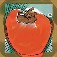
To complete Speedy Persimmon, Janet Martini mixed media using the Calligraphy variant of the Calligraphy on top of Watercolor variants and Oil Pastel strokes.
The Blenders and Distortion variants are also helpful blending tools. To create Zinnias, we used the Bulge variant of the Distortion category to enlarge the pink flowers, and the Coarse Smear variant of Blenders to pull pixels and add diffused texture to the edges. Then we used the Marbling Rake variant of Distortion to add linear texture and to pull pixels up and around the image to create a sense of movement.
Erasing techniques. Painter provides several ways to simulate traditional erasing and scratch-out techniques. Lighten an area of an image by using the Bleach variant of the Erasers, lowering the Opacity slider in the Property Bar to 5% for improved control. (You can also use the Dodge variant of the Photo brush to lighten color.) Use the Thin Grainy Pen variant of the Pens brush and white (or a light color) to scratch out pigment from a pastel or oil painting; to create strokes with more subtle texture, switch to the Thin Smooth Pen variant of Calligraphy. Use the Eraser Dry variant of the Watercolor brush to pull up pigment from a “wet” painting done with Watercolor variants (similar to sponging up a traditional watercolor). For a more subtle result, lower the Opacity slider (in the Property Bar) to 40%. Try the Bleach Runny variant of Watercolor to leach color from an area, while creating a drippy texture. To pull color out of areas when using Digital Watercolor, use the Wet Eraser, and for picking color out of smaller areas, try the Pointed Wet Eraser variant of Digital Watercolor.
For Zinnias, we painted over a photo with Pastel variants, completely covering it with colored strokes. Then, we used Distortion and Blender variants to distort the flowers, add texture and emphasize the focal point.
In this detail from a study for Paths to Water 4, Palette Knife variants were used to pull and spread color in the clouds and sky.
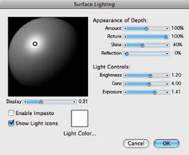
The Surface Lighting dialog box allows you to dynamically set Appearance of Depth and Light Controls for Impasto brushstrokes in the entire image.
Painting with texture. The Add Grain variant of the Photo brush is just as useful for painting as it is for photo manipulation, because it literally puts texture on the tip of your brush. You can switch textures at any time during the painting process by changing the selection in the Papers panel. For best results, use very light pressure on the stylus. Make a few marks in the document to preview the effect. For a more subtle look, try lowering the Strength and Grain settings in the Property Bar.
Painting with special effects. Painter offers intriguing special-effects brushes that allow you to paint with fire, glows, fur, sparkly fairy dust, hair spray, neon, striped strokes, shattered glass and more! In the detail of Creative Journey shown on the left, Brian Moose used the Glow variant of the F-X brush to make the paintbrush tips in his image smolder with a fiery glow.

Brian Moose used the Glow brush variant of the F/X brush to make the brush tips burn in his painting Creative Journey, a detail of which is shown here.
Painting with the Fire and Glow variants works best on a dark area of your image. To paint semi-transparent flames, choose the Fire brush variant of the F-X brush. For a subdued fire effect that you can build up gradually, with a light pressure on the stylus, choose a very dark orange color with a value (V) of l0%–15% in the Color panel. Make short strokes in the direction you want the flames to go. For realism, vary the size of the brushstrokes. Change the size of the brush by using the Size slider in the Property Bar; then paint more brushstrokes by using a light pressure on the stylus.
Calligraphy drawn with the 6D Art Pen and the Thin Smooth Calligraphy pen variant of Pens
More Expression with the 6D Art Pen
Painter and the Wacom 6D Art Pen support rotation, which, prior to the 6D Art Pen, was a missing dimension for artists using a Wacom tablet. The Painter brushes with Art Pen capabilities were designed by Cher Threinen-Pendarvis to work with the Wacom 6D Art Pen and to allow you to tap into more expression in Painter. With Painter 12 the brushes have been distributed among the Pens, Gouache, Oils and Pastel categories. The brushes are as follows: Thin Smooth Calligraphy is a broad pen that changes stroke thickness and character as you rotate the pen; Grainy Calligraphy, a tapered pen that responds by changing the character of the stroke as you rotate your hand; the Soft Flat Oils, a flat brush whose soft bristles respond subtly as you move your hand in a natural way while painting; the Tapered Gouache, a round brush whose bristles also respond as you rotate your hand and the stroke thickness also changes as you apply pressure to the stylus; and the Square Grainy Pastel, a brush that is similar to a hard square pastel that shows a lot of paper grain. Its strokes also change as you move your hand in a natural rotation while drawing.
Expressive brush strokes painted with the 6D Art Pen and the Soft Flat Oils brush incorporating Art Pen capabilities
Painting on Layers
Painter lets you paint (and erase) not only on the program’s Canvas but on transparent layers above it. A transparent layer is similar to a piece of clear acetate that hovers above the image canvas. When you paint on a transparent layer with a brush, in the clear areas you can see the Canvas underneath, as well as color on other layers that you may have stacked up. You can also change the stacking order of the acetate sheets. If you work with Adobe Photoshop, you’ll find Painter’s transparent layers familiar.
To paint this study for Cutting Back at Rincon, we used the Pens, Gouache and Airbrushes variants to paint on transparent layers. After drawing the line sketch on its own layer, we created a second layer for the color work. Using low-opacity color, we painted on the “color” layer to build up brushstrokes without altering the image canvas or the layer with the line sketch. We finished by dragging the line sketch layer to the top of the Layers panel, placing it on top of the color layer.
CHER THREINEN-PENDARVIS
To add a new layer to an existing file, open the Layers panel (Windows, Layers), and click the New Layer button near the bottom of the Layers panel. You can also add a new layer by choosing New Layer from the Layer menu. To paint on the new layer, choose any brush except a Real Watercolor, Watercolor or Liquid Ink variant, target the layer in the Layers panel and begin painting.
Layers offer great flexibility to digital illustrators. Some artists prefer to draw each item in an image on its own layer, which isolates the item so that it can be repositioned or painted on as an individual element. Transparent layers are also useful when creating glazes—thin, clear layers of color applied over existing color. (Turn to Chapter 6, “Using Layers” to read more about painting and compositing techniques.)
Painting Along a Path
When you want to paint a precise curve or shape, the Snap to Path Painting feature in Painter saves you time. Using Snap to Path, you can constrain a brushstroke to a path by clicking the Align to Path button on the Property Bar. The stroke will reflect the sensitivity that Painter brushes are famous for, such as pressure, tilt and bearing.
The default Shapes Preference settings for the Align Brush to Path
![]()
The Align to Path button in the Property Bar
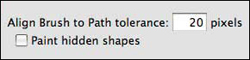
To use the Snap to Path feature, begin by choosing the Oval shape tool in the Toolbox. In the Property Bar, enable Stroke and disable Fill, and then choose a color in the Color panel. From the Shapes menu, choose Set Shape Attributes and set the Width of your stroke to 2. As you draw the shape, constrain the oval to a circle by holding down the Shift key. With the Oval shape layer visible, click on the Canvas layer in the Layers panel to select it. Choose a brush in the Brush Selector. In the Property Bar click on the Align to Path button to activate the Snap to Path function. (Note: In Preferences, General you can set the Align Brush to Path tolerance and enable Paint hidden shapes. For this example, we used the default preference settings of 20 for Tolerance with Paint hidden shapes unchecked.)
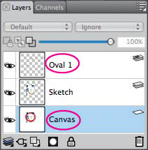
Selecting the Canvas layer, with the Oval shape layer visible
As you paint, your strokes will follow the path of the circle. To create concentric circles, select the Layer Adjuster tool, and then Shift-drag one of the corner handles of the shape to proportionally reduce the size of the circle. Now, move the smaller circle shape inside of one of your painted circles and paint with Snap to Path active around the smaller circle. Experiment by trying out more brushes with the Snap to Path feature. To read about how Carol Benioff uses the Snap to Path feature turn to “Illustrating with the Artists’ Oils” on page 106 later in this chapter. ![]()
Painting on the Canvas with an Oils brush using Snap to Path function. The Oval Shape layer is visible.
A brushstroke painted with the Pattern Pen brush, Pattern Pen Masked variant (over a gold background) using the Decorative Ginko Pen pattern as the Source. This look can be accessed by choosing Window, Media Library Panels, Looks and choosing Decorative Ginko Pen.
Sketching with Pencils
Overview Draw a loose sketch with Pencils variants; scribble and crosshatch to develop tones; brighten highlights with an Eraser.
CHER THREINEN-PENDARVIS
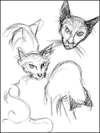
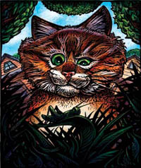
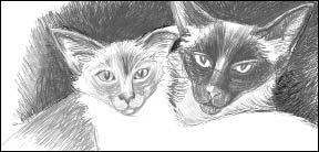
LOOSE, EXPRESSIVE SKETCHES CAN BE DRAWN with the Painter’s Pencils variants, with a look that’s similar to traditional tools, as shown in this drawing of Soshi and Pearl.
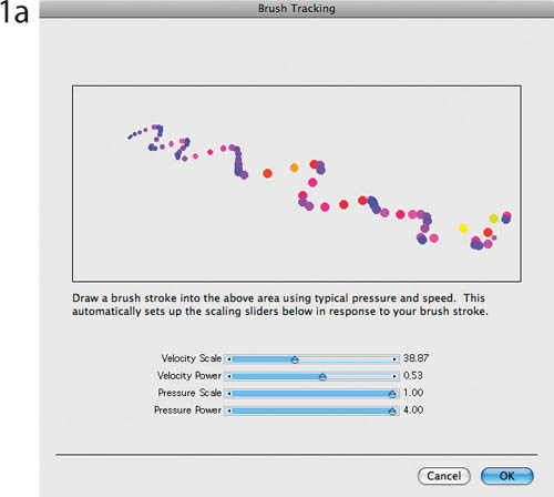
1 Setting Brush Tracking. Pencil sketching often involves rapid, gestural movements with the stylus so it’s important to set up Brush Tracking before you begin to sketch. With Brush Tracking you can customize how Painter interprets the input of your stylus, including parameters such as pressure and how quickly you make a brushstroke. Choose Edit, Preferences/Corel Painter 12, Preferences, Brush Tracking and make a representative brushstroke in the window.
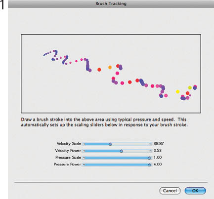
Making a stroke in the Brush Tracking window
2 Beginning to sketch. Create a new image file (File, New). (Ours measured 1100 × 600 pixels.) Click OK. Click on the Paper Selector icon in the Toolbox and select an even-textured paper such as Basic Paper and then select the Pencils category, 2B Pencil variant in the Brush Selector. The default 2B Pencil uses the Buildup method, which means that color you draw is semitransparent and will darken to black, just like when you draw with a conventional 2B graphite pencil. Select a dark gray in the Color panel and draw a line sketch that will establish the negative and positive shapes in your composition.
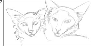
The loose composition sketch
3 Building tones and modeling form. To bring the subjects forward in the picture frame, add dark values behind them. Make crosshatched strokes with the 2B Pencil to create the darker tones. Keep your strokes loose and gestural. Lively stroke patterns will add texture interest to your drawing. To model the faces and bodies of the cats, we used the Oily Variable Pencil, which smeared the pencil slightly as we scribbled and crosshatched. The Oily Variable Pencil incorporates the Cover method, which means that the color you draw is opaque; a lighter color will paint over a darker color.
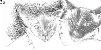
Adding tones to the background and values to the faces
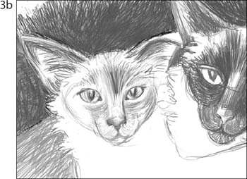
Darker tones and more texture have been added to the background and the faces.
For highlights, choose white in the Color panel and switch to the Cover Pencil variant in the Brush Selector. The Cover Pencil is ideal for adding highlights because it covers previous strokes without smearing. To clean up areas, choose the Eraser variant (Erasers). A tiny Eraser also works well for brightening highlights. ![]()
Drawing with Colored Pencils
Overview Create a sketch with the Sharp Colored Pencil variant; use the Cover Colored Pencil to further develop the drawing; adjust Color Variability settings for a more active color effect.
CHER THREINEN-PENDARVIS
YOU CAN MODIFY THE COLORED PENCIL variant and get a broken color effect (where the color only partially covers the background or underdrawing) by brushing lightly across a textured surface.
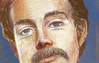
1 Starting with a sketch. To work at the same size we did, open a new 883-pixel-wide file with a white background. Click the Paper Selector near the bottom of the Toolbox, choose Basic texture and select a dark brown color in the Color panel. From the Brush Selector, choose the Pencils category and the Sharp Colored Pencil variant, and then draw a portrait sketch.
The line sketch drawn with Colored Pencils
2 Developing value and adding color. Now choose the Cover Colored Pencil 5 variant of Pencils from the Brush Selector. Use this brush and a lighter brown to develop values throughout the sketch. Choose a skin color (we chose a tan for this portrait of Steve Pendarvis) and apply strokes with a light touch to partially cover some of the brown sketch. Follow the form with your strokes, switching colors and brush sizes as you draw.
Developing values
Adding color
3 Building dimension. To give a shimmery look to the color as it’s applied, choose Window, Brush Control Panels, Color Variability, and drag the Hue (±H) and Value (±V) sliders in the Color Variability palette to 3%. Using a light touch to allow the underpainting to show through, apply fresh strokes in the areas of strongest color (in our drawing, the forehead, nose shadows and the hair). ![]()
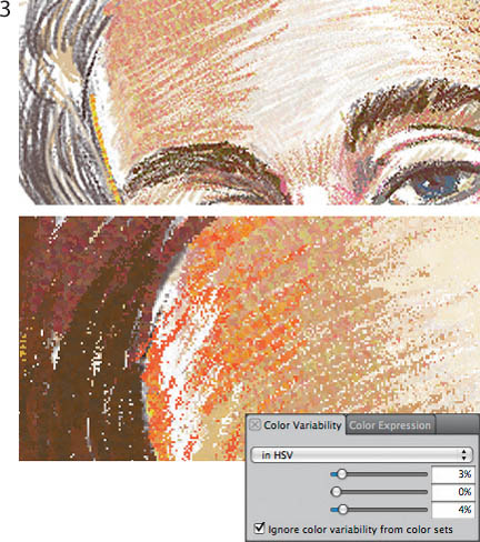
Building dimension using increased settings in the Color Variability palette, and strokes that follow the form
Making Sketchbook Studies Using Pens
Overview Start with gestural drawing; build the forms with crosshatching; clean up with an Eraser.
CAROL BENIOFF
USING THESE SIX DIFFERENT PEN VARIANTS, it’s easy to create quick studies with a variety of looks. The Pens resemble their traditional counterparts, but unlike the conventional pens they emulate, Painter’s Pens do not spatter, and you can erase their ink. Carol Benioff used the Pens to draw these black-and-white studies.
Studies from Leonardo da Vinci. Benioff began by finding good reproductions of Leonardo da Vinci’s drawings to use as a reference. Then she created a new 7 × 9-inch image in Painter at 300 pixels per inch.
1 Making a gesture drawing. She chose the Croquil Pen and she sketched a gestural drawing, mapping out the shape of the hand.
Drawing the first gestural lines with the Croquil Pen variant
2 Defining lines. Benioff drew over the gesture drawing with more definitive lines. She removed lines that she no longer needed using a Pointed Eraser variant of Erasers. Next, she built up the tones and form with short, quick strokes.
Adding defining lines to the gesture drawing and removing some of the lines with an Eraser variant
3 Completing the study. Using a combination of crosshatching and curving lines, she created the highlights and shadows that gave the hand its definition. The study had the scratchy feel of the traditional croquil pen without the splatters.
Completing the study with crosshatch and gestural strokes
4 Using the Smooth Round Pen. Turning to another drawing by Leonardo to use as her model, Benioff then selected the Smooth Round Pen variant of Pens. It had the delicate quality that she wanted to create thin expressive lines. She drew this study using long gestural strokes.
Study of a hand drawn with a Smooth Round Pen in short curving strokes
5 Using the Thick n Thin Pen. For her fifth study, Benioff selected the Thick n Thin Pen. The bold quality of line the pen produces helped to create a clean and simple drawing. She added a suggestion of shading, which she sketched using short squiggles and a bit of crosshatching.
Hand drawn with the Thick n Thin Pen
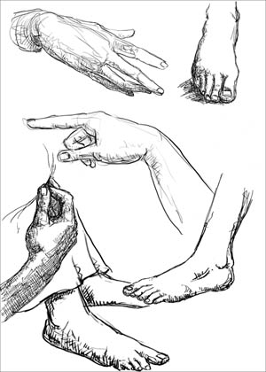
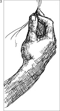
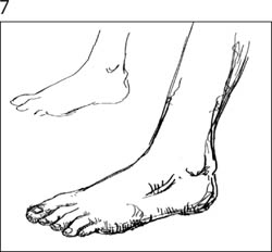
6 Using the Ball Point Pen. For this study of a foot, Benioff chose a Ball Point Pen variant. This gave her an even-weighted medium line. She built up the form using overlapping scribbles and crosshatching.
Study of a foot using the medium weight line of the Ball Point Pen 1.5
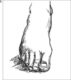
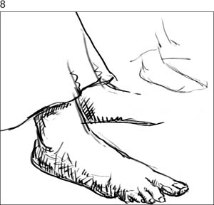
7 Using the Reed Pen. In this drawing of a foot Benioff selected the Reed Pen for its strong, thick-to-thin lines. First she drew a quick gestural outline. Then she used long, smooth strokes to define the contours. Sizing the pen nib down to 3.7 from 7 pixels in the Property Bar, she continued to draw short, curving strokes to indicate the form and shadow.
The beginning gesture drawing and the completed sketch of a foot using the Reed pen variants
8 Using a Bamboo Pen. For a strong, clear line Benioff chose the Bamboo Pen, sizing it down to about 3 pixels. Again she started with a simple gestural outline, and then used short, smooth lines to add the contours. She finished the sketch with short straight lines to add definition to the form and to indicate shadows. ![]()
The first gestures and the finished sketch of two feet, using the Bamboo Pen resized to about 5 pixels using the Size slider on the Property Bar
Expressive Drawing with Pens
Overview Create a line sketch using a Thick n Thin Pen; modify the Leaky Pen for more expression; add spotted and linear accents.
CHER THREINEN-PENDARVIS
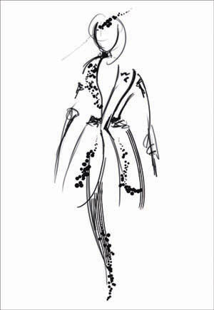
PAINTER IS THE ULTIMATE DIGITAL ART STUDIO, with literally hundreds of brushes to choose from. For Today’s Suit, a fashion illustration sketch, we drew with several expressive Pens variants in Painter, including the Thick n Thin Pen, the Coit Pen and the Leaky Pen. Additionally, we modified the Leaky Pen so that it would paint even more random spots.
1 Setting Brush Tracking. For the most responsive strokes during your work session, it’s important to set up Brush Tracking. Brush Tracking allows you to customize how Painter interprets the input of your stylus, including parameters such as pressure and speed. From the Edit/Corel Painter 12 menu, choose Preferences, Brush Tracking and make a representative brushstroke in the window. For instance, if you plan to use both light and heavy pressure while sketching slowly and then quickly, make a brushstroke that includes these factors.
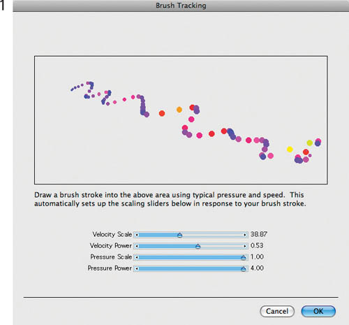
Setting up Brush Tracking
2 Creating a line sketch. Open a new file that is 1500 × 2000 pixels. In the Brush Selector, choose the Pens category from the Brush Category menu; then choose the Thick n Thin Pen 5 variant from the Brush Variant menu. It’s a good idea to make some practice marks with the pen. Choose black in the Color panel and press lightly on your stylus to sketch a thinner line and press more heavily to draw a thicker line. When you’ve finished practicing, delete your practice strokes by choosing Select, All and then pressing the Delete/Backspace key.
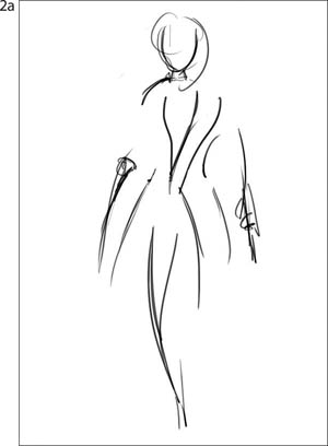
Drawing the line sketch with the Thick n Thin Pen 5 variant of Pens
Drawing a few squiggly accents on the line sketch with the Thick n Thin Pen
For this illustration, we chose to sketch the basic shapes using the Thick n Thin Pen because it allows you to draw smoothly, while varying the thickness of the lines. To sketch a graceful, tall model, use your stylus to make sweeping, curved vertical strokes, which will suggest the outline of the model and emphasize her height. As you sketch, keep in mind the motion of her walk and the sweeping curves of her clothing. Then, add a few details and accents with shorter, squiggly strokes.
3 Adding more expression to the Leaky Pen. In preparation for adding texture with the Leaky Pen, we modified its settings to make it even more expressive. Choose Window, Brush Controls, Jitter and set the Jitter Expression pop-up menu to Pressure. Save your variant by choosing Save Variant from the Brushes menu and give it a name. For good Painter housekeeping, restore the default variant to its original settings by choosing Restore Default Variant from the Brushes menu.
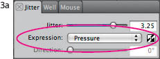
Changing the Jitter Expression pop-up menu to Pressure
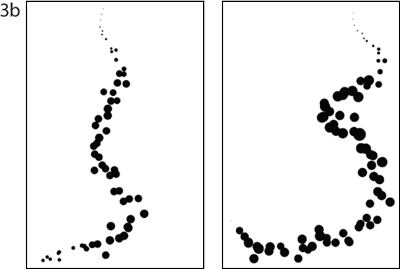
The default Leaky Pen (left) and with Jitter Expression set to Pressure (right)
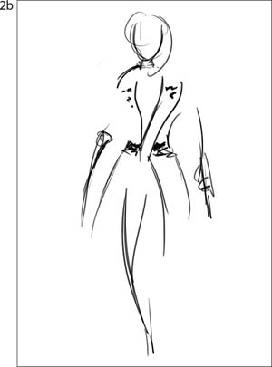
4 Adding texture with unusual Pens. Next, we added whimsical texture to the line work using two unusual Pens variants. To add interesting textured spots, we used both the default Leaky Pen and the custom Leaky Pen from step 3. Choose your modified Leaky Pen. Make a practice stroke using light pressure to begin the stroke, and then gradually apply heavier pressure at the end of the stroke. You’ll notice that the spots will become larger and more random with heavier pressure. Now, draw a few textured accent strokes on your model using the modified Leaky Pen. We loosely drew in a few accents.
Leaky Pen spots on the hat and jacket
Detail showing the Coit Pen strokes on the jacket and skirt
Next, we used the Coit Pen to draw textured line accents. When you have the spotty texture as you like it, switch to the Coit Pen variant of Pens and draw a few gently curved linear accents, as we did here along the sides of the jacket and skirt in the illustration. ![]()
A Painter Hard Media Primer
Overview Here you’ll find the basics for painting with the Hard Media brushes.
CHER THREINEN-PENDARVIS
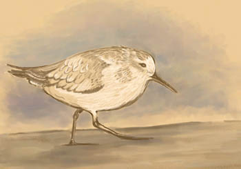
THE HARD MEDIA BRUSHES HAVE BEEN designed to perform like conventional drawing tools, in that the stroke changes as you tilt the stylus and move the brush. For instance, using the Real 6B Soft Pencil, you can draw a thin line when holding the stylus upright and then draw a thicker stroke—like shading with the side of a pencil—when you tilt the stylus.
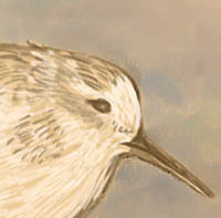
In this detail of the Sanderling Study, you can see varied thicknesses of the Real Sharp Colored Pencil strokes, and the tonal variations possible when the sides of the pencils are used for shading.
Sanderling Study (above) was painted with the Real 6B Soft Pencil variant of Pencils, the Real Soft Colored Pencil and Real Sharp Colored Pencil variants of Pencils, and the Real Pointy Blender and Real Stubby Blender variants of Blenders. Before you start a painting of your own, reading this primer will help you to achieve the results you’re looking for.
Exploring the Hard Media brushes. The new Hard Media brushes are scattered throughout Painter and can be found in these categories: Blenders, Chalk & Crayons, Charcoal & Conté, Digital Watercolor, Erasers, Markers, Pastels, Pencils, Pens and Sumi-e. The organization can be a bit confusing, but look for the word “Real” before the brush name, with one exception: The Markers have their own category, but its variants do not begin with the word “Real.”
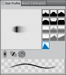
The Real 6B Soft Pencil is chosen. Here is how the Pencil profile appears in the Dab Profile panel using Preview Brush Dab view.
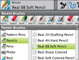
The Brush Selector and open Brush Library Panel showing the Pencils category and “Real” Hard Media Pencil variants.
The new Real 2B Pencil, Real 2H Drafting Pencil, Real 4H Hard Pencil and Real 6B Soft Pencil incorporate a new Pencil Tip Profile that is designed to emulate the transition of a conventional pencil as it moves from the pointed tip, to the side of the pencil. Typically, the tip of a pencil is used for sketching, and its side is used for shading. In the new tip profile, the stylus is centered on the darkest point of the dab, and the edge is feathered from black to gray to allow for a soft edge on the stroke.

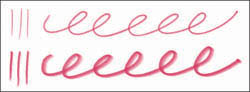
The Real 6B Soft Pencil variant of Pencils offers versatile thin and thick brushstrokes depending on the angle of the stylus. The top stroke was drawn with the stylus held erect, and the bottom stroke with the stylus tilted.
When using the Hard Media brushes, you can work directly on the Canvas or you can paint on a layer—we worked on the Canvas. To try out the Hard Media pencils, go to the Brush Selector and from the category menu, choose Pencils. Create a new file by choosing File, New. (Our file for trying out the brushes measures 600 × 600 pixels and has a white background.) The new pencils are based on the performance of conventional pencils, both in the softness/hardness and how they interact with texture on the Canvas: Real 2B Pencil, Real 2H Drafting Pencil, Real 4H Hard Pencil and Real 6B Soft Pencil. In the Paper Selector (Toolbox), choose a coarse, natural texture for trying out the brushes (we chose Charcoal paper). To draw with the fine point, hold your stylus upright at about a 20° to 30° angle from vertical and practice drawing a curved, looping stroke. Next, transition to a wider stroke as if you were shading with the side of the pencil by tilting the stylus to about 40°–60° degrees from vertical. Draw another curved looping line, this time emulating drawing with the side of the pencil.
Brushstrokes painted using the Real Soft Chalk variant of Chalk & Crayons
Strokes drawn using the Real Sharp Colored Pencil (top) and the Real Soft Colored Pencil (bottom) variants of Colored Pencils
Next, try out the Real Sharp Colored Pencil and Real Soft Colored Pencil variants of Colored Pencils. These versatile tools are great for sketching in color and for drawing both thin and thick lines.
Next, let’s explore brushes that apply grainy strokes and looks, for instance the Chalk and Pastels. Choose the Real Soft Chalk variant of Chalk & Crayons from the Brush Selector—the Real Soft Chalk paints broad strokes when used on its side and is good for blocking in large areas quickly. Paint a slightly curved horizontal stroke by slightly tilting your stylus, and then experiment with tilting it more as you rotate your hand. Next, use the Real Soft Chalk to paint a circular stroke, while moving your hand naturally. Now, try out the Real Soft Pastel variant of Pastels. This brush has a softer feel, and is also good for shading and laying broad areas of color. Using this brush, make several angular, overlapping brushstrokes, while tilting your stylus. Next, choose the Real Hard Pastel, which simulates a harder pastel and paints grainier strokes. Using this brush, paint angular strokes so that you can see how this brush interacts with the chosen texture. (For a technique using the Real Pastels and Blenders, see “Blending and Feathering with Pastels” on page 84.)
These overlapping strokes were painted using the Real Soft Pastel (left) and the Real Hard Pastel (right) variants of Pastels.
Stroke drawn using the Real Drippy Pen (top), hatched strokes using the Real Fine Point Pen (middle) and stroke drawn with the Real Variable Width Pen (bottom)
Located in the Pens category, you will find the Real Drippy Pen, Real Fine Point Pen and the Real Variable Width Pen. Choose the Real Fine Point Pen and sketch some hatched strokes as we did here. Follow up with more practice strokes with the other new pens.
Painting transparent color using the Markers. An exciting brush category and media type, the Markers incorporate the new Hard Media capabilities for tip profile control, and they also offer transparent wet media that has similarities to Digital Watercolor. Using the Markers, you can lay down color using one continuous stroke without buildup of the color, until you lift the stylus and touch the tablet again, to paint a new stroke. Similar to Digital Watercolor, the Markers work on a Gel layer, allowing for beautiful transparency effects. See “Drawing with Real Pencils and Markers” on page 86 for a creative technique featuring the Markers.
Painting a continuous overlapping stroke with the Flat Rendering Marker (top) and painting two strokes (bottom). Notice the buildup of the orange on the pink in the lower strokes.
Customizing the Hard Media brushes. When making your own “Real” Hard Media brushes, you can start with any Captured Dab, Circular and Eraser dab type brush, for example, the existing Pencils, Chalk and Pastels variants. Following is an overview of the Hard Media settings in the Dab Profile, Angle and Hard Media panels.
The Dab Type pop-up menu in the General panel of Brush Controls. The Circular, Captured and Eraser dab types are compatible with the Hard Media controls.
Within the Dab Profile panel Preview Window, you can toggle between the dab and size previews by clicking in the Preview Window. Six Tip Profiles are available, with the Pencil profile is in the bottom left. In the Angle panel, when the Angle slider is adjusted, the Preview Window in the Dab Profile panel updates to show the adjusted angle. When working with Hard Media, the recommended range for the slider is 0° to 90°, with 0° being the tip of the pencil for thin lines (as if the stylus was upright) and the other extreme, 90°, as if the stylus was tilted, shading with the side of the pencil. In the Hard Media panel, Squeeze determines the roundness or elliptical shape of the brush. In the Squeeze panel, the V Min and V Max sliders denote the minimum and maximum squeeze on the vertical axis. The H Min and H Max controls the set amount of Squeeze applied to the dab on the horizontal axis. The Stepping slider sets the number of variations for the dabs for the angle adjustment; the lower number will take longer to render the dab matrix, but will create a smoother transition from small-to-larger-size dabs. The Transition Range allows the user to set the start and finish points for the transition between a fine point to a larger shading dab. ![]()
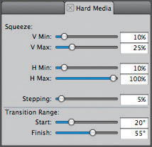
The Hard Media panel showing the Squeeze sliders and the Transition Range sliders.
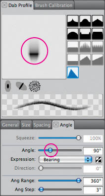
The Dab Profile panel displays Brush Tip Profiles, dab profile and stroke previews. The Angle panel contains Angle and Expression settings. The Angle slider setting is displayed in the Preview Window on the Dab Profile panel.
Painting with the Hard Media Brushes
Overview Design a still life; set Brush Tracking and make practice strokes with Hard Media brushes; build a color palette using the Mixer; draw a sketch; lay in colors and model forms; add details.
CHER THREINEN-PENDARVIS
FLOATING ORCHID 2 IS ONE IN a series of surrealist paintings of flowers hovering over land and sea. The flower was painted from life, while the simple seascape was painted from a memory of beautifully lit clouds over the sea in the early morning.
This project uses Chalk and Blenders brushes that incorporate Hard Media capabilities, which means the brushes are very sensitive to the nuances of your hand, for instance, whether the stylus is held upright or at a tilt while drawing. We love painting with the Chalk brushes because they interact with Painter’s textures in such a unique and natural way!
1 Setting up and making practice strokes. The first step is to set up the still life. We placed the blooming orchid under a full spectrum light on the desk. Then we planned a composition with plenty of space around the flower because we planned to paint a seascape behind it.
Making a brushstroke in the Brush Tracking window using light to heavy pressure
Practice strokes drawn with the Real Fat Chalk (top), Real Hard Chalk (middle) and Real Soft Chalk (bottom)
It’s important to set Brush Tracking before you work with the sensitive Hard Media brushes. Brush Tracking allows you to customize how Painter interprets the input of your stylus, including parameters such as pressure and speed. Choose Edit, Preferences, Brush Tracking (Mac OS X users, choose Corel Painter 12, Preferences, Brush Tracking) and then make a typical brushstroke in the window. For a broader range of sensitivity, we recommend making a stroke in the Preview window that reflects using light and heavy pressure while painting quickly and then slowly.
It’s a good idea to get acquainted with the brushes by making some practice strokes. In this project you will use the Real Fat Chalk, Real Hard Chalk and Real Soft Chalk variant of Chalk & Crayons and the Real Stubby Blender and Real Pointy Blender variants of Blenders.
2 Planning a color palette using the Mixer. We used the Mixer palette to build basic colors for the painting. If the Mixer is not visible, choose Window, Color Panels, Mixer. It’s a good idea to have both the Color panel and the Mixer open while you work. Apply color to the Mixer with the Apply Color tool (at the bottom of the Mixer Pad, second from left). The Dirty Brush mode is active by default. Deselect the Dirty Brush by clicking on it. The Dirty Brush mode retains color that was previously used. For this painting, we preferred to apply puddles of pure, clean color to the Mixer and then mix them using the Mix Color tool (third from left).
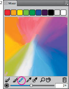
The Mix Color tool is chosen in the Mixer, and the Dirty Brush mode is turned off.
3 Sketching with Chalk. Now, it’s time to sketch. To create a file for your painting, choose File, New and set up a file that measures 10 × 12 inches at 150 ppi. In the Paper Selector located in the Toolbox, choose a natural texture (we chose Basic Paper). In the Color panel, choose a color that will complement the colors you plan to use in your painting. We created a drawing in Painter from direct observation, by sketching with one of our favorite Hard Media brushes, the Real Soft Chalk using a blue-gray color over Basic Paper. For this sketch, you can work directly on the Canvas. While drawing, carefully observe the shapes of the forms in your subject and pay careful attention to the lighting on the forms.
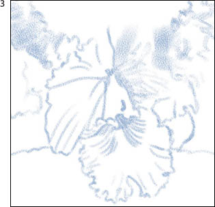
Loosely sketching with the sensitive Real Soft Chalk variant of Chalk & Crayons
4 Building an underpainting. We envisioned a background sky with soft cloud shapes. The darker values behind the white orchid will help the background to recede and allow the flower to come forward in the composition. The Real Fat Chalk is a sensitive, grainy, Hard Media brush that is ideal for laying in large areas quickly. Choose the Real Fat Chalk variant of Chalk & Crayons. Use the Sample Color tool from the Mixer to pick up color and then lay color onto the clouds and sky. Notice how the width of the stroke changes with the tilt of the stylus. When you are ready to add color to the center of interest, switch to the Real Soft Chalk. Be loose and expressive with your brush work. While carefully observing the forms and lighting, we blocked in the shapes and values, resizing the brush as we worked.
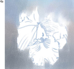
Blocking in the sky behind the orchid with the Real Fat Chalk variant of Chalk & Crayons
Using a Real Soft Chalk to lay in base colors for the flower and to add more varied colors to the background
5 Sculpting forms and modulating color. Now that the basic colors are established, begin to layer chalk strokes that will build color complexity. As you work, continue to use the Mixer palette as a paint palette to pick up color and the Real Soft Chalk to apply paint to the Canvas. Directional brushstrokes will add dynamic energy to the image. Layer color over color, and let your strokes follow the direction of the forms. Next, use a wider range of values to further establish the light on the forms. We also added brighter colors to the sky and then blended large areas of color with the Real Stubby Blender.
Modeling forms on the interior of the flower with a small Real Soft Chalk

Using the Real Pointy Blender to smooth the shadow edge on the flower petal
Now that your painting is nearly completed, zoom in to 100% and take a careful look at your composition. In our painting, the center of interest needed brighter highlights and deeper shadows. The petals in the center of the flower needed to be brightened and refined. To paint crisper edges and brighter color on these petals, we used a small Real Soft Chalk, and to add textured details to shadowed areas on the petals, we used a small Real Hard Chalk. Then, to blend small areas, we reduced the size of the Real Pointy Blender to about 7–10 pixels and brushed carefully, allowing the strokes to follow the forms. Next, to layer more texture onto the sky, we sampled color from the image using the Dropper tool, switched to the Real Fat Chalk and then loosely brushed back and forth over the cloud shapes, sampling a different color with every few strokes.
6 Refining and adding details. As with the modeling and sculpting work in step 5, when painting the smaller details, keep in mind the shapes of the forms, and apply the strokes in the direction of the forms. To add final touches to the center of the flower, we used a small Real Soft Chalk (try 7–10 pixels). First, we added strokes of varied gold, orange and brown onto the center of the flower. Then we added deeper tones to the interior to help bring the overlapping lip forward. The final brushwork can be seen in the completed illustration on page 81. ![]()
The nearly completed painting. Details in the center of interest are finessed and blended, and texture is preserved on supporting areas.
Blending and Feathering with Pastels
Overview Set up a still life; sketch from life with pastels; build color and form; blend the painting; add feathered brushstrokes to finish.
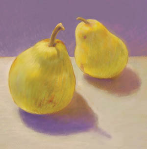
CHER THREINEN-PENDARVIS
FEATHERING—THIN, PARALLEL STROKES over a blended underpainting—is a traditional pastel technique that yields texture and freshness. Because the feathered finishing strokes remain unblended on the painting’s surface, the viewer’s eye must work to blend the colors. Here is an example of optical color blending. For more sensitivity and expressive strokes, we used new Pastels brushes that incorporate Hard Media capabilities.
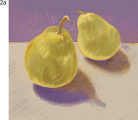
1 Starting with a sketch on colored paper. We set up a still life next to a window, arranging the subject so that the shadow would help to lead the eye into the composition and give the painting more depth. In this painting we designed a complementary color scheme, using a varied purple background that would set off the yellow and green pears.
Choosing a paper color
The Real Soft Pastel variant of Pastels incorporates Hard Media capabilities
Loosely sketching with the Real Soft Pastel variant of Pastels
Blocking in base colors on the pears and foreground to begin the underpainting
When we were happy with the still life design, we opened a new file (File, New: 4 × 4 inches × 300 ppi) with a dull purple-colored background. To set the Paper Color, click the Paper Color preview in the New Image window and choose a color in the Colors dialog box. To select a new hue or adjust its saturation, click or drag in the color wheel. To make the color darker or lighter, adjust the value slider on the right side of the window. When you have a color that you like, click OK. Now click the Paper preview in the New Image window and select Sandy Pastel Paper texture. Click OK to close the dialog box. Next, pick a color to sketch with from the Color panel (we began with a warm yellow). Select the Real Soft Pastel variant of Pastels from the Brush Selector. For a more sensitive response when using your stylus, choose Edit, Preferences/Corel Painter 12, Preferences, Brush Tracking, make a representative brushstroke in the window and click OK. The Real Soft Pastel incorporates Hard Media features, which allow you to make thin strokes when the stylus is upright and broader strokes when the stylus is tilted. (See “A Painter Hard Media Primer” on page 78 for detailed information about Hard Media.) Make a few practice strokes to get a feeling for the brush. Now increase the size of the brush (we used 50–60 pixels), so you can block in the base colors easily. Using broad strokes, lay in the base colors on the pears and suggest a horizon line (in our case, an angled table top), choosing new colors as needed.
2 Sculpting the forms. Next, we roughly sculpted the shapes of the pears. Still working with Real Soft Pastel, lay in more color over your subject, allowing your strokes to follow the direction of the forms. We sized our brush to about 40–50 pixels to paint broad strokes of color and value.
Sculpting the forms with curved and angled strokes of varied color.
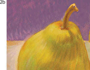
Adding hatched strokes to sculpt the form of the pears and build values
Now, resize the Real Soft Pastel to about 30 pixels, and add smaller curved and angled strokes that follow the direction of the forms. To give the simple composition more interest, we used angled strokes to paint varied purple, cream and brown colors on the background and on the table.
3 Softening the brush work. Select the Grainy Water variant of Blenders, and blend areas of color, again following the direction of the forms. To blend detailed areas with a thin, tapered brush, try the Real Pointy Blender variant of Blenders. We smoothed larger areas on the pears with the Grainy Water, then switched to the Real Pointy Blender to blend the highlight details on the stems.

Blending with the Grainy Water and Real Pointy Blender variants of Blenders
4 Adding feathered strokes and detail. To create thin, textured strokes on top of the blended forms, choose the Real Soft Pastel and reduce its size using the Size slider in the Property Bar (try 10 pixels). Stroke with this brush in the direction of the form. Here, feathering is most noticeable in the highlights near the top of the closest pear—in the varied yellow colors overlaid over the pears more neutral colors. Finish the piece by using the Grainy Water variant to soften the feathering in the shadow areas. (To do the final blending touches, we lowered the Grainy Water variant’s Opacity to 40% using the Opacity slider in the Property Bar.) Finally, we used a tiny Real Soft Pastel to add details to the stem on the foreground pear. ![]()
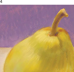
Using feathered strokes to bring out highlights and color variations on the pear
Drawing with Real Pencils and Markers
Overview Set Brush Tracking and make practice strokes; draw a line sketch using the Real 2B Pencil; paint areas of flat color with the Chisel Tip Marker; add details with the Sharp Marker.
CHER THREINEN-PENDARVIS
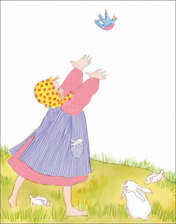
THE REAL PENCILS AND THE MARKERS incorporate the sensitivity of the Hard Media features. With Hard Media tools, the width of the brushstroke changes as you hold the stylus upright and then tilt the stylus at an angle—a more dramatic angle produces a wider line. The Markers offer transparency similar to Digital Watercolor. Because of their transparency, the Markers are an excellent choice for quickly painting solid areas of color and for building up colored washes similar to watercolor. For Chasing the Blue Bird, we sketched with the Real 2B Pencil variant of Pencils and then colored the drawing with Markers, including the Chisel Tip Marker and Sharp Marker. This drawing is inspired by the beautiful children’s book illustrations of Patricia Palacco.
1 Setting up and making practice strokes. Because of the sensitivity of the brushes, set up Brush Tracking to customize Painter to the nuances of your hand. Brush Tracking determines how Painter interprets the input of your stylus, including parameters such as pressure and speed. From the Edit/Corel Painter 12 menu, choose Preferences, Brush Tracking and make a representative brushstroke in the preview window. For instance, if you plan to use both light and heavy pressure while sketching, make a brushstroke that includes these factors.
Practice strokes drawn with the Real 2B Pencil variant of Pencils
Left: Practice strokes drawn with the Chisel Tip Marker (top), the Sharp Marker (center) and the Flat Rendering Marker (bottom.) Right: The purple stroke and gold stroke drawn over the top in the example show the ability to multiply color when separate strokes are drawn.
Now, open a new file for your illustration that is 900 × 1150 pixels (File, New). Before you start your drawing, try out the brushes by doodling with the Real 2B Pencil. Choose a dark color in the Color panel and in the Brush Selector, choose the Real 2B Pencil variant of Pencils. The Real 2B Pencil is sensitive to the tilt of the stylus and draws a thin line when the stylus is upright and a thicker line the more you tilt the stylus. Make curved and linear strokes while you vary the tilt of the stylus.
Next, in the Brush Selector, choose the Markers category; then choose the Chisel Tip Marker. Using the Markers, a continuous stroke drawn without lifting the stylus from the tablet produces even color, and this is true even if areas of the stroke overlap. This quality makes the Markers very forgiving. Make a few practice strokes with all of the Markers variants. A new stroke layers color over existing paint and darkens it, similar to using the Multiply compositing method or painting on a Gel layer.
2 Creating a line sketch. Now that you’re familiar with the brushes, use the Real 2B Pencil to draw your line sketch on the Canvas, using loose, natural strokes. If you want to clean up a line, you can do so quickly using the Eraser tool in the Toolbox.
The line sketch is drawn with the Real 2B Pencil variant of Pencils.
3 Painting the base colors. When the sketch is as you like it, make a new layer for the base coloring. Click the New Layer button at the bottom of the Layers panel, and a layer titled Layer 1 will appear. In the Brush Selector, choose the Markers from the Brush Category pop-up menu and then choose the Chisel Tip Marker from the Brush Variant pop-up menu. When you touch the Marker to Layer 1, the Composite Method for the layer automatically switches to Gel, a transparent layer mode. Use the Chisel Tip Marker to lay in the colors for the girl’s clothing and skin on this layer. Color using a single continuous stroke where possible to keep the color even.
The base colors for the little girl are painted with the Chisel Tip Marker.
Next, choose a green-gold and paint the base color for the field. The Just Add Water variant of Blenders is a useful tool for smoothing areas if overlapping strokes look too uneven for your taste.
4 Adding the details. After the base colors are established, add a second layer for the details. Paint decorative patterns on the clothing and draw the grass and other details using the Sharp Marker variant of Markers and using contrasting colors. For the stripes, reduce the size of the Sharp Marker to 7–10 pixels using the Size slider in the Property Bar and then carefully draw vertical stripes on the jumper. Use this same small Sharp Marker to loosely paint the random blades of grass. For the light brown shading on the rabbits, reduce the opacity of the Chisel Tip Marker to about 10%, using the Opacity slider in the Property Bar, and brush lightly. ![]()
The dots and stripes on the little girl’s jumper are drawn with the Sharp Marker.
The grass blades and shading are in progress in this detail.
A Painter Watercolor Primer
Overview Here you’ll find the basics for painting with Painter’s Real Watercolor and Watercolor brushes and layers.
CHER THREINEN-PENDARVIS
PAINTER FEATURES TWO KINDS OF WATERCOLOR: Watercolor layers and Digital Watercolor. This primer covers Watercolor Layers. Digital Watercolor, which is simpler to use and doesn’t require a special layer, is covered on pages 96–97.
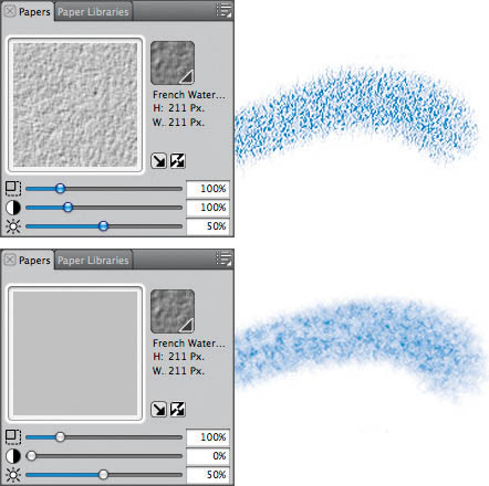
Two brushstrokes painted with the Diffuse Grainy Camel variant of Watercolor: 100% Contrast, the default (top), and painting with 0% Contrast (bottom)
Watercolor media layers provide artists with an experience that’s surprisingly like traditional watercolor. The Watercolor Layer is a simulation of a transparent wet medium containing suspended pigment. This makes it possible to create smooth, transparent washes and then diffuse color into existing wet paint to blend, as a traditional watercolorist would. Both Real Watercolor and Watercolor brushwork can be combined on Watercolor layers.
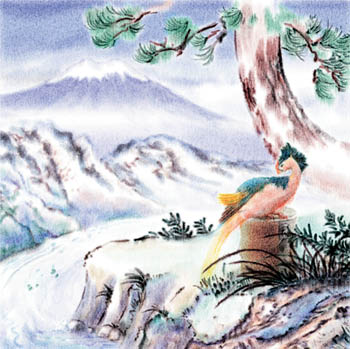
Phoenix and Painter at Mt. Fuji (above), is one of a series of studies painted using techniques similar to the one presented step-by-step in “Wet-into-Wet Watercolor” on page 92. But before you start using Watercolor, reading these four pages will help you to understand how to achieve the results you desire.
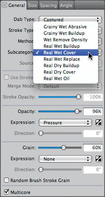
Working with the Real Watercolor controls. With Painter’s Real Watercolor, you can control the wetness, viscosity, settling rate, pigment interaction, drying time, direction and other techniques that you can achieve using traditional watercolor. The most important settings for Real Watercolor are in the Brush Controls (Window, Brush Control Panels) the Dab Profile, General, Size, and Real Watercolor panels; the Papers panel and the Layers panel. When you make a brushstroke with a Real Watercolor brush, a Watercolor Layer is automatically generated in the Layers panel. Watercolor Layers can be targeted in the Layers panel and edited like other layers. Chapter 6 tells about working with layers. In the Dab Profile panel of Brush Controls, the brush Dab Profile is chosen. In the General panel are important menus: Dab Type, Stroke Type, Method and Sub Category and more. A dab type determines the shape of the brush—for instance, the Captured dab type is used for the Real Grainy Wash variant of Real Watercolor. The Method determines the character of the paint; the Wet method is used by Real Watercolor for painting on Watercolor layers. Several subcategories are important to Real Watercolor brushes: Real Wet Buildup, Real Wet Cover, Real Wet Replace, Real Dry Buildup, and Real Dry Cover. In the Size panel, you’ll find the Size and Min Size sliders with their Expression pop-up menu, which determine the taper of the brush.
The General panel of Brush Controls, showing the Subcategory pop-up menu with options for Real Watercolor
The Real Watercolor panel is divided into five sections, Brush, Water, Pigment, Paper, and Wind, with controls for Diffusion in the lower portion. In the Brush area, you can set the Wetness, which is the amount of water that the brush applies to the paper and Concentration, the amount of pigment the brush applies to the paper. In the Water panel, you can adjust the Viscosity or thickness of the pigment. For example, if the water Viscosity is set high, the pigment will be runny; if it is low, pigment will pool more easily. With the Evaporation Rate, you can set the speed that water dries on the paper. In the Pigment area, you can adjust the Settling Rate, which determines how much pigment settles on the paper after the water dries, its Weight, which determines how quickly the pigment settles on the paper, and its Pickup. Pickup controls the amount of existing paint that is moved when a new brushstroke paints over existing pigment. In the Paper panel, you can set the Roughness, which works in conjunction with other sliders in the panel. With Flow Resistance you can adjust how paper grain affects the waterflow; with Dry Rate you can set how fast the water is absorbed by the paper and with Pigment Granulation you can determine how wet pigment settles into the valleys of the paper grain. In the Wind panel, you can set the Angle that water flows on the paper and the Force, or strength of the wind. The Diffusion controls allow you to control the Diffusion quality to preserve performance and also to pause it. Accurate Diffusion allows finer detail and a more natural-looking diffusion of pigment into the Watercolor Layer. However, it may cause a slight decline in brush responsiveness.
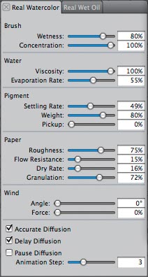
The Real Watercolor panel of Brush Controls contains controls for modifying Real Watercolor brushes.
Using the Watercolor controls. With Watercolor brushes in Painter, you can control the wetness, drying time, direction in which your wash will run and many other techniques that you’re able to do using conventional watercolor tools. The most important settings for Watercolor are in the Brush Controls (the Dab Profile, General, Size and Water panels); the Papers panel and the Layers panel. When you make a brushstroke with a Watercolor brush, a Watercolor Layer is automatically generated in the Layers panel.
In the General panel of Brush Controls, the Watercolor dab types are displayed in the Dab Type pop-up menu. A dab type determines the shape of the brush—for instance, Watercolor Flat and Watercolor Camel Hair (round). Most of the Watercolor brushes use continuous-stroke technology, which means that brushstrokes are painted using brush hairs that are a set of anti-aliased 1-pixel lines. You’ll find more information about dab types in Chapter 4, “Building Brushes.”
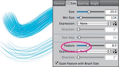
These two brushstrokes were painted with the Dry Bristle brush. The top stroke uses the default brush settings. For the bottom stroke, the Feature size was increased to 8.0 in the Size panel of the Brush Controls, which resulted in a brushstroke with fewer brush hairs.
In the Size panel of Brush Controls, you’ll find the Feature slider, which determines the density of the brush hairs in the continuous-stroke brushes. Note: A very low Feature setting (producing more densely packed brush hairs) takes greater computing power, which can slow down the performance of a Watercolor brush.
In the Water panel of the Brush Controls, Wetness works with Evaporation Threshold to control the amount and spread of the water and dye. A low Evaporation Threshold will allow more spread; higher values will cause less spread. A high Wetness setting will blur the individual bristle marks and (with a high Diffusion Amount setting) increase the spread of the stroke, but it may make the performance of the brush lag. Pickup controls the amount of existing paint that gets moved when a new brushstroke paints over existing pigment. High Pickup rates cause wet edges or puddles, which can be desirable. The Dry Rate controls the length of time the water and pigment take to settle. A high Dry Rate will keep a brush with high Diffusion Amount settings from spreading as far, because the stroke will dry before it has had time to diffuse. A low Dry Rate value will allow more time for spread. Evaporation Threshold controls the amount of water that can diffuse. (In traditional watercolor, evaporation is the rate in which liquid is sublimated into the atmosphere.) Diffuse Amount controls the amount of pigment that can diffuse. Capillary Factor and Grain Soak-In affect the amount of pigment that settles in the valleys of the paper grain. Setting both of these controls to 0 will minimize grain effects. Also, very low Capillary Factor and Grain Soak-In settings will allow a runny wash to spread more smoothly. A high Capillary Factor (with a low Grain Soak-In setting) will create a “stringy” drip texture in the runny wash.
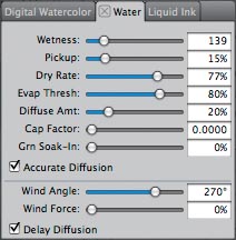
The Water panel of the Brush Controls contains controls for modifying Watercolor brushes.
Getting to Know the Watercolor Brushes
Here are some suggestions for how to paint traditional-looking brush work using several of Painter’s Real Watercolor and Watercolor brushes. Even if you’re familiar with using a stylus and Painter’s other brushes, try these exercises and experiment with all of the Watercolor brushes. You may enjoy discovering a new kind of expressive brushstroke!
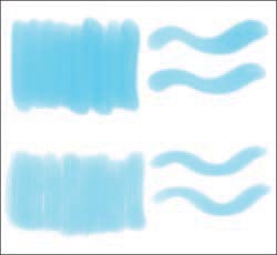
Brushstrokes painted with the Real Oval Wash (top) and the Real Grainy Wash (bottom)
Using the Wash brushes. The Real Watercolor brushes include a wide variety of brush effects, and the Wash brushes, are among the most versatile. In addition to washes, the Real Oval Wash and Real Grainy Wash allow you to paint brushstrokes that can be thick and thin, depending on the way you hold the stylus and how much pressure you apply. The Real Oval Wash is useful for smooth even washes and the Real Grainy Wash brush paints washes with a bit of texture. To paint an even wash, when you make a new stroke, place it next to the previous stroke so that it barely overlaps. Try not to paint over an area, unless you want to darken the area.
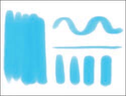
A wash painted using overlapping strokes (left) and thin-to-thick strokes (right), all painted with the Real Wet Flat
Thin and thick strokes with the Flat brushes. Look for brushes with the word Flat in their name; the Real Wet Flat and Real Wet Flat Fringe of Real Watercolor are examples. With Flat-tipped brushes, you can paint wide or narrow strokes, depending on the way you hold the stylus and how much pressure you apply. When trying the strokes that follow, position your stylus with the button facing up (away from you). To paint a wash with the Real Wet Flat (as in the image on the left), pull the brush straight across your image using even pressure. To make the thin lines, pull down. To make a curved, thin-to-thick wavy line, use light pressure on your stylus for the thin top areas, and more pressure as you sweep down and rotate the brush.
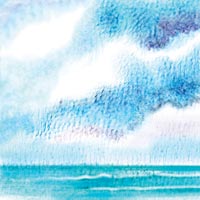
We painted this cloud study using the Runny Wash Bristle and Runny Wet Camel to paint the clouds, the Wash Camel and Fine Camel variants to paint the water and the Diffuse Camel to soften a few edges.
Expressive strokes with Camel brushes. The most versatile of all the Watercolor brushes, the Camel brushes, are round. In addition to painting washes, most Camel brushes allow you to paint brushstrokes that can be thick and thin, depending on the pressure applied to the stylus. Other Camel brushes allow you to apply drippy washes (Runny Wash Camel and Runny Wet Camel), while the Diffuse Camel paints strokes that have soft, feathery edges.
Adding detail with the Fine brushes. The Fine variants of the Watercolor brush are good for painting details, and for calligraphic line work. The Fine Bristle and Fine Camel are similar to “rigger” or “line” brushes, which are used to paint expressive line work in traditional watercolor.
Painting runny washes using the Runny brushes. The Runny variants (the Runny Wash Bristle and the Runny Wash Camel, for instance), are useful for painting drippy wet-into-wet washes, where the colors run together and blend, but they don’t displace the underlying color. The Runny Wet variants, however, will run and move existing color as the new pigment travels. The Runny Wet brushes are useful if you want to add a darker wet-looking edge to the bottom of a cloud, for instance. For all of the Runny Wash and Runny Wet brushes, the Wind Direction and Force settings determine the direction of the run and how far a wash will run, much like tipping your watercolor board when working in the field. To paint a Watercolor Runny wash that moves only a little, lower the Force setting. For more a creative project which uses a variety of Real Watercolor and Watercolor brushes, turn to “Wet-into-Wet Watercolor” on page 92. ![]()
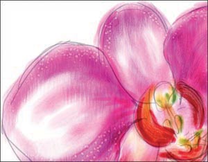
To paint details on the Pink Orchid, we used the Fine Camel variant of Watercolor.
Wet-into-Wet Watercolor
Overview Make a “pencil sketch”; loosely paint smooth washes with Real Watercolor and Watercolor brushes to build up varied color; add subtle wet-into-wet bristle marks; add details to the image and create a speckled texture using a Spatter brush.
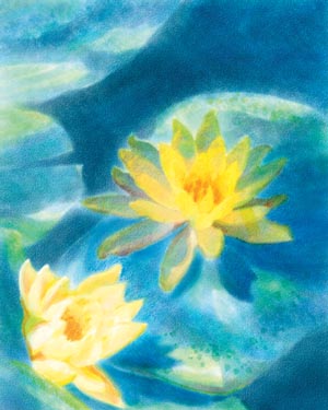
CHER THREINEN-PENDARVIS
WATER LILIES, A LOOSE WATERCOLOR PAINTING, was painted using Painter and a Wacom Intuos pressure-sensitive tablet and stylus. Watercolor wet-into-wet techniques were used; then details and texture were added. Wet-into-wet is a traditional technique that can be simulated using Painter’s Watercolor layers. Wet-into-wet is the most fluid way to apply color, as it involves keeping the paper wet while new color is applied, so that new colors blend with existing moist paint. With Watercolor layers, you can paint with brushes that apply pigment that percolates and diffuses into the paper grain, and paint washes that blend into the existing wet paint. More texture effects are possible with Watercolor layers than with Digital Watercolor, which is described on pages 96–97.
1 Setting up and opening a new file. Begin by creating a new file (File, New). In the New Image dialog box, set the Width and Height at 1500 × 1800 pixels, and then choose a paper texture by clicking the Paper swatch (we chose French Watercolor paper). Make sure the Color swatch is set to white, and click OK. (The brush sizes that you’ll use will depend on the pixel size of the document.)
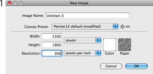
Starting a new file for the Water Lilies painting
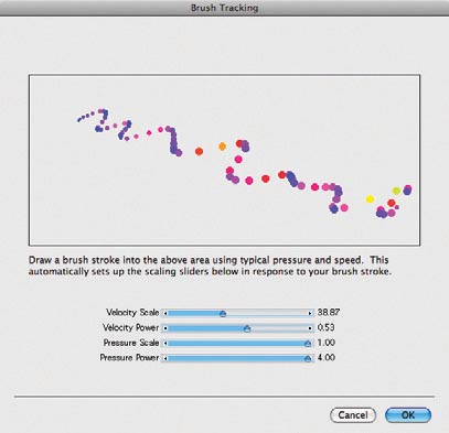
Making a brushstroke in the Brush Tracking window
2 Making a pencil sketch on a new layer. Now choose a dark gray color in the Color panel and select the Real 2B Pencil variant of Pencils (in the Brush Selector) to draw your sketch. Make a new layer by clicking the New Layer button on the Layers panel. Drawing your sketch on a new layer will give you the flexibility to adjust its opacity and composite method. We set up our references next to the computer and sketched from observation.
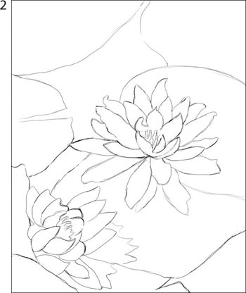
The pencil sketch drawn in Painter using the Real 2B variant of Pencils
3 Painting the first washes. The brush work in the Water Lilies painting is loose and expressive. As you prepare to begin adding color, make a few practice brushstrokes. (You can always undo the brushstrokes by pressing Ctrl/![]() -Z, or you can delete your practice Watercolor layer by selecting it in the Layers panel and clicking the Delete button on the panel.)
-Z, or you can delete your practice Watercolor layer by selecting it in the Layers panel and clicking the Delete button on the panel.)
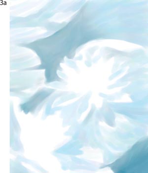
Painting smooth washes using the Real Oval Wash variant
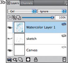
An active Watercolor layer shown in the Layers panel. The sketch layer is hidden.
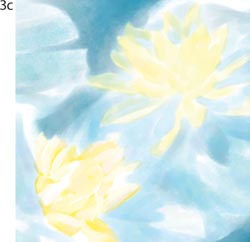
Adding light, varied washes of color using the Real Oval Wash and Real Wet Filbert variants of Real Watercolor
Plan to work from light to dark as you add color washes to your painting. Choose a light color in the Color panel (we chose a light turquoise blue). In the Brush Selector, choose the Real Oval Wash variant of Real Watercolor. (When you select a Real Watercolor brush and make a brushstroke on your image, Painter automatically creates a new Watercolor layer in the image.) When you apply a light, even pressure on your stylus, the Real Oval Wash allows you to lay in the wash areas smoothly. The slight bit of diffusion built into the brush will help the brushstrokes to blend subtly as you paint. When you make a new stroke, place it next to the previous stroke so that it barely overlaps. Try not to scrub with the brush or paint over areas too many times, unless you want to darken the area. When we wanted a more dramatic thick to thin stroke, we switched to the Real Wet Filbert variant of Real Watercolor. Painter’s Real Watercolor performs like traditional transparent watercolor. Paint with strokes that follow the direction of the forms in your subject. Complete the lighter wash areas, leaving some of the “white of the paper” showing through for the highlights. If the paint seems to build up too fast, reduce the opacity of the brush using the Opacity slider in the Property Bar. (We used opacities between 30%–70% for the light washes on the flowers, lily pads and water.)
4 Building up the mid-tones. Using medium-value colors, begin to develop your mid-tones, painting lighter colors first and then adding darker tones to continue to develop the form. Keep your light source in mind and let your strokes follow the direction of the forms. To resize the brush or change its Opacity as you work, use the sliders on the Property Bar. We gradually built up deeper golden-yellows and blues, while keeping the brush work natural and loose.
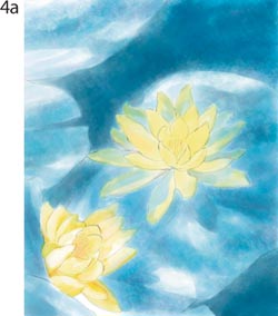
Painting deeper blues on the lily pads and water to help focus more attention on the flowers. The sketch layer is viewed at 50% opacity in this example.
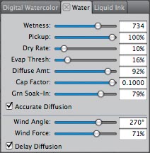
The default Runny Wet Bristle variant of Watercolor paints strokes that run vertically down the image and move existing color. The Dry Rate is set at 10%, allowing lots of time for the pant to run; the Wind Direction is set to 270°, and the Wind Force setting (71%) makes the washes drip a long way. The high Pickup rate allows the brushstrokes to move existing color. Notice that the Delay Diffusion check box is enabled for better performance.
As we completed the mid-tones stage, we switched to the Real Grainy Wash variant of Real Watercolor, which allowed us to add a more brushstroke texture over some of the wash areas and at the ends of the strokes, while still allowing the new strokes to blend as wet-into-wet.
5 Painting wet-into-wet textured washes. Painter offers dynamic brushes that allow you to emulate various traditional Watercolor texture and bleed effects. For a brush with the feel of a conventional mop brush that paints wet, textured washes, use the one of the Fractal Wash variants. Choose a slightly different color in the Color panel and dab the new color onto areas with existing color. Using the Fractal Wash and Fractal Wash Fringe, we applied deeper blue and turquoise colors (using flowing, curved strokes) on the deeper colored areas of the water. These Wash variants allowed the new color to mix with existing color without moving the existing color. Then, we added deeper blue colors to the lily pads with the Real Grainy Wash variant. To paint more color onto the flowers we used the Real Oval Wash.
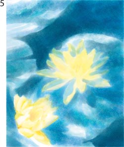
The soft washes on the flowers were painted with the Real Oval Wash variant of Real Watercolor. The textured washes were painted with the Real Grainy Wash and the Fractal Wash variants of Real Watercolor. The sketch layer is hidden in this example.
6 Modeling and adding details. If you want very crisp details, it’s a good idea to paint detail work on a separate layer, but in this case we stayed on the same Watercolor layer because we wanted to preserve the softer wet-into-wet look. Add crisper edges to areas that need definition using a small Real Wet Detail variant (6–8 pixels). To reduce the Size of the Real Wet Detail, use the Size slider in the Property Bar. If the Real Wet Detail seems too saturated for your taste, lower the Opacity to about 50%, using the Opacity slider in the Property Bar. If you’d like softer edges, experiment with the Real Wet Bristle and the Real Wet Filbert variants, using a small size (about 6–10 pixels). For expressive strokes, vary the pressure on the stylus. To paint details, we used the Real Wet Detail and Real Wet Filbert variants to add curved brush strokes and to paint small areas of color on the interior of the flowers. We also added a little more color to the shaded areas under the flowers using the Real Wet Bristle. To break up some of the crisper strokes, we chose a lighter color in the Color panel and then used the Real Wet Filbert variant to dab, lightly scrub and pull color out from the linear strokes that we had painted using the Real Wet Detail.
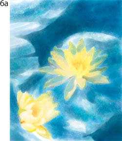
The modeling on the flowers was painted with the Real Oval Wash and Real Wet Filbert variants of Real Watercolor.
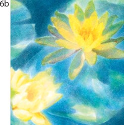
The details on the flowers are painted with Real Wet Detail and the Real Wet Filbert.
It’s not possible to use a variant of the Erasers brush on a Watercolor layer, and you can’t use a Watercolor Eraser or Bleach variant on the Canvas, or on an image layer. To softly remove color on a Watercolor layer, choose the Wet Eraser variant of Real Watercolor or the Eraser Dry variant of Watercolor. In the Layers panel, click on the name of the Watercolor layer you wish to edit and brush over the area you’d like to lighten. We used the Wet Eraser variant to brighten the highlights on the flowers and lily pads.
7 Adding speckled texture. Finally, we added a light speckled texture in the foreground, to help lead the eye to the focal point in the painting. To paint splatters on your image, choose the Dry Spatter variant of Real Watercolor and make curved strokes with the brush over the area you want to add spatters to. For a natural look, vary the size of the brush as you paint. ![]()
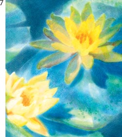
This detail shows the nearly final brushwork on the flowers and the Dry Spatter brush work on the lily pad in the foreground.
Coloring a Drawing Using Digital Watercolor
Overview Create a drawing using traditional pen and ink and paper; scan the drawing; put the drawing on a layer; use Painter’s Digital Watercolor brushes to hand-color the drawing.
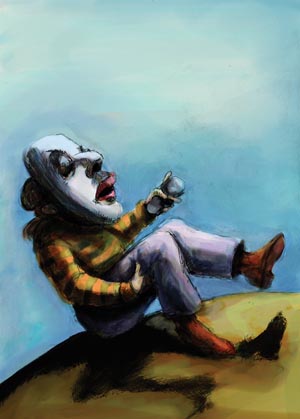
CAROL BENIOFF
CAROL BENIOFF TAKES ADVANTAGE of the quick and fluid qualities of the Digital Watercolor brushes in Study #3, one of a continuing series of prints and drawings using shoes as the motif.
1 Preparing to paint. To begin, Benioff drew with pen and ink on Rising Bristol Vellum paper. Then she scanned the drawing at 300 pixels per inch and opened the image in Painter. Next, she opened one of her custom color sets by choosing Window, Color Panels, Color Sets, clicking on the right arrow of the Color Set panel and choosing Open Color Set. For the paper texture, Benioff chose Italian Water Color Paper from the Paper Selector near the bottom of the Toolbox.
The scanned pen and ink drawing
Benioff’s custom color set
2 Putting the drawing on a layer. After she opened her scanned pen and ink drawing, Benioff selected the entire image (Select, All), cut it from the canvas (Edit, Cut) and then put the drawing onto a layer by choosing Edit, Paste In Place. To make the white areas of the drawing appear transparent in the next step, she set the Composite Method for the layer to Multiply in the Layers panel. Then she clicked on the Canvas in the Layers panel to make it active so she could begin her painting.
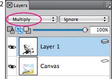
The drawing on a layer with its Composite Method set to Multiply in the Layers panel
3 Painting the sky and the foreground. To add the first washes of color, she chose the Brush tool in the Toolbox and chose the Wash Brush variant of Digital Watercolor in the Brush Selector. Using large sweeping strokes, she began painting the sky, resizing the brush from 50 to 90 pixels in the Property Bar as she worked. She also used the Soft Broad Brush variant sized to 40 pixels, the Soft Round Blender with its Wet Fringe set to 0% in the Property Bar (with its Size ranging from 40 to 70 pixels) and the Pure Water Brush sized to 40 pixels. These combinations of brushes gave her the smooth translucent look that she wanted.
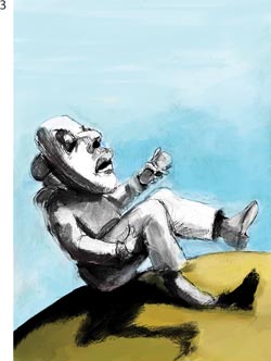
For painting the sky and foreground, Benioff used the Wash Brush, Soft Broad Brush, Soft Round Blender and the Pure Water Brush variant of Digital Watercolor.
4 Painting the figure. For the figure, Benioff chose the Real Filbert Watercolor for textured brushstrokes that would blend and bleed. She painted with long strokes that followed the contours of the drawing, decreasing the opacity for more translucent colors (with the brush size ranging from 20 to 50 pixels). For more detail in the image, Benioff used the Real Tapered Watercolor, reducing the size of the brush as needed. To blend large areas of the wash, she chose Pure Water Bristle with diffusion set to 7 (with its size ranging from 20–220 pixels).
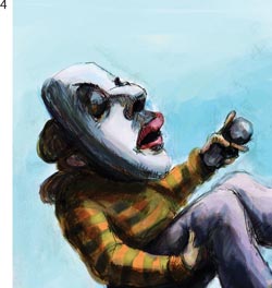
Using long, fluid strokes, Benioff painted the figure using the Real Filbert Watercolor brush. Then, she painted details with the Real Tapered Watercolor brush.
5 Mixing colors. When Benioff’s color set did not have the color she wanted, she switched over to the Mixer panel (Window, Color Panels, Mixer). She chose the Apply Color tool in the Mixer panel, painted a stroke in the Mixer, and then clicked on another color from her custom Color Set and mixed it into the colors on the palette. Using the Sample Color tool in the Mixer palette, she then could select a new color from her mix.
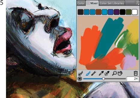
Benioff mixed colors in the Mixer panel.
6 The final touches. So she could paint glazes without mixing them with the underlying colors, Benioff dried the first Digital Watercolor washes by choosing Dry Digital Watercolor from the pop-up menu on the right side of the Layers palette. Then she painted glazes on the sky and foreground using the Wash Brush (with its size ranging from 23 to 87 pixels), the Opacity reduced to 2% and Diffusion set to 10. ![]()
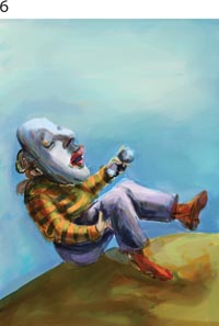
The final watercolor image without the pen and ink drawing layer
A Painter Artists’ Oils and Real Oils Primer
Overview Here you’ll find the basics for painting with the Artists’ Oils and Real Wet Oils mediums and brushes.
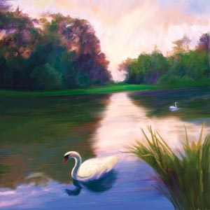
CHER THREINEN-PENDARVIS
WITH THE REVOLUTIONARY OILS medium and brushes in Painter, you can paint expressive, gestural strokes. When you paint a new stroke, you can mix the new paint with the existing paint on the canvas just as you can with conventional media.
Quiet Moment at Schwetzingen (above) was painted with the Dry Brush, Blender Brush and Blender Palette Knife brushes that incorporate Artists’ Oils capabilities. Before you start an oil painting of your own, reading this Primer will help you to achieve the results you desire.
The fluid blending of wet Artists’ Oils paint can be seen in this detail of the in-progress trees and sky.
Understanding the Artists’ Oils. With the default Painter Brushes library in Painter 12, the Artists’ Oils have been distributed into the Acrylics, Blenders, Impasto, Oils and Palette Knives categories. However, you can easily load the Painter 11 Brush library to access the entire original Artists’ Oils brush category: click to open the Brush Selector and then click the button on the top right to open the pop-up menu and choose Brush Library, Painter 11 Brushes. In the Painter 11 Brush Library, choose Artists’ Oils.
When you choose a brush with Artists’ Oils capabilities, the Canvas is filled with oil, making it very easy to lay down color and blend. You can choose the amount of paint and oil that you load into a brush, and how the new paint interacts with the existing paint. The most important settings for the Artists’ Oils are in the Property Bar and in the Artists’ Oils panel of the Brush Controls. Other settings are in the General and Dab Profile panels.
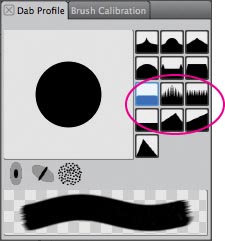
The Artists’ Oils Brush Tip profiles are located in the Dab Profile panel. The top three work best with the Artists’ Oils brushes; the bottom three work best with the Artists’ Oils Palette Knife variants.
In the General panel of the Brush Controls, the Artists’ Oils dab type is displayed in the Dab Type pop-up menu. A dab type determines the character of the brush. You’ll find more information about dab types in Chapter 4, “Building Brushes,” on page 153.
In the Dab Profile panel of the Brush Controls, you’ll find the six Artists’ Oils Brush Tip Profiles that were designed specifically to work with the Artists’ Oils. The Soft Round, Pointed Rake Profile and Flat Rake Profile work best with the brushes (the Dry Brush and Impasto Oil, for instance), and the Flat Profile, Chisel Profile and Wedge Profile were built for the Artists’ Oils palette knives (such as Blender Palette Knife and Dry Palette Knife). Depending on how you hold the stylus, the beginning of a stroke will change. Hold the stylus vertically and the start of the stroke will be flatter. Hold the stylus at an angle, and the start of the stroke will reflect the brush tip profile. The effect is subtle.
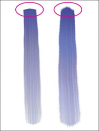
Strokes painted using the Tapered Oils variant of Artists’ Oils. This variant uses the Pointed Rake Brush Tip Profile. Leaning the stylus paints a more pointed stroke.
The Artists’ Oils panel in Brush Controls is organized into the Paint, Brush and Canvas areas. The seven sliders in the Artists’ Oils panel work in conjunction with each other to create the character of the oily brushstrokes. These controls are complex and interdependent. Dig in and try out the Artists’ Oils variants, while keeping an eye on the controls in the Artists’ Oils panel.
In the Paint area, the Amount slider controls the amount of oil that is loaded when you make each new stroke. The Viscosity slider allows you to control the flow of the paint through the brush and how fast the brush will run out of paint. The Blend slider controls how easily new strokes will mix with the existing paint.
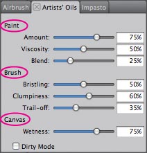
The Artists’ Oils panel of Brush Controls
In the Brush area, the Bristling slider allows you to design how subtle or prominent the bristles look. This pertains to both the head and tail of the stroke. The Clumpiness slider allows you to adjust the randomness of the brush hairs and to make them fine or coarse. For a good example of a clumpy brush, check out the Dry Clumpy Impasto variant. With the Trail-off slider, you can adjust the length of the brush trail.
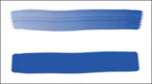
Strokes painted with the Dry Brush (top) and custom Smooth Dry Brush (bottom)
In the Canvas area, you’ll see the Wetness slider. With the Wetness slider you can adjust the Wetness of the paint on the Canvas (or layer) and how this paint interacts with new strokes.
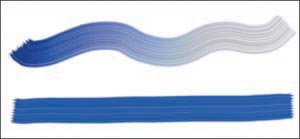
Strokes painted with the Clumpy Brush (top). For more subtle striations (bottom), adjust the Clumpiness and Blend sliders.
The Dirty Mode allows you to intermix colors as you pick them up from the Mixer and apply them to your image. When you choose a new color, you’ll notice that some of the previous color remains in the brush.
Working with the Artists’ Oils Brushes
Here are some suggestions for how to paint using the Artists’ Oils brushes. Even if you’re familiar with Painter’s other brushes, try out these ideas and experiment with all of the Artists’ Oils variants.
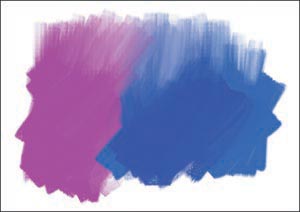
Strokes painted with the Oily Bristle and blended with the Grainy Blender
Making smooth strokes. Brushes with low Bristling and Clumpiness settings will allow you to paint strokes with smooth, soft beginnings, with less striated tones. Sample a single color from the Mixer using the Sample Color tool (not the Sample Multiple Colors tool) and paint a stroke with the Dry Brush variant. To make it smoother, in the Artists’ Oils window, reduce the Bristling to 0 and the Clumpiness to 0.
Painting striated strokes. Brushes with a high Clumpiness setting will paint strokes with variation in color and value. Experiment with the Clumpy Brush. For more subtle striations, decrease the Clumpiness setting to 20% and reduce the Blend setting to 10%.
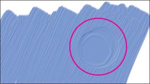
Thick strokes painted with the Wet Oily Impasto. Notice the excavated paint.
Mixing color with blender brushes. Any Artists’ Oils variant with Blender in its name will allow you to blend as you lay down new paint, just like a brush loaded with very wet paint. Choose the Grainy Blender and use light pressure on your stylus to make strokes that pull color up, blending while revealing the grain.
Artists’ Oils thick paint. The Artists’ Oils Impasto brushes paint strokes of thick paint with realistic highlights and shadows. Choose the Wet Oily Impasto brush. Using a light pressure on your stylus, and lay down several strokes on top of one another to build up thick paint. Then use heavy pressure to dig into the existing paint. You can adjust the lighting in the Canvas, Surface Lighting menu. To adjust Impasto settings, use the Impasto panel of Brush Controls. (To learn more about Impasto, see “A Painter Impasto Primer” on page 123.)
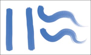
Strokes painted with the Dry Clumpy Impasto brush. Notice the graininess in the brush trails.
Working with the Real Wet Oils Brushes
The Real Wet Oils can be accessed from the Painter Brushes library in Painter 12. Click to open the Brush Selector and if you switched to the Painter 11 Brushes library, click the button on the top right to open the pop-up menu and choose Brush Library, Painter Brushes. With the Painter Brushes library open, now choose the Real Wet Oils brush category from the Brush Selector.
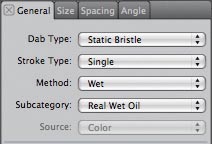
Viewing the Dab Type, Stroke Type, Method and Subcategory in the General panel of Brush Controls with the Wet Oil variant of Real Wet Oils chosen in the Brush Selector
Understanding the Real Wet Oils. The Real Wet Oils brushes use the Static Bristle dab type, chosen in the General panel of the Brush Controls, accessed by choosing Window, Brush Control Panels, General. A dab type determines the character of the brush. You’ll find more information about dab types in Chapter 4, “Building Brushes,” on page 153. The Real Wet Oils brushes incorporate the Wet method and Real Wet subcategory, which are also accessed in the General panel of Brush Controls.
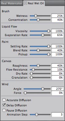
Viewing the Real Wet Oils panel of Brush Controls with the Wet Oil variant of Real Wet Oils chosen in the Brush Selector.
The Real Wet Oils panel contains important sliders that work in conjunction with one another to build the Real Wet Oils brushes. To access the Real Wet Oils panel, choose Window, Brush Control panels, Real Wet Oils. The panel is divided into four areas, the Brush, Liquid Flow, Paint and Canvas sections. To understand the Real Wet Oils brushes keep an eye on the panel as you try out the brushes.
In the Brush area, the Wetness slider allows you to control the amount of oil applied by the brush, and the Concentration slider determines the concentration of the paint.
In the Liquid Flow area, the Viscosity slider allows you to adjust the thickness of the oil and how it spreads; the Evaporation Rate slider allows you to set how fast the paint dries.
In the Paint area, the Settling Rate slider allows you to control the opacity of the paint after the oil dries; with the Blend Rate slider you can determine how easily the colors of the paint mix on the image and with the Pick Up Rate slider you can choose how much a new oil stroke is able to lift existing color from the canvas.
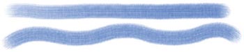
Brushstrokes painted with the Wet Oil variant of Real Wet Oils
In the Canvas area, the Roughness slider setting works in conjunction with the Flow Resistance, Dry Rate and Granulation settings. With the Flow Resistance slider you can control how the canvas grain affects the flow of the paint. The Dry Rate slider allows you to determine how fast the paint is absorbed; and with the Granulation slider you can choose how pigment settles into the valleys of the canvas texture.
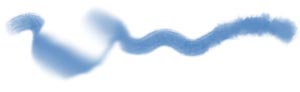
Brushstroke painted with the Wet Oil brush and then pushed and pulled with the Turp and Turp Grainy variants of Real Wet Oils
Take a few moments and try out the brushes. The Wet Oil, Wet Grainy, Wet Bristle and Wet Blender brushes allow you to lay down paint with variations of wetness and grain. The Turp and Turp Grainy are useful for blending while pushing and pulling the colors into one another. The Liquid Oil and Liquid Grainy brushes have high Wetness and low Viscosity settings, which helps the medium to pool and feel sticky. For subtle variety, the Erosion Liquid brush applies color and the Erosion Grainy can be used to blend and pull colors, while revealing the canvas grain. ![]()
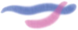
Brushstrokes painted with the Liquid Oil variant of Real Wet Oils
Painting with the Artists’ Oils
Overview Plan a composition; build a color palette using the Mixer; use brushes with Artists’ Oils capabilities to create a colorful underpainting; sculpt forms; paint glazes to build richer color and values; paint details.
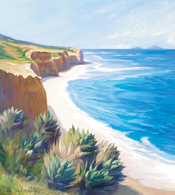
CHER THREINEN-PENDARVIS
AGAVES ON THE EDGE, Summer is one in a series of seascapes of the spectacular cliffs in San Diego, California. The inspiration for this painting was a bright sunny morning on a day when there was a brisk wind. To begin the painting, we made conventional sketches on location in a sketchbook. Back at the studio, we assembled the sketches and used them for reference as we developed the painting by using the Artists’ Oils medium in Painter.
1 Planning the composition. Observe your subject and decide where your focal point will be. After choosing the viewpoint, we made composition sketches of the landforms and lighting in pencil and pastel. We also made a more detailed drawing of a few of the plants in our sketchbook.
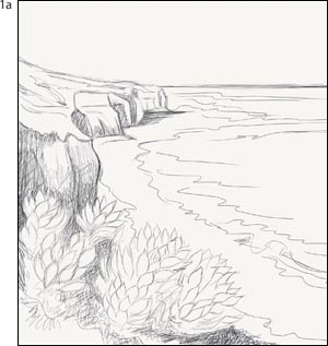
The conventional pencil sketch
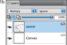
The sketch on a layer, with the Composite Method set to Multiply
Back at the studio, we scanned the composition pencil sketch at full size, at 300 ppi and saved it as a TIFF file. (The scan of the composition sketch measured 2500 × 2700 pixels.)
Open your sketch in Painter, and for added flexibility, cut it to a layer by choosing Select, All and Select, Float. To make the white areas of the layer appear transparent, set the Composite Method to Multiply in the Layers panel. Then, to stay organized, name your layers (we named our layer “sketch”). It’s a good idea to save your working file in RIFF format under a new name so that your original sketch is not accidentally replaced. RIFF format preserves media that is native to Painter—such as brushes with Artists’ Oils capabilities—which you’ll be using later in the development of your painting.
2 Mixing the base colors. For the painting, we used the Mixer panel to create a color palette based on the colors in nature, but more saturated. If the Mixer is not open, choose Window, Color Panels, Show Mixer. Apply color with the Add Color tool (the brush) at the bottom of the Mixer. You can blend between colors using the Mix Color tool (the palette knife). Just like an artist’s palette, you can pick up color from the Mixer Pad with the Sample Color tool (eyedropper in the Mixer panel) and then use the color and brushes to apply the paint to your image.
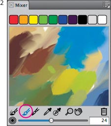
The Mixer palette with the basic colors. The Brush tool is chosen.
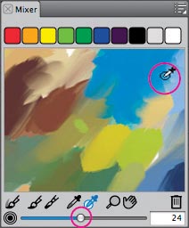
Using the Sample Multiple Colors tool
3 Making an underpainting. To access the Artists’ Oils brush category, load the Painter 11 brushes described in the tip on page 102 and then choose the Artists’s Oils in the Brush Selector. We used large brushes to create an underpainting to work out the basic values and colors in the composition. While referring to location sketches, we blocked in simple colored shapes, just as we would when painting using watercolor, acrylics or oil paint.
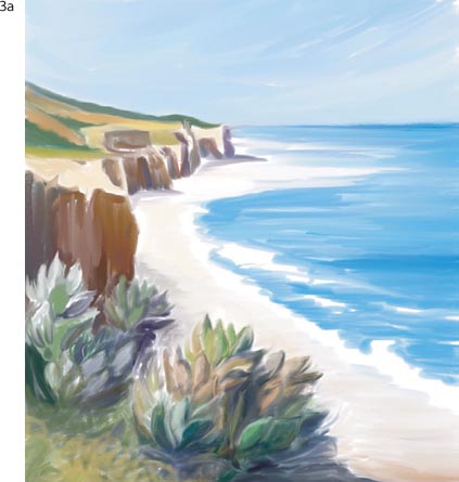
Using large brushes to lay in the basic shapes and structure. The sketch layer is hidden in the example.
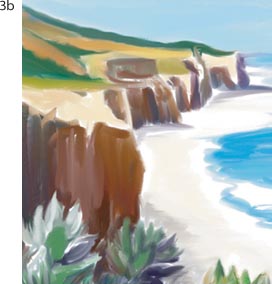
Detail of the blocked-in cliffs. The sketch layer is hidden in the image.
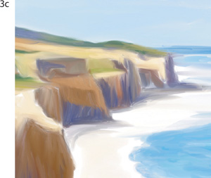
Establishing the light on the forms
Working on layers will allow added flexibility as you develop your painting. To add a new layer, click the New Layer button on the bottom of the Layers panel. With the new layer selected, begin by blocking in the darker values using broad brushstrokes. Don’t focus on the details at this stage. Use your sketch as a guide, but develop the shapes in your scene expressively.
As we began to apply color on the new layer using the Oily Bristle, we focused on the design of the landscape and the natural light. We laid in the darker values first to establish the light on the forms—the purple-gray shadows at the base of the cliffs and the darker browns on the cliff faces. Then, we roughed in the foliage by using loose strokes of warm greens, golds, and browns. For the ocean, we painted cool turquoise blues, and we used warmer blues in the sky. When your composition is established, delete the sketch layer from the file by selecting it and pressing the Delete (trash can) button on the Layers panel. When your underpainting is complete, save the file.
4 Refining the color study. Next, we added more complex color areas on another new layer. This way, we could adjust the opacity or the Composite Method if we chose to, or remove the information on the layer and start over without harming the underpainting below.
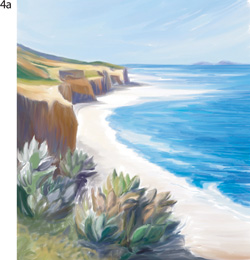
Adding more color to the foreground
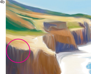
Pulling color on the cliff face using the Wet Oily Palette Knife
Click the New Layer button to add a new layer to your image and enable the Pick Up Underlying Color button on the Layers panel. This will allow you to pick up color from the underlying layer when you work with brushes such as the Blender Brush or Oily Blender Brush, that blend and smear color. Switching between the Blender Brush and the Oily Bristle variants, we painted, pulled and blended colors, rendering the forms using expressive strokes.
When you want to move and blend paint without applying more color, switch to the Wet Oily Palette Knife. To move small areas of paint, we reduced the size of the Wet Oily Palette Knife to about 9–12 pixels. The palette knife work is most visible on the broad cliff faces. When you are happy with your color study, save your file—including its layers—in RIFF format.
5 Sculpting forms and building more complex color. At this point, we wanted to take advantage of the oilier feel of the Artists’ Oils medium on the Canvas, so we dropped all of the layers to the Canvas and then saved a new version of the file with a new name. To drop your layers to the Canvas, choose Drop All from the Layers panel menu. As we sculpted and refined the forms of the landscape, we worked new color into existing color.
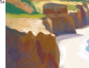
Dabbing with short strokes to sculpt the cliffs
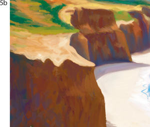
Refining the foreground cliff forms
For the foreground grass, we used the Sample Multiple Colors tool to pick up mixtures of green and gold colors from the Mixer palette and loosely painted the grass using short, curved strokes.
6 Finessing the foreground. Then, we added more color interest and light to the cliffs using lighter reddish browns and purples that were based on the colors from the Mixer. To bring the foreground cliff into clearer focus, we used a tiny Wet Oily Palette Knife to sharpen some of the edges on the cliff tops and define the smaller crevices on the cliffs. To help the distant cliffs recede, we mixed a light blue-gray and used a low-opacity Oily Bristle brush to apply a glaze of the lighter colored paint.
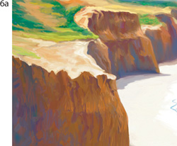
Painting the crevices in the foreground cliffs and finessing the highlights and shadows
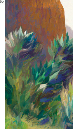
Details of the loosely painted foreground plants and grass, and the reflected light painted on the lower cliff face
To refine the agave plant forms, we defined the exterior shapes of the leaves, and then we used tints and shades of the same color to model the highlights and shadows. We also used the Dry Bristle variant of Acrylics to add accent color to the leaf edges. Next, we switched to the Wet Oily Palette Knife and pulled and blended color, making sure to let our strokes follow the forms of the leaves.
7 Painting glazes and final details. We wanted to paint the choppy, active ocean that we remembered on the windy day. So when adding more color to the water, we chose the Wet Oily Bristle. Starting with a medium value blue that had a little green in it for the turquoise water, we painted short, curved strokes. Then, we added white to mix lighter tints and added darker blues to create shades of the color, and again painted short, curved strokes.
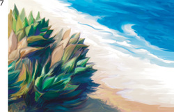
The glazes of paint on the water and the subtle color transitions on the beach
If you want to paint a calmer sea, use the Wet Oily Bristle to paint longer brushstrokes and blend them to create a smoother surface, still varying the color for interest. To smooth the transitions between the colors in the water, use the Blender Brush variant of Blenders or the Wet Oily Palette Knife.
As a last step, we zoomed in to 100% and took a closer look at the brush work. Then, we used the Dry Bristle brush to add small areas of warmer color to the foreground water and beach. ![]()
Illustrating with the Artists’ Oils
Overview Scan a rough pencil sketch for the template; fill the canvas with a colored ground; build color and form with the Artists’ Oils brushes; use the Snap-to-Path feature when painting the frame; add paper texture and lighting.
CAROL BENIOFF
WHEN DEVELOPING AN IMAGE for her ongoing series The Price of Silence, Carol Benioff maximized the fluid capabilities of the Artists’ Oils. Because she planned to combine the image with an intaglio print or use it as part of another illustration, she kept her Painter composition simple and the background open. (To read about Benioff’s creative printmaking process, turn to “Making a Color Managed Art Print” in Chapter 11.)
1 Setting up. To begin, Benioff scanned a rough sketch of her image and opened it in Painter. She selected the image (Select, All), cut it from the canvas (Edit, Cut), pasted the cut image, which is now on its own layer, and set the Composite Method to Multiply in the Layers panel. Next, she created a custom color set from a scan of one of her paintings. (See “Capturing a Color Set” on page 44 for how to create a Color Set.) Click on the Canvas layer in the Layers panel to select it. To save time while building the colored frame, Benioff used the Paint Bucket tool and selections. To make the outer frame, select the Rectangle Selection tool (Toolbox) and draw a rectangle selection. Select the Paint Bucket tool, choose Fill with Current Color in the Property Bar, select a color in the Color panel and then click inside the selection to fill it with color. Repeat the process to build the inside of the frame, but this time use a smaller rectangular selection and a yellow-ochre color. Leave the area outside the larger frame white.
The scan of the rough sketch that Benioff used as a template
2 Picking brushes. Load the Artists’ Oils category: Click to open the Brush Selector, then click the button on the upper right to open the pop-up menu and choose Brush Library, Painter 11 Brushes. In the Painter 11 Brush Library, choose Artists’ Oils. When working with the Artists’ Oils, Benioff was drawn to these brushes: Dry Brush, Dry Bristle, Wet Brush, Wet Oily Brush, Tapered Oils and Grainy Blender. To extend the possibilities within this group of variants, she made subtle changes to a few of the brushes. Benioff’s Soft Tapered Brush (described here) has soft bristles that are filled with paint that easily blends with the underlying colors. Choose the Tapered Oils variant of Artists’ Oils in the Brush Selector and from the pop-up menu, choose Restore Default Variant. Now choose Window, Brush Control Panels, Size. In the Size panel, reduce the Minimum size to 30%; in the Artists’ Oils panel, increase the Amount to 86%, reduce the Viscosity to 35%, increase the Blend to 75% and increase the Wetness to 35%. Save your new variant by choosing Save Variant from the pop-up menu on the Brush Selector and name your new brush. (See “A Painter Artists’ Oils and Real Oils Primer” on page 98 for information about the Artists’ Oils brush settings.)
Benioff filled the canvas by using the Rectangle Selection tool and the Paint Bucket.
3 Working with Artists’ Oils. Benioff kept the Sketch layer visible to use as a template, but painted on the active Canvas layer. (Click on Canvas in the Layers panel to select it.) Using the Dry Brush and cool and warm colors, rough out the values and build rich hues. Continue to add layers of paint to the image using a mix of cool and warm colors.
Roughly painting the colors of the face with the Dry Brush

Blocking out the lights and darks in the glove with neutral tones

Painting into the background with deep purples and oranges
Benioff painted neutral tones for the lights and darks of the glove using the Tapered Oils, Dry Brush, Dry Bristle and Wet Oily brushes. With short, curved overlapping strokes of dark purples and oranges, she began to paint the background area. Then she added depth and color to the face and glove. Painting with Artists’ Oils required Benioff to work with slower, shorter strokes and a lighter hand than usual. She found that by adjusting her technique, she maximized the fluidity and gestural capabilities of these brushes.
4 Adding color, details and highlights. Benioff used the Wet Oily and Dry Bristle brushes to paint a variety of ochres and greens on the glove. She refined the forms, then used a small Tapered Brush to add gestural lines and detail. To bring out the highlights, choose the Dry Bristle brush from the Brush Selector. Pick a warm white color in the Color panel. To paint as Benioff did, use a light touch to let the bristles of each stroke show at the start and end of each stroke. To smooth and blend the colors, keep the brush down while lightly brushing between multiple swaths of color.
Painting a highlight on the cheek using the Dry Bristle brush variant
5 Painting the frame using Snap to Path. For the decorations and the edges of the frame, Benioff used the Snap to Path function, which constrains your brushstrokes to the path of a visible shape, making it easy to paint concentric circles and straight edges. (See “Painting Along a Path” on page 71 for more information about using Snap to Path.) First, she drew shapes with the Pen, Oval Shape and Rectangular Shape tools. (For information about working with Shapes, see Chapter 6.) She selected the small Tapered Brush, clicked on the Align to Path button in the Property Bar, and then clicked on the Canvas Layer in the Layers panel to make it active. As she painted multiple strokes of light and dark yellow, the strokes were automatically constrained to the visible path. With the Layer Adjuster tool active, Benioff moved, rotated and scaled the shapes as needed while she painted along the transformed shapes to complete her decorative border. When it was complete, Benioff disabled the Align to Path button in the Property Bar and painted the details and shadows using small versions of the Tapered Brush and Dry Brush.
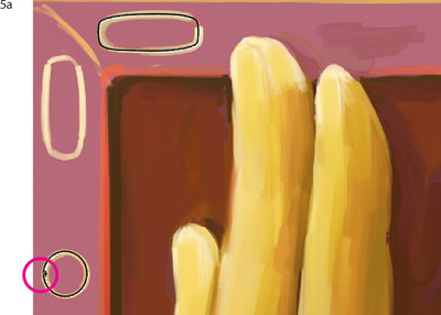
Painting with her Skinny Tapered brush on the Canvas with the Oval shape layer visible using the Snap to Path function
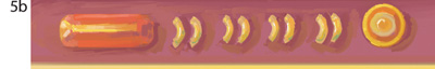
Detail of the completed decorative pattern that was painted using Snap to Path
6 Adding texture. Benioff wanted to add a subtle texture to the image. To apply the effect that she used on the painted areas only, select the Magic Wand tool, click in the white area around the image, choose Select, Invert and then Select, Save Selection. To open the Paper palette, choose Window, Paper Panels, Papers and select French Watercolor Paper. Increase the Paper Scale to 140% and increase the Paper Brightness to 65%. Now, choose Effects, Surface Control, Dye Concentration, Using Paper and set the Maximum to 162% and the Minimum to 15%. Click OK.
Detail of the final image before Benioff applied texture using the Dye Concentration effect (top) and afterward (bottom)
7 Applying lighting for drama. Finally, Benioff added drama to her image using a custom lighting effect. She lit the face and top of the glove with a custom yellow and pink Soft Globe light, dropping the rest of the image into shadow. She loaded the selection from step 6 (Select, Load Selection), and then she chose Effects, Surface Control, Apply Lighting and applied the light. (The Warm Globe light will give a similar effect.) See “Adding Dimension with Lighting” on page 288 for more information about the Apply Lighting feature. ![]()
A Painter RealBristle Primer
Overview Here you’ll find the basics for painting with the brushes that have RealBristle capabilities.
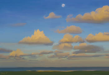
CHER THREINEN-PENDARVIS
THE REALBRISTLE BRUSHES ARE LOCATED IN the Oils and Blenders brush categories in Painter 12. The RealBristle capabilities of the brushes allow them to feel like conventional brushes as they move over the canvas. And the resulting brushstrokes are amazingly real.
You can see the incredible sensitivity and realistic brushstrokes in this detail of the in-progress clouds and sky.
Moon Over Lennox (above) was painted with the Real Flat, Real Round and Real Blender Flat variants, among others. Before you start a painting of your own, reading this primer will help you to achieve the results you desire.
Painting with RealBristle brushes. Brushes with RealBristle performance and bristle characteristics can be found in the Oils and Blenders categories in Painter 12. To choose a brush with RealBristle capabilities, go to the Brush Selector, and from the category menu, choose Oils. The RealBristle brushes include several types of variants, based on their brushstroke characteristics: Real Blenders (now found in the Blenders category), Real Fan brushes, Real Flats, Real Oils, Real Round brushes and Real Tapered brushes (now located in the Oils category). To bring experimenting with the brushes, create a new file by choosing File, New. (Our file for trying out the brushes measures 500 × 500 pixels and has a white background.) In the Paper Selector (Toolbox), choose a coarse, natural texture for trying out the brushes. (We chose Coarse Cotton Canvas paper). You can work directly on the Canvas or you can paint on a layer—we worked directly on the Canvas.
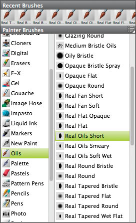
The Brush Selector, open to show the RealBristle variants in the Oils category; identified by “Real” in their names
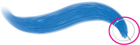
Painting a brushstroke with the Soft Flat Oils variant of the Oils. The ring on the Enhanced Brush Ghost shows the brush size, and the line indicates the tilt and bearing of the stylus. If you are using a 6D Art Pen (the flat Wacom pen that supports 360 degree rotation), a dot will appear to indicate the degree of the stylus rotation, as shown above.
Let’s begin with brushes that apply paint with various brush shapes and feels. Choose the Real Flat Opaque variant of Oils from the Brush Selector—the Real Flat Opaque is a good brush for laying in color quickly. Paint a slightly curved horizontal stroke by applying medium pressure on your stylus, and then lighter pressure, while slightly rotating your hand. Use the Real Flat Opaque brush to paint a circular stroke using moderate pressure.
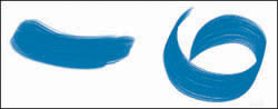
Brushstrokes painted using the Real Flat Opaque brush variant of the Oils.
Now try out the Real Flat variant of Oils. This brush has a softer feel, and is also good for laying in base colors on your paintings. Using this brush, make several overlapping horizontal brushstrokes, while varying the pressure on your stylus. Next choose the Real Oils Short variant of Oils. This brush is somewhat flat, has a stiffer feel, is a little drier, and it allows you to move existing paint on the canvas. Using this brush and a different color, paint angular strokes that overlap some of the existing paint, so that you can see how this brush interacts with paint that you’ve already applied.
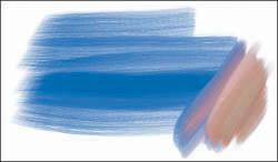
Brushstrokes painted using the Real Flat and Real Oils Short variants of the Oils.
Try out the Real Round Bristle variant of Oils. This brush is useful for applying a good amount of paint, and you’ll notice subtle bleed of pigment when brushstrokes are applied over existing paint.
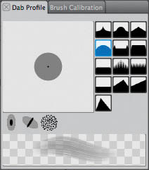
The Dab Profile panel of Brush Controls
Mixing color with blenders. Any RealBristle brush variant with Blender in its name will allow you to blend as you lay down new paint, just like a brush loaded with very wet paint. Choose the Real Blender Round variant of Blenders and use light pressure on your stylus to make strokes that apply, blend and move the existing paint.
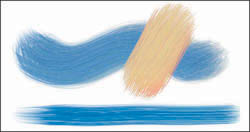
Brushstrokes painted with the Real Round Bristle (Oils) using two sizes and two colors.
Understanding the RealBristle settings. The most important settings for brushes with RealBristle capabilities are located in the Property Bar, the Dab Profile the RealBristle panels of Brush Controls; additional settings are located in the Well, General, and Artists’ Oils panels of the Brush Controls.
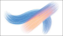
We painted the wavy blue stroke with the Real Round Bristle. Then we painted the angled peach stroke using the Real Blender Round, while tilting the stylus toward the right. Notice how the Real Blender Round moves the left edge of existing blue paint, just like a conventional brush!
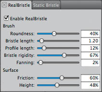
The RealBristle panel of Brush Controls contains Brush and Surface settings.
In addition to modifying the default brushes, you can enable the RealBristle functionality for other brushes within Painter. We recommend trying out the RealBristle painting capabilities with brushes such as the Acrylics, Oils and Gouache brush categories that incorporate a Camel Hair or Flat dab type.
![]()
The context-sensitive Property Bar contains settings that are important to the brushes.
To enable the RealBristle characteristics for a brush, choose the brush category and variant in the Brush Selector. (We chose Acrylics and Thick Acrylic Round.) In the RealBristle panel of Brush Controls, enable the RealBristle option. You can adjust the other settings in the RealBristle dialog box and the sliders in the context-sensitive Property Bar: the Resat, Bleed, and Feature sliders. The Resat slider controls the amount of paint flowing from the brush; the Bleed slider controls how much the new paint moves the existing paint; the Feature slider controls the tightness of the brush hairs. In addition, if a brush uses the Blend Camel Hair or Blend Flat dab type, all of the controls in the Artists’ Oils panel will affect its performance and the Blend slider will be available in the Property Bar. The Blend slider controls how new paint blends with existing paint. The Blend Flat or the Blend Camel Hair, displayed in the Dab Type pop-up menu of the General panel of Brush Controls, will give you an oiler feel. For more information on the Artists’ Oils controls, see “A Painter Artists’ Oils and Real Oils Primer” on page 98.
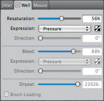
The Resat slider located in the Property Bar can also be found in the Well panel of Brush Controls. For several RealBristle variants, the Resaturation Expression pop-up menu is set to pressure.
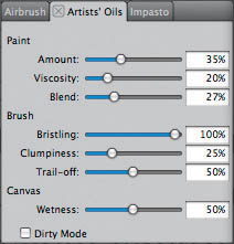
The Artists’ Oils panel of Brush Controls contains settings that affect many of the RealBristle Brushes.
In the RealBristle panel of the Brush Controls, you’ll find the six Brush Tip Profiles that work best with the RealBristle Brushes: the Pointed Profile, Medium Profile, Linear Profile, Pointed Rake Profile, Dull Profile, Soft Round Profile, Flat Profile, and Flat Rake Profile. (These tip profiles are among those visible in the Size panel of the Brush Controls.) Under the Brush area of the RealBristle controls, the Roundness slider allows you to control the overall shape of the brush, and the rounding across the width of the brush. A lower setting creates a flatter brush. With the Bristle Length slider you can control the length of the bristles, from the tip of the brush to its base. The Profile Length slider lets you set the length of the Brush Tip Profile in relation to the overall length of the bristles. Bristle Rigidity controls how flexible the bristles are. Lower values build a more flexible brush and higher values build a stiffer brush. Next, the Fanning slider controls the spread of the bristles; a lower value will build a more compact tip, while a higher Fanning value will create a wider tip, with the bristles more spread out.
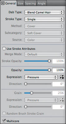
The General panel of Brush Controls contains the Dab Type pop-up menu and Opacity settings.
In the Surface panel, you’ll find the Friction and Height sliders. With Friction you can control whether the bristles move across the canvas smoothly, or whether they drag. A higher setting will reveal more texture. The Height slider allows you to paint with just the tip of the brush, or enjoy the feeling of pressing your brush onto the canvas. A lower setting will allow the bristles to splay or compress when you apply more or less pressure. When customizing brushes, if you want an oilier feel, try using one of the two new dab types. You’ll find more information about dab types, and customizing the brushes in Chapter 4, “Building Brushes,” on page 153. ![]()
Painting with the Oils and Real Wet Oils
Overview Set Brush Tracking; sketch a composition; build a color theme using the Mixer; create a painting using the Oils and Real Wet Oil brushes; blend color and add final details.
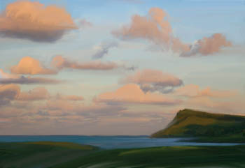
CHER THREINEN-PENDARVIS
FOR LENNOX TWILIGHT, ONE IN A series of paintings of New South Wales, Australia, we wanted to achieve the feeling of an old world oil painting. We painted using a variety of Oils brushes in Painter, beginning the study with a sketch, then using Oils brushes that incorporate RealBristle capabilities. Next we used Real Wet Oils brushes to scrub color in areas and to push and pull paint. To finish, we added details with the Real Short Oils brush, among others.
1 Setting Brush Tracking. Some of the Oils brushes incorporate RealBristle capabilities, which means they are more sensitive to the movement and pressure of your hand than other brushes. Brush Tracking allows you to customize how Painter interprets the input of your stylus, including parameters such as pressure and speed. Choose Edit (Win) or Corel Painter 12 (Mac), Preferences, Brush Tracking, make a representative brushstroke in the window and then click OK. For instance, if you plan to use both light and heavy pressure while painting quickly and then slowly, try to make a brushstroke in the window that includes all of these factors.
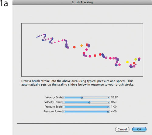
Making a brushstroke in the Brush Tracking window using light to heavy pressure
2 Planning the composition and sketching. Working in Painter, we created a black-and-white drawing using location sketches and photos as references. If you prefer, you can scan a conventional drawing and open it in Painter.
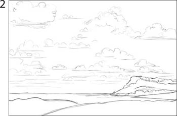
Sketching with the Real 2B Pencil variant of Pencils
The process of sketching will help you to become familiar with your subject. To sketch as we did, choose the Real 2B variant of Pencils in the Brush Selector. Next, click the Paper Selector in the Toolbox and choose a coarse, natural texture (try Coarse Cotton Canvas). This is the paper texture that you’ll use during the development of your entire image. Open a new file (File, New), and enter dimensions in the fields (this project uses a 1500 × 1000 pixel file). For this project, sketching is done on a layer, and the painting is done on the Canvas. Add a new layer to your image by clicking the New Layer button on the Layers panel. A layer titled Layer 1 appears in the Layers panel. Use the Real 2B Pencil to sketch your composition. When you are satisfied with your sketch, save it.
3 Building a color theme for the painting. Next, we used the Mixer to mix colors for the painting based on more saturated versions of the colors. With the Mixer, Painter gives the you the experience of dipping your brush in colors and then applying the paint to your image. If the Mixer is not visible, choose Window, Color Panels, Mixer. It’s helpful at this stage to have both the Color panel and Mixer open. You can choose a color from the Color panel, or from the color wells at the top of the Mixer, or you can sample color from an image using the Dropper in the Toolbox (or the Brush with Alt/Option). Apply color with the Add Color tool (second from the left) at the bottom of the Mixer Pad. The Dirty Brush mode is active by default. The Dirty Brush mode allows you to mix new colors with color you have previously applied to the Mixer pad. (Disable the Dirty Brush mode by clicking on the button if you want purer colors, as we did.) You can pick up multiple colors from the Mixer pad with the Sample Multiple Colors tool (the eyedropper with the circle at the bottom of the Mixer) and then use the RealBristle Oils brushes to apply the multi-colored paint to your image.
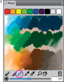
The Mix Color tool is chosen in the Mixer.
4 Building an underpainting with the Oils. When painting with watercolor, acrylics or oil, we usually begin with large brushes, and we work quickly and loosely to rough out the composition. Choose the Real Oils Short variant of Oils from the Brush Selector. The Real Oils Short is a good brush for quickly laying in color for the underpainting. Begin painting the background areas using broad brushstrokes. The Real Round variant of Oils is also a good choice. To paint while showing rich bristle marks, try the Real Short Fan brush. Don’t focus on details at this stage.
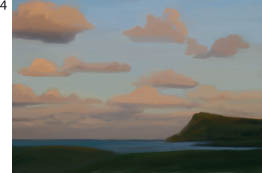
The underpainting in progress with color blended with the Real Tapered Flat variant
Focusing on the composition, the forms and the lighting, we loosely blocked in the shapes and base values, resizing the brushes as we worked. Then we began to use a wider range of values to establish the light on the forms. We expressively painted the clouds and landscape forms without restricting the brushwork to staying within the lines of the tight sketch. As we worked, we continued to use the Mixer as our paint palette to pick up color and the two Oils brushes to apply the paint to the Canvas. When your underpainting is as you like it, delete the sketch layer by clicking on it in the Layers panel and then clicking the trash can. Save a new version of your file (we named ours Lennox Underpaint).
5 Modulating color and sculpting forms. Next we used the Oils and Real Wet Oils to layer strokes to build more complex color areas. The Oil brushes with RealBristle qualities allow you to paint multiple colors with expressive, realistic bristle brush marks. The Real Wet Oils have very different qualities; with them you can achieve subtle paint application, blending and a liquid feel.
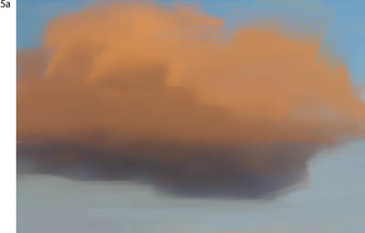
Modeling the cloud shapes with the Real Short Oils brush
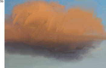
Adding brush texture to the clouds using the Real Short Fan brush
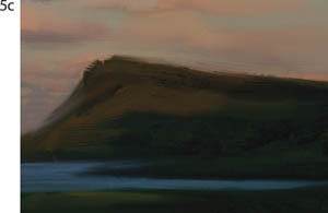
Painting the headland with the Real Short Oils and overlaying strokes using the Real Short Fan brush
The direction of the brushstrokes helps to establish the forms and add dynamic energy to the image. We layered color over color, creating striations in the colored paint (to sculpt the rugged terrain on the headland), and to suggest the forms in the foreground.
To blend color as we painted, we used the Real Tapered Wet Flat. This brush allowed us to move and blend paint without applying much new paint. If you keep the brush pressed to the Canvas, and brush back and forth over an area, you can build smooth, blended transitions between colors. Switching between the Real Tapered Wet Flat and the Real Oils Short variants of Oils, we painted, pulled and blended colors, rendering the forms using expressive strokes. This brushwork is most visible on the water, in the clouds, and in a few areas of the foreground.
6 Refining and adding details. Now, zoom in to 100% and take a closer look at your brushwork. What areas need refinement? To paint crisper edges on some of the headland, we used a small version of the Real Oils Short. To add accents of brighter opaque color to a few areas, we used a small version of the Real Flat Opaque variant of Oils. For richer brush textures on the background, we sampled color from the image using the Dropper tool, and then switched to the Real Fan Short variant of Oils. Using the Real Fan Short, we loosely brushed back and forth in a soft crosshatch pattern—which can be seen on the headland and foreground.
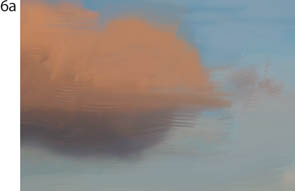
Brushing more color onto the cloud with the Wet Oil variant of Real Wet Oil
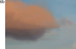
Using the Turpentine Blender variant of Real Wet Oil to soften the edge of the cloud
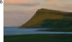
Detail of the nearly completed headland. The lighter rust color is painted with the Wet Oil variant of Real Wet Oil.
When we wanted a wetter oil look, we switched to the Wet Oils variant of Real Wet Oils and applied pigment with this brush. Using the Dropper, we sampled a different color every few strokes, then painted. To move small areas of paint, we reduced the size of the Turpentine Blender variant of Real Wet Oil to about 9–12 pixels. This brush work is most noticeable on the brighter clouds and in the lighter areas of the headland.
Experiment with each of the described brushes to get a feeling for how they apply pigment and blend it on the canvas. Use them freely as you paint your landscape.
To add final touches to the landscape, we used the Real Oils Short, Real Short Fan and the Real Tapered Wet Flat. First, we painted subtle translucent strokes of lighter green and rust onto the foreground, using gentle, curved strokes that followed the direction of the forms. We also painted lighter blue strokes onto the water and brightened a few highlights on the clouds and on the headland. ![]()
Coloring and Cloning
Overview Scan a pencil sketch; clone it, tint it and add texture; restore from the original by cloning; add color with the Airbrush, Chalk and Watercolor brushes.
PHILIP HOWE
MUCH OF THE BEAUTY of illustrator Philip Howe’s work lies in his seamless, creative blending of the traditional with the digital. In a spread for Trailblazer magazine—a detail of which is shown here—Howe combined hand-drawn calligraphy, a photo of two slides, a photo of a watercolor block (for the background), and his own pencil sketches, colored to simulate traditional watercolor.
1 Starting with a sketch. Howe began by sketching the various birds in pencil on watercolor paper. He scanned the images on a flatbed scanner, saving them as grayscale files in TIFF format. Each bird image was 4 to 5 inches square and 300 ppi.
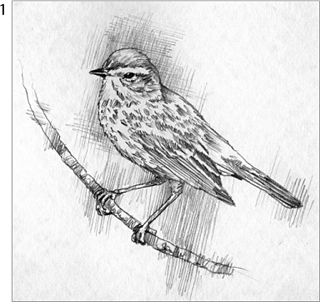
The original pencil illustration, scanned
2 Modifying a clone. Open a grayscale scan in Painter. Choose File, Clone to clone your scan, giving you a clone copy of your original. Howe added a color tint and a texture to the clone of the scanned bird. To add a tint, choose a color in the Color panel (Howe chose a reddish brown); then choose Effects, Surface Control, Color Overlay. Select Uniform Color from the Using pop-up menu, set Opacity to 30%, click the Dye Concentration button and click OK. To add texture, select a paper texture (Howe chose Basic Paper) from the Paper Selector near the bottom of the Toolbox, and choose Effects, Surface Control, Apply Surface Texture. Select Paper from the Using menu, set Amount to 50% and set Shine to 0%. Click OK.
Adding a tint and a texture to the clone
3 Restoring from the original. Howe used Painter’s cloning capabilities to replace most of the tint and texture in the bird’s body with the light gray tones of the original. In the Brush Selector, choose the Cloners category, and the Soft Cloner variant. In the Property Bar, lower this cloning brush’s Opacity for more sensitivity. (The Soft Cloner sprays similar to an airbrush.) Using an opacity you like, paint on the portion of your image that you want to restore. The original will automatically be revealed in the area covered by your strokes.
Using a Cloning method brush to partially restore the gray tones of the original
4 Adding color tints with an Airbrush. To achieve the effect of traditional airbrushing with transparent dyes or watercolor pigments, Howe used two versions of the Digital Airbrush variant of Airbrushes. The first Digital Airbrush (using the default Cover method) allowed a light color to cover a darker one. In the Property Bar, he reduced the Opacity setting to between 5% and 10%. He used this low-opacity brush to carefully lay in the golden brown tones on the bird’s back. Howe’s second airbrush used the Buildup method, which applied color transparently. The Buildup method allowed him to use a slightly higher Opacity (between 10% and 20%) to achieve richer color while preserving the intensity of the pencil sketch. To make a “transparent” airbrush similar to Howe’s, choose the Digital Airbrush variant of Airbrushes in the Brush Selector. To change its method from Cover to the Buildup Method, open the Brush Controls. (Choose Window, Brush Control Panels, General.) In the General panel, change the Method pop-up menu to Buildup, and the subcategory pop-up menu to Soft Buildup.
Applying color tints with the Digital Airbrush in Buildup method
5 Cloning again and brushing with Chalk. Howe uses the Clone feature like a flexible “Save As” command. When he’s ready to move on to the next phase of an illustration, he often makes a clone and uses the original as “source material.” Here, when he had colored the bird to his satisfaction he saved the file and then he chose File, Clone. If he over-worked an area in the new clone, he restored it by cloning in imagery from the previous version by designating it as the “source” in the Clone Source panel. Then he painted with a cloning brush to restore the area.
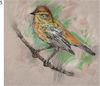
Using a Large Chalk variant to add color to the background
Howe switched to the Large Chalk variant of Chalk & Crayons and began to paint loose, gestural strokes on the image background around the bird using two similar green hues. He changed the size of the brush as he worked using the Size slider in the Property Bar.
6 Adding tints and texture. To add a finishing touch without muddying his existing color work, Howe used transparent washes to add more depth to the color on the bird’s head and other areas. To paint washes, use the Wash Camel variant of Watercolor. (As you paint, a Watercolor layer will be generated in the Layers panel, keeping these brushstrokes separate from the Canvas.) Now, sample color from the bird and background using the Dropper tool, switch to the Splatter Water variant and paint a “water drop” effect on the background. To combine the selected Watercolor layer with the Canvas, click the Layer Commands button at the bottom of the Layers panel and choose Drop.
Applying watercolor accents with the Splatter Water variant
Another spot illustration from the Trailblazer spread. Howe used the same brushes and technique for all illustrations.
Merging the files. Using the Lasso, Howe drew a loose selection around the bird; then he chose Select, Feather and feathered it 30 pixels. Then he opened the 17 × 11-inch main image and used the Layer Adjuster tool to drag and drop the bird into the main image. To blend the bird layer with the background, he set its Composite Method in the Layers panel to Multiply. ![]()
Painting with the Mirror tool
Overview Use the Mirror tool in combination with brushes to paint a beautiful wreath.
ATHOS BONCOMPAGNI
ATHOS BONCOMPAGNI USED the Mirror tool in combination with brushes to create Wreath, one of a continuing series of decorative drawings. The Mirror painting tools are useful for making symmetrical images. When you paint a brushstroke, a similar brushstroke appears on the opposite side of the image.
1 Setting up for Mirror painting. Open a new file by choosing File, New and set up a square image, Boncompagni used 3000 × 3000 pixels. Click on the Mirror tool in the Toolbox. For this image, he chose the Vertical Plane setting in the Property Bar.
The Vertical Plane guide on the document and the Mirror settings in the Property Bar; Vertical Plane and Toggle Mirror Painting are enabled.
2 Drawing with a Cover Brush. To begin, Boncompagni used a favorite brush to create a black-and-white drawing on a layer. He used the Cover Brush variant of Brushes from the Painter 5 Brush Library, loaded from the Extras folder on the Painter 12 DVD-ROM. To load this category, insert the Painter 12 DVD-ROM, navigate to the Extras folder and locate the Painter 5 Brushes folder. Open the Painter 5 Brushes folder and copy the Brushes category folder and the Brushes.jpg icon into the Painter Brushes folder within your Painter application folder. You will need to restart Painter to access the brushes. Now choose the Brushes category in the Brush Selector. Note: If you want to use a Painter 12 brush instead, try the Fine Round Gouache variant of Gouache and reduce its size to about 8–9 pixels using the Size slider in the Property Bar. Next, choose black in the Color panel. To add a new layer to your image, click the New Layer button on the Layers panel. As you draw, you will see Painter mirroring your drawing in the other segment of the image. Painter mirrors your drawing, with some variation so that the brushwork looks natural, avoiding a mechanical look.
Sketching with the Cover Brush
The completed black-and-white drawing. His strokes are mirrored on the right side.
Boncompagni used the Cover Brush to quickly and precisely draw the left side of the wreath; the right side appeared as he worked. When he was satisfied with his drawing, he saved his file.
3 Painting with color. After the drawing was complete, Boncompagni used the Chunky Oil Pastel variant of Pastels to paint the wreath. He used a coarse custom paper; for a similar look choose the Coarse Pavement paper in the Paper Selector. Next, he filled the Canvas with a dark brown color, then he painted varied color on the wreath, finishing by painting the background on the layer white.
Painting the leaves and ribbon with the Chunky Oil Pastel
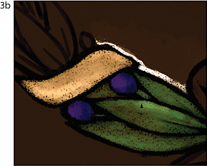
Adding highlights to the leaves with the Chunky Oil Pastel
Outlining the wreath with white and roughing in the background on the layer
Target the Canvas in the Layers panel, select a dark brown color in the Color panel and then choose Edit, Fill, Fill With Current Color. Now target the layer with your drawing. Choose a deep green color in the Color panel, and then choose the Chunky Oil Pastel variant of Pastels. Begin by laying in the base colors. Then model the forms expressively and add shadows and highlights. Painter “mirrors your strokes” as you add color. When you are satisfied with the modeling save your file.
4 Adding final details. Boncompagni wanted to avoid a mechanical look so he added final details without using the Mirror feature. To disable the Mirror feature, click the Toggle Mirror Painting button on the Property Bar. Reduce the size of the Chunky Oil Pastel to about 6–8 pixels using the Size slider in the Property Bar, and paint a few freehand strokes to complete your image (Boncompagni used touches of lighter, warmer green, gold and rust). ![]()
The modeling on the ribbon, leaves and berries can be seen in this detail of the final image.
Toggle Mirror Painting is disabled in the Property Bar.
Combining Oil Pastels, Texture and Blending
Overview Start from a pencil sketch; build a drawing using Oil Pastels variants combined with different paper textures; blend them with Blenders variants.
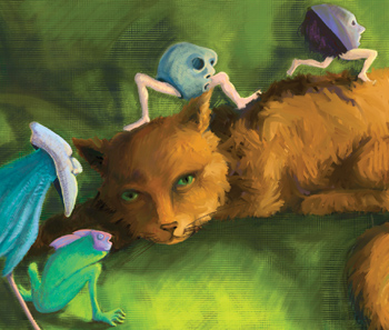
CAROL BENIOFF
THE OIL PASTELS ARE A VERY VERSATILE set of tools—their strokes, blending capability and responsiveness to paper textures all add to the tactile feel of this illustration called Cat Dreams. Carol Benioff also used Blenders variants, to smear and blend some the cat image.
1 Starting with a pencil sketch. Benioff started by scanning a pencil sketch at 300 pixels per inch and opened it in Painter. To use paper textures from multiple Paper Libraries with ease, Benioff built a custom Paper Library using the Paper Mover. Open the Paper palette (Windows, Paper Panels, Paper Libraries), and in the pop-up menu on the Paper Libraries panel, select New Paper Library. When the dialog appears, name and save your new library (For information about working with libraries, see Chapter 1.) From the pop-up menu, Benioff then clicked Import Legacy Paper Library and selected the Cracked Paper Textures Library in the Extras folder, Paper Textures, in the Painter 12 application folder. She dragged and dropped a few paper textures from this library to her custom library, titled Cat Papers. Benioff proceeded to open several more libraries, repeating this process. When she was happy with her new library, she removed the additional libraries from the Paper Libraries panel by opening the pop-up menu, choosing Remove Paper Library and then selecting the library in the Choose Library pop-up menu.
The scan of the pencil sketch
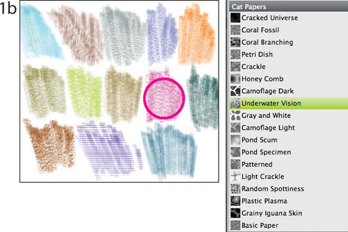
Benioff used the Paper Libraries panel to build a new library of papers from multiple libraries. Samples of the textures are shown.
2 Picking different papers. Benioff began sketching the frog-fish. She selected the Underwater Vision texture from her Cat Papers library. This paper texture simulates reptile skin and water. Using the Chunky Oil Pastel variant of Pastels, with the grain set to 9% in the Property Bar, she drew colored strokes, revealing the texture. For masked chicken body, she switched to the Squirly Wiggle texture using dark blues. To add more depth and color variations, Benioff reversed the value of the paper. She clicked on the Invert Paper button in the Papers palette and then she selected a light blue following the contours of the body. With the inverted paper texture, you can now draw into the recesses of the paper with the lighter color. Vary the pressure on the stylus as you paint to control how much of the paper texture is revealed or covered by the pigment. The Chunky Oil Pastel is built so the amount of resaturation and bleed are controlled by the amount of pressure you apply.
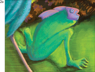
Drawing with the Chunky Oil Pastel on Underwater Vision texture for frog-fish.
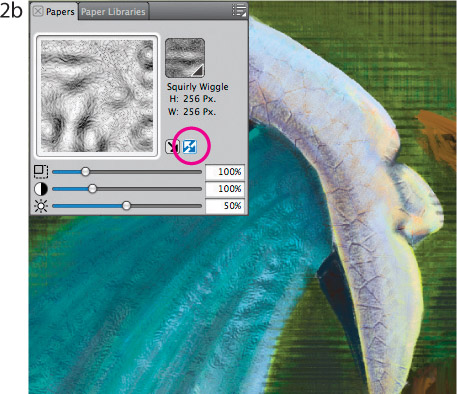
Benioff clicked the Invert Paper button in the Papers panel, when drawing the mask and feathers for this figure.
3 Building textures and color. To achieve the course line texture with layers of color in the background, Benioff drew with the Chunky Oil Pastel over the Plaid Fibers paper texture, inverting the paper texture as she switched colors. This technique both layered and blended the colors with the texture.
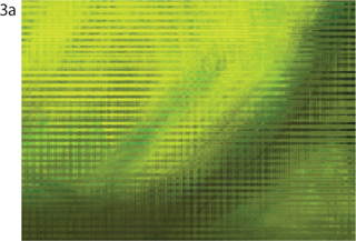
Benioff used Chunky Oil Pastel on Plaid paper texture, clicking on the Invert Paper button as she changed colors.
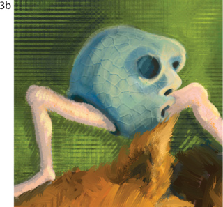
Detail showing Plaid Fibers texture, Light Crackle texture and Elephant Skin texture.
Next, Benioff chose the Light Crackle and Elephant Skin textures for the crouching mask figure. Benioff used the Real Hard Oil Pastel on the legs, and a combination of the Chunky Oil Pastel and Round Pastel in a variety of sizes to draw the mask. Again she clicked on the Invert Paper button in the Papers panel each time she switched colors, to give depth and form to the figures.
4 Adding detail. To add detail, Benioff used the Real Soft Oil Pastel in a variety of sizes from 2.5–20, which gave her smooth clean lines that were lightly textured. To clean up some of the edges, Benioff used the Round Pastel with its default grain setting of 17%, in a smaller sizes of 2 to 6.
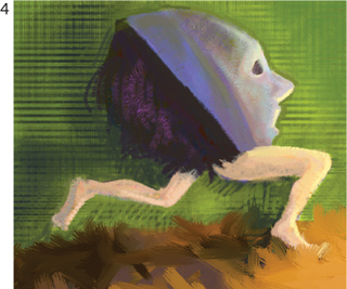
Adding detail and cleaning up edges with the Real Soft Pastel and Round Pastel.
5 Blending and smearing color. To complete this piece, Benioff used the Course Oily Blender variant of the Blenders brushes on the figure of the cat. With this brush she softened the transitions between strokes, blended the shades of ochres, rusts and browns, creating a fluid and active texture for the cat fur. ![]()
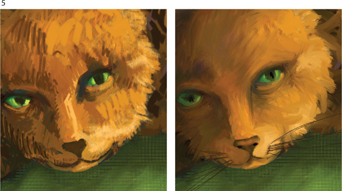
Close up of the cat before using the Course Oily Blender (left), and after blending (right).
Applying Paper Textures
Overview Scan textured paper and fabric; open the file in Painter and capture the texture; use grain-sensitive brushes and Painter’s special effects to paint and apply texture.
CAROL BENIOFF
WHILE PAINTER OFFERS A LARGE ASSORTMENT of ready-made paper grains, it also offers many ways to create your own unique surfaces. You can capture textures from video grabs, scanned photos, texture collections on CD-ROM, scans of paper, patterns, natural objects (leaves, flowers, wood grains) or images drawn in Painter. The Make Paper and Make Fractal Pattern features in Painter provide another way to generate custom paper textures. With Parked Boot, Carol Benioff took full advantage of Painter’s capability to apply paper textures with effects and brushes as she painted with variants of the Chalk and Oil Pastels.
1 Scanning and capturing paper textures. Benioff scanned decorative papers, cork, lace and flowers on her flatbed scanner at 300 ppi in grayscale mode. If you are scanning a translucent sheet, or lace, like Benioff used for this piece, you may want to place a black sheet behind it to create greater contrast. For maximum flexibility when applying the texture, make sure the scan has good contrast and a broad tonal range.
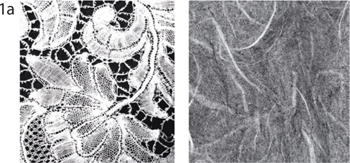
Scanned lace texture (left) and Japanese paper (right)
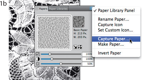
Capturing a selected area of the lace scan
Saving and naming the new paper texture
Use the Rectangular Selection tool to isolate an area of your image. The repetition of your paper pattern may be too obvious if you select an area that is smaller than 200 × 200 pixels. Open the Papers panel (Window, Paper Panels, Papers). Choose Capture Paper from the pop-up menu on the Papers palette. For the smoothest results, use a Crossfade setting between 16–30. Name your paper and click OK. A picture of the texture will appear in your current Paper library.
2 Making papers. To build the Quilted Paper, Benioff opened the Make Paper dialog box. (To choose Make Paper, click on the button on the upper right of the Papers panel and choose Make Paper.) In the Pattern pop-up menu, Benioff selected Triangle, adjusted the spacing and angle and then named her paper and clicked OK.
Selecting Make Paper in the Papers panel
Using the Triangle Pattern in the Make Paper dialog box to build the Quilted Paper
3 Filling selections with textured color. Benioff built broad areas of color and texture by selecting portions of her drawing with the Magic Wand and Lasso tools, and then filling the selections with color and texture using the Color Overlay effect. To paint as Benioff did, choose a color in the Color panel and a paper in the Papers panel. Then choose Effects, Surface Control, Color Overlay. In the Using pop-up menu, select Paper. Next, set your desired Opacity and click the Dye Concentration button for a transparent tint or the Hiding Power button for a semi-opaque look. On the background wall, Benioff applied the Japanese Paper texture and the Lace texture using Color Overlay. For more depth, she applied the Lace texture again using the Dye Concentration effect.
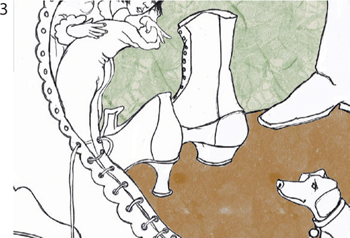
Detail of textures applied with the Color Overlay effect to the background surfaces
4 Applying paper grain with brushes. Benioff brushed the Quilted Paper texture on the ankle-high boot using the Square Chalk variant of Chalk & Crayons and a yellow ochre color. Then, for the shadow areas, she reversed the Quilted Paper by checking the Invert Paper box in the Papers panel and painted dark brown strokes. (See “Inverting the Grain” on page 60 to learn more about inverted textures.) Next, she used the Pebble Board texture and the Pastels brushes to create the leather grain on the red boot. She painted reds and browns. As she worked, she adjusted the Grain slider on the Property Bar to vary the amount of texture revealed in the strokes. Choose Pebble Board texture from the picker in the Papers panel and in the Brush Selector choose the Soft Oil Pastel variant of Pastels. Using gentle pressure on your stylus, brush textured strokes onto your image using the Soft Oil Pastel.
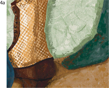
Detail of Quilted Paper texture painted onto the top portion of the brown boot
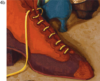
Benioff used Painter’s Pebble Board texture with Oil Pastels to paint the dark brown leather of the boots.
5 Applying paper grain with effects. For more warmth and depth on the background wall, Benioff overlaid more texture and a warm yellow light. She began by selecting the captured Japanese Paper texture in the Papers panel. Then she chose Effects, Surface Control, Apply Surface Texture and used these settings: Using, Paper; Amount, 25%; Shine, 0%. Benioff adjusted the Brightness, Exposure and Color of the Light, and then she clicked OK. ![]()

Applying a Surface Texture using Benioff’s captured Japanese Paper texture
A Painter Impasto Primer
Overview Here you’ll find the basics for painting with the Impasto medium and brushes.
CHER THREINEN-PENDARVIS
WITH IMPASTO, LUSCIOUS THICK PAINT is available at the tip of your digital brush. Painter’s Impasto brushes and Impasto depth layer give you the ability to paint with exciting, realistic, three-dimensional brushstrokes that leave bristle marks and paint texture on the surface of the image. Impasto brushes are found in the Impasto category and in other categories in the Painter Brushes library such as the Acrylics, Gouache, Oils and Cloners. Look for brushes with the word Thick in their name, such as the Thick Opaque Acrylic variant of Acrylics and the Thick Wet Camel variants of Oils. A few brushes in the Cloners category include Impasto settings; the Oil Brush Cloner and the Thick Camel Cloner variants of Cloners are examples.
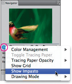
Click the Navigator Setting button on the Navigator panel to open its pop-up menu
Impasto properties. Impasto has two properties: the color of the paint and the depth of the paint. The Impasto depth medium is a grayscale bump map that is part of the Painter image Canvas. It is similar to a layer, but it does not appear in the Layers panel. Choose the Thick Tapered Flat variant of Impasto and make a brushstroke. You will see a brushstroke with the realistic highlights and shadows of thick paint. To toggle the Impasto appearance to show or hide the depth of the paint applied to the image, under the Canvas menu, choose Hide or Show Impasto. You can also toggle the appearance of Impasto via the Navigator panel. In the Navigator panel, click the Navigator Settings button (the gear) to open the pop-up menu and choose Show Impasto or Hide Impasto. When you choose Hide Impasto, only the color in the strokes is visible.
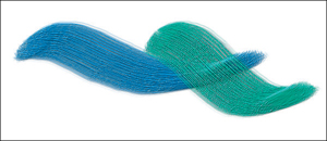
Brushstrokes made with the Thick Tapered Flat variant of Impasto
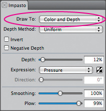
The Impasto panel of Brush Controls, with the Draw To pop-up menu set to Color and Depth
Controlling Impasto. There are two types of controls for Impasto. The first affects the appearance of individual Impasto brushstrokes and is located in the Impasto panel of Brush Controls. Choose Window, Brush Control Panels, Impasto to open the Impasto panel. The Impasto panel controls affect the performance of the Impasto brushes and the depth of individual brushstrokes as you paint them. In the Draw To menu, Color applies only color; Depth applies three-dimensional highlights and shadows but with no color; Color and Depth applies both color and three-dimensional highlights and shadows of thick paint. Depth applies the depth layer only. (For an example of an Impasto brush that uses Draw To Depth, try out the Thick Clear Varnish.) The Depth slider controls the amount of depth the brush will apply; Smoothing allows you to adjust the texture of the strokes and Plow controls how much a new stroke will displace existing paint. Under the Depth Method menu, Uniform applies depth evenly; Erase removes depth and Paper applies depth using the current paper texture. (For Hummingbird on page 123, we used the Paper Depth Method to achieve the grainy strokes.) Original Luminance applies depth based on a Clone Source, and Weaving Luminance applies depth using the current weave.
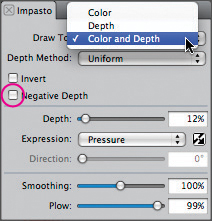
The choices in the Draw To pop-up menu in the Impasto panel
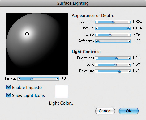
The Surface Lighting dialog box settings apply to the entire image.
The second way you can control Impasto is by adjusting lighting that shines onto the brushstrokes. Surface Lighting, which is located under the Canvas menu, is a global control, which means that it affects the entire document, including all of its layers. Surface Lighting is dynamic, which means that you can continue to adjust the appearance of the Impasto brushstrokes, until you’re satisfied with the look.
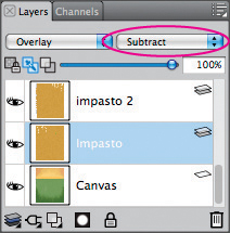
The Composite Depth is set to Subtract.
Building up, or excavating paint. The Thick Tapered Flat and Thick Round are examples of brushes that will build up thick Impasto paint. To excavate, or dig into the paint, use the Palette Knife variant of Impasto. You can also customize a brush to dig into existing Impasto paint. Choose the Thick Round variant of Impasto, and in the Impasto panel, enable the Negative Depth box.
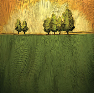
For On Golden Hill, we painted Impasto brushstrokes on layers so that we could use the Composite Depth for more complexity in the overlapping, thick brushstrokes.
Impasto, layers and Composite Depth. When creating On Golden Hill, we painted Impasto on layers so that we could adjust the Composite Method and the Composite Depth. We built up paint and excavated paint. The Composite Depth settings on the Layers panel allowed for interesting paint interaction. We painted brushstrokes on two layers with the Thick Acrylic Round variant of Acrylics. Then, we used the Composite Depth controls, Subtract (to excavate) and Add (to raise) the brushstrokes. For more Impasto painting tips and techniques, see “Brushing Washes over ‘Live’ Canvas” on page 125 and “Painting with Gouache and Impasto” on page 127. ![]()