1. Getting to Know Painter
SIT RIGHT DOWN AND POWER UP! This chapter explores Painter’s basic functions and unique strengths, as well as what’s required to run the program. If you’re new to Painter, you may want to use Painter 12 Help, available through the Help menu, to further explore topics that intrigue you.
John Derry’s illustration, Brush Mandala, was inspired by the artist Peter Max. Derry created it for the promotion of Painter using a variety of brushes and special effects such as Effects, Esoterica, Blobs and Apply Marbling. To create the mirrored group of paintbrushes, he used Painter’s Kaleidoscope, available through the Dynamic Plug-ins menu at the bottom of the Layers panel. Derry also painted spontaneous brush strokes using the Smeary Flat variant of Oils and the Smooth Ink Pen variant of Pens.
© COREL CORPORATION
Painter’s Requirements for Mac and Windows
Here are Painter’s minimum requirements: If you use a Macintosh you’ll need at least an Intel Core Duo, running System OS X 10.5 (with latest version), 1 GB of application RAM and a hard disk with approximately 300 MB of free space is required to perform an installation. To run Painter on Windows 7 or Windows Vista™ 32-bit or 64-bit editions, or Windows XP with the latest Service Packs, you’ll need a processor 1 GHz or faster, with 1 GB of application RAM. A hard disk with approximately 600 MB of free space is required to perform an installation. For both platforms, a 1280 × 800 display with 24-bit color is recommended.
When you open an image in Painter—for example, a 5 MB image—and begin working with it, Painter needs three to five times that file size in RAM in order to work at optimal speed—in our example, that would be 15 to 25 MB of RAM. Opening more than one image, adding layers or shapes, or increasing the number of Undos (under Edit, Preferences, Undo, in Windows, and under Corel Painter 12 on Mac OS X) adds further demands on RAM. When Painter runs out of RAM, it uses the hard disk chosen under Edit, Preferences, Memory & Scratch in Windows and under Corel Painter 12 on Mac OS X as a RAM substitute, “scratch disk.” Since hard disks operate more slowly than RAM, performance suffers—even if you have a fast hard disk.
This Wacom Intuos4 pressure-sensitive tablet with stylus is versatile and easy to use. The Intuos4 tablets offer pressure-sensitivity, as well as tilt and bearing. Tablets with these capabilities allow you to paint more expressive strokes with Painter’s brushes that can sense the pressure you apply, and the rotation of your hand, as you draw. You will find detailed information about using a tablet in The Photoshop and Painter Artist Tablet Book, published by Peachpit Press (www.peachpit.com/tabletbook).
The Scratch Drive pop-up menu with a Volume chosen
Ideally, to work with Painter, you would use a computer with a speedy processor; a large, fast hard disk; and lots of RAM. In addition, you’ll want a large, 24-bit color monitor—probably no less than 17 inches—and perhaps a second monitor on which to store panels. Also highly recommended—some would say essential—is a pressure-sensitive drawing tablet with a stylus. Not only is it a more natural drawing and painting tool than a mouse, but many of Painter’s brushes have a lot more personality with a pressure-sensitive input device.
Memory allocation. Painter users can set the maximum percentage of available RAM for Windows and Mac OS X that Painter will use. Windows users go to the Edit menu and then choose Preferences, Performance. Mac OS X users go to the Corel Painter 12 menu and then choose Preferences, Performance. You can specify more than the default 80% of available RAM for Painter, but this may or may not increase performance. The minimum that you can specify is 5%. If you type a number in the dialog box to change it, quit all applications, and then relaunch Painter.
File Size and Resolution
If you’re new to the computer, here’s important background information regarding file sizes: Painter is primarily a pixel-based program, also known as a bitmap, painting or raster program, not a drawing program, also known as an object-oriented or vector program. Drawing programs use mathematical expressions to describe the outline and fill attributes of objects in the drawing, while pixel-based programs describe things dot-by-dot. Since mathematical expressions are more “compact” than dot-by-dot descriptions, object-oriented files are generally smaller than pixel-based files. Also, because its components are mathematically described, object-oriented art can be resized or transformed with no loss of quality. Not so with Painter, Photoshop and other pixel-based programs. Increasing the size of most images in these programs means that additional pixels must be created to accommodate the larger size by filling in spaces as the existing pixels spread apart. As a result of these interpolated (manufactured) pixels, resized images can lose their crispness.
There are ways of working around this “soft image” dilemma. One solution is to do your early studies using a small file size (for instance, an 8 × 10-inch image at 75 pixels per inch), and then start over with a large file to do final art at full size (for instance, an 8 × 10-inch file at 300 pixels per inch). Another approach is to block in the basic form and color in a small file, and then scale the image up to final size (using Canvas, Resize) and add texture and details (textures seem particularly vulnerable to softening when enlarged). You’ll notice that many of the artists whose work is featured in this book use another efficient method: They create the components of a final piece of art in separate documents, and then copy and paste (or drag and drop) the components into a final “master” image. Painter offers yet another solution for working with large file sizes—composing with reference layers which are small “stand-in” versions of larger images. Because data for the larger images is not kept in the working file, performance improves. “Using Reference Layers” on page 212, tells more about this feature.
This scan of a photograph is a pixel-based image. Enlarging it to 1200% reveals the grid of pixels.
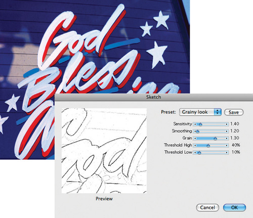
We increased the Sensitivity to 1.40 to pick up lines from the photo background. We set the Grain setting at 1.40 to add richer paper grain to the sketch.
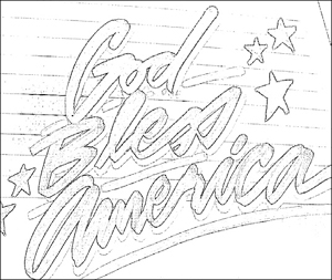
The black-and-white “sketch” image
Painter’s vector capabilities. Although the image canvas, masks and image layers—are pixel-based, the program does have some object-oriented features—type, of course, and shapes, shape paths and outline-based selections. Painter’s shapes exist as layers above the image canvas; they are mathematically described outlines with stroke and fill attributes. And Painter’s selections (areas of the image designated for work) are versatile; they can be used as pixel-based selections (similar to Photoshop’s selections), or they can be transformed into outline-based selections or converted into shapes. Chapters 5 and 6 tell more about selections and shapes.
Pixels and resolution. There are two commonly used ways of describing file sizes: in terms of their pixel measurements, or in a unit of measure (such as inches) plus a resolution (pixels per unit of measure). An image is a fixed number of pixels wide and tall—like 1200 × 1500—or a measurement combined with a resolution—4 × 5 inches at 300 ppi (4 × 300 = 1200, and 5 × 300 = 1500). If you use pixels as a measurement for Width and Height in the New Image dialog box when you create a file, notice that changing the numbers you type into the Resolution box doesn’t change the file size. But increasing or decreasing the number of pixels in the Width and Height fields in the New dialog box or the Canvas, Resize box will add (or reduce) pixel information in the picture.
Opening Files
Images in Painter are 24-bit color, made up of RGB (red, green and blue) components consisting of 8 bits each of color information. Painter will recognize and open CMYK TIFF and grayscale TIFF images as well as layered Photoshop format files in CMYK, but it will convert both CMYK and grayscale files to Painter’s own RGB mode. LAB format and other color formats will need to be converted to RGB in a program such as Adobe Photoshop or Equilibrium’s Debabelizer before Painter can read them.
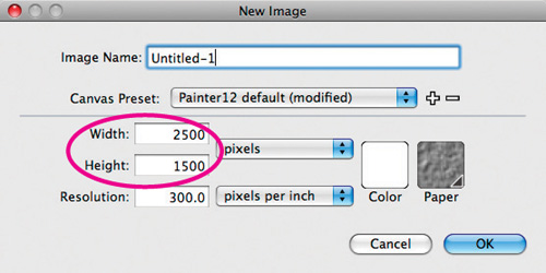
Expressing width and height in pixels in the New Image dialog box keeps the file size the same, regardless of how you change the resolution.
You can set the F keys on your keyboard for your own favorite commands, making it easier to access the commands nested in Painter’s menus and panels. Choose Edit, Preferences, Customize Keys (Windows) or Corel Painter 12, Preferences, Customize Keys (Mac OS X). You can create your own custom set, or add new commands to Painter’s default key set. To give the helpful Float command a shortcut, choose Application Menus from the Shortcuts pop-up menu, open the arrow to the left of Select and then click on the Float command. In the highlighted shortcut area, type Alt-Ctrl-F (Windows) or Option-![]() -F (Mac). The key command appears under the Shortcut list. Click OK to accept.
-F (Mac). The key command appears under the Shortcut list. Click OK to accept.
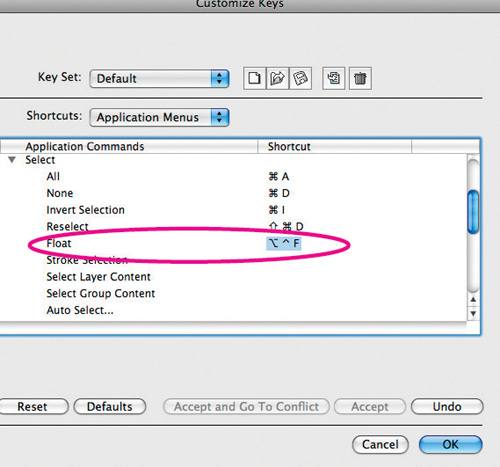
Making a function key for the Select, Float command using Customize Keys
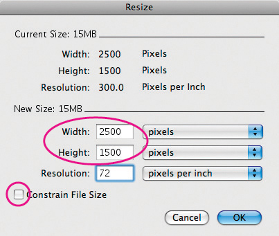
Whether the Constrain File Size check box in the Resize dialog box is checked or unchecked, if you’re using pixels as the units, the file size stays the same, regardless of how you change the resolution.
Saving Files
Painter offers numerous ways to save your image under File, Save or Save As. If you’ve created an image with a mask to hide some parts and reveal others (Chapter 5 discusses masks), some of the formats will allow you to preserve the mask (by checking the Save Alpha box in the Save or Save As dialog box), while others won’t. Here’s a list of the current formats that includes their “mask-friendliness” and other advantages and disadvantages:
RIFF. Thrifty (files are saved quite small) and robust (allows for multiple layers), RIFF (Raster Image File Format) is Painter’s native format. If you’re using elements unique to Painter, such as Watercolor layers, Liquid Ink layers, reference layers, dynamic layers, shapes, or mosaics, saving in RIFF will preserve them. (Watercolor layers, Liquid Ink layers, reference layers, dynamic layers and shapes are described in depth in Chapter 6; mosaics are described in Chapter 8.) If you have lots of free hard disk space, check the Uncompressed box in the Save dialog box when you’re saving in RIFF: Files will become many times larger, but will save and open much more quickly. Few other programs recognize RIFF, so if you want to work with a Painter image in another program, save a copy in a different format.
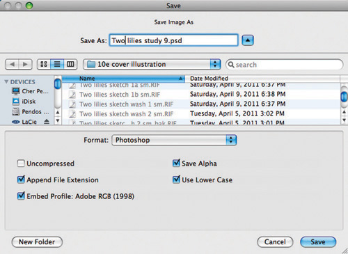
In the File, Save dialog box, you can choose to have Painter append a file extension and embed the Color Space when you save the file. You can choose to preserve alpha channels when saving as well.
Photoshop format. Saving files in Photoshop format gives you nearly all the flexibility of RIFF, and is ideal if you frequently move data between Painter and Photoshop. When you use Photoshop to open a file saved in this format, Painter’s layers become Photoshop layers (Chapter 9, “Using Painter with Photoshop,” contains more information about working with Painter and Photoshop); Painter’s masks (explained in depth in Chapter 5) become Photoshop channels; and Painter’s Bézier paths translate perfectly into Photoshop’s paths and subpaths, appearing in Photoshop’s Paths panel.
You can preserve pixel-based layers in files by saving in either RIFF or Photoshop format. Chet Phillips’ 2025 × 2517-pixel image with 8 layers weighs in at 15.8 MB as a compressed RIFF, 119.3 MB as an uncompressed RIFF.
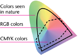
Relative sizes and extents of color gamuts
TIFF. Probably the most popular and widely recognized of the bitmap file formats, TIFF allows you to save a mask with your image (check the Save Alpha check box). Unfortunately, unlike Photoshop, all your layers are dropped onto the background, and only the first of your User Masks will be visible in Painter. Also note, Painter’s Save As dialog box gives you no option to compress the TIFF file—the Uncompressed check box is checked and grayed-out.
PICT. PICT is the format of choice for many Mac multimedia programs and other onscreen displays. Painter’s PICT format lets you save a single mask (but not layers), and you can save a Painter movie as a sequence of numbered PICT files to export and animate in another program (described in Chapter 10, “Animation and Film with Painter”). Painter also opens PICT files very quickly.
JPEG. When you save a file in JPEG format, a dialog box will appear with four choices: Excellent, High, Good and Fair. You’ll get the best-looking results by choosing Excellent. The advantage of saving a file in JPEG format is that you get superb space savings: A JPEG file is usually only one-tenth as large as a TIFF file of the same image if you choose Excellent, and only one-hundredth the size if you choose Fair. The drawbacks: no mask, layers or paths are saved, and the compression is a lossy compression—which means that some data (color detail in the image) is lost in the compression process. While JPEG is a good way to archive images once they’re finished (especially images that have no sharp edges), many artists prefer not to use JPEG because it alters pixels. Don’t save a file in JPEG format more than once—you’ll lose more data every time you do so.
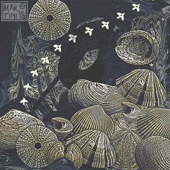
To create Zorro’s Gone, Janet Martini used several of Painter’s brushes and effects. She colored the birds white using the Graphic Paintbrush variant of F-X. To complete the image, she added a Woodcut look by choosing Effects, Surface Control, Woodcut.
JPEG is also useful for preparing 24-bit images with the tiny file sizes that are needed for graphics used on the World Wide Web.
GIF. GIF is the graphics format of choice for the majority of non-photographic images on the Web. Like saving in TIFF, PICT or JPEG, saving in GIF format combines layers with the background. It also reduces the number of colors to a maximum of 256, so remember to Save As in a different file format first if you want to be able to access the original image structure again. When you save in GIF, a dialog box appears that gives you a number of options for saving your file. Check the Preview window to see how your choices will affect your image.
EPS. Saving in this format drops layered elements into the background and ignores masks, so it’s best to choose Save As in another format if you’ll want to make changes to your document at a later time. Saving in EPS format also converts the file into a five-part DCS file: four separate files for the four-process printing colors, and a fifth file as a preview of the composite image. Check the Painter online Help for a complete explanation of the EPS Options dialog box.
PC formats. BMP, PCX and Targa are formats commonly used on DOS and Windows platforms. BMP (short for “bitmap”) is a Windows-based graphics file format, and PCX is the PC Paintbrush native format. Neither of these two formats supports shapes or masks. Targa is a popular format used for creating sophisticated 24-bit graphics. The Targa format is often used (in place of PICT) when preparing numbered files for import into Windows animation applications.
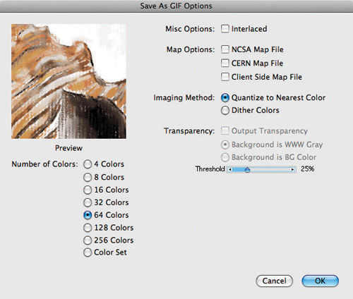
In the Save As GIF Options dialog box you can choose the Imaging Method, Number of Colors and more.
Movie formats. Movies in Painter (described in Chapter 10, “Animation and Film with Painter”) are saved as frame stacks, but you can choose Save As to export the current frame of your movie, export the entire frame stack as a QuickTime or AVI (on the PC) movie or export the entire Frame Stack as numbered PICT files. See Chapter 10 for more about multimedia formats.
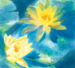
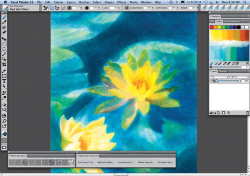
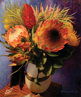
Water Lilies, a detail of which is shown here, was painted with Painter’s new brushes that feature Real Watercolor capabilities, including the Real Oval Wash and Real Wet Filbert. The final painting appears on the front cover of this book.
CHER THREINEN-PENDARVIS
Painter Basics
Here’s a guide to some of Painter’s basic operating procedures:
Navigating the Painter Workspace. The Painter 12 workspace is easy to use. Tools and functions are organized into menus, selectors, palettes and panels. The context-sensitive Property Bar allows you to choose art materials and change settings quickly. Painter’s panels (for instance, the Color Panels, Brush Control Panels, Paper Panels, Media Control Panels and Media Library Panels, Navigator, Clone Source, Layers, Channels, Auto-Painting Panels, Composition Panels, Scripts and Text panels) can be accessed from the Window menu.
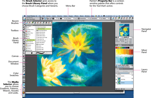
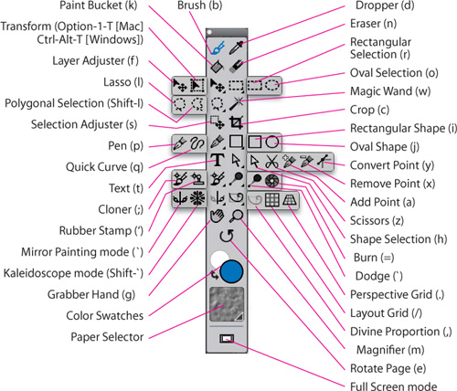
Using the Toolbox. Painter’s slick Toolbox features mark-making tools, and tools with which you can draw and edit shapes, view and navigate a document and make selections. In addition to the Color Rectangles, you’ll also find the Content Selectors near the bottom of the Toolbox.
![]()
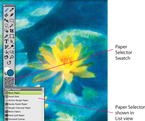
To choose papers from the Toolbox, click on the Paper swatch to access the Paper Selector so you can view the Papers in the current library and then click to choose a paper. The Papers panel also features a Papers picker and options such as Paper Scale, Paper Contrast and Paper Brightness. To open the Papers panel, choose Window, Paper Panels, Papers.
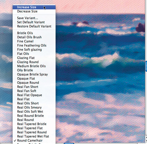
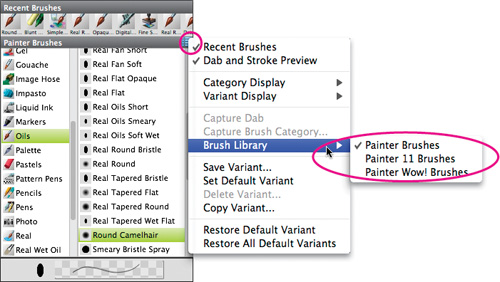
Using the Brush Selector and Brush Library panel. The Brush Selector, is located to the left of the Property Bar at the top of the Painter workspace. Click it to open the Brush Library panel, which offers an open list of choices for both brush categories and their variants. (For more information about using the Brush Selector, turn to the beginning of Chapter 3.)
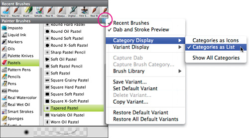
Click on the Brush Selector to open the Brush Library panel and click the Brush Category icon to open the picker. Clicking on the button to the far right of the Brush Library menu will open the pop-out menu, which will allow you to switch from List view (shown) to Thumbnail view. Click on a name or thumbnail to choose a new Brush Category.
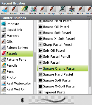
Click on the name of the Brush Variant in the Brush Library panel to choose a variant—in our case, the Square Grainy Pastel variant of Pastels. The Brush Variant menu can be displayed using the List view (shown here) or Stroke view.
Many of Painter’s menus include keyboard shortcuts.
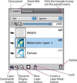
From the Layers panel menu you can choose commands such as Convert to Default Layer, Convert Text to Shapes or Dry Watercolor Layer.
Screen management shortcuts. Like other programs, Painter offers lots of shortcuts designed to cut down on your trips to the menus, panels and scroll bars. To scroll around the page, press and hold the spacebar (a grabber hand appears), as you drag on your image. To zoom in on an area of your image at the next level of magnification, hold down Ctrl/![]() -spacebar (a magnifier tool appears) and click in your image. Add the Alt/Option key to zoom out. (You can also use Ctrl/
-spacebar (a magnifier tool appears) and click in your image. Add the Alt/Option key to zoom out. (You can also use Ctrl/![]() -plus to zoom in one magnification level and Ctrl/
-plus to zoom in one magnification level and Ctrl/![]() -minus to zoom out.) These are the same zooming shortcuts used in Photoshop and Adobe Illustrator.
-minus to zoom out.) These are the same zooming shortcuts used in Photoshop and Adobe Illustrator.
By right-clicking a two-button mouse or by pressing the Control key and clicking on a one-button mouse, you can access helpful, context-sensitive menus like this one, which appears when a Brush is chosen.
To rotate the page to better suit your drawing style, press spacebar-Alt (Windows) or spacebar-Option (Mac) until the Rotate Page icon (a pointing finger) appears, and click and drag in your image until the preview shows you the angle you want. (The Rotate Page command rotates the view of the image only, not the actual pixels.) Restore your rotated image to its original position by holding down spacebar-Alt or spacebar-Option and clicking once on the image.
Another frequently used screen-management shortcut is Ctrl/![]() -M (Window, Screen Mode Toggle), which replaces a window’s scroll and title bars with a frame of gray (or toggles back to normal view).
-M (Window, Screen Mode Toggle), which replaces a window’s scroll and title bars with a frame of gray (or toggles back to normal view).
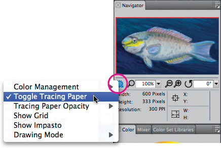
To access the Navigator Option menu click the Navigator Settings (gear) button on the Navigator panel (Window, Navigator)
Context-sensitive menus. Painter boasts context-sensitive menus that make it easier to change the settings for a brush for instance, or even quickly copy a selection to a layer. Context-sensitive menus are available for all of Painter’s tools and for certain conditions, such as for an active selection when a Selection tool is chosen. To access a context-sensitive menu, right/Ctrl-click.
Using the Navigator panel. If the Navigator panel is not open choose, Window, Navigator. You can use the Navigator panel to perform useful actions within the image window, for instance, view the entire image in the panel’s canvas preview without having to zoom out; you can move around the image window without having to adjust the magnification, change the zoom level, rotate the canvas and more. With Painter 12, helpful icon buttons and options that resided in the corner and at the bottom of the image window have moved to the Navigator panel: Color Management (the current profile, Color Management Settings, Assign Profile, Convert to Profile), Toggle Tracing Paper (allowing you to turn Tracing Paper on and off), Tracing Paper Opacity (allowing you to adjust the opacity of the Tracing Paper), Show Grid (which turns the Grid View on and off), Show Impasto (to hide or show the highlights and shadows on thick paint) and Drawing Mode (Draw Anywhere, Draw Outside, Draw Inside). (The three Drawing Modes allow you to control where you paint—anywhere in the image, outside of a selection, or inside of a selection. For a step-by-step technique that uses the Drawing Modes, see “Working with Bézier Paths and Selections” on page 193.) For a step-by-step technique using Tracing Paper, see “Auto-Painting with Custom Strokes” on page 271; see page 15 for information about using Grid Overlay. Turn to Chapter 11, “Printing Options,” for information about Painter’s Output Preview; Impasto is covered in “A Painter Impasto Primer” on page 123.
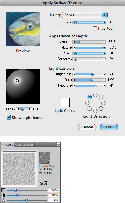
The Apply Surface Texture dialog box Preview window, shown here Using Paper (top), updates when a new choice is made in the Papers panel (bottom).
Interactive dialog boxes. Painter’s interactive dialog box design encourages you to continue to make the choices you need. As an example, you can open a piece of artwork or a photo, and then choose Effects, Surface Control, Apply Surface Texture and click and drag in the Preview window until you see the part of the image that you went to view. If you then choose Paper in the Using pop-up menu you can go outside the dialog box to choose a different paper (even a paper in another library) from the Paper Selector in the Toolbox or from the Papers panel (Window, Paper Panels, Papers). You can even move the Scale, Contrast and Brightness sliders in the Papers panel and watch as the Preview image in the Apply Surface Texture dialog box updates to reflect your choice. When you’ve arrived at a result that you like, you can click OK in the Apply Surface Texture dialog box. The Effects, Surface Control, Color Overlay dialog box and the Effects, Surface Control, Dye Concentration dialog box behave in a similar way, allowing you to choose different papers. Or you can choose Uniform Color in the pop-up menu and test different colors from the Color panel before you click OK. The Edit, Fill dialog box (Ctrl/![]() -F) is also interactive, giving you the ability to preview your image before it’s filled with the current color, pattern, gradient or weave.
-F) is also interactive, giving you the ability to preview your image before it’s filled with the current color, pattern, gradient or weave.
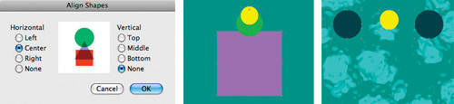
The Objects, Align dialog box with settings for the shapes in the center illustration above
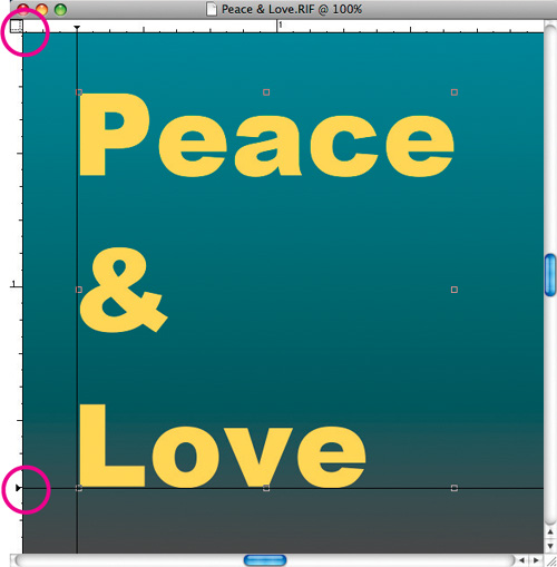
Positioning the baseline of text with the help of the Ruler and a Horizontal Guide created by clicking the Vertical ruler. The circled items here are the Ruler Origin field (top) and a triangular guide marker (bottom).
Measuring and positioning elements. The Ruler, Guides, Grid, Perspective Grids and Compositions (Divine Proportion and Layout Grid) can help you measure and position shapes and layers. The commands for these features reside in the Canvas menu. They are especially helpful for aligning text and selections.
To add a new guide, click on a Ruler. To set up a guide using precise measurements or to change the default guide color, double-click on a Ruler or a triangular marker to access the Guide Options, where you can change the options for an individual guide or for all guides at once. Delete guides by dragging their triangles off the document window or by pressing the Delete All Guides button in Guide Options.
To easily measure the exact width of an item, try moving the Ruler Origin. Press and drag it from the upper-left corner of the Ruler, where the horizontal and vertical measurements meet, to the top or the left end of the item you want to measure. Then see where the bottom or the right end falls on the ruler.
![]()
In this detail of the Property Bar, Freehand Strokes mode is chosen. To paint Straight Line Strokes, click the button to the right, or press v on your keyboard.
The Grid Overlay is useful for aligning items. Choose Canvas, Grid, Show Grid or click on the checkered Grid icon above the scroll bar. To change the grid’s appearance (for example, to create a grid of only horizontal lines), choose Canvas, Grid, Grid Options and adjust the Grid type or other settings.
The Perspective Grid is useful both for aligning items and for drawing. Choose Canvas, Perspective Grids, Show Grid to display a grid. You can adjust the grid using the Perspective Grid tool from the Toolbox by dragging the vanishing point and horizon line or either forward edge of the grid. Perspective Grid settings are located in the Property Bar when a Perspective Grid is enabled. You can adjust the settings and save your own presets.
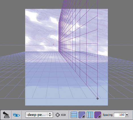
The Perspective Grid feature enables you to set up a one-point Perspective Grid, which can be useful as a guide for drawing. Useful controls are located in the Property Bar and presets can be saved.
The Layout Grid is helpful for planning compositions. For instance, you can divide your image into thirds or fifths, horizontally or vertically. Using the Layout Grid panel, you can configure the grid settings, such as the size, angle, color and opacity of the grid, as well as the number of divisions.
The Divine Proportion grid is helpful for planning a composition with classical proportions, and helps you decide where to locate the center of interest in your composition. For a step-by-step technique using this helpful feature see “Designing with Divine Proportion” on page 21.
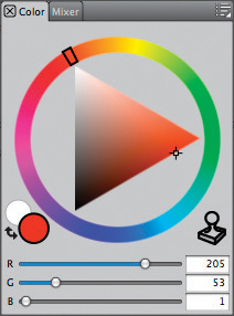
The Color panels showing a custom grouping, including the Mixer
Customizing Your Workspace
Painter makes it easy to customize your workspace. To move a panel grouping to another part of the screen, drag the blank bar at the top of the grouping. You can also remove or add panels from one group to another group to create a custom palette. To see this work easily, click on a blank area of a panel title bar and drag it from one group to another. For instance, we rearranged our Color Panels in this order: Color and Mixer, closing the other panels in the group by clicking the white “x” box near the right end of the title bar.
To save your palette layout permanently, choose Window, Arrange Palettes, Save Layout, and when the Palette Layout dialog box appears, name your panel grouping and click OK. As your needs change, it’s easy to rearrange the group. Then to restore a saved layout, choose Window, Arrange Palettes and choose the saved layout from the menu. To delete a layout, choose Window, Arrange Palettes, Delete Layout and choose the layout you want to remove from the list. To return to Painter’s default palette arrangement, choose Window, Arrange Palettes, Default.
Using the useful new Workspace feature, Painter 12 allows you to customize your workspace by hiding palettes and art materials that you don’t need for your workflow. Learn more about the Workspace functions in “Customizing a Workspace” on page 20.
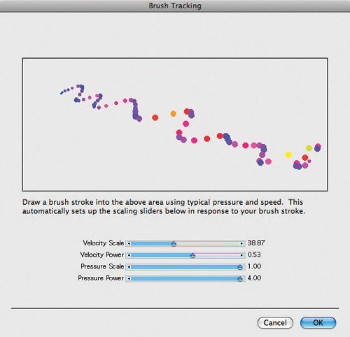
When you make a brushstroke in the Preferences, Brush Tracking dialog box, Painter adjusts the range of pressure sensitivity based on your stroke.
Setting Preferences
Painter’s Preferences (in the Edit menu in Windows or the Corel Painter 12 menu in Mac OS X) go a long way in helping you create an efficient workspace. Here are a few pointers:
Brush Tracking. Before you begin to draw, it’s important to set up the Brush Tracking so you can customize how Painter interprets the input of your stylus, including parameters such as pressure and speed. Windows users choose Edit, Preferences, Brush Tracking. Mac OS X users choose Corel Painter 12, Preferences, Brush Tracking. Make a brushstroke with your stylus using typical pressure and speed. Painter accepts this as the average stroke and adjusts to give you the maximum range or speed and pressure sensitivity based on your sample stroke. Painter 12 will remember your custom settings until you change them.
Multiple Undos. Painter lets you set the number of Undos you want under Edit, Preferences, Performance (in Mac OS X it’s Corel Painter 12, Preferences, Performance.) The default number of Undos is 32. It’s important to note that this option applies cumulatively across all open documents within Painter. For example, if the number of Undos is set to 5 and you have two documents open, if you use 2 Undos on the first document, you’ll be able to perform 3 Undos on the second document. And, since a high setting for the number of Undos can burden your RAM and scratch disk—because information is saved to support each Undo—unless you have a good reason (such as working on a small sketch where you’ll need to make many changes), it’s a good idea to set the number of Undos at a low number, such as 5, and keep open only the documents you need.
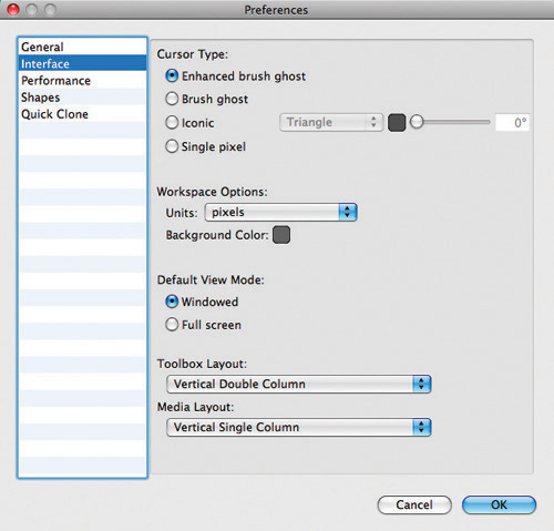
The Preferences, Interface dialog box includes the Cursor Type, Workspace Options, Default View Mode, Toolbox Layout and Media Layout settings.
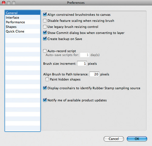
The General Preferences dialog box
Interface preferences. You can choose which panels are displayed by choosing their names from the Window menu, which makes it easy to configure Painter to save valuable screen real estate. The Preferences, Interface dialog box offers options for the Cursor Type, Workspace Options, View Mode, Windowed or Full Screen, Toolbox Layout and Media Layout.
Organizing with Libraries
Painter uses media libraries to help you manage the huge volume of custom textures, brushes and other items that the program can generate. Libraries are the “storage bins” for those items.
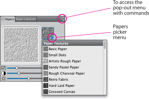
How libraries work. Every panel that includes a resource list of materials has an Import Library command. Let’s use the Papers panel as an example. Choose Window, Paper Panels, Paper Libraries. Click the button on the upper right of the panel title bar to access the pop-out menu, and choose Import Paper Library to display a dialog box that lets you search through folders on any hard disk until you find the library you want; then double-click to open it. (If you want to import a paper library from an earlier version of Painter, choose Import Legacy Paper Library.) (Caution: It’s not recommended to load libraries directly from a CD-ROM or DVD-ROM—like the Painter 12 DVD-ROM or the Painter Wow! CD-ROM—it’s more reliable to copy the libraries from the disk into your Painter application folder.) Fortunately, Painter is smart enough to show only libraries that can be opened in the panel you’re working from.
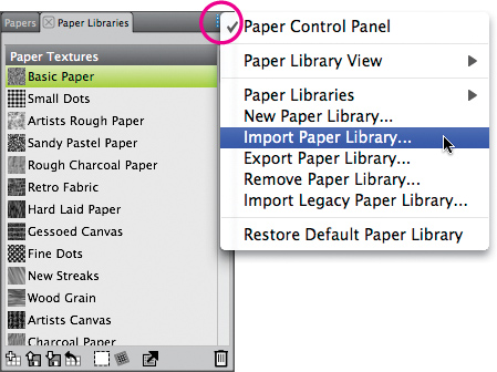
The open Paper Libraries panel showing the popped out menu where Import Paper Library is chosen
Customizing your libraries. If you find that you’re continually switching paper texture libraries, it’s probably time to use the Paper Libraries panel to compile several textures into a single custom library for your work. For instance, you can create a Paper texture library containing favorite textures that work well with Painter’s grain-sensitive Chalk and Pastel brushes—such as Basic Paper, Thick Handmade Paper and Rough Charcoal Paper (all from Painter’s default Paper Textures library), plus Rough Grain and Light Sand and Ribbed Deckle (from the Drawing Paper Textures library). The Drawing Paper Textures library can be found in the Paper Textures folder, on the Painter 12 DVD-ROM. Note: The Drawing Paper Textures library is from an earlier version of Painter—to import it, choose Import Legacy Paper Library from the menu.
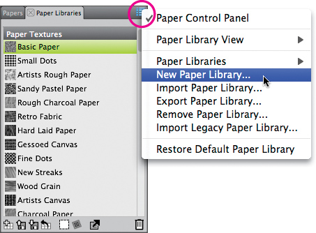
The open Paper Libraries panel showing the popped out menu where New Paper Library is chosen
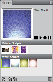
The Scripts panel showing the Painter Scripts library (top) and the custom Wow! Scripts library (bottom). The Wow! Scripts library contains special effects “macros” that can be applied to images.
Here’s how to build a custom paper library: In the Paper Libraries panel, open its pop-up menu and choose New Paper Library. (You can also click the New Paper Library button on the bottom of the Paper Libraries panel.) When the New Paper Library dialog box appears, name your new paper library. (We named ours Pastel Papers. When you click OK, the new library is automatically saved into the Paper Libraries panel, and will appear at the bottom of the panel. To copy a texture from your currently active library into the new library, click on its icon and then drag and drop the swatch into the new library.
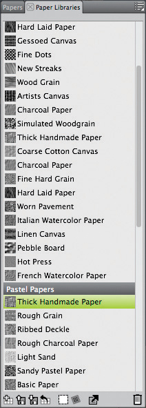
The Paper Libraries panel showing the default Paper textures library and the new Pastel Papers library
Continue adding textures to the new library in this fashion. To add a texture from another library to your new library, open the pop-up menu, choose Import Paper Library (or Import Legacy Paper Library) and open the next library that you want to draw from. (Don’t forget the libraries on the Painter Wow! and Painter 12 discs!) Your custom paper library will remain in the Paper Libraries panel even after you quit the program.
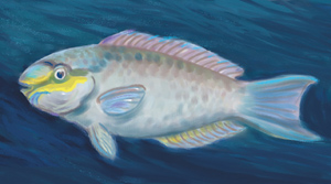
For this illustration of a Queen Parrotfish, we laid in color for an underpainting with the oil-painting brushes (including the Round Camelhair variant of Oils), and then we added texture to areas of the image by painting with grain-sensitive brushes (the Square Chalk variant of Chalk & Crayons, for instance) over the Rough Grain paper loaded from our custom Pastel Papers library.
CHER THREINEN-PENDARVIS
All media libraries work in the same way, so you can follow the above procedure. For instance, you can use the Pattern Libraries panel to create a new Patterns library that contains the only five patterns that you ever use. (See “Creating a Seamless Pattern” on page 294 to read about building a pattern using the Pattern Control and Pattern Libraries panels.) ![]()
Note: To be read as a brush library, the brush category folder and category JPEG must be inside a folder with the same name as the category.
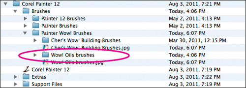
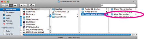
The open Corel Painter 12 application folder (shown in Mac OS X), with the Wow! Oils brushes library (created in Painter 11), copied into the Brushes folder.
Customizing a Workspace
Overview Create a new workspace; customize the new workspace by hiding and showing brushes and media variants.
THE CUSTOM WORKSPACE FEATURES in PAINTER allow you to set up Painter’s palettes, brush libraries and other art materials to suit your workflow. You can create multiple workspaces with different art material and custom palettes and import and export them.
1 Making a new workspace. To make a new workspace, begin by choosing Window, Workspace, New Workspace. Give your new workspace a name in the New Workspace dialog box (we named ours “My Watercolor Workspace”). From the Based On pop-up menu, choose a workspace (we chose Default, which would save time by opening the Colors panels and the Layers panels), and click the Save button. The screen will refresh and the new workspace will appear.
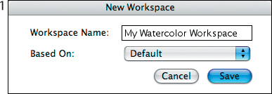
Saving a new workspace
2 Customizing the new workspace. First, display the panels that you need. If a panel is not open, choose it from under the Windows menu. Next, customize the media in your workspace: From the Window menu, choose Workspace and make sure the workspace you saved is chosen from the list. Click the Brush Selector to open the Brush Library panel. Painter 12 makes it easy to hide brush categories as follows, click its on a brush category icon or name, press the Control key to bring up the context menu and choose Hide Category. (We hid all of the categories except Digital Watercolor, Watercolor, Real Watercolor, Blenders, Gouache, and Pencils.)
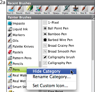
Pressing the Control key to bring up the context menu and Hide Category
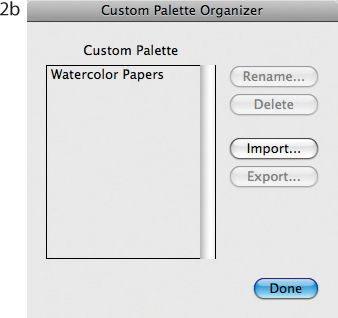
The Custom Palette Organizer dialog box showing the custom Watercolor Papers palette in the list
3 Making a custom palette. The Watercolor workspace features a custom palette that contains papers to use with watercolor. To make your own custom paper palette, choose a paper swatch from the Paper Selector in the Toolbox (or the Papers panel). Press the Shift key and drag the paper swatch from the panel—a new palette will appear. Choose another paper by dragging it off the panel and dropping it onto the custom palette. When you’ve finished adding papers, name your new palette. Choose Window, Custom Palettes, Organizer. In the Custom Palette Organizer dialog box, choose the palette name in the list and click on the Rename button, and when the Palette Name dialog box appears, name your new palette. We named ours Watercolor Papers. ![]()
Designing with Divine Proportion
Overview Open the Divine Proportion panel; set up the grid for your painting; sketch your composition.
CHER THREINEN-PENDARVIS
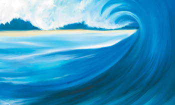
IN PAINTER, DIVINE PROPORTION helps you design compositions with the classical proportions of the Golden Rectangle (an approximate 3:5 ratio of height to width) which has been recognized by artists for centuries as pleasing to the eye. In the Barrel 2 was inspired by memories of surfing a favorite beach in San Diego. While sketching, we used a Divine Proportion grid to lay out a composition that would focus attention on the center of interest—the opening at the end of the barreling wave.
1 Opening a file and applying a grid. Begin by opening a new file for your painting. Choose File, New. In the New dialog box, type your dimensions in the Width and Height fields. To apply a grid, choose Window, Divine Proportion and click Enable Divine Proportion. Next, choose an Orientation for your composition. (To arrange the focal point of the composition in the upper right of our sketch, we clicked the Landscape Top Left button.)
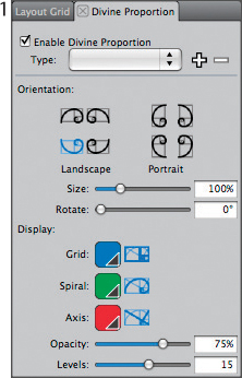
Settings in the Divine Proportion panel
2 Sketching a composition. Now choose a brush and begin sketching your composition. We chose a Sketching Pencil variant of Pencils from the Brush Selector. To view your image without the grid, turn off the Enable Divine Proportion button. To paint the wave, we used the Round Camelhair variant of Oils and customized Oils brushes. To blend and move paint, we used the Distorto variant of Distortion and the Grainy Water variant of Blenders. ![]()
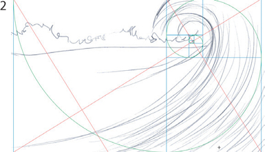
Using the grid as a guide while sketching
Gallery
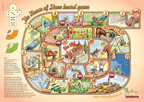
![]() The whimsical Casa di Sasso board game was created by Italian artist Athos Boncompagni and commissioned by the Tuscan holiday home Casa di Sasso (the house of stone). The game is given as a gift to the children of the Casa di Sasso guests. The game showcases the property, for example, the courtyard, panorama and the surrounding woods, and its principal character, Gino, the host of Casa di Sasso.
The whimsical Casa di Sasso board game was created by Italian artist Athos Boncompagni and commissioned by the Tuscan holiday home Casa di Sasso (the house of stone). The game is given as a gift to the children of the Casa di Sasso guests. The game showcases the property, for example, the courtyard, panorama and the surrounding woods, and its principal character, Gino, the host of Casa di Sasso.
To begin the illustration, Boncompagni drew detailed sketches of each of the sections with conventional pencil-and-paper. When the drawings were complete, he scanned them and placed them in Adobe Illustrator, where he built all of the graphics and type elements. When the graphics were complete, Boncompagni saved the file.
Next, he opened the scanned sketches in Painter. Boncompagni added a new transparent layer to his file by choosing Layers, New Layer, and he dragged the empty new layer to the top of the layer stack in the Layers panel. Working on the new layer, he used several Pens (including the Scratchboard Tool) to embellish and add color the image. Boncompagni continued the coloring process. First, he applied smooth transparent washes to the Canvas using a variety of Tinting brushes, including the Basic Round brush. Then, he modeled forms and smoothed areas using various Blenders, for instance, the Just Add Water variant. Finally, he added a few details using a small Pastel Pencil variant of Pastels.
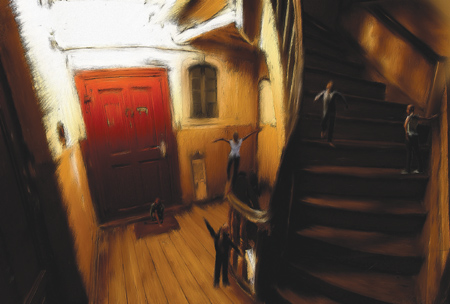
![]() Artist Alexander Jensko created Rue-de-l’eau. The image is based on a photograph that he took in the home where his grandmother lived from the 1930s through the 1980s. “The house is now in disrepair. As I stood in the staircase, memories of childhood overwhelmed me. The house is on the street named Ulica Wodna, which means ‘Water Street’ in Polish (it leads directly to the Vistula river), hence the French name,” Jensko says.
Artist Alexander Jensko created Rue-de-l’eau. The image is based on a photograph that he took in the home where his grandmother lived from the 1930s through the 1980s. “The house is now in disrepair. As I stood in the staircase, memories of childhood overwhelmed me. The house is on the street named Ulica Wodna, which means ‘Water Street’ in Polish (it leads directly to the Vistula river), hence the French name,” Jensko says.
He began the image by shooting photographs on location. Back at his studio, he created a composition that incorporated photographic elements, including the small figures, which he built in the 3D program Poser. When the composition was as he liked it, he made a copy of the file, flattened the layers and then saved the image in Photoshop format for import into Painter.
Next, Jensko opened the composition in Painter and used a variety of Blenders (such as the Grainy Water variant) to work over the images. He worked on the image Canvas. As he painted, he used the Iterative Save function in Painter to save progressive stages of the image.
To enhance the brushwork with three-dimensional highlights and shadows, Jensko used Effects, Surface Control, Apply Surface Texture using Image Luminance, with subtle settings. Finally, to finesse a few details, he used a small version of the Grainy Water variant of Blenders.
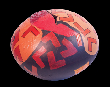
PHOTO: BOB KAY
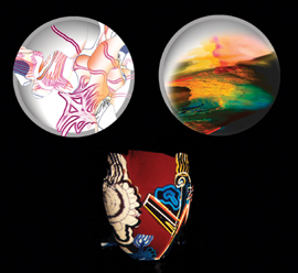
![]() “There is so much to know about color. To use it well is a real skill,” says artist Brian Gartside. Colors and shapes are the building blocks of his imagery, and he uses Painter to loosen up visually and to experiment with color. A longtime practicing potter and clay artist, Gartside uses Painter as his sketchbook and to keep himself visually fit. During his career as an artist, he has moved from painting, woodcuts, etching and silkscreen before finding his current medium—clay. Gartside is internationally renowned for developing a unique system of ceramic glazes. Sphere (above) is hand-built and decorated with textured glazes, fired to cone 6 and then embellished with a wide variety of mixed media (acrylics, oils, inks, enamel and epoxy resin). Virtual Pots (left) are examples of pots he has painted using Painter. The examples in the photograph above show his glazing technique and imagery on the actual pots. His abstract imagery is often inspired by the land and sky forms of his current home in New Zealand.
“There is so much to know about color. To use it well is a real skill,” says artist Brian Gartside. Colors and shapes are the building blocks of his imagery, and he uses Painter to loosen up visually and to experiment with color. A longtime practicing potter and clay artist, Gartside uses Painter as his sketchbook and to keep himself visually fit. During his career as an artist, he has moved from painting, woodcuts, etching and silkscreen before finding his current medium—clay. Gartside is internationally renowned for developing a unique system of ceramic glazes. Sphere (above) is hand-built and decorated with textured glazes, fired to cone 6 and then embellished with a wide variety of mixed media (acrylics, oils, inks, enamel and epoxy resin). Virtual Pots (left) are examples of pots he has painted using Painter. The examples in the photograph above show his glazing technique and imagery on the actual pots. His abstract imagery is often inspired by the land and sky forms of his current home in New Zealand.
Since the very first version of the program, Gartside has used Painter to see and mix color combinations quickly and freely. Seeing color in this way and being able to make dramatic changes quickly gave Gartside a more profound understanding of color and composition. Gartside expanded his original color experiments with later versions of Painter and now finds the new creation and manipulation of shapes, use of transparency, layers and other improved tools give him new ways to visualize. He loves the contrast of the two mediums—Painter which is all light, and clay which is grounded in earth and fire.
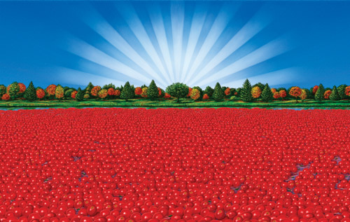
![]() Artist Delro Rosco creates illustrations for product packaging and print advertising. His work has been honored by the Society of Illustrators of New York and Los Angeles, American Illustration, the National Watercolor Society and Print magazine.
Artist Delro Rosco creates illustrations for product packaging and print advertising. His work has been honored by the Society of Illustrators of New York and Los Angeles, American Illustration, the National Watercolor Society and Print magazine.
Rosco created Cranberry Bog as feature art on the packaging for a canned food label for Aunt Nellie’s Farm Kitchen, Inc. Rosco began by drawing several sketches of the composition using conventional pencil on tissue paper. When the final design was approved by the client, he scanned the sketch into Photoshop and saved it as a TIFF file.
Opening the sketch in Painter, Rosco put the sketch on a layer by choosing Select, All and then Select, Float. He lowered the opacity for the sketch layer using the slider on the Layers panel. To aid in painting the rays in the sky, Rosco built alpha channel masks for the rays. Then, he loaded the alpha channel as a selection and laid in base colors on the sky using the Digital Airbrush variant of Airbrushes. To create more depth and interest, he varied the opacity of the airbrush as he worked, using the Opacity slider in the Property Bar.
When the general areas of color were established on the sky and landscape, Rosco used Painter’s Watercolor layers and brushes to paint glazes and to build up natural-media textures that would enhance the scene. When creating the trees in the background, Rosco found the copying, pasting and layer features helpful. For instance, he painted one tree and then selected it, copied it and pasted it back into the image as a new layer. He positioned the layer and dropped it by choosing Drop from the Layers panel menu. Then, he added more paint to blend the tree with the painting.
For the cranberries, he painted a selection of individual berries and when the illustrations were ready, he arranged the cranberries into several pleasing layer groups. Next, he copied and pasted the layer groups onto the working image, working from front to the back and adjusted their position using the Layer Adjuster tool.
When he was pleased with the arrangement of the cranberries, Rosco added final details to the painting using the Opaque Round variant of Oils, again varying the opacity to simulate transparent and opaque painting with conventional watercolor and gouache. (To learn more about using selections and masks, see the introduction to Chapter 5, “Selections, Shapes and Masks,” and for more detailed information about Layers, see Chapter 6, “Using Layers.”)
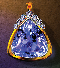
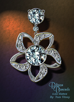
![]() Tom Tilney is a manufacturing jeweler and designer who specializes in designing with platinum and 18K gold. When Tilney is commissioned to create a new piece of jewelry for a client, he uses Painter to develop the design and to create a full-color presentation to show the client before he begins the manufacturing process. First, Tilney interviews the client to get a basic idea for the design, and for the stones and metals that are desired.
Tom Tilney is a manufacturing jeweler and designer who specializes in designing with platinum and 18K gold. When Tilney is commissioned to create a new piece of jewelry for a client, he uses Painter to develop the design and to create a full-color presentation to show the client before he begins the manufacturing process. First, Tilney interviews the client to get a basic idea for the design, and for the stones and metals that are desired.
For the example in gold, Tilney wanted to make a setting that complemented the client’s beautiful Tanzanite stone. After photographing the stone, he opened the photo in Painter. Then, he used the Pen tool to draw a shape for the border around the stone. (Later, during the manufacturing process, he would use the shape to cut a bezel to hold the stone in place.) Next, he drew the shapes that would become the yellow-gold outer portion of the pendant. To keep the shape perfectly symmetrical, he drew half of the form, duplicated it and flipped it horizontally. He moved the new segment so that the endpoints lined up with the original segment and then joined the end points. (For detailed information about working with shapes and layers, see Chapters 5 and 6.) For the diamonds along the top, Tilney used a photograph of a 10 mm stone from his Image Portfolio. He dragged the stone image from the Image Portfolio (Window, Media Library Panels, Images) and dropped it into his working image, and then he scaled it using the Effects, Orientation, Free Transform function. Then, he duplicated it to create the diamonds around the top of the piece.
Next, Tilney converted the larger shape to a layer (Shapes, Convert to Layer), and then he filled it with a custom gold gradient. To achieve a shiny appearance, and to add dimension to the gold, he used Painter’s versatile Effects, Surface Control, Apply Surface Texture effect to apply a custom gold environment map to the layer. (For information about making and applying environment maps, see Chapter 8.)
For the diamond and platinum pendant, Tilney used many of the same techniques. He used the Pen tool to draw intricate, curved shapes for the platinum and bevels. After converting the shapes to layers, he applied a custom platinum gradient to them. To achieve the look of shiny white metal, he used special environment maps that complemented the platinum-colored metal.
To complete both presentations, Tilney added artistic, textured backgrounds by choosing Effects, Surface Control, Apply Surface Texture, Using Paper and subtle settings. Then, he used the Create Drop Shadow effect to apply a soft offset shadow to each background.
![]() Known for his sensitive use of light combined with layered, luminous shadow areas in his paintings Dennis Orlando has been given the moniker “The Modern Impressionist.” For Tropical Flowers, he painted using the Artist Pastel Chalk variant of Pastels, Blenders and Oils brushes.
Known for his sensitive use of light combined with layered, luminous shadow areas in his paintings Dennis Orlando has been given the moniker “The Modern Impressionist.” For Tropical Flowers, he painted using the Artist Pastel Chalk variant of Pastels, Blenders and Oils brushes.
Orlando began the painting by setting up the still life. When the arrangement was as he liked it, he roughed in his composition, and then established the values and base color using grainy pastel strokes, working over the entire image. To suggest a tropical mood, he used a warm palette with deep shadow colors and brighter, saturated highlights. For more activity in the color, Orlando increased the Color Variability for the Artist Pastel Chalk, and then he laid in more brush strokes. When he was pleased with the color, he pulled and blended colors into one another using the Grainy Water variant of the Blenders.
For the look of wet paint, Orlando used a favorite modified Oils variant, which allowed him to add color and blend as he painted. This brushwork is most evident in the background and on the flowers and leaves. To finish the painting, he used a small version of the custom Oils brush to add crisp details to the prominent flowers. Finally, he used the Artist Pastel Chalk to paint a few more grainy highlights on the flowers and table cloth.
To print the image, Orlando worked with a fine art atelier to order a large fine art print on canvas. Back at his studio, he carefully embellished the digital print with conventional oil paint.
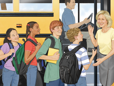
![]() Award-winning artist Don Stewart specializes in book illustration and commissioned portraits. For many years he worked on gessoed illustration board with airbrush and colored pencil. Today uses Painter’s brushes that match his traditional tools. Stewart was commissioned to create Boarding the Bus, an illustration for a children’s reader textbook published by Oxford University Press. Stewart began the illustration by making a tight drawing in Painter using the Sharp Pencil variant on Fine Grain paper. Next, so that he could protect areas while he painted, he isolated the important elements in his sketch by making selections with the Lasso (for example, the children’s clothes and their skin, and the bus). He loaded a selection for an element (Select, Load Selection) and then he chose a medium-grained canvas texture and laid in colored washes using the Wash Camel variant of Watercolor. When the watercolor brushwork was complete, he added a new layer by clicking the New Layer button on the Layers panel. He loaded each selection again, and then he added richer color and values to each element with Painter’s Airbrushes. He used the Digital Airbrush to paint smoother areas (the skin, for instance). When the subjects were modeled, he added highlights and details using the Sharp Chalk variant of Chalk & Crayons (the highlights in the hair, for instance). To add texture to the shadows, he painted with subtle colors using the Wash Camel and Sharp Chalk brushes over the medium-grained canvas texture.
Award-winning artist Don Stewart specializes in book illustration and commissioned portraits. For many years he worked on gessoed illustration board with airbrush and colored pencil. Today uses Painter’s brushes that match his traditional tools. Stewart was commissioned to create Boarding the Bus, an illustration for a children’s reader textbook published by Oxford University Press. Stewart began the illustration by making a tight drawing in Painter using the Sharp Pencil variant on Fine Grain paper. Next, so that he could protect areas while he painted, he isolated the important elements in his sketch by making selections with the Lasso (for example, the children’s clothes and their skin, and the bus). He loaded a selection for an element (Select, Load Selection) and then he chose a medium-grained canvas texture and laid in colored washes using the Wash Camel variant of Watercolor. When the watercolor brushwork was complete, he added a new layer by clicking the New Layer button on the Layers panel. He loaded each selection again, and then he added richer color and values to each element with Painter’s Airbrushes. He used the Digital Airbrush to paint smoother areas (the skin, for instance). When the subjects were modeled, he added highlights and details using the Sharp Chalk variant of Chalk & Crayons (the highlights in the hair, for instance). To add texture to the shadows, he painted with subtle colors using the Wash Camel and Sharp Chalk brushes over the medium-grained canvas texture.
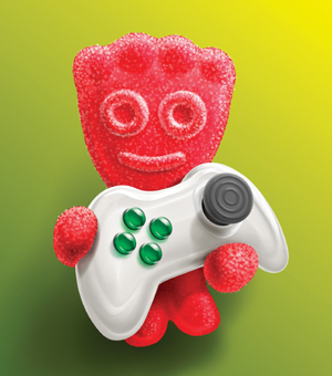
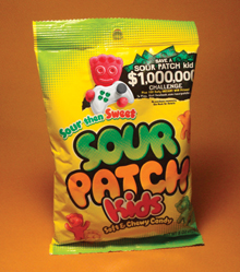
![]() Award-winning illustrator Michael Bast has worked with conventional art tools for many years. Since 1990 he has painted digitally using Painter’s brushes and art materials. Bast loves Painter because it allows him to capture the warmth and texture of his favorite conventional media.
Award-winning illustrator Michael Bast has worked with conventional art tools for many years. Since 1990 he has painted digitally using Painter’s brushes and art materials. Bast loves Painter because it allows him to capture the warmth and texture of his favorite conventional media.
To begin the Sour Patch Kids package illustration, Bast drew a detailed sketch using conventional pencils and paper, and then he scanned the drawing. He opened the sketch in Painter and cut it to a layer by choosing Select, All and Select, Float.
Before Bast began to paint his illustration, he used the Pen and Shape tools to draw vector shapes for the body of the Sour Patch character and the controller, using the sketch as a guide. Then, he converted each shape into a selection by choosing Shapes, Convert to Selection, and he saved each selection as an alpha channel by choosing Select, Save Selection. Bast also made a copy of each vector shape and converted each of them to a layer by choosing Shapes, Convert to Layer. For information about working with selections, shapes and masks, see Chapter 5, “Using Selections, Shapes and Masks.” For information about working with layers and shapes, see Chapter 6, “Using Layers.”
Using a process similar to working with a conventional Airbrush and friskets, he sprayed color within selected areas. To paint the character and controller, Bast primarily used the Digital Airbrush variant of Airbrushes to lay in base colors and to model forms. Bast likes this brush because it is easy to build up areas of color and tone. For the subtle underlying texture on the candy character, he switched to the Pepper Spray variant of Airbrushes.
Bast planned to paint the sugar granules on the character using the Image Hose. He created a custom Image Hose nozzle that incorporated photographs of sugar granules. To spray the sugar onto the character, he loaded each selection and then sprayed varied sizes of the granules onto the image. For more information about using the Image Hose, see “Creating a Color-Adjustable Leaf Brush” on page 311.
To model the smooth forms on the controller, he loaded each selection and then painted with the Digital Airbrush variant of Airbrushes. For the highlights on the shiny plastic, he used the Distorto variant of F-X. In areas where he wanted to recontour shapes (for example, the silhouette of the character), he used the Pinch variant of F-X. As a last touch, Bast created a deeper illusion of space by adding a new layer and using the Digital Airbrush to paint a soft-edged gradient behind the subject.