2. The Power of Color
Introduction
“COLOR, THE FRUIT OF LIGHT, is the foundation of the painter’s means of painting—and its language.” Abstract painter Robert Delaunay’s observation mirrors our own appreciation of color as an expressive and essential element of the visual arts. Getting the most out of Painter’s powerful color tools is an important first step for those of us who work with “the fruit of light.”
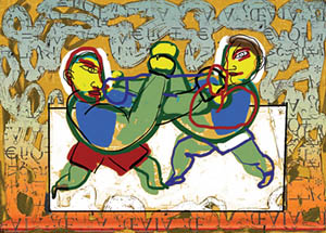
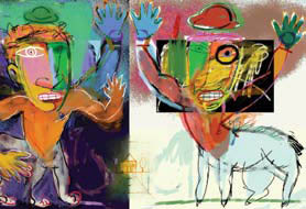
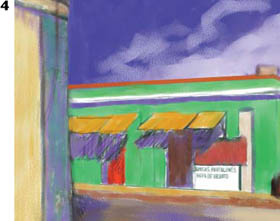
For Boxers, Susan LeVan used saturated colors in contrast with monochromatic values to communicate emotion. To see more of her work, turn to Chapter 5.
Hue, Saturation and Value
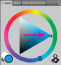
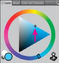
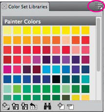
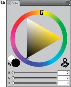
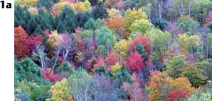
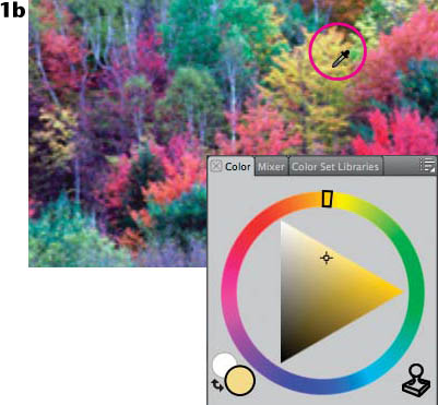
Exploring the Color panel. Painter’s interface for choosing color is built around a model that uses hue, saturation and value (HSV) as the three basic properties of color. The program is designed so that you’ll typically first choose a hue, then alter it by changing its saturation or value. Painter’s Color panel is designed to work with these properties, but the program also allows you to work in RGB (red, green, blue) color space if you prefer. If the Color panel is not open, choose Window, Color Panels, Color to open it. Painter 12 displays Color Info sliders on the Color panel, and by default, the sliders display RGB colors. To view HSV values rather than RGB choose HSV Color by clicking the button in the upper right on the Color panel and choosing HSV.
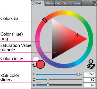
The Color panel with Hue ring, opened by choosing Window, Color Panels, Color
Hue. The term hue refers to a predominant spectral color, such as red or blue-green. Hue indicates a color’s position on the color wheel or spectrum, and also tells us the color’s temperature. A red-orange hue is the warmest color; a blue-green hue is the coolest. (Keep in mind, though, that temperatures are relative. Blue-violet is a cool color, but it warms up when it’s placed next to blue-green.)
A pigment-based color wheel

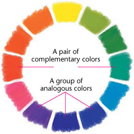
In the traditional pigment-based color system, red, yellow and blue are primary hues—colors that cannot be obtained by mixing. Secondary hues—green, orange and violet—are those colors located midway between two primary colors on the color wheel. Yellow-green, blue-violet and red-orange are examples of tertiary hues, each found between a primary and a secondary color.
Analogous hues are adjacent to each other on the color wheel and have in common a shared component—for instance, blue-green, blue and blue-violet. Complementary hues sit opposite one another on the color wheel. Red and green are complements, as are blue and orange. (Painter’s Hue ring and bar are based on the RGB components of the computer screen; they don’t exactly match a traditional pigment-based color wheel.)
To change hues in Painter’s Color panel, drag the little circle on the Hue ring or click anywhere on the ring.
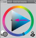
Saturation. Also known as intensity or chroma, saturation indicates a color’s purity or strength. The most common way of changing a color’s saturation is by adjusting the amount of its gray component. In the Saturation/Value triangle, move the little circle to the left to desaturate a color, or to the right to saturate it. Fully or very saturated colors—those at or near the tip of the Saturation/Value triangle—won’t print the way they look on the screen. If you want to see colors closer to their printed equivalents while you paint, the Canvas, Color Management command can help. (See the “Color Management” tip on page 38 of this chapter and the Painter 12 Help Menu.)
New in Painter 12, the Temporal Colors palette is a floating color palette that you can display on the image, allowing colors to be chosen based on the colors in the image. The elements of the Temporal Colors palette are similar to the Color panel, allowing you to choose a color from the Hue ring and then adjust it using the Saturation/Value triangle. To display the palette, open an image, position the cursor where you want the palette to appear, and then press Ctrl/Alt-1 (Windows) or ![]() /Option-1 (Mac). To choose a color on the Temporal Colors palette, click on the Hue ring, then click on the Saturation/Value triangle to select the tint or shade of the color.
/Option-1 (Mac). To choose a color on the Temporal Colors palette, click on the Hue ring, then click on the Saturation/Value triangle to select the tint or shade of the color.
The Temporal Colors palette is displayed over the image; selecting a color tint.
Saturating a color
Desaturating a color
Creating a shade of a color
Creating a tint of a color
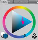
Value. A color’s lightness or darkness is its luminance or value. To create a tint of a color (lightening it, or increasing its value), move the little circle higher in the Saturation/Value triangle. To create a shade of a color (darkening it, or decreasing its value), move the little circle lower in the Saturation/Value triangle.
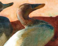
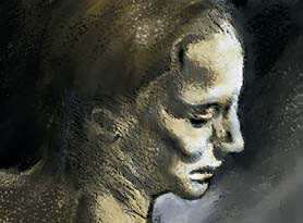
As you can see in this detail of Decoys, Richard Noble used saturated color and strong value contrast to paint a bright morning light on his subject. To see more of Noble’s work, turn to the galleries at the end of this chapter and Chapter 3.
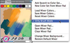
The pop-up menu allows you to save Mixer Colors, add them to a Color Set, and more.
Putting HSV to Work
Here are several practical suggestions and creative solutions for solving artistic problems using hue, saturation and value.
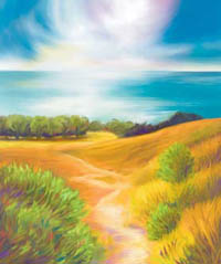
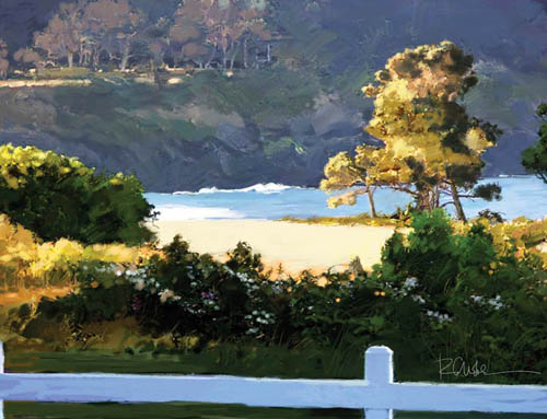
An example of atmospheric perspective. The illusion of distance is enhanced in Along Tomales Bay because the distant hills are painted with reduced saturation and less value contrast.
CHER THREINEN-PENDARVIS
Reduce saturation and value to indicate distance. Artists have been creating atmospheric (or aerial) perspective in their work for thousands of years. Hills we see in the distance have less intensity than nearer hills, and they also have less variation in value. This effect increases in hazy or foggy conditions. To depict this in your art, you can reduce the color saturation and value range as the landscape recedes from the foreground.
Use saturation to indicate time of day. At dawn or dusk, colors appear to be less saturated, and it becomes more difficult to distinguish colors. At noon on a bright sunny day, colors seem saturated and distinct.
Use color temperature to indicate distance. The eye puts warm colors in front of cool colors. For example, orange flowers in the foreground of a hedge appear closer than blue ones.
A study in value contrast, based on a drawing by Michelangelo
Create drama with light-to-dark value contrast. Baroque and Romantic period artists as diverse as Caravaggio, Zurbarán, Géricault and Rembrandt are known for their use of extreme light-to-dark contrast. They accomplished this by limiting their palette to only a few hues, which they either tinted with white or shaded by adding black. A close look at the shadows and highlights that these artists created reveals complex, modulated tone. Digital artists can use Painter’s Apply Lighting feature (from Effects, Surface Control) to add a dramatic splash of contrast to an image and also to unify a painting’s color scheme, although achieving genuine tonal complexity requires additional painting.
To paint dramatic billowing clouds in Path to Water West, we blended color by using the Smeary Palette Knife variant of Palette Knives, and the Grainy Water variant of the Blenders.
CHER THREINEN-PENDARVIS
Use complementary colors to create shadows. The Impressionists, Monet, Renoir and Degas frequently avoided the use of black in the shadow areas of their paintings. They embraced a more subjective view of reality by layering complementary colors to create luminous shadows.
Neutralize with a complement or gray. One way to tone down a hue is to paint on top of it with a translucent form of its complement. El Greco painted his backgrounds in this manner to draw attention to more saturated foreground subjects. Try painting with a bright green hue, and then glaze over it with a reduced opacity of red. The result will be an earthy olive. You can also neutralize a hue using shades of gray, as did the French artist Ingres. Although he often limited his palette to red, blue, gold and flesh tones, he created the illusion of a larger palette by adding varying proportions of gray and white.
Blending, pulling and thinning colors. Subtle changes in hue and saturation take place when colors are blended in a painting. You can use the Just Add Water, Grainy Water or Smudge variant of the Blenders (from the Brush Selector) to blend, for instance, two primary colors (red and blue) to get a secondary color (violet). For a more dramatic blending, you can pull one color into another by using the Smeary Palette Knife variant of the Palette Knives. Artists using traditional tools often thin paint by mixing it with an extender. In Painter, you get a similar effect by reducing a brush’s Opacity in the Property Bar.
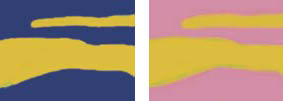
Simultaneous contrast at work. Notice how the gold looks brighter next to the dark blue than it does next to pink.
Draw attention with simultaneous contrast. If two complementary colors are placed next to one another, they intensify each other: Blue looks more blue next to orange, and white looks more white next to black. In the 1950s, Op artists used the principle of simultaneous contrast to baffle the eye. Advertising art directors understand the power of simultaneous contrast and use it to gain attention for their ads.
Use a family of colors to evoke an emotional response. You can create a calm, restful mood by using an analogous color theme of blues and blue-greens. Or develop another family of hues using reds and red-oranges to express passion and intensity. You can also use a color family to unite the elements of a composition.
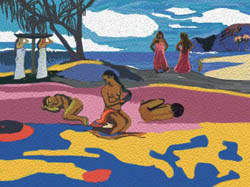
A landscape with figures, based on Mahana no atua (The Day of the God) by Paul Gauguin
Create your own color world. Post-Impressionist Paul Gauguin (among others) created a powerful, personal color language by combining several of the above techniques. He used warm, bright colors to bring a subject forward in his composition, and used cool, dark colors to convey distance and mystery. He also made the bright foreground colors seem brighter by surrounding them with darker, more subdued colors.
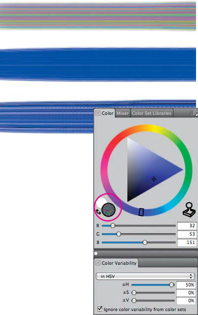
These brushstrokes were painted with the Round Camelhair variant of the Oils with the following settings in the Color Variability palette: top brushstroke, Hue slider only set to 50%; middle, Saturation slider only set to 50%; bottom, Value slider only set to 50%. The Color Variability palette shows the settings for the top brushstroke painted with the Round Camelhair.
Painting with Multiple Colors
Painter’s Brush Selector has several brushes that can paint with more than one color at a time if you use the settings in the Color Variability panel (Window, Brush Control Panels, Color Variability). Brushes with the Rake or Multi stroke type or the Bristle Spray, Camel Hair or Flat dab types have the capability to paint with multiple colors. The Van Gogh variant of the Artists brush and the Round Camelhair variant of the Oils are examples. See the “Using the Mixer panel” tip on page 32 to learn how to pick up multiple colors from the Mixer pad and apply them to your images.
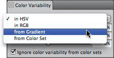
Randomize colors with Color Variability. To see how multicolor works, open the Color Variability panel by choosing Window, Brush Control panels, Color Variability. (Make sure that “in HSV” is chosen in the pop-up menu.) From the Brush Selector, choose the Round Camelhair variant of the Oils; its Camelhair dab type has the potential to carry a different color on each brush hair. Choose a color in the Color panel and begin painting. Then experiment by adjusting the Hue (±H), Saturation (±S) or Value (±V) slider in the Color Variability panel and painting again.
For transparent Watercolor washes with variable color, try the Diffuse Grainy Camel and the Wash Bristle. Both of these brushes have the potential to carry a different color in each brush hair.
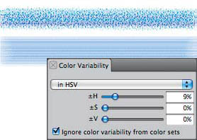
These brushstrokes were painted with the Diffuse Grainy Camel (top) and the Wash Bristle (bottom) variants of Watercolor with a Hue variability of 10%.
Also try the Scratchboard Rake variant of the Pens. The Scratchboard Rake incorporates the Rake stroke type; each “tine” of a Rake brush can paint with a different color. In the Color Variability panel, set Hue to 10% (for a subtle variation) or much higher (for a rainbow-like effect) and make brushstrokes on your image.
Use Color Variability based on a gradient. With Painter, you can paint with multiple colors from a gradient instead of using completely random Color Variability. To begin, set all the Color Variability sliders to 0; open the Color panel and set up the colors for a two-point gradient by clicking on the front color rectangle and selecting a color, and then clicking on the back color rectangle and selecting a color. Open the Gradients panel by choosing Window, Media Control Panels, Gradients. In the Gradients panel, choose Two-Point from the picker. From the Brush Selector, select the Oils category and the Opaque Bristle Spray variant. In the Color Variability panel, choose From Gradient from the pop-up menu, and then make brushstrokes on your image.
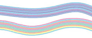
These brushstrokes were painted with the Scratchboard Rake variant of the Pens with an increased Hue variability of 10% (top) and 50% (bottom). Each “tine” of this Rake brush can carry a different color.
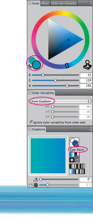
Brushstroke painted with the Opaque Bristle Spray variant of the Oils using Color Variability based on the current gradient
Choosing Color Variability from Gradient
Use Color Variability based on a color set. You can create a special Color Set containing a few colors and then use those colors when painting. Begin by opening the Color Variability panel (Window, Brush Control Panels, Color Variability); set Color Variability to “in HSV” and the ±H, ±S, and ±V sliders to 0. Open the Color Set panel (Window, Color Panels, Color Sets) and choose the New Color Set button (the “Grid”). The Color Sets panel will contain one swatch based on the current color. To add more colors, choose a new color in the Color panel. Click on the Add Color to Color Set button (the “Plus”) to add the chosen color to the Color Set. Continue to select and add more colors by using the Color panel and clicking the “Plus” button. Choose the Smeary Flat variant of the Oils, and in the Color Variability panel, set Color Variability to “from Color Set.” Paint brushstrokes on your image. To learn more about color sets, turn to “Keeping Colors in Color Sets,” on page 39 and to “Capturing a Color Set,” on page 44.
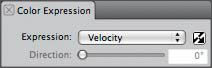
Change colors with stylus pressure. Use your pressure-sensitive stylus to paint in two colors. Start by choosing the Acrylics category and the Captured Bristle variant. In the Color Expression panel, choose Pressure from the Controller pop-up menu. In the Color panel, click on the front color rectangle and choose a bright blue color. Click the back color rectangle and select a rose color. If you paint with a light touch, you’ll be painting in rose. If you press heavily, the stroke turns blue. (If the balance between the two colors seems uneven, choose Corel Painter 12, Preferences, Brush Tracking. Make a typical brushstroke in the Scratch Pad area, click OK, and then try the graduated version of the Captured Bristle variant again.)
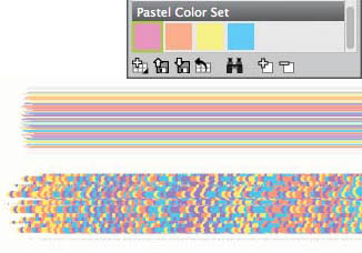
Brushstrokes painted with the Smeary Flat (above) and the Dry Ink (below) variants of the Oils using Color Variability based on the Color Set shown here
Making Color Adjustments
Painter offers several ways to modify color in scanned photos or in your artwork after you have created it. To see the results of your choices in many of the dialog boxes that are involved in color adjustments, you’ll need to click and drag in the Preview window.
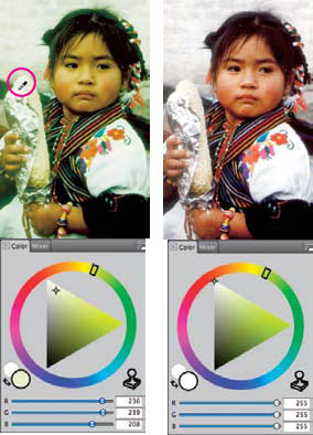
Before and after: Sampling in the image with the Dropper to determine the color cast of a bright highlight on the aluminum foil reveals these values: Red: 236, Green: 239, and Blue 208 (left); the corrected image (right) with pure white highlights shows Red, Green and Blue values of 255.
Correct Colors. Do you see an unnatural color cast in your image? The Correct Colors, Curve feature can help you fix this problem. This feature is especially useful when working with scanned photos, for instance.
To adjust an image so that the brightest highlights are pure white, begin by analyzing the color cast. (To ensure that the Main Color circle (front) in the Color panel will show the color you are about to sample, make sure that “in HSV” is chosen from the menu in the Color Variability panel.) Use the Dropper tool to sample a bright highlight in your image. In the Color panel, click on the HSV values box to toggle to RGB values. Check the RGB values in the Color panel. In our example (shown at the left), the color and numbers show that the unwanted color cast is green, because the G value is higher than the R and B values. A bright white should have R, G and B values of 255 in the Color panel. Choose Effects, Tonal Control, Correct Colors and choose Curve from the pop-up menu in the Color Correction dialog box. Curve will allow you to adjust the individual RGB values. Click on the small square icon for the color that you want to adjust. (We clicked on the Green color icon—to constrain the adjustment to only the green values in the image.) Then, position the crosshair cursor over the diagonal line, and when you see the hand cursor appear, pull down and to the right. Pulling down (as shown) will decrease the selected color in the image. Click the Reset button to try out another adjustment without leaving the dialog box.
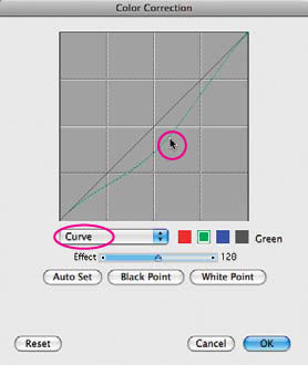
Pull the Green color curve in the Color Correction dialog box to lessen the green cast in the image above. Light colors are represented at the upper right and dark colors in the lower left. The biggest change in color occurs at the point where you pull the curve. If you pull the dot, the color you sampled will be affected most. The Effect slider controls how much of the curve will change when you pull on it. Move the slider to the right to affect a broad range of tones. Move the slider to the left to affect a narrower range of tones.
Adjust Colors. To change the hue, saturation or value of all of the colors in an image, choose Effects, Tonal Control, Adjust Colors. Experiment with the sliders and view the changes in the Preview window. Adjust Colors is also useful for quickly desaturating a full-color image—making it look black-and-white. To desaturate an image, move the Saturation slider all the way to the left.
Adjust Selected Colors. You may want to make color adjustments—in particular, color ranges of your image. Painter’s Adjust Selected Colors feature lets you make dramatic changes (turning a blue sky yellow) or more subtle ones (removing the red cast from a subject’s face). Choose Effects, Tonal Control, Adjust Selected Colors. When the dialog box opens, click in your image (not in the Preview window) on the color you want to change. Adjust the Hue Shift, Saturation and Value sliders at the bottom of the dialog box. When the targeted color is changed to the color you want, use low settings on the Extents sliders to limit the range of colors that are adjusted. Use the Feather sliders to adjust transitions between colors: 100% produces soft transition; 0% gives abrupt ones.
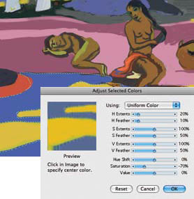
Using Adjust Selected Colors to neutralize a bright blue
Color Overlay. Found under Effects, Surface Control, the Color Overlay dialog box lets you tint an image with a color using either a Dye Concentration model (which applies transparent color) or a Hiding Power model (which covers the image with the opaque color). With either model you can add texture by choosing Paper in the pop-up menu, as we did in the illustration at the left. When using the Dye Concentration model, adjust the Amount slider to control the density of the color from 0% for no effect to 100% or −100% for full transparent coverage. The Hiding Power model operates differently. You can add color using a plus value, or pull color out of an image using a minus value. Try this to see how it works: Open a new image and use the Rectangular Selection tool to make a selection. Choose a yellow-green in the Color panel (approximately R 185, G 255, B 100). Fill the selection using Effects, Fill, Current Color. Choose yellow in the Color panel (ours was R 247, G 246, B 100) and then choose Effects, Surface Control, Color Overlay, Using Uniform Color and Hiding Power. Move the Opacity slider to 100% to see the yellow completely cover the yellow-green. Finally, move the Opacity slider to 0% to the see the yellow disappear from the original green. A negative percentage (−50) will remove more yellow from the original green.
In this image, we applied the Darken composite method to the leaf layer.
Dye Concentration. With Effects, Surface Control, Dye Concentration you can add or remove pigment from your image. Setting the Maximum slider above 100% increases the density of the existing pigment. When you choose Paper in the Using menu, the Maximum slider controls the amount of dye on the peaks and the Minimum slider controls the amount of dye in the valleys of the texture.
We added colored texture to this photo with Color Overlay.
PHOTO: PHOTODISC
Negative. Creating a negative of all or part of an image can have dramatic, artistic purposes—such as in the detail of Susan LeVan’s illustration, at left. Choose Effects, Tonal Control, Negative to convert your image or a selected part of it.
Susan LeVan used Effects, Tonal Control, Negative on the left side of the background of Guardians as shown in this detail. After creating the negative side of the image, she drew over portions of the left side to make the character unique.
Output Preview and Video Colors. Your monitor can display more colors than can be reproduced in the four-color printing process, and if you are creating images for video, some highly saturated colors will not make the transition from computer to video. It’s a good idea to convert your out-of-gamut colors while you’re in Painter so there won’t be any surprises. Choose Canvas, Color Management Settings or Effects, Tonal Control, Video Legal Colors, depending on whether your image is destined for paper or video. For more information about output for printing, turn to Chapter 11, “Printing Options.”
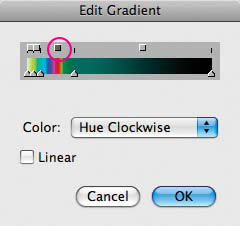
Here is the Edit Gradient dialog box with Painter’s Strange Neon gradient, and the Linear box is unchecked. When you click a square hue box above the Gradient, the Color hue pop-up menu appears. Here it’s set to Hue Clockwise, resulting in a tiny spectrum below the square hue box.
More Color Tools
Adding color with Gradients. Painter’s powerful Gradients panel lets you fill selected areas with preset gradations or ones that you’ve created. (See “Adding Color and Gradations to Line Art” later in this chapter.) You can also colorize an image with a gradation using Express in Image from the pop-up menu at the right side on the Gradients panel. To see an example of this technique, turn to “Creating a Sepia-Tone Photo” in Chapter 7.
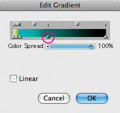
Click on a color control point triangle, and the Color Spread slider will appear. Adjust it to control the smoothness between the colors.
The gradient editor is a powerful tool for creating custom color ramps. You can’t use this tool to alter all of Painter’s existing gradations. However, it is used primarily for creating new ones. Choose Window, Media Control Panels, Gradients to open the panel; then click the button on the upper right corner, and choose Edit Gradient from the pop-up menu to bring up the gradient editor. Select one of the triangular color control points and choose a color from the Color panel. The color ramp will update to reflect your choice. Add new color control points by clicking directly in the color bar; the triangular control points are sliders that can be positioned anywhere along the ramp. To delete a control point, select it and press the Delete key; click on the gradient bar to add a new control point. Clicking on any of the squares above the gradient displays the Color menu; experiment with the options available there to get quick rainbow effects in the section of the gradient indicated by the square. To store the new gradient in the Gradients panel, choose Save Gradient from the pop-up menu on the right side of the Gradients panel.
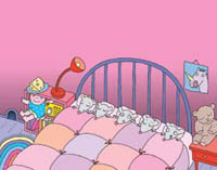
Linda Davick uses gradient fills to give her illustrations depth, as shown here in Mice. Read about Davick’s technique in “Adding Color and Gradations to Line Art” on page 40 of this chapter.
A Set with names displayed in List View
Coloring images. You can color images or selected parts of images using either Effects, Fill (Ctrl/![]() -F) or the Paint Bucket tool. The Fill command lets you fill your image with a color, a gradient, a clone source (if one is available), a pattern (if no clone source is available) or a weave. The Paint Bucket gives you the same fill options. (The Paint Bucket options appear on the Property Bar when you select the Paint Bucket tool.) Cartoonists and others who fill line art with color will want to explore the Lock Out Color feature (to preserve black line art, for example) made available by double-clicking on the Paint Bucket tool icon in the Tools palette. For more information about Lock Out Color and Cartoon Cel fills, see the Painter 12 Help Menu.
-F) or the Paint Bucket tool. The Fill command lets you fill your image with a color, a gradient, a clone source (if one is available), a pattern (if no clone source is available) or a weave. The Paint Bucket gives you the same fill options. (The Paint Bucket options appear on the Property Bar when you select the Paint Bucket tool.) Cartoonists and others who fill line art with color will want to explore the Lock Out Color feature (to preserve black line art, for example) made available by double-clicking on the Paint Bucket tool icon in the Tools palette. For more information about Lock Out Color and Cartoon Cel fills, see the Painter 12 Help Menu.
In H is for Hell-bent Haddocks (shown here as a detail), Keith MacLelland used the Paint Bucket to create a background of filled squares. To see more of MacLelland’s work, turn to the gallery in this chapter.
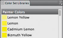
The Color Sets panel with Painter Colors as the current color set
Keeping colors in Color Sets. Painter can store your most frequently used colors in a Color Set. Painter Colors is the default set. Switch Color Sets by clicking on the Library Access button (the grid) in the Color Sets panel. You’ll find more Color Sets (including several Pantone sets) in the Color Sets folder on the Painter 12 application folder. For more about Color Sets, turn to “Capturing a Color Set” on page 44. ![]()
Adding Color and Gradations to Line Art
Overview Draw line art with the 1-Pixel Pen variant; use the Paint Bucket to fill areas with flat color and gradations; add highlights with the Airbrushes.
LINDA DAVICK
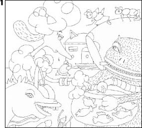
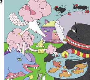
FILLING LINE ART WITH COLOR AND GRADATIONS is slick and efficient in Painter, using what children’s book illustrator Linda Davick calls “the coloring-book technique.” Davick employed the Paint Bucket tool when creating the illustration Fish Fry for Debbie Smith’s Beauty Blow-Up.
1 Creating a black-and-white line drawing. From the Brush Selector panel, choose the Pens, 1-Pixel variant. Choose Window, Brush Control Panels, General and in the General panel choose the Flat Cover subcategory. Flat Cover lets you draw a solid-color line, creating the necessary barriers for this technique that fills all neighboring pixels of the same color. Choose black in the Color panel and draw your line art, making sure all your shapes are completely enclosed with black lines. If you need to correct your work, switch the color to pure white in the Color panel and erase.
Line art created with the 1-Pixel variant of the Pens brush, shown here as a detail
2 Filling with flat color. To test color choices and tonal values, you can fill areas of your illustration with flat color. So the color is flat and not affected by settings in the Color Variability palette, choose Window, Brush Control Panels, Color Variability to open the Color Variability palette, and choose “in HSV” from the pop-up menu. Set the ±H, ±S and ±V sliders to 0. Now choose the Paint Bucket tool, and in the Property Bar, click the Fill Image button and under the Fill menu, Current Color. Turn off Anti-Alias. Choose a color, and then click in the area of your drawing that you want to fill. Since the Paint Bucket fills all neighboring pixels of the same color, you can refill by choosing another color and clicking again. If you’re filling small areas, it’s important to know that the Paint Bucket’s “hot spot” (where it fills from) is the tip of the red paint in the icon. Davick filled all areas except Zuba’s (the pink poodle) face using this method.
Filling the drawing with flat color
3 Adding color ramps. To fill the background with a gradation, open the Gradients panel (Window, Media Control Panels, Gradients). Choose Two-Point from the picker on the front of the panel and click the Linear Gradient button (from the four Types buttons to the right of the Gradient Preview), and set an angle for your fill by moving the slider. In the Color panel, choose colors for both the front and back Color rectangles. (Click on the front Color rectangle and select a color; then click on the back Color rectangle and select a color.) With the Paint Bucket chosen, in the Property Bar, click the Fill Image button, and from the Fill menu, choose Gradient. Finally, to apply the gradation, click in the area that you want to fill. Davick filled the largest background sky area with a linear gradation.
Setting up the Two-Point linear gradient for the sky behind Zuba
Filling the background with the gradient
4 Duplicating color ramps. To duplicate the large background gradation in each of the smaller background shapes—to the right of Zuba, and under the ants—Davick created a new gradation using color sampled from areas in the background gradation. She then filled the smaller background shapes with the new gradation. If you need to do this on the “negative” shapes in your image, first check the Color panel to make sure that the Color rectangle that contains the starting color of your original gradation is selected. Choose the Dropper tool and position it over the gradation in your image at approximately the same height as the top of the negative area that you want to fill. Click in the gradation to sample the color. To sample the bottom portion of the gradation, select the other Color rectangle; then position and click the Dropper at about the same height as the bottom of the area to be filled. Click in the negative area using the Paint Bucket to fill with the new sampled gradation. (If you need to refill, undo the fill—Edit, Undo Paint Bucket Fill—before you fill again.)
Sampling the gradient across from the top of the area to be filled (a); sampling across from the bottom of the area to be filled (b); filling the area with the gradation (c). Repeat this process for each flat color (negative) area to be filled.
5 Painting airbrush details. Davick finished the piece by painting with the Digital Airbrush variant of the Airbrushes within roughly circular selections to add details to Zuba’s face and fur. You can make roughly circular selections using the Lasso tool by choosing the Lasso tool and dragging in your image. (To read more about selections, turn to the beginning of Chapter 5, “Selections, Shapes and Masks.”) Now use the Digital Airbrush to add dimension. Paint along the edge of the animated selection marquee. Davick used the same Airbrush with unrestricted strokes to add other details in other areas, such as on the cat’s face and paws. ![]()
Adding dimension to Zuba’s hair using the Digital Airbrush inside a selected area
Coloring a Woodcut
Overview Create black-and-white art; float it and apply the Gel Composite Method; view the black-and-white art as you add colored brush work and texture to the original canvas layer.
CHET PHILLIPS
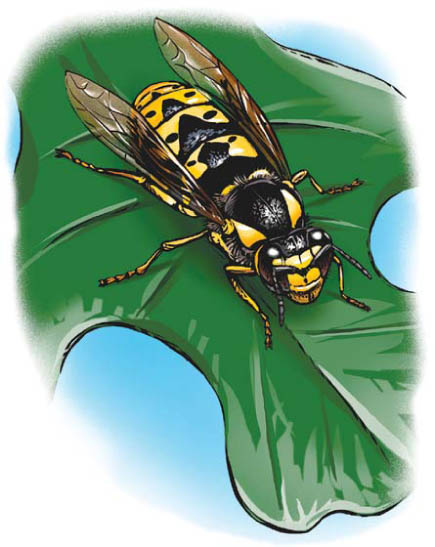
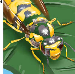
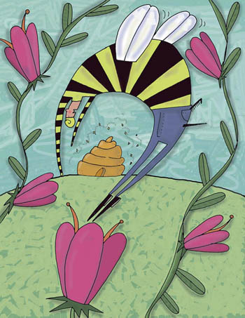
HERE’S A CREATIVE WAY TO ADD COLOR to black-and-white art, a favorite technique of artist Chet Phillips. Yellow Jacket (above), is one of eighty illustrations that Phillips created for The Bug Book, written by entomologist Hugh Danks. The book showcases different nature environments and the insects that inhabit those spaces.
For Yellow Jacket, Phillips used the Gel Composite Method, which makes the white areas of a layer appear transparent. After drawing in black-and-white on the Canvas, he floated the drawing to a layer, and then added color on the canvas using a palette of vibrant greens and golds with accents of orange and brown.
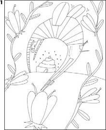
1 Creating black-and-white art. Phillips is known for his expressive drawing with the Scratchboard Tool, a versatile brush that draws lines of variable thickness, based on the pressure applied to the brush. He created a black-and-white drawing in Painter by first filling the image with black color and then etching into the black fill with white color. To draw as Phillips did, start a new document with a white background. Choose black for the Main color (front color swatch) in the Color panel, and then click on the Additional Color (back color swatch) and choose white. Select the black front color swatch by clicking on it, and then choose Edit, Fill (Ctrl/![]() -F), Fill with Current Color. Click OK. In the Color panel, click the Color Swap icon (the arrows) to reverse the colors and choose White as the Main Color. Use white and the Scratchboard Tool variant of the Pens to “etch” into the black fill, with the look of a detailed woodcut in mind.
-F), Fill with Current Color. Click OK. In the Color panel, click the Color Swap icon (the arrows) to reverse the colors and choose White as the Main Color. Use white and the Scratchboard Tool variant of the Pens to “etch” into the black fill, with the look of a detailed woodcut in mind.
Black is chosen for the Main Color in the Color panel
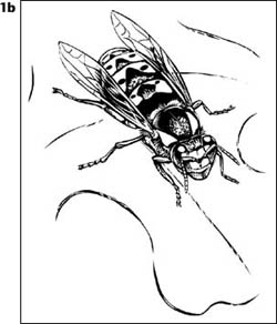
The completed black-and-white drawing
2 Making a layer with transparent white areas. Select All (Ctrl/![]() -A), choose the Layer Adjuster tool, and click once on the image. The image is now floating over a white background. In the Layers panel, choose Gel from the Composite Method pop-up menu. This method makes the white areas of the layer transparent, which allows any color you add to the background in steps 3 and 4 to completely show through without affecting the black in the layer.
-A), choose the Layer Adjuster tool, and click once on the image. The image is now floating over a white background. In the Layers panel, choose Gel from the Composite Method pop-up menu. This method makes the white areas of the layer transparent, which allows any color you add to the background in steps 3 and 4 to completely show through without affecting the black in the layer.
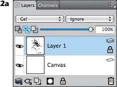
The Layers panel showing the line drawing floated to a layer. The active line drawing layer has the Composite Method set to Gel.
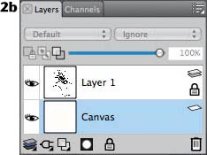
The Canvas is selected in the Layers panel.
3 Making freehand selections and laying in base colors. In preparation for painting the base colors, Phillips used the Lasso tool to draw freehand selections so he could isolate areas of his image, for instance the sky and the insect. With the selection active, he used the Digital Airbrush variant of the Airbrushes to paint within the selection. Then, he made selections for the body of the yellow jacket and laid in base colors of brown and gold. Next, he selected the large leaf and airbrushed shades of green.
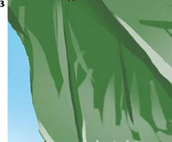
After painting the sky with the Digital Airbrush, Phillips painted the leaf with the Digital Airbrush and Scratchboard Tool.
To color his illustration, Phillips used a rich color palette. He used the Scratchboard Tool to paint the details on the leaf, beginning with lighter greens and then progressing to darker greens directly behind the grasshopper. The darker greens would help to bring the lighter colored insect forward in the composition. Then, Phillips used the Digital Airbrush to lay in color within selected areas on the insect.
Before beginning to work on the background Canvas, click the Canvas layer’s name in the Layers panel. Choose a color in the Color panel. Use the Scratchboard Tool for loose, freehand-drawn lines, as in the leaf. You can hide and show Layer 1 as you work by clicking the eye icon in the Layers panel.
To paint color within a selected, or isolated area, choose the Lasso tool in the Toolbox (it’s nested under the Rectangular Selection Tool), and drag to create an irregular selection boundary on your image. (You will find more detailed information about selections and masks in Chapter 5, “Selections, Shapes and Masks.”) Then, for smooth airbrushed strokes, choose the Digital Airbrush variant of Airbrushes in the Brush Selector.
4 Painting details and textured areas. For a fine-grained airbrush look, switch to the Fine Spray variant. You can see the smooth Digital Airbrush strokes on the leaf under the insect and Fine Spray strokes along the edge of the vignette. For the linear details on the bug, use a small Scratchboard Tool.
The linear details are drawn with a small Scratchboard Tool.
Next, using the Artist Pastel Chalk variant of Pastels, take advantage of the brush’s texture-sensitive capability to brush on grainy strokes in a few areas. Choose Basic Paper texture in the Paper Selector in the Toolbox, and the Artist Pastel Chalk variant of Pastels in the Brush Selector. Next, choose a color, and then brush lightly using the Artist Pastel Chalk to reveal texture. ![]()
Capturing a Color Set
Overview Capture color from a reference image using the Dropper; build and customize a Color Set; use the Color Set to paint a new image.
CHER THREINEN-PENDARVIS
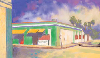
IF YOU’RE PLANNING A SERIES OF ILLUSTRATIONS based on the same color theme, you’ll find Painter’s Color Sets invaluable. Use this technique of sampling color from a photo or painting to quickly build a selective palette of colors as we did here prior to creating the pastel painting Tienda Verde.
1 Sampling the color. Open the image that contains the color range you want. Before you begin to sample the color, open the Color Variability panel (Window, Brush Controls Panels, Color Variability), choose “in HSV” from the pop-up menu and set the (±H), (±S) and (±V) sliders to 0. (This will ensure that the colors sampled will be pure color instead of variegated.) Now choose the Dropper tool and click it on a colored pixel in the image. The Color panel will display the color. If the displayed color isn’t the one you want, you can click or drag the Dropper around your image. The Color panel will update to show the new color.
The reference photograph
PHOTO: PHOTODISC
Using the Dropper to sample color from the image
2 Creating a Color Set. If the Color Set Libraries panel is not open, choose Window, Color Panels, Color Sets. Now click on the New Color Set button (the Grid). From the pop-up menu choose New Color Set, and when the New Library dialog appears, name and save your new Color Set. We named ours “Autumn Colors.” The new Color Set will appear below the default Color Set in the Color Set Libraries panel with one color swatch, which is based on the current color chosen in the Color panel. Continue to sample and add more colors by clicking the Dropper and the Plus button on the Color Set Libraries panel.
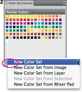
Choosing New Color Set from the Color Set Libraries panel
3 Changing the Color Set display view. You can change the view of your colors in the Color Set to fit your drawing environment. To change the size of the individual color squares, click on the button in the upper right of the Color Set Libraries panel to open its pop-up menu and choose Color Set Library View to display choices. We set ours to Small. The list view displays useful color names.
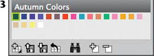
The completed Autumn Color Set
4 Using your new colors. To paint with the new Color Set, start a new file, click on a color in the set, choose a brush and begin painting. We drew a sketch using a dark blue-gray from our set with the Cover Pencil variant of Pencils, and added brushstrokes in other colors using the variants of the Chalk brush. ![]()
Applying colored brushstrokes with the Square Chalk using the Autumn Color Set
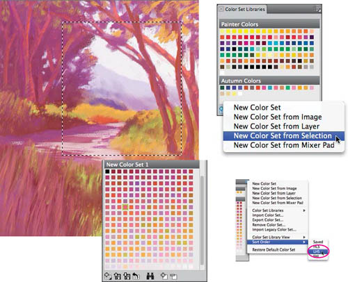
An active rectangular selection shown on Forked Path (top left). Choosing New Color Set from Selection in the Color Set Libraries panel (top right); choosing LHS in the Sort Order menu; and the brightly colored color set (bottom left).
CHER THREINEN-PENDARVIS
Coloring a Scanned Illustration
Overview Scan a traditional black-and-white pen drawing; clean up the scanned line art; use the Paint Bucket to fill areas with flat color; create texture and energy with a variety of brushes.
WENDY MORRIS
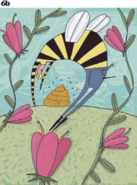
WENDY MORRIS’S WHIMSICAL DRAWING STYLE appears to be a quick, spontaneous expression, but her illustrations begin by drawing carefully with traditional pen and ink. In Morris’s Beeman, the sky is vibrant and charged with frenetic bee energy. Beeman was colored with Paint Bucket fills and a variety of brushes.
1 Creating a pen drawing and scanning. Morris chose a bright white recycled drawing paper with a smooth finish and created a black-and-white line drawing using a conventional Rapidograph pen. She intended to use the Beeman illustration for a 6 × 8-inch greeting card design that would be printed with offset lithography so she scanned the line drawing using grayscale mode at 100% magnification with a resolution of 300ppi. She saved the scan as a TIFF file and opened it in Painter, which automatically converted the grayscale art to RGB. To learn more about scanning and resolution, see Chapter 1, “Getting to Know Painter” and Chapter 11, “Printing Options.”
The raw scan of the Rapidograph pen drawing
2 Cleaning up the scan. Morris adjusted the contrast of the scanned line work using Brightness/Contrast. To make the adjustment on your scan, choose Effects, Tonal Control, Brightness/Contrast. When the dialog box appears, you can thicken or thin the line work by moving the Brightness slider (the bottom one of the two) to the left or to the right, respectively. Then, to get rid of any fuzziness along the edge that resulted from the Brightness change, increase the Contrast by moving the top slider to the right. (Keep in mind that moving it too far to the right can create a pixelated edge rather than a smooth one.) Each time you move one of the sliders, you can see the tonal adjustment on your image.
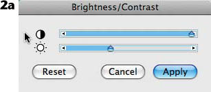
Adjusting the Brightness and Contrast to “beef up” the line work
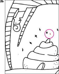
Cleaning up specks of black on the scan
Then Morris cleaned up the specks of black on the scan by choosing white in the Color panel, and touching up areas with the Flat Color variant of the Pens. She switched to black color, and used the pen to repair any breaks in the black lines. (The lines must be completely solid, to “trap” the edges of the Paint Bucket fills that follow in step 3.)
3 Trapping fills using a transparent layer. Morris used the Fill Cell method on the Canvas in an earlier version of Painter. (You can learn about the Fill Cell method using the Painter 12 Help. In Painter, the layers make it quicker and easier to do flat color fills when working with line art. The method of coloring line art described here uses a transparent layer that contains the line art alone to “trap,” or hide the edges of, the fills on the image canvas below.
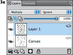
The Layers panel with Layer 1 chosen and its Composite Method set to Multiply.
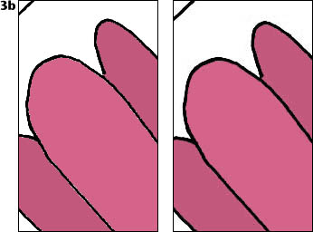
Image canvas showing the flat color fills with “halos”
Image with Layer 1 in Multiply mode and with its visibility turned on
Select the black line art by choosing Select, Auto Select, Using Image Luminance. When the selection marquee appears, hold down Alt/Option (to copy) and choose Select, Float to make a transparent layer containing only the line art. (Layer 1 will appear in the Layers panel.) In the Layers panel, turn off the visibility of Layer 1 by clicking its eye icon off; then target the Canvas layer by clicking on its name. Make the lines thinner on the canvas by choosing Effects, Tonal Control, Brightness/Contrast, and moving both sliders to the right enough to thin the lines but not enough to make breaks in them (you may have to experiment with settings, depending on the thickness of your lines).
Now choose the Paint Bucket tool, and in the Property Bar, click the Image button and from the Fill menu choose Current Color. In the Color panel, choose a new color; then click the Paint Bucket in a white area of the canvas. To complete the “trap” on your fill, toggle Layer 1’s visibility back on by clicking its eye icon, choose the layer and then choose Multiply in the pop-up Composite Method menu at the top of the Layers panel. You can inspect the result with the Magnifier tool. (To read more about Layers, turn to Chapter 6, “Using Layers.”)
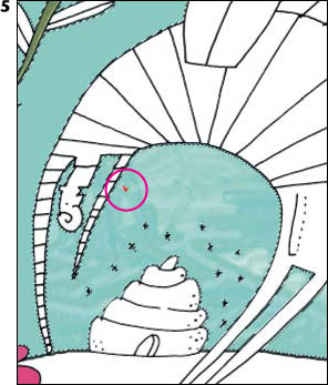
4 Making a selection with the Magic Wand. In preparation for the next step, when she planned to paint lively brushstrokes across the sky, Morris isolated the entire sky area (based on its color) by making a selection using the Magic Wand. To select all of the blue sky areas at once, she chose the Magic Wand in the Toolbox, unchecked the Contiguous check box on the Property Bar, and clicked on a blue sky area in her image. To read more about the Magic Wand and selections, turn to the beginning of Chapter 5, “Selections, Shapes and Masks.”
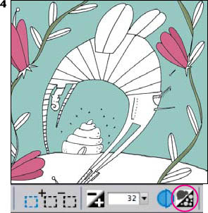
Using the Magic Wand to select the sky. This detail of the Property Bar shows the Contiguous option disabled.
5 Painting with brushes. Morris used the Dropper tool to sample sky color in her image; then she used the Variable Flat variant of the Oils to paint “helter-skelter style” brushstrokes across the sky. The Variable Flat incorporates enhanced Color Variability, which allowed the value of the color to change subtly as she painted. For more subtle brushstrokes, she lowered the opacity using the Opacity slider on the Property Bar.
Painting on the sky with free brushstrokes
6 Adding texture and details. After completing the flat color fills and the brushwork in the sky, Morris used the Dirty Marker variant of the Felt Pens to modulate color in the plant stems; then she used a low-opacity Digital Airbrush variant of the Airbrushes to paint soft shadows on the leaves and stems. To add texture to the ground, she used the Scratchboard Rake variant of the Pens.
Morris airbrushed soft shadows along edges of the foliage.
The image with fills and brushwork texture, prior to adding Pixel Dust to the bee swarm
Next, Morris added movement and energy to the bee swarm and the beeman’s stinger. She chose black in the Color panel and used the Pixel Dust variant of the Pens to paint spiraling strokes behind the bee’s stinger and above the hive. (The Pixel Dust pen is located in the Painter 5 Brushes library, within the Extras, Brushes folder, on the Painter 12 DVD-ROM.)
Morris finished the piece using the Digital Airbrush to add more highlights and shadows to the bee, plants and flowers. She airbrushed a soft drop shadow along some of the edges on the beeman and the flowers. For more subtle brushstrokes, she lowered the opacity of all of the brushes (except the Pixel Dust pen), using the Opacity slider on the Property Bar. The completed illustration can be seen at the top of page 46. ![]()
Gallery
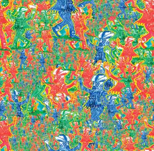
![]() RGB Cowboys is one in a series of illustrations featuring a cowboy theme created by Keith MacLelland. “By using cowboy and western iconography in the form of a visual voice, I have enabled myself to assume a persona or virtual costume within the art itself. RGB Cowboys makes a reference to red, green, blue and the RGB printing process,” says MacLelland.
RGB Cowboys is one in a series of illustrations featuring a cowboy theme created by Keith MacLelland. “By using cowboy and western iconography in the form of a visual voice, I have enabled myself to assume a persona or virtual costume within the art itself. RGB Cowboys makes a reference to red, green, blue and the RGB printing process,” says MacLelland.
By using a playful color palette of complementary colors accented by brighter oranges, golds, and reds, the cowboy is represented as a fictitious character . . . the playfulness of the color palette has a lyrical, almost cartoon-like quality. By using the complementary colors, red and green, juxtaposed against blue, MacLelland created a whimsical abstract image.
MacLelland began the illustration by creating an Image Hose nozzle using a character from his Luche Libre-esc cowboy illustration. First, he selected the cowboy, copied the silhouetted image and then pasted it into his working file as a layer and repeated the process to create seven layers. Next, he colored each cowboy layer red, green or blue using the Effects, Tonal Control, Adjust Colors dialog box. To make the nozzle file, he grouped them by Shift-selecting them and choosing Layers, Group. He opened the Nozzles panel by choosing Window, Media Library Panels, Nozzles, clicked the button in the upper right of the Nozzles panel and from the pop-up menu he chose Make Nozzle from Group.
Next, he opened a new 2500 × 2500 pixel Painter file and chose the Spray-Size-P, Angle-W variant of the Image Hose and set his brush size. He sprayed varied sizes of the cowboys onto the image, using smaller cowboys to suggest distance and keeping larger cowboys for the foreground. (To learn more about using selections and masks, see the introduction to Chapter 5, “Selections, Shapes and Masks,” and for more detailed information about Layers, see Chapter 6, “Using Layers.” To learn more about the Image Hose, turn to Chapter 8, “Exploring Special Effects.”)
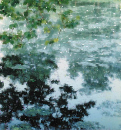
![]() Dennis Orlando’s sensitive use of light combined with layered, luminous shadow areas in his paintings has given him the moniker “The Modern Impressionist.”
Dennis Orlando’s sensitive use of light combined with layered, luminous shadow areas in his paintings has given him the moniker “The Modern Impressionist.”
Inspired by a Chinese painting on silk, Orlando painted The Pond With Low Branches with the Artist Pastel Chalk variant of Pastels, Blenders and Oils brushes. To establish a mood of late day, he used muted colors and an analogous palette with deep shadow colors but without bright highlights.
First he roughed in his composition, and then established the values and base color using grainy pastel strokes, working over the entire image. For more activity in the color, Orlando increased the Color Variability for the Artist Pastel Chalk, and then he laid in more brush strokes. When the color was as he liked it, he pulled and blended colors into one another using the Grainy Water variant of the Blenders.
For the look of wet paint, he used a favorite modified Oils variant, which allowed him to add color and blend as he painted. To finish the painting, he added a few more grainy strokes using the Artists Pastel Chalk. This brushwork is most noticeable on the lily pads in the foreground.
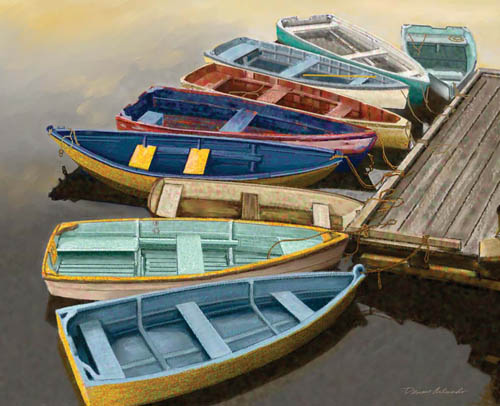
![]() For Dock With Colorful Boats, Dennis Orlando used a luminous color palette, and he painted using grainy pastel strokes.
For Dock With Colorful Boats, Dennis Orlando used a luminous color palette, and he painted using grainy pastel strokes.
Orlando’s friend Jack Twelves commissioned him to paint Dock with Colorful Boats, based on a photo that Twelves took more than twenty years ago in New England. Orlando began the painting by making a detailed sketch with the Thick and Thin variant of Pencils.
To create the linear strokes in the dock and boats, Orlando used the Straight Lines Draw Style (chosen in the Property Bar), with the Artist Pastel Chalk variant of Pastels. Then, he loosely laid in broader strokes of color using the Artist Pastel Chalk. He used a brighter palette with deep shadow colors and more saturated highlights to establish the mood. To achieve activity in the color, Orlando increased the Color Variability for the Artist Pastel Chalk, and then he laid in more brush strokes.
To retain the color activity in the boats, he reduced the opacity setting of the Grainy Water variant before blending his pastel brush strokes. This technique let him develop a rich subtle color detail in the highlights and shadows.
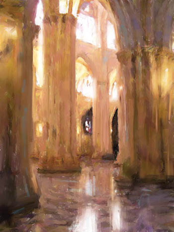
![]() Ad Van Bokhoven is an artist based in Holland who works both traditionally and digitally. To create a series of paintings featuring the Toledo Cathedral in Toledo, Spain, he used Painter to emulate the brush work and color that he achieves with traditional oil paints. Van Bokhoven appreciates the realistic effects that can be achieved with the Acrylics, Oils, Impasto and Blenders brushes in Painter.
Ad Van Bokhoven is an artist based in Holland who works both traditionally and digitally. To create a series of paintings featuring the Toledo Cathedral in Toledo, Spain, he used Painter to emulate the brush work and color that he achieves with traditional oil paints. Van Bokhoven appreciates the realistic effects that can be achieved with the Acrylics, Oils, Impasto and Blenders brushes in Painter.
When on location, he was inspired by the warm, luminous light in the church. For The Toledo Cathedral 03, Van Bokhoven began by taking photographs to use for reference. Back at his studio, he opened a new file, and then he used Oils brushes to block in a compelling color theme that included light golds, oranges, pinks and lavenders, as well as cool grays and blues. He worked directly on the Canvas, without the use of layers, to take advantage of being able to apply paint and blend it more fluidly as he worked. To mix and pull color, he used custom Blenders, based on the Round Blender Brush and the Grainy Blender variant of Blenders.
As he worked, Van Bokhoven focused on preserving the color theme and the soft play of the colors and values against one another—the subtle golds against the cool grays, blues and lavenders. Intuitively, he added accents of cool and warm greens. He kept his brush work loose and dynamic as he painted. He did not paint a lot of detail, but instead massed large areas of color for impact.
To achieve the subtle layering of color on the walls and floor, he sampled color from his image and used the Color panel to subtly change the color, which he then applied using a lower opacity brush.
As a final touch, Van Bokhoven added a subtle canvas texture to the painting. He chose a canvas texture in the Paper Selector and then chose Effects, Surface Control, Apply Surface Texture, Using Paper with subtle settings.
![]() Inspired by the warm lighting and the perspective in the architecture, Ad Van Bokhoven began The Toledo Cathedral 8 by shooting photographs for reference. Later, back at his studio, he opened a new file in Painter and used large Oils brushes—such as the Smeary Bristle Spray, Tapered Round Oils and Flat Oils variants of the Oils to lay down broad areas of color and value. To blend and move paint, he used Palette Knives and Blenders. So he could blend colors more fluidly as he worked, he worked directly on the Canvas, without the use of layers.
Inspired by the warm lighting and the perspective in the architecture, Ad Van Bokhoven began The Toledo Cathedral 8 by shooting photographs for reference. Later, back at his studio, he opened a new file in Painter and used large Oils brushes—such as the Smeary Bristle Spray, Tapered Round Oils and Flat Oils variants of the Oils to lay down broad areas of color and value. To blend and move paint, he used Palette Knives and Blenders. So he could blend colors more fluidly as he worked, he worked directly on the Canvas, without the use of layers.
As he painted, Van Bokhoven focused on keeping his brushwork loose and dynamic, without worrying about details. He skillfully massed large areas of color and value. Intuitively, he played cool colors against warm ones. Looking at the composition, you can see it is diagonally divided into mostly warm sunlit areas on the right and cool areas of shadow on the left.
Van Bokhoven wanted to achieve a subtle layering of color on the masonry and floor, so he sampled color from his image and changed the color slightly in the Color panel, and then applied it using lower opacity Oils brushes. This brushwork is most noticeable in the wall on the right and on the floor and in the shadows in the foreground. You can see more of Van Bokhoven’s work in the gallery at the end of Chapter 7, “Enhancing Photos, Montage and Collage.”
![]() Artist Richard Noble has successfully re-created the look of traditional acrylic using Painter. For Coast, a painting in his Mendocino series, he depicts the light of a sunny morning. He began by shooting photographs. Later, back at his studio, he imported a reference photograph into Painter to use as a template. To begin the painting, he roughed in base colors for his composition using the Round Camelhair variant of Oils and the Sargent Brush variant of the Artists. Both of these brushes allowed Noble to move paint around on the canvas. He also pushed and pulled color using a small Palette Knife variant of the Palette Knives. As he worked, Noble developed strong light-to-dark contrast in the painting.
Artist Richard Noble has successfully re-created the look of traditional acrylic using Painter. For Coast, a painting in his Mendocino series, he depicts the light of a sunny morning. He began by shooting photographs. Later, back at his studio, he imported a reference photograph into Painter to use as a template. To begin the painting, he roughed in base colors for his composition using the Round Camelhair variant of Oils and the Sargent Brush variant of the Artists. Both of these brushes allowed Noble to move paint around on the canvas. He also pushed and pulled color using a small Palette Knife variant of the Palette Knives. As he worked, Noble developed strong light-to-dark contrast in the painting.
When the composition was established, he used a small Round Camelhair brush to paint fine detail in the shaded areas of the foreground foliage as well as in the sunlit areas of the painting. To finish, he added a few textured details with Artist Pastel Chalk variant of Pastels. Noble printed his piece on canvas, then stretched and finished it with a clear glaze and touches of acrylic paint.
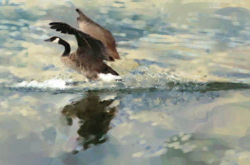
![]() Richard Noble depicted the warm, gentle light of late afternoon in Soft Landing. He painted most of the work with the Broad Water Brush variant of Digital Watercolor using one of his digital photographs for reference. “My reference photo was critical to this work,” Noble says, “because if you didn’t see what the fast camera shutter speed captures, you would not know how the geese land so effectively. I was lucky to capture the seconds of splashdown, to see the wings—held like a paraglider—and the webbed feet used like water skis!” He kept the goose to the far left of his composition to retain the feeling of motion.
Richard Noble depicted the warm, gentle light of late afternoon in Soft Landing. He painted most of the work with the Broad Water Brush variant of Digital Watercolor using one of his digital photographs for reference. “My reference photo was critical to this work,” Noble says, “because if you didn’t see what the fast camera shutter speed captures, you would not know how the geese land so effectively. I was lucky to capture the seconds of splashdown, to see the wings—held like a paraglider—and the webbed feet used like water skis!” He kept the goose to the far left of his composition to retain the feeling of motion.
After opening the photo, he chose File, Quick Clone to create a clone copy of the photo, but with a blank canvas and Tracing Paper turned on in the clone image. Noble planned to use elements from the photo and to create a more simplified image. After choosing the Broad Water Brush, he enabled Clone Color in the Color panel so that he could pick up color from the photo while he made the first loose, broad brushstrokes. As he painted, he toggled the Clone Color button off when he wanted to paint with a color he mixed using the Color panel and on when he wanted to use color from the reference. He used the Digital Watercolor brushes for smoother wash areas and the Watercolor brushes on Watercolor layers for more textured brush work. The textured brush strokes are most noticeable in the warm-colored reflections near the goose.
When Noble had the overall image blocked in, he added the lighter colors and details using the Gouache brushes. To marry the look and texture of the gouache strokes with the background watercolor strokes, he used the Confusion brush variant of the F-X brush. Noble refined the important detail areas, while leaving the larger areas rough.
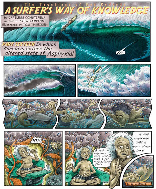
![]() Created and written by Drew Kampion and illustrated by Thomas Threinen, the Don Redondo comic strip is published in The Surfer’s Path magazine. The episodes Part 16, In which Careless enters an altered state of Asphyxia (above), and Part 18, in which Careless takes gas in Asphyxia (facing page) are shown here. After the team met to discuss the concepts, Threinen drew each scene on vellum and then scanned them and assembled them in Painter, where he added the borders, type and color.
Created and written by Drew Kampion and illustrated by Thomas Threinen, the Don Redondo comic strip is published in The Surfer’s Path magazine. The episodes Part 16, In which Careless enters an altered state of Asphyxia (above), and Part 18, in which Careless takes gas in Asphyxia (facing page) are shown here. After the team met to discuss the concepts, Threinen drew each scene on vellum and then scanned them and assembled them in Painter, where he added the borders, type and color.
To begin the illustration, Threinen sketched on vellum with traditional marker brushes. He modeled the forms by brushing washes of soft, gray tones. Then, he added details with pencils. He repeated this process for each panel. Finally, he scanned the panels and saved them as TIFF files.
After opening the scanned drawings in Painter, Threinen assembled the scenes into the comic strip file by copying and pasting each scene into the working file and positioning the scenes with the Layer Adjuster. To adjust the tones of the scans, he used Effects, Tonal Control, Brightness/Contrast. When he was happy with the contrast and arrangement, he grouped the layers then merged the group. To read about working with layers, see Chapter 6, “Using Layers.”
After the Base Art layer was in place, Threinen added the borders and the type. He used the Rectangular Shape tool to create the borders. In the Property Bar, he turned on the Stroke check box and turned off the Fill check box. He set the color he desired and drew the boxes. Next, Threinen set the type using the Text tool. After he set the elements for the header and bubbles on Text layers, he arranged the headline elements into one group and the bubble text into a second group and then merged each group.
Next, Threinen used Painter’s brushes to color elements, such as the sea, sky and the characters on individual layers. To color the ocean, he added a new empty layer to his image. Using the Basic Round variant of Tinting and varied shades of blue, he brushed washes onto the waves. In areas where he wanted to blend, he used the Blender variant of Tinting. To complete the coloring, he added more layers and color; for example, for the sky and the characters Don Redondo and Careless Constipeda.
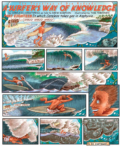
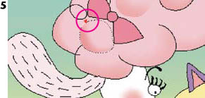
![]() “For the episode In Which Careless Takes Gas, I wanted to give the dream images a different look from the ‘real’ images of Careless slowly drowning, says Thomas Threinen. In this piece, he colored the black-and-white lines orange-red to express the dream state.
“For the episode In Which Careless Takes Gas, I wanted to give the dream images a different look from the ‘real’ images of Careless slowly drowning, says Thomas Threinen. In this piece, he colored the black-and-white lines orange-red to express the dream state.
Threinen began by drawing on vellum using marker brushes and pencils. When he was happy with the drawings, he scanned them and opened them in Painter. Working in Painter, he adjusted the contrast, assembled the scenes and created the borders and typography.
To color his illustration, Threinen painted with the Tinting brushes on layers. When used on layers with the Composite Method set to Gel, the Tinting brushes paint washes similar to using conventional Dr. Martin’s transparent watercolor dyes. He added a new layer to his image, chose the Basic Round variant of Tinting in the Brush Selector and used this brush to lay in the base colors for the water. He painted the lightest colors first, then gradually built up darker tones. Threinen painted each element on its own layer, for instance the water, island and the surfer. To blend he used the Blender variant of Tinting.
Next, Threinen colored the line drawing a red-orange to suggest the dream state. To begin, he made a copy of the layer with the black-and-white drawing by choosing Layers, Duplicate Layer. In the Color panel, he chose a red-orange color. In Gradients panel (Window, Media Library Panels, Gradients), he selected the Two-Point gradient from the picker, and chose the Linear Gradient and the Left-to-Right Gradient option. From the pop-up menu at the right end of the Gradients panel he chose Express in Image. (Read more about gradients in Chapter 2.) In areas where he wanted the lines to transition from red-orange to black-and-white, he subtly lightened the area on the red-orange layer by brushing over it with the Bleach variant of Erasers.