
Hour 5. Using Layouts
What You’ll Learn in This Hour
 Using different types of layouts
Tips for creating useful layouts
In the last hour, you learned that Android was developed to run on different hardware and to support various screen sizes. One way to support those different screen sizes was to introduce layouts for creating useful and flexible user interfaces. Layouts are usually created using XML files. The XML files are the templates for what the screen will look like. The Android system uses the layouts to properly display the user interface on different devices. This hour reviews the types of layouts and how to use them.
Getting Started with Layouts
Layout files are XML files that define what a screen—or portion of the screen—will look like in your Android apps. Layout files define the look of a user interface. The layout contains different types of view controls like EditTexts and Buttons. These view controls might reference other resources, such as strings, colors, dimensions, and drawables.
If you look at the Android documentation for a particular layout class such as LinearLayout, you can see that LinearLayout is an extension of a ViewGroup class. The ViewGroup class is defined as a view that can contain other views. A View in Android is the most basic component for building a user interface. Every Button, TextField, or Layout is a type of view. A ViewGroup is a container for other views referred to as child views. A LinearLayout is a specific type of ViewGroup that defines how each child view is drawn on the screen.
Having an idea of the class hierarchy of a layout is worthwhile. Thinking of a layout as a container for user interface elements that has specific rules applied when new elements are added is helpful. Different types of layouts use different rules for how to add child views.
Practically, you often use an XML layout file to define the views for the user interface, but you can also create any view programmatically. The layout is the container for other views whether they are defined in an XML file or created on the fly.
As you have seen, layout resource files are stored in the /res/layout directory hierarchy. You compile layout resources into your application as you would any other resources.
The included Hour5App project includes example layout files. These can be viewed as layouts in a visual editor and as XML files in a text editor. The files in the res/layout directory are activity_main.xml, padding_example.xml, weight_example.xml, and gridlayout_example.xml.
Designing Layouts Using the Layout Resource Editor
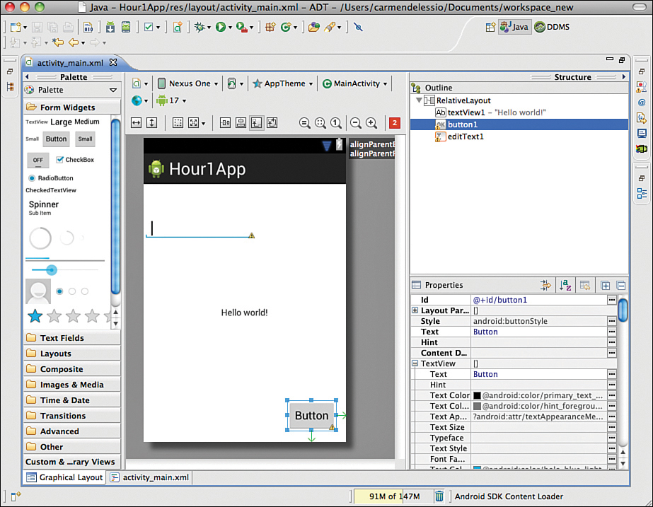
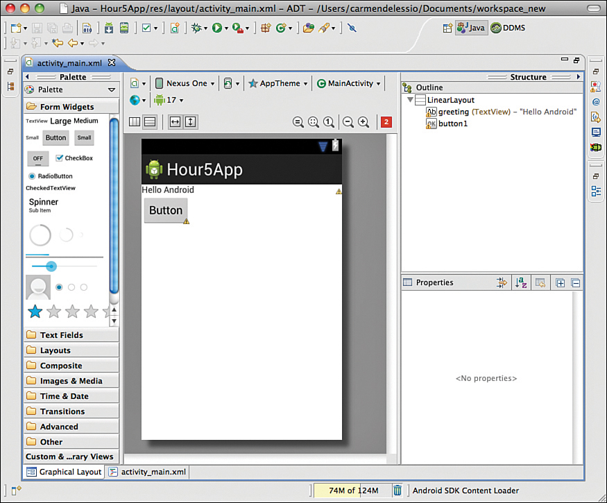
You can design and preview compiled layout resources in Eclipse by using the Layout Resource Editor (see Figure 5.1). Double-click the project file /res/layout/activity_main.xml from Hour1 within Eclipse to launch the Layout Resource Editor. It has two tabs: Graphical Layout and main.xml. The Graphical Layout tab provides drag-and-drop visual design and offers you the ability to preview the layout in various device configurations. The main.xml tab enables you to edit the layout XML directly.
Chances are, you’ll switch back and forth between the graphical and XML modes frequently.
Editing Layouts Using XML
You can edit the raw XML of a layout file. As you create more apps, editing the XML layout file directly will become natural. By switching to the XML view frequently, you can gain an understanding of XML generated by each type of control. As you change properties using the visual editor, they are also changed in the XML. Over time, you might find yourself making some edits visually and others directly in the XML file.
Because you can edit the XML file as a text file, searching for certain terms or making other changes directly can be useful.
Using Layout Resources Programmatically
In Hour 1, you created a Button and an EditText control. Those view controls are defined in the activity_main.xml file in the/res/layout directory. They are defined in the XML within a RelativeLayout element.
When you used this layout in an activity, you called the method setContentView(). This line of code was included when the project was generated:
setContentView(R.layout.activity_main);
An activity has a setContentView() method to associate the activity with the view. When you want to access the controls defined within the layout, you use findViewById(). This line creates a new Button from a reference in the layout file and assigns it to the variable myButton:
Button myButton= (Button)findViewById(R.id.button1);
The findViewById() method is available within an activity. It is also available from other views. When you use fragments or want to have a custom look in a ListView or GridView, you can create views on the fly from XML layouts. You inflate the layout file into a View object using the LayoutInflater class. You then use the new View to access controls such as Buttons. The following listing shows an example of creating a LayoutInflater and creating a View:
LayoutInflater inflater = LayoutInflater.from(context);
View exampleView = inflater.inflate(R.layout.example, container, false);
Button myExampleButton = (Button)exampleView.findViewById(R.id.button1);
The details of how to use these parameters is covered when you use LayoutInflaters to create fragments later in this book.
GO TO HOUR 8, “ACTIVITIES AND FRAGMENTS,” for more on using layouts in fragments.
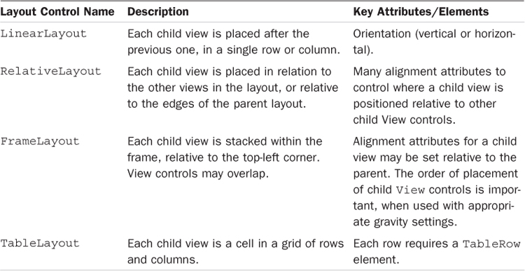
Layout Types
Having a screen be encapsulated in one large parent layout is quite common. RelativeLayout and LinearLayouts are commonly used. Table 5.1 lists the most common Layout controls.
Note: Using an Include in a Layout XML File
The XML layout includes support for an <include/> element. To use this element, create a layout file to be embedded in other layouts and then reference it as a resource. You can reference the layout named basicHeader.xml in other layout files by using <include layout="@layout/basicHeader "/> device.
Figure 5.2 shows the design of a user interface that uses LinearLayout and TableLayout. Doing this upfront work to plan out your design can make the implementation much easier.
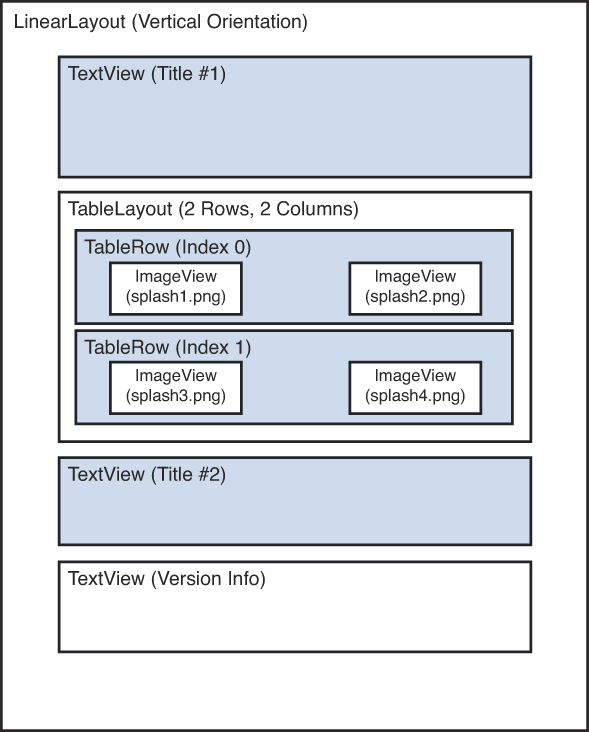
In the splash screen design in Figure 5.2, a vertical LinearLayout control is used to organize the screen elements, which are, in order, a TextView control, a TableLayout control with some TableRow control elements of ImageView controls, and then two more TextView controls.
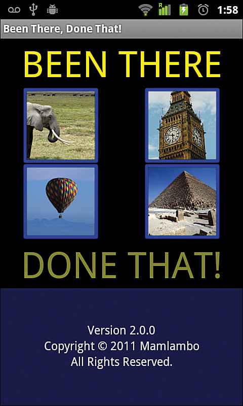
Figure 5.3 shows how this screen looks in a complete app.
More Layout Basics with LinearLayout
A LinearLayout positions views in either a column or a row. The LinearLayout’s orientation property determines the direction. If the orientation is vertical, the child views will be stacked in a column. If the orientation is horizontal, the child views will be placed in a row. Although many common attributes exist across layouts, the difference between different types of layouts is the order and rules they use for drawing widgets on the screen.
Common Attributes
Certain attributes are common across layouts and the child views within layouts. For example, all layouts share the attributes android:layout_width and android:layout_height for controlling how wide and high an item is. You can specify these attribute values in units such as density independent pixels (20dp) or as constant values that have a specific meaning. Possible values are match_parent and wrap_content.
Using match_parent instructs a layout to scale to the size of the parent layout, and using wrap_content wraps the child View control.
Changing LinearLayout Properties
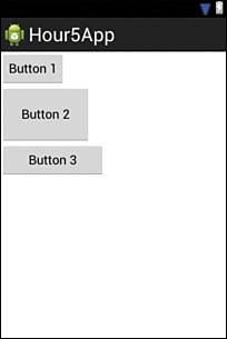
Listing 5.1 defines a LinearLayout in XML. The layout includes a TextView and a Button as child views. Figure 5.4 shows this layout in Eclipse.
LISTING 5.1 LinearLayout in XML
1: <?xml version="1.0" encoding="utf-8"?>
2: <LinearLayout xmlns:android="http://schemas.android.com/apk/res/android"
3: android:orientation="vertical"
4: android:layout_width="fill_parent"
5: android:layout_height="fill_parent">
6: <TextView android:layout_width="fill_parent"
7: android:layout_height="wrap_content"
8: android:text="Hello Android"
9: android:id="@+id/greeting"/>
10: <Button android:text="Button"
11: android:id="@+id/button1"
12: android:layout_width="wrap_content"
13: android:layout_height="wrap_content" />
14: </LinearLayout>
Line 8 of Listing 5.1 shows the text attribute for the TextView as "Hello Android". You should define "Hello Android" in the res/values/strings.xml file and then refer to it as a resource. If you defined it as
<string name="hello_android">Hello Android </string>
then you would use it to replace line 8 with
android:text="@string/hello_android"
Changing things such as the background color and orientation is also easy. You can change the background color of the LinearLayout to gray by adding the following attribute:
android:background="#777777"
You might also set the alpha value for the color—that is, the first two values for the color that set the opaqueness of the color. Use 00 to make a transparent color. Use FF to create an opaque color. So, you can also use #FF777777. The alpha value is not required.
Let’s also change the orientation from vertical to horizontal:
android:orientation="horizontal"
Something unexpected happens. The Button disappears completely.
The explanation lies in the details of the widgets. The TextView is set to a width of "match_parent". It fills the entire layout from left to right. Changing the orientation on the layout did not account for that. The TextView takes up the whole screen, and the Button is not in view. You can fix this by setting both the TextView and the Button to have a layout_width of wrap_content.
Laying Out Child Views
As you saw in Listing 5.1, changing the properties of the layout might affect where child views are placed on the screen. The following sections look at padding and margin properties and illustrate how they affect the display.
Padding
Padding is the amount of space that is added to a side of a UI element to give it more space on the screen. Padding often refers to the internal padding. For a standard Button, it is the space added between the button’s text and sides of the button. You may set padding for the whole widget or set specifically for the top, bottom, left, and right sides.
The correct unit to use to set padding (and most UI elements) is a device-independent pixel, referred to as a dip or dp within the XML layout. Device-independent pixels factor in screen resolution when displayed.
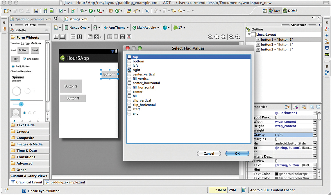
Let’s create a new layout file with three buttons to show the effect of padding.
The first button has no padding property specified. The second button has its padding set to 30dp by setting android:padding="30dp". All sides of the button are padded with 30 device pixels. The third button has its padding set to 40dp for the right and left. The right padding is set using android:paddingRight="30dp".
Figure 5.5 shows the result of using padding this way.
Layout Margins
Layout margins define the amount of space between a child view and the side of a parent container. To “push” a button down and to the right, you set the margin from the top and the left side of the layout. By adding these two lines to the layout for the first Button, you can push the button down 40 pixels and to the right 120 pixels:
android:layout_marginTop="40dp"
android:layout_marginLeft="120dp"
Because this was done in a LinearLayout with vertical orientation, all the buttons are pushed down. You would get a different result if you used another kind of layout.
Gravity
The property layout_gravity applies to child views and is easy to use. You can set the layout_gravity property to values such as left, right, center, and so on. Figure 5.6 shows the options for setting layout_gravity on button1 in this example. The button is currently set to right and is shown on the right side of the screen:
android:layout_gravity="right"
The layout_gravity property applies to the child views. Android gravity can apply to the entire layout. By setting gravity to right for the LinearLayout, all child views are moved to the right:
android:gravity="right"
Weight
The Android layout_weight property gives more space on the screen to the view with the higher weight. You can see this most easily when creating a LinearLayout with horizontal orientation.
FrameLayout
A FrameLayout is a container that has no special rules for drawing widgets. By default, all widgets are drawn in the upper-left corner of the screen. That might not sound useful, but by using the layout margin, you can place widgets anywhere. The FrameLayout is helpful when two widgets should be drawn on top of each other. For example, you might put a TextField on top of an image or use several images to draw shadows and highlights within the UI.
You can use layout_margins wisely within a FrameLayout to create interesting and useful designs.
RelativeLayout
A RelativeLayout is similar to the FrameLayout in that you can place components on top of each other, but with the RelativeLayout, you can place views in relation to other views. In a FrameLayout, when you specify the topMargin for two buttons, you are indicating how far they are from the top of the parent. With a RelativeLayout, we can specify how far they are from each other.
For example, using RelativeLayout, you can place one button to the left, right, top, or bottom of another button. A RelativeLayout can be useful when creating complex user interfaces.
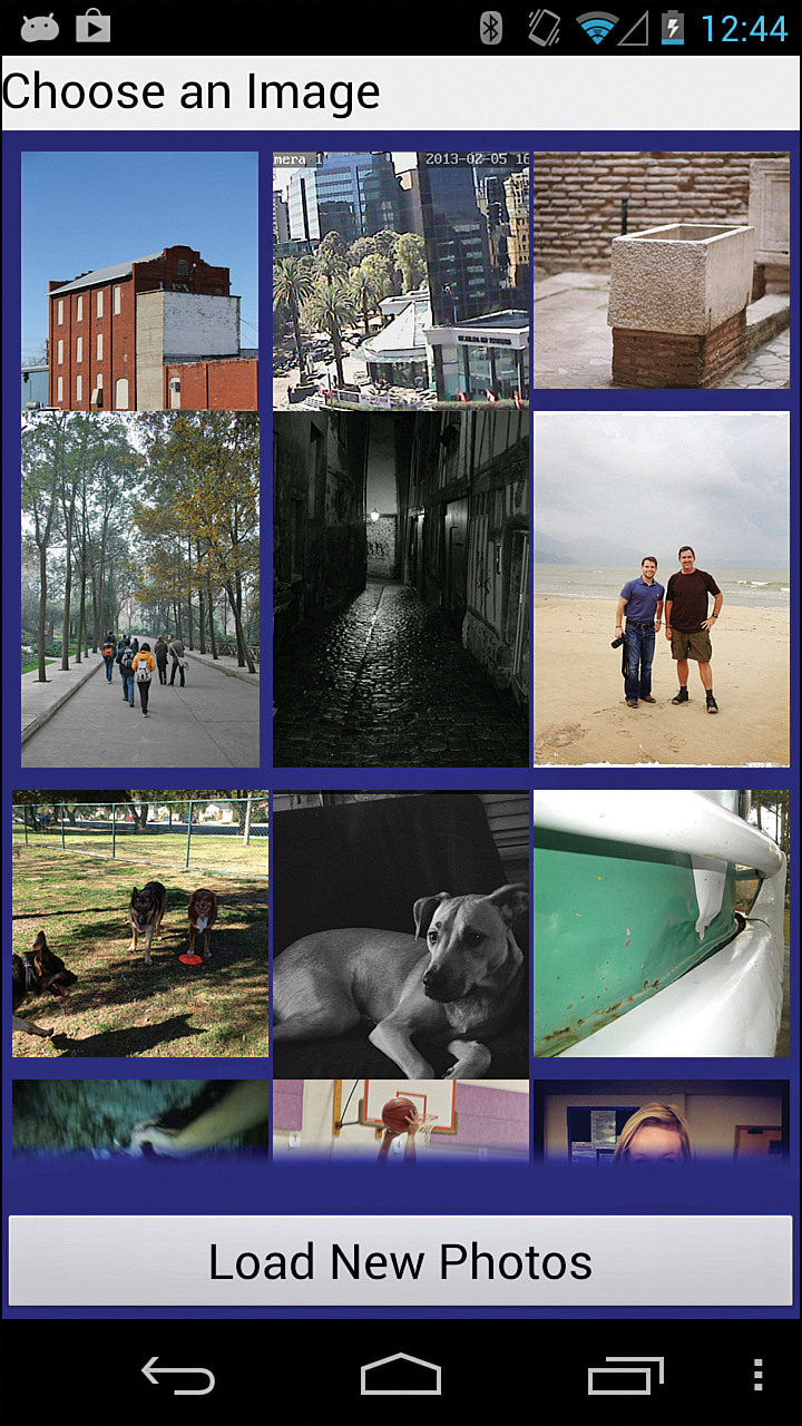
One way to use a RelativeLayout is to put a view in the middle of the design that references something above it and below it. Figure 5.7 shows a layout on Eclipse that has:
A Button aligned with the bottom of the parent:
android:layout_alignParentBottom="true"
A TextView that is in the top-left corner by default
A GridView that is below the TextView and above the Button
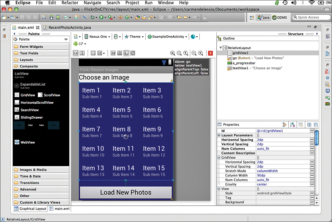
To set the position of the GridView, these properties are used:
android:layout_below="@+id/textView1"
android:layout_above="@+id/loadPhotosButton"
You’ll use this design as you develop a more sophisticated app in later chapters. You can access the most recent photos from Flickr using the API. Figure 5.8 shows the recent images displayed in the GridView.
When you use LinearLayouts and RelativeLayouts, the Android operating system takes the physical screen dimension into consideration when rendering the user interface. Because these layouts use components that are relative to each other, more opportunity exists for the system to optimize the experience. For that reason, LinearLayouts and RelativeLayouts are generally recommended.
Summary
This hour reviewed what layouts are and how they work. It examined LinearLayout in more detail as a way to understand how layouts work. XML layouts are used to create user interfaces in Android by positioning child views on the screen. Using padding, margins, and other attributes gives you significant control over the user interface. Examples using FrameLayout and RelativeLayout showed the properties of those layouts and how they are different.
Q&A
Q. With layouts, what is meant by orientation?
A. Orientation defines the direction of the LinearLayout. Vertical creates a column, and horizontal creates a row. Orientation is not used in FrameLayouts or RelativeLayout. Different layouts have different rules for laying out child views, which means they might have different attributes.
Q. What is the difference between a FrameLayout and a RelativeLayout?
A. In a RelativeLayout, you can position widgets relative to one another. That cannot be done in FrameLayout.
Workshop
Quiz
1. What is the difference between setting a layout margin and layout padding?
2. What is the relationship between a LinearLayout and a ViewGroup?
3. How would you position a Button 100 pixels from the top of the device screen? Use density-independent pixels.
Answers
1. Layout margins define the distance between a component and the edge of the layout. Padding pads the size of the component. Depending on the component, this padding can have different effects.
2. A LinearLayout extends the ViewGroup class. A ViewGroup is a View in Android that contains other views.
3. Set the margin to be 100 device pixels from the top of the screen using android:layout_marginTop="100 dp".
Exercises
1. Using FrameLayout, implement a user interface with a button in each corner of the screen. Do the same with a RelativeLayout.
To do this using a FrameLayout, follow these steps:
Create a layout file using FrameLayout.
Create four Buttons.
Set the topMargin and leftMargin of each Button so that the Buttons are placed in corners.
2. Try using one layout within another; specifically, create a LinearLayout with vertical orientation. Add a FrameLayout and a Button. Then add an ImageView to the FrameLayout.
3. Create an XML layout that uses RelativeLayout. Place an ImageView and TextView in the layout. Now, use that layout as an include in another layout.