5. Basic Principles of Visualization
In the course of executing that design, it occurred to me that tables are by no means a good form for conveying such information.... Making an appeal to the eye when proportion and magnitude are concerned is the best and readiest method of conveying a distinct idea.
—William Playfair, The Statistical Breviary
There is a time in every class and workshop when someone raises her hand and asks: How do you know that you have chosen the right graphic form to represent your data? When is it appropriate to use a bar chart, a line chart, a data map, or a flow diagram? Geez, if I had the answer to that, I’d be rich by now. I invariably reply, “I have no idea, but I can give you some clues to make your own choices based on what we know about why and how visualization works.”
In his book Misbehaving: The Making of Behavioral Economics (2015), University of Chicago’s Richard H. Thaler recounts an anecdote that may be useful for any teacher. At the beginning of his career as a professor, Thaler made many of his students mad by designing a midterm exam that was deemed too hard. The average score, on a scale from 0 to 100, was 72. He got a lot of complaints about it.
Thaler decided to run an experiment. In the next exam, he set the maximum score to 137 points. The average ended up being 96 points. His students were thrilled.
Thaler kept the 137 mark in subsequent exams and also added this line to his syllabus: “Exams will have a total of 137 points rather than the usual 100. This scoring system has no effect on the grade you get in the course, but it seems to make you happier.” It certainly did. After he made this change, Thaler never got any pushback from students again—even if he told them beforehand that they were going to be tricked!
Try to mentally visualize these numbers: 72 versus 100, and 96 versus 137. The first pair is easy. The human brain performs nicely at simple arithmetic with rounded figures. But it is abysmal when forced to manipulate any other kind of number without aid. It’s hard to picture 96 in comparison to 137 in your head. It’s much more effective to do it on a piece of paper or on a screen (Figure 5.1; the figures are shown twice, as a linear plot and as a pair of pie charts).1
1 This is a 2013 tweet by visualization author Edward R. Tufte, who got things wrong by trying to be too strict: “Pie chart users deserve same suspicion+skepticism as those who mix up its/it’s, there/their. To compare, use little table, sentence, not pies.” I am no fan of pie charts, but in this case, even if they are inferior to the linear plots, the two pie charts work better than a sentence or a table. This is why I usually say that there are no graphic forms that are intrinsically good or bad but graphic forms that are more or less effective.
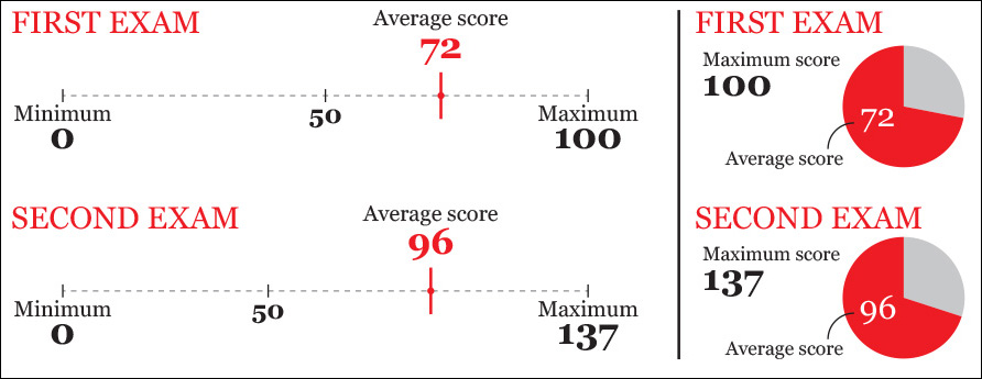
It turns out that Thaler’s second exam was harder than the first one. A score of 96 out of a maximum of 137 is a 70 percent score, in comparison to the 72 percent average of the first exam. But even if you’re aware of that—because you know how to transform a raw score into a percentage—96 over 137 still feels higher than 72 over 100. That’s a bug of the wetware sloshing inside your skull. Most people grasp the truth of an assessment only when they unequivocally envision the evidence for it, something that our kludgy brains alone often can’t do well. That’s why visualization works.
Visually Encoding Data
Vision is the most developed sense in the human species. A huge chunk of our brains is devoted to gathering, filtering, processing, organizing, and interpreting data collected from the retinas at the back of our eyes. We’ve evolved to be really fast at detecting visual patterns and exceptions to those patterns. It is only natural, then, that a set of methods consisting of mapping data into visual properties—spatial and otherwise—would prove to be so powerful.
“Mapping data into visual properties.” That’s quite a mouthful, so let me explain. Suppose that you want to compare the unemployment figures of five countries currently in economic recession. Let’s call them A, B, C, D, and E because we need to organize them alphabetically for some reason.
These figures, which I am withholding for now, are our data. The mapping part consists of choosing properties that will let readers accomplish a particular goal (“comparing accurately”) without being forced to read all numbers. I have encoded them in several ways in Figure 5.2. Which one of these graphics would you choose?
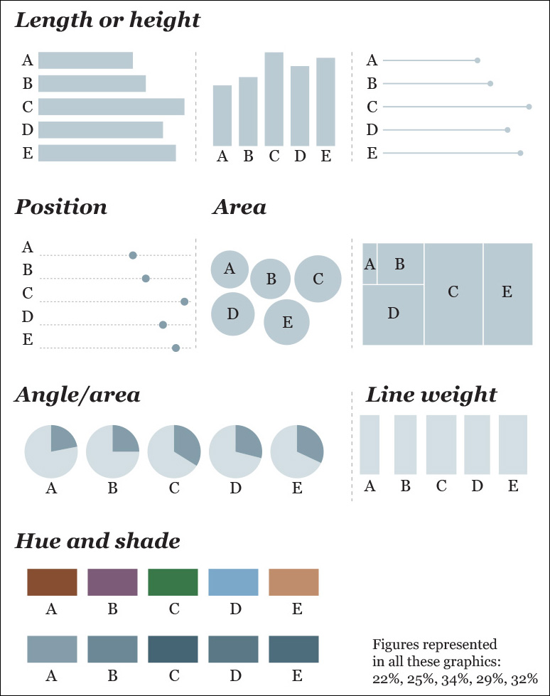
Figure 5.2 Different methods of encoding the same small data set. Remember that, perhaps because our client requested it, countries are organized alphabetically. Otherwise, it’d make more sense to arrange the figures from largest to smallest.
I’d go with length, height, or position, and here’s why: if you don’t know what the numbers are before you see the rest of the charts—the ones based on area, angle, weight, and color—can you quickly identify the highest or lowest unemployment rates and accurately compare them to the others? It’s hard, isn’t it?
Thus, here are some preliminary suggestions to find the right graphic forms for your visualizations:
1. Think about the task or tasks you want to enable, or the messages that you wish to convey. Do you want to compare, to see change or flow, to reveal relationships or connections, to envision temporal or spatial patterns and trends? We could summarize this point with a sentence that sounds tautological, but isn’t: plot what you need to plot. And if you don’t know what it is that you need to plot yet, plot many features of your data until the stories they may hide rise up.
2. Try different graphic forms. If you have more than one task on your wish list, you may need to represent your data in several ways.
3. Arrange the components of the graphic so as to make it as easy as possible to extract meaning from it. Whenever it’s appropriate, add interactivity to your visualization so people can organize the data at will.
4. Test the outcomes yourself and with people who are representative of your audience—even if it is in a non-scientific, non-systematic manner.
Choosing Graphic Forms
Numerous authors have developed methods to choose appropriate ways of encoding data depending on what you want to reveal: Jacques Bertin, Katy Börner, William Cleveland, Stephen Few, Noah Iliinsky, Stephen Kosslyn, Isabel Meirelles, Tamara Munzner, Naomi Robbins, Nathan Yau... just to name a few off the top of my head.
In these pages I am showcasing Severino Ribecca’s Data Visualisation Catalogue (Figure 5.3) and Ann K. Emery’s Essentials website (Figure 5.4). They are both valuable starting points, but not perfect ones, as they include graphic forms that are rarely useful, such as the donut chart or the radar chart. Stephen Few’s book Show Me the Numbers (2nd ed., 2012) is another worthy resource.
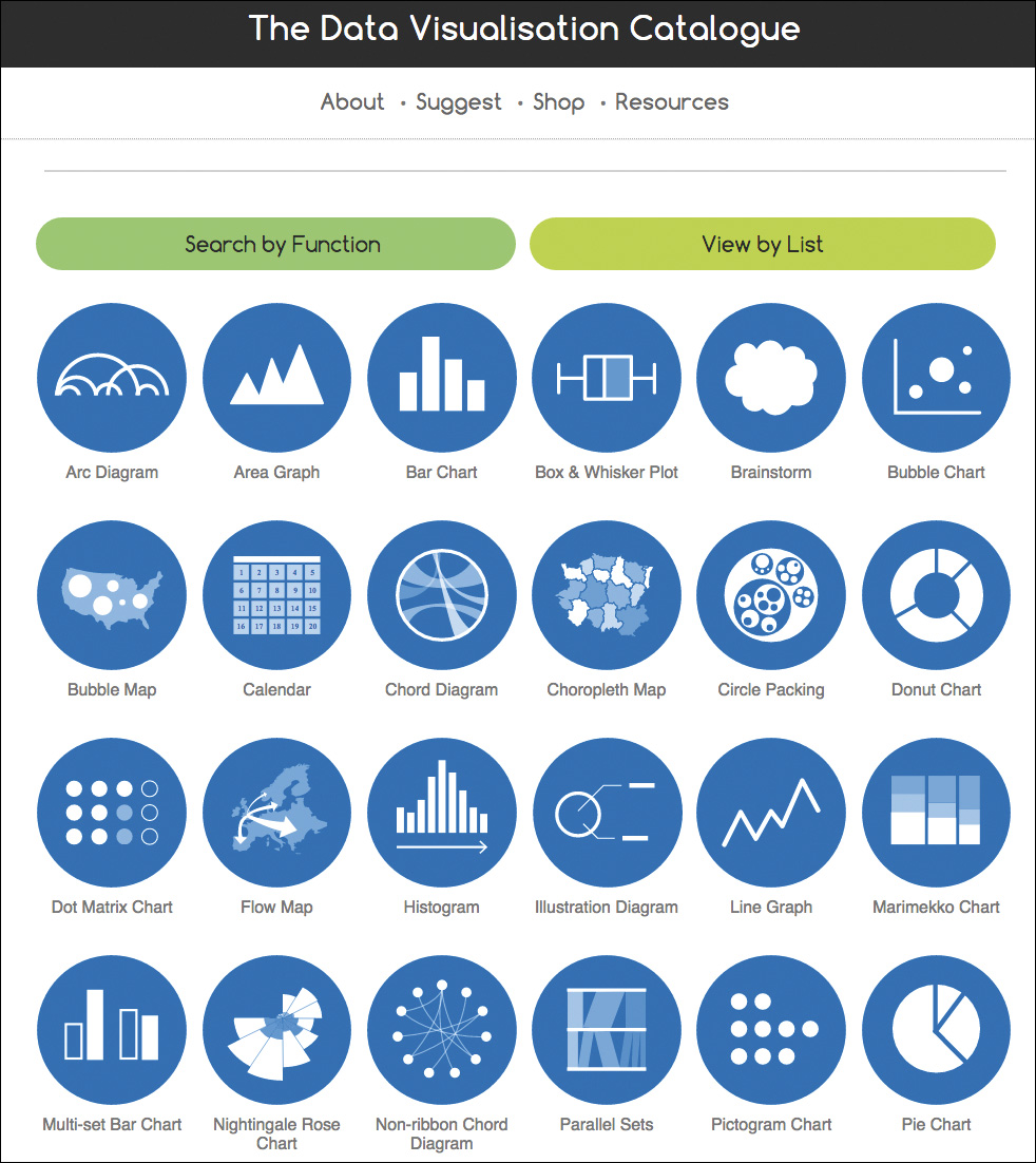
Figure 5.3 The Data Visualisation Catalogue, by Severino Ribecca: http://www.datavizcatalogue.com.
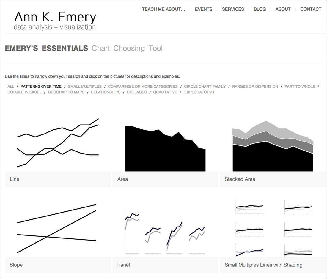
Figure 5.4 Ann K. Emery’s Essentials website: http://annkemery.com/essentials/.
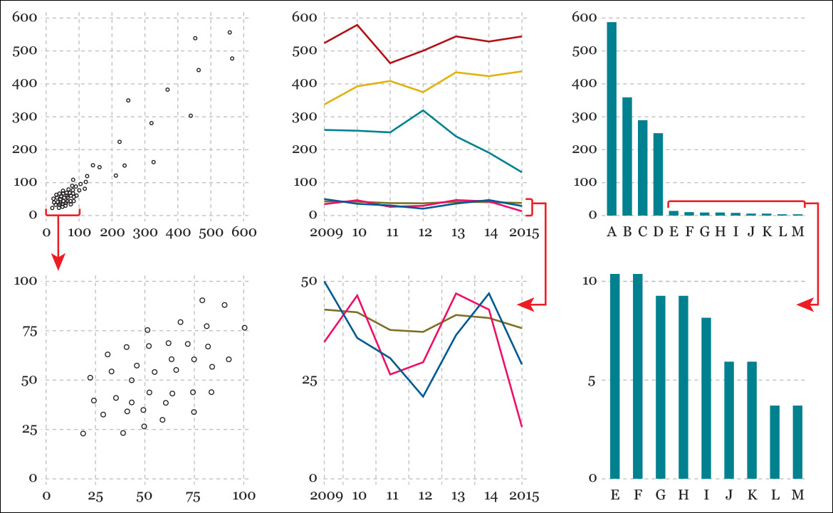
My favorite tool to make choices on how to present data, though, is a hierarchy of elementary perceptual tasks, or methods of encoding, that was put together in the 80s by two statisticians, William S. Cleveland and Robert McGill, and that was later redesigned by Cleveland himself to be included in his magnum opus The Elements of Graphing Data. You can see my own version of that scale on Figure 5.5, where I added a few examples of the graphics mainly associated with each step.
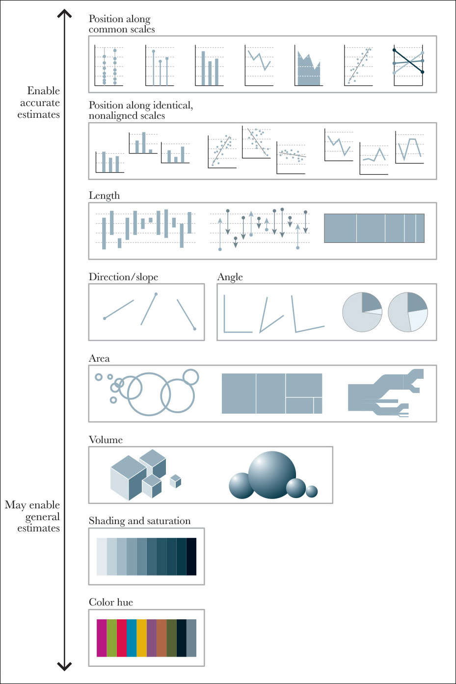
This is how Cleveland and McGill described their hierarchy: “We have chosen the term elementary perceptual task because a viewer performs one or more of these mental-visual tasks to extract the values of real variables represented on most graphs.”2
2 Cleveland and McGill’s original 1984 paper can be read here: https://www.cs.ubc.ca/~tmm/courses/cpsc533c-04-spr/readings/cleveland.pdf.
In other words, to decode a pie chart, we try to use the angle or the area of the slices as cues. When seeing a bar chart, we may pay attention to the position of the upper edge of each bar or to its length or height. When trying to decode a bubble chart, we could try to compare areas (the right choice) or diameters (which would mislead us).
Cleveland and McGill tested the effectiveness of their perceptual tasks in several experiments. The conclusion was that if you wish to create a successful chart, you need to construct it based on elementary tasks “as high in the hierarchy as possible.” The closer you move to the top of the scale, the faster and more accurate the estimates readers can make with your graphic. You can test that yourself going back to Figure 5.2. Area, color, and angle are much less effective than those graphic forms based on positioning objects on common scales.
A Grain of Salt
Two important caveats are in order at this point. First, Cleveland and McGill were writing just about statistical charts. What about data maps? After all, maps use many methods of encoding that belong to the bottom half of the hierarchy, such as area, hue, shading, and so on. Is this wrong? Hardly. Methods of encoding on the bottom half of the scale may be appropriate when the goal isn’t to enable accurate judgments but to reveal general patterns.
Figure 5.6 is a choropleth map of unemployment rates by U.S. county. Its goal isn’t to let you identify the counties with the highest or lowest rates or to rank counties in a precise manner. The map’s purpose is to reveal geographic clusters, such as the very low rates in the North-South strip from North Dakota to Texas, or the very high rates in many counties in Southern states.
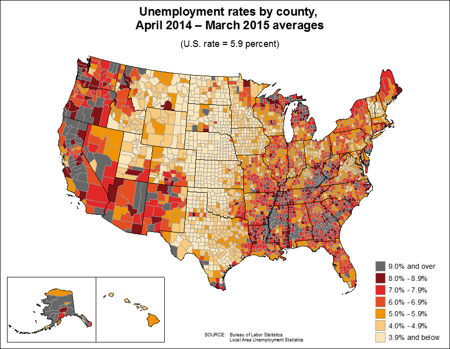
Figure 5.6 From the U.S. Bureau of Labor Statistics, http://www.bls.gov/lau/maps/twmcort.gif.
If the goal of this same graphic were to let readers compare counties, then the map wouldn’t be the right choice. We’d need to pick a graphic form from the top of Cleveland’s and McGill’s scale, perhaps a bar chart or a lollipop chart, and then rank and group the counties in a meaningful way—from highest to lowest, alphabetically, per state, and so on.
And what if our purpose is to show readers both the big picture and the details? Then we’d need both the map and the chart on the same page or, if this were an interactive visualization, a menu that’d let people switch between them. Multiple graphic forms may enable multiple tasks.
The second caveat is that you cannot apply anyone’s method of choosing graphic forms uncritically. A bit of critical judgment is paramount.
For instance, think of how hard it would be to use a method of encoding from the very top of Cleveland’s and McGill’s hierarchy to show the same data that Figure 5.7 displays. Here, readers need to decode length and area, but that’s not a huge problem, considering the purpose of the chart.
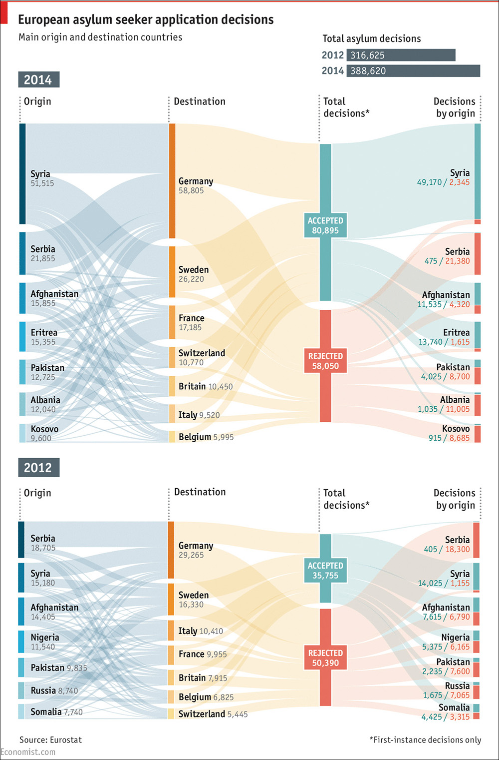
Figure 5.7 A Sankey diagram by The Economist, http://www.economist.com/blogs/graphicdetail/2015/05/daily-chart-1
In Figure 5.8, I’m comparing several versions of a chart inspired by Thomas Piketty’s 2014 bestseller Capital in the Twenty-First Century. The first one, on top, is similar to one that appears in Piketty’s book. The second is my own version, spacing the years on the X-axis correctly. Notice how different the patterns look after doing this.
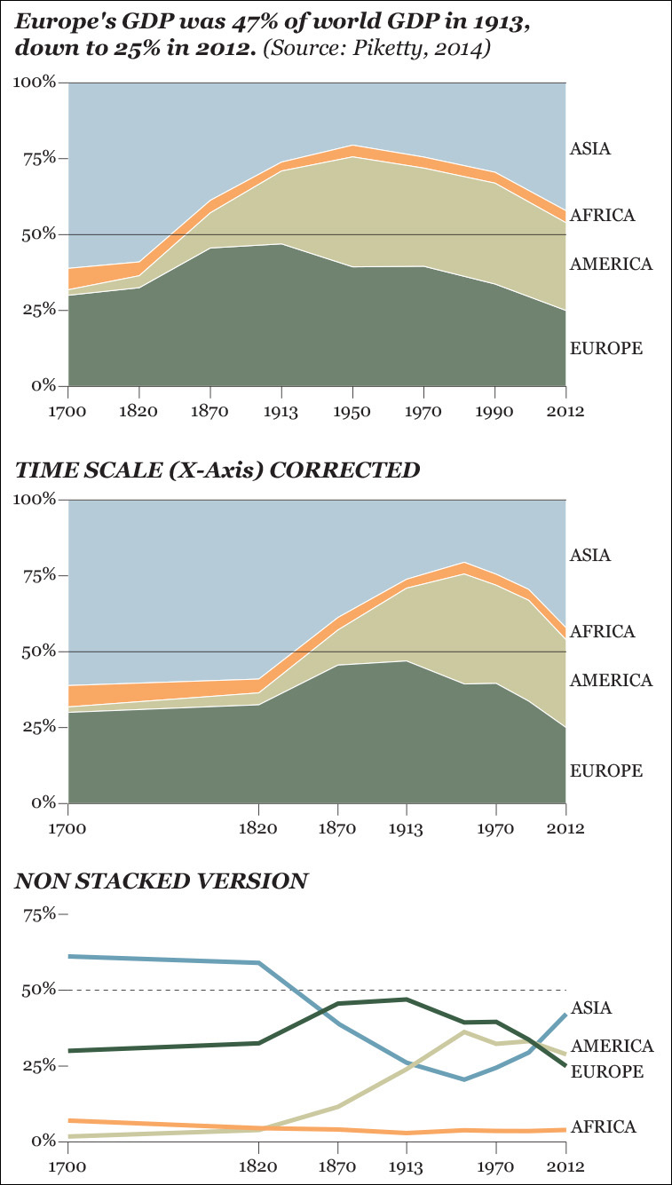
Reading Piketty’s stacked area chart forces you to perform perceptual tasks that belong to the middle of Cleveland’s and McGill’s scale. You need to either compare areas or distances between the top and bottom edges of each segment. The only changes that can be visualized accurately are Asia’s and Europe’s, as those two portions are sitting on a horizontal edge, either the 0-baseline or the 100-line on top.
Africa’s and America’s baselines shift depending on how tall Asia’s and Europe’s segments are, and that makes detecting changes in those continents difficult. It may well happen that to your eyes it seems that Africa’s output grew in the 1950s just because Africa’s segment is being pushed up by the increasing size of American economies. But Africa’s GDP barely changed in that decade.
This is all fine, though, because the purpose of this chart is explicit in its title: comparing Europe to the rest of the continents, besides making clear that figures add up to 100 percent. That’s why in the original chart Europe’s segment is emphasized and placed at the bottom, sitting on the 0-baseline. The other continents are shown to provide context.
But what if the goal of the chart was to put all continents on the same footing and compare them in an accurate manner? In that case, the stacked area chart doesn’t work well. Can you see, for instance, if America’s contribution to world GDP was larger or smaller than that of Europe in 2012? You can’t, unless you use your fingers to measure that last part of the chart. But see how easy this task is if we design a simple, non-stacked time-series chart, like the third one at the bottom?
Finally, what if you want to show both parts of a whole and all lines as individual entities, sitting on a common 0-baseline? Then, you’d need to design both charts, as National Public Radio (NPR) did with its interactive visualization about college majors (Figure 5.9).3 The designer, Quoctrung Bui, decided to first show readers the big picture—all majors together—stacked on top of each other. Then, if a reader decides that she needs more detail about a particular major, she can click it and see its change on a regular time-series chart.
3 The organization of majors in this chart is a bit confusing. As the segments are color-coded, I assumed that they were grouped somehow. It turns out that they are organized alphabetically and that colors are assigned somewhat arbitrarily.
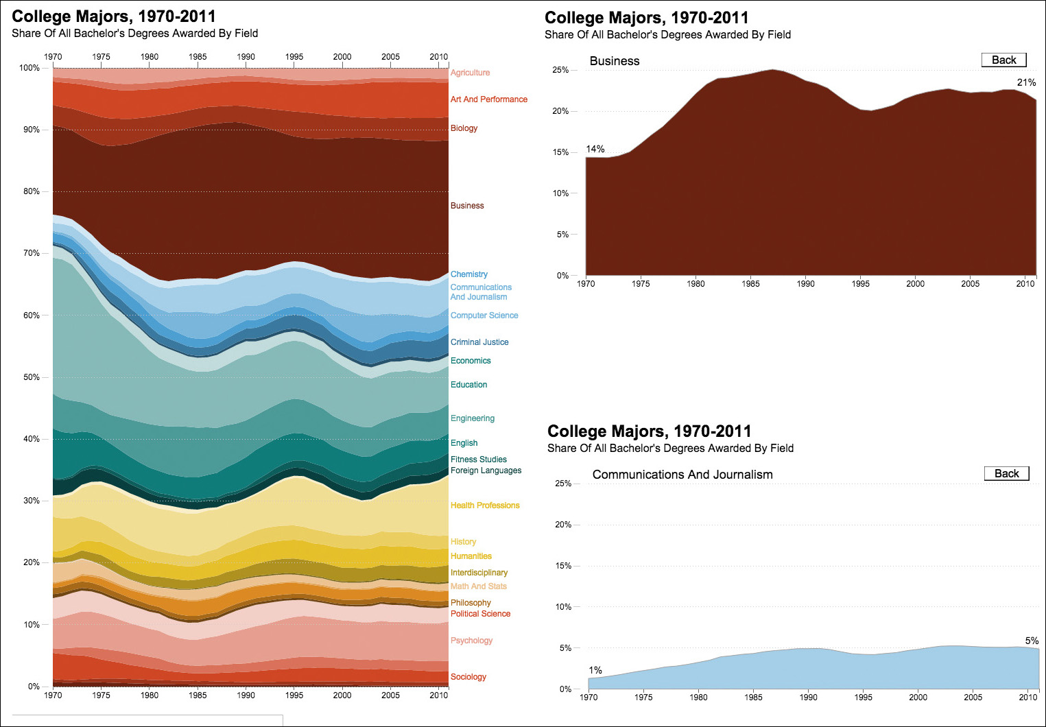
Figure 5.9 Visualization by NPR, http://www.npr.org/sections/money/2014/05/09/310114739/whats-your-major-four-decades-of-college-degrees-in-1-graph.
The examples we’ve seen in this section will help you understand another important rule of thumb: if you need to show parts of a whole, show them, by all means. But if the purpose of your chart is to show each one of those parts individually, do that. Let’s rephrase that as a more general rule: always plot your data directly.
In the first chart in Figure 5.10, I have chosen the right graphic form from Cleveland’s and McGill’s scale. All data are plotted on a common axis, so making accurate estimates is quite easy and fast. However, does it really matter to me to plot income and expenses as separate variables? Or does it matter more to see the difference between them? Depending on the answer, you’d need to choose either the first or the second chart. If the difference matters more, plot the difference, not income and expenses separately.
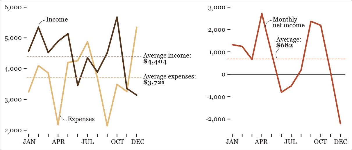
Figure 5.10 Which chart is better? It all depends on if you want to emphasize income versus expenses or if you wish to display the monthly net income.
Practical Tips About those Tricky Scales
Another factor to consider when deciding how to design a chart is its baseline and the scale on the X-axis (horizontal) and the Y-axis (vertical).
Look at the first two charts in Figure 5.11 without reading the numbers on the Y-axis. Did you notice how large the differences are? Well, they really aren’t! I truncated their Y-axis, so the baseline in both cases is set to 40 percent, rather than to 0 percent. It isn’t acceptable to do so when the main visual cue to interpret the data is length or height measured from a common baseline. Bar charts, lollipop charts, histograms, and their variants should have a 0-baseline—unless you want to increase the chances of misunderstanding (which some people do, unfortunately!).

I should point out an exception: some data sets don’t have a natural zero baseline. For instance, in economic analysis and finance, it’s common to use indexed numbers, rather than just raw figures. Indexes often—not always, as we’ll see in Chapter 8—have a base value of 100, as in Figure 5.12, which compares the cost of a product or service in different countries using the cost in the United States as the 100-baseline.
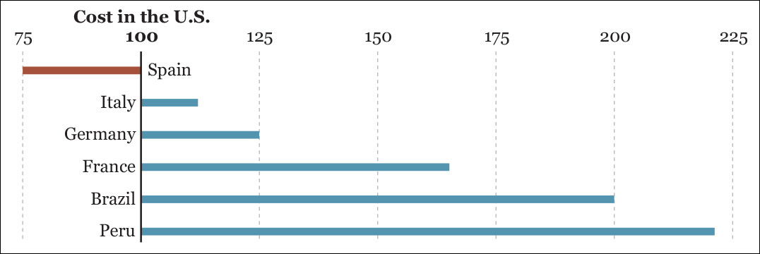
Figure 5.12 The cost of a product in different countries as a ratio of the cost of the same product in the United States.
You can think of the figures in the chart as percentage differences: 125 means 25 percent larger, and 200 means an increase of 100 percent (double). This plot would be a good choice for discussing the difference between costs in several countries in comparison to the United States. The difference between the U.S. and Brazil, for instance, is four times the difference between the United States and Germany.
We can derive a simple and flexible rule from this discussion: rather than trying to invariably include a 0-baseline in all your charts, use logical and meaningful baselines instead. This rule should help us decide what to do when designing charts in which length isn’t the method of encoding. I am thinking of dot plots, scatter plots, line charts, and so on, which rather rely on position over common axes. For example, if you’re talking about the historical unemployment rate in a country and this variable has never dropped below 5 percent, then 5 percent could be the baseline for your line chart.
Compare the two sets of charts in Figure 5.13. It’s a bit absurd to waste so much space just to show where the 0 point is, as I did on the two on top.

Another challenging situation appears when comparing widely different variables. See the first row of charts in Figure 5.14. The fact that a few data points are so large makes the smaller ones almost impossible to tell apart.
What to do? First, think of the purpose of these charts: is it just to highlight the largest values over the bulk of little ones? If that’s what you need, leave the charts as they are. But what if you want readers to be able to clearly see both the large and the small values? You’ll need at least two charts, each with its own scale, as shown in the second row of the same figure. If your data vary so much that presenting them all on a single chart renders it useless, plot your data in several charts with dissimilar scales.
Organizing the Display
Choosing the right graphic form isn’t enough to design a great visualization. You also need to think of how your variables and categories are going to be organized: from highest to lowest, alphabetically, or by any other criteria. This decision also depends on the critical questions we have already asked ourselves: what tasks should the graphic enable? What should I reveal with it?
Imagine that you’re doing some advertisement market analysis and you wish to know which kind of media influences teenagers and adults the most. You may conduct a survey and display the results as in Figure 5.15. This chart lets you compare the different methods of delivering ads within each age group.
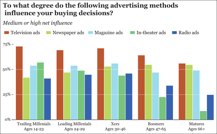
But what if what you really wish to do is not compare media within age group but across age groups? In other words, what if you want to see which media becomes more or less trustworthy as people age?
In that case, the current chart isn’t that adequate. You can clearly spot TV’s downward pattern, but that’s just because the bar corresponding to TV ads is the first one of each cluster, and its color stands out over the others. If you want to see if magazine ads become more or less trusted later in life, your brain will be forced to isolate the blue bars in the middle of each group and then compare them to each other. That’s way too much work. If seeing trends across age groups is the task we want to enable, let’s group the bars not by age but by media (Figure 5.16).
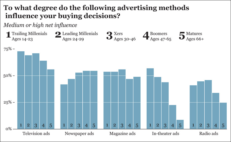
Figure 5.16 Reorganizing the data from Figure 5.15.
We could further improve this chart. I love bar charts, but they tend to look a bit clunky when you have more than 10 bars or so. An intriguing alternative would be an unorthodox line chart (Figure 5.17), which doesn’t put time on the X-axis, but a categorical variable, age groups. The beauty of this chart is that it gives us the best of both worlds: it doesn’t just let us see trends across age groups, but it also lets us compare each medium within each group, as the dots are stacked on top of each other.

Figure 5.17 Line chart with the same data used in Figure 5.15.
“Wait,” you’re probably thinking, “aren’t line charts intended to display just trends over time intervals?” Many of us learned that rule in school. But that’s just a convention, and conventions can and should change. Line charts can certainly be used to display time-series data, but time-series charts aren’t the only kind of line charts that exist in the visualization designer’s repertoire. Parallel coordinate charts, like the one in Figure 5.18, are pretty useful to visualize multi-dimensional data, as we’ll see in Chapter 9.4
4 Visualization expert Robert Kosara has a good article about parallel coordinate charts: https://eagereyes.org/techniques/parallel-coordinates.
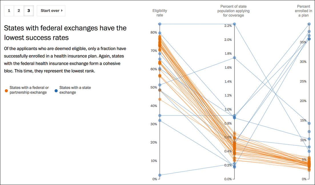
Figure 5.18 Visualization by The Washington Post, http://www.washingtonpost.com/wp-srv/special/politics/state-vs-federal-exchanges/.
Put Your Work to the Test
There are certain graphic forms that I commonly avoid. One is the radar chart, as I consider it a feeble way of presenting information. Designers sometimes defend radar charts because they look pretty. I am not always against sacrificing a bit of clarity if the payoff in the form of allure is great, but I think that in the case presented in Figure 5.19 we’re sacrificing too much.
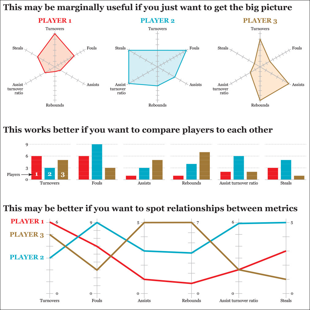
On the three radar charts on top, I am presenting metrics of three basketball players. These charts are OK if all we need is a general and quick picture of the strengths and weaknesses of the players but little else.
Now see the same fake data on a bar chart, which makes it much easier to compare players to each other. Then I take a look at the parallel coordinates chart, which may be helpful to spot relationships between variables. For instance, it lets us see that there is a correlation between assists and rebounds. All these tasks can be completed with the radar charts, too, but it takes more effort: if you want to compare the performance of the three athletes in one metric, your eyes need to hop from radar chart to radar chart.
That said, I have used radar charts a couple of times in my career as an infographics and data visualization designer. Why did I break my own rule? Because sometimes a graphic form that is an inept choice in most circumstances may be fruitful in a very specific one.
Figure 5.20 is a poster-size infographic made by my team at the Brazilian weekly news magazine Época, where I was graphics director between 2010 and 2012. It shows the results of the 2010 presidential election with a combination of bar charts, slope charts—the ones at the bottom, comparing the 2010 results with the results of the previous election, state by state—and a choropleth map.
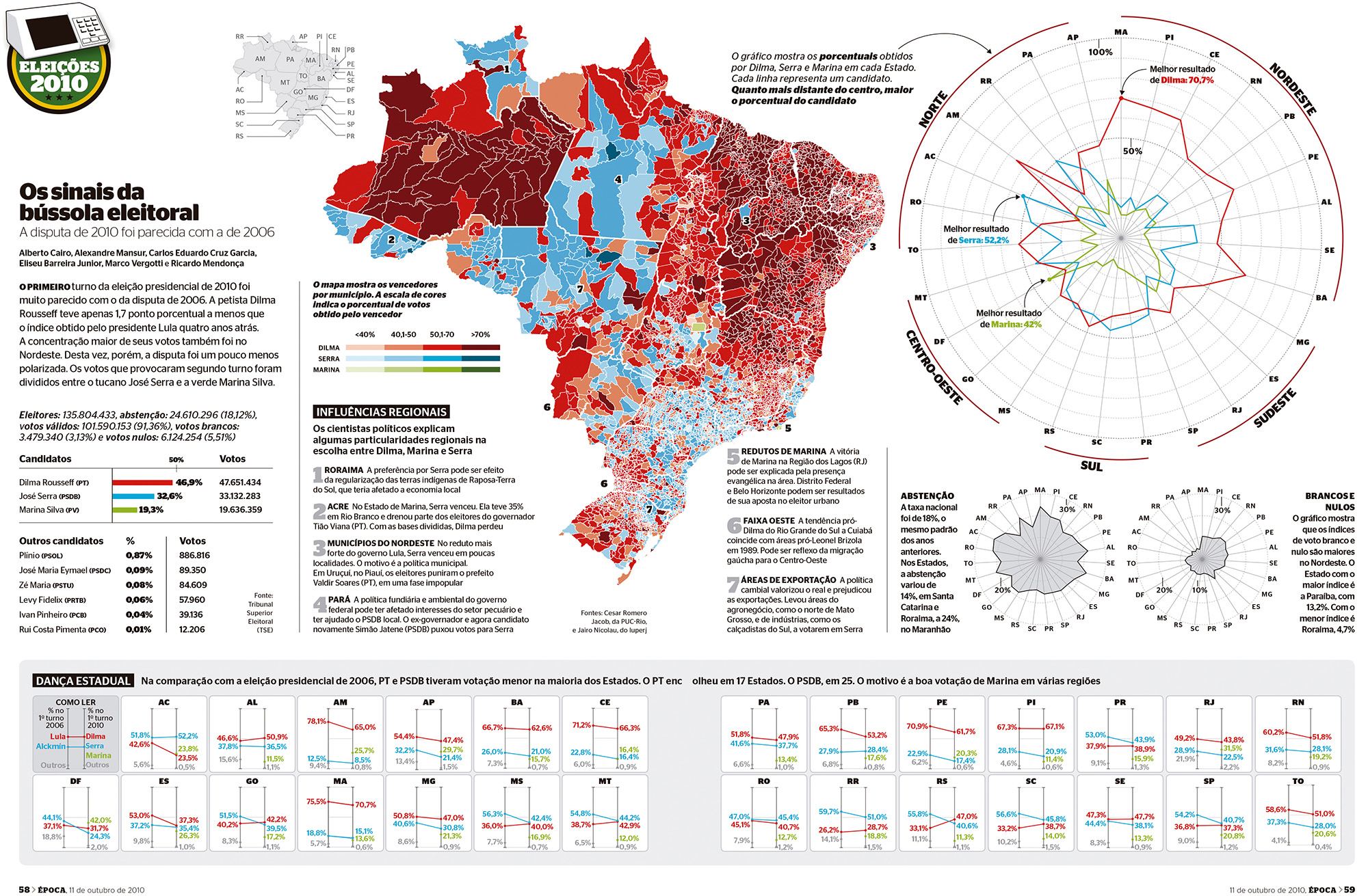
There’s also a large radar chart on the upper-right corner. In this one, each radius corresponds to one of the 27 states Brazil is divided into. There are three color lines, one for each of the candidates. Red is for Dilma Rousseff (who ended up becoming president); blue is for José Serra; and green is for Marina Silva. The center of the radar is the 0 percent point, and the outmost ring corresponds to 100 percent of the vote. The farther away a joint of one of the lines is from the center, the larger the share of the vote that particular candidate got in that state.
Let me admit at the outset that these state-by-state results could also have been displayed using a set or traditional bar charts, but we decided on the radar chart because we wanted to highlight the fact that Dilma Rousseff, the left candidate, won by a very high margin in northeastern states. Notice that the radii on the radar chart are organized according to their geographic position: northeast on the upper-right corner, southeast on the bottom-right, and so forth. Someone familiar with Brazil’s geography will be able to relate the choropleth map to the radar chart when they are placed side by side, like in this case.
It’s hard to know if a graphic form will work well until you try it and you compare it to alternatives, so when designing this infographic, I also designed bar charts and a line chart (Figure 5.21). We discarded it at the end in favor of the radar chart because we tested the latter with some journalists and designers in the newsroom. I also showed it to friends and relatives. All of them got the message the radar chart was intended to convey in a few seconds: Dilma Rousseff’s line looks like a rubber band that has been stretched out toward the northeast.

Figure 5.21 An alternative to the radar chart in Figure 5.20.
When the graphic was almost finished, Época’s managing editor at the time, Helio Gurovitz, joked that the radar chart should actually be called a “compass chart” and suggested a title: The Signs of the Electoral Compass (“Os sinais da bússola eleitoral.”) That made a lot of sense to me.
What I get from stories like this is that rules of visualization matter as much as the results of the tests you may conduct with readers, even those tests that are as informal as the one I’ve just described.
Tools like Cleveland’s and McGill’s hierarchy of methods of encoding are essential for our work, as they are grounded on empirical evidence obtained through experiments. They save time and energy that we can devote to better purposes, like plotting our data several times, giving this or that graphic form a try, putting the results side by side, showing them to as many people as possible, and then asking them about insights they get after exploring the graphic for a bit.
Some testing is critical, as very often readers don’t interpret our visualizations as we want them to. In Misbehaving: The Making of Behavioral Economics, the book I mentioned at the beginning of this chapter, economist Richard H. Thaler describes an experiment he conducted in 1995. He asked employees at the University of Southern California to choose between two imaginary 401(k) retirement plans, a riskier one with higher expected returns (Fund A) and a safer one with lower ones (Fund B).
Thaler showed one group of employees the first two charts in Figure 5.22. These show the distribution of one-year returns. Each bar represents one of 35 possible changes (increase or decrease) from one year to the next.

Figure 5.22 Charts based on Richard H. Thaler’s Misbehaving: The Making of Behavioral Economics (2015).
The worst possible annual return of Fund A, the riskier one, is a –40 percent, and the best one is an increase of nearly 55 percent over the previous year. (Remember that these bars aren’t organized chronologically, but from lowest to highest return.) Fund B shows less variation: the worst annual return is loss of –4 percent, while the best return is an increase of around 28 percent in one year.
Another group of subjects were shown the second set of two charts. These are all possible total returns over a period of more than 30 years. If you invest today and only take a look at your returns three decades from now, you may get anything from the lowest to the highest of the returns shown on the charts. There aren’t negative returns in this case, as you can see.
The results of the experiments were impressive. People who saw the first two charts said that they weren’t willing to take many risks, so they chose to put just 40 percent of their portfolio in Fund A (high risk, high return) and 60 percent in Fund B.
Those who were shown the second two charts said that they would prefer to invest 90 percent of their money in Fund A, the risky one. The funniest thing of this experiment is that both sets of charts are based on exactly the same underlying data, coming from real portfolios made of a mixture of bonds and stocks.
Take notice: The way data is visually presented has very real consequences on the lives of people who read your visualizations.
To Learn More
• Bertin, Jacques. Semiology of Graphics. Redlands, CA: Esri Press, 2010. Bertin, a cartographer, was the founding father of modern visualization. This book, originally published in French in 1967, is his most famous one.
• Börner, Katy. Atlas of Knowledge: Anyone Can Map. Boston, MA: MIT Press, 2015. Börner, a professor of information science at Indiana University in Bloomington, is the author of two other books about visualization, but this is my favorite one by far. It’s full of great examples, and it offers a thorough discussion of methods of encoding data.
• Cleveland, William S. The Elements of Graphing Data. Monterey, CA: Wadsworth Advanced and Software, 1985. An absolute classic of visualization.
• Few, Stephen. Show Me the Numbers: Designing Tables and Graphs to Enlighten. Oakland, CA: Analytics, 2004. My favorite book about statistical charts for business analytics.
• Meirelles, Isabel. Design for Information: An Introduction to the Histories, Theories, and Best Practices behind Effective Information Visualizations. Beverly, MA: Rockport, 2013. This beautiful book doesn’t cover just quantitative or data visualization, but it also describes how to represent any kind of information by means of “structures:” hierarchical, relational, temporal, spatial, spatio-temporal, and textual.
• Steele, Julie, and Noah Iliinsky. Designing Data Visualizations. Sebastopol, CA: O’Reilly, 2011. A concise and dense introduction to good visualization practices.