
8. Revealing Change
In statistics, you can’t win arguments by invoking the truth... if the truth is knowable, statisticians would all be unemployed.
—Kaiser Fung, “Numbersense and true lies”
On a sluggish August 2013 afternoon, the national public television channel in Spain, Televisión Española (TVE), delivered some cheery news. After enduring five years of economic crisis, unemployment in the country experienced a noticeable drop, from 5.0 million people to 4.7. TVE’s audience was exposed to a chart similar to Figure 8.1 for a few short seconds. Uncork the champagne!
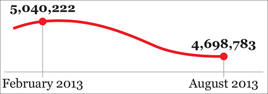
Critics of TVE, whose content is “inspired” (ahem) by whoever governs Spain at each moment, were quick to point out that the chart was flawed. It not only exaggerated the downward slope but, more importantly, its horizontal axis was truncated in a disingenuous manner.
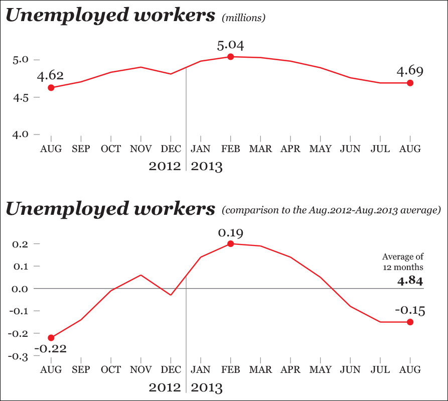
Nearly 12 percent of Spain’s jobs are related to tourism, so unemployment in my country of origin is highly seasonal: it regularly goes up during the fall and winter—except in December—and shrinks during the summer. Therefore, to get a truthful depiction of how much unemployment has varied, it’s necessary to go back in time at least 12 months.
When we do that (see the first chart in Figure 8.2), we see that unemployment didn’t get better in August 2013. Actually, there were more unemployed people in August 2013 than in August 2012, something that becomes even clearer when you compare the figures of both months with the yearly average (second chart) Where did I put the cork? The champagne is going to lose its fizz.
Quoting economist Ronald H. Coase “If you torture your data long enough, nature will always confess.” To get a confession in this case, we don’t even need to be very thorough or smart, as trimming the axes in the right places yields a message our apparatchik-in-chief will find palatable: we can fabricate change where there’s barely any.
Trend, Seasonality, and Noise
The change in one or more continuous variables is usually—not always—visualized with time series line charts. The X-axis (horizontal) in this kind of chart represents equally spaced time intervals, and the Y-axis (vertical) corresponds to the magnitude of the variables we wish to explore or present.
Thanks to the tricky example we’ve just seen, we have identified two of the features we need to pay attention to when reading a time series chart:
• The trend. Do the variables go up, down, or stay the same during the time segment we chose to explore?
• The seasonality. Do the variables show consistent and periodic fluctuations that may muddle our understanding?
We can add a third one: the noise. Are some of the variations we observe simply random changes?
It’s usually hard to see those three features at once in a single chart. They need to be separated. As Spanish book publisher Jacobo Siruela said in a 2015 interview in El País daily newspaper, “We must move away from the noise to be able to hear the melodies.” He was referring to life in general, but the dictum applies to the melodies data frequently hide.
Decomposing a Time Series
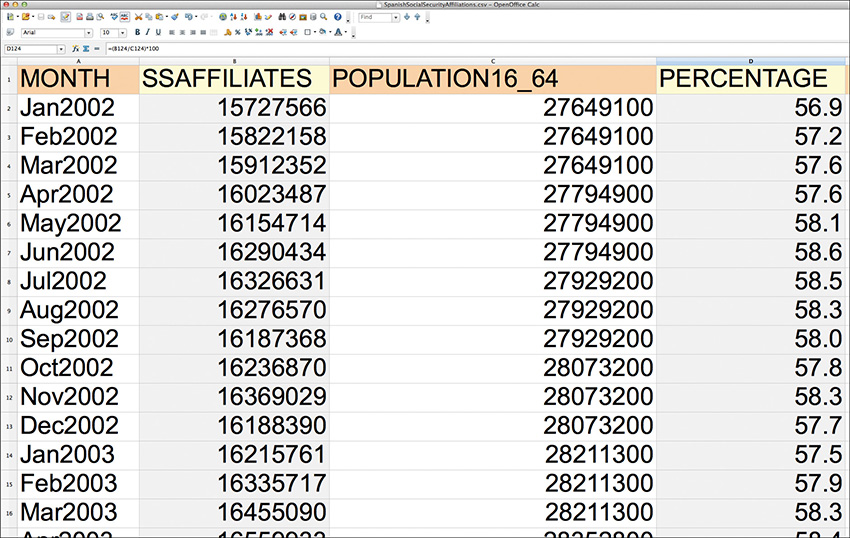
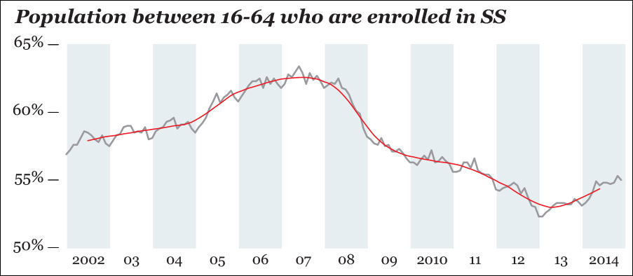
I began this chapter writing about unemployment in Spain. TVE’s chart got me curious about long-term trends. The unemployment rate is just one of the variables we could use to analyze the health of a country’s workforce. Another one, at least in Spain, is the amount of people who make contributions to Social Security (SS) to get unemployment and retirement benefits later.
Figure 8.3 is a small portion of a data set downloaded from Spain’s Instituto Nacional de Estadística (INE). The first column is the total number of SS affiliates—or enrollees—between January 2002 and December 2014.
You can see this variable on the top chart in Figure 8.4. There were 1 million more people enrolled in SS at the end of 2014 than at the beginning of 2002, which seems to be good news. However, if we ask our analysis software to overlay a straight trend line, news gets somber: the line goes down.1 Spain plunged into a deep crisis at the beginning of 2008. By 2014, the country had not fully recovered.
1 Displaying a trend line in a time series chart is not very orthodox in most cases; smoothed curves are much more useful, as you’ll soon see. I am using R for the following charts, but you can get similar results with Excel or most other data analysis tools.

Figure 8.4 In Spain, the raw number of people who are enrolled in Social Security increased (although the trend line suggests otherwise) between 2002 and 2014 (chart 1), but the population ages between 16 and 64 also grew quite rapidly (chart 2), so the percentage of people who could work and actually do has decreased (chart 3).
We face another challenge: we are not taking population size into account. One of the most confusing paradoxes of unemployment figures, if they aren’t correctly adjusted, is that they tell you how many people want to work but can’t, but not how many people could work but have given up looking for a job. This is very difficult to measure, so in our exercise we’ll use an imperfect proxy variable.
The second column in Figure 8.3 is the working age population in Spain, those folks between 16 and 64 years of age.2 This is visualized on the second chart of Figure 8.4, which shows that Spain’s working age population increased until 2008 and then started shrinking after the crisis that hit that year. Spain’s population is getting older, and large swaths of Latin American immigrants have returned to their countries, unable to get jobs. Moreover, a good number of young and well-educated Spaniards have also left.
2 This is a variable suggested by INE itself. I wrote that it’s imperfect because it may well happen that a considerable chunk of its fluctuations is due to lurking factors, such as how many of those people are still studying.
The third column in Figure 8.3 is the result of calculating the percentage of people of working age who are enrolled in SS. Or, mathematically put, this equals (SS enrollees/Population between 16 and 64) × 100.
This is displayed on the third chart in Figure 8.4. Compare it to the first one: the raw counts got higher (16.7 in 2014, versus 15.7 in 2002), but the percentage got lower. This is another example of why visualizing your data in multiple ways is so important.
Next, I am going to compare each percentage score with the average percentage of SS affiliates between January 2002 and December 2014. This average is 57.9 percent.
Each value – Average (57.9 percent) = Difference
The results are on Figure 8.5, which is really boring. The chart is identical to the third one on Figure 8.4 on everything but its scale. Besides, is a straight line a good descriptor of our variable? It isn’t. The shape of the raw data doesn’t resemble a straight line, not even close. Rather, it looks like an ocean wave with a bump in the middle. Therefore, a linear model is not adequate in this case. It doesn’t really help us put the trend (or smooth) aside to explore the other relevant features of our data, its seasonality, and noise.
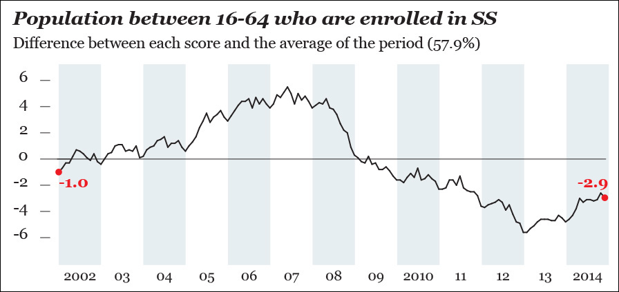
Figure 8.5 Comparing each percentage score to the average of the period between January 2002 and December 2014. This isn’t that revealing!
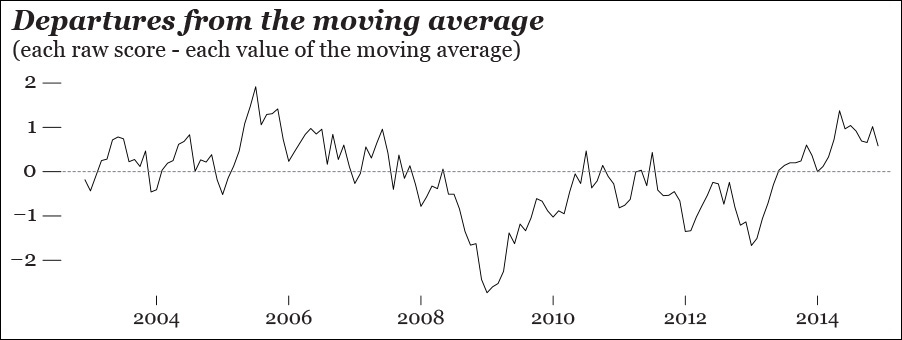
With the aid of software, we can generate a new trend line, a model that better fits our data. You can see it on Figure 8.6. This curve is based on a moving average. Without getting overly technical, what the computer has done for us is to divide our time series into small chunks of, say, 4, 6, or 8 months each (you decide that) and calculate the average of each chunk, rather than the average of the entire period, as I did before.3
3 There are many kinds of moving averages (simple or arithmetic, weighted, exponential, etc.), but it’s beyond the scope of this book to explain them. If you’re interested in learning about them, see the references at the end of this chapter.
Now we can subtract the moving average scores from all scores to design a new chart (Figure 8.7). What we get is a comparison between the moving average and the actual raw scores.
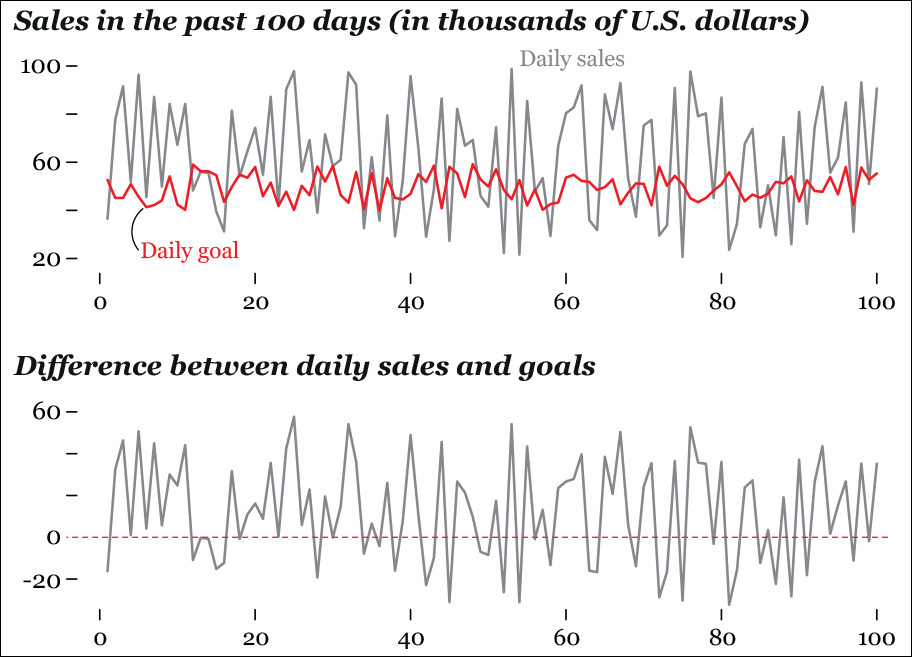
This strategy of comparing raw scores and expected or smoothed ones has many applications. Imagine that you are analyzing data from your company and that you want to compare your actual daily sales with your target sales per day. You can plot the actual scores, as in the first chart of Figure 8.8, or you can plot the difference, as in the second one. Which one of them is better? As usual, it depends on what you want to emphasize: sales and goals as separate entities, or the difference between the two. The first chart can be misleading, as both lines in it are shifting.
Let’s go back to our Spanish Social Security exercise. We have a decent smooth plot, but we haven’t studied how much of the variation is due to a pattern of periodic oscillations or to randomness. This is something we could do by hand, but a computer will handle it much more quickly. A few lines of code or mouse clicks in a data analysis software may yield something like Figure 8.9, a summary of our time series: the observed values, the underlying trend, the seasonality, and the remaining noise that isn’t part of the preceding charts.

Focus on the seasonality chart and notice that the number of SS affiliates goes up sharply in the middle of each year, and then it drops in the fall and winter. This is impossible to detect on the first chart, the one encoding the raw scores.
Seasonality varies from roughly –0.6 to 0.6, while the noise in the data (the “random” plot in Figure 8.9) goes from less than –0.4 to more than 0.4. As long as the computer has extracted these two features from the original data set for us, we can plot them directly. Figure 8.10 is a chart of the monthly variation in our data that can be explained by seasonality and noise combined. This variation can obscure the real one. You may want to consider it for your exploration by subtracting it from the raw scores, like in Figure 8.11, which looks very much like the trend in Figure 8.9.
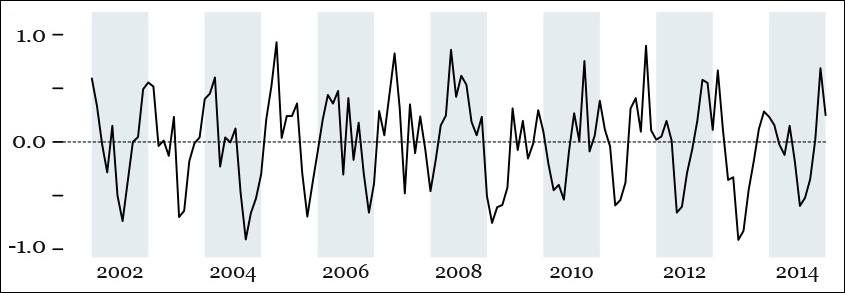
Figure 8.10 This chart is the result of adding the seasonality scores and the random scores from Figure 8.9.

Figure 8.11 This is the result of subtracting the scores shown on Figure 8.10 from our original data of affiliates to the Spanish Social Security.
Adjusted variation = Each raw score – (Each score of the seasonal chart + Each score of the Random chart)
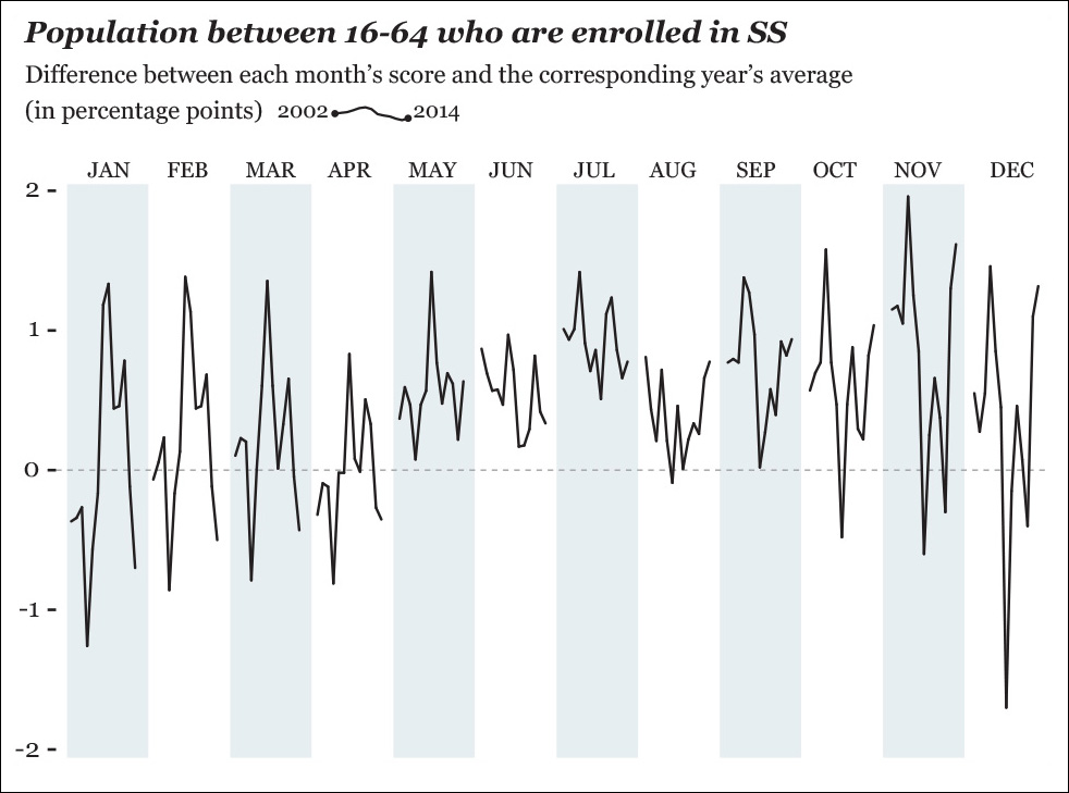
Before we move on, we should play around with our SS data a bit more. Let’s suppose that what you want to see is not the year-by-year variation, but month-by-month. In other words, you intend to compare January to January, February to February, March to March, and so forth, between 2002 and 2014. You could design something like Figure 8.12, in which we overlay the observed values and the average score of each year.
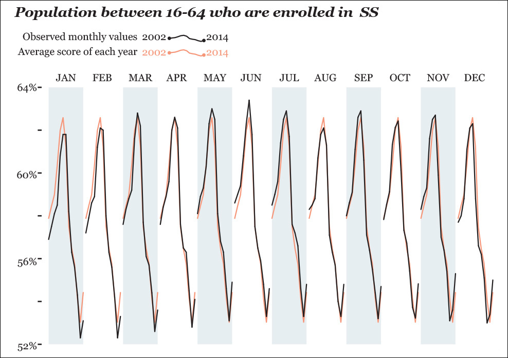
The differences in this chart are so tiny, though, that they are barely visible, so it might be better to plot things directly, as in Figure 8.13. Here, we can immediately spot some interesting facts. For instance, June and July vary little year by year; July is among the months that depart the most from each year’s average. November, December, and January show the widest changes. All these tidbits got obscured in our previous chart.
This kind of seasonal subseries chart can be very powerful. In climate science, for instance, it may be used as in Figure 8.14 to visualize concentrations of carbon dioxide and other greenhouse gases. Companies may choose this graphic form to compare their month-by-month performance with both monthly and yearly averages.
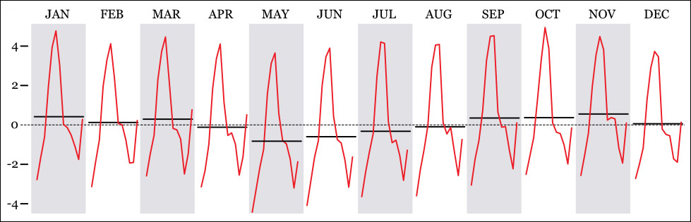
Figure 8.14 An example of seasonal subseries plot, comparing the average of all years (dotted line) with the average of every month throughout those years (horizontal black lines) and the variation within a certain month (red line).
Visualizing Indexes
Another way of exploring and presenting time series data to readers is to calculate indexes. I recently bought a single-family house in Miami, so I got curious about how the market for this kind of house has changed in the past few years, both before and after the real estate bubble exploded, roughly between 2006 and 2008.
I downloaded a data set from the U.S. Census Bureau. I visualized the total number of houses sold and then the inflation-adjusted price range breakdown (Figure 8.15). We can immediately spot some promising patterns: sales of cheap houses declined steadily even before the crisis hit and didn’t increase at all later. More expensive houses also suffered mightily between 2006 and 2008 but picked up a bit in 2013.
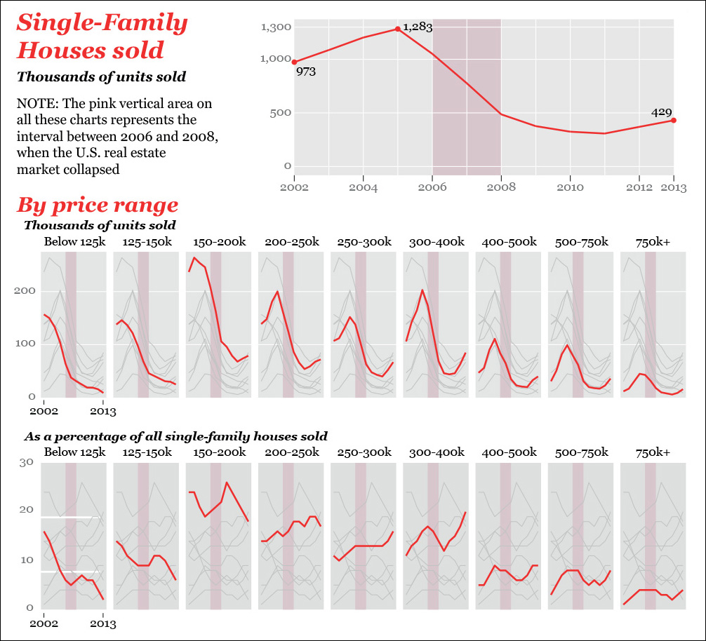
Figure 8.15 Sales of single-family houses in the United States between 2002 and 2013. Biostatistician Rafe Donahue calls this idea of plotting all values (gray lines) in comparison to one specific subset of the values (red lines) “You-are-here” plots. He describes this technique and many others in a free book: http://biostat.mc.vanderbilt.edu/wiki/pub/Main/RafeDonahue/fscipdpfcbg_currentversion.pdf.
We can better represent the relative change using a zero-based index. On Figure 8.16, the first row of charts compares the sales of single-family houses to the average score of the 2006–2008 period, when the crisis hit. This is called the index origin, the 0 percent in the charts. On the second row of charts, the index origin is the sales in 2002. The Y-axis is the difference between each year’s sales and the index origin I chose on each case.

Calculating zero-based indexes is quite easy. Just tell your favorite software tool to follow the universal formula to obtain percentage change:
Percentage change = ((Each score – Index origin) / Index origin) × 100
To illustrate this with an example, the average number of houses that sold for less than $125,000 per year between 2002 and 2013 was 63,750. This is going to be our origin. I know that the number of cheap houses sold in 2002 was 157,000. What is the percentage difference? Formula!
((157,000 – 63,750) / 63,750) x 100 = 146.3
So sales of cheap houses in 2002 were 146.3 percent higher than the average sales between 2002 and 2013. If you go to the first chart on the first row of Figure 8.16, you’ll see that number plotted. It’s the first data point of the red line, which is close to 150 percent.
Let’s do the same, but using the sales of 2002 as the origin. This year, as we’ve just seen, 157,000 houses priced $125,000 or under were sold. In 2013, that number was just 14,100. Let’s calculate the percentage difference:
((14,100 – 157,000) / 157,000) x 100 = –94.3
That’s a 94.3 percent decrease, meaning that sales of very cheap single-family houses have almost vanished in the United States. Again, if you wish to see that number represented, go to the first chart on the second row of Figure 8.16. It’s the end point of the red line.
By the way, the first time I designed these charts they didn’t look great (Figure 8.17). If there were just three or four lines on each, they would be fine, but whenever a graphic gets as cluttered as these, it’s better to opt for small multiples.
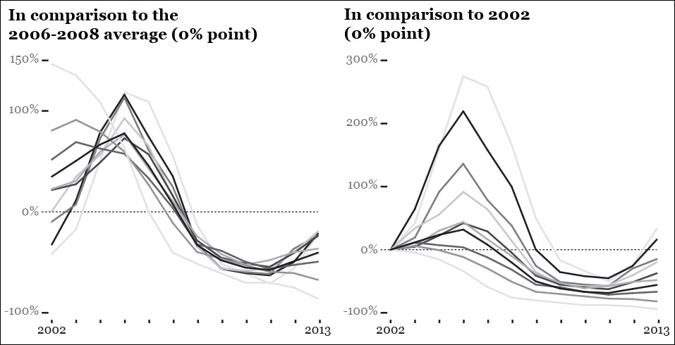
Figure 8.17 There are so many lines in this first version of my zero-based indexed charts that I didn’t even bother styling them further.
From Ratios to Logs
We’ve just learned how to compare all values in our time series to a single index value, a data point in the data set such as the one for 2002, or the average of several years. But what if we are interested in the rate of change of each time period in comparison to the previous one?
The first chart on Figure 8.18 shows the growth of the U.S. population between 1776 and 2010. This upward, regular-looking line, based on estimates with varying margins of error, looks nice, but it might hide important facts. For instance, were there noticeable changes in certain historical periods? If so, they are hard to detect. Let’s transform our data a bit.
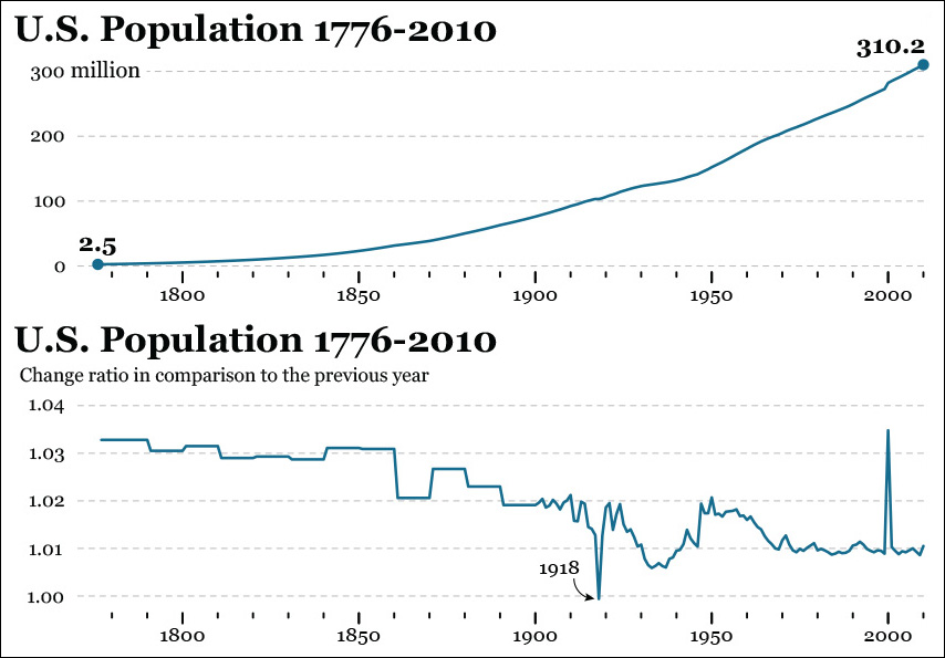
To calculate the change rate between two time periods (consecutive years, in this case) and generate the second chart in Figure 8.18, use this formula:
Change rate = New period / Previous period
For instance, the estimated U.S. population in 1800 was 5,308,483 people. In 1801, it was 5,475,787. Therefore:
Change rate between 1800 and 1801 = 5,475,787 / 5,308,483 = 1.03
This 1.03 can be read as 103 percent, which means that the population in 1801 was roughly (I’ve rounded the figures) 103 percent the population of 1800. In other words, for each 100 people in 1800, there were 103 in 1801.
On the second chart in Figure 8.18, we can spot the only year when the U.S. population was estimated to shrink slightly: 1918. The change rate between 1917 and 1918 is 0.9994, which should be rounded to 1.0. That means that the population in 1918 was basically the same as it was in 1917, or a tiny bit smaller. We can’t tell, as we don’t know the margin of error—which is likely to be greater than this 0.0006 difference, anyway!
Another way to visualize change rate is to use a logarithmic scale. Imagine that you are studying the growth patterns of a bacterial culture of 5,000 bacteria over 50 days. Most bacteria reproduce by binary fission: after a certain period of time, a bacterium grows to a size that allows it to divide into two new bacteria.
Each day, a random percentage of our bacteria, from none (0 percent) to all of them (100 percent) may reproduce. We have the data for all days, so we can obtain the daily percentage change, as in Figure 8.19.
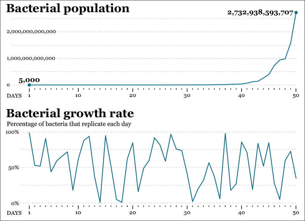
Figure 8.19 Growth of bacterial population: Raw increase and percentage of bacteria that replicate each day.
None of these charts give us a clear idea of the overall change rate, though. The first one, in fact, is almost useless, as the growth rate in our bacterial culture is exponential. The population may double in just a single day or in a few days: we began with 5,000 specimens, and after 50 days we ended up with 2,732,938,593,707, so changes on the line chart become noticeable only after day 40 or so.
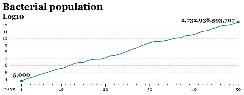
What to do? A log transformation may come in handy. All logarithmic calculations start by deciding on a “base,” which in visualization is commonly 10 but could be any other number. In a log10 scale, each increment of 1 unit of magnitude doesn’t really represent an increment of 1, but a tenfold increase. Similarly, in a log2 scale, each increment of 1 on the scale means “double the size of the figure right below me.”4
4 Logs are much more common than you may think. The Richter scale, used to measure the magnitude of earthquakes, is a log10 scale: an 8.0 earthquake is 10 times more powerful than a 7.0 earthquake.
Get ready for a mouthful: the logarithm of each number in a data set is the power to which the base (we chose 10) should be raised in order to obtain that number. This sounds much more confusing than it really is, so let’s illustrate it with a couple of values from our data set:
Day 20: 14,193,517 bacteria; Day 50: 2,732,938,593,707 bacteria
The log10 of 14,193,517 and 2,732,938,593,707 are the powers our base number 10 should be raised to obtain each of those numbers. We can express it this way:
Log10 (14,193,517) = 7.15. This means that 107.15 = 14,193,517
Log10 (2,732,938,593,707) = 12.44. This means that 1012.44 = 2,732,938,593,707
(Note: Don’t think I’m a genius. Google’s online calculator is a good friend.)
Now see Figure 8.20 and notice that on day 20 our line is a bit above the 7.0 point on the Y-scale (day 20’s log is 7.15). On day 50, it rises beyond the 12.0 point (that day’s log is 12.44.)
This new chart lets us see facts that remained invisible before, such as that the growth rate of our bacterial population is nearly constant, becoming 10 times larger roughly every 5 to 7 days.
If you are still having trouble reading the base-10 scale, think about it this way: the figures on the Y-axis are actually a number of zeroes following a 1. In other words, if you see an 8 on the Y-axis, change it for a 1 followed by 8 zeroes: 100,000,000.
How Time Series Charts Mislead
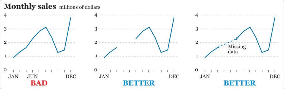
Badly designed time series line charts may be as misleading as any other kind of visualization. The first chart in Figure 8.21 is lousy because gaps in the data (we don’t have scores for April and May) are ignored and so time intervals on the X-axis are not equally spaced. Charts two and three are much better.
Another way a line chart may be deceptive is by not displaying an appropriate level of detail or depth. On April 24, 2015, the famous economist and Nobel prize-winner Paul Krugman lambasted conservative candidates for the Republican presidential nomination for proposing that the age of eligibility for Social Security and Medicare be raised to 69.5
5 “Zombies of 2016.” http://www.nytimes.com/2015/04/24/opinion/paul-krugman-zombies-of-2016.html
“Doesn’t this make sense now that Americans are living longer?” asked Krugman rhetorically, and he proceeded to reply to himself: “No, it doesn’t (...) The bottom half of workers, who are precisely the Americans who rely on Social Security most, have seen their life expectancy at age 65 rise only a bit more than a year since the 1970s.”
Krugman was quoting a 2007 Social Security Administration report that includes charts like Figure 8.22.6 According to this, a man born in 1941 who reached the age of 65 being on the top half of the earnings distribution could expect to live an average of nearly 22 years more. That same number for a 1941 male in the bottom half of the earnings distribution was 16 years.
6 “Trends in Mortality Differentials and Life Expectancy for Male Social Security–Covered Workers, by Average Relative Earnings.” http://www.ssa.gov/policy/docs/workingpapers/wp108.html
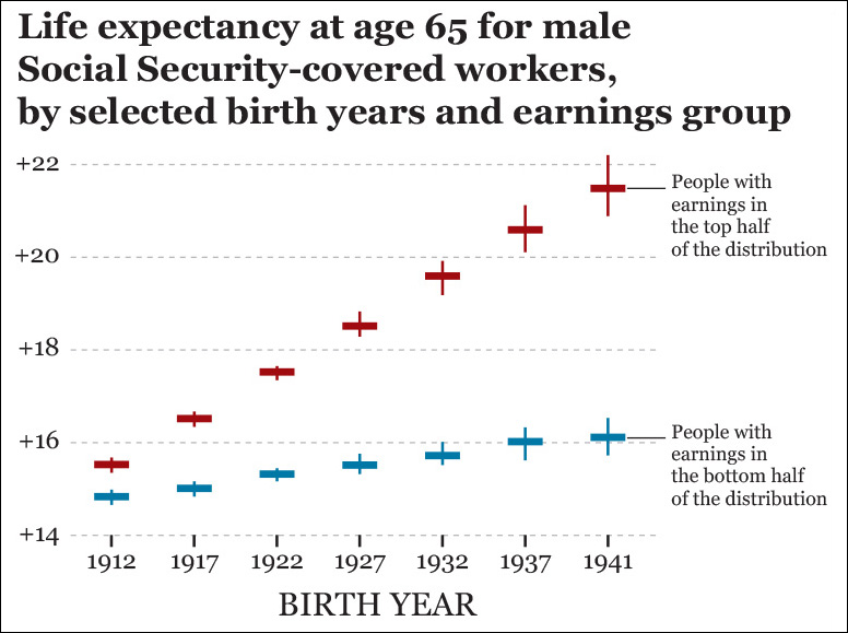
People with different political leanings will disagree on how to interpret these data, but I think that this chart is a bit more useful for an informed discussion than one displaying just the average life expectancy. Of course, we could think of dividing the data further, perhaps by income quintiles or deciles.
Exploring multiple levels of aggregation—not just when dealing with time series data—is critical to avoid paradoxes and mix effects. In a 2015 paper on how to visualize them, Zan Armstrong and Martin Wattenberg defined mix effects as “the fact that aggregate numbers can be affected by changes in the relative size of the subpopulations as well as the relative values within those subpopulations.”7 We discussed mix effects a bit (without naming them) in previous chapters, when we learned how to calculate weighted averages.
7 “Visualizing Statistical Mix Effects and Simpson’s Paradox.” http://static.googleusercontent.com/media/research.google.com/en/us/pubs/archive/42901.pdf
Most famous among mix effects is the Simpson’s Paradox, named after statistician E. H. Simpson, who described it in 1951. Here’s what Armstrong and Wattenberg say about it:
Mix effects are ubiquitous. Experienced analysts encounter (paradoxes and mix effects) frequently, and it’s easy to find examples across domains. A famous example of a Simpson’s-like reversal is a Berkeley Graduate Admissions study in which 44% of males were accepted but only 35% of females. The discrepancy seemed to be clear evidence of discrimination, yet disappeared once analyzed at the per-department level: it turned out that departments with lower acceptance rates had proportionally more female applicants.
Mix effects don’t appear just when examining time series data, but their consequences when displaying change in charts can be spectacular. On Figure 8.23, I am posing a mystery mentioned by Armstrong and Wattenberg: between 2000 and 2013, the inflation-adjusted change in median wage in the United States was 0.9 percent. However, when you disaggregate the data by educational attainment, you’ll observe that all groups are making less money than they did in the past!

Armstrong and Wattenberg offer the explanation, “Although median wages went down in each segment, something else happened as well: the number of jobs increased for higher-educated groups and declined for lower. Thus, the higher-educated, and therefore higher-earning, group had more weight in the 2013 data. The summary number of +0.9 percent depends not just on the change within population segments, but on the change in the relative sizes of those segments.”
Situations like this are as counterintuitive as they are common, so, again, never trust just an amalgamated figure. Always look beyond it.
Communicating Change
We’ve covered a lot of pretty dense material in this chapter, so it’s time for some creative inspiration. Let’s begin with Jorge Camões, author of the indispensable Data at Work: Best practices for creating effective charts and information graphics in Microsoft Excel (2016) and www.excelcharts.com. Jorge is able to achieve wonders with Microsoft Excel and forces it to create graphics it was not designed for, like horizon charts.
The horizon chart is a novel graphic form invented by Hannes Reijner of Panopticon Software,8 and later tested by Jeffrey Heer, Nicholas Kong, and Maneesh Agrawala.9
8 “The Development of the Horizon Graph.” http://www.stonesc.com/Vis08_Workshop/DVD/Reijner_submission.pdf
9 “Sizing the Horizon: The Effects of Chart Size and Layering on the Graphical Perception of Time Series Visualizations.” http://vis.berkeley.edu/papers/horizon/2009-TimeSeries-CHI.pdf
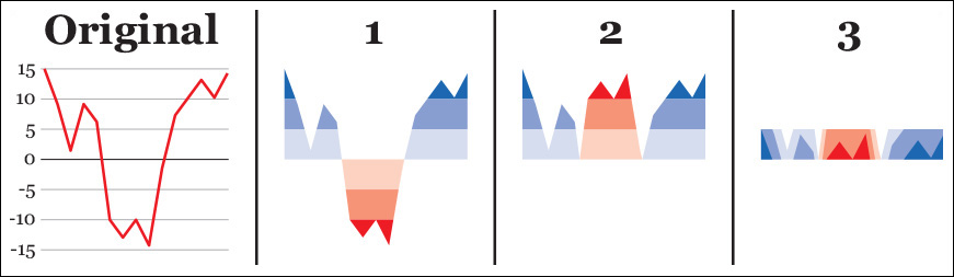
Here’s how to design and read horizon charts: say you need to display dozens of line charts like the first example in Figure 8.24 simultaneously. To make a chart like this more space-efficient we can (1) subdivide its vertical scale evenly, and color code positive and negative values, (2) mirror the color bands corresponding to negative values, and then (3) collapse the color bands. Following these steps results in a much shorter chart.
Now you are ready to be wowed by Jorge’s graphic in Figure 8.25.
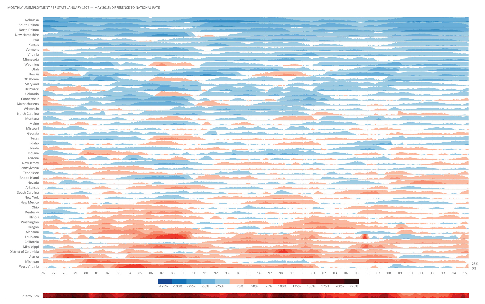
Jorge’s graphics prove that business charts and maps don’t need to be dull and ungracious and that even tools with dubious default options—Excel is great, but its base charts are notoriously ugly—can be forced to create elegant figures. Aesthetics, playfulness, and the exquisite care for typography, color, and composition are as important in artistic visualization as they are in the presentation of analytic results.
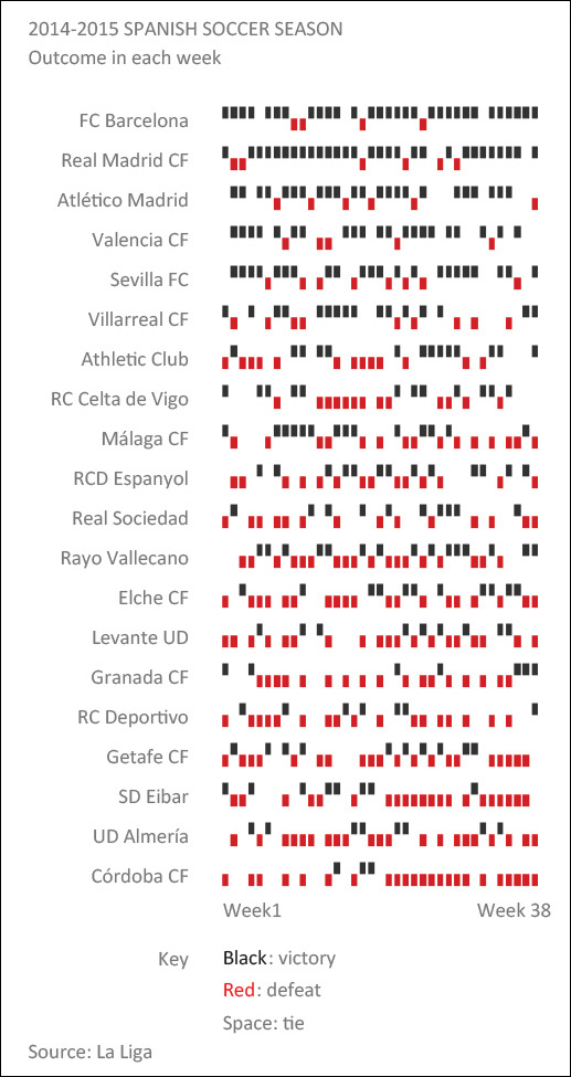
Figure 8.26 is compelling and minimalistic. The eye navigates these patterns effortlessly, aided by the highest-lowest arrangement, with the best teams on top and the worst performers at the bottom. Incidentally, I’m listening to Chopin’s Nocturnes while writing these lines and, in a brief glimpse of synesthetic insight, I thought that we could imagine this chart as a piano tune: high tones for victories, low ones for defeats, silences for gaps. Data sonification could be the next frontier in communication.
By showing that winter months are a slow period for maternities, Figure 8.27 also reveals that human beings mostly prefer the summer and the early fall to devote time to the labors of love—just focus on months with a high proportion of births and count nine months back. I wonder if the pattern would be reversed were the countries depicted in the Southern Hemisphere, rather than in the Northern one.
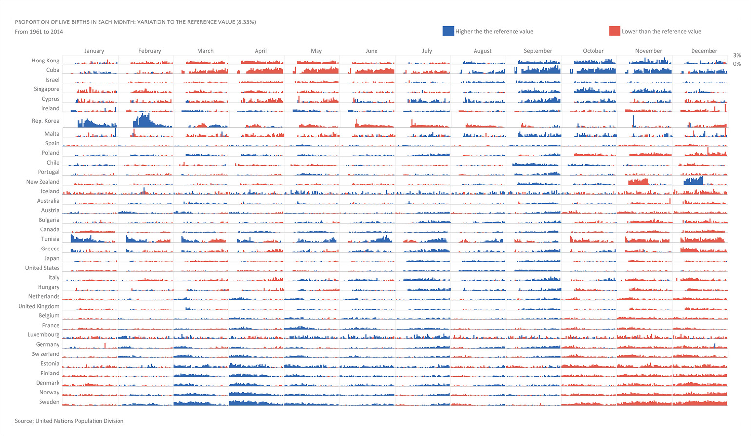
Hue and shade lie at the bottom of William Cleveland’s and Robert McGill’s scale of methods of visual encoding, described in Chapter 5, but as Figure 8.28 attests, they can be priceless when precision matters less than the unearthing of general patterns and trends. Here, the specifics of each country’s ups and downs are secondary in comparison to the simpler less-versus-more message that this tapestry-like heat map avows.

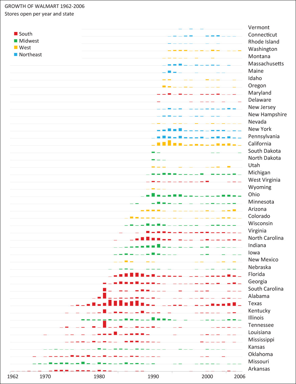
Something similar occurs in Figure 8.29 and Figure 8.30, which strengthen each other when presented side by side, in an example of a whole being greater than the sum of its parts.

Most unusual among graphic forms to present data to the public is the connected scatter plot, which works best when turns and swirls don’t obscure the data, as in Figure 8.31. Each dot is a year, the Y-axis is the U.S. Defense budget, and the X-axis represents military personnel. Begin reading the chart from the bottom right and follow the line as if it were a path (it is) toward a much smaller army, but also much higher expenditures during the presidencies of George W. Bush and Barack Obama.

Max Roser is also fond of connected scatter plots. He is an economist at the University of Oxford’s Institute of New Economic Thinking and author of the popular www.ourworldindata.org project, which is devoted to visualizing publicly available data about living standards, health, poverty, and other topics.
OurWorldInData showcases plenty of traditional time series line charts (Figure 8.32) but also strives to depict the historical change in factors such as GDP per capita and life expectancy at birth (Figure 8.33) or infant survival rates versus birth rates (Figure 8.34). These charts anticipate the topic we’re about to have fun with: the visualization of relationships.
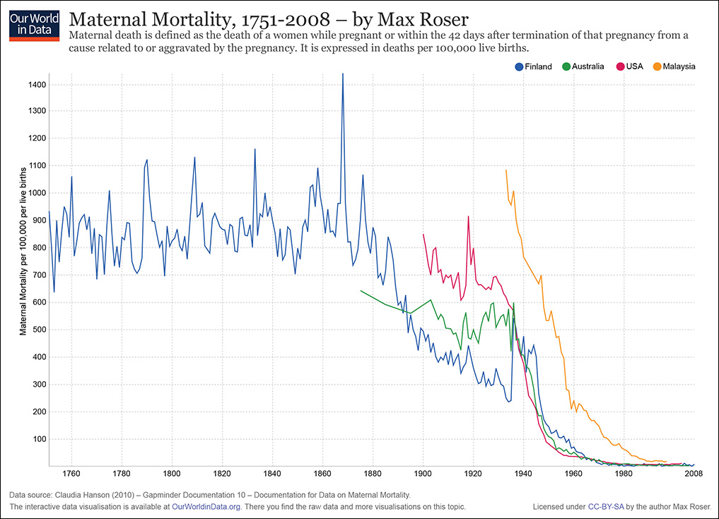
Figure 8.32 Time series line chart by Max Roser, http://ourworldindata.org/.

Figure 8.33 Scatter plot by Max Roser, http://ourworldindata.org/.
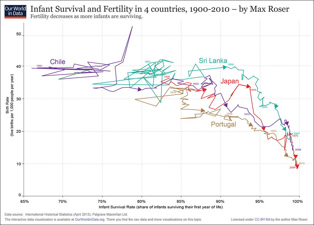
Figure 8.34 Connected scatter plot by Max Roser, http://ourworldindata.org/.
To Learn More
• Behrens, John. T. “Principles and Procedures of Exploratory Data Analysis.” Psychological Methods, 1997, Vol. 2, No. 2, 131-160. Available online: http://cll.stanford.edu/.
• Camões, Jorge. Data at Work: Creating effective charts and information graphics. Berkeley, CA: Peachpit Press, 2016. One of the best business visualization books in the market.
• Coghlan, Avril. T. A Little Book of R For Time Series. Available online: https://a-little-book-of-r-for-time-series.readthedocs.org/en/latest/.
• Donahue, Rafe M.J. Fundamental Statistical Concepts in Presenting Data: Principles for Constructing Better Graphics. A free book available online: http://biostat.mc.vanderbilt.edu/wiki/pub/Main/RafeDonahue/fscipdpfcbg_currentversion.pdf.