
Chapter 5. Starting A New App
This chapter marks the start of the real process behind designing and developing an app. Here, you will take a user-driven approach, refining every step of the way with user feedback to ensure the ideal experience. This chapter is focused on the user experience (UX) and information hierarchy to provide a solid foundation for the app.
Design Methods
Design is a very loaded term. You can design an algorithm for efficient sorting. You can design a navigational scheme to ensure ease of use. You can design a movie poster to catch people’s eyes and convey a sense of what the movie is about.
Before you worry about what your app looks like (graphic design), you need to worry about the deeper requirements. A dresser can have a stunning appearance, but it isn’t particularly useful if the drawers can’t hold the weight of clothes. That means you first need to figure out your app’s requirements. What features should the app have? How is the app organized?
Common Methods
If you’re an independent developer, you’re probably used to self-design. You think about your own needs and structure the app around best meeting those needs. You might attempt to visualize the needs of other users, but you’re often unaware of what the ideal experience is for others. If you’re working in a more corporate environment, you may be designing based on features. Someone somewhere (a project manager, a client, a CEO, or even a funder) decided your app needs X feature. A feature specification (or “spec”) is probably created, and then you implement the feature.
User-Centered Design
A better method of designing an app is called “User-Centered Design” or UCD (sometimes this is called “Human-Centered Design” to emphasize that some non-users influence the design). The basic idea is that by incorporating users throughout the planning, designing, developing, and even deployment phases, you can provide a better experience. Instead of going through all the phases of the app and finding out that no one likes it after releasing; you continually utilize users throughout each phase, focusing on user-centered evaluation.
Key Principles
UCD has six key principles:
1. The design is based on an explicit understanding of users, tasks, and environments.
2. Users are involved throughout design and development.
3. The design is driven and refined by user-centered evaluation.
4. The process is iterative.
5. The design addresses the whole UX.
6. The design team includes multidisciplinary skills and perspectives.
Explicit Understanding
This first principle is core to UCD. Obviously if the design philosophy is called User-Centered Design, there will be focus on users; however, it’s also important to consider the environment that the users are in. If your app is built for use on a construction site, using an audible chime for important notifications is probably going to be ineffective for workers who have hearing protection. If your app provides real-time transit information, downloading giant images each refresh is going to cause problems because most users won’t be on WiFi and may even have a poor cell connection.
This explicit understanding comes from real users. It isn’t from reading a study about the “average smartphone user.” It isn’t from looking at statistics. It is from actually going out to real users, talking to them, and experiencing their characteristics, their tasks, and their environment.
Continuous User Involvement
Quite a bit of software development is done with user involvement at very specific and limited points. Most commonly, the involvement is at or near deployment when changes are most costly. You can spend months or years making this amazing app that checks all the right boxes on the feature list, features excellent design, and is well developed. When it’s nearly done you reveal it to users. The reception is so bad that you have to do intensive studies to figure out what is wrong, add features that weren’t even thought of, redo the UI, and refactor most of the code. Ouch!
Some software teams try to avoid bad outcomes by involving users early on, helping to answer questions about navigation, feature exposure, and more. They take that initial feedback, make whatever changes are needed, and then develop the app. That process is a lot better than not getting user feedback until after the app is basically ready, but a lot can happen between that initial feedback and the release date. UCD requires continuous user involvement throughout every phase of the product lifecycle. Yes, you should be evaluating your wireframes with users and later evaluating your graphic design with them as well, but you should also have users involved with your error handling (when something is wrong, do they understand how to fix it?) and even your algorithms (is this code that sorts photos based on meta data fast enough?).
User-Centered Evaluation
Every aspect of the app is driven by user-centered evaluation. It doesn’t matter if you have 30 years of experience in your field and you’re totally confident that your choice is right, it is only right if it works for users. It’s also important to isolate what you’re testing as much as possible. If you’re evaluating the organization of the app, presenting fully completed comps and telling the user to “just ignore the colors” isn’t going to work. Every aspect of the experience influences the user’s perception of it, so you have to be very conscious of what you are actually evaluating.
Iterate
Fortunately, most mobile app development teams work with an iterative process instead of a traditional waterfall approach. Involve users! You shouldn’t just be iterating based on what you finished last week or last sprint, you should be iterating based on user feedback. If you implemented enough of a feature that you could test it out with users, do so. You might find out that it’s going in completely the wrong direction, so why write more code to finish the feature as is or spend more time polishing it in Photoshop? Don’t think of your designs or code as right or wrong, think of them as hypotheses that you test with users.
Whole User Experience
There are a lot of factors to consider when it comes to users and how they interact with your app. What emotional, cultural, or perceptual issues impact the way users understand or use your app? Is the iconography actually appropriate for all users? Is the hierarchy logical to someone who has a completely different background?
Multidisciplinary Team
It may be tempting to designate one person as the “user advocate” who does all the user interaction and reports the results back, but it is important that you have members across your team interacting with users. The way a project manager perceives user feedback will be different from that of a graphic designer, an API developer, a mobile developer, or a marketer. Discussing those interpretations can lead to a lot of insights. In addition, the more your team interacts with users, the more they will think about users and start considering what the ideal experience is for users. Further, this teamwork encourages transparency in decisions. When a graphic designer understand why a project manager considers a feature important, it’s much easier to design it in a way that matches what is actually needed. When a developer understands why a graphic designer created the mockups in a particular way, it’s much easier for them to work together if the design isn’t feasible.
But, But, But . . .
But it’s more work to talk to users. But I don’t even know any users. But my boss wants to define the feature set. There are plenty of excuses to use for avoiding UCD, and some are even legitimate, but your app will suffer in one way or another if you don’t design it with users. Yes, it is more upfront work, but you create a more precisely honed app without having to redo massive parts as soon as it goes live. Sure, you might not know a lot of users or any users, but working with even just a few can help you catch the majority of UX pitfalls and will ultimately leave you feeling more satisfied. It’s unfortunately quite common to have a particular person who wants to dictate the feature set and there are a few ways of dealing with this. You can curl up in a ball, hope the person is a real visionary, and likely end up with a mediocre product. If the person is focused on the business goals (more on goals shortly), you can have that person list out as many business goals as possible and see which ones can be achieved without meeting the needs of actual users. Another option is to try to understand what type of user this person is and actually factor in the feedback. There is more detail about personas later in the chapter, but the general idea is that if you can figure out the type of user this person is, you can better use his or her feedback and/or get that person to realize that his or her needs are different from the needs of other user types.
Defining Goals
What are the goals of the users of the app and what are the goals of the app from a product perspective? A surprising number of apps are designed without strongly defined goals on either side. Typically, this process starts out okay but becomes challenging as specific design decisions are being made. What buttons should be included on a given screen if you do not know the actual goal of the app? Once you have defined the goals, you can much more easily ensure that each decision along the way, especially UX decisions, will cater to those goals. It does not matter how beautifully you have designed and developed an app if it has a lack of focus, leading to user frustration.
User Goals
Starting out with user goals is a great way to get in the mindset of a user and decide what is really important in the app. The challenge is making sure you are defining goals and not tasks. For example, a task for a new Twitter app might be to be able to “read tweets in my timeline,” whereas a goal might be to be able to “read all the tweets that I find important.” These two sounds similar, but the first makes assumptions that the second does not. Consider the following:
 Does the user’s timeline contain all the tweets the user cares about?
Does the user’s timeline consist only of tweets the user cares about?
Is a chronological order the best for tweets?
By making these goals broad, you keep them separate from the means by which the user accomplishes them. It might just be that a simple, chronological timeline is the best way to read through tweets, but there is a chance that it’s not. What if you were to categorize tweets by content or the type of user who is posting them? What if you included tweets from people who might be interesting to the user but aren’t being followed? What if the user can give feedback about which tweets are valuable and that can be used to push those types of tweets to the top of the list?
Sometimes it can seem a bit challenging to create meaningful user goals. Maybe you’re creating an image manipulation app and all you can come up with is “I want to be able to easily manipulate photos.” That is not a very helpful goal, so you can break it down further. First, think of basic navigation requirements: How will users get to the photos? Next, why are they manipulating the photos? Finally, after they’ve manipulated the photos, what can they do with them? With a bit of brainstorming, your list might look more like this:
I want to browse all images on my device.
I want to improve the visual quality of my photos.
I want to make people in my photos look better.
I want to share the modified photos.
You can certainly come up with a more exhaustive list than this, but this is a good start. Notice that the photo manipulation goals do not define specific ways they are accomplished. Later, you can define features that allow the user to accomplish these goals. You might decide that the app needs to support easy fixing of blemishes such as pimples and also needs to correct red-eye; both of those features are ways to accomplish the third goal: “I want to make people in my photos look better.”
User Personas
An extremely helpful tool in analyzing what your goals mean to your app is the creation of user personas. Personas are represented as individual users, but they are reflective of a group of users with specific behavior and motivations. After learning more about the (potential) users of your app, you will be able to start finding ways of grouping them. If you were creating a photo manipulation app, you might find start to find that there are people who spend thousands of dollars on equipment and are exceedingly picky about the quality of their photos and how the photos are organized. With that knowledge, you might define Susan, an excellent photographer with an eye for perfection. When she is not using her $8,000 digital SLR for photography, she’s trying to squeeze every bit of photo quality out of her top-of-the-line phone. She likes to share a few of her photos to Google, but she is very picky about what she shares because her clients might see them. She also mentally organizes her photos by events, such as all the photos from a birthday party or all the photos from a wedding.
Another segment of your users might be more casual. They love cameras on smartphones not because of the quality of photos but because of the immediacy and the ability to share quickly. Now you define Jim, a guy who couldn’t care less what SLR stands for and just wants to share good photos with his friends. His phone is fairly average and does not take great photos, but he loves being able to immediately share whatever he is doing with all his social networks. You could explain to him that red-eye happens in photos when the flash is too close to the photo sensor, but he doesn’t care. Obviously eyes shouldn’t be red, so the device should be able to fix that automatically.
There are more personas that could (and should) be made, such as a younger user who wants to modify pictures in funny ways to get some laughs with friends, but even with just these two users you can easily see the contrasting needs. Consider the previously defined photo manipulation app and how these two users would use the app to accomplish their goals. Susan wants the photos organized by events, whereas Jim wants the newest photos to be first in the list because they are most likely what he wants to share. Susan cares about manually tweaking the white balance, contrast of shadows, and other features that Jim could not care less about; he just wants to easily make the photo look nice. Their requirements around making people in photos look good are similarly different. Susan wants to select a precise skin tone, whereas Jim just wants to be able to tap on that one horrible Friday night pimple and have it disappear. Finally, they both use sharing but in different ways.
Product Goals
Sadly, the reality of app design and development has to hit you at some point and you realize it can’t just be all about the users. We would all love for all apps to be free and work on every device, but creating great apps costs money, and supporting all devices takes time. Product goals are the goals that cover monetization, branding, and other considerations that stakeholders in the app have. A list of product goals might look like this:
Reflect company XYZ’s branding.
Release beta version to board members in six weeks.
Release 1.0 to Google Play in eight weeks.
Reach 50,000 app downloads within three months of launch.
Earn $5000 gross within three months of launch.
Notice that these goals are not direct considerations of the users, but they do affect the users. The intent to monetize means the app may cost money, it might have ads, it could have in-app purchases, or some other means of making money such as premium account support. The length of time allowed for development controls which features can be included and how refined they can be. These are requirements, but to the best of your ability you should not let them define the app.
Device and Configuration Support
Those who are inexperienced with Android find the question of device support intimidating, often relying on a “wait and see” approach that means the app works well on a typical phone and poorly on everything else. Even if your intent is only to focus on phones early on, it is worth spending some time figuring out how your app would support other devices and other configurations such as landscape. In most cases, a little bit of thinking upfront can make support for a variety of devices and configurations relatively easy, especially because best practices in Android development solve many of the challenges. In short, unless you have an extremely good reason, both the design and development processes should consider the wide variety of Android devices out there.
The other part of device support is determining the minimum version of Android you will support. Ideally, this decision is driven by your target users. If you’re building an app for just developers, you might be able to get away with support for Android 4.4 and above. If you’re building a chat app for developing nations, targeting only Android 4.4 and above is going to kill any chance you have of success. In most cases, even design that comes from newer versions of Android such as Lollipop can be applied to older versions of Android through the use of the support library, third-party libraries, and even custom solutions. Most apps developed now support version 4.0 (Ice Cream Sandwich) and above or 4.1 (Jelly Bean) and above. If you’re not sure what version your users have, then consider targeting one of these versions.
Tip
The Android landscape is always changing and it’s important to keep up with the trends to understand what devices and device types are most common to make decisions about what you should support. The Android developer dashboard (http://developer.android.com/about/dashboards/index.html) gives you what percentage of devices run a particular version of Android or have a specific density, which can help make the decision, but remember that your target users may be very different from the general trends.
When it comes to configurations, Android does not have a distinct concept of a “tablet app.” Instead, apps can run on any device, unless you specifically set them not to. It is up to you to decide whether you want to provide an experience optimized for a tablet, television, or any other device. It is fine to release an app that does not have a tablet-specific experience in version 1, but users appreciate knowing that upfront, so be sure to let them know in your app description.
Note: External Libraries
Although Android is frequently criticized for “fragmentation,” the majority of features you will want to use are available in external libraries. For instance, fragments were not available until Android 3.0 (Honeycomb), but they are available through the support library (http://developer.android.com/tools/extras/support-library.html) provided by Google. That library requires version 1.6 of Android and above—that’s the version that the original Android phone, the G1 on T-Mobile, can currently run. Even the style used for checkboxes and radio buttons from Android 5.0 and on can be applied with the AppCompat library on versions as old as Android 2.2.
High-Level Flow
The first graphical step to designing a new app is working on the high-level flow and grouping of actions based around meeting the previously established user goals. This is where you decide on the overall structure of the app. Which screen is the main screen? What are the secondary screens? How do you navigate between them? What actions can you take on a given screen?
The high-level flow is very directly tied to the goals you have established for your users. If your primary user goal is “read all the tweets that I find important,” then the main screen should facilitate accomplishing that goal. One consideration to keep in mind is that you do not want to overwhelm the user with too many options on any given screen. It’s ideal to have a primary action for a screen with a few optional secondary actions.
The main way that people choose to work on high-level flow is with flowcharts. Typically, you represent screens with shapes that have lines or arrows connecting to other screens. This lets you quickly see how easy or difficult it is to navigate through the app. In some cases, people like to create very crude drawings of screens to more easily understand what goes in them. Do whichever works best for you. Plenty of software options are available, such as full desktop solutions like Visio (http://visio.microsoft.com/en-us/pages/default.aspx) for Windows and OmniGraffle (https://www.omnigroup.com/omnigraffle/) for Mac. There are also open source solutions that work on Linux as well such as yEd (http://www.yworks.com/en/products/yfiles/yed/). If you’re looking for a web-based option, Google Drawings (http://www.google.com/drive/start/apps.html#drawings), LucidChart (https://www.lucidchart.com/), and Gliffy (https://www.gliffy.com/uses/flowchart-software/) are worth taking a look at. Whether you’re creating the flowchart digitally, on a whiteboard, or on paper, this early planning is exceedingly valuable.
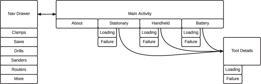
Let’s say you are working on an app for new woodworkers. During your initial user research, you found that new woodworkers have a difficult time determining what tools to buy, so your app is going to focus on helping them decide. You brainstorm various ways to organize this and decide on a basic hierarchy with some filters. After some work, you come up with a hand-drawn flowchart that shows the basic app organization (Figure 5.1). You’ve decided that the hierarchy should be based on power tools with anything else falling under an accessories section. The users will drill into either handheld or stationary for a given category, and then brand, and then a specific tool.
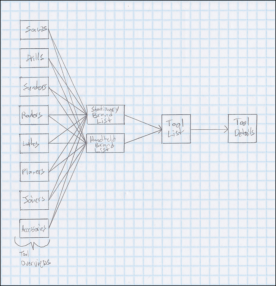
This seems very reasonable, so you walk some users through the flowchart and you learn there is a big problem with your flow. Experienced woodworkers can have very strong opinions about brands, but a lot of new woodworkers have no idea which brands are good. Their choice ends up being arbitrary, making this step unnecessary. You also find that some users are specifically looking for battery-powered tools, and this flow doesn’t offer any easy way to do that. One more issue they ran into was looking for clamps. It seems that clamps are vital to woodworking and, although you reasonably consider them an accessory, they’re sought after enough to make them worth promoting to the top level. In addition, some of the other tools such as planers and joiners weren’t looked at by any of the novice woodworkers.
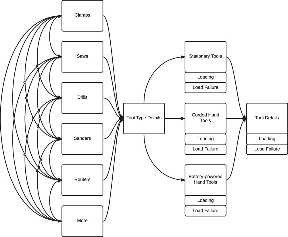
Wow, that’s a lot of feedback saying that the flowchart is wrong. Does that mean you screwed up? No! Your flowchart was a first stab at organizing the app and it generated all this valuable feedback! Not bad for some crude pencil work and a little time with some users. This is where the iteration comes in. Now that you have this great feedback, you can create an updated flowchart that addresses the concerns found in the first one and test it with users. Repeat this process as much as you need to get a solid flowchart. Once it is ready, you should create a digital version (if you haven’t already) and detail it with all the other states you are going to need to worry about. These states are things like loading and failure. By getting these in your flowcharts, you’ll have a much better idea of how much effort will be required for the app and you can ensure that people are thinking about them from the beginning. Figure 5.2 shows an example of an updated flowchart.
Wireframes
Wireframes represent the skeleton of your app. They attempt to explain the layout without any visual treatment to focus on functionality and usability. Wireframes ensure that data is grouped logically, touch targets are reasonably placed, the information hierarchy makes sense, and the data to be displayed on a given screen makes sense.
There are many different tools for wireframing. Starting out with a simple sheet of paper and a writing utensil is a great way to quickly try out a few different ideas. You can use a pen to force yourself to keep moving and trying new things without tweaking what’s there or a pencil for a more detailed draft. You don’t need to be an artist to create good wireframes. Look at the difference between the three wireframes in Figure 5.3; they all illustrate the same screen but with different levels of fidelity. They all let you quickly see if something seems to work or not.
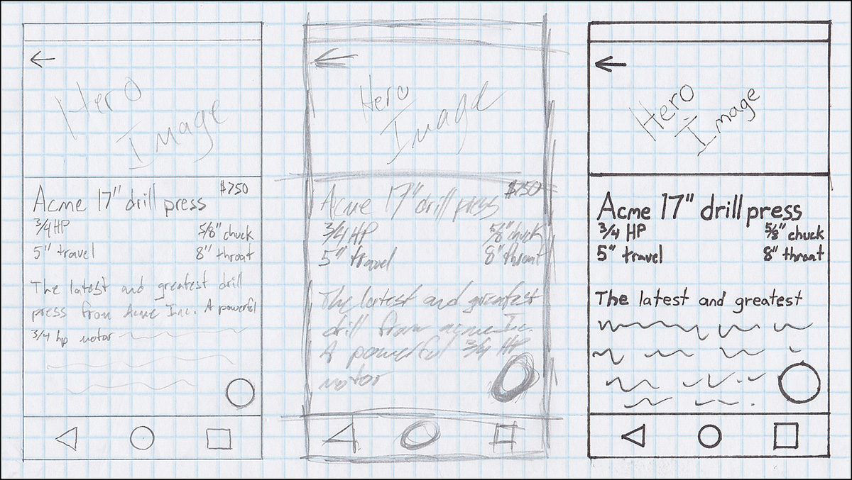
Figure 5.3 Regardless of whether your style is pretty average, excessively sketchy, or precise and bold, wireframing is an excellent way to try out different layouts with minimal effort
There are a few techniques you can apply to make your wireframes look better. First, stencils are a great way to make sure you are consistent, so consider picking up some such as the Android UI Stencil Kit (http://www.uistencils.com/products/android-stencil-kit). Next, break your sketching into small pieces. Many shapes are just a bunch of straight lines, so it’s worth spending some time practicing drawing straight lines. Sure, it’s not the most exciting thing to do, but it makes a major difference in how sharp your wireframes look. When you’re first getting better at drawing lines, put a dot at your starting point and at your finishing point. Concentrate on moving your arm (not your wrist!). Watch where you want the line to go rather than where you’re currently drawing. It won’t take long before you can draw straight lines without giving it any thought.
One more thing that comes in handy is knowing how to draw a circle or arc. Just like with drawing a line, you don’t want to rely on your wrist. Instead, find a pivot point and move the paper. For large circles and arcs, the tiny bone opposite of your thumb near your wrist provides the pivot point. Put it down on the paper and then hold the pen or pencil like you normally would. If you need a full circle, rotate the paper while keeping your drawing hand stationary. If you just need an arc, you can move your elbow while keeping your wrist straight. Need a medium-sized circle or arc? You can use one of the knuckles of your pinky finger as the pivot point (usually the middle knuckle works best, but it depends how you hold the pen or pencil). If you need a small circle or arc, you can hold the pen or pencil between your index and middle fingers and put your middle finger against the paper as the pivot point (see Figure 5.4). If nothing else, you can always try to find something that’s round and the approximate size you need (such as a pen cap) to trace around.
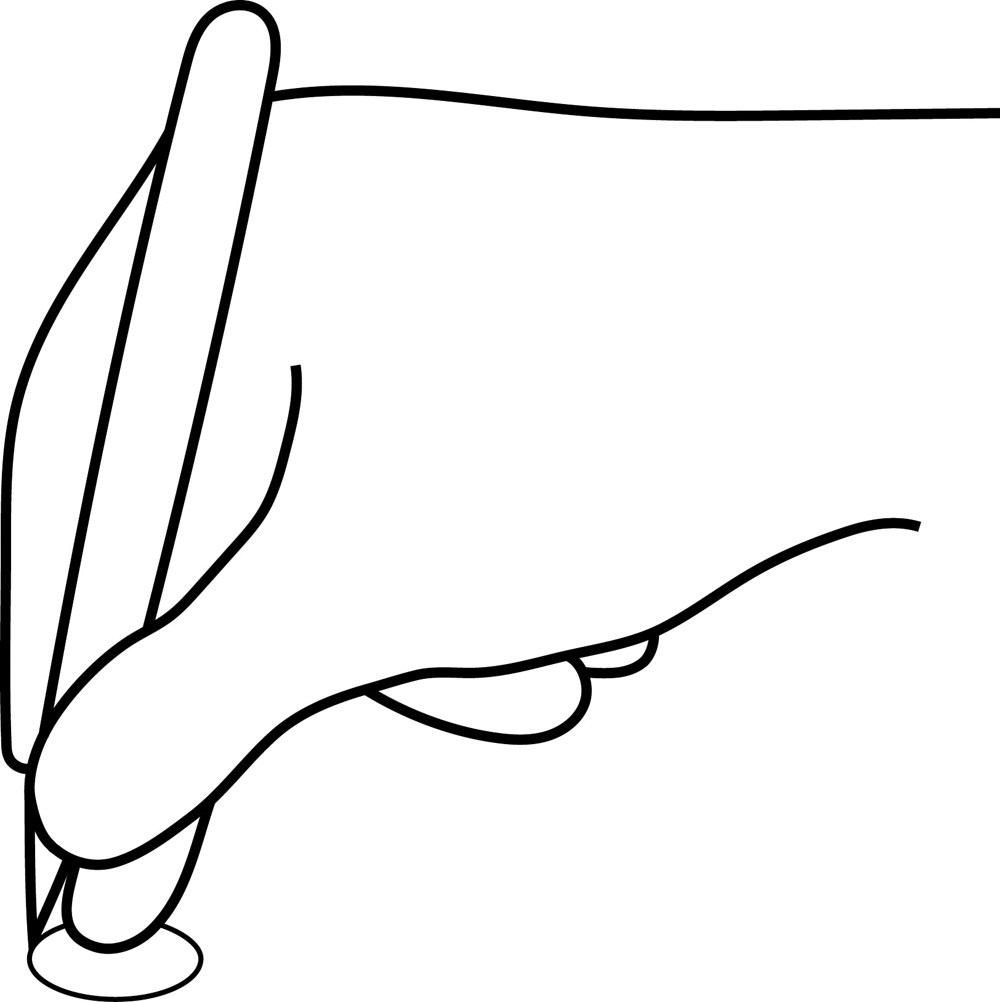
Figure 5.4 By using your middle finger as a pivot point and rotating the paper, you can create small but precise circles
When you’re ready to work with software to create more polished wireframes, a lot of different tools are available to you. Many designers are already familiar with vector-based programs such as Adobe Illustrator (http://www.adobe.com/products/illustrator.html) and Inkscape (https://inkscape.org) and prefer to stick with those. Some tools that are good for flowcharts are also good for wireframes such as the previously mentioned Omnigraffle. Another popular tool that’s available on Macs is Sketch (http://bohemiancoding.com/sketch/), which has features that extend beyond just wireframes. If you’re looking for a tool that’s available as a desktop app and a web app, give Balsamiq a try (https://balsamiq.com/); it uses a “sketch-like” style to keep the focus on what you really want to test with wireframes. Wireframe Sketcher (http://wireframesketcher.com/) is another cross-platform tool you might consider. Really, there are a lot of tools out there and there isn’t a single tool that works best for everyone. Give a few different tools a try and do a quick Google search for more if none of these work for you.
It is important to remember that the purpose of wireframing is not graphical design. Your wireframes should generally not use custom colors unless they are for defining content groups, showing interaction (e.g., a touch or swipe), or showing alignment. In fact, many wireframing tools use sketch-like graphics to help keep the focus on the content and its positioning, rather than its appearance. It is fine to use native components (such as Material Design buttons), but avoid adding in your own custom controls with any more detail than necessary. You can show a custom chart, but you should not add gradients or other visual treatments. Ultimately, the purpose is to put the emphasis on the content positioning and its hierarchy and not on the visual design. This is your opportunity to determine positioning and sizing of elements on the screen relative to the other elements.
Starting with Navigation
The beginning of any project can be intimidating, as you stare at a blank paper waiting for inspiration. Some people are able to just dive right in; others need to be more methodical. If you fall into the latter group, sometimes it helps to start with the pieces. After having created a flowchart, determining navigation should be relatively easy.
The simplest form of navigation uses fixed tabs (see Figure 5.5 for an example). It ensures that the major sections of your app are visible, it creates a clear hierarchy, and interaction is obvious. The downsides are that tabs work best when you have only a few major sections, and they also take up some screen space. The content represented by tabs should be swipeable, so that you can change tabs by swiping almost anywhere on the screen. Tabs should also only appear at the top of the section they’re appropriate for. For instance, if you were building an app for podcasts, you might have a tab for discovering new podcasts, a tab for podcasts in your library that you haven’t listened to, and a tab for podcasts that you have listened to. If the user is on the tab for discovering new podcasts and taps on a suggestion to go to the detail page for a podcast, the tabs should not appear on that detail page. In general, if your app has two to four sections, you should strongly consider tabs.
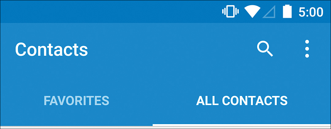
Figure 5.5 Even with just two sections, tabs are a great form of navigation when those sections are equally important
A variation on tabs is scrollable tabs (see Figure 5.6 for an example). This is where you have tabs at the top again, but they are in a horizontally scrollable view, allowing you to fit more than you can when they’re fixed. This allows you to use tabs for apps that might have five or six sections while still giving you the benefit of being obvious to users. Users might not realize the view can scroll, so selecting a tab should move it to the center of the view if it isn’t at the edge. This allows you to show the other tabs that are available and teaches users that these tabs aren’t static.
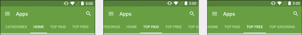
Figure 5.6 Notice that as the selected tab changes, it scrolls the view. This scrolling and the cut off tabs on the edges both tell the user that more content is available than what is shown on the screen
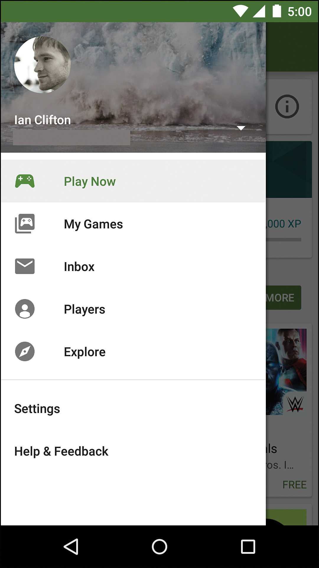
An increasingly common form of navigation is the navigation drawer or nav drawer (see Figure 5.7 for an example). It shows a hamburger icon (the icon with three horizontal lines) that can be tapped to slide the drawer in from the left. A user can also swipe from the left edge of the screen to display the drawer. The advantage of the navigation drawer is that it allows you to have a large number of top sections without using screen space when the drawer is hidden. It does have the major problem of discoverability because it is effectively invisible and it can cause confusion with navigation with the back button. Tapping a section swaps out the content on the screen rather than drilling in, which means the back button should not go back to that section (you aren’t adding to the backstack); however, the transitions often occur as the drawer is sliding back out of the way, preventing users from seeing the visual cues that transitions provide.
Another navigation scheme is to have a central page that provides links out to other sections, if needed. This works well when you have some core information that the user wants to see and either no secondary actions or just a few uncommon ones. For instance, an app that is primarily designed to just show elevations on a map should jump directly to that map view. A search feature can be in the app bar, but you don’t really need any tabs or other navigation.
It is often very helpful to see how other apps handle problems similar to yours. It’s very valuable to see how the native apps that were designed by Google work because they tend to best reflect the current state of Android design and UX. You should also look at popular third-party apps to see how they handle some of the challenges your app faces. You can learn both what apps do well and what they do poorly by spending some time exploring them.
Considering the woodworking tools app, what navigational strategy would you use? There are probably seven sections: clamps, saws, drills, sanders, routers, lathes, and more. You might be able to put lathes into the more section, but you’re really at the limit of how many items you want as scrollable tabs. Perhaps a navigation drawer is a good start? Looking at your updated flowchart, you can also see that choosing a tool type pushes the user toward another decision: stationary, handheld with a power cord, or handheld with a battery. You might want to go to a page about the tool type, explaining the general purpose of the tool with three buttons to dig into one of those categories. You might instead want to go straight to one of those categories, so that you can immediately show content. Another option is to combine those two and go to a page about the tool type with four tabs: About, stationary, handheld, and battery (see Figure 5.8 for an example flowchart with this organization). This is the situation where wireframing is particularly helpful. It would take a lot of work to build out all three of these possibilities, and you’d end up throwing away two-thirds of that. Instead, you can relatively quickly test out what these options look like and try them with users.
Continuing with Content Pieces
Now that you have thought about and wireframed navigation, it is time to get on to the content. Each of the tools needs to appear in a list and it needs to have a details page. Starting with the presentation in the list can sometimes be easier because you have to focus on what is most important and eliminate everything else. Once you have a decent list presentation, you can build the detail page from there, ensuring that common elements are consistently presented.
When creating a list of content, you need to think about what is most important and what is different between items. Weight might be very important for some tools, but it isn’t as important to put in the list view if all tools in that list weigh roughly the same. That means a little bit of research can be helpful. Similarly, knowing real examples can make a big difference in how you organize the info, how big or small you make fonts, and so on. For instance, if you’re making a list of news stories, you want to know what the normal length of headlines is so that you don’t end up with ellipses in every item after two words.
There are a lot of techniques for learning what is most important. The simplest is to just ask real users. This will generally get you pretty close, but there are often important things users don’t think about or don’t realize are important, so a helpful technique is to actually watch users and ask questions. For example, you could watch users navigating a woodworking tool site and after seeing them drill in and back out of tools a few times, ask what they’re looking for or what is causing them to back out. Also consider what a photo can get you. It’s a nice visual, but it can often convey information more effectively than words and a photo is especially helpful for users who might be unfamiliar with what they’re looking for.
After working with some real users yet again (hopefully you’re seeing the value of users by now), you might discover that the name, price, power, and photo of tools is most important. Alignment is imperative when starting to lay out content, so it’s a good idea to start with the most vital element (say, the photo in this case), and lay the other elements around it with consideration about how they align in a list. Photos in a list will generally be in one of three places: the left (start), the right (end), or the background. If you have photos for only some of the items, you generally don’t want to put them at the left edge because you will end up with a zigzag effect (see Figure 5.9) unless you include generic thumbnails that don’t add user value. Photos in the background are best when the content area is large, ensuring the text that overlays them does not completely obscure them. These list items are likely to be pretty small, so either the right side or the left side will be best. Given that this list will be hand-curated, photos should be available for all items, so the left side seems good.
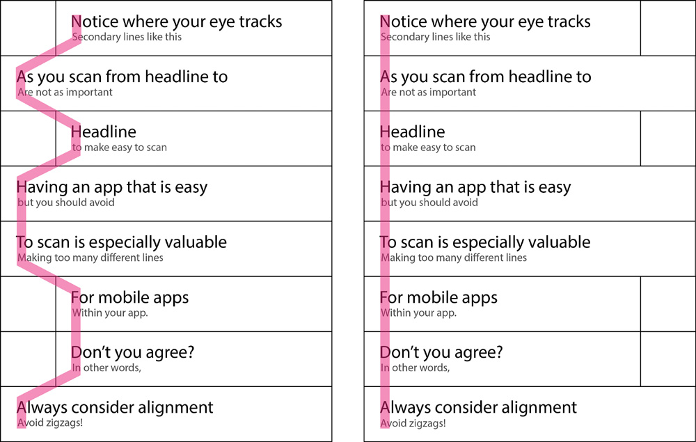
Figure 5.9 The pink highlight indicates the path of your eye when looking from item heading to item heading; the empty squares represent photos
The name is the next most important element. Given the variation in length, making sure it has as much room as possible is a good idea, so the top left seems like a good choice. Price is a very comparable element, so putting it on the right side to make it easy to scan might work. Finally, the power can go directly below the name. Figure 5.10 demonstrates what this could look like.
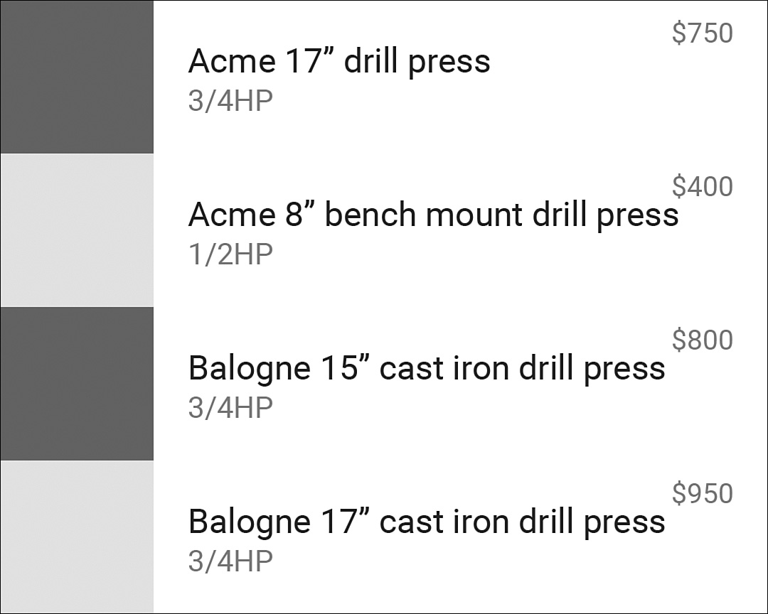
Figure 5.10 Possible layout of list items; it’s important to look at multiple stacked versions to see potential issues with alignment
Wireframing a Detail Page
The detail page should have some, if not all, of the same elements that the list items have. Here, you have more room for a large photo, so the photo is once again a good starting point. Putting it at the top allows you to give the detail page a large, hero image that can help the transition from list to detail. The other content that was on the list item should go near the top of the page. It could ultimately go just below the photo or even over the bottom of the photo. Next, figure out what other features are worth including that might not have been important enough for the list (maybe the weight is appropriate here?). These glanceable features go up near the top so that they can quickly be taken in and the user can back out if the tool doesn’t match his or her needs. You’ll probably include a description of the tool as well. You’ll also want a button for buying the tool.
When you need to test out text alignment and you don’t actually have real text content available, you can use what’s called “lorem ipsum” text. It’s essentially filler text meant to allow you to focus on typography, alignment, and other aspects of the page without worrying about the text content itself. The text is inspired by Latin, but altered to be improper and nonsensical. A quick web search for “lorem ipsum generator” will lead you to plenty of pages that can supply text for you to copy and paste. There are also variations such as “bacon ipsum,” “hipster ipsum,” and others that you can find by searching for “lorem ipsum alternative.”
The app bar often contains secondary actions on detail pages, but there isn’t any immediate need for any in this app. That means the bar can just contain the up navigation and might not even need a title. See Figure 5.11 for what the detail page wireframe looks like.
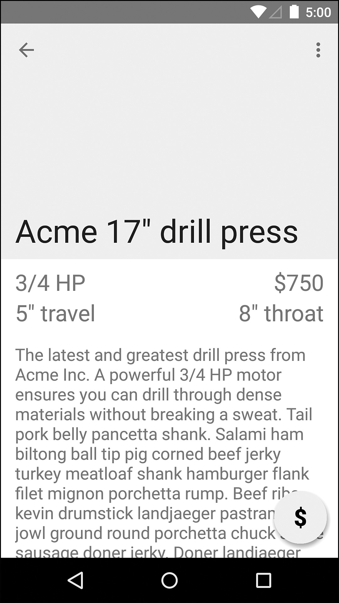
Figure 5.11 One possible layout for the tool detail page; notice that the lack of color helps you focus on size and alignment
Note: The Up Indicator
Many people are initially confused by the up indicator in Android. It shows as a left-facing arrow now (it used to be a chevron) on the left of your app bar. In many cases, it has the same behavior as the back button, but there is a subtle—though important—difference. The back button should go back to the screen you were just viewing, but the up indicator should go up a level in the hierarchy.
To make this clearer, imagine that the woodworking app has a “related tools” section on the detail page (page A) and tapping a tool there jumps to its detail page (page B). You could continue to tap on other related tools (page C, D, etc.) and see their info. The back button would take you to the detail page that lead you to the one you’re currently on (going from page D to C to B to A); the up navigation would send you back to the list of tools (skipping pages C, B, and A).
Supporting Multiple Devices
Early on in design considerations is the best time to start thinking about supporting different devices. A common mistake that designers make is to design with entirely one device in mind. It is a lot easier to balance the content on a screen when you design that content for one screen size only, but that is a bad practice to fall into. Besides, users can change font sizes, and that means views are going to be pushed around as needed.
Sometimes it can be helpful to do wireframing without any device borders to contain it. What does that UI look like in its natural form? How wide should a text view be before you make the content wrap to the second line? Is the button connected to the bottom right of the content or the bottom right of the screen?
Playing around with the content positioning early on can make it clear how you can better support not only different devices but also landscape and portrait orientations specifically. Although many apps do not support landscape orientation on phones, there is little reason not to. The amount of work involved is not significant if you are already following best practices and planning to support a variety of device sizes.
Tablets generally fit two fragments side-by-side in what is referred to as the “master/detail” flow (where “master” refers to your list of content and “detail” refers to the detailed information about the item selected from that list). Of course, there’s nothing preventing you from doing something totally different. Many of the best tablet apps have completely custom tablet layouts that take much better use of the available space than simply moving fragments around can give you. Others are able to provide a very simple interface where the user doesn’t have to change screens because it can all fit on the tablet screen. See Figure 5.12 for an example of what the woodworking tools app might look like on a tablet with minimal work by reusing what will already be built for the phone version.
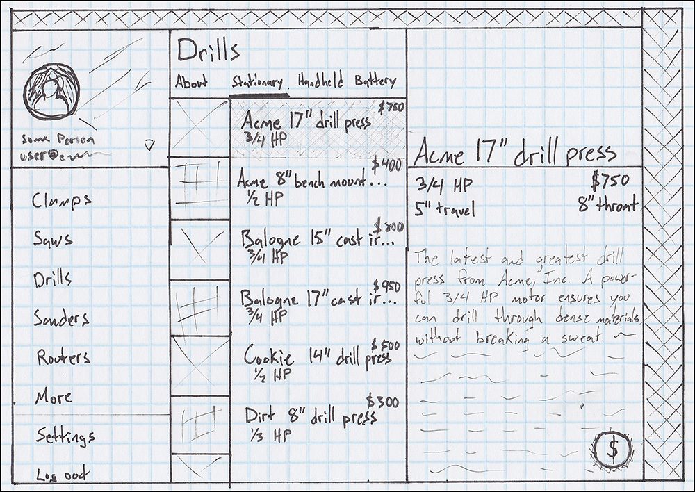
Figure 5.12 A simple wireframe illustrating a tablet layout where the navigation, tool list, and tool details are all visible; it would also be worth trying with the navigation hidden as a drawer to see if the extra breathing room for the other content helps with usability
Naming Conventions
Following clear naming conventions will undoubtedly keep your resources easier to organize and track. Chances are, many of your assets will go through revisions, so you should consider that when naming. For instance, a name such as background_red.png is unclear. Where will it be used? What happens when the design changes and the background has to be blue? Instead, name assets based on function. Your background_red.png might be used on just one page and be named appropriately (e.g., if it is only used on the settings screen, it might be called background_settings.png); if it’s used for a group of pages, it should reflect that group (e.g., an image used for all secondary pages might be called background_secondary.png).
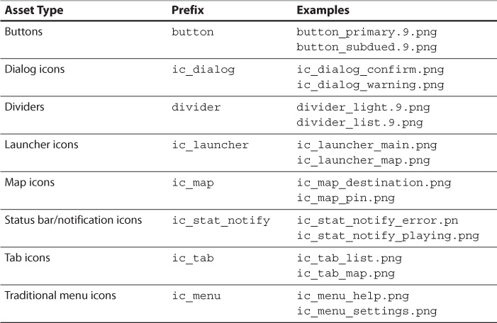
Android also has conventions for specific assets (see http://developer.android.com/design/style/iconography.html#DesignTips). Icons, for instance, start with “ic_” and then the icon type. For example, ic_dialog_warning.png would be the icon used in a warning dialog. Typically, filenames have a suffix that indicates the state. For example, button_primary_pressed.9.png would be the primary button in its pressed state; chances are you’d also have a button_primary_focused.9.png and others. Usually, the StateDrawable (see Chapter 4 “Adding App Graphics and Resources”) is named either with no state (e.g., button_primary.xml) or with a suffix to indicate that it’s stateful (e.g., button_primary_stateful.xml or button_primary_touchable.xml). This book will use the former, but remember that these are all just conventions, not requirements. Use what makes sense to you; just be consistent. See Table 5.1 for more examples.
Crude Resources
Android is very adaptable to changes in assets, which means you can quickly throw a 50 × 50 image into a list view, find out it feels too small, and try a 100 × 100 image. At this stage, resources are expected to be incomplete, but do not underestimate the value of creating some simple resources to start getting a feel for the grouping of content. Eventually, you’ll have a nicely designed default thumbnail for images, but for now you can throw a box in there to help visualize how that space will be taken up.
If you follow naming conventions, such as those in Table 5.1, it will be much easier to swap out assets and see how something different looks. In most cases, it’s enough to start by supplying just high-resolution assets such as all XXHDPI or XXXHDPI assets. Later in the process, when the assets are closer to finalized, you can create files for each of the other densities.
Summary
You cannot overestimate the value of planning when it comes to app development. In this chapter you learned the importance of working with real users, and how to define both goals for the users and goals for the business/product. You learned about creating high-level flowcharts based on the goals and then jumped head-first into wireframes. If you have not done any wireframing before reading this chapter, you might still be feeling a little overwhelmed or confused about which program you should use for your wireframes. Give a few of them a try. You can recreate some of the wireframes shown in this chapter or build your own to get a feel for which program works best for you—and don’t be afraid to break out your pen or pencil.
After reading this chapter, you should find navigation to be much clearer. It is particularly important that you understand the difference between the back button and “up” navigation, as discussed in this chapter. If you’re still unsure, see how the native Android apps handle this. In the next chapter, you will see how to develop prototype apps using the wireframes from this chapter, and you will learn to implement navigation so that you can see which really will work best for this woodworking tools app.