
Chapter 6. Prototyping and Developing the App Foundation
After having done the initial design work in the previous chapter, it is now time to start developing. This is often one of the most exciting parts of developing an app; you can go from no code to a working prototype very quickly. This chapter focuses on the process of implementing wireframes and testing the prototype with real users. The key here is that you are not creating final code, but testing the theory of the initial design and adapting as you find what works and what doesn’t.
Organizing into Activities and Fragments
The first part of developing an app is breaking the design down into manageable chunks. What are the activities and fragments? In an ideal world, you have been presented with (or created yourself) wireframes and flowcharts for phones and tablets, allowing you to easily see what part of the UI is reused and how. In the real world, you might be starting on the app before even the phone wireframes are done.
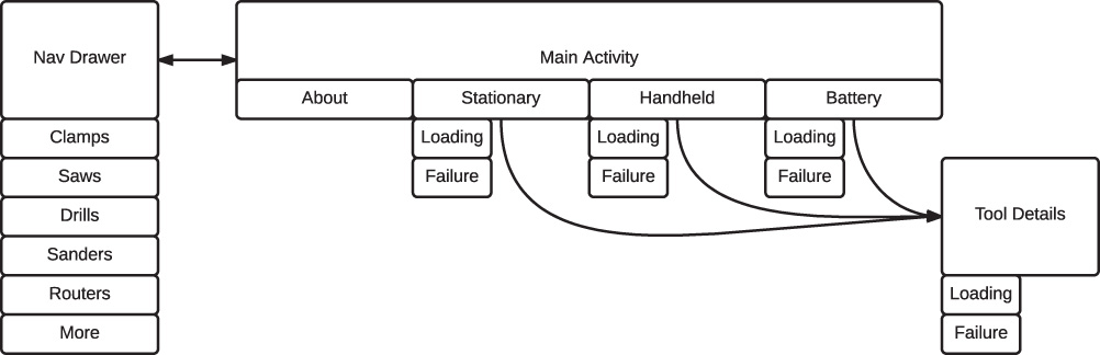
To maintain flexibility, you can break every screen into a fragment first and then create each activity that is needed to hold them together. If you have a flowchart to look at, usually each block can be a fragment. Looking at Figure 6.1, which was one of the flowcharts from the previous chapter, you can see that you essentially have two parts: the overall tool section with tabs and the tool details. You can create a single activity that manages all of the screens, but it’s probably easier to split the app into two activities. One activity handles the navigation drawer and tabs; the other activity handles the tool details.
The navigation drawer can be done as a fragment or as a layout that the activity manages, depending on your preference. The About tab is probably a fragment that has parameters to say what tool type to display info for. Each of the other tabs is a fragment, but you don’t necessarily have to create a unique Fragment class for each. It’s quite likely that the Stationary, Handheld, and Battery tabs are very similar, so you might have a fragment that displays a tool list based on parameters. Finally, you have the tool details fragment. Where appropriate, you can choose to just implement an activity without a fragment to save time for the prototype.
Keep in mind, your goal at this point is not necessarily the exact architecture of the final app. Instead, you want something that can reasonably represent the flowchart and wireframes, so that you can test what works and what doesn’t work with this initial organization. In most cases, you’re going to find issues with the design that require changes. Sometimes the issues are minor and easily accommodated; other times they’re major and require significant reworking of your app.
Creating the First Prototype
When creating the initial project, you don’t need to worry about getting everything perfect. You can easily change the name of your app later. In fact, the Android tools now are significantly better than they were in years past, so even changing the package (which is used as the app ID) is very easy.
One consideration that comes up early on is the minimum SDK level. For a prototype, just target the newest version of Android and set the minSdkVersion to whatever you need just for your test device(s). When you’re dealing with a prototype, you want to rapidly test out the organization of the content, not the implementation. If you end up finding out that the prototype has some core issues and needs to be redesigned, any time that you had spent on compatibility is wasted. In general, virtually everything you would do in a prototype with the latest version of Android can be done on older versions, perhaps with libraries or a bit of custom work, so worrying about compatibility before you even know if your design needs refinement is premature. Of course, there are always exceptions. If you are specifically supporting older versions of Android (maybe you’re writing an app that will be preloaded on a low-end phone that runs an older version of Android or you’re designing it to be used by a particular demographic that has devices with older versions of Android), it might be a good idea to support those in the prototype to make sure any possible compatibility issues stand out, letting you better estimate how much time development will take. For more information on the minSdkVersion attribute, see http://developer.android.com/guide/topics/manifest/uses-sdk-element.html.
As you get started with your prototype, it can be helpful to take advantage of the code templates Android Studio has built-in. This means that you can quickly create activities for the shell of an app, often without worrying about a lot of the details like declaring activities in the manifest or importing the support library because the details are often handled for you. Unfortunately, at time of writing, many of the templates have not been updated to match the Material Design guidelines. In some cases, that may interfere with the testing of your prototype, but in other cases the differences might be insignificant, so you just have to decide if the templates get you something that will be useful to test. You should also be aware of the various sample projects that are available from Google directly through Android Studio. See http://developer.android.com/samples/index.html for more information.
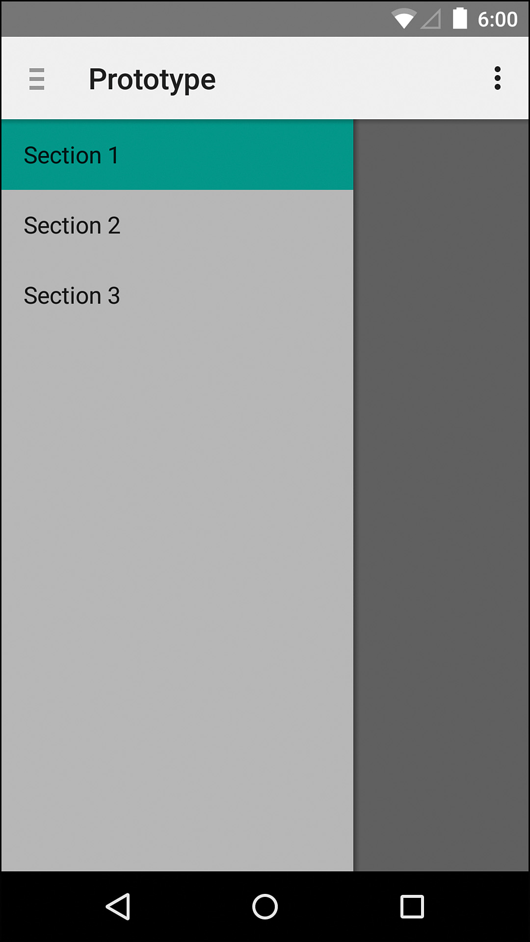
For instance, if you create an activity that uses the navigation drawer pattern using the current templates, you’ll end up with something similar to Figure 6.2. Unlike this older implementation, any new navigation drawer should always go over the app bar because that app bar is associated with the content currently on the screen and the navigation drawer is not. If you believe this difference between the older style app bar and the newer style will impact the prototype, then you can implement this is with the Toolbar class as an app bar rather than the built in action bar methods. If you’re getting confused about all these types of bars, remember that these are all “toolbars.” An app bar is the toolbar that’s at the top. The original term for app bar was “action bar,” so a lot of documentation and methods use that term still. When you see Toolbar in monospace, that means the specific class provided in Android 5.0 or in the support library as android.support.v7.widgets.Toolbar.
Tabs
Confusing semantics out of the way, it’s time to create an app. In this case, a blank activity is fine because we’ll go through the full process of creating a navigation drawer and then adding tabs. First, we need to make sure that we have the Design library included in the dependencies section of our build.gradle file. Because the Design library is dependent on the AppCompat library (which is dependent on Support-V4), it’s the only dependency we need to add. Remember too that the full code for this example prototype is included in the source code for this book in the Prototype folder for this chapter.
Now we can get that pesky toolbar out of the way. We want to ensure that the app’s theme does not add a toolbar at the top already, so open your styles.xml file and update the parent to Theme.AppCompat.Light.NoActionBar. Depending on how you created the project, Android Studio may have created multiple copies of styles.xml for different versions of Android. This isn’t necessary for the prototype, so you can delete all but the main one in res/values.
Now we can add a toolbar to the main layout. Because we’ll be adding it to multiple layouts, it’s a good idea to specify the toolbar in its own XML file so that it can be included elsewhere. Listing 6.1 shows an example saved as toolbar.xml.
Listing 6.1 Example of a Simple Toolbar Layout
<?xml version="1.0" encoding="utf-8"?>
<android.support.v7.widget.Toolbar
xmlns:android="http://schemas.android.com/apk/res/android"
android:id="@+id/toolbar"
android:layout_width="match_parent"
android:layout_height="?attr/actionBarSize"
android:elevation="4dp"
android:background="?attr/colorPrimary"/>
With the toolbar layout created, we can update the layout for the main activity. The whole thing will be wrapped with a DrawerLayout, inside of which there are two views. The first is the main content, which will be a LinearLayout containing the Toolbar, a TabLayout, and a ViewPager. The second is the NavigationView from the Design library. Listing 6.2 shows what this should look like. The Toolbar and TabLayout have the same background color and elevation, which will make them appear like one cohesive piece without complicating the view hierarchy. This might be a fragment at a future point, but keeping it this way is easy and effective right now. We’ll create the navigation drawer’s header layout and menu shortly.
Listing 6.2 Layout for the Main Activity
<?xml version="1.0" encoding="utf-8"?>
<android.support.v4.widget.DrawerLayout
xmlns:android="http://schemas.android.com/apk/res/android"
xmlns:app="http://schemas.android.com/apk/res-auto"
android:id="@+id/drawer_layout"
android:layout_width="match_parent"
android:layout_height="match_parent"
android:fitsSystemWindows="true">
<!-- The main content -->
<LinearLayout
android:layout_width="match_parent"
android:layout_height="match_parent"
android:orientation="vertical">
<include layout="@layout/toolbar" />
<android.support.design.widget.TabLayout
android:id="@+id/tabs"
android:layout_width="match_parent"
android:layout_height="wrap_content"
android:background="?attr/colorPrimary"
android:elevation="4dp"
app:tabMode="scrollable" />
<android.support.v4.view.ViewPager
android:id="@+id/viewpager"
android:layout_width="match_parent"
android:layout_height="match_parent" />
</LinearLayout>
<!-- The nav drawer -->
<android.support.design.widget.NavigationView
android:id="@+id/navigation_view"
android:layout_width="wrap_content"
android:layout_height="match_parent"
android:layout_gravity="start"
app:headerLayout="@layout/nav_drawer_header"
app:menu="@menu/nav_drawer" />
</android.support.v4.widget.DrawerLayout>
Before we start populating the tabs, we’re going to need some other pieces of the app ready.
Navigation Drawer
The navigation drawer is the other big piece of navigation, but before making the drawer, we need to define the types of tools that the drawer is organized into. This is a great case for an enum because Java enums are full classes, which means they can have methods and constructors. This lets you create a ToolType enum that can tell you the string resource ID for its name and description. Be sure to define the name and description for each type in strings.xml just like any other UI strings. Listing 6.3 shows what this could look like.
Listing 6.3 The Enum for Populating the Drawer
public enum ToolType {
CLAMPS(R.string.clamps, R.string.clamps_description),
SAWS(R.string.saws, R.string.saws_description),
DRILLS(R.string.drills, R.string.drills_description),
SANDERS(R.string.sanders, R.string.sanders_description),
ROUTERS(R.string.routers, R.string.routers_description),
MORE(R.string.more, R.string.more_description),
;
private final int mToolNameResourceId;
private final int mToolDescriptionResourceId;
private ToolType(@StringRes int toolName, @StringRes int toolDescription) {
mToolNameResourceId = toolName;
mToolDescriptionResourceId = toolDescription;
}
@StringRes
public int getToolDescriptionResourceId() {
return mToolDescriptionResourceId;
}
@StringRes
public int getToolNameResourceId() {
return mToolNameResourceId;
}
}
Now we can create the navigation drawer menu. Like all menus, it goes in the res/menu folder. We can call it nav_drawer.xml to make the purpose obvious. The menu needs to contain a group (though it can have more than one) and the group needs to have checkableBehavior set to single. This ensures that an item can be “checked” (i.e., selected as the current item) and that checking another item will uncheck the previous one. Within the group there are the size individual items. Listing 6.4 shows what this menu can look like.
Listing 6.4 The nav_drawer.xml Menu
<?xml version="1.0" encoding="utf-8"?>
<menu xmlns:android="http://schemas.android.com/apk/res/android">
<group android:checkableBehavior="single">
<item
android:id="@+id/nav_clamps"
android:title="@string/clamps"
android:checked="true"
/>
<item
android:id="@+id/nav_saws"
android:title="@string/saws"
/>
<item
android:id="@+id/nav_drills"
android:title="@string/drills"
/>
<item
android:id="@+id/nav_sanders"
android:title="@string/sanders"
/>
<item
android:id="@+id/nav_routers"
android:title="@string/routers"
/>
<item
android:id="@+id/nav_more"
android:title="@string/more"
/>
</group>
</menu>
With that ready, we need to make the navigation drawer header. This is the layout that is used at the top of the navigation drawer. In a real app, we’d worry about the background and interactivity, but we’re just focused on making a prototype, so this can be pretty simple. We create a new layout called nav_drawer_header.xml that contains a vertical LinearLayout with an ImageView and two TextViews. The values can all be hardcoded for now; we just need to make sure it looks close enough to get the point across when we evaluate the prototype with users. Listing 6.5 shows this simple layout.
Listing 6.5 The nav_drawer_header.xml Layout
<?xml version="1.0" encoding="utf-8"?>
<LinearLayout
xmlns:android="http://schemas.android.com/apk/res/android"
android:orientation="vertical"
android:layout_width="match_parent"
android:layout_height="150dp"
android:background="#FF777777"
android:paddingBottom="8dp"
android:paddingLeft="16dp"
android:paddingRight="16dp"
android:paddingTop="24dp"
android:gravity="bottom">
<ImageView
android:layout_width="64dp"
android:layout_height="64dp"
android:id="@+id/imageView"
android:src="@drawable/profile"
/>
<TextView
android:fontFamily="sans-serif-medium"
android:layout_width="wrap_content"
android:layout_height="wrap_content"
android:layout_marginTop="8dp"
android:text="Pat Woodworker"
android:textColor="#FFFFFF"
android:id="@+id/textView"/>
<TextView
android:layout_width="wrap_content"
android:layout_height="wrap_content"
android:text="[email protected]"
android:textColor="#FFFFFF"
android:id="@+id/textView2"/>
</LinearLayout>
Tool Representation
If you have real JSON that represents your data, you can take advantage of libraries such as GSON (https://code.google.com/p/google-gson/) or Jackson (https://github.com/FasterXML/jackson) that can take JSON and convert it to a simple Java object (commonly called a POJO or plain old Java object) and vice versa with very little effort. If your web API already exists, you might even be able to use it in the prototype without much effort by taking advantage of great libraries such as Retrofit (http://square.github.io/retrofit/).
Of course, most of the time you won’t have anything ready at this stage, so we’re going to assume nothing else is available yet and handle manually creating the data we want to display and the class that represents it. First, we can create the Tool class. The tool detail page requires the tool name, price, description, and a few pieces of metadata that are different for each type of tool (e.g., the drill press had horsepower, travel distance, and throat measurement). In a real app, it would make sense to have a subclass for each tool type because the metadata can vary so much, but we can do this somewhat generically now with just a string array to speed up the prototyping process.
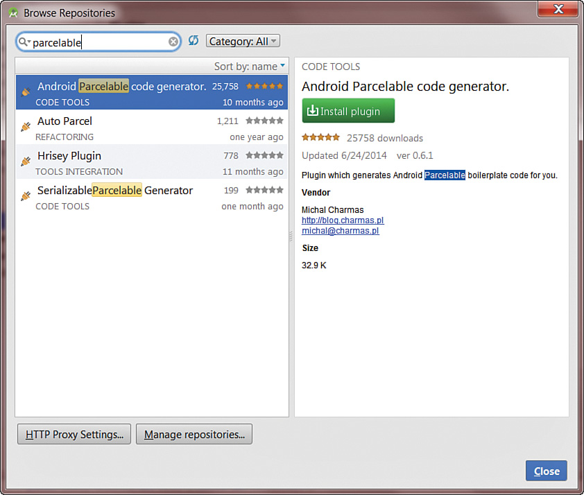
Because we’re going to need to be able to pass this class around in the app between activities and fragments, we should make it implement Parcelable. This interface provides a way of breaking a class down into primitive values stored in a Bundle class and restoring it from primitives in a bundle. This is more efficient than Serializable, but it is far more tedious to implement. Fortunately, you don’t have to do the heavy work. If you open Android Studio’s settings and go to the Plugins section, there is a button at the bottom that says, “Browse Repositories.” Click this button and search for “parcelable.” You should see the plugin called “Android Parcelable code generator” in the list as shown in Figure 6.3, so install it. After you close out the dialog windows to get back to Android Studio, it will tell you that it has to restart to use the new plugin; go ahead and do that now. When you get back into Android Studio, you can use the code insertion feature by right clicking or using the shortcut keys (Alt + Insert for Windows and Linux; Command + N on Mac) and select “Parcelable” to automatically generate all the code for you. Listing 6.6 shows a basic implementation of this class, including the parcelable bits.
public class Tool implements Parcelable {
private static final int DETAILS_COUNT = 3;
private final String mName;
private final String mPrice;
private final String[] mDetails;
private final String mDescription;
public Tool(String name, String price, String[] details, String description) {
mName = name;
mPrice = price;
mDetails = new String[DETAILS_COUNT];
if (details != null) {
for (int i = 0; i < details.length; i++) {
mDetails[i] = details[i];
}
}
mDescription = description;
}
public String getDescription() {
return mDescription;
}
public String[] getDetails() {
return mDetails;
}
public String getName() {
return mName;
}
public String getPrice() {
return mPrice;
}
@Override
public int describeContents() {
return 0;
}
@Override
public void writeToParcel(Parcel dest, int flags) {
dest.writeString(this.mName);
dest.writeString(this.mPrice);
dest.writeStringArray(this.mDetails);
dest.writeString(this.mDescription);
}
private Tool(Parcel in) {
this.mName = in.readString();
this.mPrice = in.readString();
this.mDetails = in.createStringArray();
this.mDescription = in.readString();
}
public static final Parcelable.Creator<Tool> CREATOR = new Parcelable.Creator<Tool>() {
public Tool createFromParcel(Parcel source) {
return new Tool(source);
}
public Tool[] newArray(int size) {
return new Tool[size];
}
};
}
Now that we have a way to represent each tool, we have to figure out how to get some data. One technique that is sometimes helpful is to have a class that generates instances for you using some predefined values. You can create arrays of acceptable values for each field and then choose from them by picking at random and you’ll end up with something that should be reasonable enough for basic testing. Listing 6.7 demonstrates some arrays you might set up with acceptable values for a ToolTestUtils class.
Listing 6.7 Examples of Predefined Values as Arrays
private static final String[] BRANDS = {
"Ace", "Bosch", "DeWalt", "Irwin", "Jet", "Kreg",
"Makita", "Porter Cable", "Skil", "Stanley", "Stihl",
};
private static final String[] DETAILS_HP = {
"1/4 HP", "1/2 HP", "3/4 HP", "1 HP", "1 1/2 HP", "2 HP",
};
private static final String[] DETAILS_CLAMP_TYPE = {
"Bar", "Spring", "Quick-Grip", "Pipe", "Parallel",
};
private static final String[] DETAILS_INCHES = {
"2"", "5"", "12"", "18"", "24"", "36"", "48"",
};
private static final String[] DETAILS_BATTERY = {
"12V", "18V", "20V", "24V", "32V", "48V",
};
// ... You get the idea
Next, you need to add a constructor, so that you can create a Random class with a particular seed, and a method to generate a Tool using that Random. The reason for passing in a particular seed is that it enables you to get exactly the same results, so you can ensure that your list of stationary drills is always the same. It also means that you can use this class later on for automated tests because you can create a lot of useful values and repeat results. The method for generating each object isn’t particularly interesting; it’s mostly just grabbing a random option from an array. There are a few specific checks to see which tab has been selected and choose more realistic options, but it looks more complicated than it is. Listing 6.8 shows the rest of the class (note that the sanders, routers, and more sections don’t have their details filled in; the first three sections should be enough to get a feel for the prototype).
Listing 6.8 The Code for Generating Test Tool Instances
private final Random mRandom;
public ToolTestUtils() {
this(0);
}
public ToolTestUtils(long seed) {
mRandom = new Random(seed);
}
public Tool getNewTool(ToolType toolType, ToolPagerAdapter.Tab tab) {
final String brand = getRandom(BRANDS);
String name = brand + " ";
String price = null;
final String[] details = new String[3];
switch (toolType) {
case CLAMPS:
details[0] = getRandom(DETAILS_CLAMP_TYPE);
details[1] = getRandom(DETAILS_INCHES);
name += details[1] + " " + details[0] + " Clamp";
details[1] += " opening";
price = getRandom(PRICE_LOW);
break;
case SAWS:
details[0] = getRandom(DETAILS_BLADE_SIZE);
details[1] = getRandom(DETAILS_HP);
if (tab == ToolPagerAdapter.Tab.BATTERY) {
details[2] = getRandom(DETAILS_BATTERY);
}
if (tab == ToolPagerAdapter.Tab.STATIONARY) {
name += getRandom(TYPES_SAWS_STATIONARY);
} else {
name += getRandom(TYPES_SAWS_NOT_STATIONARY);
}
break;
case DRILLS:
details[0] = getRandom(DETAILS_HP);
if (tab == ToolPagerAdapter.Tab.BATTERY) {
details[1] = getRandom(DETAILS_BATTERY);
}
if (tab == ToolPagerAdapter.Tab.STATIONARY) {
details[2] = getRandom(DETAILS_INCHES) + " throat";
name += getRandom(TYPES_DRILLS_STATIONARY);
} else {
name += "Drill";
}
break;
case SANDERS:
name += "Sander";
break;
case ROUTERS:
name += "Router";
break;
case MORE:
name += "Tool";
break;
}
if (price == null) {
if (tab == ToolPagerAdapter.Tab.STATIONARY) {
price = getRandom(PRICE_HIGH);
} else {
price = getRandom(PRICE_MEDIUM);
}
}
String description = "The latest and greatest from " + brand +
" takes " + toolType.name().toLowerCase(Locale.getDefault()) + " to a
whole new level. Tenderloin corned beef tail, tongue landjaeger boudin
kevin ham pig pork loin short loin shoulder prosciutto ground round.
Alcatra salami sausage short ribs t-bone, tongue spare ribs kevin
meatball tenderloin. Prosciutto tail meatloaf, chuck pancetta kielbasa
leberkas tenderloin drumstick meatball alcatra cow sausage corned beef
pork belly. Shoulder swine hamburger tail ham hock bacon pork belly
leberkas beef ribs jowl spare ribs.";
return new Tool(name, price, details, description);
};
public ArrayList<Tool> getNewTools(ToolType toolType, ToolPagerAdapter.
Tab tab, int count) {
final ArrayList<Tool> results = new ArrayList<>(count);
for (int i = 0; i < count; i++) {
results.add(getNewTool(toolType, tab));
}
return results;
};
private String getRandom(String[] strings) {
return strings[mRandom.nextInt(strings.length)];
}
Tab Fragments
We need a fragment for the About tab and a list fragment for the other three tabs. For the About tab, we can create a simple fragment called ToolAboutFragment that takes a ToolType enum and displays the name and description. For the real app, we’ll likely want something more detailed, perhaps with photos, but this should be enough for the prototype. Creating a new Fragment class in Android Studio via File -> New -> Fragment -> Fragment (Blank) will give you a fragment and layout to start with.
Listing 6.9 shows one way of organizing the fragment’s layout. By making the root view a vertically oriented linear layout, we can just drop the two text views in. Setting the first one to have a text appearance of ?android:attr/textAppearanceLarge allows us to take advantage of attributes that are built in to Android and create a visual hierarchy. Another attribute to notice in this file is tools:text. The tools namespace lets you specify values for attributes that are just used for working with Android Studio and not in the app. By specifying tools:text in this way, you override whatever (if anything) was put for android:text, allowing you to test text in the design view without it affecting your actual app. This is great for cases where the default is empty because you will programmatically assign a value. Although we’re only using the tools namespace to set the text here, you can use it for other Android attributes too. Want a view to stand out while you tweak it in the design tab? You could set its background via tools:background to a right red.
Listing 6.9 The Layout for the About Fragment
<?xml version="1.0" encoding="utf-8"?>
<LinearLayout xmlns:android="http://schemas.android.com/apk/res/android"
xmlns:tools="http://schemas.android.com/tools"
android:layout_width="match_parent"
android:layout_height="match_parent"
android:orientation="vertical"
android:paddingLeft="@dimen/activity_horizontal_margin"
android:paddingRight="@dimen/activity_horizontal_margin"
android:paddingTop="@dimen/activity_vertical_margin"
android:paddingBottom="@dimen/activity_vertical_margin"
tools:context="com.iangclifton.woodworkingtools.ToolAboutFragment">
<TextView
android:id="@+id/title"
android:layout_width="match_parent"
android:layout_height="wrap_content"
android:textAppearance="?android:attr/textAppearanceLarge"
tools:text="@string/clamps" />
<TextView
android:id="@+id/description"
android:layout_width="match_parent"
android:layout_height="wrap_content"
android:textAppearance="?android:attr/textAppearanceMedium"
tools:text="@string/clamps_description" />
</LinearLayout>
Now the fragment just needs to be updated to know the ToolType it is displaying and to set the appropriate text views. The convention used for passing values to a fragment that are required is to create a static newInstance method that takes those values, creates an instance of the fragment, sets those values as the fragment’s arguments, and then returns the fragment. This ensures that the arguments are set before the fragment needs them and it also keeps you from creating a custom constructor that will remove the required default (empty) constructor. Because Android can recreate your fragments via the default constructor using reflection, not having one can cause a crash that’s not obvious. Setting the arguments the way we are in this newInstance method means that Android can use the default constructor to recreate the fragment and the arguments will be restored for us. Listing 6.10 shows the fragment.
Listing 6.10 The About Fragment
public class ToolAboutFragment extends Fragment {
private static final String ARG_TOOL_TYPE = "toolType";
private ToolType mToolType;
public static ToolAboutFragment newInstance(ToolType toolType) {
final ToolAboutFragment fragment = new ToolAboutFragment();
final Bundle args = new Bundle();
args.putString(ARG_TOOL_TYPE, toolType.name());
fragment.setArguments(args);
return fragment;
}
public ToolAboutFragment() {
// Required empty public constructor
}
@Override
public void onCreate(Bundle savedInstanceState) {
super.onCreate(savedInstanceState);
final Bundle args = getArguments();
if (args == null) {
throw new IllegalStateException("No arguments set; use newInstance when constructing!");
}
mToolType = ToolType.valueOf(args.getString(ARG_TOOL_TYPE));
}
@Override
public View onCreateView(LayoutInflater inflater, ViewGroup container, Bundle savedInstanceState) {
final View rootView = inflater.inflate(R.layout.fragment_tool_about, container, false);
TextView textView = (TextView) rootView.findViewById(R.id.title);
textView.setText(mToolType.getToolNameResourceId());
textView = (TextView) rootView.findViewById(R.id.description);
textView.setText(mToolType.getToolDescriptionResourceId());
return rootView;
}
}
The ToolListFragment that will be used for the other three tabs can be created in the same way, but you should change the super class from Fragment to ListFragment. The ListFragment class handles displaying a loading state, an empty state, or a list at any given time. We only need to worry about the list of content right now, and we need to pass two pieces of content to do that: the ToolType enum and the tab that was selected. Because we haven’t defined the tabs yet, let’s do that now. We can create a new class that extends FragmentPagerAdapter called ToolPagerAdapter. This class will be responsible for constructing the fragments that are displayed when the user taps a tab or swipes between tabs. Within it, we can define an enum called Tab with a class for each tab pointing to a string resource similar to what we did for ToolType. The adapter’s constructor will need the FragmentManager (to pass to the super class constructor), the Resources (for loading the strings displayed on the tabs), and the ToolType (used when constructing the ToolListFragment). Rather than keeping the resources around, we can immediately use the resources to load the string titles into an array. We need to override getItem to return a new fragment of the appropriate type. In this case, we need the ToolAboutFragment to be instantiated if the first (0 position) tab is selected, our in-progress ToolListFragment to be instantiated if any of the next three tabs is selected, or an exception to be thrown for any other position (just in case we add more tabs later and forget to handle them). One extra bit we do is override getItemId, which returns a unique ID for each fragment so that the super class can reuse existing fragments. When you tap the Stationary tab, the super class will look to see if a fragment of that ID has already been created, reusing it if it has. Because we don’t want the fragment for stationary drills to be used when tapping the tab for stationary saws, we represent the tool type with the tens digit and the tab position with the ones digit to create a simple unique ID. The complete ToolPagerAdapter class is in Listing 6.11.
Listing 6.11 The ToolPagerAdapter Class
public class ToolPagerAdapter extends FragmentPagerAdapter {
public enum Tab {
ABOUT(R.string.about),
STATIONARY(R.string.stationary),
HANDHELD(R.string.handheld),
BATTERY(R.string.battery);
private final int mStringResource;
Tab(@StringRes int stringResource) {
mStringResource = stringResource;
}
public int getStringResource() {
return mStringResource;
}
}
private final Tab[] mTabs = Tab.values();
private final CharSequence[] mTitles = new CharSequence[mTabs.length];
private final ToolType mToolType;
private final ToolType[] mToolTypes = ToolType.values();
public ToolPagerAdapter(FragmentManager fm, Resources res, ToolType toolType) {
super(fm);
mToolType = toolType;
for (int i = 0; i < mTabs.length; i++) {
mTitles[i] = res.getString(mTabs[i].getStringResource());
}
}
@Override
public Fragment getItem(int position) {
switch (position) {
case 0:
return ToolAboutFragment.newInstance(mToolType);
case 1:
case 2:
case 3:
return ToolListFragment.newInstance(mToolType, mTabs[position]);
}
throw new IllegalArgumentException("Unhandled position: " + position);
}
@Override
public int getCount() {
return mTabs.length;
}
@Override
public CharSequence getPageTitle(int position) {
return mTitles[position];
}
@Override
public long getItemId(int position) {
for (int i = 0; i < mToolTypes.length; i++) {
if (mToolTypes[i] == mToolType) {
return (i * 10) + position;
}
}
throw new IllegalArgumentException("Invalid position (" + position + ") or ToolType (" + mToolType + ")");
}
}
With the adapter for our tabs ready, we need to update the main activity. The onCreate method has the typical setContentView call and the toolbar setup. Then it needs to set up the drawer. We have to set up the navigation icon in the toolbar and also the click listener that triggers the opening of the drawer. We also need to make the activity implement OnNavigationItemSelectedListener and call the setter for that listener on our NavigationView. If this is the first time the activity is launching (i.e., the Bundle passed into onCreate is null), then we should also set up all the tabs.
We’ll create a setupTabs method that takes the position and sets up the ViewPager as needed. It needs to create a ToolPagerAdapter based on the position (using the appropriate ToolType). Then it can clear out all existing tabs, create tabs from the adapter, add the page listener, set the adapter, and set the tab listener. The OnTabSelectedListener simply needs to set the current item based on the position of the tab. In this example, we are simply finding the views each time, which isn’t very efficient. It’s good enough for a prototype, but it would be better to retain these references in a real app.
We can implement onNavigationItemSelected by using a switch on the ID of the MenuItem that was selected (this represents the item in the drawer that was created from the XML we wrote). The switch just needs to set the current position, but you might also do other handling here in future. Be sure to set the MenuItem as checked, call setupTabs with the new position, and close the drawer. Note that many apps would also set the title here, but our design displays the section under the tabs, so it might be redundant to show it in the app bar as well.
One more thing we need to do is handle the navigation drawer state. That means we should override onSaveInstanceState to store the current nav position (don’t forget to call through to the super method). We should also override onRestoreInstanceState, calling through to the super method, and adding a few lines of code to set things back up. We retrieve the position from the Bundle, and then we get the MenuItem that represents that position to call setChecked on it. Finally, we trigger our setupTabs method.
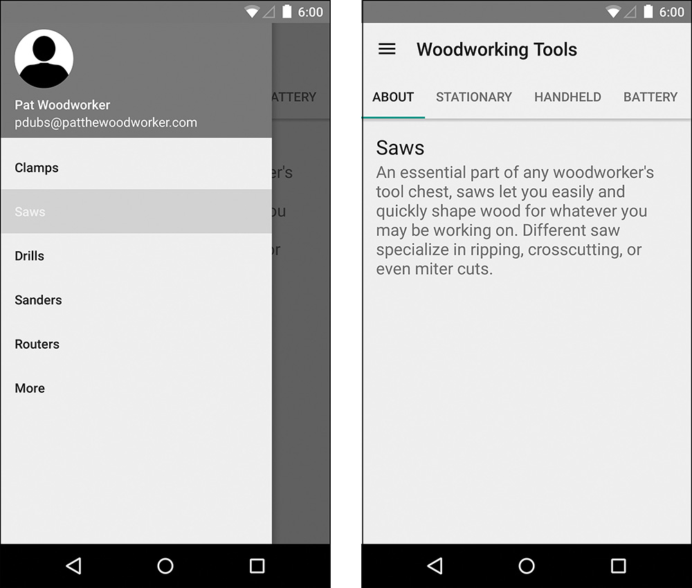
Listing 6.12 shows what the activity looks like now and Figure 6.4 shows the state of the navigation in the UI at this point.
Listing 6.12 The Updated MainActivity
public class MainActivity extends AppCompatActivity implements NavigationView.OnNavigationItemSelectedListener {
private static final String TAG = "MainActivity";
private static final String SELECTED_POSITION = "selectedPosition";
private int mCurrentNavPosition;
private DrawerLayout mDrawerLayout;
private NavigationView mNavigationView;
private Toolbar mToolbar;
private ToolType[] mToolTypes = ToolType.values();
@Override
protected void onCreate(Bundle savedInstanceState) {
super.onCreate(savedInstanceState);
setContentView(R.layout.activity_main);
mToolbar = (Toolbar) findViewById(R.id.toolbar);
setSupportActionBar(mToolbar);
// Enable opening of drawer
mDrawerLayout = (DrawerLayout) findViewById(R.id.drawer_layout);
mToolbar.setNavigationIcon(R.drawable.ic_menu_black_24dp);
mToolbar.setNavigationOnClickListener(new View.OnClickListener() {
@Override
public void onClick(View v) {
mDrawerLayout.openDrawer(GravityCompat.START);
}
});
// Add drawer listener
mNavigationView = (NavigationView) findViewById(R.id.navigation_view);
mNavigationView.setNavigationItemSelectedListener(this);
// Set up tabs and title
if (savedInstanceState == null) {
setupTabs(0);
}
}
@Override
public boolean onNavigationItemSelected(MenuItem menuItem) {
switch (menuItem.getItemId()) {
case R.id.nav_clamps:
mCurrentNavPosition = 0;
break;
case R.id.nav_saws:
mCurrentNavPosition = 1;
break;
case R.id.nav_drills:
mCurrentNavPosition = 2;
break;
case R.id.nav_sanders:
mCurrentNavPosition = 3;
break;
case R.id.nav_routers:
mCurrentNavPosition = 4;
break;
case R.id.nav_more:
mCurrentNavPosition = 5;
break;
default:
Log.w(TAG, "Unknown drawer item selected");
break;
}
menuItem.setChecked(true);
setupTabs(mCurrentNavPosition);
mDrawerLayout.closeDrawer(GravityCompat.START);
return true;
}
@Override
protected void onRestoreInstanceState(Bundle savedInstanceState) {
super.onRestoreInstanceState(savedInstanceState);
mCurrentNavPosition = savedInstanceState.getInt(SELECTED_POSITION, 0);
final Menu menu = mNavigationView.getMenu();
final MenuItem menuItem = menu.getItem(mCurrentNavPosition);
menuItem.setChecked(true);
setupTabs(mCurrentNavPosition);
}
@Override
protected void onSaveInstanceState(Bundle outState) {
super.onSaveInstanceState(outState);
outState.putInt(SELECTED_POSITION, mCurrentNavPosition);
}
private void setupTabs(int position) {
final ViewPager viewPager = (ViewPager) findViewById(R.id.viewpager);
final TabLayout tabLayout = (TabLayout) findViewById(R.id.tabs);
final ToolPagerAdapter toolPagerAdapter = new ToolPagerAdapter(getSupportFragmentManager(), getResources(), mToolTypes[position]);
tabLayout.removeAllTabs();
tabLayout.setTabsFromPagerAdapter(toolPagerAdapter);
viewPager.addOnPageChangeListener(new TabLayout.TabLayoutOnPageChangeListener(tabLayout));
viewPager.setAdapter(toolPagerAdapter);
tabLayout.setOnTabSelectedListener(new TabLayout.OnTabSelectedListener() {
@Override
public void onTabSelected(TabLayout.Tab tab) {
viewPager.setCurrentItem(tab.getPosition());
}
@Override
public void onTabUnselected(TabLayout.Tab tab) {
}
@Override
public void onTabReselected(TabLayout.Tab tab) {
}
});
}
}
Before we get back to the list fragment, we need to make an adapter that will be used to create the views, which means we also need a layout that will display the list items. We can either make this layout have a RelativeLayout as the root or a LinearLayout, the former has the advantage of a shallower view hierarchy and the latter has the advantage of being able to center the text vertically as a group even if the metadata is missing. We’ll go with the LinearLayout approach in this case, but either is fine. Listing 6.13 shows this simple layout, which we save as list_item_tool.xml. Typically, layouts are named based on the root use and then the specific type (in our case we have a list item that represents a tool). A layout for a fragment that displays details about bacon might be called fragment_bacon_details.xml but you might call it activity_bacon_details.xml if you planned to use it in an activity. Because the files are organized alphabetically, this helps visually group the layouts based on their use. Of course, this is a convention, so you can use whatever naming scheme works best for you.
Listing 6.13 The list_item_tool.xml Layout
<LinearLayout xmlns:android="http://schemas.android.com/apk/res/android"
xmlns:tools="http://schemas.android.com/tools"
android:layout_width="match_parent"
android:layout_height="wrap_content"
android:orientation="horizontal">
<ImageView
android:layout_width="@dimen/thumbnail_size"
android:layout_height="@dimen/thumbnail_size"
android:id="@+id/thumbnail"
android:contentDescription="@null"
android:layout_marginBottom="@dimen/default_padding"
android:layout_marginStart="@dimen/default_padding"
android:layout_marginTop="@dimen/default_padding"
tools:src="#FFBBBBBB" />
<LinearLayout
android:layout_width="match_parent"
android:layout_height="wrap_content"
android:padding="@dimen/default_padding"
android:gravity="center_vertical"
android:orientation="vertical">
<TextView
android:id="@+id/price"
android:layout_width="match_parent"
android:layout_height="wrap_content"
android:gravity="end"
android:textAppearance="?android:attr/textAppearanceMedium"
android:lines="1"
tools:text="$200"/>
<TextView
android:id="@+id/name"
android:layout_width="match_parent"
android:layout_height="wrap_content"
android:textAppearance="?android:attr/textAppearanceLarge"
android:textSize="18sp"
tools:text="Acme 17" Bench Mount Drill Press"/>
<TextView
android:id="@+id/meta"
android:layout_width="match_parent"
android:layout_height="wrap_content"
android:textAppearance="?android:attr/textAppearanceMedium"
android:textSize="16sp"
tools:text="1/2 HP"/>
</LinearLayout>
</LinearLayout>
The adapter we make that uses the list_item_tool.xml layout can extend from ArrayAdapter, cutting down on the amount of code we need to write. Our ToolArrayAdapter can pass a List of Tool instances to the super’s constructor. The constructor normally takes an ID for a text view, which it then uses to set the text displayed for each item using the getString method of the object, but we can pass -1 here because we’ll implement the getView method ourselves. Remember that getView receives a convertView, which is a view previously returned by getView for an item that is now off the screen. It can be null if there are no previous views being recycled, so we just need to inflate the layout we made in that case. In a real app, you should never use findViewById every time getView is called. You can use the common “View Holder” pattern (basically you have a separate object that keeps all the view references for you), which is covered in Chapter 8 “Applying the Design,” or you can use a custom view, which is covered in Chapter 12 “Combining Views for Custom Components.” For a prototype, calling findViewById more than necessary is okay.
One extra thing we want to do is to vary the thumbnails with different shades of gray to help simulate different images. We’ll make a simple method that takes an int and returns a color. We’ll define three colors, so we can switch over the absolute value (to get rid of any negatives) modulus three. If you’re not familiar with the modulus operator, it returns what the remainder would be when dividing numbers (e.g., 10 divided by 3 will give you 3 and the remainder is dropped off because we’re dealing with integers but 10 modulus 3 gives you 1). By using three, we guarantee that the number returned will be zero, one, or two, so we just have to return a color for each of those. In this case we can hardcode the colors because they’re just here for the prototype. These will be different shades of gray such as 0xff777777. Using 0x says that the value is in hexadecimal format just like how you specify a color in XML. The rest of the values are in pairs (where 00 is the lowest value and ff is the highest) ff is for the alpha value, so ff is fully opaque. The red, blue, and green pairs can be anything you want. By making the three pairs the same, you create a gray. The last bit we need to do is get an int that we can use to key off of. You could pass in the position of the view, which would give you a very regular pattern of your grays, but that pattern is very noticeable and can cause people to try to understand why the pattern is there when that isn’t at all the focus of the prototype. Instead, we want something somewhat random, but we can “cheat” by just using the hash code of the tool’s name. A hash code is intended to be used for data structures such as a hash map, which means the range of possible values should be well distributed across instances of the object. In other words, the hash code for one tool’s name is unlikely to be the same as for another tool, but the hash code for a given tool’s name will always be the same. This is perfect for our needs. You can see how everything comes together for the ToolArrayAdapter in Listing 6.14.
Listing 6.14 The ToolArrayAdapter
public class ToolArrayAdapter extends ArrayAdapter<Tool> {
private final LayoutInflater mLayoutInflater;
public ToolArrayAdapter(Context context, List<Tool> objects) {
super(context, -1, objects);
mLayoutInflater = LayoutInflater.from(context);
}
@Override
public View getView(int position, View convertView, ViewGroup parent) {
if (convertView == null) {
convertView = mLayoutInflater.inflate(R.layout.list_item_tool, parent, false);
}
final Tool tool = getItem(position);
// Set TextViews
TextView textView = (TextView) convertView.findViewById(R.id.price);
textView.setText(tool.getPrice());
textView = (TextView) convertView.findViewById(R.id.name);
textView.setText(tool.getName());
textView = (TextView) convertView.findViewById(R.id.meta);
textView.setText(tool.getDetails()[0]);
// Set color for thumbnail
convertView.findViewById(R.id.thumbnail).setBackgroundColor(getThumbnailColor(tool.getName().hashCode()));
return convertView;
}
private int getThumbnailColor(int key) {
switch (Math.abs(key) % 3) {
case 0:
return 0xff777777;
case 1:
return 0xff999999;
case 2:
return 0xffbbbbbb;
}
return 0;
}
}
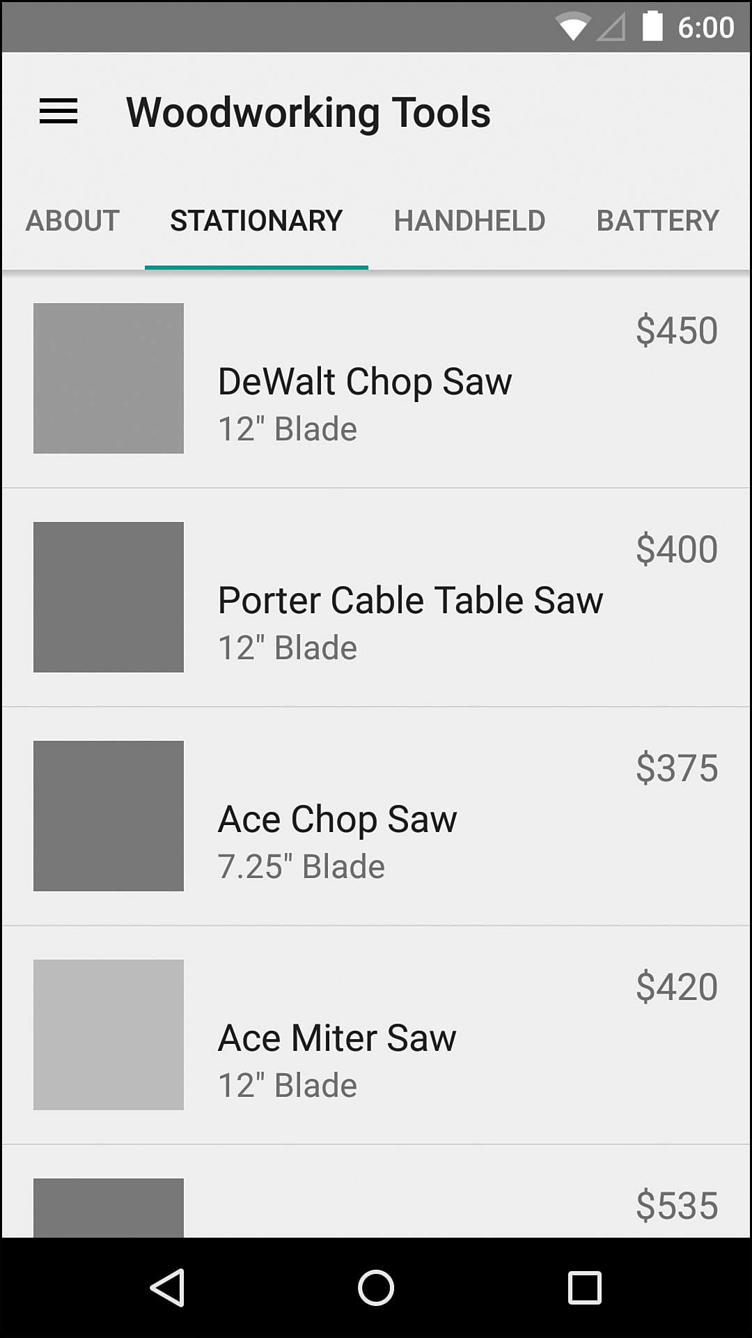
We can finally get back to our ToolListFragment. Its newInstance method will take both a ToolType enum and a ToolPagerAdapter.Tab enum, and we need to update the fragment to make use of the adapter we just made. Using the ToolTestUtils we created earlier, we can populate the adapter with 20 tools to give the basic feel we expect the app to have once there is real data. The fragment also needs to handle clicks, so we can update it to implement AdapterView.OnItemClickListener. In the onItemClick method, we get the Tool object from our adapter and then start the ToolDetailActivity, which we need to make next. The full fragment is in Listing 6.15, and an example of the UI is in Figure 6.5. You may find that the entire app is extremely bland (and excessively gray) at this point. That’s okay! The less final an app looks, the more comfortable most people feel in critiquing it. Remember, you’re not worried about color choice at this point.
Listing 6.15 The ToolListFragment
public class ToolListFragment extends ListFragment implements AdapterView.OnItemClickListener {
private static final String ARG_TOOL_TYPE = "toolType";
private static final String ARG_TAB = "tab";
private ToolType mToolType;
private ToolPagerAdapter.Tab mTab;
private ToolArrayAdapter mToolArrayAdapter;
public static ToolListFragment newInstance(ToolType toolType, ToolPagerAdapter.Tab tab) {
final ToolListFragment fragment = new ToolListFragment();
final Bundle args = new Bundle();
args.putString(ARG_TOOL_TYPE, toolType.name());
args.putString(ARG_TAB, tab.name());
fragment.setArguments(args);
return fragment;
}
public ToolListFragment() {
// Required empty public constructor
}
@Override
public void onCreate(Bundle savedInstanceState) {
super.onCreate(savedInstanceState);
final Bundle args = getArguments();
if (args == null) {
throw new IllegalStateException("No arguments set; use newInstance when constructing!");
}
mToolType = ToolType.valueOf(args.getString(ARG_TOOL_TYPE));
mTab = ToolPagerAdapter.Tab.valueOf(args.getString(ARG_TAB));
final ArrayList<Tool> tools = new ToolTestUtils(mTab.hashCode()).getNewTools(mToolType, mTab, 20);
mToolArrayAdapter = new ToolArrayAdapter(getActivity(), tools);
setListAdapter(mToolArrayAdapter);
}
@Override
public void onActivityCreated(Bundle savedInstanceState) {
super.onActivityCreated(savedInstanceState);
getListView().setOnItemClickListener(this);
}
@Override
public void onItemClick(AdapterView<?> adapterView, View view, int position, long id) {
final Tool tool = mToolArrayAdapter.getItem(position);
ToolDetailActivity.startActivity(getActivity(), tool);
}
}
Tool Details
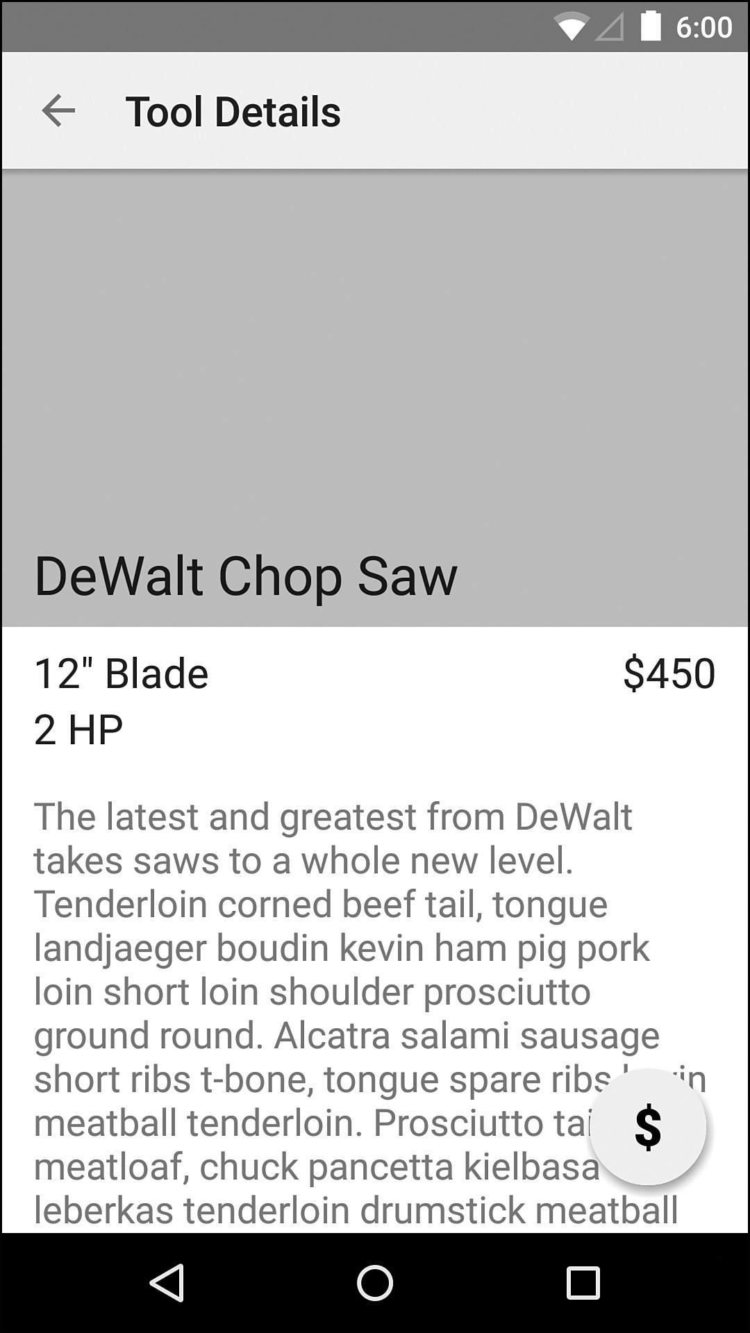
To save a tiny bit of time, we’re going to implement the detail activity without using a fragment. That means we need to create a blank activity with Android Studio and then get started on the layout. Figure 6.6 shows what we’re going to build. The root of this layout will be a RelativeLayout. Our toolbar will go on the top, followed by a ScrollView that contains just about everything else, and then a floating action button (FAB) will be added to the bottom-right corner. The FloatingActionButton view comes from the Design library. Inside the ScrollView, we’ll have another RelativeLayout that positions everything how we want it. All the content is just text and a single image, so this layout is fairly simple. The complete layout is in Listing 6.16.
Listing 6.16 The activity_tool_detail.xml Layout
<RelativeLayout xmlns:android="http://schemas.android.com/apk/res/android"
xmlns:app="http://schemas.android.com/apk/res-auto"
xmlns:tools="http://schemas.android.com/tools"
android:layout_width="match_parent"
android:layout_height="match_parent"
android:orientation="vertical"
tools:context="com.iangclifton.woodworkingtools.ToolDetailsActivityFragment">
<include layout="@layout/toolbar" />
<ScrollView
android:layout_width="match_parent"
android:layout_height="wrap_content"
android:layout_below="@id/toolbar"
android:fillViewport="true">
<RelativeLayout
android:layout_width="match_parent"
android:layout_height="wrap_content"
android:paddingBottom="80dp">
<ImageView
android:id="@+id/image"
android:layout_width="match_parent"
android:layout_height="220dp"
android:layout_alignParentStart="true"
android:layout_alignParentTop="true"
android:layout_marginBottom="8dp"
android:contentDescription="@null"
android:src="#FFBBBBBB"/>
<TextView
android:id="@+id/name"
android:layout_width="wrap_content"
android:layout_height="wrap_content"
android:layout_alignBottom="@+id/image"
android:layout_alignStart="@+id/image"
android:paddingBottom="8dp"
android:paddingLeft="@dimen/activity_horizontal_margin"
android:paddingRight="@dimen/activity_horizontal_margin"
android:textAppearance="?android:attr/textAppearanceLarge"
android:textSize="26sp"
tools:text="Acme 17" drill press"/>
<TextView
android:id="@+id/detail_0"
android:layout_width="wrap_content"
android:layout_height="wrap_content"
android:layout_above="@+id/detail_2"
android:layout_alignStart="@+id/image"
android:paddingLeft="@dimen/activity_horizontal_margin"
android:paddingRight="@dimen/activity_horizontal_margin"
android:textColor="@color/black_87"
android:textSize="20sp"
tools:text="3/4 HP"/>
<TextView
android:id="@+id/detail_1"
android:layout_width="wrap_content"
android:layout_height="wrap_content"
android:layout_alignStart="@id/detail_0"
android:layout_below="@id/detail_0"
android:paddingLeft="@dimen/activity_horizontal_margin"
android:paddingRight="@dimen/activity_horizontal_margin"
android:textColor="@color/black_87"
android:textSize="20sp"
tools:text="5" travel"/>
<TextView
android:id="@+id/detail_2"
android:layout_width="wrap_content"
android:layout_height="wrap_content"
android:layout_alignEnd="@+id/price"
android:layout_below="@+id/price"
android:paddingLeft="@dimen/activity_horizontal_margin"
android:paddingRight="@dimen/activity_horizontal_margin"
android:textColor="@color/black_87"
android:textSize="20sp"
tools:text="8" throat"/>
<TextView
android:id="@+id/description"
android:layout_width="wrap_content"
android:layout_height="wrap_content"
android:layout_alignParentStart="true"
android:layout_below="@id/detail_1"
android:layout_marginTop="16dp"
android:paddingLeft="@dimen/activity_horizontal_margin"
android:paddingRight="@dimen/activity_horizontal_margin"
android:textAppearance="?android:attr/textAppearanceMedium"
tools:text="The latest and greatest drill press from
Acme Inc. A powerful 3/4 HP motor ensures you can drill through dense
materials without breaking a sweat. Tail pork belly pancetta shank.
Salami ham biltong ball tip pig corned beef jerky turkey meatloaf
shank hamburger flank filet mignon porchetta rump. Beef ribs kevin
drumstick landjaeger pastrami tail jowl ground round porchetta chuck
swine sausage doner jerky. Doner landjaeger bresaola spare ribs short
loin tenderloin pancetta fatback kielbasa capicola prosciutto. Beef
tenderloin tail sirloin rump tongue short ribs picanha pork chop,
landjaeger porchetta. Filet mignon shank shoulder bacon sausage
frankfurter."/>
<TextView
android:id="@+id/price"
android:layout_width="wrap_content"
android:layout_height="wrap_content"
android:layout_alignEnd="@+id/image"
android:layout_below="@+id/image"
android:paddingLeft="@dimen/activity_horizontal_margin"
android:paddingRight="@dimen/activity_horizontal_margin"
android:textColor="@color/black_87"
android:textSize="20sp"
tools:text="$750"/>
</RelativeLayout>
</ScrollView>
<android.support.design.widget.FloatingActionButton
android:id="@+id/fab"
android:layout_width="wrap_content"
android:layout_height="wrap_content"
android:layout_alignParentBottom="true"
android:layout_alignParentEnd="true"
android:layout_margin="@dimen/default_padding"
android:src="@drawable/ic_buy"/>
</RelativeLayout>
Back in the ToolDetailActivity class, we need to make sure the Tool is an extra in the Bundle that is added to the Intent that launches the activity, so we create a helper method called startActivity to do all the work. This is a handy pattern because it keeps code outside of the activity from having to know which extras are required and which keys to use. The onCreate method just pulls out the Tool and sets each of the text views in the layout. Because we’re repeating the process of finding a view, casting it to a TextView, and setting the text, we can create a simple helper method for that. Listing 6.17 shows this simple activity completed.
Listing 6.17 The ToolDetailActivity
public class ToolDetailActivity extends AppCompatActivity {
private static final String EXTRA_TOOL = "com.iangclifton.woodworkingtools.TOOL";
public static void startActivity(Context context, Tool tool) {
final Intent intent = new Intent(context, ToolDetailActivity.class);
intent.putExtra(EXTRA_TOOL, tool);
context.startActivity(intent);
}
@Override
protected void onCreate(Bundle savedInstanceState) {
super.onCreate(savedInstanceState);
setContentView(R.layout.activity_tool_detail);
final Toolbar toolbar = (Toolbar) findViewById(R.id.toolbar);
setSupportActionBar(toolbar);
getSupportActionBar().setDisplayHomeAsUpEnabled(true);
final Tool tool = getIntent().getParcelableExtra(EXTRA_TOOL);
if (tool == null) {
throw new IllegalStateException("Tool not available as extra; use startActivity when creating an activity instance");
}
findAndSetTextView(R.id.name, tool.getName());
findAndSetTextView(R.id.price, tool.getPrice());
findAndSetTextView(R.id.detail_0, tool.getDetails()[0]);
findAndSetTextView(R.id.detail_1, tool.getDetails()[1]);
findAndSetTextView(R.id.detail_2, tool.getDetails()[2]);
findAndSetTextView(R.id.description, tool.getDescription());
}
private void findAndSetTextView(int id, String text) {
final TextView textView = (TextView) findViewById(id);
textView.setText(text);
}
}
With all of this done, we now have a reasonable prototype that we can test with users. To keep this chapter from going on too long, we didn’t implement the actual purchase screen (what happens when you press the FAB), but we can explain to users that the purchase feature isn’t complete. It’s actually fairly common that some pieces will be missing in your prototype (maybe your privacy policy hasn’t made it through the gauntlet of lawyers or a particular screen depends on a third-party SDK), so don’t let that discourage you from showing what you have so far to users.
Evaluating the First Prototype
Now that you have a working prototype, you can begin testing. First, give it a try yourself. If you coded everything, you’ve likely interacted with all of the core pieces, but that’s often with a focus on just making them function. You’re definitely going to have a biased perspective, but you can still catch some of the possible issues either to immediately fix or to keep an eye on when real users interact with the prototype. Does the organization seem logical and simple? Is the positioning and spacing of elements enough to make them appear grouped where they should? Can you easily tell one list item from the next? Some of these can easily be addressed when graphical design is applied to the app such as the distinction between list items, but more significant issues like the organization can require you to step back and make changes to the flow, wireframes, and prototype.
Once you have either fixed the sharp edges or made notes of what to keep an eye on, it’s time to get the app in the hands of real users.
Working with Users
The first time you ever show users a working prototype of your app can be exciting and a bit scary. You’re not sure what to expect, and you may have a tendency to be defensive. Remember, the users aren’t criticizing you; they’re critiquing your design theory. You want to be receptive to all feedback at this point and, after working with enough users, you can decide which feedback to act on. You should also keep in mind that people tend to point out things that feel wrong or look out of place far more than they point out what feels right. If you create a painting masterpiece but put a random streak of a bright, out-of-place color across it, how many people do you think will comment about all the details that make the painting great before pointing out that strange streak?
One more thing to consider is that, while some people are eager to critique, others feel like they are being rude by pointing out any issues. It’s important to be encouraging (“Wow, that’s really good feedback!”) rather than discouraging (“Really, that actually matters to you?”). You can also provide encouragement by saying things such as “We feel something just doesn’t work on this page, but we haven’t figured out what,” which makes people feel like they’re helping by pointing out all the issues rather than just being negative. A very valuable technique is to get users to think aloud. This is where you have your users talk through what they’re thinking as they interact with the app. The dialog might be something like this:
“This looks like an app that has a lot of different drills. I’m not really sure what the difference is between handheld and battery. Let’s see what the handheld tab has. Oh maybe these are corded tools. If I tap one of those, it looks like this page has all the detail info. I’m not sure why there’s a floating dollar sign.”
It’s a bit tricky to do well, but it can be exceedingly useful even when it’s not done perfectly. You can also get different feedbacks depending on how you direct the users to interact with the app.
Open-Ended
One of the ways you can have users interact with the app is with open-ended exploration. This means you are handing the prototype to a user and letting them just explore it, talking through what they’re finding. This type of feedback can be good at revealing what users don’t find or interact with, such as if users never try to touch an item in a list.
Specific Goal
Another way to have users interact with the app is to give a specific goal. This goal will depend on the app and should be realistic. For example, in a music streaming app, you might have a user listen to a specific song, which gives you insight into whether users tend to search (and do they search song names, artists, albums, lyrics, etc.) or browse, and you’ll see snags along the way. For the tool app, you can give users the task of buying a particular tool that may have requirements such as buying a table saw for under $600.
It can even be helpful to have the users perform a task that can’t be completed. It might seem a bit weird, but this lets you see other behavior that isn’t exhibited when the users find exactly what they’re looking for. Generally, people are encouraged to keep trying as long as they feel like they’re making progress. For example, you might be searching for something on a website, drilling into categories that are more and more specific to what you’re looking for. Suddenly, you get to a page that doesn’t go any deeper and doesn’t have what you’re looking for. What do you do? Your behavior at this point is very telling of the design.
Dynamic Goal
Having multiple users attempt to accomplish the same goal can help you determine if that goal is easy to accomplish and if a given user is an outlier (if you test with just one person and that person gives up, does that mean your organization was bad overall or was it just bad for this one particular user); however, users will have goals that you don’t anticipate or don’t think to test. If you describe goals that are slightly less specific or that are more dependent on the users’ experience, you may discover something new.
For instance, you can ask the user “What kind of projects do you like to work on?” Once the user has responded, you can follow up with “Pretend you have to create a new woodworking shop from scratch and have to buy all new power tools. Use the app to buy the most important tools for that project.” This type of scenario is going to result in a different experience for each user, but you might find out something valuable in addition to just how users navigate the app. You may learn that half of users tend to think about saws before anything else or most users think of price first. These insights can help you revise the app to better meet the needs of your users.
Real User Feedback
Enough of the theory, what does real user feedback actually look like and what do you do with it? Some of the feedback will be spoken by users. For example, putting this prototype in front of users, here is a very small subset of user feedback:
1. I don’t understand how the clamps are organized. What the heck is a battery-powered parallel clamp?
2. It feels like there is a missing line in the list.
3. Do you really have a jigsaw with a 12-inch blade? I’d love to see that!
4. I don’t know what a router is.
5. What is a quick-grip clamp? It seems like it’s easy to grip any kind of clamp.
The first item here is a shortcoming of the prototype. Because we didn’t specifically handle clamps, the generated text didn’t necessarily make sense for them, but it does reveal a good point: The way we organize the clamps is probably going to be different from how we organize power tools.
The second item was in response to the list of sanders (shown in Figure 6.7), which didn’t have any metadata to display below the name of each tool in our list. We should make sure each item has metadata or consider if our layout needs to change for cases when metadata isn’t available.

The third item is another shortcoming of the prototype. It is pretty common to have a fair bit of feedback related to the prototype not handling all cases. Just consider whether the feedback might be hinting at a problem with the design so far (like the first item) or if it’s just an issue with the prototype (like this item).
The fourth item is interesting. Because the users are beginning users, many of them may be unfamiliar with certain tools. This particular user didn’t even try tapping the router section to see the about page, so it’s worth considering how to encourage users to explore tools more.
The fifth item is similar to the previous one but it’s a little more specific. The user knows what clamps are but not what a particular type is. Our design didn’t consider individual types, just overall tools.
The other kind of feedback that you’ll receive, whether you realize it or not, is behavioral. What did your users actually do when they interacted with the app and what does it mean? Here are some examples:
1. Several users didn’t interact with the navigation drawer even when they needed to in order to complete a goal.
2. Some users who did interact with the navigation drawer selected an item, changed tabs, and then immediately reopened the navigation drawer.
3. Some users tried to scroll down past the list of twenty items when given the task “Find a table saw for under $300.”
The first item is very troubling. It’s likely that many users did not realize that the navigation drawer was available. Given that the only indication of it is the hamburger menu that isn’t necessarily immediately obvious to all users, it might be valuable to have the drawer start opened, slightly open and then close, or even closed with a different main screen explaining that the drawer is available.
The second item is more difficult to interpret. Why would users reopen the navigation drawer immediately after selecting a tab? Don’t be afraid to ask the users why they do certain things. In this case two users said they weren’t sure whether they were still on the right tool section after changing tabs. Another said, “I was seeing if this menu on the side changed after I moved to the other tab.” This suggests that it’s not obvious whether the top level navigation is the drawer with tabs being subnavigation or if it’s the other way around. We might have hoped that the fact that the navigation drawer covers the tabs would help convey its importance, but users don’t always pick up clues we think we’re leaving nor do they always behave how we’d expect, which shows the importance of testing with real users. Given that both the first item and the second item affected many of our users and both are related to the navigation drawer, it is worth creating a prototype with an alternative.
The third item shows that users are looking for more content. We specifically gave them a task that couldn’t be accomplished, and they tried to scroll past the list we provided. Asked why, users said they were trying to load more tools to find one that was the right price. Great! This means users are familiar with the pattern of autoloading more items in a list and that they were confident that the stationary saw section was the right place to find the table saw (which is correct).
Next Steps
It can be difficult to decide how to approach all the user feedback you receive while testing your prototype. Sometimes it’s helpful to start with the biggest problem (either the one affected the most users or the one that most significantly impacts the organization of the prototype) and see what other issues might be related. For instance, our biggest problem was the navigation drawer. It was nonobvious and caused confusion even for those who found it. Related to that, we had a user that very specifically didn’t tap on an item in the drawer because it was unfamiliar. Perhaps we can address all of these by putting the tools directly on a main screen, letting users drill into them from there so that the main screen doesn’t have any tabs? With them on the main screen, we have the opportunity to test having images or text to help explain what the tools are.
We also need to consider how to organize the clamps section and the more section, which don’t make sense when they’re organized the same way as the others. Perhaps the tabs can be based on the currently selected tool type. Because they’re going to be on another screen, it isn’t as strange to have different tabs as it would be with our current navigation.
Once you have considered the user feedback and how you can address it, it’s time to update your wireframes and your prototype. Then you test with users again. It might seem like you’ve solved all the issues, so why bother testing again? Have you ever written some code, tried it out only to find there’s a bug, fixed that bug, and tried it again (perhaps to find a new bug)? This iterative User-Centered Design process is exactly the same. The real difference is that computers will do what you tell them to (even when it’s not what you really meant), but you never know what users will do.
Summary
In this chapter, you learned how to quickly create prototype apps based on wireframes. You should now feel confident creating layouts that can demonstrate wireframes on a real device, although you will get more practice in future chapters. The important thing to take away from this chapter is that the wireframe is a theory, and you create a prototype to test that theory. To actually test that theory, you work with real users and understand their interactions with your app. Sometimes you find that you have to completely throw out all the wireframes, but that’s okay. Proving that something does not work is an important part of iterating on the app, and it’s far better to throw it out now than to develop the whole thing and release it only to find out you have a core issue that you didn’t know about.
The next chapter shows how design can be applied to wireframes. The design retains the information hierarchy of the wireframes but can give the app a completely different feel.